Saturday, October 22, 2016
Weekly Indicators for October 17 - 21 at XE.com
- by New Deal democrat
My Weekly Indicators piece is up at XE.com.
Recently a number of indicators have wobbled. This week both some positive and negative indicators wobbled towards neutral.


Little Stevie Hayward of Powerline Is Still an Economic Jackass
Like the other writers at Powerline, little Stevie Hayward thinks he's economically literate. I'll pause in my writing so you can laugh.
On September 26th, he did a standard cut and paste article, citing the recent string of weak profits as a sign that the economy was in real trouble. In a rebuttal published the next day, I noted that that the answer was actually far more nuanced. As anyone who actually watches the market knows, energy and basic materials sectors are largely responsible for the earnings weakness.
Well, we're now a few weeks into the 3Q16 earnings season. And what's happening? Let's go to the Zack's website:
First, earnings growth for these 81 index members is not only tracking better relative to what these same 81 companies reported in the preceding quarter, but also the 4- and 12-qurater averages. In other words, the earnings growth pace has notably improved relative to the recent past.
Second, the improvement in growth on the revenue side growth is even more notable, with Q3 revenue growth for these 81 index members notably better relative the preceding quarter as well as the 4- and 12-quarter averages.
Third, positive EPS surprises for this group of companies are tracking notably above historical periods. This could be interpreted to mean that estimates may have been too low ahead of the start of this reporting season. But the reality is that Q3 estimates didn’t fall as much as had been the case with other recent quarters.
Fourth, positive revenue surprises are also notably tracking above historical levels. Given the earlier comment about the modest negative revisions to Q3 estimates ahead of the start of this earnings season, it is reasonable to interpret the revenue trends (both growth as well as surprises) as a sign of improvement in the overall earnings picture.
.....
The improvement in Q3 growth following the strong recent results indicated that we could very well end up modestly in positive territory for the quarter. But there is no question about expectations for Q4 and beyond, with positive growth is expected to resume in Q4 and ramp up in the following quarters. Earnings growth is expected to be in double-digits in 2017 and the following year.
We're only about 20% of the way through the season right now, so we shouldn't get too excited. But the trend is clearly improving.
So, will Mr Hayward write a retraction/correction/a "gee I was really wrong" piece? Of course not. I'm sure he thinks he's still economically literate. But at least there's yet another piece that shows how incredibly wrong the Powerline guys are at economics.
Thursday, October 20, 2016
September housing starts and permits give sharply conflicting signals
- by New Deal democrat
On Monday I said that housing permits and starts for September would be of more than usual importance. So of course the signals were as clear as mud!
A more detailed examination, with a forecast for the last three months of the year, are up at XE.com.
Wednesday, October 19, 2016
Debunking a Doomer Dumpster Fire at Daily Kos
- by New Deal democrat
I generally don't bother with this any more, especially since the site in question with rare exception long ago ceased to be a source of original work, but every now and then some dumpster fire of DOOM, usually derivative of Zero Hedge, shows up at Daily Kos.
Yesterday we got an example, and since there are people who still think there is some credibility there, I thought I would set the record straight.
The piece in question claims that the record low in initial unemployment claims is false, and that about half of all jobs created since 2009 are fake, based on the BLS's "birth-death" model.
Both of these claims are demonstrably false.
Let's start with the second one. The monthly jobs report is based on a survey of employers. Since some new employers start up each month, and some others go out of business, and the BLS has no independent means of verifying how much of each there were in any given month, they use a model to estimate how many businesses were "born" or "died" that month, and plug that into the jobs number.
Here's what the diarist has to say about that:
[W]hat about Obama's "15 million new private-sector jobs since early 2010"? That's an impressive number, amirite?
But are those jobs real? Or are they conjured up out of a mathematical model? Allow me to introduce you to the BLS's Birth-Death Model. ... Based on the raw BLS numbers, the Birth-Death Model accounts for 7,487,000 of those 15 million jobs.
Ummm, no.
Here are the facts. The BLS isn't stupid. They know that their birth-death estimates can throw off the monthly job numbers. So they turn to a source that can give them a much more accurate count. That source is the number of businesses who file with the states to join the unemployment insurance system. Every year in March the BLS corrects its monthly reports for the prior year based on the much more complete record of how many employers went into or out of business, as revealed in those fillings with the states.
Here are the facts. The BLS isn't stupid. They know that their birth-death estimates can throw off the monthly job numbers. So they turn to a source that can give them a much more accurate count. That source is the number of businesses who file with the states to join the unemployment insurance system. Every year in March the BLS corrects its monthly reports for the prior year based on the much more complete record of how many employers went into or out of business, as revealed in those fillings with the states.
For example, here is the announcement just last month of the preliminary revisions for 2016:

In case it isn't clear already, here are the spot on sentences in that announcement:
"Each year the Current Employment Statistics (CES) survey employment estimates are benchmarked to comprehensive counts of employment for the month of March. These counts are derived from state unemployment insurance (UI) tax records that nearly all employers are required to file."
Oh.
So, while the birth-death model is undoubtedly having an effect on 2016 reports, it is no longer reflected in any of the job numbers for 2015 and before, which have all been revised based on this comprehensive benchmark. The diarist is spouting nonsense.
These same comprehensive state records are the basis for debunking the first claim as well.
Here's the graph that the diarist in question uses to make the claim that the 40 year low in initial jobless claims are bogus:
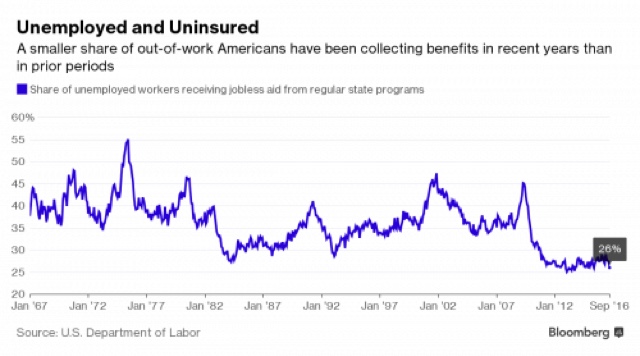
Here's the problem: that graph doesn't show what percent of INITIAL unemployment is covered by unemployment insurance vs. not, but rather what percent of ALL unemployment, including continuing claims (of, e.g., 10 or 25 or 40 weeks) is covered. Since many states cut back the number of weeks of unemployment insurance they will pay, more of the unemployment at the longer durations such as 26 weeks is not covered by insurance.
To find out if that affects initial claims, all we have to do is go back to that same comprehensive record of employers who pay into the unemployment insurance system. Once a quarter, the DOL surveys how many employees are covered in the unemployment insurance system. That statistic is called "covered employment." Here it is (in blue below) compared with total employment (red):

Do you see any big drop-off in that number? Of course not. But just to give you the accurate percentage, in the below graph I have divided covered employment by all employment. The result is the percentage of all jobs that are covered by unemployment insurance:

Notice that from 1980 forward, during expansions that percentage has been pretty consistent at about 94% to 95%.
So, finally, let's take the number of initial jobless claims -- which have been making new 40 year lows repeatedly this year -- and divided them by the percentage of covered employment. The lower the % of covered employment, the higher the "normed" number of initial claims will be. And here is the result:

Norming for the percent of covered employment dies not change the fact that initial claims are running at 40 year lows. Again, the diarist is spouting nonsense.
One more thing: he drags out the hoary chestnut that
" Another way to keep unemployment numbers low is to simply stop counting people," citing to
\the decline in the Labor Force Participation Rate.
As I have constantly pointed out, in that very same survey the Census Bureau asks the people who are not in the Labor Force whether or not they want a job, and every month about 90% of those people say thaey don't. The Census Bureau helpfully reports, each and every month, the number of people who aren't in the labor force who say they "want a job now," and here it is:

It is about 1.5 million higher than at its previous lows, but on the other hand it is about equal to the number in 1995, not a notably awful year.
Now, every now and then, just a like a blind squirrel, a Doomer will find a useful "nut" of information. But not this time.
And by the way, probably the best way to determine if the *number of jobs added* in an expansion has been weak or not, is to compare what percent of jobs compared with the working age population has been each month. Here's what that comparison looks like for prime working age 25-54:

And here's what it looks like for age 15-64 (although I don't really think high school and college aged kids should be added in):

In terms of the number of jobs added in any given month, this expansion has been weak, but at least as good if not better than the one that preceded it.
Tuesday, October 18, 2016
Watching aggregate sales and payrolls
- by New Deal democrat
Way back in the depths of the Great Recession in 2009, I used to hear a lot of comments like, "How can people buy anything, when they don't have jobs?!?" But the truth is, as I pointed out at the time, that sales lead jobs. This was true at the bottom, and it is generally true at the top too.
With this morning's release of consumer prices, up +0.3% for September, let's take an updated look at sales and jobs.
Let's start with real aggregate payrolls for nonsupervisory workers. This is the grand total, in real terms, of wages being paid to average Americans, which I believe is the best measure of how well the jobs market is or isn't delivering. To make it easier to see, I am dividing the data into two 25 year intervals:


Note that in the last 50 years, real aggregate payrolls have always peaked 6 to 12 months before the onset of a recession, usually declining but occasionally just going sideways for an extended period. These last made a peak 2 months ago.
Now let's add on real retail sales (green and red in the graphs below), likewise divided into two 25 year periods (the predecessor series and the current series ran concurrently during the 1990s):


Like aggregate payrolls, real retail sales also peaked (or at very lest went sideways) for an extended period of time, typically nearly 12 months, before the onset of recessions. Further, with the exception of the 1982 and 1990 recessions, real retails sales always peaked significantly before aggregate employment.
The bottom line is that we should expect both real sales and real aggregate payrolls to peak well before the onset of the next recession, and we should look for sales to peak first. With that in mind, let's zoom in on the last year. Here are real retail sales and real retail sales per capita (per capita sales tend to peak even earlier):

The big increase in September nominal sales was still not quite enough to make a new high in either series, which last occurred two months ago.
There is no cause for any immediate concern. But we definitely want to keep a close eye on the long leading indicators as the late cycle of the expansion continues.
Bonddad's Tuesday Linkfest
I'm a financial Adviser with Thompson Creek Wealth Advisors and attorney with The Law
Office of Hale Stewart


The pound is dropping versus the dollar and euro, which may increase import inflation. Recently, Bank of England head Carney publicly stated inflation would run above the bank's 2% target.


Office of Hale Stewart

Is Inflation Making a Comeback?


The pound is dropping versus the dollar and euro, which may increase import inflation. Recently, Bank of England head Carney publicly stated inflation would run above the bank's 2% target.

EU inflation is at its highest level in 2 years.

Chinese PPI prints its first positive number in 5 years.
What influences productivity over time? The literature on the fundamentals of economic growth tends to focus on three factors. One is the pace of technological development. Productivity improves as new general purpose technologies are introduced and diffuse through the whole economy. Classic examples are the automobile and electricity. The second factor is human capital. The workforce receives better training and a higher level of knowledge over time, both of which help make workers more productive and improve growth over the medium and long run. The third factor is productive public capital. The idea is that government would provide certain types of public capital that would not otherwise be provided by the private sector, such as roads, bridges and airports. This type of public capital can improve private-sector productivity and, therefore, may lead to faster growth.
Monday, October 17, 2016
The darkening skies
- by New Deal democrat
In my Weekly Indicators column on Saturday, I noted that the data had gotten a little darker. Since I have been increasingly concerned about the direction of the economy over the next year or two, I thought I would spell out where my worry is coming from..
Let me start with the long leading data, and go from there.
First of all, while corporate bond yields made a new low after the Brexit vote, (blue in the graph below) mortgage rates did not follow (red):

Meanwhile,while adjusted corporate profits have rebounded from their Q4 2015 low, they are still stalled below their previous highs:

Turning to the consumer side of the ledger, housing starts (blue in the graph below) did make - just barely - a new high several months ago, but basically have been stalled since the early part of 2015. Meanwhile, motor vehilcle sales (red) (a shorter leading indicator) appear to have made their peak for the cycle one year ago:

Mortgage applications have not made a new high since June, and may go negative YoY by December:

Which leaves real money supply the only one of Prof. Geoffrrey Moore's original long leading indicators as unambiguously positive. Further, according to the paradgm spelled out by Prof. Edward E. Leamer typically housing turns down first among consumer expenditures, followed by cars, followed by nondurable goods, before a recession hits. Right now neither houses nor cars are really going anywhere -- not down, but not up either.
Two other short leading indicators are no longer helping.
First, the price of gas is now only about 1% less than it was a year ago, and has been trending up, not down as per a typical autumn, since August:

Further, as industrial metals have weakened again, the US$ has also turned just a little higher:

Neither one of these are headwinds yet. But if gas were to go back up to the $3.25 range next year or so, and the US$ strengthens, this would be very bad news.
Finally, when it comes to coincident indicators, industrial production is the first among equals, and while it bottomed in March, it hasn't made a lot of progress since:

Worse, the progress it has made has chiefly been from natural resource extraction bouncing off the bottom (red in the graph below), while manufacturing, which made slow progress in 2015, has completely stalled this year (blue):

None of this is to say that we are presently in a recession, or even that one is imminent. For example, the continual new lows in initial jobless claims are potent evidence that the jobs market is still in decent shape, and consumer spending continues to rise in real terms.
But put the above all together, and you have a more fragile expansion, with little in the way of new tailwinds to help it. The one good thing that has happened in the last six months -- the lows in interest rates -- really need to start feeding through to a significant improvement in housing starts and permits. I still think they will, because historically they have done so. But if for any reason they don't, then the economy can be tipped into contraction by not much of a negative shock.
If the economy were to tip into recession soon, my concern isn isn't just academic. This expansion has witnessed the poorest YoY wage growth of any expansion in over 60 years (red in the graph below), and as the unemployment rate risses during a recession, - and stays elevated for potentially several years afterward -- YoY wage growth tends to fall by at least 2%:

Since our best YoY growth in wages to date is only 2.6%, that measns we are very vulenrable to outright wage deflation in the next recession, for the first time since 1938.
So, this month's housing permits and starts report takes on added importance, as does the long leading indcator of coproate profits in the upcoming Q3 GDP report, as does the tightening (or not) of credit conditions for Q3 that will be reported in early November.
Bonddad's Monday Linkfest
Sorry I've been out of the loop for the last week. I've been utterly transfixed by the presidential election; it seems like something new and crazy emerges every hour.
I'm a financial Adviser with Thompson Creek Wealth Advisors and attorney with The Law Office of Hale Stewart


I'm a financial Adviser with Thompson Creek Wealth Advisors and attorney with The Law Office of Hale Stewart
Technology, Energy, and Financials are Outperforming the SPYs


A Closer Look At the Financials
6-Month Chart of the Major Financial ETFs

10-Week Performance of the Biggest XLF Positions

A Closer Look At the Technology Sector
6-Month Charts of the Technology Sectors

10-Week Performance of the XLKs Largest Members Relative to the SPYs

Sunday, October 16, 2016
Saturday, October 15, 2016
Weekly Indicators for October 10 - 14 at XE.com
- by New Deal democrat
My Weekly Indicator post is up at XE.com. Between energy, commodities, the US$, and mortgage applications, there has been a slight but noticeable darkening of the picture.
Friday, October 14, 2016
September retail sales: positive with one fly in the ointment
- by New Deal democrat
As you all probably already know, real retail sales is one of my favorite metrics. I haven't looked at it in a little while, so this morning's report is a good opportunity to catch up.
The below graph shows nominal (blue) and real (red) retail sales.

With a nice +0.6% increase in September, nominal retail sales are at another record. So long as consumer prices have not increased by more than 0.2% (we'll find out next week), real retail sales set another record as well.
Further, sales lead jobs. The direction of the YoY rate of change in retail sales tends to lead YoY payroll growth by 6 - 12 months. Here are the last 10 years ending August:

This argues that YoY job growth is likely to be stable to slightly decelerating in the next few months, a somewhat contrary signal to that given by the Labor Market Conditions Index released several days ago.
Finally, the one fly in the ointment is that, between anticipated inflation in September, plus normal population growth of about .075% per month, it is unlikely that real retail sales per capita will be better than flat compared with June and July:

Real retail sales per capita is a long leading indicator, and this suggests it will have made no improvement over the last 4 months.
Wednesday, October 12, 2016
JOLTS, Labor Market Conditions index consistent with late 2017 recession
- by New Deal demorat
I continue to be unimpressed with the Job Openings and Labor Turnover Survey (JOLTS), as showing post-mid cycle deceleration for over a year. I have found what I hope is a better way to present my argument, so that you can see why the report is less than heartening.
First, here is a comparison of job openings (blue), hires (red), and quits (green, right scale). Because there is only one compete past business cycle for comparison, lots of caution is required. But in that cycle, hires and quits peaked first, while openings continued to rise before turning down in the months just prior to the onset of the Great Recession:

Through today's report for August, 2016 looks very much like 2006, or even early 2007.
To better show you my concern, let's look at this same data as expressed in YoY% changes:

Although there's lots of noise in the squiggles, the pattern of maximum growth at mid cycle gradually declining under zero prior to the onset of the 2008 recession is evident. Here is a close-up of the years 2005-08 to show you the deceleration of quits and hires from their peaks in late 2005, and the flatness of hires before declining in the months just before the recession:

Now let's look at the same time frame up until this month's release:

You can see similar peaks of quits and hires in late 2014, and the general flatness in hires over the last year. The rates of YoY change are equivalent to those at the end of 2006.
If the same pattern as the last economic cycle were to hold for this one, JOLTS would show continued deceleration before rolling over into an actual recession about 12 months from now.
Meanwhile the LMCI has been slightly negative virtually all this year. As shown in the graph below, this is consistent with slowdowns (as in 1985 and 1995) as well as prior to recessions:

Still, the LMCI has not declined nearly as much as it typically has prior to most of the recessions in the last 50 years. At the same time, note that the LMCI does a pretty good job forecasting the direction of the YoY change in employment (red). So the YoY trend in the monthly jobs report is likely to continue to decelerate.
Still, the LMCI has not declined nearly as much as it typically has prior to most of the recessions in the last 50 years. At the same time, note that the LMCI does a pretty good job forecasting the direction of the YoY change in employment (red). So the YoY trend in the monthly jobs report is likely to continue to decelerate.
While I'm not forecasting any actual negative monthly job reports in the near future, the YoY payrolls graph still shows continued deceleration. Here is a bar graph of the monthly gain in jobs for the last 3 years, minus 150,000, better to show the deceleration from the peak of nearly 2 years ago:

The 4th quarter of last year showed job increases of over 250,000 per month. It is a virtual certainty that the job reports for this quarter are going to average much less.
In summary, both the LMCI and the JOLTS reports have been adding to the accumulating evidence that we are getting late in the expansion, if we only go by these two metrics, and we follow the 2001-07 template, a recession could begin within about 12 months. Which means that this month's housing data, as well as the long leading business profit and residential investment data in the first Q3 GDP estimate will take on added importance.
Tuesday, October 11, 2016
Does the recent stagnation in the unemployment rate mean we're DOOOMED?
- by New Deal democrat
The unemployment rate has varied between 4.7% and 5.1% over the last 12 months. Does that mean a recession is near, or even already here? I examine this at XE.com.
Bonddad's Tuesday Linkfest
Oil's Rebound


Is Rallying the Energy Sector


Here's the Valuation of the 10 Largest Holdings of the XLEs


And a 1-Year Chart Of All the Members


Monday, October 10, 2016
Five graphs for 2016: Q3 update
- by New Deal democrat
At the beginning of this year, I identified graphs of 5 aspects of the economy that most bore watching. Now that we are 3/4's through the year, let's take a look at each of them.
#5 The Yield Curve
The Fed attempted to embark on a tightening regimen last December. The question became, would the yield curve compress or, worse, invert, an inversion being a nearly infallible sign of a recession to come in about 12 months. It turned out that the weakness in the world economy plus Brexit caused a moderate compression just at the long end:

After the June Brexit vote, the 10 year treasury fell to all time lows (typically long rates only start to fall once the tightening cycle has caused the economy to weaken). Indeed, weakness in the economy has put the Fed back on hold all this year. The bottom line is that the yield curve is still quite positive when seen in a historical perspective.
#4 The trade weighted US$
Perhaps the biggest story of 2015 was the damage done by the 15%+ surge in the US$ that began in late 2014 -- which not only harmed exports, but pretty much cancelled out the positive effect on consumers' wallets by lower gas prices.
Here there has been a big change:

Against all currencies, the US$ has recently ben in the range of unchanged to +3% YoY - a more typical if still elevated range. Against major currencies, the US$ has actually declined YoY for most of this year.. This is good news.
Against all currencies, the US$ has recently ben in the range of unchanged to +3% YoY - a more typical if still elevated range. Against major currencies, the US$ has actually declined YoY for most of this year.. This is good news.
#3 The inventory to sales ratio
An elevated ratio of business inventories to sales means that businesses are overstocked. This has frequently but not always been associated with a recession. I have been using the wholesalers invenotry to sales ratio, since it has fewer secular issues. This ratio increased has fallen significantly since its high in January:

The good new is that this kind of fall tends to happen as a recession ends. the bad news is that it hasn' fallen more, telling us that the inducstrial economy is still weak.
The good new is that this kind of fall tends to happen as a recession ends. the bad news is that it hasn' fallen more, telling us that the inducstrial economy is still weak.
#2 Discouraged workers
While 2015 saw a big improvement in involuntary part time employment, this trend has completely stalled in the last 12 months:

We are still at least 1,500,000 above a "good" number. Worse, this kind of stall is something that we see as a cycle is approaching its peak.
We are still at least 1,500,000 above a "good" number. Worse, this kind of stall is something that we see as a cycle is approaching its peak.
#1 Underemployment and wages
The single worst part of this economic expansion has been its pathetic record for wage increases. Nominal YoY wage increases for nonsupervisory workers were generally about 4% in the 1990s, and even in the latter part of the early 2000s expansion. In this expansion, however, until recently nominal increases averaged a pitiful 2%, meaning that even a mild uptick in inflation is enough to cause a real decrease in middle and working class purchasing power.
There is increasing consensus that the primary reason for this miserable situation has been the persistent huge percentage of those who are either unemployed or underemployed, such as involuntary part time workers.
The single worst part of this economic expansion has been its pathetic record for wage increases. Nominal YoY wage increases for nonsupervisory workers were generally about 4% in the 1990s, and even in the latter part of the early 2000s expansion. In this expansion, however, until recently nominal increases averaged a pitiful 2%, meaning that even a mild uptick in inflation is enough to cause a real decrease in middle and working class purchasing power.
There is increasing consensus that the primary reason for this miserable situation has been the persistent huge percentage of those who are either unemployed or underemployed, such as involuntary part time workers.
This expanded "U6" unemployment rate ( minus 10%) is shown in blue in the graph below, toether with YoY nominal wage growth (minus 2%):

In the 1990s and 2000s, once the U6 underemployment rate fell under 10%, nominal wage growth started to accelerate. U6 has been under 10% for close to a year,, and there has been some mild improvement off the bottom. More than anything, the US needs real wage growth for labor, and the present nominal reading of 2.6% still isn't nearly good enough. With the expansion in deceleration mode well past mid-cycle, it is not clear at all how much further improvement we are going to get before the next recession hits.
In the 1990s and 2000s, once the U6 underemployment rate fell under 10%, nominal wage growth started to accelerate. U6 has been under 10% for close to a year,, and there has been some mild improvement off the bottom. More than anything, the US needs real wage growth for labor, and the present nominal reading of 2.6% still isn't nearly good enough. With the expansion in deceleration mode well past mid-cycle, it is not clear at all how much further improvement we are going to get before the next recession hits.
Subscribe to:
Posts (Atom)