Saturday, April 9, 2016
Weekly Indicators for April 4 - 8 at XE.com
- by New Deal democrat
My Weekly Indicator post is up at XE.com .
Rail traffic remains awful, but the bigger news is the major decline in corporate bond yields.


Friday, April 8, 2016
Wholesale inventories and sales: bad news for Q1, good news for the year


If they get "less bad," that is more evidence that this has been an inventory correction that won't grow into an actual recession.
From Bonddad:
A few points:
Here's a 5-year chart of the US dollar:

The overall level has moved lower since the end of last year. But the real test will be a move below the ~93.75 level. With the Fed on the sideline for now, that's a distinct possibility.
I'm not completely sold on the rebounding commodities story.
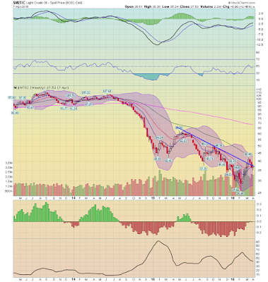
The weekly oil chart is still very bearish. While prices broke through upside resistance a few weeks ago, they have since retreated below important technical levels. I'd need to see a move above the 50-week EMA to be sold on the rebound or bottoming story.
Industrial metals have a similar weekly chart to oil:

Like oil, we've seen a nice bounce. But the fundamental picture is still bearish. China is slowing, lowering their demand. The global build-out in raw material extraction over the last 5+ years is forcing basic materials companies to continue producing to at least cover fixed costs. This keeps supply flowing, adding further downward pressure on prices. So we're seeing an increase in product and lower demand occur when there is weak global demand.
I'm more comfortable with an assessment that a bottom may by in.
From Bonddad:
A few points:
Here's a 5-year chart of the US dollar:

The overall level has moved lower since the end of last year. But the real test will be a move below the ~93.75 level. With the Fed on the sideline for now, that's a distinct possibility.
I'm not completely sold on the rebounding commodities story.

The weekly oil chart is still very bearish. While prices broke through upside resistance a few weeks ago, they have since retreated below important technical levels. I'd need to see a move above the 50-week EMA to be sold on the rebound or bottoming story.
Industrial metals have a similar weekly chart to oil:

Like oil, we've seen a nice bounce. But the fundamental picture is still bearish. China is slowing, lowering their demand. The global build-out in raw material extraction over the last 5+ years is forcing basic materials companies to continue producing to at least cover fixed costs. This keeps supply flowing, adding further downward pressure on prices. So we're seeing an increase in product and lower demand occur when there is weak global demand.
I'm more comfortable with an assessment that a bottom may by in.
Bonddad Friday Linkfest
We'll be doing our regular Monthly economic review on Thursday, April 28th at 3PM CST. You can sign up at this link.

- Political ideology, free trade and the minimum wage (BB)
- When will student debt be paid off? No idea (BB)
- The rise of the 1099 economy (The Nation)
- Dividends are beating buybacks (CNBC)
- UK production down .5% in Feb (ONS)
- See Also -- Markit number for UK Manufacturing (Markit)
- Active managers still not beating the market (FT)
- Corporate defaults hit 7-year high (FT)
- Worst earnings season since crisis coming up (BB)
EM Bonds Have Upside Room to Run

Thursday, April 7, 2016
The Bond Market Is GDP Bearish
In today's linkfest, I linked to a post from the Capital Spectator that argues (I believe convincingly) the treasury market is predicting a weaker equity market.
I wanted to briefly expand on the author's point.
Treasuries rally when traders see weaker economic growth and, in correlation, lower inflation. The reason is simple: slower economic growth leads to lower revenue growth, leading to weaker earnings. And weak earnings are a drag on equity indexes. In addition, in a weaker growth environment, traders like to increase the treasury component of their portfolios for their stable and predictable return. Finally, weak growth usually leads to lower inflationary pressures.
The converse is also true: when traders see stronger fundamental growth, they sell treasuries, opting for the potentially higher returns of the equity market. In addition, stronger growth usually leads to increasing inflation.
That being said, here is the weekly chart for the IEFs -- the 7-10 year treasury market ETF:

The market has been in an uptrend since the end of 2013. Let's now turn to the TLTs:

There are three primary patterns.
1.) A rally from the end of 2013 to the beginning of 2015
2.) A brief sell-off followed by a triangle consolidation in 2015
3.) A rally through upside resistance of the consolidation triangle at the beginning of 2016.
Notice there is no sell-off in sight.
Consider the above developments in conjunction with the latest release from the Atlanta GDP Now model:
The GDPNow model forecast for real GDP growth (seasonally adjusted annual rate) in the first quarter of 2016 is 0.4 percent on April 5, down from 0.7 percent on April 1. After yesterday morning's light vehicle sales release from the U.S. Bureau of Economic Analysis and the manufacturing report from the U.S. Bureau of the Census, the forecast for real GDP growth declined from 0.7 percent to 0.4 percent due to declines in the forecasts for real consumer spending growth and real equipment investment growth. The forecast for real GDP growth remained at 0.4 percent after this morning's international trade report from the U.S. Census Bureau, as a slight decline in the forecast for real net exports was offset by a slight increase in the forecast of real equipment investment growth.
The model has been decreasing since the beginning of February.

Overall, 1QGDP does not look good right now.
I wanted to briefly expand on the author's point.
Treasuries rally when traders see weaker economic growth and, in correlation, lower inflation. The reason is simple: slower economic growth leads to lower revenue growth, leading to weaker earnings. And weak earnings are a drag on equity indexes. In addition, in a weaker growth environment, traders like to increase the treasury component of their portfolios for their stable and predictable return. Finally, weak growth usually leads to lower inflationary pressures.
The converse is also true: when traders see stronger fundamental growth, they sell treasuries, opting for the potentially higher returns of the equity market. In addition, stronger growth usually leads to increasing inflation.
That being said, here is the weekly chart for the IEFs -- the 7-10 year treasury market ETF:

The market has been in an uptrend since the end of 2013. Let's now turn to the TLTs:

There are three primary patterns.
1.) A rally from the end of 2013 to the beginning of 2015
2.) A brief sell-off followed by a triangle consolidation in 2015
3.) A rally through upside resistance of the consolidation triangle at the beginning of 2016.
Notice there is no sell-off in sight.
Consider the above developments in conjunction with the latest release from the Atlanta GDP Now model:
The GDPNow model forecast for real GDP growth (seasonally adjusted annual rate) in the first quarter of 2016 is 0.4 percent on April 5, down from 0.7 percent on April 1. After yesterday morning's light vehicle sales release from the U.S. Bureau of Economic Analysis and the manufacturing report from the U.S. Bureau of the Census, the forecast for real GDP growth declined from 0.7 percent to 0.4 percent due to declines in the forecasts for real consumer spending growth and real equipment investment growth. The forecast for real GDP growth remained at 0.4 percent after this morning's international trade report from the U.S. Census Bureau, as a slight decline in the forecast for real net exports was offset by a slight increase in the forecast of real equipment investment growth.
The model has been decreasing since the beginning of February.

Overall, 1QGDP does not look good right now.
Bonddad Thursday Linkfest
We'll be doing our regular Monthly economic review on Thursday, April 28th at 3PM CST. You can sign up at this link.
- Low-skilled immigrants are good for the working class (BB)
- Fed Minutes (FED)
- Wind and solar are crushing fossil fuels (BB)
- Mark Perry uses wrong data in minimum wage debate; gets busted.
- Worst quarter for dividend cuts since Great Recession (Political Calculations)
- Lead exposure map (Vox)
- New DOL rule goes into effect for retirement advisors (Vox)
- How much value has the energy industry destroyed (Enterprising Investor)
- 3 Things -- See Bernie Sanders point (Pragmatic Capitalism)
- A few encouraging developments (Scott Grannis)
- Reliable indicators (Irrelevant Investor)
- Falling treasury yields -- not good (Captial Spectator)

Wednesday, April 6, 2016
Jazz Shaw Now Relies on Discredited Research For Bogus Minimum Wage Argument
I've blogged about Jazz Shaw several times before (see here, here and here). He is economically incompetent. Of course, that doesn't stop him from writing about economics.
He has relied on the works of Mark Perry of the AEI to argue an increase in the minimum wage causes job losses. However, it turns out some of Mark Perry's assertions were based on, shall we say, highly questionable data methods. Reid Wilson and H. Luke Shaefer at the University of Michigan document the faults at this link. This type of issue brings into question all of Mr. Perry's assertions and, by way of extension, Mr. Shaws arguments.
If Mr. Shaw were an honorable or ethical man, he would print a retraction of his arguments.
I'm not holding my breath.
JOLTS, Labor Market Conditions Index give different clues to job growth
- by New Deal democrat
After a blizzard of data last Friday, this week is pretty desolate. But we do have two follow-up reports on the labor market: the Labor Market Conditions Index, and the JOLTS report.
Let's start with the LMCI. As I have previously noted, the LMCI shows promise as a long leading indicator, as 40 years worth of data shows it turning negative usually a year or more before the onset of a recession:

As you can see, it also does a good job forecasting the YoY direction of job growth.
This month's report was the third in a row that was negative. This is another small addition to the evidence that 2017 might be a poor year. It also suggests that monthly job gains, currently averaging just under 225,000, will continue to decelerate.

Now let's turn to the JOLTS report. While it is an extremely useful dissection of the labor market, it has only existed for 15 years, and thus includes only one full expansion. Comparing this month's report with those of a few months ago shows why trends in the report must be taken with many grains of salt.
For the last year I was unimpressed with the report. True, job openings (blue in the graph below) were soaring to new heights, but actual hires (red) stalled -- the same pattern as in 2005-06. late in the last cycle. Two months ago openings decreased significantly - something which happened just before the 2007 recession started. Here is the complete series, including yesterday's report for February:

The pattern from the last expansion was: first, hires peak. Then, openings peak.
Here is a YoY look at the same data:

Openings had been rising faster than hires, which are have been barely positive. Until two months ago, when hires soared to a new all-time high, as shown in the first graph above at far right. Since then, the upward trend in hires has remained.
Some more good news was contained in the quits rate, which also continued in an uptrend, if not quite at their record of two months ago (red in the graph below):

This means that workers were confident enough in their prospects to voluntarily leave their jo bs. Note that layoffs (blue) remained low. Needless to say, the increase in voluntary quits is a significant positive.
Further, last month Dean Baker made a point that there is "pent up damend" for quits, and therefore they should continue to all time record highs. Here's a link to a graph of the U6 underemployment rate (inverted) vs. Quits:

For every level of underemployment over the last 3 years or so, there have been more Quits than occurred during the last cycle -- supporting the hypothesis of "pent up demand."
For every level of underemployment over the last 3 years or so, there have been more Quits than occurred during the last cycle -- supporting the hypothesis of "pent up demand."
So, while the LMCI continues to suggest a maturing expansion, this month's very positive JOLTS report - if the trends from the last expansion repeat themselves - suggests that job growth has a ways to go.
Bonddad Wednesday Linkfest
We'll be doing our regular Monthly economic review on Thursday, April 28th at 3PM CST. You can sign up at this link.

- ISM service index up 1.1 to 54.5 (ISM)
- BLS JOLTs report (BLS)
- Dude -- where's my yield (BB Gadfly)
- What do buybacks really tell us (A Wealth of Common Sense)
- Are profits important to returns? (AWCS)
- The market is still extended (bespoke)
- Did the 1936 fiscal stimulus help the economy? (The Money Illusion)
- Slower labor market growth ahead? (The Captive Spectator)
- Germany having problems (NYT)
- Panama papers impact growing (NYT)
- Australia AIG manufacturing index rises to 58.1 (AIG)
- Australia AIG service index drops to 49.5 (AIG)
- Fed President Evans Speech (Chicago Fed)
JOLTS quits and hires

Tuesday, April 5, 2016
Bonddad Tuesday Linkfest
We'll be doing our regular Monthly economic review on Thursday, April 28th at 3PM CST. You can sign up at this link.

- Interview with Peter Praet, ECB Governor (ECB)
- Why is the Fed worried about China (Mark Thoma)
- Negative rates in Japan lead to lending freeze (BB)
- Fed President Rosengren's speech (Boston Fed)
- Global manufacturing the weakest in 3 years (BI)
- RBA keeps rates at 2% (RBA)
- Australian retail sales flat (SA) (Australian Bureau of Statistics)
- Japanese service index right at 50 (Markit)
- EU unemployment down .1% to 10.3% (Eurostat)
- EU retail sales up .2% (Eurostat)
- EU composite and service PMI at 53.1 (Markit)
- Markit UK Service increases 52.7-53.7 (Markit)
- IMF Warns on global growth (IMF)
- India trims interest rates with economic headwinds (FT)
- Yen at 17-month high (FT)
EU unemployment, though high, continues moving lower

Monday, April 4, 2016
Time to Move Into Brazil?
Disclaimer: The information contained in this presentation is provided for informational purposes only and is not intended to substitute for obtaining advice from a financial adviser or attorney
Presentation of the information via the Internet is not intended to create, and receipt does not constitute, any formal professional relationship.
Accuracy of Information: While we use reasonable efforts to furnish accurate and up-to-date information, we do not warrant that any information contained in or made available through this website is accurate, complete, reliable, current or error-free.
Brazil is in the middle of a very serious political crisis along with a terrtible economic situation. Yet the weekly chart of the Brazilian ETF shows prices have moved through key resistance. Does this mean it's time to start nibbling at this ETF?
Let's start with the positve by looking at the weekly chart of the EWZ:

There are two key bullish developments: prices breaking a downtrend that started in 3Q14 along with plenty of upside momentum "room to run." The former indicates we're seeing traders begin to take at least small positions in this ETF in anticipation of a rebound. Furthermore, the MACD indicates this ETF could rally to a considerable degree.
Now for the bad news: the country is in terrible shape. First of all, the current president faces impeachment. Other members of the government are embroiled in a very large corruption scandal and the judiciary is under popular fire. I make no predictions about the potential outcome. I only note this in a very large crisis that endangers the entire political culture.
Second, the economy is in terrible shape:


Taking the charts in top to bottom order:
- The economy has contracted for a year. Remember that the textbook definition of a depression is six consecutive quarters of contraction.
- Unemployment is increasing.
- Prices are rising,
- So the central bank increased interest rates to 14%, essentially slamming on the brakes to tame price increases.
Everyone wants to buy low and sell high. What they often forget in that equation is that in order to buy low, they typically have to take on a tremendous amount of risk. The Brazil ETF represents a tremendous opportunity but also a very high degree of the following types of risk: economic, inflationary and political.
Only take a position in the EWZ if you can lose every penny you in invest in the position. It could all go to hell tomorrow.
Stock prices don't lead corporate profits - it's the other way around
- by New Deal democrat
I've been saying this for several years, and the relative performance of corporate profits and stocks in the last year has certainly borne this out. My Q1 update is up at XE.com .
Bonddad Monday Linkfest
We'll be doing our regular Monthly economic review on Thursday, April 28th at 3PM CST. You can sign up at this link.


- Saudis moving away from oil (NYT)
- 2Q16 fixed income outlook (Adviser Perspectives)
- March jobs report in 14 charts (WSJ)
- ISM index was solid (ISM)
- Remembrances of depression econ (Krugman)
- New minimum wage research (Upjohn Employment)
- California and NY's minimum wage increases (EPI)
- Record bond market bullishness is worrying (Marketwatch)
- India fails to exploit an opening (FT)
- Australian housing permits down .5% M/M (ABS)
- Massive data leak exposes over 11 million offshore records (NYT)
- Chinese companies poised to develop driverless cars (NYT)
- UK Construction positive and unchanged at 54 (Markit)
- Wisdom wanes for don't fight the Fed (FT)
EU Industrial Prices

UK Construction Activity

Sunday, April 3, 2016
Weekly Equity, Bond Market and International Summaries Are At XE.com
We'll be doing our regular Monthly economic review on Thursday, April 28th at 3PM CST. You can sign up at this link.
US Equity and Economic Review
US Bond Market Week in Review
International Economic Week in Review
US Equity and Economic Review
US Bond Market Week in Review
International Economic Week in Review
Saturday, April 2, 2016
Weekly Indicators for March 28 - April 1 at XE.com
- by New Deal democrat
My Weekly Indicator piece is up at XE.com.
There is a constellation of things that tend to happen near the end of a recession or inventory correction, and ....
Friday, April 1, 2016
ISM new orders surge to 58.3: the shallow industrial recession is ending
- by New Deal democrat
OK, probably ending, since nothing is perfect. But if there are reasons to be more concerned about 2017, this morning's ISM report is very strong evidence that the shallow industrial recession we have had for the last year is ending, either now or within the next 3 months.
Last month I wrote that "For me to be confident that this slowdown was ending, I would want to see new orders spike to at least 54."
Well, as forecast by the regional Fed reports, New Orders blew out to the upside at 58.3. With the sole exception of the month of September 2001 (for obvious reasons), there has never been a reading over 55 in a downturn in industrial production that hasn't either coincided, or been shortly followed by, the end of that downturn. This is true all the way back to 1948, although the below graph (thru January), for clarity, just focuses on the last 20 years:

Here is a close-up fo the last 10 years, updated through this morning, comparing ISM new ordes (red) with industrial production(blue):

Let me put this about as strongly as I can: this has been the single most important datapoint so far this year.
From Bonddad: Let me add a few points:
First, the anecdotal comments are unanimously bullish:
- "Unemployment rate is low in our county, making it hard to find workers. We are understaffed and running lots of overtime." (Plastics & Rubber Products)
- "Business in telecom is booming. Fiber plant is at capacity." (Chemical Products)
- "Current trends remain steady. No issues with delivery or costs." (Computer & Electronic Products)
- "Capital equipment sales are steady." (Fabricated Metal Products)
- "Requests for proposals for new equipment [are] very strong." (Machinery)
- "Government is spending again. Have received delivery orders." (Transportation Equipment)
- "Things are starting to pick up. Our business is seasonal and it is that time of year." (Printing & Related Support Activities)
- "Business conditions are stable, little change from last month." (Miscellaneous Manufacturing)
- "Incoming sales are improving." (Furniture & Related Products)
- "Our business is still going strong." (Primary Metals)
Not one shows weakness.
Why this is happening? The oil market is contracting, lowering their capital investment needs. International markets are weak and the dollar is still strong. It's possible we could see equipment replacement drive demand:
Global sales of construction equipment such as bulldozers, diggers and dump trucks are expected to expand in 2017 after five years of shrinkage, according to Off-Highway Research, a consulting firm.
Machinery manufacturers including Caterpillar of the US and the UK’s JCB have been hit since 2012 by falling demand, which is rooted in China’s economic slowdown and the negative impact this has had on industries including construction and mining.
Off-Highway Research is expecting a rebound in global unit sales of construction machines in 2017, driven by the gradual replacement of ageing vehicles and its prediction of an improvement in commodity prices.
To that end, consider this chart of the XLIs, which have recently rallied:

And a majority of the ETFs 10 largest holding are either stronger than the SPYs or improving:

March jobs report: mixed headline, mainly negative leading employment indicators
- by New Deal democrat
HEADLINES:
- +215,000 jobs added
- U3 unemployment rate up +0.1% to 5.0%
- U6 underemployment rate up +0.1% 9.8%
With the expansion firmly established, the focus has shifted to wages and the chronic heightened unemployment. Here's the headlines on those:
Wages and participation rates
- Not in Labor Force, but Want a Job Now: down 158,000 from 5.870 million to 5.712 million
- Part time for economic reasons: up 135,000 from 5.988 million to 6.123 million
- Employment/population ratio ages 25-54: up +0.2% from 77.8% to 78.0%
- Average Weekly Earnings for Production and Nonsupervisory Personnel: up $.04 from $21.33 to $21.37, up +2.3%YoY. (Note: you may be reading different information about wages elsewhere. They are citing average wages for all private workers. I use wages for nonsupervisory personnel, to come closer to the situation for ordinary workers.)
The more leading numbers in the report tell us about where the economy is likely to be a few months from now. These were mainly negative
- the average manufacturing workweek fell from 41.8 hours to 41.7 hours. This is one of the 10 components of the LEI, the net will be a negative.
- construction jobs increased.by +37,000. YoY construction jobs are up +301,000.
- manufacturing jobs decreased by -29,000, and are now *down* -20,000 YoY
- temporary jobs - a leading indicator for jobs overall increased by 4,000 (but is still down from December's high).
- the number of people unemployed for 5 weeks or less - a better leading indicator than initial jobless claims - increased by 115,000 from 2,297,000 to 2.412,000. The post-recession low was set 7 months ago at 2,095,000.
Other important coincident indicators help us paint a more complete picture of the present:
- Overtime was unchanged at 3.3.
- Professional and business employment (generally higher-paying jobs) increased by +33,000 and are up +606,000 YoY.
- the index of aggregate hours worked in the economy rose by 0.2 from 104.9 to 105.1 (but is still below January's 105.3).
- the index of aggregate payrolls rose by 0.5 from 127.2 to 127.7.
- the alternate jobs number contained in the more volatile household survey increased by +246,000 jobs. This represents an increase of 2,987,000 jobs YoY vs. 2,802,000 in the establishment survey.
- Government jobs rose by +20,000.
- the overall employment to population ratio for all a ges 16 and above rose by 0.2 from 59.8 to 59.9 m/m and +0.6% YoY.
- The labor force participation rate rose 0.1% from 62.9% to 63.0% and is now up +.0.3% YoY (remember, this incl udes droves of retiring Boomers).
Let me start with the positive. In addition to the headline jobs number, the best news was the jump in the employment population ratio and the labor force participation rate. The core e/p ratio for ages 25-54 has jumped +0.5% just in the last 3 months, and has now made up almost 2/3 of the ground it lost in the last recession. That jump in participation is why both the unemployment and underemployment rates rose slightly.
Another piece of good news is in the leading construction sector, which has added nearly 5% more jobs in the last year. The higher paying professional and business services sector also has added about 3% more jobs in the same time. Hourly earnings continued to be "meh," although aggregate payrolls grew smartly.
But the negatives, especially among the series that lead, are beginning to outweigh the positives. Revisions were mixed. The manufacturing workweek declined, and manufacturing jobs are now down YoY. Although temporary jobs rose this month, they have failed to top their December peak for the last 3 months. Short term unemployment has continued to rise slightly. A coincident indicator, aggregate hours, also failed to exceed its January high.
So while we can cheer yet another month of jobs added to the economy, and the jump in participation, this report just adds to my concern about next year.
A few comments on top of NDD’s points:
We’re seeing the long-term impact of the oil market slowdown along with the weaker trade environment. From the report:
In March, employment in professional and business services changed little for the third month in a row. In 2015, the industry added an average of 52,000 jobs per month.
Employment in manufacturing declined by 29,000 in March. Most of the job losses occurred in durable goods industries (-24,000), including machinery (-7,000), primary metals (-3,000), and semiconductors and electronic components (-3,000).
Industrial production has been weak for the last 12 months while capital investment contracted in the 4Q15. The combination of these two events means manufacturing jobs will be declining, explaining the drop of 29,000. And, we’re also seeing broader ramifications of this slowdown. For example, as manufacturers slow, they consumer fewer professional services, i.e. they are more judicious in using their accountant or lawyer. This explains the weak pace of professional job growth.
Both the participation rate and employment/population ratio increased .1%. This tells us that people are coming back into the labor force – another health sign.
However, how long can this pace of hiring continue in the face of weak corporate profit growth?

At some point, you’d think businesses would start to cut costs
Bonddad Friday Linkfest
We'll be doing our regular Monthly economic review on Thursday, April 28th at 3PM CST. You can sign up at this link.
- Candian GDP up fourth consecutive month (Statistics Canada)
- Is economic growth in the final innings? (Frank Holmes, Adviser Perspectives)
- Five reasons emerging markets have rebounded (WF, Adviser Perspectives)
- The BOJs struggle has just begun (Brookings)
- The Fed is worried about Japanese style deflation (Marketwatch)
- Tesla orders surge on new model's unveiling (NYT)
- Markit EU up slightly (Markit)
- Japan manufacturing contracts (Markit)
- Chinese manufacturing improves (but is still contracting) (Markit)
- UK Manufacturing barely expanding (Markit)
- Defensive sectors lead U.S. in 1Q (FT)
Thursday, March 31, 2016

Bonddad Thursday Linkfest
Thursday I'll be doing a free webinar that will review the last month or so of US economic data along with an overview of the major markets (equities and bonds). It's free! It'll last at most 30 minutes (probably shorter). You can sign up here.


- Kansas isn't doing that will under Brownback's policies, especially compared to Nebraska (BB)
- International issues very important to Yellen (BB)
- Melting ice sheet could flood cities by 2100 (NYT)
- U.S. and China jockey for dominance in the S. Chine Sea (NYT)
- Rousseff loses key support before impeachment vote (NYT)
- Trump's 24 hours of mayhem (Politico)
- EU annual inflation at -.1% (Eurostat)
- Canada and the Commodity Boom (Lynn Patterson, Bank of Canada)
- Candian industrial prices down 1.1% in Feb. (Statistics Canada)
- The reprocussions of financial booms and busts (Angry bear)
- China credit outlook cut to negative (BB)
- Look for the employment/population ratio and participation rate numbers in employment report (BB)
- UK GDP up .6% (ONS)
Canadian Producer Prices


Lower income households are getting clobbered by rent increases
- by New Deal democrat
Tomorrow just about every data point in the world will be reported ... but while we are waiting, here is an important story that will particularly be of interest to our progressive readers.
A study by the Pew Foundation shows that rents are killing lower income households. Oddly, it hasn't been picked up by progressive blogs. I came across the study by way of Mike Shedlock, who claimed that it shows that consumers haven't been spending any of their gas savings. Ummm, actually, no, since the first thing that Pew tells us is that
Expenditures are a key but often overlooked element of family balance sheets. .... [T]his chartbook uses the Bureau of Labor Statistics’ Consumer Expenditure Survey to explore household expenditures, examining changes in overall spending and across individual categories from 1996 to 2014.
Since gas prices only started their big decline late in 2014, actually the Pew study tells us absolutely zero about what consumers have done with their gas savings in 2015 and 2016. But I digress.
Here is the overall summary graph from the Pew Foundation:

More important is the breakdown in expenses of shelter, transportation, food, and healthcare costs that Pew finds contributed the most to the increase in household expenditures.

Notice two things in particular about this graph. First of all, from 2004 through 2013 there are slow increases in housing, transportation, food, and healthcare. Secondly, there was a spike in at least 3 of the 4 series in 2014, accounting for the lion's share of the entire two decade change! I would love to know what that is all about (was there a quirk in the sample, or the data?). Pew unfortunately doesn't explain. But by far the biggest spike, accounting for 5% of all household expenditures, was in housing.
A final graph shows that for lower income households, rents spiked in 2014 from just over 30% to just under 50% of their entire expenditures!

This is confirmed by the measure of median asking rent, compiled by the Census Bureau:

Note that rents have soared in the last few years, and made yet another all time record, even adjusted for inflation, in the last quarter of last year. This even as wages for lower income jobs have actually declined in real terms since the recession.
Further, it is entirely rents that are driving the increase in inflation in the last few months. Take out housing costs, and the CPI is almost exactly ZERO now, and has been negative for the last year:

This is particularly important, since the Fed has been claiming that an uptick in inflation justifies raising interest rates. But raising interest rates will only make housing even more unaffordable, a completely perverse outcome.
I do expect a big secular increase in the construction of new condominiums and apartments, because the return in profits, due to high rents, is so compelling. But in the meantime, lower income households are getting absolutely clobbered by increased housing costs, and although the Pew study stops in 2014, it seems likely that at least some of the subdued increase in consumer spending we have seen since is because increased rents are soaking up some of consumers' gas savings.
Subscribe to:
Posts (Atom)