Saturday, March 12, 2016
Weekly Indicators for March 7 - 11 at XE.com
- by New Deal democrat
My Weekly Indicator post is up at XE.com.
For the last month I have pointed out that the trends that were established in 2015 are all reversing. That process continued this week, as one more turned positive, and one deteriorated closer to negative.


Friday, March 11, 2016
Potpurri for a light week of economic data
- by New Deal democrat
Well, this has been just about the lightest week I can ever remember for economic news. Even the JOLTS report, which is usually issued the week after the jobs report, was put off until next week.
So here are a few things to hopefully interest you until something actually, you know, happens.
1. Labor conditions were negative, but there's no cause for imminent concern.
The Labor Market Conditions Index does a good job forecasting the trajectory of the YoY% change in jobs. Here's the long view:

Here is the last 5 years:

We're not any worse than we were in 2012, so there's no cause for panic. On the other hand, the continuing weakness in the LMCI indicates that were are going to get progressively weaker jobs gains in the coming months.
2. Wholesalers' inventory to sales ratio. OUCH!
No updated graph, because FRED waits for retail sales to update total sales and inventory data.
The high frequency weekly data has been pointing to a bottom in the shallow industrial recession. That wholesalers' inventories grew as well as sales falling contradicts that narrative. Bad news. Hopefully a one-month glitch? I dunno.
3. Can you really have a recession when nobody is getting laid off?
Jobless claims:

I mean, seriously, how could that be even possible!?!
4. Speaking of high frequency weekly data...
My rule of thumb for not-seasonally-adjusted data is that, when the series is less than half as good, or bad, as it was at its best/worst YoY, then it has probably made a bottom or top
Here's steel (through February):
Here's steel (through February):

and staffing:

and rail (this year is that purple squiggle on the left):
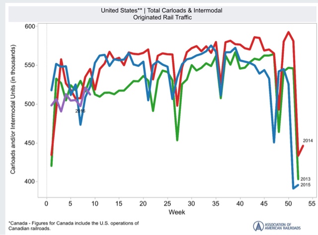
Steel does look like it has bottomed. Staffing not quite yet, although the YoY comparisons are clearly "less bad" than they were in the September through December frame. Rail is probably benefitting from less bad February weather this year - another two or three weeks of data will tell the tale.
Wednesday, March 9, 2016
Updating the mid-cycle indicators: part 2 of 2
- by New Deal democrat
A majority of the 7 mid-cycle indicators should have turned south well before the beginning of a recession. Since lots of commentators are talking about recession now, I've taken an updated look at these 7 indicators.
Part 2 of 2, with the conclusion, is up at XE.com.
Tuesday, March 8, 2016
Updating the Mid-cycle indicators: part 1 of 2
- by New Deal democrat
If the mid-cycle indictors haven't turned, talk of an imminent recession is clearly premature.
So, have they? I take a detailed look in two parts. Part 1 is up at XE.com.
Monday, March 7, 2016
Four out of five leading jobs indicators show weakening
- by New Deal democrat
Every month when I discuss the jobs report, I have a section devoted to those parts of the report which tell us where the overall numbers are likely to go in the future.
We may be at a turning point for those numbers, as 4 out of 5 either look like they are turning or have already turned.
First, here are temporary jobs:

Note that these typically turn down about a year before the overall jobs numbers turn down.
Here is a close-up on the last year:

These look like they are making a peak now (or may have made a peak 2 months ago).
Next, here are the number of unemployed between 0 and 5 weeks. This was identified by Dr. Geoffrey Moore, the founder of ECRI, and in his 1993 book he wrote that it was more accurate than initial jobless claims:

These are quite noisy. But they have not made a new low in 5 months.
Third, here are jobs in manufacturing:

In the post-World War 2 era, these sometimes but not always peaked significantly before the onset of a recession. Sometimes they went sideways for awhile before rolling over as well.
Since 1990, they have undergone a secular decline. But even then the first derivative (i.e., rate of decline) accelerated before the last 2 recessions (red, right scale):

Now here is a close-up on the last 5 years:

These have pretty clearly gone sideways in the last year, and the first derivative has declined.
Fourth, here is the manufacturing workweek:

This is one of the actual components of the LEI. Note that these peaked almost two years ago, although they are improving off their recent bottom in late 2015, thus being consistent with an ebbing of the shallow industrial recession.
Finally, here are residential construction jobs, which also typically peak a year or more before jobs as a whole turn down:

These are still growing, as the housing sector is doing quite well.
The poor improvement in manufacturing jobs is a representation of the shallow industrial recession in the economy during the past year. But the other three either have not made new highs in months, or even going on two years, suggesting that the overall labor market is decelerating. This is a caution flag for jobs possibly turning negative next year.
Sunday, March 6, 2016
Saturday, March 5, 2016
Weekly Indicators for February 29 - March 4 at XE.com
- by New Deal democrat
My Weekly Indicators post is up at XE.com.
This is one of those time when watching the high frequency data is so important, because the trends do appear to be changing.
Friday, March 4, 2016
February jobs report: solid headlines, decidedly mixed internals
- by New Deal democrat
HEADLINES:
- +242,000 jobs added to the economy
- U3 unemployment rate unchanged at 4.9%
With the expansion firmly established, the focus has shifted to wages and the chronic heightened unemployment. Here's the headlines on those:
Wages and participation rates
- Not in Labor Force, but Want a Job Now: down -103,000 from 5.973 million to 5.870 million
- Part time for economic reasons: unchanged at 5.988
- Employment/population ratio ages 25-54: up +0.1% from 77.7% to 77.8%
- Average Weekly Earnings for Production and Nonsupervisory Personnel: unchanged at $21.32, up +2.4%YoY. (Note: you may be reading different information about wages elsewhere. They are citing average wages for all private workers. I use wages for nonsupervisory personnel, to come closer to the situation for ordinary workers.)
The more leading numbers in the report tell us about where the economy is likely to be a few months from now. These were neutral to negative.
- the average manufacturing workweek was unchanged at 41.8 hours (but last month was revised up +0.1. This is one of the 10 components of the LEI, the net will be a posittive.
- construction jobs increased.by +19,000. YoY construction jobs are up +253,000.
- manufacturing jobs decreased by -16,000, and are up +25,000 YoY.
- Professional and business employment (generally higher-paying jobs) increased by +23,000 and are up 604,000 YoY.
- temporary jobs - a leading indicator for jobs overall decreased by -9,800.
- the number of people unemployed for 5 weeks or less - a better leading indicator than initial jobless claims - increased by +48,000 from 2,249,000 to 2.297,000. The post-recession low was set 6 months ago at 2,095,000.
Other important coincident indicators help us paint a more complete picture of the present:
- Overtime was unchanged at 3.3 hours.
- the index of aggregate hours worked in the economy fell by -0.4 from 105.3 to 104.9.
- The broad U-6 unemployment rate that includes discouraged workers declined from 9.9% to 9.7%.
- the index of aggregate payrolls fell by -0.7 from 127.8 to 127.1.
- the alternate jobs number contained in the more volatile household survey increased by +520,000 jobs. This represents an increase of 2,843,000 jobs YoY vs. 2,673,000 in the establishment survey. [Note: I updated this to correct an error, as I originally had +555,000 jobs for this]
- Government jobs rose by +12,000.
- the overall employment to population ratio for all a ges 16 and above -rose by 0.2 from 59.6 to 59.8 m/m and +0.5% YoY. The labor force participation rate rose 0.-1% from 62.7% to 62.9% and is now up +.0.1% YoY (remember, this incl udes droves of retiring Boomers).
The headline numbers - strong job gains, and a decline in the broad U6 underemployment rate - are certainly welcome.
Other significant positives included positive revisions to the last two months, an increase in both the employment to population ratio and labor force participation rate, and a decline in those out of the labor force who want a job now (but still about 1.4 million above its 1999 and 2007 lows).
But there were some significant and/or worrisome negatives as well. Last month's big increases in wages and hours were partially reversed. More worrisome was the establishment of a trend in declining temporary jobs (a leading indicator for overall employment), and negatives in two other leading sectors: a rise in short term unemployment, and a loss of manufacturing jobs
In short, while the strong positives in coincident measures of employment are certainly welcome, the decline in some important leading indicators for employment raises a significant yellow flag.
Thursday, March 3, 2016
February ISM manufacturing suggests slowdown still has a ways to go
- by New Deal democrat
I wrote a month ago that before either an inventory slowdown or a recession end, the new orders sub-index of the ISM Manufacturing Index turns up first. The inventories component tends to trough at the end of a recession, or sometimes bounce along a bottom for a few months.
Last month I compared ISM new orders (red in the graph below) with real GDP. A similar order occurs with Industrial production (blue):

It was encouraging one month ago that new orders were above 50 showing expansion.
So what happened this month? Once again new orders were positive (red in the graph below). Inventories, however, also ticked up slightly (blue):

Note, by the way, that both new orders and inventories are consistent with levels we saw during past non-recession inventory corrections, in 1996, 2002, and 2012.
For me to be confident that this slowdown was ending, I would want to see new orders spike to at least 54. They didn't do that. That doesn't mean that I expect things to get worse. In fact there are encouraging signs in things like steel production and rial shipments that we may have bottomed. The failure of new orders to pick up means at least that we aren't out of the woods yet.
Wednesday, March 2, 2016
Houses and cars put up a yellow flag
- by New Deal democrat
I have a new post about the two most leading sectors of the consumer economy - housing and cars - up at XE.com.
Tuesday, March 1, 2016
The danger of Donald Trump the demagogue: What Larry Summers Said
- by New Deal democrat
Apologies for the light posting this week. I'm travelling again.
No photo this time, but I just paid $1.49 a gallon for gas. I wonder if i will ever see a price that low again in my lifetime. Yesterday morning at hotel breakfast, I had an unpleasant encounter with an odler white couple badmouthing CNN for calling Trump on at least not knowing that he ought to refuse support from the KKK.
Which brings me to Larry Summers, who makes the best case I have read to date on why Trump's popularity is so dangerous:
The possible election of Donald Trump as President is the greatest present threat to the prosperity and security of the United States. ... [N[ever before had I feared that what I regarded as the wrong outcome would in the long sweep of history risk grave damage to the American project.
The problem is not with Trump’s policies, though they are wacky in the few areas where they are not indecipherable. It is that he is ... demagogically offering the power of his personality as a magic solution to all problems—and making clear that he is prepared to run roughshod over anything or anyone who stands in his way. ...
Donald Trump is the type of demagogue the founders warned us about. Well put, Larry Summers.
Monday, February 29, 2016
Fed rate hikes and rents: What Dean Baker says
- by New Deal democrat
Dean Baker notices that, excluding shelter, consumer prices have only "surged" from negative to +0.4% YoY:
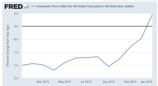
Which still makes YoY inflation ex -shelter still close to its lowest value in 70 years:

He says:
If higher inflation is being driven by rising rents, it is not clear that higher interest rates are the right tool to bring prices down. Every Econ 101 textbook tells us about supply and demand. The main factor pushing up rents is more demand for the limited supply of housing. The best way to address this situation is to construct more housing.
But housing is perhaps the most interest sensitive component of demand. If we raise interest rates, then builders are likely to put up fewer new units. This will create more pressure on the housing stock and push rents up further.
Sunday, February 28, 2016
Saturday, February 27, 2016
Weekly Indicators for February 22 - 26 at XE.com
- by New Deal democrat
My Weekly Indicators column is up at XE.com. The bifurcated economy of last year is undergoing some important shifts.
Friday, February 26, 2016
Making sense of the housing muddle, part 2
- by New Deal democrat
Yesterday I noted that the housing market lately has been subject to a lot of conflicting crosscurrents, and noted that excluding NY, which skewed the national reports higher by 100,000 units in May and June, the trend in housing permits has continued higher.
In fact, virtually all of the variability in housing permits has been among multi-unit properties:
In fact, virtually all of the variability in housing permits has been among multi-unit properties:

In the past, single family permits have usually declined before multi-unit permits, as buyers turn from their first to second choice in housing as conditions deteriorate.
Another important crosscurrent is the collapse of fracking in the Oil patch. The below two graphs compare fracking states North Dakota and Oklahoma:
Another important crosscurrent is the collapse of fracking in the Oil patch. The below two graphs compare fracking states North Dakota and Oklahoma:


This is hardly an exhaustive list, but it certainly does suggest that the depression in the Oil patch has coincided with a decline in new housing activity, while outside of the Oil patch, permits have continued to rise.
Yet another crosscurrent is the increase in foreign buying of higher end properties. Foreigners typically pay cash, In the last several years the Canadian, British, French and German buyers have been surpassed by the Chinese. According to the NAR's Profile of International Home Buying Activity, through March 2015.
While there hasn't been any more recent national survey, a report for Florida in September indicated that:
Florida is one of the major U.S. destinations of international residential real estate buyers. Approximately 25 percent of foreign home buyers purchasing U.S. property buy Florida properties. ....
- International unit sales totaled 44,000 properties, 12 percent of Florida’s residential market (15 percent a year ago), compared to four percent nationally.
So part of the relative softness in new housing activity in the second half of 2015 probably reflected less foreign buying of US properties.
The surge and subsidence in foreign purchases of high-end properties undoubtedly has played an important role in the YoY decline in median prices of new single family houses:

Finally, as I have frequently noted, the biggest single driver of house buying is mortgage interest rates. The below graph compares the YoY change in mortgage rates (blue, inverted) vs. the YoY% change in housing permits (red):

The recent decline in mortgage rates is only going to help home purchasers and should help drive improvement in the housing market going forward.
To summarize, the housing market is a real muddle. I think the least bad interpretation is that it has been going sideways. Although the NYC-induced distortions may have translated into the real economy via starts, I am very reluctant to consider that spike a turning point, when single family permits and permits ex-NY still show an uptrend. Finally, recent low mortgage interest rates should translate into more home-buying and an increase in permits and starts a few months down the road.
Thursday, February 25, 2016
Making sense of the housing muddle, part 1
- by New Deal democrat
I've been withholding comment on the housing market while waiting for the state-by-state breakdown, which was finally released this morning. The truth is, there are so many crosscurrents in the housing story that it is tough to discern any one trend, so I'll divide this analysis into two posts.
The huge spike caused by the expiration of a NYC program last June is still affecting the YoY and monthly trend. But if those permits translated into actual starts, then maybe they shouldn't be treated as distortions after all. Then there is the similar effect of the remarkably warm December in the Northeastern US. And what about the collapse of the fracking industry in some states of the Oil patch? Further, the price aspect of the market in particular has also been affected by the big increase - and now decrease - in foreign cash buyers of high end properties over the past few years.
In other words, I can generate graphs that point up, sideways, and down, all of which have credibility. A total muddle.
So let me start by looking at the overall picture, and the specific continuing issue of the NYC spike from late last spring.
First, here is the overall picture of new home building, including permits (green), starts (red), and new home sales (blue):

New home sales tend to peak first, somewhere in mid-cycle, followed by permits, and then starts one or two months later - but starts are much more volatile. All of these made highs earlier last year, and turned down in the most recent month compared with December. But all have had secondary peaks recently nearly equaling the early 2015 peaks.
But the most comparable series with new single family home sales are 1 unit permits and starts. Here's what they look like:

Although January was down from December, single family permits and starts, the trend is undeniably upward.
Now let's look at just permits for NY:

The huge spike caused by the expiration of a NYC program last June is still affecting the YoY and monthly trend. But if those permits translated into actual starts, then maybe they shouldn't be treated as distortions after all. Then there is the similar effect of the remarkably warm December in the Northeastern US. And what about the collapse of the fracking industry in some states of the Oil patch? Further, the price aspect of the market in particular has also been affected by the big increase - and now decrease - in foreign cash buyers of high end properties over the past few years.
In other words, I can generate graphs that point up, sideways, and down, all of which have credibility. A total muddle.
So let me start by looking at the overall picture, and the specific continuing issue of the NYC spike from late last spring.
First, here is the overall picture of new home building, including permits (green), starts (red), and new home sales (blue):
New home sales tend to peak first, somewhere in mid-cycle, followed by permits, and then starts one or two months later - but starts are much more volatile. All of these made highs earlier last year, and turned down in the most recent month compared with December. But all have had secondary peaks recently nearly equaling the early 2015 peaks.
But the most comparable series with new single family home sales are 1 unit permits and starts. Here's what they look like:
Although January was down from December, single family permits and starts, the trend is undeniably upward.
Now let's look at just permits for NY:
Last spring was a huge spike adding 100,000 extra units to the annualized national total!
To remove the distortion, here are national permits ex-NY State:
To remove the distortion, here are national permits ex-NY State:

The trend certainly apprears to be positive if mild.
While I cannot measure excluding just New York, but here it is for the Northeast, showing the increase/decrease in permits (blue) and starts (red) since January 2015):

After June the number of starts has exceeded the number of permits in all but one month, so most if not all those permits from springtime appear to have been translated into actual starts in the seven months since. So while the NYC issue may have created a distortion, it is a distortion which has nevertheless translated into the real economy.
IN part 2, I will look at other issues in the muddle.
Wednesday, February 24, 2016
Gas prices look like they have finally (seasonally) bottomed
- by New Deal democrat
Gasoline refiners are in the process of switching over to their summer blend, which means that gas prices at the pump should rise. And, as this graph from Gas Buddy shows, it looks like in the last week or so gas prices may have made their winter bottom:

Here's the longer view:

Given that seasonality, a YoY comparison is helpful establishing the trend:

It had looked like the trend was bottoming back in December (when the YoY comparisons were less than 10%), before Oil went below $27/barrel in January and there was a renewed pulse downward. So no forecast there!
By the way, if you want a real good handle on how cheap gas actually is, here are nominal gas prices (blue) compared with nominal average hourly earnings (red) for the last 25 years, both normed to 100 as of January 2016:

Laborers have to work less time to pay for a gallon of gas than at any time in the last 25 years except for 1998-99 and briefly at the end of 2001 and early 2002. For there to be a new "real" record low would require gas prices to fall to about $1.25 a gallon.
Tuesday, February 23, 2016
Comparing modern industrial recessions
- by New Deal democrat
I have a new post up at XE.com, comparing the current situation with the 2001 recession.
Monday, February 22, 2016
A Simple Explanation Of the Infrastructure Investment Idea So Simple Even A Stupid Jackass Could Understand It
I'm going to make this as easy as possible for the simply minds to understand.
1.) The US infrastructure is in terrible shape.
2.) The US 10-year bond is STILL really cheap.
3.) For those of you who claim to be business savvy: in order to determine if an investment is worth it, we compare the rate of return to the cost of the project. So, here's a chart of the difference between the 10 year CMT treasury and 10 year inflation adjusted CMT treasury:

So, the cost of the project, at current rates, would be a little over 1.2%. And, just to give us a margin of latitude, let's use the 10 year CMT-10 year inflation adjusted difference for the duration of the latest expansion. Eyeballing the chart, we get a ~2.2%. That means that, over the life of the project, we need to make more than 2.2% on an annual basis. That is, literally, the lowest financial bar to jump on planet earth.
[UPDATE]: As I mentioned below, I wrote this in a fit of early morning pique. There would, of course, be additional costs. But as most of those would be amortized over an extended period of time (as in 30-40 years minimum), the long-term economic rewards are still far higher than the cost.
4.) Let's use basic macro analysis for this. Here is a aggregate level AS/AD model:

D1 and D2 are GDP (C+I+G+NX). G=government spending. The vertical axis is the price level and the horizontal access is total national income. Borrowing money and spending it shifts the AD from D1-D2.
So: we borrow money to increase government spending on stuff we really, really, really, really, really, really, really, really, really, really, really, need. As in BADLY. We hire a large number of blue collar folks who have seen their income stagnate. We invest in something we desperately need.
Actually, I realize that most stupid jackasses won't get this, largely because it involves thinking and a basic knowledge of econ and finance. But our readers will get the idea.
[UPDATE]: Here's what started this rant: I read the following over on Marginal Revolution:
Yet governments do not wish, and that is what we must think more deeply about. Not “why can’t central banks halt deflation?” So if in a monetary policy or macroeconomic analysis you read the phrase “out of options,” you would do well to substitute in “governments do not wish to pursue their remaining options.”
First of all, he's entirely correct. The whole, "we must freeze government spending" line of thought has turned into a massive cutting off of our collective noses to spite our face line of reasoning. Making matters worse are the following points:
1) A large number of people advocating for this line of thought don't know thing one of economics. They always say they do. But even a cursory analysis of not only their writing but their respective backgrounds indicates they either: didn't attend college, did attend college but don't have an economics background, or never worked in finance. Yet for some reason, they think they can say, "it's all about supply and demand" and it's all OK.
2.) There is no economic model where this does not make sense. By investing in infrastructure you're hiring a lot of people now who then build a number of public goods (roads, bridges, electrical infrastructure and the like) that increase efficiency and productivity over decades of time. Simply look at my hometown of Houston, Texas. Four of the major area of growth (Sugarland, Katy, Cypress and the Woodlands) are all on major highways, without which no meaningful growth would have occurred. But with these highways in place, massive growth is occurring. And it will continue to occur.
This is just such a no-brainer that the fact we're not even talking about it, let alone implementing it, just boggles the mind.
1.) The US infrastructure is in terrible shape.
2.) The US 10-year bond is STILL really cheap.
3.) For those of you who claim to be business savvy: in order to determine if an investment is worth it, we compare the rate of return to the cost of the project. So, here's a chart of the difference between the 10 year CMT treasury and 10 year inflation adjusted CMT treasury:

So, the cost of the project, at current rates, would be a little over 1.2%. And, just to give us a margin of latitude, let's use the 10 year CMT-10 year inflation adjusted difference for the duration of the latest expansion. Eyeballing the chart, we get a ~2.2%. That means that, over the life of the project, we need to make more than 2.2% on an annual basis. That is, literally, the lowest financial bar to jump on planet earth.
[UPDATE]: As I mentioned below, I wrote this in a fit of early morning pique. There would, of course, be additional costs. But as most of those would be amortized over an extended period of time (as in 30-40 years minimum), the long-term economic rewards are still far higher than the cost.
4.) Let's use basic macro analysis for this. Here is a aggregate level AS/AD model:

D1 and D2 are GDP (C+I+G+NX). G=government spending. The vertical axis is the price level and the horizontal access is total national income. Borrowing money and spending it shifts the AD from D1-D2.
So: we borrow money to increase government spending on stuff we really, really, really, really, really, really, really, really, really, really, really, need. As in BADLY. We hire a large number of blue collar folks who have seen their income stagnate. We invest in something we desperately need.
Actually, I realize that most stupid jackasses won't get this, largely because it involves thinking and a basic knowledge of econ and finance. But our readers will get the idea.
[UPDATE]: Here's what started this rant: I read the following over on Marginal Revolution:
Yet governments do not wish, and that is what we must think more deeply about. Not “why can’t central banks halt deflation?” So if in a monetary policy or macroeconomic analysis you read the phrase “out of options,” you would do well to substitute in “governments do not wish to pursue their remaining options.”
First of all, he's entirely correct. The whole, "we must freeze government spending" line of thought has turned into a massive cutting off of our collective noses to spite our face line of reasoning. Making matters worse are the following points:
1) A large number of people advocating for this line of thought don't know thing one of economics. They always say they do. But even a cursory analysis of not only their writing but their respective backgrounds indicates they either: didn't attend college, did attend college but don't have an economics background, or never worked in finance. Yet for some reason, they think they can say, "it's all about supply and demand" and it's all OK.
2.) There is no economic model where this does not make sense. By investing in infrastructure you're hiring a lot of people now who then build a number of public goods (roads, bridges, electrical infrastructure and the like) that increase efficiency and productivity over decades of time. Simply look at my hometown of Houston, Texas. Four of the major area of growth (Sugarland, Katy, Cypress and the Woodlands) are all on major highways, without which no meaningful growth would have occurred. But with these highways in place, massive growth is occurring. And it will continue to occur.
This is just such a no-brainer that the fact we're not even talking about it, let alone implementing it, just boggles the mind.
Sunday, February 21, 2016
Subscribe to:
Posts (Atom)