Saturday, December 19, 2015
Weekly Indicators for December 14 - 18 at XE.com
- by New Deal democrat
My Weekly Indicator post is up at XE.com.
The resiliency of the US consumer continues in the face of the global economic hurricane to be amazing.


Thursday, December 17, 2015
November housing report: almost all great news
- by New Deal democrat
The November housing report overall was excellent, but there is still one nagging open question.
Let's do the good news first. Except for the June spike, this was the best report since early in the Great Recession:

This, along with November's post-recession record vehicle sales, is the simple but devastating rebuttal to those who claim we are already in a recession. We're not.
Even better, single family house permits did set a post-recession record:

This is pure good news.
Multi-family housing spiked in November as well:

Record rents should be creating demand for more multi-unit housing, and the flatness in this metric for the last 4 months has been puzzling.
Now for the nagging concern: like most analysts, I have been putting down the spike in June exclusively to expiration of a housing program in New York. It turns out that only half of the spike can be attributed to New York, as shown in the below graph of total permits (red) vs. pemits ex- NY (blue) [NOTE: graph only goes through October]:

So the decline in permits from July through October can't just be laid at New York's feet. And the state-by-state breakdown in permits won't be reported until next week.
In the meantime, we do have the regional breakdown through November, and here is what permits for all regions ex- the Northeast looks like:

So while I can't signal "all clear" on this most leading part of the US economy until housing permits ex-NY set a new high, we did set a decisive new high in all other regions in November. Most likely, next week we'll find that is true for everywhere except New York, and then I can declare this month's report unvarnished great news.
In the meantime, we do have the regional breakdown through November, and here is what permits for all regions ex- the Northeast looks like:
So while I can't signal "all clear" on this most leading part of the US economy until housing permits ex-NY set a new high, we did set a decisive new high in all other regions in November. Most likely, next week we'll find that is true for everywhere except New York, and then I can declare this month's report unvarnished great news.
Industrial production: the commodity collapse gets an assist frommother nature
- by New Deal democrat
I wanted to follow up on yesterday's industrial production numbers.
First of all, here is the series broken down into manufacturing (blue), mining (red), and utilities (green):

As you can see, manufacturing, while unchanged for the month, continued at its highest point since 2007. The downturn in mining (oil and metals) continues, while the unseasonably mild November weather in much of the nation caused utility production to cliff-dive.
Because 2001 was a business-led recession, where the consumer held up, let's take a look at the same 3 series through that time:

Manufacturing turned down a year before that recession.
Now let's see how overall industrial production fared at the time of the 2001 recession:

Let's compare that with the present downturn, including yesterday's number:

Our current shallow industrial recession is a little more than half of the depth of the downturn that became the 2001 recession, and at the moment the current downturn is much more concentrated in commodities, with an assist last month from global warming.
While the current shallow industrial recession is the biggest threat to the economy since 2009, it isn't yet at a point that makes me think that the economy as a whole is near a recession. For that, I would expect to see a significant decline in manufacturing, and declines in consumer purchases of houses and cars. right now, that's not happening.
Wednesday, December 16, 2015
Good news on housing, mixed on industrial production
- by New Deal democrat
I'm on the road right now, so this will be a brief note without graphs. I'll update later.
Housing can be summarized as follows:
- permits for single family homes made another post-recession record
- permits overall had their best motnh except for June
- the only fly in the ointment is that housing excluding New York (NY being responsible for most of the surge in May and June) is still short of those months, and flat since
- starts, which are more volatile, and slightly less leading, also had a strong month but have been flat for most of this year.
Industrial production, on par with the last few months, wasn't nearly as bad as the headline suggests:
- manufacturing was unchanged at a post-recession record
- mining continued to decline
- utilities went off a cliff (thank you, global warming!)
More later.
Tuesday, December 15, 2015
What November real retail sales tell us
- by New Deal democrat
I have a new post up at XE.com looking at this metric 4 different ways, including as a harbinger for employment, as a marker for early vs. late cycle expansioin, and as a long leading indicator of recession.
Monday, December 14, 2015
High yield junk bonds are imploding: We're DOOOOMED!!!
- by New Deal democrat
The market for junk bonds is imploding. Prices for CCC-rated corporate bonds are down 21% from their peak:

We're DOOOOMED!
Oh, wait. I'm sorry, that was 1998 Asian currency crisis. It was another 2 years and 9 months after that implosion before a US recession occurred:

This is the current graph of CCC-rated corporate bonds:

They are down 17% from their peak, less than the 1998 carnage.
There were some important differences between 2008 and 1998. In 2008:
- the derivates were centered on the lifeblood of the US economy: housing
- an oil price spike of 100% in 2 years had just occurred
- the underlying economy was already in contraction
In contrast, in 1998:
- the issue was centered on a particular corner of the market: foreign currencies
- oil was in the process of making a secular bottom
- the underlying economy was in expansion
While a bond implosion is never to be lightly dismissed, I think it is pretty obvious that our current situation, where the carnage is centered on the Oil patch and other commodities, and the service economy remains in a decent expansion, is more like 1998.
The bottom line is that, while low grade corporate bonds almost always blow out on the cusp of of early stages of a recession, the converse is not true. You can have a junk bond blowout without triggering or indicating a recession.
I suspect it won't be over until a dead whale - maybe a good-sized energy producer or utility - washes up on the beach, prompting Fed and/or Treasury action, just as the bankruptcy of Long Term Capital Management did in 1998. But so long as the consumer keeps buying more houses and cars, and generally spending as measured by real retail sales, I don't see any imminent general problem.
Sunday, December 13, 2015
Forecasting the 2016 election economy: the "Bread and Peace" model
- by New Deal democrat
This is the latest installment in my series, "Forecasting the 2016 election economy," a real-time experiment to see if I can forecast the outcome of the November 2016 Presidential election by making use of economic indicators up to a year in advance.
We have already seen that a number of economic indicators have a good track record of correlating with the election result, provided we know their values in the first 3 quarters of the election year. We have also seen that at least one long leading indicator, housing permits, has some validity in forecasting the election day status of changes in the unemployment rate, one of the best such economic indicators. We have seen that 80% of the time, just knowing whether or not the economy is in recession in Q3 of the election year has accurately forecast the popular vote winner in the election, going back over 150 years! Finally, we have seen that the long leading indicators through Q3 of 2015 suggest that it is more likely than not that this economic expansion will continue through Q3 of next year, and thus favor the election of the Democratic Party nominee.
There is one other well-known model, from economist Douglas Hibbs, called the "Bread and Peace" model. This model makes use of "real disposable personal income per capita" measured over the entirety of the last Presidential term, with weights for each period prior to the last measurement decreased by 20% (i.e., the last period before the election gets a weighting of 1, the period before that a weighting of 0.8, the period before that a weighting of 0.64, and so on). From this is subtracted the number of casualties in any wars of choice, with 1% being subtracted for each 100,000 casualties during the Presidential term. The result of this subtraction gives the percentage of the vote that can be expected to go to the incumbent party.
Here is a graph showing how the "Bread and Peace" model has performed since 1952, with its last projection before the 2012 election:
 As you can see, the model stumbled somewhat badly in 2012, forecasting that Obama would win only 47% of the vote, when in fact he received about 53%, as shown in this "post mortem" graph below:
We have already seen that a number of economic indicators have a good track record of correlating with the election result, provided we know their values in the first 3 quarters of the election year. We have also seen that at least one long leading indicator, housing permits, has some validity in forecasting the election day status of changes in the unemployment rate, one of the best such economic indicators. We have seen that 80% of the time, just knowing whether or not the economy is in recession in Q3 of the election year has accurately forecast the popular vote winner in the election, going back over 150 years! Finally, we have seen that the long leading indicators through Q3 of 2015 suggest that it is more likely than not that this economic expansion will continue through Q3 of next year, and thus favor the election of the Democratic Party nominee.
There is one other well-known model, from economist Douglas Hibbs, called the "Bread and Peace" model. This model makes use of "real disposable personal income per capita" measured over the entirety of the last Presidential term, with weights for each period prior to the last measurement decreased by 20% (i.e., the last period before the election gets a weighting of 1, the period before that a weighting of 0.8, the period before that a weighting of 0.64, and so on). From this is subtracted the number of casualties in any wars of choice, with 1% being subtracted for each 100,000 casualties during the Presidential term. The result of this subtraction gives the percentage of the vote that can be expected to go to the incumbent party.
Here is a graph showing how the "Bread and Peace" model has performed since 1952, with its last projection before the 2012 election:

This is because "real disposable personal income" was one of the poorest-performing consumer measures of Obama's first term, growing by only 3% through August, before increaseing another 1.7% in September and October, to be up 4.7% on election day, with much of that increase coming in just the last few months before the election:
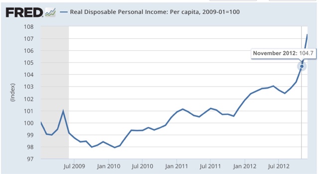
This highlights an unusal feature of the model. the last 3 months before the election count for fully half the wight of the entire result. Each successive preceding quarter counts for about half of th subsequent one. thus if real disposable personal income per capita grew linearly by 10% in the first 3 1/2 year s of a presidency, but did not grow in the lsat 3 momonths before the election, the model projects only +5% for this metric.
Since real per capita disposable income almost always grows outside of recessions and their immediate vicinity, this is n accord with our previous discussioin: a flat - or declining measure right before the election usually means a recession - which is exactly what the simple model indicating that a 3rd quarter recession in election year predicts the popular vote winner 80% of the time.
So what does the model suggest now? Let's take a look at 3 Presidential elections for which the model predicted similar results, and did not have a war (such as in 1968) to detract from the numbers.
First, here is 1988:

Next, here is 1996:

Finally, here is 2004:

In all 3 cases, "real disposable personal income per capita" rose fairly linearly throughout the preceding 4 years, with results on election day of +9.5%, +6.1%, and +7.1%, respectively.
Now here is the 2 years and 10 months of Obama's 2nd term:

Currently "real dispoable personal income is up + 6.4%.
We don't know what it's values will be for the next year. What we can say is that, *IF* real disposable personal income per capita continues to grow at the average rate it has since the beginning of 2013, it will be approximately +8.6% on election day, and the "Bread and Peace" model will favor a Democratic victory with the nominee receiving somewhere on the order of 53%-54% of the vote.
First, here is 1988:
Next, here is 1996:
Finally, here is 2004:
In all 3 cases, "real disposable personal income per capita" rose fairly linearly throughout the preceding 4 years, with results on election day of +9.5%, +6.1%, and +7.1%, respectively.
Now here is the 2 years and 10 months of Obama's 2nd term:
Currently "real dispoable personal income is up + 6.4%.
We don't know what it's values will be for the next year. What we can say is that, *IF* real disposable personal income per capita continues to grow at the average rate it has since the beginning of 2013, it will be approximately +8.6% on election day, and the "Bread and Peace" model will favor a Democratic victory with the nominee receiving somewhere on the order of 53%-54% of the vote.
Of course, this isn't a real forecast, since we won't know the final equation until election day next year. So we need to see if our leading indicators can help us out. And it also suggests that we should not rely on one single metric, but rather an index of metrics, to improve outocmes. As it happens, a British team has done just that with the Index of leading Indicators. Those will be the subjects of my next posts..
Saturday, December 12, 2015
Weekly Indicators for December 7 - 11 at XE.com
- by New Deal democrat
My Weekly Indicator post is up at XE.com .
Due to the reversal of Thanksgiving Day seasonality, we improved from absolutely horrible to merely bad this week.
Friday, December 11, 2015
New progressive blog aggregator
- by New Deal democrat
By way of exploring a big increase in the number of reads of this here blog (YAY!!!), I stumbled upon a new progressive blog aggregator, ProgBlog .
The most recent headlines and ledes from probably over 100 progressively-oriented blogs are included in chronological order. This is a good way to scan for stories of interest in just a minute or two. It won't substitute for your daily reading of economic blogs, as I think this blog and Calculated Risk are the only two mainly economic blogs included, but well worth adding to your favorites and checking once or twice a day.
Good news and bad news on retail sales
- by New Deal democrat
This morning's retail sales report can be summarized as follows:
- +.2% headline
- +.4% ex-auto
- +.3% ex-gasolinle
which is something of a reversal of recent months, where auto sales have done the heavy lifting.
Let me get the good news out of the way first. Once the CPI comes out next week, we will probably find out that November set a record. This is because gas prices account for most of the month to month variability in the CPI. There is an underlying core inflation rate of between +0.1% and +9,2% each month, so if we take that, as well as the volatility of gas prices, into account, we almost always can identify the direction, and ususally the fluctuation +/-0.2%, of the overall CPI number.
Here's what the last year looks like, including the change in November gas prices:

November CPI is likely to be no higher than unchanged, and could easily decline by -.4%.
Let's apply that to real retail sales (red in the graph below) compared with nominal retail sales, both normed to 100 as of October:

If consumer prices are up by no more than +.1%, we will tie the previous record -- and we are likely to surpass it.
The bad news is that, even so, the above graph suggests that real retail sales are flattening. This is not uncommon in the 18 months before a recession. Just another sign that we appear to be later in the cycle.
Thursday, December 10, 2015
Single family housing is outperforming multi-unit housing. And that tells us . . .
- by New Deal democrat
The first thing it tells us, is that I can write a click-bait headline sending you over to my newest post up at XE.com to find out the answer.
Gas prices finally break below last winter's low
- by New Deal democrat
Last winter gas prices bottomed at $2.02. For the last 2 weeks, gas prices flirted with, but never broke through, that low.
Until yesterday. Average US gas prices are now sitting right at the $2.00 mark:

I don't know how much further they may fall. The bottom could be anytime between now and early February. Since in the last 10 years, the seasonal top and bottom in gas prices has tended to be about $1 apart, in summer I thought the bottom might be at about $1.82. Here's what I wrote about the summertime peak only being $0.80 above last winter's low back in July:
This tells us that the medium term trend in gas prices, taking out seasonality, is still down. That suggests that gas prices are going to fall below $2/gallon this winter.We'll probably continue below the $2 mark in the next few days, but I doubt we'll make it all the way down to my original forecast low.
But this does show a continued deflationary background to the economy, and a continued slight boost to most consumers' wallets.
Wednesday, December 9, 2015
The Future is Bright . . . or perhaps not
- by New Deal democrat
Bill McBride a/k/a Calculated Risk has reiterated his case for optimism, in "The Future's So Bright . . ." While I like and respect Bill, and both of us believe the housing market is crucially important, both of us in important part due to a terrific 2007 paper by Professor Edward Leamer, "Housing IS the business cycle," this is one point where I part company with him. It's not that I am pessimistic. I just do not believe that his argument supports his conclusion.
To show you why, let me take each of his points in order, frequently using his own graphs.
First of all, he cites housing, using the following graph of single-family (blue) and total (red) starts:

Notice the huge bulge in multi-family starts from the beginning of the graph (1968) through the late 1980s, as the Boomer generation hit young adulthood. Bill focuses on this demographic argument, saying "Demographics and household formation suggests starts will increase to around 1.5 million over the next few years."
To show you why, let me take each of his points in order, frequently using his own graphs.
First of all, he cites housing, using the following graph of single-family (blue) and total (red) starts:
Notice the huge bulge in multi-family starts from the beginning of the graph (1968) through the late 1980s, as the Boomer generation hit young adulthood. Bill focuses on this demographic argument, saying "Demographics and household formation suggests starts will increase to around 1.5 million over the next few years."
But note that even that bulge did not prevent huge downturns in 1970, 1974, and 1980-82. So there is a secular tailwind -- but turbocharged volatility to both the upside and the downside.
Next, Bill cites growth in state and local government jobs, which are clearly lagging indicators for the economy. The reason is, these follow revenue collection, and revenue collection only starts to fall/rise after the recession/recovery starts:


Next, he cites household debt levels. These have fallen to 35 year lows. but are at levels they were in 1981 when the Fed raised rates and engineered a recession anyway! And while they bottomed in mid-expansion in the 1990s and 2000s, they peaked in 1986 and fell off in the years leading to the 1991 recession:
Next, he cites deficit reduction:
But note when the "peaks," or at least smallest deficits have occurred: in 1989, 2000, and 2007 - in other words, just before the onset of each recession. This is a coincident indicator. That the deficit continues to fall simply means that the expansioin is continuing, and doesn't really tell us anything about the future.
Next, he cites household debt levels. These have fallen to 35 year lows. but are at levels they were in 1981 when the Fed raised rates and engineered a recession anyway! And while they bottomed in mid-expansion in the 1990s and 2000s, they peaked in 1986 and fell off in the years leading to the 1991 recession:

Bill also cites total household debt:

But notice when this graphic last peaked: in the 3rd Quarter of 2008! This is a coincident to slightly lagging indicator. So I don't see where we can make any useful forecasts based on household debt levels.
Next, Bill cites the architectural billings index. But this is for commercial construction (blue), which lag residential construction (red):
But notice when this graphic last peaked: in the 3rd Quarter of 2008! This is a coincident to slightly lagging indicator. So I don't see where we can make any useful forecasts based on household debt levels.
Next, Bill cites the architectural billings index. But this is for commercial construction (blue), which lag residential construction (red):

Further, the index is current at similar levels to where it was in 2000 and 2007:

So I don't see how it can serve as a useful economic forecasting tool.


Bottom line: I am not persuaded by Bill's fundamental analysis, which relies mainly on coincident and even one lagging indicator. I think there is considerable merit to his demographic argument (but see my caveat above), but I think there are two other long-term trends that will prove more important.
Finally, he cites the renewed growth in the prime working age 25 - 54 demographic. If that were true, then real YoY GDP growth ought to correlate well with YoY population growth in this demographic. But as shown in the graph below, which subtacts the YoY% change in this demographic from the YoY% growth in GDP, while the deceleration in growth of the prime working age demographic has generally correlated with a deceleration in real GDP since 1985, the relationship does not hold true at all for the 1965-85 period when the prime working age demographic was growing at an accelerated rate - but real GDP growth was decelerating:
UPDATE: Here is a graph of the two components broken out separately, so you can see the acceleration of growth in the prime age demographic as the Boomer generation hit (blue), but the simultaneous deceleration of real GDP growth (red):
Bottom line: I am not persuaded by Bill's fundamental analysis, which relies mainly on coincident and even one lagging indicator. I think there is considerable merit to his demographic argument (but see my caveat above), but I think there are two other long-term trends that will prove more important.
First, the long-term decline in interest rates is almost certainly over. Interest rates will either go sideways or up from here. Periodically refinancing debt at lower interest rates has been a vital middle class strategy since the early 1980s, but that well has prbobaly run dry:

as supported by Bill's own graph of mortgage refinancing since 1990:

Secondly, the entry of a large demographic into the labor force tends to depress wages (as did the Boomers between 1974-95). Even without that headwind, wages have basically stagnated since 2000:

The American middle class will only make progress for the next few decades to the extent that its real income rises - something that, with the exception of the late 1990s tech boom, and the oil price crash of 2008, has been largely elusive for 40 years. Whether the future is bright or not will depend most of all on how that wage issue plays out.
Tuesday, December 8, 2015
BREAKING: ISIS is armed with 1000s of dildos!!!
I'm sorry, but that's the first thing that leapt to mind when I saw this photo above a CNN story about ISIS:

Yes I do have a warped mind. Why do you ask?
JOLTS, Labor Market Conditions Index continue to show a maturing expansion
- by New Deal democrat
Two jobs-related releases yesterday and today continue to show decelerating improvement.
Yesterday the Labor Market Conditions Index was released. This has an excellent long term record of forecasting the direction of YoY job growth. Here is the long term view:

Here is the short-term view over the last 10 years:

While the Index improved in the last month, the rate of change was the worst in 3 years bar 2 months earlier this year:
The YoY% change in jobs growth also declined to a new low after its likely February 2015 cycle high.
Turning to this morning's JOLTS report for October, it was something of a mirror image of last month: openings declined, but actual hires and quits improved.
Here is the long term view since the inception of the series:

The pattern looks increasingly like that of ~2006 in the last cycle.
There was some limited good news in that both hires and quits turned ever so slightly positive YoY:

But this YoY level is well below that of the last 2 years.
Quits did tie a record for this expansion:
Quits did tie a record for this expansion:

And hires seem to have a slight improving trend, although this month's level did not set a record.

Although - barring another upward surge in the US$ - I do not see any recession in the near future, the jobs market shows accumulating signs of a maturing expansion.
Although - barring another upward surge in the US$ - I do not see any recession in the near future, the jobs market shows accumulating signs of a maturing expansion.
Monday, December 7, 2015
A closer look at underemployment
- by New Deal democrat
One of the big success stories in the labor market this year has been the progressive decrease in the discouraged and the underemployed. The below graphs both add together those "not in the labor force but who want a job now" and "part time for economic reasons."
Here is the big picture since the beginning of the modern series in 1994. Note that the low occurred at the height of the tech boom in 1999 at 7.483 million. I have subtracted that so that you can see how much of an increase there has been since then:

At its post-recession worst, an additional 8 million people had been thrown into this category. That is equivalent to over 5% of the workforce!
The big decline has taken place beginning with the 3rd Quarter of 2014, which I've zoomed in to show below:

Even so, at present we are 2 million or more above the tepid levels of 1996 and 2004-05. At our 2015 rate, it will take another 5 quarters for us just to get to that level. And with the Fed raising rates, I am not confident at all that we will sustain our recent pace.
Sunday, December 6, 2015
If 2016 is 1972 redux, is Hillary Clinton the Democrats' Richard Nixon?
- by New Deal democrat
BooMan has had several good articles in the past week analogizing the 2016 election to the Democrats' disastrous 1972 nomination of McGovern, who thereafter was epitomized by the GOP as the personification of "the loony left." I have long thought that 2008 marked the beginning of a secular political shift in the US electorate. In the past 225 years, the US has had 4 such paradigms:
- 1788 -1860: Ascendancy of the Southern and Western planters. Four of the first 6 US Presidents came from Virginia. Beginning with 1828, the Jacksonian democrats were ascendant until the political parties completely fractured in 1860.
- 1860 - 1932 The "Grand Old Party." During this period, the Democrats were the party of "rum, romanism, and rebellion" and were trounced except for the two terms of Grover Cleveland and Woodrow Wilson (who won in 1912 in part courtesy of the fracturing of the GOP with Teddy Roosevelt's "Bull Moose" insurgency).
- 1932 - 1980. The New Deal Democrats. This is self-expanatory. The New Deal coalition started to fracture massively in 1968, and was completely routed by 1980.
- 1980 - 2008. The GOP Southern Strategy.While Nixon claimed that "We are all Keynesians now," Reagan repudiated as much of the New Deal as possible, and Bill Clinton came full circle, declaring that "the era of big government is over" in 1995.
In 2008, Barack Obama began to put together a new coalition that included Latinos and some Rocky Mountain social libertarians in addition to women, blacks, and a new "Solid Northeast" that expanded to include Virginia, with Florida and North Carolina in play as well, courtesy of a critical mass of transplanted Yankees. This coalition was forreshadowed and described in "Whistling Past Dixie," which encouraged democrats to look West rather than try to win back working class whites in Dixie.
Booman's analogy is that, in a mirror image of 1972, now it is the GOP that appears hopelessly fractured between the right-wing but sane candidates (Jeb Bush, Rubio, Christie, Kasich, Graham, and Potacki) and the right wing and also insane candidates (Trump, Carson, Fiorina, Cruz). As an aside, I think the basic test for which wing a candidate falls within is, Would the modern version of LBJ's "Sunflower" ad against Goldwater, which strongly implied that Goldwater couldn't be trusted with the nuclear arnsenal, be effective against the GOP nominee? If it's Trump, Carson, Fiorina, or Cruz, I think it would.
But if the GOP candidate is the modern McGovern, it is intriguing to consider whether Hillary Clinton is a modern analogue for Tricky Dick Nixon. I think a fair case can be made that she is. She is certainly seen as cold and both overly and overtly calculating. While nothing she has done may be outright unlawful, there's a lot that looks really sleazy. Remind you of some 1972-ish candidate? (I am assuming she will be the nominee, although I prefer Sanders).
But if the GOP candidate is the modern McGovern, it is intriguing to consider whether Hillary Clinton is a modern analogue for Tricky Dick Nixon. I think a fair case can be made that she is. She is certainly seen as cold and both overly and overtly calculating. While nothing she has done may be outright unlawful, there's a lot that looks really sleazy. Remind you of some 1972-ish candidate? (I am assuming she will be the nominee, although I prefer Sanders).
The important thing to remember is, Nixon won - in a landslide. This was in part due to a strong economy (almost every economic indicator was solidly positive throughout 1972 despite increasing inflation), and partly due to his being seen as a fundamentally sure hand on the rudder. While the jury is still out on the economy -- but barring even more strength in the US$, I do not see a recession starting before the election -- I think most voters, even those with a strong distaste for her, are likely to see Hillary Clinton as a fundamentally sure hand on the rudder.
So if 2016 is like 2012 -- a fundamental change ongoing, but not yet at fruition in the electorate -- then the truth is, there are parallels on *both* sides of the aisle.
Saturday, December 5, 2015
Weekly Indicators for November 30 - December 4 at XE.com
- by New Deal democrat
My Weekly Indicator post is up at XE.com .
Appropos of Star Wars, we are all familiar with the Millenium Falcon's "hyperdrive." Well, that's what Thanksgiving seasonality did to the intensifying commodity slump, and some other indicators too.
Subscribe to:
Posts (Atom)