Saturday, May 2, 2015
Weekly Indicators for April 27 - May 1 at XE.com
- by New Deal democrat
My Weekly Indicators post is up at XE.com.
I am in agreement with ECRI's Lakshman Achuthan (h/t Doug Short).


Friday, May 1, 2015
Four measures of real wage stagna-- ... er, slight improvement
- by New Deal democrat
In the last several years, I have written a number of posts documenting the stagnation in average and median wages, for example here and here. Courtesy of the crash in gas prices, there has been a bit of a change in the last 8 months.
We have a variety of economic data series to track both average and median wages:
- The most commonly known measure is that of average hourly pay for nonsupervisory workers, which is part of the monthly jobs report.
- The Bureau of Labor Statistics, which conducts the household employment survey, also reports "usual weekly earnings" for full time workers each quarter.
- The BLS also measures the Employment Cost Index quarterly.
- The BLS also measures "business sector real compensation per hour" quarterly.
The first graph tracks monthly average (mean, not median) hourly wages (blue), median wages from the employment cost index (red), real compensation per hour (brown), and median usual weekly earnings (green). All are adjusted for inflation. Since the quarterly index of median wages only started in Q1 2001, I have normed the indexes to 100 at that time:

The median measure of the Employment Cost Index made a new high. Real compensation per hour through the end of last year equalled its past highs. Average wages for nonsupervisory workers made a new 35 year high. Only the median measure of real weekly earnings is still languishing well off their 2010 high.
Here is the same data measured YoY:

While this is noisy, it shows the impact of the big decrease in gas prices late in the recession, their increase back to near $4 in 2011 and 2012, and the big decline in late 2014. Here's a close-up of the same YoY data since the beginning of 2014:

How this breakout is affected by the complete absence of inflation is shown when we look at the raw numbers nominally:

Median wages as measured by the Employment Cost Index did indeed show accelerated growth in Q1, while average wage growth actually decelerated, as did growth in real usual weekly earnings. So, there's some qualified good news here. Real wages have actually increased by nearly all measures. But by most measures it isn't due to workers suddenly getting better raises.
Thursday, April 30, 2015
Bernanke 1; WSJ Editorial Board 0
From Bernanke's Blog
It's generous of the WSJ writers to note, as they do, that "economic forecasting isn't easy." They should know, since the Journal has been forecasting a breakout in inflation and a collapse in the dollar at least since 2006, when the FOMC decided not to raise the federal funds rate above 5-1/4 percent.
and then there is this:
The WSJ also argues that, because monetary policy has not been a panacea for our economic troubles, we should stop using it. I agree that monetary policy is no panacea, and as Fed chairman I frequently said so. With short-term interest rates pinned near zero, monetary policy is not as powerful or as predictable as at other times. But the right inference is not that we should stop using monetary policy, but rather that we should bring to bear other policy tools as well. I am waiting for the WSJ to argue for a well-structured program of public infrastructure development, which would support growth in the near term by creating jobs and in the longer term by making our economy more productive. We shouldn't be giving up on monetary policy, which for the past few years has been pretty much the only game in town as far as economic policy goes. Instead, we should be looking for a better balance between monetary and other growth-promoting policies, including fiscal policy.
Just beautiful.
It's generous of the WSJ writers to note, as they do, that "economic forecasting isn't easy." They should know, since the Journal has been forecasting a breakout in inflation and a collapse in the dollar at least since 2006, when the FOMC decided not to raise the federal funds rate above 5-1/4 percent.
and then there is this:
The WSJ also argues that, because monetary policy has not been a panacea for our economic troubles, we should stop using it. I agree that monetary policy is no panacea, and as Fed chairman I frequently said so. With short-term interest rates pinned near zero, monetary policy is not as powerful or as predictable as at other times. But the right inference is not that we should stop using monetary policy, but rather that we should bring to bear other policy tools as well. I am waiting for the WSJ to argue for a well-structured program of public infrastructure development, which would support growth in the near term by creating jobs and in the longer term by making our economy more productive. We shouldn't be giving up on monetary policy, which for the past few years has been pretty much the only game in town as far as economic policy goes. Instead, we should be looking for a better balance between monetary and other growth-promoting policies, including fiscal policy.
Just beautiful.
Rents spike to new record in Q1
- by New Deal democrat
Tuesday the Census Bureau released its quarterly report on homeownership. While the bulk of the commentary focused on the homeownership rate, and price of housing, I would like to focus on apartment rentals. The share of apartment building compared to single family home construction has jumped since the last recession, partly due to the swelling demographic of Millennials entering the market, and partly due to stagnant wages.
Here is the rental vacancy rate compared with the homeowner vacancy rate:
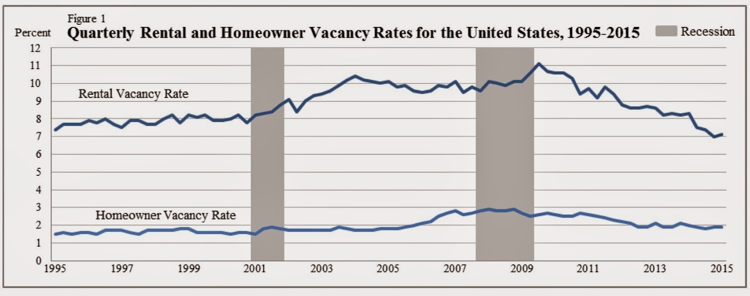
Rental vacancies made a record low in the 4th quarter of 2014, and bounced up just a little in the first quarter of 2015.
This is the flip side of the 20-year low in homeownership rates:

Unsurprisingly, in nominal terms, the median asking rent has been rising to new records in the last several years:

But that doesn't tell us what has been going on in real terms. To do that, we should adjust for inflation, or alternatively by wages. That is what I have done in the chart below. It shows nominal asking rents vs. median weekly wages as compiled by the BLS. It shows that real rents declined in the 1990s as wages increased, soared in the 2000 - 2009 period, and had remained below that peak ever since -- until this past quarter:
| Year | Median Asking Rent | Usual weekly earnings | Rent as % of earnings | Real median asking rent |
|---|---|---|---|---|
| 1988 | 330 | 382 | 86 | 657 |
| 1992 | 401 | 437 | 92 | 674 |
| 1993 | 422 | 450 | 88 | 688 |
| 2000 | 478 | 568 | 84 | 655 |
| 2002 | 545 | 607 | 90 | 714 |
| 2004 | 620 | 629 | 99 | 774 |
| 2009 | 723 | 739 | 99 | 795 |
| 2012 | 721 | 768 | 94 | 740 |
| 2013 | 734 | 776 | 95 | 743 |
| 2014 Q1 | 766 | 790 | 97 | 765 |
| 2014 Q2 | 756 | 782 | 97 | 751 |
| 2014 Q3 | 756 | 797 | 95 | 749 |
| 2014 Q4 | 766 | 796 | 96 | 760 |
| 2015 Q1 | 799 | 802 | 100 | 799 |
In the first quarter, for the first time in history, the median asking rent equaled the entire weekly earnings of the median worker.
Even worse, the median wage of all workers does not quite accurately capture the median wage of renters, since they tend to be from lower income groups. And as the graph below compiled by the Employment Law Project from last August shows, the median real wage of the 4th and 5th quintile as of then had declined more than the median real wage of workers overall compared with their 2009 peak:

Looking at multi-unit housing construction helps us distill some signal from the noise. First of all, after booming in earlier 2014, apartment construction has declined slightly:
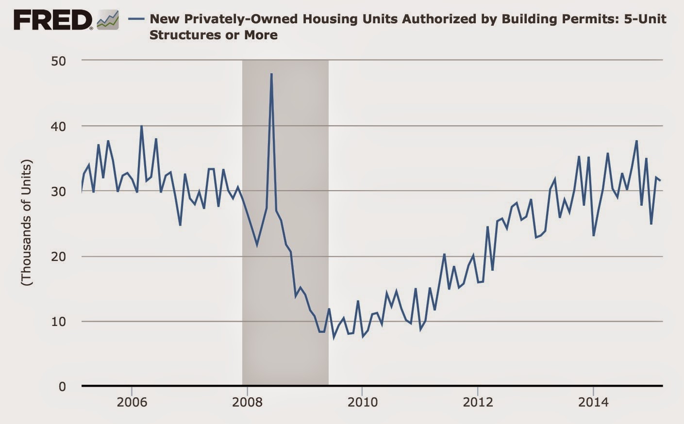
A second important point is the regional difference in the data. Below is a portion of the Census Bureau's table showing median asking rents nationwide (1st column), and broken down by regions: Northeast (2nd column), Midwest (3rd), South (4th), and West (5th):

As you can see, the lion's share of the increase in the 1st quarter was a nearly 10% increase in asking rents in the Western region. As the chart below shows, the West also has the lowest vacancy rate of any of the regions (although the Northeast is also very low):

It's certainly possible that the spike in rents in the Western region is noise due to small sample size, but a comparison of housing permits in the West vs. the Northeast, both of which regions have especially low vacancy rates, shows that from miid-2013 to mid-2014, in all but one quarter issuance of permits slowed more in the West than in the Northeast:

Given the lag in completions of apartment buildings after permits are issued, this is what I would expect given the jump in rental prices in the West.
I do expect that some of the spike in asking rents int he first quarter will prove to have been noise, but it is unwelcome nevertheless. But with low vacancy rates, the big increase in rents, and the continuing tailwind of Millennial household formation, I expect the slowdown in apartment construction to be transitory.
Even worse, the median wage of all workers does not quite accurately capture the median wage of renters, since they tend to be from lower income groups. And as the graph below compiled by the Employment Law Project from last August shows, the median real wage of the 4th and 5th quintile as of then had declined more than the median real wage of workers overall compared with their 2009 peak:
Looking at multi-unit housing construction helps us distill some signal from the noise. First of all, after booming in earlier 2014, apartment construction has declined slightly:
A second important point is the regional difference in the data. Below is a portion of the Census Bureau's table showing median asking rents nationwide (1st column), and broken down by regions: Northeast (2nd column), Midwest (3rd), South (4th), and West (5th):
As you can see, the lion's share of the increase in the 1st quarter was a nearly 10% increase in asking rents in the Western region. As the chart below shows, the West also has the lowest vacancy rate of any of the regions (although the Northeast is also very low):
It's certainly possible that the spike in rents in the Western region is noise due to small sample size, but a comparison of housing permits in the West vs. the Northeast, both of which regions have especially low vacancy rates, shows that from miid-2013 to mid-2014, in all but one quarter issuance of permits slowed more in the West than in the Northeast:
Given the lag in completions of apartment buildings after permits are issued, this is what I would expect given the jump in rental prices in the West.
I do expect that some of the spike in asking rents int he first quarter will prove to have been noise, but it is unwelcome nevertheless. But with low vacancy rates, the big increase in rents, and the continuing tailwind of Millennial household formation, I expect the slowdown in apartment construction to be transitory.
Wednesday, April 29, 2015
Comments on First Quarter 2015 GDP
- by New Deal democrat
This post is up at XE.com. As bad numbers go, this one wasn't too bad. As in, it was expected, and the way it was bad was expected.
Tuesday, April 28, 2015
John Hinderaker: The Dan Rather of the Right
It's no secret that I think John Hinderaker is, at best, a fool. While I've focused exclusively on his remarkable record of economic ineptitude (Powerline has been 100% wrong in their economic analysis for an entire year), his abject tonal deafness on other matters is remarkably striking. We writes from the perspective of pure WASPness; he has had no problems or issues in his life, therefore others should just pull themselves up by their own bootstraps and achieve the same success he has. His lack of empathy is stunning.
For those of you who weren't around on the internet 10+ years ago, the Powerline Blog was a primary participant in the Dan Rather 2004 document scandal. If I recall correctly, Rather ran with a story a few weeks before the election about then candidate Bush's National Guard service. Rather stated he had documents that showed there was an issue with Bush's attendance. Several conservative blogs deconstructed the document and proved it was a fake, eventually leading to Rather's resignation. Powerline was a primary mover in this story, eventually being named Blog of the Year by Time magazine. This was a remarkable story, as it marked the ascendency of blogs to the national debate. It also helped to further the still ever-present "liberal media" meme that remains a staple of the right wing's victimization mentality.
My how the tables have turned. Just like Rather, Hinderaker has been desperate to malign Harry Reid in any manner possible. To further that end, he ran a story on April 3 in which he recanted the tale of an anonymous source who stated he had seen Harry Reid's brother at an AA meeting after the altercation that led to Reid's recent injuries. According to Hinderaker, this story was proof positive that Harry Reid was lying about the source of his injuries. While Hinderaker did add a disclaimer, he only did so after telling the entire tale, essentially relegating it to a mere afterthought.
Well, it turns out the story was deliberately fabricated to see how far the right wing noise machine would go to spread a meme. Here is a link to the story that explains the who, what, where, when and why. Were this a "liberal" media figure at the heart of the scandal, Hinderaker and his ilk would be demanding his resignation. Thankfully for Hinderaker's blogging career, he has no such standards for himself. He'll continue typing away, making shit up as he goes along. And he'll probably continue to receive guest hosting spots because he's been a good solider. But, outside of conservative circles, he now has zero credibility. All others listening to him will know that Hinderaker is not only a pathetically bad reporter and analyst, but he obviously has no standards nor shame. The fall from prominence and respectability is complete.
For those of you who weren't around on the internet 10+ years ago, the Powerline Blog was a primary participant in the Dan Rather 2004 document scandal. If I recall correctly, Rather ran with a story a few weeks before the election about then candidate Bush's National Guard service. Rather stated he had documents that showed there was an issue with Bush's attendance. Several conservative blogs deconstructed the document and proved it was a fake, eventually leading to Rather's resignation. Powerline was a primary mover in this story, eventually being named Blog of the Year by Time magazine. This was a remarkable story, as it marked the ascendency of blogs to the national debate. It also helped to further the still ever-present "liberal media" meme that remains a staple of the right wing's victimization mentality.
My how the tables have turned. Just like Rather, Hinderaker has been desperate to malign Harry Reid in any manner possible. To further that end, he ran a story on April 3 in which he recanted the tale of an anonymous source who stated he had seen Harry Reid's brother at an AA meeting after the altercation that led to Reid's recent injuries. According to Hinderaker, this story was proof positive that Harry Reid was lying about the source of his injuries. While Hinderaker did add a disclaimer, he only did so after telling the entire tale, essentially relegating it to a mere afterthought.
Well, it turns out the story was deliberately fabricated to see how far the right wing noise machine would go to spread a meme. Here is a link to the story that explains the who, what, where, when and why. Were this a "liberal" media figure at the heart of the scandal, Hinderaker and his ilk would be demanding his resignation. Thankfully for Hinderaker's blogging career, he has no such standards for himself. He'll continue typing away, making shit up as he goes along. And he'll probably continue to receive guest hosting spots because he's been a good solider. But, outside of conservative circles, he now has zero credibility. All others listening to him will know that Hinderaker is not only a pathetically bad reporter and analyst, but he obviously has no standards nor shame. The fall from prominence and respectability is complete.
Sunday, April 26, 2015
Saturday, April 25, 2015
Weekly Indicators for April 20 -24 at XE.com
- by New Deal democrat
My Weekly Indicator post is up at XE.com.
Looks like good news on consumers, but bad news seeping into hiring.
Friday, April 24, 2015
US housing market March update
- by New Deal democrat
I have a new post up at XE.com.
The trend in the US housing market is of slow improvement.
Five graphs to watch in 2015: 1st quarter update
- by New Deal democrat
At the end of last year, I highlighted 5 graphs to watch in 2015. Now that we have all of the reports for the first three manoths, let's take another look.
#5. Mortgage refinancing
After a mini-surge at the end of January (light brown in the graph below), refinancing applications fell back to somnolence during February due to a rise in mortgage rates. Refinancing recovered a little in March as rates retreated, but not so low as in January. Mortgage News Daily has the graph:

Over the last 35 years, refinancing debt at lower rates has been an important middle/working class strategy. There is little room left for that strategy. If mortgage refinancing stays turned off too long, and wages don't grow in real terms, then consumer spending falters and so does the economy.
#4 Gas prices
Here is a graph of gas prices (blue) compared with nominal average hourly wages (red) since the bottom in prices in 1999:

How long must a worker labor in order to buy a gallon of gas? After skyrocketing in the lead-up to the Great Recession, gas prices collapsed, helping the consumer start to spend again on other things at the bottom of that recession. The recent collapse in gas prices took us almost all the way back to that bottom. Just as in 1986 and 2006, at first consumers saved the money, but once they loosen their pursestrings this will be a strong tailwind to the economy.
#3 Part time employment for economic reasons
Next is a graph of part time workers for economic reasons expressed as a percentage of the labor force. In the first quarter, this continued to improve:

In the longer view, however, this only brought us to the equivalent of levels in 1988, and still 2% (about 3 million) above the boom level of 1999 and about 1.5% (2.25 million) above the level of 2007.

#2 Not in Labor force but want a job now:

This moved generally sideways during the first quarter, going down by only -56,000 from 6.445 million in December. It is now almost 700,000 above its post-recession low of November 2013 (just prior to Congress's cutoff of extended unemployment benefits) and more than 2 million above its 1999 and 2007 lows.
#1 Nominal wage growth
After an anomalous decline in average hourly wages in December, and a big positive reversal in January, wages for nonsupervisory workers were totally flat in February, and then increased again in March.

After increasing in 2013 and the first half of 2014, in the last 7 months nominal wage growth YoY declined back to its post-recession low. Needless to say, this decline is troubling.
Compare our present expansion with the previous three. In the 1980s and 2000s, by the time we improved to 5.5% unemployment, nominal wage growth was approaching 3% YoY. In the 1990s expansion, at worst wage growth was on the cusp of acceleration, but was nevertheless 3.5%. Unless wage growth starts to accelerate now, the pattern is not holding.
There have been a few interesting notes about the lack of wage growth. The staff of the Federal Reserve has done a study indicating that the number of long-term unemployed plays an important role (since presumably these people are more desperate). In a similar vein, the Atlanta Fed has reported that the relatively high number of underemployed, and in particular employees who work part time for economic reasons, and also the high number of those out of the labor force, but who would return to work if conditions were better (see items number 2 and 3 above), are an important factor in holding down wage growth. It has also been suggested that the disproportionate (compared to normal times) percentage of relatively highly paid employees (Boomers) retiring from the labor force, and being replaced by younger workers, is holding down wages.
In summary, three months of data into the year shows two series positive (gas prices, involuntary part time employment), little improvement in two others (refinancing, discouraged dropouts from the labor force), and an actual worsening of one (nominal wage growth). Should wage growth not improve, and mortgage refinancing remain dormant, we are going to run into trouble, and I will be looking for other long leading indicators to start rolling over, perhaps in the latter part of this year.
#5. Mortgage refinancing
After a mini-surge at the end of January (light brown in the graph below), refinancing applications fell back to somnolence during February due to a rise in mortgage rates. Refinancing recovered a little in March as rates retreated, but not so low as in January. Mortgage News Daily has the graph:
Over the last 35 years, refinancing debt at lower rates has been an important middle/working class strategy. There is little room left for that strategy. If mortgage refinancing stays turned off too long, and wages don't grow in real terms, then consumer spending falters and so does the economy.
#4 Gas prices
Here is a graph of gas prices (blue) compared with nominal average hourly wages (red) since the bottom in prices in 1999:
How long must a worker labor in order to buy a gallon of gas? After skyrocketing in the lead-up to the Great Recession, gas prices collapsed, helping the consumer start to spend again on other things at the bottom of that recession. The recent collapse in gas prices took us almost all the way back to that bottom. Just as in 1986 and 2006, at first consumers saved the money, but once they loosen their pursestrings this will be a strong tailwind to the economy.
#3 Part time employment for economic reasons
Next is a graph of part time workers for economic reasons expressed as a percentage of the labor force. In the first quarter, this continued to improve:
In the longer view, however, this only brought us to the equivalent of levels in 1988, and still 2% (about 3 million) above the boom level of 1999 and about 1.5% (2.25 million) above the level of 2007.
#2 Not in Labor force but want a job now:
This moved generally sideways during the first quarter, going down by only -56,000 from 6.445 million in December. It is now almost 700,000 above its post-recession low of November 2013 (just prior to Congress's cutoff of extended unemployment benefits) and more than 2 million above its 1999 and 2007 lows.
#1 Nominal wage growth
After an anomalous decline in average hourly wages in December, and a big positive reversal in January, wages for nonsupervisory workers were totally flat in February, and then increased again in March.
After increasing in 2013 and the first half of 2014, in the last 7 months nominal wage growth YoY declined back to its post-recession low. Needless to say, this decline is troubling.
Compare our present expansion with the previous three. In the 1980s and 2000s, by the time we improved to 5.5% unemployment, nominal wage growth was approaching 3% YoY. In the 1990s expansion, at worst wage growth was on the cusp of acceleration, but was nevertheless 3.5%. Unless wage growth starts to accelerate now, the pattern is not holding.
There have been a few interesting notes about the lack of wage growth. The staff of the Federal Reserve has done a study indicating that the number of long-term unemployed plays an important role (since presumably these people are more desperate). In a similar vein, the Atlanta Fed has reported that the relatively high number of underemployed, and in particular employees who work part time for economic reasons, and also the high number of those out of the labor force, but who would return to work if conditions were better (see items number 2 and 3 above), are an important factor in holding down wage growth. It has also been suggested that the disproportionate (compared to normal times) percentage of relatively highly paid employees (Boomers) retiring from the labor force, and being replaced by younger workers, is holding down wages.
In summary, three months of data into the year shows two series positive (gas prices, involuntary part time employment), little improvement in two others (refinancing, discouraged dropouts from the labor force), and an actual worsening of one (nominal wage growth). Should wage growth not improve, and mortgage refinancing remain dormant, we are going to run into trouble, and I will be looking for other long leading indicators to start rolling over, perhaps in the latter part of this year.
Thursday, April 23, 2015
Update on sales, housing, and employment: February was weather, March was the OIl patch
- by New Deal democrat
(First of all, sorry for the lack of posting. Real life has been busy, the economy not so much.)
As we all know, there has been a run of weak data for the last several months. In previous posts, I've suggested that February's poor retail sales were due to weather, while March's poor employment report was due to Oil patch weakness. Since some new state-level data has been published, I can update these notes.
Let me take the last first. The state-by-state breakdown of employment and unemployment for March was reported the other day. So, how did the northeast, and in particular Massachusetts fare, vs. the Oil patch states of Texas and Oklahoma? The following charts cut to the chase.
Here's employment:

Note that Massachusetts was one of the big winners for employment growth in March. And the Oil patch states of Texas and Oklahoma among the big losers.
Here is employment changes by region:

Note that the Northeast was the big winner in March, with growth of 44,900. The Midwest, especially the eastern part, where there has been a big growth in fracking, and the Pacific portion of the West were the big losers, down -50,300 and -13,700, respectively.
Now, here's the unemployment rate:

While none of our big states made the list, the new Oil patch states of North Dakota and West Virginia did.
Next, let's take a look at housing starts by region. Here's what happened in the Northeast:

Let's contrast that with housing starts in the Western region:

Housing starts cratered in February in the snow-slammed Northeast, and almost completely recovered. Meanwhile starts in the West fell in February, and cliff-dived in March.
Finally, let's update some state sales tax reports. These are a reasonable proxy for retail spending. Keep in mind that March collections frequently represent sales that actually took place in February.
Massachusetts was the epicenter of horrible winter weather. In February Massachusetts reported a paltry +0.2% YoY increase. In March it reported an actual decline of -0.4% YoY! Texas had YoY increases of over 11% in January and February. In March, that fell to +1.5% YoY.
In my post several weeks ago, I concluded:
To summarize:
- retail sales through January into February appear to have suffered primarily due to the unusually poor winter weather.
- hiring in February was also primarily affected by the weather, although Oil patch weakness played a contributing role.
- jobs in March so far look like they were primarily affected by Oil patch weakness.
The new data supports that view. We know that retail sales rebounded somewhat in March. As I noted last week, Gallup's report of Daily Consumer Spending indicates that in the last several weeks, consumer spending has taken off. On the other hand, temporary staffing has stalled and is now barely positive YoY, suggesting that the Oil patch weakness continues to hit the economy.
Sunday, April 19, 2015
Saturday, April 18, 2015
Weekly Indicators for April 13 - 17 at XE.com
- by New Deal democrat
My Weekly Indicator post is up at XE.com. Two big changes: consumer spending and temporary staffing.
Friday, April 17, 2015
CPI: there is still no inflation, and real wage growth has stopped
- by New Deal democrat
This inflation report this morning concluded 4 data series that size up where we are at our current crossroads.
Industrial production tanked, as expected. Housing (of which I'll write more later) was a mixed bag: the more forward-looking and less volatile permits, as revised, tied their post-recession high in February but fell back, in a normally variable range, in March. Starts, which were severely impacted by the weather especially in the Northeast during February, only came back partway, as the Western region took a dive (Oil patch weakness?).
As to inflation, the primary takeaway I heard from the talking heads was "OMG! OMG! Core CPI ticked up .1% to 1.8%, thus moving closer to the Fed's 2% ceiling, oops, I mean target."
But the fact is that headline CPI is still just a skosh negative YoY:

The tame CPI number means that real retail sales for March took back almost all February's weakness, although they are still below their November peak:

They also mean that real wages declined slightly more in March from their January peak:

There has been a lot of pushback against the Fed raising rates in June, most recently from former Fed vice-chair Alan Blinder, mainly due to this weakness. At this point I think we can safely assume that rate hikes are off the table in the next few months.
Thursday, April 16, 2015
Johnson and Johnson: A Great Company In a Great Sector
This is not an invitation to buy or sell this security. Do your own research and come to your own conclusions. Heck, you might learn something in the process.
Johnson and
Johnson (JNJ) is just barely the second largest company in the health care
sector. With a market cap of $279.72, it
is just below Novartis’ $272.81 total.
Pfizer and Merck come in 3rd and 4th,
respectively. JNJ recently announced an earnings beat, but also warned on growth thanks to a strong dollar. Despite this warning, JNJ is a buy at current
levels. It has a strong balance sheet, growing revenue, positive cash flow and an attractive dividend yield (2.78%). With an aging population, the US, Europe and Asia will provide an increasing number of customers for the company's products. Finally, the health care sector is in the middle of a three
year rally.
The Health Care
Sector
Global health care
spending is buoyed by two key factors: aging world demographics and broad
insurance coverage.
In the US, 10,000 baby boomers will retire/day through 2029. And with the uninsured level dropping, a
larger percentage of the US will have access to the health care market. Europe has universal coverage and an aging population ,
as does Asia. JNJ has international reach, allowing them to take advantage of these developments.
JNJ’s Charts
The above factors explain why the health care
ETF has been in a three-year rally:

The weekly XLV chart has more
than doubled over the last three years, rising from a low of 33.65 in 2012 to a high of 76.01 earlier this year. JNJ has been a strong participant in this rally:

The weekly chart shows a rally form 2012-2014, when the
stock rose from ~56 to 1~08. There was a
period of consolidation that lasted about 6 months in 2013, when prices moved
between 78-83 on the low end and 89-92 on the top end. Prices broke the longer-term uptrend at the end of last
year and have since been consolidating in a triangle pattern. Pay particular attention to the MACD, which
is nearing a buy signal.

JNJ’s daily chart
shows the company is trading right around the 200 day EMA, near yearly
lows. But with a 2.78% yield and
solid earnings history, this price level looks very attractive, which is supported
by this table from Morningstar:

The company’s PE is 27% lower than the industry average,
despite having better revenue and net income growth. And their ROA is 12.4 compared to the
industry’s 7.3. Despite being one of the
largest companies in their industry, JNJ is undervalued.
JNJ the Company
JNJ is a multi-national health care company with
three divisions: consumer products (~19% of sales), pharmaceuticals (~43% of
sales) and medical devices (~38% of sales).
Each segment has international exposures. All financial information will be analyzed at
the consolidated level.
It doesn’t get
much better than JNJ’s balance sheet. With
a current ratio of 2.36 and quick ratio of 1.76, they have ample liquidity. Accounts receivable decreased from 9.5% of
assets in 2010 (which is still a very low number) to 8.3% in 2014. Inventory has increased, but that statement is
deceptive: it rose from 5.2% of assets in 2010 to 6.2% in 2014. LTD only comprises 11.53% of liabilities. And to be on the safe side, they have 99 days
of cash on hand. While the word “bulletproof”
is a bit cliché, it clearly applies here.
Solid financials
don’t end at the balance sheet. Top line
revenue has grown between 3%-6% for the last four years. While not a gangbusters pace, it’s impressive
for one of the largest health care companies in the world. Additionally, expenses are contained. COGs has been very stable at 30%-31% since
2011. Operating income has been a bit
more variable, coming in between 23%-28% over the same period. And net margin has fluctuated between 14% and
21% for the last four years. Moreover, the
dividend payout ratio is a solid 47.5% while the interest coverage ratio is 39,
meaning the company has more than adequate resources to pay its obligations.
And finally, we
turn to the cash flow statement, where the company has free cash flow levels between
$11.4-$14.7 billion for the last four years.
This is more than adequate to fund the $7.4 billion dollar dividend from
current operations. It also means they have ample financial room to maneuver should
they experience any problems.
JNJ is a well-managed company with solid overall financials, growing earnings and strong cash flow. Thanks to the global aging of various populations, the company's customer base will grow over the next decade. And at current levels, the company is undervalued relative to its peers. What's not to like?
Wednesday, April 15, 2015
Industrial Production: why, if you're not already, you should be reading "Weekly Indicators"
- by New Deal democrat
For the last month, I have been saying, based on the "Weekly Indicators" of poor rail transport and steel production, that March Industrial Production was likely to be poor. And this morning, we found out just how poor: down -0.6%. It is not down over -1% from its peak in November 2014.
Yesterday March retail sales were reported to have increased, also as forecast by the "Weekly Indicators" of stable YoY comparisons in the Johnson Redbook and Gallup Daily Consumer spending. Still, sales are the second of the 4 big coincident indicators of economic growth vs. contraction to have failed to exceed their November peaks.
But if you have been reading my "Weekly Indicator" columns over at XE.com, you already knew that. If you haven't, well, you should.
Subscribe to:
Posts (Atom)