Saturday, December 27, 2014

An Entire YEAR of Incompetent Economic Analysis From Powerline


     The guys at Powerline Blog amaze me.  Never has a group of individuals been so consistently wrong on the economy, yet continue to write about it as though they have something of substance to say.  For example, John Hinderaker was one of the many conservatives who argued that QE and government stimulus would lead to soaring interest rates and rampant inflation.  As he wrote in 2009:

I’ve assumed that the profligate spending and borrowing planned by the Democrats in Congress and the White House will run up a debt that we and our children just can’t pay, so, in the time-honored tradition of banana republics, the Obama administration or its successors will inflate our currency and repay its creditors (China, mostly) in devalued dollars. Thus, I’ve been buying gold. I’ve assumed that an actual default by the United States government is unthinkable. 

See also here and here.  Hinderaker was not alone.  A year later, a group of conservative economists signed a letter to the Federal Reserve arguing that QE would lead to inflation, largely using the same logic as Hinderaker.  Earlier this year, Bloomberg did an analysis of this prediction and determined that if you had followed their advice, you would have lost $1 trillion dollars.  And, now you know why I now refer to Hinderaker as “Trillion Dollar Loss.”  His economic incompetence can be quantified with a very large and quite unflattering number that shows the extremely negative ramifications of buying into his analysis. 

     But, Hinderaker is not alone at Powerline.  He shares his blog with several others who, like him, are just as incompetent at basic economic analysis.  And their collective posts from 2014 highlight the amazing breadth and depth of economic ignorance.  This is not a case two people debating finer points of a  particular discipline.  Instead, it's a group of people who literally have absolutely not one clue about what they're talking about, yet continuing to do so.

The First Quarter GDP Contraction

     US real GDP contracted in the 1Q at a 2.1% annualized pace.  Most economists attributed this to the inclement weather.  For example, the March Beige Book noted:

Reports from most of the twelve Federal Reserve Districts indicated that economic conditions continued to expand from January to early February. Eight Districts reported improved levels of activity, but in most cases the increases were characterized as modest to moderate. New York and Philadelphia experienced a slight decline in activity, which was mostly attributed to the unusually severe weather experienced in those regions. Growth slowed in Chicago, and Kansas City reported that conditions remained stable during the reporting period. The outlook among most Districts remained optimistic.

     CNN reported that Janet Yellen made the same observation:

"Part of that softness may reflect adverse weather conditions. But at this point it's difficult to discern exactly how much," Yellen told the Senate Banking Committee in a hearing Thursday. (Ironically, the hearing, originally scheduled for two weeks ago, had been postponed due to a snow storm in Washington.)

     Steve Hatward tried to show his capabilities in this post, in which he argued that we're in for "Japan style problems."

     And according to John "Trillion Dollar Loss" Hinderaker:

This morning, as Steve noted, the Commerce Department revised its estimate of 1st quarter GDP to show a shocking 2.9% annualized decline. The White House tried to spin the awful numbers, arguing that the drop was largely accounted for by cold weather

He then quoted from Senator Jeff Sessions press release, which stated:

The American economy is the victim of a tragic collision with reality. We are living out the truth that no amount of political rhetoric, professional spin, or expedient demagoguery can create a single job, produce a dime of prosperity, or boost opportunity for a single working person.

     However, a simple look at two publicly available indicators would have revealed just how wrong Hinderaker's and Hayward's analysis was.   These numbers are the leading economic indicators and coincident economic indicators, both available for free from the conference board.  Both numbers are composites of a broad number of economic statistics that are universally accepted as, well, leading and coincident indicators.  Neither of this numbers showed any signs of a contraction before the number was released, indicating that weather was most likely the primary reason for the contraction.  And, considering the US economy has been hitting its stride in the two subsequent quarters, it's a good bet that bad weather was in fact the main reason for the 1Q contraction. 

The part time work issue.

     On several occasions, the boys at Powerline have commented that all the job growth has been part-time.   Paul Mirengoff observed the following on July 15: “In reality, full time jobs decreased by 523,000 according to the Bureau of Labor Statistics — a shocking number that is obscured, but hardly offset, by the addition of 800,000 part time jobs.”   John Hinderaker made the same comment on November 2 with this chart:


Looking at that, you’d probably think that part time work was simply taking over!

But if you look at the historical data, you will notice a distinct trend:


Part time work always advances in the early part of a recovery as shown in the chart above.  And – just to add insult to injury – under Bush II, the economy had the exact same problem: part-time work rose after the recession was over, and then stayed high for a bit longer then usual.  Funny, but I seem to remember that Hinderaker though that economy was just "awesome! Awesome I tell you."  Yet when the exact same things happens under a Democratic president, it's a sign of extreme economic mismanagement.

     So, the whole part-time canard from Powerline can be explained by going to the St. Louis Federal Reserve’s FRED page and simply pulling up two charts which clearly explains that what is happening is normal.  You’d think that the guys at Powerline -- all of whom hold advanced degrees -- would know how to do that. 

The stock market is really just a giant bubble.

     I love this argument for several reasons.  Ever since the Fed engaged in QE, there has been a continual chorus of detractors arguing it was only inflating the stock market, not creating real and meaningful growth.  But, what else should the Fed have done?  Nothing? That is an absurd statement on its face.  And, you can rest assured that if the Fed had taken that tact, the same people would have been complaining about the Fed doing nothing.

     The best explanation and defense of the Fed's policy came from Steve Poloz, head of Canada's Central Bank:

     Let’s walk through a thought experiment together. What would our world look like today if, instead of keeping interest rates low to stimulate the economy, both Canada and the United States had moved their policy rates back up to neutral at the beginning of 2011? We estimate that the neutral rate of interest today is between 3 and 4 per cent for Canada, and use a similar number for the United States, so our thought experiment is to raise rates to about 3 1/2 per cent in both countries.

     Such a move would of course allow those headwinds we talked about earlier to blow us backwards. We estimate that, under this hypothetical scenario the output gap in Canada would have been around 5 1/2 per cent today, instead of around 1 per cent. Unemployment would have been around 2 percentage points higher than it is today, and core inflation would be running somewhere between 0 and 1 per cent.

     Most of the impact would be felt in reduced housing construction and renovation and auto production, as these were the sectors that responded to the policies put in place after the crisis. Moreover, these estimates do not capture the range of confidence effects that would permeate the rest of the economy under such a difficult scenario, so the story could even be worse.

     From this monetary policy-maker’s perspective, that’s an unattractive alternative. Our primary job is to pursue our 2 per cent inflation target, with a degree of flexibility around the time horizon of its achievement; that flexibility permits the Bank to give due consideration to financial stability risks, provided they do not threaten macroeconomic performance.

     Put more bluntly, not doing anything would have done, at minimum, just as much damage and potentially more by forcing the economy to work against itself.   This is, at best, a very poor policy option.

     On several occasions the boys at Powerline have argued that QE has led to a stock market bubble (see here and here).  The most obvious question to ask here is, have all of the individual authors making this argument taken their profits and placed their gains into money market accounts?  Or, are they still participating in the market against their own advice?
 
     However, let's also note that corporate profits -- the mother's milk of stock market gains -- are also at record highs which supports the market's current valuation.  Scott Grannis noted as much on
December 5 of this year:

Today's revision to Q3/13 GDP gives us our first look at corporate profits for the quarter, and they just keep on growing. Nominal after-tax profits are at a new all-time high, and have risen almost 9% in the past year. This is very impressive no matter how you look at it.

Record high corporate profits indicate that not only is there justification for the stock market rally, but that the underlying economy is in fact growing.  In fact, one could also argue the Fed's ZIRP policy has in fact been successful based on this economic metric alone.

    But, at bare minimum, the corporate profits picture indicates that the "we're in a stock market bubble caused by the Fed" is -- like most other Powerline observations -- a pure canard.

Continually comparing this expansion to the 1981 expansion

     Conservative commentators and economists have continually compared the economic results of this expansion to that which occurred after 1981.  They've done this for several reasons, the first of which is the 1981 recovery was far closer to a "v" recovery where the post-recession expansion picks up speed quickly.  The exact opposite happened post 2008.  Secondly, in using 1981 for comparison, conservatives get to invoke the name "Reagan," and, in doing so, allowing conservatives to get a nice case of warm fuzzies.

     Powerline has made this comparison on multiple occasions (see here, here, and here).  However, this comparison couldn't be more inappropriate -- a fact which is more than obvious to anyone who knows economic history and has a basic understanding of economics.  Reagan's recession was caused by the Fed raising interest rates to slow inflation.   That means that, once inflation was moving lower, the Fed could simply lower interest rates to stimulate growth.  On the expansion side of a Fed-induced recession is faster growth.

     But this expansion followed the popping of an asset bubble, which leads to a balance sheet recession, which can be explained thusly:

A balance sheet recession is a type of economic recession that occurs when high levels of private sector debt cause individuals or companies to collectively focus on saving (i.e., paying down debt) rather than spending or investing, causing economic growth to slow or decline. The term is attributed to economist Richard Koo and is related to the debt deflation concept described by economist Irving Fisher. Recent examples include Japan's recession that began in 1990 and the U.S. recession of 2007-2009.

As a result, on the other side of a balance sheet recession, consumers and businesses are diverting more of their income to debt repayment than consumption.  This leads to far slower growth, which is exactly what we've seen.  

     And, as noted above, to anyone who knows economics as claimed by the boys at Powerline, this should be obvious. 

Continually focusing on the labor force participation rate

     Conservatives discovered a new economic statistic starting about 2008: the labor force participation rate, which shows the percentage of the population that is actually "participating" in the labor force.  This number started to increase around 1970 as two demographic changes started to occur: women entering the labor force and the baby boomers hitting their prime earning years.  Those two trends are apparent in this long term chart:


     The boys at Powerline have blamed the post 2008 drop on this recovery in several posts (see here and here).  What's notably absent from their posts is any citation to the myriad reports done on this topic since 2008.  Thankfully, Invictus over at the Big Picture Blog has done the work the boys at Powerline should have done.   Here's the general economic consensus about the drop in the LPR:

Of note is the fact that the drop in the labor force participation rate was just 0.6 percentage point during the 2007–2009 economic downturn whereas, between 2009 and 2012, since the end of the recession, the rate declined by another 1.7 percentage points. A major factor responsible for this downward pressure on the overall labor force participation rate is the aging of the baby-boom generation.

If Powerline were in fact as adept at economic analysis as they claimed, this should have been obvious.

Conclusion

     The sum total of the above points is clear: Powerline's economic analysis has been completely wrong on numerous occasions throughout the entire 2014 year.  And their degree of ineptness is severe.  For example, they couldn't even go to the Fred system to draw a graph comparing part-time employment to total employment; they couldn't do a simple google search of LPR research, nor could they be bothered to understand what a balance sheet recession is even though that's the exact economic situation we're in.  This degree of ineptitude is beyond a minor disagreement but instead rises to the level of abject incompetence. 

    Put more directly, no one at Powerline has any clue about economics.  Period.


Weekly Indicators for December 22 - 26 at XE.com


 - by New Deal democrat

My Weekly Indicators column is up at XE.com.

'Tis the season for crashing commodity prices to power US consumers.

Friday, December 26, 2014

Housing sales: November 2014 update


 - by New Deal democrat

My detailed look at housing sales for November is up at XE.com.

November looked poor, but in large part that was due to the surge in housing starts in November of last year.

Requiem for a wager


 - by New Deal democrat

One year ago I had a significant difference of opinion from Bill McBride a/k/a Calculated Risk, and just about the nicest guy in the econoblogosphere, about the direction of the housing market.

Based mainly on interest rates, I wrote that:
Bill... is looking for stronger economic growth in 2014 in part because he expects that "the housing recovery should continue."  Unless the interest rate spike that began in April 2013 abates, I disagree that the housing recovery will continue, and that will have a negative effect on growth rates by the end of 2014.... 
[A] rise in 1% in interest rates YoY almost always leads to a decline of 100,000 or more housing permits a year, with usually no more than a 6 month lag.  The only 3 exceptions are in 1968, for a short period between between the two parts of the "double dip" 1980 and 1981 recessions, and during the 2004-05 blowoff phase of the housing bubble.
Based primarily on demographics, Bill said that:
I expect growth for new home sales and housing starts in the 20% range in 2014 compared to 2013. That would still make 2014 the tenth weakest year on record for housing starts (behind 2008 through 2012 and few other recession lows). So I expect further growth in 2015 too.
 Given our very different forecasts, we made a charitable wager. If permits, starts, or new home sales were down -100,000 YoY in any month, Bill had to make a charitable donation.  If any of those metrics were up by 20% YoY for even one month, I had to make a charitable donation.

Here's what actually happened in the first 11 months of 2014 compared with 2013:

  • Permits averaged 990,000 in 2013. So far in 2014 the have averaged 1,020,000, for a gain of 3%. Their worst YoY loss was -8000 in January.  Their biggest YoY% gain was +8% in March and July.
  • Starts averaged 930,000 in 2013.  So far in 2014 they have averaged 990,000, for a gain of 6%. Their worst YoY decline was -77,000 last month.  Their best gain was just over 20% YoY in April.
  • Sales of single family homes averaged 431,000 in 2013.  So far in 2014 they have averaged 433,000, for a gain of less than 1%. Their worst YoY decline was -60,000 in March.  Their best gain was +15% YoY in August.
Since starts had a 20% YoY gain in April, I made good on our wager by donating to Tanta's memorial fund. In the larger picture, however, neither one of our forecasts came to pass.  Permits were never down YoY anywhere near -100,000, and the 2014 average for starts and sales were nowhere near +20%. I have gained a healthy respect for the importance of demographics, and if I read Bill correctly, he has begun to highlight the important effects of even a small change in interest rates.

I'll have a more detailed look at permits, starts, and sales for November up at XE.com later today.

I suspect our 2015 forecasts for housing will be much closer, but who knows, maybe there will be room for another wager!

Wednesday, December 24, 2014

Here's some Christmas cheer


 - by New Deal democrat

The next time some Doomer tells you that everything is still awful, and that the American people "on Main Street" know it, feel free to point them to this post.

Or, just post this graph, from that article:


More Americans now feel positive about the economy than negative.

Should we thank Saudi Claus?


Tuesday, December 23, 2014

For the record


 - by New Deal democrat

Over at Daily Kos, Meteor Blades has trotted out the canard that I made a big mistake in forecasting the kind of recovery we would have from the Great Recession.  So this post will serve to put that canard to bed.

Meteor Blades and I have not been on polite terms since I wrote a diary back in my DK days in May 2009, on that year's April jobs report, in which I said:
    The BLS reported this morning that in April the economy shed another 539,000 jobs.  The U3 unemployment rate also increased to 8.9%.  This is a .4% increase from March, and is what I expected.    This is one of those cases where "less awful" actually ought to give rise to some hope.
Meteor Blades  commented that:
One month may be the start of a new trend, but it is not of itself a new trend.
He followed that up with a front page post on that blog entitled  One Month of Slightly Less Terrible Jobless News does not make a Trend, in which he wrote:
Since the Bureau of Labor Statistics announced its monthly payroll survey numbers Friday, there’s been quite a bit of happy-talk – including from some progressives – about how we’re just around the corner from the end of the "Great Recession." ….Is the intent of the happy-talkers to use fact that unemployment is getting worse at a better rate to chill the widespread rage over what has - during the past three decades - brought us to the economic precipice? …. Beats me. 
….  Only the foolish can put a smiley face on Friday’s jobless report.
(my emphasis) 

Since then, Meteor Blades has steadfastly denied that his insult was aimed at either Bonddad or myself, but now that you can see the quotes side-by-side, the truth is pretty obvious.

Since, as it turned out, neither of us were foolish in the slightest, the canard that we predicted a V shaped jobs recovery is one of those things that the Doomers occasionally trot out to defend their abysmal record.  So let's set my record straight.

One of the things I am not afraid of doing is challenging the conventional wisdom, where there is data to support such a challenge.  In 2009, the conventional wisdom was that even after the recession officially ended, there would be a long period of increased unemployment and continuing job losses.  Since there was a contrary case to be made, I thought it was worth writing about, and did so in 3 parts. 

Here's the intro and conclusion from the first entry: 
Recently data has caused me to question the certainty of such a continuing "jobs recession."  While I'm not saying it will happen, there is a surprisingly decent case that contrary to the accepted wisdom, the recovery from this recession may not be "jobless" at all, but particularly in its earlier portion may feature quite robust job growth. There are several different reasons supporting such an outcome  
.... the recession is nearly over, but suggests that at least in the next few months, there could be actual job growth, more robustly than almost anyone suspects.
Notice that I challenged the "certainty" of a jobless recovery, and even highlighted the conclusion's "could be" in italics. 

And I repeated the qualification that I was only "making a case," not embracing a forecast, in part 2 and part 3 as well.  In the conclusion to part 2, I even posited a test to see if there would be a V-shaped jobs recovery or not, writing:
one way to tell if we [are] going to have a V-shaped recovery or not [is] "monthly manufacturing hours worked:"  an average rise of only 0.1 hours per month means a lackluster increase in plant use, over 0.15 supports a V-shaped recovery.
And here again is the into and conclusion in the last installment:
In this 3 part series, I am examining the mounting evidence that contrary to the accepted wisdom that we will have a "jobless recovery" where GDP turns up anemically but unemployment stubbornly rises, the recovery from this recession might not be "jobless" at all, but particularly in its earlier portion may feature quite robust job growth as the GDP starts to grow probably right now  
Finally, let me repeat that I am not saying that we will have a "V"-shaped jobs recovery -- only that a surprisingly substantial case can be made that it might indeed happen.
This is self-explanatory.  A "case can be made" for an alternative almost everybody seems to be dismissing, not "I forecast" X. I explicitly said to the contrary, and even noted a way to test the hypothesis.  In fact, a couple of months later,  I highlighted the contrary argument for a jobless recovery:
Since I recently hit the Rec list arguing that The Recovery may not be Jobless for Long, an admittedly minority view, it's only fair that I present the contrary conventional wisdom, which was ably set forth last week by Dr. David Altig
So what happened?  As to employment, that bottomed 8 months after the end of the 1991 recession, 22 months after the end of the 2001 recession, and 8 months after the 2008-09 recression.  The unemployment rate shows a more stark contrast,  peaking 15 months after the 1991 recession, 20 months after the 2001 recession, but only 4 months after the end of the 2008-09 recession. 

And by March 2010, I was able to write that there was a Bifurcated Recovery:
industry and associated economic metrics show a strong V-shaped recovery, the best since 1983, then once we look at that part of the economy most closely associated with average American consumers, another picture emerges entirely.
 I recommend that you check out the graphs in that last post. The recovery from the 2008-09 recession was indeed V-shaped for things associated with industry and production.  It also was relatively V-shaped for real GDP, and also, in the earlier part of the recovery, in terms of aggregate hours worked, which made up over half of their 22-month loss of 10% (to October 2009) over the next 26 months. For the number of jobs created, and certainly for wages, it was not.

Where I have made forecasts and been wrong, I have had no problem saying so.  In fact, earlier this year my forecast of a YoY decline of 100,000 housing permits didn't pan out.  What did I do?  I wrote about it publicly, and examined the data to see what might help my forecast - in the case of housing this  year, the fact that the huge Millennial generation created  upward pressure on household formation, and their presence was a boon to housing data just as that of the Boomer generation was half a century ago.

But the alleged forecast of a V shaped recovery isn't one of them, because that's explicitly what it was not.

More evidence of a consumer blast-off courtesy of cheap gas


 - by New Deal democrat

No graphs this time, but I wanted to point out that there were a slew of reports this morning confirming that low gas prices (and maybe an asssist from consistent stronger job growth, and maybe a little bit of wage growth), have caused a real surge in consumer sentiment and behavior in the US.

Here's the list:

  • Personal spending for November rose a strong +0.6%.
  • ICSC same store sales for last week were reported up +3.3% for the week, and +3.1% YoY.
  • Redbook same store sales last week were up +5.3% YoY, the third-strongest showing all year.
  • Consumer sentiment from the University of Michigan at 93.6, down just 0.2 from two weeks ago, and  together the strongest monthly showing bar one since 2005.
  • Gallup's 3 day average of consumer spending hit $130 on December 14th for only the second time since the onset of the last recession
  • Gallup's daily Economic Confidence index just had the best daily (-1) and weekly (-4) readings since before the last recession.
It is crystal clear that in the last 2 to 3 months, there has been a real change in attitude among average Americans about the economy, and their wallets are showing it.

Saturday, December 20, 2014

Weekly Indicators for December 15 - 19 at XE.com


 - by New Deal democrat

My Weekly Indicators post is up at XE.com.

The strong dichotomy between international and domestic US data continues.

US Equity Market Review For the Week of December 15-19: Searching For the Signal In the Noise

     I think it's the secret desire of every technical analyst to always find order in the chaos.  We secretly believe that if we look long enough and hard enough at a series of charts, a clear pattern and future course of action will emerge.  There are times -- like the last couple of weeks -- where it has been damn hard to see what is happening.  For example, take this 30-day, 5-minute chart of the SPYs:


There are two week-long rallies with a slight upward angle -- one at the end of November and one at the beginning of December.  Both rallies hit resistance in the upper-206/lower207 area.  Then a downward sloping channel emerges with increased volatility and wider price swings.  Losses were consolidated at the beginning of last week until the Fed announcement when prices moved sharply higher.  But the chart really doesn't give us any meaningful and understandable overall pattern to discern.  Instead, it's a jumbled mess.


The daily SPY does still show an upward-sloping rally.  But there are two problems with this, with the first being the sell-off that clearly broke through the support lines connecting the early February and mid-December lows.  Martin Pring advises that a break doesn't change the trend if it is less than 2%-3%.  But that's not the case here where the move was over 6%.  And then there's the potential upward sloping wedge pattern forming, which is usually considered a topping pattern.  The trend break and the wedge give a strong indication that the market is indeed topping. 
 
     But, when we pull the lens back further to a far longer time frame, we're still in a rally:


Looking at the 4-year weekly chart, we're still clearly moving higher.  The price action that was so confusing above has been reduced to two bars, one red and one clear, indicating we had a brief sell-off followed by a rally. 

          And that analysis falls in line with the latest economic analysis from the Fed's latest policy statement:

Information received since the Federal Open Market Committee met in October suggests that economic activity is expanding at a moderate pace. Labor market conditions improved further, with solid job gains and a lower unemployment rate. On balance, a range of labor market indicators suggests that underutilization of labor resources continues to diminish. Household spending is rising moderately and business fixed investment is advancing, while the recovery in the housing sector remains slow. Inflation has continued to run below the Committee's longer-run objective, partly reflecting declines in energy prices. Market-based measures of inflation compensation have declined somewhat further; survey-based measures of longer-term inflation expectations have remained stable.

          This is directly in line with the Conference Board's LEIs and CEIs:

The Conference Board Leading Economic Index® (LEI) for the U.S. increased 0.6 percent in November to 105.5 (2004 = 100), following a 0.6 percent increase in October, and a 0.8 percent increase in September.

“The increase in the LEI signals continued moderate growth through the winter season,” said Ken Goldstein, Economist at The Conference Board. “The biggest challenge has been, and remains, more income growth. However, with labor market conditions tightening, we are seeing the first signs of wage growth starting to pick up.”

“Widespread and persistent gains in the LEI point to strong underlying conditions in the U.S. economic expansion,” said Ataman Ozyildirim, Economist at The Conference Board. “The current situation, measured by the coincident economic index, has been improving steadily, with employment and industrial production making the largest contributions in November.”

The Conference Board Coincident Economic Index® (CEI) for the U.S. increased 0.4 percent in November to 110.7 (2004 = 100), following a 0.2 percent increase in October, and a 0.3 percent increase in September.

          And finally, consider this chart from Scott Grannis showing the relationship between corporate profits and GDP:


Earnings are the mother's milk of the stock market.  And right now, corporations are making a ton of money.

     On the downside, the market is still expensive from a valuation perspective, so the upside is limited, barring further growth.  But given the underlying economic fundamentals there is no reason to think growth won't continue.  And that makes the last month of price action nothing more than statistical noise in the wider context of a growing economy.

Friday, December 19, 2014

Programming note


 - by New Deal democrat

We're getting down to the end of the year.  Next week we get reports on durable goods, personal income, and the final revision of Q3 GDP, and that about does it.

So over the next two weeks, I'll be grading my forecast for 2014 made at the end of last year,  making a detailed forecast for 2015, and pointing out a few important relationships to watch.  Also I'll be looking back at my 2014  housing forecast and compare it with the very different forecast made by Bill McBride, a/k/a Calculated Risk.

BTW, I'm sure you have noticed that the guy after whom this site is anmed has been more or less M.I.A.  That's because he hasn't been posting links to most of his stuff, which you can find by clicking on this link to XE.com's market blog. Since we routinely get 2000+ page views over there (I got 7000+ for my Weekly Indicators piece last weekend), he's been spoiled.

I generally post stuff relevant to jobs and wages over here, with general data and forecasting commentary over there. I don't plan on changing that, and I've been encouraging Hale Stewart to post more "old-fashioned" Bonddad pieces here.

Thursday, December 18, 2014

The current economic tale told by real retail sales


 - by New Deal democrat

I have a new post up at XE.com, describing how real retail sales have value as long leading, coincident, and mid-cycle indicator for the economy, and a short leading indicator for jobs.

It's a pretty useful metric.  What's it showing now?

Wednesday, December 17, 2014

Americans finally think the economy has turned a corner


 - by New Deal democrat

I have a new post up at XE.com.  All sorts of gauges of consumer sentiment indicate that, courtesy of cheaper gasoline, and probably consistent job gains of over 200,000 a month, in the last few months American consumers are coming around to the opinion that the economy is actually doing OK.

Real aggregate and average wage measures set records in November


 - by New Deal democrat

Courtesy of the huge decline in gas prices, in November consumer prices actually declined by -0.3%. Not only does that bring the YoY inflation rate down to +1.4%, but because of this deflation, at least two important measures of wages set records.

The most important record is that in real aggregate wages per capita.  What this measures is how much in real, inflation-adjusted wages are being paid out for each person in the US population.  This further tells us how much, in real terms, wage-earners in the aggregate have to spend on their families.  Here's the graph:


This just set an all time record in this metric, which goes back 50 years.

Second, average real wages for all employees just set a post-recession record:


This series is less than 10 years old, so this is a record for the series.

Finally, while it did not set a record, here is a look at real, inflation-adjusted wages for all nonsupervisory workers (a more representative series for middle and working class Americans):


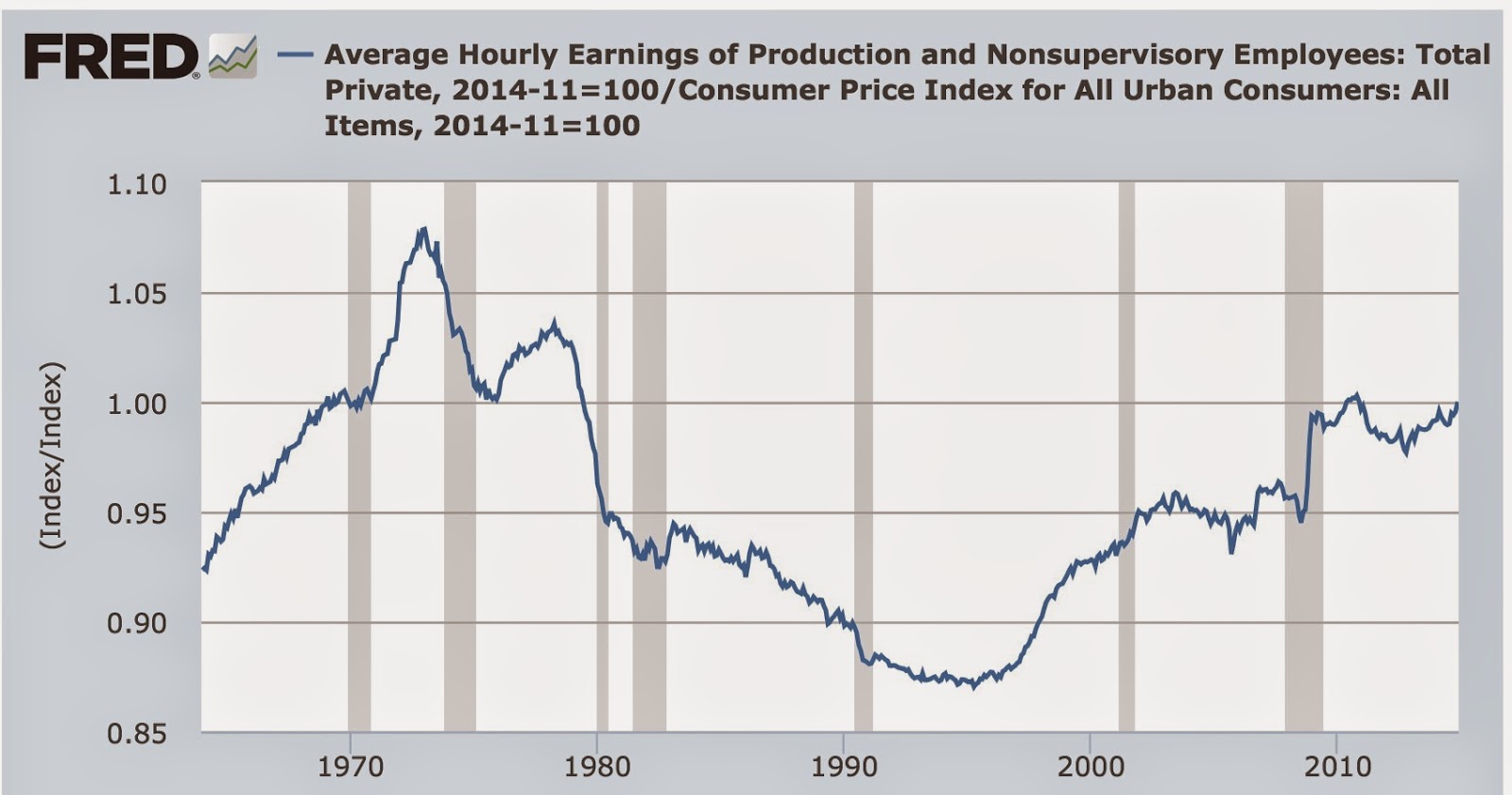
As a result of the boot due to declining energy prices in November, this series is only 0.3% off from its October 2010 post-recession peak, and thus only 0.4% from a 35-year high, as shown in this graph showing the entire 50 years of this metric:


None of this should take away from the fact that workers have not been rewarded by owners for their increased productivity over the last 40 years.  Because of this, in the larger view, wages are still stagnant.  But this is real, solid progress, and it deserves mention.  And it is all because of the breaking of the Oil choke collar.

Tuesday, December 16, 2014

The Oil Choke Collar: 2015 may be the acid test


 - by New Deal democrat

It's nice to be proven right.  Even more, it's nice to be proven right, for the right reason.

For the second time in two years, Oil's choke hold on the economy is asserting itself. Acceleration in recovery causes acceleration of demand, and acceleration of Oil prices - which causes the economy to stall. That choke hold won't go on forever, though. There are three forces that will combine to bring it to an end: alternate fuels, conservation, and exploration.
.... 
[T]he Oil choke hold on the economy will not last forever. I claim no clairvoyance, but a good guess is that by 2013 or 2014, the combination of alternative fuels and technology, conservation, and exploration will relieve the current situation
(emphasis added)

In 2012 and 2013, gas prices made lower seasonal peaks, and lower seasonal troughs, than in 2011.  They made a lower peak again this past spring.  Periodically during that time (e.g.,here and here) I updated the data on alternative fuels, conservation, and exploration.  Finally, a few months ago, I documented, as I consistently have since 2011, that the use of alternative fuels has been increasing - including in the vehicle fleet, that ridership on mass transit was still increasings, that demand of gas in the US was consistently declining from its 2006-07 peak, and that exploration was bringing on new supply.  I concluded:
In short, there is a very good chance that at some point in the next few months - or even weeks - we will see a new 4 year low in gas prices in the US.
Of course, by November we did see that new 4 year low, and now we have even seen a 5 year low.

In short, 3 and a half years ago I made a specific forecast about oil prices.  Not only was I right, and not only was I right about the time frame involved, but I was also right for the right reasons.  Average vehicle fleet mileage rose.  Use of mass transit rose.  Use of alternative fuels, such as in natural gas powered vehicles, and solar power, rose.  Demand for gasoline in the US fell.  New oil supplies from deep water drilling and shale oil extraction, came on line.

In simplest terms, supply rose faster than demand, ultimately creating a surplus in prodcution.  Indeed, depending on which source you read, demand is either expected to rise more slowly, or to actually fall.  And because, as Bill McBride a/k/a Calculated Risk pointed out yesterday, because supply is inelastic over the short term, a small change in demand leads to a large change in price.

Now, on November 27, Saudi Arabia refused to cut production, triggering the most recent cliff-dive in oil prices.  It is important to remember that, by that time, gas prices in the US has already fallen below $3 a gallon.  Was there a political aspect to that?  It's certainly possible, as Russia, Iran, and ISIS are among the biggest losers.

But - and somebody really needs to explain this to the Village Idiot over at Daily Kos - it is precisely because the Oil choke collar was already disengaging that such a move, if politically motivated, became possible. If demand were rising faster than supply, prices would be rising, not falling. There would be no way to "punish" players, since they would all be sharing in the profits windfall.  It is only because there was now excess supply that the issue of who would take the hit from already-lower prices became an issue.

Further, unlike the Village Idiot, somebody who actually does know what he is talking about when it comes to the oil markets, Prof. James Hamilton of Econbrowser, has estimated that "In other words, of the observed 45% decline in the price of oil, 19 percentage points– more than 2/5– might be reflecting new indications of weakness in the global economy." In other words, the fall in the price of Oil is not just about politics.

All of which means that the year 2015 could prove to be the ultimate test of my "oil choke collar" thesis.  One of my stock replies to those bemoaning relatively poor, below-trend, US GDP growth over the last few years has been, "Give me $2.50 a gallon gas instead of $3.50 a gallon gas, and I'll show you growth!"  If oil prices have been acting like a governor, choking off growth in the US economy by approaching $4 whenever the economy appears poised to obtain "escape velocity," then particularly with the present positive configuration of both the long and short leading indicators, IF oil prices remain in a new, lower range in 2015, we finally ought to see above-trend US growth.

Monday, December 15, 2014

Gas prices now at 5 year low, nearing Y2K prices in real, wage-adjusted terms


 - by New Deal democrat

This is from GasBuddy:


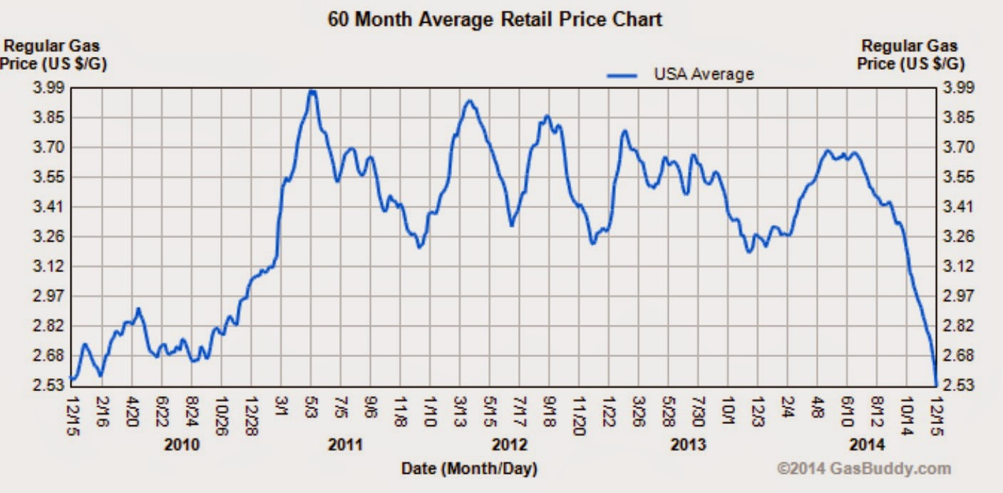
Gas prices have fallen below $2.56 per gallon.  This is the lowest they have been in 5 years.

Here is an update of the price of a gallon of gas as a share of the average hourly wage:


Note this is only through November. So far in December prices have plunge another 10%. "Real" gas prices could be at a 10 year low by the end of this month, and barely above their price at the turn of the Millennium.

There is evidence this is having a pronounced effect on living expenses on lower income households.  More on that in a post later this week.

Note:  As Jeff Miller points out, just as "the cure for high prices, is ... high prices," so low prices tend to "cure" themselves as well.  I do not claim any profound knowledge as to how long these relatively low prices for gas will last. To the extent there is a political, rather than economic, reason for the Saudis in particular not to cut back on production, then as soon as the political goal has been achieved, prices might rise again quickly.  On the other hand, to the extent the moves in price have an economic basis, then, just as it took from 2008 through 2014 for exploration, conservation, and alternative fuels to break through the "Oil choke collar," it may well take a similar amount of time for those forces to reverse.

Sunday, December 14, 2014

A thought for Sunday: one step from despair


 - by New Deal democrat

[Who said: "I believe that our Great Maker is preparing the world, in His own good time, to become one nation, speaking one language, and when armies and navies will be no longer required" ?  Hint:  not a hippie.  Answer at the bottom.]

This was a horrible week for what I once thought were American values.

First we find out that letter that state officials are submitting as official "comments" to federal legislation, were in fact dictated almost word-for-word by energy companies.  Then we find out that the CIA enthusiastically embraced torture - not even to extract actionable information, but to make sure that nothing was left, or even to induce false information that could be used politically.

Finally a multi-billion dollar gift is delivered from Congress to Wall Street, repealing a provision of the Dodd-Frank Act that prohibited Wall Street banks from gambling on derivatives with their FDIC-insured deposits.  On this last bit, fully 1/3 of all Democrats in the House voted in favor, Senate Democrats are expected to follow, and President Obama is expected to sign the bill into law.

Let's be clear about one thing:  not a single word has been uttered by any lawmaker as to why this repealer is economically necessary. Wall Street banks are already making record profits.  By definition we are not talking about a farmer, industrialist, or merchant hedging against adverse contingencies.  This is strictly about gambling - with deposits that are backed up ultimately by the US taxpayer.  It is also "moral hazard" at its absolute worst.  Gains will be distributed as profits.  Catastrophic losses will be bailed out.  There is every incentive to swing for the fences.

And 1/3 of the supposed protectors of the middle/working class voted in favor?

But wait, we are told soberly by, among others, Barack Obama. Here's what the democrats got out of deal, according to Kevin Drum at Mother Jones:
In 20 years of being on the appropriations bill, I haven’t seen a better compromise in terms of Democratic priorities. Implementing the Affordable Care Act, there’s a lot more money for early-childhood development — the only priority that got cut was the EPA but we gave them more money than the administration asked for....There were 26 riders that were extreme and would have devastated the Environmental Protection Agency in terms of the Clean Water and Clean Air Act administration; all of those were dropped. There were only two that were kept and they wouldn’t have been implemented this fiscal year. So, we got virtually everything that the Democrats tried to get.
The ... full-year appropriations legislation for most Government functions [ ] allows ... authorities and funding provided to enhance the U.S. Government’s response to the Ebola epidemic, and to implement the Administration’s strategy tocounter the Islamic State of Iraq and the Levant, as well as investments for the President’s early education agenda, Pell Grants, the bipartisan Manufacturing Institutes initiative, and extension of the Trade Adjustment Assistance program.
In other words, the democrats got funding - for one year - for favored programs.  The republicans permanently killed a provision keeping Wall Street from gambling with FDIC-insured deposits.

Imagine you want to throw a party for your graduating senior.  You expect the party to get a little raucous, and you don't want trouble, so you go to your difficult neighbor and ask him to agree.  He agrees, but only if you agree to deed over to him 5' of your yard.  You got something temporary. He got something permanent. Sound like a deal?  Well, that's akin to what those guardians of the little guy and gal just agreed to.

Mark my words, those same cuts will be demanded by the GOP next year.  And the protection against gambling with FDIC insured deposits will still be gone, so another demand will be made of the democrats to save the cuts.

When it comes to American history, the scales fell from my eyes long ago. Andrew Jackson and Manifest Destiny virtually defined the 19th Century.  If native tribes had to be slaughtered, well, too bad for them.  The effort to expand slavery West and South (to Cuba, Mexico, and the Caribbean) were centerpieces of the Jacksonian dogma.

And torture?  Been there, done that, in the Phillippine - American War of 1899 - 1902.  Just an example:
To force information from a Filipino mayor believed to have been covertly helping insurgents, American soldiers resort to what they call the “water cure.” After tying the mayor’s hands behind his back and forcing him to lie beneath a large water tank, they pry his mouth open, hold it in place with a stick and then turn on the spigot. When his stomach is full to bursting, the soldiers begin pounding on it with their fists, stopping only after the water, now mixed with gastric juices, has poured from his mouth and nose. Then they turn on the spigot again.
The disgust felt by many, such as Mark Twain, was unpersuasive.

In World War 2, many Americans at home wanted all Nazi and Japanese POW's killed.  They were restrained by the military, which pointed out that American POWs were also being held by Germany and Japan.

But I digress.  A couple of weeks ago, I wrote that the Presidency of George W. Bush might turn out to be as influential as that of Andrew Jackson.  That torture - even if not effective - is viewed as a legitimate tool of government, that Wall Street should unquestioningly be given what it wants - are now topics of "legitimate" discussion, even "bipartisan" approval.  The entire range of acceptable policies has been moved a full standard deviation to the right, and remained so during the presidency of the man who ran on "Hope" and "Change."

And the GOP hasn't officially taken control of the Senate yet.

I am one step from despair.  But despair will never be an option.

You want hope?  Here is the answer to the question I posed at the outset of this post.  That sentence was uttered by President Ulysses S. Grant, the General who had saved the Union, in his second inaugural speech, 1873.  There is no record of outrage from Washington insiders in response.

Saturday, December 13, 2014

Weekly Indicators for December 8 - 12 at XE.com


 - by New Deal democrat

My Weekly Indicator post is up at XE.com.

There is a stark contrast between the more internationally-influenced data vs. US domestic data.

Thursday, December 11, 2014

The Oil choke collar breaks: American consumers attack!


 - by New Deal democrat

I have a post up at XE.com about the great November retail sales report this morning.

A few Doomers have actually predicted poor Christmas sales.  Not gonna happen.

Tuesday, December 9, 2014

A look at the first 6 months of 2015


 - by New Deal democrat

I have a new post up at XE.com looking at the short leading indicators -- those that tell us the direction of the economy about 6 months out.  These should verify for us the direction forecast by the long leading indicators roughly 6 months ago.

Sunday, December 7, 2014

A Deep Question for John "Trillion Dollar Loss" Hinderaker; Isn't Obama A Genius, Too?

     By way of background, John Hinderaker of the Power Line blog was one of the many conservatives who argued that QE and government stimulus would lead to massive inflation and a spike in interest rates.  Obviously, neither happened.  Bloomberg analyzed the potential investment ramifications of this failed thinking and determined that, if you had taken this advice, you would have lost $1 trillion dollars.  Put in less formal terms, we know that Mr. Hinderaker's economic analysis would have lost you serious money.  Of course, that has not stopped him from continuing to write about economics in the ensuing years.  (Gee, I wonder is he's invested in stocks .... )

     Which leads to this observation.  Mr. Hinderaker once made the following public statement about President Bush:

It must be very strange to be President Bush. A man of extraordinary vision and brilliance approaching to genius, he can’t get anyone to notice. He is like a great painter or musician who is ahead of his time, and who unveils one masterpiece after another to a reception that, when not bored, is hostile.

He later attempted to walk the above statement back, but it's most likely this was done because of the large amount of ridicule directed at him for that statement.

However, let's assume for the sake of argument that Bush is a genius and compare the total establishment jobs performance under Bush and Obama:


Obama's overall performance is better than Bush's.

So, if Bush is a genius, and his establishment jobs performance was worse than Obama's doesn't that make Obama ... a super-genius?