Saturday, November 15, 2014
Weekly Indicators for November 10 - 14 at XE.com
- by New Deal democrat
My Weekly Indicators piece is up at XE.com.
More softness has shown up in coincident indicators.


US Equity Market Review For the Week of November 17-21
One month ago, traders had re-examined their risk calculus and determined that equities were too risky, sending shares lower and the vix higher. A rally in the bond market was reaching its apex, equities sold off and momentum indicators cratered to some of the lowest levels in years. Fast forward a mere month, and the entire environment has more or less changed: equities have returned to previous levels, momentum indicators are back at higher levels and the vix is again showing market calm.

Nothing highlights this changing situation more than the Vix, which spiked in mid-October to 26.25 but which has returned to a far more tranquil reading of 13.3. And note the speed with which things have settled down; in less than a month, the market has gone from about a week of "holy shit, everything is changing" to "we're back to where we were."
The 30 minute charts of the SPY and IEFs highlight this change.


Nothing highlights this changing situation more than the Vix, which spiked in mid-October to 26.25 but which has returned to a far more tranquil reading of 13.3. And note the speed with which things have settled down; in less than a month, the market has gone from about a week of "holy shit, everything is changing" to "we're back to where we were."
The 30 minute charts of the SPY and IEFs highlight this change.
Over the last month, the SPYs have slowed and consistently moved higher. The rally has consolidated gains on several occasions and, after doing so, resumed its ascent. However, the pace of the rise has clearly decreased, with prices forming a slow yet very price obvious arc.
At the same time, the bond market has not sold off to the same degree as the equities rally. Instead, the IEFs have consolidated their position between the 104.5 and 105.25 price levels since the end of October. If traders were seriously re-allocating their portfolios due to a return of the "equities are going to continue rallying" concept, we'd see bonds move lower. But that isn't happening.
In fact, the weekly TLTs (20+ section of the curve) are still obviously in an uptrend. All the EMA -- short and long -- are moving higher. The only bearish element on this chart is the decline in volume over the last few weeks, which could indicate the trend is about to reverse. But prices would need to move at least another 2% lower, which is a far larger bond market than equity market move.
That leads to the question: what's next? To answer that, let's look at the daily chart of the micro, mid and large cap ETFs:
The large caps' chart (OEF, top chart) is most closely tracking the SPYs. Prices have moved through previous resistance, although the pace of the rally has clearly decreased, indicating short-term declining momentum. In contrast, the mid-caps (middle chart) haven't made new highs, instead resting right at previously attained levels. And while the micro-caps (bottom chart) have broken through resistance levels, they clearly have little upward momentum.
This means that overall, we have a potential for another 5%-10% rally caused by events like a solid GDP read or strong employment report. But ultimately the market is still expensive, requiring positive fundamental news to move higher. It also makes this a stock-pickers market were a company that is growing faster than the economy as a whole and its sector and then its industry will fetch a premium price.
Friday, November 14, 2014
Gas price declines power consumers in October
- by New Deal democrat
I have a new post up at XE.com on this morning's retail sales number.
This is our first indication of how much the decline in gas prices is helping out consumers.
Thursday, November 13, 2014
Jobs and wages graphapalooza!
- by New Deal democrat
At the end of the day, the economy ought to operate to bring the most benefit to the most people. Jobs and wages are a pretty good proxy for that desideratum. With that in mind, let me update some of my graphs about them.
At the end of last year, Congress cut off extended unemployment benefits, on the theory that they provided a "hammock" for the unemployed, who would otherwise be motivated to find new jobs. If that's true, then those who told the Census Bureau that they were not even looking anymore, and so were out of the labor force, but wanted a job now, should be declining. Here's what has actually happened (graph shows NILFWJN as percent of work force):

Instead of falling, nearly a million more people, or .4% of the workforce, have been added to this group. Aside from the privation, and aside from the fact that these people aren't adding to the economy by spending the benefits, that means that unemployment is 0.4% lower than it would otherwise be.
Another way to look at the overall employment situation is to look at how many hours of work are available to those in the labor force, and those who want a job now but aren't counted in the work force:

This continues to slowly increase and is only about 1.8% below its 2007 peak and 5.8% below its peak during the 1990s tech boom.
How about wages? One measure I like is how much total real wages are available per person in the US population. That's what is shown in this next graph:

In the aggregate, real wages are quite close to their prior peaks. That tells us that it is the distribution of income among the workforce that is the most acute problem.
Finally, even back in the horrible days of 2008 and 2009 I used to like to find at least one item of good news. That's the final graph, showing something that went totally unremarked in last week's employment report. Namely, we have passed the 10,000,000 mark in new jobs added to the economy since the jobs trough in February 2010:

Once upon a time, Doomers used to claim that we weren't really adding any jobs, or were just "bottom bouncing." They went silent on that claim quite a while ago. Then they claimed that the jobs recovery was only part time jobs. Part time jobs are that nearly flat line at 0 at the bottom. 99% of all of the jobs added have been full time jobs.
Except for the vile conduct of Congress a year ago in cutting off extended unemployment benefits, we are still making progress. Not nearly enough, not nearly what I would like to see, but nevertheless progress.
The mighty Krgthulu has spoken: median income =/= median wages
- by New Deal democrat
I've called median household income The most misused statstic in the econoblogosphere. People routinely cite it to claim that wages have fallen since the onset of the Great Recession. They have not.
The "households" included in the statistic include all those headed by anyone over age 16, including the burgeoning cohort of elderly retirees. Even excluding that age cohort, it includes households including the unemployed. Strip out the elderly and adjust for unemployment, and household incomes show the same stagnation as wages.
But now the authoritative voice of Krgthulu Has spoken
although Leonhardt talks about wages, the chart he shows is median income, which is a somewhat different story. Wages for ordinary workers have in fact been stagnant since the 1970s, very much including the Reagan years, with the only major break during part of the Clinton boom.I hereby invoke Delong's Rule:
QED1. Paul Krugman Is Right. 2. If You Think Paul Krugman Is Wrong, Refer to #1
Tuesday, November 11, 2014
Making the case that the consumer is slowing down
- by New Deal democrat
A year ago, based on the long leading indicators at the time, I thought the economy would be in the midst of a slowdown about now. I have a new post up at XE.com, making the Case for a consumer slowdown, based on trends in housing and cars.
The evidence is far from solid, especially given the relief consumers are having at the gas pump. We'll see.
It's (also) the interest rates, stupid!
You know the old saw, "it's the economy, stupid!" Both Robert Reich and Atrios have boiled last week's election results down to that maxim.
Atrios said, "It isn't really a big mystery why people still aren't thrilled with the economy. The foreclosure crisis and the great recession destroyed lives, and opportunities for The Kids Today are pretty crap."
Reich blames median household income:
If you want a single reason for why Democrats lost big on Election Day 2014 it’s this: Median household income continues to drop.This is the first “recovery” in memory when this has happened.Jobs are coming back but wages aren’t.While I agree with his prescription:
[Democrats] have a choice.
I disagree about using the metric of median household income, since your 75 year old Uncle Earl and 85 year old grandma are counted in that statistic, and there are a ton more Uncle Earls and Grandmas than there used to be (more on that below); and among 25 to 54 year olds it tracks the employment to population ratio nicely.They can refill their campaign coffers for 2016 by trying to raise even more money from big corporations, Wall Street, and wealthy individuals.And hold their tongues about the economic slide of the majority, and the drowning of our democracy. Or they can come out swinging.
While the lack of a platform that speaks to younger voters was certainly an issue, I believe almost all commentators have overlooked another crucial component of what happened last week -- interest rates.
You've probably seen this graphic already from ABC news, showing the skew among age groups over the last 5 elections. Note that younger voters constituted 12% of the electorate in each of that last 3 midterms.

But look at what happened with the 60+ cohort: it grew from 23% in 2006 to 32% in 2010, to 37% in 2014!
Not only has the midterm electorate skewed heavily towards senior citizens in the last 8 years, but the senior citizen cohort itself has become more conservative. The reason? Most people arrive at their basic political orientation at about age 18, and never fundamentally change. In 2006, 65 year olds had turned 18 in 1959. In 2010, that was 1963. This year it was 1967.
Now let's look at how 18 year olds political orientation has changed over time:

In 2006, there were still some FDR era voters around. By yesterday, they had all but disappeared, replaced by an island of JFK era 18 year old blue voters amidst a red tide of Truman, Eisenhower, and LBJ voters. In other words, the 65+ year old cohort that went to the polls in 2014 was the most conservative in several decades. (PS: Note that Obama turned 18 in very red 1979, which might not be a coincidence with his apparent veneration for Reagan).
And what do elderly voters care about? It isn't jobs, and it isn't wages. After all, they are almost all retired!
No, what they care about is the interest rates their CD's and money market accounts are earning, and the COLA adjustments to their Social Security.
And there, the news has been abysmal for the last 6 years.
Here's the rate on CD's from 2008 to the present:

And here's the COLA adjustment to Social Security in the last 6 years:

Average CD rates have run no higher than 1%. Social Security COLA has averaged 2.2%.
Now here's inflation (and keep in mind that there is evidence that seniors probably face higher inflation rates for what they buy):

For the last 5 years, inflation has averaged about 2% a year.
Obama and the democrats are seen as having bailed out Wall Street in 2009. Meanwhile savers and those on fixed incomes have taken it in the chops.
So let's review:
- A burgeoning midterm electoral cohort
- skewing more conservative than in several decades
- that is the prime viewership for Fox News
- took it in the chops on their savings and, to a lesser extent, Social Security.
- They blamed Obama and the democrats.
Last week, they got even.
Sunday, November 9, 2014
A thought for Sunday: the importance of state-level third parties
- by New Deal democrat
[You know the drill. It's Sunday. Regular nerdy economic blogging will resume tomorrow. And be sure to read Bonddad's latest summary, below]
There was a devastating piece about the Democratic Party published about a month ago by Chris Bowers, I think, that reads particularly bitterly in the light of last Tuesday's midterm election results. Of course I can't find it now. (UPDATE: I think it was This piece. By Matt Stoller. If you haven't read it yet, go read it now). But in summary, it said that the high point of the left netroots was the Lamont-Lieberman Senate contest in 2006. Anti-Iraq war progressives defeated Joe Lieberman in the primary. But because Connecticut has no "sore loser" law preventing primary losers from re-filing and running as independents in the general election, Lieberman did so, and the Democratic Party establishment, including one Barack Obama, rallied around him. When Lieberman won with the help of GOP votes, he got a standing ovation in the Senate.
In 2008 most of the netroots backed Obama, who also suggested that he was anti-Iraq war (he never actually cast a vote) vs. the pro-Iraq war Hillary Clinton. But once Obama won and no longer needed progressives, he dumped Howard Dean as Democratic Party Chair, along with his "50 state strategy," and installed economic neoliberals as his most powerful appointments.
The point Bowers(?) was making is that the party establishment learned in 2006 that it didn't have to worry about progressives. Progressives would lose most primaries where the primary determinant was money, and then they would fall meekly in line, backing a centrist Democrat in the general. This is where Kos's mantra "more and better" democrats led.
The GOP, when installed in power via Bush, or even with a stranglehold on a necessary artery, like the filibuster rule in the Senate, has relentlessly pursued a maximalist strategy, rallying round the most extreme policies and maybe compromising a little at the end. The democratic estabslishment, with no party discipline to the right, pursues milquetoast centrist policies and even then compromises with the GOP.
The Progressive voice is never going to be heard, let alone come to power, under these circumstances.
In order to do so, progressives need to take a page from the historical rise of the UK's Labour Party. One hundred years ago, the UK's two major parties were the Conservatives (a thoroughly reactionary party), and the Liberals, a center-left coalition much like today's Democrats. The Labour Party formed after the Liberals stabbed them in the back.
And Labour did not win by defeating Conservatives. Labour won by driving the Liberal party to the brink of extinction.
Similarly, progressives will not win because of GOP losses. Progressives will only win by driving corporatist democrats to the edge of extinction, just as movement conservatives took over the GOP by making Rockefeller Republicans as extinct as the dodo bird).
As spelled out above, corporatists are throughly in charge of the democratic establishment, to the point, it is widely reported, that they would prefer GOP election wins over progressive democratic candidates. See, for example, here
So, how to make corporatist democrats extinct? By showing them that they can never win. And how do you show them that they will never win? By borrowing a page from the career of Joe Lieberman.
It isn't enough for progressives to primary corporatists. State level third parties, like New York's Green Party, give progressives the ability to stay in elections right through the general election, even if they lose a democratic primary to corporatists.
Yes, this strategy will mean some general election losses over a few cycles. But when corporatist democrats learn that they cannot win, they will start to disappear. Progressives will win either as Democrats, or under another party banner.
By the way, this happened before. One hundred years ago, there were active Populist and Progressive Parties in the states (remember Robert LaFollette?). Ultimately they became part of the winning New Deal coalition.
Progressives shouldn't abandon the Democratic Party. But they should target the corporatists as mercilessly as Tea Party republicans targeted their less-extremist wing, and state level Third Parties are an indispensable part of that attack.
US Equity Market Summary For The Week of November 3-7
At the end of last week's column, I make the following observation:
So, in conclusion, we're where we were a few weeks ago: a market that is pretty expensive that has decent earnings growth potential but whose various companies also face some a weak international environment and a stronger dollar. That limits the upside potential a bit.
To begin this week's market review, let's take a look at the overall valuation of the major indexes:

The above screen shot from the WSJ's market page highlights the bulls predicament. The S&P 500 is trading at a PE of 19; this isn't "super" expensive, but it certainly isn't cheap either. And its forward PE of 16.65 doesn't provide a great deal of upside room. The NASDAQ 100 has the same problem; it's currently more expensive than the S&P 500 and its forward PE is also high, limiting a rally. The Dow is in a somewhat better position, but, frankly, as an index it's an historical anachronism -- I follow it because I have to, bit because it provides a unique insight into the markets.
And not only are the valuation measures limiting a potential rally, so is increased international economic risk. The EU is hovering just above recession and/or a deflationary situation, Russia is quickly becoming a potential economic disaster, Abenomics is stalling and China's real estate market is starting to fall under its own weight. Although the US economy is actually on decent footing, most major companies derive a fair amount of their revenue from international operations. This means the potential international slowdown has negative implications for earnings growth, and, by extension, a potential market rally. And, just to add the icing on the cake, the dollar is rallying, making the repatriation of profits that much more difficult. All of the previously listed issues add up to limit any rally.

The limited upside potential is highlighted on the SPY daily chart. In mid-October, the market had a sharp sell-off from peak to trough of 201.9 to 181.92 -- a near 10% selloff. But nearly three weeks later, prices rebounded, erasing losses and eventually making new highs. The pace of the rally, however, has decreased. Note in the circled area the candles have narrower bodies, indicating the opening and closing levels for that trading day were very close. Overall volume has also decreased.


The micro-caps (daily chart above) hit resistance at their upside resistance trend line. More importantly, they didn't continue through resistance with the other averages.


So, in conclusion, we're where we were a few weeks ago: a market that is pretty expensive that has decent earnings growth potential but whose various companies also face some a weak international environment and a stronger dollar. That limits the upside potential a bit.
To begin this week's market review, let's take a look at the overall valuation of the major indexes:
The above screen shot from the WSJ's market page highlights the bulls predicament. The S&P 500 is trading at a PE of 19; this isn't "super" expensive, but it certainly isn't cheap either. And its forward PE of 16.65 doesn't provide a great deal of upside room. The NASDAQ 100 has the same problem; it's currently more expensive than the S&P 500 and its forward PE is also high, limiting a rally. The Dow is in a somewhat better position, but, frankly, as an index it's an historical anachronism -- I follow it because I have to, bit because it provides a unique insight into the markets.
And not only are the valuation measures limiting a potential rally, so is increased international economic risk. The EU is hovering just above recession and/or a deflationary situation, Russia is quickly becoming a potential economic disaster, Abenomics is stalling and China's real estate market is starting to fall under its own weight. Although the US economy is actually on decent footing, most major companies derive a fair amount of their revenue from international operations. This means the potential international slowdown has negative implications for earnings growth, and, by extension, a potential market rally. And, just to add the icing on the cake, the dollar is rallying, making the repatriation of profits that much more difficult. All of the previously listed issues add up to limit any rally.
The limited upside potential is highlighted on the SPY daily chart. In mid-October, the market had a sharp sell-off from peak to trough of 201.9 to 181.92 -- a near 10% selloff. But nearly three weeks later, prices rebounded, erasing losses and eventually making new highs. The pace of the rally, however, has decreased. Note in the circled area the candles have narrower bodies, indicating the opening and closing levels for that trading day were very close. Overall volume has also decreased.
The 30 minute chart adds more detail to the analysis. There are two rallies. The first starts mid-way through the 15th, continues through resistance until November 4th and then breaks the trend. The second rally started on the 4th, but has a lower angle, indicating declining momentum.
Two other broad indexes raise concerns about a potential continuation of the rally: the IWCs and QQQs.
The micro-caps (daily chart above) hit resistance at their upside resistance trend line. More importantly, they didn't continue through resistance with the other averages.
And while the QQQs broke through resistance, they traded sideways last week, which is better seen on the 5-minute chart:
The detailed daily chart shows the QQQs hit resistance at the 101.6-101.7 level and failed to continue higher. In fact, last week's QQQ 5-minute chart looks like a sideways consolidation pattern.

Last week's sector performance chart also shows why the overall advance was subdued. While industrials and financials advanced, so did utilities, health care and staples -- three sectors that are defensive in orientation.

And when we look at year-to-date sector performance, defensive sectors again are the two top performers also representing 3 of the top 4.
To return to the theme from the opening paragraph, the market is expensive and faces moderately strong headwinds in the form of increasing international economic uncertainty and a stronger dollar. When these factors are combined with the more defensive nature of the market's advance and its already expensive valuation levels, a topside rally is limited, barring better company or sector level earnings news and/or speculation. That makes the current more and more a stock-pickers market.
Last week's sector performance chart also shows why the overall advance was subdued. While industrials and financials advanced, so did utilities, health care and staples -- three sectors that are defensive in orientation.
And when we look at year-to-date sector performance, defensive sectors again are the two top performers also representing 3 of the top 4.
To return to the theme from the opening paragraph, the market is expensive and faces moderately strong headwinds in the form of increasing international economic uncertainty and a stronger dollar. When these factors are combined with the more defensive nature of the market's advance and its already expensive valuation levels, a topside rally is limited, barring better company or sector level earnings news and/or speculation. That makes the current more and more a stock-pickers market.
Saturday, November 8, 2014
Weekly Indicators for November 3 - 7 at XE.com
- by New Deal democrat
My Weekly Indicator post is up at XE.com.
Global weakness is affecting US data at the margins.
Friday, November 7, 2014
Four important graphs about jobs for October 2014
- by New Deal democrat
As you know, since the expansion in jobs is firmly in place, recently I have turned my attention to metrics of underemployment and wages.
We're having the best year for jobs added in over a decade. Jobs have grown by almost 2% in the last 12 months. This is about 1% over population growth and should get us to full employment in about two years, if the trend continues.
Let's look at a few measures of labor underutilization beyond the unemployment rate.
First, here is the employment to population ratio for ages 25-54, Prof. Krugman's favorite shorthand measure:

This made a new post-recession high in the latest report. It is 2.1% off its bottom and is 2.9% off 79.5%, a reasonable figure for full employment.
Next, here is involuntary part time employment as a share of the civilian labor force:

This is about 1.5% higher than during full employment years. Note it is also following a trajectory similar to that following the severe 1982 recession.
Next, here is the number of those who aren't even counted in the civilian labor force but want a job now:

This one is bad news. It has been moving in the wrong direction ever since Congress cut off extended unemployment benefits at the end of last year, and is back close to 2 million above where it should be for full employment.
Finally, here is a look at wage growth for nonsupervisory personnel (blue) vs. consumer inflation (red):
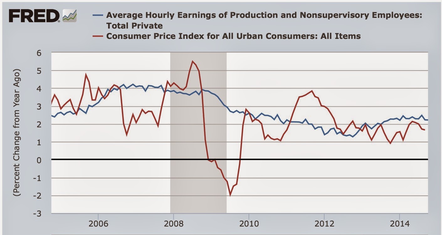
This is a little bit concerning, because nominal wage growth, now +2.2% YoY, has gone in the wrong direction in the last couple of months. On the other hand, real wages have grown, because consumer inflation has declined (thank you, gasoline!). I do expect both the nominal and inflation adjusted numbers to improve in the coming months. We'll see. The bottom line for now is, real wages have improved slightly, but over the longer term remain stagnant.
October jobs report: solid improvement, except for discouraged workers
- by New Deal democrat
HEADLINES:
- 214,000 jobs added to the economy
- U3 unemployment rate fell from 5.9% to 5.8%
Wages and participation rates
- Not in Labor Force, but Want a Job Now: rose 188,000 from 6.349 million to 6.537 million
- Employment/population ratio ages 25-54: up 0.2% from 76.7% to 76.9%
- Average Weekly Earnings for Production and Nonsupervisory Personnel: up $.04 to $20.70 up 2.2% YoY
Since the economic expansion is well established, in recent months my focus has shifted to wages and the chronic heightened unemployment. The headline numbers for October continue to show a little progress on wages, and mixed results on participation.
Those who want a job now, but weren't even counted in the workforce were 4.3 million at the height of the tech boom, and were at 7.0 million a couple of years ago. Since Congress cut off extended unemployment benefits at the end of last year, they have actually risen by over half a million, and this month were 6.537 million.
On the other hand, the participation rate in the prime working age group has made up over 40% of its loss from its pre-recession high.
After inflation, real hourly wages for nonsupervisory employees probably rose from September to Ocotbe. The nominal YoY% change in average hourly earnings is 2.2% somewhat better than the inflation rate.
The more leading numbers in the report tell us about where the economy is likely to be a few months from now. These were flat to slightly positive
- the average manufacturing workweek was unchanged at 40.8 hous. This is one of the 10 components of the LEI.
- construction jobs increased by 12,000. YoY construction jobs are up 464,000.
- manufacturing jobs were up 15,000, and are up 170,000 YoY.
- Professional and business employment rose 37,000 and is averaging a 56,000 monthly gain for the last year.
- temporary jobs - a leading indicator for jobs overall - increased by 15,100.
- the number of people unemployed for 5 weeks or less - a better leading indicator than initial jobless claims - increased by 90,000 from 2,383,000 to 2,473,000, compared with last December's 2,255,000 low.
Other important coincident indicators help us paint a more complete picture of the present:
- Overtime hours were down from 3.5 hours to 3.4 hours.
- the index of aggregate hours worked in the economy rose sharply by 0.5 to 101.9
- The broad U-6 unemployment rate, that includes discouraged workers decreased from 11.8% to 11.5%
- Part time jobs for economic reasons decreased by -76,000 to a total of 7.027 million.
- the alternate jobs number contained in the more volatile household survey increased by 683,000 jobs. This is a 3,8 million increase in jobs YoY vs. 2,643,000 in the establishment survey.
- Government jobs increased by 5,000.
- the overall employment to population ratio for all ages 16 and above rose 0.2% from 59.0% to 59.2%, and has risen by +1.0% YoY. The labor force participation rate rose from 62.7% to 62.8%, and is unchanged YoY - an actual improvement! (and remember, this includes droves of retiring Boomers).
Of the important metrics I am watching now, adjusted for inflation, nonsupervisory wages probably also rose this month, albeit slightly.
Additionally, higher paying construction, manufacturing, and business and professional service jobs are showing consistent improvement. In other words, with continued improvement in overall employment, it looks like the manta that the economy is only adding low paying jobs is beginning to give way.
The one big sore spot is the continuing increase in people who have completely stopped looking, but want a job now. On the other hand, the employment to population ratio among the prime 25-54 working age group made a new post-recession high, and is over 40% back to pre-recession levels - not great, but improvement nevertheless.
Thursday, November 6, 2014
Hmmmm... I see a pattern here
- by New Deal democrat
[Note: regular economic blogging will resume with the Jobs Report tomorrow morning]
Gloria Borger, CNN:
David Atkins, Digby's blogNow voters demand change elections more often than they don't. Consider this: Republicans win the Senate in 2002, then lose it in 2006. The Democrats hold the Senate until losing control of it last night -- predictions are that they might be in a good position to take it back in two years.At some point, someone might start listening: Voters are steaming. They're anxious.... .... [W]hat happened last night is not a communications problem. It's a governing problem. Almost 8 out of 10 voters who voted yesterday don't trust the government to do the right thing
[T]his was yet another wave election. The latest in a long string since 2006. It needs to be said again.
Turnout keeps declining in midterm elections as people lose faith in the political process. And the people who do vote, consistently vote for someone to change something. It's entirely likely that people will be fed up with Republicans fighting one another and putting terrible bills on the President's desk and vote again for change in the other direction in 2016--particularly with a larger, more progressive electorate. Not a given, of course, but likely.
And why not? The country is broken, and everyone who isn't already wealthy knows it. .... And it seems like absolutely nothing is going to change any of that, no matter who gets into office....
Eventually this will reach a breaking point. It has to. It'll break when some sufficiently large crisis occurs, and one side is fully prepared to use that seething rage for constructive outcomes.
The party that is more ready for that moment will be the one that makes real policy changes. Until then, we'll just keep surfing waves ....Markos Moulitsas:
In 2004, Republicans won big, and Democrats were left trying to figure out what went wrong.Let me distill this down to its essence. In a legacy two party system from which there appears to be no escape, voters have no choice but to throw the current crop of bums out, and give the other crop of bums another chance, until one or other of the groups of bums actually starts addressing their problems.
Then in 2006, Democrats won big, and they decided everything was fine. Republicans merely shrugged it off as the 6-year-itch that bedevils parties that hold the White House in a president's last midterm.2008, Democrats won big again, and Republicans were left fumbling for excuses, but mainly decided it was Bush's fault and an artifact of Barack Obama's historic campaign.In 2010, Republicans won big, so they were validated. All was fine! Democrats were left fumbling.In 2012, Democrats won big, so they decided everything was fine. Demographics and data to the rescue! Republicans decided to rebrand, until they decided fuck that, no rebranding was needed.And now in 2014, Republicans are validated again in the Democrats' own 6-year-itch election. Democrats are scrambling for answers.And I'll tell you what the future looks like:In 2016, Democrats will win big ....In 2018, Republicans will win ....Then in 2020, Democrats will win ........ And that cycle won't be broken until 1) the Democrats figure out how to inspire their voters to the polls on off years, or 2) Republicans figure out how to appeal to the nation's changing electorate.
Unit labor costs flat
- by New Deal democrat
This morning the BLS reported Unit Labor Costs. This measures how productive labor is, by measuring it per unit of production. The index rose slightly in the 3d Quarter, but 2nd Quarter ULC were revised downward, making the index essentially flat this year:

Note that over the last few years, however, unit labor costs have risen slowly (which is good for labor). This is also shown when we measure ULC by their YoY% growth:

(ignore the upward and downward spikes from 4Q 2012 and 2013, which were due to tax strategies by corporations in anticipation of the ending of the Bush tax cuts).
Finally, corporate profits deflated by unit labor costs is a long leading indicator. Here it is measured YoY for the last 65 years:

A negative number doesn't guarantee a recession in the next year or so, but it does most of the time, and further, there has almost never been a recession without being preceded by a negative number.
Finally, let's zoom in on the last 10 years (note this only goes through Q2, but corporate profits have generally been positive, so we should see another positive number when this is reported next month).

This shows ULC growing slightly less than profits for the last several years. While I'd like to see better improvement in labor's position, this does suggest strongly that 2015 will be another positive year for jobs.
Average weekly earnings and the Employment Cost Index have also risen off their post-recession bottoms. Tomorrow in the jobs report we will get our first read on how that is carrying over into the 4th Quarter.
Wednesday, November 5, 2014
A disengaged oil choke collar + rising wage growth is almost pure good news
- by New Deal democrat
I have a new post up at XE.com. Falling commodity (gas) prices plus rising wages has been a sure sign of continued growth, going back 50 years.
A little post-election-day economic balm
- by New Deal democrat
Perchance you would like to ponder something other than politics this morning. In that case, let me offer you some economic balm.
The likelihood is that absolutely nothing is going to get done in Washington in the next two years. In fact, I expect - and hope - that exactly one thing happens, and that is that the US does not default on its debts via a Debt Ceiling Debacle even worse than the one we had in 2011. (and please, pretty please, Obama, resist the urge to cave in to a "grand bargain" on your way out the door).
If Washington can simply manage to do absolutely nothing to the economy in the next two years, except to agree to pay already incurred debts (a/k/a lift the debt ceiling), then we are in the best position we have been in for nearly a decade for the economy by itself to improve the lot of the working and middle class appreciably.
Here's why:
- there is nothing in the long leading indicators to suggest that we are going to enter an economic downturn at any point in at least the next 9 months. If interest rates continue to drift lower and housing starts improve as a result, you can extend that forecast into 2016.
- continuing economic growth means continuing positive monthly jobs reports
- so long as there is positive jobs growth, and initial jobless claims stay at or near their current levels, the unemployment rate is going to continue to decline -- and that's not just the usual rate, but all the other variations on the unemployment rate as well.
- Because the unemployment rate should remain below 6.5% for the foreseeable future, that means that nominal wage growth, which has been improving for the last 18 months, will continue to improve further - i.e., to 2.5% YoY or 3.0% YoY.
- Also, incremental tightness in the labor market is going to mean that better paying jobs become an increasing share of employment - my hypothesis is that this recovery is no different from previous recoveries, where low wage jobs get added first, and higher wage jobs get added later. Like the expansion after the deep 1982 recession, there was so much slack that it took a long time for those higher paying jobs to show up. There is evidence from the last few jobs reports that it is beginning to happen.
- Unless there is a reversal in gas prices, this is going to mean significant real wage growth to the average working family.
In short, simply leaving the economy alone for the next 2 years is likely to mean a continued improvement in the jobs picture, and a significant improvement on the wage front. Or, if ever there was a time when laissez faire might be a perfectly decent policy, this point in the cycle is it.
Just the probabilities, I know. Lots could go wrong. But the above scenario isn't just plausible, among the plausible scenarios, it is the most likely.
Monday, November 3, 2014
Initial jobless claims forecast 280,000 +/-80,000 jobs created in October UPDATED
- by New Deal democrat
The level of initial jobless claims has been doing a good job in this expansion of forecasting the general level and direction of both employment and the unemployment rate. While I haven't been able to do a formal regression analysis, the below scatter graph, showing the level of initial jobless claims on the bottom axis, and the monthly change in employment on the left axis, shows that for every 10,000 monthly average decline in jobless claims, there has been an increase of 10,000 to 12,000 jobs in the monthly jobs report:

Keeping in mind that in October we had the lowest initial jobless claims reports since 2000, the midpoint of the distribution for the October jobs number is about 280,000. With the exception of a few outliers, jobs reports have typically come within 80,000 of that midpoint, giving us a range of 200,000 at the low end and 360,000 at the high end.
Also, since initial claims tends to lead the trend in the unemployment rate by several months, I am expecting a further decline in that rate from 5.9% within the next two months.
And since the unemployment rate has been a good leading indicator for nominal wage growth, I am also expected nominal wages for nonsupervisory employees to improve from their present 2.2% YoY in the next several months as well.
========================
UPDATE Wed. Nov. 5
Many thanks to Craig Eyermann at Political Calculations, who via Doug Short ran the regression on the above data. Here's theactual mathematical regression:

Eyermann cautioned: "On the whole, I would describe the overall correlation as fairly weak - I wouldn't use the regression to attempt to predict either value."
Erm, uh, well, since I already did that, I guess we'll just sit back and see what happens on Friday! FWIW, the regression does suggest a result centered on 261,000.
Sunday, November 2, 2014
Consumers' (accurate) bifurcated take on the economy - and why that isn't good for Democrats
- by New Deal democrat
Naked Capitalism picked up a piece from Wolf Richter the other day (subsequently copied-and-pasted by the Pied Piper of Doom) entitled, The shrinking piece of a barely growing economy: why the Glorious Economy of ours feels so crummy. It's ultimate conclusion is,
Since PCE is used to adjust GDP for inflation, “real” economic growth has been systematically overstated by understating inflation. If GDP had been deflated over the years with CPI, instead of PCE, that measly 2.3% growth of per-capita GDP since 2007, as crummy as it may appear, would likely benegative. And that explains why so many people – struggling with soaring rents, medical expenses, college costs, etc. – find that their slice of the economic pie has been shrinking since the financial crisis.
Is the economy actually "shrinking?" Do consumers really think it's "crummy?" Although the facts do not support either of these assertions, as we will see the benefits have skewed towards those whose incomes normally are associated with GOP voters.
The first clue that this is a cherry-picking Doomer piece is the use of the present progressive tense, to convey the sense of an ongoing trend, and the selection of a specific starting point. Now, there are good reasons not to use GPI as the GDP deflater, since GDP measures a lot more than consumer activity, even though it is the largest component, but let's pass that. Richter's claim that if GDP were deflated by CPI, "would likely be negative" since 2007, is easy to examine. It took be about 3 minutes to generate the graph at the St. Louis FRED. And technically, if we simply compare Q3 2014 to Q3 2007 in that graph, indeed Q3 is 0.3% lower than the 2007 peak.
Which make me wonder why he didn't do it. Probably because when you graph real per capita GDP deflated by PCE (red) and compare it with real per capita GDP deflated by CPI (blue), and put it in the context of a longer term (here, 20 years), this is what you get:

Does this look like an economy that is "shrinking" to you? Whichever way we measure, the economy per capita shrank (past tense) by 5% or 6% in 2008 and 2009, and has grown by about 6% to 7% since then, over 5 years. Since 2010, with the exception of 3 quarters in 2011, real per capita GDP has grown at a similar rate regardless of whether DPI or PCE is used as the deflator:

Not only that, but real per capita disposable income has made a new high as well:
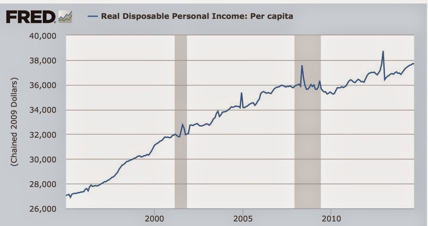
So, if I were happy with GDP in 2007, why wouldn't I also be happy now, if on a per capita basis, it is less than 0.3% from the peak quarter of that year?
Assuming that is true, then the answer, presumably, is that the benefits of the expanding economy for the last 5 years have by no means been evenly shared, something Richter mentions in only one sentence, with no data in support.
This is also easy to examine. Here's a graph of the labor share of GDP. This has sunk like a stone since the turn of the Millennium, before stabilizing at a very low level in the last 4 years:

Now let's deflate real GDP per capita by this labor share, and see how the average worker is experiencing GDP:

Since the labor share has not significantly improved after plummeting in the recession, the average worker, unlike GDP as a whole, has not returned to their level of financial well-being in 2007 - although even for them the situation has improved significantly since the bottom.
Here's an alternate way of looking at the same thing. This is average hourly wages, deflated by the CPI, and deflated further by the unemployment rate. This gives us a good measure of the average income received those who are working plus those who want to work, but haven't found a job:

Note that after flatlining pretty much since the Millennium, it has turned up in the last 18 months or so.
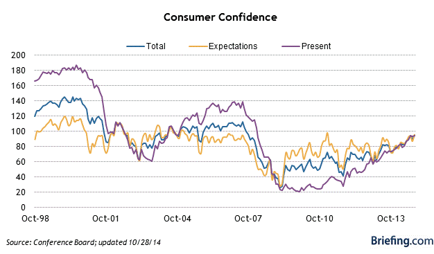
And that's what consumers are telling the pollsters. Here's the Conference Board's consumer confidence measure:
And here's the similar measure by the Univesity of Michigan:

Note that the present conditions index for each, while not all the way back, is close to where it was in the last expansion. And here's a look at Gallup's economic confidence index as well, first over the longer term:

And now for the last year:

Note the improvement here as well.
And remember this graph, when Pew Research recently asked people if they though the economy was recovering:
And remember this graph, when Pew Research recently asked people if they though the economy was recovering:

All of these measures are similar to what we saw above when we looked at the hard economic data.
So, on the whole, consumers don't think the economy is "crummy," either. More like "meh," neither particularly good nor particularly bad.
But here is the most telling and interesting breakout of that confidence, from Bespoke Investment via Cam Hui, comparing confidence among those earning more than the median (red), and $30,000 - $50,000 (blue):

Note the big difference - in fact, the biggest divergence in the history of the series. The choice of colors is appropriate. The more affluent tend to be Republican, the less so, Democrat. Affluent Republican voters - who usually have higher turnout anyway - appear to be reasonably satisfied with the economy, and thus likely to support GOP incumbents. Democratic leaning members of the working class are still as pessimistic as they were 10 and 20 years ago - with no compelling reason to reward Democratic candidates, who haven't been touting any program to deal with the ongoing malaise.
Subscribe to:
Posts (Atom)