This is up over at XE.com
http://community.xe.com/forum/xe-market-analysis/international-week-review-creeping-deflation-and-secular-stagnation-edition
Saturday, April 19, 2014
Weekly Indicators for April 14 - 18 at XE.com
- by New Deal democrat
My Weekly Indicator post is up at XE.com. There was a stark difference in hiring permanent employees vs. hiring temporary employees and firing this past week.


Friday, April 18, 2014
No, the ratio of "employer-to-employer flows" does *NOT* prove the job market isn't improving
- by New Deal democrat
Mike Konczal of the Next New Deal has a post up claiming to show that even the currently employed are struggling to find jobs, and therefore there has been no jobs recovery. Like many Doomish arguments, it suffers from "proving too much." The author finds some metric either flatlining or going down since 2009, therefore conditions are not improving. The author never thinks through the implications of the same data showing the exact same thing for previous economic expansions. That's Konscal's problem here.
Konczal says:
Even those who have been unemployed zero weeks are having trouble finding jobs in this economy. And this is important evidence against the idea that the labor market is doing better than people realize if you just ignore the long-term unemployed.
.... If the economy is heating up significantly and the long-term unemployed aren’t capable of taking jobs, then the EE transition rate should be increasing. So how is it doing?
.... If the economy was heating up and the unemployed or those out of the labor force couldn't take jobs, we would expect this to increaseHere's the graph Konczal uses to support his conclusion:
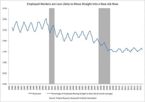
Except here's the problem: the graph just isn't flatlining since 2009 to the present. It also flatlines from 2003 to 2008, and even more tellingly, from 1994 to 1999 - during the biggest economic boom since the 1960s (highlighted below):
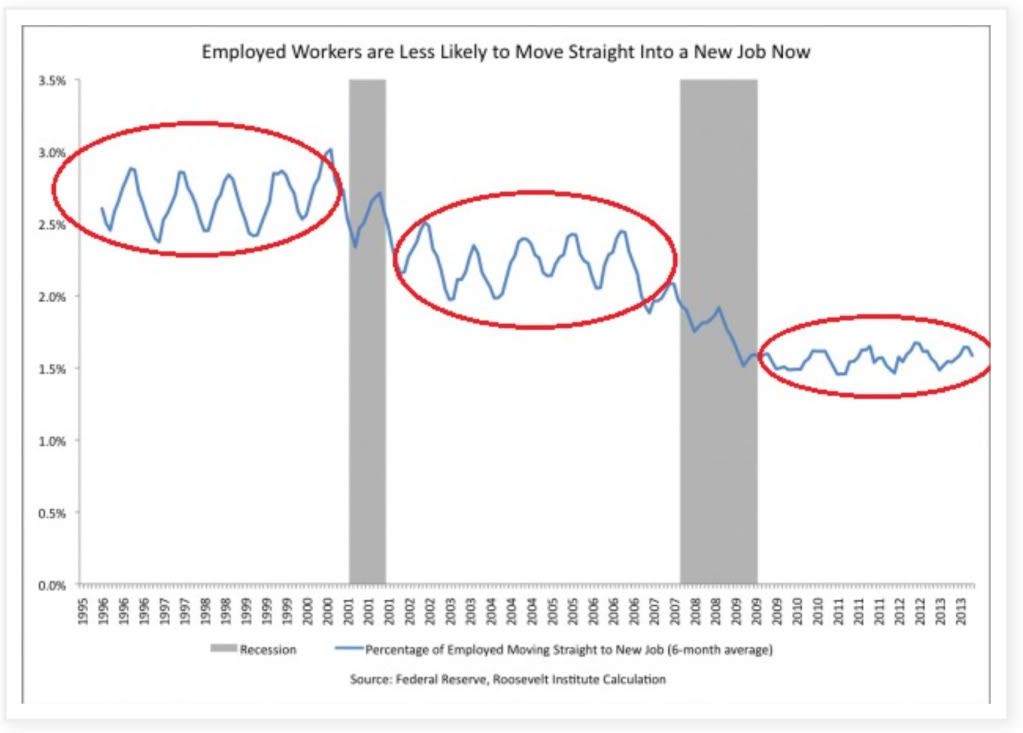
Is Konczal seriously contending that "the labor market wasn't improving" during the biggest boom in the last half century?
The "stair-step down" trend in Konczal's graph reminded me of another, namely, the employment to population ratio. Here is that graph for the same period of time:
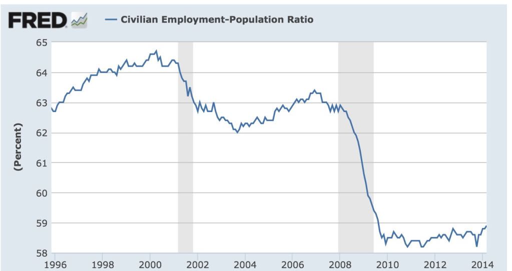
As it turns out, that isn't a coincidence. The Census Bureau also took a detailed look at this data in 2006 (pdf). Here's their graph showing the data up until that point:
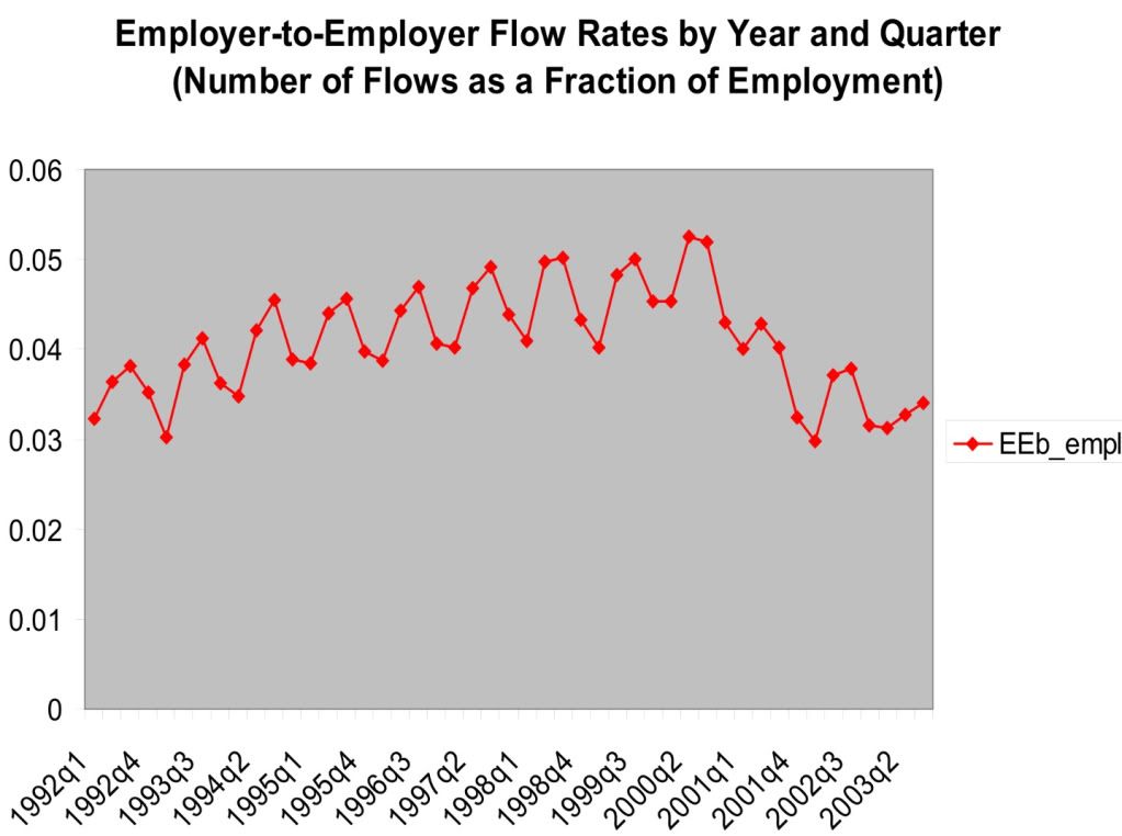
Notice how closely the data tracks the employment to population ratio. Unlike Konczal's graph, the Census Bureau's graph does slightly increase during the mid-1990s. This is likely due to the fact that the two graphs are measuring slightly different things: Konczal's graph measures the "percentage of employed moving straight to a new job" on a 6 month basis, while the Census Bureau's graph measures "number of flows as a fraction of employment" on a quarterly basis.
Konczal's problem is that he entirely fails to take into account the effect of demographics. Here's the Census Bureau's graph showing how employer to employer flows skew by age:
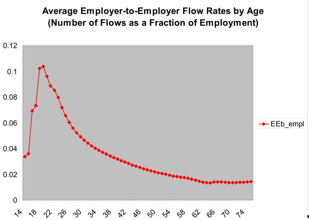
A huge percentage of employer to employer flows comes from people in their 20's. The percentage declines sharply as we move into the 30's and continues to gradually decline thereafter until about age 60.
So what Konczal has failed to account for is the huge distortion in the demographics of the work force caused by young people staying in college longer, and by the Boomer generation skewing the median employment age much higher into the age group that wants nothing more than to hang on to their current job until retirement age.
In other words, Konczal's graph appears to be another manifestation of the employment to population ratio, and not say anything about the relative strength of this job recovery. (My position remains, there has been a jobs recovery, it just hasn't been strong enough.) His data is sound, but his conclusion is faulty because it proves too much.
Thursday, April 17, 2014
A note about the strong rebound in March economic data
- by New Deal democrat
I have a post up at XE.com about the recent run of excellent March economic data.
Thoughts On Inflation In Light of Yellen's Comments Yesterday
This is up over at XE.com
http://community.xe.com/forum/xe-market-analysis/thoughts-us-inflation-light-yellens-comments
http://community.xe.com/forum/xe-market-analysis/thoughts-us-inflation-light-yellens-comments
Coke and Pepsi Now Tied Over the Last 10 Years

When I was a kid, I assumed that coke was the stronger brand. In retrospect, that impression was probably created by the "Pepsi challenge" marketing plan when I was kid (this was the 1970s).
But flash forward to the last 10 years and you wind up with a tie game between the performance of both stocks. Pepsi was the winner during the previous expansion. The two had similar performance in '08, Coke eventually outperformed Pepsi from 11-13, but now the two are more or less tied.
Wednesday, April 16, 2014
Tuesday, April 15, 2014
Real retail sales set new high: real wages decline
- by New Deal democrat
Based on the March reports, I can now update two of my frequent metrics: real retail sales, and real wages.
March inflation was only +0.2%, which still caused a small increase in the YoY measure. This is almost all due to the price of gas, which had already hit its 2013 high in early March, whereas gas is still increasing seasonally this year.
Real retail sales hit a new high in March:
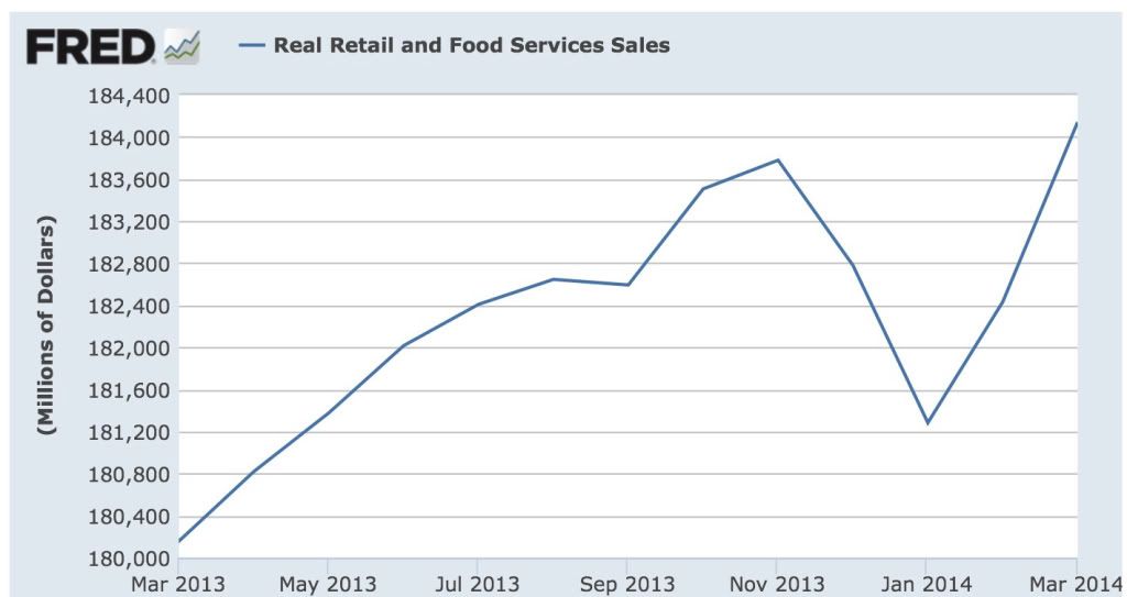
so the expansion is intact.
Since real retail sales per capita tend to hit their peak a year or more before any recession, let's look at that measure as well:
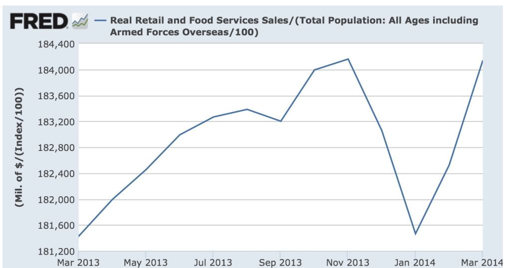
Here we haven't quite made a new high. Note that we had a similar decline in 2012 before sales per capita hit their stride again.
Finally, with the -$.02 decline in average hourly earnings in March, real wages took a significant hit:
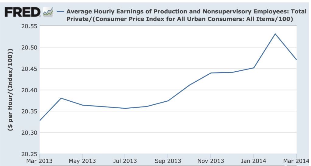
Real wages are still up YoY, and there is no sign that the trend is changing. Still, the average American household could use a raise, particularly since the increase in interest rates last year have brought refinancing to a screeching halt.
Monday, April 14, 2014
Indian Market Rallying on Election Hopes

India is in the middle of national elections. There is strong hope that a technocratic politician will win be nominated prime minister and that his pro-business orientation will help to break the log-jams inherent in Indian politics.
Right now markets have topped out at highs established in early May of last year. However, the uptrend remains firmly intact.
For more on this, see the NY Times coverage which has been very informative.
Sunday, April 13, 2014
International Week in Review: More Problems From China Edition
International Week in Review: More Problems From China Edition:
http://community.xe.com/forum/xe-market-analysis/international-week-review-chinas-problems-continue-edition
http://community.xe.com/forum/xe-market-analysis/international-week-review-chinas-problems-continue-edition
Saturday, April 12, 2014
Weekly Indicators for April 7 - 11 at XE.com
- by New Deal democrat
My Weekly Indicators post is up at XE.com. The run of springtime positive data continues.
Friday, April 11, 2014
Putting stock margin debt in a longer term historical context
- by New Deal democrat
I have a new post up at XE.com discussing the issue of record margin debt in stocks. The CHARTS OF DOOM that you've probably seen only go back to about 1990. What happens when we go back to the 1960s and 1970s, or even the 1920s and compare?
--------
For those of you who are long-term readers and remember us from our Daily Kos days, I wanted to add a note. One thing that makes my blood boil is when a person of modest means and very limited financial knowledge is panicked by a Doomer post, and asks them questions like, "I'm so scared. What should I do with my 401k? Should I cash it out?"
Literally I have messages bookmarked where the Doomers were bearish on stock in June 2009. That's how bad the level of analysis has been. I recall a top ranked diary from someone called "Stranded Wind" who argued that the FDIC was about to go bankrupt in July 2008 and actually wrote
Run, don’t walk, to your bank and get the funds you have clear of this mess before it gets any worse.That diary got 610 comments and 345 recommends. People actually followed his advice. A full three years later he got banned after it was discovered that he apparently had a much darker side.
Well, the diaries in the last couple of weeks have given rise to some similarly panicked comments. Anything is possible, but the panic these people spread has some real world consequences among their less informed readers.
Thursday, April 10, 2014
QQQ's In Short Term Downtrend

The QQQs have broken their nearly year-long uptrend and are currently trading in a downward sloping channel.
Wednesday, April 9, 2014
Japan's Slow Growth Continues
This is over at XE.com
http://community.xe.com/forum/xe-market-analysis/japans-slow-growth-continues
http://community.xe.com/forum/xe-market-analysis/japans-slow-growth-continues
Tuesday, April 8, 2014
"Prices will fluctuate:" why progressives (and everybody else) should care about corporate profits and stock prices
- by New Deal democrat
I was minding my own business yesterday when my attention was called to a diary on the Rec list at Daily Kos. Didn't I disagree?
Well, actually, not really. Although the conclusions hardly call out for breathless Doom-and-Gloom OMG IT"S GONNA CRASH!!!
Which is in stark contrast to the "stocks don't matter" (but only if they are going up) mantra of the Pied Piper of Doom.
But this is a good time to point out why, even if you are a card carrying leftie progressive, you ought to care about the direction of corporate profits and stock prices: because for as long as records have been kept, they have reliably foretold the direction of jobs. If corporate profits and stock prices are going up, there is an extremely high probability that jobs are going to be added to the economy. If corporate profits and stock prices are going down, there is an excellent chance that a lot of people are going to be laid off, soon.
Although the data goes back many decades, here is a close up of the last 10 years of corporate profits (red, right index) and jobs (blue, left index):

And here is a close up of the last 10 years of stock prices (red, right index) and jobs (blue, left index):

The problem progressives (and many others too) have with the economy is that almost all of the gains have gone to producers, and almost none to labor. We could have profits and stock prices going up at a slower rate, and still have increasing jobs as well as increased middle and working class incomes - not to mention spending on improving our infrastructure.
At the moment there is some concern among the financial press that corporate profits in the 1st quarter actually declined. And because I care a lot about jobs, that means I am concerned too.
Before I conclude, a few comments about that diary yesterday. Here's the conclusions the diarist actually made:
Except for the breathless invocation of a "crash," I don't really disagree with this person. Later on he defined "crash" to mean a 20% correction in stock prices at some point in the next 2 1/2 years. Since stocks have corrected by at least 19% in more than half of the last years where there has been a midterm election alone, as shown by this graph:[E}very time the overall price of stocks have gotten this expensive in the past there has been a crash.So is it really a radical suggestion to say that we are overdue for a severe stock market correction/crash?Like stocks, when [houses] get expensive the risks switch to the downside.Does this mean that the economy is about to collapse? That there is nothing ahead but doom-and-gloom? No. But it does mean that there is almost no chance that we will avoid a serious stock market correction before the 2016 election. What's more, housing will soon be topping, if it hasn't topped already. Both of these things will be putting pressure on the banks and the economy in general.

And since stocks have declined by 20%+ on average about once every 4 years going back to 1900, a prediction of a 20% correction at some time before the end of 2016 is really just saying "stock prices will fluctuate normally." Indeed, I've described in several posts how corporate profits tend to lead stock prices, and prices have increased about 20% more than corporate profits in the last 18 months. Unless there is a real surge in corporate profits this year, a 20% correction in stock prices would hardly be unusual. As to the increase in margin debt, that tells us nothing about timing. All it does show - and it is significant - is that the more the leverage, the faster the decline might occur, when it does (because leveraged players in trouble have to unwind positions quickly, and can't hold them).
As to housing, for almost 6 months already, I've been forecasting an outright decline at some point this year, to the tune of -100,000 in permits or starts. Last month starts were -62,000 YoY, and on a seasonally adjusted basis, all housing series have declined from their recent peaks. As this graph of housing permits vs. the Case Shiller house price index shows:

sales peak and trough before prices. If prices overshoot (and in at least some metro areas they almost certainly have), they will correct once sales start to dry up and inventory accumulates, as may already be happening in, e.g., Phoenix (h/t Calculated Risk:

So yes, there is reason to be concerned about housing, and reason to be concerned that stock prices will fall. At some point housing, stock prices, and corporate profits are all going to have peaked, and then layoffs will cause an actual loss of jobs in the economy. But the odds of an actual downturn in the economy with actual sustained job losses this year are virtually nil.
Staples Outperforming Discretionary

Above is a chart showing the ratio of consumer discretionary stocks to consumer staples stocks. Discretionary stocks were outperforming from 04/13 until recently when the relationship broke down. This indicates a change in the risk appetite among traders, at least in the short term.
More Signs Of A Short-Term US Market Top
On the weekly charts below, notice that all the MACDs have given a sell signal and "rolled over," meaning they are moving lower.


Saturday, April 5, 2014
Weekly Indicators for March 31 - April 3 at XE.com
- by New Deal democrat
My Weekly Indicators column is up at XE.com.
The spring rebound is continuing.
Subscribe to:
Posts (Atom)