Tuesday, December 18, 2012

Morning Market Analysis


Yesterday, the long end of the treasury curve sold off on decent volume, moving through the short-term support.  The next logical target is the 200 day EMA.  Notice the volume pick-up over the last four trading sessions -- a clear negative reaction to the Fed's decision which is seen as accepting a higher rate of inflation


The financial sector had a big day, printing a very strong candle on high volume.  Combine that with the rising MACD and CMF, and a break through the 16.2 and 16.4 level looks like a strong possibility. 


The homebuilding sector is still consolidating between the 24.5 and 27 price level.  Remember the old trading adage that the longer the amount of time spend consolidating, the stronger the rally afterward.


The Chinese market appears to be making strong progress to get out of the doldrums.  Over the last few trading sessions, we've seen some incredibly strong bars printed, which has moved the market through the shorter EMAs and towards the 200 day EMA.  In addition, prices are currently right at levels established in early September and mid-October.   


Monday, December 17, 2012

The Good, Bad And Ugly of 2013; Part 1 -- The Good

As we approach year end, thoughts naturally turn to the "year that was" type of thinking.  Unfortunately, as NDD and I have written over the last few weeks, there really isn't much to write about from the US perspective which is anything near glowingly positive.

Let me back up and explain my basic theory of the US economy.  When we first started to emerge from the Great Recession, I wrote a piece titled, the Fits and Starts expansion, where I essentially argued that we'd be in for a period of sub-par growth.  Here is the concluding paragraph to that piece:

I describe the initial phase of the next expansion the "fits and starts" expansion because not one of the four elements outlined above will lead completely or continually. I think it's far more likely we'll see an increase in consumer spending one quarter followed by increased stimulus spending and an increase in exports the next quarter. In other words, various economic sectors will take the lead one quarter and then fall back. In other words, we'll see fits and starts from the above sectors.

I wrote that back in August 2009, and we've seen nothing but stubbornly slow growth since.  Consider these two charts of US GDP:


The top chart shows that in real terms, total US GDP is above pre-recession levels.  That's good because, frankly, not many countries can make that assertion right now.  The bottom chart shows the same data, but in a "percentage change from the same quarter last year" perspective.  Notice that growth has been hovering around 2% for most of the last few years, and only approached 3% in one quarter.  Simply put, that's nothing more than a fair track record at best.  Again, it's better than most (see my posts last week on Japan, the UK and the EU), but that's really not saying much.

So -- why this slow pace of growth?  As I've pointed out a few times before, we're in the middle of a debt deflation recovery, which was first theorized by Irving Fisher.  In the previously linked document, he proffered the following steps to this phenomena:

Then we may deduce the following chain of consequences in nine links: (1) Debt liquidation leads to distress setting and to (2) Contraction of deposit currency, as
bank loans are paid off, and to a slowing down of velocity of circulation.  This contraction of deposits and of their velocity, precipitated by distress selling, causes (3) A fall in the level of prices, in other words, a swelling of the dollar. Assuming, as above stated, that this fall of prices is not interfered with by reflation or otherwise, there must be (4) A still greater fall in the net worths of business, precipitating bankruptcies and (5) A like fall in profits, which in a " capitalistic," that is, a private-profit society, leads the concerns which are running at a loss to make (6) A reduction in output, in trade and in employment of labor. These losses, bankruptcies, and unemployment, lead to (7) Pessimism and loss of confidence, which in turn lead to (8) Hoarding and slowing down still more the velocity of circulation. The above eight changes cause (9) Complicated disturbances in the rates of interest, in particular, a fall in the nominal, or money, rates and a rise in the real, or commodity, rates of interest.


Put in less formal terms, the country as a whole takes out too many loans, so they have to spend a lot of time paying off or liquidating the debts.  This is the end result of the housing bubble and why these types of bubbles create an entirely different post-recession growth dynamic.

Against that framework, let's look forward into 2013 and organize the data between the good, the bad and the ugly.

The Good

There are some good signs which are encouraging for next near.


First, the financial service obligations ratio of US households (which is the broader measure of consumer debt health) has been dropping sharply for the last few years and is now near 30 year lows.  This tells us that households have either been paying off or liquidating debt in sufficient quantities to lower overall household debt. That helps us move away from the debt-deflation dynamic.

We can look at the same data using Flow of Funds data:


 The above data shows total household credit market debt outstanding in Log scale and shows that over the last few years, the rate of increase has actually become a decrease.

In addition to the improving consumer credit market, we also see the housing market rebounding.  Consider the following chart (thanks to Calculated Risk for all the Housing Charts):


The above chart shows the year over year percentage change in the Case Shiller housing price index.  This number has been rising for the entire year and is now in positive territory.  The reason is inventories are now at far healthier levels:


The top chart shows that new home inventory is at its lowest level in nearly 40 years, while the bottom chart shows the existing home inventory level is far closer to levels seen at the beginning of the 2000s.  Lower supply equals higher prices and a far healthier supply/demand scenario.

The decreased number of new homes for sale leads to a discussion of housing starts, which are now emerging from a historically low level:


As the chart above shows, housing charts have risen from their lows and are now moving to far healthier levels.  This is a very encouraging sign according to Leamer.

In addition to housing making a comeback, auto sales are rising:


Auto sales have rebounded from the post-recession lows and are now at levels seen in the mid-1990s.

The reason the housing and auto sales markets provide us with good news is they are durable goods which typically require long-term financing.  Consumers don't engage in these transactions unless they think they'll be able to make the payments for an extended period of time.  Hence, these are indicators that some consumers have enough confidence to go into longer-term debt.


Finally, the above chart shows CPI and PPI, both core and total's year over year percentage change.  Inflation is clearly under control.  And while we have seen PPI spike several times over the last 5 years, producers have absorbed those costs, thereby preventing them from bleeding into broader prices.

Tomorrow, I'll look at the bad and the ugly.

Morning Market Analysis

Let's start the week by looking at some currency charts from the seven major reserve currencies:


Both the yen (top chart) and the dollar (bottom chart) are weakening.  The yen is dropping because traders are assuming that with the new elections coming, the BOJ will be more strongly pressured to engage in an asset purchase program that spurs growth, hence lowering the value of the yen.  The dollar is dropping for several reasons.  First, traders are becoming more comfortable with the risk on trade, thereby moving out of "safe haven" currencies such as the dollar.  The Fed's recent decision indicates that they are becoming more comfortable with a higher rate of inflation.


In contrast to the yen, the Australian dollar has been rising since early October, when it bounced off the 200 day EMA for the third time in the last six months.  Since then it's been rallying, rising above the shorter EMAs and pulling them higher.  Notice the MACD is rising, but only in a "sort-of" way; this is not a strong rally from a momentum perspective.


The above chart compares the Aussie dollar verses the Japanese yen for the last year.  Notice that the yen has only had a gain relative to the Aussie dollar for early 2012; since then, the Aussie dollar has been the better performing currency of the Asian region.


In contrast to the dollar, we see the euro has rallied and is now near a six month high.  After rallying starting at the beginning of August, the euro consolidated gains above the 200 day EMA and traded in a range between 126 and 130.5.  Now prices appear to be looking at a possible upside break-out, which is confirmed by the CMF reading.  However, the MACD is a bit weak.

 
When comparing the dollar (UUP) and euro (FXE) notice the near inverted relationship; the dollar moves up, the euro moves down.  The reverse is also true.


Saturday, December 15, 2012

Weekly Indicators: Initial claims, Gallup consumer spending take the spotlight edition


  - by New Deal democrat

November monthly data reported this past week included improving retail sales, advancing industrial production and capacity utilization (although October was revised downward), and decreases in both producer and consumer prices. In the rear view mirror, October manufacturing and trade sales came in poor.

A reminder that I watch the high frequency weekly indicators because even though they are more noisy, they will signal a turn or continuation in the direction of the economy well before monthly data is reported. In particular, right now November monthly data is still affected by Hurricane Sandy, while its affect the weekly data has almost completely abated.

To begin with, Employment related indicators, especially first time claims for unemployment benefits, were quite positive as the effects of Sandy continue to abate:

The Department of Labor reported that Initial jobless claims fell from 370,000 to 343,000. This is only 1000 higher than the lowest weekly report since the onset of the recession at the end of 2007. The four week average fell by 26,250 to 381,500. As of one week ago, the effects of Hurricane Sandy were still slightly affecting the weekly number. As the elevated post-Sandy numbers wash out, the 4 week average should continue to decline for the next several weeks.

The American Staffing Association Index increased from 91 to 94. This is normal post-Thanksgiving week rebound. The general trend in this index remains similar to last year.

The Daily Treasury Statement showed that for the first 9 days of December, $68.1 B was collected vs. $61.2 B for the first 9 days of December last year. For the last 20 days ending on Thursday, $145.4 B was collected vs. $128.3 B for the comparable period in 2011, an increase of $17.1 B or +13%. Tax collections have continued to increase sharply for over a month.

Same Store Sales and Gallup consumer spending continued very positive, with Gallup also making a new 4 year high:

The ICSC reported that same store sales for the week ending December 7 declined -0.7% w/w but were up +3.2% YoY. Johnson Redbook showed a 2.2% YoY gain. Johnson Redbook has consistently been lower than the other series for consumer spending, usually running under 2% YoY so this is relatively positive. The 14 day average of Gallup daily consumer spending as of December 13 was $82, compared with $74 for this week last year. Earlier this week we had the highest 14 day average since November 2008, at $89.

Bond yields rose and credit spreads continued to retreat from their recent lows:

Weekly BAA commercial bond yields rose +.01% this week at 4.57%. Yields on 10 year treasury bonds however fell -.01% to 1.62%. The credit spread between the two likewise increased by .02% to 2.95%. Spreads have increased in the last few weeks, but remain well off their 52 week highs.

Housing reports continue to be generally positive:

The Mortgage Bankers' Association reported that the seasonally adjusted Purchase Index rose 1% from the prior week, and also increased 9% YoY, close to if not at a 2 year high. The Refinance Index increased 8% for the week, and continues to be close to its recent multi-year highs.

The Federal Reserve Bank's weekly H8 report of real estate loans this week declined -21 w/w to 3523. The YoY comparison also decreased to +1.1% and is 1.4% above its bottom.

YoY weekly median asking house prices from 54 metropolitan areas at Housing Tracker  increased +2.4% from a year ago. YoY asking prices have been positive for over an entire year.

Money supply returned to being fully positive:

M1 rose +0.1% for the week, and also increased +2.0% month over month. Its YoY growth rate rose to +13.8%. Real M1 also rose to +12.0% YoY. M2 increased +0.3% for the week, and was up +0.1% month over month.  Its YoY growth rate rose to 7.4%, so Real M2 rebounded to 5.6%. The growth rate for real money supply has declined significantly in recent months, but is still quite positive.

Rail traffic remained negative YoY, but still due to coal, although the diffusion index increased, and intermodal traffic has also turned negative:

The American Association of Railroads  reported that total rail traffic was down -5700 carloads YoY, or -1.0%.   Non-intermodal rail carloads were again off considerably less than in recent weeks, only -4900 or -1.6%, and as usual entirely due to coal hauling, which was off -13,000. Ex-coal carloads were up 7300. Negative comparisons rose from 6 back to 8.  For the second week in a row, however, intermodal traffic was actually down -800 or -0.3% YoY.

Finally, the price of oil rose slightly while the price of gasoline continued to fall, and gasoline usage also fell:

Gasoline prices fell $.04 last week to $3.35. This is still higher than last year at this time. Oil prices per barrel increased from $85.93 to $86.73. Gasoline usage was down for one week at 8488 M gallons vs. 8666 M a year ago, or -2.1%. The 4 week average at 8542 M vs. 8650 M one year ago, was off -1.2% YoY.

Turning now to the high frequency indicators for the global economy:

The TED spread rose from 0.23 to 0.29, a 3 month high, and in the middle of its 3 year range. The one month LIBOR fell from 0.2120 to 0.2090, near its 3 year low.

The Baltic Dry Index fell sharply from 966 to 784, a 2 month low, but still within the middle of its 1 year range. The Harpex Shipping Index also fell 7 more to yet another new 52 week low of 353. The longer term declining trend in shipping rates for the last 3 years is intact.

Finally, the JoC ECRI industrial commodities index rose from 122.24 to 123.20. It continues to be positive YoY, up 4.85.

Once again the old-fashioned type of economy is producing weak or contractionary data. This includes shipping, rail traffic, and gasoline usage. On the other hand, domestic rail ex-coal is positive and improving. Housing continues its resurgeance from a very low level. Consumer spending is getting even stronger. Weekly employment data is very positive. Gas prices are accomodative for now. One new small negative is that bank lending rates and bond rates and spreads have turned up slightly. Money supply, however, remains quite positive.

In general the leading data remains positive, while the coincident data is mixed. The economy is shambling along, with what still appears to be a lukewarm positive bias.

Have a nice weekend.

Friday, December 14, 2012

Nerds of the Living Dead


- by New Deal democrat

Here is a rare photo of Bonddad and NDD, exemplifying their updated views on the shambling along US economy and zombie-like, living dead world economy:


BWAHAHAHAHAHAHA ! ! !

Weekend Weimar, Beagle and Pit Bull

It's that time of the week again.  I'll be back on Monday; NDD will be here over the weekend.  Until then ....


November Industrial Production, Real Retail Sales, CPI all good


- by New Deal democrat

The economy lurched forward in November, more than making up for the downturn in October.

At this point we have 3 of the 4 coincident indicators most generally presumed to be used by the NBER in dating economic peaks and troughs. We already knew that employment rose. Additionally, it is thought that some weight is placed on aggregate hours worked, and those also rose. Today we found out real retail sales and industrial production, and both of those rose as well.

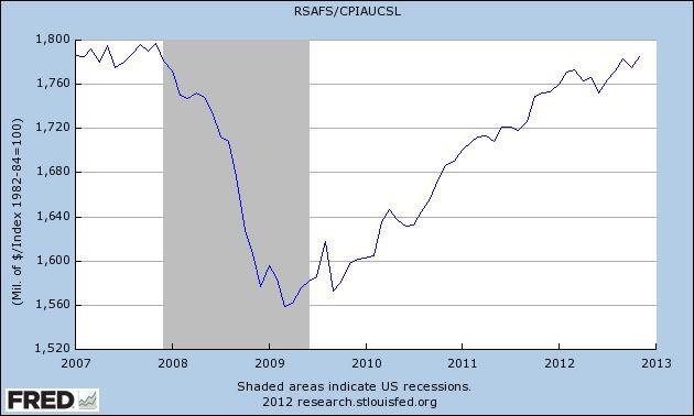
Real retail sales rose to a new post-recession high:


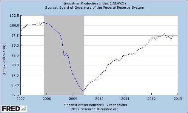
Meanwhile, industrial production also rose, although it is still about 0.5% below its recent peak in July:


ECRI appears to rely upon a different sales metric, inflation-adjusted manufacturing and trade sales. Those were just reported as declining in October, so we have no apples-to-apples November comparison.

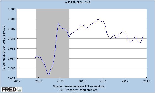
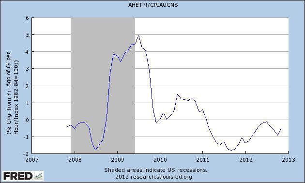
The final coincident indicator, real personal income, hasn't yet been reported for November. With the -0.3% decline in consumer inflation, however, we can see how average hourly earnings adjusted for inflation were doing in November:


Note that these have risen in the last two months, but from the lowest level since the recession. This has everything to do with the Oil choke collar. As gas prices rise, real wages worsen. When they fall, as they have in the last few months, real wages improve. Here's the YoY look at the same data:


Wage-earners are still losing ground, although at a less-bad rate, only -0.5% YoY in November.

Industrial production has been basically flat since March, the same month that employment growth, while still positive, ratcheted down. Real retail sales are improving again, although real manufacturing and trade sales are flat. Depending on the area of emphasis, the US economy is either slightly expanding or slightly contracting -- i.e., still shambling along.

The EU: Continent Wide Zombie Like Economy

I wrote this story last weekend. Since then, Markit and the ECB have released additional information to that provided in this post.  However, nothing released has changed the overall tenor of the economic situation.


The EU is another zombie economy -- an economy that is shrinking in a continent wide slowdown. Let's start by looking at the GDP data:


The chart above is from the latest EU GDP report.  Consider the following data points:

1.) The EU 17 has been contracting for three straight quarters.
2.) The EU 27 has bee contracting for two straight quarters.

In other words, the entire continent can be described as in a recession according to one of the standard definitions of recession (two straight quarters of contraction).

Also note the following.

1.) Three countries have been contracting for two straight quarters: Belgium, Denmark and Finland

2.) Four countries have been contracting for three quarters: Czech Republic, Spain, UK and Hungary

3.) Six countries have been contracting for at least four quarters: Italy, Greece, Cyprus, Portugal, Netherlands and Slovenia.

That means that of 27 countries in the EU 27, a little under half are in a technical recession.


When we look at the contributions from household spending and investment to EU growth, we see that household spending contracted in 6 of the last 8 quarters for the EU17 and 27 and only barely grew for the EU 27 in the 3Q12.  Total investment has contracted for four straight quarters as well.  In short, two key components of GDP have shown no meaningful growth in a year.


The above is from the ECB's latest chart pack and shows that the only GDP element keeping the region out of trouble is net exports.  


Unemployment is moving higher:


Consider the following points from the latest Markit survey of the EU region:

The headline index has now remained below the neutral 50.0 mark for ten consecutive months and, although the latest reading was the highest since
July, it was nonetheless indicative of a solid contraction in overall private sector output. The average reading so far in Q4 is the weakest since the second quarter of 2009.  Downturns continued in both the manufacturing and service sectors in November. However, rates of contraction slowed to seven- and three-month lows respectively. Both sectors were affected by weak demand from domestic and export markets.


Here is the accompanying chart:

For most of the last year, we can see that the PMI has been below 50.  This has corresponded to a very weak reading from industrial production and corresponding industrial production readings:


 The left chart above shows that industrial production growth has been negative or just barely growing for most IP sectors over the last year.  The key element of the chart on the right is that incredibly sharp drop in industrial confidence (the dotted red line), which is now dropping at levels last seen in the great recession.


And the above chart shows that retail sales have been contracting for over a year and a half.  As a result, consumer confidence has been dropping for the same time as has retail confidence.

Like the Japanese and UK economies presented earlier this week, the EU economy is in terrible shape.  It's in a continent wide recession; retail sales as is industrial production.  


Morning Market Analysis


The Brazilian market's weekly chart still shows that the market is near multi-year lows.  Prices are below the 200 day EMA, and the shorter EMAs are below the 200 as well.  Momentum is weak, and the CMF is barely positive.


The Russian market's ETF is still trading in a range between 24 and 32 -- a range that has existed for nearly a year.


The Indian ETF is still trading in a range between the 47.5 area and 62.5.  However, momentum is rising and the CMF shows an influx of money.  They key to this chart will be if prices can continue above the 200 day EMA, which has provided upside resistance the entire year.


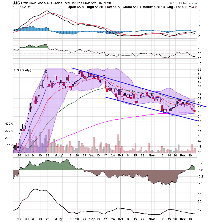
After spiking earlier this year due to massive drought conditions, the grains complex has been heading lower for the summer and fall.  Right now, prices are right at the 50 week EMA.


On the daily chart, notice that prices have been moving lower in a very disciplined manner for the last three and a half months.  Prices are right at the 200 day EMA, with a stabilized MACD.  However, we see a slightly positive CMF.


Thursday, December 13, 2012

The fiscal cliff vs. the entitlement cliff


- by New Deal democrat

The following from Prof. Brad DeLong bears repeating:
With respect to the "fiscal cliff", ... no deal means that the long-run finances of the U.S. government are automatically rebalanced and the tax system becomes more progressive--major wins--at the cost of some risk of a small recession in 2013--a significant loss, but not an overwhelming one given the long-run stakes.
The source for DeLong's "small recession" remark is this study [pdf] by the Congressional Budget Office showing that the tax hikes and automatic spending cuts making up the "fiscal cliff" will cause the U.S. economy to contract at an annual rate of 1.3% for the first half of 2013, and the unemplpoyemtn rate would rise to about 91%. However, economic growth would resume in the second half of the year to 2.3%.

In order to avoid this mild recession lasting 1/2 a year, we are told that Social Security and Medicare must sustaain permanent cuts that won't address the underlying problem of soaring medical costs at all, but will cut real benefits to older Americans who have paid into the system for their entire lives by 20% or even more, forever.

A visual aid may help clarify. The recession that would be caused by going over the fiscal cliff is like this:


The permanent cuts to social insurance programs, into which generations have paid payroll taxes throughout their entire lives,made by a "grand bargain" will be like this:


In other words, we are being told that we have to go over the second cataract in order to avoid going over the first one. The choice is pretty obvious.

For the record, the Northwest Plan by Bruce Webb and Dale Coberly shows that the shortfall in Social Security benefits several decades from now can be entirely cured by an increase of a few tenths of a percent in the payroll withholding tax. Medicare is actually much more efficient than private medical insurance. The problem with Medicare is soaring medical costs, not the aging of the Boomers.

Was the Fed Statement Really That Momentous?

Here's the money quote from yesterday's Fed release:

To support continued progress toward maximum employment and price stability, the Committee expects that a highly accommodative stance of monetary policy will remain appropriate for a considerable time after the asset purchase program ends and the economic recovery strengthens. In particular, the Committee decided to keep the target range for the federal funds rate at 0 to 1/4 percent and currently anticipates that this exceptionally low range for the federal funds rate will be appropriate at least as long as the unemployment rate remains above 6-1/2 percent, inflation between one and two years ahead is projected to be no more than a half percentage point above the Committee’s 2 percent longer-run goal, and longer-term inflation expectations continue to be well anchored.

So, the Fed won't move on rates until unemployment is below 6.5% or the inflation rate is above 2.5%.  Is this really a momentous decision?

It is in the sense that the Fed is issuing hard targets -- they're tying the rate decision to unemployment and they have given themselves a good escape hatch in regards to inflation (which, given their dual mandate, was required).  This does create a certain level of certainty for the markets, which some have argued is vitally important for an economy trying to emerge from a debt-deflation recession. 

However, does anyone out there think the Fed was going to raise rates anytime soon?  The Fed -- and literally every other "first world" central bank (Japan, UK, ECB, etc...) has rates at very low levels to combat sluggish economies, has had rates at those low levels for a number of years and has given us no signs that they intend to raise rates soon.  I don't know anyone in their right mind who has been watching the overall economic performance over the last few years (and especially the last few months) who thinks rates are going up.  And I think you could make a convincing argument that the only people making that argument are people who are trying to come with ideas for columns rather then reasonably analyzing the economic landscape.

Given the underlying data, I think this is more of a situation confirming what the market already thought -- that the ultra-low rate environment is here for a really long time -- rather than being anything revolutionary.  


Initial claims blow away Sandy, maybe recession too


- by New Deal democrat

Earlier this week I calculated what initial jobless claims were likely to have been ex-Sandy. I can now calculate that number for the week ending December 1.

NY and NJ together were 60,888 of a total of 500,931, or 12.6% of the total of non-seasonally adjusted claims, which after seasonal adjustment were revised to 372,000. A year ago NY and NJ constituted 91.2% of all claims in the same week. Backing them out and calculating the total jobless claims number had the remaining 48 states constituted 90.7% (compared with October of this year) or 91.2% (compared with a year ago) of total claims gives us estimates of 360,000 and 358,000 respectively.

That makes the best estimate for what initial jobless claims would have been one week ago had Sandy not occurred, 359,000. The 4 week average would have been 372,000.

While I can't calculate this week's number, assuming the effects of Sandy have dissipated, today's report of 343,000 would lower the 4 week moving average to 362,000, a new post-recession low.

No recession has ever begun within 2 1/2 months of a new low in initial jobless claims. Unless we find out that there was a special "issue" with today's number, this, along with the likely new post-recession high in real retail sales for November also reported this morning, is strong evidence that while the economy is shambling along, it is not actually in recession.

Morning Market Analysis

Considering the Fed's decision yesterday, let's start by looking at the US Treasury Yield Curve


All section so the US treasury curve -- save the long end (bottom chart) -- are trading at or near highs of near 6-month long trading ranges.  This tells us that traders are still concerned about the economy and are keeping the risk on trade going full steam.


The transports are in a very interesting, longer-term technical situation.  For most of this year, they have been trading in a very tight range.  While the markets were rallying earlier this year, this lack of advance was concerning.  However, now that the markets are in a weaker technical position, the fact the transports are holding their own is somewhat comforting, indicating that traders are aren't in the mood to sell the market as sharply as recent action would lead one to think.


And while we're on the topic of trading ranges, gold is also in a near year-long trading range as well.