Tuesday, July 24, 2012
Morning Market Analysis
The Italian (top chart) and Spanish chart (bottom chart) are both in terrible technical shape. Both are at 6 months lows and below their respective 200 day EMAs. Both show decreasing (and negative) momentum and weak prices. Both charts also have prices below all their respective EMAs. In short, the most logical move for both is down.
Interestingly enough, the emerging Europe ETF is in the middle of a decent rally. Prices are in an upward sloping channel and are above all the shorter EMAs. Momentum is increasing -- although its rate of ascent is slowing -- and prices are strengthening.
The top chart (SPY 5 minute) shows that -- despite the sharp sell-off at the open -- prices rallied for the entire day. The bottom chart (the 60 minute SPY) places everything in context; for most of the last month prices have been trading in a tight range between 132.5 and 138.
What's fascinating is that -- despite heightened uncertainty in the world as a whole -- gold remains in a very thigh range.
Monday, July 23, 2012
A Comment on Crops, Crop Prices, Global Warming and Abject Stupidity
One of the odd things about reading economic reports on a daily basis is you wind up reading about sectors your never thought you would read about. For example -- and as some of you may have noticed -- I've wound up becoming interested in agricultural futures (yes, the movie Trading Places and the infamous phrase "crop report" enters my mind on a regular basis). As a result, I've noted that over the last 5 years, we've had several major weather related seasons that horribly impacted crop prices. In 2008, it started with Russia being on fire -- that is, literally the whole country was engulfed in a wildfires, leading to the country banning exports, which in turn drove up crop prices.
This year, the entire US Mid-west -- in what was supposed to be a banner year -- is now in the middle of a horrible drought which is literally killing the latest crop.
All that being said, here's the deal: there is no way to look at these events -- along with the massive amount of record temperatures being reported across the country (not to mention the record polar ice cap melt) -- and not come to the conclusion that global warming is here and we better get ready to understand its impact on the economy.
So, if you don't think global warming is real, let me make this comment: you are
More importantly, your stupidity has voided your first amendment right to speak. Put another way, you're too damn stupid to have a place in sane public discourse. Please go back to the children's table in the kitchen and let the adults discuss this matter as adults.
Here's Bill Nye, doing what he does best: explaining things in a way even an idiot political operative or blogger can understand (OK -- maybe I'm overstating the case)
This year, the entire US Mid-west -- in what was supposed to be a banner year -- is now in the middle of a horrible drought which is literally killing the latest crop.
All that being said, here's the deal: there is no way to look at these events -- along with the massive amount of record temperatures being reported across the country (not to mention the record polar ice cap melt) -- and not come to the conclusion that global warming is here and we better get ready to understand its impact on the economy.
So, if you don't think global warming is real, let me make this comment: you are
- an idiot
- a dolt
- a moron
- an embicile
- dumber than a stump
- dumber than a post
More importantly, your stupidity has voided your first amendment right to speak. Put another way, you're too damn stupid to have a place in sane public discourse. Please go back to the children's table in the kitchen and let the adults discuss this matter as adults.
Here's Bill Nye, doing what he does best: explaining things in a way even an idiot political operative or blogger can understand (OK -- maybe I'm overstating the case)
Will the Grain Complex's Price Spike Lead to Recession?
NDD has written extensively about the oil choke collar. However, does the same hold true for food prices -- and, more specifically, grain prices? This is an important question to ask considering the latest run-up in the grain complex.
So -- let's look at the data. Unfortunately, the FRED system only has a long series of non-seasonally adjusted numbers for the cereals and baked goods component of the CPI. These numbers go back to the late 1930s. The seasonally adjusted numbers go back to the 1990s. So, the numbers we'll use going ahead will be the NSA numbers.
Here's the long series, going back to the mid-1930s. We can break this chart down into two periods; pre and post 1974.
Before 1974 we see several large YOY percentage spikes in prices that didn't lead to a recession. These occurred in the early-1940s and the early 1950s. In addition, there is a somewhat large spike in the late 1960s that was not followed by a recession. There are three spikes -- the first in the late 1940s, the second in the late-1950s and the final at the beginning of the 1970s that were followed by a recession. So, in the pre-1974 era, there is a 50/50 chance a large YOY cereal and bakery price spike would proceed a recession.
However, starting in the early 1970s, we see that large price spikes were far more likely to occur before a recession. On this graph note that in the early/mid 1970s we see a YOY spike of over 30% that presaged a recession. A smaller spike of nearly 10% occurred before the 1980s double-dip recession. A spike of nearly 10% occurred before the early 1990s recession (where we also had an oil price spike). Finally, there was a large YOY run-up before the last recession, that continued into the recession.
Let's look at the more recent data in more detail.
The above chart shows that before the 1974 recession, the YOY grain price spike was nearly 20%, which helped to create the 1974 recession. In addition, notice the nearly 13% YOY price spike that occurred before the 1980 recession.
The above chart shows the remainder of the data. Note the large spike before the second dip of the early 1980s double-dip recession, along with the over 6% spike before the early 1990s recession. Finally, a near 5% spike occurred before the last recession -- a spike which continued to increase into the recession. Also note the nearly 5% run-up that occurred just recently, which occurred as the US economy was slowing down.
Put another way, since 1974, a year over year percentage change of 5% or more in the cereals and bakery component of the CPI has occurred before every recession. That's not a comforting thought when you consider these charts:
So -- let's look at the data. Unfortunately, the FRED system only has a long series of non-seasonally adjusted numbers for the cereals and baked goods component of the CPI. These numbers go back to the late 1930s. The seasonally adjusted numbers go back to the 1990s. So, the numbers we'll use going ahead will be the NSA numbers.
Here's the long series, going back to the mid-1930s. We can break this chart down into two periods; pre and post 1974.
Before 1974 we see several large YOY percentage spikes in prices that didn't lead to a recession. These occurred in the early-1940s and the early 1950s. In addition, there is a somewhat large spike in the late 1960s that was not followed by a recession. There are three spikes -- the first in the late 1940s, the second in the late-1950s and the final at the beginning of the 1970s that were followed by a recession. So, in the pre-1974 era, there is a 50/50 chance a large YOY cereal and bakery price spike would proceed a recession.
However, starting in the early 1970s, we see that large price spikes were far more likely to occur before a recession. On this graph note that in the early/mid 1970s we see a YOY spike of over 30% that presaged a recession. A smaller spike of nearly 10% occurred before the 1980s double-dip recession. A spike of nearly 10% occurred before the early 1990s recession (where we also had an oil price spike). Finally, there was a large YOY run-up before the last recession, that continued into the recession.
Let's look at the more recent data in more detail.
The above chart shows that before the 1974 recession, the YOY grain price spike was nearly 20%, which helped to create the 1974 recession. In addition, notice the nearly 13% YOY price spike that occurred before the 1980 recession.
The above chart shows the remainder of the data. Note the large spike before the second dip of the early 1980s double-dip recession, along with the over 6% spike before the early 1990s recession. Finally, a near 5% spike occurred before the last recession -- a spike which continued to increase into the recession. Also note the nearly 5% run-up that occurred just recently, which occurred as the US economy was slowing down.
Put another way, since 1974, a year over year percentage change of 5% or more in the cereals and bakery component of the CPI has occurred before every recession. That's not a comforting thought when you consider these charts:
The long leading indicators are still positive
-by New Deal democrat
In his 1992 book, Prof. Geoffrey Moore, the founder of ECRI, identified 4 data series that turned more than 1 year before business cycle turning points:
- housing permits
- corporate profits after taxes
- real M2 money supply
- corporate bond yields (inverted)
That all of those turned down in late 2010 or early 2011 is the primary reason, along with the Oil choke collar, that I foresaw weakness in the first half of this year. By the second quarter of last year, however, each was improving again.
With the possible exception of corporate profits, each is still in an uptrend.
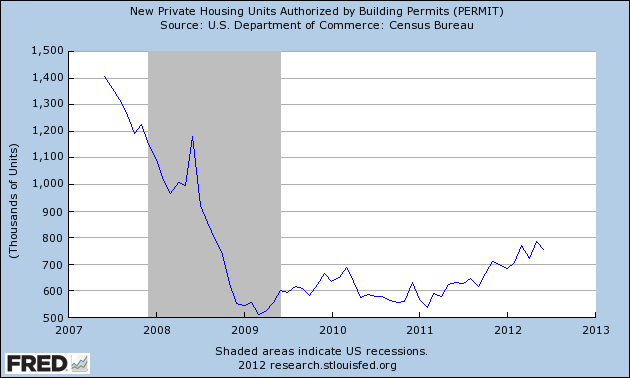
First of all, here's housing permits:

Housing permits last bottomed 18 months ago. They continue to run about +200,000 compared with a year ago.
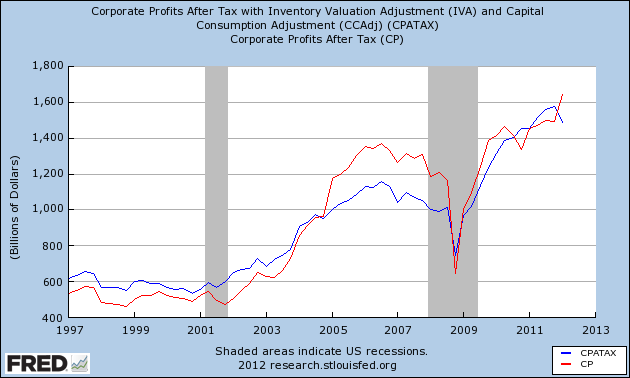
Next, here's corporate profits after taxes (red) and also after inventory adjustments (blue):

While corporate profits after inventory adjustments did decline slightly in the first quarter, corporate profits after taxes continued to improve. Note that these turned at least 18 months before the onset of either of the two last recessions.
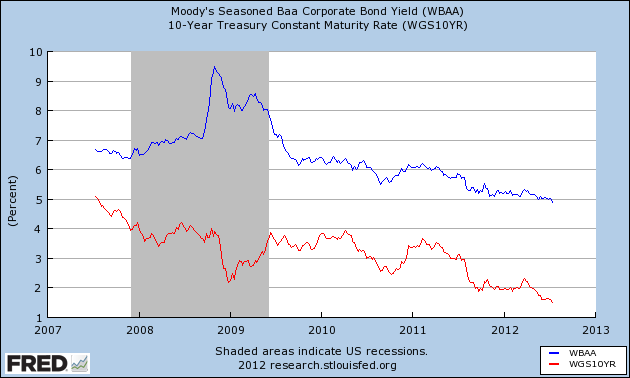
Bond yields continue to decline to new lows, as they have since the beginning of 2011. Since this series is inverted as a long leading indicator, this is positive:

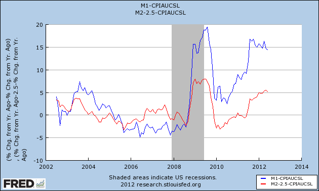
Finally, real money supply, both for M1 and M2, has been positive for over a year:

Although at the moment the economy looks to be teetering on the edge of recession, if we simply follow the series that Prof. Moore studied for half a century as long leading indicators, the situation should improve later in the year.
Morning Market Analysis
The daily charts of the three major ETFs still show a reluctant rally; prices are moving higher, but there is hardly a sense of this being a strong rally. Instead, this is money seeking out some place to go, but not thrilled about where it lands. All are above the 200 day EMA, indicating we're in a bull market. However, the QQQs have a muddled shorter EMA picture, while the same EMAs are losing their intensity on the IWM chart. The IWMs MACD has given a sell signal, and the same indicator on the SPY and QQQ chart is weak as well.
There is further good news, however. The weekly top performing sectors were
- Energy
- Basic Materials.
- Technology
- Utilities
- Industrials
- Consumer Discretionary
- Health Care
- Consumer Staples
- Financials
The weekly chart of the euro shows that prices are in a clear downtrend, and have been in one for nearly a year. Prices are trading below the 200 week EMA; all the shorter EMAs are below the 200 day EMA, and all are heading lower. Momentum and the RSI are weak, the CMF is negative and volatility is rising. In short, the next logical price target is the low established last summer.
The yen is still trading sideways. This currency is caught between two currents. Bulls are looking for a safety bid -- a place to park money to ride out the overall economic storm. However, there is still concern about Japan's overall growth rate, leading to downward pressure. There is also the possibility that the BOJ will engage in further easing, adding downward pressure to the yen.
The Australian dollar is now in an uptrend. Prices are above the 200 day EMA and the shorter EMAs are rising. The MACD shows positive momentum, relative prices are strong and money is flowing into the market. There are several reasons for this. First, Australia has a higher interest rate. Secondly, the economy is, overall, still doing fairly well.
Saturday, July 21, 2012
Weekly Indicators: Consumer spending red flag edition
- by New Deal democrat
Monthly data reported included very poor June real retail sales, off -0.5%. Consumer prices were flat, meaning -0.3% deflation for the 2nd quarter. Housing permits declined, although still at the third highest level in 4+ years. This contributed to a -0.3 decline in the June LEI, the second decline in 3 months. Existing home sales also dropped to a 6 month low. Housing starts, which usually follow permits by about a month, did rise to a 4+ year high, and industrial production also rose 0.4.
A reminder about my weekly look at the high frequency weekly indicators: they are not meant to be predictive at all. Rather, while reporting on monthly or quarterly data is "looking in the rear view mirror," by using data that is reported every week we are glancing out the side windows at what is happening virtually in real time. Although weekly data can be noisy, turns will show up here before they show up in monthly or quarterly data.
And indeed, a significant turn did show in consumer spending. Last year the smoothed Gallup daily consumer spending data showed that, despite concerns of an imminent recession from some last September, consumer spending was holding up. Meanwhile same store sales were almost uniformly running at over +2% YoY. Last winter, I identified this as a metric to watch. Beginning in May, this level was being frequently breached to the downside by at least one of the reporting services. By late June, Gallup spending in particular was basically flat YoY. All of this presaged the poor June retail sales number.
This week, Same Store Sales were decidedly mixed and Gallup was negative.
The ICSC reported that same store sales for the week ending July 14 were flat w/w, and were up +2.6% YoY. Johnson Redbook reported a 1.7% YoY gain. Shoppertrak, which has been very erratic, reported a +3.6% YoY gain. The 14 day average of Gallup daily consumer spending, at $67 was $4 under last year's $71 for this period. This is the fifth week in a row in which consumer spending has weakened significantly, and the worst YoY comparison in two months for the Gallup report. One year ago, sales were building to a good "back to school season" that peaked in early August. Since the beginning of June, however, sales have been in decline. This is now a red flag showing that consumers have turned cautious and that caution has continued into July.
Employment related indicators were also mixed to poor:
The Department of Labor reported that Initial jobless claims rose 36,000 from the prior week's unrevised 350,000, reversing all of its decline and then some from last week. The four week average fell 1000 to 375,500.
The Daily Treasury Statement for the first 13 reporting days of July was $97.5 B vs. $96.9 B a year ago, a very slight +0.6% improvement. For the last 20 days ending July 19, $135.0B was collected vs. $135.8B for the same period in 2011, an outright decline. This decline may be an artifact of the July 4 holiday, since an extra Monday is included in last year's number. Moving the average by one day either way results in a +$4B or +$7B gain.
The American Staffing Association Index fell by 5 to 88. This index has been generally flat for the last three months, mirroring its 2nd quarter flatness last year. The big decline this week is due to the July 4 artifact that happens every year. It should rebound next week.
The energy choke collar is close to re-engaging:
Gasoline prices rose again last week, up .02 to $3.43. Oil prices per barrel rose sharply during the week, and settled Friday up another $5, closing Friday at $91.83. Gasoline usage, at 8628 M gallons vs. 9028 M a year ago, was off -4.4%. The 4 week average at 8848 M vs. 9154 M one year ago is off -3.3%, still a significant YoY decline; however, June and early July of 2011 were the only months after March 2011 where there was a YoY increase in usage, so the YoY comparison now is especially difficult.
Bond prices and credit spreads both decreased:
Weekly BAA commercial bond rates fell .13% to 4.90%. These are the lowest yields in over 45 years. Yields on 10 year treasury bonds fell .09% to 1.52%. The credit spread between the two declined to 3.38%, but is still near its 52 week maximum. The recent collapse in bond yields shows fear of deflation due to economic weakness, as does the recent increase in credit spreads.
Housing reports remained mixed:
The Mortgage Bankers' Association reported that the seasonally adjusted Purchase Index declined a slight -0.1% from the week prior, but remained down approximately 3% YoY, back into the middle part of its two year range. The Refinance Index rose 22%, again at its 3 year high.
The Federal Reserve Bank's weekly H8 report of real estate loans this week rose +0.1%, and the YoY comparison remained at +0.9%. On a seasonally adjusted basis, these bottomed in September and is up +1.2%.
YoY weekly median asking house prices from 54 metropolitan areas at Housing Tracker were up + 2.7% from a year ago. YoY asking prices have been positive for 7 1/2 months, and remain higher than at any point last year.
Money supply was positive and is now being compared with the inflow tsunami of one year ago:
M1 rose +2.7% last week, and was up +1.8% month over month. Its YoY growth rate rose to +16.0%, so Real M1 is up 14.4% YoY. M2 was flat for the week, and was up 0.8% month/month. Its YoY growth rate remained at 8.5%, so Real M2 grew at +6.%. Real money supply indicators after slowing earlier this year, have increased again, but YoY comparisons are starting to wane as expected.
Rail traffic turned solidly positive:
The American Association of Railroads reported a +3.9% increase in total traffic YoY, or +20,300 cars. Non-intermodal rail carloads were up +1.7% YoY or +4600, as coal hauling turned solidly positive for the first time in months, up 3000 carloads YoY. Intermodal traffic was up 15,600 or 6.8% YoY. Negative comparisons, however, continued for 10 of the 20 carload types.
Turning now to high frequency indicators for the global economy:
The TED spread stayed at 0.37. In the last few weeks it has established new 52 week lows. The one month LIBOR declined slightly 0.2468. It has risen significantly above its recent 4 month range, it remains well below its 2010 peak, and has still within its typical background reading of the last 3 years. Even with the recent scandal surrounding LIBOR, it is probably still useful in terms of whether it is rising or falling.
The Baltic Dry Index fell another 73 to 1037. It is still 367 points above its February 52 week low of 670, although well below its October 2011 peak near 2200. The Harpex Shipping Index fell for the seventh from 430 to 423, but is still up 47 from its February low of 375.
Finally, the JoC ECRI industrial commodities index rose from 116.13 to 118.73. This is still near its 52 week low. Its recent 10%+ downturn during the last few months remains a strong sign of all that the globe taken as a whole is slipping back into recession, and its increase in the last two weeks is probably primarily due to the price of Oil.
While as I have said for the last several weeks, weakness has grown widespread, the most positive signs are in the long leading indicators of bond yields, money supply, and housing. Labor indicators remain weak, and it is particularly ominous that the Oil choke collar is close to re-engaging just when consumers appear to be rolling over.
Have a nice weekend!
Friday, July 20, 2012
Weekend Weimar, Beagle and Pitbull
It's that time of the week. NDD will be here tomorrow or Sunday with the weekly indicators. I'll be back on Monday. Until then..
Initial jobless claims and the onset of recessions
- by New Deal democrat
With the recent increase in the number of initial jobless claims filed weekly, and the general weakness we have seen in the data for the last month, I wanted to take a close look at the relationship of initial jobless claims to the onset of recessions -- not in terms of the duration between the upturn of claims and the start of a recession, but rather the amount of the increase.
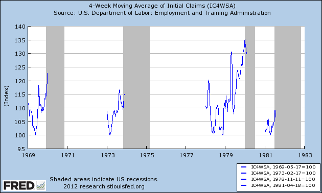
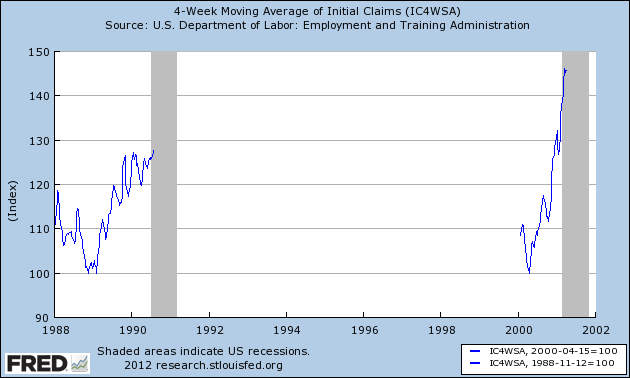
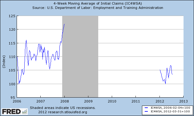
We have data going back 45 years and including 7 recessions. In each of the graphs below, I took the lowest number of initial claims reported during the economic expansion and normed that to 100. I started with January 1st of that year, and continued to the end of the first month of the next recession. The result shows the percentage by which initial claims had increased at the onset of each recession. After the first month of each recession, claims rose sharply and are not included.
Here's the result for the miserable 1970s and the major recession of 1981-82:

Here are the 1990 and 2001 recessions:

And here is the onset of the Great Recession and the entirety of this year so far:

The only case that is comparable is the onset of the major recession of 1981-82, and even there claims were consistently over 5% higher than the previous low at all times. The lowest initial claims number during the interim between the "double dip" at that time was still over 400,000, and on a population adjusted basis, 50% higher than the low of March 31 of this year.
As usual, the caveat of a limited data set applies, and this is only one series, but the limited increase in initial claims in the last 3 1/2 months looks much more consistent with very weak growth than actual contraction.
Morning Market Analysis
Let's start with the entire US grains complex, which shows prices are now at yearly highs. All have moved through key resistance levels and have incredibly bullish alignments in their EMAs. At some point, prices that are going parabolic like this have to come back to earth -- or at least fall to the 10 or 20 day EMA. However, given the weather situation, this will only be a buying opportunity.
The dollar is trading in a sideways pattern, with 23 providing resistance and 22.4 providing support. The decreasing MACD is a sign of consolidation; as prices moved higher, momentum increased, but now as prices consolidated, momentum slows. The 50 and 200 day EMAs show us that the overall trend is still higher (both are rising), but the CMF indicates traders are leaving the market -- which, given the overall price level, is probably a sign of some profit taking from the May rally.
The weekly chart of the junk bond ETF shows that people are still reaching for yield. The EMA picture is still rising and the MACD has given a sell signal. The only negative on the chart is the CMF, but that is close to moving into positive territory.
Thursday, July 19, 2012
Ben's Testimony, the Beige Book and Consumer Spending
Over the last few days, Bernanke has spoken to Congress and the Fed has released the Beige Book. In addition, we've seen a lot of soft numbers come from the US over the last few months. As such, let's start looking at a macro view of the US economy. Consider this a "you are here" type of overview.
From the testimony:
The top chart shows that on an inflation-adjusted basis, the US economy is now larger than before the recession. This shows that, despite complaints about the recovery (which are warranted and justified) the economy is in fact growing. The second chart shows the year over year percentage change in growth. For the last four quarters, this number has been at or below 2%, which is very weak.
Overall, real PCEs are clearly higher than their pre-recession levels. In general, this data set has moved continually higher, with a few periods of leveling off -- noticeably in early 2011 and over the last 4 months.
Services comprise about 65% of PCEs. First, the overall trend is clearly higher, with current levels being higher than their pre-recession levels. However, the second half of last year we see a leveling off of purchases, which lasted for about 5-7 months depending on how you classify it. But purchases have moved higher since.
Non-durable goods comprise about 23% of PCEs. Here we see there was a complete stall of purchases for an entire year in 2011. But they are still higher than their pre-recession levels.
The durable goods data is more volatile, which is to be expected. Overall, durable purchases are higher now than at their pre-recession peak. However, over the last five months -- with the exception of three months ago -- this data has stalled. This is concerning, as it indicates that consumers are holding back on spending for big items, which tells us consumers are getting cautious about the future.
Real retail sales are not doing well. First, as the chart shows, there has been a general leveling off for the last 5-7 months, depending on how you classify the phase "leveling off." In addition, consider these two charts from Tim Duy:
The top chart shows the YOY percentage change in retail sales without gas and auto sales. The chart shows a sharp drop outside of these two, key purchases. The bottom chart is more of a rolling average, and it shows that sales are dropping sharping on a short term basis. Again, this has very negative implications for the economy.
Above we have light vehicle and truck sales. While this data set has been over 14 million/annually for 5 of the last 6 months, the pace of the overall trend has clearly leveled off. But this is a hard set to read. It could be that consumers are simply buying fewer cars total now considering the overall economy, meaning this figure won't hit pre-recession levels. Or, it could me increased caution on the part of consumers.
Now, let's take a look at income.
The top chart shows real DPI, while the bottom chart shows real DPI less transfer payments. There is actually good news in these charts. First, real DPI has increased over the last three months after a long period of leveling off. In addition, real DPI less transfer payments is showing a similar increase.
The retail sales figures are especially troubling, as they show a depressed sector with diminishing consumer activity. And the numbers presented by Tim Duy are downright scary. However, overall PCEs -- which are a larger data set -- are fair. The overall rate shows an increase, largely because of service and non-durable purchases. My guess is that people are purchasing services they can't do themselves and are finally replacing non-durable goods that have worn out over the last few years. The durable goods numbers -- along with the car sales numbers -- also add to the concern, as they show the consumer is starting to clip his wings regarding big purchases.
From the testimony:
The U.S. economy has continued to recover, but economic activity appears to have decelerated somewhat during the first half of this year. After rising at an annual rate of 2-1/2 percent in the second half of 2011, real gross domestic product (GDP) increased at a 2 percent pace in the first quarter of 2012, and available indicators point to a still-smaller gain in the second quarter
The top chart shows that on an inflation-adjusted basis, the US economy is now larger than before the recession. This shows that, despite complaints about the recovery (which are warranted and justified) the economy is in fact growing. The second chart shows the year over year percentage change in growth. For the last four quarters, this number has been at or below 2%, which is very weak.
Household spending has continued to advance, but recent data indicate a somewhat slower rate of growth in the second quarter. Although declines in energy prices are now providing some support to consumers' purchasing power, households remain concerned about their employment and income prospects and their overall level of confidence remains relatively low.From the Beige Book
Most Districts reported modest increases in retail spending on a year-over-year basis, but many reported slower growth in recent months compared with earlier in the year; however, Boston and Cleveland reported sales as flat, and New York cited softer sales. There were a few reports that high summer temperatures negatively affected sales. Sales of big-ticket household goods were strong in the Richmond, Chicago, Kansas City, and Dallas Districts, while sales were reportedly flat for home furnishings and major appliances in the San Francisco District. Boston reported that sales for furniture and electronics had slowed, and retailers in the New York District reported that home goods sales were weak. Reports from luxury-goods retailers were mixed. Firms in the Philadelphia, Atlanta, and Chicago Districts reported that sales of high-end goods remained strong, while retailers in the Kansas City and San Francisco Districts indicated demand had softened, and those in the Cleveland District noted that sales of luxury goods had slowed. Most Districts reported that vehicle sales remained robust. Demand was high for fuel-efficient vehicles in particular. Looking forward, merchants in the Boston and Philadelphia Districts were concerned that economic uncertainty could result in restrained sales growth, while retailers in the Cleveland District anticipated that the third quarter will be higher compared with year-ago levels. Kansas City noted that merchants there expected further strengthening in the coming months.
Overall, real PCEs are clearly higher than their pre-recession levels. In general, this data set has moved continually higher, with a few periods of leveling off -- noticeably in early 2011 and over the last 4 months.
Services comprise about 65% of PCEs. First, the overall trend is clearly higher, with current levels being higher than their pre-recession levels. However, the second half of last year we see a leveling off of purchases, which lasted for about 5-7 months depending on how you classify it. But purchases have moved higher since.
Non-durable goods comprise about 23% of PCEs. Here we see there was a complete stall of purchases for an entire year in 2011. But they are still higher than their pre-recession levels.
The durable goods data is more volatile, which is to be expected. Overall, durable purchases are higher now than at their pre-recession peak. However, over the last five months -- with the exception of three months ago -- this data has stalled. This is concerning, as it indicates that consumers are holding back on spending for big items, which tells us consumers are getting cautious about the future.
Real retail sales are not doing well. First, as the chart shows, there has been a general leveling off for the last 5-7 months, depending on how you classify the phase "leveling off." In addition, consider these two charts from Tim Duy:
The top chart shows the YOY percentage change in retail sales without gas and auto sales. The chart shows a sharp drop outside of these two, key purchases. The bottom chart is more of a rolling average, and it shows that sales are dropping sharping on a short term basis. Again, this has very negative implications for the economy.
Above we have light vehicle and truck sales. While this data set has been over 14 million/annually for 5 of the last 6 months, the pace of the overall trend has clearly leveled off. But this is a hard set to read. It could be that consumers are simply buying fewer cars total now considering the overall economy, meaning this figure won't hit pre-recession levels. Or, it could me increased caution on the part of consumers.
Now, let's take a look at income.
The top chart shows real DPI, while the bottom chart shows real DPI less transfer payments. There is actually good news in these charts. First, real DPI has increased over the last three months after a long period of leveling off. In addition, real DPI less transfer payments is showing a similar increase.
The retail sales figures are especially troubling, as they show a depressed sector with diminishing consumer activity. And the numbers presented by Tim Duy are downright scary. However, overall PCEs -- which are a larger data set -- are fair. The overall rate shows an increase, largely because of service and non-durable purchases. My guess is that people are purchasing services they can't do themselves and are finally replacing non-durable goods that have worn out over the last few years. The durable goods numbers -- along with the car sales numbers -- also add to the concern, as they show the consumer is starting to clip his wings regarding big purchases.
Miserly growth hangs on despite poor real retail sales, deflation
- by New Deal democrat
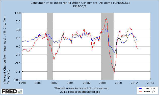
As I've noted several times recently, one sign of economic strength or weakness is shown by comparing YoY consumer prices (blue in the graph below) vs. commodity prices (red, amplitude divided by 2 better to show the comparison). Usually before a recession there will be a rise in inflation, with the more upstream producer and commodity prices spiking higher than consumer prices. As the economy weakens into and through a recession, the more upstream prices fall more than consumer inflation, and their bottom marks the end of the recession. Here's an updated graph from 1998 to the present, showing that pattern for both the 2001 and 2008-09 recessions, as well as the weakness in 2006 (in which one quarter of GDP was just barely positive, and we had one month of job losses plus two of tiny gains):
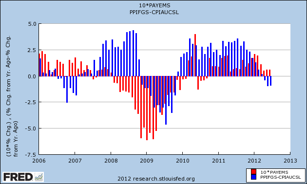
Another way to give you a better look is to subtract YoY consumer prices from producer prices (blue in the graph below). A negative result shows weakness, a positive result shows strength. Then we compare with monthly job gains or losses (red). Here is an updated graph the period of 2006 to the present:

In 2006 YoY price weakness did not result in actual job losses, except for one small loss in one month. At this point in the cycle in both 2001 and 2008 there were job losses. This year, as in 2006, job gains have remained positive even in the face of YoY price weakness.
I suspect we will have at least two more months of declines in YoY inflation, as the July and August 2011 CPI numbers of +.3% and +.3% are replaced, and hence further economic weakness. After that the 2011 monthly readings were essentially 0, so unless something truly awful happens, I expect the relative weakness to end.
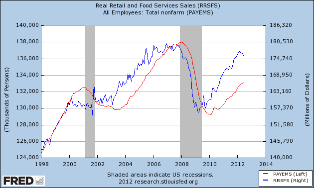
We got another slap in the face earlier this week as real retail sales for June fell -0.5%, meaning almost a 1% decline since March. As I wrote back in 2009 when the recession was bottoming out, real retail sales are the "holy grail" precursor of job growth or losses, consistently changing direction a number of months in advance. Then it was an optimistic sign. Not now. Here's real retail sales (blue, right scale) v. payrolls (red), left scale) since 1998:
That real retail sales have turned south is definitely a bad sign. On the other hand, note that we had deeper declines in both late 2005 and 2006 without job losses (except for one month, mentioned above).
In other words, while growth is lousy, we aren't necessarily tipping into contraction.
Morning Market Analysis
The US markets are all rebounding and are all back within an upward sloping channel. All are also above their respective 200 day EMAs. However, the momentum readings for all -- while positive -- are weak. In contrast, we see that volume is again flowing into the markets in the form of a rising CMF. But don't read too much into the rally. The Treasury market is still absorbing a ton of capital, keeping equity money on the side -- at least for now.
The Chinese market is still moving sideways, consolidating losses and building a possible base from which to rally. The shorter EMAs are moving sideways, but the longer ones (50 and 200 day) are both moving lower. Money is moving into the market, although this is probably traders "nibbling" for the sake of a longer term position.
The Indian market continues to grind higher, as prices are still in a gentle, upward sloping channel. They hit resistance just above the lowest Fib level, but this is to be expected. The EMAs are trying to attain a more bullish stance, but aren't there yet. Like the US rally, this looks like a "grinder higher" rally, rather than a "euphoric buying" rally, meaning that unless there is a fundamental change in the underlying economy, I wouldn't expect this rally to move strongly higher.
Subscribe to:
Posts (Atom)