- European yields drop at auction (WSJ)
- China's GDP slows to 8.9% (WSJ)
- EU inflation slows (WSJ)
- Dr. Copper gets a new specialty (WSJ)
- Grain prices slump after USDA report (Agrimoney.com)
- Credit Suisse downgrades crop price forecast (Agrimoney.com)
- Andrew Sullivan on the right and left's misunderstanding of Obama (The Daily Beast)
- China steps up foreign market participation (FT)
- The stronger dollar is starting to negatively impact US corporate profits (FT)
- Saudi looks to keep oil at $100/bbl (FT)
Tuesday, January 17, 2012
Bonddad Linkfest


1952: Investment

In 1952, we see some pretty wild vacillations in overall gross investment and its contributions to overall GDP. The first quarter -- which saw GDP increase 4.1% -- saw investment contribute about 36% of overall growth. The second quarter's figure was incredibly negative which was caused exclusively by a huge contraction in inventory investment. This was reversed in the third quarter with a move to restock inventories.
Here is how the 1953 Economic Report to the President explained it:
Beginning in the third quarter of 1951, the rate of business inventoiy accumulation declined, as businessmen attempted to bring over-plentiful stocks into line with sales volume. By mid-1952, sellers of such diverse commodities as textiles, apparel, autos, and home appliances appeared to have completed the process of paring down the excess inventories which they had accumulated in the preceding months. Indeed, in some areas retail inventories had probably dipped below the levels required by sales, while business purchasing agents were pursuing a policy of handto- mouth ordering.The following chart shows the situation graphically:
During the third quarter, a change became evident as nonfarm inventories were accumulated at an annual rate of 3 billion dollars. Since there was some decline in inventories of steel during this quarter, the rate of accumulation of nonsteel items exceeded 3 billion dollars. Most nondurable goods industries and the nonsteel-using segments of durable goods industries shared in this rise. However, business sales to ultimate consumers did not rise in line with inventories; production and shipment of producers' durables and automobiles fell, largely as a result of the steel strike. But as the final quarter of the year got under way, metal-using firms had already completed in most cases a remarkable recovery. Production and sales of automobiles, appliances, apparel, and almost all types of commodities expanded considerably. At the same time, inventories continued the more rapid climb begun earlier, while government purchases of goods and services rose moderately.

The distortions caused by the inventory situation hide the fact that there was a strong investment environment among manufacturing companies. This was caused primarily by an accelerated depreciation credit that was passed to encourage investment in defense related industries. Here's a chart that shows the investment situation:

Behind the Jobless Recovery
Great piece today in the WSJ on how low interest rates and economic uncertainty are creating an environment that encourages investment over hiring.
This plays into a few themes we've noted here on the Bonddad Blog.
1.) The decrease in manufacturing employment -- which has cratered over the last 10 years -- is partly caused by an increase in automation. Consider the following two charts:


The top chart shows durable goods manufacturing jobs and the bottom shows non-durable goods jobs. Both have been cratering. Yet, we're still seeing increasing in manufacturing industrial production:

Put another way, the US economy is simply making more with less.
Secondly, there is tremendous investment occurring. As the article points out, inflation adjusted investment in plant and equipment has increased 31% during this expansion.
I highly recommend the rest of the article.
In no other U.S. recovery since World War II have companies been simultaneously faster to boost spending on machines and software, while slower to add people to run them.
Part of this is the old story of substituting capital for labor. But a combination of temporary tax breaks that allowed companies in 2011 to write off 100% of investments in the first year and historically low short- and long-term interest rates have pushed that process into overdrive.
.....
Instead of hiring, companies such as Sunny Delight and chain-saw maker Stihl Holding AG are investing in technology or other ways to make existing operations faster and more productive. History suggests that investment that increases productivity eventually will create jobs and raise living standards. The mechanization of the farm and the automation of the factory both raised fears of permanent unemployment that were unrealized, as efficiencies in production of basic commodities created jobs in all sorts of services.
.....
And that is happening more in this recovery than in the recent past. Spending on gear and hiring usually are more synchronized. Since the economy began growing again in 2009, spending on equipment and software has surged 31%, adjusted for inflation. In the postwar period, only in the wake of the 1982 and 1970 recessions has such spending grown faster. Private-sector jobs have grown just 1.4% over the same span. Only recoveries following the 1980 and 2001 recessions saw slower job growth.
Erik Brynjolfsson, a Massachusetts Institute of Technology economist, says companies began stepping up labor-saving investments in the first half of the last decade. The turning point, he says, came during the recession, when companies realized they could do far more than they expected with fewer people.
Even as demand has drifted back, companies are keeping that ball rolling by spending more money on machinery that automate functions. "It's as if the economy had a pent-up potential for labor savings that hadn't been harvested until the recession," says Mr. Brynjolfsson, author of a new book on automation.
.....
The U.S. today is second only to Japan in the use of industrial robots. Orders for new robots were up 41% through September from a year earlier, according to the Robotics Industries Association trade group. That has helped fuel a larger boom in productivity. Output per hour worked in nonfarm businesses has increased 6% during the recovery. Hours worked are up only 1.5%.
This plays into a few themes we've noted here on the Bonddad Blog.
1.) The decrease in manufacturing employment -- which has cratered over the last 10 years -- is partly caused by an increase in automation. Consider the following two charts:


The top chart shows durable goods manufacturing jobs and the bottom shows non-durable goods jobs. Both have been cratering. Yet, we're still seeing increasing in manufacturing industrial production:

Put another way, the US economy is simply making more with less.
Secondly, there is tremendous investment occurring. As the article points out, inflation adjusted investment in plant and equipment has increased 31% during this expansion.
I highly recommend the rest of the article.
Morning Market
Let's start with what my qualifications for "liking" the current market rally.
1.) An uptick in copper
2.) A continuing rally in the dollar
3.) A sell-off in the treasury market
What I'm looking for in all three of these markets in confirmation that, not only is the stock market rallying, but other markets are either confirming the strengthening of the US economy or traders are starting to sell-off their safety assets.

On the daily chart, we see that the dollar is technically in an uptrend. But prices are just barely above previously established highs and the A/D and CMF are both printing bearishly right now, while the MACD is moving sideways.

The weekly chart shows the dollar in a positive uptrend.
I'd give this chart a weak bullish rating. While the price chart is still bullish, the underlying tecnhicals are weak.

Coppers daily chart printed strong break-out last week. Plus, the 10 and 20 day EMAs are moving higher with the 10 day EMA moving through the 20. Additionally, the MACD is also moving higher as well.

The weekly chart shows a strong break-out on very strong volume. The MACD and volume indicators all confirm the move. This is a bullish chart.


However, last week the treasury market rose, largely in reaction to the EU situation.
Given my above criteria, the dollar, copper and treasury market situation now put me in the bullish camp. However, from a fundamental perspective I still have concerns largely based on the EU situation and the possible long-term fall out. But if the equity markets are a leading indicator (and they are a component of the Conference Boards LEI index), then the data tells us the latest moves are in advance of anticipated economic action in the US. That being said, let's take a look at the equity ETFs.

The IWMs have been inching higher for the last few weeks. Right now, they are just below long-term resistance established in late October. The MACD is slightly positive and has given a buy signal, while the volume indicators are both bullish. The shorter EMAs are also moving higher. I'd place a buy at about 77.50 on the above chart.

The QQQs are a bit more difficult to gauge. Frankly, I'd wait to make a move here until we see prices over the highs established at the end of October; there is simply too much overhead resistance.

The SPYs have been moving up in stages; they gap higher and then trade sideways for a few days to consolidate gains. I'd move in at current levels.
All of the above positions would be small; I'm still not thrilled by the market not the underlying fundamentals. But the ancillary markets are now confirming the upside move so it's time to at least make a few preliminary trades.
1.) An uptick in copper
2.) A continuing rally in the dollar
3.) A sell-off in the treasury market
What I'm looking for in all three of these markets in confirmation that, not only is the stock market rallying, but other markets are either confirming the strengthening of the US economy or traders are starting to sell-off their safety assets.

On the daily chart, we see that the dollar is technically in an uptrend. But prices are just barely above previously established highs and the A/D and CMF are both printing bearishly right now, while the MACD is moving sideways.

The weekly chart shows the dollar in a positive uptrend.
I'd give this chart a weak bullish rating. While the price chart is still bullish, the underlying tecnhicals are weak.

Coppers daily chart printed strong break-out last week. Plus, the 10 and 20 day EMAs are moving higher with the 10 day EMA moving through the 20. Additionally, the MACD is also moving higher as well.

The weekly chart shows a strong break-out on very strong volume. The MACD and volume indicators all confirm the move. This is a bullish chart.


However, last week the treasury market rose, largely in reaction to the EU situation.
Given my above criteria, the dollar, copper and treasury market situation now put me in the bullish camp. However, from a fundamental perspective I still have concerns largely based on the EU situation and the possible long-term fall out. But if the equity markets are a leading indicator (and they are a component of the Conference Boards LEI index), then the data tells us the latest moves are in advance of anticipated economic action in the US. That being said, let's take a look at the equity ETFs.

The IWMs have been inching higher for the last few weeks. Right now, they are just below long-term resistance established in late October. The MACD is slightly positive and has given a buy signal, while the volume indicators are both bullish. The shorter EMAs are also moving higher. I'd place a buy at about 77.50 on the above chart.

The QQQs are a bit more difficult to gauge. Frankly, I'd wait to make a move here until we see prices over the highs established at the end of October; there is simply too much overhead resistance.

The SPYs have been moving up in stages; they gap higher and then trade sideways for a few days to consolidate gains. I'd move in at current levels.
All of the above positions would be small; I'm still not thrilled by the market not the underlying fundamentals. But the ancillary markets are now confirming the upside move so it's time to at least make a few preliminary trades.
Monday, January 16, 2012
The ECRI Weekly Leading Index, unmasked
- by New Deal democrat
This is a continuation of my series reverse engineeering ECRI's Weekly Leading Index (WLI). I began by noting that ECRI's founder, Prof. Geoffrey Moore, in 1990 initially proposed a Weekly Leading Index made up of indicators whose values could be computed weekly, or if monthly were reported at the beginning of the next month. While this index would be a little less reliable than the Long Leading and Short Leading Indeces, it would have the advantage of being more timely.
Its weekly components were:
Real M2
Dow Jones Bond Average
S&P 500 stock price index
Initial claims for unemployment insurance
Journal of Commerce change in commodity prices
Dun and Bradstreet new business formation and large business failure
Real estate loans, deflated, growth rate
The quickly reported monthly components were:
Average workweek in manufacturing
Layoff rate under 5 weeks
ISM manufacturing vendor performance
ISM manufacturing inventory change
The questions remained, were the monthly components included in the final result? Were the weekly components weighted? Were there any changes in the list? As to the last, I have noted that it is almost impossible to generate a decline such as ECRI claims for the WLI in 2011 if Real M2, which experienced a tsunami-like increase in late summer, were still included. I have suggested that the credit spread between government and corporate bonds might have replaced Real M2 in the list at some point.
It appears that ECRI spokesman Lakshman Achuthan himself has all but settled the issue. Appearing as a guest author at Barry Ritholtz' "The Big Picture" blog in 2009, he wrote:
The link takes you to the book "Beating the Business Cycle," authored by Achuthan in 2004. There, at pp. 108-09 he says
So that is pretty clear. There are seven indicators (confirming that the early monthly reports are not part of the index), and specifying that initial jobless claims and the JoC-ECRI industrial commodity index are two of the components.
Finally, a little google searching reveals that several issues of Business Week including the "Business Week Leading Index" are archived online. Here is a screenshot of one of them, edited only to delete a line describing another unrelated index. Note that it includes precisely seven indicators:

Another example can be found here.
So that just about settles it. The referenced "real estate loans" are sourced to the Federal Reserve Bank and weekly updates can be found here.
It appears that the index is weighted. Also, I continue to question whether Real M2 survived the transition, just as it appears that AAA bonds were substituted for the similar Dow Jones Bond Average. With those caveats, the components of the WLI are unmasked.
This is a continuation of my series reverse engineeering ECRI's Weekly Leading Index (WLI). I began by noting that ECRI's founder, Prof. Geoffrey Moore, in 1990 initially proposed a Weekly Leading Index made up of indicators whose values could be computed weekly, or if monthly were reported at the beginning of the next month. While this index would be a little less reliable than the Long Leading and Short Leading Indeces, it would have the advantage of being more timely.
Its weekly components were:
Real M2
Dow Jones Bond Average
S&P 500 stock price index
Initial claims for unemployment insurance
Journal of Commerce change in commodity prices
Dun and Bradstreet new business formation and large business failure
Real estate loans, deflated, growth rate
The quickly reported monthly components were:
Average workweek in manufacturing
Layoff rate under 5 weeks
ISM manufacturing vendor performance
ISM manufacturing inventory change
The questions remained, were the monthly components included in the final result? Were the weekly components weighted? Were there any changes in the list? As to the last, I have noted that it is almost impossible to generate a decline such as ECRI claims for the WLI in 2011 if Real M2, which experienced a tsunami-like increase in late summer, were still included. I have suggested that the credit spread between government and corporate bonds might have replaced Real M2 in the list at some point.
It appears that ECRI spokesman Lakshman Achuthan himself has all but settled the issue. Appearing as a guest author at Barry Ritholtz' "The Big Picture" blog in 2009, he wrote:
Our leading indexes are composites of key drivers of the business cycle. Correlations are not part of our process which focuses on the relationship of indicators around inflection points in growth and inflation. .... ECRI does not suggest that the LLI is a perfect leading indicator, but it does not include stock prices and has a longer lead than stock prices over growth rate cycle turns.(my emphasis) (UPDATE: To avoid confusion, please note that the reference to stocks not being included, is to ECRI's "long leading index," a completely separate index).
You can read more about the Weekly Leading Index (formerly known as the Business Week leading index) here: http://books.google.com/books?id=vSz99DDF-q8C&pg=PA107&dq=beating+the+business+cycle+weekly+leading+index&client=firefox-a
The link takes you to the book "Beating the Business Cycle," authored by Achuthan in 2004. There, at pp. 108-09 he says
"To monitor developments on a more frequent basis, Moore helped develop a Weekly Leading Index (WLI) in 1983. Some of the components of the WLI, like initial jobless claims, had long been available on a weekly basis. Others had to be created from scratch, like the Journal of Commerce-ECRI industrial materials price index, designed to measure inflation in a broad range of industrial raw materials. Starting in 1983, the weekly index was published in Business Week magazine. Known at the time as the Business Week Leading Index, ... In the late 1990s, ECRI began to publish the index through our own website, businesscycle.com.Then, at pp. 135-36 he elaborates:
"We .. determin[e] good proxy measures for the various drivers [of the economy] -- that is, individual leading indicators -- and combin[e] them into composite indeces which objectively summarize their information. For example, in constructing the Weekly Leading Index (WLI) , we use a specific leading indicator -- initial claims for unemployment insurance -- to represent employment, which is a key driver of the business cycle. Likewise, we pick out six other specific leading indicators that are updated weekly, to represent other cyclical forces. Because the seven indicators are rarely unanimous, we summarize them into the composite WLI ...."
(my emphasis)
Finally, a little google searching reveals that several issues of Business Week including the "Business Week Leading Index" are archived online. Here is a screenshot of one of them, edited only to delete a line describing another unrelated index. Note that it includes precisely seven indicators:
Another example can be found here.
So that just about settles it. The referenced "real estate loans" are sourced to the Federal Reserve Bank and weekly updates can be found here.
It appears that the index is weighted. Also, I continue to question whether Real M2 survived the transition, just as it appears that AAA bonds were substituted for the similar Dow Jones Bond Average. With those caveats, the components of the WLI are unmasked.
I'll Be Back in the AM
The markets are closed in observance of MLK's birthday, so I'll be back in the AM. However, NDD has a piece up shortly that will be very cool.
Saturday, January 14, 2012
Weekly Indicators Will Return Next Week
NDD has had a brutal week at work and simply ran out of time this week. As his attorney or record, I've counseled him to consumer a large quantity of adult beverages in quick succession.
Weekly indicators will return next week.
Weekly indicators will return next week.
Friday, January 13, 2012
Stephen Colbert: The Presidential Candidate of the Bonddad Blog
If ever anyone -- and I mean anyone -- could make me have hope in the current electoral situation, it is Jon Stewart and Stephen Colbert. Unfortunately, Jon is not running. However, Stephen is at least forming an exploratory committee. There, I, Bonddad of the Bonddad Blog, do hereby formally announce my endorsement of Stephen Colbert for President of the United States of South Carolina.
Seriously -- if anyone can demonstrate how completely screwed up our current political fundraising system is, it's Colbert and Stewart. And the clips below are gold -- they're funny, but they're not, but they are, but they're not. These guys make the 24 hour news cycle bearable. The clips below explain why.
Seriously -- if anyone can demonstrate how completely screwed up our current political fundraising system is, it's Colbert and Stewart. And the clips below are gold -- they're funny, but they're not, but they are, but they're not. These guys make the 24 hour news cycle bearable. The clips below explain why.
The Colbert Report
Get More: Colbert Report Full Episodes,Political Humor & Satire Blog,Video Archive
Get More: Colbert Report Full Episodes,Political Humor & Satire Blog,Video Archive
The Colbert Report
Get More: Colbert Report Full Episodes,Political Humor & Satire Blog,Video Archive
Get More: Colbert Report Full Episodes,Political Humor & Satire Blog,Video Archive
1952 PCE's

The above chart shows the percentage contribution that personal consumption expenditures (PCEs) made to GDP in 1952, along with the contribution of the subparts of the PCE statistic. The second and fourth quarter were the big months for PCEs, with the second quarter's growth being drive by non-durable goods while the fourth quarter's growth was driven by durable goods purchases. The first quarters contributions were incredibly weak, with an actual contraction in non-durables being the reason for the contraction. Also note the drop in durable purchases in the third quarter.
The reason for the large drop in durable goods purchases in the third quarter was a large steel strike, which shutdown auto manufacturing. With the strike ended in the fourth quarter, auto production ramped back up, leading to higher production and, therefore, more durable goods.
Regarding the expansion and increased use of consumer debt, consider the following from the 1953 economic report to the president:


1952: A Look At GDP and Its Subparts
This post is part of the Bonddad Economic History Project.

Above is a graph of the percentage change in GDP and the contributions of various subparts. The data tells us the following:
1.) There were two quarters of very good growth -- the first and fourth quarter. The second quarter the economy was very close to 0% while the second quarter's growth was fair.
2.) PCEs provided a lot of firepower in the second and fourth quarter, while they added some in the third.
3.) Gross private investment was very strong in the third and fourth quarter. It was a primary reason for the drag on growth in the second quarter.
4.) Net exports subtracted from growth in each quarter of the year.
5.) Government spending (from the Korean War) was the primary driver of growth in the first and second quarter. It contributed in the third and added remarkably little in the fourth.

Above is a graph of the percentage change in GDP and the contributions of various subparts. The data tells us the following:
1.) There were two quarters of very good growth -- the first and fourth quarter. The second quarter the economy was very close to 0% while the second quarter's growth was fair.
2.) PCEs provided a lot of firepower in the second and fourth quarter, while they added some in the third.
3.) Gross private investment was very strong in the third and fourth quarter. It was a primary reason for the drag on growth in the second quarter.
4.) Net exports subtracted from growth in each quarter of the year.
5.) Government spending (from the Korean War) was the primary driver of growth in the first and second quarter. It contributed in the third and added remarkably little in the fourth.
Morning Market
Remember that I'm looking for the following events to "like" the market rally: an increase in copper, better intra-day stats in the equity markets, a continued rally in the dollar and a sell-off in the treasury market.

Yesterday, copper popped higher on very high volume. While it printed a small bar, which I really don't like, the upward gap is impressive. Plus, the gap has come at a technically important time.

The dollar is right at important technical levels -- highs from early October. The EMAs are still strong, but the A/D and CMF are weakening, which is concerning.

The dollar has been moving sideways for the last six days, using the late and mid-December high points as technical support. We need to see the dollar move through the 23 price level.


The treasury market is consolidating and not selling off -- at least not yet.


The above two charts of the IWMs and SPYs illustrate my continued concerns with the equity markets. The IWMs stayed in a tight range for about a week and a half before drifting higher over the last three sessions. The SPYs have traded in two tight ranges for the last week and a half, but there hasn't been a lot of strong intra-day action.

The QQQs are the best looking average, with a clear uptrend, but also have the same issue -- trading in ranges, popping a bit, and then trading sideways. The fact that only one average has a good chart is also concerning.

Yesterday, copper popped higher on very high volume. While it printed a small bar, which I really don't like, the upward gap is impressive. Plus, the gap has come at a technically important time.

The dollar is right at important technical levels -- highs from early October. The EMAs are still strong, but the A/D and CMF are weakening, which is concerning.

The dollar has been moving sideways for the last six days, using the late and mid-December high points as technical support. We need to see the dollar move through the 23 price level.


The treasury market is consolidating and not selling off -- at least not yet.

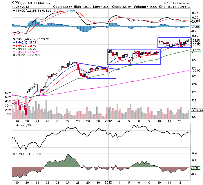
The above two charts of the IWMs and SPYs illustrate my continued concerns with the equity markets. The IWMs stayed in a tight range for about a week and a half before drifting higher over the last three sessions. The SPYs have traded in two tight ranges for the last week and a half, but there hasn't been a lot of strong intra-day action.

The QQQs are the best looking average, with a clear uptrend, but also have the same issue -- trading in ranges, popping a bit, and then trading sideways. The fact that only one average has a good chart is also concerning.
Thursday, January 12, 2012
Bonddad Linkfest
- UK industrial production sags (FT)
- ECB keeps rates at 1% (FT)
- China's inflation drops to 4.1% YOY (FT)
- Spain and Italy and successful bond auctions (FT)
- German inflation cools (BB)
- Indian industrial production increases more than forecast (BB)
- The Beige Book
- Census retail sales report
- DOL's initial unemployment report
- Reducing the US' petroleum consumption from transportation
Will Food Prices Reassert Themselves?
Three stories over the past week caught my eye:
First, we have a dry spell in South America:

While food prices only comprise 14.79% of CPI calculations transportation prices only comprise 17.3%. Yet, large oil spikes (and subsequent gas spikes) can have a disproportionate effect on consumer sentiment and spending. And while the chart above does not conclusively state that high YOY percentage changes always proceed a recession, it does say that high high prices can be a precursor to recession. So, it behooves us to keep an eye on this situation.
I always look at the grains charts as a proxy for food prices, largely because corn, wheat and soybeans are the foundations of the US food system. To that end, consider these charts of grains:

The weekly grains chart sold off at the end of last summer and drifted lower through mid-December. Prices rallied strongly at the end of last year and in the first week of January. While the EMA picture is still bearish, prices have rallied into the 20 week EMA. The MACD has given a buy signal as sell, although the A/D and CMF volume indicators are weak.

The daily chart shows that grains have rallied strongly over the last few weeks. Prices have advanced through the 10, 20 and 50 day EMA. These EMAs are also rising, with the 10 now moving through the 50. The MACD is rising and has now turned positive. However, the A/D line is not that exciting, although the CMF shows some positive movement.
In short, food prices may be a problem to keep an eye on this year.
First, we have a dry spell in South America:
Crop prices rose sharply this week on worries that unusually dry weather in South America could cut global supplies. Temperatures rose last week in South America and rains that fell over the weekend were lighter than had been expected. The dryness could leave corn plants there stunted because they are pollinating this time of year.Second, we have a lack of corn seed supply in the US midwest:
According to the Associated Press, traders are worried that lower exports from Brazil and Argentina could reduce world food supplies. Strong demand from livestock producers and ethanol makers has already drawn down global reserves of corn and soybeans.
Crop prices had been falling this winter on expectations that exports from the United Sates could help supply the global market. A hot summer didn't damage the U.S. corn crop as severely as some traders had expected. But gains from the U.S. Farm Belt could be offset by losses in South America if dry weather there leads to lower crop yields.
January soybeans rose 37 cents Tuesday to $12.095 per bushel. March wheat rose 22.75 cents to finish at $6.4475 per bushel. March corn rose 13.75 cents to $6.3325 per bushel
As farmers across the U.S. prepare to plant this year's corn crop, they are running up against an unexpected obstacle: a lack of seed.Third, we have this:
By some estimates, U.S. production of corn seed was down 25% to 50% ahead of this planting season. Output of corn seed, which is grown from specialized plants, was sliced by drought conditions across the Midwest and the Great Plains last year
The shortage of seed threatens to scuttle what some expect to be the biggest planting of corn in the U.S., the world's largest producer, since World War II. Early forecasts have been calling for up to 95 million acres to be sown with corn this spring, a 3.4% increase from 2011.
The problem could mean the second year in a row of tumult for the corn market. Last year, hot weather led to a smaller U.S. crop than traders had expected, fueling a historic rally in corn prices to a record $8 a bushel in late spring.
Hedge funds raised their wagers on higher commodity prices by the most since July 2010 after signs of accelerating U.S. growth bolstered optimism that demand for raw materials will strengthen.That got me thinking about this graph, which shows the YOY percentage change in the food price component of CPI:
Money managers expanded their combined net-long positions across 18 U.S. futures and options by 25 percent to 671,915 contracts (.MMLOSH) in the week ended Jan. 3, Commodity Futures Trading Commission data show. Bullish bets on cotton rose the most since April 2009 and those on coffee doubled. Crude-oil holdings reached a three-week high.
Prices for metals and bulk commodities such as coal rose at least 85 percent of the time since 2004 when global industrial production strengthened, Macquarie Group Ltd. estimates. U.S. unemployment fell to the lowest in almost three years, and it joined China, Australia, Germany, India and the U.K. in reporting manufacturing gains. Almost $253 billion was added to the value of global equities last week on speculation economies will skirt a slump as Europe’s debt crisis deepens.
“You’ve been seeing a risk-on trade across the board, not just in commodities,” said John Bailey, the founder and chief executive officer of Stamford, Connecticut-based Spruce Private Investors LLC, which advises investors holding about $3 billion of assets. “Between a calming in Europe and better-than- expected numbers in the U.S., including employment and housing, that has led to a risk-on attitude among managers.”

While food prices only comprise 14.79% of CPI calculations transportation prices only comprise 17.3%. Yet, large oil spikes (and subsequent gas spikes) can have a disproportionate effect on consumer sentiment and spending. And while the chart above does not conclusively state that high YOY percentage changes always proceed a recession, it does say that high high prices can be a precursor to recession. So, it behooves us to keep an eye on this situation.
I always look at the grains charts as a proxy for food prices, largely because corn, wheat and soybeans are the foundations of the US food system. To that end, consider these charts of grains:


The daily chart shows that grains have rallied strongly over the last few weeks. Prices have advanced through the 10, 20 and 50 day EMA. These EMAs are also rising, with the 10 now moving through the 50. The MACD is rising and has now turned positive. However, the A/D line is not that exciting, although the CMF shows some positive movement.

In short, food prices may be a problem to keep an eye on this year.
Beta testing the Shadow Weekly Leading Index
- by New Deal democrat
As readers know, I am trying to reverse engineer the ECRI Weekly Leading Index. Prof. Geoffrey Moore recommended 11 elements for this index when he proposed it in 1990. As originally conceived, the weekly index was supposed to anticipate the monthly LEI, which had to rely on late reports like housing permits and durable goods orders. By contrast, the 4 monthly numbers incorporated into the weekly index would all be known within one week of the end of the previous month. The weekly index would be slightly less reliable than the LEI, but by dint of early report, would be very useful.
Ten of the 11 elements are publicly reported (the 11th is Dun and Bradstreet's weekly number of business formations and dissolutions which is not available to the public). Of the remaining 10, six are weekly series and the other 4 are the monthly series noted above. I have already created several preliminary graphs based on only 7 elements which look very close to ECRI's Weekly Index, including its roller coaster ride of the last two years. So it's time to beta-test and make refinements based on the results.
The list below is the changes in those 10 numbers for the last week. The only change I have made is the substitution of credit spreads for real M2, which I have reason to believe was replaced on the list. Another issue is whether ECRI continues to include the early monthly reports, or changed Moore's original concept by only relying on weekly reports. The last issue is whether the report is an unweighted average of the elements or not. I am giving two forecasts for the WLI, one that includes and one that does not include the early monthly reports. The forecast assumes an unweighted index.
The following weekly components changed as follows for the week ending January 6 (YoY change in parenthesis):
DJ Bond Avg -.07 to 114.58, or -0.1% (YoY up from 111.12, or +3.1%)
S&P 500 +20.21 to 1277.81, or +1.6% (YoY up from 1271.50, or +0.5%)
Initial Jobless claims*: +27,000 to 399,000 or -6.8% w/w (YoY -15,000 from 414,000, or +4.8%)
Commodity price changes: +2.47 to 119.81, so +2.1% (YoY -17.05 from 133.65, or -10.4%)
Purchase Mortgage applications: +8.1% w/w (YoY -17.9%)
10 year treasury - BAA credit spread*: +.02 to 3.29%, or -0.6% (YoY up from 2.69%, or -18.2%)
If only weekly series are used, the predicted week over week change is +0.7, and the YoY growth rate is -6.4.
The following early monthly reports changed as follows (YoY change in parenthesis):
Avg manufacturing workweek +.1 to 41.5, or +0.2% (+.2 YoY, or +0.5%)
Unemployment 0-5 weeks*:+159 to 2669, or -6.0% (YoY -32, or +1.2%)
ISM vendor performance flat at 49.9, or 0.0 (YoY -6.8, or -12%)
ISM inventory change -1.2 to 47.1, or -2.5% (YoY -4.7 or -9.1%)
If the early monthly reports are included, the unweighted predicted weekly change is -0.4 and the YoY growth rate is -5.8.
[*Note: these are inverse relationships, so the higher the number, the lower the growth score]
We'll have an answer tomorrow. I anticipate refining the forecast as I am able to determine better how ECRI constructs their Index.
As readers know, I am trying to reverse engineer the ECRI Weekly Leading Index. Prof. Geoffrey Moore recommended 11 elements for this index when he proposed it in 1990. As originally conceived, the weekly index was supposed to anticipate the monthly LEI, which had to rely on late reports like housing permits and durable goods orders. By contrast, the 4 monthly numbers incorporated into the weekly index would all be known within one week of the end of the previous month. The weekly index would be slightly less reliable than the LEI, but by dint of early report, would be very useful.
Ten of the 11 elements are publicly reported (the 11th is Dun and Bradstreet's weekly number of business formations and dissolutions which is not available to the public). Of the remaining 10, six are weekly series and the other 4 are the monthly series noted above. I have already created several preliminary graphs based on only 7 elements which look very close to ECRI's Weekly Index, including its roller coaster ride of the last two years. So it's time to beta-test and make refinements based on the results.
The list below is the changes in those 10 numbers for the last week. The only change I have made is the substitution of credit spreads for real M2, which I have reason to believe was replaced on the list. Another issue is whether ECRI continues to include the early monthly reports, or changed Moore's original concept by only relying on weekly reports. The last issue is whether the report is an unweighted average of the elements or not. I am giving two forecasts for the WLI, one that includes and one that does not include the early monthly reports. The forecast assumes an unweighted index.
The following weekly components changed as follows for the week ending January 6 (YoY change in parenthesis):
DJ Bond Avg -.07 to 114.58, or -0.1% (YoY up from 111.12, or +3.1%)
S&P 500 +20.21 to 1277.81, or +1.6% (YoY up from 1271.50, or +0.5%)
Initial Jobless claims*: +27,000 to 399,000 or -6.8% w/w (YoY -15,000 from 414,000, or +4.8%)
Commodity price changes: +2.47 to 119.81, so +2.1% (YoY -17.05 from 133.65, or -10.4%)
Purchase Mortgage applications: +8.1% w/w (YoY -17.9%)
10 year treasury - BAA credit spread*: +.02 to 3.29%, or -0.6% (YoY up from 2.69%, or -18.2%)
If only weekly series are used, the predicted week over week change is +0.7, and the YoY growth rate is -6.4.
The following early monthly reports changed as follows (YoY change in parenthesis):
Avg manufacturing workweek +.1 to 41.5, or +0.2% (+.2 YoY, or +0.5%)
Unemployment 0-5 weeks*:+159 to 2669, or -6.0% (YoY -32, or +1.2%)
ISM vendor performance flat at 49.9, or 0.0 (YoY -6.8, or -12%)
ISM inventory change -1.2 to 47.1, or -2.5% (YoY -4.7 or -9.1%)
If the early monthly reports are included, the unweighted predicted weekly change is -0.4 and the YoY growth rate is -5.8.
[*Note: these are inverse relationships, so the higher the number, the lower the growth score]
We'll have an answer tomorrow. I anticipate refining the forecast as I am able to determine better how ECRI constructs their Index.
Morning Market
Yesterday, commenter I Will Not Accept the Terms of Service (great name, BTW) asked the following question:
These charts of been going up for 2 weeks And you still arent impressed? ;-)
We followed with a few exchanges, which ended with this (from him): At the same time, if stocks rise and bonds haven't yet started falling, that means there's still a lot of money sitting outside the equity market wondering if it should come back. I guess maybe you really just want to see it take off first before committing... which is okay I guess.
This gives me a good set-up to the way I look at the markets.
I'm a huge fan of inter-market analysis. Put another way, one market's price action does not happen in a vacuum. Other markets and the economy also have to act/react in certain ways. We also have to consider the fundamental economic situation to see if that information jibes with the markets. For more on this, I would suggest reading John Murphy's Intermarket Analysis, or Martin Pring's The All Season Investor.
Yesterday, I posted an article titled, "What Will It Take For Me to Be Impressed With the Markets?" where I outlined other technical developments that I need to see. First, it's not important to me that the markets are rising, but how they are rising. To me, the equity price charts are very weak -- the candles are small, intra-day action is weak and volume is low. In addition, we haven't seen other markets either sell-off (the treasury market) or rally (copper). If the stock market were really in a strong upswing we'd see money come out of the safety bid (treasuries) and more money move into industrial commodities (copper). Also consider that as of the end of last year the best performing market for a year was the treasury market -- which is not a harbinger of a strong equity market. Finally, while the US' fundamental situation is improving, Europe is on (or at the beginning of) a recession and Asia is slowing. Can the US realistically de-couple from these markets and not have it effect growth? I have my doubts on that.
Finally, let me add this: I could be wrong. The markets like to make an ass out of all analysis (myself included) on a regular basis. So, I would recommend that you also read the writings of a more bullish analyst as well because they could be seeing things correctly.
All that being said, something I forget to add to my "What Will It Take For Me to Be Impressed With the Markets" article was the dollar. For the last 6-9 months, the dollar has been the beneficiary of a safety bid, largely caused by the declining euro. However, there has been talk in the currency markets that the dollar may now be benefiting from the "risk on" trade. This means that as the US economy improves, more international investors want to invest here, which increases the dollar's value.

The dollar spent the last quarter of the year in a symmetrical consolidation pattern. Prices broke out mid-December and have drifted higher since. However, notice the weakening position in the A/D and CMF; both are indicating that the volume inflow is declining. In addition, the MACD is even and not showing much momentum. For the dollar, the big question is, "is this now rising because of increased confidence in the US economy, or is it a safety trade because of a declining euro?" I think it's a bit of both right now, meaning a continued move higher in the dollar would be a net positive.
In addition

Yesterday, copper had a nice pop and is now right at upside resistance. Which we're not out of the woods yet, we are closer.

In addition, industrial metals (which includes copper) have moved through resistance and are now approaching resistance. While the MACD has given a buy signal, the EMA picture is still weak and the CMF/A/D picture is muted.


The treasury market is the biggest stick in the mud. The daily chart shows prices are rising and the weekly chart shows prices are still above the long-term trend line.
So, the short version is the conditions are improving; the dollar is rising (some of which is a risk on trade) and copper specifically and industrial metals generally are improving. But the treasury market is still strong, which is not equity positive and which ultimately gives me great pause.
These charts of been going up for 2 weeks And you still arent impressed? ;-)
We followed with a few exchanges, which ended with this (from him): At the same time, if stocks rise and bonds haven't yet started falling, that means there's still a lot of money sitting outside the equity market wondering if it should come back. I guess maybe you really just want to see it take off first before committing... which is okay I guess.
This gives me a good set-up to the way I look at the markets.
I'm a huge fan of inter-market analysis. Put another way, one market's price action does not happen in a vacuum. Other markets and the economy also have to act/react in certain ways. We also have to consider the fundamental economic situation to see if that information jibes with the markets. For more on this, I would suggest reading John Murphy's Intermarket Analysis, or Martin Pring's The All Season Investor.
Yesterday, I posted an article titled, "What Will It Take For Me to Be Impressed With the Markets?" where I outlined other technical developments that I need to see. First, it's not important to me that the markets are rising, but how they are rising. To me, the equity price charts are very weak -- the candles are small, intra-day action is weak and volume is low. In addition, we haven't seen other markets either sell-off (the treasury market) or rally (copper). If the stock market were really in a strong upswing we'd see money come out of the safety bid (treasuries) and more money move into industrial commodities (copper). Also consider that as of the end of last year the best performing market for a year was the treasury market -- which is not a harbinger of a strong equity market. Finally, while the US' fundamental situation is improving, Europe is on (or at the beginning of) a recession and Asia is slowing. Can the US realistically de-couple from these markets and not have it effect growth? I have my doubts on that.
Finally, let me add this: I could be wrong. The markets like to make an ass out of all analysis (myself included) on a regular basis. So, I would recommend that you also read the writings of a more bullish analyst as well because they could be seeing things correctly.
All that being said, something I forget to add to my "What Will It Take For Me to Be Impressed With the Markets" article was the dollar. For the last 6-9 months, the dollar has been the beneficiary of a safety bid, largely caused by the declining euro. However, there has been talk in the currency markets that the dollar may now be benefiting from the "risk on" trade. This means that as the US economy improves, more international investors want to invest here, which increases the dollar's value.

The dollar spent the last quarter of the year in a symmetrical consolidation pattern. Prices broke out mid-December and have drifted higher since. However, notice the weakening position in the A/D and CMF; both are indicating that the volume inflow is declining. In addition, the MACD is even and not showing much momentum. For the dollar, the big question is, "is this now rising because of increased confidence in the US economy, or is it a safety trade because of a declining euro?" I think it's a bit of both right now, meaning a continued move higher in the dollar would be a net positive.
In addition

Yesterday, copper had a nice pop and is now right at upside resistance. Which we're not out of the woods yet, we are closer.

In addition, industrial metals (which includes copper) have moved through resistance and are now approaching resistance. While the MACD has given a buy signal, the EMA picture is still weak and the CMF/A/D picture is muted.


The treasury market is the biggest stick in the mud. The daily chart shows prices are rising and the weekly chart shows prices are still above the long-term trend line.
So, the short version is the conditions are improving; the dollar is rising (some of which is a risk on trade) and copper specifically and industrial metals generally are improving. But the treasury market is still strong, which is not equity positive and which ultimately gives me great pause.
Wednesday, January 11, 2012
Bonddad Linkfest?
- Euro drops on Fitch statement (BB)
- US farmers probably planted the most wheat in three years (BB)
- Treasury sees record bid for latest 3-year auction (BB)
- Germany on brink of recession (BB)
- EU banks hoarding cash (BB)
- EU businesses welcome the declining euro (FT)
- Why Best Buy is going out of business gradually (Forbes)
- The people v. Best Buy, Round 2 (Forbes)
- US Homebuilders surge (FT)
- Will South Carolina be different for Romney? (TPM)
What's Holding the Economy Back?
For the last year and half, the US economy has not been able to get to "escape velocity" -- a rate of growth over 3%. There are several reasons for this with the biggest one being the lower level of consumer spending. Consider this chart of the seasonally adjusted annual rate of change of personal consumption expenditure growth:

For the latest expansion, we've seen growth rates right around 2.5%. However, this rate is low when compared to the last two expansions. Consumers are spending; just not in the same amounts as before. As such, we are seeing lower growth. Because consumers make-up 70% of GDP growth, this is a very important issue. In addition,

austerity is hurting growth. The above chart shows the impact of government spending on overall economic growth. Over the last 8 quarters, government spending has subtracted from growth. In other words, a contractionary policy is, well, contractionary.


The above chart shows the percentage contribution to GDP from commercial real estate and the bottom charts shows the percentage contribution from residential construction. The commercial chart is a bit more positive, but it's still very weak. The residential charts is terrible. At least it's been hurting less over the last four quarters.
Both of these charts show that we're not building anything right now which has a tremendous impact on the economy. First, it creates jobs. But the actual building requires raw materials such as wood, copper etc.. which have to be mined. The process involves heavy machinery -- which increases durable goods manufacturing. And once the structure is build, we have to put furniture in it. In short, construction has a very large multiplier effect that we're simply not seeing right now. For more on this topic, see this paper from Edward Leamer.
So, we have the following:
1.) A weaker consumer. Consumer spending comprises 70% of the economy. While the consumer is spending, he's simply not spending as much.
2.) Austerity. Since 1970, federal government spending has accounted for about 20% of overall GDP. As I've shown in the Bonddad Economic History Project, government spending for the Korean War was a tremendous driver of the early 1950s expansion. For 6 of the last 8 quarters, we've seen government spending subtract from overall growth.
3.) A lack of housing participation. Housing -- and it's incredibly important multiplier effect -- are absent from this recovery.
Remember, the GDP equation is
Consumer spending + gross investment + net exports + government spending = GDP.
Elements 1 and 2 are weaker, element 3 has subtracted from growth for the last 10+ years and we've deliberately letting element 4 subtract from growth.

For the latest expansion, we've seen growth rates right around 2.5%. However, this rate is low when compared to the last two expansions. Consumers are spending; just not in the same amounts as before. As such, we are seeing lower growth. Because consumers make-up 70% of GDP growth, this is a very important issue. In addition,

austerity is hurting growth. The above chart shows the impact of government spending on overall economic growth. Over the last 8 quarters, government spending has subtracted from growth. In other words, a contractionary policy is, well, contractionary.
The above chart shows the percentage contribution to GDP from commercial real estate and the bottom charts shows the percentage contribution from residential construction. The commercial chart is a bit more positive, but it's still very weak. The residential charts is terrible. At least it's been hurting less over the last four quarters.
Both of these charts show that we're not building anything right now which has a tremendous impact on the economy. First, it creates jobs. But the actual building requires raw materials such as wood, copper etc.. which have to be mined. The process involves heavy machinery -- which increases durable goods manufacturing. And once the structure is build, we have to put furniture in it. In short, construction has a very large multiplier effect that we're simply not seeing right now. For more on this topic, see this paper from Edward Leamer.
So, we have the following:
1.) A weaker consumer. Consumer spending comprises 70% of the economy. While the consumer is spending, he's simply not spending as much.
2.) Austerity. Since 1970, federal government spending has accounted for about 20% of overall GDP. As I've shown in the Bonddad Economic History Project, government spending for the Korean War was a tremendous driver of the early 1950s expansion. For 6 of the last 8 quarters, we've seen government spending subtract from overall growth.
3.) A lack of housing participation. Housing -- and it's incredibly important multiplier effect -- are absent from this recovery.
Remember, the GDP equation is
Consumer spending + gross investment + net exports + government spending = GDP.
Elements 1 and 2 are weaker, element 3 has subtracted from growth for the last 10+ years and we've deliberately letting element 4 subtract from growth.
What Will It Take For Me To Be Impressed With the Markets?
Since the beginning of the year, I've been complaining about the market rally. While it technically looks like it's rallying, the rally is very weak. Frankly, I don't think it's a rally that has any legs. However, here are the conditions I need to see to be impressed.
1.) Print some strong bars: We've seen a lot of very weak candles on the daily chart. What we really need to see is strong, intra-day price action. In fact, we need to see several days of strong, intra-day price action -- say, 1%+ for 2-3 days on really good volume. Having the trading end on the highs of the day on a volume spike would be great. And having the intra-day rally move higher would be stellar. Instead, what we've seen for the last week is a lot of sideways trading, which is not exciting me.
2.) Copper has to break out. Right now, copper is trading in a downward range:

Copper has to make strong move higher, indicating that industrial demand is picking up again. The good news from the commodity markets is that we're already seeing the grain markets rally. But, we really need to see the industrial metals pop.
3.) We have to have a sell-off in the treasury markets. So long as there is a safety bid in the market in the form of the treasury market, money will get sucked away from the equity market. What we need to see is traders throw-in the towel on the safety trade and plow their sale proceeds into the equity markets.
1.) Print some strong bars: We've seen a lot of very weak candles on the daily chart. What we really need to see is strong, intra-day price action. In fact, we need to see several days of strong, intra-day price action -- say, 1%+ for 2-3 days on really good volume. Having the trading end on the highs of the day on a volume spike would be great. And having the intra-day rally move higher would be stellar. Instead, what we've seen for the last week is a lot of sideways trading, which is not exciting me.
2.) Copper has to break out. Right now, copper is trading in a downward range:

Copper has to make strong move higher, indicating that industrial demand is picking up again. The good news from the commodity markets is that we're already seeing the grain markets rally. But, we really need to see the industrial metals pop.
3.) We have to have a sell-off in the treasury markets. So long as there is a safety bid in the market in the form of the treasury market, money will get sucked away from the equity market. What we need to see is traders throw-in the towel on the safety trade and plow their sale proceeds into the equity markets.
Morning Market

The 60 minute IWM chart shows that prices gapped higher yesterday. This is technically good, but notice (again) the lack of follow through. Prices gapped and then stopped.

The daily chart shows the remarkable lack of strong bars over the last week and a half. Most bars have very small bodies and small shadows. There is simply no conviction in the market.

In fact, the QQQs gapped higher and then moved lower throughout the session. Notice that prices closed near the low of the day -- not the high. This is not a sign of strength.

And while the SPYs have technically broken out, I've circled the price clusters the index has formed. Instead of making a strong move through resistance on heavy volume, prices moved higher and then moved sideways for about a week (the first circled area). Then prices gapped higher and formed a second price cluster.


And notice that various sectors of the market are suffering from the same weak conditions.
Subscribe to:
Posts (Atom)