- by New Deal democrat
In the rear view mirror, second quarter GDP was revised down from 2.5% to 2.0%. The more forward looking durable goods orders declined for a second month, down -0.7%. Another leading indicator, the University of Michigan final consumer sentiment reading for November showed that consumer confidence has rebounded about halfway from its debt ceiling debacle collapse that began in July. Personal income was up 0.4%, while spending rose only 0.1%. The personal savings rate rose .2% to 3.5%.
With the continuing exception of Oil prices, and a small increase in corporate bond yield spreads, all of the high frequency weekly indicators turned in another positive week.
Let's start again this week by looking at jobs. While there was some weekly noise, the trend remains positive. The BLS reported that Initial jobless claims rose 5,000 to 393,000. The four week average declined 2500 to 394,250. The four week average remains close to its best reading in over 3 years.
The American Staffing Association Index rose by 1 to 92 last week. In the last couple of months, this series has resumed a slight upward trajectory, but remains lower YoY.
Tax withholding returned to a positive YoY reading this week. Adjusting +1.07% due to the 2011 tax compromise, the Daily Treasury Statement showed that while for the first 16 reporting days of November, $109.7 B was collected vs. $112.1 a year ago, a decline of -2.4 B, for the last 20 days, $137.5 B was collected vs. $130.0 a year ago, an increase of $7.5 B or 5.7%. I use the 20 day metric precisely because there is a definite pattern to deposits by day of the week. Thus it appears that last week's negative YoY 4 week loss may have been an outlier. This will be closely watched in the next several weeks.
Housing continues to show stabilization. The Mortgage Bankers' Association reported that seasonally adjusted purchase mortgage applications increased 8.2% last week. On a YoY basis, purchase applications were up 4.8%. Although YoY reports have been negative for several months, the actual change is very slight, and we remain firmly within the range that purchase mortgage applications have been in since May 2010. Refinancing fell -4.0% w/w despite near record low rates, and may have been strongly influenced by seasonality.
YoY weekly median asking house prices from 54 metropolitan areas at Housing Tracker showed that the asking prices declined -0.3% YoY. Once again, this is a new "best" YoY reading in 5 1/2 years. The areas with YoY% increases in price increased to 21, meaning that 40% of all metropolitan areas in this survey now have YoY positive changes in asking prices. Only Chicago still showed double-digit YoY% declines. YoY asking prices for houses could turn positive on a nationwide basis as early as this week.
Retail same store sales remained positive as they have been all year. The ICSC reported that same store sales for the week of November 12 decreased -0.9% w/w but increased 2.8% YoY. Shoppertrak reported that YoY sales rose 3.8% YoY but were off -3.4% week over week. We have entered a period of high seasonality, so the YoY figures are by far the more reliable measure of sales.
The American Association of Railroads reported that total carloads increased 1.9% YoY, up about 10,400 carloads YoY to 545,100. Intermodal traffic (a proxy for imports and exports) was up 7,000 carloads, or 3.0% YoY. The remaining baseline plus cyclical traffic increased 3400 carloads or 1.1% YoY. Total rail traffic has improved substantially in the last two months after having turned negative for 6 of 12 weeks during the summer.
Weekly BAA commercial bond rates rose .04% to 5.16%. Contrarily, yields on 10 year treasury bonds fell .03% to 2.02%. This is the second week of very small increasing spreads in contrary directions. If it were to continue and amplify, it would represent significant weakness.
Finally, the Oil choke collar remains engaged, as Oil closed at $96.77 a barrel on Friday. This remains above the recession-trigger level calculated by analyst Steve Kopits. Gas at the pump decreased $.07 to $3.37 a gallon. Measured this way, we probably are about $.10 above the 2008 recession trigger level. Gasoline usage is once again off substantially, down -2.7% YoY, at 8592 M gallons vs. 8829 M a year ago. The 4 week moving average is off -3.9%. This continues to suggest that consumers have permanently altered their gasoline usage habits towards more conservation.
Money supply was not reported this week.
If ECRI's recession call is correct, it appears it will have to be imported from Europe and China via manufacturing, or else the consumer is going to have to finally give out due to real wage declines. There is simply no sign of recession in the recent weekly indicators. More specifically, the continuation of sub-400,000 initial jobless claims reports suggest that we will see a good jobs report this coming Friday.
Saturday, November 26, 2011
Thursday, November 24, 2011
Why I'm giving thanks to the Occupy Wall Street movement
- by New Deal democrat
This Thanksgiving something like 99% of Americans owe a special thanks to the Occupy Wall Street movement. It is not a question of what the movement does next, or what agenda or specifics it needs to succeed. It already has succeeded, and the only question is whether its success will continue.
Let's flash back nearly 5 months. The House Republican caucus refused to pass what until then had been a pro forma raising of the US's debt ceiling, taking the payment of our country's debts hostage to partisan demands about cuts in social spending. Over the Fourth of July weekend, President Barack Obama proposed a "grand bargain", for the first time explicitly proposing cuts to Medicare and Social Security as an enticement to obtain tax increase concessions from the GOP. The GOP still refused, even though the proposed "bargain" was weighted something like 10 to 1 in favor of spending cuts over tax increases. At the end of the day, only 174 House Republicans mustered the political courage to vote in favor of paying this country's bills. Nancy Pelosi and the Democrats had to come to their rescue on August 2. In direct reaction to that debacle, Standard and Poor's downgraded the US's credit rating from AAA two days later.
During that 5 week period, according to the daily Gallup poll, the economic confidence of Americans plummeted - to ratings not seen since the worst of the "great recession."
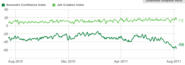
Economic indicators began to show outright contraction by mid-August. More and more it looked like a recession might be about to start.
In direct response to the debt ceiling debacle, in which the wishes of the majority of Americans -- for the budget to be balanced primarily via tax increases on the rich, and secondarily by cuts in military and general domestic spending, with Social Security and Medicare left intact -- were ignored and spurned by Washington, on July 13 a Canadian magazine called for an occupation of Wall Street to start on September 17. As the US News and World Report put it, on July 26:
That relentless focus by the OWS movement has shone the bright light of day on the efforts of the elite in Washington to enshrine the Bush tax cuts for the wealthy while spending cuts are proposed for everybody else.
Without the Occupy Wall Street movement, I doubt very much Washington would have been derailed from its toxic austerian plans. So this Thanksgiving Day I say "Thank you, OWS."
This Thanksgiving something like 99% of Americans owe a special thanks to the Occupy Wall Street movement. It is not a question of what the movement does next, or what agenda or specifics it needs to succeed. It already has succeeded, and the only question is whether its success will continue.
Let's flash back nearly 5 months. The House Republican caucus refused to pass what until then had been a pro forma raising of the US's debt ceiling, taking the payment of our country's debts hostage to partisan demands about cuts in social spending. Over the Fourth of July weekend, President Barack Obama proposed a "grand bargain", for the first time explicitly proposing cuts to Medicare and Social Security as an enticement to obtain tax increase concessions from the GOP. The GOP still refused, even though the proposed "bargain" was weighted something like 10 to 1 in favor of spending cuts over tax increases. At the end of the day, only 174 House Republicans mustered the political courage to vote in favor of paying this country's bills. Nancy Pelosi and the Democrats had to come to their rescue on August 2. In direct reaction to that debacle, Standard and Poor's downgraded the US's credit rating from AAA two days later.
During that 5 week period, according to the daily Gallup poll, the economic confidence of Americans plummeted - to ratings not seen since the worst of the "great recession."
Economic indicators began to show outright contraction by mid-August. More and more it looked like a recession might be about to start.
In direct response to the debt ceiling debacle, in which the wishes of the majority of Americans -- for the budget to be balanced primarily via tax increases on the rich, and secondarily by cuts in military and general domestic spending, with Social Security and Medicare left intact -- were ignored and spurned by Washington, on July 13 a Canadian magazine called for an occupation of Wall Street to start on September 17. As the US News and World Report put it, on July 26:
A group calling itself "New Yorkers Against Budget Cuts" announce[d] a meeting on Wall Street on August 2 to protest potential austerity measures as a result of the debt-ceiling crisis. That day, another set of protesters planning for an upcoming "occupation" protest joins them, and, according to occupywallst.org, after the assembly the two groups "gather into working groups to plan for the September 17 occupation of Wall Street."As Dean Baker described so well yesterday, the OWS movement has successfully forced the mainstream media and Washington to acknowledge that by far the biggest problem facing this country is not deficit reduction at all, but rather the now-chronic lack of jobs in the economy, and the longstanding and ongoing and increasingly disparate distribution of income in the US, due to economic and tax policies that favor an upward redistribution of wealth to a very few at the top, who are "too big to fail", vs. "the 99%" for whom there are no bailouts but only calls for austerity and sacrifice.
That relentless focus by the OWS movement has shone the bright light of day on the efforts of the elite in Washington to enshrine the Bush tax cuts for the wealthy while spending cuts are proposed for everybody else.
As a result, OSW is directly responsible for two outcomes in Washington in the last two weeks. One is the failure of the 'Supercommittee' in which Democrats refused to capitulate to GOP demands of no meaningful tax increases, and unlike July refused to dangle ever larger Social Security and Medicare cuts as an enticement. As a result, on January 1, 2013 the Bush income and estate tax cuts are set to expire, and cuts in military and general domestic spending will make up the difference.
Secondly, GOP hostage-taking came to an abrupt and very quiet halt. The latest stopgap budget resolution was set to expire on Saturday November 19. In stark difference to their behavior earlier this year, the House Republican caucus quietly passed another stopgap resolution to avoid a government shutdown through December 16.
Meanwhile economic confidence has regained at least part of its lost ground, and recent data shows that Americans are increasing their spending on purchases like cars. The threat of at least an imminent domestic recession appears to be receding.
Secondly, GOP hostage-taking came to an abrupt and very quiet halt. The latest stopgap budget resolution was set to expire on Saturday November 19. In stark difference to their behavior earlier this year, the House Republican caucus quietly passed another stopgap resolution to avoid a government shutdown through December 16.
Meanwhile economic confidence has regained at least part of its lost ground, and recent data shows that Americans are increasing their spending on purchases like cars. The threat of at least an imminent domestic recession appears to be receding.
Without the Occupy Wall Street movement, I doubt very much Washington would have been derailed from its toxic austerian plans. So this Thanksgiving Day I say "Thank you, OWS."


Tuesday, November 22, 2011
Happy Thanksgiving
My father is in for the holidays, so I think this is a good time to sign off for the already holiday shortened week. We'll be back next Monday.
Until then, have a safe and happy Thanksgiving. And just in case you need a little off-center humor for the week ...

I couldn't resist this one.
Until then, have a safe and happy Thanksgiving. And just in case you need a little off-center humor for the week ...

I couldn't resist this one.
About The "Oursourcing Our Jobs" Argument
From the WSJ:
This is a a point that needs to be stressed when we're talking about the "outsourced" jobs. In reality, there are many regions of the world that are growing at far more impressive rates than the US. In addition, these are new markets with an emerging middle class. That means is simply makes more sense to locate the factories and manufacturing facilities in these countries to sell to that market.
U.S.-based multinational corporations added 1.5 million workers to their payrolls in Asia and the Pacific region during the 2000s, and 477,500 workers in Latin America, while cutting payrolls at home by 864,000, the Commerce Department reported.
The faster growth abroad was concentrated in emerging markets, such as China, Brazil, India and Eastern Europe, according to economists Kevin Barefoot and Raymond Mataloni, of the U.S. Commerce Department.
"Judging by the destination of sales by affiliates in those countries," the economists wrote in a recent survey, "the goal of the U.S. multinational corporations' expanded production was to primarily sell to local customers rather than to reduce their labor costs for goods and services destined for sale in the U.S., Western Europe and other high-income countries."
This is a a point that needs to be stressed when we're talking about the "outsourced" jobs. In reality, there are many regions of the world that are growing at far more impressive rates than the US. In addition, these are new markets with an emerging middle class. That means is simply makes more sense to locate the factories and manufacturing facilities in these countries to sell to that market.
No Really -- CRA and the GSEs Weren't the Reason for the Collapse
For those of us in the economic blogsphere, Barry Ritholtz over at the Big Picture is a bit like a blogfather. He was one of the first economic bloggers who I read regularly. We've traded some occasional emails and he's always been very gracious.
His latest Washington Post column illustrates why he has such a great reputation: his research is exhaustive, which appeals to the academic side of me. His latest column for the Washington Post adds much more intellectual weight to the argument that the CRA and the other government GSEs weren't the cause of the financial mess.
Here are some salient points:
Then there's the question of where the bubble occurred:
And then there is this:
And that's the buzzer ending the game.
For those of you who still adhere to the CRA/GSE line of argument please do us a favor: don't reproduce.
And a special thanks to Barry for being intellectually rigorous at a time when our political and economic discourse is incredibly stupid.
His latest Washington Post column illustrates why he has such a great reputation: his research is exhaustive, which appeals to the academic side of me. His latest column for the Washington Post adds much more intellectual weight to the argument that the CRA and the other government GSEs weren't the cause of the financial mess.
Here are some salient points:
A McKinsey Global Institute report noted “from 2000 through 2007, a remarkable run-up in global home prices occurred.” It is highly unlikely that a simultaneous boom and bust everywhere else in the world was caused by one set of factors (ultra-low rates, securitized AAA-rated subprime, derivatives) but had a different set of causes in the United States. Indeed, this might be the biggest obstacle to pushing the false narrative. How did U.S. regulations against redlining in inner cities also cause a boom in Spain, Ireland and Australia? How can we explain the boom occurring in countries that do not have a tax deduction for mortgage interest or government-sponsored enterprises? And why, after nearly a century of mortgage interest deduction in the United States, did it suddenly cause a crisis?This is an incredibly good point, and should put the argument to bed for good: did the rest of the world have CRA legislation or GSEs" If not, why did these economies also experience an economic bubble?
Then there's the question of where the bubble occurred:
For example, if the CRA was to blame, the housing boom would have been in CRA regions; it would have made places such as Harlem and South Philly and Compton and inner Washington the primary locales of the run up and collapse. Further, the default rates in these areas should have been worse than other regions.So, prices spiked in neighborhoods that weren't the targets of the legislation. That's one powerful law if it can effect economic areas not intended to be effected.
What occurred was the exact opposite: The suburbs boomed and busted and went into foreclosure in much greater numbers than inner cities. The tiny suburbs and exurbs of South Florida and California and Las Vegas and Arizona were the big boomtowns, not the low-income regions. The redlined areas the CRA address missed much of the boom; places that busted had nothing to do with the CRA.
And then there is this:
•Nonbank mortgage underwriting exploded from 2001 to 2007, along with the private label securitization market, which eclipsed Fannie and Freddie during the boom. Check the mortgage origination data: The vast majority of subprime mortgages — the loans at the heart of the global crisis — were underwritten by unregulated private firms. These were lenders who sold the bulk of their mortgages to Wall Street, not to Fannie or Freddie. Indeed, these firms had no deposits, so they were not under the jurisdiction of the Federal Deposit Insurance Corp or the Office of Thrift Supervision. The relative market share of Fannie Mae and Freddie Mac dropped from a high of 57 percent of all new mortgage originations in 2003, down to 37 percent as the bubble was developing in 2005-06.The private market underwrote the vast majority of the sub-prime loans. These organizations weren't subject to the law.
•Private lenders not subject to congressional regulations collapsed lending standards. Taking up that extra share were nonbanks selling mortgages elsewhere, not to the GSEs. Conforming mortgages had rules that were less profitable than the newfangled loans. Private securitizers — competitors of Fannie and Freddie — grew from 10 percent of the market in 2002 to nearly 40 percent in 2006. As a percentage of all mortgage-backed securities, private securitization grew from 23 percent in 2003 to 56 percent in 2006
And that's the buzzer ending the game.
For those of you who still adhere to the CRA/GSE line of argument please do us a favor: don't reproduce.
And a special thanks to Barry for being intellectually rigorous at a time when our political and economic discourse is incredibly stupid.
Morning Market
Yesterday, the market sell-off continued:

The 5-minute charts clearly shows prices consolidating and then breaking support at the 123 level. Prices are now moving lower in a downward sloping channel.

When trading patterns -- like this topping triangle pattern -- the general rule of thumb is to measure the height of the pattern and the subtract or add that to the break-out point to get a price target. Here, the height is roughly 7 points (122-129), so our price target is in the 117 range.

I've added the Fibonacci levels for added measure.

I've added some of the technical indicators to the graph to show that overall, volume is weakening and the MACD is showing declining momentum, as well as giving a sell signal. In short, the weight of the evidence is clearly in the "market moving lower" camp. This jibes with the overall fundamental situation, which is also equity negative.

Oil has broken through its upward sloping trend line and is now trading around the 10 day EMA. While the EMA picture is still bullish, the 10 day EMA is now moving sideways, telling us the shorter trend is weakening. Also note the MACD has given a sell signal. The next level of support is around the 200 day EMA, where we also have previously established price levels.

Gold is still in the middle of a multi-year rally, with several trend lines currently supporting prices. However, notice that prices may be forming a topping pattern right now, indicating the rally may be over.

Supporting that view is the current 6-month daily chart, Notice there are two failed rallies, with the second topping below the first. Also note the weakening EMA picture, with the EMAs unable to show maintain a strong rally posture.

The 5-minute charts clearly shows prices consolidating and then breaking support at the 123 level. Prices are now moving lower in a downward sloping channel.

When trading patterns -- like this topping triangle pattern -- the general rule of thumb is to measure the height of the pattern and the subtract or add that to the break-out point to get a price target. Here, the height is roughly 7 points (122-129), so our price target is in the 117 range.

I've added the Fibonacci levels for added measure.

I've added some of the technical indicators to the graph to show that overall, volume is weakening and the MACD is showing declining momentum, as well as giving a sell signal. In short, the weight of the evidence is clearly in the "market moving lower" camp. This jibes with the overall fundamental situation, which is also equity negative.

Oil has broken through its upward sloping trend line and is now trading around the 10 day EMA. While the EMA picture is still bullish, the 10 day EMA is now moving sideways, telling us the shorter trend is weakening. Also note the MACD has given a sell signal. The next level of support is around the 200 day EMA, where we also have previously established price levels.

Gold is still in the middle of a multi-year rally, with several trend lines currently supporting prices. However, notice that prices may be forming a topping pattern right now, indicating the rally may be over.


Supporting that view is the current 6-month daily chart, Notice there are two failed rallies, with the second topping below the first. Also note the weakening EMA picture, with the EMAs unable to show maintain a strong rally posture.
Monday, November 21, 2011
Bonddad Linkfest
- Job polarization is increasing in the US
- China confirms spending plan of $1.7 trillion
- Is vocational training the answer?
- Eurozone prints a trade surplus
- Asian exports lower because of slower world growth
- Housing may be near a bottom
- Work sharing programs may be a good answer
- Wheat prices may have reached a floor
- Agricultural commodities bear brunt of speculator pessimism
- Nonferrous metal price declines continue
Getting deep into the weeds about Jobs, Jobs, Jobs
- by New Deal democrat
It's been quite a while since I looked at detailed metrics of future job growth, something I devoted a lot of time to a couple of years ago. With a divergeance in forecasts between recession vs. continued growth, this is a good time to take another look. Some of the metrics have performed better than others. Many continue to support optimism, but at least one is downright ominous and may be telling us that revised jobs data will show substantial job losses from earlier this year.
1. V shaped real retail sales and industrial production recoveries vs. jobs:
One point I frequently made is that this is a "bifurcated recovery", where manufacturing and sales are performing much better than job and income growth. Although we've had a recent slowdown in some ISM series, the description of a "bifurcated recovery" is still valid.
Real retail sales and Industrial production are still in V shaped recovery mode. Real retail sales have recovered 80% from their trough, and industrial production two-thirds:
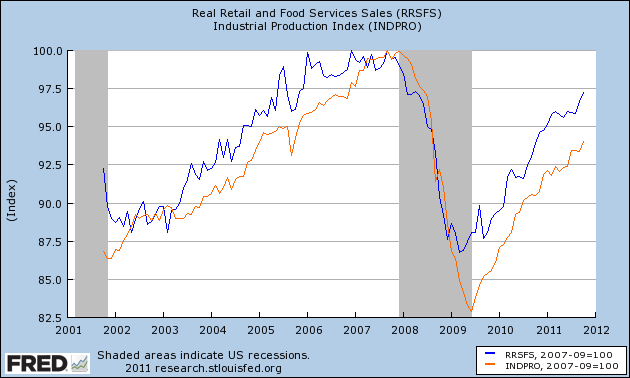
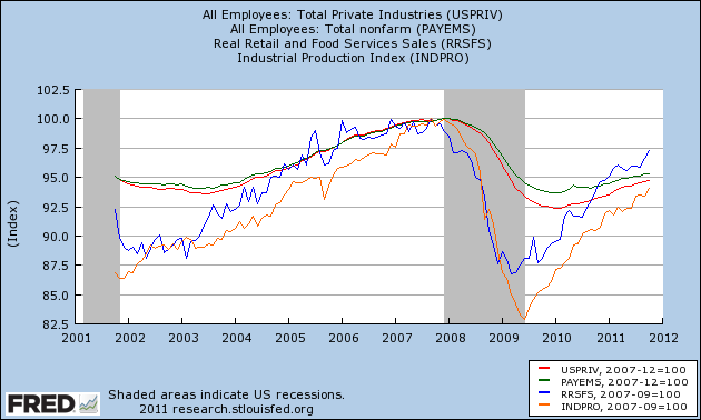
Comparing those with private jobs (red) and total payrolls (green), we can see that the percentage losses in sales and production were steeper, and have made up nearly or more than all of their ground compared with jobs. Meanwhile, private jobs have regained only slightly over 30% of their losses. When government employment is added for the total jobs picture, less than 25% of the losses have been regained:
2. Comparing improvements in aggregate hours and jobs:
Another point I have frequently made is that aggregate hours worked are recovering faster than new jobs. Since more hours were lost than jobs during the recession, if past was prologue then we would have to wait for aggregate hours to regain their lost comparative ground before job growth would match the growth in hours. This is still the case:
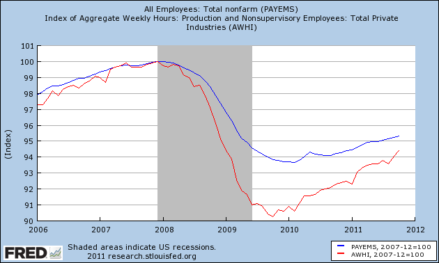
If the trend continues then by about next summer aggegate hours (red) will have made up all of their comparative losses with jobs (blue) and we can start to expect job growth to fully reflect growth in hours.
3. Comparing real retail sales with jobs:
The closest thing I found to a "holy grail" leading indicator for future job growth when I took a thorough look over 2 years ago was real retail sales. Real retail sales tended to lead turning points in jobs by about 4 to 8 months. Since sales are still rising, we should expect continued job growth over the next few months as well. (This metric has also recently been touted by Prof. Karl Smith of UNC - Chapel Hill at Modeled Behavior).
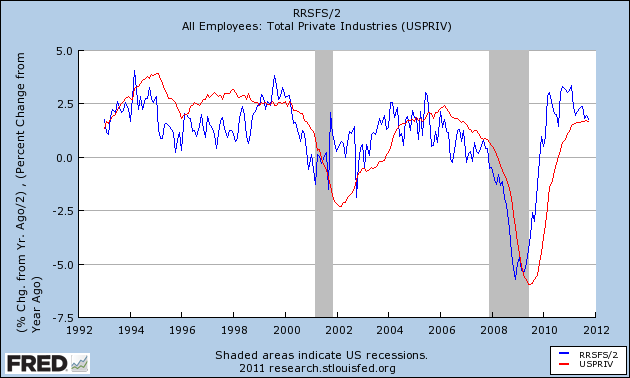
I also found that over the last 40 years, the YoY% growth in real retail sales, divided by two, gave a reasonably close forecast to YoY% growth in jobs, at least over a longer horizon if not every month. Since real retail sales were averaging 6% YoY growth at the end of 2009, this led me to expect strong job growth in 2010. It didn't happen, although measuring by private jobs, the metric is at the moment almost in perfect alignment:
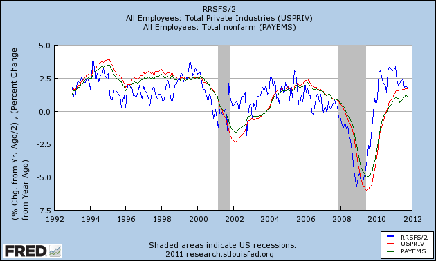
When we add government jobs into the mix, and compare real retail sales with total jobs (green), the metric still falls considerably short:
This is yet another indication of just how significant government job losses have been to the relatively poor jobs recovery. At the same time, because real retail sales are a leading indicator for jobs, this reinforces that we should expect to continue to see positive job growth in the economy, with private jobs at least being added at something like a 2% YoY rate.
4. Comparing initial jobless claims with jobs added:
In 2010 I thoroughly debunked the idea that we needed 400,000 or less in initial jobless claims to be consistent with job growth. It simply makes a lot of difference how deep the recession is, and also the pattern declining into a recession is quite different from the pattern during a recovery. I pointed out half a year ago that if we were to descend into a "double dip", I would expect to see a break in trend in the scatter graph comparing these two series, with a new trend line to the left of the recovery trend line developing. Here is the updated graph (using private jobs vs. all jobs to avoid the 2010 census distortions) , with the last 6 months' data in brown:
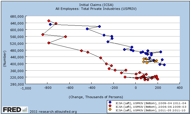
No break in trend happened. Since this scatter graph ends with October, it doesn't show the decline in the 4 week moving average below 400,000 in the last couple of weeks. Should that continue through the end of November, I would expect a very good November employment report, with something like 175,000 private jobs being added.
5. Okun's Law
Okun's law is actually a rule of thumb that holds that for every 2% YoY increase in GDP, there should be a 1% decline in the unemployment rate. Generally speaking, 2% YoY GDP growth equals no change in unemployment. A 4% GDP increase gives you a 1% decrease in unemployment. Contrarily a 0% YoY change in GDP gives you a 1% increase in unemployment.
I make use of a corollary, which is the YoY% growth in GDP minus 2% approximately equals the YoY% change in job growth 3 to 6 months later. Here is the graph of this relationship going back 65 years, and it has ominous implications:
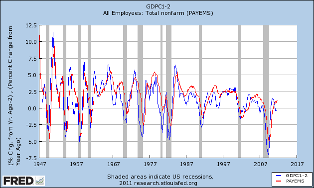
Since 1948 there has never been a period of 2 or more quarters where YoY GDP% growth was under 2%, that has not equated actual YoY job losses in the next few months. If this relationship holds true now, then contra all of the other above data, we should have already been seeing outright job losses, and they could continue through the winter.
As I said, this contradicts virtually all of the previous indicators we have discussed. A possible explanation comes via Jeff Miller of A Dash of Insight, who informed us yesterday that the BLS's Dynamic Business Report of actual job data collected from the states showed that in the first quarter of this year only 250,000 jobs were created, rather than the 500,000 previously reported. If this revision is applied to all of the 2011, it would mean that the pathetic job gains of this past summer turn into outright significant losses. Not only would this tend to vindicate Okun's law, it would affect all of the data sets above. For example, the scatterplot graph above would probably then show that we did indeed break trend in the direction of a "double-dip."
6. Forecasts of the unemployment rate:
Finally, let's update a few metrics forecasting the unemployment rate. The premise here is that initial jobless claims are a leading indicator of the unemployment rate. The best way to measure initial claims, however, is to adjust for population, which is done in this first graph:
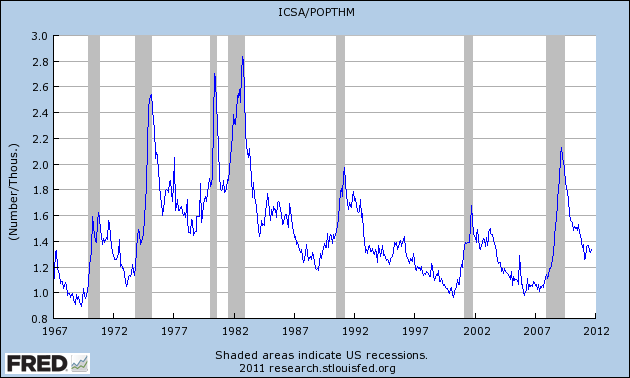
So adjusted, the recent initial claims levels aren't so bad. In fact, they are better than most readings during the last 50 years.
This metric had an excellent record for predicting the unemployment rate several months out -- until this recovery. It predicted an unemployment rate of under 7%, and needless to say were are far above that:
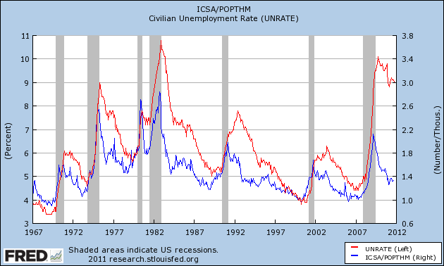
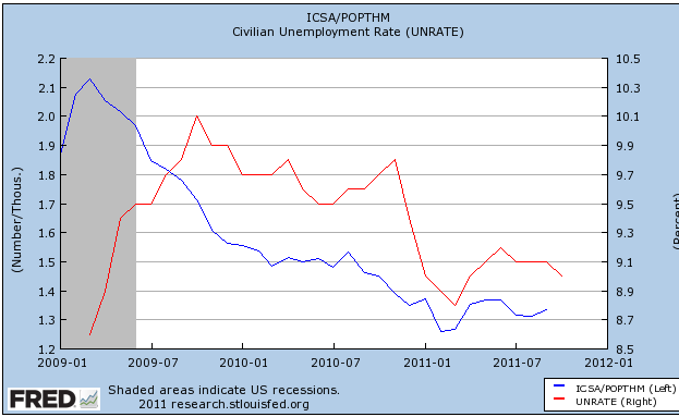
Taking a closer view of the last several years, it appears that the big disconnect occurred in 2009, when initial claims steeply declined, yet unemployment remained stubbornly high. Since then, the two series have tracked one another rather well. This suggests we should see the unemployment rate drop slightly to about 8.8% in the next few months:
Finally, here is a slightly different metric from Thumbcharts. This compares the last six month period with the same six month period one year before. In this longer term metric, initial claims also have an excellent record predicting the unemployment rate -- although like the metric above it shows that the YoY decline in initial claims considerably outpaced the decline in the unemployment rate a year ago:
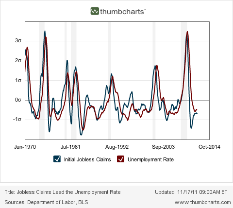
This metric likewise predicts a continued decline in the unemployment rate over the next few months.
Summary
Continued job losses in government continue to have a depressing impact on job growth during this recovery, causing distinctly subpar growth compared with previous recoveries. Undoubtedly as I have pointed out just a few days ago, that housing until recently did not participate in the jobs recovery also has had an effect.
At the same time, most of the above metrics suggest that we should see continued job growth in the months ahead, and a continuing decline in the unemployment rate compared with a year ago. If present underlying economic trends continue (as to which there is obviously no guarantee), then by next summer or so we may see stronger job growth as the deficit in aggregate hours is completely made up.
The contrary indicator is Okun's law, which suggests we should already be in the throes of actual job losses. It is possible that we will find when the jobs data is revised that we did lose a significant number of jobs earlier this year, but that the situation will improve going forward from here, which would be more consistent with all of the data sets above.
It's been quite a while since I looked at detailed metrics of future job growth, something I devoted a lot of time to a couple of years ago. With a divergeance in forecasts between recession vs. continued growth, this is a good time to take another look. Some of the metrics have performed better than others. Many continue to support optimism, but at least one is downright ominous and may be telling us that revised jobs data will show substantial job losses from earlier this year.
1. V shaped real retail sales and industrial production recoveries vs. jobs:
One point I frequently made is that this is a "bifurcated recovery", where manufacturing and sales are performing much better than job and income growth. Although we've had a recent slowdown in some ISM series, the description of a "bifurcated recovery" is still valid.
Real retail sales and Industrial production are still in V shaped recovery mode. Real retail sales have recovered 80% from their trough, and industrial production two-thirds:
Comparing those with private jobs (red) and total payrolls (green), we can see that the percentage losses in sales and production were steeper, and have made up nearly or more than all of their ground compared with jobs. Meanwhile, private jobs have regained only slightly over 30% of their losses. When government employment is added for the total jobs picture, less than 25% of the losses have been regained:
2. Comparing improvements in aggregate hours and jobs:
Another point I have frequently made is that aggregate hours worked are recovering faster than new jobs. Since more hours were lost than jobs during the recession, if past was prologue then we would have to wait for aggregate hours to regain their lost comparative ground before job growth would match the growth in hours. This is still the case:
If the trend continues then by about next summer aggegate hours (red) will have made up all of their comparative losses with jobs (blue) and we can start to expect job growth to fully reflect growth in hours.
3. Comparing real retail sales with jobs:
The closest thing I found to a "holy grail" leading indicator for future job growth when I took a thorough look over 2 years ago was real retail sales. Real retail sales tended to lead turning points in jobs by about 4 to 8 months. Since sales are still rising, we should expect continued job growth over the next few months as well. (This metric has also recently been touted by Prof. Karl Smith of UNC - Chapel Hill at Modeled Behavior).
I also found that over the last 40 years, the YoY% growth in real retail sales, divided by two, gave a reasonably close forecast to YoY% growth in jobs, at least over a longer horizon if not every month. Since real retail sales were averaging 6% YoY growth at the end of 2009, this led me to expect strong job growth in 2010. It didn't happen, although measuring by private jobs, the metric is at the moment almost in perfect alignment:
When we add government jobs into the mix, and compare real retail sales with total jobs (green), the metric still falls considerably short:
This is yet another indication of just how significant government job losses have been to the relatively poor jobs recovery. At the same time, because real retail sales are a leading indicator for jobs, this reinforces that we should expect to continue to see positive job growth in the economy, with private jobs at least being added at something like a 2% YoY rate.
4. Comparing initial jobless claims with jobs added:
In 2010 I thoroughly debunked the idea that we needed 400,000 or less in initial jobless claims to be consistent with job growth. It simply makes a lot of difference how deep the recession is, and also the pattern declining into a recession is quite different from the pattern during a recovery. I pointed out half a year ago that if we were to descend into a "double dip", I would expect to see a break in trend in the scatter graph comparing these two series, with a new trend line to the left of the recovery trend line developing. Here is the updated graph (using private jobs vs. all jobs to avoid the 2010 census distortions) , with the last 6 months' data in brown:
No break in trend happened. Since this scatter graph ends with October, it doesn't show the decline in the 4 week moving average below 400,000 in the last couple of weeks. Should that continue through the end of November, I would expect a very good November employment report, with something like 175,000 private jobs being added.
5. Okun's Law
Okun's law is actually a rule of thumb that holds that for every 2% YoY increase in GDP, there should be a 1% decline in the unemployment rate. Generally speaking, 2% YoY GDP growth equals no change in unemployment. A 4% GDP increase gives you a 1% decrease in unemployment. Contrarily a 0% YoY change in GDP gives you a 1% increase in unemployment.
I make use of a corollary, which is the YoY% growth in GDP minus 2% approximately equals the YoY% change in job growth 3 to 6 months later. Here is the graph of this relationship going back 65 years, and it has ominous implications:
Since 1948 there has never been a period of 2 or more quarters where YoY GDP% growth was under 2%, that has not equated actual YoY job losses in the next few months. If this relationship holds true now, then contra all of the other above data, we should have already been seeing outright job losses, and they could continue through the winter.
As I said, this contradicts virtually all of the previous indicators we have discussed. A possible explanation comes via Jeff Miller of A Dash of Insight, who informed us yesterday that the BLS's Dynamic Business Report of actual job data collected from the states showed that in the first quarter of this year only 250,000 jobs were created, rather than the 500,000 previously reported. If this revision is applied to all of the 2011, it would mean that the pathetic job gains of this past summer turn into outright significant losses. Not only would this tend to vindicate Okun's law, it would affect all of the data sets above. For example, the scatterplot graph above would probably then show that we did indeed break trend in the direction of a "double-dip."
6. Forecasts of the unemployment rate:
Finally, let's update a few metrics forecasting the unemployment rate. The premise here is that initial jobless claims are a leading indicator of the unemployment rate. The best way to measure initial claims, however, is to adjust for population, which is done in this first graph:
So adjusted, the recent initial claims levels aren't so bad. In fact, they are better than most readings during the last 50 years.
This metric had an excellent record for predicting the unemployment rate several months out -- until this recovery. It predicted an unemployment rate of under 7%, and needless to say were are far above that:
Taking a closer view of the last several years, it appears that the big disconnect occurred in 2009, when initial claims steeply declined, yet unemployment remained stubbornly high. Since then, the two series have tracked one another rather well. This suggests we should see the unemployment rate drop slightly to about 8.8% in the next few months:
Finally, here is a slightly different metric from Thumbcharts. This compares the last six month period with the same six month period one year before. In this longer term metric, initial claims also have an excellent record predicting the unemployment rate -- although like the metric above it shows that the YoY decline in initial claims considerably outpaced the decline in the unemployment rate a year ago:
This metric likewise predicts a continued decline in the unemployment rate over the next few months.
Summary
Continued job losses in government continue to have a depressing impact on job growth during this recovery, causing distinctly subpar growth compared with previous recoveries. Undoubtedly as I have pointed out just a few days ago, that housing until recently did not participate in the jobs recovery also has had an effect.
At the same time, most of the above metrics suggest that we should see continued job growth in the months ahead, and a continuing decline in the unemployment rate compared with a year ago. If present underlying economic trends continue (as to which there is obviously no guarantee), then by next summer or so we may see stronger job growth as the deficit in aggregate hours is completely made up.
The contrary indicator is Okun's law, which suggests we should already be in the throes of actual job losses. It is possible that we will find when the jobs data is revised that we did lose a significant number of jobs earlier this year, but that the situation will improve going forward from here, which would be more consistent with all of the data sets above.
Morning Market
Remember that the story for the last few weeks has been the equity market's trading range and which way they would break. At the end of the last week, we got our answer: prices would break lower:

The IWMs hit resistance at the 200 day EMA and moved lower. They are now resting on the 50 day EMA. The long lower shadows over the last two trading sessions show that prices have moved below key support levels, but closed higher.

The QQQs, broke lower, printing one strong candle and a shorter one on Friday. Thursday's volume number was pretty strong, but Friday saw a drop.

The SPYs have moved thorugh the 200 day EMA and have printed closes right below the 50 day EMA over the last few days.
The combined impact of these charts is simple: as a combined unit, the equity averages are pointing lower. The QQQs have the strongest technical support as they are sitting on the 200 day EMA, while the IWMs are right at the 50 day EMA. As a general FYI, the general rule of trading thumb to use when trading a consolidation pattern is figure out the height of the pattern at its widest/largest and subtract that amount from the point where prices break through.
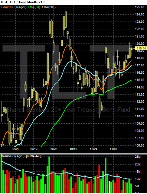
The long end of the treasury market moved higher last week, but notice that prices did not close above previously established highs. Also note the volume was incredibly weak, indicating a lack of movement into the market. This tells us that traders are looking for another safe haven asset.

Although it printed stronger volume, the dollar is still in the middle of an upward sloping channel and is also centered right around the 200 day EMA.

The IWMs hit resistance at the 200 day EMA and moved lower. They are now resting on the 50 day EMA. The long lower shadows over the last two trading sessions show that prices have moved below key support levels, but closed higher.

The QQQs, broke lower, printing one strong candle and a shorter one on Friday. Thursday's volume number was pretty strong, but Friday saw a drop.

The SPYs have moved thorugh the 200 day EMA and have printed closes right below the 50 day EMA over the last few days.
The combined impact of these charts is simple: as a combined unit, the equity averages are pointing lower. The QQQs have the strongest technical support as they are sitting on the 200 day EMA, while the IWMs are right at the 50 day EMA. As a general FYI, the general rule of trading thumb to use when trading a consolidation pattern is figure out the height of the pattern at its widest/largest and subtract that amount from the point where prices break through.
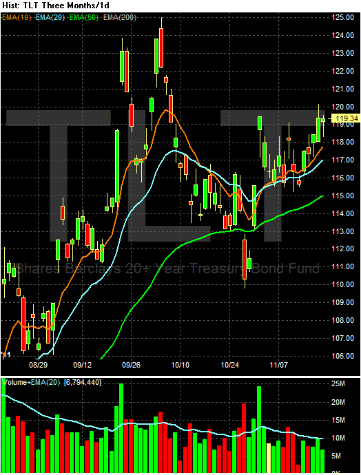
The long end of the treasury market moved higher last week, but notice that prices did not close above previously established highs. Also note the volume was incredibly weak, indicating a lack of movement into the market. This tells us that traders are looking for another safe haven asset.

Although it printed stronger volume, the dollar is still in the middle of an upward sloping channel and is also centered right around the 200 day EMA.
Saturday, November 19, 2011
Weekly Indicators: ECRI vs. the LEI edition
- by New Deal democrat
Monthly data for October released in the last week was excellent. In stark contrast to ECRI's continued recession call, the Index of Leading Indicators was up 0.9, primarily as a result of the surge in housing permits, which rose to their highest level (ex-housing credit) in 3 years. Starts also remained steady at over 600,000. PPI fell -0.3% and the CPI fell -0.1%. The YoY CPI also fell -0.2% to 3.6%, the first YoY evidence from the recent decline in gasoline prices. Industrial production rose by a strong 0.7. Real sales also rose strongly, up 0.5%, and with the decline in inflation, real retail sales were up 0.6%. The Empire State and Philly manufacturing reports for November were also both positive.
The high frequency weekly indicators generally were positive again, but with a likely error in a housing report, and a disconcerting decline in tax withholding.
Starting with jobs, the BLS reported that Initial jobless claims fell 2,000 to 388,000. Only 3 weeks in the last 3 years have been lower. The four week average declined to 396,750. The four week average remains close to its best reading in over 3 years. This is a short leading indicator and bodes well for the next payrolls report.
The American Staffing Association Index remained at 91 last week. In the last couple of months, this series has resumed a slight upward trajectory, but remains lower YoY.
Disconcertingly, however, Tax withholding was significantly down from last year's levels. Adjusting +1.07% due to the 2011 tax compromise, the Daily Treasury Statement showed that for the first 12 reporting days of November, $84.2 B was collected vs. $91.5 a year ago, a decline of -7.3 B. More importantly, for the last 20 days, $129.1 B was collected vs. $132.7 a year ago, a decline of $3.6 B or 2.7%. I use the 20 day metric precisely because there is a definite pattern to deposits by day of the week, but this is the steepest 4 week loss all year. This will have to be closely watched in the next several weeks.
The MBA weekly report may have had errors. The Mortgage Bankers' Association reported that seasonally adjusted purchase mortgage applications decreased -14.8% last week. On a YoY basis, purchase applications were down -9.5%. This would be very bad, but it is completely at odds with the report of the same data at Mortgage News Daily, which showed a -2.2% decline w/w and a -5.1% decline YoY, which is firmly within the range that purchase mortgage applications have been in since May 2010. I am inclined to believe that Mortgage News Daily was reporting the correct numbers. Refinancing fell -12.2% w/w. Refinancing has been very volatile and affected by small changes in interest rates.
Meanwhile, YoY weekly median asking house prices from 54 metropolitan areas at Housing Tracker showed that the asking prices declined -0.5% YoY. Once again, this is a new "best" YoY reading in 4 1/2 years. The areas with YoY% increases in price remained at 19, meaning that one third of all metropolitan areas in this survey now have YoY positive changes in asking prices. The areas with double-digit YoY% declines decreased to only 1 -- Chicago.
Retail same store sales remained positive as they have been all year. The ICSC reported that same store sales for the week of November 5 increased 3.1% YoY, and 0.3% week over week. Shoppertrak reported that YoY sales rose 3.6% YoY and were up 6.5% week over week.
The American Association of Railroads reported that total carloads increased 2.6% YoY, up about 13,700 carloads YoY to 544,600. Intermodal traffic (a proxy for imports and exports) was up 11,100 carloads, or 5.2% YoY. The remaining baseline plus cyclical traffic increased 1500 carloads or 0.5% YoY. Total rail traffic has rebounded in the last 6 weeks month after having been soft during the summer.
Weekly BAA commercial bond rates rose .01% to 5.12%. Contrarily, yields on 10 year treasury bonds fell .02% to 2.05%. This is a very minor episode of increasing spreads in contrary directions. If it were to continue and amplify, it would represent significant weakness.
Money supply continues to stabilize after its Euro crisis induced tsunami. M1 increased 0.1% last week, and is down -1.1% month over month. remains up 19.3% YoY, so Real M1 remains up 15.7%. M2 increased 0.5% w/w. It remained up 0.1% m/m, and 9.8% YoY, so Real M2 was up 6.2%. The YoY increase in both M1 and M2 remains very high.
Finally, the Oil choke collar remains engaged, as Oil closed at $97.41 a barrel on Friday. This is back above the recession-trigger level calculated by analyst Steve Kopits. Gas at the pump iincrreased $.02 to $3.44 a gallon. Measured this way, we probably are about $.15 above the 2008 recession trigger level. Gasoline usage is once again off substantially, down -3.7% YoY, at 8625 M gallons vs. 8952 M a year ago. The 4 week moving average is off -5.7%. This appears more and more to be evidence that consumers have permanently altered their gasoline usage habits towards more conservation.
The stark difference in forecasts between the Conference Board LEI and the ECRI index sets up a real world test of these two reports. Most significantly, as far as we know ECRI does not make use of the yield curve, but the yield curve is an important component of the LEI. All of the monthly data reported this week shows an economy briskly expanding and poised to continue. The weekly data was more tepid, but generally positive with the very significant exceptions of the price of Oil and tax withholding. Since WTI and Brent Oil are converging, and retail gasoline prices so far are not reflecting any surge, this may not be as bad news as it initially seemed. The next few weeks will tell if the poor tax withholding in the last 4 weeks was noise or not.
Have a nice weekend.
Monthly data for October released in the last week was excellent. In stark contrast to ECRI's continued recession call, the Index of Leading Indicators was up 0.9, primarily as a result of the surge in housing permits, which rose to their highest level (ex-housing credit) in 3 years. Starts also remained steady at over 600,000. PPI fell -0.3% and the CPI fell -0.1%. The YoY CPI also fell -0.2% to 3.6%, the first YoY evidence from the recent decline in gasoline prices. Industrial production rose by a strong 0.7. Real sales also rose strongly, up 0.5%, and with the decline in inflation, real retail sales were up 0.6%. The Empire State and Philly manufacturing reports for November were also both positive.
The high frequency weekly indicators generally were positive again, but with a likely error in a housing report, and a disconcerting decline in tax withholding.
Starting with jobs, the BLS reported that Initial jobless claims fell 2,000 to 388,000. Only 3 weeks in the last 3 years have been lower. The four week average declined to 396,750. The four week average remains close to its best reading in over 3 years. This is a short leading indicator and bodes well for the next payrolls report.
The American Staffing Association Index remained at 91 last week. In the last couple of months, this series has resumed a slight upward trajectory, but remains lower YoY.
Disconcertingly, however, Tax withholding was significantly down from last year's levels. Adjusting +1.07% due to the 2011 tax compromise, the Daily Treasury Statement showed that for the first 12 reporting days of November, $84.2 B was collected vs. $91.5 a year ago, a decline of -7.3 B. More importantly, for the last 20 days, $129.1 B was collected vs. $132.7 a year ago, a decline of $3.6 B or 2.7%. I use the 20 day metric precisely because there is a definite pattern to deposits by day of the week, but this is the steepest 4 week loss all year. This will have to be closely watched in the next several weeks.
The MBA weekly report may have had errors. The Mortgage Bankers' Association reported that seasonally adjusted purchase mortgage applications decreased -14.8% last week. On a YoY basis, purchase applications were down -9.5%. This would be very bad, but it is completely at odds with the report of the same data at Mortgage News Daily, which showed a -2.2% decline w/w and a -5.1% decline YoY, which is firmly within the range that purchase mortgage applications have been in since May 2010. I am inclined to believe that Mortgage News Daily was reporting the correct numbers. Refinancing fell -12.2% w/w. Refinancing has been very volatile and affected by small changes in interest rates.
Meanwhile, YoY weekly median asking house prices from 54 metropolitan areas at Housing Tracker showed that the asking prices declined -0.5% YoY. Once again, this is a new "best" YoY reading in 4 1/2 years. The areas with YoY% increases in price remained at 19, meaning that one third of all metropolitan areas in this survey now have YoY positive changes in asking prices. The areas with double-digit YoY% declines decreased to only 1 -- Chicago.
Retail same store sales remained positive as they have been all year. The ICSC reported that same store sales for the week of November 5 increased 3.1% YoY, and 0.3% week over week. Shoppertrak reported that YoY sales rose 3.6% YoY and were up 6.5% week over week.
The American Association of Railroads reported that total carloads increased 2.6% YoY, up about 13,700 carloads YoY to 544,600. Intermodal traffic (a proxy for imports and exports) was up 11,100 carloads, or 5.2% YoY. The remaining baseline plus cyclical traffic increased 1500 carloads or 0.5% YoY. Total rail traffic has rebounded in the last 6 weeks month after having been soft during the summer.
Weekly BAA commercial bond rates rose .01% to 5.12%. Contrarily, yields on 10 year treasury bonds fell .02% to 2.05%. This is a very minor episode of increasing spreads in contrary directions. If it were to continue and amplify, it would represent significant weakness.
Money supply continues to stabilize after its Euro crisis induced tsunami. M1 increased 0.1% last week, and is down -1.1% month over month. remains up 19.3% YoY, so Real M1 remains up 15.7%. M2 increased 0.5% w/w. It remained up 0.1% m/m, and 9.8% YoY, so Real M2 was up 6.2%. The YoY increase in both M1 and M2 remains very high.
Finally, the Oil choke collar remains engaged, as Oil closed at $97.41 a barrel on Friday. This is back above the recession-trigger level calculated by analyst Steve Kopits. Gas at the pump iincrreased $.02 to $3.44 a gallon. Measured this way, we probably are about $.15 above the 2008 recession trigger level. Gasoline usage is once again off substantially, down -3.7% YoY, at 8625 M gallons vs. 8952 M a year ago. The 4 week moving average is off -5.7%. This appears more and more to be evidence that consumers have permanently altered their gasoline usage habits towards more conservation.
The stark difference in forecasts between the Conference Board LEI and the ECRI index sets up a real world test of these two reports. Most significantly, as far as we know ECRI does not make use of the yield curve, but the yield curve is an important component of the LEI. All of the monthly data reported this week shows an economy briskly expanding and poised to continue. The weekly data was more tepid, but generally positive with the very significant exceptions of the price of Oil and tax withholding. Since WTI and Brent Oil are converging, and retail gasoline prices so far are not reflecting any surge, this may not be as bad news as it initially seemed. The next few weeks will tell if the poor tax withholding in the last 4 weeks was noise or not.
Have a nice weekend.
Friday, November 18, 2011
Psssst: is this the beginning of the end of the housing bust?
- by New Deal democrat
Housing construction is a long leading indicator, indeed along with interest rates probably the most important one. So those commentators who say that we won't get housing improvement until we have job improvement have causation exactly backwards. Rather, it is much more likely that we won't get more meaningful job improvement until we have more meaningful housing improvement. Further, the decline in housing starts and permits after the expiration of the $8000 housing credit was probably an important factor in the slowdown in GDP earlier this year, and probably plays a role in ECRI's recession call.
With that in mind, housing permits coming in at 653,000 on Wednesday is a significant positive. It confirms the uptrend we've been seeing in housing permits this year, and is the first reading over 650,000 in a year and a half:
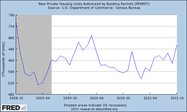
This time we were led out of the bottom of the recession by manufacturing and exports, but obviously they need help. In the past it has typically taken an improvement of 200,000 housing starts from the bottom to signal that a housing-led expansion has begun:
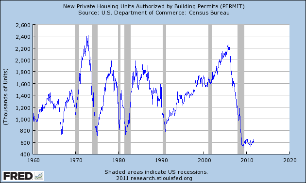
With October's report we are 70% of the way there from the March 2009 bottom of 513,000.
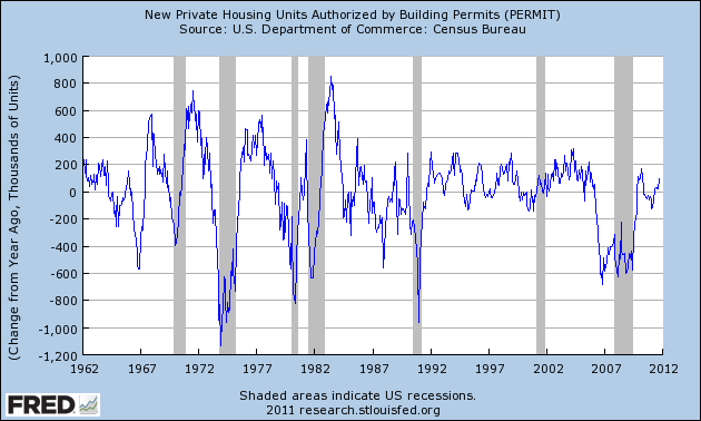
Another way of looking at housing and expansions is to measure the YoY improvement in the raw numbers. Typically in expansions there have been sustained periods of 200,000+ growth YoY:
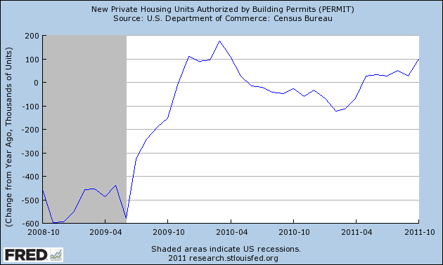
With Wednesday's number we are half the way there, for the first time without help from the housing credit:
It is worth keeping in mind that Bill McBride a/k/a Calculated Risk has shown the strong leading relationship between housing starts and the unemployment rate, so a confirmed uptrend should mean at least a small reduction in the unemployment rate.
As Bonddad described earlier this morning, in the past week we have had a raft of very good economic reports. Housing permits was probably the most significant of them all. While by no means are we at the end of the housing bust (although the bottom was probably put in two years ago in terms of permits and starts), Wednesday's number was significant. If the trend continues, we may have 200,000+ improvement off the bottom within 6 to 12 months. In short, we may be at least at the beginning of the end.
Housing construction is a long leading indicator, indeed along with interest rates probably the most important one. So those commentators who say that we won't get housing improvement until we have job improvement have causation exactly backwards. Rather, it is much more likely that we won't get more meaningful job improvement until we have more meaningful housing improvement. Further, the decline in housing starts and permits after the expiration of the $8000 housing credit was probably an important factor in the slowdown in GDP earlier this year, and probably plays a role in ECRI's recession call.
With that in mind, housing permits coming in at 653,000 on Wednesday is a significant positive. It confirms the uptrend we've been seeing in housing permits this year, and is the first reading over 650,000 in a year and a half:
This time we were led out of the bottom of the recession by manufacturing and exports, but obviously they need help. In the past it has typically taken an improvement of 200,000 housing starts from the bottom to signal that a housing-led expansion has begun:
With October's report we are 70% of the way there from the March 2009 bottom of 513,000.
Another way of looking at housing and expansions is to measure the YoY improvement in the raw numbers. Typically in expansions there have been sustained periods of 200,000+ growth YoY:
With Wednesday's number we are half the way there, for the first time without help from the housing credit:
It is worth keeping in mind that Bill McBride a/k/a Calculated Risk has shown the strong leading relationship between housing starts and the unemployment rate, so a confirmed uptrend should mean at least a small reduction in the unemployment rate.
As Bonddad described earlier this morning, in the past week we have had a raft of very good economic reports. Housing permits was probably the most significant of them all. While by no means are we at the end of the housing bust (although the bottom was probably put in two years ago in terms of permits and starts), Wednesday's number was significant. If the trend continues, we may have 200,000+ improvement off the bottom within 6 to 12 months. In short, we may be at least at the beginning of the end.
Recession Watch
Here are charts of some of the indicators used by the NBER to determine whether or not the US is in or headed toward a recession:

Real GDP continues to increase, and in fact is now slightly above the peak of the previous expansion.

Real retail sales stalled for most of this year, but have increased for the last two months.

Industrial production is still moving upwards, although at a slightly reduced rate.

Personal income less transfer payments are still increasing, but are far below the previous peak.
As usual, the one big problem area is employment, or perhaps, more appropriately, the lack thereof.

Let me add a few more indicators that I use:

The ISM manufacturing index declined sharply earlier this year, but is still ever-so-slightly positive.

The ISM services index is showing a reading above positive.

Weekly initial claims are now slightly below 400,000.
Bottom line: the indicators say we're in for more fits and starts growth.

Real GDP continues to increase, and in fact is now slightly above the peak of the previous expansion.

Real retail sales stalled for most of this year, but have increased for the last two months.

Industrial production is still moving upwards, although at a slightly reduced rate.

Personal income less transfer payments are still increasing, but are far below the previous peak.
As usual, the one big problem area is employment, or perhaps, more appropriately, the lack thereof.

Let me add a few more indicators that I use:

The ISM manufacturing index declined sharply earlier this year, but is still ever-so-slightly positive.

The ISM services index is showing a reading above positive.

Weekly initial claims are now slightly below 400,000.
Bottom line: the indicators say we're in for more fits and starts growth.
Will the Dollar Rally?
From Daily FX:
Back in September of 2008, the credit markets began to seize when news that Lehman Brothers had lost access to its credit lines and thereby would be forced to close shop made the headlines. The normal operation of the capital markets depends on the availability and circulation of credit. Banks frequently require short-term funds to cover obligations for overnight up to a few months when there is not enough cash on hand to cover liabilities or they are unable to liquidate positions to raise the necessary capital. Normally, it isn’t difficult to raise this capital through the open market at very low cost; but when there is a risk of falling short of mandated reserves, banks will generally hold cash rather than lend it out. For those that come up short, such a situation can spell a quick end.
These are the financial dynamics that we need to watch for now. We are already seeing the signs of real trouble building up. The most pressing concerns are still across the Atlantic as European banks are attempting to cut their holdings in Euro Zone government debt to shore up their balance sheets and meet reserve ratios that have been pushed up to 9 percent by regulators and have to be met by the middle of next year. Yet, we are seeing the strain spread to the US and the rest of the world. Gauging the global strain, the demand from European banks for funds in the US (struggling to find it in the EU), the Fed reported today that its swap lines to the region rose to $2.25 billion. Domestically, the Libor-Overnight Index Spread (a favored gauge for the cost of short-term money) rose to its highest since June of 2009. The kindling has been stacked. If there is a spark - like an influential bank failing (perhaps on the same level as MF Global) – credit markets could freeze and leverage dollar liquidity.
Thursday, November 17, 2011
Morning Market
For the last few weeks, the market has been moving sideways. Yesterday, we saw a change in several of the major equity ETFs.

On high volume, the SPYs printed a strong downward bar that moved through the 200 and 50 day EMA.

We see the move in good detail on the 10 day, 5-minute chart. Prices moved through important support a little before lunch yesterday and remained there for the remainder of the trading session.

In addition, we saw the QQQs move through the 50 day EMA, also printing a strong bar on decent volume. That makes two equity indexes that made significant downside moves yesterday.
Ideally, to confirm this move lower, we'd like to see prices advance into the EMAs on declining volume and then sell off once they hit important resistance levels (like the EMA).

In contrast, we have the IEFs' which advanced yesterday, but with not quite enough momentum to make it through important technical resistance -- yet. With the weaker CPI print this week, real yields actually increased overall, meaning we have move upside room in the Treasury markets.

On high volume, the SPYs printed a strong downward bar that moved through the 200 and 50 day EMA.

We see the move in good detail on the 10 day, 5-minute chart. Prices moved through important support a little before lunch yesterday and remained there for the remainder of the trading session.


In addition, we saw the QQQs move through the 50 day EMA, also printing a strong bar on decent volume. That makes two equity indexes that made significant downside moves yesterday.
Ideally, to confirm this move lower, we'd like to see prices advance into the EMAs on declining volume and then sell off once they hit important resistance levels (like the EMA).

In contrast, we have the IEFs' which advanced yesterday, but with not quite enough momentum to make it through important technical resistance -- yet. With the weaker CPI print this week, real yields actually increased overall, meaning we have move upside room in the Treasury markets.
Bonddad Linkfest
- Speculators increase raw materials bets
- Five risks heading into 2012
- The economy's overall structural shift
- US economy shows signs of momentum
- US migration hits a record low
- Gingrich was paid $1.7 million from the GSEs
- EU growth is at .2% ... again
- OWS: more trouble than change?
- Farmland prices increase the most in 30 years
- Tracking crop exports
Jon Stewart on the "Super" Committee
If it wasn't for Jon Stewart, I wouldn't be able to deal with the 24 hour news cycle.
What Does the Market's Low Volume Tell Us?
From Mark Hulbert:
To find out how worried we should be, I analyzed stock-exchange volume at the beginning of all bull markets since the early 1970s. I relied on the precise definition of a bull market that is employed by Ned Davis Research, the quantitative research firm, according to which there have been 10 bull markets since the mid 1970s.
For each of these bull markets, I calculated a ratio of two numbers: The first is average daily NYSE trading volume over the first six weeks of that bull market, and the second is the average over the six weeks prior to the bull market’s beginning (that is, in the last six weeks of the preceding bear market). I chose these six-week windows because that is how much time has passed since the early October lows.Across all 10 past bull markets, this ratio’s average was 2.15 to 1. That means that trading volume was more than twice as high in the first six weeks of the average past bull market than in the six weeks of the preceding bear market.How does this compare to what we’re experiencing today? The ratio of average daily trading volume in the six weeks since the October low to the average in the six weeks prior to that was 1.87 to 1 — 13% lower than this ratio’s average and lower than the minimum this ratio has been at the beginning of any of the last 10 bull markets.
Bonddad Linkfest
- How to succeed even if the super-committee fails
- Republicans have tax policy identity crisis
- Spanish bonds near critical level
- Deficit panel will probably hit a stalemate
- French borrowing costs spike
- Portugal on target to meet IMF bail-out requirements
- Household debt's contribution to unemployment
- Initial claims drop 5,000
- A look at US income mobility
- Will the increase in oil prices hit the consumer
Morning Market

Today I want to start with oil, as its rally is ongoing. Prices moved through the 102 price level, but have fallen back in a standard profit taking move. Notice the strength of this rally; all the EMAs are moving higher, prices are above the 200 day EMA and there have been periods of profit taking along the way. There is technical resistance at the 104 area, but aside from that, there is very little stopping the upward advance. This is important because at some point, this will translate into higher gases at the pump.
For the last few weeks, equity prices have been in a sideways trading pattern. However, yesterday we may have seen a break.

The SPYs printed strong downward bar that moved through the lower line of the consolidating triangle and the 200 day EMA. The only support we see is at the 50 day EMA. However, this occurred in very low volume, indicating a lack of urgency on the part of traders.

We see a similar move in the QQQs, with prices being a bit closer to the 50 day EMA.

But we see that the Russell 2000s are still within their trading range.
It's important to remember that the equity markets -- together -- comprise an entire data set. We need to look at all three major averages (SPY, QQQ and IWM) to get a clear understanding of the overall market direction.

At the same time, we're not seeing a really strong rally in the Treasury market. The IEFs are still above all their EMAs, but we're not seeing any major new advances and volume is incredibly weak. Ideally, if we were going to see a massive stock market sell-off, it would be accompanied by a Treasury market rally as traders made a flight to safety.

The dollar is still in an upward sloping channel, with prices just above the 200 day EMA. The shorter EMAs are in a tight bundle, indicating there is little direction in the market right now.
Subscribe to:
Posts (Atom)