Monday, December 20, 2010

Year End Look At the Treasury Market


The primary trend for the IEFS has been a strong, upward sloping pattern over the last three years. However, notice that prices are currently nearing this important trend line. The real question is will the line hold? If not, then a fundamental trend that has lasted three years will be over, indicating an important shift in the bond market.


This year there were three important trends. The first was the rally that started in late May, caused by the EU crisis. This rally lasted until September, when prices formed a triangle top. Prices have since fallen hard and fast. Note the increasing volume on the sell-off.


Notice that when the IEFs were forming a second top, the MACD was decreasing (a), indicating the momentum was declining, indicating the rally was weaker. The MACD has continued to decline, indicating momentum continues to decline. This has been followed by a declining A/D line and negative CMF, both of what tell us that money is leaving the market.

New Jobless Claims and the Unemployment Rate continued (I)

- by New Deal democrat

On Friday I noted that adjusting first time jobless claims by population gives you the "initial jobless claims rate," which has tracked very closely over the last half century with the unemployment rate, with very few exceptions - one of which is now.

Surprising relationships like this are powerful motivation to the data nerd in me, so over the weekend (while I wasn't going to holiday parties), I took a further look. This is the first follow up post on what I found.

The following graphs come from a terrific site called Thumbcharts. The title of the graph is "Jobless Claims lead the Unemployment Rate." The methodology is explained as follows:
This chart shows the annual rate of change for initial jobless claims and the unemployment rate. Each series is modified with a six-month moving average and is compared using standard deviation.
In other words, as of now we are comparing the average of initial jobless claims from June 11 through December 11 of this year, with the same six month period last year. Similarly, the average unemployment rate from May through November of this year is being compared with the same average from last year.

Here is the resultant graph:


The graph is interactive, so it allows you to zoom in on particular periods. So I chose those where the unemployment rate did not decline as much as the change in initial jobless claims. The software also displays the actual data for one month when you place your cursor over that month, but it doesn't reproduce, so I am noting it in my comments to each graph.

But here is the summary: in every case except for the 1980-1982 "double dip," a decline of 10% as measured of initial jobless claims was followed within 10 months by a similar decline in the unemployment rate. Increase that to a 20% decline in the measure of initial jobless claims, and the period shrinks to 8 months.

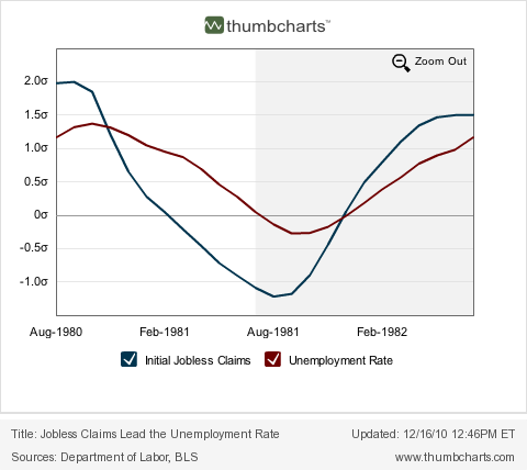
Here is the 1980-1982 "double dip" recession period:


Initial Jobless claims were down 10%+ YoY by May 1981. The YoY low in the change in the unemployment rate (i.e., a percentage change in a percent) was -1.2% in September 1981.

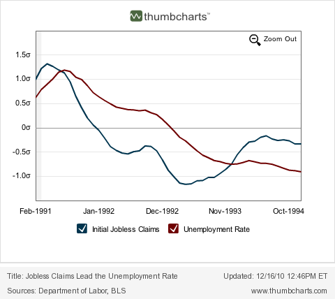
Here is the 1991 recession and "jobless recovery" thereafter:


Initial Jobless claims were down 10%+ YoY by January 1993. They were down 20%+ by April 1993. The Unemployment Rate was down 10%+ in November 1993 -- 11 months later.

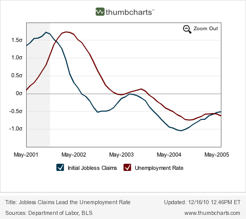
Here is the 2001 recession and "jobless recovery" thereafter:


Initial Jobless claims were down 10%+ YoY by March 2004. The Unemployment Rate was down 10%+ in September 2004 -- 6 months later.

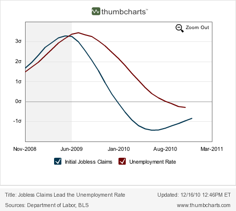
And here is the Great Recession and current recovery:


Initial Jobless claims have been down 10%+ by March 2010, and 20%+ since April. The Unemployment Rate is only down -1.5% in November 2010. As with the metric I posted Friday, presently this is by far the weakest decline in the unemployment rate compared with initial jobless claims in the entire series.

The two data series' past relationship argues that if initial jobless claims continue to drift lower to 400,000 over the next 6-8 months, by that time unemployment is likely to be under 9%. To repeat the 1980-82 scenario, there would have to be a shock (like a large further increase in the price of Oil, or another Euro crisis, or similar), sending initial claims higher, in order to negative the decline in the employment rate.

------
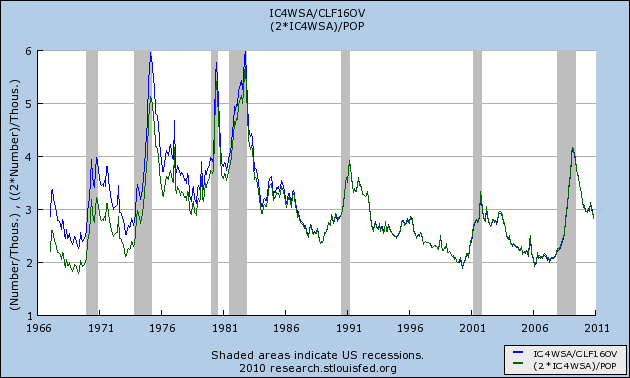
P.S. SilverOz asked me to look into initial claims are a percentage of the labor force. I have done so, and here is the comparison between that (green) and initial claims are a percentage of population (blue) (I multiplied this by two so it would be easier to compare):


As you can see, they are virtually identical since 1980. This reflects the gradual entry of women into the workforce.

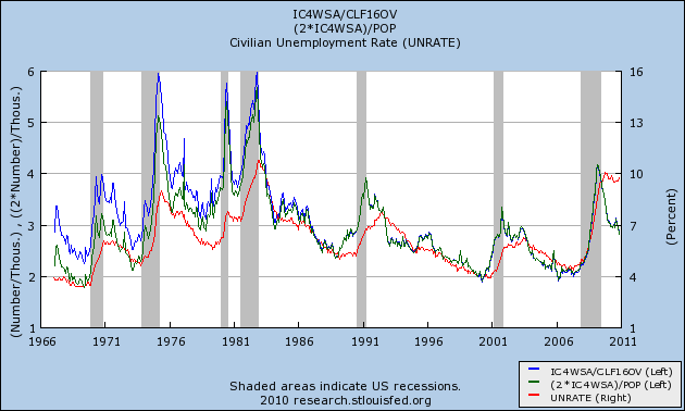
In this graph I add in the unemployment rate (red):


The relationship tracks more closely via my original metric.

The data series start in the 1960's, so unfortunately I cannot take the comparison back further.

I have much more to say about this, hopefully tomorrow.

Year End Look At the Stock Market

Today I'm going to look at all the markets from a variety of time perspectives to see where we are in the cycle.


First, let's remember the long view about where we are in the market. This is a three year chart with weekly candles. Starting in early 2009 the market started to rally. Notice the massive volume sell-off the occurred before the rally started, indicating a selling frenzy. The markets rallied for about a year. The this spring we had the EU crisis. Stock sold-off, but notice that prices stayed around the 50 day EMA. Then when it looked as though the EU crisis wasn't as bad as thought, prices started to rally again. Now, prices are over key resistance areas.


On the daily chart, prices have clearly broken through key resistance, and have now formed a downward sloping pennant pattern, finding support at the 10 day EMA. The EMAs are in a very bullish pattern -- all are moving higher, the shorter area above the longer and prices are above all the EMAs.


The technical indicators confirm the rally. The A/D line indicates a continuous flow of new money has been flowing into the market, although it as leveled off in December. The CMF confirms this inflow. The MACD has given a buy signal, but has been moving sideways for the last week.

The equity markets are in a rally. There is no reason to think this rally will fade, barring a fundamental hit to the economy.

I'll tackle the Treasury market, the dollar and oil later today.

Friday, December 17, 2010

Back on Monday

Sorry -- no dog pictures this weekend.

We'll be back on Monday.

Weekly Indicators: the Consumer is Back edition

- by New Deal democrat

This week continued the spate of strongly improving data - except for housing. Both the Empire State and Philly Fed regional reports surprised strongly to the upside. Industrial production and capacity utilization turned back up, although less strongly. Consumer inflation was somnolent, producer prices not so. Housing permits and starts remained down in the ditch. Leading Indicators came in at +1.1%, meaning the last 3 months are up a combined 2.0%, meaning more improvement ahead. But the star of the show had to be retail sales, which at +.8% continue a 5 month winnng streak, totaling +4.8% - or an annual growth rate in excess of 10%.

Most of this week's high frequency data was strong as well.

The BLS reported 420,000 new jobless claims. The 4 week moving average fell to 423,000, another new low since early August 2008. Seven of the last eight weeks have shown 440,000 or fewer new claims. As I said last week, if this trend continues (no guarantee), the average will drop below 400,000 by February.

Gas at the pump increased ten cents to $2.98 a gallon last week. This is about $0.30 above its average from a few months ago. Oil continued to flirt with the $90 a barrel mark. Despite this, gasoline usage was significantly higher than last year, 9.349 B gallons vs. 8.963 B a year ago. Gasoline stocks remain back in their normal range for this time of year.

The Mortgage Bankers' Association reported that its seasonally adjusted Purchase Index decreased 5.0% last week, but generally remains stable for the last couple of months. This series is comparable to year-ago levels excluding those periods when home buyers rushed to beat the expiring $8000 tax credit. Contrarily, the Refinance Index declined for the fifth straight week, by 0.7%. As I said last week, rapidly increasing mortgage interest rates are killing refinancing, and this may have an effect on consumer spending later.

The ICSC reported same store sales for the week ending December 11 increased 3.1% YoY, and increased 0.8% week over week. Shoppertrak reported that sales declined -0.4% YoY in the week ending December 11. They anticipate that Holiday sales will increase about 4% YoY when all is said and done.

Railfax showed improvement in most measures compared with last year. Additionally, for the first time in a while, shipments of lumber and scrap metal are comfortably above last year's numbers, indicating some improvement in the housing market.

The American Staffing Association reversed its Thanksgiving week decline and is back at 101 for the week ending December 4. This index will decline significantly over the next several weeks as it always does, and won't give much reliable information again until January.

M1 was down -1.5% for the week, down -.3% vs. last month, and +8% YoY, meaning "real M1" is up 7.0%. M2 held steady for the week, but was up +.15% vs. last month, and 3.0% YoY, meaning "real M2" is up 2.0%. Real M2 has stalled without being able to break out of the "red zone" below +2.5% YoY.

Weekly BAA commercial bond rates increased from 5.95% last week to 6.09%. This compares with yields on 10 year bond yields going up .25%. All bonds have come under stress recently, but this suggests investors are "reaching for yield." It's worth noting also that bond yields and stocks continue to move in opposite directions, indicating zero fear of a deflationary pulse.

The Daily Treasury Statement showed receipts in the first 11 reporting days of December of $77.8 B vs. $67.0 B a year ago, for a gain of 16%! For the last 20 days, $130.9 B has been received vs. $117.5 B a year ago, another strong gain of 11%.

The development of commodity inflation, especially as feeding through into the bond market, will have to be watched. Still, with the exception of housing, the economy seems to be firing on all cylinders. A few pundits have begun to use the surprising phrase that the economic recovery seems to be turning "self-sustaining." I would say they are more likely correct than incorrect, and even though we would like a lot more growth in jobs and income, that has to be very welcome news.

Have a nice weekend!

No, Virginia, the CRA Didn't Cause the Financial Meltdown

Once again, we're seeing the great lie that the Community Reinvestment Act was a cause of the financial meltdown in 2008. This is being promoted by the dissent to the report issued by the Congressional Committee that is looking into the crisis. First, I love the idea that a law -- passed in the late 1970s -- was the cause of a crisis 30 years later. However, the Minneapolis Federal Reserve looked into the issue and here is their conclusion:


Before we turn to our analysis of CRA lending data, we have two important points to note regarding the CRA and its possible connection to the current mortgage crisis.

The first point is a matter of timing. The current crisis is rooted in the poor performance of mortgage loans made between 2005 and 2007. If the CRA did indeed spur the recent expansion of the subprime mortgage market and subsequent turmoil, it would be reasonable to assume that some change in the enforcement regime in 2004 or 2005 triggered a relaxation of underwriting standards by CRA-covered lenders for loans originated in the past few years. However, the CRA rules and enforcement process have not changed substantively since 1995.2/ This fact weakens the potential link between the CRA and the current mortgage crisis.

Our second point is a matter of the originating entity. When considering the potential role of the CRA in the current mortgage crisis, it is important to account for the originating party. In particular, independent nonbank lenders, such as mortgage and finance companies and credit unions, originate a substantial share of subprime mortgages, but they are not subject to CRA regulation and, hence, are not directly influenced by CRA obligations. (We explore subprime mortgage originations in further detail below.)

.....

Using loan origination data obtained pursuant to the Home Mortgage Disclosure Act (HMDA), we find that in 2005 and 2006, independent nonbank institutions—institutions not covered by the CRA—accounted for about half of all subprime originations. (See Table 1.) Also, about 60 percent of higher-priced loan originations went to middle- or higher-income borrowers or neighborhoods, populations not targeted by the CRA. (See Table 2.) In addition, independent nonbank institutions originated nearly half of the higher-priced loans extended to lower-income borrowers or borrowers in lower-income areas (share derived from Table 2).

In total, of all the higher-priced loans, only 6 percent were extended by CRA-regulated lenders (and their affiliates) to either lower-income borrowers or neighborhoods in the lenders' CRA assessment areas, which are the local geographies that are the primary focus for CRA evaluation purposes. The small share of subprime lending in 2005 and 2006 that can be linked to the CRA suggests it is very unlikely the CRA could have played a substantial role in the subprime crisis.

.....

It is also possible that the remaining share of higher-priced, lower-income lending may be indirectly attributable to the CRA due to the incentives under the CRA investment test. Specifically, examiners may have given banks "CRA credit" for their purchases of lower-income loans or mortgage-backed securities containing loans to lower-income populations, which could subsequently affect the supply of mortgage credit.

Although we lack definitive information on banks' CRA-induced secondary market activity, the HMDA data provide information on the types of institutions to which mortgages are sold. The data suggest that the link between independent mortgage companies and banks through direct secondary market transactions is weak, especially for lower-income loans. (See Table 3.) In 2006, only about 9 percent of independent mortgage company loan sales were to banking institutions. (Figure not shown in table.) And among these transactions, only 15 percent involved higher-priced loans to lower-income borrowers or neighborhoods. In other words, less than 2 percent of the mortgage originations sold by independent mortgage companies in 2006 were higher-priced, CRA-credit-eligible, and purchased by CRA-covered banking institutions.

.....

Two basic points emerge from our analysis of the available data. First, only a small portion of subprime mortgage originations is related to the CRA. Second, CRA-related loans appear to perform comparably to other types of subprime loans. Taken together, the available evidence seems to run counter to the contention that the CRA contributed in any substantive way to the current mortgage crisis.

So, who are you going to believe. A group of economic wonks who have done a ton of research looking at the data, or a bunch of Congressional/political hacks who have been lobotomized by the Washington political process?


Two views of Jobless Claims and Unemployment

- by New Deal democrat

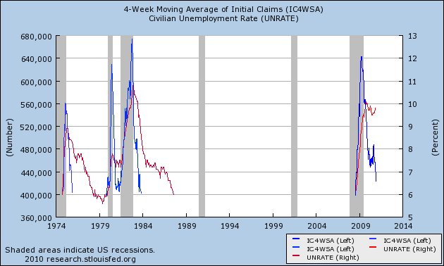
While the recent decline in first time unemployment claims is certainly good news, the fact remains that over 400,000 initial jobless claims have been made each and every week for a long time. Since the beginning of August 2008 to be precise.

That got me wondering how long initial claims were over 400,000 in the other severe recessions of the 1970s and early 1980s. As it turns out, in the 1973-74 recession, they only exceeded 400,000 for 1 year: November 1974 to November 1975. In the "double dip" 1980 and 1981-82 recessions, however, claims remained elevated over 400,000 for a full 4 years -- November 1979 through November 1983!

Comparing that with the time unemployment over 6% gives us the following graph of two periods of "hard times:"


In fact, unemployment stayed over 6% for all but a few months in 1978-79 for a full 17 years, from April 1974 to August 1987. That is certainly a portrait of a very bad decade, that we hopefully are not in the process of repeating.

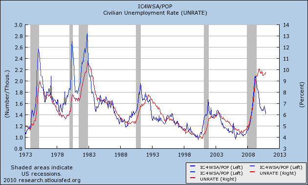
But it isn't really fair to compare 400,000 weekly new jobless claims over a time period when population grew from 200 million to over 300 million. So I replaced that metric by dividing the number of initial claims by the population, giving me the number of people per 1000 who were laid off each week, and this is the graph that emerged:


This, second graph is the better one, since we are measuring both first time claims and the unemployment rate as percentages of population. And it paints a more interesting picture. Seen in this light, we have improved to the point where are having fewer layoffs now than we have had in about half of the last 35 years.

Notice too that by this measure, the unemployment rate and initial jobless claims track closely, with 2 exceptions. One is during the very brief 1979 recession, where there wasn't time for unemployment to rise very much.

The second time is right now. Unemployment remains far more elevated than is suggested by the relative lack of layoffs. In other words, the poor employment situation isn't so much that a large number of people are still being laid off, but rather that hiring for new jobs is close to pathetic.

It strikes me that this is of a piece with why we haven't seen new hiring keep up yet with real retail sales (as I described yesterday). I think I can pinpoint why. I'll put up a post on that next week.

Philly Fed Increases

From Bloomberg:

Manufacturing activity has picked up this month in the Mid-Atlantic region. The Philadelphia Federal Reserve's index rose nearly two points to 24.3 to indicate significant improvement in the sample's subjective assessment of general business conditions.

Specific readings on new orders and backlog orders are both picking up steam which is good news for future shipments and employment. Shipments increased though at a slower pace than November's pace. Manufacturers in the sample added to their workforces though, like shipments, at a slower pace than in November. They did however sharply extend the workweek, that is they worked their existing workforce longer. Hopefully employment will begin to pick up in line with orders.

Both input prices and output prices spiked reflecting rising fuel and commodity costs. This could mark the beginning of a trend or could just be a one-time blip. This report, led by new orders, adds to this week's good news on the manufacturing sector.


Here's the relevant chart:


Like the Empire State survey, the Philly Fed number dropped probably as a result of the EU situation. However, it appears the region has bounced back.

Thursday, December 16, 2010

Yesterday's Market


First, note that equity prices broke through a key downward sloping trendline yesterday.


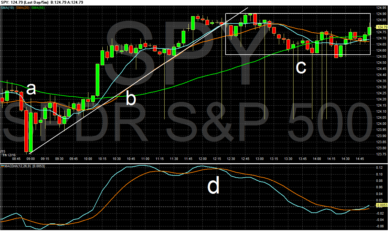
Note the sharp, early morning sell-off (a) followed by a strong rally (b). After the MACD (d) printed same height peaks (a bit before (a) on the chart), a reversal was likely. Prices broke the uptrend and then moved sideways for the rest of the day.


On the SPYs daily chart, notice that prices are still printing small bars on decreasing volume, indicating the intensity of trade has slowed. This is to be expected considering we're going into the end of the year holidays.


Also note the IWMs are rallying, indicating that risk based capital is still moving into the market.


Yesterday the Treasury market also revered several days of declines.


In the afternoon, notice the three different trend lines whose angle increases. This indicates the momentum behind the rally was gaining steam as the trading day progressed.

Initial Claims Continue to Move In the Right Direction

From Bloomberg:

Fewer workers than forecast filed claims for unemployment benefits last week, pointing to a drop in firings that signals the U.S. job market is improving.

Applications for jobless insurance payments fell by 3,000 to 420,000, sending the average over the past four weeks to the lowest level since August 2008, according to data from the Labor Department issued today in Washington. Other reports showed work began on more houses last month and manufacturing picked up in the Federal Reserve Bank of Philadelphia region in December.

A decrease in firings would be a harbinger of bigger gains in payrolls that will help bring down the jobless rate, which has been at 9.5 percent or higher for 16 consecutive months, the longest stretch since monthly records began in 1948. Fed policy makers this week said they will continue to buy Treasury securities in a bid to reduce unemployment.

“Hiring is picking up, but there’s still a lot of work to be done,” said Aaron Smith, a senior economist at Moody’s Analytics Inc. in West Chester, Pennsylvania. “The labor market is gaining traction, which should be a positive for housing.”

A Closer Look At Inflation

The BLS has issued all of the inflation reports for the month, so this is a good time to take a look at the overall data to see if we are still in a deflationary scare or not. Let's start with PPI:

The Producer Price Index for Finished Goods rose 0.8 percent in November, seasonally adjusted, the U.S. Bureau of Labor Statistics reported today. This increase followed a 0.4-percent advance in both October and September. At the earlier stages of processing, prices received by manufacturers of intermediate goods climbed 1.1 percent in November, and the crude goods index moved up 0.6 percent. On an unadjusted basis, prices for finished goods rose 3.5 percent for the 12 months ended November 2010, their smallest 12-month increase since a 3.1-percent advance in August.


Let's look at the year over year (YOY) percentage change of producer prices at various stages of production.


Crude prices are picking up steam, largely as commodity prices increase form the decreasing dollar.


But intermediate prices are still tame. Notice how the percentage bars in the recovery (d) are lower than both period (a) and (b) during the last expansion. This tells us that -- so far -- crude price increases are being absorbed at the intermediate stages of production


The PPI for Finished goods is also still lower than the last expansion (compare (d) to (a)).

Finally, here is a graph of all the PPIs of the various states of production on a linear scale:


Notice the crude goods jump around a lot, whereas the intermediate adn finished goods track each other a lot more closely. Also note that jumps in crude goods move to intermediate and finished goods, but not in as large a way as you might think. In short, crude prices get absorbed in production.

Let's turn to CPI:


The Consumer Price Index for All Urban Consumers (CPI-U) increased 0.1 percent in November on a seasonally adjusted basis, the U.S. Bureau of Labor Statistics reported today. Over the last 12 months, the all items index increased 1.1 percent before seasonal adjustment.

The indexes for food, energy, and all items less food and energy all increased slightly in November. The index for food at home rose in November after being unchanged in October, with the indexes for eggs and nonalcoholic beverages both rising notably. Although the index for gasoline rose, the index for household energy declined and the increase in the energy index was the smallest in five months.

The index for all items less food and energy rose in November after being unchanged the previous three months. Increases in the indexes for shelter and airline fares accounted for most of the rise, while the indexes for new vehicles, used cars and trucks, and household furnishings and operations all declined.

Over the last 12 months, the index for all items less food and energy has risen 0.8 percent. The energy index has risen 3.9 percent over that span with the gasoline index up 7.3 percent but the household energy index down 0.2 percent. The food index has risen 1.5 percent, with the food at home index up 1.7 percent.

Let's look at the data:


Total CPI is printing about 2.5% YOY, which is still very low. It indicates there is little to no price pressure in the economy right now. More importantly:


The core figure has been declining on a YOY basis for almost two years, indicating the pace of decline continues and deflation is still an issue.

Finally, let's take a look at a chart that compares the YOY change in core and total CPI since 1980.

In the above chart, total CPI is the red line, while CPI less food and energy is the blue line. Notice you can divide the chart into basically two areas. The first is before the year 2000 when the core and total CPi tacked each other pretty closely and total CPI was far less volatile. Over the last 10 years, notice the total CPI's YOY percentage change has become extremely volatile, largely as a result of commodity inflation.

Looking at more detail into the last 10 years, we get this chart:


Total CPI has been far more volatile over the last 10 years.

Real Retail Sales, the "Holy Grail" leading indicator for jobs, signals more growth ahead

- by New Deal democrat

The blowout upside report and revisions for retail sales, and the somnolent inflation report, show that real (inflation adjusted) retail sales have grown at a rate of over 6% a year for the last three months. Indeed, real retail sales have exceeded 6% YoY growth for almost half of this year. That bodes very well for employment going forward.

Because we have a large number of new readers, courtesy of Citizen K at DK, Jeff Miller at A Dash of Insight, and Seeking Alpha, I am taking this opportunity to explain again why I believe real retail sales are the "holy grail" leading indicator for job growth.

It is certainly true that any number of economic series have a correlation with payroll gains and losses. But none of them -- not GDP, not personal consumption, not person income, nor others -- over the long term tracks so closely with payroll growth. For example, in the past I have looked at GDP and compared it with payroll growth, noting that YoY percentage changes in GDP (minus two percent) appears to lead payroll growth:
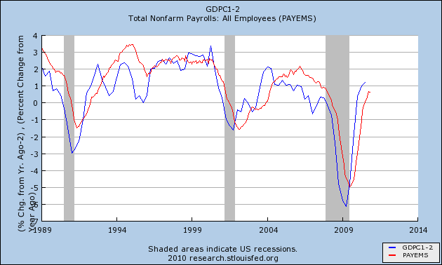


The problem is that GDP is only reported quarterly, so by the time you learn the GDP for a quarter (like Q4 2010), you already know what the payroll growth was. At best, YoY GDP when initially reported, can give guidance about payroll growth over the next couple of months.

To the contrary, not only do real retail sales correlate closely with payrolls over the long term, but they consistently lead the job market.

Contrary to the commonly held belief, historically it has not been the case that job growth leads to consumption. Rather, it is the other way around. Consumer spending typically leads jobs with a lag of about 5 months. Here is a graph showing that point as an average of all post-World War 2 recessions (0 = the month a recession ends):
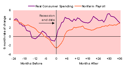


In fact, real retail sales have consistently turned at both tops and bottoms, an average of 3-5 months before job growth or losses turned with considerable variance (since WW2, the actual lead has been -4, -3, 0, +1, +4, +5, +5, +11, +14, +16, and +17 at tops, and -2, 0, +2, +3, +4, +6, +6, +7, +9, and +23 at troughs). This time real retail sales bottomed in April 2009, 8 months before jobs bottomed, longer than usual but well within its normal range as described above, and not nearly with so much a lag as in the 2002-03 "jobless recovery."

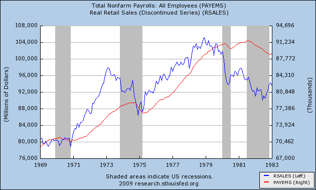
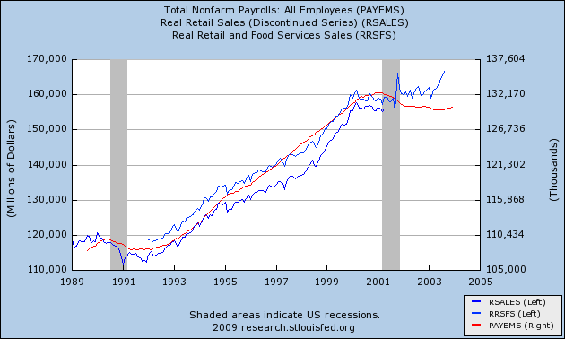
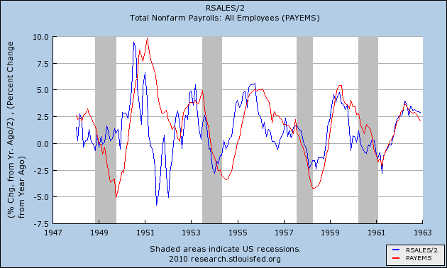
In order to show you this relationship in the most comprehensive way, I am reproducing here graphs showing the entire 60 year record of real retail sales compared with jobs. With the sole exception of the 1961 recession, Real retail sales (the blue line) has consistently made peaks and troughs ahead of payrolls (the red line) ...

in the postwar period from 1948 through the 1962:
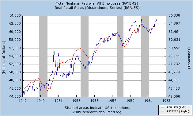


as it did during the 1970s recessions (ex the 1970 trough):

as it did during the 1991 and 2001 recessions and "jobless recoveries":


as it has just done with regard to the "Great Recession:"
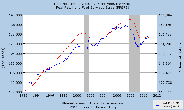


Not only do real retail sales have an excellent track record leading turning points for job growth and contractions, but they also have a very strong relationship to the rate of those jobs added or lost. Thus, the above graph, based on a relationship that goes back over 60 years, strongly suggests that job growth is going to turn stronger, and very soon.

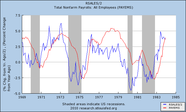
To see this, let's examine the year-over-year percentage changes in each. That is what the next series of graphs show. Because real retail sales are historically much more volatile, these graphs take the YoY percentage change in real retail sales and divide by 2 (blue line), which historically yields a very close fit with YoY payroll changes (red line).

Here it is for the immediate postwar period:

And here it is for the 1970s recessions and recoveries:

And here it is for the two "jobless recoveries" and up until now:
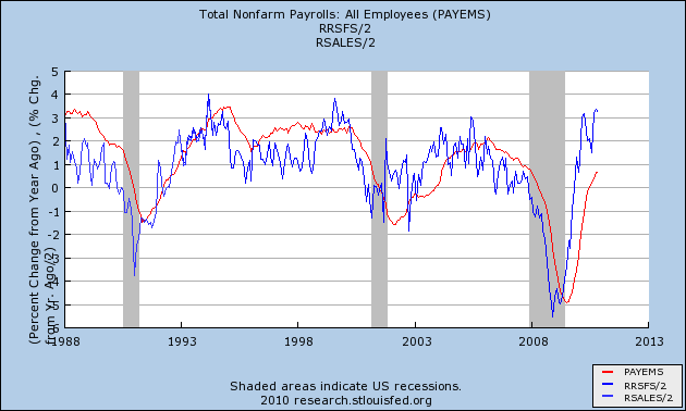

Notice that real retail sales not only lead, but that the amplitude of the changes is usually very similar.

In fact, the weakest relationship by far occurred during the lame "Bush expansion." Real retail sales only went up more than 5% YoY (translating to 2.5% on our graph) for 4 months during that entire time: February and March 2004 and June and July 2006. It took 12 months thereafter for YoY job growth to peak at 1.7%. If our recovery were as weak as the Bush expansion, that would still mean 2 million jobs added in a year by spring 2011, or an average of 165,000+ jobs a month.

Real retail sales have been up over 6% YoY now for 5 of the last 10 months. We were here once before, in April, before a nearly simultaneous confluence of bad events - the BP oil disaster, the Euro crisis, Oil at $90, and the expiration of the $8000 housing credit - knocked us into the summer slowdown, when both consumers and employers temporarily "froze" as they worried about a repeat of the 2008 financial panic. If we can avoid a similar series of setbacks, I am confident that at some point within the next 12 months, payroll growth is going to approach the growth in real retail sales, just as it has for over 60 years. And that means some pretty strong job growth in the upcoming months.

Yesterday's Market


Over the last five days, notice the SPYs are forming a rounding top. In addition, the rally up was grinding -- prices were moving higher, but there were very few strong bars or rallies; instead prices were inching up and then giving back a fair amount of ground. In contrast, the last two days we've seen a sell-off with strong moves lower, printing very strong bars.


Yesterday, prices rallied to the 68.2% Fibonacci level (a) before selling off to the 38.2% Fib level. Prices then moved sideways and hit the EMAs before moving lower (b). After selling off, prices moved into a grinding rally, but broke the trend and again moved lower (c). Prices then sold-off, rallied to (d) and sold off again.


Over the last few weeks, notice that Treasury prices have had several gaps lower (a) and some very strong bars lower (b) as well. This is a strong sell-0ff.


A closer look at the dollar shows the price/EMA situation is still mired in indecision. The EMAs are more or less moving sideways with prices trapped there.


Lumber was in an uptrend (A), which it broke at (B), when prices started to move lower. However, prices have started to rebound (D) and momentum is increasing (C). I use lumber as a proxy for the new home market.


Copper is still in a strong uptrend (A). Although prices dipped a few weeks ago (B), they are now back above the trend line (C). Also note the MACD is increasing (D)and the EMAs are in a very bullish orientation.

Wednesday, December 15, 2010

Empire State Back in Positive Territory


From the NY Fed:

The Empire State Manufacturing Survey indicates that conditions improved in December for New York State manufacturers. After dropping sharply into negative territory in November, the general business conditions index bounced back above zero, climbing 22 points to 10.6. The new orders and shipments indexes also rose above zero, while the unfilled orders index remained negative. The inventories index was negative, indicating that inventory levels were lower over the month. The indexes for both prices paid and prices received were positive and higher than last month, suggesting that prices rose, while employment indexes were negative, indicating that employment declined. Future indexes were generally at high levels—a sign that conditions were expected to improve over the next six months. Significantly, the future prices paid index was positive and rose sharply, indicating that respondents expected input prices to accelerate.

Here's a chart of the data:


Notice the Philly Fed also fell into negative territory a few months ago, but is now also printing a positive number.

Industrial Production Increases

From the Federal Reserve:

Industrial production increased 0.4 percent in November after a decline of 0.2 percent in October. The rate of change for industrial production was revised down in October but up in September; the net effect of the revisions from June to October left the level of industrial production in October about the same as was previously reported. In the manufacturing sector, output advanced 0.3 percent in November with gains in both durables and nondurables. The gains among durable goods industries were particularly broad-based; only the production of motor vehicles and parts decreased substantially. Excluding motor vehicles and parts, overall factory output advanced 0.7 percent. The output of mines edged lower, but the output of utilities moved up 1.9 percent as the return of more seasonal temperatures boosted the demand for heating. At 93.9 percent of its 2007 average, total industrial production in November was 5.4 percent above its level a year earlier. The capacity utilization rate for total industry rose to 75.2 percent, a rate 5.4 percentage points below its average from 1972 to 2009.


Consider this additional information:


Manufacturing production increased 0.3 percent in November. The factory operating rate moved up to 72.8 percent, its highest level in more than two years but still well below its long-run (1972 to 2009) average of 79.2 percent. The output of durable goods rose 0.4 percent, and with the exceptions of nonmetallic mineral products and motor vehicles and parts, output advanced in all of the major industries. Gains of 1 percent or more were reported in wood products, primary metals, fabricated metal products, machinery, computer and electronic products, and miscellaneous manufacturing. The production of nondurable goods rose 0.2 percent. Increases of 1 percent or more occurred in paper, printing and support, and plastics and rubber products. The indexes for petroleum and coal products and for chemicals both advanced around 0.5 percent. However, the production of food, beverage, and tobacco products declined and more than retraced the previous month's increase. The output indexes for textile and product mills and for apparel and leather both moved lower.

In November, the index for other manufacturing (non-NAICS), which consists of publishing and logging, fell 0.7 percent and was more than 7 percent below its year-earlier level. The output of mines edged down 0.1 percent in November, and the capacity utilization rate for mining moved down to 88.7 percent, a level 1.3 percentage points above its average from 1972 to 2009. The output of utilities rose 1.9 percent, as the output of both electric utilities and natural gas utilities increased. The operating rate for utilities rose, to 78.4 percent, but remained below its readings during the summer.

And we have the following information for market groups:

The production of consumer goods fell 0.5 percent in November. The output of consumer durable goods moved down 2.3 percent in large part because of a drop of 6.0 percent in the production of automotive products. Production advanced for all of the other major durable goods categories: home electronics; appliances, furniture, and carpeting; and miscellaneous consumer durables. The output of nondurable consumer goods was unchanged in November following declines in the two previous months. Among non-energy nondurable goods, the indexes for foods and tobacco, for clothing, and for chemical products all posted declines, but the output of paper products moved up 0.3 percent. The production of consumer energy products rose 1.9 percent as a result of both higher sales to residences by utilities and an increase in gasoline refining.

The output of business equipment rose 0.9 percent in November and was 12.5 percent above its level a year earlier. The indexes for industrial and other equipment and for information processing equipment both rose about 1-1/4 percent. The production of transit equipment fell 0.6 percent, which more than reversed its October increase.

In November, the index for defense and space equipment moved up 1.5 percent--its second consecutive monthly increase.

The production indexes for construction supplies and business supplies both rose 0.9 percent in November. Over the 12 months ending in November, the output of construction supplies has moved up 6.0 percent, while the output of business supplies has increased 1.4 percent.

The production of materials increased 0.7 percent in November, which more than reversed the October decline. The output of durable materials advanced 0.9 percent, as a decline in the output of consumer parts was more than offset by gains in the production of equipment parts and other durable materials. The output of non-energy nondurable materials also rose 0.9 percent. Within this market group, the indexes for chemicals and paper advanced following declines in the previous month. However, the production of textile materials recorded its fourth consecutive monthly decline. The production of energy materials moved higher with the gains in utilities and in support activities for oil and gas operations more than offsetting a decline in crude oil extraction.

Comments/observations in no order of importance:

1.) The broad based increases are welcome and indicate the manufacturing sector is still in a strong recovery. It also indicates the moderate slowdown that was caused by the EU situation in the Spring appears to be over.

2.) The increase in business equipment output should be a good harbinger of the business and equipment investment sub-category of the GDP report. This is further bolstered by the increase in communication equipment.

3.) The increase in construction supplies is interesting and is somewhat confirmed by lumber prices, which tried to rally off a bottom, fell back and are currently moving a bit higher.

4.) The broad increase in consumer durables is very encouraging, and indicates that businesses are thinking consumers will increase their purchases of these items. This bodes well, as these are typically more expensive items that usually require some type of financing to purchase.

Simply put, this is a very encouraging report.

Why Have Bond Yields Increased?

Over the past month, interest rates have increase from 2.62% to 3.3%. In Monday's FT, the paper proffers three reasons for the increase: better economic news, indicating a move from safe haven Treasuries to equities is warranted, higher inflation expectations and the Fed will not engage in QE2 because of the political backlash. To this, I will add a fourth, which is concern for the U.S.' fiscal situation.

Let's take these one at a time:

Better economic news: Outside of employment, the news has been positive. Retail sales are strong, household net worth is up, initial unemployment claims appear to be decreasing, manufacturing is still strong and the tax deal went through Congress. In short, it appears that things are looking up after the stall caused by the Spring. Good news means that companies should see an increase in earnings, which raises equity valuations, making bonds less attractive.

Higher inflation expectations: These are being stoked by the decreasing dollar and its negative impact on commodity prices (which move inversely to the dollar). More precisely, oil's recent increase to around $90/bbl is adding to inflationary concern. However, the US CPI number is still very low -- especially year over year -- so I really don't see this being a root cause of the Treasury sell-off.

The Fed will back off QE2: not according to yesterday's Fed statement.

The tax deal will lead to a worsening of the US fiscal situation: the markets have dropped sharply since the deal was passed, indicating the deal is probably leading to concern about future debt issuance from the U.S. The bottom line is the tax deal will lead to lower revenue for the government, meaning the US is not serious about its fiscal health.

I think its about 50/50 between the better economic news and the tax deal. There is no way to empirically prove this breakdown; its merely an intuitive guess.

Tuesday, December 14, 2010

Yesterday's Market


Notice that in the last two days, the markets have had a late day sell-off on high volume. This indicates traders are getting nervous about the market, thinking that overnight there will be a news event that will sent the market lower.


On the daily chart, notice there are two series of bars. The first (a), are a series of very strong, upwardly moving bars. The second (b) are smaller, indicating weakening upward pressure and a slackening of demand.


The Treasury market is continuing to sell-off (a) in a big way on high volume (b).


The dollar is still mired near the EMAs, which are also in a tight range. Also note that prices are near key Fibonacci levels.

So -- stocks are still moving higher, but are printing weaker and weaker bars. Bonds are in the middle of a fire sale and the dollar is looking for a direction.


After moving through the key $90/level, prices have retreated to the 10 day EMA. However, notice the very bullish EMA orientation -- all are moving higher, the shorter EMAs are above the longer EMAs and prices are above all the EMAs. However, the MACD is currently moving sideways, indicating momentum is decreasing.