Wednesday, July 21, 2010

Yesterday's Market


Yesterday was one heck of a rally (a). Prices gapped lower at the open (b), rallied through the EMAs and then consolidated (c). After a controlled, downward sloping pennant pattern, prices broke through resistance (d) and then moved through prior highs (e). Prices again consolidated in a downward sloping pennant pattern (f), but again broke through resistance (g), closing on a high point on strong volume.


On the 10 day chart, notice that prices have now advanced above key Fibonacci levels.


On the daily chart, notice that prices and EMAs are in tight ranges on all the big averages, indicating there is an even balance between the bulls and bears and has been for at least a week.


Treasury prices are still benefiting from a safety bid. While the long-end of the curve (the TLTs) may be consolidating at the top of range, the 7-10 year part of the curve (the IEFs) continue to move higher. Until we see Treasury prices drop, we'll probably have a subdued stock market.


With talk of deflation increasing, the Gold has lost its luster. Notice that prices continue to move lower with the EMAs continuing to become more bearish. The 10 and 20 day EMAs are both moving lower and the 10 has crossed below the 50 day EMA.


While momentum has left the gold market (b), we haven't seen a huge flight out of the security (c).

Tuesday, July 20, 2010

A Closer Look At the Early 90s Recession and Recovery

A few days ago I posted an article on the unemployment rate and initial unemployment claims of the last three recoveries. All charts showed the same thing: while the economy recovered within a short time (3-4 quarters) employment recovered over a longer time period -- usually taking at least a year after the end of the recession to start declining. That got me thinking -- what actually happened during those recessions and subsequent recoveries? Why were they different than other recoveries where employment recovered at a faster pace? So, let's take a detailed look at each of these recessions and the quarters afterwords to see exactly what happened.

First of all, let's date the recession. According to the NBER, the recession of the early 1990s lasted from 7/90 to 3/91 -- 9 months or three quarters (3Q90, 4Q90 and 1Q 91).


Above is a chart of the GDP for the three quarters of the recession and the give quarters after the recession. Notice that for the three quarters after the recession, GDP growth was positive but weak.


The recession started in 3Q90 when GDP printed 0% growth. However, notice that PCEs are still strong enough to offset the big negative contribution from gross private domestic investment.


By 4Q90, the negative impact of the drop in domestic investment had bled over into PCEs. This combination of weak consumer spending and weak gross domestic investment led to a contraction in GDP of 3.5% in 4Q90.


GDP contracted at a slower pace in the 1Q91, but the economy still had to contend with a massive cut in domestic investment.

Here are two charts of the percentage change in investment:


Notice how both categories dropped hard during the three quarters of the recession (7/90 - 3/91).

Hypocrisy and Confirmation Bias on Economics Blogs

- by New Deal democrat

There is an economic blogger who is currently hitting top of the lists at the place Bonddad and I hail from, on the theory that the "crashing" of the ECRI leading indicators makes it a sure thing that we are entering a double-dip recession.

What the ECRI indicators mean, may or may not be true. But here is the very same blogger, last October 9, in response to an article posted at the Wall Street Examiner's website that noted that ECRI's "Index of future U.S. economic growth slipped in the latest week, but its yearly growth rate climbed to a new record high, indicating a smooth recovery in the near-term":
xxxxxxxx
Oct 2 2009, 12:02 PM

"a new record high"??

Unemployment is increasing, many other indicators are turning down, and we are in the deepest recessions since the Great Depression, but their indicator is hitting a "new record high"?
Doesn't that fact automatically discredit them?
In other words, 9 months ago ECRI's index, when bullish, was scorned as "automatically discredited" but now, when bearish, is embraced as the very pinnacle of oracular wisdom. With not the slightest explanation from the blogger in question as to what he may have learned about the index in the interim, or any other reason why -- except, of course, that they now can be cited in support of Doom.

This, by the way, is the same blogger who wrote of the oncoming "foreclosure tsunami" three months ago when RealtyTrac reported a spike upward in their data. Since, then both the raw number and the YoY comparison have decreased. The only reason to highlight the report then and ignore it since is whether or not it supports a pre-existing opinion.

This is from Bonddad:

This same blogger recently stated the Baltic Dry Index signaled the coming of a double dip. Actually, a little bit of perspective and research will help to clear the air here.


Above is chart of the index from investmenttools.com Notice the index has "crashed" three times over the year. Despite this incessant crashing, the US has had three quarters of economic growth along with the rest of the world. In other words -- this is a volatile index because it is tied to the commodity price cycle.

However, as the Economist points out, there is another reason for the latest "crash:"

There are growing doubts, however, about what the Baltic Dry is actually signalling. The confusion is whether the index is saying more about the supply of ships than the demand for their cargoes. The index spiked dramatically in 2008 as China’s imports of commodities soared at a time when the supply of ships was constrained and port congestion added to demand for capacity (see chart). The financial crisis soon caused the index to fall back but not before this period of dramatic growth in demand from China had prompted a surge of orders for bulk carriers, especially the very largest ones that are used on the China trade routes.

These ships take around three years to come on-stream. Despite the cancellation of some orders the new ships are now flowing in: in the first half of this year the global fleet increased by 23% as new vessels came into service at the rate of 16 a month. There are now 23 such vessels arriving each month, adding to oversupply.

Other freight indicators are less negative than the Baltic Dry. Container-shipping rates are holding pretty steady as companies decide to accept a lull in traffic rather than cut rates to stimulate demand. And according to the International Air Transport Association, an airline grouping, air freight is booming, up by 34% in May on a year-on-year basis. But air freight measures trade in high-value finished goods, whereas bulk ships reflect demand for the raw materials of which they are made. If there is more to its decline than supply-side distortions, the Baltic Dry could yet be a grim warning of what is to come.

In other words, we have the following fact pattern.

1.) Several years ago when China was buying a ton of commodities, shippers ramped up orders for ships.

2.) The economy hit the great recession.

3.) These orders for new ships went forward.

4.) Now there is an increased supply of ships.

5.) Increased supply lowers prices.

A little research can save a lot of panic.

Back to New Deal.

I cite the above blogger not to single him out, but only as an example, because this is something that is constantly seen in the econo-blogosphere. Commentators select only those indicators which support their pre-existing point of view. Further, readers do not read a blogger critically. They do not track whether the blogger gave the indicator or expert the same weight when he/she/it pointed in the opposite direction. Rather, they read a blogger to confirm their own pre-existing views. That's called "confirmation bias" and it is the fundamental problem with their claims of "fundamental analysis."

Confirmation bias on the part of his readership is exactly why my co-blogger, Bonddad, was celebrated as a guru when he was bearish, but reviled as a "corporate shill" when he turned bullish in late spring of 2009 -- even though he was correct.

As for me, I try to simply and consistently go where the numbers take me, good or bad, and generally speaking to K.I.S.S. about those numbers which have in the past worked particularly well correlating with others in the business cycle. I do have opinions about the long term (we're in what I started to call a "S l o w M o t i o n Bust" back in 2007, that has not resolved yet), and I'm sure I'm far from perfect in my goal, but as to the immediate future I try to let the numbers tell me rather than impose my preconceptions on the numbers.

As to ECRI, they made a gutsy and correct call in Spring 2009. Their indicator deserves a lot of respect. The longer it stays down, the more it suggests a downturn. But because the numbers are strongly affected by one series -- the crash in purchase mortgage applications after April 30 -- they might whipsaw. So I am being cautious.

This in Bonddad again.

NDD brings up a really good point. Here is my two cents.

The economic blogsphere got the crash/recession right and for that they deserve a ton of credit. But since the economy started printing positive numbers, the economic blogsphere has done everything possible to ignore or discredit the numbers. The lines of argument have gone something like this:

1.) One number isn't important compared to all this negative data.

2.) 2-3 months don't make a trend.

3.) That number isn't important; this other one (that is negative) is important.

4.) The positive numbers are completely fabricated; the negative numbers are sacrosanct.

It's been like watching a paranoid schizophrenic find justifications for his delusions.

Here are the facts: the economy has been expanding for three quarters, and will probably print a positive numbers in the fourth quarter. Real PCEs are increasing, manufacturing is expanding, exports are increasing. That's what the data says. No matter how you try and wash it away, that's what's happened. I don't know what to tell you if that doesn't fit in with your preconceived notion of what happened.

However, as NDD and I have both pointed out, the economy faces headwinds. I believe he is more bearish than I am. I see growth in the 1%-2% range for the rest of the year. That does mean I am no longer as bullish as I once was. The reason for that change is simple: the data softened. Anyone who tells you they can make a firm prediction and hold to it for longer than three months is lying to you. Again -- that's the way economics works.

A Closer Look at the Early 1990s Recovery

A few days ago I posted an article on the unemployment rate and initial unemployment claims of the last three recoveries. All charts showed the same thing: while the economy recovered within a short time (3-4 quarters) employment recovered over a longer time period -- usually taking at least a year after the end of the recession to start declining. That got me thinking -- what actually happened during those recessions and subsequent recoveries? Why were they different than other recoveries where employment recovered at a faster pace? So, let's take a detailed look at each of these recessions and the quarters afterwords to see exactly what happened.

First of all, let's date the recession. According to the NBER, the recession of the early 1990s lasted from 7/90 to 3/91 -- 9 months or three quarters (3Q90, 4Q90 and 1Q 91).


Above is a chart of the GDP for the three quarters of the recession and the give quarters after the recession. Notice that for the three quarters after the recession, GDP growth was positive but weak.


The recession started in 3Q90 when GDP printed 0% growth. However, notice that PCEs are still strong enough to offset the big negative contribution from gross private domestic investment.


By 4Q90, the negative impact of the drop in domestic investment had bled over into PCEs. This combination of weak consumer spending and weak gross domestic investment led to a contraction in GDP of 3.5% in 4Q90.


GDP contracted at a slower pace in the 1Q91, but the economy still had to contend with a massive cut in domestic investment.

Here are two charts of the percentage change in investment:


Notice how both categories dropped hard during the three quarters of the recession (7/90 - 3/91).

Yesterday's Market


Yesterday, the SPYs were in a fairly tight trading range -- between lines (a) and (b).


In the bigger picture, notice that prices are resting at the 38.2% Fibonacci area.


The IWMs -- which represent riskier assets -- has fallen a bit further, settling in the 61.8% and 50% Fibonacci areas.


As the economic data has weakened, the dollar has as well. After breaking its uptrend (a), prices have gapped lower on several occassions (b). Also note the now bearish EMA orientation -- all the shorter EMAs are moving lower, the shorter are below the longer and prices are now below all of EMAs (c). Finally, prices are now below the 200 day EMA (d).


Gold continues to move lower. Note that prices have formed a two wave downward count -- down (a), up (b) and down (c). Also note the bearish EMA orientation (c) -- all the EMAs are heading lower, the 10 day has crossed below the 50 and 20 is about to do so and prices are below the shorter EMAs.

Monday, July 19, 2010

GDP, Initial Unemployment Claims and the Unemployment Rate for the Last Three Recoveries

Consider the following GDP data points:

The first three quarters after the 7/90-3/91 recession saw the following rates of GDP growth: 2.7%, 1.7% and 1.6%.

The first three quarters of after the 3/01-11/01 recession saw the following rates of GDP growth: 3.5%, 2.1% and 2%.

Assuming the NBER dates the end of the recession sometime at the end of last summer (which the St. Louis Fed's charts already do), we have the following quarterly GDP growth rates: 2.2%, 5.6% and 2.7%.

Notice the last two quarters of the recent recovery are already printing higher GDP growth rates than the other two recoveries. In other words, this recovery is printing stronger at the macro level than the last two.

Now consider the following employment charts:


After the 7/90-3/91 recession, initial unemployment claims were about 420,000 for over a year after the recession ended.


After the 2001 recession, initial unemployment claims remained above 400,000 over a year after the recession ended and spiked to a little below 440,000 almost a year and a half after the recession ended.


About a year after the latest recession ended, initial claims have dropped to the 440,000-480,000 area.

Now consider the following charts of the unemployment rate:


After the early 90s recession, the unemployment rate continued to increase over a year after the recession ended.


After the 2000 recession, the unemployment rate continued to increase over a year after the recession ended.


About a year after the recession ended, the unemployment rate is stagnant.

Here's the point of the above data.

1.) From a GDP growth rate perspective, this recovery has printed stronger than the last two recoveries at the same point in the recovery.

2.) Post-recovery employment has been a big problem for the last three recoveries.

The Failure of Austerity

From the NY Times:

As Europe’s major economies focus on belt-tightening, they are following the path of Ireland. But the once thriving nation is struggling, with no sign of a rapid turnaround in sight.

Nearly two years ago, an economic collapse forced Ireland to cut public spending and raise taxes, the type of austerity measures that financial markets are now pressing on most advanced industrial nations.

“When our public finance situation blew wide open, the dominant consideration was ensuring that there was international investor confidence in Ireland so we could continue to borrow,” said Alan Barrett, chief economist at the Economic and Social Research Institute of Ireland. “A lot of the argument was, ‘Let’s get this over with quickly.’ ”

Rather than being rewarded for its actions, though, Ireland is being penalized. Its downturn has certainly been sharper than if the government had spent more to keep people working. Lacking stimulus money, the Irish economy shrank 7.1 percent last year and remains in recession.

Joblessness in this country of 4.5 million is above 13 percent, and the ranks of the long-term unemployed — those out of work for a year or more — have more than doubled, to 5.3 percent.

Now, the Irish are being warned of more pain to come.

“The facts are that there is no easy way to cut deficits,” Prime Minister Brian Cowen said in an interview. “Those who claim there’s an easier way or a soft option — that’s not the real world.”

And now we learn of the incredible rewards:

Moody's Investor Services Inc. on Monday cut Ireland's credit rating, citing a rising debt burden, a weak growth outlook and the high cost of rebuilding a shattered banking system.

The ratings agency lowered Ireland's credit rating to Aa2 from Aa1, with a stable outlook, indicating that it isn't likely to consider a further downgrade soon.

The Irish economy was the first in the euro zone to enter a recession, from which it only emerged in the first quarter of this year. It was hit particularly hard because excessive bank lending drove a construction boom that came to an abrupt end in 2008 when the banks ran into difficulty.


There is a time and a place to but back on government spending. We're not there yet.

Yesterday's Market


Friday's sell-off did a lot of technical damage to the rally. Notice how prices moved through all the EMAs (a) on higher volume (b).


The QQQQs are trading right around the 200 day EMA (a).


The IWMs are now back below all the EMAs on heavy volume (a). Also note how the 10 and 20 day EMA are moving lower.


The 10-day, 5 minute chart shows the action in a bit more detail. Prices ran into a lot of resistance at the 110 area (a) mid-week. On Friday, there was a large sell-off that lasted all day (b). Also note the increased volume right at the close of Friday's trading (c), indicating traders wanted to get out of the market over the weekend.


Industrial metals remain in a trading range. Notice how the 10 and 20 day EMAs are vacillating.


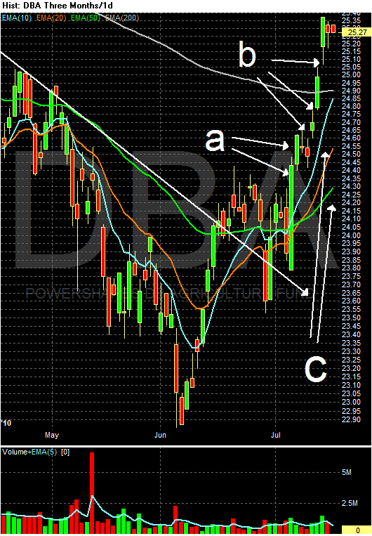
The agricultural prices rally continues. Over the last few weeks we've seen some incredibly strong bars (a) along with gaps higher (b). Also note the EMA orientation -- the shorter are above the longer and all three shorter EMAs (10, 20 and 50) are moving higher (a). Finally, prices are now above the 200 day EMA.


The long-end of the Treasury curve is now above the long-term trend line again and


The IEFs bounced off their long-term trend line (a).

Friday, July 16, 2010

Weekly Indicators: Psssst! Deflation is Here edition

- by New Deal democrat

This is the week we found out that we have actually already started into deflation with PPI declining 0.5% and CPI declining for the third month in a row, albeit by only 0.1%. Virtually every piece of monthly economic data released -- retail sales, industrial production, capacity utiilization, consumer confidence, the Empire State and Philly Fed reports -- all pointed to a marked slowdown. Whether it actually tips into negative GDP and if so for how long remains the question.

The single most important weekly leading indicator continued to worsen, increasing the odds yet again of an outright contraction in GDP. The MBA mortgage indexes for the week ending July 9 both fell. According to the MBS, the purchase index fell yet another 3.1% to its lowest measure since December 1996. Even the refinance index fell slightly, although clearly there is a lot of refinancing being done at the extremely low mortgage rates now being offered.

Since house prices look like they may be falling quickly, between the end of the "spring selling season" and the expiration of the $8000 credit, deflationary expectations in this market may be feeding on themselves. I'll look into this more shortly.

The ICSC reported same store sales for the week ending July 9 rose 3.2% in the July 3 week vs. a year earlier, although down -1.5% from the last week. This is the third week in a row of 3%+ YoY comparisons. Shoppertrak did not issue a public report this week.

Gas fell back slightly to $2.72. The 4 week average of usage remians up substantially from last year, about +2%-4% YoY in the last several weeks. Apparently consumers like cheaper gas. Hoocoodanode?

The BLS reported 429,000 new jobless claims this week. And now, {drum roll}, let me repeat a quote from this very post last week:
In the next 3 weeks, we may finally break out of the range these have been in since the beginning of the year -- but if so the reason is most likely that GM in particular is keeping its auto plants open in July, so typical seasonal layoffs aren't happening.
As I say from time to time, you're reading the right blog.

Railfax was, frankly, a poor report. Both intermodal and cyclical traffic turned down slightly, and decreased their improvement over last year's report. Worse, baseline traffic is now all the way back to where it was a year ago. Raiflfax has recently started highlighting motor vehicle and scrap metal carloads, and both of these declined sharply in the last week. As I frequently counsel, please click through and take a look at their very revealing graphs.

M1 fell 1% in the week, but the 4 week average in Real M1 is still about +3.5% YoY. M2 also fell about 0.4%, but Real M2 is up about 1.5% YoY (due to declining YoY CPI growth). Monetary indicators aren’t out of the woods yet (I would want to see real M2 up more than 2.5%), but are looking better.

The American Staffing Association reported a decrease of 1.86% in its index for the week ending July 4, 2010. They ascribed to the decline to the shortened workweek.

There is good news in the Daily Treasury Statement. July is continuing the pattern of improvement over last year's numbers, $57.6 B vs.$49.0 B last year, a gain of over 18%. For the last 20 reporting days, we are also up 6%, $129.3 B vs. $121.6 B.

This week repeated the pattern from last week. Coincident indicators continue to show some strength, but leading indicators -- especially purchase mortgage applications, which are the most important metric of all right now-- are of real concern.

Next week I hope to post my semi-awaited updated outlook for the second half and the beginning of next year. Deflation will certainly play a role in that outlook.

In the meantime, in the immortal words of Nat King Cole:

Roll out those lazy, hazy, crazy days of summer,
those days of soda and pretzels and beer...

(and some really good German white brots that I'll be wolfing down tomorrow!)


Empire State and Philly Fed Show Slowing Growth


From the NY Fed:

The Empire State Manufacturing Survey indicates that while conditions for New York manufacturers continued to improve in July, the pace of growth in business activity slowed substantially over the month. The general business conditions index remained positive but fell 15 points, to 5.1.The new orders and shipments indexes were also positive but lower than last month’s levels. Employment indexes dipped as well, with the average workweek index falling below zero for the first time this year. The prices paid index was positive and held steady, while the prices received index declined to a level just below zero. The future general business conditions index was little changed, remaining close to its May and June levels but below the highs seen earlier in the year. The index for future number of employees fell markedly, although it remained above zero. The capital spending and technology spending indexes were also positive, but both were well below the peak levels reached in May.
Here's a chart of the data:


From the Philly Fed:

According to the firms polled for July's Business Outlook Survey, regional manufacturing activity continues to expand but at a slower pace than in June. The general activity index decreased to 5.1 this month, down from 8 in June.

The firms reported a decline in new orders this month compared with June. However, employment showed a slight improvement over last month. Firms do expect to see growth in business over the next six months but are less optimistic than in previous months.


Here's a chart of the data:

With both of these regional indicators, the indexes are still positive. But they are coming close to contraction areas which is not comforting.

No Really -- Austerity Doesn't Work

From the AP:

China rebounded quickly from the global downturn, powered by a 4 trillion yuan ($586 billion) stimulus and a flood of bank lending. But communist leaders worry about surging home prices and a possible spike in bad loans at state-owned banks. They have imposed curbs on lending and investment, key drivers of growth and demand for raw materials.


But government spending is bad -- or at least I thought it was. But then the Chinese government spent 4 trillion in stimulus and got a growth rate of 11.9%. Surely that can't be due to the government spending, can it?

Yesterday's Market


Let's start with agricultural prices. Over the last few days they have been in a clear uptrend. There are three gaps higher (a, b and c). Also note that prices have risen throughout the trading day on two days (d and e).


On the daily chart, prices are through the 200 day EMA. The shorter EMAs are rising with the shorter EMAs above the longer EMAs.


The SPYs are trapped at the 200 day EMA


The QQQQs are trapped at the 10 day EMA.


The 200 day EMA is acting as a magnet for the IWMs, keeping them from rallying.


On the SPYs, take a closer look at the incredibly strong resistance the 200 day EMA is giving prices. Also note the volume is a bit weak (b).


The 10 day chart really shows how prices have stalled (a).


Treasury prices have moved back over the long-term trend line.