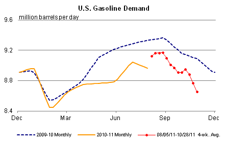
Last week I noted that weekly gasoline usage was down almost 10% YoY. Because the series can be noisy, it was suggested that the 4 week moving average might be a better guide to the trend. Well, this week's data was released yesterday, and here is the graph showing gasoline demand for the last two years:

The 4 week moving average is now off nearly 5%. In fact, the graph doesn't really do the downturn justice. By compariing the EIA gasoline demand weekly raw data, we can see that demand actually held up quite well (as in, within 1 or 2% YoY compared with 2010) through June. As gasoline prices were near $4 a gallon in April, and up about $1.50 a gallon, or +40% YoY, it made sense that consumers were cutting back.
But the decline in usage intensified in July, and now at -5% YoY is the worst since the mid-September through mid-October 2008 period when we were being told that we faced Economic Armageddon. And like that decline, this one is occurring despite an ongoing decline in gasoline prices (down about $0.50 since April).
Something's happening here, but what it is ain't exactly clear. The most obvious candidates are:
1. demand destruction. But if so, why is consumer spending, as measured by the Gallup daily survey, holding up so well?
2. energy efficiency. But have we really bought so many hybrid vehicles to make that big a difference?
3. the weather. OK, we did have a strange Nor'easter that pummeled the northern and western suburbs of the Megalopolis, but that was one day only.
4. random stuff just happens. Always a possibility, but this seems unlikely given at least three weeks in a row of awful YoY comparisons.
I don't have any single great explanation. But something is clearly going on as far as I can tell, and hopefully some other bloggers will take a serious look for which explanation is the most important.