Back in March, I wrote a post entitled The Bifurcated Recovery, based on the campaign rhetoric of John Edwards, who railed about the difference between the "two Americas," one more prosperous than ever, and one left behind and in desparate need. I said then that
8 months after GDP bottomed out, there is such a stark bifurcation between the American industrial and consumer economies that you may as well be looking at statistics from two separate countries. The financial (Wall Street) and industrial recovery is V-shaped and stronger than any recovery since 1983. The economy of wages and employment, and of houses, autos, and general retail - in short, the consumer economy of average Americans - is little better than L-shaped and in some cases isn't happening at all. We really do have two separate economies.We are now 8 months more past that declaration, and yet it is still true. 2010 was the year of the Bifurcated, V and L shaped recoveries. Large corporations, manufacturing and industry, exporters, and transportation sectors are doing well. Jobs and income are improving off the bottom, but at a lackluster pace so far. Construction and state and local government are still mired at the bottom of the recession.
I. Let's start with the overall GDP, shown here in real, inflation-adjusted terms:
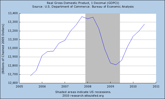
The economy as a whole declined about 4% in real terms in 6 quarters from its peak in the 4th quarter of 2007. There is a substantial chance that when this quarter's GDP it reported, 6 quarters later, the entirety of that decline will have been made up. That, boys and girls, is a V-shaped recovery.
That V-shaped recovery also shows up in industrial production:
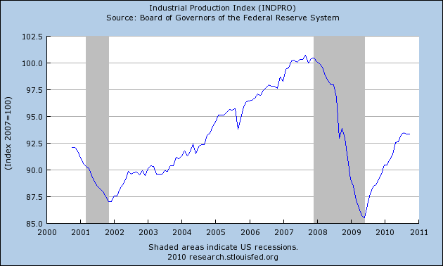
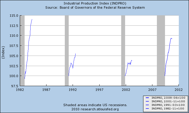
Industrial production declined 15% from its peak and has recovered over half of its loss. It is common for GDP to recovery fully more quickly than industrial production, but this is the strongest recovery in industrial production by far since 1983:
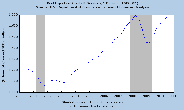
Exports have also regained almost all of the ground they lost:
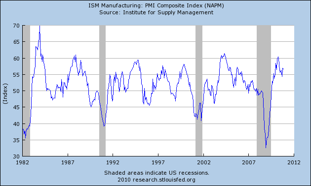
And V-shaped charts turn up in virtually every other aspect of manufacturing, for example, the ISM manufacturing reports, which had the strongest recovery since 1983, and shows manufacturing still growing faster than almost all of the last economic expansion:
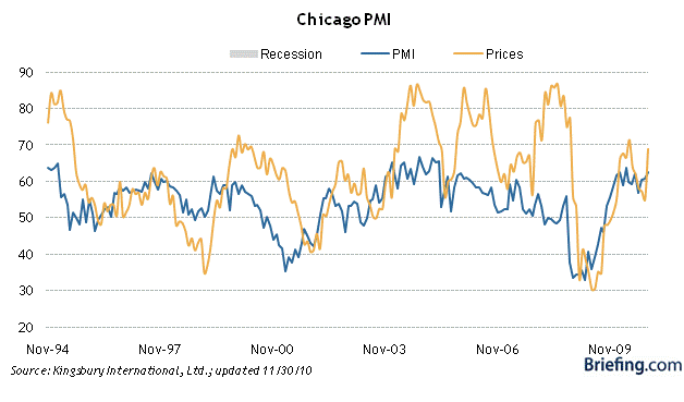
The Chicago PMI (which measures the industrial economy in the midwest) for also has shown a similar intensity:
Looking at some subparts of the industrial economy, this graph shows durable goods manufacturing and employees so employed:
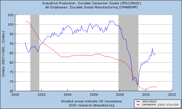
Durable goods declined almost 35% from their pre-recession peak and have also come halfway back. That hasn't helped durable goods employment, which declined 20% and aftern turning positive in the early part of the year, has stagnated since. (N.B.: I'll discuss employment further in Part IV below)
The same story has played out in nondurable goods manufacturing and employees in that sector:
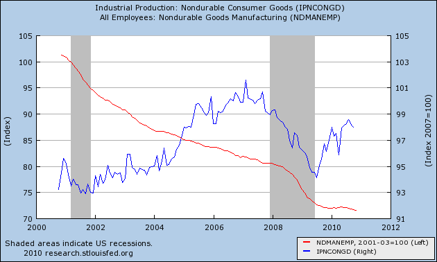
Nondurable goods manufacturing declined about 6% from its pre-recession peak (right scale) and has made 2/3 of that up. Employment in that area is still in decline.
Auto sales make up the largest share of durable goods purchased by consumers. They declined from about 16 million a year to 9 million in early 2009, and have since rebounded to over 12 million, or about 40% of the way back to their peak:
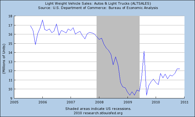
This is still not as strong a rebound as in the rest of the industrial economy.
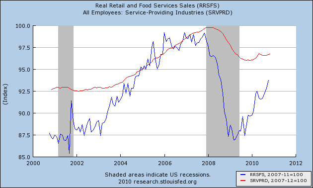
Additionally, real retail sales (blue) which make up about 70% of consumer spending, declined about 12.5% from their pre-recession peak, also increased from their bottom, but have also made up over half of that loss. Employment in the service part of the economy (red) declined almost 4%, and has been eking out small gains all this year:
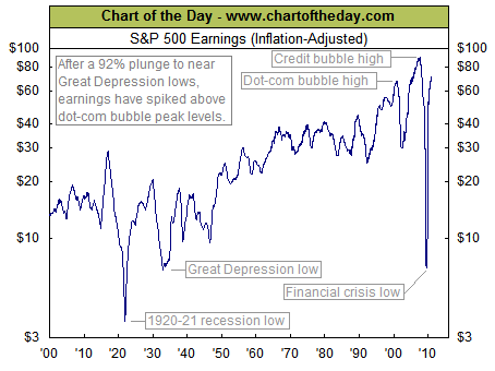
There is yet one more graph that is probably the most V-shaped of them all. S&P 500 earnings, which almost entirely disappeared during the past recession - for the first time since the worst days of the 1929-32 contraction - have already exceeded their dot-com high and are closing in on their all-time, credit-bubble high (h/t chartoftheday):
That V-shaped recovery also shows up in industrial production:

Industrial production declined 15% from its peak and has recovered over half of its loss. It is common for GDP to recovery fully more quickly than industrial production, but this is the strongest recovery in industrial production by far since 1983:

Exports have also regained almost all of the ground they lost:

And V-shaped charts turn up in virtually every other aspect of manufacturing, for example, the ISM manufacturing reports, which had the strongest recovery since 1983, and shows manufacturing still growing faster than almost all of the last economic expansion:

The Chicago PMI (which measures the industrial economy in the midwest) for also has shown a similar intensity:

Looking at some subparts of the industrial economy, this graph shows durable goods manufacturing and employees so employed:

Durable goods declined almost 35% from their pre-recession peak and have also come halfway back. That hasn't helped durable goods employment, which declined 20% and aftern turning positive in the early part of the year, has stagnated since. (N.B.: I'll discuss employment further in Part IV below)
The same story has played out in nondurable goods manufacturing and employees in that sector:

Nondurable goods manufacturing declined about 6% from its pre-recession peak (right scale) and has made 2/3 of that up. Employment in that area is still in decline.
Auto sales make up the largest share of durable goods purchased by consumers. They declined from about 16 million a year to 9 million in early 2009, and have since rebounded to over 12 million, or about 40% of the way back to their peak:

This is still not as strong a rebound as in the rest of the industrial economy.
Additionally, real retail sales (blue) which make up about 70% of consumer spending, declined about 12.5% from their pre-recession peak, also increased from their bottom, but have also made up over half of that loss. Employment in the service part of the economy (red) declined almost 4%, and has been eking out small gains all this year:

There is yet one more graph that is probably the most V-shaped of them all. S&P 500 earnings, which almost entirely disappeared during the past recession - for the first time since the worst days of the 1929-32 contraction - have already exceeded their dot-com high and are closing in on their all-time, credit-bubble high (h/t chartoftheday):
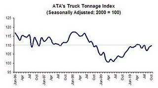
II. Over 100 years ago, Charles Dow (of the Dow Jones Industrial and Transportation Averages) theorized that the amount of goods produced should correlate with the volume of traffic moving those goods to market. While the trucking industry, after recovering about 2/3 of its volume, has stalled:
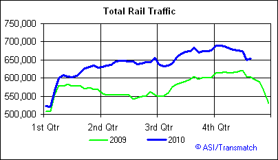
Total rail traffic, which declined almost 30% from peak to bottom in late 2008, has erased almost 3/4 of that decline:
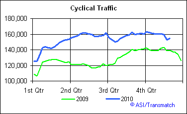
Cyclical rail traffic, which is most sensitive to economic conditions, and which did improve first following the 2001 recession, shows a similar pattern:
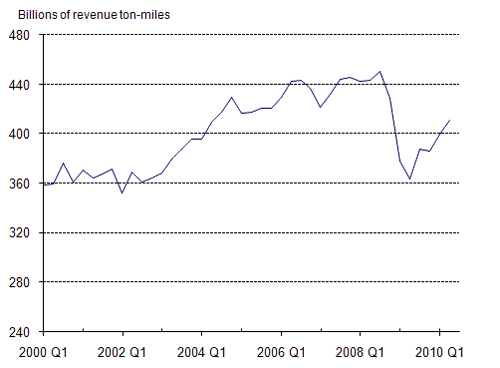
Because rail transport is more energy efficient, given the bounceback in the price of Oil to near $90 a barrel for much of this year, it is likely that shippers have switched from truck to rail transport where possible, explaining the disparate recovery. Thus, Railroad revenue ton-miles, which are reported quarterly, show over 1/2 of the lost ground recovered through September 2010:
Although I can't show you a graph, I can tell you that air cargo revenue ton-miles show a smaller rebound as well, having fallen about 40% from 1.262 Billion in December 2006 to 0.764 Billion in February 2009, and as of September 2010 had increased to 0.949 Billion (note: like rail traffic, undoubtedly some of this is seasonal variation, but the YoY increase from September 2009 - 2010 was +3%).
III. If industry and associated economic metrics show a strong V-shaped recovery, the best since 1983, the opposite is the case with ground zero for the credit bubble - housing - and also state and local governments.
Real residential spending has typically powered consumer recoveries. Housing permits, however, after collapsing nearly 80% from their levels during the boom and increasing only about 10% due to the $8000 housing credit, gave almost all of that gain right back. This is the weakest housing recovery on record, including the Great Depression:
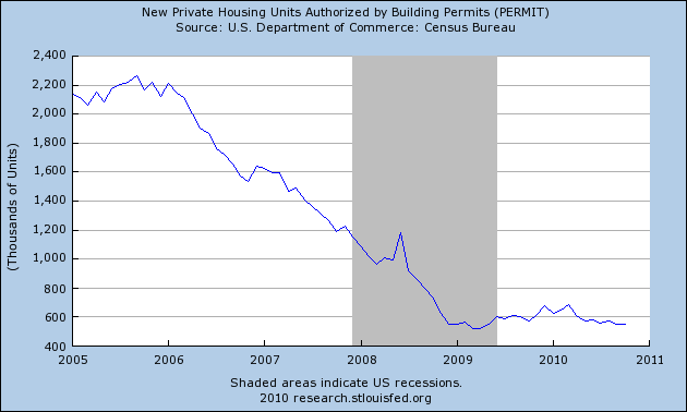
(note: I am addressing volume of new homes built, not prices of either new or existing houses, in this discussion. Foreclosures are likely to continue at high levels for several years yet, and prices, having resume their decline to the long term mean, will likewise continue to do so).
Courtesy of Calculated Risk, we can break out residential vs. non-residential construction spending:
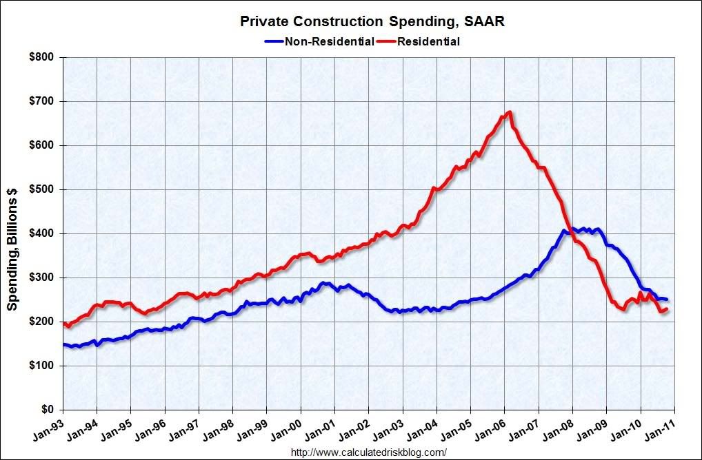
Residential spending improved, but relapsed again due to the expiration of the $8000 housing credit. Commercial construction is still declining, but the rate of decline has decreased considerably. Since as CR notes, historically commercial spending has usually bottomed about 16 months after residential spending, because of the delay imposed by the expiration of the tax credit, this time both commercial and residential spending may begin to increase at about the same time.
If construction is bouncing along the bottom, then state and local governments are still in the throes of recession. While tax revenues hit bottom in about March or April, and have been improving since, according to the Rockefeller Institute:
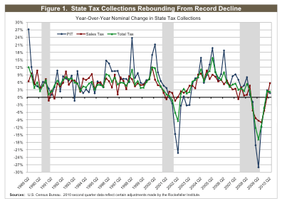
they are still far below where they were two years ago before the recession intensified. Worse, since Congress refused to renew meaningful fiscal assistance to the states, waiting next summer is a $60 Billion shortfall that many states - most expecially California - are completely unequipped to handle.
IV. Finally, let's look at jobs and wages.
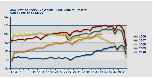
Temporary jobs, normally thought of as the harbinger of other job growth, have been in a strong uptrend all year long, as shown in this graph of the American Staffing Association's index:
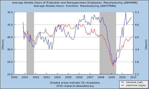
Further, the V-shaped recovery described in manufacturing also shows up in average weekly hours (blue, left scale) and overtime (red, right scale) worked in manufacturing:
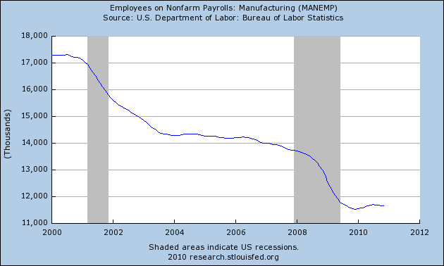
But if hours have gone up, the sector has completely failed to add to manufacturing employment:
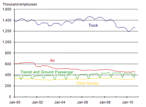
And despite improvement in truck, rail, and air transportation,employment in the transportation industries was stagnant all year:
Further, reflecting the bottom bouncing in housing, and continuing decline in nonresidential building, construction employment continues to bounce along the bottom, thankfully no longer declining but not increasing either:
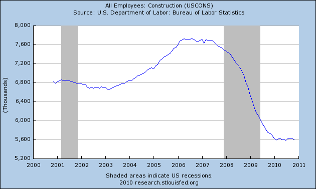
Over two million jobs were lost in construction since its late 2005 peak (note: there is no data breaking this down between residential vs. commercial construction jobs).
Government employment now includes more workers than all goods-producing employment. It is typically the last to turn down in a recession, and the last to turn up, sometimes not doing so until a year later. For example, here is the chart showing gains and losses in government employment on a monthly basis during the 1970s, showing that even after the economy began to recover from the deep recessions of 1973-74 and 1981-82, employees in government continued to be laid off:

Here is the chart of the same data, showing again that government employees continued to be laid off even into 2004, even after employment as a whole turned up in late 2003:

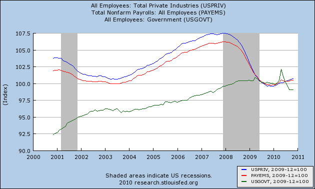
Now, let's break down job gains and losses in the Great Recession and thereafter. As the graph below shows, overall employment (red) is improving seeemingly at a snail's pace. Better progress off the bottom has been shown by jobs in the private sector (blue), but government - lagging a year behind as is the norm - is still shedding jobs, over 250,000 during this year of private job recovery:
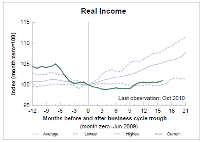
Wages are not in much better shape. Because of high unemployment and slack in production capacity, there was been much downward pressure on wages and salaries. As a result, after a big decline, real income has just barely turned up from the bottom. This remains close to the worst improvement in real income in any of the post-WW2 recessions:
In the graph below, the year over year change in average hourly earnings is in green, the employment cost index (which is a median measure which does not get upwardly distorted by salaries at the upper end of the income scale) is in blue, and consumer inflation is in red:
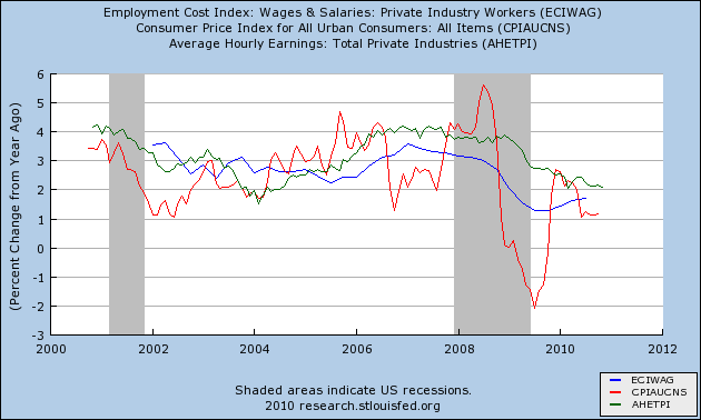
As you can see, wages are still under intense downward pressure since the onset of the recession, and as a prelude to this past summer's slowdown both were negative, although wages have since recovered vs. inflation. Quite simply, downward wage pressures remain problematic.
In summation, we really do have two separate economies:
(1) an industrial, export, Wall Street, and general consumer goods economy, which is in a strong, full, V-shaped recovery; and
(2) an economy consisting of
- housing and other construction, which is still bouncing along the bottom or still in declining slightly,
- state and local government, lagging one year behind and still in the throes of recession; and
- employment, which is growing slowly; and wages and income, which are barely growing at all.
The story of 2010 was indeed that of the bifurcated recovery.
- employment, which is growing slowly; and wages and income, which are barely growing at all.
The story of 2010 was indeed that of the bifurcated recovery.