Saturday, September 3, 2011
Weekly Indicators: lack of confidence hurricane warning edition
In the rending of garments over yesterday's jobs report, it is easy to overlook that most of the monthly data reported last week was actually good. Personal income and spending both rose at a robust clip. The Chicago PMI came it at 56.5. The ISM manufacturing index remained slightly positive. Factory orders surprised to the upside. Other series did not decline as much as feared - Case Shiller for example declined, but less than expected, and the YoY% of decline may have troughed. Only consumer confidence, as expected, plummeted. Even the jobs number is best considered ex-Verizon strike at +45,000.
The high frequency weekly indicators continued to reflect the pummeling taken by consumer (and employer?) confidence most likely primarily due to the debt debacle.
Let's look at the signs in order of their magnitude again this week:
Money supply -a leading indicator - continued its surge. M1 was up 1.0% for the week, and also increased 5.4% m/m, and 20.1% YoY, so Real M1 was up 17.5%. Iincreased 0.2% w/w, and also increased 2.4% m/m, and 10.2% YoY, so Real M2 was up 7.6%. The YoY increase in M1 in the last month is the highest in the history of the series. The YoY increase in M2 is at readings typically associated with the end of recessions rather then their onset. While this is an emotional, probably panic-driven move, it is still very positive for the economy going forward.
The Oil choke collar tightened slightly last week, as Oil finished at $84.12 a barrel on Friday. It is still about $10 below its recession-trigger level. Gas at the pump rose $.05 to $3.63 a gallon. Gasoline usage was -1.7% lower than a year ago, at 9229 M gallons vs. 9386 M a year ago. With few exceptions, gasoline usage has been negative for almost 6 months. It continues to surprise me how little weight gasoline prices are given in most economic commentary this year.
The Mortgage Bankers' Association reported that seasonally adjusted mortgage applications increased 0.9% last week. For the third week in a row, the YoY comparison in purchase mortgages was negative, down -8.2% YoY. Refinancing decreased 12.2% w/w due to an increase in interest rates. Refinancing has surged recently with sharp decline in interest rates.
Median asking house prices from 54 metropolitan areas at Housing Tracker showed that the asking prices again declined -2.0% YoY. This is the smallest YoY decline in the 5 year history of this series (YoY measurements were possible beginning in April 2007). The areas with double-digit YoY% declines remained at 6. The areas with YoY% increases in price also remained at 13. Thus, one quarter of all metro areas are now showing YoY increases.
Retail same store sales continue to perform well. The ICSC reported that same store sales for the week of August 20 increased 3.0% YoY, and increased 0.1% week over week. Shoppertrak reported a 5.0% YoY increase for the week ending August 20 and a WoW increase of 0.7%. This is the seventh week in a row of a strong rebound for the ICSC, joined for the fourth week by Shoppertrak.
Adjusting +1.07% due to the 2011 tax compromise, the Daily Treasury Statement showed that for all of August 2011, $144.0 B was collected vs. $135.5 B a year ago, for an increase of $8.5 B. For the last 20 days, $119.4 B was collected vs. $111.9 B a year ago, for an increase of 6.7%. With the exception of one week, withholding tax collections have rebounded strongly for the last 6 weeks.
The American Association of Railroads reported that total carloads decreased -0.5% YoY, down 3700 carloads YoY to 536,000 f. Intermodal traffic (a proxy for imports and exports) was, unusually, also down 1700 carloads, or- 0.5% YoY. The remaining baseline plus cyclical traffic was down 2500 carloads, or -0.8% YoY%. Rail traffic has been negative YoY for 4 of the last 8 weeks. Using the breakdown of cyclical vs. baseline traffic that was graciously provided to me by Railfax, baseline traffic was down 9200 carloads, or -4.7%YoY, while cyclical traffic was up 6700 carloads, or +6.2% YoY. Please note that rail traffic in this reporting period and next week as well may have been affected by Hurricane Irene.
Initial jobless claims coninued their recent range just above 400,000, as the BLS reported Initial jobless claims of 409,000. The four week average increased to 410,250. Jobless claims remain lower than for all but two months in the last 3 years.
The American Staffing Association Index remained at 87 for the third week. This series has completely stalled, and in fact has decreased one point since peaking one month ago.
Weekly BAA commercial bond rates increased .11% to 5.40%. Yields on 10 year treasury bonds increased only .02% to 2.19%. This indicates a slight but continuing increase in the relative distress in the corporate market, indicating increased relative fear of rising corporate defaults.
Finally, one metric which has been extremely telling in the last 45 days has been the daily Consumer Confidence tracking poll by Gallup. It began to decline precipitously on July 5. It bottomed on August 2 and essentially remained at that bottom - until the last few days, when it regained about 1/3 of the ground lost.
For now, gasoline usage and mortgage applications continue to be strong negatives, joined less substantially by temporary staffing and rail traffic. These are offset by a surge in money supply, withholding tax payments, retail sales, and a near-leveling off in house prices. Initial jobless claims are a neutral. Since so much of the poor data in the last month or so may have been provoked by a profound loss of confindence due to the debt debacle, the significant upturn in the last few days of the Gallup economic confidence poll may signal that the poor news is not becoming self-reinforcing. Keep your fingers crossed - and have a great Labor Day weekend!
Friday, September 2, 2011
The "0" Jobs Report
Let's start out with the headline numbers, which showed 0 job creation on the Establishment Survey and included downward revisions for both June and July as well. The report also showed that several leading indicators from the report also declined (hours worked and pay) marginally. And while the official U-3 unemployment rate remained unchanged at a very high 9.1%, U-6 picked up a tenth of a point to rise to 16.2% and my personal favorite measure, U-5, did decline a tenth to 10.6%. In good news (if this can be called that), both the participation rate and employment-population ratio gained a tenth of a point and in even better news, the Household Survey showed a gain of 331,000 jobs last month.
In other "good" news, the number of both those not in the labor force and those not in the labor force that want a job declined as over 350,000 people entered the labor force last month. And while we need these re-entrants, we must also recognize that they will have a dampening effect on the U-3 unemployment rate as they return.
Obviously, the Verizon strike had an impact on the numbers, but even discounting that (since it will be added back in next month and needs to be discounted then as well), we would only be up 45,000 jobs. Government continues to be a drag on employment, shedding another 17,000 with all of those losses essentially coming from local governments.
Once again we are also seeing the real return of an educationally bifurcated economy, as those with either some college or a college degree gained (Household Survey numbers) 449,000 jobs last month, which was offset by losses of 581,000 jobs by those with just a high school diploma (all numbers are for ages 25+). The economy actually appears to be doing ok for those with a post-secondary education, but still mired in losses for those without.
Overall, this report was particularly bad as not only did it show no headline job growth, but 2 of the leading indicators from the report dipped this month and it continues to showcase a deceleration of the economy and the jobs picture that has materialized over the past few months. Once again though, this seems (at this point) relegated to those without higher educational attainment and the youth (ie under 25) as opposed to broad based declines (again, at this point). the report for September should be especially interesting, as it will be the first report that would fully include the fallout of the recent spate of negative numbers and loss of confidence (as we must remember that hiring decisions are typically made at least a full month prior to actually taking place).
And once again, this summary was brought to you by SilverOz.
Notes on the employment report
Although there were some important silver linings, there are a lot of red flags in this mornings' employment report, beyond the 0 change in jobs in August.
The three big silver linings were:
1. leaving aside the Verizon strike, jobs in August were actually up +45,000, and private payrolls were up +62,000.
2. the household survey showed a gain of +331,000 jobs. Over the longer term, this series and the establishment survey tend to converge, so that's a positive.
3. the U-6 unemployment rate declined from 16.3% to 16.1%, and 165,000 people re-entered the labor force.
In neutral data, the usual unemployment rate remained steady at 9.1%. The manufacturing workweek, one of the 10 Leading Indicators, was steady.
But there are some major red flags.
1. Aggregate hours declined. This is one of the coincident indicators used by the NBER or at least a few of its members to determine beginning and ending dates for recessions. Here's the graph from last month:
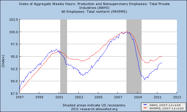
In the above graph, payrolls (red) went sideways, and aggregate hours (blue) declined .2 this month.
2. Manufacturing employment declined -3,000. This is a leading indicator for employment, including in the pre-WW2 deflationary era.
3. Earnings per hour declined $.03. This is wage deflation in the face of 3%+ price inflation.
4. June and July were revised downward, June to +20,000 and July to +86,000. This is what tends to happen in recessions, not in recoveries.
5. The biggest negative, in my book, is what happens to the below graph comparing initial jobless claims to payroll employment (the graph does not include this morning's data):
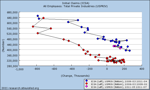
With today's data, we appear to have a break with the blue recovery series (0 jobs at slightly over 400,000 average jobless claims). Because the striking Verizon workers were able to file jobless claims, I can't lay the change off on that strike. The graph becomes consistent with being on the cusp of a double-dip recession.
Thursday, September 1, 2011
Looking at construction spending
One simplified way to look at why the recovery in jobs in the last two years has been so anemic is simply to notice that construction has continued to fall throughout. At no point has construction spending for either residential or nonresidential construction turned positive on a YoY basis, but both may have made bottoms and its possible that today's data could put us very close to being YoY positive, if not over the top. Estimates are for construction spending to be flat.
I'll be unavailable when the numbers get reported at 8:30 a.m. eastern time. Bill McBride a/k/a Calculated Risk will do his usual excellent job of explaining both the residential and nonresidential numbers. Here's what I'll be looking for.
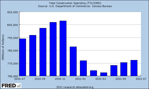
Here's total construction spending for the last year, in $ millions. The projection is that today's number will be unchanged from last month's report. If that happens, then we will be only about 2% under spending from 12 months ago:
Since ultimately its all about jobs and income, let's compare total construction spending with construction jobs. As you can see, there's an unsurprisingly close fit between the two (comparing YoY% changes in each):
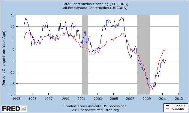
Note that being only 2% negative would be the best showing in nearly 4 years, and would bode well for construction employment.
As indicated above, construction spending gets broken down into several parts, including residential and nonresidential spending. Since housing always leads the economy, frequently by over a year, spending on residential spending is an important metric.
It ought to be unsurprising is that residential construction spending tracks housing permits closely, with a few month lag (first you get the permit, then you build the house). Housing permits have improved a little in the last few months, so there is a reasonable possibility that residential construction spending increased last month:
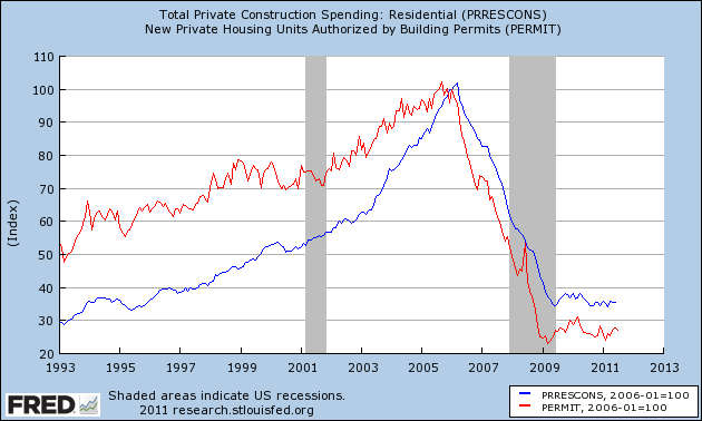
In absolute numbers, residential construction spending appears to have bottomed in March of this year at $227.254 Million. One year ago it was $235.589 Million. Last month it was $235.752 Million.
So even if residential spending is simply unchanged, then residential spending may turn YoY positive for the first time in half a decade (except for a few months when it was distorted by the $8000 housing credit), adding to the evidence that this very important and leading part of the economy has finally bottomed out.
I'll check back in later to see how we did.
Wednesday, August 31, 2011
Is the bottom in housing prices staring us in the face?
Many if not most times you will see me cite year-over-year trends in economic data. This is because prior research has been based on YoY trends, and also because many, many data series have marked seasonality. So, for example, with rail traffic you simply can't compare wintertime post-Christmas carloads with late summer or autumn carloads. Similar issues exist for tax withholding and for state tax receipts. Thus the only valid way to see a trend is YoY.
But where there is no seasonality, or where the data has already been seasonally adjusted, YoY comparisons lag turning points. For example, weekly initial jobless claims are seasonally adjusted by the BLS. Waiting for a YoY change there in 2009 would have completely missed the turning point. YoY initial claims did not turn positive (i.e, lower) until November 19, 2009, even though the bottom was made on the week of March 28, 2009.
Which brings us to housing prices. Note: I'm discussing nominal prices here, not "real" inflation adjusted prices. Yesterday the Case-Shiller housing indices for June were released. Here's a graph of the Case-Shiller 20 city index for the last five years:
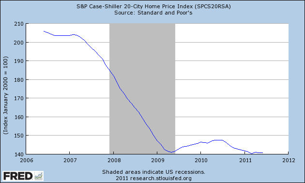
The Case-Shiller data in the graph above IS seasonally adjusted. So we don't have to wait for YoY changes to make valid statements about the data. Well, here is the data for the 20 city index shown above for the last 6 months:
2011-01-01 141.75
2011-02-01 141.31
2011-03-01 140.30
2011-04-01 140.94
2011-05-01 140.84
2011-06-01 140.76
As I pointed out yesterday, the variation in the index over the last 6 months is less than 1%, and on a seasonally adjusted basis we have not made a new low in 3 months. In fact we are less than 1% below where this index stood in mid- 2009 (before most of the $8000 housing credit distortions kicked in).
Yes, it's only nominal and not "real," and by no means is it clear that March will prove to have been the absolute bottom, but even if there is some further deterioration, we are probably near the bottom in nominal (not "real") housing prices. In fact the bottom in housing prices may be staring us right in the face.
----------
P.S.: It may be tempting to think that the overhang of foreclosures will drive house prices further down. But consider that the same overhang existed in January. It existed in February. It existed in March. And April, May, and June, too -- but it did not drive prices down in those six months. Is anything different about the foreclosure overhang now than during the last half year?
Bonddad's Summer Vacation
Tuesday, August 30, 2011
Housing price declines lessen further in August
Housing Tracker's final report of asking prices in 54 metropolitan areas for August is in, and it shows that the YoY rate of declines continues to lessen, now only -2.8% YoY. Here's the updated chart:
| Month | 2007 | 2008 | 2009 | 2010 | 2011 |
|---|---|---|---|---|---|
| January | --- | -7.5% | -11.5% | -5.8% | -8.7% |
| February | --- | -7.8% | -12.0% | -5.2% | -8.4% |
| March | --- | -8.3% | -10.9% | -5.0% | -7.3% |
| April | -2.7% | -8.6% | -9.6% | -5.0% | -6.8% |
| May | -3.5% | -9.1% | -8.1% | -5.0% | -5.6% |
| June | -5.0% | -9.8% | -7.0% | -5.0% | -4.4% |
| July | -5.4% | -10.4% | -6.1% | -5.1% | -4.2% |
| August | -6.0% | -10.6% | -5.5% | -6.1% | -2.8% |
| September | -6.2% | -11.1% | -5.1% | -6.6% | --- |
| October | -6.7% | -11.4% | -4.5% | -7.0% | --- |
| November | -6.6% | -11.7% | -4.5% | -6.7% | --- |
| December | -7.2% | -11.4% | -5.6% | -7.8% | --- |
If this rate of second derivative improvement continues, we could see a YoY increase in asking prices nationwide before the end of the year. If so, that would mean the nominal bottom in housing prices has already occurred -- probably last January (because of the strong seasonality in housing prices)!
Additionally, as Calculated Risk notes, Housing Tracker's updates continue to show that inventory is also declining.
Note that Housing Tracker is current through last week, vs. this morning's Case-Shiller report, which is an average of April, May, and June. Because of the distortions resulting from the $8000 tax credit that expired in spring 2010, it is interesting to compare 2011 YoY vs. 2009 Case-Shiller index as well as 2011 YoY vs. 2010. Here are the numbers - the first column is vs. 2010, the second vs. 2009:
February: -3.5% -2.7%
March : -3.9% -1.4%
April : -4.2% -0.6%
May : -4.5% 0.0%
June: -4.5% -0.6%
With May and June's data, I suspect the YoY% declines in the Case-Shiller index have made a trough. In the next month or two, with the end of the YoY housing credit distortions, I expect Case Shiller to join Housing Tracker (which is current through last week) in reporting "less worse" declines.
Additionally, with today's data we can see that the seasonally adjusted Case Shiller 20 city index has meandered within a range of less than 1% in the first six months of this year. I bet that little fact isn't getting mentioned on other blogs, is it?
----------
BTW, Dante Atkins a/k/a thereisnospoon has a piece up at Digby's Hullbaloo, purporting to show that present housing prices are still way too high. While I very much appreciate his political commentary, this economic piece is badly misleading.
The "roller coaster ride" of prices is not adjusted for YoY% changes in housing prices For example, there was a 10%+ decline in real housing prices between 1926 and 1933. Even more glaring, there was a 35%+ decline in housing prices between 1912 and 1921 -- almost identical to the declines since the beginning of 2006 till now. Go back and watch the roller coaster ride and pay attention to the markers that tell you when you are in the 1910's, 1920's and the Great Depression. The "roller coaster" stays almost completely flat -- during two of the three worst downturns in the last 100 years!
Thereisnospoon suggests that housing has much, much further to fall, but in fact, this series has never been at a level under 110 since 1949. It is presently at about 132, and thus is only about 15% higher than its lowest reading in 62 years. I expect almost all of the remaining adjustment to take place via inflation rather than a continuing decline in nominal prices.
The Economy is A Moving Target
Starting a little over two years ago, the economy started to grow as evidenced by the GDP report along with the regional manufacturing numbers. The doomers continued to talk of the coming end of the world. However, their prognostications became less frequent as the data emerged. They would triumphantly return when data turned bad, but would otherwise be silent. Now, however, that the economy is weakening, they have returned in force. But as NDD pointed out yesterday, they are essentially making the same arguments this year that they made last year, taking away from the potency of their argument.
But the doomers are not the only ones guilty of this type of short-sightedness. The perma-bulls were just as guilty as the economy slid into recession. At that time, talk of a recession indicated we were in a "mental recession," rather than a real recession. The constant drops in the market were in fact buying opportunities. The bursting of the housing housing bubble would have a limited impact and the damage from the financial fall-out would be contained. You get the idea.
The point of the previous two paragraphs is simple: the economy is a moving target. While there are many people who made their reputations by being negative, they have not changed their analysis as the economy rebounded. Hence, for the last two years, they have essentially become the children crying wolf, without realizing the continued prognostications for eminent demise make them look more and more out of touch. And indeed -- their argument started with, "it's only one number," to advance to massive conspiracy theories that the entire economic complex is a group of individual agencies who rig numbers at the behest of their corporate masters. And the perma-bulls who continually said "buy" looked incredibly stupid as the market dropped like a stone, continually telling the American public that stocks would never be this cheap again (only to buy see them drop another 200 points the next trading session). In short, anyone who continually has one opinion about the economy (bullish or bearish) is always going to miss half the story. More importantly, they're going to try and impose their version of reality over existing data, making their analysis laughable.
Let me put this another way: anyone who was a perma bull or perma bear for the last four years was wrong 50% of the time. Is that the person who you want to listen to on a regular basis?
Monday, August 29, 2011
Treasury Tuesdays
Overall, the IEFS are looking over-extended in the short run; prices have moved through resistance in near parabolic fashion on high volume, largely as a safe haven play. However, there is still a great deal of concern regarding the overall economy, and the Fed is not raising rates anytime soon, so there is little downward pressure on prices right now.While I thought that prices were overextended, I was not expecting the slight sell-off we saw over the last five trading days.
Here is a chart of last week's action

Prices did sell-off a bit, finding support at levels established a few wees ago. Also note that after the sell-off, prices tried to bounce a bit higher, but printed some very small bars on low volume, indicating a lack of interest on the part of traders. However, the 10 day EMA is now moving sideways, showing a possible reversal of trend.
One indicator which confirms that the Treasury market is probably a bit expensive is its relationship to the high-yield market, which indicates the Treasury market was a bit over extended last week, as evidenced by this chart from Dragonfly Capital:

There is still a fair amount of concern in the market regarding the economy; this should keep a bid underneath Treasury prices. However, the equity markets appear to have bottomed and are rising slightly. As such, I would expect continued slight selling pressure in the Treasury market this week.
The data and renewed recession: update
A couple of weeks ago I wrote a summary called The data says: no double dip recession. No sooner had it come, out, though, then the data took a couple of steps closer to the dividing line between expansion and contraction.
I noted at the time that spreads between BAA corporate bonds and treasuries hadn't widened. (this is one of the indicators that was also useful in the pre-WW2 deflationary era.) That very week, the situation changed. Here's an updated graph through the middle of last week:
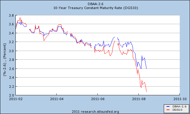
As I noted in my "Weekly Indicators" column over the weekend, this now looks like it would just before a recession.
Secondly, despite +.5% growth in retail sales, it turned out that inflation surprised to the upside as well at +.5%, meaning that real retail sales were flat:
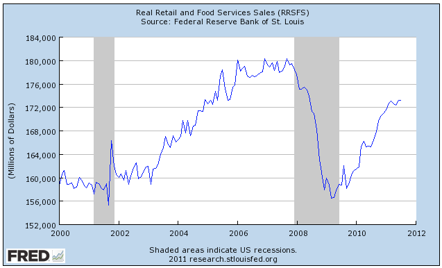
In terms of the modern leading indicators, still only 3 of 10 are lower than 6 months ago. The credit spread widening adds one negative point to the pre-WW2 readings. In terms of coincident indicators, as of July there are 4 positive, and 1 neutral.
There are two ways that I can think of whereby a contraction could start more or less simultaneously in all data series: (1) poor government policy (viz., 1937); or (2) imported from an overseas trading partner (I consider this more doubtful). I'll address those separately.
Thoughts on Ben's Speech
To achieve economic and financial stability, U.S. fiscal policy must be placed on a sustainable path that ensures that debt relative to national income is at least stable or, preferably, declining over time. As I have emphasized on previous occasions, without significant policy changes, the finances of the federal government will inevitably spiral out of control, risking severe economic and financial damage.1 The increasing fiscal burden that will be associated with the aging of the population and the ongoing rise in the costs of health care make prompt and decisive action in this area all the more critical.Although the issue of fiscal sustainability must urgently be addressed, fiscal policymakers should not, as a consequence, disregard the fragility of the current economic recovery. Fortunately, the two goals of achieving fiscal sustainability--which is the result of responsible policies set in place for the longer term--and avoiding the creation of fiscal headwinds for the current recovery are not incompatible. Acting now to put in place a credible plan for reducing future deficits over the longer term, while being attentive to the implications of fiscal choices for the recovery in the near term, can help serve both objectives.
Fiscal policymakers can also promote stronger economic performance through the design of tax policies and spending programs. To the fullest extent possible, our nation's tax and spending policies should increase incentives to work and to save, encourage investments in the skills of our workforce, stimulate private capital formation, promote research and development, and provide necessary public infrastructure. We cannot expect our economy to grow its way out of our fiscal imbalances, but a more productive economy will ease the tradeoffs that we face.
Finally, and perhaps most challenging, the country would be well served by a better process for making fiscal decisions. The negotiations that took place over the summer disrupted financial markets and probably the economy as well, and similar events in the future could, over time, seriously jeopardize the willingness of investors around the world to hold U.S. financial assets or to make direct investments in job-creating U.S. businesses. Although details would have to be negotiated, fiscal policymakers could consider developing a more effective process that sets clear and transparent budget goals, together with budget mechanisms to establish the credibility of those goals. Of course, formal budget goals and mechanisms do not replace the need for fiscal policymakers to make the difficult choices that are needed to put the country's fiscal house in order, which means that public understanding of and support for the goals of fiscal policy are crucial.
In layman's terms, we can think about multiple time frames without exploding out respective heads. For example, as I recently pointed out, there is much concern about the numerator of the debt/GDP equation while there is no discussion about the denominator. If we take the steps currently to grow the economy -- to provide the requisite capital on which the economy can grow -- than long-term growth should return.
Economic Week in Review
Manufacturing: durable goods increased 4%, ex-transport, orders were up .7%. Non-defense capital goods were up 2.4%. This report runs counter to the recent regional manufacturing surveys, all of which have been weaker. For example, the Richmond Fed's regional manufacturing index further contracts, moving from a -1 reading to -10.
Real Estate: New home sales dropped .7%, which also included a downward revision to the June number. This was another bad report from the real estate sector, as the recent existing home sales figures were also weak.
The general tenor of the economic news releases continues to be bad. The consumer is under extreme pressure, manufacturing (one of the primary drivers of this expansion) is weakening and real estate is still bouncing along the bottom.
Equity Week in Review and Preview of the Upcoming Week/Month
The good news is it looks as though the market found a temporary bottom. But we are hardly out of the woods. An upside testing of the declining EMAs is in order, followed by a retest of the 112 level. If the 112 level holds, we'll be in far better shape. But that bottom is new and still very tenuous. Any rally should be considered suspect until we see prices advance through the 200 day EMA. Any move below the 112 area should be shorted.Last week, the market continued its move to find a bottom:

The 112 area is now providing stronger support for prices, as this is the area where prices stopped two different sell-offs. Also note that prices rallied to the 20 day EMA at the end of last week before halting their advance -- another positive sign. Finally for the positives, the entire short-term pattern looks like a double bottom. However, notice the volume is heavier on both recent sell-offs than the rallies -- a sign of concern. Also notice that the bars comprising the rally are weaker than the bars of the sell-offs. In addition, the EMAs are still very bearishly aligned, although the 10 day EMA is moving with a slight upward trend now.
This is still not a market I would buy -- there is tremendous downward pressure both technically and fundamentally. I would still place trading triggers below the 112 area with in the money put options.
Sunday, August 28, 2011
Weekend rant: the Doomers tell a compelling story -- until you look at their record
But if the "analysis" rests on the same ideology as that held by the reader, it will be enthusiastically accepted. The analyst's feet are almost never held to the fire. If 6 or 12 months later, it is proven wrong, well so what? By then we're on to the next "analysis" that now proves the opinion correct. But if you actually want to be guided by reason and logic, and want to overcome your own biases, you need to examine past "fundamental analysis" and see just how often previous assertions have proven false.
Wall Street has a problem. You see Wall Street functions much like Las Vegas. Their immense wealth depends on the continuing myth that their games aren't rigged, and the willful denial of reality by the suckers.No, this wasn't yesterday's top-rated diary at DK. It was the top rated diary almost exactly one year ago, on August 30, 2010, by the same diarist on the same theme, namely Wall Street has run out of suckers and so the stock market is going to dive.
....
Wall Street may seem all powerful, but like Vegas it has an Achilles Heel - if the people don't feed the beast it will starve. If the greed of The House gets to extreme, and the rigging of the games becomes too obvious to ignore, people will stop gambling at the casinos and in the stock market. The House goes broke. That tipping point, where the willful denial of Main Street starts to break down because the game rigging is so blatant, may have finally been reached.
....
Against the backdrop of unusually low equity trading volumes, even for a typically sleepy August, continued strong flows out of equities into bonds, and high-profile hedge funds shutting down, a bitter truth is dawning for investment professionals. Namely, that the ranks of retail investors, commonly derided as "dumb money" by the Street, have made the right call on US equity and bond markets ....
....
$50.2bn has been pulled from US equity funds on top of the $74.6bn in outflows during 2009, while $152bn has flooded into US bond funds
The [pump and dump] game doesn't work if the dumb money decides not to play. If the dumb money can't be convinced to buy the overpriced assets then the smart money is stuck. Eventually they will have to sell those assets, and pump-and-dump doesn't work when the only ones playing are the Wall Street insiders.
....
Which brings us back to the stock market. Remember last May? Economic forecasts were being revised upwards. Most economists said we were in "good shape". Bonddad came back to Daily Kos and proclaimed long-term victory over the doom-and-gloomers. Ironically, Bonddad's victory dance was on the exact same day as Wall Street's Flash Crash. I said double-dip recession, like several other bloggers.
It was right around this time that the "dumb money" decided to not believe the happy talk and stopped investing in the stock market. The overall stock market has dropped about 9% since then.
In fact, so many bloggers remained negative in the face of the economic establishment that an economist at the Federal Reserve said in June that bloggers didn't understand economics.
In July, I warned that the leading indicators were crashing, as did many other blogger. In a call-out diary, Bonddad said the leading indicators were fine.
[graph of LEI, and LEI minus yield curve]
Since that time the housing market has literally crashed with all signs pointing downward. The 2nd Quarter GDP was revised down. The unemployment numbers, both monthly and initial claims, were dramatically worse than expected. Regional economic surveys, such as the Philly Fed Index, have disappointed.
The "dumb money" didn't buy into the false hype. The "smart money" did. Now the "smart" money is stuck with these overpriced assets.
Yesterday, that diarist made a compelling "fundamental" case that the retirement of the Baby Boom generation meant a generation-long bear market in stocks. He even went so far as to make the following guarantee:
Consider the simple fact that sending your money is a sure-fire loser for this past 11 years, and for the next 16 years.When you ponder the compelling case made by that diarist, that earned close to 300 recommendations, consider the following:
Ponder that for a moment. You are assured of losing money on Wall Street for 16 years!
- it isn't news. I heard the exact same argument being made on the late Louis Rukeyser's "Wall Street Week" 15 years ago; namely, that there would be a secular bear market once Boomers had to start cashing in their retirement funds.
- while the Boomers were a very large generation, the echo boom is nearly as large.
- alone among industrialized countries, the US's population is booming, as the tsunami of mainly Latino immigrants adds to the younger population, as do their children.
So a guarantee of losing money for the next 16 years seems a little, ummm, overconfident.
Beyond that, consider the diarist's variation on the same theme one year ago: that Wall Street is a rigged ponzi scheme and the market is sure to go down, because the rubes have finally figured out they've been taken to the cleaners. That one also was top-ranked, also earning over 250 recommendations.
Since that time, contra the diarist's prediction, we've had 4 quarters of economic growth, and no double-dip recession. Instead of crashing, the 3rd and 4th quarter of 2010 showed good but not great growth. The diarist got that one dead wrong. Housing sales have gone sideways to slightly upward since that time.
And about that dumb money that he was trumpeting? How did it fare? On August 30, 2010, the S&P 500 was at 1048.92. Even after the recent crash, on Friday it closed at 1176.80. That's up +12.2%, plus dividends. The DJIA was at 10009.73 on August 30 of last year. On Friday it closed at 11283.54, up +12.7%, plus dividends.