Friday, March 11, 2011
Weekly Indicators: Nihon ni oojishin edition
The monthly data out this week was sparse, and contradictory. The Census Bureau reported that retail sales for February were up 1.0% unadjusted for inflation. January's sales were revised upward significantly, from 0.3% to 0.7%, taking a poor "real," inflation-adjusted number to a pretty good one. With the oil price spike in February, keep in mind that this number won't look nearly so good once inflation is figured in.
On the other hand the University of Michigan's consumer sentiment index fell to its lowest reading since October. More ominously, its forward looking expectations index fell all the way from 71.6 to 58.3, the lowest reading since the depths of the Great Recession in March 2009. This is a leading indicator (although one very prone to fluctuation and of relatively minor weight). In addition to the issue of Oil, I would not discount the effect of the appearance that one political party is nakedly making war on the working class. (Oil and political stupidity were what I identified back in January as the biggest threats to the economy this year).
Turning to the high-frequency weekly indicators:
The BLS reported that Initial jobless claims last week were 397,000. The 4 week average is 392,000. This is the third time in the last four weeks that this number has come in below 400,000.
Oil was trading at about $101.50 a barrel Friday morning, having spent the entire week above $100. It remains at a level above 4% of GDP and thus there WILL be a significant economic damage. How much and for how long it will last remain the questions . Gas at the pump rose $0.14 more last week to $3.52 a gallon. This is an increase of $.40 in just six weeks! Despite that, this week gasoline usage was 200,000 barrels a day higher than last year, or over 2%. I expect this comparison to deteriorate if the oil price spike continues.
Railfax was up 3.6% YoY. Baseline and cyclical traffic remain barely ahead of last year's level. Intermodal traffic (imports) is increasing YoY. Shipments of motor vehicles also improved YoY.
The Mortgage Bankers' Association reported an increase of 12.5% in seasonally adjusted mortgage applications last week. This series continues to meander generally in a flat range since last June. Nevertheless, this 8 month period of flatness is the longest time since 2006 that this series has gone without a major decline. Refinancing also increased 17.2%, and also remains near its lowest point since last July 3. This is not an auspicious start to Spring selling season.
The American Staffing Association Index remained at 90 for the 5th week in a row. This series has completely stalled out in terms of relative YoY gains. In other words, it has stopped making progress towards its pre-recession peak, although it remains 13% ahead of where it was a year ago.
The ICSC reported that same store sales for the week of February 26 increased 2.3% YoY, and also increased 2.6% week over week. This series' YoY comparisons had been trending lower since the first of the year, but for the last two weeks there have been good YoY comparisons. Shoppertrak reported that sales rose 3.6% YoY for the week ending March 5. It attributed this to the change in the week of President's Day this year vs. last year. On a week over week basis, sales increased 4.6%. It is remarkable so far how well these series have held up in the face of spiking energy costs.
Weekly BAA commercial bond rates dropped -.01% to 6.05%. This compares with a +0.01% increase in the yields of 10 year treasuries to 3.47%. Both series are down from recent highs, and there is still no relative weakness in corporate bonds.
M1 was up 0.1% w/w, up 1% M/M, and still up a strong 9.2% YoY, so Real M1 is up 7.9%. M2 was up 0.2% w/w, up .5% M/M and up 4.1% YoY, so Real M2 is up 2.4%. M2 is back into the "yellow zone" below 2.5%, and has been hovering around this mark for about a month. There has never been a recession without both negative real M1 and real M2 below +2.5% YoY.
Adjusting +1.07% due to the recent tax compromise, the Daily Treasury Statement showed that for the first seven days of March, $60.0 B was collected vs. $59.7 B a year ago, for a gain of +0.3 B YoY. For the last 20 days, $157.8 B was collected vs. $144.4 B a year ago, for a gain of $13.4 B, of over 9%. I suggest using this series with extra caution, because the adjustment for the withholding tax compromise is only a best guess, and may be significantly incorrect.
Despite the continued good news in initial jobless claims, and the welcome revision to retail sales, Oil remains a choke collar around the economy. Last year I put together a list of harbingers - data series that telegraphed the summer slowdown. Looks like it's time for an update.
In the meantime, have a nice weekend!
Cognitive dissonance alert: Mish and austerity
Yesterday I damn rear had a case of whiplash when I read this from MIsh.
Europe is in trouble. The PIIGS are imploding under austerity measures and the most of the rest of Europe except perhaps Germany does not look very good(my bold)
Huh?!? Is this the same Mish who last May worried about:
(my emphasis)Austerity Measures Postponed, Scaled Back, Stretched Out, Abandoned
These austerity programs will not last long.
Expect to see Greece, Romania, France, Germany, and the UK all scale back, abandon, or stretch out austerity plans when the global economy does a second half relapse under the weight $trillion in consumer debt and round after round of "stimulus" measures that did little but rack up still more debt.
And certainly this must not be the same Mish who wrote last June:
So let me get this straight: people like Krugman are 'Keynesian clowns' whose calls for fiscal stimulus will lead their countries to ruin: a "relapse." On the contary, Austerity is the shining, gleaming path to the future: "exactly what needs to happen ."Britain’s new coalition government on Tuesday unveiled the most severe package of spending cuts and tax increases since the early days of Margaret Thatcher’s era.While I disagree with raising taxes, it is crystal clear Osborne has his head on straight as to what will drive a sustainable recovery
....[T]he sharp reductions defy conventional economic wisdom, which holds that governments should increase spending to stimulate growth when the private sector is weak.
The steps outlined to the House of Commons by George Osborne, the chancellor of the Exchequer, would cut the annual government deficit by nearly $180 billion over the next five years
I cannot stress enough the significance of these austerity measures. In the long-term cutting deficits is exactly what needs to happen. In the short-term however, global "growth" is going to take a hit.
....The Keynesian clowns are howling all over the globe about this state of affairs.
However, it is very important not to blame austerity measures for killing the recovery, regardless of what happens. There was no global recovery to save in the first place, only a massive, fiscally reckless, coordinated reflation effort that masked the true state of the economy.
It is impossible to spend one's way to prosperity. Europe appears to have gotten the message.
And less than a year later, the US is posting 3% growth, while countries which embraced Mish's Austerianism are "imploding."
No, no contradiction there.
Who's the clown?
What a Government Shutdown Means
The political impact of the 1995-1996 shutdowns was so significant that Roy Meyers, a political science professor at the University of Maryland Baltimore County, says he is surprised that it has become even a possibility again, given the blame Republicans took in opinion polls at the time. Later in 1996, House Republicans lost nine seats to Democrats and Democratic President Bill Clinton was reelected with an 8.5 percentage point popular vote margin."The federal government's activities are so wide-ranging it would be a tremendous effort to estimate its impact," says Meyers, who has written about the 1995-1996 shutdowns.
Read the whole thing.
Thursday, March 10, 2011
Ayn Rand Is Full of Crap
I've read the Fountainhead and Anthem (because I was a fan of Rush's 2112) some time ago. First, I thought the Fountainhead could have been about 800 pages shorter, although I'm sure an English major could tell why all the bits and pieces needed to be in there. The word "verbose" comes to mind.
But more importantly, Rand wrote fiction. She uses allegories to explain her philosophy. Very long allegories. But it's an idealized world that has no bearing on reality (much like the models on which most modern economic theories are based).
How do I know this? Simple.
From 1945 - 1964, the top marginal tax rate was over 90%.
From 1964 - 1980, the top marginal tax rate was over 80%.
Here is a graph of real US GDP for the same period:

There was no "Going Galt." The economy still grew. In fact

As the above chart of the YOY percentage change in GDP shows, the economy was more prone to grow at faster rates in the "going Galt" days of massively high taxation.
BTW: This is not an endorsement of 90% top marginal tax rates. Or 80% However, I have continued to argue for some time that top marginal rates do need to be higher than current levels only because the budget gap is so large. And no, that will not kill the economy or lead to people fleeing the U.S. in droves. But that's for another day.
But, the argument that people will "go Galt" when rates increase is, well, bullshit.
This moment of clarity was brought to you from the world of objective facts and figures, not the idealized world of Ayn Rand.
Is Asian Inflation Heating Up?
Inflation concerns in Asia have grown in the past few months, but have focused on rising food costs exacerbated by bad weather and, more recently, higher oil prices amid political tensions in the Middle East.Yesterday, when I wrote about prices in the latest Beige Book, I noted there were two types of inflation. The first was from commodity price increases, which, in the U.S.' experience are typically absorbed by manufacturers in the form of compressed margins or increased productivity. Something I forgot to mention was that commodity price spikes are typically self-slowing. For example, when oil reaches a certain price level, demand naturally slows, lowering demand and slowing inflation. So raw material price spikes are absorbed by the manufacturing plant.
But unease is now growing around so-called core inflation, which typically excludes volatile elements such as energy and food, and which has also been rising in much of the region.
.....Thailand on Wednesday raised its benchmark interest rate for the third time in recent months and cited pressure both on overall and core inflation.
And the Bank of Korea said in a report Wednesday that inflation is coming not just from supply shortages but also from the demand side on the back of the country's economic recovery.
Separately, central bank Governor Kim Choong-soo warned the country's inflation may break through the bank's forecast for the first half of the year.
Economists say many Asian countries are now fully recovered from the recent global financial crisis, and as a result are getting back to where they were in 2008, when a long economic expansion was starting to reveal acute shortages of labor, land, infrastructure and factory capacity.
Unemployment has returned to precrisis levels in some Asian countries, with unemployment now below 4% in Malaysia, Thailand, Singapore, Hong Kong and South Korea. Indices measuring utilization of industrial capacity are at or well above historical averages in some countries, and land for farming or new residential development has become increasingly hard to come by.
"There's not much slack left" in Asia, says Robert Subbaraman, an economist at Nomura in Hong Kong. As a result, he says he and his colleagues believe inflation "is going to be long-lasting in Asia."
However, core inflation is different. It comes from a lack of slack in the economy. As the above article notes, when an economy starts humming and has lack of spare capacity (low unemployment, high capacity utilization) prices start to increase. This is the situation the Asian economies now face. In short -- it's a good problem to have.
The Bifurcated Unemployment picture: unaffected college grads vs. emigrating Latinos?
As promised, I want to take a closer look at the latest unemployment statistics. The February jobs report showed a decline in the unemployment rate of almost 1% in the last three months. More specifically, the unemployment rate for African Americans has declined from 16.0% to 15.3%; and for Latinos from 13.2% to 11.6%. Is the news for minorities as improving as the numbers make it look, or is there something else going on? Put another way, is the decline in the unemployment rate "real" or it it people becoming discouraged and dropping out of the labor force?
The BLS starts with the working age population. People in that set are either in the labor force, or not in it. Of the subset of people in the labor force, there are further subsets of employed or unemployed. So if people drop out of the labor force (as defined by the BLS), they are no longer counted as unemployed. But that distorts the unemployment rate, making the employment situation look better than it really is.
To test how much of the drop in the unemployment rate was "real" vs. "discouraged workers" who dropped out of the labor force, I crunched some numbers to get a "real" unemployment rate. First, I held the "not in the labor force" ratio constant from November to February , exactly as it would be If there were no increase in discouraged workers in the last three months. Since the BLS helpfully produces a statistic called the "employment-population ratio", then all I have to do is create an "unemployed-population ratio" that is the mirror image of that change. Next I take the 3 month change in that "unemployed-population ratio" and solve for the equivalent change in the "official" unemployment rate, creating a "real" rate. The difference between the "real" unemployment rate vs. the actual unemployment rate shows how much of the decline is persons dropping out of the labor force.
Thus, for example, if in November 60% of the working age population were employed, 10% unemployed, and 30% not in the labor force, then in February if 61% were employed, by holding the labor force constant as a percentage of the working age population, 9% would be unemployed. The change in the unemployment-population ratio is 10:9. If the unemployment rate in November were 6%, holding the labor force constant gives us a predicted unemployment rate of 5.4%. (10:9 = 6:5.4). The extent to which the actual February unemployment rate is different from 5.4% tells us how much of the change in the unemployment rate is "real" vs. persons dropping out of (or entering) the labor force.
I performed this exercise for the population as a whole, and also by race (white, black, Latino), and also by level of education. The results were in stark contrast.
First, here is the total result and results broken down by race:
| Race or ethnicity | Nov. 2010 unrate | Feb. 2011 unrate | Nov. 2010 un-pop ratio (emply-pop) | Feb. 2011 un-pop ratio (emply-pop) | Feb. 2011 "real" un- pop ratio | Feb. 2011 "real" unrate |
|---|---|---|---|---|---|---|
| Total | 9.8 | 8.9 | 6.3 (58.2) | 5.7 (58.4) | 6.1 | 9.5 |
| whites | 8.9 | 8.0 | 5.8 (59.0) | 5.1 (59.4) | 5.4 | 8.3 |
| blacks | 16.0 | 15.3 | 10.0 (52.5) | 9.5 (52.2) | 9.7 | 15.5 |
| latinos | 13.2 | 11.6 | 8.8 (58.4) | 7.6 (58.4) | 8.8 | 13.2 |
Now here are the results by education level:
| Education level | Nov. 2010 unrate | Feb. 2011 unrate | Nov. 2010 un-pop ratio (emply-pop) | Feb. 2011 un-pop ratio (emply-pop) | Feb. 2011 "real" un- pop ratio | Feb. 2011 "real" unrate |
|---|---|---|---|---|---|---|
| H.S. dropout | 15.7 | 13.9 | 7.3 (39.3) | 6.3 (39.2) | 7.4 | 15.9 |
| H.S. graduate | 10.0 | 9.5 | 6.1 (55.0) | 5.7 (54.6) | 6.5 | 10.7 |
| some college | 8.7 | 7.6 | 6.0 (63.8) | 5.4 (64.1) | 5.7 | 8.3 |
| college diploma | 5.1 | 4.3 | 4.0 (72.7) | 3.3 (73.6) | 3.1 | 4.0 |
(N.B.:In the above graphs, "unrate" means "unemployment rate". "emply-pop" is the employment to population ratio - in parentheses. "Un-pop" is the unemployment to population ratio, actual for November, and adjusted for February with the labor force held constant. The two bolded columns are the "official" vs. "real" unemployment rates).
First of all, as to the population as a whole, only 1/3rd of the decline in the unemployment rate - 0.3% of 0.9% official decline - is due to actual employment gains. The other 2/3rd's is due to people dropping out of the labor force.
But two things really stand out:
1. the decline in the unemployment rate among college graduates is very real, in fact it is understating the change, because college grads are re-entering the workforce. By contrast, we can see that the lower one goes on the education scale, the less the "real" decline in unemployment, to the point where the "real" unemployment rate among those who only have a high school diploma or less, has actually increased in the last three months. This means that highly educated workers are returning to the workforce, but low-skilled workers are dropping out - and this during the best five month period for employment gains in the last three years.
2. something is going on with Latinos. Broken down by race/ethnicity, fully 2/3rd's of the decline in unemployment among both whites and blacks is "real." By contrast, there has been NO decline whatsoever in the "real" unemployment rate among Latinos.
By my figuring, if their participation rate had remained the same, there would have been 545,000 more unemployed Latinos than counted -- compared with 578,000 whites and 232,000 blacks. Considering Lationos make up only about 13% of the population, that is a HUGE dispartiy. And that is on top of the annual January population readjustment of -187,000 Latinos, vs. -233,000 whites -- and an upward adjustment of blacks -- which again is a huge disparity.
So why are Latinos dropping out of the population, and the workforce in such disproportionate numbers? I suspect the answer has to do with both voluntary and coercive emigration. Either a significant number of undocumented or marginally documented are returning to their home countries because of poor economic conditions here, or involuntarily due to fear of stepped up immigration enforcement or actual deportation.
The biggest categories of people who have dropped out of the labor force in the last three months are people with high school degrees but no college. This accords with the fact that the sectors hardest hit over the last few years have been construction and manufacturing. Both of those sectors employ blue collar physical laborers frequently with only a high school diploma or less. These are the people whose jobs are being replaced either in Asia or by robots, or nonexistent due to the 5 year old construction bust.
This also explains two puzzling and maddening facts about our society: as this graph courtesy of Matt Trivisonno shows, every month more and more Americans are going on food stamps:
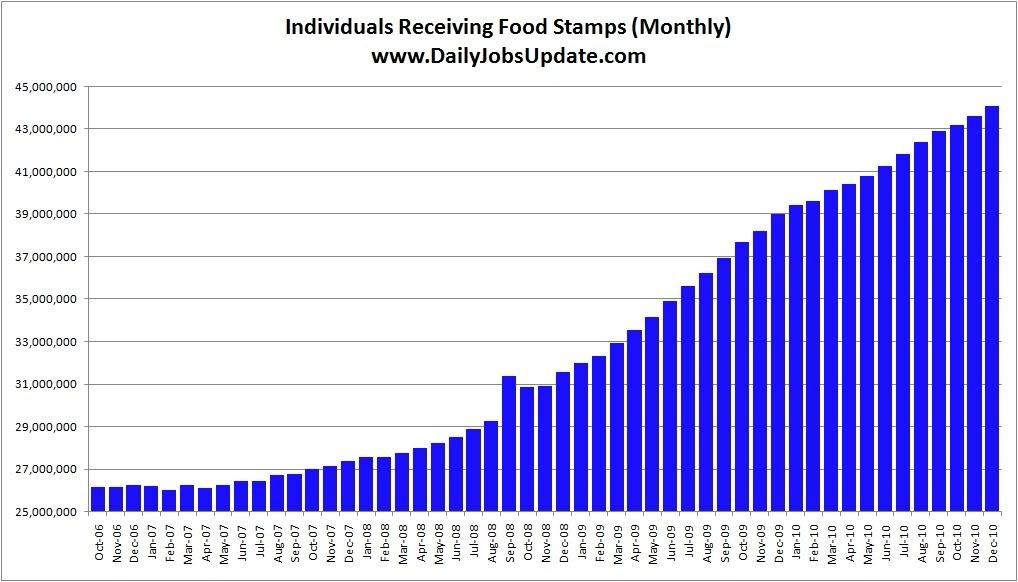
Meanwhile, as this column among others points out, the Village of Washington, D.C. is full of college graduates who can't understand what the fuss is all about, and have moved on to "shared sacrifice" by the little people in the hinterlands.
Wednesday, March 9, 2011
The Washington Lobotomy Factory Moves in High Gear
The nomination of a Nobel Prize winner to a seat on the board of the Federal Reserve will likely be blocked because a key senator says the economist is not qualified for the job.Sen. Richard Shelby, the highest-ranking Republican on the Senate Banking Committee, says he plans to oppose the nomination of Peter Diamond, a Massachusetts Institute of Technology professor, for a third time.
The opposition, which he stated at the panel's hearing on the nomination, raises the likelihood that President Barack Obama's choice for the Fed will be blocked again.
The Senate Banking Committee twice approved Diamond's nomination last year along partisan lines. He was never confirmed by the full Senate because Democrats lacked Republican support.
Do I really need to say any more than this? The guy has a NOBEL PRIZE. That means he's really smart -- as in groundbreaking smart. As in smarter than the average Congressman (which I understand isn't saying much at this point).
And -- he won his Nobel Prize for work on LONG TERM UNEMPLOYMENT. God knows we shouldn't be listening to him, or asking his advice on anything. After all, he's obviously not qualified to do anything regarding the economy, is he?
Beige Book Part II; Prices
Manufacturing and retail contacts across Districts reported rising input costs. Manufacturers in many Districts conveyed that they were passing through higher input costs to customers or planned to do so in the near future. Homebuilders in the Cleveland and Atlanta Districts noted rising material costs, but acknowledged little ability to pass through the costs to buyers. Retailers in some Districts mentioned they had implemented price increases or were anticipating such action in the next few months. There is little evidence of wage pressures across Districts. Wages remained steady in the Boston, Philadelphia, Cleveland, Kansas City, and Dallas Districts, while moderate wage pressures were reported in the Chicago, Minneapolis and San Francisco Districts. Philadelphia, Dallas, and San Francisco noted that most wage increases were for workers with specialized skills.There are two primary places where price pressures manifest themselves. The first is in input costs to the production process in the form of higher raw material prices which is obviously happening in the manufacturing sector. We've seen futures across a variety of commodities increase (wheat, corn, soy beans, oil, copper, coffee, sugar, and cotton are but some examples). Also consider this information from the latest ISM manufacturing report:
"A continued weak dollar is increasing the cost of components purchased overseas. It is going to force us to increase our selling prices to our customers." (Transportation Equipment)From the same report:
- "We continue to see significant inflation across nearly every type of chemical raw material we purchase." (Chemical Products)
- "Our plants are working 24/7 to meet production demands." (Fabricated Metal Products)
- "Prices continue to rise, while business limps along at last year's pace." (Nonmetallic Mineral Products)
- "Overall demand is off 10 percent." (Plastics & Rubber Products)
The ISM Prices Index registered 82 percent in February, 0.5 percentage point higher than the 81.5 percent reported in January and the highest reading since July 2008. This is the 20th consecutive month the Prices Index has registered above 50 percent. While 66 percent of respondents reported paying higher prices and 2 percent reported paying lower prices, 32 percent of supply executives reported paying the same prices as in January. A Prices Index above 49.4 percent, over time, is generally consistent with an increase in the Bureau of Labor Statistics (BLS) Index of Manufacturers Prices.The 13 industries reporting paying increased prices during the month of February — listed in order — are: Fabricated Metal Products; Food, Beverage & Tobacco Products; Machinery; Chemical Products; Electrical Equipment, Appliances & Components; Plastics & Rubber Products; Paper Products; Transportation Equipment; Apparel, Leather & Allied Products; Nonmetallic Mineral Products; Primary Metals; Computer & Electronic Products; and Miscellaneous Manufacturing. Furniture & Related Products is the only manufacturing industry reporting paying lower prices on average during February.
And we also have the following list of commodities increasing in price:
Aluminum (6); Aluminum Products (2); Brass (3); Brass Products (2); Cocoa; Copper (7); Copper Based Products (4); Corn (6); Diesel (3); Fuel Oils (2); Gasoline; Nickel; Plastics (2); Plastic Products (2); Plastic Resins (4); Polyethylene; Polyethylene Resin (2); Polypropylene (2); Rubber Products; Soybean Oil (4); Stainless Steel (4); Stainless Steel Products (2); Steel (6); Steel — Hot Rolled; Steel Products (3); Steel Surcharges (2); Sugar (2); Sulfuric Acid; and Wheat.
However, the increase in raw materials prices is not cause for panic.
Above is a chart for PPI of raw materials (blue) and final PPI (red). Notice that industry absorbs a lot of the increase in raw material price increases, usually by compressing margins and increasing productivity.
The chart above shows the same information (crude PPI vs. final PPI), but in a percentage change from last year format. Notice we see the same thing -- raw material price increases are absorbed by industry -- usually by compressing margins and increasing productivity -- and not passed on in a large way to final customers.
From the wage side, we're not seeing a big increase for one simple reason: at 8.9% unemployment, there is going to be little to no wage increase demand from the labor side. Consider the following charts:
Average weekly hours are still very low, meaning employers can simply increase the number of hours people work before they start to hire new people. This is a form of labor market slack.
Second, the year over year rate of increase in wages (not adjusted for inflation) has been decreasing. Again, this is because of the large amount of slack in the labor market.
Third, notice the employment cost index's YOY's percentage change for wages and salaries has been showing a slowed pace of increase.
So, while we are seeing an increase in raw material prices, these price increases are usually absorbed by industry and not passed on to consumers. Wage pressures are non-existent.
Tuesday, March 8, 2011
What Not Repairing Our Infrastructure Means
From the New America Foundation this week comes a brief report on the efficiency losses of America's outmoded infrastructure. The costs approach $200 billion per year, with sitting in traffic making up over half that total. An excerpt:
Congestion has worsened as the expansion of the highway system has failed to keep pace with usage. Since 1980, mileage of U.S. highways increased 4.5% while the number of passenger cars increased 12.7% and the number of trucks increased 56.4%. As a result, the amount of time wasted has increased dramatically over the past few decades rising from 14 hours per driver in 1982 to 34 hours in 2009. The cost of these delays has increased from $24 billion in 1982 to $115 billion in 2009 dollars. Congestion has also slowed truck freight. Truckers experience 243 million hours of bottleneck delay annually at a cost of $32.15 per hour, in addition to general traffic delay. Given that oil prices have increased dramatically in recent years, and are likely to remain elevated, the cost of congestion and poor infrastructure are rising.The growth in truck freight on the roads is really remarkable. I would be surprised if it weren't more efficient to move that freight by rail, even at the cost of displacing people from the rail system.
An update on savings and growth
Early last week January savings and spending were reported. I haven't updated those graphs in awhile, so this is a good opportunity to do so.
To begin with, on a real, inflation adjusted basis, Americans saved more money at the bottom of the Great Recession than at any time since World War 2:
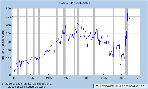
As you can see, some of that savings has been spent to fuel the recovery so far, but most of the accumulated savings - as much as at the end of the 1980-82 recession - is still available.
Amercians' relative newfound frugality can be seen in this update graph of the savings rate as well:
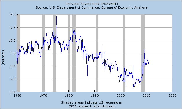
This has been trending sideways for over a year and a half, and from the longer term point of view, is a good thing.
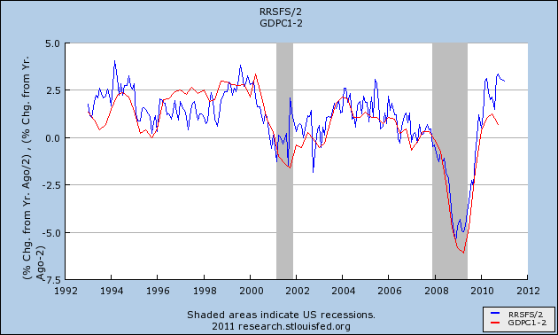
Yesterday I pointed out that job growth in 2010 tracked real GDP growth (red) more closely than real retail sales (blue). Which means that the two series have diverged more than usual, as you can see here:
So, how will the divergeance get resolved? Back in August of last year I began keeping track of the real, inflation adjusted personal savings rate, and updated that view in November. Here is how the relationship between the real personal savings rate (blue) and real GDP (red) stands now:
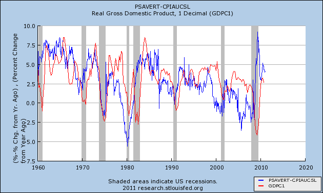
As I said then, the reason for keeping track of the relationship is that as can be seen in the above graph, a substantial change in the real personal savings rate is mirrored by a similar substantial change in real GDP about 6 to 18 months later. Subtract 2% from that change in real GDP, and you have a reliable prediction of the change in jobs growth and the unemployment rate another 6-12 months after that. The logic of this isn't hard to follow: increased savings serve as the "tinder" that ignites subsequent spending. That spending leads to growth, and then that growth leads to the creation of jobs.
Thus an increase in savings is a "long leading indicator" for employment in a range of 18 to 30 months later. We are now about 21 months past that peak increase in savings, so this relationship predicts further increases in YoY job growth in 2011. As I pointed out back in November, "subsequent GDP increases are generally similar to the precursor real personal savings rate -- which has been above 5% for much of the last 18 months. Which means that an unemployment rate significantly under 9% by the end of 2011 is quite doable."
Beige Book Part I; Lending
This time around, I'm going to start with lending. First, here are two links (here and here) that examine the latest reports from the FDIC's Quarterly Banking Profile. While the banking sector is clearly on the mend, we're not completely healed yet, meaning the ability to lend -- even in a zero rate environment -- is compromised.
Against that back drop, consider the following from the Beige Book:
Loan demand varied across District and loan category. Richmond, Dallas, and San Francisco noted improvements in overall loan demand, while Kansas City observed a decrease. Demand for residential real estate loans increased in Philadelphia, Atlanta, and Dallas but was weaker in New York, Cleveland, St. Louis, and Kansas City. The New York, Philadelphia, Richmond, Chicago, and San Francisco Districts reported improvements in commercial loan applications. The Dallas District experienced mixed commercial loan demand, while St. Louis noted that demand was unchanged to weaker. Cleveland reported business loan applications were beginning to pickup but demand for consumer loans remained soft. The Philadelphia District expected little change in loan volume as consumers remained reluctant to borrow.The macro indicators tell us the following:Most Districts reported that credit standards were unchanged to tighter. Kansas City reported standards were unchanged for all types of loans. New York noted some tightening of commercial loan standards but little change in the standards for residential mortgages or consumer loans. The Atlanta District reported increased standards for residential mortgage loans. St. Louis indicated standards had tightened somewhat for commercial mortgages, but were unchanged for C&I loans, and were unchanged to somewhat tighter for residential mortgages. San Francisco noted relatively restrictive standards for both consumer and commercial loans.
Community bankers in the Chicago and Dallas Districts cited increased competition for C&I lending from large banks. Atlanta noted improvements in credit conditions for all loan segments except those related to residential construction and real estate. Cleveland, Richmond, Chicago, Kansas City, and Dallas indicated steady to improving credit quality, and New York reported steady to lower delinquency rates. San Francisco reported that venture capital financing was improving with increased investor interest and IPO activity.
1.) The BB confirms the healing trend first mention in the Quarterly Banking Profile. Credit conditions are improving and delinquencies are decreasing.
2.) Loan standards are by and large tightening. This is not good for the economy right now, as credit needs to flow. However, considering loose standards helped to create the current mess, the tightening might be good in the long run.
3.) The loan picture is extremely mixed and is highly dependent on loan type and location.
Let's look at the details.
NY: Bankers report a decrease in the demand for residential mortgages, but increased demand for commercial and industrial loans and especially commercial mortgages; demand for consumer loans is reported to be little changed. Bankers indicate no change in the demand for refinancing. Respondents note some tightening of credit standards for commercial and industrial loans, on net, but no change in standards for the other loan categories. Bankers report no change in spreads of loan rates over costs of funds across all loan categories; spreads had been narrowing towards the end of 2010, based on the prior few surveys. Respondents indicate that average deposit rates have been steady to declining. Finally, bankers report a decrease in delinquency rates for commercial mortgages but no change in delinquencies for the other loan categories.
Philly: At most of the Third District banks contacted for this report, total outstanding loan volume has been roughly level since the previous Beige Book. Overall, business loan and residential mortgage volumes outstanding have edged up at commercial banks in the District, but consumer loan volume outstanding has eased. The outlook among Third District bankers interviewed in February is that total loan volume will expand only slightly over the next two quarters. Bankers said that consumers will remain reluctant to borrow until employment begins to improve more steadily and that business firms are still focused on strengthening balance sheets rather than taking on more debt. One banker expressed a view shared by many when he said, "Creditworthy businesses are not looking to borrow."
Cleveland: In general, bankers reported that commercial loan demand was stable or showed modest growth since our last survey. Some bankers commented that demand is strongest from health care providers, small manufacturers, and energy companies. On the consumer side, conventional loan demand remains soft, although a few of our contacts told us that they are seeing a modest pickup. Direct and indirect auto lending continues to show strength, while reports on the use of home equity lines of credit were mixed. Interest rates for business and consumer credit were generally stable. Most of our contacts said that activity in the residential mortgage market has slowed (refinancings and new-purchase originations) due to rising interest rates and seasonal factors. Core deposits continue to grow, with most of the growth occurring in nonmaturing products. The credit quality of businesses and consumer applicants was characterized as stable to improving, while delinquency rates were trending down across most portfolios. Staffing levels have shown little change during the past few weeks. Selective hiring is expected during 2011.
Richmond: Loan demand in the District continued to improve in recent weeks. Several contacts reported that small business lending in particular had increased, with much of the demand coming from capital improvement needs. Demand from medium and large firms was mixed, with some bankers stating that both were requesting more loans, while other lenders' gains were limited to medium-sized businesses. Much of the demand from large businesses was for mergers and acquisitions. A banker in North Carolina noted a marked pick-up in consumer borrowing, mostly with respect to credit card usage, but added that many consumers were paying down debt. A loan officer in Richmond noted a sharp increase in home repair loans. However, several lenders around the District commented on the limited amount of mortgage activity--both for new homes and refinancing. West Virginia continued to lag, with one area banker reporting that loan demand was weak, and the high rate of repayments made sustaining loan volumes difficult. Most bankers were encouraged by recent improvements in credit quality, with several noting that the number of problem loans had declined. Another lender stated that healthy businesses in his area were starting to have more confidence in the recovery and had come back for loans.
Atlanta: District banking contacts reported an increase in mortgage applications in January and early February; most of those attributed the increase in number of applications to refinance activity and lower interest rates. The majority of bankers stated that mortgage lending standards have increased in recent months; while a few bankers reported elevated standards remained unchanged. Small businesses related to construction and real estate in particular, described worsening credit conditions, with many indicating that they either did not receive the amount of credit requested or that they refused the offered credit because of unfavorable terms. Small businesses outside of construction and real estate reported improving credit conditions at community and regional banks.
Chicago: Credit conditions continued to improve in January and early February. With market interest rates rising, financing costs increased, but corporate credit spreads for a number of large firms in the District were slightly improved. Competition for commercial and industrial loans continued to be fierce, and contacts noted an increased presence of large banks in small business lending. Demand for business and consumer credit increased. Much of this continued to be refinancing of existing debt, but core loan demand was noted to be slowly rising. Credit line utilization also picked up, as working capital needs increased. While delinquencies remained elevated, loan quality continued to improve, albeit at a slower pace than during the previous reporting period. Several contacts noted that the banking sector seems to be on its way toward balance sheet repair with earnings improving, and may be starting to turn the corner on lending. Credit availability is beginning to improve for most loan types, although the bulk of lending is still going to the most high quality borrowers.
St. Louis: A survey of senior loan officers at a sample of large District banks showed little change in overall lending activity during the fourth quarter of 2010. During this period, credit standards for commercial and industrial loans remained unchanged, while demand for these loans ranged from unchanged to moderately weaker. Credit standards for commercial real estate loans tightened somewhat, while demand for these loans was moderately weaker. Meanwhile, credit standards for consumer loans remained unchanged, while demand for these loans ranged from about the same to moderately stronger. Credit standards for residential mortgage loans ranged from unchanged to tightened somewhat, while demand for these loans was moderately weaker.
KC: Bankers reported weaker loan demand, increased deposits, and an improved outlook for loan quality in the recent reporting period. Overall loan demand decreased slightly as demand for commercial and industrial loans, residential real estate loans, and consumer installment loans decreased while commercial real estate loan demand edged up. For the fourth straight survey, credit standards remained unchanged in all major loan categories. Loan quality was mostly unchanged from the previous period, while the outlook for loan quality over the next six months improved. Bankers reported increased deposits with gains in transaction and money market accounts.
Dallas: Financial firms report a slight uptick in overall loan demand. Commercial and industrial loan activity remains mixed, but demand for residential real estate loans has picked up from very low levels. Loan pricing is highly competitive, and contacts at community banks report increased competition from larger banks moving "down market" in order to attract new business. Credit quality appears to have stabilized and in some cases is improving. Increased cost of regulatory compliance is restraining lending activity, especially for community banks. Outlooks have improved slightly due to improving credit quality, some deposit run-off, and increased optimism regarding the overall direction of economic activity.
Frisco: Reports from District banking contacts indicated that loan demand was up somewhat compared with prior reporting periods. Although businesses reportedly remained cautious in regard to their capital spending plans, demand for commercial and industrial loans rose a bit. Demand for consumer credit grew modestly as well. A few reports indicated that lenders' willingness to extend credit to small and medium-sized businesses improved in recent weeks, which respondents attributed primarily to perceived improvements in the outlook for existing business plans. Nonetheless, lending standards for consumer and business lending remained relatively restrictive. Venture capital financing showed further signs of improvement, with contacts noting ongoing increases in investor interest and IPO activity.
Here are some observations, in no order of importance:
1.) Credit standards are still very tight, and some districts are tightening further. I'm not sure if this "tightening" is in fact a return to more more prudent lending standards overall, or whether banks are simply keeping a tight reign on lending as their own balance sheets continue to repair.
2.) Overall loan demand is stable to increasing somewhat, but there is not a stampede to obtain loans. Other factors indicate consumers are still repairing their balance sheet, which cuts down on consumer demand for loans, and businesses on the average are simply not trying to obtain credit either.
3.) Several districts noted that larger banks are moving into medium and small bank areas of business as a way to increase their respective bottom lines. This indicates the smaller banks are probably unable to make more of these loans.
4.) Overall, it's interesting to note how little lending there appears to be occurring. Banks are constrained by their balance sheets, consumers are paying down debt and businesses are still concerned about the economy and repairing their respective balance sheets.
5.) Residential loans are still in the doldrums.
Monday, March 7, 2011
Agricultural Prices From a Long Term Perspective


In all the above chart, notice the corn, wheat and soy all spent years consolidating prices in a fairly tight and predictable range. Now all three have broken out of their price ranges and are using the top part of the previous range as technical support for current price advances. And old traders adage says the longer the base, the stronger the advance.
The Dollar is At Critical Support Levels

According to the Financial Times, the amount bearish bets have increased over the past few months. Short dollar positions have increased from 200,000 to 280,000.
The primary reason is the difference in the way the various central banks are handling the commodity price increases. The ECB looks at total inflation, meaning their position has become more hawkish. The Fed looks at core inflation, meaning their position is now more dovish. From the dollar's perspective, there is also the increase in oil prices, which will slow U.S. growth, thereby making the dollar less attractive as an investment.
A quick note to commenters
As you all may already know, one of Bonddad's posts Friday has generated a fair amount of blowback. Back in the old days, I almost never did any comment moderation, but now I do a lot. My rule of thumb is that, if disagreement is based on facts, it gets published, no matter its "tone." To that end, I probably haven't deleted a comment in almost half a year.
On the other hand, "spam" is getting much more sophisticated, and a few comments may get caught in the filter, which seems to have happened to a couple over the weekend. I've published them now. So nobody's comments have been ignored, censored, or deleted.
The Jobs Report big picture in 5 graphs
On Friday I showed that the trend of increasing jobs reports was intact, when one bears in mind that for 12 of the last 13 months, the final revision was on average about +50,000 higher than the initial report. Even after the yearly benchmark changes that was still true for 9 of the twelve months of 2010.
Today let me update 5 graphs that I have been running over the last few months in some cases, and for over a year in others, to show some "big picture" correlations with the jobs report. All of these show data that has reliably led the jobs picture by weeks (the first graph) or months (the next two), or has led the unemployment rate by months (the last two).
First of all, here is the scatter graph of initial jobless claims (left) and monthly jobs gained/lost (bottom) for the last two years. Blue is all private jobs, red includes government jobs as well (except I have excluded the March through August 2010 period which was distorted by census hiring and firing):
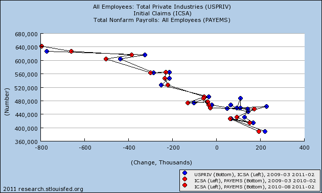
As you can see, there is a nearly linear relationship. So long as initial claims continue under 400,000, we should expect robust monthly jobs reports (with a very big +/-125,000 variance, however). It is also important to note that we have been shedding government jobs for the entire two year period, without any "double-dip." While laying off government workers now is insane policy, and will be a drag on the economy, it is safe to say that it alone will not be enough now or during this summer to cause a renewed recession.
Next, let's look at jobs vs. GDP. This is a series I have been running for well over a year. Despite the complaints that GDP does not measure the happiness of Main Street, the fact remains that it is an excellent way to predict YoY jobs over the next 6-12 months. Subtract 2% from the YoY percentage growth of GDP, and you will be very close to the YoY% of jobs growth a few months later. Here is that graph now:
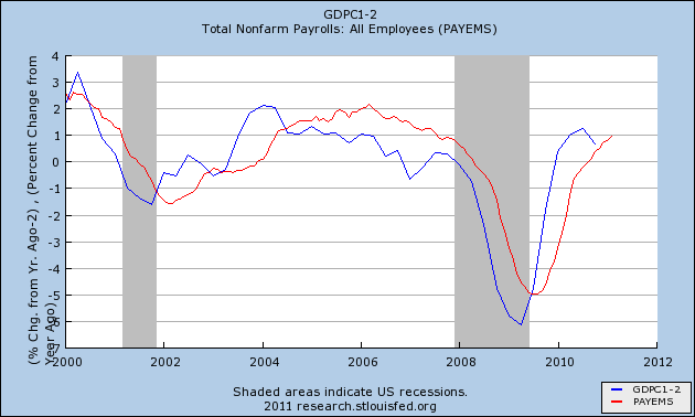
As you can see, it remains an excellent predictive tool.
Third, let's look at real retail sales vs. jobs. This is another series I have been running for well over a year. It is updated monthly, and so gives earlier signals of turning points than GDP. While it remains an excellent tool for the direction of YoY job growth, it has not performed so well in the last year:
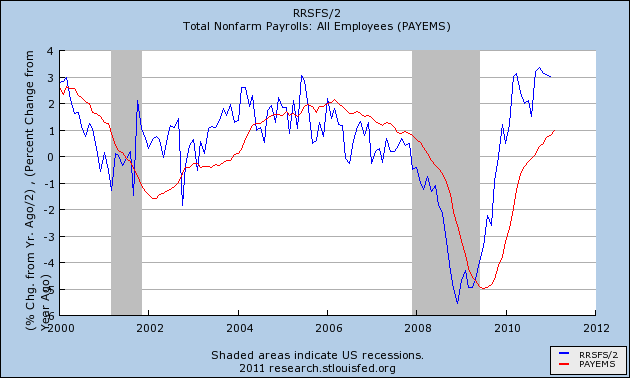
My suspicion is that it is not performing so well this time around because the retail sales do not include those sales associated with new home sales and home improvements, compared with other recoveries. Nevertheless, if real retail sales continue to predict 3% annual job growth for an extended time, I expect job growth to trend in that direction.
Now let's look at two graphs comparing initial jobless claims with the unemployment rate. First, courtesy of Thumbcharts, is a graph comparing the average of the last last 6 months of initial claims (blue) and the unemployment rate (red) over the same period, with the equivalent 6 months the year before. With the exception of the double-dip 1980-1982 recessions, this has an excellent track record.
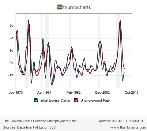
As the readings from last August and September disappear, the initial claims average will continue to decline YoY, and this predicts that there will continue to be a substantially lower unemployment rate than the same period a year ago. While this might not mean further decline in the unemployment rate from here, it very strongly argues against any significant increase back above 9% in that rate.
Finally, let's look at initial jobless claims as a percentage of the population vs. the unemployment rate. This is the graph I began running about 3 months ago when I was totally surprised by the close and long-lasting fit (although there has been a slight drift upward over the long term in the unemployment rate vs. claims):
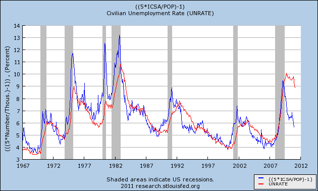
This graph argued 3 months ago that the unemployment rate was far too high compared with initial claims. Since then the unemployment rate has declined 0.9%!!! As population-adjusted initial claims has consistently led the unemployment rate for almost 50 years, this graph suggests that further declines in the unemployment rate in the coming months are likely. If so, the dramatic drop in the unemployment rate could be the surprise economic story of 2011.
The question remains, however, how much of the decline in the unemployment rate is an unalloyed good and how much has to do with participants dropping out of the work force. I will get down into the weeds on that subject in my next post.


