Friday, August 27, 2010
Weekend Weimar And Beagle
It's that time of the week. Think and work on anything except the markets or the economy. Until Monday ...
Weekly Indicators: Horse Latitudes Edition
An initial note: at another, large blog, someone commented that "Krugman = lagging indicator." The person meant it sarcastically, but rephrased as "pundits = lagging indicator," it is true. It has been proven over and over again that pundit opinion as a whole follows trends. Which means that it misses turning points, which is why the KISS method of sticking with the LEI is more successful. As the economic data has deteriorated in the last few months, the range of generally accepted opinion has moved Gloomier and Doomier. It will continue to move that way until AFTER the next turning point.
More specifically, this weekend check out the Barron's website's data section, and see what insiders are doing, since individual investor sentiment is totally spooked by the "Hindenberg omen." Like the "Digby put" almost 2 months ago, it may actually be the "Hindenberg contrary omen." Insider buying vs. selling will tell us so.
This week the reduction of 2nd quarter GDP was made official. The economy is in the doldrums, nearly completely stalled. Durable goods orders, a leading indicator, tanked. New and existing home sales also declined, completing the collapse since the expiration of the $8000 tax credit.
One other item of interest, quite overlooked in the media, was the release of loan data for the second quarter by the Fed. Loans typically do not bottom until well after the bottom of a recession. They are badly lagging indicators, but they do confirm a turn. As it happens, a few of the series did actually turn up. Most all of the rest continued to decline, but at a much lower rate than they had up until this year. Too early to say they've turned, but they look like they are getting ready to turn.
Now here's my look at high frequency weekly indicators:
The Mortgage Bankers' Association reported that "the Refinance Index increased 5.7 percent from the previous week and is at its highest level since May 1, 2009. The seasonally adjusted Purchase Index increased 0.6 percent from one week earlier." The Purchase index continues to tell us that we have hit bottom, but without a significant bounce back yet. Refinancing tells us that household debt as a percentage of disposable income is going down, probably substantially. This is a good sign for the future.
The ICSC reported same store sales for the week ending August 21 rose 2.3% vs. a year earlier, and declined -0.4% from the prior week. Shoppertrak, on the other hand, reported that for the week ending August 21, YoY sales were up 4.5%, and down -0.4% vs. the prior week. The ICSC report concerns me, as this is the poorest YoY showing in several months, and the 4th straight week of WoW declines. Are consumers growing fearful again?
Gas prices decreased $.05 to $2.70 a gallon, at the low end of the range since May. At 9.373 million barrels consumed a day vs. 9.105 the same week last August, we continue to run ahead of last year, indicating expansion.
The BLS reported 473,000 new jobless claims, back in its 8 month range. We won't know if the increase we saw since early June has due primarily to state and local government and census layoffs until we see the jobs numbers a week from today.
Railfax continued to show renewed strong growth vs. last year in all 4 sectors: Cyclical, intermodal, baseline, and total traffic all continued to move sharply up, and intermodal traffic hit a new high! Auto carloads also continued to rebound strongly, although waste and scrap metal remained at last year's levels. In the last few weeks, I have written tht rail traffic has suggested that the double-dip was right now. Last week a reader asked in the comments
Question: when you say that the rail traffic suggests the double dip is right now, does that mean we are already on the way up out of it, given that traffic is turning back up after having been down?Answer: yes it may be so. The bottom line is, indicators seem to behave differently in deflation vs. inflation, in that lead times become much more compact. Rail traffic has suggested that the downturn foreseen in the LEI beginning in April has already been happening. Rail traffic may now be telling us that the downturn in the private vs. public sector may be abating.
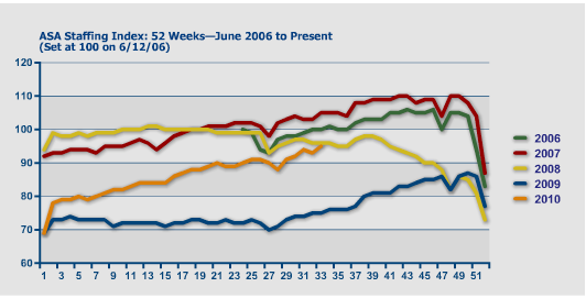
The American Staffing Association reported that for the week ending August 15, temporary and contract employment increased by 1.31%, pushing the index to a two year high of 95.0. This series is a leading indicator for jobs, and again suggests that the private sector is continuing to grow.
M1 declined -0.6% in the last week, but was up 1.0% month over month, and up 4.4% YoY, so “real M1” is up 3.1%. M2 increased less than 0.1% in the last week, and is up 0.3% month over month, and up 2.4% YoY, so “real M2” is up 1.1%. We have never had a recession without a negative real M1 reading, so this is encouraging, although the YoY trend remains down. Additionally, I would like to see real M2 up over 2.5% to feel confident that there will be no double-dip.
Weekly BAA commercial bond rates dropped .22% more last week to 5.56%, a decline of 0.76% in 9 weeks! This is simply totally inconsistent with the notion that another deflationary bust has started and creditworthiness is about to become an issue.
The Daily Treasury Statement as of August 25 (18 reporting days into the month) shows $116.4 B has been collected vs. $110.2 B a year ago, a gain of 5.6%. For the last 20 reporting days, we are up 5.8%, $125.0 B vs. $119.2 B. This is towards the low end of advances since the series turned positive YoY in March. This suggests to me that private sector employment is not continuing to improve relative to last year, although small positive growth may be taking place.
For the first time in awhile, almost all of the weekly indicators were positive, although their strength varied. Mortgage applications and rail traffic are particularly encouraging. The ICSC same store sales figure does concern me, however. Next week we'll get the jobs report, and what I will be particularly watching is whether weakness remains concentrated in the real estate/construction and government jobs area where stimulus programs expired, or whether the weakness is spreading out.
GDP Redux
1.) PCEs are still increasing in line with the previous three quarters.
2.) PCEs of durable goods increased 6.9%.
3.) Service expenditures increased the most in a few years.
4.) Gross private domestic investment increased at a strong rate
5.) Equipment and software investment continues
6.) Residential investment was positive as well.
As I noted in the initial post on GDP, the real issue in the 2nd quarter was a huge increase in imports.
A Closer Look at GDP: Investment
Let's continue our look at today's GDP report with a closer look at domestic investment.
Total domestic investment is increasing at a solid rate.
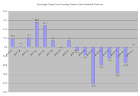
Non-residential investment was just positive last quarter, although I wouldn't hold my breath about this number moving strongly higher in the near future.
Equipment and software investment increased at a strong pace, as did
Residential investment.
A Closer Look At GDP: PCEs
Let's take a deeper look into the data from today's report, starting with the largest percentage component of GDP, personal consumption expenditures or PCEs. You can click on all images for a larger image.
Total PCEs increased 2% from the preceding quarter, right in line with recent experience.
Services -- which comprise 65% of PCEs saw the largest increase since 2Q08.
Purchases of non-durable goods also increased, although at a lower rate than the previous quarter.
Durable goods purchases increase at a healthy pace.
GDP Revised Lower to 1.6%
Real gross domestic product -- the output of goods and services produced by labor and property located in the United States -- increased at an annual rate of 1.6 percent in the second quarter of 2010, (that is, from the first quarter to the second quarter), according to the "second" estimate released by the Bureau of Economic Analysis. In the first quarter, real GDP increased 3.7 percent.
.....
The increase in real GDP in the second quarter primarily reflected positive contributions from nonresidential fixed investment, personal consumption expenditures, exports, federal government spending, private inventory investment, and residential fixed investment. Imports, which are a subtraction in the calculation of GDP, increased.
The deceleration in real GDP in the second quarter primarily reflected a sharp acceleration in imports and a sharp deceleration in private inventory investment that were partly offset by an upturn in residential fixed investment, an acceleration in nonresidential fixed investment, an upturn in state and local government spending, and an acceleration in federal government spending.
Let's take a look at the contributions to the percentage change:
The big issue is that imports subtracted 4.45 points from growth. Everything else is OK. From the preceding quarter, notice the PCEs increased 2%, gross private domestic investment increased 25%, exports were up 9% and government spending increased 4.3%. Imports increased a 32.4%, largely because of a 39.3% increase in imported goods. In other words, the real issue here is the increase in the trade deficit:
I'll touch on this for the rest of the day.
Yesterday's Market
After gapping higher at the open, prices broke the trend line started yesterday (a). They found support at previous lows (b) and tried breaking out but found resistance at the EMS (C). Even getting above the EMA couldn't give prices enough momentum, so they fell through support (e). When momentum shifter (f) prices rose but found resistance at the EMA (g), so they fell (f) on increasing volume.
The SPYs are currently at important support levels (a).
The IEFS (7-10 year treasury) are still in a rally (b). Notice the number of upward gaps the chart has printed recently (a).
After breaking through important resistance, the TLT has also printed several important upward gaps as well (a and b). Also notice how bullish the EMAs are -- the shorter are above the longer and all are rising (c).
Cattle is still in an uptrend (A), which has continued through important resistance levels (C) and consolidated gains along the way (B). After peaking, prices have fallen (d), but are still at elevated levels.
Copper is clearly consolidating recent gains (A).
Wheat is also consolidating gains (A).
Crude oil is currently at important support levels (A).
Thursday, August 26, 2010
A Look At the Value Line Average
Have you noticed that Valueline Arithmetic is currently correcting from a high it made earlier this year? That recent peak was an all time high, and therefore was higher than the peak before the 2008-2009 crash. The Drawdown from this recent peak is approximately 15%. What do you make of this situation? Especially given that the S&P 500 has only recovered about 50% relative to its pre-crash high,while Valueline Arithmetic recovered over 100% and is now correcting. Would be very interested in what you have to say about this situation.
First, I had completely forgotten about Value line. For those of you who are unfamiliar, VL does some of the best fundamental research on the planet. They used to issue two huge binders, broken down by industry. Each industry section began with a general overview of the industry. Then the report would fundamentally break down each company within the industry and assign each company a ranking (which I think was 1 through 5). If I remember correctly, VL's top picks usually outperformed the market on a pretty regular basis. Anyway, this is a great source of information.
That being said, here is how Value Line explains their index:
On June 30, 1961, we introduced the Value Line Composite Index. This market benchmark assumes equally weighted positions in every stock covered in The Value Line Investment Survey. That is, it is assumed that an equal dollar amount is invested in each and every stock. The returns from doing so are averaged geometrically every day across all the stocks in The Survey and, consequently, this index is frequently referred to as the Value Line (Geometric) Average (VLG). The VLG was intended to provide a rough approximation of how the median stock in the Value Line universe performed.On February 1, 1988, Value Line began publishing the Value Line (Arithmetic) Average (VLA) to fill a need that had been conveyed to us by subscribers and investors. Like the VLG, the VLA is equally weighted. The difference is the mathematical technique used to calculate the daily change.
The VLA provides an estimate of how an equal-dollar weighted portfolio of stocks will perform. Or, put another way, it tracks the performance of the average, rather than the median, stock in our universe. It can be shown mathematically, for all practical purposes, that the daily percentage price change of the VLA will always be higher than the VLG. The systematic understatement of returns of VLG is a major reason that the VLA was developed. Moreover, although the differences between daily price changes may seem small, the magnitude of the annual differential between the two averages can be very large. The greater the market volatility, the larger the spread between the geometric and arithmetic averages becomes.
In 1965, when the current Timeliness Ranking System began, our only market average was the VLG, so we scored the ranks on a geometric basis. This allowed us to compare the performance of the ranks versus the market (as measured by the VLG). After we started the VLA, we began scoring the ranks both on a geometric and arithmetic basis.
In other words, the VLA is an index of the average VL stock. That being said, here is the weekly chart:
Click for a larger image.
The reason this average has outperformed the SPYs is VL has a better selection of stocks. That shows they're pretty good at their job.
The index has printed two highs over the last few years -- A and B. Prices reached areas around previous highs and then started to move sideways. Notice how prices have risen and then turned into more of a sideways orientation (see curved line C). Since hitting previously established highs, prices have found support at line D and the 50 week EMA. Also note the index has declining momentum (F). Finally, take a good look at the EMAs (E). The shorter are above the longer, but the 10 and 20 week EMA are moving lower and the 10 is slowly working below the 20. This is a bearish development.
So -- what does this mean? All the equity averages -- even the VL -- is suffering from the concern over the US economy's overall direction right now. The recent spate of economic numbers indicate the economy is slowing which is bad for all equities.
However, the higher quality of the VL selection process is probably preventing an overall crash in this average.
Durable Goods Rise .3%
Orders for durable goods, products such as autos and appliances designed to last three years or more, rose 0.3% in July from June, largely due to aircraft orders, the Commerce Department said Wednesday. Excluding the volatile transportation sector, orders tumbled 3.8%.We've been seeing this slowdown in the latest regional manufacturing numbers.The figures provided the latest evidence that the rebound in manufacturing, which propelled the early stages of the economic recovery, is unlikely to remain strong enough to offset weakness in consumer spending and waning support from federal stimulus.
A key gauge of future business investment—orders for nondefense capital goods excluding aircraft—fell 8% from a month earlier. That drop, the worst decline since January 2009, offset the gains seen in May and June.
While the durable-goods data can be volatile, they raised doubts about whether the underlying strength of businesses can keep the economy expanding in the second half of the year.
"The recovery has been relying so heavily on the industrial side of the economy for support, and it seems as though that support has now all but disappeared," said Ellen Beeson Zentner, an economist at Bank of Tokyo-Mitsubishi UFJ.
From the NY Fed:
The Empire State Manufacturing Survey indicates that conditions improved modestly in August for New York manufacturers. The general business conditions index rose 2 points from its July level, to 7.1. The new orders and shipments indexes both dipped below zero for the first time in more than a year, indicating that orders and shipments declined on balance; the unfilled orders index was also negative. The indexes for both prices paid and prices received inched down, while employment indexes were positive and higher than last month. The six-month outlook weakened; though future indexes were generally still positive, many fell in August, with the notable exceptions of the future employment and capital expenditures indexes, which climbed after falling last month.
And here is the chart from the Philly Fed:
Notice it dropped below 0.
And here is the PMI.
While still positive, it has moved lower the last few months as well.
Here are the relevant durable goods charts:
Although still in an uptrend, durable goods orders have moved near sideways for the last few months.
And the ex-aircraft number dropped in a big way last month.
For more on manufacturing, see this interview in the WSJ.
An updated look at the Stressors on the Recovery
In the last couple of weeks, I have updated my "Big Picture" look at the economy. In the long term, the Slow Motion Bust is continuing, and will continue until the huge excesses of debt are wrung out of the system and prices (of housing) are reset to levels that ordinary people can afford. In the short term, the KISS method of relying on the LEI shows an economy converging on zero -- GDP is likely to be somewhere near zero this quarter and next.
In this post I want to take a look at the current status of the reasons why the economy is "converging on zero." I have listed them before, they aren't a surprise. Some, most notably the BP oil catastrophe, have already worked themselves out (although their afteraffects will certainly linger). Several important others are due to the expiration of government assistance, in one leading sector of the economy (housing), and one lagging sector (government employment). The price of Oil is also important. Let's take a look at them:
1. The Euro Crisis
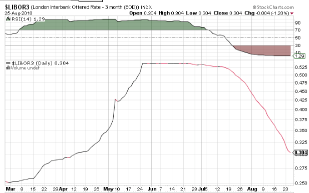
The Eurozone crisis was the trigger that provoked the current downturn. Measures of fear in the markets shot up from March through May as the crisis intensified (although, it is important to note, never anywhere near 2008 levels). This fear was measured through LIBOR rates. Here is a current look at the 3 month LIBOR:
It has returned by more than 75% to its pre-crisis levels. This doesn't mean that there can't be a new crisis (is Greece solvent?), but for now, that stressor has generally dissipated.
2. The Price of Oil
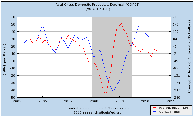
In April with the price of Oil briefly topping $90 on an intraday basis, both Bonddad and I noted that high-priced Oil would be one certain way to derail the recovery in a hurry. Prof. James Hamilton, who is an expert in the area, noted that Oil briefly approached (or touched) the 4% of GDP (or 6% of discretionary income) that in the past had triggered recessions. Since that time, Oil has retreated, most recently to $70 again, but has been very volatile.
Here is a graph that looks at the monthly price of Oil measured as a divergeance from $90/barrel over the last 5 years, and compares it with quarterly GDP. As you can see, the price of Oil so measured has an excellent track record for predicting GDP in the immediate future.
The graph isn't perfect, because I should measure the "real" inflation adjusted price of Oil, which would make the inflection point closer to $85 five years ago. Also, as Prof. Hamilton points out, the velocity of the price change is also important. The economy might be able to handle a smaller change of e.g., $5/barrel per quarter, but it takes longer to "digest" larger changes, both up and down.
Nevertheless, just as we and others have said, the price of Oil is indeed having an impact on the economy, and all things being equal, predicts zero GDP -- a complete stall, but not a significant downturn -- in the next quarter or two, after which there may be a mild rebound.
3. The expiration of the $8000 housing creditt
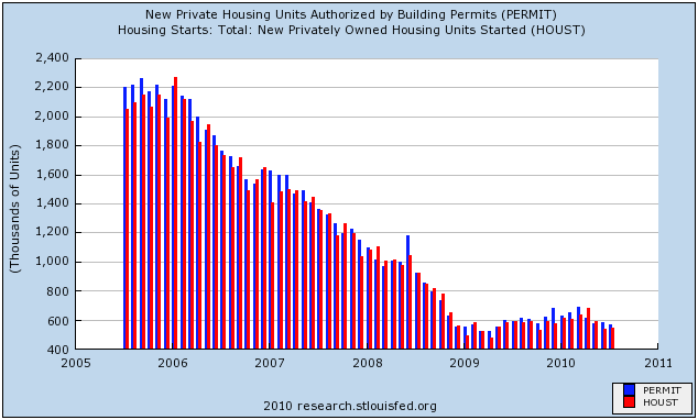
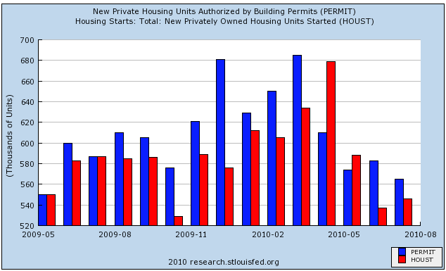
As I pointed out yesterday, the post-expiration collapse has taken place. I do not expect further significant deterioration. Here are housing permits and starts going back 5 years to the top of the bubble:
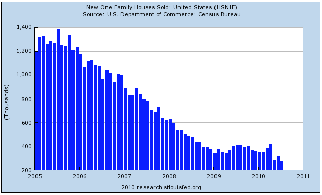
And here are new home sales updated through yesterday:
We may bounce along the bottom for awhile, but this is a case where reporting percentage declines (35% lower than last year!!!) masks that the absolute decline is much, much smaller than it was earlier in the housing bust. Housing leads the economy, and this will have a negative effect that will feed through for some months to come -- but it is going to be a much smaller negative effect than in the 2006-2008 period.
4. Census, state and local layoffs
Through the week ending August 14, about 500,000 census workers have been laid off. Only 80,000 remain. Depending on their local state laws, some unknown amount of them will be eligible for unemployment benefits. Due to the insane Congressional inaction/ lame action on renewing stimulus to the states (some of which has reportedly been hoarded for next year rather than being used for its intended purpose), it is quite likely that there are thousands of government employees, most notably teachers, who have been laid off this month.
While those layoffs suggest a headlong rush back into deep recession, they are totally contradicted by what is happening in the private sector. Here is a graph of the American Staffing Association's temporary help index, which has continued to rise through last week, to a level equal to August 2008:
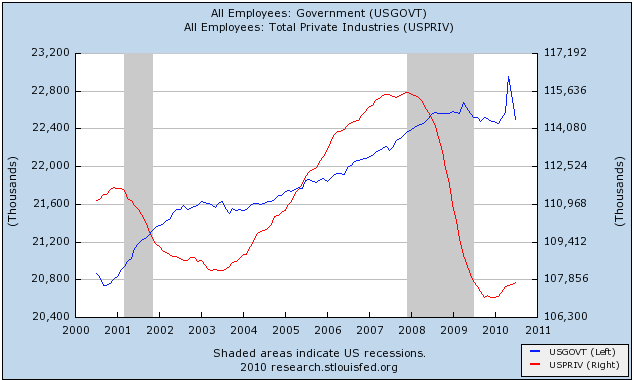
Now here is a graph comparing government employment (blue) with private employment (red):
As you can see, private employment has continued to rise all through this year. It is government employment (not just census, but also state and local governments) which have given us our dismal job reports in the last couple of months.
In summary, Oil supports the notion of a stall in the recovery, exacerbated by layoffs sparked by the decline of 100,000 houses a year not being built, and further exacerbated by state and local government layoffs sparked by the loss or hoarding of federal aid. Essentially, both of these sectors have been "reset" to one year ago by the loss of stimulus. I fully expect the state and local losses to abate once current budgets are in place, while the construction losses, while small, as a leading sector will echo through the economy for some months to come.
Additionally, while the slow motion bust will continue, and while the renewed slowdown will mean more pain, I see nothing in the data causing me to change my opinion that the "Great Recession" bottomed out in the summer of 2009.
Yesterday's Market
After forming a double top (a and b), prices have moved lower, consolidating in two general areas (c and d).
Yesterday prices gapped lower at the open (a) and moved lower. However, their lower points (b) were accompanied by a reverse in momentum (c), signaling a reverse. Prices then rose into the 50 minute EMA (d). They then reversed again (e) and rose for the rest of the day (f), moving through the resistance areas established at the close of the previous days markets (g). Notice how along the way, prices fell into the EMAs (h).
The Russell 2000 hit support at previous levels (b) and rallied strongly yesterday (a). This is probably the result of program trading.
The QQQQs have had three big gaps lower over the last two weeks (a, b and c).
After gapping higher yesterday (a), the IEFs moved lower for the remainder of the trading session (b and c). Prices traded higher into the 10 and 20 minute EMA throughout the day (d).
Yesterday's bounce looks technical. The IWMs hit support where there were probably a ton of computerized buy orders. The Treasury markets fall also looks like like a "let's take some profits off the table" situation.
Gold is still in a rally (a) and has consolidated gains by falling into the 10 and 20 day EMA (b). Also note the EMAs are in a very bullish posture (c) -- the shorter are above the longer and all are rising.
Wheat continues to correct after breaking its drought induced uptrend (a). Prices are currently at important support levels (b). If they fall through the next area of support is at the 50 day EMA (d). Also note that momentum is clearly negative (c).
Wednesday, August 25, 2010
Notes on the Bond Market
For a few months at the start of this year, things were looking up for stock market investing. Optimistic about growth, investors were again putting their money into stocks. In March and April, when the stock market rose 8 percent, $8.1 billion flowed into domestic stock mutual funds.Here is the accompanying graphic:
But then came a grim reassessment of America’s economic prospects as unemployment remained stubbornly high and private sector job growth refused to take off.Investors’ nerves were also frayed by the “flash crash” on May 6, when the Dow Jones industrial index fell 600 points in a matter of minutes. The authorities still do not know why.
Investors pulled $19.1 billion from domestic equity funds in May, the largest outflow since the height of the financial crisis in October 2008.
Over all, investors pulled $151.4 billion out of stock market mutual funds in 2008. But at that time the market was tanking in shocking fashion. The surprise this time around is that Americans are withdrawing money even when share prices are rallying.
The stock market rose 7 percent last month as corporate profits began rebounding, but even that increase was not enough to tempt ordinary investors. Instead, they withdrew $14.67 billion from domestic stock market mutual funds in July, according to the investment institute’s estimates, the third straight month of withdrawals.
A big beneficiary has been bond funds, which offer regular fixed interest payments.
As investors pulled billions out of stocks, they plowed $185.31 billion into bond mutual funds in the first seven months of this year, and total bond fund investments for the year are on track to approach the record set in 2009.
From last week's Barron's:
But in the Information Age, you can find out anything about anything on—where else?—Google. Google Trends tracks what people are searching as well as how many news stories mention the search term. And, observers Nicholas Colas, chief market strategist at BNY ConvergEx Group, "bubble" seems to have a hold on the imaginations of Google users for the better part of the past 18 months.Colas notes that it takes a while for a bubble to inflate fully and burst. The peak in Google searches for "housing bubble" was in 2005—years before the top in the market. It takes time, and usually leverage, to get the last, credulous buyers who ignore all the warnings to buy at the top tick.
But as for the terms "bond bubble" and "Treasury bubble," Google hasn't had enough searches to register a trend, Colas finds. That suggests bond investors "seem oblivious to bubble chatter," so he concludes that any backup in yields is apt to be met with more buying.
.....
As ISI Group points out in its Friday missive to clients, yields on government bonds have collapsed around the globe in the past two months. While the 10-year U.S. Treasury yield hit a 16-month low of 2.53%, the German 10-year bund fell to a record low 2.27% while the comparable U.K. gilt dipped below 3%, to 2.98%. And in Japan, the 10-year yield is under 1%, at 0.94%. So it's not just an American phenomenon.
.....
More importantly, Gluskin Sheff's David Rosenberg—who's been spot-on in his call on bonds and the economy slowing to stall speed—also takes issue with the two Jeremies' assertion that the $559 billion influx into bond mutual funds and $233 billion exodus from equity funds from January 2008 to June 2010 signals a bubble. If anything, it shows households' increased acumen, says Rosenberg, given that Treasury bonds returned 13% over that span while stocks lost 21%.
From the WSJ:
A similar bubble is expanding today that may have far more serious consequences for investors. It is in bonds, particularly U.S. Treasury bonds. Investors, disenchanted with the stock market, have been pouring money into bond funds, and Treasury bonds have been among their favorites. The Investment Company Institute reports that from January 2008 through June 2010, outflows from equity funds totaled $232 billion while bond funds have seen a massive $559 billion of inflows.We believe what is happening today is the flip side of what happened in 2000. Just as investors were too enthusiastic then about the growth prospects in the economy, many investors today are far too pessimistic.
.....
Today the purveyors of pessimism speak of the fierce headwinds against any economic recovery, particularly the slow deleveraging of the household sector. But the leveraging data they use is the face value of the debt, particularly the mortgage debt, while the market has already devalued much of that debt to pennies on the dollar.
This suggests that if the household sector owes what the market believes that debt is worth, then effective debt ratios are much lower. On the other hand, if households do repay most of that debt, then the financial sector will be able to write-up hundreds of billions of dollars in loans and mortgages that were marked down, resulting in extraordinary returns. In either scenario, we believe U.S. economic growth is likely to accelerate.
A few points/observations:
1.) Personally, from an investing perspective I'm a big fan of high quality, dividend paying equities and some fixed income. For example, I like portfolios that have companies like Exxon, MMM, coke, etc... The reason is with a dividend you always have a little bit of cash coming in. This puts a natural floor under the stock and provides an income stream for further investments. I'm hoping this style of investing is catching on; the pure growth play is a huge, double down bet at the investment table.
2.) As both NDD and I have pointed out, we've seen in increase in the personal savings rate over the last year or so. That money has to go somewhere. Savers see bank accounts paying next to nothing, so a bond mutual fund with liberal withdrawal privileges is the next best thing.
3.) In addition to the Treasury market, consider these charts of the mortgage backed bond market, investment grade corporate bond market and the junk bond market:
Money is clearly flowing into a variety of fixed-income funds, not just the Treasury Market.
4.) All of the fixed income markets have an inflection point that starts a rally right around the break-out of the Greek crisis this spring. This tells us that the Greek crisis was probably a catalyst event for the investment public, and a clear signal to put on the breaks and move money into more conservative venues. Since then, the US economy has printed weaker numbers, which has confirmed that asset shift to income yielding investments.
A note about Housing Permits, Starts, Sales, and Prices
Here's what Calculated Risk said about June existing home sales when they were reported a month ago:
Months of supply increased to 8.9 months in June from 8.3 months in May. A normal market has under 6 months of supply, so this is already high - and probably excludes some substantial shadow inventory. And the months of supply will increase sharply next month when sales collapse.So July existing home sales were reported yesterday and, surprise surprise, they collapsed. This didn't prevent the usual Circle Jerks of Doom from taking place at the usual locations.
Notice I didn't use the present progressive tense, "collapsing". That's because home sales aren't.
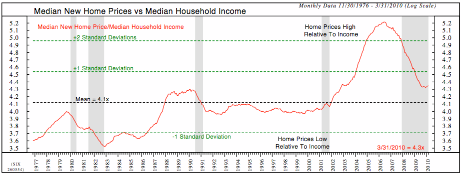
In the first place, you have to distinguish between volume, i.e., the number of housing units being sold, from the prices at which they are being sold. As I pointed out just a couple of days ago, housing prices are nowhere near bottom and probably have at least two more years to fall. Here's a graph from Ned Davis Research via The Big Picture, making that same point:
But sales, i.e., volume, are another story altogether. Here's a graph, showing house permits (blue) and starts (red) since the peak of the housing bubble five years ago:
Note that both these series bottomed out in early 2009 and have not made new lows since.
Notice that there are two peaks, coinciding with the original, and extended, end dates for the $8000 housing credit. Notice that permits fell immediately in May and have stayed in the same range in the two months since. Starts, as per usual, lagged one month.
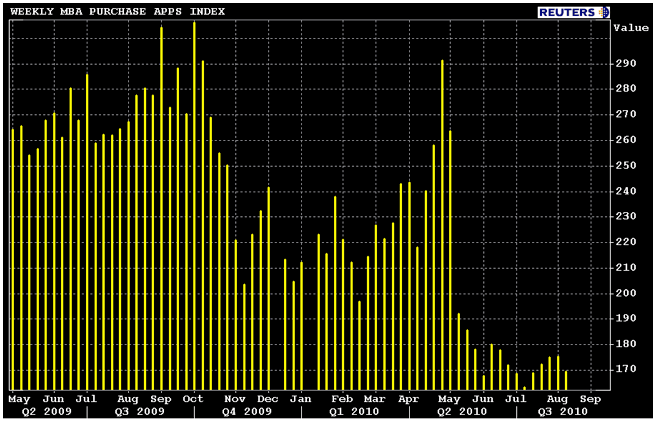
Now here is a graph showing purchase mortgage applications from the mortgage bankers association from the same time period as the second permits and starts graph above:
Notice that purchase applications fell off a cliff immediately after the April 30 deadline, and have been in a range since the beginning of July.
This morning, new home sales followed the same pattern. After surging to (all months revised) 414,000 in April, they fell to 281,000 in May, rose to 315,000 in June, and fell back to 276,000 in July (sorry, no graph).
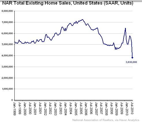
Now here are existing home sales. The graph covers a longer time period, but the two peaks and subsequent swan dives after the expiration dates of the housing credit are obvious:
Home sales declined in June, but the real force of houses that went under contract after the April 30 ending of the $8000 tax credit wasn't felt until July (exactly as CR said). If that isn't good enough for you, then consider Prof. Dean Baker of "Beat the Press", who isn't exactly a raging optimist, who said, "Economists With a Clue Were Not Surprised by the July Plunge in Home Sales" , noting that they came, on schedule, about 6 - 8 weeks after the plunge in mortgage applications.
While I can't swear that August existing home sales won't be worse than July, they probably won't be substantially worse. Furthermore, because sales are seasonal, it is perfectly possible that December - February will be worse than this. What I think is just about certain is that this is the seasonally adjusted bottom taking place right now, perhaps including next month, a bottom that was delayed a year by the housing credit. Which will differentiate 2011, which will likely feature slowly rising sales with still-declining prices, from the 2006-08 period during which both sales and prices were declining.
But anyone who says that home sales are "collapsing" as an ongoing event is either ignorant or is getting their kicks by being the host of the Circle Jerk of Doom, or both.
Yesterday's Market
Notice the large number of failed rally attempts over the last 10 days; prices have just had a hard time getting beyond the 10 and 20 minute EMA.
Yesterday we have another gap lower, making five in the past week and a half.
The EMAs are now turning bearish (a), with the shorter crossing below the longer (especially the 200 day EMA). The A/D line hasn't seen a big exodus of money yet (b), but the CMF is starting to show people leaving (c). In addition, momentum is clearly waning (d).
\Prices are at clear support levels (a).
Notice that prices yesterday hit upside resistance at the 200 minute EMA three times.
Simply put, the market has a clear bearish tilt right now. Don't expect to see rallies maintain momentum beyond the 200 day EMAs.
Further confirming the bearish tone of the stock market is the bond market's rally, which is still in full force. The long-term uptrend is still in place (e) and the EMAs are still very bullish (a). Money is flowing into the market (b and c) and there is clear momentum (d).
After peaking at the end of April (a), lumber prices tumbled (b) and are currently consolidating losses (c).
Copper prices are correcting. They have either formed a flag pattern (b) or a downward sloping pennant pattern (c). Momentum is moving lower (d).
Copper could still be in a simple correction from their recent rally as prices have yet to break below major support. However, with the weakness in the housing market, I have to wonder how strong copper can be going forward.