Every Friday I usually try to post some pictures of mine and my wife's "kids." Unfortunately, we have one less "child" today. Kate -- who has been with me since she was a puppy -- has passed away.
Kate was one of the most stubborn dogs I have ever met. She was also incredibly demanding. She would come into the office and demand attention. She was also smarter than most people I know. I am known to make the joke, "the more people I know, the more I like my dogs." Kate is a big reason for that.
But most importantly, she got me through some of the most difficult periods in my life. She was always there in my corner. Even when she got older and was a bit arthritic, she would still go up the stairs with me and follow me to the office. That loyalty is what won my heart over. I could look down at her and say, "we're going to the gates of hell." And she would look up and say, "and what are we waiting for?" I will miss her very much.
The blog is closed until Monday. Until then, go spend time with the people in your life that mean the most to you. And if you are so inclined, please make a donation to a local animal rescue site or no kill shelter.
Wednesday, March 10, 2010
Industrial Metals Charts
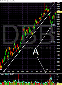
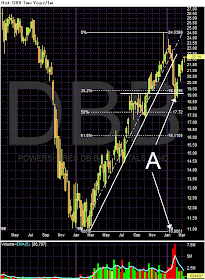
On the yearly chart in weekly bars, notice that prices broke the almost year-long uptrend on extremely havey volume at point A. Also note that prices fell to around the 38.2% Fibonacci level.
The above charts shows more detail with daily bars.
A.) While momentum has returned
B.) Money is not flowing into the security.
Industrial metals are extremely important because they are used to make manufacturing goods. The lack of volume flowing into the market -- at least for now -- raises some concerns.
Wednesday Commodities Round-Up
A.) The new uptrend is still in place
B.) Prices are above important resistance, but
C.) Prices still need to get above C in order for the rally to be a "real" rally.
Note the bullish EMA picture (A): all the EMAs are moving higher, the shorter EMAs are above the longer EMAs and prices are above the longer EMAs
B.) Momentum is still moving in the right direction, but it is starting to move a sideways over the last few days which is concerning. In addtion,
C.) Money is flowing out of the security
Consumer Credit: You're reading the right blog
- by New Deal democrat
As Bonddad pointed out a couple of days ago, Consumer Credit is up:
This brought to mind something I wrote 6 months ago:
Now, I haven't heard any update on that from the Doomers in the last week, have you?
Here was my response then:
and here is the then-current data for the "Great Recession":
I continued:
The updated graph shows that:
1. First, real retail sales turned.
2. Then, jobs turned.
3. Consumer credit bottomed in December and turned positive in January. Just as I said it would.
You're reading the right blog.
As Bonddad pointed out a couple of days ago, Consumer Credit is up:
This brought to mind something I wrote 6 months ago:
One of the gloomy meme's du jour for the last few days has been how the record year-over-year post-WW2 drop in consumer credit presages worse times ahead. For example, the King of All Doomers had said:
Today, consumer credit contracted at a pace that is shockingly twice as bad as March, even though the March contraction was the biggest drop since 1990....
Now, I haven't heard any update on that from the Doomers in the last week, have you?
Here was my response then:
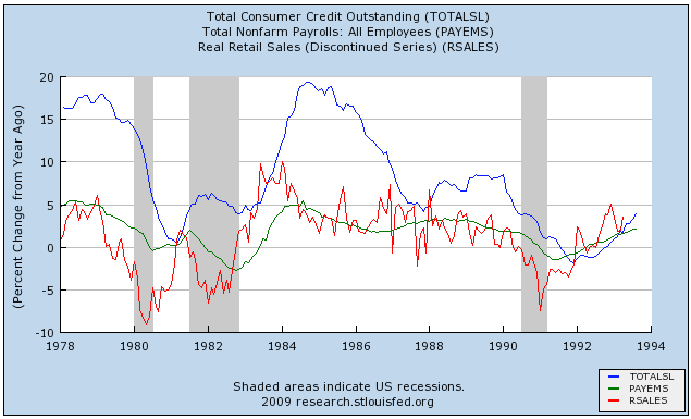
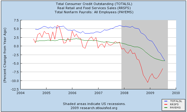
There's just one small problem with that analysis. Consumer credit is a totally reliable lagging indicator. Here's a couple of graphs showing the relationship among 3 data series: real retail sales (red), jobs (green), and consumer credit (blue). I have graphed in year-over-year terms to better show the trend, so this is the "first derivative" of the "real" numbers -- but the general relationship holds for the "actual" numbers as well. Notice the order in which each series turns.Here's the 1980s and 1991 recessions:
and here is the then-current data for the "Great Recession":
I continued:
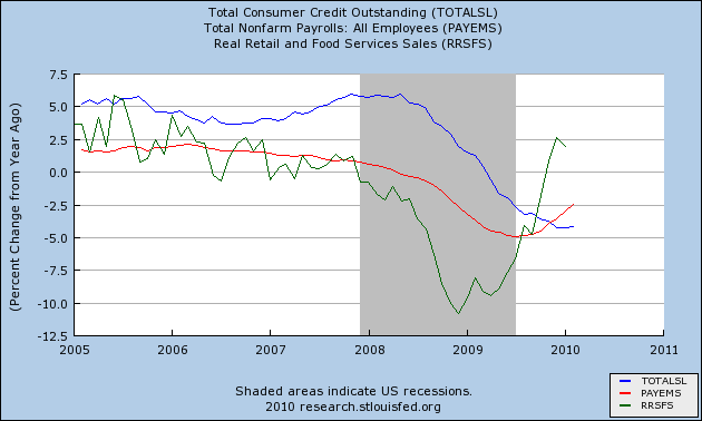
The order is unmistakably clear (and it goes back as far as the data has been kept);Here is the same graph, updated through January's data, reported last Friday (green and red lines from the above graph are reversed):
1. First, real retail sales turn (red).
2. Then, jobs turn (green).
3. Finally, about a year after real retail sales turn, consumer credit turns (blue).
Real retail sales turned in December 2008.
Jobs are turning now.
Consumer credit will probably turn in about December.
The updated graph shows that:
1. First, real retail sales turned.
2. Then, jobs turned.
3. Consumer credit bottomed in December and turned positive in January. Just as I said it would.
You're reading the right blog.
Tuesday, March 9, 2010
Why Is This So Difficult?
From the WSJ:
Credit default swaps are derivatives, nothing more, nothing less. They are not satanic creations meant to doom mankind to an apocalyptic future. They are simply options on bonds -- that's it. When options first came out we had the same reaction. 40 years year, options are now standard risk management tools.
CDS need to be traded on a public exchange -- all of them. They do not need to be abandoned; they need to be regulated -- just like options or futures. Period, end of story.
This really is not that complicated people.
German Chancellor Angela Merkel called for fast action against credit-default swaps Tuesday, as European Central Bank governor Christian Noyer said they should be traded through clearing houses under the control of a supervisor.Clearing houses should be set up in each of the largest currency zones where CDS are traded...under the control of each zone's supervisors," Mr. Noyer said at a press conference in Paris. The clearing should "take place at conditions that would make the recourse to the central bank possible in case of need," Mr. Noyer said.
European policy makers over the past week have highlighted the role of market speculation in exacerbating problems faced by Greece, questioning whether investors should be able to benefit from its troubles.
Credit default swaps are derivatives, nothing more, nothing less. They are not satanic creations meant to doom mankind to an apocalyptic future. They are simply options on bonds -- that's it. When options first came out we had the same reaction. 40 years year, options are now standard risk management tools.
CDS need to be traded on a public exchange -- all of them. They do not need to be abandoned; they need to be regulated -- just like options or futures. Period, end of story.
This really is not that complicated people.
A Very Important Unemployment Graph
Click for a larger image.
Thanks to Calculated Risk for this chart. Note the huge divergence between unemployment rates by educational level. Those with less than a high school education saw their unemployment spike from 8% at the beginning of the recesssion to 15% currently. Now look at those with a college degree or higher -- they are still at "technical" full employment -- they have an unemployment rate at about 5%.
In a recent article I wrote on the employment situation I noted the following:
Totaling construction and manufacturing jobs we get ~6 million. In other words, about 73% of the jobs lost during this recession came from two economic sectors -- construction and manufacturing.
This is a blue collar recession in a big way. Most importantly, a lot of these jobs aren't coming back. Manufacturers are replacing people with machines on a regular basis and construction will be at low levels for some time.
In other words, we really need to come up with a plan B for most of the unemployed.
... and a Turning Point for Unemployment
- by New Deal democrat
In particular I discussed how data about the duration of unemployment is coincident with payrolls. Well, the same data series has something interesting to show about the unemployment rate as well.
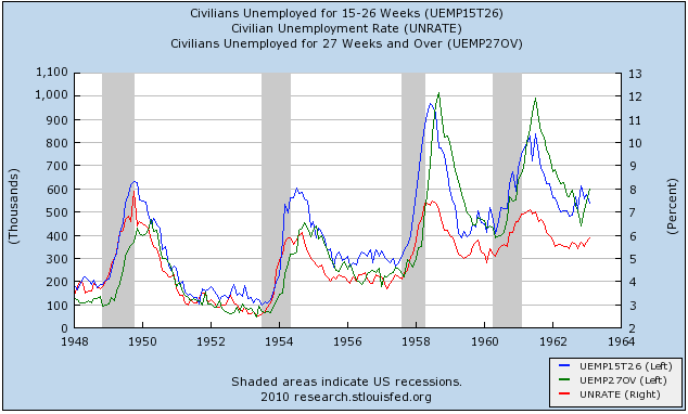
In the graphs below, the blue line is unemployment of 15-26 weeks' duration, the green line unemployment of over 26 weeks, and the red line is the unemployment rate. Here it is for 1948-1963:
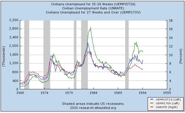
and here it is for 1969-1994:
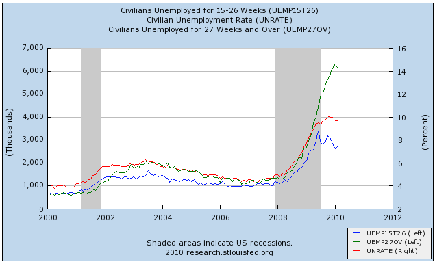
and here it is for the last 10 years:
Note that in all prior cases, unemployment peaked before or certainly no later than the green line. As I said yesterday, it is not certain that the February decline in unemployment of 27 weeks' or longer duration means that January was the top, but it certainly suggests that the top is being formed.
In other words, it looks like the 10.2% unemployment of October was the real deal -- the peak unemployment rate. If so, while this may have been a "jobless recovery" up until now, it has been far more like the brief (6 month) 1992 recovery than the terribly long 21 month one of 2002-03.
Treasury Tuesdays
Yesterday's Market
The two charts below -- one of the SPYs and one of the QQQQs -- illustrate the same point. Since the beginning of February, both have rebounded sharply. Also note that prices have moved through various resistance levels and consolidated at various times. But both are approaching key resistance areas -- highs established for the year.. The question for both is will the rally continue or not?
Monday, March 8, 2010
The New Normal for the US Economy
From Bloomberg:
See this as well.
he “new mix” is out to topple the “new normal” as the paradigm for America’s economic future.
The 5.9 percent annualized surge in fourth-quarter growth -- the fastest since 2003 -- was powered more by exports and business investment than the traditional drivers of consumption and housing. This new mix of demand will boost the economy by 3.7 percent in 2010 and pave the way for 3.5 percent annual average increases thereafter, said Joseph Carson, an economist at AllianceBernstein in New York, who coined the phrase.
His forecast contrasts with the 2 percent rate penciled in for later this year and the longer term by new-normal proponent Mohamed El-Erian, chief executive officer of Newport Beach, California-based Pacific Investment Management Co., who argues that growth will be depressed by consumer retrenchment and financial regulation.
“What’s going to change is how we generate growth, not how fast we can grow,” Carson said in an interview. “That’s how I come up with a new mix rather than a new normal.”
The outcome of the debate has ramifications for policy makers and investors. El-Erian and his colleagues at Pimco predict the Federal Reserve will keep its benchmark interest rate near zero through 2010, and they warn that stock prices may be too high, based on their outlook for the economy. The Standard & Poor’s 500 Index closed at 1,138.70 Friday, up 68 percent since March 9, 2009.\\
.....
Advocates of both camps agree consumption will be restrained as households struggle with an unemployment rate that remained at 9.7 percent in February and a $12.6 trillion reduction in their net worth during the recession. They also agree that emerging markets, not the U.S., will lead the world economy in the recovery. Where they differ is on the extent that U.S. companies can tap into expansion overseas, boosting domestic growth in the process.
Emerging-market and developing economies will expand 6 percent as a group this year, compared with 2.1 percent for developed nations, according to a Jan. 26 report by the Washington-based International Monetary Fund.
“The U.S. is well positioned to take advantage of the strength in the emerging markets because the U.S. manufacturing sector has been generating big productivity gains and improving its competitive position,” Carson said. U.S. employee output per hour grew 3.8 percent last year, the largest gain since 2002, according to the Labor Department.
See this as well.
Consumer Credit Expands
From the Federal Reserve:
First, revolving credit -- credit cards etc.. -- decreased indicating consumers are dumping cards and banks are dumping customers. However, non-revolving credit increased.
Let's flesh out the data.
Note that consumer credit starting dropping at the end of 2008 and continued to drop for all law year. We've only seen a possible bottom this month.
Note that in almost 30 years of data, this is the first time we've seen a decrease. The pace of expansion was moderate in the early 1980s followed by a slightly steeper increase. Demand leveled out in the early 1990s leading to a steep increase that lasted until the beginning of this recession.
Now, let's add in the debt service payment ratio and household obligations ratio:
Both of these ratios started to increase a bit before 1995 and continued to increase until the latest recession. Note the steep drop over the last ~year as households have sought to de-leverage themselves.
Let's add one more piece of data from the latest senior loan officer survey:
Click for a larger image.
Notice that willingness to make loans hit a low point at the end of 2008, but has since opened up.
Consumer credit increased at an annual rate of 2-1/2 percent in January 2010. Revolving credit decreased at an annual rate of 2-1/4 percent, and nonrevolving credit increased at an annual rate of 5 percent.
First, revolving credit -- credit cards etc.. -- decreased indicating consumers are dumping cards and banks are dumping customers. However, non-revolving credit increased.
Let's flesh out the data.
Note that consumer credit starting dropping at the end of 2008 and continued to drop for all law year. We've only seen a possible bottom this month.
Note that in almost 30 years of data, this is the first time we've seen a decrease. The pace of expansion was moderate in the early 1980s followed by a slightly steeper increase. Demand leveled out in the early 1990s leading to a steep increase that lasted until the beginning of this recession.
Now, let's add in the debt service payment ratio and household obligations ratio:
The household debt service ratio (DSR) is an estimate of the ratio of debt payments to disposable personal income. Debt payments consist of the estimated required payments on outstanding mortgage and consumer debt.The financial obligations ratio (FOR) adds automobile lease payments, rental payments on tenant-occupied property, homeowners' insurance, and property tax payments to the debt service ratio.
Both of these ratios started to increase a bit before 1995 and continued to increase until the latest recession. Note the steep drop over the last ~year as households have sought to de-leverage themselves.
Let's add one more piece of data from the latest senior loan officer survey:
Click for a larger image.
Notice that willingness to make loans hit a low point at the end of 2008, but has since opened up.
A Turning Point for Jobs ...
- by New Deal democrat
Last September I wrote a series entitled When will the economy add jobs? that looked at a bunch of "Leading Employment Indicators." Although it came up a little short, in retrospect it was a pretty good effort. The economy had been losing 200,000 or more jobs a month when it was written, and although we only got one positive month since then, the average in the last four months has only been -25,000 (-30,000 if you back out census jobs, which is reasonable).
As I commented the other day, the laggards have primarily been construction jobs, and also government jobs. Government jobs always lag, so the difference is mainly the continued losses in construction jobs. Back out construction losses, and nonpfarm payrolls bottomed in December and almost 100,000 jobs have been added since then. In other words, my index did a good job predicting the turnaround in service and manufacturing jobs, which doesn't seem too shabby. Since housing has had a miniscule recovery (and commercial construction is receiving last rites), I'll have to look for a good reliable leading indicator in construction to add into the formula.
But it may be moot now, because just about every other indicator imaginable suggests we are at the turning point for jobs.
Our co-blogger Invictus made a point late last year of how historically the household survey tends to lead (by 1 or 2 months) or at least turn coincidently with the establishment survey. He was concerned at that point because it hadn't. Here's how the establishment survey led nonfarm payrolls out of the last two recessions:
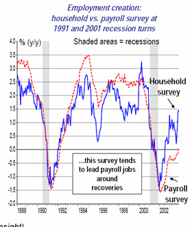
As Bonddad and I both pointed out yesterday, it looks like the household survey may have bottomed in December 2009:
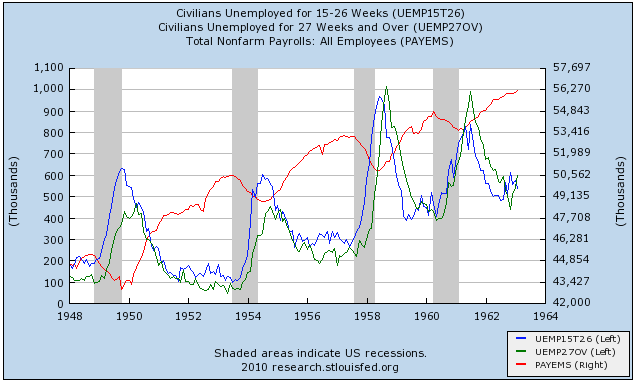
Beyond that, in Part 3 of my jobs series last September, I considered and rejected an indicator based on duration of unemployment, because it was too coincident. I said then that "an examination of jobs data shows that it always troughs at or after the peak in the 5-14 duration weeks' employment data, but coincident with or slightly before the 15-26 week data." I also pointed out that "
Here are the graphs I used to show that point, first for the period of 1948-63:
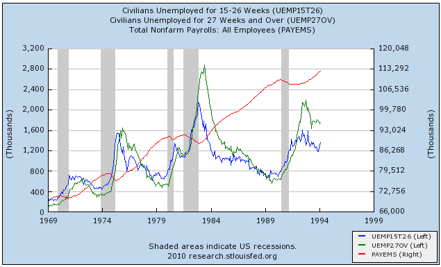
and then for 1969-1994
and finally, here it is for the last 10 years:
In all series before this one, the red line above peaks at or before the blue line (unemployment from 16 to 27 weeks' duration) does, and in the last "jobless recovery," coincident with longer term unemployment.
N.B.: I am on a brief getaway and may not be able to respond to comments until Wednesday.
Last September I wrote a series entitled When will the economy add jobs? that looked at a bunch of "Leading Employment Indicators." Although it came up a little short, in retrospect it was a pretty good effort. The economy had been losing 200,000 or more jobs a month when it was written, and although we only got one positive month since then, the average in the last four months has only been -25,000 (-30,000 if you back out census jobs, which is reasonable).
As I commented the other day, the laggards have primarily been construction jobs, and also government jobs. Government jobs always lag, so the difference is mainly the continued losses in construction jobs. Back out construction losses, and nonpfarm payrolls bottomed in December and almost 100,000 jobs have been added since then. In other words, my index did a good job predicting the turnaround in service and manufacturing jobs, which doesn't seem too shabby. Since housing has had a miniscule recovery (and commercial construction is receiving last rites), I'll have to look for a good reliable leading indicator in construction to add into the formula.
But it may be moot now, because just about every other indicator imaginable suggests we are at the turning point for jobs.
Our co-blogger Invictus made a point late last year of how historically the household survey tends to lead (by 1 or 2 months) or at least turn coincidently with the establishment survey. He was concerned at that point because it hadn't. Here's how the establishment survey led nonfarm payrolls out of the last two recessions:
As Bonddad and I both pointed out yesterday, it looks like the household survey may have bottomed in December 2009:
Beyond that, in Part 3 of my jobs series last September, I considered and rejected an indicator based on duration of unemployment, because it was too coincident. I said then that "an examination of jobs data shows that it always troughs at or after the peak in the 5-14 duration weeks' employment data, but coincident with or slightly before the 15-26 week data." I also pointed out that "
durations of unemployment data tend to become very "saw-toothed" as they approach and then recede from their peaks. The biggest pre-peak sawtooth in the 5-14 week data is 10%. Since we have already declined about 18% in that series before the recent upward move, that series has probably already peaked. But we have only declined about 7.5% from the peak in the 15-26 month data, which in the past has had a pre-peak sawtooth of 15%. At best, if we get a drop of more than 15% in that data, it might give us one month's lead on the trough in the jobs data."
Here are the graphs I used to show that point, first for the period of 1948-63:
and then for 1969-1994
and finally, here it is for the last 10 years:
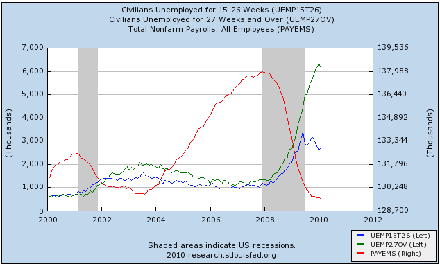
In all series before this one, the red line above peaks at or before the blue line (unemployment from 16 to 27 weeks' duration) does, and in the last "jobless recovery," coincident with longer term unemployment.
In the last few months, not only has unemployment of 5 to 14 weeks turned down nearly 20%, but unemployment of more than 26 weeks also posted a decline in February. That does not mean the longest duration employment has definitely peaked, but it certainly looks like the topping process has begun, and the decline in 15.26 weeks is the real deal.
If the past relationship holds, the turning point for jobs is now.
Tomorrow, I'll discuss unemployment.
N.B.: I am on a brief getaway and may not be able to respond to comments until Wednesday.
Market Mondays
Last week, the SPYs finished an up(A), down(B), up(C) pattern.
The EMAs are still in a bullish configuration: the shorter EMAs are above the longer EMAs, prices are above all the EMAs and all the EMAs are moving higher.
A.) Momentum is increasing and
B.) Money is flowing into the market.
The two charts below are of the micro-cap (IWC), small cap (IWM) and mid-cap(IWR) markets. Notice all the charts confirm last week's action with the exception being some of these markets saw price moves above/through important resistance levels. This is important as it indicates that markets which are riskier saw larger gains.