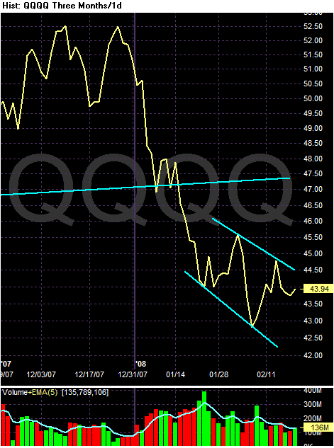
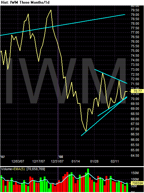
I'm trying to learn new ways of saying "consolidation" or "trading range." Maybe in another language? How about French? Would that be le' trading range?
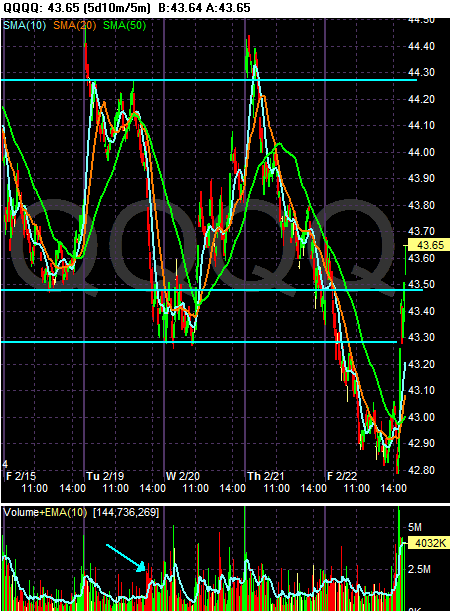
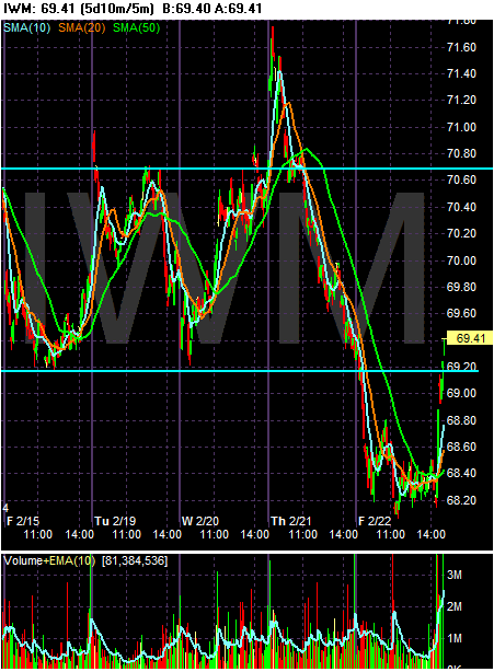
Anyway, last week the markets were in trading range. Technitions can differ about where the actual support and resistance lines are, but they're still very obviously there.
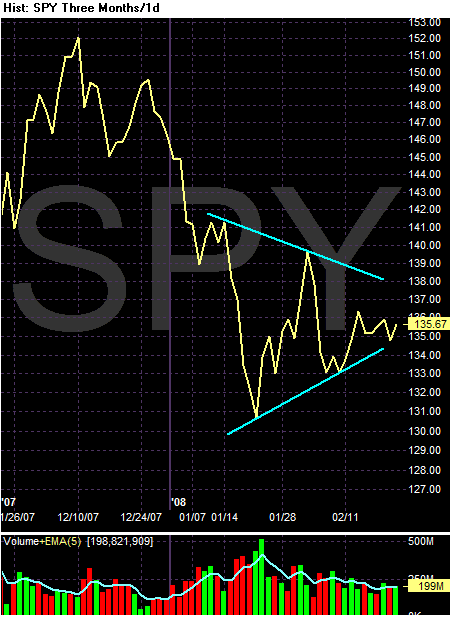
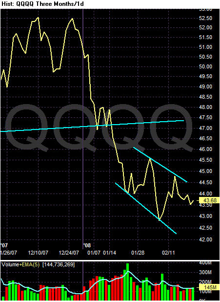
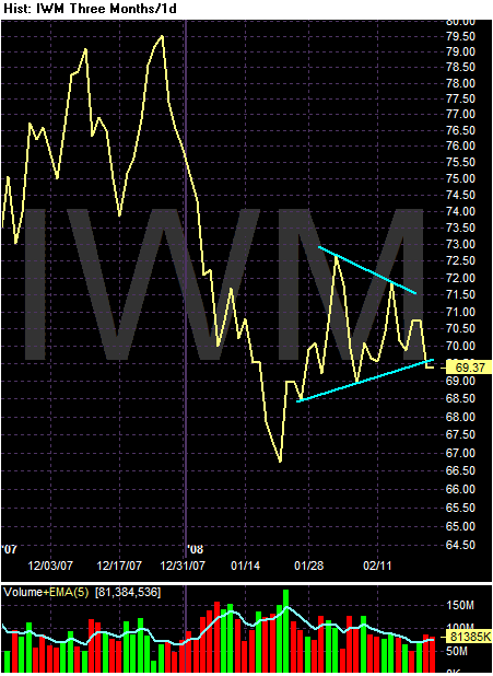
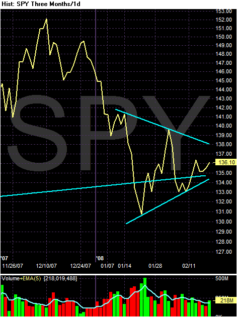
And to clear out the noise on the daily charts, here are the line charts of the above charts respectively.
Saturday, February 23, 2008
Friday, February 22, 2008
Weekend Weimar and Beagle
The market are almost closed, which means it's time to stop thinking about the markets and economics. So, here are some pictures of my and the future Mr$. Bonddad's kids -- as in the 4--legged variety.
Here is Scooby looking, well, really cute
And here are Kate and Sarge on the Weimar couch. Yes, I have a piece of furniture that is their's and their's alone.
Here is Scooby looking, well, really cute
And here are Kate and Sarge on the Weimar couch. Yes, I have a piece of furniture that is their's and their's alone.
If This Happens, We're Hosed
From CBS:
First -- if this happens I would expect a legal maelstrom almost immediately. The CDO parties will argue their respective insurance policies are based on the companies before a split and therefor the court should not allow the companies to break-up. I would think the insurers would argue the current situation was completely unforeseeable when the parties signed the respective contracts. At least, that's what I would argue (It's amazing I still remember Contracts II). At bare minimum, I would expect an immediate request for an injunction preventing the split until after the situation is worked out.
Second, even if there is an injunction, I think the mere threat of an actual break-up will send ripples through the market that will cost a ton of pain.
Third, if this goes through, the CDO market will take a mammoth hit -- a hit larger than any we have seen so far. One of the prime reasons so many people own these bonds is the insurance, which increased the credit rating on a particular security. A material change in the insurer might lower the credit rating on some deals to below investment grade, forcing a liquidation. That would be damn ugly indeed.
Recent comments from Ambac Financial and MBIA Inc. suggest that the two largest bond insurers may be warming up to the idea of separating their municipal bond businesses from their more troubled structured-finance units.
"There will be a lot of bumps in the road to that outcome," Light explained. "There will be a lot of disappointed counterparties that had what they thought were guarantees on structured debt deals. Some will almost certainly file suits. Not many will want to contribute any capital to the bad insurer
First -- if this happens I would expect a legal maelstrom almost immediately. The CDO parties will argue their respective insurance policies are based on the companies before a split and therefor the court should not allow the companies to break-up. I would think the insurers would argue the current situation was completely unforeseeable when the parties signed the respective contracts. At least, that's what I would argue (It's amazing I still remember Contracts II). At bare minimum, I would expect an immediate request for an injunction preventing the split until after the situation is worked out.
Second, even if there is an injunction, I think the mere threat of an actual break-up will send ripples through the market that will cost a ton of pain.
Third, if this goes through, the CDO market will take a mammoth hit -- a hit larger than any we have seen so far. One of the prime reasons so many people own these bonds is the insurance, which increased the credit rating on a particular security. A material change in the insurer might lower the credit rating on some deals to below investment grade, forcing a liquidation. That would be damn ugly indeed.
Credit Problems Spreading to the Big Boys
From the WSJ:
Let's take a step back an look at this situation.
-- First, this is the insurance contract on bonds, not the bonds themselves. Let's remember that.
-- Notice the big cost increase since the beginning of the year. The question is, why? My guess is there are a few reasons. First, there has been a huge amount of bad economic news in the US. Secondly, the election is causing uncertainty, which is something traders hate. Third, there has been no good news from the financial sector for some time. Fourth, there is simply put a ton of anxiety about the next 6-12 months.
-- I have to wonder if the insurance was too cheap and now we are seeing a return to normal pricing. According to the story, the cost of insurance on $10 million of high-grade bonds was $80,970/year. Even though we're dealing with high-grade credits, that still looks pretty cheap to me. While I wouldn't expect the number to be sky-high, I also don't expect it to be pennies-on-the-dollar. Plus, this last expansion has been characterized by a complete misunderstanding about the cost of risk.
In recent days, investors in credit-default swaps, which act as insurance policies against defaults, have grown increasingly gloomy because of worries about the global economy and the possibility of problems in the market.
The losses are tracked by several indexes, which track the cost of buying insurance on bonds issued by 125 big companies. Two of the indexes are at records and have doubled since the start of the year, meaning investors who sold this insurance suffered losses. The worry is that the indexes' moves could prove to be self-fulfilling prophecies, causing heavy losses for investors and making it even harder for people and companies to borrow money. Adding to the anxiety: Analysts can only guess at the volume of investments tied to the indexes, who is holding them and what it would take to trigger a full-scale sell-off.
.....
The trouble is brewing in the market for these esoteric investments. Markit iTraxx Europe tracks the cost of insuring a basket of 125 investment-grade debt issues by European companies, including banks such as Barclays PLC, beverage company Diageo PLC, and retailer Tesco PLC. The Markit CDX North America Investment-Grade Index references the cost of insuring against default by 125 U.S. and Canadian investment-grade companies, including telecommunications company AT&T Inc., retailer Wal-Mart Stores Inc. and fast-food operator McDonald's Corp.
As of yesterday, the annual cost of five years of insurance against default on $10 million in bonds on the CDX index had risen to $152,000 from $80,970 at the start of the year. The cost of €10 million ($14.7 million) of insurance on the iTraxx had rose to €123,750 from €51,320 at the beginning of the year.
Let's take a step back an look at this situation.
-- First, this is the insurance contract on bonds, not the bonds themselves. Let's remember that.
-- Notice the big cost increase since the beginning of the year. The question is, why? My guess is there are a few reasons. First, there has been a huge amount of bad economic news in the US. Secondly, the election is causing uncertainty, which is something traders hate. Third, there has been no good news from the financial sector for some time. Fourth, there is simply put a ton of anxiety about the next 6-12 months.
-- I have to wonder if the insurance was too cheap and now we are seeing a return to normal pricing. According to the story, the cost of insurance on $10 million of high-grade bonds was $80,970/year. Even though we're dealing with high-grade credits, that still looks pretty cheap to me. While I wouldn't expect the number to be sky-high, I also don't expect it to be pennies-on-the-dollar. Plus, this last expansion has been characterized by a complete misunderstanding about the cost of risk.
Manufacturing and Industrials Update
Two recent regional manufacturing reports and the national industrial production report indicate this area of the economy is slowing down.
The Empire State index showed a big decline:
Here's the accompanying chart
And yesterday's Philadelphia survey also dropped:
Here's the accompanying chart:
Notice the incredibly large drop-off over the last 6 months or so.
The Federal Reserve also issued industrial production recently.
However, the details tell a clearer story:
In other words, the increase in consumer products is pretty much about energy and not companies responding to increased consumer spending.
So tech output increased (which is good) but everything else didn't.
So, construction got an end of the year bump, but then decreased.
The bottom line is the information from the manufacturing sector isn't that good. Consumer energy goods are increasing production, but other consumer areas are trading water. On the industrial side, construction related areas dropped while information tech increased. This is a very lop-sided picture. Let's see how this has effected the XLIs -- the industrial ETF.
The 5-year chart in weekly increments shows a clear uptrend in place. While the index briefly dropped below the trend line at the beginning of this year, the lack of follow though (or the quick turnaround) implies traders still see a great deal of value in this sector.
Above is a 1 year weekly increment chart. It shows a pretty clear triangle patter that formed in the second half of last year. A triangle pattern is considered topping or reversal pattern.
Above is a three month chart in daily increments with the simple moving averages visible. Notice the following:
-- Prices are below the 200 day SMA.
-- The 200 day SMA is pretty much level and the 10 and 20 day SMAs are rising
-- Only the 50 day SMA is moving lower.
-- The 10, 20 and 50 day SMAs are bunched together, indicating a lack of direction, or a market looking for direction.
In other words, the industrial sector is concerned about the information, but traders aren't willing to give up the ghost. My guess is there is still a lot of confidence in international growth at this point.
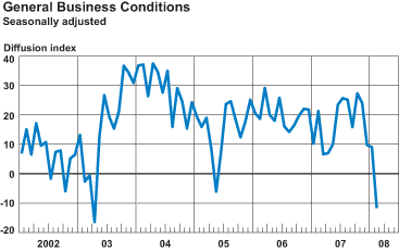
The Empire State index showed a big decline:
The Empire State Manufacturing Survey indicates that conditions for New York manufacturers deteriorated in February. The general business conditions index tumbled nearly 21 points to -11.7, falling below zero for the first time since May 2005. The new orders and shipments indexes also dropped into negative territory. The prices paid index rose for a second consecutive month, to its highest level in considerably more than a year, while the prices received index remained elevated but close to January’s level. Employment indexes dipped below zero. Future indexes were generally positive, but well below levels of late last year. In particular, future employment indexes posted significant declines, hovering just above zero.
Here's the accompanying chart
And yesterday's Philadelphia survey also dropped:
The survey’s broadest measure of manufacturing conditions, the diffusion index of current activity, fell from -20.9 in January to -24.0 this month (see Chart). Forty percent of the firms reported no change in activity from January, but the percentage of firms reporting decreases (42 percent) was substantially greater than the percentage reporting increases (18 percent). Other broad indicators also suggested continued declines this month. Demand for manufactured goods, as represented by the survey’s new orders index, remained negative, although the index increased from -15.2 to -10.9. The current shipments index, however, fell 10 points, from -2.3 to -12.2. Indexes for both unfilled orders and delivery times remained negative.
Here's the accompanying chart:
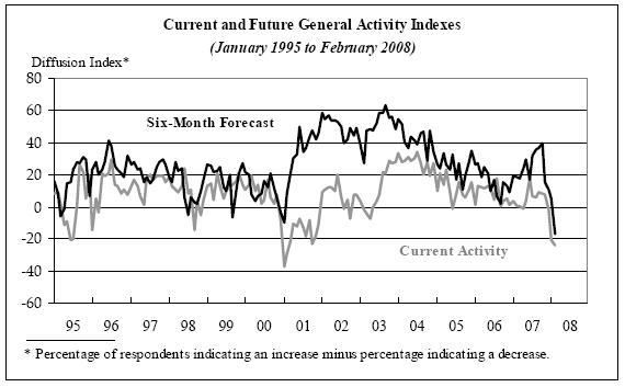
Notice the incredibly large drop-off over the last 6 months or so.
The Federal Reserve also issued industrial production recently.
Industrial production increased 0.1 percent in January for a second consecutive month. Output in the manufacturing sector was unchanged in January, as lower output of motor vehicles and parts offset a small net gain elsewhere. The output of utilities climbed 2.2 percent, while the output of mines moved down 1.8 percent. At 114.2 percent of its 2002 average, overall industrial production was 2.3 percent above its January 2007 level. The rate of capacity utilization in January was unchanged, at 81.5 percent, a rate 0.4 percentage point above its year-earlier level and 0.5 percentage point above its 1972-2007 average.
However, the details tell a clearer story:
Consumer energy products advanced, consumer non-energy nondurables remained unchanged, and consumer durables fell.
In other words, the increase in consumer products is pretty much about energy and not companies responding to increased consumer spending.
The output of business equipment rose 0.4 percent in January; increases in information processing equipment and in transit equipment outweighed a decrease in industrial and other equipment.
So tech output increased (which is good) but everything else didn't.
The output of construction supplies fell 1.1 percent in January after a rise of the same magnitude in December; production in January was 1.2 percent below its year-earlier level and about 4 percent below its peak in 2006. The output of business supplies increased 0.5 percent.
The production of non-energy materials edged down 0.1 percent in January, while the output of energy materials was unchanged.
So, construction got an end of the year bump, but then decreased.
The bottom line is the information from the manufacturing sector isn't that good. Consumer energy goods are increasing production, but other consumer areas are trading water. On the industrial side, construction related areas dropped while information tech increased. This is a very lop-sided picture. Let's see how this has effected the XLIs -- the industrial ETF.
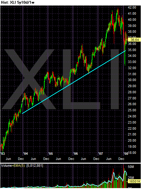
The 5-year chart in weekly increments shows a clear uptrend in place. While the index briefly dropped below the trend line at the beginning of this year, the lack of follow though (or the quick turnaround) implies traders still see a great deal of value in this sector.
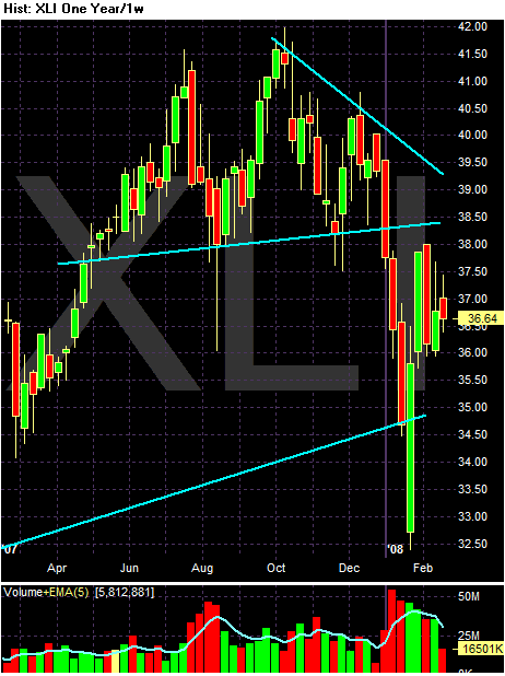
Above is a 1 year weekly increment chart. It shows a pretty clear triangle patter that formed in the second half of last year. A triangle pattern is considered topping or reversal pattern.
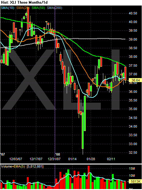
Above is a three month chart in daily increments with the simple moving averages visible. Notice the following:
-- Prices are below the 200 day SMA.
-- The 200 day SMA is pretty much level and the 10 and 20 day SMAs are rising
-- Only the 50 day SMA is moving lower.
-- The 10, 20 and 50 day SMAs are bunched together, indicating a lack of direction, or a market looking for direction.
In other words, the industrial sector is concerned about the information, but traders aren't willing to give up the ghost. My guess is there is still a lot of confidence in international growth at this point.
Thursday, February 21, 2008
Today's Markets
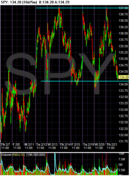
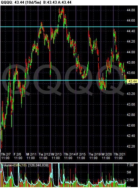
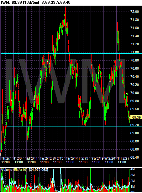
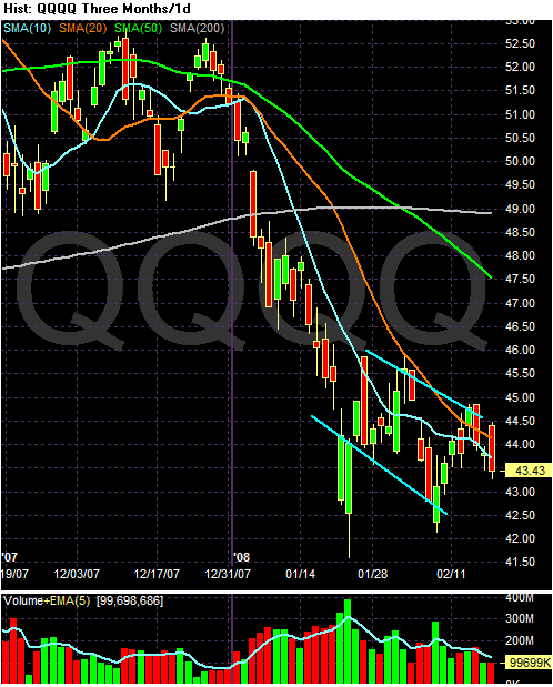
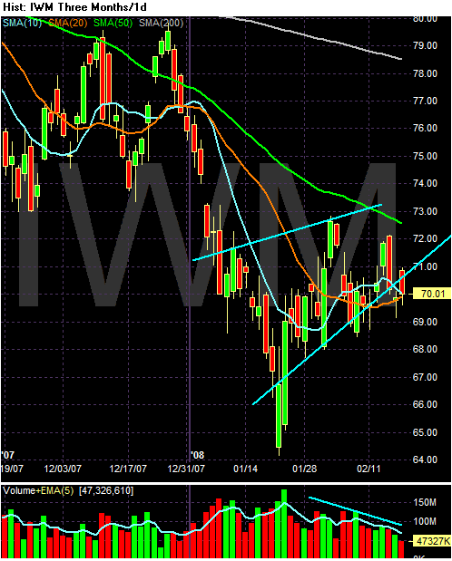
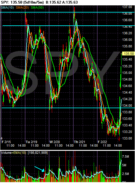
Below are three charts of the SPY, QQQQ and IWM, respectively. Each chart is a 10 day chart with 5-minute bars. I have drawn support and resistance lines to show areas that appear to offer either support or resistance. As the charts show, we've been rallying one day only to have those gains disappear the next. We're still stuck in a trading range.
Rate Cuts Aren't the Answer
I've strenuously argued against cutting interest rates for awhile now. There are several reasons for this.
1.) Even before the Fed started lowering interest rates, overall interest rates were not that high.
2.) Inflation is a bigger problem than the Fed thinks.
3.) Lower rates won't do squat about financial firms wrecked balance sheets.
Now we're learning that lower rates don't mean, well, lower rates..
The article goes on to state:
I don't see that until we see major economic cooling from China and India.
1.) Even before the Fed started lowering interest rates, overall interest rates were not that high.
2.) Inflation is a bigger problem than the Fed thinks.
3.) Lower rates won't do squat about financial firms wrecked balance sheets.
Now we're learning that lower rates don't mean, well, lower rates..
Mortgage applications fell 22.6% in the week ended Feb. 15, the Mortgage Bankers Association said. That's the lowest since the week ended Jan. 4.
The 30-year fixed mortgage rate soared 37 basis points to 6.09%, the highest since late December. It's continued to surge this week.
Longer-term mortgage rates are closely tied to the 10-year Treasury yield, which has roared back in part due to inflation concerns. The benchmark yield was unchanged at 3.90% on Wednesday.
Refinancing activity, which skyrocketed as Treasury yields and mortgage rates dived in January, is coming back to earth.
Applications for buying a home fell to their lowest level in nearly five years.
The article goes on to state:
Economists expect that slowing growth will naturally cool inflation. GDP advanced at just a 0.6% annual pace in the fourth quarter. Some analysts are predicting a mild recession in the first half of this year as job growth and consumer spending slow.
I don't see that until we see major economic cooling from China and India.
Stagflation Concerns Rising?
The excerpts below are from a WSJ cover story which says stagflation concerns are rising.
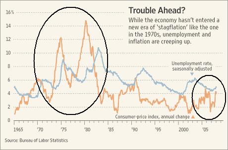
First -- before anyone hits the panic button -- here is chart from the same story that compares the unemployment and inflation rate of the 1970s and now. Notice we are nowhere near the problem levels we saw in the 1970s.
Remember -- it takes a long time to change the levels of unemployment and inflation; the fed can't just turn them around next month. As a result, when economists take current conditions and extrapolate them out the possibility of stagflation increases.
First, the article notes that inflation is not behaving itself (where have I read that before?)
Two other price increases come to mind while reading this. FedEx announced a rate increase awhile ago and the airlines added a "fuel surcharge" sometime in the last 6-9 months. For those of you who missed it, here is an article I wrote on inflation on Tuesday. Short version: there are a ton of reasons to be concerned.
However, on the employment picture I'm not sure we're going to get really high unemployment. According to the NBER the last recession ended in November 2001. However according to the BLS, employment growth really didn't start meaningfully increasing until 2003. According to the BLS's employment level information, there were 137,778,000 jobs in January 2001 and 137,417,000 in January 2003 -- a decrease of 361,000. By January 2004 the total jobs numbers were 138,463,000. So the job market was seriously lagging after the end of the latest recession.
I have a working theory about the job market this expansion. Employers really held back on hiring this time around. Instead of mass hiring, they really worked at increasing their overall productivity and used that instead of a massive round of hiring. When it became more and more obvious that they needed more employees, employers added as few as possible, instead relying on the increase in productivity combined with fewer employees.
As a result, we now have a lot of employers who are wedded to a high productivity/low labor input model. But this model uses a very high level of employee/productivity interaction. That means any loss of employees will lead to bigger losses in productivity and therefore bigger losses in profit.
As a result, employers can't start a massive round of layoffs. Cuts to the labor force will happen very slowing if at all. As a result, we're not going to see sky high unemployment this time around, although we will see an increase.
First -- before anyone hits the panic button -- here is chart from the same story that compares the unemployment and inflation rate of the 1970s and now. Notice we are nowhere near the problem levels we saw in the 1970s.
Remember -- it takes a long time to change the levels of unemployment and inflation; the fed can't just turn them around next month. As a result, when economists take current conditions and extrapolate them out the possibility of stagflation increases.
First, the article notes that inflation is not behaving itself (where have I read that before?)
Sara Lee Corp. this week told analysts it expects to recoup rising raw-material costs in part by raising prices, especially on bread. Company spokesman John Harris said Sara Lee's significant competitors had matched the increases, with consumers showing no sign of trading down to lower-cost brands. "With commodities reaching unprecedented levels," Mr. Harris said, "it is quite likely we will take pricing up again."
Goodyear Tire & Rubber raised the price of replacement tires 7% on Feb. 1, on top of two increases totaling 11% last year. Chief Financial Officer Mark Schmitz told analysts last week that the hike was the result of rising prices of key raw materials, according to a transcript by Thomson Financial. Mohawk Industries Inc. raised carpet prices in December and again in January because of rising material costs, even though sales have been hurt by the slumping housing market.
The declining dollar, while boosting U.S. exports, is adding to inflation pressure, as goods priced in foreign currencies become relatively more expensive. Prices for imports from China jumped 0.8% in January, the largest monthly increase since the Labor Department began reporting the data in 2003.
Two other price increases come to mind while reading this. FedEx announced a rate increase awhile ago and the airlines added a "fuel surcharge" sometime in the last 6-9 months. For those of you who missed it, here is an article I wrote on inflation on Tuesday. Short version: there are a ton of reasons to be concerned.
However, on the employment picture I'm not sure we're going to get really high unemployment. According to the NBER the last recession ended in November 2001. However according to the BLS, employment growth really didn't start meaningfully increasing until 2003. According to the BLS's employment level information, there were 137,778,000 jobs in January 2001 and 137,417,000 in January 2003 -- a decrease of 361,000. By January 2004 the total jobs numbers were 138,463,000. So the job market was seriously lagging after the end of the latest recession.
I have a working theory about the job market this expansion. Employers really held back on hiring this time around. Instead of mass hiring, they really worked at increasing their overall productivity and used that instead of a massive round of hiring. When it became more and more obvious that they needed more employees, employers added as few as possible, instead relying on the increase in productivity combined with fewer employees.
As a result, we now have a lot of employers who are wedded to a high productivity/low labor input model. But this model uses a very high level of employee/productivity interaction. That means any loss of employees will lead to bigger losses in productivity and therefore bigger losses in profit.
As a result, employers can't start a massive round of layoffs. Cuts to the labor force will happen very slowing if at all. As a result, we're not going to see sky high unemployment this time around, although we will see an increase.
A Broad Look At the Currency Markets
The currency markets are very inter-related; as one currency drops, another rises. So it makes sense to start looking at a group of currencies to see where money is flowing into and out from.
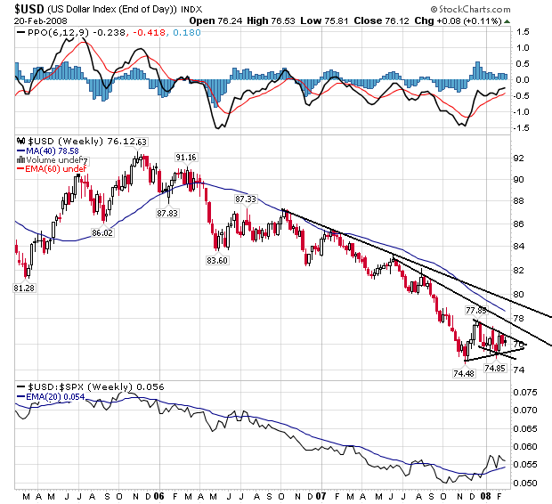
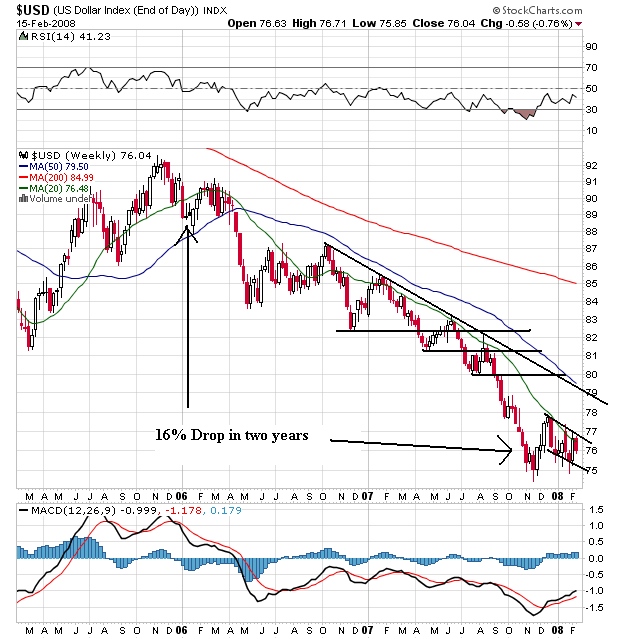
The dollar has been in a downtrend since the beginning of 2006. It has made a clear pattern of lower lows and lowers highs. Also note the accelerated decline since mid-2007 when the Fed started cutting rates.
The dollar formed a bottom at the end of last year, bounced higher and is now consolidating in either a triangle or flag pattern.
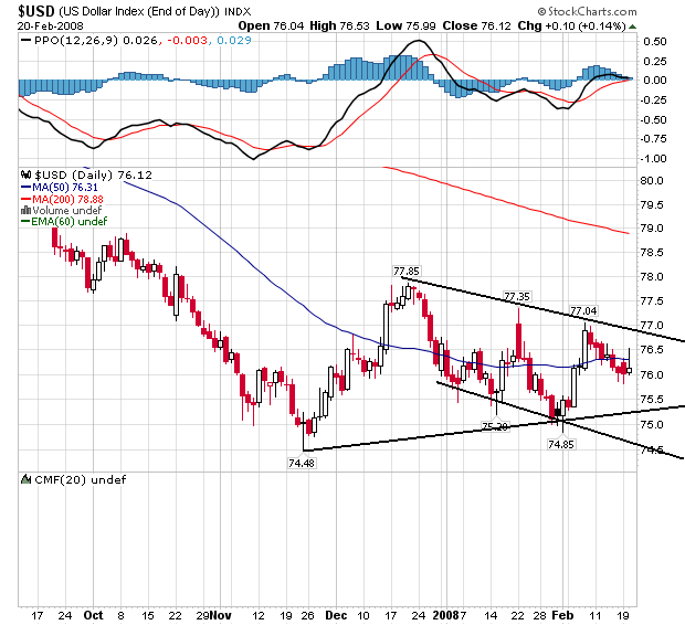
On the dollar's daily chart you can see the consolidation very clearly. I think the most appropriate technical call is a bear market flag, however some analysts may see a triangle consolidation.
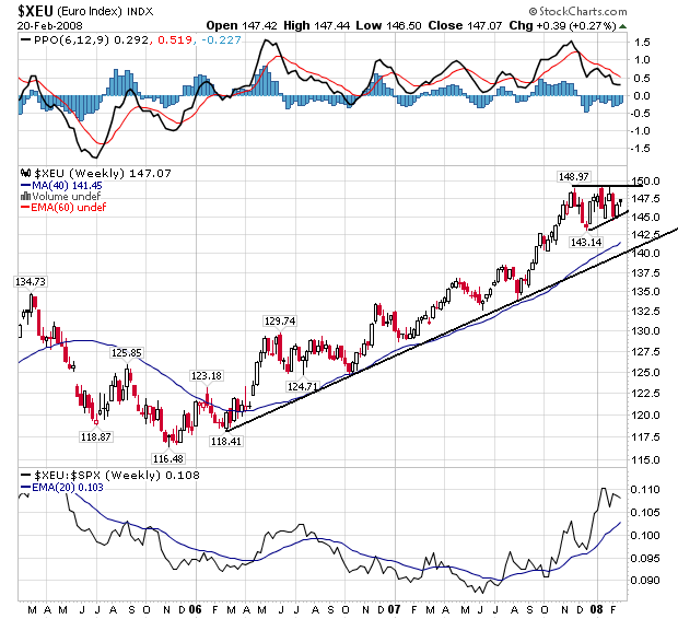
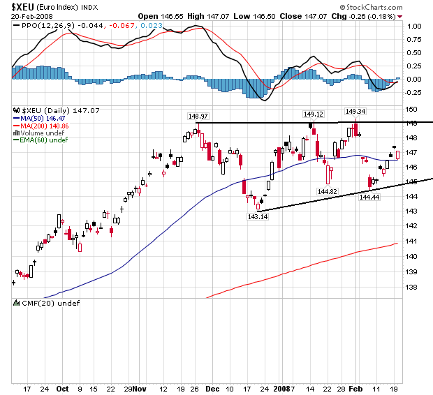
The euro has been the clear beneficiary of the dollar's decline. Notice that since the beginning of 2006 we have a clear rally with higher highs and higher lows. We also have a consolidation pattern that starts in late 2007.
Here is a closer look at the euro's consolidation pattern, which is a clear bull market flag. Also note the euro and dollar chart's are a near mirror image of each other for the last two years.
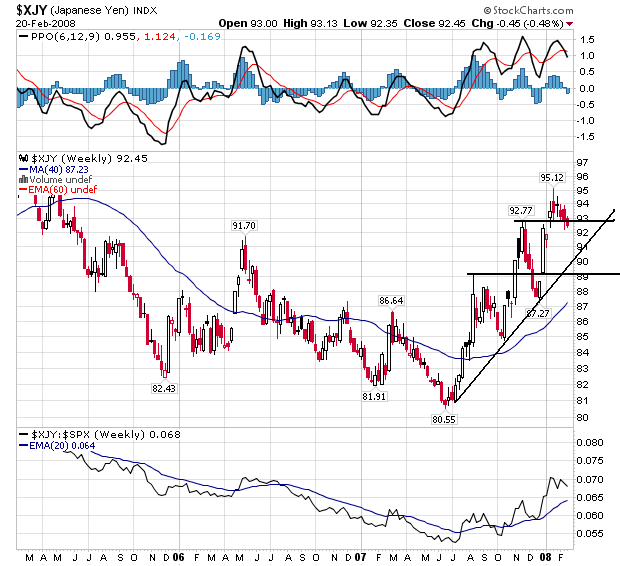
The yen had a rough time from 2005 to mid 2007. The market found a bottom in 2005, bounced higher and then fell to a new low in late 2007. This looks an awful lot like a dead cat bounce to me.
The yen stared a pretty strong rally in mid-2007 making a continued pattern of higher highs and higher lows. However, until it also looks as though the yen is in a giant bottoming pattern for this entire chart (roughly 3 years). Until the yen makes a strong move from this area to say 100 I think we could continue to call the yen in a bottoming formation.
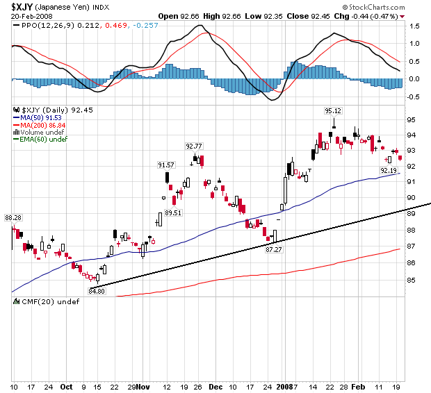
On the daily chart there is a very gentle rally with higher highs and higher lows. But the lack of a serious upward sloping incline makes me wonder about trader's sincerity about the rally. To me, this chart says, "we really want to bid this chart higher, but we're really not sure that's a good idea."
So, what do these charts tell us?
-- The euro and dollar are clearly in direct competition with each other.
-- There is a lot of hesitancy to the yen's chart. The lack of a serious upward incline to the latest rally makes me wonder about trader's underlying conviction. This chart says, "the Japanese economy isn't out of the woods yet, at least not according to traders."
Wednesday, February 20, 2008
Today's Markets
First, let's look at the macro environment. Because of the noise in the candlestick charts, here are three line charts. They should the SPYs, QQQQs, and IWMs are still consolidating.
The SPYs have been forming a solid triangle for the last two months.
Although the QQQQs are trending down, notice they too are in a clear channel
And the IWMs are formed a triangle as well, although we can debate where the lower line is.
Daily gyrations are important to watch, but until we break out in a direction the daily news is a bit pointless.
What Inflation?
I know -- you saw this all day yesterday and now you're thinking "cut it out."
But:
The number isn't that bad if you don't eat or drive anywhere.
But:
Inflation remained hot in January, led by large increases in energy and food prices but also in a host of underlying core prices, the government reported Wednesday.
U.S. consumer prices rose a seasonally adjusted 0.4% last month, the Labor Department reported Wednesday. See full government report.
Excluding food and energy prices, the core CPI rose 0.3% in January, the biggest gain since June 2006.
The increases in the CPI and core CPI rates were above the median estimates of economists surveyed by MarketWatch. Economists had projected a 0.3% gain in the CPI and a 0.2% increase in core inflation. The report contains updated seasonal factors.
As a result, December CPI was revised up to a 0.4% gain compared with the initial estimate of a 0.3% increase.
On a year-over-year basis, the CPI is up 4.3% in January. Core inflation is up 2.5% over the same period, the fastest pace since February 2007.
The number isn't that bad if you don't eat or drive anywhere.
Market Breadth Still Weak
From IBD:
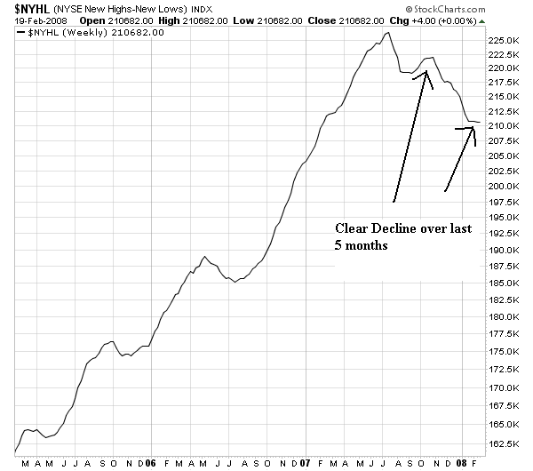
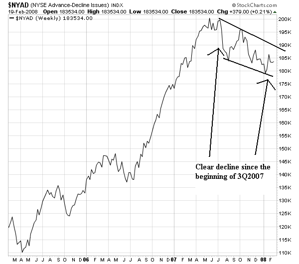
Market breadth is an extremely importance coincident indicator. The underlying reason is simple. A rally should attract buyers who continue to bid up more and more shares. As this process continues, more and more shares should make new highs. The reverse is also true. As the market declines, more stocks decline in value than advance. This leads to more stocks making new lows instead of new highs.
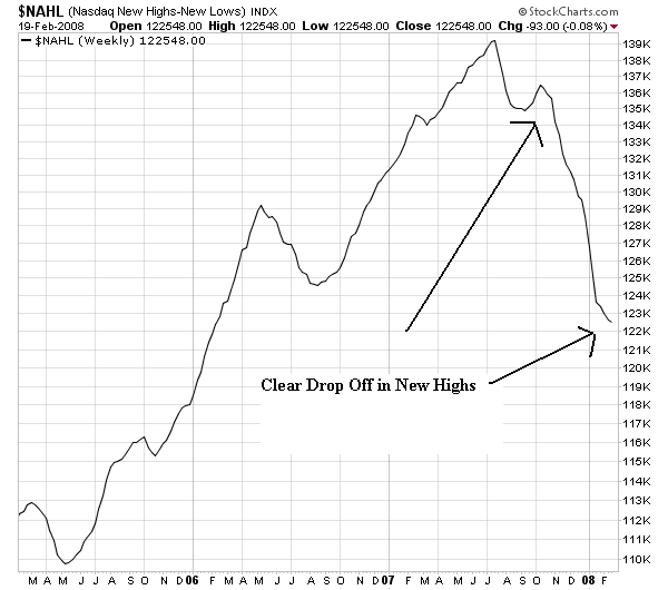
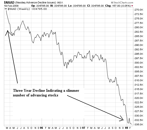
Here are the market breadth charts which indicate a deteriorating fundamental situation in the market.
The New York new high/new low chart peaked at the beginning of the third quarter of 2007 and has been declining since.
The New York advance decline line is also in a downtrend, although there is clearly some bullish sentiment preventing a big collapse. The decline is pretty gentle and down trends are followed by uptrends.
The NASDAQ new high/new low chart has dropped off a cliff.
The NASDAQ advance/decline line shows a three year decline, indicating a declining number of market leading stocks.
Last week's follow-through may have marked a bullish turn in the market, but that doesn't mean investors should be in a hurry to buy stocks.
Why? There just aren't many compelling candidates. A strong new rally typically yields a rash of breakouts by new leaders within a few weeks of the follow-through rally confirmation.
This week's IBD 100 is comprised of few new names, especially those with superior fundamentals. That indicates a lack of sector rotation, or emerging leadership.
Meanwhile, much of the market's old guard is still deep in corrections.
Some of their basing patterns show flaws. So even if they look more promising as they build the right side, you need to make sure the stock meets all your fundamental and technical criteria.
Market breadth is an extremely importance coincident indicator. The underlying reason is simple. A rally should attract buyers who continue to bid up more and more shares. As this process continues, more and more shares should make new highs. The reverse is also true. As the market declines, more stocks decline in value than advance. This leads to more stocks making new lows instead of new highs.
Here are the market breadth charts which indicate a deteriorating fundamental situation in the market.
The New York new high/new low chart peaked at the beginning of the third quarter of 2007 and has been declining since.
The New York advance decline line is also in a downtrend, although there is clearly some bullish sentiment preventing a big collapse. The decline is pretty gentle and down trends are followed by uptrends.
The NASDAQ new high/new low chart has dropped off a cliff.
The NASDAQ advance/decline line shows a three year decline, indicating a declining number of market leading stocks.
A Closer Look At the Oil Market
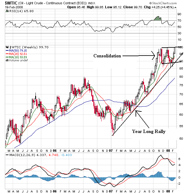
With oil hitting $100/bbl yesterday, let's take a closer look at the oil market.
Above is a multi-year chart of oil. Notice the following:
-- Although oil dropped in mid-2006, that had more to do with Goldman Sachs rebalancing it's energy index than a market fundamental. In other words, the sell-off in the second half of 2006 was a technical rather than fundamental event.
-- The market has been rallying for the better part of the last year.
-- The market has been consolidating for the last 4 months.
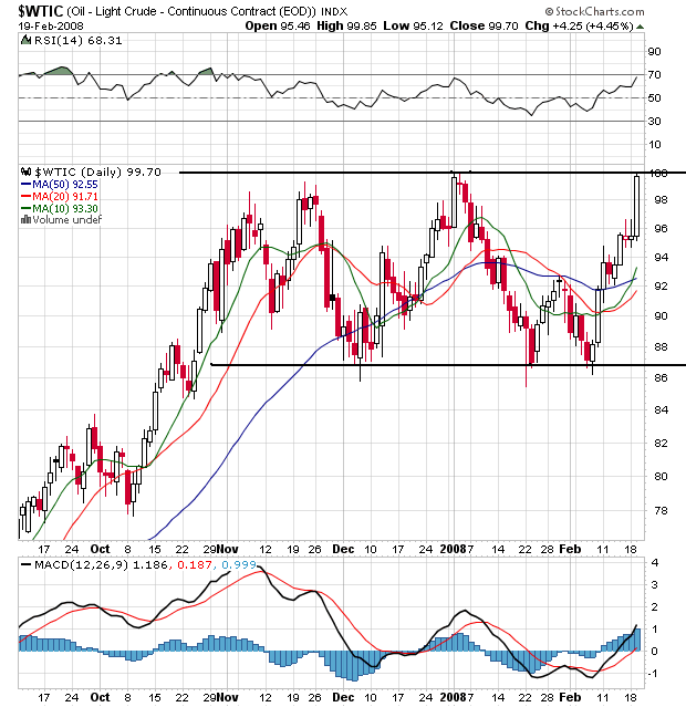
Above is a chart of the last 6 months. Notice the clear consolidation pattern that is going occurring. Also of interest is the fact that over the last 4 months talk a a recession has increased yet oil hasn't dropped below technical support in the upper 80's. That means that so far -- even with the possibility of a slowdown in growth -- the market still thinks oil is a pretty expensive commodity.
Tuesday, February 19, 2008
Cracks Emerging in the Treasury Market Rally?
From Bloomberg:
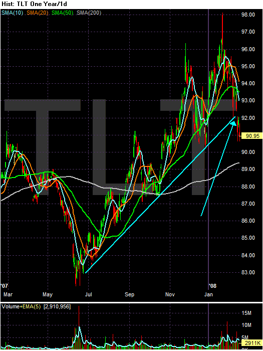
Here is a year long daily chart of the long end (20+ years) of the curve.
Notice the clear break of the uptrend that has been in place since early July.
Treasuries fell, pushing the 10-year note's yield to the highest level in more than a month, on speculation accelerating inflation will prompt the Federal Reserve to be less aggressive in cutting borrowing costs.
U.S. debt securities extended their decline after an industry report today showed confidence among homebuilders had its first back-to-back monthly increase in almost a year. Traders eliminated bets the Fed will lower the target lending rate by three-quarters of a percentage point at its meeting next month, in favor of a smaller reduction.
``The Fed is almost done easing because the market won't allow more,'' said Mark MacQueen, a partner and portfolio manager in Austin, Texas, at Sage Advisory Services Ltd., which oversees $5 billion. ``Every day that passes, people become less assured there's going to be a recession. I find little value in Treasuries.''
Here is a year long daily chart of the long end (20+ years) of the curve.
Notice the clear break of the uptrend that has been in place since early July.
A Closer Look At the Utilities Sector
The utilities sector is "for widows and orphans" meaning it's an ultra safe area of the market. Let's see what the long, medium and short-term charts are saying.
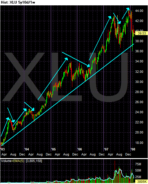
This is a five year weekly chart if the sector. Notice the clear pattern of higher highs and higher lows. Also notice the increased volume, although the latest volume is less than that from roughly mid-2007.
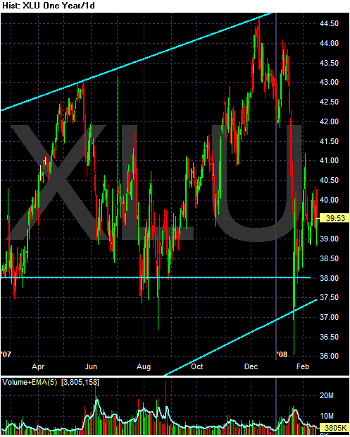
This is a one year daily chart. While the bottom is arguable, there is a pretty clear broadening formation. We don't know whether this is a consolidation pattern or a topping pattern. The index is still about the long-term (5 year) trend line.
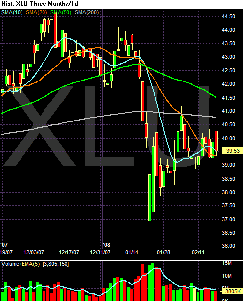
The SMA picture is a bit confusing; there is no clear trend one way or the other. Notice the following.
-- Prices are just below the 200 day SMA
-- The 50 day SMA is clearly in a downtrend, but the 200 day SMA is has a very slight downtrend.
-- Prices are right at the 10 and 20 day SMA
-- The SMAs are within 2 points of each other.
A Closer Look At the Basic Materials Sector
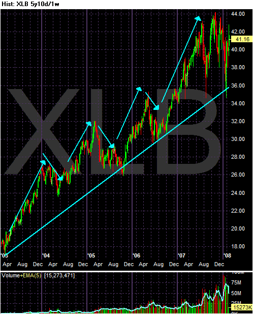
Basic materials is a market sector that has done very well during the latest bull market run. As the world has engaged in more and more infrastructure spending we've seen the likes of steel, iron and other basic materials companies rally. So, let's take a look at the XLBs to see where they are in the cycle.
Above is a five year weekly chart. Notice a clear higher high and higher low patter along with increasing volume over the 5 years period. It's possible the last year or so was seen a "buying frenzy" where everybody and their brother feels the need to get into the sector.
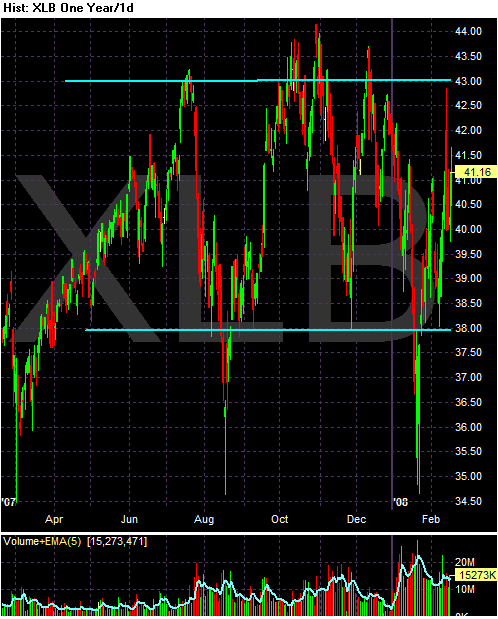
This is a one year daily chart. There is no clear topping pattern emerging. In his book Profits in the Stock Market, Gartley lists seven reversal patterns. One of them is called "complex" and it could also be called, "I have no idea what this is."
There are two lines of support and resistance that seem to exist at roughly 38 and 43. However, those levels are pretty subjective and there is legitimate room for doubt about where the lines should be.
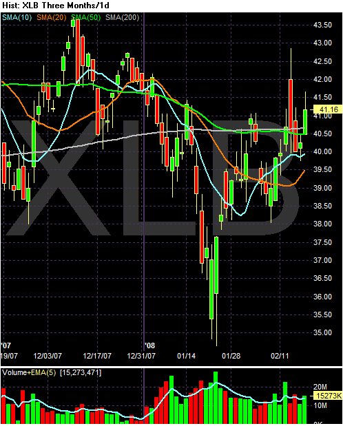
The SMA picture is very confusing. Notice the following:
-- Prices are right around the 200 day SMA, which is the traditional line between a bull and bear market
-- The 50 and 200 day SMA are both moving in a more or less straight line.
-- The 10 and 20 day SMAs are both heading up, but their overall position is pretty messy.
Short version, this sector is still technically in a rally. But it's also looking for direction.
Today's Markets
The big news today was oil closing above $100/bbl. That sent all the indexes lower.
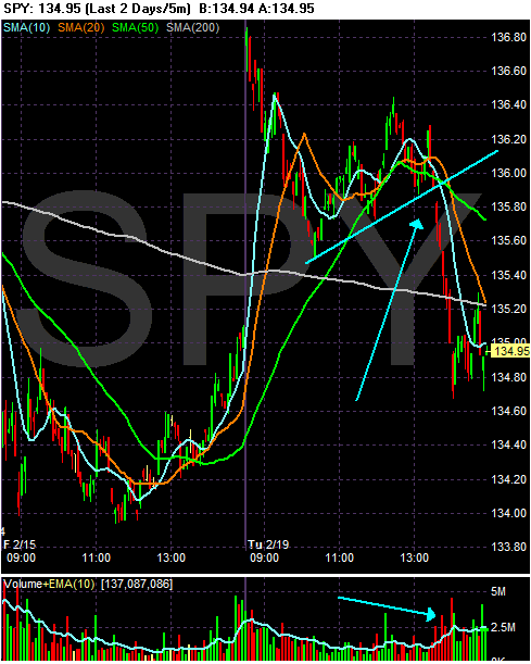
Notice that once the SPYs broke lower, they did so on heavy volume. Also notice the index closed near the daily lows, indicating traders don't want to hold anything overnight.
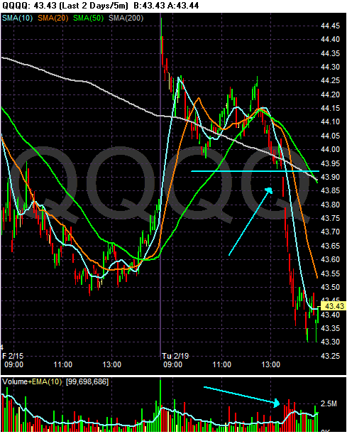
Like the SPYs, the QQQQs broke lower on heavy volume after oil closed.
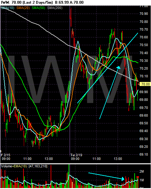
The exact same thing happened to the IWMs
On all the chart, notice they all opened higher but couldn't hold onto the gains. That indicates concern.
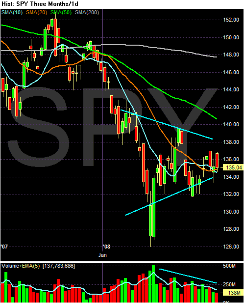
On the daily charts below, notice we're still in the middle of a consolidation for all the averages. I added a second lower trend line for the IWMs. Also note that on the SPYs and IWMs we have decreasing volume, a classic pattern further confirming consolidation is occurring.
What Inflation? -- Conclusion
The four posts below show the following:
1.) There have been very large price spikes in a variety of energy and food commodities. These are not small increases. In addition, the breadth of the increases nullifies the argument that the price increases are the result of a disruption in a particular market.
2.) One of our largest trading partners [thanks to an anonymous poster for pointing that out] has high and accelerating inflation.
3.) The US dollar -- which is the base currency for most commodities -- has been dropping in value for the last two years. In addition, the zero maturity money supply has been increasing at a high year over year rate for the last year and that rate of increase is accelerating.
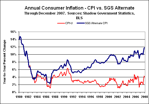
4.) The US government's methodology for computing CPI has changed over the last 25+ years and the that methodology may be understating the official inflation rate. I can't speak to the validity of this argument. However, considering the price increases I am seeing at the personal level I find this argument at worst worth discussion.
Conclusion: inflation is a problem.
What Inflation? pt. IV
Finally, consider this chart from Shadow Stats:
The CPI chart on the home page [as reprinted above] reflects our estimate of inflation for today as if it were calculated the same way it was in 1990. The CPI on the Alternate Data Series tab here [the chart above], reflects the CPI as if it were calculated using the methodologies in place in 1980. Further background on the Alternate CPI and Ongoing M3 series is available in the Archives in the August 2006 SGS newsletter.
What Inflation? pt. III
Above is a long-term chart of the dollar. Notice the chart is in a clear bear market pattern of lower lows and lower highs. Remember that most commodities are priced in dollars, so as the dollar drops in value the value of these commodities by definition increases.
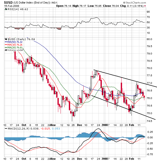
Above is a daily chart of the dollar. There is some good news here. Notice the dollar is consolidating above its recent lows, indicating traders have bid up the dollar a bit. Also note the simple moving averages are bunched, indicating a lack of direction. This is better than all the SMAs moving lower. It looks as though traders are wondering of the dollar is fairly priced right now, or whether it was fallen enough and should be higher.
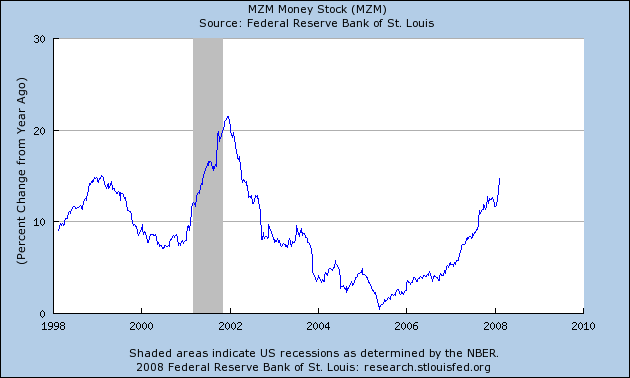
Finally, above is a chart of the percentage increase from the previous year in MZM which is defined as:
A measure of the liquid money supply within an economy. MZM represents all money in M2 less the time deposits, plus all money market funds.
That's a big damn increase.