Saturday, July 13, 2024

Weekly Indicators for July 8 - 12 at Seeking Alpha


 - by New Deal democrat


My “Weekly Indicators” post is up at Seeking Alpha.

The good news this past week on inflation was confirmed by the weekly data, and YoY nominal consumer spending hit a new high as well.

The good news cause bond yield to decline significantly, and stocks to make yet another all time high.

As usual, all of the details on the most up to the moment data are organized for you in the post, and clicking over and reading will reward me a little bit for doing so.

Friday, July 12, 2024

Real average nonsupervisory wages near, real aggregate nonsupervisory payrolls at, all-time highs


 - by New Deal democrat


Now that we have the CPI reading for June, we can calculate how average wag earners are doing in “real” terms.


First, real average hourly nonsupervisory wages increased 0.4% for the second straight month. On a YoY basis, they have risen slightly under 1.0%:


This is on par for average real wage growth for the past 30 years.

More importantly, in absolute terms after declining earlier this year, real average hourly wages are at their highest level since September 2021, and only 0.1% below that month and December 2020 for the highest all-time real wages excluding the three lockdown months that were subject to extreme labor force distortions (since so many more low wage workers were laid off compared with office workers):


Although I won’t bother with the long term graph, the previous all-time high in January 1973 was never exceeded before the pandemic. June’s reading was 0.7% higher than that.

Second, and perhaps even more importantly, real aggregate nonsupervisory payrolls rose 0.2% in June to another all time record high (blue in the graph below, right scale). On a YoY basis, they are up 2.3% (red, left scale):


I particularly like this metric because, not only does it measure the “real” well-being of average American workers, but it has been an infallible short leading indicator for the economy for almost the past 60 years, as shown in the pre-pandemic historical graph of the same information as above (note blue line is in log scale to better show shorter term trends):


To recap what I have written previously, not only have absolute real payrolls always peaked at least several months before a recession, but the rolling over process has tended to be gradual rather than sudden. And on a YoY basis, real aggregate wages almost always turn negative within two months before or after the onset of a recession.

As shown in the first graph above, real aggregate nonsupervisory payrolls show no signs of rolling over. That is an excellent indication that the expansion has some time to go.

While I am at it, here is the latest monthly estimate through May of real median household income from Motio Research:


Per their calculations, real median household income is 0.2% its all-time non-lockdown high set this March.

Thursday, July 11, 2024

A somnolent consumer price report, with headline YoY inflation marginally under 3%, tests whether 2% inflation is a target or a ceiling for the Fed


 - by New Deal democrat


Consumer prices in June failed to show any inflation at all for the second month in a row, as they declined -0.1% following an unchanged reading in May. On a YoY basis inflation decelerated -0.3% to 3.0% (technically 2.98% if you go out one further decimal point), the lowest YoY increase since March 2021. 

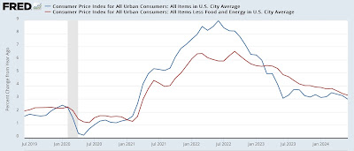
For the record, “core” inflatioin less food and energy increased 0.1%, the lowest monthly increase since January 2021. On a YoY basis it was higher by 3.3%, the lowest since April 2021.  Here is the YoY% change in both headline (blue) vs. “core” (red) inflation:


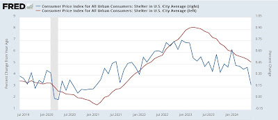
As usual, the price of gasoline and the imputed price of shelter were the primary components, as energy declined -2.0% for the month, while shelter increased 0.2%, the lowest monthly increase in that component since February 2021. Here are the monthly (blue, right scale) and YoY (red, left scale) % changes in the shelter index:


On a YoY basis, imputed shelter inflation was 5.1%, the lowest since March 2022.


Shelter has continued to behave just as I expected. Here is an update to the 12-18 month leading relationship between house prices (as measured by the FHFA) and Owners’ Equivalent Rent in the CPI:


 House prices are currently increasing a little higher than their average pre-pandemic rate (because, ironically, the Fed’s rate hikes have exacerbated a shortage in housing supply, thereby driving up its price), which has translated to OER and the other measures of shelter inflation to continue to decelerate YoY, but at a much slower pace than their initial rapid decline. I expect this trend to continue in the coming months.

When we strip out shelter, all other items declined -0.1% for the month, again after being unchanged in May, and are only up 1.8% YoY - the 14th month in a row they have been up less than 2.5% YoY:


In other words, properly measured, inflation continues not to be a problem at all. 


Before I finish, let’s take an updated look at our recent and former problem children, starting with new and used vehicle prices. The former were unchanged in June - the 10th time in 11 months they were unchanged or actually declined, while the latter declined another -1.5%. On a YoY basis both are in outright deflation, as new car prices are down -0.9% and used vehicle prices are down -9.5%:


Since just before the pandemic, new vehicle prices are up 20.4% and used vehicle prices are up 27.2%. Meanwhile average hourly wages for nonsupervisory personnel are up 25.7%:


While car prices may still seem shocking, the fact is that wages have almost completely caught up.

Here’s what happened with the remaining problem areas of inflation:

  (1) food away from home, which peaked at 8.8% YoY over one year ago, increased 0.4% again in June, and increased 0.1% (actually 0.03% one decimal point further) on a YoY basis to 4.1% i, vs. its pre-pandemic average of 2.5%-3.0%:


 (2) electricity, which had followed gas prices higher, appears to be starting to follow them lower, declining -0.7% in June, and has decelerated to a 4.4% YoY gain:


 (3) transportation services - mainly car repairs (up 0.2% for the month, but down from its peak of. 14.2% YoY in January 2023 to 6.0%) and insurance (up 0.8% for the month and up 19.5% YoY - still down from April’s 22.6% YoY gain) - declined-0.5% for the second month in a row. It had rocketed from its pre-pandemic range of 2.5%-5.0% to as high as 15.2% in October 2022, but has since decelerated to a gain of 9.2% YoY:


Based on the past inflationary period of 1966-82, it is clear that transportation services lags increases in vehicle prices by 1-2 years and even more, sometimes increasing right through recessions.

To sum up: aside from shelter and transportation services, *no* sub-sector of prices was up more than 4.4% YoY. Many measures, including headline and core measures, made new 3 year lows YoY. And inflation ex-shelter continued well under control.

On final important comment: the Fed tolerated a number of years where inflation was up to 1% below its target of 2% with complete equanimity. Now that YoY inflation is marginally under 3%, a Fed with symmetric preferences would be equally comfortable, and open to lowering rates. The suspicion before the pandemic was always that the Fed treated 2% inflation more as a ceiling than a target. Given recent signs of weakening in some sectors, and the fact that Fed policy takes a long time to reach full effect, my personal opinion is that this report gives the Fed has the cover it needs, if it chose to, to lower rates at its meeting later this month. If it doesn’t, that suggests that its preferences are in fact asymmetric - and in the more dangerous deflationary direction.

On jobless claims, the unresolved seasonality hypothesis is holding up


 - by New Deal democrat


Ever since jobless claims started higher in May, I’ve cautioned that I suspected that unresolved seasonality may be at play. This week and the next two weeks are the acid test for that hypothesis, because they were the lowest weeks for claims all last summer.


And . . . The unresolved seasonality hypothesis held up for the first of those weeks.

Last week initial claims declined -17,000 to 222,000 - a lower number than any week last summer. The four week average declined -5,250 to 233,500. With the usual one week delay, continuing claims declined -4,000 to 1.852 million:


But of course, if seasonality is at play, the YoY numbers should be benign. And they are.

YoY initial claims are down -3.6%. The four week average is down -4.6%. Continuing claims, which have been higher YoY for many months, are close to the bottom of that YoY range, higher by 4.6%:


Since the YoY metrics are most important for forecasting purposes, this continues to be a positive sign for the economy.

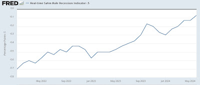
Finally, although I’ve cast doubt on whether the “Sahm Rule” is giving an accurate signal this time around because of the huge impact of recent immigration, here is an update through the first week of July for that comparison:


Initial and continuing claims are more consistent with an unemployment rate of perhaps 3.8%, not 4.1%. I strongly suspect the recent increase in the unemployment rate is indeed recent immigrants who have been unable to find permanent jobs yet.

Wednesday, July 10, 2024

The leading sectors of the labor market are still generally trending positive


 - by New Deal democrat


Our economic news drought ends tomorrow with the CPI report, and I’ve beaten the issue of unemployment to death, so today let’s turn to the leading sectors from the Establishment Survey portion of the jobs report, where as I’ve been reporting for months, the situation is considerably better.


Since I’ve been paying special attention to the manufacturing and construction sectors, let’s start by taking an overall look at them:


Going back 40 years, prior to a recession at least one of the two has been in a downturn, with the other at most flat. But while manufacturing employment has been flat in the past year, construction employment has continued to boom.

Average weekly hours in the manufacturing sector is one of the 10 “official” leading indicators, and here the story is downright positive:


Hours have always declined prior to or just entering a recession. By contrast, since January of this year, average hours have *increased* from 40.2 to 41.0 per week.

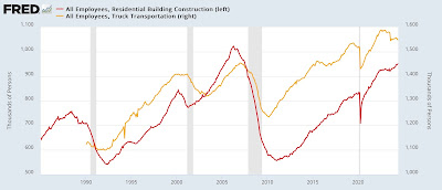
Let’s next take a look at several leading sub-sectors. Truck transportation has indeed declined sharply, following a major bankruptcy in the sector last summer. Residential construction jobs, by contrast, have bucked the trend of higher mortgages and lower starts, and have continued to increase in the past year:


Temporary help services have been in a severe downtrend for over two years:


I don’t have any special insight into this, but it appears that some kind of secular change is taking place.

One other sector - not a leading one, but as it is large and important, worth mentioning - that is also under stress is professional and business jobs:


These are only up 0.3% in the past year. In the past entire 85 year history of this series, that weakness has never happened outside of a recession.

But let’s bring this back to where I began above. Manufacturing and construction together make up the vast bulk of the goods producing sector, and that in the aggregate has always turned down in advance of a recession; but it is still increasing:


In summary, when we look at the leading sectors of the labor economy, while a few pockets - trucking and temporary help - are in real downturns, the bulk of the indicators are pointing higher. Until I see broader weakness in the goods-production measures of the jobs report, I see no support there for a recession beginning in the next few months.

Tuesday, July 9, 2024

A historical look at labor force participation surges, real GDP, and unemployment


 - by New Deal democrat


In my discussion yesterday of why the Sahm Rule might be giving a false signal at present, I noted that “in addition to the 1980-81 double-dip period, significantly the only other time [a big increase in new entrants into the labor force leading up to a recession] even came close was 1968-69, when the Baby Boom was entering the labor force in droves.”


Let’s explore that more today, and why it is relevant to our current situation.

Between 1946 and 1963, 76 million Boomers were born to a population of 190 million at the end of the period. By contrast, for example, 73 million Millennials were born between 1981 and 1996 to a population that ended the period at 270 million. In other words, Millennials only accounted for 27% of the total population at that time, while at the end of 1963 Boomers accounted for a full 40% of the entire US population!

Here’s what happened when that huge generation entered the labor force, including for the first time most young women.

Most notably, as the prime age population surged, so on a secular basis did the unemployment rate. As the surge ended, the unemployment rate declined on a long term basis as well:


With so many new entrants to the labor force, lots of pressure was place on wages as well. When the surge subsided, real wages began to increase again:


Along with the surge in population, the labor force participation level surged as well, and the two gradually abated together also:


Over the long term, the civilian labor force has increased by an average of roughly 1% annually. So below let’s compare the YoY% increase in the civilian labor force minus 1%, with the unemployment rate:


Even there, with considerable noise, we can see that the outsized increase in the labor force that began as the Boomers entered it in the 1960s and ended in the late 1990s corresponded to a secular increase and then decrease in the unemployment rate with a delay of several years.

I want to emphasize that I am hardly advocating for a monocausal view of the economy or unemployment rate. Trade, tax, and business policies mattered, as most certainly did the OPEC oil shocks of the 1970s and their collapse in 1986. But the correlation is clearly there.

Now let’s take this same graph and apply it to the post-pandemic era. Note that this is using the Census Bureau’s population numbers, rather than the CBO’s much larger numbers:


Even using the Census Bureau’s numbers, the increase in the labor force has equaled that of the 1960s and 1980s. If we were to use the CBO’s numbers instead, it would look much more like the 1970s.

In short, the only other time in the past 75 years when we had a major surge in growth in the labor force, we also had a general uptrend in the unemployment rate on a secular basis. 

Finally, this secular uptrend in the unemployment rate included periods of very robust real GDP growth, frequently over 5% YoY:


So history does support the hypothesis that we can have an expanding economy even with a gradual uptrend in the unemployment rate caused by labor force increases.

Monday, July 8, 2024

Further on why the big increase in immigration has been distorting the signal from the ‘Sahm Rule’


 - by New Deal democrat


In my summation of Friday’s employment report, I wrote that “[t]here will probably be lots of chatter in the next few days as to whether the “Sahm Rule” has been triggered. It has not, because the 3 month average in the unemployment rate is 4.0%, and the lowest 3 month average in the last year is 3.6%. Additionally, Claudia Sahm herself has indicated that the same immigration issue I have highlighted may also make her metric signal a false positive this time.”


And right on cue, the usual suspects have pounced.  So let’s take a more in-depth look.

To be clear, the data is pretty close to triggering the “Sahm Rule.” Here’s the real time indicator from FRED from which I have subtracted the 0.5% threshold so that it shows at zero, first for the post-pandemic period:


And now for the pre-pandemic period:


In the past, there have only been three occasions - 1967, 1976, and 2002 - when the current level has occurred in the absence of a recession. Indeed, more often than not, once the 0.3% threshold has been crossed, a recession has been close to occurring.

But as I wrote last month, and as Sahm herself as well as Harvard econ professor Jason Furman have suggested, this time might indeed be different because of immigration.

Let’s start with a long term graph I have run many times before: the YoY% change in initial unemployment claims (red) vs. the YoY% change in the unemployment rate, prior to the pandemic:


It is crystal clear that initial claims, for over half a century, have led the unemployment rate.

Now let’s look at the last three years:


Despite the fact that initial claims have turned *lower* YoY ever since the beginning of the year, the unemployment rate YoY has continued to climb. 

This is unprecedented. There has not been a single time at any point in the past 50+ years when initial claims have been declining YoY and the unemployment rate has not followed suit. Not once!

But the unemployment rate might rise because jobs are harder to find (essentially a demand side issue), or it might rise because there is a surge in people trying to find a similar amount of jobs (a supply side issue). To see which has been more important, let’s slice and dice the recent number of unemployed (blue in the graphs below) by the number of permanent job losers (gold), and also new entrants (like recent immigrants) plus re-entrants (red):


Since the low in December 2022, the total number of unemployed has risen by 1.113 million. Of that, only 261,000 have been permanent job losers. By contrast, new and re-entrants to the labor force have increased by 514,000, about double the number of job losers!

By contrast, here is the historical record pre-pandemic:


We only have a full record going back 30 years, but in that period of time before both pre-pandemic recessions, permanent job losers increased sharply, while new and re-entrants to the labor force stayed steady or even declined.

This strongly suggests a supply side explanation.

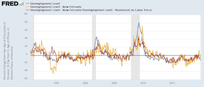
Another way to look at similar data is to break out new entrants, like recent immigrants (gold in the graphs below) from total unemployed (blue again) and new plus re-entrants (red again):


We can see that both new and re-entrants have increased in the last several years.

Now here is the pre-pandemic comparison:


Only during the 1980-81 “double-dip” recession period did new and re-entrants increase prior to a recession.

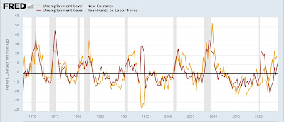
And just how much have new and re-entrants increased? By about 20% YoY for new, and over 10% for re-entrants in the past year, a considerably higher rate than total unemployment:


Such an increase was almost totally unprecedented in the 50 years before the pandemic:


In fact, in addition to the 1980-81 double-dip period, significantly the only other time it even came close was 1968-69, when the Baby Boom was entering the labor force in droves.

Indeed, going back 60 years, the 20%+ increase in unemployment in new entrants, and 10%+ increase among re-entrants has only been seen coming *out of* recessions, not going in to one:


With that in mind, let’s again take a look at the increase in the native born (blue) and foreign born (red) labor force since the onset of the pandemic:


The native born labor force declined much more sharply, and only in the past two months has exceeded its pre-pandemic level, while the foreign born labor force has exceeded its pre-pandemic level by roughly 1,000,000.

And now remember that the population figures I have been using above have probably undercounted post-pandemic immigration to the US by over 3 million, and the number of recent immigrants in the labor force by 2 million!

Put this together, and the picture painted is not one of a labor market where the demand for workers has gone soft, but primarily where the supply of new workers, especially recent immigrants, as well as re-entrants to a strengthening market, has swamped the number of positions available.

And because so much of the increase in labor supply is driven by people who were not previously part of the US economy (because they were foreigners), it is perfectly compatible to have both a growing economy (i.e., one not in recession) and an increasing unemployment rate.