Saturday, February 22, 2014
Weekly Indicators for February 17 - 21 at XE.com
- by New Deal democrat
My Weekly Indicator column is up at XE.com.
Those of you of a certain Neanderthal age may remember a line from The Who's "Won't Get Fooled Again": "Meet the new boss. Same as the old boss."
Well, there's been a return of the old boss when it comes to economic data.
Friday, February 21, 2014
The Dueling Doomers of DailyKos horribly bobble a "housing bubble"
- by New Deal democrat
Ugh! You would think after years of having their heads handed to them by economic data, the Doomers might go crawl away somewhere, but every now and then, they stick their heads up and, if they don't see their shadow, figure it's OK to come out and play economic analysis.
So today's lesson - alas, as usual - is about cherry-picking data. Both of DK's Pied Pipers are out today with claims that we've been in a second "housing bubble." One of them even showed up with -as we will see, fatally flawed - graphs.
For those people who might amble over here from that non-bastion of economic analysis, I've been bearish on the housing market for months. So much so that I even have a charitable bet with Bill McBride a/k/a Calculated Risk that housing starts and sales will be down by at least 100,000 YoY at some point this year (he's bullish, he thinks housing sales will average +20% YoY this year).
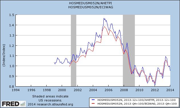
But being bearish is different than saying that the increase in house prices that began 2 years ago (that neither of the aforesaid twins saw coming) is a "bubble." It's possible that California might have some outlandish prices, but California is not the whole country. As I pointed out earlier today, the best way to measure the true cost of housing is to compare it with wages, and when you do that, you see that the median prices of existing homes are a little less than they were in 1999 and 2000 (blue), and just to be fair, equal to 2000 prices (the earliest comparison that can be made) when we use median wages (red), although for this I am stuck with a quarterly measure last updated through December:
Now let's do the same thing (both measures) new homes:
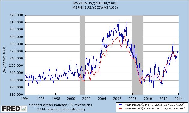
There simply is no housing bubble in the vast majority of the housing market. Even new home prices (10% of the market), adjusted both for average nonsupervisory wages and for median wages, are only about midway between their recent bottom and the bubble top.
But, but, but ... what about the graphs? Most of the graphs I actually have no problem with (e.g., mortgage applications are in the tank, and housing permits and starts have stalled, as I've already documented -- like I said, I'm bearish). Again, for those of you who might come over from yon, I've examined the relationship between interest rates and housing starts for almost the last 70 years, and the simple fact is, a 1% increase in interest rates almost always leads to a 100,000 decrease in permits and/or starts within a year afterward.
Most of the graphs have to do with housing sales. No problem. But there are two graphs upon which the claim that housing is in a bubble (i.e., prices) are based. One doesn't really prove anything, and the other is flat-out dishonest.
The one which really doesn't prove anything is the graph showing housing flips and profits. It's from Realty Trac, and here's the link to the article. And here's what Realty Trac says about their data set:
Homes flipped in 2013 accounted for 4.6 percent of all U.S. single family home sales during the year, up from 4.2 percent in 2012 and up from 2.6 percent in 2011. Flips accounted for 3.8 percent of all sales in the fourth quarter, down slightly from 3.9 percent of all sales in the third quarter and down from 7.1 percent of all sales in the fourth quarter of 2012 — the highest percentage of sales represented by flips in a single quarter since RealtyTrac began tracking flipping data in the first quarter of 2011.(my emphasis).
In other words, Realty Trac's data only began 3 years ago, close to the bottom of the housing market. What percentage of sales were flips in 2008? 2006? 2004? 2000? 1990? Realty Trac doesn't know, and doesn't purport to know. Is the percentage of flips in 2013 similar to what we saw in a healthy market? Realty Trac doesn't know, and doesn't presume to tell us. And even within their 3 year data set, the percentage of sales that were flips in 4Q 2013 were only a little more than 1/2 of what they were a year before (3.8% vs. 7.1%). Hardly the sign of a market that is getting frothy.
The flat out dishonest graph is this one:
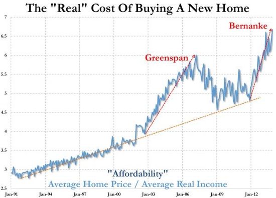
It's probably from Zero Hedge, although it actually isn't sourced at all. In fact it is a close relative of a Zero Hedge graph I debunked a year ago. Both suffer from the same dishonesty. They compare nominal house prices with inflation-adjusted income. If I compare the nominal price of Coca Cola from 1960 to the present, with inflation adjusted income, Coca Cola is going to look like its price has shot to the moon. Totally dishonest.
The honest comparison is nominal prices to nominal wages (what I've done above) or inflation-adjusted prices to inflation-adjusted wages. Do that, and if you find something that shows there is a bubble, now you've got my attention.
Unitl then, sorry, Doomers, there is no housing bubble in the vast majority of the housing market. But if it makes you feel any better, I think the housing slowdown is going to negatively impact the economy for at least most of this year.
January existing home sales and the housing slowdown
- by New Deal democrat
Let me start out by saying that, in terms of their importance for the economy, existing home sales are the least signficant number, even though existing sales are about 90% of all sales. That's becuase the impact from construction trades, suppliers, landscaping, furniture, appliances, etc., is much less for existing that new home sales.
But since they are 90% of the market, they dominate the housing slowdown.
Let me start by taking my graph of housing permits (blue) and starts (green) normed to 100 in September 2012, and add in existing home sales through this morning's report (red):
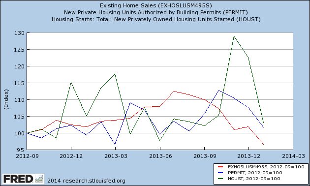
Existing home sales peaked earlier and are now lower than they were 16 months ago.
Next, to give you another perspective other than a YoY one, here are ths same three series, normed to 100 at their respective 2013 peaks:
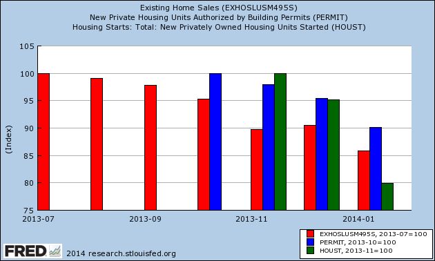
All of them have declined at least 10% from those peaks.
Next, here is months' supply of inventory:
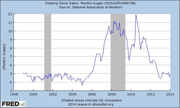
This is a little higher than during almost all of the housing boom. It may be a neutral reading, or it may be slightly supportive of prices.
Finally, some writers are claiming that there has been a second housing "bubble." There may have been some merit to that claim in terms of new home prices, but that claim has no credibility when applied to existing home prices. To show you why, let's take a look at the median price for an existing home, divided by the average wage for nonsuperivosory workers. I use this measure becuase housing itself is a component (the largest) of inflation, so measuring affordability by wages is probably a better "real" measure (note that these are not seasonally adjusted, hence the sine-wave pattern):
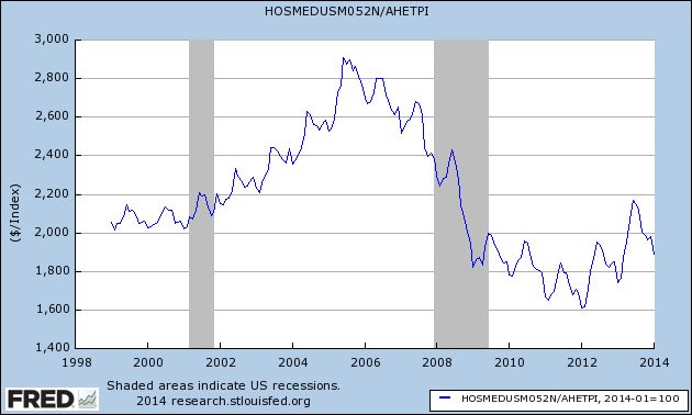
So measured, prices of existing homes, while more than 20% higher than they were at the bottom two years ago, still are slightly less than they were in 1999 and 2000, still far below what they were during the bubble. I appreciate that people in California may be seeing a different situation, but that's the premium you pay to live in a beautiful climate, and the astronomical cost of living in California is a big reason for the outmigration to the interior West for the last 10-20 years.
All that being said, with home prices up 20% in two years, and interest rates having risen such that the monthly interest payment on a mortgage is about 30% more than it was for a mortgage in the same amount several years ago, it's no surprise that home sales have been falling.
Existing home sales fall to 18 month low
- by New Deal democrat
Existing home sales fell to 4.62 million annualized in January, the lowest number since July 2012 (seasonally adjusted). Median prices also fell, but these are very seasonal, and need to be compared YoY.
While the median price for an existing home is more than 20% higher than it was in January 2012, as a multiple of the average wage the median price is no higher than it was in 1999 or 2000.
This was not unexpected, and is further evidence of a housing slowdown. More later with a few graphs.
Thursday, February 20, 2014
Rising natural gas partially offsets flat gasoline pries in January
- by New Deal democrat
I have a post up at XE.com on this morning's CPI release. It wasn't as low as I had hoped, but we are still on track for 1.0% or so YoY inflation in February.
A closer look at the housing slowdown
- by New Deal democrat
With yesterday's reports on housing permits and starts, we now have 3 of 5 monthly reports that have turned negative YoY: in addition to starts, pending sales and existing home sales already turned negative YoY in November and December, respectively.
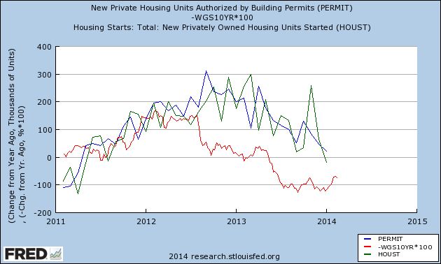
First of all, as I've documented a number of times, even in the post-World War 2 era where there was over 15 years of pent-up demand, typically a 1% rise in interest rates led to a -100,000 decline in nonfarm housing starts or permits within about 9 months. Here's an update of that relationship covering the last 3 years, showing the YoY change in 1,000's in permits (blue) and starts (green), and comparing that with the YoY% change in treasury bond rates, expressed in basis points (red):
Now let's look at the same data, expressed as the YoY% change in permits and starts, and YoY change in treasuries by percent averaged monthly:
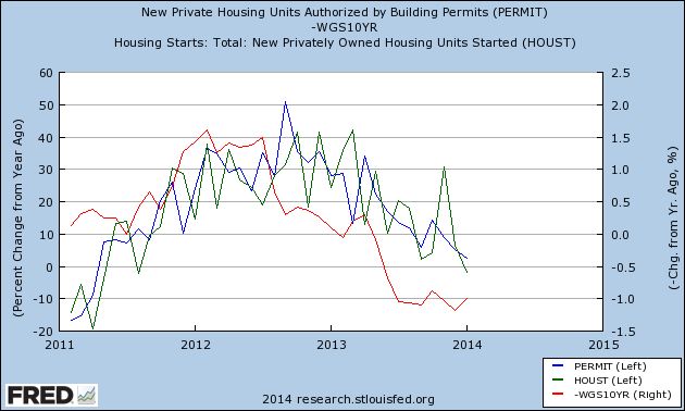
Permits and starts follow interest rates, it's just about that simple (with the exception being those few times when "buy now or be forever priced out" was a dominant theme, which may actually have played into the October and November 2013 spike).
The YoY low in interest rates was in early 2012 as shown in the above two graphs. This next graph norms permits (blue) and starts (green) to 100 as of September 2012, about 8 months later:
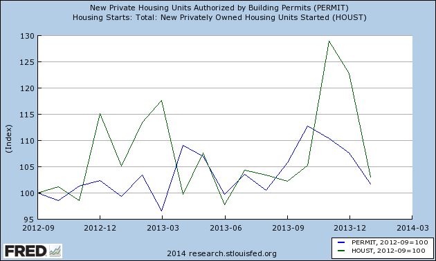
Permits have failed to advance more than 5% above their level in September 2012 in 10 of the ensuing 16 months. Starts are more erratic, with several spikes, but generally show the same pattern.
Finally, in the past I have documented that housing permits have typically declined 200,000 from their expansion high prior to a recession beginning (the notable exception was just prior to 2001, where they declined by 175,000. This final bar graph shows the declines in permits from their October highs:
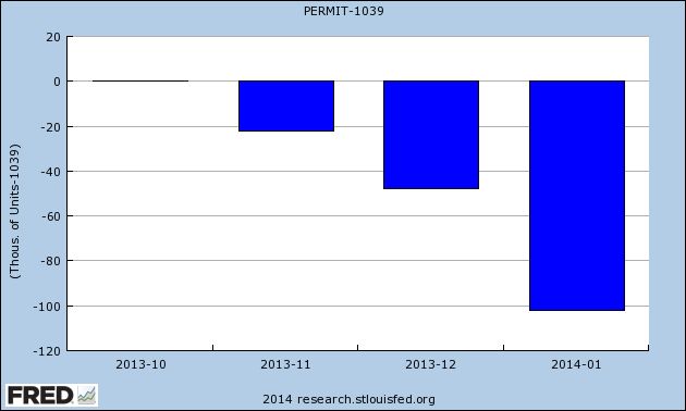
While the housing data continues to confirm my belief that 2014 will be marked by a deceleration in the growth of the economy, the decline above isn't serious enough to cause me to think the economy will actually contract anytime soon. Further, I agree with Bill McBride that, over the longer term, the fundamentals favor a housing recovery.
Meanwhile, existing home sales will be reported this Friday, and new and pending home sales will be reported next week.
Emerging Markets Rebound, But Hit Resistance
The emerging market ETF has rallied from 37 to ~ 39.5 but has hit resistance just below the 200 day EMA and at the lower 40s -- a level that has support for technical resistance. However, notice two important technical details with this chart: the MACD is still clearly moving lower and the CMF has been printing negative numbers over about 3 1/2 months. Neither of these facts bodes well for the future price moves.
Wednesday, February 19, 2014
Housing permits decline, housing starts now down YoY
- by New Deal democrat
As Bill McBride reminded his readers this morning, he and I have a charitable bet on the direction of the housing market this year. In the past, with rare exception, whenever interest rates have risen by at least 1%, housing permits have decreased by 100,000 a year or more. The exceptions (such as 1968 and at the peak of the housing bubble) were when "buy now or be forever priced out" was a reasonable - or widespread - argument. In 1968 it was because of secularly and rapidly rising interest rates; in 2004-05 it was because of seemingly permanently rising prices.
This morning January housing permits and starts were reported. Permits fell to 54,000 to 937,000. This contrasts with 991,000 in December, and 915,000 one year ago, so permits rose 2.4% on a YoY basis.
The big story, however, is that housing starts fell 168,000 to 880,000. Last month's number was revised upward by 49,000 to 1,048,000. Which means that starts are down from 898,000 one year ago, or -18,000, or -2.0% YoY.
It seems obvious that weather was an issue in the January reports. And the initial anecdotal reports from February (e.g., this morning's MBA report) look even worse.
But what is happening is what I expected to happen. The weather has just made it happen a little sooner, I think.
PS.: I'll update with YoY graphs once they are available on FRED.
Tuesday, February 18, 2014
Australian ETF Breaks Through Resistance
Since a sell-off last fall, the Australian ETF has been trading between the upper 22s and mid 24s. At the upper end of this range has been the 200 day EMA, the line delineating between a bull and bear market. Now prices have moved through this level, with plenty of upside room to run.

