Saturday, May 4, 2013

Weekly Indicators: May Day rebound edition


 - by New Deal democrat

The big news was the continuing expansion of employment in April, and the decline in the unemployment rate. Average hourly earnings increased, but the workweek decreased. As the manufacturing workweek is a component of the Index of Leading Indicators, this will be reflected in that compilation. April light vehicle sales declined. The ISM manufcaturing index was barely positive, the Chicago PMI barely negative. ISM services were positive.

In the rear view window, Q1 productivity and unit labor costs, and the employment cost index all rose. March factory orders and construcition spending declined. Pending home sales rose slightly, as did the Case-Shiller home price index. Personal income and spending both rose as the personal savings rate remained flat at a very low level.

Let's start this week's look at the high frequency weekly indicators by looking at transports and consumer spending, which were the two areas with significant changes last week:

Transport

Railroad transport from the AAR
  • -7200 or -2.6% carloads YoY

  • -6200 or -3.5% carloads ex-coal

  • +5100 or +2.1% intermodal units

  • -2100 or -0.4% YoY total loads
Shipping transport Rail transport went negative for the third time in a month, even excluding coal, although intermodal shipments improved. This still has to be watched carefully to see if this is the beginning of a slump.  The Harpex index remains slightly off its January 1 low of 352, and the Baltic Dry Index remains above its recent low.

Consumer spending Gallup's YoY comparisons have been very positive since last December. They got less positive in the early part of April, but have rebounded again.  The ICSC varied between +1.5% and +4.5% YoY in 2012. In the last month or so it has been near or even below the bottom of this range, but rebounded this week. The JR report this week also rebounded the upper part of its typical YoY range for the last year.

Employment metrics

Initial jobless claims
  •   324,000 down 15,000

  •   4 week average 342,250 down 15,250
American Staffing Association Index
  • 92 unchanged w/w, down -0.04% YoY
Initial claims established a new lower bound to their recent range of between 330,000 to 375,000. The spring increase of the last two years has not materialized this year.  The ASA is still running slighty below 2007, but now slightly behind last year as well. In other words, the comparison is continuing to deteriorate on a YoY basis.

Daily Treasury Statement tax withholding
  • $128.4 B (adjusted for 2013 payroll tax withholding changes) vs. $134.7 B, or -4.7% YoY for the last 20 days.  The unadjusted result was $149.5 B for a 11.0% increase.

  • $163.6 B was collected during April vs. $148.6 B unadjusted in 2012, a $15.0 B or a +10.1% increase YoY.
These are still good YoY comparisons compared with the last three months. While my best estimate is that collections should be up 15% due to the payroll tax increases that took effect on January 1, that appears not to be accurate, so now that we have enough data from this year I am making comparisons with earlier this year, and those comparisons did improve in April.

Housing metrics

Housing prices
  • YoY this week +5.8%
Housing prices bottomed at the end of November 2011 on Housing Tracker, and averaged an increase of +2.0% to +2.5% YoY during 2012. This weeks's YoY increase once again ties the record increase in March this year.

Real estate loans, from the FRB H8 report:
  • down 2 or -0.1% w/w

  • up 12 or +0.3% YoY

  • +2.1% from its bottom
Loans turned up at the end of 2011 and averaged about 1% gains YoY through most of 2012.  In the last two months the comparisons have softened significantly.

Mortgage applications from the Mortgage Bankers Association:
  • -1.4% w/w purchase applications

  • +13% YoY purchase applications

  • +3% w/w refinance applications
After going sideways for 2 years, this year purchase applications have finally risen slightly.  Refinancing applications were very high for most of last year with record low mortgage rates, but have decreased slightly recently.

Interest rates and credit spreads
  •  4.53% BAA corporate bonds down -0.01%

  • 1.73% 10 year treasury bonds unchanged

  • 2.80% credit spread between corporates and treasuries down -0.01%
Interest rates for corporate bonds have generally been falling since being just above 6% two years ago in January 2011, hitting a low of 4.46% in November 2012.  Treasuries have fallen from about 2% in late 2011 to a low of 1.47% in July 2012. Spreads have varied between a high over 3.4% in June 2011 to a low under 2.75% in October 2012.  The  last several months saw a marked increase in rates and credit spreads have widening, followed by a sudden and strong positive reversal in the last several weeks.

Money supply

M1
  • +1.2% w/w

  • +3.7% m/m

  • +10.9% YoY Real M1

M2
  • -0.2% w/w

  • +0.7% m/m

  • +5.7% YoY Real M2
Real M1 made a YoY high of about 20% in January 2012 and has generally been easing off since.  This week's YoY reading increased sharply.  Real M2 also made a YoY high of about 10.5% in January 2012.  Its subsequent low was 4.5% in August 2012. It has increased slightly in the last month or so.

Oil prices and usage
  •  Oil $95.61 up +$2.61 w/w

  • Gas $3.52 down -$0.02 w/w

  • Usage 4 week average YoY -1.8%
The price of a gallon of gas has declined sharply since the end of February, and is down about 10% YoY. The 4 week average for gas usage remained negative after nine weeks in a row of being positive YoY.

Bank lending rates The TED spread recently increased slightly off its 18 month+ low.  LIBOR remained at its new 52 week low and is close to a 3 year low.

JoC ECRI Commodity prices
  • down 1.69 to 125.43 w/w

  • +0.35 YoY
Although April employment and March income and spending were positive, most of the other monthly data was negative, especially indluding anything related to manufacturing. Government construction spending also pulled down that number. As always recently, housing remained a bright spot.

The high frequency indicators were more mixed this week. All money indiators, including money supply, corporate bond rates and interest rate spreads, and bank lending rates, were positive. Housing prices and mortgage applications were positive. Jobless claims were extremely positive. Consumer spending, which had been weakening, turned more positive again. Shipping rates were positive. Gas prices hit new multi-month lows.

Negatives again included rail shipments, joined this week by temporary staffing, which continues to deteriorate. Oil prices increased. Commodities tumbled.

Tax withholding remains a question mark. It is negative after my best estimated adjustment, which is obviously off, but relative to the last few months, this past week was very good.

This was a positive week, marked by low gas prices and low initial claims, but temporary staffing and rail weakness are a real concern. So long as the consumer keeps spending, we are keeping our heads above water.

Have a nice weekend.

Friday, May 3, 2013

Bonddad vacation pix and golden doodle


. - by New Deal democrat

In case you haven't noticed, Bonddad's posting has been light this week. For the very good reason that he's been on vacation with the Bondspouse.

So in lieu of doggie pictures, I got him to send along a photo from the road trip:


And in case that photo made you want to gouge your eyes out, here is a much more adorable golden doodle anyway:


Whew! That's much better!

He'll be back next week. I'll see you tomorrow with the weekly indicators.

US GDP Overview: Income -- Or - We're Just Not Making Much Money Right Now

One of the biggest problems with this expansion is the lack of meaningful income growth - which is to be expected with a higher rate of unemployment.  Consider these charts:


Real income growth has stagnated several times.  It actually decreased for most of 2011.  It rose a bit at the beginning of 2012, but has again stagnated started in mid-2012.  The large spike is a massive outflow of dividend payments in anticipation of the dividend tax increase this year.


Notice that we see the same pattern in income less transfer payments -- a metric used by the NBER to date recessions.


Above is a chart of the real percentage change in real personal income.  I've drawn a red box around most of the observations of this data point for the duration of this expansion.  Notice how the highest rate of growth (the top of the red box) is still below most data points of previous expansions.  This tells us that wage growth is below the level of most expansions.


The real change in real disposable income for this expansion is (again) at one of the lowest rates for an expansion in the last 70 years.


Finally, notice that we see declining year over year wage growth for most of this expansion in the average hourly earnings of production workers.  It's only been over the last few months that this number has increased.


What has helped to power keep the consumer party going is the increased savings in the system.  Notice the savings rate increased to over 5% on several instances during the latest expansion.  

In an age of high unemployment, low wage growth is to be expected.  However, with the declining savings rate, we'll need to see real wage growth in the future to keep powering the economy forward.

April employment: a good report with crappy leading internals


- by New Deal democrat

I dubbed last month's report "the best awful employment report I've ever seen." This month was somewhat the reverse. The headline jobs number slightly beat expectations at 165,000, and the unemployment rate declined -0.1% to 7.5%. (BTW, a long long time ago the Pied Piper of Doom said he'd consider an unemployment rate of under 8% an actual recovery. I must've missed the celebration.).

Anyway, while the headline jobs number and unemployment rate sketch out where the economy is. As usual for me, let's look first at the more leading numbers in the report which tell us about where the economy is likely to be a few months from now - and that's where the problem comes in:
  • The good news is that temporary jobs - a leading indicator for jobs overall - increased by 31,000. The bad news is that all of the other leading components of the report were unchanged or weakened.

  • construction jobs declined -6,000

  • the number of people unemployed for 5 weeks or less - a better leading indicator than initial jobless claims - rose 10,000 from 2,464,000 to 2,474,000. Nevertheless, both March and April have been near a new post-recession low.

  • the average manufacturing workweek declined -0.1 hour from 40.8 hours to 40.7 hours. This is one of the 10 components of the LEI and will affect that number

  • manufacturing jobs were unchanged.

Now here are some of the other important coincident indicators filling out our view of where we are now - and the internals here are decidedly mixed:
  • the average workweek decreased from 34.6 to 34.4 hours

  • overtime hours decreased by -0.1 hours

  • The broad U-6 unemployment rate, that includes discouraged workers, actually rose from 13.8% to 13.9%

  • the index of aggregate hours worked in the economy fell -0.4 from 98.2 to 97.8

  • government continued to shed jobs, -11,000 this month
Good news included:
  • the alternate jobs number contained in the more volatile household survey showed a gain of 293,000 jobs

  • 31,000 people entered the labor force, so the declining unemployment rate was unambiguously good.

  • February's report was revised up 44,000 to 332,000. This was the first 300,000+ number of the recovery, and a number Paul Krugman once said he would consider unambiguously good. March was revised up 50,000 to 138,000. Positive revisions like this happen in recoveries, not at the onset of recessions.

  • average hourly earnings increased $.04 to $23.87. The YoY change rose from +1.8% to +1.9%. When the CPI for April is reported (possibly as low as -0.5%) we are probably going to find that real, inflation adjusted hourly earnings are the most positive in several years.

The decline in the unemployment rate was certainly good news, but remember that it is a lagging indicator. The best news in the report was the revision to January, finally giving us a 300,000+ report in the recovery. None of the numbers indicate we're in a recession now - and, special memo to ECRI, your meme that employment can rise in a recession is now busted, since the longest that happened is 8 months after a peak, and we're now 9 months past the month you are claiming was the peak.

Nevertheless, the leading components of the report almost all weakened.

Thursday, May 2, 2013

Auto sales lowest in 5 months


- by New Deal democrat

Last weekend I said that the two important data releases this week, in addition to tomorrow's jobs report, would be the personal savings rate and auto sales. We now know that both came in relatively poor.

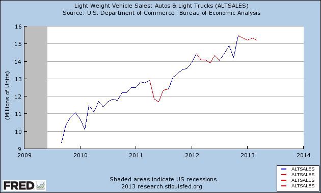
For the second month in a row, March had the lowest savings rate since before the 2008 recession. This tells us that conumers in the aggregate have little room left before being tapped out. Yesterday's auto sales report told us that consumers have pulled back at least a little on purchasing durable goods. This isn't fatal: similar pullbacks occurrred in both 2011 and 2012 (shown in red in the below graph of light vehicle sales)(note the graph does not include yesterday's 14.92 annualized data point):


Typically before recessions vehicle sales have declined by about 10%. This is only a 4% decline.

But the situation is deteriorating.

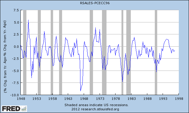
One of the other metrics I found that has been very consistent is that prior to recessions, YoY retail sales growth grows less than YoY PCE growth. Real retail sales are much more volatile than pce's as this graph below (subtracting YoY PCE growth from YoY real retail sales growth through 1997) shows, in a very specific and non-random way:


Note that early in economic expansions, YoY real retail sales growth far outstrips YoY PCE growth. As the economy wanes into contraction, YoY real retail sales grow less and ultimately contract more than YoY PCE's. You can see that by noting that retail sales minus PCE's are always negative BEFORE the economy ever tips into recession. That's 11 of 11 times. Further, in 10 of those 11 times (1957 being the noteworthy exception), the number was not just negative, but was continuing to decline for a significant period before we tipped into recession. This makes perfect sense, as retail sales generally include many far more discretionary purchases. As the economy accelerates, consumers make more discretionary purchases. As it slows, the more discretionary retail purchases are the first things cut.

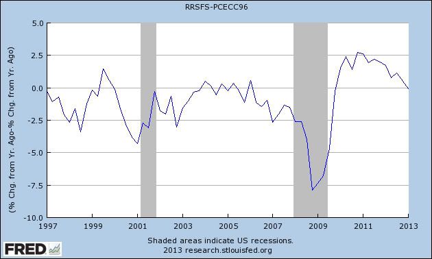
Here's what the graph of the two looks like now:


Retail sales are just becoming less than PCE growth on a YoY basis. This represents a significant weakening of consumers. So April's relatively poor vehicle sales are a point of concern.

US GDP Overview Pt II: Personal Spending -- We're Still Spending, Just Not As Much As Before

Let's continue our look at the US economy by looking at personal spending.


Overall, real personal consumption expenditures (PCEs) have been increasing for the duration of the recovery.  They are now at higher levels that those we saw in the previous expansion.

Let's break these down into their components starting with the largest and moving to the smallest.


Service spending accounts for about 65% of total PCEs.  Notice that this part of PCEs has been increasing at a consistent rate for the duration of the recovery as well.


Spending on non-durable goods (about 21% of PCEs) has also been increasing, but this level of spending has been increasing at a far slower rate starting in 1Q11.


Spending on durables has been very strong.  Also note the importance of this spending: durables typically require some type of financing.  Hence, people don't take these obligations on unless they're confident they can make the payments for the the entire length of the obligation.


Above is the chart for total truck and auto sales.  After cratering in response to the recession, we see this number claw its way back to the levels seen for a majority of the 1990s expansion.


Real retail sales are now at higher levels than those of the preceding expansion.  However, the rate of growth has not been consistent.  There are several periods that show little to no growth -- a description which applies to the last 4-5 months.

The above data shows that consumers are still spending -- and spending at rates higher than those of the previous recovery.  However, like the GDP situation, the problem is that spending is occurring at a slower rate than previous expansions.


The reading for the year over year percentage change in PCEs is one of the lowest for this point in an expansion of the last 70 years.


Initial claims: 324,000


- by New Deal democrat

As you probably have already read elsewhere, initial claims fell to the lowest level since January 2008. The 4 week average is slightly above its March low this year.

We'll see what the following weeks hold, of course, but I just wanted to point out that this qualifies as a totally normal reading for an expansion. While it would be nice if claims were to continue to drop another 20,000 or 40,000 over time, even if they stay at this level, that is perfectly decent for a regularly expanding economy.

Wednesday, May 1, 2013

A note about average wages, median wages, and household income


- by New Deal democrat

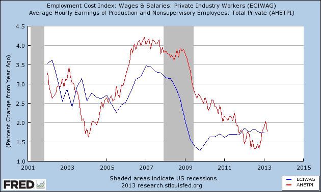
Yesterday marked the quarterly release of the Employment Cost Index, which measured +0.3% in the first quarter of 2013. One of the virtues of this index is that it measures median (i.e., 50th percentile) wages rather than average, or mean wages as does the monthly report on average hourly earnings (which will be updated on Friday with the employment report). Mean wages can be distorted by extravagant payments to those at the top. Median wages aren't.

For a long time after the recession, YoY average wages were running significantly higher than median wages. No more. Both are running between +1.5% to +2.0% YoY:


That's good news up to a point, and in particular that YoY changes in neither mean nor median wages are no longer decelerating to zero. So at least we seem to have avoided the spectre of an actual decline in nominal wages. The bad news is that even with 2% inflation, workers are actually losing money (as they did during 2011 and 2012). This is simply not sustainable. At some point the superlow interest rates that are fueling massive refinancing of debt by American households are going to end, and then we are not going to make any economic progress at all without significantly increases wages.

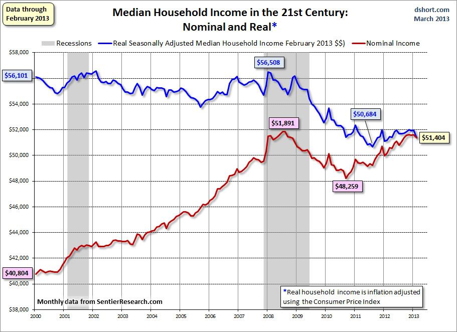
On a related note, about a month ago one of Doug Short's updates about median household income got picked up widely, and as I expected it appears to have been widely misinterpreted by Doomers was a decrease in *wages.* It ain't so. First of all, here's Doug's most recent update:


Notice that median household income declined about 10% into 2011, and since then has slowly risen, although it is still about 7% under its 2007 pre-recession peak.

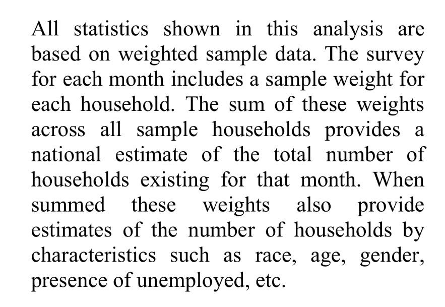
But the index isn't measuring wages. It is measuring household income, including in that mix households where one or both adults are out of the workforce, whether through retirement, disability, or inability to find work. Here's the relevant passage from Sentier Research, which compiles the data:


Just to be sure, I contacted them directly and they confirmed the above to me.

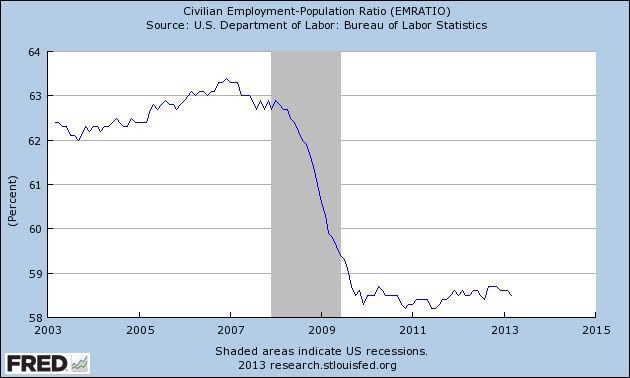
Well, as you know from the employment to population ratio, a lot of people have dropped out of the workforce:


Note that even in the case of retirement, salary or wage income stops and is replaced only by Social Security and pension income plus any income of past savings or investment. In other words, it's almost always a lot lower than the previous wage and salary income. So the decline in household income as measured by Doug Short is almost identical to the downward change in the employment to population ratio, because they are measuring very similar things.

Hence the big difference between the measures of average and median wage growth on the one hand, which are low but positive, vs. median household income, which declined sharply between 2007 and 2011 (and with 10,000 retiring Boomers a day, is likely to trend lower over the next 10 to 20 years).

Sorry, Doomers, the stock market isn't divorced from reality


. - by New Deal democrat

Lately I've just been ignoring the Doomers. They've been so wrong for so long that it just isn't worth the time to debunk their periodic Pastisches of Pessimism (tm) in which they prove that they can string together a random assemblage of graphs going down. The canard that the stock market has become divorced from reality, though, has recently been bubbling up in the fevered Doomer imagination in multiple places and hasn't been given a good spanking, so I guess it's time for a little intellectual discipline.

The stock market is and has been for decades one of the components of the Leading Economic Indicators. It isn't perfect - no indicator is - but it almost always makes a peak and a trough, respectively, before the economy as a whole. For example, most recently it peaked in early Ocober 2007 and bottomed in March 2009 2 months and 3 months, respectively, before the economy as a whole.

In the last couple of months, the stock market has made new highs while the economy has been just shambling along, and consumer savings have been stretched to make up for the payroll tax increase. Why is that?

To simplify - actually oversimplifying some - investors in the stock market in the aggregate try to measure the near term outlook for the profitability of the companies in which they trade. the belief is that if profits go up, so will the stock price and in some cases the dividends paid as well.

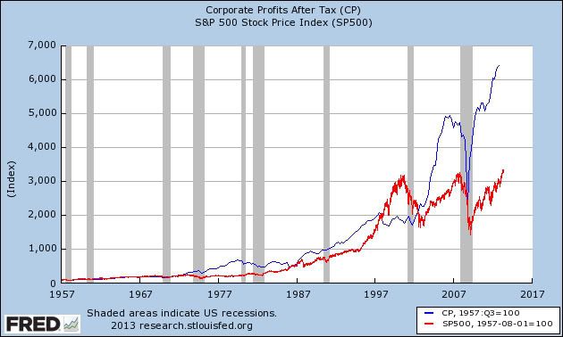
And boy, have profits gone up! The below graph compares corporate profits after tax (blue) with the S & P 500 stock index (red), with both normed to a value of 100 in 1957:


Let's start with the 1987 stock market crash. Notice in the graph that the crash brought profits and stock prices right back in line to their 1957 parity. Then for 10 years corporate profits.boomed, even moreso than the stock market. But beginning in 1997 the stock market entered a bubble, where corporate profits leveled off and even declined slightly, but the stock market continued to boom with the dot com craze.

Notice that since the ensuing crash, stock prices, while broadly correlating with corporate profits, never again reached parity with their 1957 level. Rather, since March 2009 the stock market has gained about 125% - and so have corporate profits, which by far are at all time highs, and have been at new highs for almost three years.

Another way to measure this is to look at the p/e or price-to-earnings ratio. This measures how much buyers of stock are willing to pay for a dollar of earnings (a good layperson's comparison is to think of how much a home buyer is willing to pay per square foot of a house. The higher the price per square foot, the more expensive the house). One year ago, the Dow Jones Industrials had a p/e of 14.68. They ended last week at 15.73. This is not much above their long term average. By contrast, in 1929 their p/e was over 18 and at the height of the dot com bubble it was over 20.

So could the stock market decline tomorrow? Of course! But it's worth noting that in the graph above you can see that corporate profits (the blue line) tend to peak well before stock prices (the red line). In fact corporate profits are a recognized long leading indicator, which means they usually peak at least a year before the economy as a whole.

None of anything I've said above is cheer leading for the economy. Corporate profits may be booming, but real wages actually declined in the last couple of years. They've rebounded in the last couple of months, but as I pointed out yesterday, we now have the lowest personal savings rate since before the 2008 recession.

So while stock prices are firmly in line with the reality of corporate profit growth, they don't measure what is happening with wages and income for average Americans. In fact the biggest economic problem is precisely that those productivity gains are barely being shared with workers at all.

If my word isn't good enough for you, maybe you should point the Doomers to this highly recommended Daily Kos diary by Ministry of Truth from three weeks ago, the title of which is Corporate profits just hit an all time high BECAUSE wages just hit an all time low. That diary isn't incorrect at all. The stock market's problem isn't that it is divorced from reality. It is that it is reflecting reality all too well.

Tuesday, April 30, 2013

April gas price decline may lead to near 50 year lows in monthly, YoY inflation


- by New Deal democrat

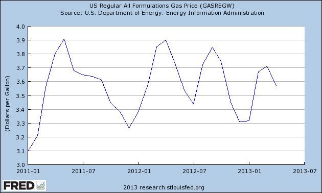
Gas prices for the final week of April were reported yesterday, showing yet another $0.02 decline. For the month, gas prices in April averaged almost 4% less than prices in March:


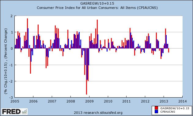
As I've noted before, a reasonable estimate of how gas prices affect overall consumer prices is to take the change in gas prices, divide by 10, and add 0.1% or 0.2%. That will come close to the non-seasonally adjusted change in consumer prices. (If you want to be more conservative, you could divide by 12 or even 16, but that only changes the ultimate result by +0.1). Here's a graph showing that relationship for the last 9 years as a sample (blue is gas prices, red is CPI):


It certainly isn't a perfect relationship, but it is usually quite close.

Applying that to April 2013, we get -0.4% + 0.1% or +0.2%, for an estimate of -0.2% or -0.3% non-seasonally adjusted CPI. Since the seasonal adjustment for April will be about -0.3%, the seasonally adjusted inflation rate for April is likely to be close to -0.5%.

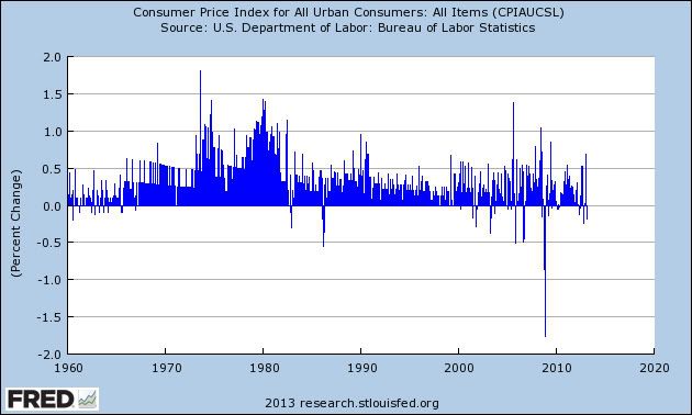
If that happens, it will make for one of the most deflationary readings in 50 years, outside of the drastic late 2008 deflation during the great recession (only one month in 1986 and several in 2006 are equal):


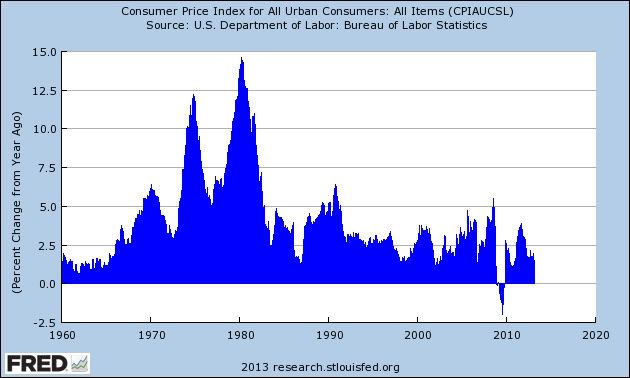
Further, YoY inflation will be about +1.0%, also matching the lowest inflation rate in 50 years outside of the great recession (only 1963, 2002, and 2006 saw YoY inflation of only 1.0%:


Barring a bad accident in Friday's employment report, this will also produce the best YoY advance in real wages in over 2 years.

The surprise easing of the oil choke collar is one of the biggest economic stories so far this year.

Good news and bad news on personal saving


- by New Deal democrat

Yesterday's personal income and spending report is one of two data points in addition to the monthly jobs report that I think are especially important this week (the other being vehicle sales).

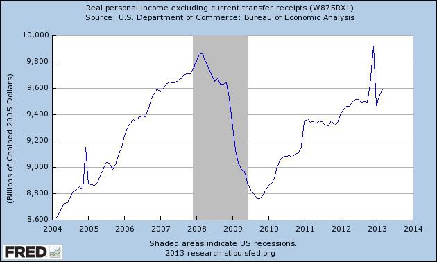
Personal spending is important because it is one of the 4 coincident indicators thought especially important in dating recessions and expansions, when normed for inflation and transfer payments. It rose im March for the second month in a row:


Note that the big December - January spike and decline were about the timing of payments like bonuses to minimize the implications of increases in tax rates. Leaving that anomaly aside, it's clear that real personal income is higher than at any point last year. This confirms that no recession has begun yet.

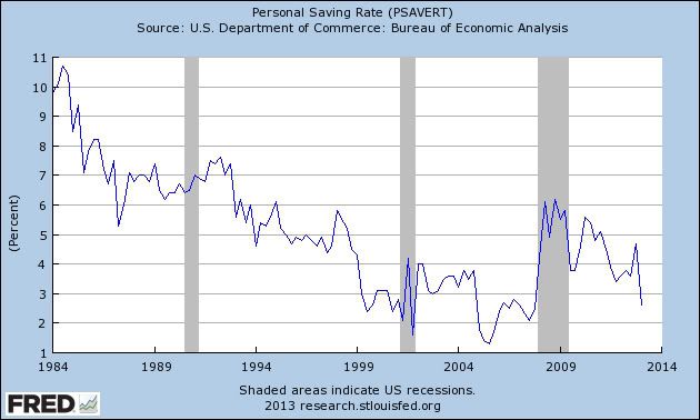
In the longer term, however, the biggest concern is the personal savings rate. With the increase in payroll taxes in January, what would the consumer do? After three months, we have our answer: the consumer continued to spend, by saving less. Below is the personal savings rate, calculated quarterly, and the result isn't pretty:


We now have a savings rate as low as what we had prior to the 2001 and 2008 recessions. It's true that we can go on this way for awhile, but there is no more maneuvering room. When consumers ultimately decide to save more and spend relatively less, that's when a recession happens.

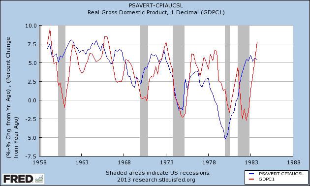
And here is an update on the long leading indicator of the real personal savings rate, i.e., the savings rate subtracting the inflation rate. First, here's the comparison of the real personal savings rate (blue) averaged on a quarterly basis, and real GDP (red) from 1958 through 1983:


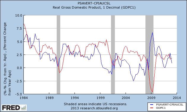
And here it is from 1984 through the first quarter of 2013:


The real personal savings rate tends to lead GDP by about 18 to 24 months. Two years ago the real personal savings rate fell to zero, which has always signalled a later recession. While I do not rely on any one indicator, and in fact all of the other long leading indicators are positive, the pathetic personal savings rate is not good news.

Monday, April 29, 2013

Conservative Blogs Respond to the Reinhart and Rogoff Data Debacle

As readers of this blog (and many others) are aware, one of the primary papers supporting the austerity argument has come under some very intense criticism.  Not to be outdone, conservative blogs and politicians have rushed to the defense of their doctrine.  Below, I want to highlight some of the primary arguments advanced in support of R&R.

Perhaps the most in-depth analysis was performed by John Hinderaker over at Powerline:


Not to be outdone, his co-blogger Steven Hayward offered this well-focused analysis:


Ed Morissey at Hot Air made these observations:


And here is how the National Review weighed in:


Not to be outdone, Instapundit added this:


Larry Kudlow -- perhaps the leading economic intellectual on the right -- really hit the nail on the head with this:


And finally, Donald Luskin provided an incredibly well-thought out response here:


I look forward to the response to all of the above well-researched and conceived points.


US GDP Pt. I: An Overview

It's been awhile since I looked in detail at the US economy.  As it so happens, over the last few weeks we've had both the most recent Beige Book issued by the Federal Reserve and the latest GDP report from the BEA.  So this week I'm going to delve into US economy data to see just exactly where we are.

Let's start with a few basic points.


The US economy is growing and has been growing for the last three years.  Currently, on an inflation adjusted basis, GDP is now higher than it was at the end of the last expansion.


The basic problem is that we're not growing fast enough.  On a year over year basis, the US economy has been growing at between 2%-2.5% for the duration of this expansion.  That's the slowest rate of year over year growth we've seen in the last 50 years.  The slow growth is to be expected, as we're in the middle of a debt deflation recovery.  

Assuming, accordingly, that, at some point of time, a state of over-indebtedness exists, this will tend to lead to liquidation, throughthe alarm either of debtors or creditors or both. Then we may deduce the following chain of consequences in nine links: (1) Debt liquidation leads to distress setting and to (2) Contraction of deposit currency, as bank loans are paid off, and to a slowing down of velocity of circulation.  This contraction of deposits and of their velocity, precipitated by distress selling, causes (3) A fall in the level of prices, in other words, a swelling of the dollar. Assuming, as above stated, that this fall of prices is not interfered with by reflation or otherwise, there must be (4) A still greater fall in the net worths of business, precipitating bankruptcies and (5) A like fall in profits, which in a " capitalistic," that is, a private-profit society, leads the concerns which are running at a loss to make (6) A reduction in output, in trade and in employment of labor. These losses, bankruptcies, and unemployment, lead to (7) Pessimism
and loss of confidence, which in turn lead to (8) Hoarding and slowing down still more the velocity of circulation.The above eight changes cause (9) Complicated disturbances in the rates of interest, in particular, a fall in the nominal, or money, rates and a rise in the real, of commodity, rates of interest.

Bonddad is on vacation this week, so I've written some posts in advance that don't require stock charts. 

To get an idea for how economists are talking about this recovery, consider this overview of the economy from the latest Beige Book:

Reports from the twelve Federal Reserve Districts suggest overall economic activity expanded at a moderate pace during the reporting period from late February to early April. Activity in the Cleveland, Richmond, St. Louis, Minneapolis, and Kansas City Districts was characterized as growing at a moderate pace, while the Boston, Philadelphia, Atlanta, Chicago, and San Francisco Districts noted modest growth. The New York and Dallas Districts indicated that the pace of expansion accelerated slightly since the previous Beige Book.

The word "moderate" has become the Fed's favorite adjective.


Sunday, April 28, 2013

A Note To Erika Johnsen of Hot Air -- Austerity is Dead

Hot Air is one of the conservative blogs I read.  And while they're good at explaining conservative political opinions, they are absolutely horrible about explaining economics.

Case in point.

Erika Johnson is up in arms about the French criticizing the German's continued insistence on austerity as the primary method of dealing with the EU's problem. She writes:

French President Francois Hollande is in a world of political hurt right now in terms of his failure to reignite the stagnating French economy, his flailing administration’s poor ethical reputation, and his attempts to simultaneously satisfy both his campaign pledges and his EU-promises, it looks like his party is thinking about deploying the ol’ unite-behind-a-common-outside-enemy tactic to try and rally the troops. That’s right: German Chancellor Angela Merkel, because all of these debt crises and austerity measures are totally all her fault, you guys! 

First, France is in a world of economic hurt.  She got this one right.  It's a big reason I'm bearish on the economy there (see here and here).

But it's also obvious that she hasn't been paying attention to economics for, I don't know, about 4 years.  You see, Ms. Johnson, there has been a debate about "austerity" and it's policy implications.  First, notice that countries that implemented austerity just aren't growing as advertised.  For example, there's Spain:

Spain admitted on Friday that it would need two extra years to bring its budget deficit back below the EU limit of 3 per cent of gross domestic product, a relaxation of its austerity targets that won tacit approval from Brussels.

.....
The delay reflects the continuing weakness of the credit-starved Spanish economy, which is set to shrink by another 1.3 per cent this year before returning to modest growth in 2014. Government finances have been hit hard by the bursting of Spain’s debt-fuelled housing bubble, which led to a surge in unemployment and forced Madrid to nationalise a string of troubled banks.

Spain has been implementing austerity for a few years now -- and look how much good it's done the country:


That is a track record of success that I'd hang my economic policy hat on.

And then there's the UK -- which just narrowly missed printing a triple dip recession (there's a sign of progress) with a whopping .3% GDP reading in the latest report.  Their plan of fiscal consolidation is going so well that .. "The chancellor’s rolling five-year plan to eliminate the underlying deficit, originally intended to achieve its objective by 2016, will be extended until 2018 because of low growth."  Where's the stellar growth from austerity? 

You can see similar track records all across countries that are implementing austerity.

And her sudden love of Germany is a bit odd.  After all, they have and encourage strong labor unions, promote alternative energy and have socialized medicine.  They also used fiscal stimulus to limit the effects of the recession   Doesn't their success invalidate the majority of her economic theories?

So, a note to Ms. Johnson.

Please make sure you're up-top-date on current economic theory before commenting on economics.   Recent developments have invalidated austerity based policy.  Your nemesis Paul Krugman is in fact the victor:

For the past five years, a fierce war of words and policies has been fought in America and other economically challenged countries around the world.

On one side were economists and politicians who wanted to increase government spending to offset weakness in the private sector. This "stimulus" spending, economists like Paul Krugman argued, would help reduce unemployment and prop up economic growth until the private sector healed itself and began to spend again.

On the other side were economists and politicians who wanted to cut spending to reduce deficits and "restore confidence." Government stimulus, these folks argued, would only increase debt loads, which were already alarmingly high. If governments did not cut spending, countries would soon cross a deadly debt-to-GDP threshold, after which economic growth would be permanently impaired. The countries would also be beset by hyper-inflation, as bond investors suddenly freaked out and demanded higher interest rates. Once government spending was cut, this theory went, deficits would shrink and "confidence" would return.


.....

The argument is over. Paul Krugman has won. The only question now is whether the folks who have been arguing that we have no choice but to cut government spending while the economy is still weak will be big enough to admit that.