- by New Deal democrat
Happy New Year! In 2012 I am making some additions and improvements to this weekly recap of high frequency indicators designed to capture an up to the moment snapshot of the economy. First of all, many of the data series have seasonality and so must be tracked YoY. But one problem reporting simple YoY data is that it will lag turning points. To capture those turning points better, I am reporting new 4 month high or low YoY comparisons where applicable. Secondly, because of the concern that global weakness may itself cause a US recession, I am adding several indicators of global strength or weakness: two credit stress indexes, and two shipping indexes. Finally, I hope shortly to introduce a Shadow Weekly Leading Index, designed to replicate that ECRI series as much as possible from public data.
Before turning to the high frequency weekly indicators, let's as usual briefly check out the monthly reports. All of the monthly data reported this week was positive, although a few came in lighter than expectations. Construction spending, ISM manufacturing, ISM services, factory orders, vehicle sales, and most importantly of all, payrolls, all were positive month over month. Further, all of the leading indicator components of the ISM, factory order, and payroll numbers, also showed improvement. These numbers show an ongoing solid, if not stellar, recovery.
There are still a couple of weeks left where holiday seasonality can strongly influence the high frequency weekly indicators.
Weekly employment-related data continued positive:
The BLS reported that Initial jobless claims fell by 9,000 to 372,000. The four week average declined by 1750 to 373,250. This is the lowest level since mid-2008. Seasonality will remain significant for a couple of more weeks, so caution is still warranted in reading too much into these extremely good numbers.
The American Staffing Association Index fell by 7 to 86 last week. This is entirely due to seasonality, and in fact, the index is back above year ago levels, after stagnating in mid-2011.
Adjusting +1.07% due to the 2011 tax compromise, the Daily Treasury Statement showed that withholding for the full month of December was $164.0 B vs. $169.9 B a year ago. Since there were two more reporting days for December 2010 vs. 2011, however, this is not a concern. For the last 20 reporting days, $150.3 B was collected vs. $142.4 B a year ago, a gain of +5.5%.
Housing data was mixed:
The Mortgage Bankers' Association reported that seasonally adjusted purchase mortgage applications decreased -9.7% from two weeks ago. While they did not report a YoY figure, it is nevertheless clear that YoY purchase applications were down, continuing a decline that began about a month ago. The overall trend remains flat since over 18 months ago. Refinancing also fell -1.9% from two weeks ago.
For the sixth week in a row, YoY weekly median asking house prices from 54 metropolitan areas at Housing Tracker were positive, up +2.1% YoY. This is the best reading in close to 5 years. An absolute majority of metro areas -- 29 -- had YoY price increases. Since the issue in 2012 will be whether the sales price trend catches up with asking prices, or whether asking prices will "catch down" with YoY Case-Shiller data, my downside metric is changing from -10% YoY to -5% YoY. While I believe asking prices are leading sales prices, if I am wrong sellers should start to capitulate and the number of areas with -5% or greater declines should increase. Nine metropolitan areas had YoY decreases in excess of -5%. In the meantime, Chicago remained the only area with a 10% YoY price decrease.
Sales and transportation continued strong:
Retail same store sales continued to perform well. The ICSC reported that same store sales for the week ending December 31 increased strong +5.3% YoY, and were also up 1.2% week over week. Shoppertrak, did not report, however, Johnson Redbook also reported a strong 4.9% YoY gain.
The American Association of Railroads reported that total carloads increased 4.7% YoY, up about 19,100 carloads YoY to 426,900. Intermodal traffic (a proxy for imports and exports) was up 14,400 carloads, or 8.6% YoY. The remaining baseline plus cyclical traffic increased 4,600 carloads or 1.9% YoY. Total rail traffic has staged an impressive rebound in the last 4 months. This made a YoY high one week ago.
Money supply and credit spreads were tepid:
Money supply has been flat or down since its Euro crisis induced tsunami of late summer. M1 increased +1.5% last week, but only +0.5% month over month. It is still up 17.3% YoY, so Real M1 remains up 13.9%. This is about 8% under its peak YoY gain at the end of summer. M2 was flat week over week, but also up +0.5% month over month. It remains up 9.6% YoY, so Real M2 was up 6.2%. This is about 4% less than its YoY reading at the crest of the tsunami.
Weekly BAA commercial bond rates declined .03% to 5.21%. Yields on 10 year treasury bonds fell .01% 1.94%. Spreads in the last couple of months have generally widened slightly, representing increasing weakness. This spread had a 52 week maximum difference in August and tied that within the last month.
With the positive news, the Oil choke collar tightened again:
Oil closed at $101.81 a barrel on Thursday. This is above the recession-trigger level calculated by analyst Steve Kopits. Gas at the pump rose $.04 a gallon to $3.30. Measured this way, we are just about at the 2008 recession trigger level. Gasoline usage, at 8556 M gallons vs. 8853 M a year ago, was off -3.4%. The 4 week moving average is off -4.9%. Since March the YoY comparisons have been almost uniformly negative, and substantially so since July.
Now let's turn to new high frequency indicators designed to track the global slowdown/recession:
The TED spread is at 0.5723 down from 0.5800 week over week. This index is slightly above its 2010 peak, and has been increasing since summer. The one month LIBOR is at 0.295, even with one week ago. While it too has been increasing since summer, it remains below its 2010 peak.
The Baltic Dry Index at 1426 continues to decline from its October 52 week high of 2173. The Harpex Shipping Index has been declining for a full year, and at 389 is at a 52 week low. Please note that these two indexes are influenced by supply as well as demand, and have generally been in a secular decline due to oversupply of ships for over half a decade. The Harpex index concentrates on container ships, and has been leading at recent tops and lagging at troughs. The BDI concentrates on bulk shipments such as coal and grain, and has been more lagging at the top but has turned up first at the 2009 trough.
While global worries generally continue to increase, in the US with the sole exception of mortgage applications there is no hint of any present or imminent downturn in any of the data as we begin 2012.
Have a good weekend.
Saturday, January 7, 2012
Friday, January 6, 2012
1951, Employment and Income
Thanks to the economy being on a war footing, unemployment was incredibly low - coming in below the 5% most economists consider to be full employment.
Total non-farm employment grew by over 1 million jobs during the year.
However, despite the need for durable goods, total goods producing actually added less than 200,000 total jobs during the year.
The real job gains occurred in the service industries, which saw about 900,000 jobs added, and
government employment, which saw large increases (around 300,00).
Thanks to near full employment, disposable personal income increased:
On a continuously compounded annual rate of change basis,we see a slight gain in the first quarter, a big gain in the second and then more moderate increases in the third and fourth.
And on a percentage change from the previous year, we see strong increases in the second, third and fourth quarter.
The following charts are from the 1951 Economic Report to the President, and are included because I think they're really interesting.
1951, Exports and Imports
This post is part of the Bonddad Economy History Project
From the 1952 Economic Report to the President:
From the 1952 Economic Report to the President:
December employment report: you're reading the right blog
- by New Deal democrat
Yesterday I said, based on trends in initial jobless claims, to expect an increase in private jobs by about +200,000, and a slight decrease in the employment rate. This morning the BLS reported that private jobs increased by +220,000 and the unemployment rate declined to 8.5%. Total nonfarm payrolls increased by +200,000. November's number was revised down by 20,000, but October's was revised up by 12,000. As I like to say from time to time, you're reading the right blog.
Here's the BLS's graph of monthly job changes. While 200,000 is nice, and about 75,000 more than needed to accomodate population growth, we're still not adding jobs fast enough to put a dent into the losses from trend due to the Great Recession:
In fact, both the participation rate and the employment to population ratio were unchanged. These have not moved upward significantly since the end of the recession.
Unemployment is certainly trending down:
Workers involuntarily working part time decreased by 371,000 to 8.1 million.
Generally the internals of the report were also quite good. Almost all of the leading indicators in the report fared well. Manufacturing hours were up .1 to 40.5 hours. Jobs in manufacturing were also up, +23,000. Construction added +20,000. Only manufacturing overtime declined, -.1 to 3.2 hours.
One of the other coincident indicators used by the NBER to measure expansion vs recession, aggregate hours, also increased strongly, up .5 to 94.8. Aggregate hours continue to increase more strongly than actual job additions. Once these have "caught up" to their pre-recession trend, I expect job growth to be more robust.
The diffusion index - a measure of how many sectors were adding vs. subtracting jobs - also registered strong improvement, up to 61.2%.
One item of continuing concern, however, is that real wages still aren't keeping up with inflation. While they were up .2% in December, they were only up 2.1% for the year 2011, over 1% less than the inflation rate.
In summary, so long as you weren't suckered by the ADP report yesterday, this is a very good report. It's just still not good enough to make a significant contribution to an improvement in the trend.
____________
Silver Oz adds:
1) The summary states: "Among the marginally attached, there were 945,000 discouraged workers in December, a decrease of 373,000 from a year earlier."
2) The non-seasonally adjusted unemployment rate declined to 8.3%, and U-6 declined from 15.6 to 15.2%
3) The yearly private jobs gain is 1.9 million
4) Table A-4 shows big gains in employment for college graduates and some college and the declines for High School grads and less than HS again this month.
From Bonddad:
First, thanks to NDD for covering this report; my schedule is a bit tight this AM, so I only have time to add a few comments.
1.) As I noted in the review of 2011's employment situation, we've seen job growth for the last 12 months. The above highlights that fact clearly. Unfortunately, we haven't had enough job growth, which explains why the long-term unemployment rate is still high.
2.) The lowered readings on labor participation continue to tell a story of the beginning of the boomers retirement; expect this number to stay low for the next decade or so as this trend continues.
3.) Overall -- in conjunction with the lowered initial claims reading of the alst six or so weeks -- this is a very encouraging report.
Morning Market
There's good and bad news in the equity market situation.
First, the QQQs have broken out. Most importantly, we see a really nice, bullish candle print yesterday. In addition, the MACD is showing an improving momentum situation. While the volume is a bit lacking, you're not going to get everything you want out of a rally. However,
Neither the IWMs nor the SPYs have made any more of an advance since their early week highs. More importantly, neither has advanced with the QQQs, indicating that the QQQs advance was the result of a particular stock issue or sector rather then a good feeling about the economy or markets as a whole.
The daily charts of both the IWMs and SPYs show the weakness of each respective market. The IWMs are back below resistance and the SPYs have not made a strong move yet.
Also consider that the markets should have all moved higher yesterday with the ADP report and the initial jobless claims print -- both of which were extraordinarily good.
The markets may be pausing in anticipation of the BLS report later this AM. However, not rallying yesterday indicates there is serious concern about something right now.
Thursday, January 5, 2012
Morning Market
There's good and bad news in the equity market situation.
First, the QQQs have broken out. Most importantly, we see a really nice, bullish candle print yesterday. In addition, the MACD is showing an improving momentum situation. While the volume is a bit lacking, you're not going to get everything you want out of a rally. However,
Neither the IWMs nor the SPYs have made any more of an advance since their early week highs. More importantly, neither has advanced with the QQQs, indicating that the QQQs advance was the result of a particular stock issue or sector rather then a good feeling about the economy or markets as a whole.
The daily charts of both the IWMs and SPYs show the weakness of each respective market. The IWMs are back below resistance and the SPYs have not made a strong move yet.
Also consider that the markets should have all moved higher yesterday with the ADP report and the initial jobless claims print -- both of which were extraordinarily good.
The markets may be pausing in anticipation of the BLS report later this AM. However, not rallying yesterday indicates there is serious concern about something right now.
First, the QQQs have broken out. Most importantly, we see a really nice, bullish candle print yesterday. In addition, the MACD is showing an improving momentum situation. While the volume is a bit lacking, you're not going to get everything you want out of a rally. However,
Neither the IWMs nor the SPYs have made any more of an advance since their early week highs. More importantly, neither has advanced with the QQQs, indicating that the QQQs advance was the result of a particular stock issue or sector rather then a good feeling about the economy or markets as a whole.
The daily charts of both the IWMs and SPYs show the weakness of each respective market. The IWMs are back below resistance and the SPYs have not made a strong move yet.
Also consider that the markets should have all moved higher yesterday with the ADP report and the initial jobless claims print -- both of which were extraordinarily good.
The markets may be pausing in anticipation of the BLS report later this AM. However, not rallying yesterday indicates there is serious concern about something right now.
Bonddad Linkfest
- China land sales drop (FT)
- Yields on Hungary debt near 10% (FT)
- Euro continues to fall versus the dollar (FT)
- Oil near 8-week high on Iran Issues (BB)
- A look at gas prices and oil supply (EIA)
- Initial Claims fall to 372,000 (BB)
- DOL's official initial claims report (DOL)
- ADP report shows increase of 325,000
- Job cuts increase 31% (BB)
- India's cotton crop may be lower than expected (BB)
Tomorrow's employment report: cross your fingers ...
- by New Deal democrat
With the last month's decline in initial jobless claims, I thought it would be worthwhile to re-run a couple of graphs.
Here is the most recent graph comparing population-adjusted initial jobless claims with payrolls, from 2009 to the present. A change in the population adjusted initial jobless claims rate is mirrored in the unemployment rate, frequently with a 1 or 2 month delay (note this graph does not include the last 4 weeks' data of claims):
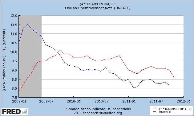
This suggests that it is likely we will see a new post-recession low in the unemployment rate tomorrow.
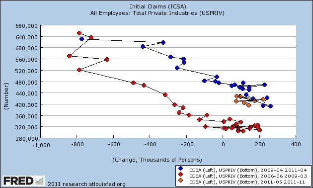
Similarly, if the trend comparison between initial jobless claims and payrolls holds, with the 4 week average now at about 372,000, we should see about a 200,000 gain (+/- 75,000) in private jobs tomorrow:
Even if both happen, it's still a long, slow, painful slog of a recovery. Cross your fingers ....
With the last month's decline in initial jobless claims, I thought it would be worthwhile to re-run a couple of graphs.
Here is the most recent graph comparing population-adjusted initial jobless claims with payrolls, from 2009 to the present. A change in the population adjusted initial jobless claims rate is mirrored in the unemployment rate, frequently with a 1 or 2 month delay (note this graph does not include the last 4 weeks' data of claims):

This suggests that it is likely we will see a new post-recession low in the unemployment rate tomorrow.
Similarly, if the trend comparison between initial jobless claims and payrolls holds, with the 4 week average now at about 372,000, we should see about a 200,000 gain (+/- 75,000) in private jobs tomorrow:

Even if both happen, it's still a long, slow, painful slog of a recovery. Cross your fingers ....
This is NOT What Socialism Looks Like
One of the thing that really infuriates me about our political dialog is how politicians throw words around which have absolutely no basis in fact. Over the last few years, I've heard the word "socialism" used like a comma. However, consider the following chart:
The above chart shows the percentage contribution of overall government spending to overall GDP growth since the first quarter of 2008. For 6 of the last 8 quarters, government spending has subtracted from overall growth. In the preceding months, we see that government spending did contribute to overall growth, but that effect has now worn off.
Let's look in more detail at the above data:
The above chart gives us more detail of government contributions to overall GDP growth. First, notice the blue line, which is defense spending. This number has been a powerful contributor to economic growth over the last three years; it has only contracted in four quarters. Secondly, notice federal non-defense spending -- the red line. Its contribution at the beginning of the chart was actually far weaker than defense spending. In other words, it was the war efforts that really added to overall growth. More importantly, in the 4Q09-2Q10 period we see non-defense spending at higher levels than defense spending -- a situation we also see in 1Q09 and 2Q10. Put another way, out of the last 15 quarters, federal non-defense spending has contributed more economic growth than defense spending in 5 quarters -- or 33% of the time. Finally, notice the green line, which shows the percentage contribution of state and local spending to GDP growth. This number has subtracted from growth 11 of the last 15 quarters -- or 73% of the time. For the quarters it did contribute, it did so at very low rates.
What to these two charts tell us?
1.) Defense spending is actually far more important to overall GDP growth over the last 15 quarters than federal non-defense spending.
2.) State and local governments fiscal issues are hurting overall economic growth.
3.) An economic policy that is contractionary, in fact, leads to slower growth.
Put another way: this ain't socialism.
Wednesday, January 4, 2012
Morning Market -- Still Not Happy With the Rally
Oil is right at important resistance. Notice the jump in volume over the last two days and the positive crsosover from the MACD.
On the weekly chart we see that there isn't must resistance between a break-out and the high from last spring, which means the economy could be facing more oil related problems.
Gold has rallied above resistance and hit the 200 day EMA. Also note the MACD has given a buy signal. However, the CMF is negative. On the fundamental side, the bulls will point to Europe as the primary driver upside. The big sell-off could have been overdone.
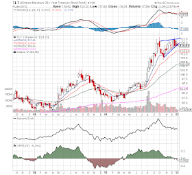
This is the big issue with the treasury market: prices are right near long-term support from a trend line started last spring. Over the last few months, we've seen both momentum and the volume related indicators decrease. However, on the fundamental side, the treasury market is still catching a safety bid. In order to be comfortable with the markets current rally, this trend line needs to be broken.
The long-end of the treasury curve is forming an upward sloping triangle consolidation pattern -- which has occurred at the end of a 6 month rally. Right now, prices are at important support levels; a convincing move through these levels would add more fuel to the equity market's rally.
The 60 minute chart really shows my concern with the latest rally. We see a nice gap higher on Tuesday -- and then nothing. Prices are in fact drifting lower -- hardly the sign of strength. Also notice that momentum has died as well. Prices have not collapsed -- but they are just staying there.
The IWMs shows the basic problem in a more pronounced manner. Prices actually gapped lower yesterday and then drifted higher. Again -- notice the lack of real, meaningful follow-through on the rally.
A Look at the Currency Markets
At the end of last year, the dollar enjoyed a rally, which eventually took the UUPs above their upside resistance established by a symmetrical triangle pattern. However, now the dollar has broken through both the upper trend line, the November rally trendline and the 10 and 20 day EMA. Yesterday we saw the dollar print a very strong volume bar as well.
The euro is in the process of an orderly devaluation caused by the EU crisis. After rallying last spring and consolidating gains over the summer, the euro has broken a long-term trend line and moved lower in a fairly disciplined way. Prices are now approaching a low established at the end of 2010/beginning of 2011. Should they move through that level, the next logical target is 125.
The yen is still in the middle of a multi-year rally. However, the Japanese central bank has shown a distinct propensity to intervene in the market to lower the yen's value. As such, the recent move higher will probably be short-lived.
The real winner here may be the Australian dollar which has broken out of a symmetrical consolidation pattern. Australia's economy was remarkably resilient during the recession. And while the Aussie sold-off last year, it didn't crash and in fact has consolidated near high levels. In addition, Australia has an attractive interest rate curve (even though it's currently partly inverted).
1950 Summation
This page is a link to all the articles from the Bonddad Economic History Project that deal with the year 1950.
1950 GDP
1950 GDP and Contributions to Growth
1950 Discount Rate and Inflation
1950 Employment and Income
1950 Industrial Production
1950 GDP
1950 GDP and Contributions to Growth
1950 Discount Rate and Inflation
1950 Employment and Income
1950 Industrial Production
Grading my 2011 outlook
- by New Deal democrat
In view of my post yesterday describing how close the data came to contraction in the second and third quarters of 2011, now is a good ttime to grade myself on two pieces I wrote last January forecasting the economy for 2011. A few things I got wrong, and at least one thing I got bone-chillingly correct.
My first piece was 2011: Self-sustaining recovery vs. political idiocy (and Oil). I said that 2011 would probably unfold in three phases. Relying on the continuing positivity of the LEI, I said:
But if I was wrong about the first quarter, read what I said about what would come next:
Finally, I said:
In the second part of my 2011 outlook, I said that there was a race between household deleveraging and wage deflation. I'll write more about that after Friday's employment report.
Feel free to weigh in with plaudits or brickbats.
In view of my post yesterday describing how close the data came to contraction in the second and third quarters of 2011, now is a good ttime to grade myself on two pieces I wrote last January forecasting the economy for 2011. A few things I got wrong, and at least one thing I got bone-chillingly correct.
My first piece was 2011: Self-sustaining recovery vs. political idiocy (and Oil). I said that 2011 would probably unfold in three phases. Relying on the continuing positivity of the LEI, I said:
1. The first quarter - good growth is likelyNope. While I can fairly plead the Japanese earthquake and tsunami as an unforeseeable shock, the economy was already beginning to fade in February, due most likely to the Oil choke collar already kicking in.
Given the backdrop of consumer spending fueled by the recent increase in the real personal savings rate, Q1 2011 looks like a good bet for above trend economic growth.
But if I was wrong about the first quarter, read what I said about what would come next:
2. The second and third quarters - beware political idiocy (and Oil)While deflation didn't appear, and the timing was a little off, I submit that there are few watchers of the economy who could match that forecast for bone-chilling accuracy.
While it is a near 100% certainty that Congress will not pass any economic stimulus packages, the real problem is whether they can simply leave the recovery alone. This crew gives every sign that they will not.
At some point in March or April, a debt ceiling increase will have to be passed. This Congress gives every indication of preparing for first class brinksmanship and idiocy on that score - meaning that either a government shutdown and/or default will actually occur, or dimwitted austerity measures will pass. So much for the second quarter.
A second episode of idiocy will occur in June when the last of fiscal aid to the states ends. I see zero chance for any extension, and thus renewed budget cuts and layoffs visited by the "50 little Hoovers." So much for the third quarter.
Against this is the backdrop of $90 Oil, which we once again saw in December. I should point out that the inflection point - Oil at 4% of GDP - given general inflation and GDP growth, is probably now more like $94 a barrel. But continuing expansion in Q1 should push us there. As with 2010, the effect of the price of Oil depends on how far and for how long it overshoots that mark. At this point I do not anticipate much of an overshoot, but combined with Congressional idiocy, this should be enough to restart fears of a double-dip in the April-July window, as a brief deflationary spurt again appears as Oil kills some demand are retreats in price.
All in all, there is an excellent chance for deceleration, although probably not outright decline, in the second quarter and over the summer.
Finally, I said:
3. The fourth quarter - the yield curve reasserts itselfCongressional idiocy did stop for the while, and the decrease in the price of gasoline did boost demand as the final quarter showed renewed growth (although the deflation I foresaw did not start until the October CPI and is ongoing)..
Congressional idiocy probably will not recur after midyear until the end of 2011. The decleration discussed above should cause Oil once again to back off. Under these circumstances, with deflation off the table or over with, the yield curve, which has been relentlessly and increasingly positive ... will likely reassert itself. As I do not see the Fed becoming senile and decreasing real money supply, this should signal re-accelerating growth from about Labor Day until year's end.
In the second part of my 2011 outlook, I said that there was a race between household deleveraging and wage deflation. I'll write more about that after Friday's employment report.
Feel free to weigh in with plaudits or brickbats.
Morning Market
The good news for the bulls is yesterday's price action saw three major averages push higher through upside resistance. In addition, we see nice volume advances on both the QQQs and IWMs, indicating an increased excitement on the part of investors. The bad news is we are seeing very weak candles on both the QQQs and the SPYs, as typified by the following chart of the QQQs:
Essentially, prices gapped higher at the open and then stayed at that level for the remainder of the trading session.
Additionally, we saw over, more economically aggressive sectors rally yesterday as well:
The energy, finance, industrial and technology ETFs all broke out yesterday as well. However, they all have the same problem as the major averages: very weak candles, especially considering the strong volume price below.
The short version is while yesterday's rally was impressive as a headline, the underlying fundamentals are not impressive -- at least not yet. For this rally to be real -- at least for me -- I need to see stronger intra-day movement, especially when the volume print is so heavy.
Tuesday, January 3, 2012
Bonddad Linkfest
- South Korean manufacturing at three year low
- EU manufacturing shrinks again
- Chinese manufacturing slowing
- World's biggest economies must refinance $7.6 billion in debt this year
- German unemployment drops again
- Dollar gains 13% in 2011; retains safe haven status
- India and China see manufacturing gains
- Bullish bets on commodities increase
- US consumer spending faces strong headwinds this year
- Singapore contracts in 4Q
How close did we come to recession in 2011?
- by New Deal democrat
Pending further revisions, the answer is "pretty darn close." I'm not using the shorthand description of "2 quarters of negative GDP", but rather the official NBER definition of a significant downturn in production, sales, income, and jobs.
As readers know, I've been proverbially scratching my head and trying to figure out ECRI's September 23 call (to subscribers) that a recession had either already begun or would begin by the end of the 4th quarter of 2011. Recently they've walked back that call and said a recession would start by the end of the the first half of 2012, but in September they were very clear that it would start by year end 2011. Also it would improper to call it a "forecast" of recession -- saying a recession may have already begun isn't a forecast, it's a report of an ongoing event, which begs the question, why hadn't they been forecasting a recession already?
In any event, their spokesman made very clear that he was using the NBER descripton of recession, which caused me to take a look at exactly what those 4 criteria were showing as of September 23 (which means, as of the August monthly data), and where we stand now.
Here's a graph of the 4 data series generally used by the NBER to determine if the economy is in a recession or expansion, through August:
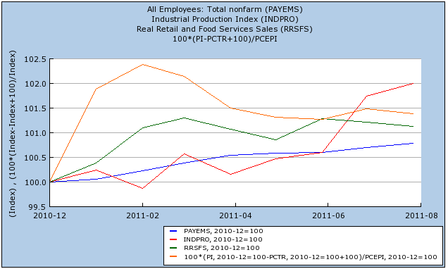
When the last data was released in September, it showed that real income (orange) had peaked in February, and had generally declined since. Real retail sales (green) had been flat since March. Industrial production (red) had been flat through June, increased in July, and declined slightly in August. Only nonfarm payrolls (blue) look consistently positive in this graph -- and that's only because of the subsequent revisions. In September, after May payrolls of +53,000, June had been revised down to +20,000, and July to +85,000 -- and it had just been reported that exactly zero jobs had been created in August.
Lots of other coincident data, like consumer confidence, rail traffic, and several regional Federal Reserve reports -- most notably one of the most horrific Philly Fed contractions on record -- had just been reported. No wonder ECRI was in a rush to get ahead of the apparent cliff-dive.
Three months later, the data doesn't look so bad:
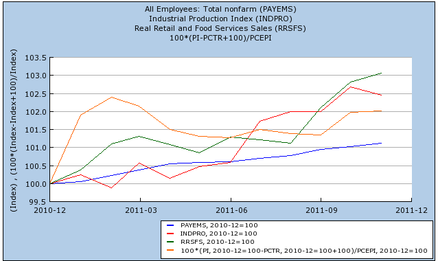
Generally speaking, all of the series had good months, especially in October. Only industrial production declined in November -- although real income is hanging on to positivity by a thread, and could easily be revised away. Of course, we also still have to wait for the December data, and the inevitable revisions -- so ECRI's original "forecast" isn't wrong yet.
Bonddad here:
When you look at last year's US data, you see, more or less, the following picture: a decent spring followed by roughly 6-8 months of stagnation in most indicators, followed by 4Q increases in a large number of metrics. The stagnation started with Japan's earthquake in the Spring that disrupted world supply lines and was followed by the US debt debacle at the end of the summer. Those two events provided a potent 1-2 punch to confidence in the economy and the US' ability to actually deal with its issues in a productive manner. The point is the economy withstood some fairly large external shocks which were spaced out enough to really hit the economy at bad points. Japan hit right as oil was increasing in price and gas at the pump was acting as a choke hold on the economy. After we started to get up from Japan we get hit with Congress behaving like children which knocked us down for another three months. It's only been over the last few months that we've seen an increase in consumer confidence -- and that is still an increase from very low levels.
Starting in roughly mid-December, I started to grow more bullish on the US economy, largely based on the breadth of positive indicators we were seeing. However, we've really only seen, at best, a month and a half of good data, so the jury ultimately is still out.
Pending further revisions, the answer is "pretty darn close." I'm not using the shorthand description of "2 quarters of negative GDP", but rather the official NBER definition of a significant downturn in production, sales, income, and jobs.
As readers know, I've been proverbially scratching my head and trying to figure out ECRI's September 23 call (to subscribers) that a recession had either already begun or would begin by the end of the 4th quarter of 2011. Recently they've walked back that call and said a recession would start by the end of the the first half of 2012, but in September they were very clear that it would start by year end 2011. Also it would improper to call it a "forecast" of recession -- saying a recession may have already begun isn't a forecast, it's a report of an ongoing event, which begs the question, why hadn't they been forecasting a recession already?
In any event, their spokesman made very clear that he was using the NBER descripton of recession, which caused me to take a look at exactly what those 4 criteria were showing as of September 23 (which means, as of the August monthly data), and where we stand now.
Here's a graph of the 4 data series generally used by the NBER to determine if the economy is in a recession or expansion, through August:

When the last data was released in September, it showed that real income (orange) had peaked in February, and had generally declined since. Real retail sales (green) had been flat since March. Industrial production (red) had been flat through June, increased in July, and declined slightly in August. Only nonfarm payrolls (blue) look consistently positive in this graph -- and that's only because of the subsequent revisions. In September, after May payrolls of +53,000, June had been revised down to +20,000, and July to +85,000 -- and it had just been reported that exactly zero jobs had been created in August.
Lots of other coincident data, like consumer confidence, rail traffic, and several regional Federal Reserve reports -- most notably one of the most horrific Philly Fed contractions on record -- had just been reported. No wonder ECRI was in a rush to get ahead of the apparent cliff-dive.
Three months later, the data doesn't look so bad:

Generally speaking, all of the series had good months, especially in October. Only industrial production declined in November -- although real income is hanging on to positivity by a thread, and could easily be revised away. Of course, we also still have to wait for the December data, and the inevitable revisions -- so ECRI's original "forecast" isn't wrong yet.
Bonddad here:
When you look at last year's US data, you see, more or less, the following picture: a decent spring followed by roughly 6-8 months of stagnation in most indicators, followed by 4Q increases in a large number of metrics. The stagnation started with Japan's earthquake in the Spring that disrupted world supply lines and was followed by the US debt debacle at the end of the summer. Those two events provided a potent 1-2 punch to confidence in the economy and the US' ability to actually deal with its issues in a productive manner. The point is the economy withstood some fairly large external shocks which were spaced out enough to really hit the economy at bad points. Japan hit right as oil was increasing in price and gas at the pump was acting as a choke hold on the economy. After we started to get up from Japan we get hit with Congress behaving like children which knocked us down for another three months. It's only been over the last few months that we've seen an increase in consumer confidence -- and that is still an increase from very low levels.
Starting in roughly mid-December, I started to grow more bullish on the US economy, largely based on the breadth of positive indicators we were seeing. However, we've really only seen, at best, a month and a half of good data, so the jury ultimately is still out.


