- by New Deal democrat
If you scroll down the right hand side of this page, you'll notice a major change. Gone are the lists of economics and stock trading blogs, and instead there is a whole new widget called "my favorite blogs."
The change was inspired by Frank Chow, whose blog features an awesome list of progressive blogs that update throughout the day as new content is added. My goal is to accomplish the same thing here with economics and investment blogs. The list includes not just progressive favorites but also a few from other points on the spectrum, nerdy numbers-crunchers, and investment commentary. I've added some names that weren't on the blogroll, and cleaned out the dead wood. I'm sure I've missed more than a few, and I'll add on to the list as time goes on.
Feel free to suggest other names to add on to the list if you don't see a valuable resource, and of course check back in here during the day to see constantly updated content.
Saturday, August 20, 2011
Weekly indicators: at the crossroads edition
- by New Deal democrat
Monthly data showed NY area manufacturing in decline, and Mid-Atlantic manufacturing fell off a cliff to one of its worst readings ever. Despite that, industrial production was up in July. Inflation was hot at +0.5%. Home sales declined, but remained generally flat in the larger picture. Leading Indicators for July were up +.9, largely on the back of a surge in money supply thought partly to be a flight to safety from European to American banks.
The high frequency weekly indicators reflected that emotional volatility and appear to be at a crossroads where any further deterioration will signal outright contraction - but are within their range from the last month.
This week let's begin by looking at those items which had the biggest moves. The first three smell of panic:
Money supply -a leading indicator - continued to surge. M1 was flat for the week, but increased 5.5% m/m, and 20.8% YoY, so Real M1 was up 17.2%. M2 increased 0.4% w/w, and also increased 2.6% m/m, and 9.9% YoY, so Real M2 was up 6.3%. The YoY increase in M1 in the last two weeks is the highest in history.
Weekly BAA commercial bond rates decreased .07% to 5.31%. Yields on 10 year treasury bonds much further, however, down .35% to 2.27%. This indicates almost a huge increase in fear of deflation, and also a significant increase in the relative distress in the corporate market, indicating increased relative fear of rising corporate defaults.
The Mortgage Bankers' Association reported that seasonally adjusted mortgage applications decreased a whopping -10.1% last week. For only the 2nd time in the last 12 weeks, the YoY comparison in purchase mortgages was negtive, down -1.1% YoY. Refinancing increased another 8.0% w/w due to cliff-diving interest rates, but was still -16.3% below last year.
Other series also tipped back into contraction this week:
The American Staffing Association Index declined from 88 to 87. This series' trend is now worse than 2007, and has completedly stalled, just as it did in mid 2008.
The Oil choke collar loosened slightly more. Oil finished at $82.70 a barrel on Friday. This is the lowest price in a year, and is over $10 below its recession-trigger level. Gas at the pump fell $.07 to $3.60 a gallon. Gasoline usage was -2.8% lower than a year ago, at 9195 M gallons vs. 9459 M a year ago.
The American Association of Railroads reported that total carloads decreased -0.1% YoY, down 600 carloads YoY to 527,900 for the week ending August 13. Intermodal traffic (a proxy for imports and exports) was up 1900 carloads, or 0.8% YoY. The remaining baseline plus cyclical traffic was down 3400 carloads, or -1.6% YoY%. Rail traffic has been negative YoY for 3 of the last 6 weeks. Using the breakdown of cyclical vs. baseline traffic that was graciously provided to me by Railfax, baseline traffic was down 3400 carloads, or -1.2%YoY (all of which and then some can be laid to coal shipments, down 5600 carloads YoY), while cyclical traffic was up 4200 carloads, or +3.9% YoY.
Employment related data has been improving considerably in the last month, and several other series remained sanguine:
Initial jobless claims have clearly reversed their April - June upturn and are solidly trending back downward. The BLS reported Initial jobless claims of 408,000. The four week average decreased to 402,500. Jobless claims remain decisively below their recent range, and with the exception of 7 weeks in February - April of this year, are lower than they have been in 3 years.
Adjusting +1.07% due to the 2011 tax compromise, the Daily Treasury Statement showed that for the first 14 days of August 2011, $93.7 B was collected vs. $92.5.7 B a year ago, for an increase of $1.2 B. For the last 20 days, $142.6 B was collected vs. $125.9 B a year ago, for an increase of $16.7 B, or 13.3%. With the exception of last week, withholding tax collections have rebounded strongly for the last 5 weeks.
Retail same store sales continue to perform well. The ICSC reported that same store sales for the week of July 30 increased 3.5% YoY, and decreased -0.5% week over week. Shoppertrak reported a 3.6% YoY increase for the week ending July 30 and a WoW increase of 2.5%. This is the sixth week in a row of a strong rebound for the ICSC, joined for the third week by Shoppertrak.
Finally, continuing a real positive trend boding well for the longer term future, YoY weekly median asking house prices from 54 metropolitan areas at Housing Tracker showed that asking prices once again declined only -2.9% YoY. For the second week in a row, this is the smallest YoY decline since May 2007. The areas with double-digit YoY% declines remained at 6. The areas with YoY% increases in price increased by one more to 12. A few months ago only 3 or 4 areas had actual increases, and well over 10 had decreases. At the beginning of this year, only one metro area was showing YoY increases.
The question we face is whether the rapid contraction -- shown in the Philly Fed, in consumer confidence, in purchase mortgage applications, in treasury bond yields, and mirrored in surging money deposits -- that may have been a visceral pavlovian freeze in reaction to the debt debacle and fears about Europe, become self-reinforcing or not.
Have a nice weekend!
Friday, August 19, 2011
Bond Market to Congress: PLEASE, TAKE SOME MONEY
Right now, the 10 year is trading a little over 2%.
In other words, the bond market is not worried about a default in any way, shape or form.
Put another way, the bond market is saying, HERE'S SOME MONEY. NO REALLY -- HERE'S SOME MONEY. WE REALLY DON'T WANT TO CHARGE YOU THAT MUCH TO TAKE IT -- JUST TAKE IT. IN FACT, WE'RE LITERALLY GIVING IT AWAY.
For God's sake -- the yield is negative when you take inflation into account.
It's not like we couldn't do something constructive with it.
Where Are the Positive Economic Projections From the Debt Deal?
Since the debt deal, we've seen many economic houses and analysts lower their projections for overall US growth, but no major upward revisions -- at least, none that I've seen.
Has anyone seen a credible, non-think tank, upward revision to a GDP projection since the debt deal was passed, where the passage of the debt deal was the catalyst for the upward revision? Anyone? Do these revisions include their assumptions, or are they just spouting off (writing an opinion without basing it on any economic assumptions)? No assumptions = non credibility.
Please post sightings in the comments.
The Philly Fed fiasco and the debt debacle
- by New Deal democrat
Jimdotz commented yesterday wondering if the plunge in the Philly fed could be a reaction to the debt debacle, just as consumer confidence probably was (and just as the purchase mortgage cliff-dive reported yesterday probably was). While there is no smoking gun, I think he has a good point.
Back in September 2008 Bill McBride a/k/a Calculated Risk said that one of the effects of the panic emanating from Washington was that ordinary people probably got the message that: "Wow, this is bad. Let's make sure our money is safe, and watch our expenditures." With the Philly fed fiasco, I wonder if we haven't just had a similar moment.
This was one of the twenty worst readings of the Philly Fed index in the last 40 years, putting it among the 5% worst readings ever. In other words, a full bore, mid-recession reading. Beyond that, it was the second steepest drop in one month in the history of the index. Only early 2000 when the dotcom bubble burst had a worse plunge.
Below I've put together a list of every month that the Philly Fed was below -30 in the last 40 years, together with the reading the month before. -30 readings don't come out of nowhere. They typically follow a number of months of worsening negative numbers. This one simply fell off a cliff.
Here's the data:
--------
Oct-74 -26.1
Nov-74 -32.3
Dec-74 -57.9
Jan-75 -45.3
-----
Mar-80 -19.3
Apr-80 -37
May-80 -53
Jun-80 -54.4
Jul-80 -57.2
Aug-80 -39
--------
Nov-81 -26.2
Dec-81 -34.6
-------
Aug-90 -18.2
Sep-90 -43.5
Oct-90 -48.2
Nov-90 -27.2
Dec-90 -37.1
Jan-91 -31.9
-------
Dec-00 -8
Jan-01 -36.1
-------
Aug-08 -22.8
Sep-08 -1.4
Oct-08 -38.9
Nov-08 -41.2
Dec-08 -36.1
Jan-09 -28.4
Feb-09 -33.9
Mar-09 -30.8
------
Jun-11 -7.7
Jul-11 3.2
Aug-11 -30.7
I see a real danger here that the seize-up in activity could be self-reinforcing. It strains credulity to believe that a cutback of this scope was due to fears about European bankers. Rather, it seems far more likely that suppliers, like consumers, had a visceral reaction to the utterly reckless brinksmanship about paying the nation's bills on display in Washington. If so, we are paying a very heavy price for that economic lunacy.
Bonddad here:
A little over a week ago, I wrote and article titled If a Recession Comes, Blame Washington, where I wrote:
Since the debt deal was signed, we've had a massive stock market sell-off. Also note that we've also seen major investment houses cut GDP growth forecasts (and we have yet to see a credible positive projection from this deal). And as NDD points out, we've also seen a massive drop in consumer confidence. Now we have the Philly Fed printing a terrible number. Personally, I agree with NDD's thesis that the utter stupidity of Washington during the debt debacle showed the world that the US is willing to not pay its bills and place the entire US economy in play as a political football. This is why S&P downgraded the US outlook (which I agreed with and which, I believe, is turning out to be a correct assessment).
We are governed by fools.
Also, consider the following from the WSJ:
Jimdotz commented yesterday wondering if the plunge in the Philly fed could be a reaction to the debt debacle, just as consumer confidence probably was (and just as the purchase mortgage cliff-dive reported yesterday probably was). While there is no smoking gun, I think he has a good point.
Back in September 2008 Bill McBride a/k/a Calculated Risk said that one of the effects of the panic emanating from Washington was that ordinary people probably got the message that: "Wow, this is bad. Let's make sure our money is safe, and watch our expenditures." With the Philly fed fiasco, I wonder if we haven't just had a similar moment.
This was one of the twenty worst readings of the Philly Fed index in the last 40 years, putting it among the 5% worst readings ever. In other words, a full bore, mid-recession reading. Beyond that, it was the second steepest drop in one month in the history of the index. Only early 2000 when the dotcom bubble burst had a worse plunge.
Below I've put together a list of every month that the Philly Fed was below -30 in the last 40 years, together with the reading the month before. -30 readings don't come out of nowhere. They typically follow a number of months of worsening negative numbers. This one simply fell off a cliff.
Here's the data:
--------
Oct-74 -26.1
Nov-74 -32.3
Dec-74 -57.9
Jan-75 -45.3
-----
Mar-80 -19.3
Apr-80 -37
May-80 -53
Jun-80 -54.4
Jul-80 -57.2
Aug-80 -39
--------
Nov-81 -26.2
Dec-81 -34.6
-------
Aug-90 -18.2
Sep-90 -43.5
Oct-90 -48.2
Nov-90 -27.2
Dec-90 -37.1
Jan-91 -31.9
-------
Dec-00 -8
Jan-01 -36.1
-------
Aug-08 -22.8
Sep-08 -1.4
Oct-08 -38.9
Nov-08 -41.2
Dec-08 -36.1
Jan-09 -28.4
Feb-09 -33.9
Mar-09 -30.8
------
Jun-11 -7.7
Jul-11 3.2
Aug-11 -30.7
I see a real danger here that the seize-up in activity could be self-reinforcing. It strains credulity to believe that a cutback of this scope was due to fears about European bankers. Rather, it seems far more likely that suppliers, like consumers, had a visceral reaction to the utterly reckless brinksmanship about paying the nation's bills on display in Washington. If so, we are paying a very heavy price for that economic lunacy.
Bonddad here:
A little over a week ago, I wrote and article titled If a Recession Comes, Blame Washington, where I wrote:
The problem with the debt deal is it took government action off the table at a time when governmental action is needed. Instead of borrowing at insanely low rates, investing massively in a degrading US physical and intellectual infrastructure, Congress is taking action off the table. Remember that governmental spending is a component in the GDP equation -- a fact lost in Washington policy debates, as is the different between consumption and investment. In short, Washington is focused on exactly the wrong thing at exactly the wrong time and as such should bear the brunt of any economic slowdown we face.
Since the debt deal was signed, we've had a massive stock market sell-off. Also note that we've also seen major investment houses cut GDP growth forecasts (and we have yet to see a credible positive projection from this deal). And as NDD points out, we've also seen a massive drop in consumer confidence. Now we have the Philly Fed printing a terrible number. Personally, I agree with NDD's thesis that the utter stupidity of Washington during the debt debacle showed the world that the US is willing to not pay its bills and place the entire US economy in play as a political football. This is why S&P downgraded the US outlook (which I agreed with and which, I believe, is turning out to be a correct assessment).
We are governed by fools.
Also, consider the following from the WSJ:
"Buyer confidence may be an all-time low," said Anthony Sanders, a real estate finance professor at George Mason University. "The economy is scaring the living daylights out of most potential homebuyers."Contributing to the gloomy outlook for the economy is a pullback in federal, state and local government spending. Standard & Poor's, the rating firm, said Thursday that the deficit-reduction deal it previously pronounced as inadequate "could undermine the already fragile economic recovery."
Key Market Levels To Watch For Today
It looks like we're in for more wild swings. Remember, this is Friday, and given that the market has been a roller coaster over the last few weeks, it's doubtful that traders will want to keep their positions over the weekend. This will only add to volatility, especially in the last half hour or so of trading. Keep your eyes on the following levels:
SPY: 112
QQQ: 50 - 50.5
IWM: 64-65
A strong move and a close through any of these levels will be a technical problem for the markets.
Also pay attention to volume.
SPY: 112
QQQ: 50 - 50.5
IWM: 64-65
A strong move and a close through any of these levels will be a technical problem for the markets.
Also pay attention to volume.
Thursday, August 18, 2011
Friday Dollar Analysis
Last week, I wrote the following about the dollar:

We have a continuation of the overall trading pattern of the last four months, with prices moving between 20.9 and 21.6/21.7. Prices are below the 200 day EMA, indicating we're in a bear market, and all the shorter EMAs are moving lower with the shorter below the longer.

The line chart shows the action in more detail. The strength of support at the 20.9/21 area is impressive.

Above is a chart comparing the Australian dollar, euro, yes and dollar over the last two years. While the euro and dollar have become mirror images of each other, the yen and AD are rallying. The AD has a bid because Australia has a strong resource economy. Japan is catching a bid as a safer environment than the US and euro.
Until the dollar moves convincingly below the 20.9 area, we're still in a trading range.
What's interesting about the last two weeks events is they should have sent the dollar tumbling. A weak GDP report indicates there is little reason to park dollars in the US; the Fed decision indicates there is no interest rate incentive to buy dollars. And the S&P downgrade correctly pointed out that the US political system is a wreck more interested in partisanship than solving problems. Yet, the dollar didn't crash, instead continuing to form a solid base. The dollar is -- at least, so far -- the least ugly of several options. However, keep a strong eye on the 20.9 area; a move through that would be a problem.Here is a chart of current prices:

We have a continuation of the overall trading pattern of the last four months, with prices moving between 20.9 and 21.6/21.7. Prices are below the 200 day EMA, indicating we're in a bear market, and all the shorter EMAs are moving lower with the shorter below the longer.

The line chart shows the action in more detail. The strength of support at the 20.9/21 area is impressive.

Above is a chart comparing the Australian dollar, euro, yes and dollar over the last two years. While the euro and dollar have become mirror images of each other, the yen and AD are rallying. The AD has a bid because Australia has a strong resource economy. Japan is catching a bid as a safer environment than the US and euro.
Until the dollar moves convincingly below the 20.9 area, we're still in a trading range.
The fundamental problem with "fundamental analysis" of the economy
- by New Deal democrat
There is a diary currently up on the rec list at the G.O.S. where a commenter refers to my post yesterday pointing out that most of the economic data is actually still improving (BTW, LEI came out today at +.9), to which the author responded that "Bonddad did a good job going into the recession but his tendency to see the world as a bond trader gives him a blind spot," and another (quoting my conclusion) chimed in that Bonddad has "too much faith in charts and graphs."
As an initial matter, does NOONE read the goddam byline? I put it up there in italics for a reason - to emphasize that it is not Bonddad's post. But beyond that, riddle me this: when Bonddad was "doing such a good job going into the recession," and posting diaries chock full of graphs, among the 10,000s of comments to those diaries, WHEN DID EVEN ONE SINGLE PERSON COMPLAIN ABOUT THE USE OF GRAPHS? Feel free to educate me in the comments, but I was there. I participated in those threads. I can't recall even a single complaint lodged against Bonddad when the graphs he used pointed downward.
Nope. The complaints only came when those very same graphs started to point upward. Suddenly they became nothing more than "pretty pictures" which failed to take account of "fundamental analysis."
So, today is a good time to post a lengthy piece I drafted months ago, showing the pitfalls of "fundamental analysis" as practiced by a prominent former diarist at DK. I didn't publish it then becuase I didn't want it taken as a personal slam against that diarist, who was downsized out of an IT job, spent 99 weeks on unemployment, and is currently doing good deeds in the Peace Corps in the Dominican Republic. So, please do not interpret it so, I wish that diarist well. Nevertheless, read on for a demonstration of the problem of "fundamental analysis."
[Note: this part onward drafted in May 2011] Whether at political, economic, financial, or investing sources you will read reams of commentary about the economy, most of it extrapolating into the future, and almost everything you read in one seemingly intelligent article will be contradicted by the next just as seemingly intelligent article. Typically the author has an underlying ideology or Big Picture thesis, and presents opinion, authority, and/or data scoured from a variety of sources in support of that thesis.
And yet we know that following typical economic commentary gives you no more than a coin-flip's chance of being correct. Why not? There are some excellent reasons, including confirmation bias, where a writer or reader highlights only those facts supporting an already-held opinion and discounts or dismisses contrary facts. Furthermore, studies have shown that most commentators simply project existing trends into the future, and thereby miss turning points.
The following article, What will an economic recovery build upon?, appeared at the Huffington Post and several other sites on August 27, 2009. This is an article I have re-read probably a dozen times since it was published, better to understand what the author missed. I should note that as of last report the author was serving in the Peace Corps in the Dominican Republic. I applaud his endeavor and wish him well now and in the future.
I am republishing the article in full. All of the graphs are shown exactly as presented by that author (in blue), but updated through May 2011 (in red). As you read it, contemplate how compelling and persuasive case it appeared to make that a recovery simply could not have been starting based on the data it showed at the time. Based on this, the author stated at the time that the government stimulus would produce at most only two quarters of positive GDP.
Afterward, I'll comment on why you should treat even the most erudite, compelling "fundamental analysis" of the economy with bucketfuls of salt.
Now, without further adieu, here is the article:
================================================
There's been a lot of talk recently about the economy. Has it bottomed? Are we recovering? Will we see a "V" shaped bounce? Or a "U"? Or a "W"?
Since most of the economic numbers are still negative, it seems a little premature to talk about a recovery. Nevertheless, since the cheerleaders of the economy have brought it up, let's examine exactly what is going to lead this economy out of our deep recession.
In order to do that we must look at a topic that the Green Shoots crowd doesn't mention much -- the fundamentals of the economy.
I'm going to make this as simple and uncontroversial as possible.
Since consumer spending is more than 70% of the American economy, let's start there.
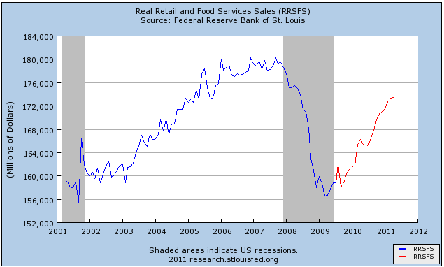
This chart shows us clearly why the economy has contracted so much. It also shows a clear bottom in consumer spending. The question is whether than bottom is temporary or permanent?
To answer that we must look at the fiscal health of the consumer. There are two measurements of that - money coming in and money going out.
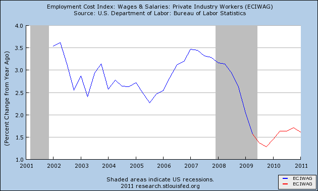
As you can see, workers have virtually stopped getting raises, and that assumes that people are still working.
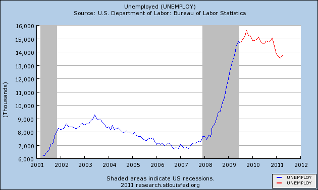
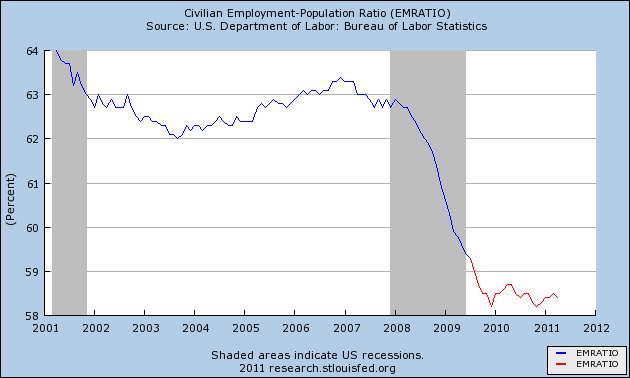
Obviously the American worker's income is under incredible pressure, and this is translating to less buying. The tiny downward correction on the number of unemployed in the chart above is due to nearly half a million workers no longer being counted as unemployed despite not getting new jobs.
There is another element to the American consumer's balance sheet, and that is savings and debt.
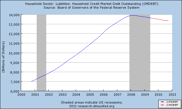
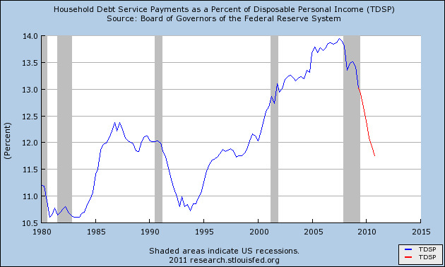
While there has been a modest improvement in the debt servicing levels of the American consumer, there has been very little improvement for overall debt levels. This is a reflection of lower interest rates, not to debt actually being paid down.
The debt charts are beginning to move the right way, but they are nowhere near close to what can be considered "healthy".
The San Francisco Federal Reserve put it this way:
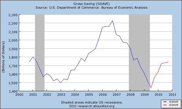
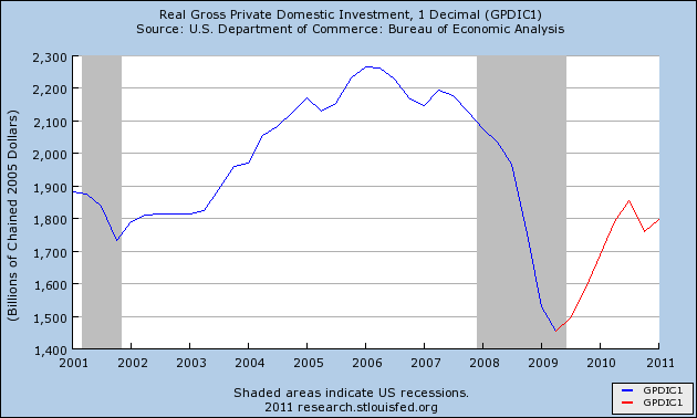
These two charts are the most damning of all. Without saving and investing there can be no sustained economic recovery. Period. This is an absolute disaster.
Not only do these charts show no bottom, they are moving in the wrong direction at a worsening rate. Until these charts reverse the fundamentals of the economy will get worse.
[NDD note: my emphasis]
The IMF summed up the situation this way:
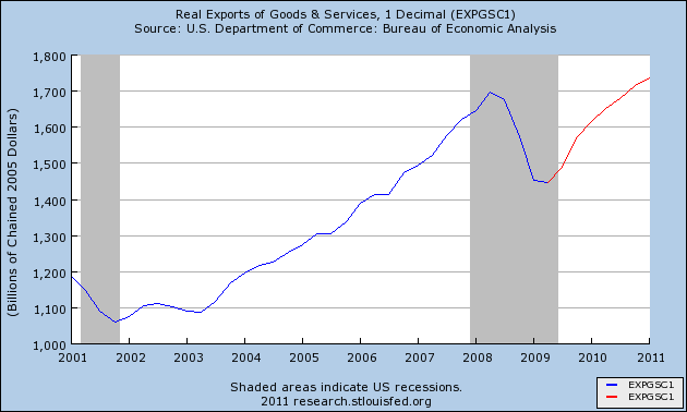
There are signs that the rest of the world is starting to recover, but to benefit from that America will have to produce products that the rest of the world wants to buy. So far there has been no significant signs that this is happening.
Of course there is one more element of the economy that I haven't covered here, and it is booming!
Lately there has been some improved housing numbers, but there are several caveats to them. For starters, the marginal improvement in comparisons are to the disastrous selling season of mid-2008.
Secondly, 43% of all home sales last quarter were first-time home buyers. Normally that would be a good thing, but this time it is a reflection of the government's $8,000 tax credit that people are rushing to take advantage of. Some people are even using it as a down payment.
In case people have already forgotten, borrowers that require extraordinary help getting into a house are much more likely to default on their mortgages. It looks like an attempt at reinflating the housing bubble.
Finally, those small signs of price increases are due entirely to more expensive homes being forced onto the market.
The other positive economic number we've seen recently is in auto sales. This is due to the recently ended cash-for-clunkers program.
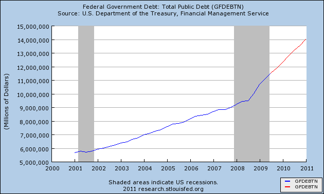
So the spiraling government debt and the two most positive economic numbers are directly linked. With that in mind you have to ask yourself, what will the economic recovery build upon?
=============
The logic of the article seemed compelling, didn't it? And yet it turned out to be dead wrong. Let me make three points:
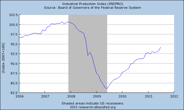
1. Hindsight is 20/20. Foresight beyond a few months is almost impossible. Looking back two years later, we know that more than anything else, manufacturing led the economy out of the bottom of the recession. [Update 8/19/11: and it is precisely because, in retrospect, we know that the recovery built on a boom in manufacturing and exports especially to Asia, that the downturn in manufacturing surveys is now so distressing]. Industrial production:
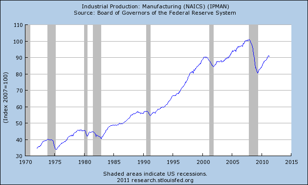
and the ISM manufacturing index have shown the steepest increases in several decades.
We also know that, because of ample personal savings built up during the recession
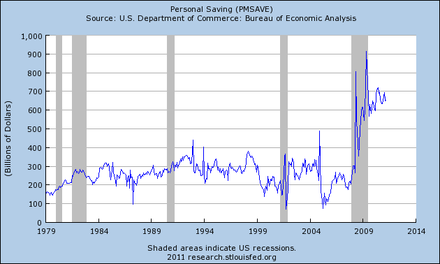
once conditions began to thaw, consumer spending did increase strongly as shown in the updated real retail sales graph at the beginning of the article above. And auto manufacturing increased by 4 million a year
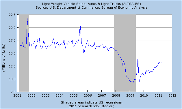
and durable goods purchases also increased strongly.
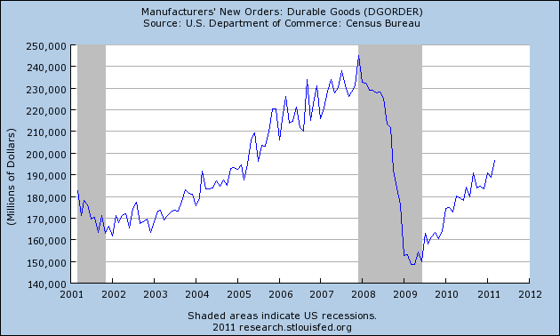
Just as in 1992 people could not foresee the impact that the internet would have, and how that would power a decade-long tech boom, and just as in 2001 people didn't know just how out of control the housing bubble, associated debt financing, and Wall Street leverage would become, so at the bottom of the great recession it was impossible to know that manufacturing would grow as strongly as it has, or that consumer debt refinancing would take place as quickly and strongly as it has.
2. Use of the present progressive tense is usually a sign of faulty analysis.
In the crucial highlighted paragraph, the author says that gross savings and investment "are moving in the wrong direction at a worsening rate," thereby assuming that the trend would continue. Of course it did not. It is almost always more proper to say a data series "has been moving" in direction X. Because, in fact, that is all you know. As I said at the outset, most economic observers just project past trends - usually based on data that is coincident or lags the general economy - into the future, and so they miss important turning points. In short, they get it wrong. As I pointed out at the time, one could have used the identical data series chosen by that author in 1982 or 1991 and they would have told the same pessimistic story - and have been just as wrong. Indeed, just as it was wrong two years ago to simply project the fearful declines into the future, so it would be equally wrong to simply project the upward trajectories of data recently into the future now.
3. While the past is never a perfect predictor of the future, what pundits miss is, economic cycles generally run in a typical order including both expansions and recessions, as demonstrated by Prof. Edward Leamer:
No method is perfect, but if in the past eight economic cycles, A has led to B has led to C, then the odds are very good that in this cycle, if A has occured, B is going to occur and then C.
Studies of why pundits fail so often have been done, and time after time they have shown that most people simply project current trends forward. They fail to see the turning points and so are usually caught off-stride when the turn happens.
That is why I do not rely on intellectualized "fundamental analysis" as touted by the author of the very erudite article above. It is much better to dispassionately rely on data and take your personal biases out of analysis as much as possible.
There is a diary currently up on the rec list at the G.O.S. where a commenter refers to my post yesterday pointing out that most of the economic data is actually still improving (BTW, LEI came out today at +.9), to which the author responded that "Bonddad did a good job going into the recession but his tendency to see the world as a bond trader gives him a blind spot," and another (quoting my conclusion) chimed in that Bonddad has "too much faith in charts and graphs."
As an initial matter, does NOONE read the goddam byline? I put it up there in italics for a reason - to emphasize that it is not Bonddad's post. But beyond that, riddle me this: when Bonddad was "doing such a good job going into the recession," and posting diaries chock full of graphs, among the 10,000s of comments to those diaries, WHEN DID EVEN ONE SINGLE PERSON COMPLAIN ABOUT THE USE OF GRAPHS? Feel free to educate me in the comments, but I was there. I participated in those threads. I can't recall even a single complaint lodged against Bonddad when the graphs he used pointed downward.
Nope. The complaints only came when those very same graphs started to point upward. Suddenly they became nothing more than "pretty pictures" which failed to take account of "fundamental analysis."
So, today is a good time to post a lengthy piece I drafted months ago, showing the pitfalls of "fundamental analysis" as practiced by a prominent former diarist at DK. I didn't publish it then becuase I didn't want it taken as a personal slam against that diarist, who was downsized out of an IT job, spent 99 weeks on unemployment, and is currently doing good deeds in the Peace Corps in the Dominican Republic. So, please do not interpret it so, I wish that diarist well. Nevertheless, read on for a demonstration of the problem of "fundamental analysis."
[Note: this part onward drafted in May 2011] Whether at political, economic, financial, or investing sources you will read reams of commentary about the economy, most of it extrapolating into the future, and almost everything you read in one seemingly intelligent article will be contradicted by the next just as seemingly intelligent article. Typically the author has an underlying ideology or Big Picture thesis, and presents opinion, authority, and/or data scoured from a variety of sources in support of that thesis.
And yet we know that following typical economic commentary gives you no more than a coin-flip's chance of being correct. Why not? There are some excellent reasons, including confirmation bias, where a writer or reader highlights only those facts supporting an already-held opinion and discounts or dismisses contrary facts. Furthermore, studies have shown that most commentators simply project existing trends into the future, and thereby miss turning points.
The following article, What will an economic recovery build upon?, appeared at the Huffington Post and several other sites on August 27, 2009. This is an article I have re-read probably a dozen times since it was published, better to understand what the author missed. I should note that as of last report the author was serving in the Peace Corps in the Dominican Republic. I applaud his endeavor and wish him well now and in the future.
I am republishing the article in full. All of the graphs are shown exactly as presented by that author (in blue), but updated through May 2011 (in red). As you read it, contemplate how compelling and persuasive case it appeared to make that a recovery simply could not have been starting based on the data it showed at the time. Based on this, the author stated at the time that the government stimulus would produce at most only two quarters of positive GDP.
Afterward, I'll comment on why you should treat even the most erudite, compelling "fundamental analysis" of the economy with bucketfuls of salt.
Now, without further adieu, here is the article:
================================================
There's been a lot of talk recently about the economy. Has it bottomed? Are we recovering? Will we see a "V" shaped bounce? Or a "U"? Or a "W"?
Since most of the economic numbers are still negative, it seems a little premature to talk about a recovery. Nevertheless, since the cheerleaders of the economy have brought it up, let's examine exactly what is going to lead this economy out of our deep recession.
In order to do that we must look at a topic that the Green Shoots crowd doesn't mention much -- the fundamentals of the economy.
I'm going to make this as simple and uncontroversial as possible.
Since consumer spending is more than 70% of the American economy, let's start there.

This chart shows us clearly why the economy has contracted so much. It also shows a clear bottom in consumer spending. The question is whether than bottom is temporary or permanent?
To answer that we must look at the fiscal health of the consumer. There are two measurements of that - money coming in and money going out.

As you can see, workers have virtually stopped getting raises, and that assumes that people are still working.


Obviously the American worker's income is under incredible pressure, and this is translating to less buying. The tiny downward correction on the number of unemployed in the chart above is due to nearly half a million workers no longer being counted as unemployed despite not getting new jobs.
There is another element to the American consumer's balance sheet, and that is savings and debt.


While there has been a modest improvement in the debt servicing levels of the American consumer, there has been very little improvement for overall debt levels. This is a reflection of lower interest rates, not to debt actually being paid down.
The debt charts are beginning to move the right way, but they are nowhere near close to what can be considered "healthy".
The San Francisco Federal Reserve put it this way:
The combination of higher debt and lower saving enabled personal consumption expenditures to grow faster than disposable income, providing a significant boost to U.S. economic growth over the period.
In the long-run, however, consumption cannot grow faster than income because there is an upper limit to how much debt households can service, based on their incomes. For many U.S. households, current debt levels appear too high, as evidenced by the sharp rise in delinquencies and foreclosures in r66ecent years. To achieve a sustainable level of debt relative to income, households may need to undergo a prolonged period of deleveraging, whereby debt is reduced and saving is increased.


These two charts are the most damning of all. Without saving and investing there can be no sustained economic recovery. Period. This is an absolute disaster.
Not only do these charts show no bottom, they are moving in the wrong direction at a worsening rate. Until these charts reverse the fundamentals of the economy will get worse.
[NDD note: my emphasis]
The IMF summed up the situation this way:
Directors observed that the crisis will have important implications for the role of the United States in the global economy. The U.S. consumer is unlikely to play the role of global "buyer of last resort" -- suggesting that other regions will need to play an increased role in supporting global growth.Not all of the economy is domestic. America does get some economic support from foreign trade.

There are signs that the rest of the world is starting to recover, but to benefit from that America will have to produce products that the rest of the world wants to buy. So far there has been no significant signs that this is happening.
Of course there is one more element of the economy that I haven't covered here, and it is booming!

Lately there has been some improved housing numbers, but there are several caveats to them. For starters, the marginal improvement in comparisons are to the disastrous selling season of mid-2008.
Secondly, 43% of all home sales last quarter were first-time home buyers. Normally that would be a good thing, but this time it is a reflection of the government's $8,000 tax credit that people are rushing to take advantage of. Some people are even using it as a down payment.
In case people have already forgotten, borrowers that require extraordinary help getting into a house are much more likely to default on their mortgages. It looks like an attempt at reinflating the housing bubble.
Finally, those small signs of price increases are due entirely to more expensive homes being forced onto the market.
The other positive economic number we've seen recently is in auto sales. This is due to the recently ended cash-for-clunkers program.
So the spiraling government debt and the two most positive economic numbers are directly linked. With that in mind you have to ask yourself, what will the economic recovery build upon?
=============
The logic of the article seemed compelling, didn't it? And yet it turned out to be dead wrong. Let me make three points:
1. Hindsight is 20/20. Foresight beyond a few months is almost impossible. Looking back two years later, we know that more than anything else, manufacturing led the economy out of the bottom of the recession. [Update 8/19/11: and it is precisely because, in retrospect, we know that the recovery built on a boom in manufacturing and exports especially to Asia, that the downturn in manufacturing surveys is now so distressing]. Industrial production:

and the ISM manufacturing index have shown the steepest increases in several decades.
We also know that, because of ample personal savings built up during the recession

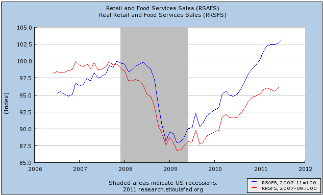
once conditions began to thaw, consumer spending did increase strongly as shown in the updated real retail sales graph at the beginning of the article above. And auto manufacturing increased by 4 million a year

and durable goods purchases also increased strongly.

Just as in 1992 people could not foresee the impact that the internet would have, and how that would power a decade-long tech boom, and just as in 2001 people didn't know just how out of control the housing bubble, associated debt financing, and Wall Street leverage would become, so at the bottom of the great recession it was impossible to know that manufacturing would grow as strongly as it has, or that consumer debt refinancing would take place as quickly and strongly as it has.
2. Use of the present progressive tense is usually a sign of faulty analysis.
In the crucial highlighted paragraph, the author says that gross savings and investment "are moving in the wrong direction at a worsening rate," thereby assuming that the trend would continue. Of course it did not. It is almost always more proper to say a data series "has been moving" in direction X. Because, in fact, that is all you know. As I said at the outset, most economic observers just project past trends - usually based on data that is coincident or lags the general economy - into the future, and so they miss important turning points. In short, they get it wrong. As I pointed out at the time, one could have used the identical data series chosen by that author in 1982 or 1991 and they would have told the same pessimistic story - and have been just as wrong. Indeed, just as it was wrong two years ago to simply project the fearful declines into the future, so it would be equally wrong to simply project the upward trajectories of data recently into the future now.
3. While the past is never a perfect predictor of the future, what pundits miss is, economic cycles generally run in a typical order including both expansions and recessions, as demonstrated by Prof. Edward Leamer:
The temporal ordering of the spending weakness is: residential investment, consumer durables, consumer nondurables and consumer services before the recession, and then, once the recession officially commences, business spending on the short-lived assets, equipment and software, and, last, business spending on the long-lived assets, offices and factories. The ordering of the recovery is exactly the same.
No method is perfect, but if in the past eight economic cycles, A has led to B has led to C, then the odds are very good that in this cycle, if A has occured, B is going to occur and then C.
Studies of why pundits fail so often have been done, and time after time they have shown that most people simply project current trends forward. They fail to see the turning points and so are usually caught off-stride when the turn happens.
That is why I do not rely on intellectualized "fundamental analysis" as touted by the author of the very erudite article above. It is much better to dispassionately rely on data and take your personal biases out of analysis as much as possible.
A Basic Math Lesson
One of the major problems in Washington is their inability to perform simple math. So, consider this my contribution to the national dialog on the economy. And -- a warning -- it involves some math.
Everyone is concerned with the debt/GDP ratio. Right now, total US debt is about $14.6 trillion, while nominal GDP is about $15 trillion. Going back to first or second grade, we can now make a fraction with the total debt as the numerator (the number on top) and the GDP figure being the denominator (the number on the bottom). Pulling out the ol' HP12C (which still works even after being commandeered as a chew toy), we get a ratio or percentage of 97.33%. So, there is also most as much debt as GDP.
However, looking at the preceding paragraph, we see two numbers (the miracle of fractions in action). There is a numerator (which is causing tremendous consternation right now) and a denominator (which has been remarkably absent from the national discussion). So, what if we focus on the denominator for just a minute, which represents growth. Forgive me here, but, again, I must use more math, but this time it's simple addition.
The GDP equation has four variables (long-time readers, please be kind. I'm talking to Washington here and they are stupid): C (consumer spending) + I (gross private investment) + X (net exports) + G (government spending). Right now, the consumer is OK but not great, investment is fair, but not great and the US is a net importer, so that subtracts from growth. That leaves government spending.
Now, let's also assume that we can borrow at insanely low rates (say, 2.12%) and use that money to invest in something like infrastructure (not like we need to, but let's assume the American Society of Civil Engineers has a certain level of expertise in this area).
Now, let's say we borrow $500 billion in next years budget and target that spending on infrastructure. Let's also assume we have an additional $900 billion in borrowing, increasing our total borrowing to $1.4 trillion. At the same time, we increase out GDP growth to 3%. That means we get the following numbers. $16 trillion in total debt and GDP at the end of next year of $15.45 trillion, or a debt to GDP ratio of 103%. Yes -- the ratio is still increasing, but so is GDP. Now, let's also assume that -- thanks to investment in infrastructure -- we can project a higher rate of growth for the next few years -- say 3%. By the end of the second year, GDP is $15.91 trillion and $16.39 trillion at the end of the third year. In short, by growing the economy and making prudent investments, we can slow the debt/GDP percentage growth rate, increase economic activity and lower unemployment. And no, a major investment in infrastructure is not a boondoggle, as I've demonstrated by looking at my city, Houston which could not have grown to become the fourth largest city in the US without major infrastructure investment. I should also add -- this is the entire secret formula to China's growth rate -- a rate which many in the US drool over. And finally, as GDP grows, unemployment starts to drop as businesses now see this thing called aggregate demand.
The point, boys and girls of Washington, is borrowing money at insanely low rates and making prudent investments with that money will grow the economy at strong enough rates to neutralized the increase in debt in the debt/GDP equation. It will also lower unemployment. In the above examples, I've used 3%. When you're talking about $15 trillion, an addition, 1/10 of growth is meaningful, so if we get to 3.5% (a not unheard of growth rate with prudent investment), we can really start to slow the ratio increase, lower unemployment and make everybody that much happier.
This has been a public service announcement of the basic math department. I hope I have not caused too much trouble or too many headaches.
Thursday Oil Market Analysis
 The overall trend in the oil market is down. Prices peaked in April and May at the 115 level and have since been moving lower. They spent three months (May, June and July) fluctuating around the 100 level before moving lower at the beginning of this month in reaction to a weak US GDP revision and overall market weakness. However, prices have bounced back and have hit the 10 day EMA as upside technical resistance.
All of the shorter EMAs are below the 200 day EMA and the shorter EMAs are all moving lower.

Over the last five days, prices formed an upward sloping wedge, the lower bound of which have been violated. Prices are now looking at support in the 86 level. Prices are clustering around the 85-88 area. We've seen three sharp rallies to the upper bounds of that range, only to see prices move lower.
Fundamentally, we're at the end of the summer driving season when US demand spikes upward. In addition, there is concern about the pace of economic expansion in the rest of the developing world, leading to less upward pressure on prices. There is also now a tremendous amount of upward resistance to price advances. There is little reason to see oil moving meaningfully higher in the current environment.
Wednesday, August 17, 2011
A Quick Note on the Markets


Above are three charts of the ETFs which track the QQQs, IWMs and SPYs, respectively. At the opening of trading today, all three hit resistance at the 10 day EMA. In addition, all three's A/D and CMF indicators shows an exodus from the securities. While the MACD is nearing a buying signal, it is still negative, meaning the buy signal would be weak.
After a severe sell-off, it's common for stocks to have a "dead-cat bounce," where the security will rally weakly before moving lower. Typically, the security hits resistance at an EMA or Fibonacci level. I'm not saying that's what we'll have here, although the indicators are lining up in that direction.
Ideally, we'd like to see the market hit resistance and then retest previous lows before moving higher. That would tell us that a majority of traders have established important trading levels where they will purchase a security. In contrast, a strong move below those levels (112 on the SPYs, 65 on the IWMs and 50 on the QQQs) would give us a strong sell signal. However, there is too much upward resistance to even think about going long at this point.
The data says: no double-dip recession
- by New Deal democrat
There has been a big scare reminiscent of last year as to whether the economy is about to enter, or even has already entered, a "double-dip recession." Although the Oil choke collar and Washington lunacy, along with a few other factors, have managed to bring the economy nearly to a stall, unless a foreign-origin contraction is sneaking in "under the radar" unseen even in LIBOR, EURIBOR, or TED spread rates, the simple fact is that the vast majority of the US economic data - including the majority of both modern and pre-WW2 deflationary era Leading Indicators - refute the notion that a recession has begun or is even close.
The NBER focus
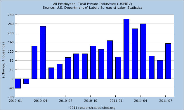
In the first place, we know that a recession is actually called by the NBER, and we know that they focus of 4 data series - Industrial Production, employment, real retail sales, and real income. A fifth series, aggregate hours worked, is also important to at least one member. As of yesterday, we know enough to know that all five of those series are positive through July.
Here's employment, which has been positive ex-census for 17 months straight:
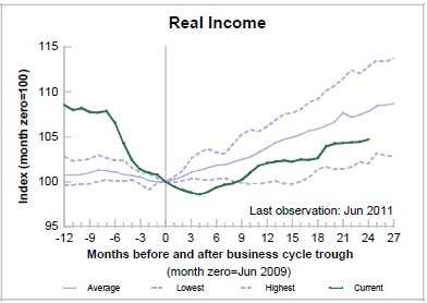
Real income continues to increase, albeit at a woefully inadequate pace:
Both nominal and real retail sales continue to improve. Although we don't have the July CPI report yet, it is not expected to come anywhere near the +.5% recorded in July retail sales:
Yesterday's industrial production report of +.9% maintains the solid upward trend of that series:
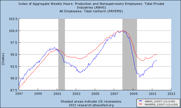
Finally, aggregate hours (blue) have continued to improve, and also continue to improve relative to payrolls (red):
Not one of the 5 series most critical to an NBER determination have turned negative. All 5 are still improving through July.
The 3 long leading indicators
There are 3 series in particular that function best as long leading indicators: housing, the yield curve, and the DJ Bond Index. A recession call gets no help from any of them, either.
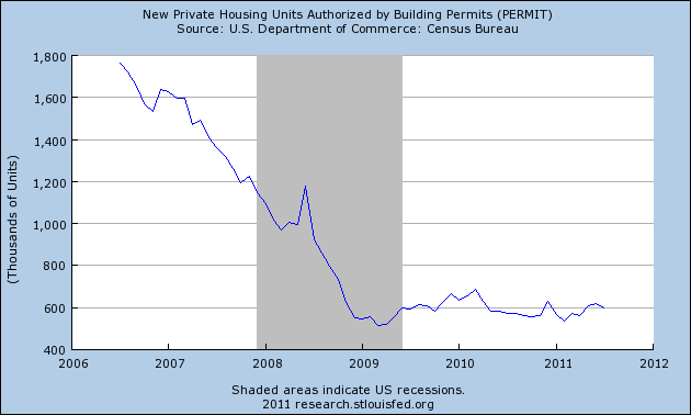
According to Prof. Edward E. Leamer, housing has its biggest effects on the economy 12 to 15 months from a significant change. Here are housing permits for the last 5 years. There was a 75%+ collapse in housing permits between early 2006 and the bottom in 2009. With the help of the US and California housing credits, permits gained over 100,000 over the next year. When the programs ended in spring 2010, housing permits rapidly declined over 100,000, and continued a much slower decline for the rest of the year, before improving to the 600,000 level again very slowly this year. Prof. Leamer's research predicts that the maximum impact of the spring 2010 decline has arrived and is beginning to recede:
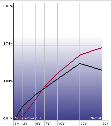
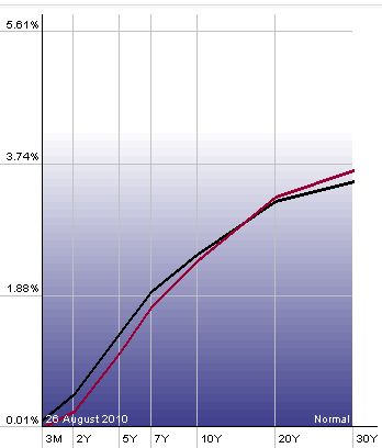
Since the 1950s, the yield curve has been a potent forecasting tool for a period about 1 year later. No recession in the last 50 years has begun without an inverted yield curve in the year prior. This includes the curve inversion of late 2006. In the below two graphs, the present yield curve (red) is compared with its flattest post-2006 reading, in December 2008 (left) and August 2010 (right). We know that within a year of the first reading a recovery was underway, and we know that as of the last revisions, positive GDP continued for at least close to a year after the second. There is no reason to believe the yield curve now is predicting anything worse.
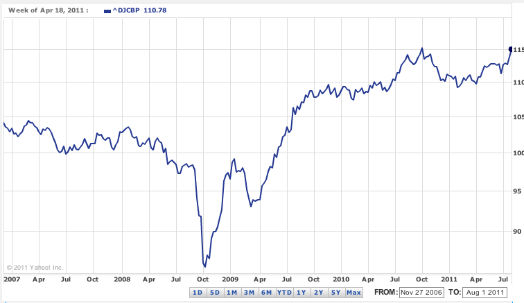
Relying upon the yield curve, however, has come under some justified criticism given the zero bound on Fed interest rates. Indeed, the yield curve did not invert at any time between 1930 and 1954 despite the occurrence of the worst recessions in the last 100 years during that time (it did invert in 1928). In the case of pre-WW2 deflationary recessions, however, the Dow Jones Bond Average had a nearly perfect record, also turning negative about a year before those recessions. Here's what its modern version, the Dow Jones Corporate Bond Index, looks like now - it made a new eight year high last week:
The remaining modern leading indicators:
In all cases in the last 50 years, no recession began until at least 8 of the Leading Economic Indicators were below their levels of 6 month before. Here is a graph (ending in early 2009) of a 6-month diffusion index of the indicators:
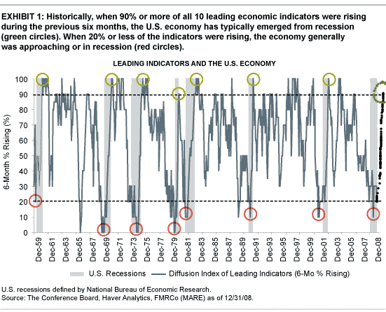
The point of this index is that, to signal recession or recovery, at least 8 or 9 of the 10 indicators should all be moving in the same direction. The present record isn't even close. So far, only 3 -- ISM vendor performance, stock market performance, and consumer expectations -- may be negative for 6 months. Let's look at the evidence in more detail.
No recession in the last 50 years, has occurred without Real M1 (blue) turning negative, and Real M2 (red) being up less than +2.6% YoY. Real M1 has remained relentlessly positive, and after a sustained period under +2.5% YoY, Real M2 has also improved strongly in the last 2 months (in the graph below 2.5% is subtracted from M2):
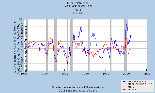
Indeed, either the yield curve inverted, or Real money supply turned negative, before every single recession since 1920.
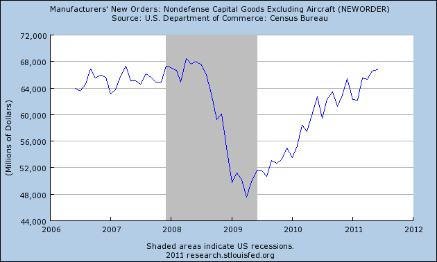
Additionally, "core" new durable goods orders have also continued to improve:
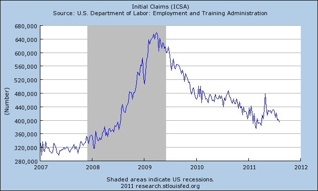
Perhaps more importantly, initial jobless claims, which had turned seriously negative from April through June, have completely reversed, and are approaching their late February - early April lows:
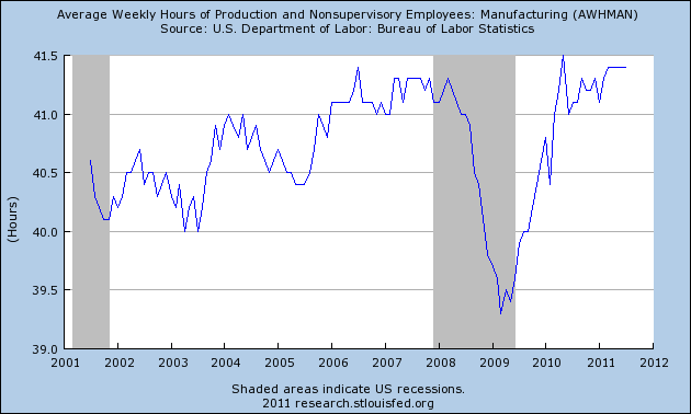
The manufacturing workweek has remained steady for the last 3 months:
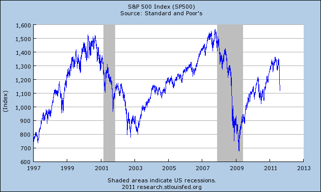
In fact, only 3 of the 10 leading indicators have turned decisively negative, stocks:
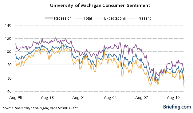
consumer sentiment:
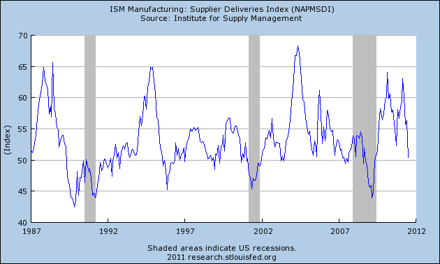
and vendor deliveries in the ISM survey:
Many regional manufacturing surveys, such as the Empire State survey released yesterday, are similarly negative.
Three out of 10 leading indicators turning negative is not enough to overcome the inference of continued economic expansion from the positive to neutral readings of the other 7.
Other leading indicators in pre-WW2 recessions:
Because both academic economists like Prof. Brad DeLong, and lay observers have voiced skepticism, even "alarm," that economic indicators developed from post-WW2 inflationary recessions, usually brought about by Fed tightening, may not be applicable to deflationary scenarios brought about by asset and credit contraction like the present, during the last several months I tested publicly available economic data series that go back to the 1920s at least.
Additionally, Prof. Geoffrey Moore, the founder of ECRI and the father of modern business cycle research, did publish a manuscript in 1961 discussing at length Leading Indicators for pre-WW2 recessions, available from the NBER via the St. Louis Fed. Indeed, some of his source data went all the way back to 1854. He found that they were valid indicators fir the post WW2 recessions as well. Here is his graph showing the most effective pre-WW2 leading indicators:
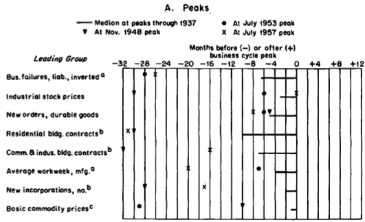
You can see that at least 4 of these are still in use today. Several others, including business failure liabilities and new incorporations, do not seem to be publicly available. Using the JJM ETF as a proxy for industrial commodities, the record is equivocal. After approaching their February 12 month high only 3 weeks ago, commodities have made a new 9 month low this week.
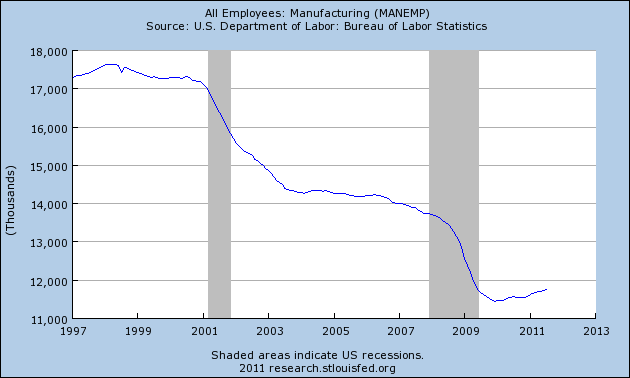
Additionally, another leading indicator he found, though not as effective as those above, was employment in manufacturing. Although there has been a steep secular decline in US manufacturing employment, in the last two years something very counter-trend has happened. Employment in manufacturing has risen, right up through July:
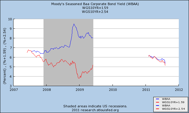
Additionally, another comparison that is available for data going all the way back to the 1920s is that of corporate bonds vs. long term government bonds. As a recession approaches, most usually yields on both decline, but government bonds significantly moreso than BAA grade corporate bonds, which carry more risk. As the recession actually hits, the series typically diverge, as BAA corporate bonds price in expectations of some defaults. This pattern was apparent going into the "great recession." While there was a slight divergence in the last several months, it was not that significant, and in the downdraft in yields last week, it completely disappeared:
The Oil choke collar
Finally, I would be remiss if I did not include a discussion of the Oil choke collar. Every time the price of energy has exceeded 4% of GDP, a recession has occurred. We have breached that level this year:
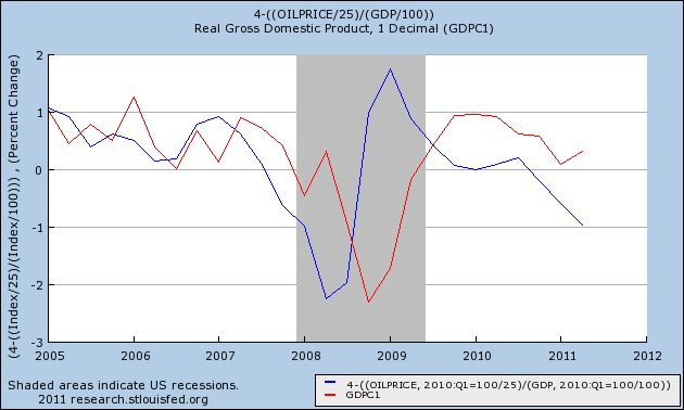
A little explanation is in order. The left scale is set to show the divergence in price from Kopits' inflection point of 4% of GDP. Thus the left scale result, n, equals 4 minus Oil price/GDP. If Oil price =5% of GDP, then N = 4-5= -1. Contrarily, if Oil price = 3% of GDP, then N = 4-3 = +1. Also note that since the graph had to be done quarterly, it does not reflect the decline in Oil prices since June 30 (all the way down to $76 and currently about $86).
As you can see, since the price of Oil approached the inflection point in 2005, it has predicted GDP changes very well. And it does not bode well for revisions to Q2 2011 GDP or the third quarter either.
One important difference, noted by Prof. James Hamilton of UCSD, is that this time around, there has been less of a "shock" since consumers did see these prices 3 years ago. Consumers have thus not over-reacted, as has been demonstrated all year by strongly positive retail sales reports.
Thus, while high energy prices have shown up in some of the stalling data above, they do not necessarily imply a contraction. At least, they have not bled broadly over into other data series as they have before every other oil-induced recession.
Conclusion
There is no doubt that the economy is under serious stress. Manufacturing, which had been leading the recovery, has completely stalled, and in at least a few regions, may actually have contracted slightly. Nervousness about a financial seize-up reminiscent of 2008, and a fundamental loss of confidence in Washington panicked the markets (as well as consumer confidence) in the last several weeks. Oil continues to act as a choke collar on economic growth.
But the simple fact is that the current data does not make out a case that either a double-dip recession has started, or is imminent. Most of the domestic US economic data remains solidly positive.
There has been a big scare reminiscent of last year as to whether the economy is about to enter, or even has already entered, a "double-dip recession." Although the Oil choke collar and Washington lunacy, along with a few other factors, have managed to bring the economy nearly to a stall, unless a foreign-origin contraction is sneaking in "under the radar" unseen even in LIBOR, EURIBOR, or TED spread rates, the simple fact is that the vast majority of the US economic data - including the majority of both modern and pre-WW2 deflationary era Leading Indicators - refute the notion that a recession has begun or is even close.
The NBER focus
In the first place, we know that a recession is actually called by the NBER, and we know that they focus of 4 data series - Industrial Production, employment, real retail sales, and real income. A fifth series, aggregate hours worked, is also important to at least one member. As of yesterday, we know enough to know that all five of those series are positive through July.
Here's employment, which has been positive ex-census for 17 months straight:

Real income continues to increase, albeit at a woefully inadequate pace:

Both nominal and real retail sales continue to improve. Although we don't have the July CPI report yet, it is not expected to come anywhere near the +.5% recorded in July retail sales:

Yesterday's industrial production report of +.9% maintains the solid upward trend of that series:

Finally, aggregate hours (blue) have continued to improve, and also continue to improve relative to payrolls (red):

Not one of the 5 series most critical to an NBER determination have turned negative. All 5 are still improving through July.
The 3 long leading indicators
There are 3 series in particular that function best as long leading indicators: housing, the yield curve, and the DJ Bond Index. A recession call gets no help from any of them, either.
According to Prof. Edward E. Leamer, housing has its biggest effects on the economy 12 to 15 months from a significant change. Here are housing permits for the last 5 years. There was a 75%+ collapse in housing permits between early 2006 and the bottom in 2009. With the help of the US and California housing credits, permits gained over 100,000 over the next year. When the programs ended in spring 2010, housing permits rapidly declined over 100,000, and continued a much slower decline for the rest of the year, before improving to the 600,000 level again very slowly this year. Prof. Leamer's research predicts that the maximum impact of the spring 2010 decline has arrived and is beginning to recede:

Since the 1950s, the yield curve has been a potent forecasting tool for a period about 1 year later. No recession in the last 50 years has begun without an inverted yield curve in the year prior. This includes the curve inversion of late 2006. In the below two graphs, the present yield curve (red) is compared with its flattest post-2006 reading, in December 2008 (left) and August 2010 (right). We know that within a year of the first reading a recovery was underway, and we know that as of the last revisions, positive GDP continued for at least close to a year after the second. There is no reason to believe the yield curve now is predicting anything worse.


Relying upon the yield curve, however, has come under some justified criticism given the zero bound on Fed interest rates. Indeed, the yield curve did not invert at any time between 1930 and 1954 despite the occurrence of the worst recessions in the last 100 years during that time (it did invert in 1928). In the case of pre-WW2 deflationary recessions, however, the Dow Jones Bond Average had a nearly perfect record, also turning negative about a year before those recessions. Here's what its modern version, the Dow Jones Corporate Bond Index, looks like now - it made a new eight year high last week:

The remaining modern leading indicators:
In all cases in the last 50 years, no recession began until at least 8 of the Leading Economic Indicators were below their levels of 6 month before. Here is a graph (ending in early 2009) of a 6-month diffusion index of the indicators:

The point of this index is that, to signal recession or recovery, at least 8 or 9 of the 10 indicators should all be moving in the same direction. The present record isn't even close. So far, only 3 -- ISM vendor performance, stock market performance, and consumer expectations -- may be negative for 6 months. Let's look at the evidence in more detail.
No recession in the last 50 years, has occurred without Real M1 (blue) turning negative, and Real M2 (red) being up less than +2.6% YoY. Real M1 has remained relentlessly positive, and after a sustained period under +2.5% YoY, Real M2 has also improved strongly in the last 2 months (in the graph below 2.5% is subtracted from M2):

Indeed, either the yield curve inverted, or Real money supply turned negative, before every single recession since 1920.
Additionally, "core" new durable goods orders have also continued to improve:

Perhaps more importantly, initial jobless claims, which had turned seriously negative from April through June, have completely reversed, and are approaching their late February - early April lows:

The manufacturing workweek has remained steady for the last 3 months:

In fact, only 3 of the 10 leading indicators have turned decisively negative, stocks:

consumer sentiment:

and vendor deliveries in the ISM survey:

Many regional manufacturing surveys, such as the Empire State survey released yesterday, are similarly negative.
Three out of 10 leading indicators turning negative is not enough to overcome the inference of continued economic expansion from the positive to neutral readings of the other 7.
Other leading indicators in pre-WW2 recessions:
Because both academic economists like Prof. Brad DeLong, and lay observers have voiced skepticism, even "alarm," that economic indicators developed from post-WW2 inflationary recessions, usually brought about by Fed tightening, may not be applicable to deflationary scenarios brought about by asset and credit contraction like the present, during the last several months I tested publicly available economic data series that go back to the 1920s at least.
Additionally, Prof. Geoffrey Moore, the founder of ECRI and the father of modern business cycle research, did publish a manuscript in 1961 discussing at length Leading Indicators for pre-WW2 recessions, available from the NBER via the St. Louis Fed. Indeed, some of his source data went all the way back to 1854. He found that they were valid indicators fir the post WW2 recessions as well. Here is his graph showing the most effective pre-WW2 leading indicators:

You can see that at least 4 of these are still in use today. Several others, including business failure liabilities and new incorporations, do not seem to be publicly available. Using the JJM ETF as a proxy for industrial commodities, the record is equivocal. After approaching their February 12 month high only 3 weeks ago, commodities have made a new 9 month low this week.
Additionally, another leading indicator he found, though not as effective as those above, was employment in manufacturing. Although there has been a steep secular decline in US manufacturing employment, in the last two years something very counter-trend has happened. Employment in manufacturing has risen, right up through July:

Additionally, another comparison that is available for data going all the way back to the 1920s is that of corporate bonds vs. long term government bonds. As a recession approaches, most usually yields on both decline, but government bonds significantly moreso than BAA grade corporate bonds, which carry more risk. As the recession actually hits, the series typically diverge, as BAA corporate bonds price in expectations of some defaults. This pattern was apparent going into the "great recession." While there was a slight divergence in the last several months, it was not that significant, and in the downdraft in yields last week, it completely disappeared:

The Oil choke collar
Finally, I would be remiss if I did not include a discussion of the Oil choke collar. Every time the price of energy has exceeded 4% of GDP, a recession has occurred. We have breached that level this year:

A little explanation is in order. The left scale is set to show the divergence in price from Kopits' inflection point of 4% of GDP. Thus the left scale result, n, equals 4 minus Oil price/GDP. If Oil price =5% of GDP, then N = 4-5= -1. Contrarily, if Oil price = 3% of GDP, then N = 4-3 = +1. Also note that since the graph had to be done quarterly, it does not reflect the decline in Oil prices since June 30 (all the way down to $76 and currently about $86).
As you can see, since the price of Oil approached the inflection point in 2005, it has predicted GDP changes very well. And it does not bode well for revisions to Q2 2011 GDP or the third quarter either.
One important difference, noted by Prof. James Hamilton of UCSD, is that this time around, there has been less of a "shock" since consumers did see these prices 3 years ago. Consumers have thus not over-reacted, as has been demonstrated all year by strongly positive retail sales reports.
Thus, while high energy prices have shown up in some of the stalling data above, they do not necessarily imply a contraction. At least, they have not bled broadly over into other data series as they have before every other oil-induced recession.
Conclusion
There is no doubt that the economy is under serious stress. Manufacturing, which had been leading the recovery, has completely stalled, and in at least a few regions, may actually have contracted slightly. Nervousness about a financial seize-up reminiscent of 2008, and a fundamental loss of confidence in Washington panicked the markets (as well as consumer confidence) in the last several weeks. Oil continues to act as a choke collar on economic growth.
But the simple fact is that the current data does not make out a case that either a double-dip recession has started, or is imminent. Most of the domestic US economic data remains solidly positive.
Tuesday, August 16, 2011
Wednesday Commodity Round-Up

First note that copper is trading right around a very important trend line: one that was established over two years ago. Breaking this would signal an important reversal. In addition, note the very large volume spikes over the last two weeks, indicating a tremendous amount of volume during the recent sell-off.

The above chart shows that prices are finding some support at the long-term trend line. However, prices are below the 200 day EMA and the shorter EMAs are moving lower. The 10 day EMA has crossed below the 200 day EMA, and the 20 is sure to follow over the next week or so. The A/D and CMF show money is clearly flowing out of the market, and the MACD shows negative momentum.
This is not a market I would go long in right now. However, a definitive move below 50.50 would be a good shorting opportunity.
The Great Muni Bond Collapse -- That Never Happened

Above is a chart of the municipal bond market ETF. While the overall trend is up, there have been two periods of sharp declines. The first occurred at the end of 2008 when the economy hit the skids. The second occurred at the end of last year when money moved out of government bonds as well because there was hope the economy was picking up, thereby signalling to people that they move out of safe haven assets (government bonds) and into riskier assets (like equities). The point is that fears over an imminent muni bond collapse have been overblown for some time. Also note

That last week when the market tanked, munis caught some of the safety bid.
In short, the great muni bond collapse ... never happened.
Household deleveraging continues
- by New Deal democrat
Trans Union reports:
Meanwhile, analyzing the latest revisions to GDP, Dave Altig of the Atlanta Fed notes that: "Consumption growth has been especially weak in this recovery, and the pattern of consumer spending has been more concentrated in consumer durables than has been the case in prior business cycles."
In other words, people are paying off debt religiously and saving for durable goods that will last. Sounds like Americans are taking to heart the advice from a Steve Martin SNL skit:
"Don't Buy Stuff You Cannot Afford."
Trans Union reports:
The national credit card delinquency rate (the rate of borrowers 90 or more days past due) decreased for the sixth consecutive quarter, dropping to 0.6% at the end of the second quarter in 2011. This is the lowest mark observed in 17 years. Credit card debt per borrower increased $20 in the quarter to $4,699, though it remains near record-low levels....
[T]he Q2 2011 TransUnion data released today shows credit card delinquency rates improving by more than at any other time since the recovery began in 2009, both on a quarter-over-quarter basis (-18.9%) and on a year-over-year basis (-34.8%).
"National credit card delinquency rates have fallen to levels not seen since 1994 as consumers continue to tighten their spending," said Ezra Becker, vice president of research and consulting in TransUnion's financial services business unit.
Meanwhile, analyzing the latest revisions to GDP, Dave Altig of the Atlanta Fed notes that: "Consumption growth has been especially weak in this recovery, and the pattern of consumer spending has been more concentrated in consumer durables than has been the case in prior business cycles."
In other words, people are paying off debt religiously and saving for durable goods that will last. Sounds like Americans are taking to heart the advice from a Steve Martin SNL skit:
"Don't Buy Stuff You Cannot Afford."
Where's the Crowding Out?
If the government was issuing so much debt that it was crowding out corporate debt, then corporate debt would be a bargain. In other words, it's price would be low, meaning yields would be higher. Now consider this chart of the LQD -- the liquid bond fund:

The 5- year chart shows a rally, interrupted only by the sell-off at the beginning of the great recession. In fact,

In fact, when markets sold-off, the corporate bond market clearly caught a bid. Also note the increased volume on the rally. Additionally, we have a very bullish EMA picture.
There is no crowding out in the current market data.

The 5- year chart shows a rally, interrupted only by the sell-off at the beginning of the great recession. In fact,

In fact, when markets sold-off, the corporate bond market clearly caught a bid. Also note the increased volume on the rally. Additionally, we have a very bullish EMA picture.
There is no crowding out in the current market data.
Monday, August 15, 2011
Treasury Tuesdays
Last week, I didn't write on the bond market because of the overall turmoil. However, I did make several observations about the Treasury market throughout the week.

Over the last four days, the IEFs have consolidated gains. We see an initial consolidation in the 102.6 - 103.4 area followed by a sell-off to 101.6 -- a price level established on Monday, August 7. Prices rallied a bit and then consolidated again iin a tight range of 102.4-102.8.

Another way to look at recent price action is we're seeing a triangle consolidation, although the lack of a firm move between the lines doesn't rest well with me.

The daily chart shows a bit of a sell-off. However, prices are still above the 10 day EMA and looking to hit them for support. Also note the drop in volume. This indicates there isn't much selling (talking profit) in the current market, so traders are clearly waiting for something.
Finally, as food for thought, consider this 5-year, weekly chart:

Notice the IEFs are in the middle of a 5-year bull run. However, how much lower can rates on the 10 year go realistically?
Conversely, the IEFs have staged a massive rally on volume that is nearly 3-5 times the levels of the previous month. The market has printed some incredibly strong upward bars compared to the previous three months. From their recent level of approximately 97, prices have rallied almost 5%. While this is not a rally in commensurate response to the stock market sell-off, it's a big rally for the stodgy fixed income world.And then there was this on Thursday:
These two charts show an incredibly clear shift in investing trend from risk acceptance to risk avoidance. Traders are dumping stocks (risk based assets) and plowing the proceeds into US government bonds.
The daily chart and its respective indicators are very bullish. All the EMAs are moving higher with the shorter above the longer. The A/D and CMF both indicate money is still flowing into the market and the MACD is still very positive, telling us the market's momentum is still strong. However, notice the candles are a bit above the EMAs, indicating the market may be slightly over-extended at this point. A pullback to the 10 day EMA would make tremendous sense, especially as people start to take some profit off the table.Despite the S&P downgrade, the Treasury market is still considered a safe haven investment, so it is catching a bid as a place to put stock market sell-off proceeds and safe have money in general. Let's take a look at the charts:
However, there is still no indicator of a sell-off developing.

Over the last four days, the IEFs have consolidated gains. We see an initial consolidation in the 102.6 - 103.4 area followed by a sell-off to 101.6 -- a price level established on Monday, August 7. Prices rallied a bit and then consolidated again iin a tight range of 102.4-102.8.

Another way to look at recent price action is we're seeing a triangle consolidation, although the lack of a firm move between the lines doesn't rest well with me.

The daily chart shows a bit of a sell-off. However, prices are still above the 10 day EMA and looking to hit them for support. Also note the drop in volume. This indicates there isn't much selling (talking profit) in the current market, so traders are clearly waiting for something.
Finally, as food for thought, consider this 5-year, weekly chart:

Notice the IEFs are in the middle of a 5-year bull run. However, how much lower can rates on the 10 year go realistically?