Friday, August 13, 2010

Weekly Indicators: Hawaiian volcano photography edition

- by New Deal democrat

A few months ago, I posted a photograph of Kilauea volcano in Hawaii by night, and recommended that readers put the sight on their "bucket list." Since then, I happened across the Hawaiian Lava Daily blog by photographer Leigh Hilbert.

Here is a particularly spectacular piece of his night photography, showing the Milky Way galaxy in the night sky over the lava's fiery ocean entry:


(click here for large sized copy)

By all means, please go over and check his blog out, not just for the photography, but for his stories -- of eating lava-heated mangoes off an old tree, or of a new resident's seemingly hopeless building of a flimsy rock wall to hold off the advancing flow (be sure to read all the way to the end).

But before you take your weekend break, this week we found out that inflation picked up a little bit, to 0.3% MoM (which is better than the deflation we had in Q2). Import and export prices, however, both declined.

Retail sales were up 0.4%, so real retail sales were up 0.1%, the first increase in three months. June was also revised "less worse" from -0.5% to -0.3%. Consumer confidence about the present snapped back, but future expectations remained in the gutter, although ever so slightly higher (so a miniscule positive to the LEI).

Inventories increased (from extremely taut levels), but most dismally, the trade balance deteriorated sharply. Our consumer stimulus seems to have done an absolutely stellar job -- for factory jobs in China. This is a major, ongoing, structural problem that simply must be solved.

Now, here's what happened with the high frequency weekly indicators I follow:

The Mortgage Bankers' purchase mortgage index rose for the fourth week in a row, another small step up out of the sub-sub-basement. We've almost certainly hit the post $8000 credit termination bottom, but so far there is no real sign of any quick bounce back.

The ICSC reported same store sales for the week ending August 7 rose 3.7% vs. a year earlier, and declined a slight 0.2% from the prior week. Shoppertrak did not make a weekly report, but said that for the month of July, sales were up 4.5% YoY and 2.0% from June.

Gas prices increased to $2.78 a gallon, the higherst in at least 2 months. At a rate of 9.236 million barrels a day, last week remained about 3% higher than least year.

The BLS reported 484,000 new jobless claims, the highest since April. While auto worker anomalies have ended, I this data series is probably still distorted due to filings by laid off census workers, although laid off municipal, state, and construction/real estate employees due to the ending of those two stimulus programs this spring are also excellent candidates.

Railfax did a complete U-turn this week, showing strong growth vs. last year in all 4 sectors: Cyclical, intermodal, baseline, and total traffic turned sharply up.

The American Staffing Association reported that for the week ending August 1, temporary and contract employment grew by w%, pushing the index up two point to 94. This index has resumed growing for the last three weeks, and has grown almost every week this year. I suspect that we will have to wait for the temp workforce to be back to pre-recession levels before we see large numbers of permanent hiring to take place. At present rates, that is still 3-6 months away.

M1 was up 0.7% this week, so is up 4% on a YoY basis. For the month of July, “real M1” finsihed up 2.7%. The trend of the "second derivative" YoY, however, continues to decline. This is of some concern going forward. M2 went up 0.2% this week, or about 2.4% YoY for July. In real terms, M2 finsihed July up 1.1%. To be "out of the woods" in terms of a double dip I would want to see continued positive real M1 and real M2 up more than 2.5%. As an additional note, the unchange MoM M2 means that part of the LEI should be unchanged.

Two weeks ago I started to track weekly BAA commercial bonds, as this series has been reported since the 1920s and may work better than the yield curve in times of deflation. Weekly BAA commercial bond rates dropped .08% more last week to 5.86%, still showing no sign of distress as might be found if another deflationary bust had started.

As usual, there continues to be good news in the Daily Treasury Statement. So far in August $58.7 B has been collected vs. $54.2 B a year ago, a gain of 8.5%. For the last 20 reporting days, we are also up over 7%, $126.6 B vs. $118.2 B. As I discussed earlier today, this series shows that private sector employment is growing, how much is hours vs. new hires is not known.

Regardless of whether you are a Doom and Gloomer or a Happytalking Corporate Shill, enjoy your weekend!

Does anyone think these people filed for unemployment benefits?

- by New Deal democrat

Yesterday and today, I've been addressing the conundrum that virtually every measure typically used to measure employment (temporary hires, tax withholding) suggests we ought to be having much stronger payroll gains than we have had this year. Over at The Big Picture, our sometimes-coblogger Invictus has noted the same with regard to the ISM manufacturing index and durable goods orders as well in the last few weeks. This post adds to that picture.

One question, asked with renewed urgency after yesterday, is where are all the weekly new jobless claims coming from? They aren't broken down by industry or service, so we have been left to guess. There may have been a distortion to the good side in July from auto workers not being laid off by GM. There almost certainly has been some effect to the down side of Census workers filing (eligibility varies from state to state, and as this post excellently argues, it may pay some of the workers to wait several months first -- if they can survive).

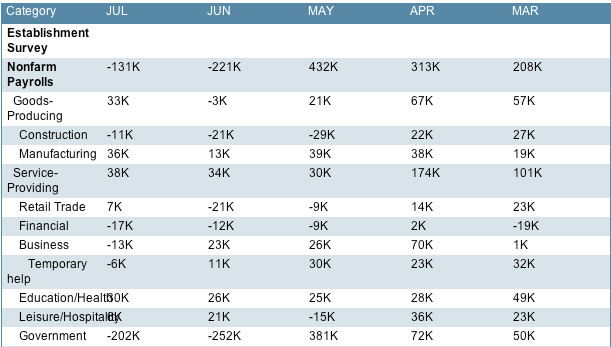
But with several months of initial jobless claims increases to look at, and several subsequent nonfarm payrolls reports, let's take a look at this convenient breakdown via briefing.com:


Notice the virtually ALL of the decrease in employment for the last few months has come from 3 sources: (1) government workers, including census workers (about 368,000 laid off) and also state and local employees (another 86,000). This has been 80%-90% of the downdraft. The remaining part is split between (2) construction (-32,000), and (3) finance (-29,000) -- but the finance layoffs haven't been in Wall Street finance, a closer look at the BLS breakout reveals about 1/3 of them to have been in real estate finance.

In other words, almost all of the non-census downdraft in payrolls has been from the two stimulus programs that ended in April-June: the $8000 home buying credit, and aid to the states. Do you suppose most of those people applied for jobless benefits? If so, that easily explains almost the entire stalling and upturn in those numbers.

Put another way, part of the downturn in employment that would have normally taken place a year ago, making 2009 even worse, is instead taking place now. If so, all else being equal, it is more likely to be the tail end of the job loss hurricane, rather than the onset of a new one.

While collectively my posts yesterday and today explain where the biggest weaknesses are located, and part of the reason why, there is a decisive aspect of the sudden slowdown since April that needs to be addressed, and is not going to be addressed by the economics profession. With that tantalizing clue, more (hopefully) Monday.
Tax Withholding soars -- Why haven't nonfarm payrolls?

- by New Deal democrat

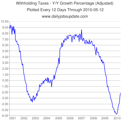
A conundrum I have noted several times in the last several months is the wide divergence between the large percentage increases in YoY tax withholding, consistent with 200,000+ monthly job gains during 2004-05, and the poor nonfarm payrolls reports in the last few months. A note by Econbrowser's Prof. James Hamilton, confirming something I noticed in July's data, appears to solve the riddle.

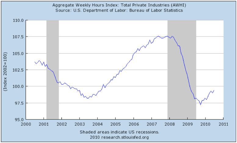
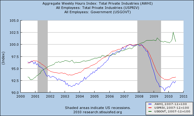
Although July, like June as revised, showed an actual loss in jobs, Prof. Hamilton called attention to the fact that aggregate hours in the private sector have continued to increase, as shown in this graph:


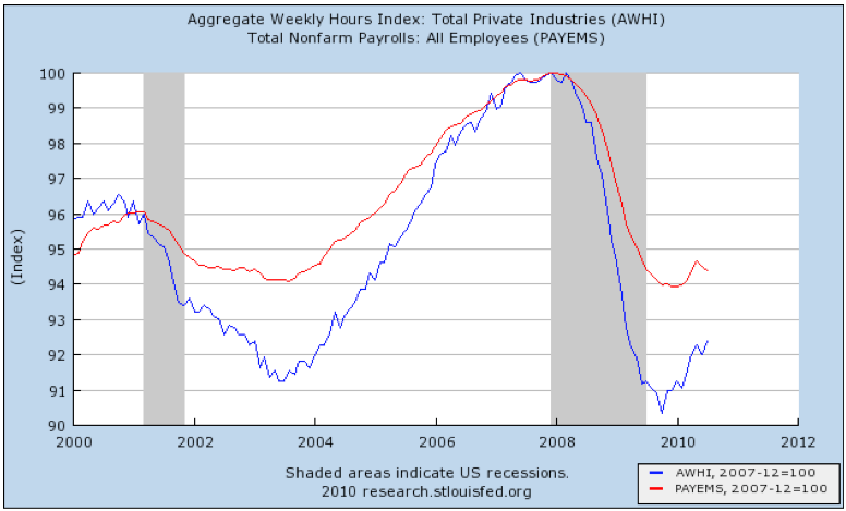
That contrasts with the record of nonfarm payrolls, which have stalled, and declined, in the last several months:


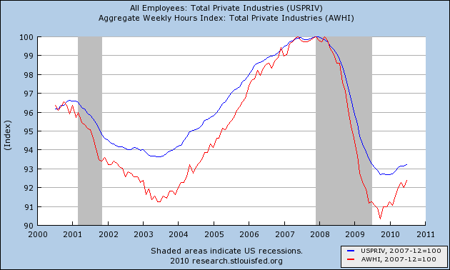
Since state and local employees do not have to pay Social Security, that made me wonder if what we aren't seeing is a sharp divergence between the public and private employment sectors. Indeed, when you measure YoY withholding tax data against YoY changes in private employment only, there is a considerably tighter fit:


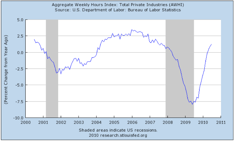
Further, compare the YoY percentage change in aggregate hours in the private sector in this graph:

with the following graph employing a slightly different measure of YoY percentage change in withholding from Matt Trivisonno's tax withholding blog (graph does not show the last 90 days):


The trends in the two graphs are almost identical over the entire time period. This is confirmed if for the remaining last 90 days we make use of the 20 day YoY rolling withholding data I track as part of my "Weekly Indicators" column:

4/9 +2.5%
4/16 +7.8%
4/23 +9.6%
4/30 +4.8%
5/7 +7.4%
5/11 +5.2%
5/18 n/a
5/25 +2.3% (18 days)
6/- n/a
6/11 +7%
6/18 +2.3%
6/25 +6.5%
7/2 n/a
7/9 +5.5%
7/16 +6%
7/23 +11%
7/30 +9%
8/5 +9%

Now let's put government employees into the mix (in green):


What this graph confirms is that public sector workers are responsible for the entire decline in jobs the last several months. Note that government jobs tend to be lost very late into recessions, or even well into recoveries (note 2003 for example).

This highlights another important fact: the primary reason why nonfarm payrolls as a whole have not kept up with industrial production, or aggregate hours, is that losses in state and local employment, which otherwise would have happened a year ago, were delayed because of the 2009 stimulus package, and are hitting full-force now instead. It remains to be seen how much of a dent the just-enacted supplemental aid to the states will impact these job losses.

Since the strong withholding tax rebound is confirmed by private sector jobs and hours, and state and local jobs have in the past lagged rather than led other job indicators, this all argues significantly against a "double-dip."

Yesterday's Market


First, notice that the lows from Wednesday provided a "zone of resistance" for any upward movement in yesterday's market.


Yesterday, there were five moves through the EMAs, none of which gained any serious momentum beyond the EMAs. That tells you the market is very bearish right now.


Note particularly the last rally which printed some very strong bars on rising volume. If any rally was going to get some steam to move higher, it was this one. But there was no move higher, meaning the bears were in control.


Prices are now in the "Fib zone" - the area between the 38.2% and 61.8% Fibonacci retracement where prices typically run into some resistance.


The technical chart tells us that prices have broken an uptrend (a) and are now below all the EMAs (b). However, a lot of money flowed into the market over the last rally (c and d). The question now is will that money start to leave or will we simply see a little profit taking with money remaining in the market? The best way to tell that is is we start to see some very strong bars printed -- bars with long bodies. Also note the MACD has given a sell signal (e), meaning that at best, we're moving into a period of consolidation.


Note the same analysis as the SPYs applies to the QQQQs.


The IWMs are technically a bit weaker because they didn't see as large an influx of money (the A/D and CMF lines).

Thursday, August 12, 2010

Initial Unemployment Claims Increase


From Bloomberg:

The outlook for the August employment report is off to a bad start in what can't be good for today's stock market. Initial jobless claims for the August 7 week came in at 484,000, far above expectations for 460,000 and the highest level since February. The four-week average, up a steep 14,250 to 473,500, is also the highest since February. There are no unusual factors affecting the results.

In a partial offset, continuing claims fell 118,000 in data for the July 31 week. The four-week average fell 64,000 to 4.519 million. The unemployment rate for insured workers came down one tenth to 3.5 percent. These numbers do look good but do reflect, to a degree, the expiration of benefits as the unemployed simply fall out of the insured labor pool.


Here is the accompanying chart:


This report is terrible. Looking at the chart, initial claims are moving sideways and are now at the high end of their range.

July foreclosures down nearly 10% from last year

- by New Deal democrat

Atrios this morning says that "The forgotten foreclosure crisis [ ] keeps getting worse."

Ummm, no. Yes, foreclosures do constitute a huge problem, and yes I agree that cramdown legislation would be a boon to the economy, but to the contrary, it seems we can stick a fork in the notion that there was going to be a massive second round of foreclosures due to 2005 vintage mortgage re-amortizations coming due:

RealtyTrac reported that on a YoY basis:
filings declined ... nearly 10% [ ] in July. There were 325,229 properties that received a foreclosure filing in July, a 4% increase from May. It also marks the 17th consecutive month that foreclosure activity exceeded 300,000, said James Saccacio, CEO of RealtyTrac.

Saccacio added that default notices were down from the previous year for the sixth straight month in July as servicers and lenders have escalated repossessions (REOs) to near-record levels.

In July 97,123 properties received a default notice, a 28% decrease from July 2009 but a 1% increase from the previous month. Default notices are down 32% from the 142,064 peak in April 2009.
Here is the updated chart of year over year changes in foreclsoure activity for the last 16 months:

MonthYoY % changeactual foreclosures
04/2009+32 342,038
05/2009+18 321,480
06/2009+33 336,173
07/2009+32 360,149
08/2009+18 358,471
09/2009+29 343,638
10/2009+19332,292
11/2009+22 306,627
12/2009+15 349,519
01/2010+15 315,716
02/2010+6 308,524
03/2010+8 367,056
04/2010-2 333,837
05/2010+1322,920
06/2010-7313,841
07/2010-10 325,229


The trend in those numbers is definitely not "getting worse."

Next month (August) marks the peak of when mortgage re-amortizations come due. If the fabled "tsunami" doesn't appear then, we can safely call it a blown prediction, although there may yet be an echo-foreclosure increase due to renewed house prices declines in the next couple of years. Probably this is what RealtyTrac's spokesman, Rick Sharga, is refering to when he states his belief that foreclosure activity probably won't peak until next year.

Temporary employees and Nonfarm Payrolls

- by New Deal democrat

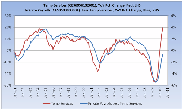
About a week ago, our occasional co-blogger Invictus, who now typically hangs out at the more spacious digs of Barry Ritholtz' the Big Picture (and more power to him), posted about the divergence between temporary help and nonfarm payrolls, wondering if the unique difference in this recession/recovery was "as good as it gets."


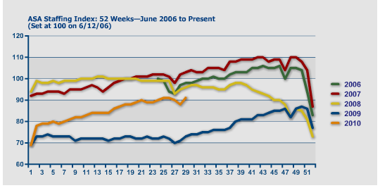
I do think that this is a case were "it's different this time", but only in that the relationship between the two series is not as simple as initially appears. In fact, I believe the divergence is explained well by this graph from the American Staffing Association that I posted several weeks ago:


It's not just that the hiring of temporary help is a precursor to the hiring of permanent jobs. Each temporary job can also be seen as an *alternative* to establishing a permanent position. In the 2008-09 downturn, temporary services, like all other jobs, were hit hard. The graph by the American Staffing Association suggests that employers are first re-filling their needs by temporary positions before making the riskier commitment of a permanent position.

Note that in 2001 there was a steeper decline in temp help than in 1991, and similarly a deeper decline in 2009 than in 2001. The relationship between the two series thus can be explained as "the deeper the loss in temp services, the longer the lag." As there were a lot of temporary positions to re-fill, and they have not already been filled, it makes sense that the robust pattern seen in the temporary index would not yet be seen in the nonfarm payrolls number.

Note also that there was a temporary downturn for several weeks in the Association's index, which also showed up in the nonfarm payrolls number. This past week, for the third week straight, the Association's index increased again taking the index higher than shown above, to 94.

Yesterday's Market


Notice that prices were in a tight range for the last 8 days. However, yesterday prices moved lower in a big way (b).


Prices gapped lower (a) at the open. And then prices ran into upside resistance at the 10 minute EMA (b). Prices tried to break through to the upside twice but couldn't get any momentum going (c), so they closed by moving through the EMAs and closing near their lows for the day (d).


On the daily chart, notice that in one day, the uptrend was broken (b) and that prices have moved through all the EMAs (c). You can also see the upside resistance area that prices had (a) for about a week.


It wasn't just the SPYs that experienced really bad technical damage yesterday; all the average were hit hard as evidence by the above charts of the QQQQs and IWMs.


At the same time, notice that the short and medium parts of the yield curve are still rallying. Notice especially the upward strength of the IEF chart; it is a perfect example of what a bullish chart should look like.

On the 5-minute chart, oil is now in a clear downtrend (a and b) with an area of consolidation (c) to consolidate the losses.


After moving through the important 80/bbl level (a and b), prices are now back down below that level and are below all the EMAs.

Wednesday, August 11, 2010

More on Structural Unemployment

Several weeks ago, I wrote two articles comparing this recovery to the other two jobless recoveries (see here and here). I came to the conclusion that we were going through a labor market realignment. NDD disagreed. Now there is another very thoughtful critique of the structural unemployment argument that is well worth the read.

Russian Heatwave May Lower Russian GDP by 1%

From the FT:

Russia has begun counting the economic toll of the worst heatwave since records began as economists warned that the wildfires and disastrous summer harvest could wipe as much as 1 per cent off the country’s economic growth.

The record-breaking heatwave has destroyed grain crops across Russia, ruining close to a third of the country’s forecast harvest, while wildfires raging in the Moscow region have spread noxious smog over the capital, forcing businesses to close and many to flee the city.

Alexander Morozov, chief economist at HSBC, said the combined impact of the heatwave on agriculture and general economic activity could reduce Russia’s gross domestic product growth by about 1 per cent this year, a cost to the economy of about $15bn (€11bn, £9.5bn).

An estimated 10 to 13 per cent decline in Russian agricultural output this year would cost about 0.6 per cent of GDP, Mr Morozov said. Weather-related disruption to industrial production and the retail and services sector could account for a further 0.4 per cent decline.

Economists have predicted that Russia’s economy will grow by about 4 per cent this year as the country starts to recover from its steepest recession in more than a decade. But Mr Morozov said the impact of the drought and fires could halt the recovery in the third quarter.

That is a very serious consequence.

The Dollar and Manufacturing


With the dollar recent drop, I was thinking it would be a good time to look at the dollar/ISM relationship to see if the dollar's recent drop might lead to an increase in the ISM numbers, and hence, manufacturing. The chart shows the relationship exists sometimes (the two boxed areas) but certainly not at all times. In other words, the exchange rate is a factor at times, but not always.

Yesterday's Market

For the last week or so, the market has been unable to overcome key resistance levels. That trend continued yesterday.


The SPYs are still finding extreme resistance in the 113 area.


The inability to make a strong move higher occurs despite a strong rally yesterday. Prices opened lower (a), bumped along the bottom (b) but then rallied strongly (c) after the Fed announcement. However, there was strong end of the day selling on high volume (d).

The daily chart shows where resistance lies (a). However, prices are still in an uptrend (b) and the EMA picture is still very bullish (c).


On the QQQQs, notice that prices are still under resistance (b), but prices are forming lots of small candles (a), indicating a lack of conviction in either direction.


However, the bond market is seeing a rally. Prices moved higher (a), consolidated over a 5 day period (b), gapped higher (c), consolidated again (d) and then moved higher yesterday after the Fed decision (e).


The IEF (7-10 year Treasury) chart is still incredibly bullish. The primary uptrend is still in place (a) and the EMA picture is as bullish as it can get (b) - the shorter EMAs are above the longer, all the EMAs are moving higher and prices are above all the EMAs. Also note that prices have continued to move through resistance for the entire rally.


Yesterday oil fell through important support levels (a) and consolidated in a triangle consolidation pattern (b).

Copper's daily chart shows that prices have broken an uptrend (a) and are consolidating (b). However, the EMA picture is still strong (c).


But on the five minute chart there are some strong downtrends (a and b). However, prices have broken trend (c) and started a slight uptrend (d).

Tuesday, August 10, 2010

Welcome to the World of Quantitative Easing

From the Federal Reserve:

To help support the economic recovery in a context of price stability, the Committee will keep constant the Federal Reserve's holdings of securities at their current level by reinvesting principal payments from agency debt and agency mortgage-backed securities in longer-term Treasury securities.1 The Committee will continue to roll over the Federal Reserve's holdings of Treasury securities as they mature.


This will help to increase M1 and M2. However, despite this move towards easing, the markets are still having trouble moving above key resistance areas.

Productivity Drops .9%

From the BLS:

Nonfarm business sector labor productivity decreased at a 0.9 percent annual rate during the second quarter of 2010, the U.S. Bureau of Labor Statistics reported today, with output and hours rising 2.6 percent and 3.6 percent, respectively. (All quarterly percent changes in this release are seasonally adjusted annual rates.) The decline in output per hour follows five quarters of strong productivity growth. The second-quarter gain in hours worked was the largest since the first quarter of 2006 when hours rose 4.1 percent. From the second quarter of 2009 to the second quarter of 2010, both productivity and output increased 3.9 percent; hours were unchanged (tables A and 2).


This is actually very good news. Why? As productivity continued to increase, companies had less incentive to hire because they could continue to get more with less. Now they are getting less out of their existing workforce, indicating increased hiring is probably needed to get more productivity.


Savings, Spending, Growth, and Jobs

- by New Deal democrat

In this post I want to take address a secular change in the economy. One of the questions that frequently gets asked in any discussions about how the economy can recover is, "Where is the spending going to come from?" While many households are strapped, the status of aggregate savings in society may surprise you. What I'm going to discuss is that -- over a multi-year period -- savings leads to spending, spending means growth, and growth means jobs.

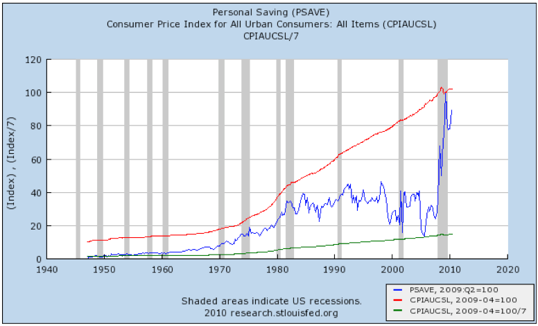
The BEA in its monthly personal income and spending report, also keeps track of savings and the saving rate. I want to show you that in real, inflation-adjusted terms. But since I can't make the transformation in the line itself (because one is measured quarterly, the other monthly), what I have done is to show it by comparing the amount of savings (blue) with the change in prices due to inflation, measured at the high (red) and low (green) points compared with those savings:


As you can see, after reaching a post World War 2 inflation adjusted low in 2005, in the last 5 years personal savings have skyrocketed to its postwar high at the bottom of the recession in the second quarter of last year. Simply put, there is an awful lot of "fuel" available to fire up spending.

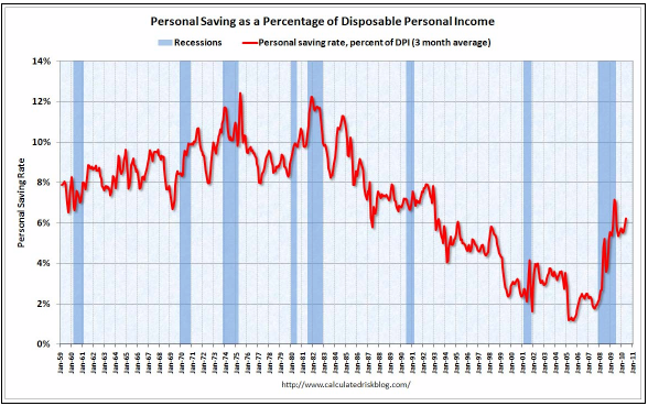
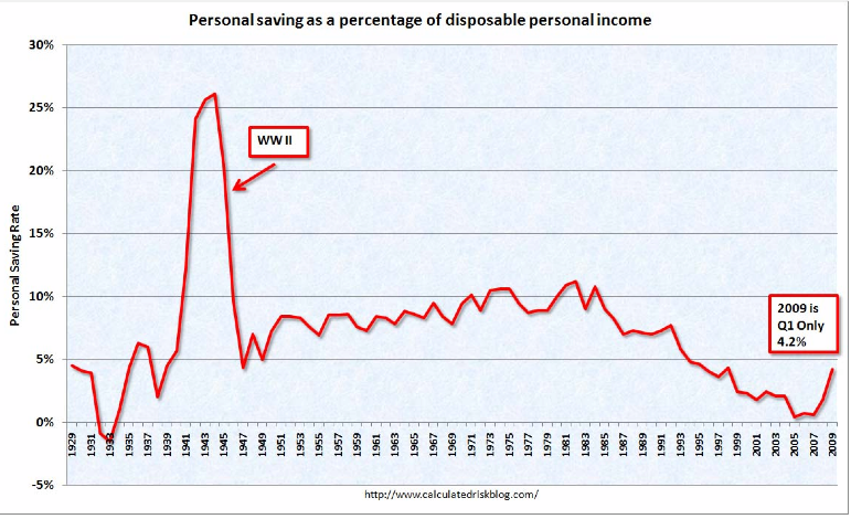
But the above series only goes back to 1947. What about during the Great Depression? Using a slightly different series -- the personal savings *rate* as a percentage of disposable personal income, Prof. James Kennedy was able to generate this data, and as recently as the 1st quarter of 2009, Calculated Risk plotted it on the following graph:


With the release of second quarter GDP, CR updated a more truncated graph of the same information:


Note that the trend in the personal savings rate during the Great Depression and "Great Recession" in the two graphs above are nearly identical.

The graphs also tell us that the 1930-32 period was much more severe than the last few years, as even in the aggregate families went through accumulated savings during the worst of the downturn. In our era, savings were blown on toys via home equity withdrawals earlier in the decade, and throughout the downturn there was a dramatic increase in savings, almost identical to what happened during the New Deal recovery from the Great Depression bottom.

But what can accumulated savings, and a dramatic increase in the savings rate, tell us about spending, growth, and jobs?

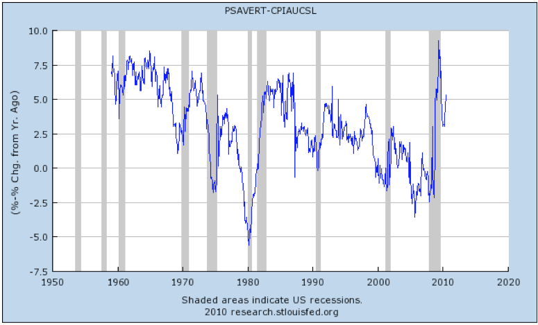
The most informative way to look at the issue is to measure "real" savings, that is, the percentage by which savings exceed inflation. And here, the story is equally dramatic. At the bottom of the "Great Recession" a year ago, the "real savings rate" was higher than at any point since World War 2.


Indeed, since we know that the savings rate was something like 6% during the New Deal era, at which time inflation averaged 2.5%, last year we had even higher savings than then (note that during World War 2, saving almost literally went "off the chart.").

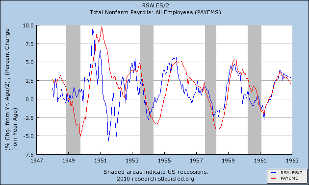
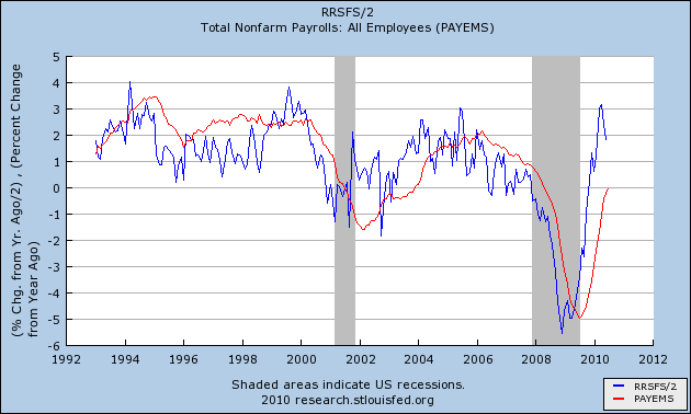
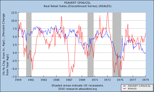
In the past, I've shown that real retail sales is a reliable leading indicator of job growth and losses. Here are a couple of those graphs, first for the immediate post World War 2 period:


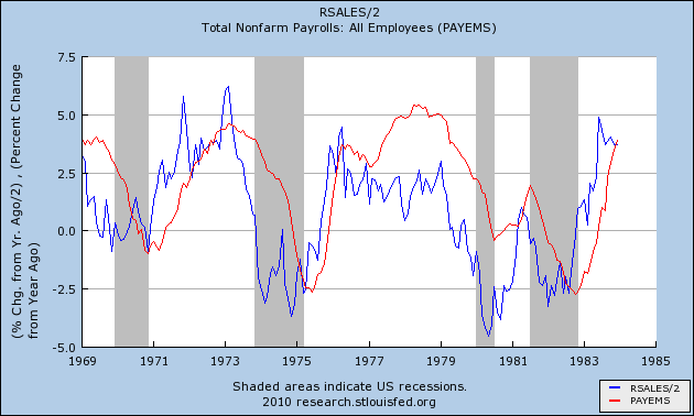
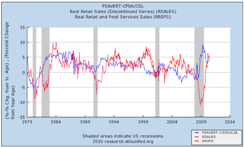
And here it is for the 1970s recessions and recoveries:


Finally, here is the same series measured YoY, including last Friday's data. As you can see, despite the disappointing jobs figures of the last couple of months, the relationship is still holding solidly:


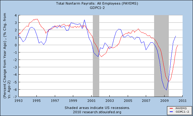
Since consumer spending is about 2/3's of GDP, the same relationship holds between GDP growth and subsequent job growth, where YoY growth of GDP somewhere north of 2% has been consistent with actual job growth:


All we need to do now is connect the "fuel" (savings) to the "fire" (spending). Here are several graphs showing the relationship for the last 50 years between the "real savings rate" (blue) and "real retail sales" (red):


Although the comparison is somewhat noisy, with several exceptions (spending crashing compared with saving as the Fed raised interest rates in 1966, again when Volcker raised interest rates 10% in 1981, and finally spending soaring with saving crashing during the "housing only goes up!" mortgage equity withdrawal mania of 5 years ago), real saving has been a reliable leading indicator of consumer spending. In short, when the real savings rate goes up dramatically, it brings on a recession. As consumers let go of some of their accumulated savings, and the savings rate levels off or declines, the spending brings about a consumer driven economic expansion.

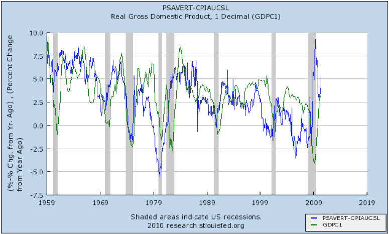
Similarly, here is the "real personal savings rate" compared with GDP:


It is clear that real personal savings also leads GDP growth.

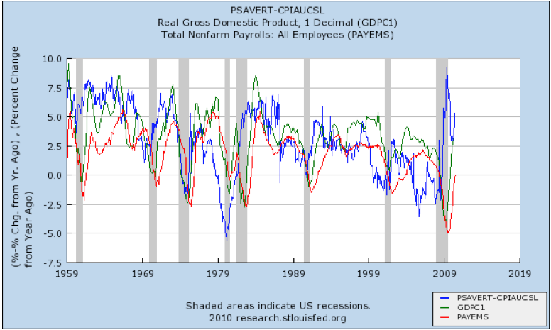
In other words, accumulated savings eventually gives way to spending. That spending leads to growth, and then that growth leads to the creation of jobs. Here is a rather noisy graphs encompassing all of those data series:


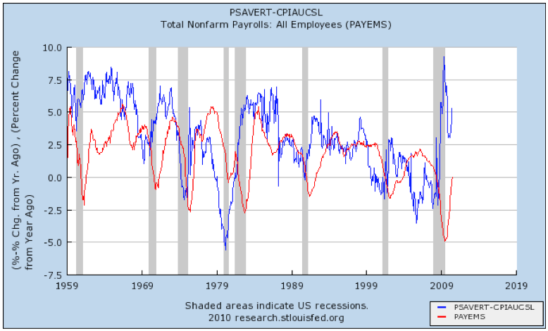
But to simplify, let's cut out the middle-in-time series. Here is a graph of the real savings rate (blue) and job growth (red):

An increase in savings is a "long leading indicator" -- frequently several years later -- of job growth. It is the fuel accumulated during recessions that leads to the fire of growth and jobs in the subsequent expansion.

In the second quarter, note that saving went back up again, as people were scared by a number of things (in particular that the Eurozone crisis) into believing the credit markets might freeze up again (see Bonddad's post yesterday on LIBOR rates). Concurrently, retail spending stalled, going down -0.7% in May and -0.4% in June.

IF the stressors that gave rise to increased savings and decreased spending in the second quarter abate (as is suggested by, e.g., the decrease in the Libor rates in the last few weeks), the above indicates that there is plenty of "fuel" still stored up to reinvigorate consumer spending, that should in turn create more private sector jobs. That growth may be enough to counter the loss of state and local government jobs (which if estimates are accurate may continue to run 20,000 a month) and a renewed loss of some construction jobs (on the order of 5,000 to 10,000 a month) due to the downturn in housing after the expiration of the $8000 housing credit, even in the absence of further fiscal stimulus.

Even if that does not occur, and we have a "double-dip", in the longer term, a continued increased rate of savings will fuel an even more robust recovery once housing prices bottom in a couple of years or so.