Friday, July 10, 2009

Weekend Beagle and Weimar

It's that time of the week. I and the crew will be back on Monday. Until then here are the kids:


Invictus: A Lighter Shade of Green

While I have previously agreed with Bonddad and NDD that the “worst” of our economic woes are behind us, I’m cautious to the extreme about what a recovery might look like, and very dubious that one has actually begun.
I don’t think I’m feeling quite as “green” as they are, and here are just a few reasons why. I’ve circled what could have been (mistakenly) interpreted as green shoots at previous points during the recession. In the end, they were just head fakes.

Let’s look (again) at Aggregate Weekly Hours (one of NBER member Jeffrey Frankel’s favorite metrics):


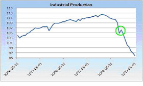
Industrial Production also gave us a head-fake green shoot last year, only to also fall precipitously again. It, too, has shown no sign yet of bottoming. We know that this is another measure closely watched by the NBER.

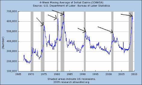
Lastly, at least for now (in the interest of getting this post up and a discussion started), let’s address Unemployment Insurance (UI) Claims. Yes, it is true that today’s number was better than expected, and that the four-week moving average has been moving in the right direction (i.e. down). However, after another false green shoot decline several weeks ago, continuing claims – which need to confirm the downward trend in the other UI series – have turned back up again, hitting another new record high today:


Look, I want this recession to be over as much as the next guy, but that fact that we’re all sick and tired of it just isn’t going to make it so. Yes, things have gotten a bit “less bad” of late. But “less bad” ≠ “recovery,” it only equals “less bad.” When we start seeing some real stabilization (dare I say improvement?) in the metrics that matter – especially to the folks who are going to make the call – we’ll have something to talk about, but not until then, in my humble opinion.

New Jobless claims at the End of Recessions

- by New Deal democrat

I've been wondering whether it was possible for a Recession to end officially even if over half a million jobs a week are being lost, as measured by new jobless claims. Much to my surprise, the answer is a resounding "YES".

The table below shows information new jobless claims for every recession beginning in 1970. All numbers are in 1000's (e.g., 336 is 336,000 new jobless claims, the highest point during the 1970 recession). Data shown is the highest week's new jobless claims for each recession, its equivalent adjusting for population growth to 2009, the new jobless claims during the last week of the end of each recession, that data also adjusted for population growth to 2009, and finally the percentage decline off the high number to the number during the last week of every recession.


YearHigh2009
equiv.
end2009
equiv.
% off High
1970 336 504 325488 (-3%)
1974 561 800 547782 (-2.3%)
1980 629 840 559728 (-11%)
1982 695 860 612757 (-12%)
1991 501 602 501602 0%
2001 489525 447480 (-3%)
2009 659? 659? ? ? ?


Note that adjusted for population growth, jobless claims during the 1974, 1980, and 1982 recessions were considerably worse than our present recession. Also note that the biggest percentage decline until the declared end of any prior recession was -12%.

A 12% decline from the April 2009 high of 659,000 jobless claims would be ~580,000. Thus, if we aren't seeing the end of the 2008-2009 recession right now (given yesterday's -565,000 number), it will be the steepest percentage drop in new claims during any recession in the last 40 years.

Sorry that the chart is rather rudimentary, but in light of yesterday morning's data, I wanted to get this bit of information out as soon as possible.

Today's Markets

Today was a great example of why it's important to be aware of the technical and fundamental environment. While the technical indicators said sell the fundamental numbers (the big drop in unemployment claims) said wait. As a result...


Prices -- which had fallen below the neckline of a head and shoulders pattern and looked poised to move lower -- stalled in their decline. However, prices are still below the neckline and the shorter EMAs are moving lower.


However, the IWMs continued their move lower. This makes sense as this is the more speculative area of the market -- people would sell these holdings before others.


The transports are still below their trendline.


The one holdout is the NASDAQ which is stubbornly holding to these levels.

Forex Fridays


There are two important points to make about the weekly chart. First, the MACD and RSI are signaling a lower move ahead. This jibes with the price pattern which says prices are consolidating in a triangle pattern before a move lower (based on the indicators).


The daily chart confirms that we have a high probability of moving lower. First we see the price consolidation in more detail. Secondly notice the full stochastic is giving an over-bought reading. Stochastics/oscillators are better to use when prices are in a range which they clearly are.

Thursday, July 9, 2009

Today's Market

I will post this in the morning. I just got done putting together the rough draft of my dissertation. 357 pages and I'm tired.

See you in the morning.

BD

The Economic Free Fall is Over

Gloom and doom is the way of blogs lately. Nothing is good; everything is bad. Unfortunately, lost in this translation is a set of monthly trends that shows the worse is over. Now -- this does not mean everything is roses. Far from it. As I have mentioned in the past the recovery will be weak with slow growth and high (7%-8% minimum) unemployment for the better part of a year. But the data indicates the worse is behind us.

Before I begin, let me make a few observations.

1.) There are two predominant ways to present economic data: year over year and month over month. Year over year removes seasonality. Here's an illustration. Suppose you are looking at the retail sector's employment trends starting in September and you see in increase in hiring. A logical conclusion is things are looking up because companies are hiring more. However, this excludes the possibility of a seasonal effect; namely that retail typically hires more people as the holiday season approaches. As a result, it's better to compare this September to last September -- this removes "seasonality" from the equation.

However, month over month has value as well -- especially when the economy is at a turning point. While the current year over year data is terrible, the current month to month data shows an extended (as in more than a few months) period of stabilization. This tells us the worst is over.

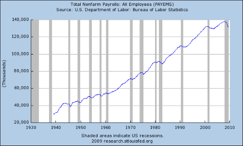
2.) There's been a great deal of debate about employment centered on whether or not the unemployment rate a leading or coincident indicator. As I demonstrate in this article in all expansions save one since WWII the year over year percentage change in GDP has increased before the unemployment rate has dropped. While the past is not a guarantee of future performance, that's one heck of a track record for an economic indicator. In short, the unemployment rate lags GDP growth over 80% of the time. The rate of establishment job growth is thought of as a coincident indicator -- that is the number of people on payrolls increases and decreases with overall economic growth. However, this number has developed a lagging quality over the last few expansions meaning the recession could technically end and we could still experience job losses. Take a look at this chart which shows the increasing lag time for establishment job growth:


If you want a reliable series of employment indicators, look at the 4-week moving average of initial unemployment claims which typically peaks right at or slightly before the end of a recession:


(This is another reason I believe the recession is technically nearing the end; the 4-week moving average of initial unemployment claims has been dropping for several months)

What appears to be happening overall is the following: companies are still letting people go at the "traditional" time in the cycle. However, they are waiting longer before they start to rehire people.

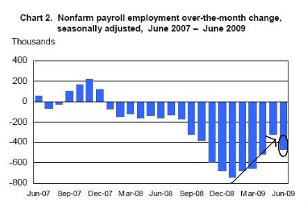
While we're on the topic of employment, let's take a look at the latest jobs report because an important fact was overlooked:


We'd had four straight months of better and better employment reports -- reports that showed the rate of job loss was decreasing. That makes the latest jobs report an outlier in the series. Combine that fact with the following points:


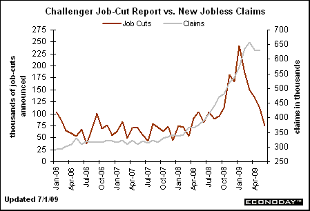
The Challenger Job Cut Survey is clearly improving and


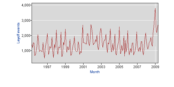
The seasonally-adjusted number of mass lay-offs spiked, fell and moved a bit higher but is still far lower than before you get an improving jobs situation.

Let me add one more point: I am not saying it's wonderful that people are out of work, or that we shouldn't increase the length of time people are on unemployment insurance or anything remotely or even non-remotely related to that. What I am saying is the statistical series are improving.

Now, let's look at some other important numbers.


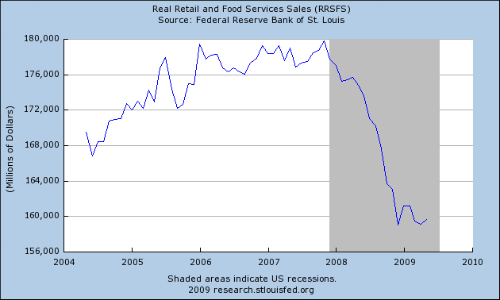
Real (inflation adjusted) retail sales have bottomed as have


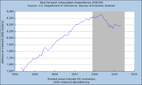
Real (inflation-adjusted) personal consumption expenditures. In addition


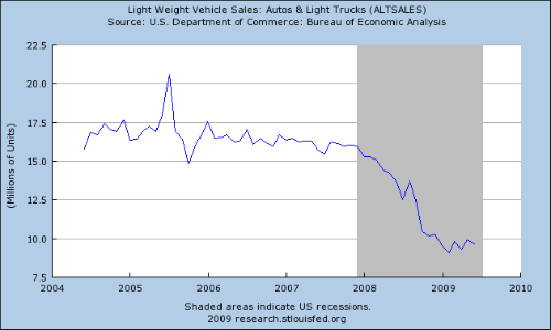
auto sales have bottomed.


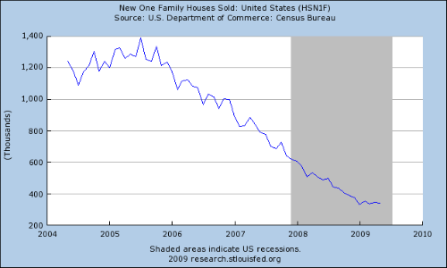
And maybe new home sales have as well.

But that's not all.


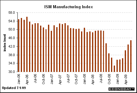
The ISM manufacturing index has been increasing in clear upward trend as has the


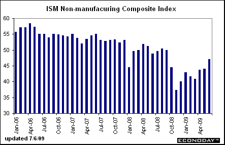
ISM non-manufacturing index. In addition


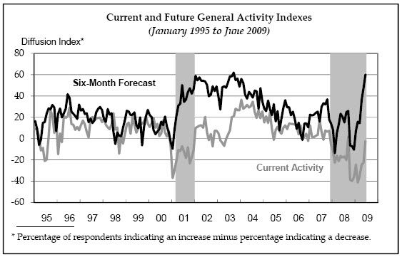
The Philly Fed and


New York Federal Reserve index of regional manufacturing has improved.

The bottom line is there are a ton of indicators saying the worst is over. Now -- this does not mean we have clear skies ahead because nothing could be farther from the truth. There are huge challenges. But, all signs are the worst is over.

A Jack-and-the-Beanstalk sized Green Shoot

- by New Deal democrat

The BLS reported this morning that weekly jobless claims fell a stunning 56,000 to 565,000.

At their peak in April, weekly jobless claims were 658,750. This is almost 100,000 less claims than then. Note that in previous years the July 4 holiday has not affected these seasonally adjusted numbers, so appears not to be an issue.

Even during the booming 1990s, weekly jobless claims averaged about 300,000-325,000 a week, so this week's figure represents an ~30% improvement.

This number is consistent with the bottom of the recession being called by the NBER right now.

I've been crunching numbers on this exact point, I will post more later when I get the chance (maybe tonight or tomorrow morning).

Consider this a Jack and the Beanstalk sized green shoot.
-----
Update: Peter Broekvar at The Big Picture says this number was "artificially lower" because of a lack of auto plant closures.

So, was it "artificially higher" in May and June when Chrysler and GM went down?

Thursday Oil Market Round-Up

Click on all images for a larger image


On the weekly chart, notice the RSI turned negative a little bit ago and the MACD is about to give a sell signal. In addition, prices are falling through an upward sloping trendline.


This is where the real action is. Notice the MACD and RSI have been declining since early June. in addition prices have broken the uptrend very strongly. Finally, prices have fallen through the EMAs.

Bottom line -- this chart is moving lower.

Wednesday, July 8, 2009

Today's Markets


Prices continue to fall. In addition, note the 10 day EMA is about to move through the 50 day EMA. Also note the volume increase in today's trading.

As with the SPYs, note the 10 day EMA is approaching a move through the 50 day EMA. Also note the volume increase in today's trading.


This is still the hold-up that prevents a big move lower. Prices are still right at the 200 day EMA. When they fall, watch out.

And the Transports Confirm


In case you were wondering whether the correction was real...

On Unemployment Exhaustion

Several people have commented that unemployment data should be coordinated with unemployment exhaustion rates. Fair enough.

The information is from the department of labor. Unfortunately, they use a flashbook format which I can't copy. So here is the link:

http://www.doleta.gov/unemploy/chartbook/chartrpt.cfm

Use data batch number 7.

The information is important for several reason:

1.) Unemployment exhaustion is currently at an all-time high. This is the point people think is important (which it is).

BUT

Coordinate the DOL data with NBER business cycle data found here:

http://wwwdev.nber.org/cycles/cyclesmain.html

Notice that spike in exhaustion rates typically happen at the end of recessions.

That jibes with information found in this post where I note the 4-week moving average is moving lower, the Challenger job cuts report is dropping and the seasonally adjusted mass lay-offs are dropping.

Let me add this: I am not saying it's good that unemployment benefits are ending, nor am I saying anyone who has lost benefits can go to hell. I am not saying that in any way, shape, or form. These people need an extension of benefits.

However what I am saying is this is another data point that indicates we're probably near the end of a recession.

Wednesday Commodities Round-Up

Click for a larger image


Industrial metals are still rising. The MACD and RSI are still increasing. However, prices are getting caught between the 10 and 20 day EMA on the lower side and the 50 day EMA on the upper side. In addition ---

This chart better shows the triangle consolidation pattern that is forming at the top of the rally. Also note that prices are barely hanging on to the upward sloping trend line. In addition, on the daily chart notice the MACD and RSI are moving lower. This chart tells us prices are really thinking about moving lower.


On agricultural prices, notice the chart has taken a big move lower. This is confirmed by the RSI and MACD making big moves lower.


The daily chart better shows the move lower. Notice the MACD and RSI have taken big moves lower. Prices have broken the upward sloping trendline. And the EMA are moving lower as well -- the 10 and 20 day EMA have crossed below teh 50 day EMA and are looking to make lower lows.

With agricultural and oil prices moving lower it's highly probably industrial metals will follow suit.

Tuesday, July 7, 2009

Today's Markets

Take a look at all the charts. The short version is the correction is now here. Prices on all the indexes have fallen through important technical levels. The only thing preventing a serious fall is the QQQQs which are at the 200 day EMA. And frankly, I don't expect that level to hold.


More on Umployment

There was more good and bad news in Friday's employment report.

First the good news


The number of people unemployed for less then five weeks is clearly on a downward path. That's good. However


The 5-14 weeks number is still increasing as is


The 15-26 weeks and


The 27 and greater weeks.

Here's what I think is happening. The longer unemployment times are structural issues. For example, construction workers who are going to out of work for some time because of the low level of housing starts etc... But the decrease in the shorter time is a very good development and indicates the longer term unemployment picture may approaching its worst level.

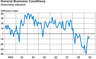
ISM Up

From the Institute for Supply Management:

The NMI (Non-Manufacturing Index) registered 47 percent in June, 3 percentage points higher than the 44 percent registered in May, indicating contraction in the non-manufacturing sector for the ninth consecutive month, but at a slower rate. The Non-Manufacturing Business Activity Index increased 7.4 percentage points to 49.8 percent. The New Orders Index increased 4.2 percentage points to 48.6 percent, and the Employment Index increased 4.4 percentage points to 43.4 percent. The Prices Index increased 6.8 percentage points to 53.7 percent in June, indicating an increase in prices paid from May. This is the first time the index has registered above 50 percent since October 2008. According to the NMI, six non-manufacturing industries reported growth in June. Respondents' comments continue to be mixed and tend to be industry- and company-specific about business conditions."


Here's a chart:


Notice the index has been in an uptrend since October of last year. While the number is still below 50 and therefore still in a contraction it has been slowly inching its way into positive territory.

Here are the anecdotal comments from the same report:


  • "Business has improved and holding steady." (Arts, Entertainment & Recreation)
  • "Activity level is flat. Clients are delaying capital spending decisions." (Professional, Scientific & Technical Services)
  • "Economy may be stabilizing. Second half looks more positive than first half." (Information)
  • "Have begun spending government stimulus funding, and expect conditions to gradually improve in the near future." (Public Administration)
  • "Occupancy levels continue to increase at a slow pace." (Accommodation & Food Services)
  • "Activity is still slow and little has changed since last month." (Wholesale Trade)

Simply put, this is an improving series and adds further evidence that the worst is over.

Rail traffic update

- by New Deal democrat

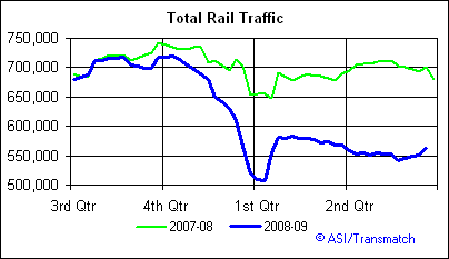
Several weeks ago I took a very prominent blogger to task for making use of a 13 week moving year-over-year average of rail traffic data, comparing data from mid-March to mid-June 2009, to that of mid-March to mid-June 2008, to claim that rail traffic was "horrible" and "13-week moving averages are still moving lower, with no apparent end in sight."

In other words, this blogger was taking a very lagging trend and using it to predict worse coincident data in the future.

I countered that the 4 week moving averages of present traffic were a far more reliable statement of the present, and could portend a rise in the future, saying "It is certainly too soon to say that is a trend, but it could be the beginning of one, and if that is the case, then the lagging indicator of the 13 week year-over-year average cited by that prominent blogger will abruptly begin to rise - a couple of months from now."

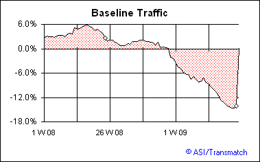
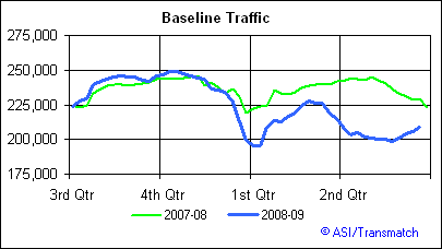
Well, the present trend has continued. Look at the following graph of baseline rail traffic (all graphs reposted from Railfax), showing a clear increase in the last couple of months (note to gloomsters, this is not a second derivative "less worse" statistic, it is an absolute "better" number):


and here is the same 4 week moving average for total traffic (which also includes cyclical and intermodal cars):


And lo and behold, look what has just happened to the 13 week year over year moving average of baseline rail traffic: it has just started to rise.


No guarantees of course, but if leading indicators are correct, the coincident indicator of rail traffic should continue to improve, and in that case not only will the 4-week moving average continue to improve, but baseline rail traffic this year could actually surpass last year's activity in a couple of months.

The use of badly lagging data to project trends into the future is endemic in the economic blogosphere. Just yesterday I read another very prominent economic post that consisted almost entirely of projecting year-over-year percentage changes into the future to foretell economic Armageddon -- a classic case of driving by looking in the rear view mirror.

Treasury Tuesdays

Click on all images for a larger image


The longer end of the curve has been rallying for about a month. However, prices are just now starting to cross the upward sloping trend line. Also note that prices ran into upside resistance at the 50 day EMA. Also note the declining volume as the rally progressed -- which is not a good sign. However, the 10 and 20 day EMA are still rising and prices are still above the shorter EMAs.
The shorter end of the curve is (so far) consolidating gains below the the 50 day EMA. But like the TLTs, prices are getting squeezed between the shorter and longer EMAs, indicating something will have to give soon.

Monday, July 6, 2009

Today's Markets

Click for a larger image


The head and shoulders is about done. It is possible the right shoulder could continue for a bit. However, the most obvious direction from here is down. Not good.

About the Jobs Report

There was a lot of ink spilled about Friday's jobs report. According to most it was a sign the economy isn't getting better and that we're all going to hell. However, let's take a look at a few points.


The trend of job losses was positive until Friday's report -- we had four consecutive months of decreasing losses. That makes Friday's report an outlier.


The 4-week moving average of initial jobless claims is still declining (although from high levels)


The Challenger job cuts report is still moving lower and


The rate of seasonally adjusted mass lay-off events and initial claimants is decreasing.

So, so far Friday's report looks like an outlier. Now, if we have a few more reports like that then we have an issue. But not until then.