Saturday, March 16, 2024

Weekly Indicators for March 11 - 15 at Seeking Alpha


 - by New Deal democrat


My “Weekly Indicators” post is up at Seeking Alpha.

Not a lot of movement in any indicator this week. The long leading background, even after all this time, still tilts negative even though “less bad.” And the shorter term data continues mixed, as some sectors are very positive, and a few are very negative.

As usual, clicking over and reading will bring you up to the virtual moment on the economy, and bring me a little lunch money for my efforts.

Friday, March 15, 2024

Industrial and manufacturing production improve for the month, but 16+ month fading trend continues


 - by New Deal democrat


Industrial production is an indicator that has faded somewhat in importance in the modern era since China’s accession to normal trading status in 2000. Before that, a downturn in production was an excellent coincident indicator for a general downturn in the economy. Since then there have been several downturns, most importantly during 2015-16, when the broader economy, most notably housing and the consumer, did not follow. That was again the case of the downturn in 2023 - which has not resolved yet.

This morning’s report was another case of good news and bad news. The good news is that industrial production rose 0.1% for the month, and manufacturing production rose 0.8% from downwardly revised January numbers:


The bad news is that both remain down YoY, by -0.3% and -0.2% respectively (which, note, is not as bad a YoY comparison as either 2015-16 or 6 to 12 months ago), and both remain down from their respective peaks of September and October 2022. Here’s the YoY view:


In fact, the general trend over the past half year appears to be a further slight fade from a secondary peak in the summer of 2023.

This is, needless to say, particularly unwelcome in view of yesterday’s poor real retail sales report. If both manufacturing and the consumer are stallling out, that is not good. It will heighten the importance of this month’s report on personal spending, to see how well the broader measure of real spending on goods in particular is holding up.

Thursday, March 14, 2024

Good news and bad news Thursday: the bad news is real retail sales


 - by New Deal democrat


The bad economic news this morning was that after taking into account inflation, retail sales, which rose 0.6% nominally, were only up 0.2%, and last month’s number, which I described as making a “face-plant,” was revised down a further -0.3% to -1.1%.

In other words, the net result was that real retails sales were -0.1% worse than last month’s poor result as initially reported.

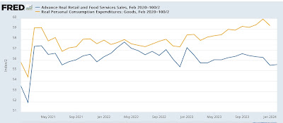
Which is bad enough. But it means that the last two months are the worst post-pandemic numbers in almost three years. Below I show them in comparison with real personal consumption on goods, the similar metric from the personal income and spending report, normed to 100 as of just before the pandemic:


I included the second number above because real retail sales and real personal spending on goods tend to track one another fairly closely over time, and both (/2) tend to forecast the trend in nonfarm payrolls. What has been compellling over the past half year is the marked divergence between the two spending measures, as retail sales have declined, while real personal spending has continued to increase.

 Here’s the record of both compared with jobs going back 15 years measured YoY:


On that same YoY basis now, real retail sales (blue) are down -1.6%, after a revised -2.0% in January, meaning a (noisy!) trend forecast of a YoY decline in jobs of over -0.5%, vs. the real personal spending forecast of roughly a 1% gain: 


Usually in the past (as, going back almost 75 years) such a decline in real retail sales has meant recession - but not in the last 18 months. I continue to expect the unusual large divergence between the two spending measures to resolve, hopefully in the direction of real personal spending.

Good news and bad news Thursday: the good news is jobless claims . . .


 - by New Deal democrat


This morning brought us both good and bad economic news.


The good news was that initial jobless claims continue very low, at 209,000, down -1,000 from last week, while the four week average declined -500 to 208,000. Even better, after major downward revisions, continuing claims rose 17,000 to 1.811 million:


Recall that continuing claims had been reported over 1.900 million, so as I said above, this was major!

On the more important YoY basis for forecasting, initial claims are down -14.3%, the four week average down -7.2%, and continuing claims, which before revisions had been running at about 10% higher YoY, are now only up 2.2%:


This is all very positive for continued good employment numbers in the months ahead (but see my next post today!).

Last week the unemployment number very much did NOT do what I expected, which was to remain steady or decline. Instead it rose to a new 2+ year high of 3.9%. I wondered whether, because unemployment includes both new and existing job losses, it followed continuing claims more than initial claims (although initial claims lead both).

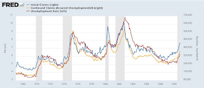
Here’s the long term pre-pandemic trend (divided into two parts for easier viewing)(continuing claims /8 for scale):


Historically, as I’ve always pointed out, initial claims lead both continuing claims and the unemployment rate. The above graph shows that continuing claims also lead the unemployment rate, although with much less of a lead time.

So here is the post-pandemic record:


The divergence between initial and continuing claims beginning this past autumn looks like it indeed has passed through into the unemployment rate. Since the historical record remains that initial claims lead continuing claims, and in the past three weeks (post revisions!) continuing claims have declined sharply, we’ll see how this shakes out after the full month of March.

Wednesday, March 13, 2024

The most potent labor market indicator of all is still strongly positive


 - by New Deal democrat


On Monday I examined some series from last Friday’s Household survey in the jobs report, highlighting that they more frequently than not indicated a recession was near or underway. But I concluded by noting that this survey has historically been noisy, and I thought it would be resolved away this time. Specifically, there was strong contrary data from the Establishment survey, backed up by yesterday’s inflation report, to the contrary. Today I’ll examine that, looking at two other series.


Historically, as economic expansions progress and the unemployment rate goes down, average hourly wages for nonsupervisory workers improve at an increasing rate (blue in the graph below). But eventually, inflation (red) picks up and overtakes that wage growth, and a recession occurs shortly thereafter. Not always, as we’ll see in the graph below, but usually:


As you can see, there have been a number of exceptions to the rule, chiefly where inflation outstripped wage growth, but no recession happened anyway. Typically this has occurred because of the entry of so many more people (like women in the 1980s and early 1990s) into the labor force.

And we certainly see that inflation outstripped wages in 2022, not coincidentally when there were several negative quarters of real GDP. But with the decline in gas prices, in 2023 inflation subsided much more sharply than wage growth, and the economy improved more substantially. That has remained the case in the first two months of 2024.

But an even more potent indicator is one I have come to rely on even more: real aggregate payrolls for nonsupervisory workers. Here’s its historical record up until the pandemic:


There’s not a single false positive, nor a single false negative. If YoY aggregate payroll growth is stronger than YoY inflation, you’re in an expansion. If it’s weaker, you’re in a recession. Period.

And here is its record since the pandemic:


Real aggregate nonsurpervisory payrolls are positive, and they got more positive in 2023 compared with 2022. Currently they are 2.6% higher YoY than inflation.

In addition to the YoY comparison, real aggregate nonsupervisory payrolls have always declined, at least slightly, from their expansion peaks before every single recession in the past 50 years except for when the pandemic suddenly shut down the economy:


Not every slight decline means a recession is coming. But if real aggregate payrolls are at a new high, you’re not in a recession, and one isn’t likely to occur in the next 6 months, either.

And in case it isn’t clear from that long term graph, here’s the short term graph of the same thing:


Real aggregate nonsupervisory payrolls made a new all-time high in February. Despite the negative metrics in the Household survey, this is *very* potent evidence that not only are we not in a recession, but one isn’t likely in the immediate future either.


Tuesday, March 12, 2024

February consumer inflation: the tug of war between gasoline and shelter continues


 - by New Deal democrat


Last month I described the trend in consumer inflation as an ongoing “tug of war” between energy and housing. Energy (mainly gasoline) peaked in June 2022 and made its  low in June 2023, while housing, which peaked in early 2023, has been gradually disinflating since.

That tug of war continued in February. Energy prices firmed, up 2.3% for the month, while shelter, which still increased 0.4% for the month, had its lowest YoY reading since June of 2022. As you may already know, both headline and core inflation rose 0.4% in February. The YoY increases were 3.2% and 3.8% respectively. The former YoY reading is in the range that it has been for the past 6 months, while the latter is also the lowest since April 2021. Here are the monthly changes in each for the past two years:


In lieu of a bunch of graphs, here is the Census Bureau’s spreadsheet. The column at the far right shows the YoY increases, where it is easy to see where the remaining problem areas are:

The only sectors still up over 4% YoY are food away from home, transport services (mainly repairs and insurance), and - still - housing. Here’s what the first two look like, plus a breakout of the motor vehicle repair and maintenance component of transport services:


Inflation in food away from home is still gradually disinflating, and is now at its lowest YoY rate of increase since June 2021. although it is still running about 1.5% above its YoY rate before the pandemic. If its present trend continues, it will be increasing at its pre-pandemic level in about 6 months. 

Transportation services, however, have stopped decelerating for the last 8 months. As shown above, however, it isn’t due to repairs, which while still up 6.7% YoY, have shown sharp deceleration. Rather, it is almost all due to motor vehicle insurance (which unfortunately is not broken out separately on FRED), which was up another 0.9% in February alone, and is up a whopping 20.6 YoY!

Aside from motor vehicle insurance, as I’ve been saying for months, the only *real* remaining inflation problem boils down to shelter. To show this, below are the YoY% increases in headline inflation (which has been bouncing around between 3.1% and 3.7% for over half a year, core inflation, which has been very gradually trending downward, energy (now down -1.7% YoY, /3 for scale), and CPI ex-shelter, which is up only 1.8% YoY:


An issue has been made by a few people about whether series like the Apartment List National Rent Index, which have shown slight YoY *declines* in rents for several months, have been giving a true leading reading. While rent of primary residence has continued to increase, up 0.5% in February, the YoY comparisons continue to show deceleration, Here are the monthly% (blue, right scale) and YoY% (red, left scale) changes in the CPI for rent of primary residence:


YoY comparisons will get much more challenging beginning next month, as the final 0.7% monthly reading from last February drops out of the picture. But the last 3 months have only increased a total of 1.1%, and are the lowest 3 month average since autumn 2021. I suspect that the slowly decelerating trend will continue. If it continues over the next 6 to 9 months, YoY rent in the CPI will be about 3.4% - right in the middle of its pre-pandemic range.

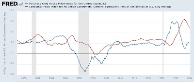
Finally, here is this month’s update of the graph comparing house prices as measured by the FHFA Index (/2.5 for scale) with CPI measure of owners equivalent rent:


Like rent of primary residence, owners equivalent rent, up 6.0% YoY, is increasing at the lowest pace since July 2022. Although house prices have resumed increasing in the past half year, the pace of those increases is in line with their pre-pandemic trend. Thus I expect the deceleration the CPI shelter index to continue, although it may do so at a slower pace.

To sum up, my conclusion this month is the same as it was last month, to wit: if there are no unpleasant surprises awaiting in the months ahead as to gas prices, we can expect headline inflation to continue to be fairly stable, and shelter to continue to show disinflation, leading to gradually lower core inflation readings as well.


Monday, March 11, 2024

Scenes from the February jobs report: yes, the Household Survey really was recessionary


 - by New Deal democrat


Later this week we get a lot of interesting reports, including CPI tomorrow, retail sales on Thursday, and industrial production on Friday. In the meantime, let’s take a further look at some of the more noteworthy data from Friday’s employment report. In particular, as I wrote then, the Household Survey portion of that report was downright recessionary. Let me show you why.

Let’s start with YoY civilian employment. This is only up 0.4%. (Note: in this graph, as in all of the below graphs except for the last one, I subtract the current value so that it shows exactly at the zero line for easy comparison with previous occasions where the YoY value has been the same):


In the past 75 years, that has only occurred 5 times not associated with recessions: 1952, 1995, 2003, 2011, and 2013: 


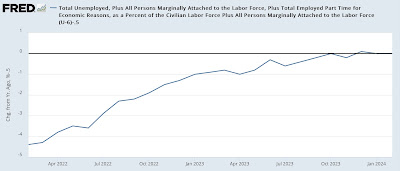
U6 underemployment is up 0.5% YoY:


In that series 30 years of existence, that has only happened once outside of a recession, in 2003:


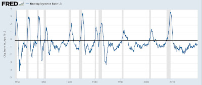
U3 unemployment is up 0.3% YoY:


That has occurred outside of recessions 5 times in the past 75 years: in 1952, 1956, 1963, 1967, and 2003


Finally, while the Sahm rule, which requires the 3 month average of the unemployment rate to be higher by 0.5% from its low in the previous 12 months, has not been triggered, that metric is up .27%:


That has occurred outside of a recession occurring only 5 times as well: 1962-63, 1967, 1977, 1986, and 2003:


In other words, more often than not when any of these Household Survey metrics have been at these levels in the past, it has been shortly before or early in a recession.

The current divergence between YoY job growth as measured by the Establishment and Household Surveys is 1.36% (By the Establsihment Survey, jobs have increased 1.6% YoY vs. the 0.2% in the Household Survey). Since the Korean War, that big a divergence has occurred 17 times in over 800 months, usually only lasting one month:


Based on past experience, I expect the two surveys to track more closely in the months ahead. The question is, which one will resolve towards the other? At any given time, there is always some metric that is going to be recessionary, and another which supports expansion. In this case, I suspect the Household Survey’s weakness will be the metric that proves transitory, but for now that weakness is very much real.