Saturday, October 28, 2023

Weekly Indicators for October 23 - 27 at Seeking Alpha


 - by New Deal democrat


My Weekly Indicators post is up at Seeking Alpha.

With half of reports in, Q3 profits for corporations have made a new all-time high. Meanwhile the stock market has made repeated new 3 month lows. The former is a long leading indicator, the latter a short leading indicator, so we shall see which one proves more accurate.

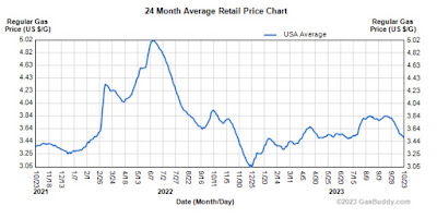
And in case you haven’t noticed at the pump, gas prices have declined to new 6 month lows as well, so maybe that consumer spending spree can continue for awhile.

As usual, clicking over and reading will bring you up to the virtual moment as to the economy, and reward me a tiny little bit for my efforts.

Friday, October 27, 2023

Spending soars, income stagnates, savings sink like the Titanic


 - by New Deal democrat


Real life intruded yesterday, so I didn’t put up any information about the Q3 GDP report. I’ll write in detail next week, but in the meantime there were 4 basic highlights:
1. Obviously it was an excellent report overall.
2. The long leading metric of real residential fixed spending also rose slightly, although as a share of real GDP it fell, so technically it was a slight negative.
3. Proprietors’ income also rose, both nominally and after adjusted for inflation, so it was positive.
4. The only other fly in the ointment was the real personal income declined for the Quarter, as to which we got more information in this morning’s report on personal income and spending, to wit, below…

This year real personal income and spending have assumed more importance than usual, because as gas and other commodity prices have declined sharply, consumers ramped up spending. That continued in September - but with a very major caveat that consumers have been raiding their savings to do so.

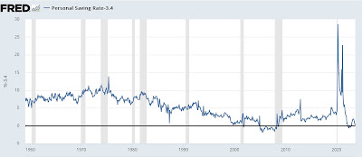
So let me start right out with the personal saving rate, which declined monthly by a sharp -0.6% to 3.4%. Since May the personal saving rate has declined a whopping -1.9%! To put this in perspective, the below graph subtracts 3.4% from the value to show it at the zero line historically:


In the past half century, the saving rate has only been this low in 2005-07 and for most of 2022. This simply cannot be sustained for long.

Obviously that money got spent, and in September personal spending rose a sharp 0.7% nominally, while income rose 0.3%. Since PCE inflation clocked in at +0.4%, in real terms (after rounding) spending rose 0.4%, and income was unchanged. The below graph (and all other graphs in this post below) is normed to 100 as of just before the pandemic:


While spending has ramped up all spring and summer, note that real income has flatlined since May. This may be noise, or it may be an early warning of a trend change. We’ll see.

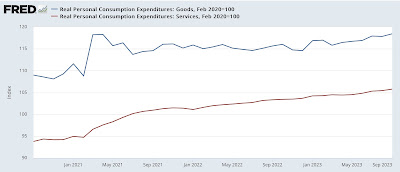
Dividing consumption into spending on goods (which tend to turn first) vs. services shows that both continued strong in September:


Services, as they have almost for the past 50+ years, have risen consistently since the pandemic low. Like so many other items, however, June 2022 was the inflection point for spending on goods, which have risen with some fluctuation ever since. Although I won’t bother with the graph, the YoY% increases are also very robust and not at all recessionary.

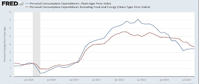
As mentioned above, the PCE deflator increased 0.4% for the month. Here’s what both headline and core PCE inflation look like on a YoY basis since before the pandemic:


Just as with the CPI earlier this month, the core measure has continued to decelerate, to 3.7% while headline iinflation has stabilized, at 3.4%.

Finally, there are two other metrics contained in this report that the NBER looks at for recession dating. Both were positive.

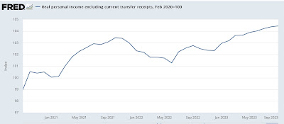
Real income ex-government transfer payments rose 0.1% to another new high:


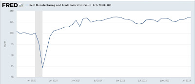
And real manufacturing and trade sales (which uses the PCE deflator) rose 0.4% and tied its previous post-pandemic highs:


In short, the good news is that all of the relevant spending indicators came in very positive. The bad news is that real income has stagnated in recent months, and that spending splurge has been fueled by shoveling into savings, a situation which is unlikely to continue for very long.

Thursday, October 26, 2023

Jobless claims continue near expansion lows


 - by New Deal democrat

Jobless claims continued very low last week, justifying taking down the “yellow caution flag” that had been in place for a number of months.


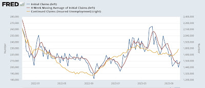
Specifically, weekly new claims rose 10,000 to 210,000 - still a very low historical number. The more important four week moving average increased 1,250 to 207,500. Contrarilyk with a one week lag, continuing claims rose sharply, up 63,000 to 1.790 million, their highest level since spring, and before that, the highest level in 18 months:


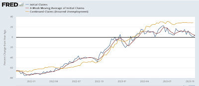
On the YoY basis which is more important for forecasting, initial claims were up 4.5%, the four week average up 3.4%, and very much conversely, continuing claims up 28.7%:


Basically, there are very few new layoffs, but those previously laid off are having a *relatively* harder time finding new employment, although by historical standards this too is very low. As you may recall, in September I wondered whether we were dealing with unresolved seasonality. This is only one week of an increase in claims. If we are seeing a delayed such effect, then claims should continue to rise over the next few weeks. We’ll see.

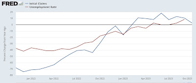
Finally, since initial claims lead the unemployment rate by several months, so far in October initial claims are only up 2.8% YoY. Since one year ago the unemployment rate, averaged over 3 months, was 3.6%, this suggests that in a few months it will stabilize at roughly 3.7% (3.6*1.028=3.7%):


 Needless to say, this comes nowhere close to triggering the “Sahm Rule” for nowcasting recessions.

Wednesday, October 25, 2023

The bifurcation in the new vs. existing home market continues


 - by New Deal democrat

Last week we saw that sales of existing homes plummeted to a 28 year low, save for one month in 2010; but prices for the very limited number of such homes on the market rose 2.8% YoY.


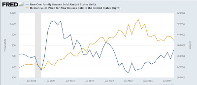
This morning we saw the exact converse happen with new home sales, which rose to a 12 month high of 759,000 annualized, up 83,000 from one month ago; while prices declined $14,300 month over month to $413,800, very close to a 2 year low:


In short, the compete bifurcation of the new vs. existing home markets continues. Unlike existing homeowners, many of whom are shackled in place by 3% mortgages, new home builders can offer price incentives and downsize floor plans to increase sales.

Which is an interesting twist on my basic housing mantra, which is that interest rates lead sales, which in turn lead prices. Let’s update each metric.

First, here are mortgage rates (red) vs. new home sales (blue) and permits (light blue):


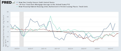
As mortgage rates rose sharply in 2022, permits and sales sank. Mortgage rates moderated throughout most of 2023 so far, and both sales and permits have responded positively.

Here’s the same data captured as YoY% changes, so that it is easier to see that both sales and permits followed the changes in mortgage rates, which are /10 for scale, and inverted better to show the relationship:


As I always caution, new home sales, while the most leading housing metric of all - usually the first to turn - are also very volatile, and sharply revised. So with the increase in mortgage rates to new 20 year highs, I fully expect both sales and permits to reverse lower in the next few months.

Meanwhile, as indicated in the first graph above, prices continued to increase, even as sales declined, until last October. Sales bottomed in July 2022, but prices have generally continued to decline, and may be bottoming now.

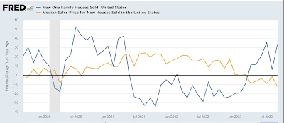
Here is the same data YoY:


While sales are up 33.9% compared with one year ago, prices are down -12.3%.

New and existing home sales combined are down in the aggregate since one year ago, and so are prices. Since mortgage rates will put more pressure on sales, I expect prices to continue to moderate (if that’s an appropriate word, considering overall un-affordability) in the months to come.

Tuesday, October 24, 2023

Stock prices and bond yields during disinflationary, deflationary, and reflationary periods


 - by New Deal democrat


This is an update of a post I wrote almost exactly 10 years ago. I’m doing this because of an important secular change I noticed that appears to have happened in the financial markets.

Back when I first started delving into financial markets and economy 30 years ago, I noticed that, dating all the way back to the Great Depression, the stock market appeared to perform best during periods of very low inflation, or very slight deflation, that persisted. The more inflation beyond about 3%, the worse the market performed. And in the rate case where deflation was more than -1%, the stock market performed horribly (because deflation of greater than -1% almost always includes wage deflation).

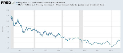
It has generally also been true that bond yields move in very long, e.g., 60 year or so cycles of declining vs. increasing interest rates.

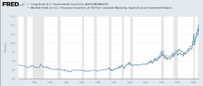
For example, here are long bond rates between the early 1920s and 1980:


And here they are between 1981 and the present:


Based on those two insights, it appeared that bond yields and stock prices behaved differently vs. one another during times of longer term declines in the inflation rate (disinflation), times of very low inflation rates or even deflation (deflation), or longer term increasing interest rates (reflation).

So, 10 years ago I wrote the following:

“it is important to keep in mind the difference between inflationary recessions and deflationary recessions. All of the post-WW2 recession through 2000 were inflationary recessions. Inflation increased, the Fed raised short rates to counter it, long rates began to decline as bond investors anticipated weakness, and a recession began. In deflationary recessions, an asset bubble bursts, and/or a debt overhang reaches critical mass, and the inflation rate declines, possibly turning into deflation. Interest rates follow, subject ot the zero lower bound. 

“The difference in the two types of scenarios is manifest in the different way that interest rates have behaved vis-a-vis stock prices during the disinflationary period of 1982-97 vs. 1998 to the present.” 

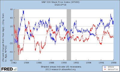
At that point in the post I included two graphs (in the old FRED format you may remember). First, the YoY% change in stock prices vs. Treasury yields from 1982-98:


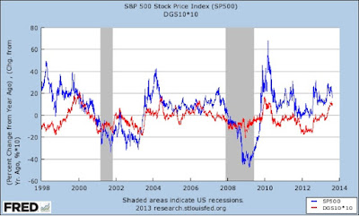
And then the period from 1998 to 2013:


I continued:

“During the disinflationary period of 1982-97, the YoY percentage change in stock prices was the mirror image of the YoY percentage change in bond yields. Stocks rose when bond yields fell, and stocks fell when bond prices rose. From 1998 on, however, almost always stock prices and bond yields have moved in the same direction (with the exception of late 2003 through mid-2006). 

“During that period, bond yields fell even with a strong economy. 

“But that changed beginning in 1998. From that point until the present, bond yields have generally risen with a strengthening economy, and fallen with a weaker economy. As first the tech stock bubble burst, and then the housing bubble burst, there were deflationary moves in asset prices and declining bond yields simultaneously. Several times since then, there have been brief periods of outright deflation. Perhaps a more finely grained assessment is that, since 1998, during periods of a strong economy, bond yields and stock prices behaved as mirror images. But during periods of a weak economy (which has been the vast majority of the time since the turn of the Millenium), the two asset classes have moved in tandem.”


So, dear reader, perhaps you are wondering what has happened in the 10 years since then.

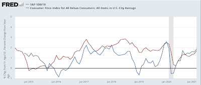
Fear not. Here is the same graph (averaging stock prices monthly), starting in 2014 through early 2021:


And here it is from 2021 to the present:


You can see that bond yields and YoY inflation continued to move in broad similarity up until early 2021, just as they had since 1998. 

Then the situation changed. Since early 2021, they have moved in opposite directions. It could of course just be a brief divergence, but I suspect this is a longer term secular change, marking a reflationary era in which over time the trend in bond yields will continue to be higher, just as it was between the early 1950s to 1980. Stock prices will react negatively to each such racheting higher.

Monday, October 23, 2023

A further examination of the state of the economic tailwind


 - by New Deal democrat


With no big economic news today, I thought I would pick up where I left off Friday, when I identified three major reasons for the economic tailwind that prevented a recession from happening in the past 12 months.


1. Commodity prices generally and gas prices specifically

I am beginning to think that all economic forecasts should come with an open caveat on the order of “subject to the trend in gas prices, which are set by a few geopolitical actors.” Certainly that was the case in 2022, when the War in Ukraine drove prices skyward, and then they fell back to ground as Europe in particular dealt with their reliance on Russian fuel.

This year prices rose as the economy strengthened, but they have fallen again in the past month, and averaged $3.50/gallon when I pulled this graph this morning, which is about -8% lower than 1 year ago:


Historically gas prices have a complex relationship with the economy. As shown in the graph below, gas prices averaged quarterly have a broad positive correlation with real GDP for the same quarter:


Which is another way of saying that large moves in gas prices affect the economy almost immediately (as in, “the remedy for high prices, is high prices.”)

But note the exceptions of 2006 and 2016. In both cases gas prices retreated sharply, even as an expansion continued (first due to the ebbing effects of Katrina, the second due to the success of fracking production in the US). A similar situation appears to be playing out in the past 12 months, where a big YoY decline in gas prices has been driving a sharp increase in GDP (which is expected to continue in the Q3 report this Thursday).

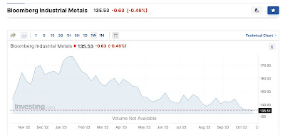
I also track industrial metals, which exclude the direct inclusion of energy prices. These also declined sharply this year. They appeared to be stabilizing, but in the past month have declined to new 12 month lows:


This may be traders’ reaction to the Israel/Gaza situation. But it may also have to do with continued weakness in China. So the commodity tailwind may be starting up again.

2. The slowdown in China

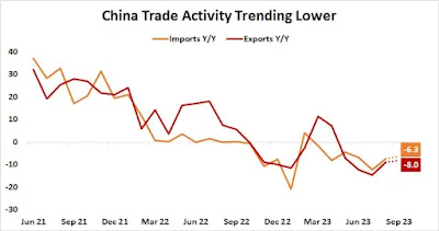
Below is a graph of imports to and exports from China measured YoY:


While I take all statistics about China with multiple grains of salt, if I saw this chart coming out of any transparent economy, I would treat it as recessionary. And because China is such a huge consumer of raw materials, I would treat it as placing further deflationary pressure on commodities, which we may be seeing with industrial metals in the past few weeks in the graph above.


3. Pandemic disruptions in the supply chains for houses and motor vehicles

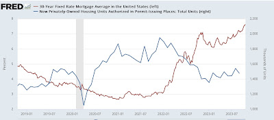
As I have noted many times, mortgage interest rates lead sales. With mortgage rates having hit 8% last week, let’s update the YoY graph of rates (inverted,*10 for scale) vs. housing permits:


One year ago mortgage rates hit 7%. But then they declined to 6% in the spring before rising to new highs more recently. So we cannot project current rates forward. But *IF* this uptrend in rates does not promptly reverse, then it is likely that permits will decline to new cycle lows below 1.350 million annualized, shown in the below graph of absolute mortgage interest rates and permits:


In fact, with interest rates about 10% higher (7%*1.10) than they were last year, a decline during winter to 10% below 1.350 million, or about 1.225 million, is possible.

And sooner or later, the big downturn in permits and starts is going to catch up with housing units under construction, which as I noted Friday are only down 2% so far.

The situation is much less clear when it comes to motor vehicles.

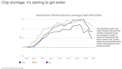
This past spring SP Global wrote:

S&P Global Mobility estimates that in 2021 more than 9.5 million units of global light-vehicle production was lost as a direct result of a lack of necessary semiconductors, with the third quarter of 2021 experiencing the largest impact with an estimated volume loss of 3.5 million units. Another 3 million units were impacted in 2022.

During the first half of 2023, however, losses identifiable as specifically related to the semiconductor shortage fell to about 524,000 units globally.”

They also supply the following graph comparing backlogs in chip shipments compared with normal (normal=1):


At that time, the backlog was still about 3X the usual pre-pandemic time.

 
Car manufacturers are struggling to keep up with the demand for new vehicles, as the shortage of chips has resulted in a shortage of critical components needed for production. It has also led to higher car prices as manufacturers pass on the additional costs to consumers.”

 
Overall, the auto industry stocked 60 days’ worth of vehicles at the beginning of October. That’s considered a normal supply of inventory by historical standards, and it’s also the highest since early spring 2021”

But needless to say, it varies considerably with the popularity (or lack thereof) of the vehicles being sold:

brands like Dodge, Chrysler, Lincoln, Infiniti, Volvo, Ram, Jeep, and Mini offer plenty of new vehicle stock. In contrast, inventory levels still sit well under normal for Honda, Toyota, Kia, Subaru, Lexus, Cadillac, Land Rover, and Hyundai.”

To summarize the situation with motor vehicles, the chip shortage itself may be mainly over, but there is roughly 10,000,000 vehicles worth of pent-up demand that is far from being addressed. The net result for now is that vehicle prices have reached a new, stratospheric equilibrium, that is also constraining sales from satisfying that pent-up demand.