Friday, January 20, 2023

Existing home sales and prices decline; plus, a closer look at multi-unit housing construction


 - by New Deal democrat


I will keep my comments on December existing home sales and prices brief. That’s because, even though they make up about 90% of the total market, they have much less economic impact than new home construction. They are best used to confirm trends; in this case, that housing sales have continued to decline, and prices (which follow sales with a lag) have also rolled over.


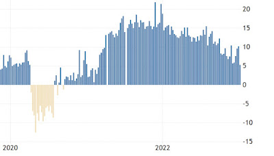
And confirm both trends they did. December sales declined another -1.5% to 4.02 million annualized, a -34% YoY decline. Via Mortgage News Daily, here’s what they looked like for the last 3 years through November:


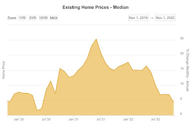
The median price of an existing home, which isn’t seasonally adjusted, declined further to $366,900, only a 2.3% YoY increase from 2021’s $358,800. My rule of thumb for non-seasonally adjusted data is that the trend has turned when the YoY increase is less than 1/2 of its maximum increase in the past 12 months. That was January 2022’s +17.1%. Needless to say, only a 2.3% YoY increase in December confirms that prices have turned down. Here’s what YoY prices also look like for the past 3 years through November:


With that out of the way, I wanted to follow up a little on yesterday’s post about housing construction, since I read a piece that pointed out that the remaining strength in the market is multi-family construction.

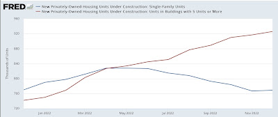
Indeed, that is the case. Single family housing under construction peaked at 828,000 units annualized in April, and is down -7% since then, while multi-unit construction has continued to increase since that time from 827,000 units annualized to 926,000, a 12% increase:


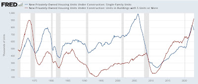
This is not unusual. A long term look indicates that with the exception of the 1980s, multi-unit construction has always peaked later than single family construction:


This is generally because apartment and condominium living is typically a less expensive alternative to buying a single family home. When prices get steep enough, young buyers in particular find that apartments or condos are their only affordable option.

Still, with the exception of the pandemic, and at the tail end of the 2000s housing bubble, even multi-unit construction has turned down in advance of recessions. The latest occasions (outside of 2007, when there was a -3% decrease followed by a 6% increase up until the recession began) were in 1973 and 1981, where multi-unit construction peaked 4 months before the onset of the recessions, and declined -3% and -7% respectively. Most often, multi unit construction peaked no later than 4 months after single family construction, although in the case of the housing bubble, it took over 2 years!

Since the YoY% pace of multi-unit construction growth has only slowed from 27% in August to 24.8% in December, it appears we are at least a few months away from this sector rolling over.

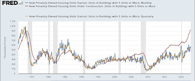
Edited to Add: In the past, multi-unit housings under construction has generally peaked 1-5 months after the 3 month average of multi-unit starts has peaked. The below graph shows such starts both monthly (which are very noisy, blue) and quarterly (gold) to best show this:


The 3 month average of multi-unit starts appears to have just peaked in Sep-Nov, so it is likely that multi-unit construction turns down by April.


Thursday, January 19, 2023

The actual Big News in this morning’s housing report was - positive


 - by New Deal democrat


For the second month in a row, the biggest news in the housing report was not in the headlines. 


Most of what you are going to read is about how bad housing permits and starts were, and that they are recessionary.

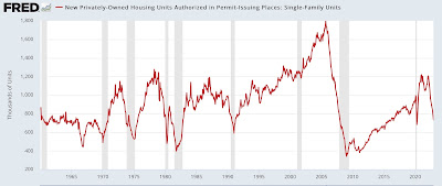
And it’s true. In particular, the most leading and least noisy housing metric of all is single family permits, and they declined another 6%+ to 830,000 annualized, their lowest reading in over 5 years excepting the pandemic lockdown month of April 2020:


They are also down 39% from their peak in early 2022. This is recessionary, plain and simple.

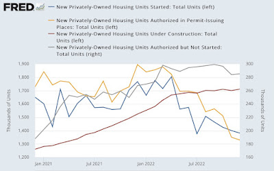
The recessionary or near-recessionary figures also include total permits (gold in the graph below), down 1.5% to 1330 for the month and down 30% from their 2022 peak, also the lowest in 4 years except for two pandemic lockdown months; and total starts (blue), down 1.4% for the month, down 19% from their 2022 peak, and also the lowest since the pandemic lockdowns. I’ve also included housing permitted but not started (gray, right scale), which is down 4% from its peak in October. We’ll come back to the red line later:


But that’s not the most important story in this morning’s report.
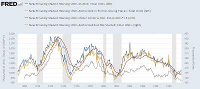
As shown in the two graphs below, going back 50+ years, the typical pattern in the housing market is:
1. Permits (gold) peak
2. Within a month or two later, starts (blue) peak.
3. After that, units permitted but not started (gray) peak.
4. Finally, housing units under construction (red) peaks:


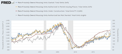
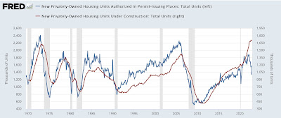
To make the relationship easier to see, below I’ve simply included permits (blue) and units under construction (red):


Going back 50+ years, units under construction have *always* peaked with a delay, and *always* declined, almost always by over 5% (the exceptions being 2001 and the pandemic) before a recession began.

And what happened with housing units under construction in December? They made an all-time high, that’s what (as best shown in the close-up graph of the last two years above).

Most importantly, it is housing units under construction, not permits and not starts, that are the “real” economic activity in housing.

I am surprised that actual housing construction has held up this long - and this past year has been the biggest lag ever between the downturns in permits and starts, and a downturn in construction. And I *do* expect it to ultimately follow suit, and turn down in a big way. But until this happens, new housing construction is making a *positive* contribution to the economy.

That’s the actual big news from the December report.


Jobless claims continue their string of good news


 - by New Deal democrat


If yesterday’s economic data was bad, this morning’s was considerably better (I’ll post on housing construction later).


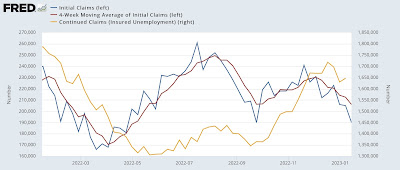
Initial jobless claims declined 15,000 to 195,000, tied for their best number in almost 8 months. The 4 week moving average declined 6,500 to 206,000, the best number in over 6 months. Continuing claims, one week earlier, did increase by 17,000 to 1.647 million, still lower than their December readings:


These continue to be just excellent numbers.

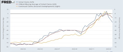
Further, both initial claims and their 4 week average improved, and are lower YoY, although continuing claims are just slightly higher:


Unless and until the 4 week average of initial claims is higher by 10%+ YoY and stays there, there is no recession signal.

This is very good news. 

Wednesday, January 18, 2023

And the King of Coincident Indicators rolls over


 - by New Deal democrat


This morning’s second big - and big negative - report was for industrial production, the King of Coincident Indicators (I call it so because historically, it more often than not marks the exact month +/-1 that a recession begins or ends).


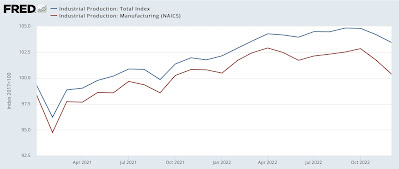
In December industrial production declined -0.7%, and manufacturing production declined -1.3%. Even worse, both were revised down by -0.4% and -0.5% for November. Total production was lower than at any time since last February; manufacturing production was lower than at any time since October 2021:


If production did truly peak in October, we are much closer to recession than we previously thought.

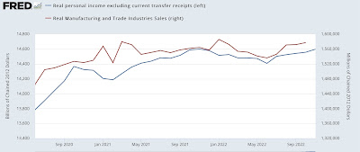
With that in mind, let’s look at the two other of the “big four” coincident indicators in addition to payrolls used by the NBER to calibrate expansions and recessions. These are real manufacturing and trade sales, and real personal income less transfer receipts:


Both of these rebounded nicely since June with the big decline in gas prices (that has probably ended), but are still below their early 2022 peaks. I would expect these to stall or worse in the next few months, but let’s await the data.

The bottom line is that job growth is really the last coincident indicator standing at this point. When jobs roll over, the recession has begun.


December real retail sales: the worst in almost two years


 - by New Deal democrat


Real retail sales, one of my favorite indicators, was updated this morning for December, and it was significant.


It’s not just that retail sales declined -1.1% for the month both in nominal and real terms; it’s that both October and November were revised downward by -0.2% and -0.4% respectively, so the ultimate number is considerably worse than would otherwise have been expected.

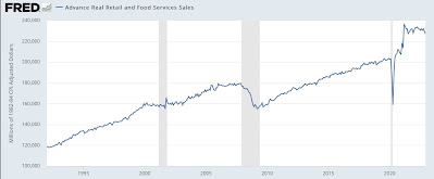
How so? First, here are real retail sales in absolute terms for the past 25+ years:


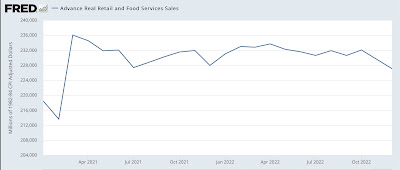
Note that in the year before both the 2001 and 2008 recessions, real retail sales went flat. As shown in the below close-up of the past two years, last month was the worst showing since February 2020, before the last pandemic stimulus was passed:


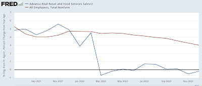
This shows up as the second month in a row of a negative YoY reading (which is pretty impressive in a negative sense, because December 2021 was *awful* due to the original Omicron COVID mega-wave) (I’ll come back to the red line showing the YoY% change in payrolls in a moment):


Here’s the longer term YoY view:


As I’ve noted many times, real retail sales going negative YoY, at least for more than one or two months, has been an excellent harbinger of incoming recession. In fact, the relationship goes back about 75 years. While I’ve discounted the negative numbers from spring 2021, as I wrote about yesterday, because of distortions due to comparisons with the spring 2021 stimulus months, there is no distortion in these negative readings. If they continue any further, that would be very strong evidence that a recession is close at hand.

Which returns us to the red line in the graph above. Remember that consumption leads jobs. If we omit the March-May months, we have 7 months since of absolute weakness in consumption growth, and decelerating jobs gains. This morning’s report is a potent warning that we should expect jobs growth to decelerate further, and perhaps sharply. 


Tuesday, January 17, 2023

Why the Fed’s present rate hike campaign is almost unprecedented


 - by New Deal democrat


Just how unprecedented is the Fed’s current rate hike policy? Since the Fed started actively managing the Fed Funds rate in the late 1950s, only two other occasions are similar.


The reason the Fed is hiking rates is to combat inflation. But, as I have pointed out in the past, the post-pandemic Boom is very similar to the immediate post-WW2 Boom. In 1947 in the face of 20% YoY inflation, the Fed did - basically nothing. It raised the discount rate from 1% to 1.5%:


Prices stabilized on their own once they reached the limit of ordinary consumers to bear. There was a brief inventory-led recession in 1948, and the economy proceeded to motor right forward.

In 2022, the Fed raised rates by 4% in the last 10 months of the year, one of the most aggressive rate hike regimes in history, as shown in the below graph of the YoY change in the Fed funds rate:


Inflation peaked in June. Since then, the Fed has continued to hike rates by 2.75%:


Not only was the 2022 rate hike regime among the most aggressive, but it was unusual in another way. As shown in the below graph, in all other occasions of significance but two, the Fed raised rates coincident with *rising* inflation. The Fed stopped hiking rates before or at most shortly after inflation peaked:


Indeed, typically once inflation started declining, the Fed started to *lower” rates, generally in the face of a weakening economy. By contrast, last year the YoY change in the CPI peaked in June. Since then, the Fed has hiked rates by another 2.75%.

There have only been 4 other times in the past 60+ years that the Fed has continued to raise rates after inflation peaked. Two of those were barely significant, involved rate hikes of only 0.5%. In 1997, the Fed funds rate increased from 5.25% to 5% as inflation declined from 3.4% to 1.4%. In 2018-19, the Fed funds rate was increased from 2% to 2.5% as inflation declined from 2.9% to 1.5%. Neither of those were associated with a recession (the 2020 recession being caused by the pandemic).

Two other times involved rate hikes 2% to 3% or less that were associated with slowdowns but no recessions. In 1984, the Fed funds rate was hiked over 5 months from 9.5% to 11.75%, as inflation declined from 4.9% to 4.3%:


In 1994-95, the Fed funds rate was hiked from  3% to 6% over 17 months, even as inflation varied only from 2.8% to 2.3% to 3.1%:


There was a sharp slowdown - enough perhaps not coincidentally to contribute to the GOP obtaining a majority in the House of Representative for the first time since the Great Depression - but no recession.

By far the biggest episode occurred in 1980 and 1981. In April 1980 the Fed funds rate peaked at 17.5% exactly as inflation peaked at 14.6%. Thereafter, despite inflation receding to 13.2%, the Fed under Paul Volcker renewed a rate hike campaign, going from 9% to 19%, even as inflation continued to cool to 9.7%. The deep 1981-82 recession, that saw unemployment rise to over 10% for the first time since the Great Depression, ensued:


The current Fed rate hike campaign is more serious than any but the 1980-81 hikes. And even in 1994 inflation was mainly going sideways, not declining. That leaves only the 1984 episode as the only other one truly comparable.

Using core inflation, the situation is the same, with the exception that inflation has not declined significantly at present, solely due to the prominence of the badly lagging measure of owner’s equivalent rent that makes up 40% of the metric:


And it is similar if I use the core personal consumption expenditure deflator as well, with the exception of 1969, where the Fed continued to raise rates into a recession as the core deflator peaked but stabilized there. In our present situation the core deflator has declined -0.5% from 5.2% last February to 4.7% in November:


To summarize: over the past 60+ years, the Fed has normally only raised rates as inflation was rising, and stopped or reversed course once inflation began to decline. Several of the exceptions are not significant, involving rate hikes of 0.5% as inflation declined. One (1994) involved rate hikes in the face of relatively flat inflation, and of the remaining two, one (1984) contributed to a sharp slowdown in the economy with no recession. The other (1980-81) contributed to one of the two worst recessions since the Great Depression, and was justified by Volcker as being necessary to uproot inflationary expectations and a wage-price spiral.

There is very little evidence of any wage-price spiral or embedded future expectations at present. And yet the Fed has continued to hike rates even as inflationary pressures have ebbed (and outside of Owner’s Equivalent Rent, appear contained).


The important trend in retail sales that Redbook’s weekly report is telling us about


 - by New Deal democrat


This is the first of hopefully two posts I will put up today.


Tomorrow retail sales for December will be reported. In advance of that, I wanted to discuss their comparison with the weekly high-frequency data of Redbook consumer sales, which I have been paying heightened attention to in the past several months.

Here is what Redbook YoY sales look like since the beginning of 2020:


After the initial pandemic lockdowns, they returned to positivity by summertime. Then they really took off with the receipt of the 2021 stimulus $$$ in March, peaking at about 18% YoY (on a 4 week average) at the end of the year. During 2022 they maintained strong YoY comparisons, before declining on a 4 week average basis from 14% at the end of July to only 7% in early December. If that trend were to continue, Redbook sales will go negative YoY in roughly April of this year.

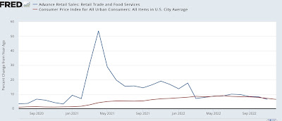
Now let’s compare that with retail sales YoY, shown since July 2020 below (blue), compared with YoY CPI (red):


At first YoY retail sales and YoY Redbook do not appear that closely related. But on closer examination there is really only one difference. Retail and Redbook correspond at all times except during the three month March-May period of the 2021 stimulus spending, and again in the YoY comparisons one year afterward. In all other periods the two correspond - and Redbook has the smoother, less noisy trajectory.

I’m not sure what subset of retail sales went nuts in spring 2021 that Redbook wasn’t picking up (the first suspect was e-commerce, but that did not prove to be the case).

The point is that during late 2020, both Redbook at retail were higher about 2-5% YoY, then increased to 15-20% higher YoY in the second half of 2021, and decreased to 5-8% in the second half of 2022 through November. 

Redbook did have several good weeks at the end of December, so I won’t hazard any prediction of what tomorrow will bring for retail sales. but the suggestion is that they, like Redbook, have been deteriorating sharply on a YoY basis since last summer. At present, real retail sales are flat compared with inflation YoY. But if the deterioration continues several more months, I would expect a significant negative real retail sales comparison, which has a history going back over 50 years as being a harbinger of imminent recession.

One final note: here is what real retails sales looked like YoY in the early to mid-1990’s:


Note they deteriorated significantly but did not go negative in 1995-7. I’ll explain the significance in my second post today.


Monday, January 16, 2023

COVID endemicity: 100,000+ (mainly needless) excess deaths per year


 - by New Deal democrat


I suspect these updates are going to be much less frequent from now on; for example, if a significant new wave is evident. 


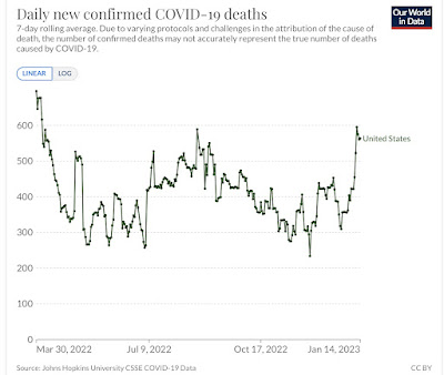
That’s because, as we start our fourth year of the pandemic, the good news is that it is far less lethal than it was during its first two years. From March 2020 through March 2021, 500,000 Americans died of Covid. Another 500,000 died in the next 12 months. But since last March, only 100,000 have died so far (an average of roughly 400 per day, mainly seniors, and mainly unvaccinated):


The bad news is that any hope that vaccinations would put an effective end to the pandemic - in terms of infections - is long gone. The virus has continually mutated to become more and more infectious, and far more evasive of the defenses erected both by previous exposures and by vaccinations, as the original strains through Delta were replaced by Omicron BA.1, then BA.2, then BA.2.12.1, then BA.5, and now the Alphabet soup featuring BQ.1&1.1 and XBB.1.5:


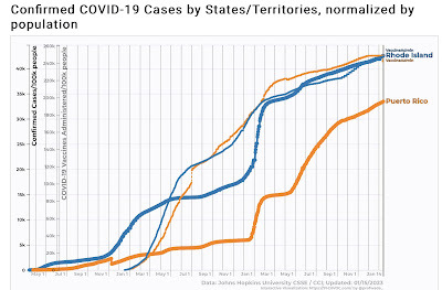
This is perhaps best shown by the situation in Puerto Rico and Rhode Island, two of the very best jurisdictions for the percentage of people who are vaccinated (thin line). Despite this, both had serious waves of infections throughout 2022:


One thing I considered is that perhaps COVID deaths were merely replacing deaths from influenza among the elderly. This does not appear to be the case.

In 2019, the last year before COVID, the CDC estimated that there were 26,400 deaths from the flu, with a huge range of error from 19,100 to 96,800. This year so far the estimate is 27,600 with a range of error from 16,000 to 48,000.

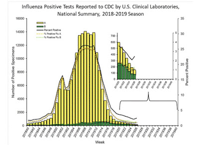
Further, here’s what flu infection levels looked like during the 2019 season:


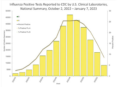
This winter, we had an even worse peak, which occurred (so far, anyway) several months earlier:


But as I said at the outset, at least COVID appears to be far less lethal now than in its first two years.

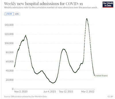
Here’s what hospitalizations looked like from autumn 2020 through the end of winter 2022:


Hospitalizations peaked at 117,700 on January 9, 2021; and then at 154,000 on January 15, 2022.

Hospitalizations appear to have just peaked again on January 3, at 47,600:


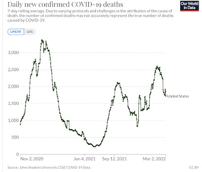
Similarly, deaths peaked on January 14, 2021 at 3380; and on February 1, 2022 at 2600:


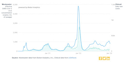
As shown in the first graph above, this year deaths appear to have peaked on January 11, at 596. This is all in the face of what Biobot waste water levels suggest his been a higher level of infections that has persisted for over half a year, at a rate of roughly 1 in 1000 persons daily +/-200, as shown in the second graph at the beginning of this post.


So, the good news appears to be that, just like during the first two winters of Covid, the waves have peaked as soon as the infections from Holiday social get-togethers have worked through the population. Even the super-infectious XBB.1.5 has not created a wave meaningfully bigger than BA.2.12.1 did late last spring, in terms of “real” infections, hospitalizations, or deaths.

But the bad news is that we appear to be resigned to a future where perhaps 130,000 more people, most of them seniors, die in excess of what otherwise would be the case, each and every year, and most needlessly, as the percentage of the population being vaccinated has all but ground to a halt.