Saturday, November 19, 2022

Weekly Indicators for November 14 - 18 at Seeking Alpha


 - by New Deal democrat

My Weekly Indicators post is up at Seeking Alpha.

It had to happen sooner or later. Earlier this year, based on the long leading indicators, I went on “Recession Watch.” Now, for the first time in a very long time, I have escalated to “Recession Warning.” I believe there is much more than a 50/50 chance of a recession beginning in the next 6 months.

For all the gory details, click on over and read, which will bring you up to the virtual economic moment. As usual, it will also reward me a little bit for the efforts I made.

Friday, November 18, 2022

Existing home sales decline to recessionary levels; prices have clearly turned down; low inventory still a problem


 - by New Deal democrat

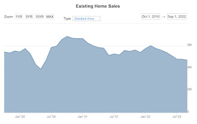
As I wrote earlier this morning, my primary interest in existing home sales at this point is prices. [Note: graphs below for sales and prices does not include October]


For the record, existing home sales fell to a new 2.5 year low (i.e., since the teeth of the pandemic lockdowns) of 4.430 million annualized:


Before the pandemic, the last time the number was this low was in 2012. Further, this is down -19.5% YoY, -26.4% from their recent secondary February high, and -35.3% below their October 2020 expansion high. This is the kind of number I would expect at the cusp of a recession.

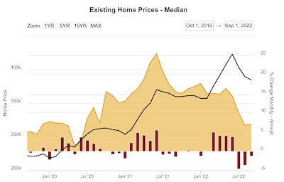
More importantly, median prices declined seasonally by -1.5% for the month to $379,100. This is “only” 6.6% higher than one year ago, and is the slowest YoY% increase in over 2 years:


The highest YoY% change in the past 12 months was +17.6% in January.  This is the third month in a row that the rate of change has declined by over 50%, my rule of thumb for when a seasonally-adjusted data set would turn down. 

In short, I think we can safely say that existing home prices, were we able to seasonally adjust, have turned down from a peak during summer.

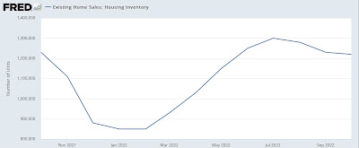
Inventory is also not seasonally adjusted. This turned down m/m, but YoY is -0.8% lower:


We are nowhere near solving the low inventory problem that we have had since even before the pandemic hit.

Core inflation using house prices rather than imputed rents


 - by New Deal democrat

Later this morning existing home sales will be reported for October, which will mainly be of interest to me only for what happened with prices, and secondarily whether the problem of low inventory which has existed for 3 years is moving in the direction of resolution.


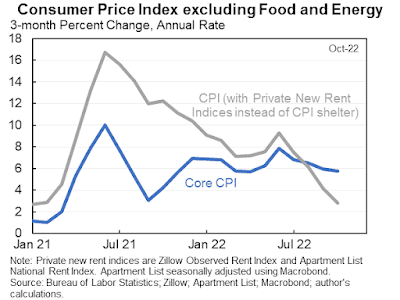
In the meantime, yesterday Jason Furman got some traction, and amplification by Paul Krugman, of the below graph which measures core inflation using new rent indices (e.g., Zillow) rather than owners’ equivalent rent:


The implication is - one embraced by Krugman - that inflation is already not a problem. 

I don’t think this is really the case, because we are still using an imputation of hypothetical rents to measure house prices.

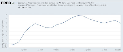
I already posted a graph of what core inflation ex-shelter would look like:


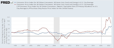
But let’s go one step further and measure what core inflation, *including* shelter looks like, using actual house prices as measured by the FHFA Index rather than owners equivalent rent, thus banishing the entire problem. Here it is:


Most importantly, as of August (the last month for which the house price index has been reported), YoY core inflation including house prices was 8.6%. At its peak 6 months earlier in February, it was 12.4%. If it were to continue to decline at that rate, in October core inflation using actual house prices would be 7.3% - declining fast, but still above the official 6.3% reading of core inflation using imputed rents. It would take until about next April for core inflation using house prices to get to the Fed’s comfort zone of 3% or less.


Thursday, November 17, 2022

Housing permits and starts continue to fall, but housing under construction continues to (slowly) rise


 - by New Deal democrat


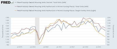
The monthly numbers for housing permits, starts, and single family permits all declined this month. Permits (red in the graph below) declined -38,000 annualized to 1.526 million annualized, and starts (blue) declined -62,000 annualized to 1.425 million, both the lowest since summer 2020. Single family permits (gold, right scale), which have the most signal and least noise, declined -31,000 annualized to 831,000, the lowest since May 2020 and before that, the lowest since April 2019:


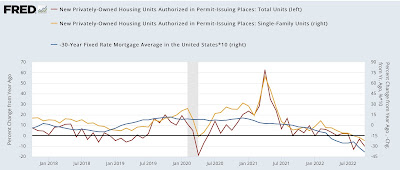
Perhaps more importantly, here’s a variation on a graph I have run many times over the past 10 years, comparing the YoY change in interest rates, in this case mortgage rates (inverted, *10 for scale) with the YoY% change in total housing permits (red) and single family permits (gold):


These are well within the ranges of declines that have previously been consistent with recessions, with the exception of 1966, although frequently (not shown) the actual recession hasn’t started until there has been a -40% decline.

As I always point out, interest rates lead housing permits roughly by 3 to 6 months. As shown above, for example, this year mortgage rates turned negative (i.e., higher) YoY in April. Housing permits in total and for single family units followed in August. As of now, YoY interest rates have risen almost 4%, an increase only exceeded by 5% and 6% increases in 1980 and 1982 respectively, which coincided with -50% declines in housing permits (not shown). Thus, we should expect housing permits to have declined by about -40% by about January or February, to levels of 1.100-1.150 million and .700-.740 million units annualized, putting a likely recession start date in the 1st quarter of 2023.

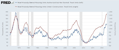
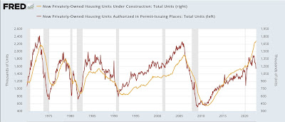
BUT, this time it really is slightly different. In the past, housing permitted and not yet started, and housing units under construction, have typically turned down well in advance of the onset of any recession:


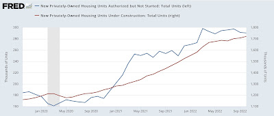
But because of a shortage of building materials, there have been record numbers of housing units that have been permitted, but have not yet been started (blue in the graph below), which appears to have peaked in July,  and consequently a big lag in housing under construction (red), which rose slightly again this month, although it has only risen 3.2% in the past 6 months:


Because housing under construction is the actual economic activity, this suggests that  residential housing has continued to contribute ever so slightly to GDP growth. 

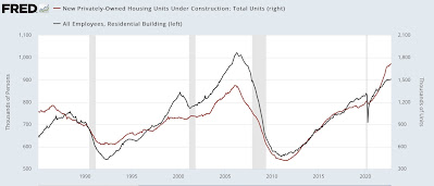
This is reinforced by the generally coincident nature of employment in residential construction (gray in the graph below) compared with housing units under construction:


With the sole exception of the 2020 pandemic lockdown recession, construction, which is an even smoother metric than single family permits, has always peaked at least 6 months before the onset of recession, with a median time of 18 months, and as much as 47 months; and has declined at least 6.5%, and as much as 34%, with a median decline of 20% from peak:


In other words, there is a significant element of “it’s different this time,” in that construction has in the past typically followed a decline in permits by 0 to 11 months, with a median of 5.5 months. Further, a recession has typically followed a decline in construction by between 6 and 47 months, with a median time of 18 months; and has declined at least 6.5%, and as much as 34%, with a median decline of 20% from peak.

We are now 10 months out from the peak in permits, and construction has not yet rolled over. Nor has residential construction employment, which has also typically turned down months in advance of any recession. Thus past history would suggest no recession begins until at least 6 months from now, and possibly much later - depending on how quickly construction rolls over and how abruptly it declines.
Jobless claims: evidence the jobs market is cooling slightly from white hot to red hot


 - by New Deal democrat

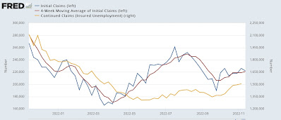
Initial jobless claims declined -6,000 this week to 222,000. The 4 week average rose 2,000 to 221,000. More interestingly, continuing claims one week ago rose 13,000 to 1,507,000, the highest number in over 7 months:


By historical standards, it is still true that almost nobody is getting laid off (outside of tech). But current numbers are evidence that the job market, while still red hot, is not quite as white hot as earlier this year. In fact, if jobless claims were to stay at current levels, by the end of January they will be negative YoY and up over 20% from their lows, which would turn this indicator - which has been one of the most positive all this year - negative.

Wednesday, November 16, 2022

October industrial production: consistent with a very slow expansion


 - by New Deal democrat

I call industrial production the King of Coincident Indicators, because more often than any other metric it coincides with the peaks and troughs of economic activity as determined by the NBER, the official arbiter of recessions.


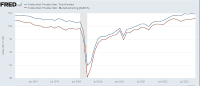
Unlike retail sales, the news this morning for October was not so good. While manufacturing production did increase +0.2% to a new post-pandemic high, overall production declined -0.1% for the month. Also, July and August’s production numbers were revised down -0.1% each, and September’s strong number was revised down -0.4% to only +0.1%. As a result, total production has gone nowhere in the three months since July:


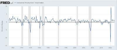
This sideways trend in total production is frequently observed before recessions, but it also coincides with slowdowns during expansions (see, e.g., 2018-19), so is not particularly dispositive of anything. Unfortunately FRED does not have a tool for creating 3 month moving averages (the one big shortfall of that site imo), but I can approximate showing you this via a graph of the quarter over quarter change for the past 60 years ending with the July-September quarter:


Note, for example, the negative q/q reads during the 1966 and 2016 slowdowns. 

This is a report consistent with a very slowly expanding economy, but one that is not yet in recession.

October retail sales: consumers: “We’re not dead yet!”


 - by New Deal democrat

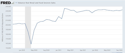
Retail sales, my favorite consumer indicator, was reported this morning for October. And it was a good number, up +1.3% nominally, and up +0.5% after adjusting for inflation:


On the bright side, this was the highest absolute number since April. On the down side, retail sales have still gone essentially nowhere for the last 18 months. 

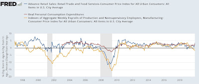
As a result, YoY retail sales are only up +0.5%. Since real retail sales YoY have an excellent historical record of coinciding with imminent recession, here they are historically from 1997 through 2019, compared with real aggregate payrolls for non-supervisory employees, another excellent coincident indicator (gold), and also real personal spending YoY (red):


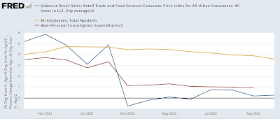
The latter historically has lagged somewhat, but is included because there is an excellent case that this year consumers have shifted from spending on goods, which are more reflected in retail sales, to spending on services, which are better picked up in the personal income series. Here’s the close-up of all three for the past year:


Real retail sales did go negative for several months in the spring, coinciding with the negative Q1 and Q2 real GDP reports, but have since turned slightly positive. As I noted the other day, real aggregate payrolls remain positive - although certainly not strong; and real personal consumption expenditures are still pretty robust.

Short conclusion: no recession yet.

Because real retail sales have also historically been an excellent short term indicator for payrolls, here is that comparison for the past year, together with real personal spending as well:


Although this month’s retail sales report was very good, it nevertheless continues to imply further weakening jobs reports in the months going forward.

So, a good report, but one that does not change the underlying decelerating trends.


Tuesday, November 15, 2022

October producer prices: more evidence that supply chain pressures have eased


 - by New Deal democrat

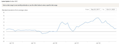
Let me start this discussion of October’s producer price index by pointing to the NY Fed’s “Global Supply Chain Pressure Index” for the past 5 years through October:


Before Trump’s tariff’s in 2018, most often this index was slightly below zero. It zoomed higher when the pandemic, and with the exception of a few months, stayed there until spring of this year. It has generally declined since the beginning of this year, and especially since May. It is now showing only a little more than “normal” pressure.

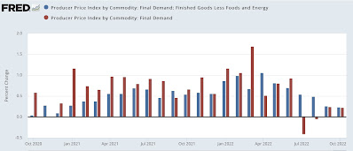
With supply chain issues abating, so has pressure on producer prices. In October, prices for final demand, and “core” demand minus food and energy, both increased 0.2%:


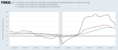
On a YoY basis, final demand PPI decelerated to 8.0% (compared with a March high of 11.7%), while “core” prices decelerated to an 8.1% gain:


Perhaps more importantly, for the last 4 months final demand PPI has increased by precisely 0.0. With supply chain pressures eased, if this deceleration continues, by sometime next spring producer prices will be within their pre-pandemic “normal” range of inflation.

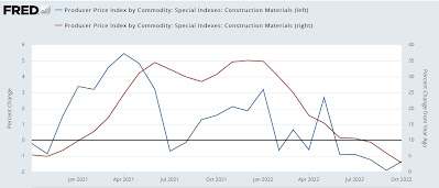
Of special note, producer prices for construction materials declined -1.3% in October (blue, left scale below); on a YoY basis they have decelerated to only a 2.9% gain (red, right scale):


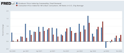
This is in marked contrast to the rising 7.9% YoY gain in “owner’s equivalent rent” in the CPI. Here’s a comparison of the last two years of CPI and PPI:


If producer and consumer prices continue to trend as they have since the middle of this year, then by the middle of next year they will both be back into a “normal” range.  The question remains, how much damage will the Fed insist on doing before we get there?


Monday, November 14, 2022

Some foreboding signs and portents from consumption and employment data


 - by New Deal democrat

I have a special post up at Seeking Alpha, looking at some very troubling signs from several of the high frequency indicators I track weekly as to consumption and employment.

Click over and read the whole article, but here is a little taste: the below is what the YoY% change in the 20-day total of payroll tax withholding has been in has been as of the first week of each month this year:

  • Jan +9.3%
  • Feb +11.6%
  • Mar +13.4%
  • Apr +12.6%
  • May +3.6%
  • June +20.7%
  • July +7.8%
  • Aug -3.4%
  • Sept +1.7%
  • Oct +3.6%
The first half of this year was, in the aggregate, terrific. And then things slowed down precipitously. Considering inflation has been over 5% YoY all year long, this chart certainly appears to indicate that, in real terms, there has been no YoY increase at all in payroll tax collections since late summer. That’s not good.