Saturday, July 28, 2018

Weekly Indicators for July 23 - 27 at Seeking Alpha


 - by New Deal democrat

My Weekly Indicators post is up at Seeking Alpha.

After the article was published, I noticed a couple of errors. Since, unlike with XE.com, at Seeking Alpha I can't go back and revise the article itself, I corrected in a comment, which I'm repeating below. I expect the kinks required by my tight publication schedule there to get worked out in short order. In the meantime, sorry for the errors.

First, the brief monthly/quarterly data recap should be updated as follows:

Data for June included new and existing home sales, which both declined. Durable goods orders rose. Consumer confidence as measured by the University of Michigan rose slightly, although the longer term trend in the leading "expectations" component has been generally flat for 18 months.

In the rear view mirror, Q2 GDP as expected came in quite strong, at +4.1%, although exports contributed roughly +0.5% more than usual to that number. The long leading indicator of proprietors income increased, but that of private fixed residential investment as a share of GDP declined.

Second, in the conclusion I accidentally wrote that mortgage rates were a positive. As I note in the body of the article, having risen back above 4.65%, they are a negative, which is what I factored into my long term forecast of neutral. It's worth noting, though, that had the yield curve been only 0.5% tighter, the only remaining positive would be the credit indexes, and that would be enough to have tipped the long term forecast to negative.

Friday, July 27, 2018

Q2 GDP: likely as good as it is going to get this year


 - by New Deal democrat

[Note: FRED hasn't gotten around to updating the GDP data. I'll update this post once the graphs are available. UPDATE: Posted now.]

This morning's preliminary reading of Q2 2018 GDP at +4.1% was generally in line with forecasts.  The coincident data, as I've reported in my "Weekly Indicators" column, as well as things like industrial production, the regional Fed reports, and real retail sales, have all been very positive for the past few months. So, "hurrah!" for the growth of one to four months ago.

One point widely notied, which I'll also repeat: exports added about 0.5% more than usual to the GDP number. This was almost certainly producers trying to get ahead of Trump's trade wars, and will likely subtract an equivalent percentage over the next quarter or two. In other words, GDP ex-frontrunning the trade war was about 3.6% annualized.

But will it last?  As usual, my attention is focused not on where we *are*, or more properly, recently *were*, than where we *will be* in the months and quarters ahead.

There are two leading components of the GDP report: real private residential investment and corporate profits. Because the latter will not be released until the second or third revision of the report, I make use of proprietors' income as a more timely if less reliable placeholder.

So let's take a look at each.

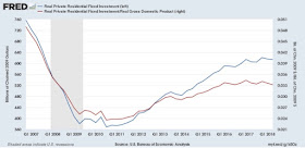
Real private residential fixed investment actually declined slightly (blue). Measured by the more precise method of its share of the GDP as a whole (red), residential investment it was even more significant: 


According to Prof. Edward Leamer, this typically peaks about 7 quarters before the onset of a recession. As it has not made a new high since five quarters ago, and must be considered a signficant leading indicator of recession at this point, although it is only down about half the percentage from its peak as the least amount prior to a recession (-3% vs. -6% before 2001).

On the other hand, proprietors' income rose about 1.3% nominally in the second quarter. The below graph compares it with the less timely but more accurate corporate profits:


In short: one long leading indicator declined, the other rose.

When discussing Q4 2017 GDP six months ago, I indicated that I wasn't expecting any big surge due to the relative flatness or restrained growth in housing for most of 2017.  The below two graphs show the leading relationship between housing permits (using the less volatile single family measure) and GDP broken up into two roughly 30 year periods:


Since the YoY% change in permits for 2015-17 was roughly 10% (divided by 4 for purposes of scale in the above graphs shows a number of ~2.5%), I wrote that a continued roughly 2.5% YoY growth of GDP for the next few quarters is a reasonable projection. 

Obivously that wasn't true for the second quarter, although YoY growth remains only +2.9%.

To reiterate what I said three months ago in response to Q1 GDP, while the economy is very likely to continue to grow through 2018, together this most recent data suggests a more questionable picture heading in 2019.  

There is nothing in this morning's strong Q2 GDP that causes me to change that view.  All of the long leading indicators with the possible exception of corporate profits (for which proprietors' income is a less reliable proxy)  have continued to weaken, and there has been accumulating evidence in the monthly and even weekly reports that the important component of housing is at best very weakly positive and may even have tipped over to negative.

Thursday, July 26, 2018

Why a yield curve inversion is not a necessary precursor to a recession


 - by New Deal democrat

For the last decade I have made a specialty of observing "long leading indicators" -- those metrics that turn at least a year before the economy as a whole does -- and of historical indicators that date as far back as the 1910s.

That specialty is particularly relevant in discussing the current obsession with the shape of the yield curve, slicing and dicing the modern data as it relates to the Fed funds rate, 3 and 6 month Treasuries, 2 year Treasuries, 10 year Treasuries, and the inflation rate.

Why? Because historically a yield curve inversion is not a necessary precursor to a recession.

To begin with, the Fed did not begin making use of the Fed funds rate until 1954. The Fed itself didn't exist until 1914, and for the first 40 years of its existence only made use of the discount rate, which itself was not made uniform nationwide until 1935.

And the Fed funds rate did *not* exceed the 10 year Treasury yield prior to either the 1957 or 1960 recessions. The first time that measure of the yield curve did invert was in 1965, which presaged a steep slowdown in 1966 which did not quite qualify as a recession:


So, next, let's compare the discount rate with long term government bonds going all the way back to the 1920s (the modern 10 year treasury data is also shown in green to show the very close correspondence between it and the archival series):


With the exception of the "great contraction" of 1929-32, the yield curve measured this way never inverted before 1959. That's *5* recessions which waiting for a yield curve inversion would have missed.

We also have data on short term government bonds in the 3-6 month range going back to the 1920s as well.  Here's what they look like compared to long term bonds:


Again, no inversions whatsoever between 1929 and 1959, although it did come close, but did not invert, prior to the 1927 and 1957 recessions.

Finally, a number of commentators are stressing the necessity for the Fed funds rate to exceed the inflation rate for a recession signal.  We can examine this, using the discount rate, going all the way back more than 100 years:


There are problems both ways with this argument. On the one hand, the Fed funds rate exceeded the inflation rate for most of the 1920s, 1960s, 1980s, and 1990s -- in short, the most prosperous decades during the last century! On the other hand, the Fed funds rate did *not* exceed the inflation rate prior to the 1918, 1920, and 1949 recessions -- and was moving the "wrong way" prior to the 1957 recession!

In short, once we go back before 1960 -- i.e., a low interest rate environment very similar to the one we have been in for the last decade -- although a yield curve inversions is very bad (1929!), neither an inversion nor a "tight" real Fed funds or discount rate is necessary at all for a recession to occur.

While it is far too long to get into here, here are several other historical graphs to consider.

First, the annual rate of nonfarm housing starts, dating all the way back to the 1800s:


Second, the monthly rate of nonfarm housing starts dating back to 1945 (and continuing through the 1960s to show that they accord very closely with the modern housing starts series, also shown):


The archival annual housing starts series turned negative during the year in which recessions began 11 out of 14 times.  The archival monthly series turned negative before all 4 post-WW2 recessions leading up to and including 1960.

A detailed historical consideration of housing is far too long for this post. But consider that the common thread, going back almost 150 years, appears to be that something happens in the economy to cause consumers to pull back on their purchases of important durable goods like houses, of which the Fed raising interest rates (and inverting the yield curve) may only be one cause.
Wednesday, July 25, 2018

A blockbuster new home sales report confirms that housing has turned flat this year


 - by New Deal democrat

 This morning's new home sales report was the kind of stunning reversal which shows why I do not follow it nearly as closely as the much less volatile single family permits.

Today's number of 631 thousand was a nine-month low. Further, May's original figure of 689 thousand units was revised down by almost -4% to 666 thousand. Last November, at 712 thousand, now stands out as the high water mark. The first two quarters of this year were flat, and were below both the 4th quarter of last year, and the high point of the three month rolling average is last November through this January. Finally, the number of houses *for sale,* i.e., inventory, rose slightly to a new expansion high.

In short, new home sales, as revised, have now confirmed the sideways movement in single family permits.

Since FRED hasn't updated its numbers yet, here is the graph from the Census Bureau:


Here is the most recent FRED quarterly graph of new home sales (blue), single family permits (red), and single family starts (green). I'll update once FRED does: 


UPDATE: That didn't take long!

For good measure, the other most positive measure of the housing market, purchase mortgage applications, declined slightly again this week.  Here's a graph of this (from Yardeni.com) over the past few years:


Note that purchase mortgage applications also look like they are at least flattening, if not rolling over.  The 4 week YoY comparison has declined from +7% a year ago, to +4% early this year, down to +2% now.

Although I obviously can't say for sure, most likely Friday's GDP report, which will include quarterly private residential construction, will probably also reflect his trend.

I'll update then, but this morning's report is close to a blockbuster, because it confirms the message of other, less volatile measures: the housing market has gone sideways this year.

Tuesday, July 24, 2018

The "real" Fed funds rate and recessions


 - by New Deal democrat

I've seen several posts recently that might be summarized as "don't worry, be happy" because, despite a series of Fed funds rate hikes, the "real" inflation-adjusted Fed funds rate is still negative, on the order of -1%.  I beg to differ.

Let me cut to the chase: below are two graphs covering the lat 60 years (before about 1954, there really wasn't any official "Fed funds" rate). The "real" Fed funds rate is shown in red. The YoY change in the Fed funds rate is shown in blue:


Typically, the Fed funds rate was higher than the inflation rate before recessions. BUT, notice that there were three lengthy "false positives," i.e., the "real" Fed funds rate was also higher than the inflation rate during most of the 1960s, 1980s, and 1990s expansions, two of which were among the best economies the US has ever had.  Further, there was one "false negative," as the Fed funds rate never exceeded the inflation rate before the 1980 recession.

In other words, using the "real" Fed funds rate as your metric gives you correct calls for only 5 of the last 9 recessions, although to be fair, if you simply imply that a "loose" Fed funds rate is inconsistent with an oncoming recession, that improves your score to 8 out of 9.

But the simple fact is, using the *velocity* of Fed funds hikes is the most reliable guide over this time period.  When the Fed funds rate has been raised by 1.75% YoY or more during this period, at very least a sharp slowdown has occurred (1984 and 1994), and on all other occasions a recession followed.  Without such an increase, no recessions occurred.

Presently the Fed funds rate has been rising at 0.75% YoY. This is similar to the first half of the 1960s expansion.

So, is my conclusion "don't worry, be happy"?  No. The issue is found at the far left of the graphs, in the mid-1950s. That was the tail end of the low-interest-rate, low-inflation period similar to today.  Because we don't have data for that entire expansion, we really can't make a conclusion. But (not shown) the Fed funds rate did increase, somewhat slowly, by a total of 3%.

And if there isn't a Fed funds rate before 1954, there was a Fed discount rate, going all the way back to 1914 (NY Fed rates shown), and uniform for the country since 1935. Here's what that looks like compared with long term government bonds:


No yield curve inversions from 1930 to the mid-1950s. During lengthy periods of time, no changes at all. And yet four recessions happened -- one of which, in 1949, followed a two year period of up to 20% inflation(!) from 1946 to 1948, during which time the Fed pretty much sat on its hands. 

In other words, I strongly suspect that relying upon the "real" interest rate to forecast recessions only works on those occasions where the Fed raises rates in order to lower a rate of inflation that it considers too high. 

I'll take a more detailed look at what the Discount Rate might teach us in another post.  

Monday, July 23, 2018

A tantalizing question about existing home sales: have they peaked?


 - by New Deal democrat

I normally don't pay that much attention to existing home sales, even though they are about 90% of the overall market.  That's because their economic impact is not nearly so important as new home sales, because of all of the construction costs and purchases made by the new homeowners over the next year or two.

But let's take a look, at least partly because existing home sales *may* -- and it's a very big "may" -- be in the midst of a turning point.

The overall picture in the report is same old, same old: sales flat, prices up over 5% YoY, inventory still depressed. I do not envy at all buyers in this market, where the average house sells in a mere 27 days!

But let me return again to my basic housing mantra:

first, sales turn
then prices turn
finally, inventory turns

I discount the "months' inventory" metric, because historically it has turned because sales turn, and not because of a meaningful change in inventory.

So -- first, sales. Here's the long term view through last year:


Note that sales turned flat at roughly 5.50 units in summer 2015, and have hovered near that mark +/- 5% since.

Here's the last 12 months through May. June came it at 5.38 units annualized:


See that peak in November? We'll come back to that.

Second, prices. Here's an important graph of median new vs. existing home prices through last year:


The median new house used to sell at a 10% premium. Since the great Recession, that has blown out to 30%. The price of the median existing home has continued to rise strongly, up to $276,900 in June.

Finally, inventory. Again, here's the long term graph:


June's inventory, reported this morning, was 1.95 million units. That is the first YoY increase since 2014.
_________

Now let's get to the tantalizing question: did existing home sales peak last November,  and did inventory bottom last month? Let's follow the mantra:

Sales bottomed in 2010
Prices bottomed in 2012
Inventory made a temporary bottom in 2012, but then has continued to fall -- until now?

In the meantime, let's hypothesize that maybe sales peaked in November 2016.
Prices are continuing to rise.
We would expect to see that inventory will continue to rise.

In other words, it's at least possible that we have reached the point, with existing homes, where increased interest rates and price increases that exceed income growth, have caused the cycle to turn.

The much more economically important new home sales will be reported in two days. This metric, along with purchase mortgage applications, has been the most positive of all housing measures for the past few years. The less volatile single family permits have not made a new peak in four months. Will new home sales continue to defy gravity, or will they too show signs of stress? We'll see.

Sunday, July 22, 2018

The President of the United States is a Russian asset


 - by New Deal democrat

That the President of the United States is a Russian asset needs to be openly acknowledged. He may be a naive, negligent or unwitting asset, a coerced asset, or a willing and enthusiastic asset, or some combination thereof, but at this point there is no getting around that he is a Russian asset.

My readers who have followed me from progressive blogs presumably have no trouble accepting this.  But I know that I also have many readers from investment or economic sources, many of whom are probably Republicans. To them I ask two simple questions: (1) in what way has he acted in any way inconsistent with being a Russian asset? and (2) if you evaluated him the same way you evaluated SEC and other filings in order to determine whether or not to purchase a stock, to what conclusion would you come?

What possible reason could there be for a President of the United States to insist on meeting the Russian President both without any witnesses in the room, and also no means to verify what was discussed? Why would a President who is known for bombastically unloading on just about everybody else on the planet, refuse to utter, over a period lasting years, a single negative word about one singular matter: the conduct of the Russian state?

In the past week I have only heard three potential arguments against the fact posited by the title of this post.

The first comes from a comment here, which in summary says:
[H]e thinks he's doing great work; he thinks Putin's terrific; he thinks this will all be justified as a brilliant move once the nation and the world catches up with his brilliance...and, especially, he thinks he's enacting his supporters' wishes, sticking it to the uppity European deadbeats and mending fences with the "real" leaders.....
The fact that he concealed it all from his staff (nobody else in the meeting, etc.) [could just] mean ... [that] it was Putin's idea: let's be alone "so we can really talk" (with some nods to the dangers of "Fake News").
But this just means that the President is a naive or negligent asset, in so deep over his head that he does not know he is being played.

The second, from Al Jazeera, says that "Trump is not Putin's Puppet," postulating that he has parted company with Russian policy when there is profit to be made. But that implies that he has been both willingly and knowingly abetting Russian policy when there *is* profit to be made. And that, by further implication, suggests that he has already done so in his pre-Presidential career, which of course supports the theory that he engaged in money laundering for the Russian mafia, which is coercive both as a subject of blackmail and also as a threat of violence against his family members.

The third is that, in terms reminiscent of Hitchhiker's Guide to the Galaxy, that no asset would be that obvious. Well, a useful idiot certainly would be.

In short, I do not see how any person, discerningly sifting the evidence, could not come to the conclusion that the President of the United States is a Russian asset. We need to face that fact openly and publicly.

Weekly Indicators For July 16 - 20 at Seeking Alpha


 - by New Deal democrat

UPDATE: the article has now been published, and you can find it Here.

I get paid per view, so, you know, go for it!

__________________

All posts at SA have to be approved by their editors. Two weeks ago I was given instructions for how I could "fast-track" publication, if I submitted Friday evening.

Worked like a charm last week.

This week's edition has been sitting in their "pending" bin since late Friday. I've heard crickets.

If it isn't published there by tomorrow morning, I will publish it here so that it doesn't go stale.