Saturday, October 4, 2014

There is no mysterious dark pool of missing workers distorting the unemployment rate


- by New Deal democrat

As I noted yesterday,  Jared Bernstein recently said in a New York Times column:
So why not just look at the unemployment rate and call it a day? Because special factors in play right now make the jobless rate an inadequate measure of slack....

There are at least two special factors that are distorting the unemployment rate’s signal....
Bernstein's column predictably unleashed another brushfire of  "the unemployment rate is phony" commentary by the usual Doomers.  While I respect Jared Bernstein and generally find his commentary interesting and accurate, in this case I strongly disagree. And I have data in support of my point.

Let me take his two "special features" in order.  He says:
First, there are over seven million involuntary part-time workers, almost 5 percent of the labor force, who want, but can’t find, full-time jobs. That’s still up two percentage points from its pre-recession trough. Importantly, the unemployment rate doesn’t capture this dimension of slack at all — as far as it’s concerned, you’re either working or not. Hours of work don’t come into it.
Every single month for the last 60 years, the Census Bureau has  counted those "who want, but can't find, full-time jobs."  During that time, on 9 occasions the economy has gone through a recession where the unemployment rate exceeded 6%.  Nine separate times, the unemployment rate has thereafter declined to under 6%.

So, let's do a true apples-to-apples comparison.   When the unemployment rate crossed the 6% threshold to the downside, what percent of the civilian labor force "wanted, but couldn't find, full-time jobs?"  That's what the below graph shows.  The unemployment rate is in red, and I've subtracted 6 so that it crosses the black 0 line at 6% unemployment.  The percentage of the civilian labor force that is working part-time, but wants full-time work is in blue.  As of yesterday, that was ~4.55%, so I have subtracted that percentage to place that at zero as well:


In 7 of the 8 prior cases, when the unemployment rate crossed 6%, involuntary part-time employment was about 1% less than it is now.  The 8th time is telling:  following the 1982 recession, which at its trough featured an employment rate even worse than that of the Great Recession, it took until August 1987 for the unemployment to fall to 6%.  That month the percentage of the labor force that were involuntarily working part time jobs was ~4.43%, only 0.1% lower than yesterday's rate.

In other words, what we are seeing now is conquerable to what we saw in the recovery from the severe 1982 recession, and only 1% higher than during recoveries from less severe recessions.  If we use a back-of-the-envelope approximation that part time workers are averaging about 1/2 the number of hours of full time workers, that gives us an increase in the unemployment rate compared with recoveries from more typical recessions of about 0.5%, or a hypothetical 6.4% unemployment rate with a typical mix or full time to part time employees in an apples to apples comparison.

Next, Bernstein says:
The second special factor masking the extent of slack as measured by unemployment has to do with participation in the labor force. Once you give up looking for work, you’re no longer counted in the unemployment rate, so if a bunch of people exit the labor force because of the very slack we’re trying to measure, it artificially lowers unemployment, making a weak labor market look better.
While we only have data going back 20 years, still in every single month since then, the Census Bureau counts those who have entirely stopped looking, and dropped out of the labor force, but want a job now.

In the graph below, I have again subtracted 6 from the unemployment rate, so that it crosses the 0 line at 6%.  Percentage of those who have left the civilian labor force, but still want a job now, compared with the labor force (blue) as of yesterday was about 4%, so I have subtracted that percentage to show it at 0 as of yesterday:


Note that while there are about 0.8% more who fit in this category now compared with 2003, the percentage of those who are so discouraged that they have left the labor force altogether is about 0.5% lower than it was in 1994.   In other words, there is no reason to think this is unusual at all, in an apples to apples comparison with other times of 6% unemployment.

In summary, there is no reason to think that the unemployment rate is underestimating labor slack compared with prior severe recessions, and in is likely only undercounting slack by about 0.5% compared with recoveries from milder recessions.


US Market Review For the Week of September 29-October 3

     Although the uptrend is still in place for both the SPYs and QQQs, weakness in the IWMs, mid-caps and micro-caps is at minimum adding to downside pressure.  Changes in the international risk calculus (see here) are also adding to concerns.   

     From a fundamental perspective, there are few indicators pointing to anything but a continued moderate expansion in the U.S..  Let's start with the long leading indicators.  The worst of the four is building permits which have been moving sideways for about a year.  Corporate earnings dropped in the first quarter largely as a result of a very bad winter, but they rebounded in the 2Q.  M2 Y/Y growth is hovering around 5% and the inverted corporate yield curve is still in an uptrend.  The leading indicators have been in an uptrend for the last 6 months, and all concurrent indicators (industrial production, establishment jobs, income less transfer payments and real manufacturing and trade industry sales) are moving higher.  The total effect of these data points is one of continued growth for the US.

     Also, consider last weeks ISM manufacturing and service sector reports, both of which were solidly positive, especially the anecdotal comments. 

     I asked NDD to add some comments about the market as well; here are his thoughts:

I rarely comment on the stock market from an investor point of view.  Normally I look at it from the point of view of a short leading indicator for the economy.

The selloff this week has been pretty tame - less than 5% of the value of the market.  And while there are a few divergences, I see only one issue qualifying as a genuine yellow flag.

The first divergence is the cumulative advance decline line.  I would expect a significant decline in the a/d line before I would expect to see a major market decline.  In prior recent selloffs, the a/d decline, like the market, moved to higher highs and higher lows.  This time it has established a lower low than the selloff in August:


Still, it's not anything major at this point.

Next, consider bond yields compared with the S&P index.  Since 1998, bond yields and stock prices have typically moved in tandem.  Only when the economy has been strong, as in 2004-05, have yields moved sideways or lower when the market moved higher.  But that is what has happened for nearly all of this year:


The S&P is up about 20% from a year ago, while yields have been generally declining since January. Only briefly during the August selloff, and again this week, have bonds demonstrated a"flight to safety" downturn in yields matching stock rice declines.

Again, a divergence, but hardly an established trend at this point.

Next, I am not seeing a big divergence between insiders and the public.  If I saw insiders selling hand over fist, coupled with a complacent public, I would be more concerned.  As you can see from this graph taken from last saturday's Barron's:


insiders really aren't hoisting a red flag  Again, at least not yet.

Finally, there is one divergence worthy of a yellow flag:  corporate profit growth vs. stock prices. Because corporate profits are a long leading indicator, and stocks a short leading indicator, typically on an averaged quarterly basis, stocks reflect corporate profits.  Here are corporate profits measured by YoY% change (blue) vs. the quarterly average for stock prices, also as a YoY% change (red), for the last 10 years.


Typically stocks follow bonds with a lag of several quarters.

Only twice has that not been the case: in 2006-07 and this year.  Since corporate profits have only been up by about 5% YoY for the last 4 quarters, stocks should follow, but they haven't -- so far.

I fully expect stocks to revert to that mean.  Like 2006-07, there are signs that this might be a blowoff top.  But the same was true 3 and 6 months ago (remember the great margin scare of March 2014?). This last divergence is worthy of a yellow flag.  But that doesn't mean the correction is going to happen right now.

Bonddad Here:

Now, let's start with the charts that are sending warning signals.


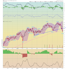
The micro caps were trading in a symmetrical triangle pattern for most of the last year.  Prices moved through the lower trend line a few weeks ago on higher volume and are now below the 200 day EMA; momentum is declining and volatility is increasing.  And, once prices broke through support, momentum to the downside increased as indicated by the longer candles. 


The mid-caps were still in a slight uptrend until this week.   But prices have moved through support.  They also dipped below the 200 day EMA before rebounding a bit on Thursday and Friday.  But the last two candles are weak and printed on declining momentum and a weakening price structure. 


And the mega-caps (S&P 100) were not immune either, as they too briefly fell below their long-term trend line.


But on the plus side we have the NASDAQ which is still in very solid technical shape.  Prices are over 5% above the long term trend line.  While the underlying technical indicators are declining, prices would have to fall a fair amount before this average was in any way endangered.  And the fact it didn't drop sharply last week when other indexes were tells us traders are not so concerned as to sell their larger tech positions (at least not yet).

     And, considering that the underlying backdrop is still at least moderately bullish, the number of stocks below their 200 day EMAs is at a bullish level:


     So, let's sum up the basic points from above.  First, the underlying US economic condition is still positive.  No series of economic indicator (long, leading and concurrent) is pointing to a contraction or even recession.  Last week's ISM numbers for both sectors of the economy (manufacturing and service) point to continued expansion.  There are concerns about several other economies, most notably the EU and Japan.  But the core of the US is still solid.  And given its size, it can continue to grow at a moderate pace while other world regions experience a slowdown.
    
     There has been technical degradation of several sub-indexes.  This sell-off was triggered by international concerns and a re-calibration of traders risk calculus.  The charts indicate the sell-off is most likely to continue for at least the coming week, based on the weakening micro and mid-cap indexes.  But several other indicators (stocks below their 200 day EMA) indicate the market is approaching over-sold territory.  And when we place that data point against the fairly decent US economic environment, it's difficult to see the sell-off reaching panic proportions.


Weekly Indicators for September 29 - October 3 at XE.com


 - by New Deal democrat

First, the good news:  the Oil choke collar has disengaged to the point where it is already close to its 2011 and 2012 lows.

Now, the bad news:  there was more deceleration this week.

Friday, October 3, 2014

Yes, Doomers, we "can* compare 5.9% unemployment now with previous recoveries


 - by New Deal democrat

Beginning with Jared Bernstein's piece in the NYTimes this week, there's been another spasm of allegations that there is a dark, uncounted pool of secret unemployed that aren't showing up in the official numbers.  Culminating with a post at the usual DOOMER place claiming that the job report this morning, and in particular the decline to 5.9% unemployment, was not a good report.  

Nonsense.

Every single month, the Census Bureau counts those who have entirely stopped looking, and dropped out of the labor force, but want a job now.

Every single month, the Census Bureau counts those who are working part time jobs, but would like a full time job.

Thus, it is pretty easy to compare this jobs recovery with the prior two jobs recoveries.

Following the 1991 recession, the unemployment rate first dropped below 6% in September 1994.  That month here are the numbers for those who were out of the job force, but wanted a job (NILFWJN) and who were part time for economic reasons (PTER):

NILFWJN 6.104 million
PTER 4.332 million

Following the 2001 recession, the unemployment rate first dropped below 6% in November 2003.  Here are the numbers for that month:

NILFWJN 4.534 million
PTER 4.882 million

Now here are the numbers for this month:

NILFWJN  6.349 million
PTER 7.103 million

Especially considering that the labor force has grown, the number of those who have completely stopped looking is equivalent to 1994.  The number of part time jobs is about 2.5 million higher than in those two prior recoveries.

On the other hand, in this recovery, we have created a lot more jobs than would previously have been suspected with a 2% average GDP. It appears the trade-off for that is that a significant number remain part time jobs, and wage growth has suffered.

September jobs report: Now that's better! (but still not good enough)


- by New Deal democrat

HEADLINES:

  • 248,000 jobs added to the economy
  • U3 unemployment rate declined from 6.1% to 5.9%
Wages and participation rates
  • Not in Labor Force, but Want a Job Now: up 45,000 from 6.304 million to 6,349 million
  • Employment/population ratio ages 25-54: down -0.1% from 76.8% to 76.7%
  • Average Weekly Earnings for Production and Nonsupervisory Personnel: minus -$.01 from  $20.68 to $20.67, up 2.-% YoY
July was revised upward by 31,000 to 243,000.  August was revised upward by 38,000 to 180,000. The net revision was thus 69,000.  This means the "speed bump" that jobs hit last month has been almost renirely revised away. 

Since the economic expansion is well established, in recent months my focus has shifted to wages and the chronic heightened unemployment.  The headline numbers for August show a little progress on wages, and mixed results on participation.


Those who want a job now, but weren't even counted in the workforce were 4.3 million at the height of the tech boom, and were at 7.0 million a couple of years ago.  They have actually risen for the first eight months of this year. As noted above they are presently 6.349 million.  This is almost certainly due to the cutoff in extended unemployment benefits by Congress at the end of last year.


On the other hand, the participation rate in the prime working age group has made up 40% of its loss from its pre-recession high.


After inflation, real hourly wages for nonsupervisory employees probably were close to unchanged from August to September. The YoY change in average hourly earnings is +2.-%, somewhat better than the inflation rate.


The more leading numbers in the report tell us about where the economy is likely to be a few months from now. These were flat to slightly positive

  • the average manufacturing workweek rose by +0.1 hours to 40.9.  This is one of the 10 components of the LEI, and will have a positive impact.

  • construction jobs increased by 16,000. YoY construction jobs are up 230,000.  

  • manufacturing jobs  were up 4,000, and are up 161,000 YoY.

  • temporary jobs - a leading indicator for jobs overall - increased by 19,700.

  • the number of people unemployed for 5 weeks or less - a better leading indicator than initial jobless claims - decreased by 226,000 from 2,609,000 to 2,383,000, compared with December's 2,255,000 low.

Other important coincident indicators help us paint a more complete picture of the present:


  • Overtime hours were up from 3.4 hours to 3.5 hours.

  • the index of aggregate hours worked in the economy  fell by -0.1% from 109.2. to 109.1

  • The broad U-6 unemployment rate, that includes discouraged workers decreased from 12.0% to 11.8%.

  • Part time jobs for economic reasons decreased by 100,000 to a total of 7.103 million.
Other news included:
  • the alternate jobs number contained in the more volatile household survey increased by  232,000 jobs.  The household survey jobs numbers had been lagging the establishment survey numbers, but as expected this difference has now been almost entirely made up, with the household survey showing a 2,330,000 increase in jobs YoY vs. 2,645,000 in the establishment survey. 

  • Government jobs increased by 12,000.
  • the overall employment to population ratio for all ages 16 and above was unchanged at 59.0%, and has risen by +0.4% YoY. The labor force participation rate declined slightly from 62.8% to 62.7, and has fallen by -0.5% YoY (but remember, this includes droves of retiring Boomers).
.This wass a good report, which also almost completely revised away last month's subpar report.  The economy is still adding over 200,000 jobs a month.  The unemployment rate declined due to a big increase in jobs, with only a small (-97,000) decline in the civilian labor force.  At 5.9%, it is finally back in what used to be considered a nomral, non-recessionary range.

The internals to the report were only mildly positive.  Involuntary part time jobs did decrease, although those who have stopped looking but want a job now increased.

The bottom line is, we continue to make slow, grinding progress towards normalcy.  Wages are still a big disappointment.  This was a very good post-Great Recession report. It would be a mediocre report for virtually any othere economic expansion since World War 2.


John "Trillion Dollar Loss" Hinderker, Employment Redux

Ol' TDL (Trillion Dollar Loss) likes to complain about the US employment situation, and, more specifically, blame it on Obama.  While the US jobs market clearly has tons of slack, this is in fact a world-wide situation.  How do we know this?  By r-e-a-d-i-n-g economic reports like this one from the OECD: 

Despite some recent improvement, slow recovery from the financial crisis means that many G20 economies still face a substantial jobs gap, which will persist until at least 2018 unless growth gains momentum.

With more than 100 million people still unemployed in the G20 economies and 447 million 'working poor' living on less than $2 a day in emerging G20 economies, the weak labour market performance is also threatening economic recovery because it is constraining both consumption and investment.


That report contains this graphic information (pictures may help ol' TDL because economic writing is obviously a bit advanced for him)


The employment problem is hitting a lot of countries, not just the US.  That means that either the Obama's polices have magically had a global impact (much like the CRA somehow leading to a global housing crisis) or there is something happening at the macro level that is beyond the scope of partisan US politics.

Thursday, October 2, 2014

John "Trillion Dollar Loss" Hinderaker Attempts Economic Analysis; Fails

In case you're wondering, John Hinderaker was one of the many people who said the Fed's policies would lead to hyper inflation and spiking interest rates.  Bloomberg calculated the net investment returns a Hinderaker portfolio would have earned and came up with a net loss of $1 trillion.  Hence, from here on out, I will refer to Hinderaker as Mr. Trillion Dollar Loss of Mr. TDL for short.

Now we have Mr. TDL using Senate Republican slides to demonstrate how bad things are.  As you might guess, they are extremely misleading.

Let's start with this:

 
Notice very carefully the starting date for the graph: 2005.  Yet just a few weeks ago, Hinderker posted a more complete graphs of the same data:


As I wrote at the time:

Except, of course, that isn't what the graph shows.  It shows the incomes rose in the 1980s and 1990s (Democrats and Republicans) and then moved sideways under Bush (who Hinderaker called a genius) and down under Obama.   In other words, it rose under a Republican and Democrat, stagnated under Bush and fell under Obama.  This is called chart reading, which Hinderaker obviously can't do.

Notice that Hinderaker's hero Bush also had a drop in median income.  Interesting that nothing was mentioned about that.

And then there is this:


Obama is no Reagan!  Of course, this is also a misleading graph.  I'll let Barry Ritholtz explain why:

Consider an ordinary recession: The economy begins to heat up as wages rise and consumers borrow and spend. The Fed, concerned about increasing inflation, raises interest rates. As credit becomes more expensive, sales slow, putting the economy at risk of slipping into a recession.

But fear not! After six months or so, the Fed then lowers rates, unleashing all that pent-up demand. Consumers and businesses begin spending again, folks get hired and the entire virtuous cycle begins anew.

That approach is what we have seen in the 15 or so post-World War II recession-recovery cycles. An overheating economy leads to rising rates leads to a slowdown leads to falling rates. Rinse, lather, repeat.

That isn't what occurs after a credit crisis such as the Great Recession. Assets purchased with cheap and widely available credit become worth significantly less once the bubble bursts. But the debt remains. All of that leverage used to purchase all of those assets -- regardless of whether it's subprime mortgages or dot-com stocks -- sticks around.

Hence, a post-credit-crisis recovery is dominated not by the release of pent-up demand, but by massive corporate, household and government deleveraging. Even before the financial crisis, Reinhart and Rogoff were detailing how and why recoveries from such events were such slow, protracted and painful affairs.

It's an apples to oranges comparison.  

Ol' "Trillion Dollar Loss" Hinderaker fails again. 

SPYs and DIAs are Getting Near Key Support Levels


Both the SPYs and DIAs have strong, nearly year long trend lines in place.  Current price action has placed prices very near to these levels.  Should prices break through these levels, the next price target would be the 200 day EMAs.

The unemployment rate as a leading indicator for wage growth


 - by New Deal democrat

One of the most pronounced issues in the US economy generally is the stagnation of wages since the turn of the Millennium, and specifically the lack of wage growth since the current economic expansion began over 5 years ago.

Several months ago I undertook to explore whether there were one or more leading indicators for wage growth.  While I have not found any Holy Grail, the exercise has begun to bear fruit.

In this post, I'm going to explore nominal wage growth.  Because most employers probably determine raises without reference to the inflation rate, and partly because raises are usually only given once a year, nominal wage growth is much less subject to noise than real wage growth.  This makes it easier to distill signal from noise.  I'll deal with real wage growth in one or more subsequent posts.

Here's what I'll show in this post:

  • nominal wage growth makes a good "mid-cycle" indicator
  • the unemployment rate typically makes tops and bottoms months before nominal wage growth
  • the exception, following severe recessions, is where the unemployment rate peaks at a number higher than 8%.  In those cases nominal wage growth has bottomed when the unemployment rate has fallen to about 7.5% +/-1%.
This rule allows us to make useful predictions.  I'll test the rule with a forecast at the end of this post.

To begin with, I have been looking for some worthwhile "mid-cycle" indicators, i.e., data series that typically have an inflection point about midway through an economic expansion.  The YoY% change in nominal wages appears to be such an indicator.

Here are nominal wages from 1965-83:


and here they are from 1984 to the present:


In each case, there has been a sudden surge in nominal wage growth of about 2% close to the midpoint of the economic expansions.  In other words, there are no false negatives.  Further, there are only 2 false positives, in 1974 and 1976.  Since we had a turnaround and a 2% gain that began in mid-2012, that suggests that late 2012 was close to the midpoint of this economic cycle.

But more importantly, I want to be able to forecast whether or not we can expect improvement in wages going forward.  Since nominal wage growth appears to have an inflection point near mid-cycle, I wondered if a normally lagging indicator like the unemployment rate might be a worthwhile leading indicator for wage growth.  It turns out that it is.

In the below graphs, the unemployment rate is in blue, and is inverted, so that post-recession peaks show as downward spikes.  Expansion lows in the unemployment rate are broader affairs and show as rounded peaks.  Average hourly earnings are shown in red. I've normed the series for relative ease of viewing, particularly in the case of the inflationary 1970's.

Here is the unemployment rate compared with average hourly earnings for 1965-1983:


and here it is from 1984 to the present:


These show that the unemployment rate peaked before nominal wage growth bottomed in 5 of 7 cases.  Similarly the unemployment rate bottomed before nominal wage growth peaked in 5 of 7 cases. The worst contrary result was only -7 months.

Next, note that the unemployment rate is subtracted from 7.5.  This means that a declining unemployment rate from, e.g., 9% to 6%, shows as a rising line crossing 0 at the point where the unemployment rate is 7.5%.  Of the three cases (1974, 1982, and 2008) where the recession peak in unemployment was worse than 7.5%, nominal wage growth bottomed when the unemployment rate was 8.4% (1975), 7.0% and 6.6% (two months in 1986), and 8.1% and 7.8% (two months in 2012).  This gives us a rule of thumb that all it takes is for the unemployment rate to fall to 7.5% +/-1% to generate sufficient tightness for nominal wage growth to begin to rise.

As I said at the beginning of this post, the relationship is consistent enough to be able to generate useful forecasts.  Since we know that (1) initial jobless claims lead the unemployment rate, and these have still been improving over the last 6 months; and (2) nominal wage growth generally does not peak until after the unemployment rate has made its expansion bottom; then (3) over the next 6 months or so, we should expect nominal wage growth to continue to rise, and make a new YoY% high for this economic expansion.

That's my prediction.  We'll see if it pans out or not.

Wednesday, October 1, 2014

Markets Are Breaking Down


The transports have broken through a year long trend line with a decreasing MACD.  There is also the increase in volume on the sell-off.  
 
 
The Microcaps have broken through support and are moving lower, printing stronger bars on increasing volume.  Also note the increasing volatility.
 
 
The Russell 2000s are approaching long-term support.  Today's sell-off was on increasing volume with increasing volatility. 


Tuesday, September 30, 2014

Sadly, Ed Yardeni is the Wanker of the Day - wage stagnation edition

 - by New Deal democrat

Dr. Ed Yardeni has some clickbait up at his blog titled, The Wage Stagnation Myth.

Yardeni is a highly-regarded financial markets analyst, but this is just sad.

He writes that
There is a widespread myth that real incomes have been stagnating for many years.  That's apparently true based on real median income for households.... [but]
real pre-tax compensation per payroll employee (including wages, salaries, and supplements) is up ... 16.8% since the start of 2000.
Real wages and salaries in personal income is ... up 14.6% since the start of 2000.  Real average hourly earnings of production and nonsupervisory workers i sup ... 13.4% since the start of 2000.
 In the first place, like so many others, he starts by conflating wages and income, setting up a straw man.  No, Dr. Ed, the fact of wage stagnation is not based on income metrics, but on wage metrics.  To give you a head start, here are 7 of them I helpfully catalogued in a post only one month ago.

Secondly, note that all of Yardeni's metrics appear to be mean, not median, measures.  You remember the old saw about Bill Gates walking into a bar, and now the mean wealth of the patron is $1 billion.  That's what Yardeni does. When you measure in median, not mean terms, wage stagnation is blazingly apparent.

The only measure he cites which might possibly be a median measure ("real pre-tax compensation," he doesn't name the data series), includes "supplements." Whether these are management bonuses or e.g., health benefits, they hardly are contrary evidence.  We know that health cost inflation has soared for several decades.  That companies may have picked up some of these has nothing to do with actual wages.

That a premier Wall Street analyst is so blind to the blazingly bright evidence is, sadly, not shocking at all.


Housing sales and construction show slight improvement to stagnation


 - by New Deal democrat

I have a new post up at XE.com discussing this month's housing sales and construction releases.

There is a very slight uptrend, but by and large, the market has stagnated. I also comment on what I expect in the next 6 months or so.  Housing is crucially important, because more than anything else, it forecasts the economy 12-18 months out.

Sunday, September 28, 2014

US Market Review For The Week of September 22-26

     The market is most likely consolidating gains with a downside bias targeting the respective long-term trend lines for the SPYs and QQQs.  Supporting the consolidation argument is the sideways movement of the IWMs as they trade between the 106/107 level on the lower end and the 119/120 level on the top end.  They have been in this range since mid-Spring which attests to its overall importance.  Also supporting the consolidation conclusion is that the SPYs and QQQs are still meaningfully above their respective long-term trend lines.   
 

The overall uptrend of the SPYs remains very much intact, with a strong trend line connecting the October and early February lows.  But September was a tough month.  Price broke through the 200 level, topping out at 201.90, but have since moved lower, although in a disciplined manner.  Prices are currently sitting at the 50 day EMA, but the MACD is giving us a sell signal and prices are weakening.


Then there is the IWM chart, which was consolidating between two price levels -- the 106/107 for the lower prices and the 119/120 level for the upper.  But within that consolidation prices were forming a symmetrical triangle.  But last week they broke through the lower trend line.  With a negative MACD and rising volatility, I'd expect this downside move to continue, at least to the 106/107 level of support.


The IWMs downside move has been telegraphing this move lower for the last month.  Notice that prices formed a general downward sloping channel starting at the beginning of the month.  Prices continue to print a series of lower lows and lower highs until prices couldn't keep the upside momentum going on the morning of trading on September 20th.  Prices gapped higher at the open, but then slid below the 200 minute EMA.  Since then prices have been using the 10, 20 and 50 minute EMA as resistance points while also dragging the 200 minute EMA lower. 


The SPYs show a similar pattern.  Prices gapped higher on the 19th, but they quickly moved lower.  On Monday, prices became entangled in the 200 minute EMA eventually moving lower.  And although prices moved higher on Thursday, closing at session highs, they gapped lower at the open on Thursday and quickly printed strong downward bars.  Overall, the last week's price action is bearish. 


And finally we have the QQQ daily chart, which, like the SPYs chart, shows an index that is clearly in an uptrend.  Back of the envelope calculations indicate it would need to move lower by almost 7% to hit the long-term trend line.  But, the chart also has weaker underlying technical with the MACD moving lower, weakening relative strength and a decreasing CMF.