Saturday, April 26, 2014
Weekly Indicators for April 21 - 25 at XE.com
- by New Deal democrat
After two very positive weeks, this week the high frequency data was much more mixed.
I tell ya, I don't get no respect
- by New Deal democrat
Joe Weisenthal at Business Insider writes that:
And he concludes:[T]here are lots of different ways to measure housing (price, inventory, new home sales, existing home sales, etc.) ....As Bill McBride at Calculated Risk pointed out in a must-read post this week, the biggest part of the existing home sales decline is due to a drop in distressed housing sales (fewer and fewer firesales as a result of stretched homeowners) while the percentage of sales that are conventional is on the rise. So this is a good sign.And even new home sales/housing starts (which are off to a sluggish start this year) should be up nicely for the year as a whole.
Numbers remain generally up (the numbers that really matter, anyway)....Seriously, Joe? Housing starts don't matter? New home sales don't matter? While starts typically follow the pattern for permits by a month or two (so I am expecting a big YoY gain in starts next month, given their horrible April 2013 number, and as they catch up with permits), new home sales are just as leading as housing permits.
And the piece Joe cites from Bill McBride was written the day before the awful March new home sales came out.
Here we are, 1/4 of the way through 2014, literally every metric is down YoY except permits, the concerns are sufficient enough that the title of Joe's piece is Is it Time to Freak Out about Housing? and his only cite is to the forecast of an average monthly gain of 20% YoY. How's that working out so far?
Gee, on the other hand, did anybody say the housing market was going to run into these problems? Anyone at all?
Now I know how Rodney Dangerfield felt. I tell ya, I don't get no respect.
Friday, April 25, 2014
Thursday, April 24, 2014
The "rental affordability crisis" is real, but it's about declining real wages, not a bubble in rents
- by New Deal democrat
Earlier this week there was a post at another site about the "rental affordability crisis." Claiming there was a bubble in rents as well as housing, the writer called me out by link for my ridicule of Doomers who see a bubble every time a metric goes up.
HIs analysis of the issue was wrong. The shame is, he highlighted a real, serious problem. But in his zeal to find yet another bubble, he overlooked the real story, of how declining real wages in the two lowest quintiles have created real hardship for renters in that group.
Let's start with the fundamental mistake that the writer made. He wrote:
"Things are expected to continue getting worse, as rents will outpace the rate of inflation (not to mention incomes) for years to come."
In support of that assertion, he provided the following graph of median asking rents:
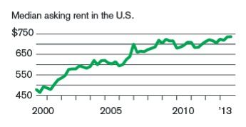
You can probably immediately see the problem, just by looking. The huge increase in rents took place from 2000 through 2008. Rents have varied by only +/-5% since then. And that's exactly what the data, compiled by the Census Bureau, shows. The data series goes back to 1988, and below is a chart of nominal asking rents vs. median weekly wages, compiled by the BLS, showing that real rents declined in the 1990s as wages increased, then soared in the 2000 - 2008 period, and have been below that peak ever since:
| Year | Median Asking Rent | Usual weekly earnings | Rent as % of earnings | Real median asking rent |
|---|---|---|---|---|
| 1988 | 330 | 382 | 86 | 649 |
| 1992 | 401 | 437 | 92 | 677 |
| 1993 | 422 | 450 | 88 | 690 |
| 2000 | 478 | 568 | 84 | 658 |
| 2002 | 545 | 607 | 90 | 717 |
| 2004 | 620 | 629 | 99 | 777 |
| 2009 | 723 | 732 | 99 | 797 |
| 2012 | 721 | 765 | 94 | 740 |
| 2013 Q1 | 718 | 770 | 93 | 722 |
| 2013 Q2 | 735 | 776 | 95 | 741 |
| 2013 Q3 | 736 | 778 | 95 | 738 |
| 2013 Q4 | 746 | 782 | 95 | 746 |
Note that from 2000 to 2009, real median rents rose 17.8%, from .84 to .99 of wages. By January 2013 that was back down to .93, but by the end of 2013 had risen to .95.
The final column above shows "real" asking rents (rents deflated by the CPI), and indicates that rents haven't even kept up with inflation for the last 5 years (although they increased more than inflation in 2013). There simply is no bubble in rents.
The final column above shows "real" asking rents (rents deflated by the CPI), and indicates that rents haven't even kept up with inflation for the last 5 years (although they increased more than inflation in 2013). There simply is no bubble in rents.
So what's the big deal? The problem is that, while median wage earners aren't having a problem, the decrease in real wages in the bottom two quintiles is putting them in a real bind.
The Wharton School of the University of Pennsylvania's public policy brief that is the source of the "rental affordability crisis" information says:
According to data from the U.S. Census, half of all renters, and 83 percent of renters with incomes under $20,000, paid more than 30 percent of their incomes in rent in 2011.
....
[D]emand for rental apartments has grown and apartment construction has not kept pace. Between 2010 and 2013, the national apartment vacancy rate fell by half, from 8.0 percent to 4.3 percent,.....
....
... [But i]ncome growth has failed to keep pace with rental growth over the last decade. At the national level, between 2000 and 2011, growth in REIS rent exceeded the growth in median renter income by the affordability rate to fall further.
Instead, the greatest decline in affordability has occurred amongst low-to-middle income households. [For example, i]n Atlanta, the share of households with incomes between $20,000 and $35,000 in year 2010 dollars who paid at least 30 percent of their incomes in rent rose from about 20 percent in 1980 to more than 80 percent in 2012....Even households in the $35,000 to $50,000 real income tier have experienced declining affordability rates, albeit not to the same degree....However, the highest income groups in the data – households making $50,000 or more in real terms—have experienced little decrease in affordability.
[my emphasis]
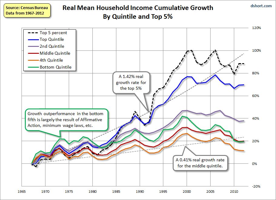
In other words, the problem isn't a bubble in rents. The problem is that even when rents have not kept pace with inflation, the income of the typical household that rents has experience a real decline. The Harvard Joint Housing Center points out [pdf] that in 2010, 70% of all rental households had below the median of household income, and 40% of renters were in the in 25% of household income.
And what has happened to the bottom two quintiles of income earners? They have fallen further behind the median and the upper 2 quintiles, as shown in this well-known graph of income by quintiles last updated by the Census Bureau in 2011:
And as the Employment Law Project pointed out last June, since 2009 real incomes of the bottom two quintiles - and particularly the fourth quintile -- fell the most in real terms through 2012:
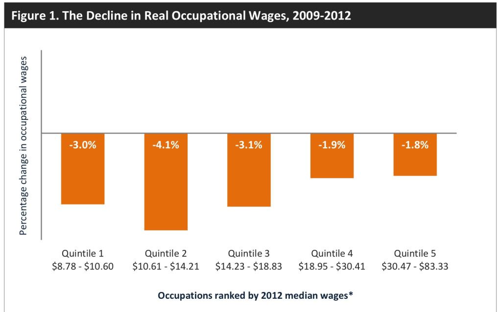
In other words, even though rents have failed to keep up with inflation since 2008, and even if they have declined as to real median weekly wages since then, they have continued to increase in real terms compared with the falling real incomes of the bottom two quintiles who make up the typical renter household. Rental prices have failed to go up more in the last several years not because of a lack of demand, but because higher rents are simply out of the reach of the typical renter.
It's a shame that the writer of that piece was so focused on the idea that there must be a bubble in rentals and housing that he completely overlooked this very real problem. It demonstrates in yet another way that falling real incomes among the lower middle class and working class are destroying the American dream.
US' Slow Recovery Is Still Intact
All of the coincident indicators are still increasing.
http://community.xe.com/forum/xe-market-analysis/us-slow-recovery-still-intact
http://community.xe.com/forum/xe-market-analysis/us-slow-recovery-still-intact
Wednesday, April 23, 2014
Increased interest rates, asking prices taking a serious bite out of home sales
- by New Deal democrat
I have a new post up at XE.com on new and existing home sales. Total home sales are off -13.5% from their peak 9 months ago, as higher interest rates and an overshoot on increasing home prices is taking a serious bite out of the market
Yield Curve Is Flattening
Above is a chart of the difference between the 30 and 5 year CMTs -- constantly maturing treasuries. Since the beginning of December, this spread has been declining.
The reason for the decrease is a rally in the long-end of the curve as the 30 year CMT has decreased from ~ 3.9 to ~3.5, or a decrease of about 40 basis points. That tells us that traders don't see inflationary pressures.
Tuesday, April 22, 2014
Treasuries Are the Surprise Year to Date Winner
When the Fed announced an end to the quantitative easing program, the treasury market sold off. The reason is simple: the largest buyer of treasuries had announced they were leaving the market. However, since January 1, treasuries have outperformed the market as a whole.
When we compare long treasuries, SPYs, commodities (DBC) and the dollar (UUP) since January 1, treasuries again outperform.
When we compare long treasuries, SPYs, commodities (DBC) and the dollar (UUP) since January 1, treasuries again outperform.
Monday, April 21, 2014
The state of housing: an update on permits and starts, and a look ahead
- by New Deal democrat
One of my key mantras is that I don't fight with the data. Sometimes there is an obvious asterisk (e.g., the government shutdown, or particularly severe weather, e.g., Sandy), but as a general rule trying to make the data fit your worldview will lead you astray.
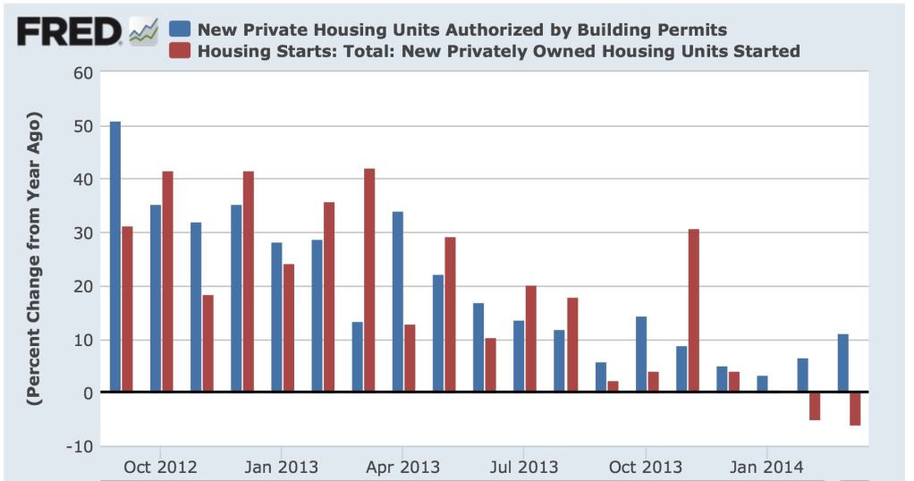
With that in mind, much as it pains me to say it, while housing starts and sales have been trending down as I thought they would:
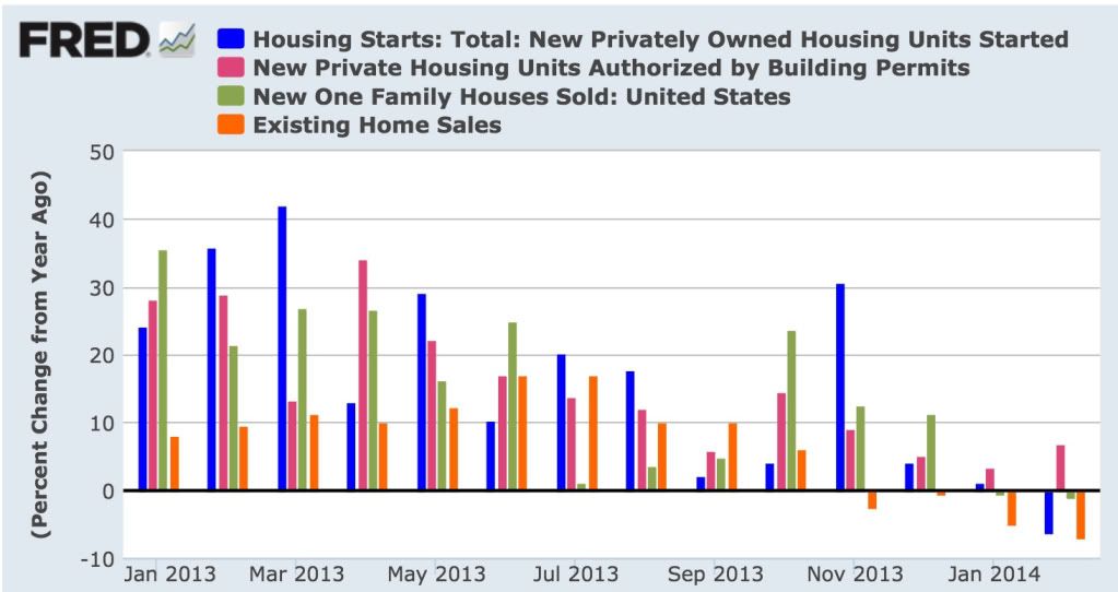
the best and most forward looking indicator, housing permits, has reversed course and trended upward in the last two months:
Last year I pointed out that on 15 of 19 occasions in the last 60 years, when there had been a 1% increase in interest rates, housing permits had decreased YoY by at least -100,000. One time, in 2000, permits decreased only -62,000. The three remaining times appear to be cases of "buy now or be forever priced out," in which the housing market levitated for awhile, and then crashed all the harder.
So here is what YoY interest rates (inverted) and housing permits YoY look like updated through March:
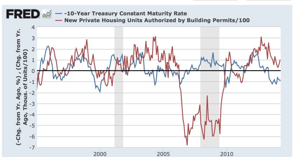
While permits have certainly decelerated, they have resolutely not turned negative, something that I absolutely thought would have happened by now.
(By the way, it's not like any of these have approached Bill McBride's forecast of a 20% average gain for 2014 over 2013 either. He may win his bet with me due to an isolated month of YoY comparisons, in particular June or July, where starts and sales in 2013 posted horrible numbers. But from here on in permits would have to exceed 1.1 million in a month for Bill to win the bet on that basis, and that seems very unlikely. And for the record, Bill is the nicest blogger there is and we are on good terms. This is a friendly bet for charity.)
So why have permits held up? A lot of the data is exactly what I'd expect to see as permits roll over. And there are reasons to think that the tow month YoY increase in permits might be an artifact of the unusually severe winter.
To begin with, builders appear to be seeing an actual slowdown. Here's homebuilder sentiment compared with housing starts (h/t Scott Grannis):
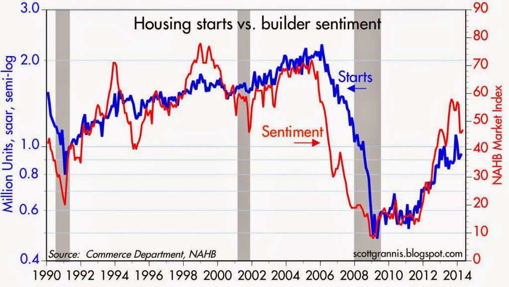
Note that the two generally move in the same direction, and homebuilder sentiment has decreased in the last few months.
More significantly, here is a graph of buyer traffic (via Paper Economy):
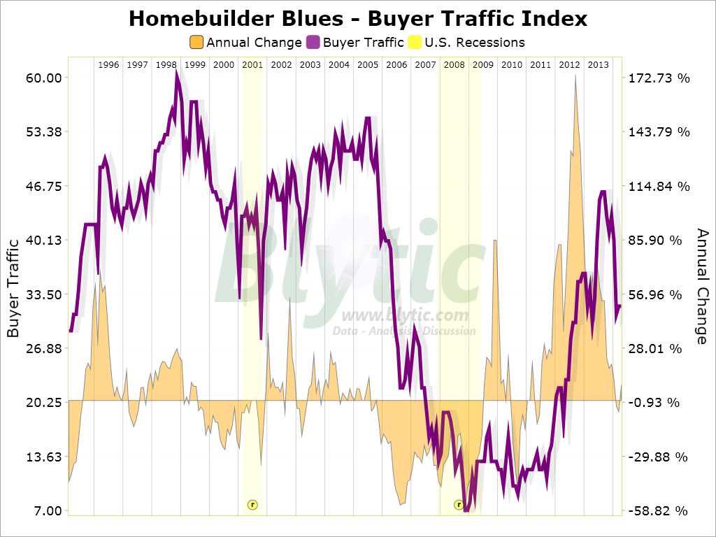
Buyer traffic appears to have decreased in the last few months, and is now basically flat YoY. This certainly does not look like what I would expect to see if there were to be an increase in housing starts or sales.
As to the unusual winter shifting permits in some regions from January and February to March, here are permits in the Northeast:
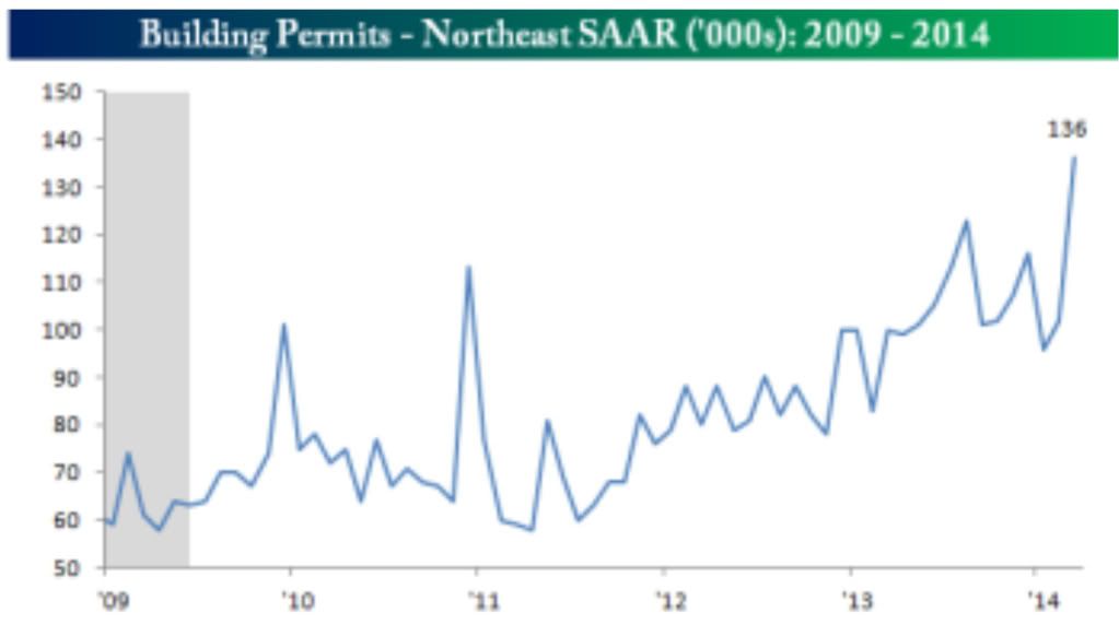
It looks pretty clear that there were several months of depressed winter data, followed by a huge rebound as the weather broke in March. Although I won't post it, a similar but smaller rebound occurred in the Midwest, while the South was negative YoY in March.
So there is reason to believe that the increasing trend in permits YoY since January might be an artifact of the unusually severe winter.
But on the other hand, in support of the reslience of housing permits, the below quote from this article in Redfin points out that several markets are experiencing outright booms:
While the housing market has cooled in many major cities since last year, other cities have only gotten hotter. In certain areas of Texas, North Carolina, Colorado and the Pacific Northwest, homes are selling like hotcakes thanks to strong job and population growth, worsening inventory shortages and ... relative affordability.And here is the accompanying chart showing the stats:
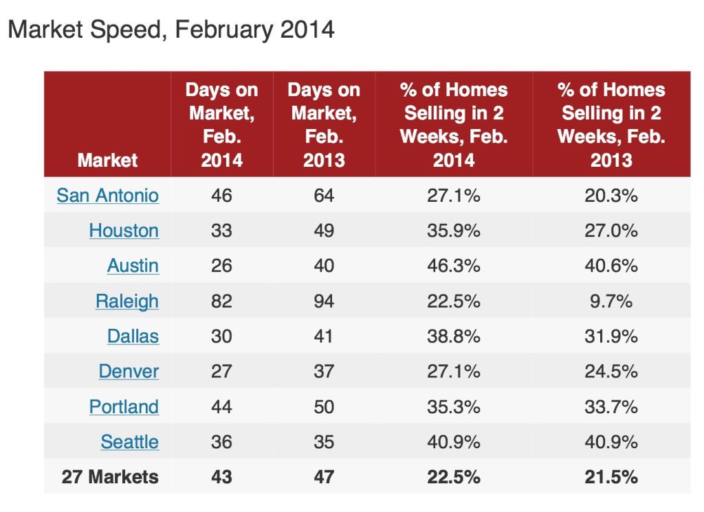
If there is a migration from high-priced to low-priced housing markets, this could be ameliorating the increase in mortgage rates.
Yet another factor may be the changing rent-vs.-own ratio. According to the US Census Bureau (pdf), while housing prices declined by about 1/3 from top to bottom, and have made up less than half of that decline since, median rents have remained within 5% of $700 per month since 2008. In the last few quarters of 2013, they rose to the top end of that range. In metro areas with relatively expensive rentals, buying a house may be more attractive.
Still, as noted by Realty Trac, the increase in mortgage rates has raised the minimum down payment to buy a house by about 20%:
Not coincidentally, the number of months' supply of houses has been slowly rising. In this week's reports of new and existing home sales, I will be particularly looking to see if this increase continues. There does not appear to be any magic number, as the below graph indicates, which compares the median house price change YoY (left scale) with the monthly supply of houses (inverted, right scale):The income needed to qualify for a median-priced home in the fourth quarter of 2013 was $41,500, up from an average minimum income of $34,250 a year earlier. (That minimum assumes you'll spend no more than 25 percent of your household income on your mortgage.)
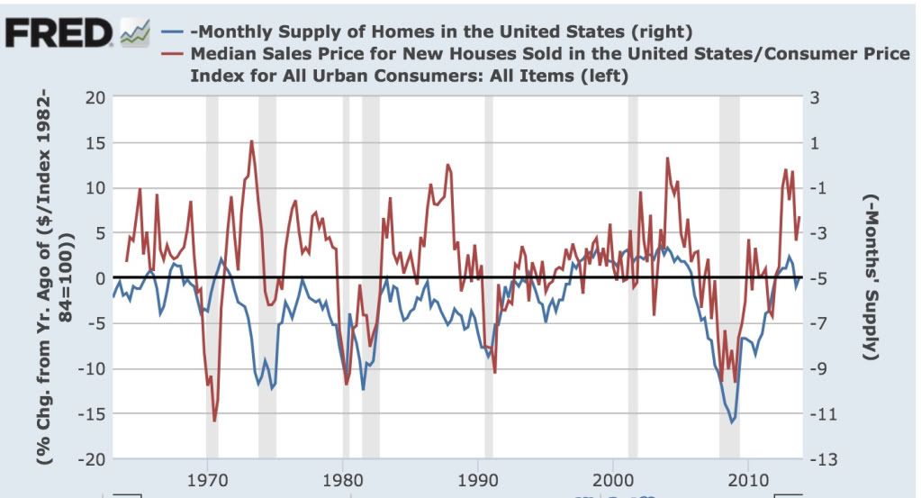
In the 1960s, 5 months supply was enough to bring prices increases to a halt. In the 1970s and 1980s, it was more like 7 months. In 2006, it was between 5 and 6 months' supply.
April and May of last year were particularly strong months for housing permits. If they are going to turn negative, those are the months where they should do so. If double-digit price increases continue, and affordability rapidly declines, then as with the prior 3 occasions, delaying the day of reckoning will only make it a harder fall.
So tomorrow and Wednesday, I will be paying particular attention to the median price months' supply of both new and existing homes. Is there evidence that the market has not withstood the most recent price increases? In the case of new homes, there is already evidence that there has been a peak, and YoY price increases may have ended. Is the months' supply steady, or is it increasing further? An increase in the months' supply is evidence supporting that there is or shortly will be a pullback in building.
Latin American Markets Rebound
Latin American markets sold off in tandem when the Fed announced the end of QE, which basically reversed the flow of "hot money" funds leaving the US into development markets. Also hurting these economies is the Chinese slowdown, as many of these countries supply raw materials to the Chinese economy.
But LA has made some impressive strides in its own right, which were heavily discounted in the sell-off. Traders have obviously reassessed these markets and are again committing funds.
Chile and Colombia are understandable bets; both countries are on fairly decent economic footing. Brazil is a bit more of a puzzle, as there hasn't been much good news from that country since the first of the year. And Argentina has some issues, especially with its publicly released economic numbers that make me question its market strength.
Here's a chart of the regions performance over the last year.
Sunday, April 20, 2014
A thought for Sunday: the legacy of a fateful choice
- by New Deal democrat
Bonddad's weekly international summary, below, is well worth a read at XE.com. In it he describes the deflationary danger of the pro-creditor/pivot to austerity choices that were made in the developed world.
The below quote, from Larry Summers describing his "secular stagnation" theme, in particular leapt out at me:
In 2008-09, we could have bailed out debtors, or we could have bailed out creditors. Had we bailed out debtors, the debtors could have used that bailout money to renegotiate, pay down, or pay off their debts to the creditors, and then both would be made reasonably whole. Bailing out creditors rescued them, but didn't cancel the debt, and so debtors still had to deleverage and pay off the debts, a painful and slow process.in such a situation falling wages and prices or inflation at slower-than-expected rates is likely to worsen economic performance by encouraging consumers and investors to delay spending, and to redistribute income and wealth from higher spending debtors to lower spending creditors.
At that critical juncture, none other than Larry Summers had the most powerful position possible to argue in favor of bailing out debtors, but did not do so. We chose creditors, and we've been paying the price since.


