Saturday, September 14, 2013

Weekly Indicators: Manufacturing and transport break out to the upside edition


 - by New Deal democrat

Month over month August data included a rise in real retail sales (and July revised positively), a decline in consumer sentiment, an increase in the PPI, a decrease in import and export prices, and falling business and wholesale inventories.

Let's start this edition of the high frequency weekly indicators by looking at the real economic version of the Dow signal, i.e., comparing manufacturing with transport:

Steel production from the American Iron and Steel Institute
  • +0.9% w/w

  • +6.9% YoY

Steel production over the last several years has been, and appears to still be, in a decelerating uptrend. It had been negative YoY for last 3 weeks, but turned positive this week.

Transport

Railroad transport from the AAR
  • +6000 carloads up +2.2% YoY

  • +7200 carloads or +4.7% ex-coal

  • +14,400 or +6.7% intermodal units

  • +20,500 or +4.2% YoY total loads
Shipping transport Rail transport had been both positive and negative YoY during midyear, but this week was the fifth positive week in a row since then, and equals its most positive showing in a long time. The Harpex index had been improving slowly from its January 1 low of 352, but then flattened out for 9 weeks before making a new 52 week high several weeks ago. The Baltic Dry Index has rebounded to make yet another 18 month high. In the larger picture, both the Baltic Dry Index and the Harpex declined sharply since the onset of the recession, and have been in a range near their bottom for about 2 years, but stopped falling earlier this year, and now seem to be in an uptrend.

Employment metrics

Initial jobless claims
  • 292,000 down -21,000

  • 4 week average 321,250 down -7250

The American Staffing Association Index was steady at 97. It is up +5.5% YoY

Tax Withholding
  • $67.3 B for the first 8 days of September vs. $60.4 B last year, up +6.9 B or +11.5%

  • $146.3 B for the last 20 reporting days vs. $129.4 B last year, up +16.9 B or +13.1%

Initial claims made a new 6 year low this past week, due to state reporting glitches. Next week's numbers will average out to the real story. In any event, they remain firmly in a normal expansionary mode. Like each of the last three years that this same, a good, downside breakout has occurred.

Temporary staffing had been flat to negative YoY in spring, but has broken out positively in the last two months. Tax withholding, after a relatively poor August, is again posting better comparisons.

Consumer spending Gallup's 14 day average of consumer spending is positive, but less so than earlier this year. The ICSC varied between +1.5% and +4.5% YoY in 2012, while Johnson Redbook was generally below +3%. The ICSC has been weakening but improved this week, and Johnson Redbook remains at the high end of its range, and has actually been improving.

Oil prices and usage
  • Oil down -2.32 to $108.21 w/w

  • Gas down -$0.02 at $3.59 w/w

  • Usage 4 week average YoY down -0.1%
The price of Oil retreated slightly from its new 2 year high last week. The 4 week average for gas usage was negative, for the second week after eight straight weeks of being up YoY.

Interest rates and credit spreads
  • 5.49% BAA corporate bonds up +0.09%

  • 2.92% 10 year treasury bonds up +0.16%

  • 2.57% credit spread between corporates and treasuries down -0.07%
Interest rates for corporate bonds had been falling since being just above 6% in January 2011, hitting a low of 4.46% in November 2012. Treasuries fell to a possible once-in-a-lifetime low of 1.47% in July 2012, and have decisively risen about 1.5% above that mark. Spreads, however, made another new 2 year low this week. Their recent high was over 3.4% in June 2011.

Housing metrics

Mortgage applications from the Mortgage Bankers Association:
  • -3% w/w purchase applications

  • +7% YoY purchase applications

  • -20% w/w refinance applications!
Refinancing applications have decreased sharply -- 71%!! -- in the last 4 months due to higher interest rates, and are now lower than they have been since June 2009. Purchase applications have also declined from their multiyear highs in April, but are still slightly up YoY.

Housing prices
  • YoY this week +10.6%
Housing prices bottomed at the end of November 2011 on Housing Tracker, and averaged an increase of +2.0% to +2.5% YoY during 2012. This weeks's YoY increase remains near a 7 year record.

Real estate loans, from the FRB H8 report:
  • -2 or -0.1% w/w

  • -0.1% YoY

  • +1.2% from its bottom
Loans turned up at the end of 2011 and averaged about 1% gains YoY through most of 2012.  Over the last few months, the comparisons have completely stalled.

Money supply

M1
  • +0.5% w/w

  • -0.1% m/m

  • +8.7% YoY Real M1

M2
  • +0.1% w/w

  • +0.1% m/m

  • +4.6% YoY Real M2
Real M1 made a YoY high of about 20% in January 2012 and decelerated since then. Earlier this year it increased again but this week remained near its new 2 year low established last week (although it is still positive).  Real M2 also made a YoY high of about 10.5% in January 2012.  Its subsequent low was 4.5% in August 2012. It increased slightly in the first few months of this year, then stabilized, but has declined again in the past several months.

Bank lending rates The TED spread is still near the low end of its 3 year range, although it has risen slightly in the last couple of months.  LIBOR established yet another new 3 year low one week ago.

JoC ECRI Commodity prices
  • down -0.23 to 123.27 w/w

  • -1.10 YoY

This week was generally positive, with the same concerns about the long leading indicators as I've had for the past several months. Interest rates are negative, mortgage applications and real estate loans have turned negative (although purchase mortgage applications are still steadily positive YoY), and money supply is decelerating although still positive.

The shorter leading indicators of initial jobless claims and interest rate spreads are positive, although we need to see how jobless claims are revised next week. Temporary employment has turned strongly positive in the last two months. The oil choke collar is engaged but has eased off a bit, although commodities have turned negative.

The coincident indicators look like they have broken out positively. Rail traffic, which had been a real concern, has broken to the upside strongly for several weeks in a row, as has shipping. Steel production broke out to the upside this week as well. Consumer spending is holding up reasonably well. Bank lending rates are at or near their lows. Tax withholding has also improved moderately in the last couple of weeks. House prices remain strongly positive.

Barring Debt Ceiling Debacle part Deux in Washington, or a further oil price shock, the economy appears ready to pick up steam again for the rest of the year. I remain much more cautious about 2014.

Have a nice weekend.

Friday, September 13, 2013

Why America Is Not the Greatest Country Anymore

Here's something a little bit different.  It's from the first episode of the Newsroom and it's a great monologue.  And I get exactly how Jeff Daniels feels.


Retail sales un-stagnate


- by New Deal democrat

Last weekend I re-read the 2013 outlook I posted in two parts back in January. That boiled down to (1) almost complete stagnation in the first half (2) followed by a rebound in the second. An astute commenter asked me last weekend if the rebound in some of the Weekly Indicators heralded that rebound. I think it does, and this morning's retail sales report for August (and especially the upward revision to July) adds some incremental evidence to that hypothesis.

Since consumer inflation was +0.2% in July, the revision means that real retail sales increased +0.2% in that month. August inflation was probably +0.1% +/-0.1%, so most likely real retail sales ticked up in August as well. Here's an updated graph of real retail sales through July:


At the moment it looks like Washington will manage to avoid Debt Ceiling Debacle part Deux, and if that happens I see no reason why we won't have continued expansion through the rest of this year.

Wherein I nit-pick Profs. Paul Krugman and Mark Thoma: respect the Oil choke collar!


-by New Deal democrat

Yesterday Bonddad linked to an excellent article by Prof. Mark Thoma on why the recovery has been so sluggish. If you haven't read Thoma's piece yet, by all means do so. This morning Prof. Paul Krugman amplified on a post from earlier this week about how this recovery, like the last two, has been distinctly un-V-ish, citing the zero lower interest rate bound and nominal wage rigidity.

One picks fights with such luminaries at one's peril, but this is more nit-picking. You see, actually, if you measure by real GDP, the recovery actually was rather V -ish:

There were 6 quarters from peak to trough, and 8 quarters till we surpassed the prior peak.

Additionally, there are a host of other measures that started off looking V -ish, but then faltered at about midyear 2010. Here's one of them, industrial production:


What could have caused the downshifting of so many indicators into second gear at around that time? Oh, yeah:


That's when Oil ramped up back over $3 a gallon and stayed there. Give me $1.60 a gallon gas, or even $2.60 a gallon gas, instead of $3.60 a gallon gas, and I'll show you one heckuva V-shaped trajectory.

From Bonddad:

Earlier this week I noted that oil's price charts are very bullish.  In addition, the political situation in the Middle East is such that it will provide upward pressure on oil.  Here's an updated daily chart:


Prices are still elevated.  While momentum and volume inflow are weakening, they are still positive and fairly strong.


Chinese Economy and Market Rebounding

The news coming out of China has been very positive over the last few months:

Chinese industrial output, investment and retail sales all strengthened in August, the latest evidence of an upswing in growth in the world’s second-biggest economy.

Coming on the heels of robust export figures and muted inflation, the recent data leave little doubt that the Chinese economy has rebounded after a shaky half-year. Although analysts still question the durability of the recovery, China’s strong run of form should help the government hit its target of 7.5 per cent growth this year. 

This has been positive for the Chinese market:
Starting in January we see the first leg down, moving from the 2450 to 2200 area, or a loss of about 2%.  Prices rebounded until the beginning of June when they dropped sharply, moving from 2300 to 1950, or a move of about 15%.  But since then, prices have been rebounding.  Several days ago they moved through the 200 day EMA on a strong candle print.


The chart about shows this is an important development for the Pacific region, ex-Japan.  Remember that most of SE Asia -- Hong Kong, South Korea, Taiwan, Singapore, Malaysia and others feed into the Chinese market in some manner.

Thursday, September 12, 2013

Five Years After The Collapse ....

Barry over at the Big Picture blog and Mark Thoma have been doing some great work over the last week, looking back at the financial collapse to get an idea for what happened and what we've learned (or not learned).

Here's a video with Barry:


And here is a link to a piece written by Mark Thoma on why the recovery has been so slow.

Both piece offer some great analysis and perspective and are well worth the reading or viewing.
hy has the recovery from the recession been so slow? Part of the answer is that recessions caused by a collapse of the financial sector are among the hardest to recover from. But that is not the only reason for the slow recovery. - See more at: http://www.thefiscaltimes.com/Articles/2013/09/10/10-Real-and-Bogus-Reasons-Slow-Recovery#sthash.UzWFMNl2.dpuf


hy has the recovery from the recession been so slow? Part of the answer is that recessions caused by a collapse of the financial sector are among the hardest to recover from. But that is not the only reason for the slow recovery. Many additional factors are often cited for the agonizingly slow recovery, some real and some bogus. Let’s begin with the real reasons for the slower than necessary recovery, and then turn to bogus reasons that have been used to support ideological goals: - See more at: http://www.thefiscaltimes.com/Articles/2013/09/10/10-Real-and-Bogus-Reasons-Slow-Recovery#sthash.UzWFMNl2.dpuf
hy has the recovery from the recession been so slow? Part of the answer is that recessions caused by a collapse of the financial sector are among the hardest to recover from. But that is not the only reason for the slow recovery. - See more at: http://www.thefiscaltimes.com/Articles/2013/09/10/10-Real-and-Bogus-Reasons-Slow-Recovery#sthash.UzWFMNl2.dpuf

hy has the recovery from the recession been so slow? Part of the answer is that recessions caused by a collapse of the financial sector are among the hardest to recover from. But that is not the only reason for the slow recovery. Many additional factors are often cited for the agonizingly slow recovery, some real and some bogus. Let’s begin with the real reasons for the slower than necessary recovery, and then turn to bogus reasons that have been used to support ideological goals: - See more at: http://www.thefiscaltimes.com/Articles/2013/09/10/10-Real-and-Bogus-Reasons-Slow-Recovery#sthash.UzWFMNl2.dpuf

Actually, it's Republican Leadership That Is Causing "Uncertainty"

One of the more common arguments from the political right about why the recovery is so slow is that government is creating "uncertainty."  Barry explained why this is an incredibly stupid argument in a Washington Post Column. Mike Konczal over at the Next New Deal pretty much destroyed the "uncertainty index" created to show "uncertainty."  I would simply put it like this: there is always uncertainty because time is linear and we can't see into the future. 


But if you really want to blame someone for creating uncertainty, look at the Republican House. Starting with the debt negotiations two years ago that resulted in a Standard and Poor's credit downgrade, to last years budget fiasco to the current situation where the House leadership literally can't get anything done, the reality is this: Republican House leadership is creating a ton of political uncertainty through their utter ineptness.

There are times when it looks like Speaker John Boehner and Majority Leader Eric Cantor have no idea how to run the House Republican Conference.

In just two frantic days, rank-and-file House Republicans sidelined leadership’s plan to fund the government and take another nonbinding, quixotic vote on defunding President Barack Obama’s signature health care law. These Republicans said the leadership plan is too weak, lacks a long-term strategy and is akin to waving a white flag on Obamacare.

.....
 
It’s a pattern that’s played out over the course of this Congress. Boehner and Cantor propose a plan, announce a vote and conservatives bail.

Boehner and Cantor have spoken about the need for immigration reform, yet there’s not a shred of urgency among House Republicans to pass it. The two GOP leaders endorsed Obama’s proposal to launch military attacks on Syria, yet just a few dozen Republicans — at most — agreed with them. The farm bill that Cantor oversaw remains unfinished. The appropriations process has been a debacle, as House Republicans have violated their own budget guidelines. And in private discussions, GOP leadership aides acknowledge they have absolutely no idea how they’ll lift the $16.7 trillion debt ceiling. That deadline hits in mid-October.


Canada Continues Its Economic Doldroms

From the latest interest rate decision by the Canadian Central Bank:

The global economy continues to expand broadly as expected, but its dynamic has moderated. In the United States, the process of normalization of long-term interest rates has begun in the context of stronger private domestic demand. Recent data, however, point to slightly less momentum overall than anticipated. In Europe, there are early signs of a recovery, and Japan’s situation remains promising. In a number of emerging market economies, financial volatility has increased, adding uncertainty to growth prospects, although China continues to grow at a solid pace. Commodity prices have been relatively stable, with geopolitical stresses putting some upward pressure on global oil prices.

Uncertain global economic conditions appear to be delaying the anticipated rotation of demand in Canada towards exports and investment. While the housing sector has been slightly stronger than anticipated, household credit growth has continued to slow and mortgage interest rates are higher, pointing to a continued constructive evolution of household imbalances. Looking through the choppiness of the recent data, the level of Canada’s GDP is largely consistent with the Bank’s July forecast. The output gap is expected to begin to narrow in 2014.

Inflation in Canada remains subdued. With inflation expectations well-anchored, both core and total CPI inflation are expected to return slowly to 2 per cent as the output gap closes.

Against this backdrop, the Bank has decided to maintain the target for the overnight rate at 1 per cent.  As long as there is significant slack in the Canadian economy, the inflation outlook remains muted, and imbalances in the household sector continue to evolve constructively, the considerable monetary policy stimulus currently in place will remain appropriate. Over time, as the normalization of these conditions unfolds, a gradual normalization of policy interest rates can also be expected, consistent with achieving the 2 per cent inflation target.

Overall, Canada is in in a situation much like the US.


While the country is growing, it is doing so at a slower rate.

Unemployment is still at stubbornly high levels.

 But inflation is clearly under control.


But the interest rate is still low, indicating that low rates are not having the stimulative effect most would want.

Canada appears to be in the same situation as the US: growth at a rate just fast enough to keep us out of recession, but not enough to hit escape velocity.

Wednesday, September 11, 2013

The UK Is Printing Strong Economic Numbers

The numbers coming out of the UK over the last few months have been very impressive.  First, consider the Markit Services index:

August’s survey of UK service providers signalled continued strong growth of activity and new business. Activity rose at the sharpest pace since December 2006, while growth in new work was the best seen since May 1997.
 

Capacity continued to be tested, with backlogs of work rising at the sharpest pace for over 13 years. However, employment broadly stagnated, in part due to an inability of service providers to replace leavers.
 

The headline seasonally adjusted Business Activity Index registered 60.5 in August. Improving on July’s 60.2, the latest reading was the highest in over six-and-a-half years. Over a quarter of the survey panel registered an increase in activity.

Here is the accompanying chart:


The latest print is above all readings from the recovery.

Construction is also in very good shape:

August data indicated another strong improvement in the overall performance of the UK construction sector, as highlighted by steep and accelerated expansions of both output and new business volumes. Construction companies also remain confident about the year-ahead outlook for business activity at their units, with around 46% of survey respondents expecting a rise and only 10% a reduction.
 

Adjusted for seasonal influences, the headline Markit/CIPS UK Construction Purchasing Managers’ Index® (PMI®) registered 59.1 in August up from 57.0 in July and above the neutral 50.0 value for the fourth consecutive month. The latest reading indicated a sharp rise in total business activity and the fastest pace of output expansion in the construction sector since September 2007.

Here's the accompanying data:


Again, this is the strongest print of the recovery.

And manufacturing is also printing at strong levels:

Latest data indicated that the UK manufacturing sector maintained its robust start to the third quarter of 2013. After the solid increases in output and new orders registered in July, August saw the momentum continue to build, with growth rates for both variables at their highest since 1994. However, cost inflationary pressures surged higher on the back of rising raw material prices.
 

The seasonally adjusted Markit/CIPS Purchasing Manager’s Index® (PMI®) hit a two-and-a-half year high of 57.2 in August, up from a revised reading of 54.8 
in July (previously reported as 54.6). The PMI has signalled expansion for five successive months.

Here's a chart of the manufacturing data:

The manufacturing number is rising strongly.

While all the usual caveats apply, these numbers all point to higher growth in the next few quarters.

Let's take a look at the UK ETF:


The UK ETF is a buy right now.  Not only are the economic fundamentals positive, the the ETF is in a bullish posture.  Prices broke through the lower 19 level on a strong volume spike.  This was accompanied by risking volume.  All the EMAs are rising -- including the long-term trend (the 200 day EMA).  In addition, the MACD and CMF show increasing upward momentum and rising volume inflow.


Median family income continued stagnation in 2012


- by New Deal democrat

Berkeley Professors Saez and Piketty have updated their work on family income in the US through 2012, making use of data from IRS returns. As covered by, for example, Prof. Mark Thoma, they found that the top 10% captured 95% of all of the increase in aggregate incomes since the recovery began. Here's the essential graph, showing the shares of total income over the last 100 years going to the 90th to 95th percentile (red), 95th to 99th percentile (blue), and the top 1 percent (black):


That lopsided accumulation of income flows naturally from the fact that, in addition to skyrocketing CEO compensation, the lion's share of capital gains accrue to those in the top income percentiles, and while wages of nonsupervisory workers have stagnated as many are still unemployed (red), the stock market has nearly doubled since the beginning of 2009 (blue):


This study also updates their data on "real median family income", which I reported on a month ago: The Truth about the decline in real median household income.

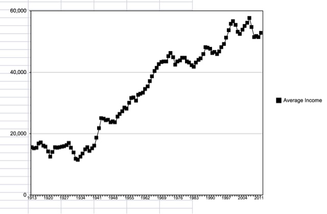
Saez and Piketty report on the inflation adjusted median income of the bottom 90% at column (7) in Tables A4, A5, and A6. They found income exactly unchanged at $30,997 in 2012 compared with 2011. Excluding capital gains, measured one way they found a very slight increase from $31,426 to $31,522. Measured another way they found a very slight decrease from $30,458 to $30,439. These are all roughly a 10% decrease from 2008. While they provided no graphic representations for this, they did provide one of average income, showing an increase but still below its recession peak:


As I indicated a month ago, it is important to note that these are not median wages or salaries. Rather, median incomes reflect the significant and persistent decrease in the employment to population ratio, partly due to the long term unemployed, and partly due to Boomer retirements.

That stimulus was primarily aimed at the financial sector of the economy, and less so at the average American family, leading to the natural result that the capital-owning class has recovered spectacularly, while the well-being of wage-earners has not materially increased, strikes me as the essence of the spectacular failure of policy that Prof. Krugman was railing against last week.

The Moderate Expansion Continues; ISM Adds Bullish Fuel

Last week the Federal Reserve Released the Beige Book, which shows (surprise) a continued moderate expansion.

Reports from the twelve Federal Reserve Districts suggest that national economic activity continued to expand at a modest to moderate pace during the reporting period of early July through late August. Eight Districts characterized growth as moderate; of the remaining four, Boston, Atlanta, and San Francisco reported modest growth, and Chicago indicated activity had improved. Consumer spending rose in most Districts, reflecting, in part, strong demand for automobiles and housing-related goods. Activity in the travel and tourism sector expanded in most areas. Demand for nonfinancial services, including professional and transportation services, increased slightly on net. Manufacturing activity expanded modestly. Residential real estate activity increased moderately in most Districts, and demand for nonresidential real estate gained overall. Lending activity was mixed. Lending standards were largely unchanged, while credit quality improved. Demand for agricultural products was strong during the reporting period, but growing conditions and production in some areas were somewhat weak as a consequence of extreme weather. Demand for natural resource products was stable or up slightly, and extraction increased in anticipation of further demand growth. 

But two releases last week added bullish fuel to the economic argument in the guise of the ISM manufacturing and service numbers (we've already covered the ISM numbers in two posts see here and here).

The ISM manufacturing number was strong:

The PMI™ registered 55.7 percent, an increase of 0.3 percentage point from July's reading of 55.4 percent. August's PMI™ reading, the highest of the year, indicates expansion in the manufacturing sector for the third consecutive month. The New Orders Index increased in August by 4.9 percentage points to 63.2 percent, and the Production Index decreased by 2.6 percentage points to 62.4 percent. The Employment Index registered 53.3 percent, a decrease of 1.1 percentage points compared to July's reading of 54.4 percent. The Prices Index registered 54 percent, increasing 5 percentage points from July, indicating that overall raw materials prices increased when compared to last month. Comments from the panel range from slow to improving business conditions depending upon the industry."

Here's a chart of the number:


The two most recent readings show strong upward movement, rising higher than all levels seen before the 1Q11.  15 of the 18 industries reported growth.  Last week, NDD noted the new orders index is very bullish for the next few months.

The anecdotal quotes are a bit less bullish, however:
  • "Slight improvements in both domestic and international sales." (Fabricated Metal Products)
  • "Business is slowing down, not sure why — but we may end up below last year's sales levels, whereas we had forecast 6.5 percent growth." (Miscellaneous Manufacturing)
  • "Material prices continue to be favorable; business is steady." (Paper Products)
  • "Slowing down slightly, but still stronger than last year by 20 percent." (Furniture & Related Products)
  • "Military slowdown affecting business." (Computer & Electronic Products)
  • "Summer seasonal businesses are doing well after a late start." (Printing & Related Support Activities)
  • "Still not seeing the year we had expected. Cautious about the balance of 2013." (Machinery)
  • "Tight government spending still affecting business." (Transportation Equipment)
  • "With improved weather outlook in the central states, agricultural prices are relaxing year over year." (Food, Beverage & Tobacco Products)
  • "We have benefitted from the Yen; seeing a 20 percent decrease in material costs from 2012 to 2013." (Chemical Products)
 Several industries are reporting a slowing with the only visible cause being sequestration.  However, no one is foreseeing an imminent collapse.  And even with the recent slowing, the year over year numbers are still higher.

Let's turn to the services number:

"The NMI™ registered 58.6 percent in August, 2.6 percentage points higher than the 56 percent registered in July. This indicates continued growth at a faster rate in the non-manufacturing sector. This month's NMI™ is the highest reading for the index since its inception in January 2008. The Non-Manufacturing Business Activity Index increased to 62.2 percent, which is 1.8 percentage points higher than the 60.4 percent reported in July, reflecting growth for the 49th consecutive month. The New Orders Index increased by 2.8 percentage points to 60.5 percent, and the Employment Index increased 3.8 percentage points to 57 percent, indicating growth in employment for the 13th consecutive month. The Prices Index decreased 6.7 percentage points to 53.4 percent, indicating prices increased at a significantly slower rate in August when compared to July. According to the NMI™, 16 non-manufacturing industries reported growth in August. The majority of respondents' comments continue to be mostly positive about business conditions and the direction of the overall economy."

The chart shows the recent strength of the number:


The anecdotal stories are more bullish than the manufacturing sector:

  • "High demand for products is driving expansion." (Management of Companies & Support Services)
  • "We continue to see growth in the retail and wholesale sectors of our business, and expect to see new orders for our products continue to grow as well." (Information)
  • "We seem to have a flurry of activity in our pipeline." (Construction)
  • "Business orders are up and improving. Still concerned about sustainability through Q4." (Professional, Scientific & Technical Services)
  • "Experiencing a strong housing rebound and continued solid performance by the tourism sector." (Public Administration)
  • "Conditions continue to show improvement." (Retail Trade)
  • "Generally slow, increasing economy." (Transportation & Warehousing)
These combined reading of the ISM numbers is the economy is ripe for higher growth.  Manufacturing new orders numbers are very bullish while the service sector appears to be on very solid ground.

Tuesday, September 10, 2013

The Latin America Sell-Off Is Consolidating Losses

For reasons unknown, Latin America is not an important region for the US.  This despite the fact that Mexico is one of our largest trading partners and the regions close geographic relationship to the US.  However, over the last 13 years the Latin American countries have made great economic strides.  Unfortunately, the region's indexes have sold off since the Fed's tapering announcement last spring.  But the sell-off appears to be consolidating.

Let's start by looking an an ETF for the region.


The daily chart shows three important technical events.  The first is the rally that lasted from May 2012 to May/June 2013.  Prices broke support in the late Spring/early summer and dropped sharply, with a total loss of about 26%.  However, prices have since been consolidating their losses between the 56/58 area and 63.

We can break the respective markets down into three categories, with the first being those that are sill consolidating losses.


The Chilean ETF (upper left), Peruvian ETF (upper right) and Brazilian ETF (center, above) have all dropped, although at different rates.  But all three appear to have at least stopped their respective descents.  The Chilean ETF's rate of decline decreased substantially, and it now appears to be using the upper 40s as support.  The Peruvian ETF rallied to the 35 area in early August where it is now consolidating gains, the the Brazian ETF is clearly basing in the 42.5-45 area.


Both the Mexican ETF (left) and the Colombian ETF (right) attempted a rally in June/ July, only to see a sell-off.   But the price drop that ended the rally did not take prices to previous lows. 


And finally there is Argentina which is actually rallying.

All this despite an overall decent economic environment.  


Data from World Bank

Overall growth, with the exception of Brazil, is still progressing at decent annual rates. 


Data from World Bank

Inflation is a potential problem for all save Argentina.  But while CPI is running hotter than the US, it appears to be at least contained for now.

The region's sell-off is largely due to the Fed's tapering announcement, which led to a large outflow of funds.  However, there is nothing wrong with the economic fundamentals at this time.

Oil Becoming Potential Major Economic Threat

Oil is quickly becoming a potential major threat to the economy.


Oil hit resistance at the 98 level five times during the first half of 2013, finally breaking through in July.  Prices consolidated gains between the 102/104 and 108 levels over the summer.  During this time, the MACD declined which means there is now ample upside room for an increase in momentum.  Prices broke through resistance over the last few weeks, with a big upward candle print on Friday.  The MACD also printed a buy signal last week.  Finally, notice the very bullish orientation of the EMAs: all three shorter EMAs (10, 20 and 50) are moving higher, with prices using them as support rather than resistance.


The weekly chart simply increases the upward bullish case.  The EMA picture is very bullish.  Momentum is increasing, and an increasing amount of money is flowing into the market.  Also, there is very little recent upside resistance to slow the advance. 

Finally, there is the political side.  With the President putting off Syrian action until Congressional approval is given, he's made sure the Middle East will remain an object of tension for at least another weak.  This adds political uncertainty to the fire, which is also bullish for Oil's price future.

It's rare when the multiple technical time frames line up with fundamental developments to create a bullish scenario.  When they do, it's hard to not argue to go long. 


Monday, September 9, 2013

The gaping hole in the jobs recovery is manufacturing


- by New Deal democrat

There simply is no question that there has been a jobs recovery since the end of 2009. While it hasn't been fast enough, the 6 million plus people who have jobs now who didn't at that time would probably disagree strongly with those few who continue to insist on using scare quotes.

The rejoinder has been that jobs haven't grown nearly fast enough to close the gap with where they need to be taking into account population growth. In the aggregate, adjusted for population, job growth has been slow. But as we will see, the poor growth is concentrated in just a few areas, and in particular in manufacturing.

To make the point, every single graph I am running in this post describes one or more category of jobs, as a percent of the population.

Jobs are broadly divided into service and goods-producing sectors. Let's start with the service sector.

The first graph below shows the entirety of service sector jobs (blue) and all private sector service jobs (i.e., not including governement jobs (red)) for the last half century:


As you can see, the service sector grew almost relentlessly until about 1999, and broadly speaking, has held steady since.

This next graph focuses in on the last 15 years. To show the trend clearly, I've added 0.075% to the private-sector only line (red), which does not affect its slope at all:


This graph tells us two things:

- (1) private sector service jobs have almost completely recovered from their recession losses. As a share of the population, there are as many private sector service jobs as there were in the boom year of 1999 and from 2003 into 2005. In fact it is very questionable that we would want as many services jobs as we had as a percent of the workforce immediately before the 2008-09 severe recession. To have as many as we did in the peak year of the tech boom would only take about another 0.25% or so, or about 800,000. At the clip of 150,000 a month, if present trends continue we'll hit that sometime between the end of this year and next spring.

- (2) It would take about another 0.5% of the population getting federal, state, and local jobs to bring those back up to where they were, on average, in the 10 years between the tech boom and the onset of the great recession. That's about 1,500,000 jobs. In other words, not only do we have to rehire all the police and fire personnel and teachers who have been let go, but to keep even with population growth we need to hire more.

Now let's turn to the goods-producing sector of the economy.

The first graph shows all goods-producing jobs (blue), and just manufacturing plus construction jobs (red). The primary difference, which isn't much, is employment in resource extraction such as mining:


Note that goods producing jobs held fairly steady through the 1970's, but have been decreasing, and decreasing at an accelerating rate, since that time.

But the decline is not proportionate between manufacturing and construction. This is clearly shown when we isolate construction:


Before the late 1980's, construction had rarely exceeded 2% of the entire workforce. And only with the housing boom and bubble that began in the late 1990's did it exceed 2.2%. It is questionable to say the least that we would want to recreate all of the construction jobs that existed at the height of the bubble. Less than 0.4% of additional construction jobs would put us above the level of the late 1980's housing boom. And 0.5% puts us where we were in 2003. This is somewhere between 1.2 million and 1.6 million jobs.

Finally, let's contrast constuction jobs (blue) with manufacturing jobs (red) since the tech boom:


As we saw before, construction jobs have declined only 0.4% since then. But manufacturing jobs have declined 1% since October 2004 (the closest they ever came to being YoY positive during that expansion), and a full 2.5% since 1998. The stark contrast is better shown when I add 0.0425% to the construction sum, so that both rates are equal in 1998 (note, it does not affect the slope of the difference at all):


Measuring since 1999, we have lost a whopping 7,500,000 manufacturing jobs as a share of the population! Even measuring since their last downward inflection point we are down 3,500,000 manufacturing jobs.

Here's one final graph, comparing total payrolls as a percentage of the population (blue), and all payrolls exclusive of manufacturing (red), plus 0.6% for direct comparisons with 1999:


In short, even measuring conservatively, the manufacturing jobs lost since their last downward inflection point before the last recession account for half of the entire remaining shortfall in jobs during the recovery (3.5 million of 6.8 million). If we measure from the time of the last legitimate jobs boom, they account for two-thirds of all losses (7.5 million of 11.3 million).

Market/Economic Analysis: US

Let's start by looking at last week's major US economic releases

The Good

Construction spending increased .6%.  While this was an overall good number it's important to remember that overall this number has been weak for the last four years, especially in the public area as shown on the charts kept by CR.

The ISM manufacturing number printed at 55.7 with strong internal increases.

The ISM non-manufacturing number printed at 58.6%.

While I'll be discussing both the ISM numbers later this week, consider these charts from the releases.


Overall manufacturing production spiked two months ago to levels not seen since right after the end of the recession. 


The ISM services employment index is rising to higher levels which may bode well for service employment figures over the next few months.

The trade gap came in at 39 billion.  On that topic, consider this chart from Calculated Risk:


Notice how both imports and exports started to stall at the beginning of 2012.  The import stall is the sign of decreased domestic demand for goods while the export stall is a sign of the slowing world economy.

The US created 168,000 jobs last month.  NDD noted this is a second report with a net decrease in the previous month's revisions, which is  a yellow flag going forward. 


The Neutral

None, although it could be argued the employment report's downward revisions to previous months would count as a neutral development.

The Bad 

Non

Conclusion: last week's news was a mixed bag.  While the ISM numbers indicated both areas of the economy (service and manufacturing) were doing well, the downward revision to June and July's establishment jobs numbers were a yellow flag that is a bit concerning right now.  Add that to the other potential weaker numbers (the recent weak durable goods print, the downward revision in new home sales, oil's price spike, weak government contribution to GDP) and you have yet another week where economic numbers are raising some potential concern.

That being said, let's turn to the markets.


The 60 minute chart for the SPYs is a bit messy, so let's explain the three major technical developments.
  • The blue Fibonacci lines are for the rally from the week of June 24 to the week of August 5
  • The yellow Fibonacci lines (which also overlap some of the blue Fib lines) are for the sell off from the week of August 5 to August 26).
  • The red boxes show price consolidation that occurred the week of August 12-19 and August 26.
All that being said all we really have is a rally (from late June to early August) following by a sell-off to Fib levels which was followed by a relief rally last week.


 The daily chart puts the latest movement in better perspective, showing the sell-off and relief rally.  The underlying technicals show a weakening picture: the MACD's trend is one of decline, the shorter EMAs are moving lower and the CMF is negative.  This tells us that a rally is most likely a relief rally to a sell-off with another sell-off potentially down the line.


The treasury market continues its sell-off.  The belly of the curve (IEFs, top chart) have broken two key levels of support: 104 and 100.  The EMA picture is negative (all moving lower with the shorter below the longer), momentum is negative as is the CMF.  The long end of the curve (TLTs, bottom chart) has been declining at a sharper rate since the beginning of May.  Also note the bearish position of the EMAs and negative momentum.

Conclusion: the market are still in a transition.  The treasury sell-off -- which has occurred in reaction to the Fed's tapering announcement -- indicates the markets are potentially also anticipating higher inflation (caused by higher growth).  It could also be a sell-off which is trying to find a bottom after the announcement of the withdrawal of market support from the Fed.  Equities are at minimum consolidating recent gains.  They're waiting for some signal to move higher.  But as NDD has noted, corporate earnings are weakening which is not supportive of further advances.