Saturday, July 6, 2013

Weekly Indicators: do traders know that Egypt is the only middle eastern country without Oil? edition


 - by New Deal democrat

Monthly data reported in the last week was all positive. Only ISM services declined - to a less expansionary reading. Construction spending and factory orders for May were up, as were ISM manufacturing (which went from contraction to expansion) and vehicle sales (which reached a 5 year record) for June. June payrolls were also up, as were aggregate hours worked. Unemployment was unchanged.

The big story among the high frequency weekly indicators this week was a spike in the price of Oil, so let's start with that:

Oil prices and usage
  •  Oil $103.22 up +$6.66 w/w

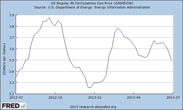
  • Gas $3.50 down -$0.07 w/w

  • Usage 4 week average YoY unchanged
The price of Oil increased sharply this week to a new 52 week high. Apparently this was due to civil strife in Egypt - which is the only country in the middle east that does NOT have Oil! There seems to be no sign of the strife spreading, so I have no idea what is going through traders' minds. The price of a gallon of gas fell in June, but is not at year lows. This will probably turn around shortly. The 4 week average for gas usage was unchanged.

Interest rates and credit spreads
  •  5.42% BAA corporate bonds up +0.19%

  • 2.55% 10 year treasury bonds up +0.22%

  • 2.87% credit spread between corporates and treasuries down -0.03%
Interest rates for corporate bonds had generally been falling since being just above 6% in January 2011, hitting a low of 4.46% in November 2012. Treasuries previously were at a 2.4% high in late 2011, falling to a low of 1.47% in July 2012, but have retreated back above that high. Spreads have varied between a high over 3.4% in June 2011 to a low under 2.75% in October 2012. After being close to that low 6 weeks ago, interest rate spreads backed up significantly but have now stabilized.

Housing metrics

Mortgage applications from the Mortgage Bankers Association:
  • -3% w/w purchase applications

  • +12% YoY purchase applications

  • -16% w/w refinance applications
Refinancing applications have decreased sharply in the last 6 weeks due to higher interest rates. Purchase applications have also declined from thier multiyear highs in April, although they continue to be quite positive YoY.

Housing prices
  • YoY this week +8.1%
Housing prices bottomed at the end of November 2011 on Housing Tracker, and averaged an increase of +2.0% to +2.5% YoY during 2012. This weeks's YoY increase remained close to their new 6 year record.

Real estate loans, from the FRB H8 report:
  • -0.4% w/w

  • up +0.4% YoY

  • +2.3% from its bottom
Loans turned up at the end of 2011 and averaged about 1% gains YoY through most of 2012.  In the last several months the comparisons have completely stalled, although this week was again positive YoY.

Money supply

M1
  • -0.6% w/w

  • -0.8% m/m

  • +8.9% YoY Real M1

M2
  • unchanged w/w

  • +0.4% m/m

  • +5.4% YoY Real M2
Real M1 made a YoY high of about 20% in January 2012 and eased off thereafter. Earlier this year it increased again but has backed off its highs.  Real M2 also made a YoY high of about 10.5% in January 2012.  Its subsequent low was 4.5% in August 2012. It increased slightly in the first few months of this year and has stabilized since.

Employment metrics

American Staffing Association Index
  • 94 up 1 w/w, up +1.1% YoY
Initial jobless claims
  •   343,000 down -3,000

  •   4 week average 345,500 down -250
Tax Withholding
  • $150.8 B for the month of June vs. $139.0 B last year, up +$11.8 B or +8.5%

  • $152.5 B for the last 20 reporting days vs. $145.2 B last year, up $7.3 B or +5.0%
The ASA deteriorated to being flat or negative compared with last year in the last several months, although it rebounded slightly this week. Daily tax withholding was very weak compared with its YoY average comparison in the last 5 months. Initial claims remain within their recent range of between 325,000 to 375,000, and have flattened out just as they have in the last 3 springs and summers.

Transport

Railroad transport from the AAR
  • +2800 carloads up 1.0% YoY

  • +3200 carloads or +1.9% ex-coal

  • -3700 or -1.5% intermodal units

  • -1100 or -0.2% YoY total loads
Shipping transport Rail transport has been both positive and negative YoY in the last several months. This week it was negative once again. The Harpex index had been improving slowly from its January 1 low of 352, but has flattened out in the last 4 weeks. The Baltic Dry Index decreased this week but remains close to its 52 week high.

Consumer spending Gallup's YoY comparisons are still very positive, but less so than they have been since last December. The ICSC varied between +1.5% and +4.5% YoY in 2012, while Johnson Redbook was generally below +3%. The ICSC was again below the lower part of that range this week, but Johnson Redbook has been close to the high end of its range.

Bank lending rates The TED spread is still at the low end of its 3 year range.  LIBOR rose slightly from its new 3 year low established three weeks ago.

JoC ECRI Commodity prices
  • up 1.24 to 121.99 w/w

  • +3.57 YoY
This week most of the indicators, including some very important ones, showed weakness. The only strong positives were housing prices, gas prices, bank lending rates, and YoY purchase mortgages. Weak positives included temporary staffing, jobless claims, and credit spreads. Consumer spending remains very positive, but less so than in the last 6 months. Tax withholding payments, while also positive, are also at among their worst YoY comparisons in 5 months.

Negatives include rail traffic, bond prices, refinancing and weekly purchase mortgages, and real estate loans w/w. Oil prices are of course very negative, activating the Oil choke collar for the first time in a long time.

The sharp rise in interest rates and the sharp decrease in mortgage refinancing have now been joined by a big spike in Oil prices, which will shortly be felt at the pump. The big coincident indicators of the economy, consumer spending and initial jobless claims are trending more weakly positive and sideways, respectively. They continue, however, to show no signs of rolling over into negativity.

Have a nice weekend.

Friday, July 5, 2013

Weekend Weimar, Beagle and Pitbull

It' that time of the week.  I'll be back on Monday and NDD will be here over the weekend.

Until then:


Four measures of wage stagnation


- by New Deal democrat

Following my post last week about how reports of income declilnes do not mesh with reports of wage stagnation or slight growth, I have done a lot more research. The research aren't finished, and is way too lengthy for one post. So let me just start by focusing on wages.

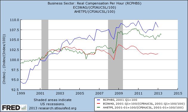
One thing I noted last week is that we have at least three separate economic data series to track wages: average wages, median wages, and wages per unit production hour. The first graph tracks all three, adjusted for inflation using the CPI as necessary. Average hourly wages are in green, median wages from the employment cost index are in red, and unit labor production cost are in blue. Since the quarterly index of median wages only started in Q1 2000, I have normed the indexes to 100 at that time:


As you can see, average wages have risen fitfully, mainly having to do with the price of gas (more on that below). Median real wages have essentially been flat for 10 years. This is certainly not what I would call good, given all the productivity gains during that same period. You need consumers to have the money to buy, before real growth in selling picks up as well.

But none of the above three series uses tax return data. In response to my critique of his work, David Cay Johnston pointed to analyses of tax returns as supporting his general thesis of contraction.

While we don't have access to individual tax returns, as Berkeley economists Piketty and Saez did, we DO have access to the Daily Treasury Statement of withholding taxes paid. These can give us a very good, if imperfect picture of how those below the 90th percentile are doing. That's because withholding taxes are capped at an amount, adjusted for inflation, that is at about the 83rd percentile of income. Since the top 10%+ of wage earners do not pay any proportionate increase in withholding taxes, the change in taxes paid from withholding for Social Security and Medicare should capture about 5/6 of any change in average wages for those in the bottom 83%. It isn't perfect since a wage-earner can enter or drop out of the maximum withholding category, but if anything this should magnify the effect of wage loss during the great recession.

To give an example, if all of the wage gains went to the top 10%, then withholding taxes would increase by at most (and actuallym, less than) by the rate of the CPI. Contrarily, if tax withholding increases by more than the CPi, it must be coming from the bottom 83% of wage-earners.

In the table below, I am excluding 2011 and 2012 due to the temporary 2% decrease in the tax withholding rate. This does not affect the comparisons among the other years at all, however:

Withholding payments 2006 2007 2008 2009 2010 2013
Q2 total 395.7 422.1 433.2 393.1 410.6 476.5
CPI adjusted 449.4 468.7 470.1 418.9 433.3 476.5
+ #employed adjusted 448.4 461.8 463.8 433.6 451.3 476.5


The first row above shows the raw numbers for second calendar quarter (April through June) withholding taxes paid for each year. The second column adjusts for inflation using the CPI, giving the "real" number. Finally, because there is a change in the number of people earning wages during any given time period, and we want to measure average wages for those actually employed, the third column adjusts by nonfarm payrolls using the total number of such employees from May of each year.

In short, the table above shows that wages, after a decline during the worst of the great recession and its aftermath, have improved again to new, real, highs, by about the same percentage as shown in the average hourly wage series. While the data from tax withholding can't give us median wages, that publicly available income tax information confirms the three other data series on wages indicates to me that they are reliable. Average real wages for the bottom 83% have risen slightly. Median real wages, as far as we can tell, have been stagnant since before the great recessin.

I want to show one other graph, because this shows how the generally increasing price of gasoline between 1999 and 2011 acted on real wages. Here are averge wages and median wages, this time deflated by CPI ex energy:


You can see that unlike the first graph above, if we leave out gasoline, average wages continued to rise up intil 2011, and median wages stayed almost completely flat for mose of the last decade. This tells us that the price of gasoline is largely responsible for whatever increase or decrease has occurred in real wages over that time. Big increases such as in 2008 and 2011 show up as signficant decreases in real wages in the first graph. Big decreases in late 2006 and late 2009 show up as significant increases in real wages. The price of gas has remained within a range of about $3.25 to $4.00 a gallon since 2011, and real wages have varied slightly accordingly, yet another peice of evidence of how the "Oil choke collar" has acted as a governor on the economy.

The Jobs report: why aggregate hours are so important


- by New Deal democrat

Every month I report on the number of working hours added to the economy, in addition to the number of jobs. This is because the number of hours added or lost is a more granular and accurate measurement of economic reality.

This month was a perfect example. As I noted in my post about this morning's report, the skunk in the garden was the increase in the U-6 rate, and the increase of 322,000 in the number of people who were employed part time for economic reasons (i.e., if there were full time work, they would take it.) Subtracting the 196,000 gain from that number gives us a loss of -126,000 jobs.

As I predicted, it has already made the headlines. Here's Business Insider, reporting on GOP House Majority Leader Eric Cantor's reaction to the report:
House Majority Leader Eric Cantor focused his entire statement on the uptick in part-time jobs:
Today’s report is an encouraging sign for the working men and women who found a job last month, and those who are still looking. However, earlier this week the White House reminded us once again that its policies have held back the job growth that we should expect from an economic recovery. Obamacare has been predicted to be a drain on employment since before its passage and that outcome was confirmed by the Obama Administration’s delay of the employer mandate. The added costs and regulations to businesses across our nation mean less jobs and less economic growth.
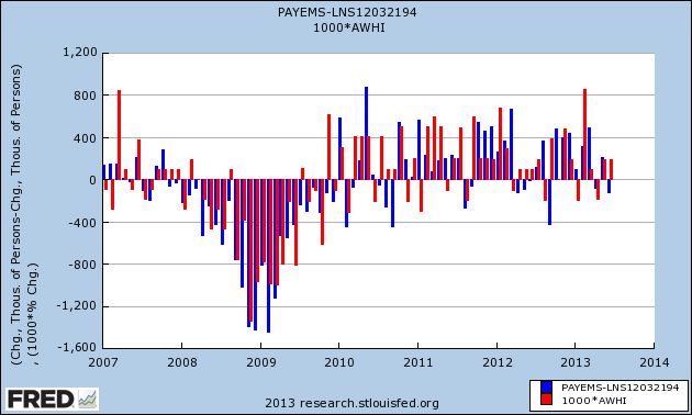
Cantor is wrong, and aggregate hours worked is why. If I have one employee working 35 hours a week, and I replace her with two employees working 25 hours a week, I've actually added 15 hours a week to my payroll. That's what happened this month, as shown in the below graph of the net number of part time minus full time payrolls each month (blue, showing a loss) vs. the percentage change in the number of hours of work in the economy each month (red, showing a gain):


In other words, even taking into account the decline Cantor highlighted, the jobs part of the economy still made gains in June, as it added about 0.2% (or 2.5% annualized) to the number of hours workers were paid for.

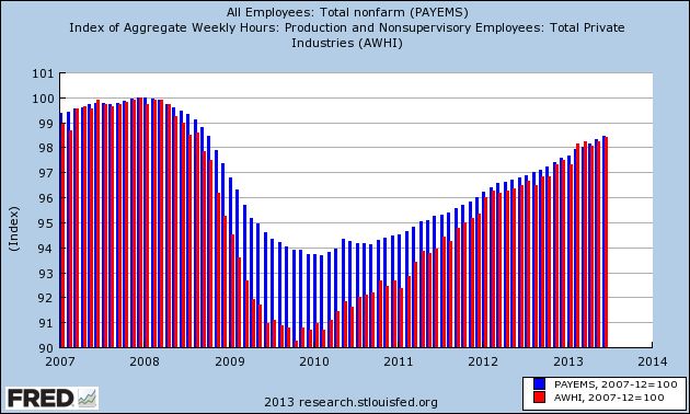
And here's an update through June of a graph I've run many times before, showing that while the economy shed about 6% of all jobs during the recession, the cut in hours was much steeper, with the economy losing about 10% of all hours worked.


That additional 4% loss in hours had to be made up first before jobs and hours began moving more in sync last year.

June employment report: coming up roses with one skunk in the garden


- by New Deal democrat

As you probably already know, the headline report is that 195,000 jobs were added in June, and the unemployment rate remained steady at 7.6%. There were big positive revisions to April and May, and an unusually complicated more comprehensive underemployment situation.

As always for me, after the headline the next thing I want to do is look at the more leading numbers in the report which tell us about where the economy is likely to be a few months from now. These were generally positive with one exception.
  • temporary jobs - a leading indicator for jobs overall - increased by 9500.

  • the number of people unemployed for 5 weeks or less - a better leading indicator than initial jobless claims - declined by 14,000, and is about 225,000 off its lows.

  • the average manufacturing workweek rose 0.1 hour from 40.8 hours to 40.9 hours. This is one of the 10 components of the LEI and will affect that number posivitvely.

  • construction jobs rose +13,000, adding to the evidence that the housing recovery is real.

  • manufacturing jobs, on the other hand, declined for the 4th month in a row, down -6000.

Now here are some of the other important coincident indicators filling out our view of where we are now:
  • The average workweek for all workers was unchanged at 34.5 hours

  • overtime hours were also unchanged at 3.3 hours.

  • the index of aggregate hours worked in the economy rose strongly from last month's level of 98.4, itself revised up 0.1, to 98.6. In terms of hours if not jobs, the economy is almost back to where it was at its pre-recession peak.

  • The broad U-6 unemployment rate, that includes discouraged workers, however, rose strongly from 13.8% to 14.3%. This ia almost certainly because not only did 177,000 people enter or re-enter the workforce, but also because those working part time for economic reasons increased sharply by 322,000.
Other news included:
  • the alternate jobs number contained in the more volatile household survey showed a gain of 177,000 jobs.

  • Combined revisions to the April and May reports totalled +70,000 jobs, with the reports now showing +199,000 and +195,000 jobs, respectively. This happens in expansions and contradicts any theory of recession.

  • average hourly earnings increased $0.10 to $24.01. This 0.4% in real terms is probably unchanged, given my prediction for a June CPI increase of +0.4% as well. The YoY change, however, also rose from +2.0% to +2.2%. The bottom line here is that if gas prices can remain contained, the average American household is probably making at least a little progress.

The June employment report, at bottom, is more of the same that we've had for over three years: positive, and in no way indicating any imminent economic contraction, but simply not good enough. The report was almost uniformly encouraging, with most of the Leading aspects and the internals confirming improvement. The upward revisions to April and May are particularly encouraging, as is the strong news on aggregate hours of work.

The skunk in the garden is the U-6 unemployment rate spike. I hasten to note that U-4 and U-5 improved. Only this most broad measure declined. Part of the unemployment news was paradoxically "good" as more people joined the workforce, and indeed the Employment/Population ratio rose slightly to 58.7%. But the big spike in part time for economic reasons is jarring, especially in juxtaposition to the rest of the report (I'm sure it will be headlined elsewhere that subtracting the increase in part time jobs, the headline number would be negative.) It is at least possible that this is fallout from Obamacare, but it's impossible to tell without a lot more digging.

Thursday, July 4, 2013

Happy 4th

The markets are closed today.  NDD and/or I will be back in the AM for the employment report hoopla.

Have a happy and safe holiday.
-----
NDD chiming in.  Here is a picture just taken of my patriotic observation of Independence Day:


I am told that Congress did something 237 years ago today, but fortunately the Royal Security Agency had been eavesdropping and was able to prevent the terrorist uprising from coming to fruition. God save the Queen!

Wednesday, July 3, 2013

Vehicle sales almost back to pre-recession normal


- by New Deal democrat

If it had been up to either Bonddad or me, the government would have taken a much more active role (a new WPA, huge spending on infrastructure, and allowing people 55+ to buy into Medicare early, for example) in getting us out of the Hard Times we entered in 2008. Alas, it was pretty clear by about 2010 that none of that was going to happen, and the best we could hope for was for government to at least not put obstacles (like the debt ceiling debacle) in the way of a normal recovery from a credit bust.

I mention that because Paul Krugman has said several times, although I can't find a link right now, that the way long term depressions ended before the 1930's was that stuff wore out. Even durable goods that last a long time wear out, and ultimately must be and are replaced. As that replacement cycle kicks in, the economy improves.

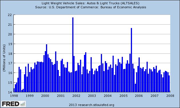
And yesterday's report on June vehicles sales provides evidence of exactly that. First, here's a graph of motor vehicle sales from 1998 through 2007:


Notice that during that 10 year period, vehicle sales almost always were in a range that began at 16 million on an annualized basis.

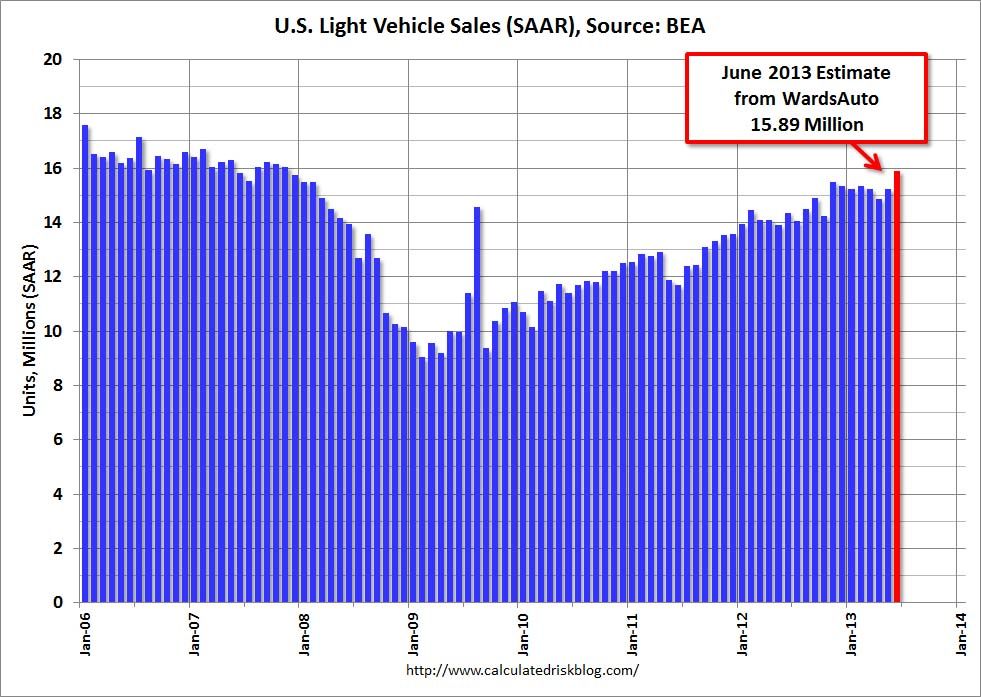
Now here's Bill McBride a/k/a Calculated Risk's graph of vehicle sales starting in 2006 through yesterday:


At 15.9 million vehicles annualized, June was only about 10,000 vehicle sales short of the pre-recession normal range.

The recovery continues. Yes, it is slower than any of us would like, and we need improvements in wages and many more jobs, but the economy continues to move in the right direction. To be more wonky about it, while the recent spike in interest rates causes me concern about 2014 and 2015, that auto sales have continued to rise through midyear means that, if Washington can avoid throwing more monkey wrenches into the economy, expansion ought to continue through the end of this year.

By the way, did I mention that we're going to hit the debt ceiling again this autumn?

And We Listen to Conservatives on Economics Because?

If anything, the last four years have illustrated a very important point: conservatives don't know a damn thing about economics.

I've already demonstrated that John Hinderaker of Powerline is not clueless, but clue free -- he's never had any concept of how the economy works.  Greg Mankiw of Harvard has shown that his ivory tower severely limits his analytical abilities and John Taylor continues to incorrectly compare this expansion to the 1980s expansion despite their highly divergent causes.

And now we're reminded that the calls for inflation and currency debasement from the Fed's bond buying program were horribly wrong:

A group of 43 economists, including former aides to Republican presidents and presidential candidates, published an open letter to the Fed’s chairman, Ben Bernanke, saying the program should be “reconsidered and discontinued.” The planned bond purchases “risk currency debasement and inflation, and we do not think they will achieve the Fed’s objective of promoting employment,” the economists wrote. 

.....

But as the accompanying charts indicate, the Fed’s critics of 2010 and 2011 have not proved to be prescient. Far from bringing disaster, Q.E.2 appears to have helped the economy. 

And finally, over at Barry's blog, we note that the Heritage Foundation has a remarkably interesting way of scoring countries that are successful despite not using "free market" concepts.  Read the entire piece: Where 7.8% Growth is “Moderate” and 4.4% is “Spectacular”


In a "market place of ideas" those that are proven correct should be "purchased" and those that are incorrect should be avoided, if for no other reason that incorrect analysis will lead to a loss of money.  If you had listened to conservative economists "analysis" you'd have lost a ton of money by now.


Market/Economic Update: France

I'm less bearish on France, as some of the recent Markit and industrial production numbers could indicate the economy may pull out of its slump.  But these positive numbers are of short duration, meaning we could simply be seeing an upward blip.  We're in a, "trust, but verify" mode.

Let's start with GDP:

The economy has contracted in three of the last four quarters.  Aside from a .5% increase in 2Q12, PCEs have been weak.  Investment has contracted for four straight quarters and exports have now dropped for two consecutive quarters.  While the slowdown is not sharp, it is broad.

In addition, unemployment is still far too high.  According to the Eurostat database, French unemployment is currently at 11%.


The latest Markit numbers are a bit more encouraging:

Latest data signalled an easing of the downturn in the French manufacturing sector during June. The headline Purchasing Managers’ Index® (PMI®) – a seasonally adjusted index designed to measure the performance of the manufacturing economy – registered 48.4, up from 46.4 in May. Although remaining below the 50.0 mark for a sixteenth consecutive month, the latest index reading was the highest in this sequence.

Here's a chart of the data:


The blue line is showing a fairly decent increase that is fast approaching the 50 level the separates expansion from contraction.

And an expansion may be possible from the latest IP numbers:

During the last three months (q-o-q), output increased in the manufacturing sector (+0.8%), as well as in industry as a whole (+0.9%).

Output improved in other manufacturing (+0.4%), in the manufacture of electrical and electronic equipment (+1.5%), in the manufacture of transport equipment (+2.0%). It rose in the manufacture of coke and refined petroleum products (+14.7%). On the contrary, output decreased in the manufacture of food products and beverages (-1.2%).


Here's a chart of the data:


The chart is a bit confusing, but we do see a bump in the overall composite numbers.  However, the trend is still lower; we need to see additional numbers to conclude this is not a one month blip.

Let's turn to the daily chart:


After hitting a peak in late May, the market has moved lower, finding support at the 200 day EMA and the top Fib fan.  We also see declining momentum and CMF. 

If prices move through the 200 day EMA, there's plenty of technical support.

I don't think this chart is a shorting opportunity anymore, nor do I think it's a buying opportunity.  The economic data is still too fresh with too small of a trail to make a move as of yet.


Tuesday, July 2, 2013

Consumer inflation for June likely up 0.4%


- by New Deal democrat

Since 1999, inflation ex-energy has run generally between 1% to 2.8% a year, or about 0.1% to 0.2% a month, rounded. Once we add in energy costs, CPI is much more volatile:


One of my big theses on this blog over the last few years has been that the impact of the "Oil choke collar" on consumers explains a lot of the economy, especially with wages rising between 1.5% to 2% a year. In other words, with that low growth in wages, there is a big difference in the ability of consumers to save and spend based on an inflation rate under +1.5% and one over +2.0.

So I have taken to testing this hypothesis by making predictions about consumer inflation each month, to show how big a role the price of gasoline plays. Well, June is over, and we now know the average cost for gasoline for the month. Although the price of gas declined significantly in the last week, since the report will be issued today (i.e., in July), I do not believe it will be considered in the calculations of June's CPI. Escluding it, gasoline prices rose only $.01 in June, having averaged-$3.62 in June vs. $3.61 in May, an increase of only 0.3%. Here's a graph for the last twelve months including yesterday's report to put this in perspective


To arrive at an estimate of inflation, we divide this by 10, which gives us less than even 1/10 of a percent of inflation, or 0.03%. The non-seasonally adjusted inflation number will probably add 0.1% to that. Finally, per the below graph, you can see that in June between 0.2% to 0.3% is added for the seasonal adjustment, as seen in the June 2012 entry in the graph below of seasonally adjusted vs. non-seasonally adjusted consumer prices for the last year:


That suggests that consumer inflation for June is going to be reported at +0.4% +/-0.1%. This would bring YoY CPI up to 1.8%.

While that will bring about stories about how inflation is coming back, it is unlikely to be sustained in the third quarter. Last year saw a surprise spike in the price of gas from $3.25 to $3.90 from July through September. Unless that gets repeated, the monthly CPI readings of +0.5% and +0.5% in August and September (seasonally adjusted) are not going to be repeated, and YoY CPI is going to subside back towards +1.0%.

98/99 Price Level Still Providing Upside Resistance For Oil

This is probably some of the best news out there, as an oil price spike could send the weak recovery into a one quarter contraction:


Monday, July 1, 2013

Don't Expect a Bond Market Rout

We've now had a few weeks to digest the Fed's statement that they were thinking of removing the QE program.  Let's take a step back and get an idea for what has happened.

The biggest move has come in the fixed income markets.  As the FT has noted, we've seen a huge sell-off in bonds from both central banks and investors at large:

Holdings of US Treasuries held at the Fed on behalf of official foreign institutions dropped a record $32.4bn to $2.93tn, eclipsing the prior mark of $24bn in August 2007. It was the third week of outflows in the past four.

Private investors are also dumping fixed income. Bond funds tracked by EPFR Global, a data provider, saw total redemptions of $23.3bn in the week to June 26. US funds were the worst hit, with withdrawals totalling $10.6bn, but emerging market debt funds also saw record redemptions of $5.6bn.

This is to be expected as the Fed has essentially placed a permanent floor in the bond market for the last three years.  At the same time, it's important to ask if the sell-off is overdone.  First, the Fed hasn't started to taper yet.  And a careful reading of their statement indicates that they may not even do it if the economy slows too much.  Read in light of last week's downgrade of US growth for the first quarter, it's entirely likely that the Fed's plans may already be put on hold.  Also remember the Fed will continue to reinvest principal payments as they come due.

At the same time, let's also remember that Treasury rates are at historic lows, as shown on this chart from the St. Louis Fed:

   
Since the beginning of the 1980, we've had a permanent rally in the fixed income market, essentially taking rates as low as they can conceivable go.  So, at some point, we have to expect the process to reverse.

But just how much of a sell-off can we expect?  Not much, for three reasons.

First, inflation is non-existent.  Here is a chart of the Y/O/Y percentage change in total and core CPI:


Both core and total inflation are running below 2% on a year over basis.  And with commodity prices under control, China slowing and the EU in a depression, it's highly doubtful we'll see massive price spikes in the near future.  (In fact, we could probably use a little more inflation).

Secondly, the US population is getting older.  The most commonly stated fact to support this statement is that, thanks to the baby boomers, we're seeing 10,000 people retire per day.  As people get older, their' investment strategy becomes more conservative, hence an increase in bond market purchases.

Third, there's still a tremendous amount of uncertainly out there.  While it appears that China has averted a credit crunch for now, their central bank is clearly clamping down on the shadow lending business, which will further clow Chinese growth.  The Chinese slowdown, in turn, is negatively impacting raw materials exporters like Australia and Latin America.  The US is certainly not setting any growth records and Brazil, India and Russia are facing their own set of difficulties.  Put more generically, this is an environment where having a percentage of a portfolio yielding 2.5%-3% is an attractive feature.

While an uptick in yields was bound to happen eventually (and is obviously happening now), the above three reasons should limit the upside increase.


Economic/Market Analysis: US

Let's take a look a the news from last weed, then follow up with the markets.

The good 

Manufacturing sub-indexes gave us some good news.  The Dallas Fed's manufacturing index increased to 17.1.  Many of the sub-categories of indicators also increased.   New orders for durable goods increased 3.5%; the total was up .7% ex-transportation.  This figure has increased 3 of the last 4 months, which should help to alleviate the downward pressure we're seen in the manufacturing sector over the last few months.  Finally, the Richmond Fed's index increased 10 points to 8.

We had more good news from the housing market.  The case shiller home price index increased month to month and year over year.  The 10-city index increased 2.6% M/M and the 20 city index increased 2.5% M/M/  The year over year numbers were 11.6% and 12.1%, respectively.  New home sales increased 2.1% M/M and 29% Y/Y

Consumer confidence rose to a recovery best: Consumer confidence is at a recovery best, at 81.4 in June and up nearly 7 points from a revised 74.3 in May for the third straight strong gain. The assessment of the present situation is also up for a third straight month, at a recovery best 69.2 which hints at general strength for the slate of June indicators. But the gain here does mask a small uptick in those who say jobs are hard to get, now at 36.9 percent for a 5 tenths increase that does not point to new gains for the June employment report.

Personal income and disposable personal income both increased .5% in May, month to month. 

Although the Chicago PMI decreased, the internals were very positive: Growth in business activity has slowed sharply this month based on the Chicago PMI which came in at 51.6, down 7.1 points from May. Big moves aren't unusual for this index but a look at the details points to solid growth in the area with new orders coming in at a very respectable 54.6 to indicate healthy monthly growth though down from an outsized 58.1 in the prior month. Production rose solidly, but again at a slower rate, while employment picked up in the month. A big contraction in backlog orders is a negative in the report. Other details include a shortening in delivery times, consistent with slowing conditions, and a slight rise in price pressures for raw materials. Though details are mostly positive, the Dow is slipping in initial reaction to this report which covers all areas of the Chicago economy and not just manufacturing.


The Neutral

The Chicago Fed's National Activity Index's three month moving average decreased:  The index’s three-month moving average, CFNAI-MA3, decreased to –0.43 in May from –0.13 in April, marking its third consecutive reading below zero and its lowest level since October 2012. May’s CFNAI-MA3 suggests that growth in national economic activity was below its historical trend. The economic growth reflected in this level of the CFNAI-MA3 suggests subdued inflationary pressure from economic activity over the coming year.

Only one of the four indicator groups made a positive contribution, although two of the groups did improve.  The only really good news coming from this reading is that a period of subdued economic activity should have minimal inflationary pressures.  


The bad 

First quarter GDP was revised lower, from 2.4% to 1.8%.  Lower readings from both PCEs and imports/exports were the primary reason for the move lower: the increase in personal consumption expenditures (PCE) was less than previously estimated, and exports and imports are now estimated to have decline.

The Kansas City Fed's manufacturing index fell from 2 to -5.   This particular index had fairly severe deterioration in its dub-indexes, most likely due to the several severe weather incidents over the last few months: Production fell at both durable and non-durable goods-producing plants, with food and machinery manufacturing particularly weak. Other month-over-month indexes showed mixed results. The production index dropped from 5 to -17, its lowest level since March 2009, and the shipments and new orders indexes also fell markedly. The order backlog and employment indexes increased somewhat but still remain slightly below zero. Both inventory indexes edged higher after falling in May.  

Let's turn to the markets.


The daily SPY chart (bottom chart) shows that prices are currently using the top Fib fan as technical support.  And while momentum and CMF are clearly negative, the market are hardly falling out of bed.  As the 60 minute chart shows (top chart), we essentially have a situation where the market is dropping, and then rallying on the perceived value play that arises at those lower levels.


The IEFs have broken through support at the 105 level, fell to ~101 (a drop of about 3.8%) but then caught a bid that hit resistance just below the 10 day EMA.  Momentum is weak and volume flow is negative.  I'll highlight this market later today.


 The real story of the dollar is that we're seeing it continue to trade within a broad range between 21.5 and 23.2.  Until we break out of this range, most movement is really just noise.


Sunday, June 30, 2013

Three thoughts for Sunday: the funniest person on the entire internet, an unfunny sitaution at the Supreme Court, and how to cut the cord?


- by New Deal democrat

[Note: regular nerdy economic blogging will resume tomorrow. Meanwhile, here are three basically random thoughts]

1. The funniest person on the entire internet, bar none...


... is KevJumba's dad.

And the above is just a pale imitation of the flashback where he is handed his newborn son, and while cradling him immediately starts to lecture: "You're going to be a doctor. Or a lawyer."

2. Is Justice Scalia showing signs of dementia?

I'm being serious here. Yes, I disagree strongly with his opinions. But he used to be a whole lot sharper. He wouldn't have authored language in one opinion that directly and funadamentally refuted his diametrically opposed opinion from a mere 24 hours before, like he did this week in the DOMA opinion about fealty to history, that was in direct contradiction to the majority opinion he signed on to that entirely jettisoned the text, Congressional intent, and history of the Fifteenth Amendment in the Voting Rights Act case.

And that's not all. In the last couple of years he has brazenly given speeches directly opining on cases pending before the Court. This is a serious breach of judicial decorum to say the least. Then there was the gasp-inducing "racial entitlements" comment. And a google search of the issue led me to this note about what seems like a pretty serious mental lapse on the Bench last year during the ACA legal arguments:
[T]he “Jack Benny” exchange in the Medicaid expansion argument is simply embarrassing, another example of Justice Scalia losing control of his own cleverness – to the point where the Chief Justice had to step in and say, “That’s enough frivolity for a while,” but only after Justice Scalia realized that he had gotten completely off track with his own intervention (he was playing around with “your life” and “your wife,” but at the very end, after the Chief Justice tried to get him to stop with, “Let’s leave the wife out of this,” Justice Scalia said, “I’m talking about my life,” which completely undermines the point, such as it was, that he was trying to make).
The guy is 77 years old. We're probably all familiar with grampa or aunt Minnie who suddenly seemed to lose their brain's "governor" at about that age - if something entered their mind, it exited their mouth. We also have the example of David Brinkley, who at 76 after nearly half a century in broadcasting had a very senior moment on-air on the night of the 1996 presidential election, excoriating the result. Then there's Helen Thomas, who after half a century as a leading White House correspondent was summarily fired after she let loose with some anti-Israeli diatribes.

If Scalia is beginning to show signs of dementia, there will be fascinating but ugly political battles inside the Court itself as other conservatives try to hide his diminishing capacity from the other branches of government and the public - not to mention keeping it out of his opinions - and inside the Senate as GOPers try to ensure that the balance of power in the Supreme Court cannot be shifted during Obama's second term.

3. Finally, you may not realize it, but over 90% of my posts for the last year have been written on a tablet. I officially "cut the cord" for internet service at my residence. (That should explain some of the odd grammar and punctuation that shows up in some of these posts, when I lose my battle with what Apple is sure I want to say and how I want to say it).

Now I'm considering cutting the television cable as well. What options should I explore?