Saturday, March 30, 2013

Weekly Indicators: withholding tax mystery solved? edition


 - by New Deal democrat

Here is this week's look at data that gets reported on a high frequency, weekly basis. While it can be noisier than monthly or quarterly data, it has the virtue of being virtually up to the minute. Amplifications or reversals of trend will show up here before they show up in monthly data, which can already be two months old by the time they are reported.

In the rear view mirror, 4th quarter 2012 GDP was revised up slightly. Monthly data released in the past week included sharp increases in personal income, spending, and saving. Durable goods were up. The Chicago PMI became less positive. Consumer sentiment as measured by the Conference Board declined; as measured by the Univeristy of Michigan it increased. New home sales declined.

Let's start again this week's look at the high frequency weekly indicators by checking what is happening with tax withholding, where we may finally have a reason for the awful YoY adjusted readings:

Employment metrics

Daily Treasury Statement tax withholding

  • $151.0 B (adjusted for 2013 payroll tax withholding changes) vs. $156.0 B, -3.2% YoY for the last 20 days.  The unadjusted result was $175.8 B for a 12.7% increase.

  • $175.2 B was collected for the first 20 reporting days of March vs. $142.4 B unadjusted in 2012, a 23.4% increase YoY.
These are the best YoY comparisons in over two months, and the Thursday vs. Thursday 20 day comparison is up over 7% even on an adjusted basis. I've been saying that I see no reason why employment should have fallen off a cliff in January. A reader suggested that many employers may have been waiting until the end of the quarter to start making the increased payments, and that certainly looks like an explanation at this point. It'll take a few more weeks to be sure if that is so, or we just saw an anomaly this week.

Initial jobless claims
  •   357,000 up 21,000

  •   4 week average 343,000 up 3,250
American Staffing Association Index
  • up 1 to 91 w/w up 2.4% YoY
Initial claims have established a new lower range of between 330,000 to 375,000 this year. In the last two years, beginning at the end of the first quarter there has been a spike of 20,000+ in jobless applications, and we may be seeing the beginning of that spike this week.  The ASA is still running slighty below 2007, and slightly ahead of last year.

Consumer spending Gallup has been very positive for 3 months. This week's YoY comparison is with the best spending week of the first half 2012, and was still up nearly 10%.  The ICSC varied between +1.5% and +4.5% YoY in 2012. with one exception, the report for the last few weeks has been near the bottom of this range, and indeed was below that range this week. The JR report this week is at the top of its typical YoY range for the last year.  Even in the worst case, it still looks like consumer spending has not collapsed due to the tax withholding increase.

Housing metrics

Housing prices
  • YoY this week. +4.9%
Housing prices bottomed at the end of November 2011 on Housing Tracker, and have averaged an increase of +2.0% to +2.5% YoY during 2012. This week remained slightly below the best YoY comparison in about 7 years.

Real estate loans, from the FRB H8 report:
  • up 1 or up less than +0.1% w.w

  • up 4 or +0.1% YoY

  • +2.1% from its bottom
Loans turned up at the end of 2011 and averaged about 1% gains YoY through most of 2012.  In the last month these have stalled.

Mortgage applications from the Mortgage Bankers Association:
  • +7% w/w purchase applications

  • +10% YoY purchase applications

  • +8% w/w refinance applications
Purchase applications had been going sideways for 2 years. In the last couple of months they have finally broken out of that range - slightly - to the upside.  Refinancing applications were very high for most of last year with record low mortgage rates, but did decreased recently with an increase of mortgage rates.

Interest rates and credit spreads
  •  4.85% BAA corporate bonds down -0.06%

  • 1.94% 10 year treasury bonds down -0.10%

  • 2.91% credit spread between corporates and treasuries up +0.04%
Interest rates for corporate bonds have generally been falling since being just above 6% two years ago in January 2011, hitting a low of 4.46% in November 2012.  Treasuries have fallen from about 2% in late 2011 to a low of 1.47% in July 2012. Spreads have varied between a high over 3.4% in June 2011 to a low under 2.75% in October 2012.  The  last several months have seen a marked increase in rates and credit spreads have widened.

Money supply

M1
  • unchanged w/w

  • -2.1% m/m

  • +7.3% YoY Real M1

M2
  • +0.2% w/w

  • declined less than -0.1% m/m

  • +4.7% YoY Real M2
Real M1 made a YoY high of about 20% in January 2012 and has generally been easing off since.  This week's YoY reading remained above a new low set several weeks ago.  Real M2 also made a YoY high of about 10.5% in January 2012.  Its subsequent low was 4.5% in August 2012. In absolute terms, M2 made a high over 2 months ago and is down -0.5% from that peak. The behavior of M2 continues to bear close scrutiny.

Oil prices and usage
  •  Oil $97.07 up $3.36 w/w

  •   gas $3.70 down $0.01 w/w

  • Usage 4 week average YoY +1.5%
The price of a barrel of Oil has backed off recent seasonal highs, and is actually down YoY.  Unusually for the last year plus, the 4 week average for gas usage for the eighth week in a row was positive YoY.  This may be due to winter weather having been actually winter-like this year.

Transport

Railroad transport from the AAR
  •  +600 or +0.2% carloads YoY

  • +2200 or +0.8% carloads ex-coal

  • +3300 or +1.4% intermodal units

  • +3600 or +0.7% YoY total loads
Shipping transport Rail transport appears to have returned to its general trend from last year, but was just barely positive in all respects this week.  The Harpex index remains slightly off its 3 year low of 352, and the Baltic Dry Index remains above its recent low.

Bank lending rates The TED spread increased slightly from its 18 month+ low.  LIBOR remained at its new 52 week low and is close to a 3 year low.

JoC ECRI Commodity prices
  • up 0.12 to 128.09 w/w

  • +3.24 YoY
Very few of the indicators are negative right now. Depending on the precise date of measurement, tax withholding may remain negative. Real estate loans have completely stalled. Bond yields are generally increasing and spreads widening.

But in general the weekly indicators have remained positive, but increasingly less so, over the course of the last month or so. Housing prices and mortgage applications remain very positive. Initial jobless claims are still positive even with the marked increase this week. Temporary staffing has turned more neutral though still weakly positive. Rail and shipping are also positive, but just barely so, as are commodities. Overnight bank lending rates remain somnolent.

As with last week, probably the brightest spots are consumer spending, still resilient in the face of the payroll tax increase, and gas prices, which are negative YoY and accomodative, and gas usage, which has been up YoY for several months.

The tone remains positive, but muted. Have a nice weekend.

Friday, March 29, 2013

Weekend Weimar, Beagle and Pit Bull

It's that time of the week again.  I'll be back on Monday; NDD will be here over the weekend with his weekly indicators.

Until then, enjoy the pups:


Gross Domestic Income up 2.6% in 4Q 2012


- New Deal democrat

It's been a full year and a half since ECRI said a recession was either already happening or would happen in a few months. As if to mark the occasion, the BEA served up another haymaker yesterday.

In one of his early appearances in support of the call, Lakshman Achuthan touted the superior reliability of "gross domestic income" vs. gross domestic product. As Tim Iacono recounted at the time:
[A]nyone who keeps track of [ECRI's 2011 recession call] might want to refer back to this appearance in early December by Achuthan on Bloomberg Surveillance in which, beginning at about the five minute mark, he goes on at great length about how GDI (Gross Domestic Income – the other half of the GDP report) is a more accurate measure of economic growth and that it portends doom.
Well, yesterday as part of the third estimate of 4th quarter 2012 GDP, BEA reported on GDI:
Real gross domestic income (GDI), which measures the output of the economy as the costs incurred and the incomes earned in the production of GDP, increased 2.6 percent in the fourth quarter, compared with an increase of 1.6 percent in the third. For a given quarter, the estimates of GDP and GDI may differ for a variety of reasons, including the incorporation of largely independent source data. However, over longer time spans, the estimates of GDP and GDI tend to follow similar patterns of change.
The BEA also said that:
Real GDP increased 2.2 percent in 2012 (that is, from the 2011 annual level to the 2012 annual level), compared with an increase of 1.8 percent in 2011. .... Real GDI increased 2.0 percent in 2012, compared with an increase of 1.8 percent in 2011.
So, if GDI is more reliable than GDP, and unlike the +0.4% GDP, we should be looking at the +2.6% GDI as the more reliable estimate of economic performance in the last quarter of 2012, then there is very little chance that it marked the onset of any recession. And instead of decelerating over time, which is ECRI's central thesis, the economy actually accelerated in 2012 vs. 2011.

Oopsie.

P.s.: real personal income minus transfer receipts also rebounded back above its summer 2012 levels in January. That means that all 4 of the main coincident indicators used to determine if the economy is expanding or contracting -- industrial production, real retail sales, employment, and real personal income less transfer receipts (ex- the December blip) -- are at new post-recession highs.

Morning Market Analysis


Let's start with a comparison chart of four fixed income bond markets over the last year: the junk bond market (blue line) municipal market (green line) treasury market (black line) and mortgage back market (red line).  There are a few interesting points about this graph.  First, the clear winner is the junk market, which has gained about 11%.  Second, the corporate bond market returned 8.5%, but hit that total in mid-October.  Third, notice the treasury and municipal market.  The treasury market hit that number in October and the mortgage market hit it in late November.  Since then, both have been stagnant.

The point is that with the exception of the junk bond market, all other fixed income market have been stagnant for the last 5-6 months.


Yesterday, the grains ETF took a massive dive, falling 6.44%.  Notice the strength of the bar and the massive spike in volume.  The reason?  A massive spike in inventories:

Corn plunged the most since May, sparking a slump in soybeans and wheat, after the government said U.S. inventories were bigger than analysts forecast and that farmers will plant the most since 1936. 

Inventories of corn on March 1 totaled 5.399 billion bushels in the U.S., the world’s biggest grower and exporter, the Department of Agriculture said today. While that’s down 10 percent from 2012 and a nine-year low, analysts expected 4.995 billion. Farmers will sow 97.282 million acres, up from 97.155 million in 2012 and the most in 77 years, the USDA said. 


 Several recent articles in the Financial Times have highlighted the problems faced by Brazil -- a slowing economy withing rising inflationary pressure (see here and here).  As a result, the Brazil ETF shouldn't be expected to perform well -- which it hasn't done for the last nine months.


 Oil has been rallying all week.  Yesterday, it punched through resistance from the Fib fans.  It now has clear sailing to the 998 price level.

Thursday, March 28, 2013

The Oil choke collar loosens


- by New Deal democrat

A couple of years ago I wrote that a fair target for when the Oil choke collar would start to loosen was this year, i.e., 2013. The recent evidence is that the loosening is indeed starting. I've been meaning to write a long post on this, but haven't had the time. Rather than keep putting it off indefinitely, let me dole it out in little bits.

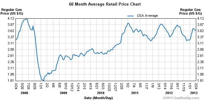
The most important information is that the price of gas has been declining on an annual basis since its peak of $4.25 in 2008. Specifically, its peak in 2011 was less than the peak in 2008. The peak in 2012 was less than 2011, and the peak so far this year is less than in 2012 (h/t gasbuddy):


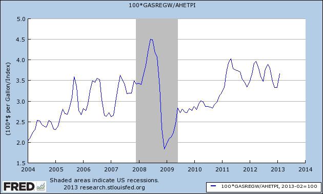
The news is even better when we consider the prices of gas as a share of average earnings. The following graph divides the price of a gallon of gas by average hourly earnings for nonsupervisory workers to give us the "real" gas price for Joe Sixpack:


While gas prices are still higher than they were before the 2008-09 recession, each successive peak has been less, meaning that even at its last couple of peaks, it has taken less and less of a bite out of the average consumer's wallet.

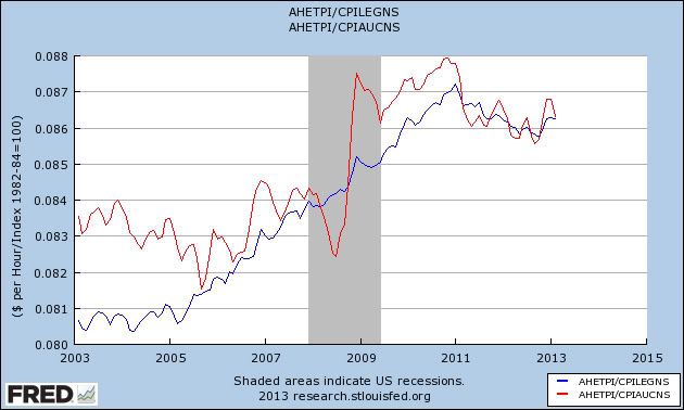
Another way to look at the same data is to calculate real, inflation adjusted wages with (red line) and without (blue line) the effect of gas prices, which is what the next graph does:


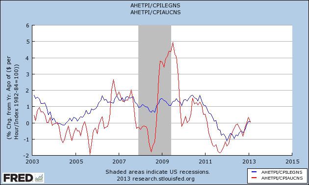
Here's the same data measured on a Year-over-year basis:


Notice that increasing gas prices have been the largest factor in plummeting YoY real wage growth. Secondly, it looks like that declining trend has bottomed, and in the last couple of months has actually turned positive YoY.

The loosening of the Oil choke collar, enabling Americans to save more, or spend more on other goods, may be the sleeper economic story of this year. There's much more to the story, and I'll follow up in further posts.

Is the Economy Stronger Than We Think? Pt. II

Last week, I wrote a post titled, "Is the Economy Stronger Than We Think?" where I looked at the strengthening housing market, stronger industrial production, rising retail sales and strong manufacturing and non-manufacturing numbers.  My conclusion was that -- even though these numbers were only from one month -- the strength was impressive.

Last week the conference board issued it's leading and coincident numbers, which again impressed.  Consider the following:

The Conference Board LEI for the U.S. increased in February for the third consecutive month. Large positive contributions from all the financial components, building permits and average workweek in manufacturing offset the negative contributions from manufacturers’ new orders for nondefense capital goods and consumer expectations for business conditions. In the six-month period ending February 2013, the leading economic index increased 2.3 percent (about a 4.6 percent annual rate), an improvement from the contraction of 0.2 percent (about a -0.4 percent annual rate) during the previous six months. In addition, the strengths among the leading indicators have become more widespread in recent months

Let's look at the data.


8 of the 10 LEI components increased last month.  And note the strength in some of the numbers: the average workweek added .13 to the index; building permits added .14, the leading credit index added .14 and the interest rate spread added .20.  The size of these increases in conjunction with the breadth of the increases is good news.

Let's turn to the coincident indicators.

The Conference Board CEI for the U.S., a measure of current economic activity, rose moderately in February, following a sharp decline in the previous month. The index increased 1.0 percent (about a 1.9 percent annual rate) between August 2012 and February 2013, faster than the growth of 0.4 percent (about a 0.8 percent annual rate) for the previous six months. However, the strengths among the coincident indicators have become somewhat less widespread, with three out of four components advancing over the past six months. The lagging economic index continued to increase almost at the same pace as the CEI, resulting in virtually no change in the coincident-to-lagging ratio. Real GDP expanded at a 0.1 percent annual rate in the fourth quarter of 2012, after increasing 3.1 percent (annual rate) in the third quarter.

The conference board's statements on the CEI are a bit puzzling.  They state, "However, the strengths among the coincident indicators have become somewhat less widespread, with three out of four components advancing over the past six months."  But there are only four individual components for the index, meaning 75% of the components are rising.  Additionally, consider the underlying CEI data.


In the last 6 months, there have been 24 individual data readings.  Of those, only 4 (those outlined above in red) were negative.  I would argue that this is a very positive data set, not weak as is implied by the press release.  And consider these additional data points that flesh out the above numbers:


Total non-farm employees (top chart) and industrial production (bottom char) continue to move higher.


While the statistic "total manufacturing and trade sales" doesn't exist in the FRED data base, the above six data points are from the LEI report and show the total amount of this category for each of the last six months.  With the exception of the drop in October (the third data reading) this number has moved higher each month.


Personal income less transfer payments is the only weak data point in the series.  However, with unemployment still at 7.7%, it's foolish to expect any upward wage pressure (I'm not saying it's good that it's happening; but I am saying we know why the number is weak). 

Additionally, consider this chart of the data from the report:


Both indicators are still firming moving higher.  While we shouldn't extrapolate this trend to infinity, we should note the underlying trend as it currently exists.

Finally, Fed Presesdent Lockhart used three data points as leading indicators for employment:

Dennis Lockhart, president of the Federal Reserve Bank of Atlanta, has identified three leading indicators of the labor market: changes in jobless claims, temporary help and the ability of small businesses to hire the employees they need. All three have improved, with applications for jobless benefits averaging 339,750 a week in the four weeks ended March 16, the lowest since February 2008.
 
A jump of 16,000 jobs in February brought temporary-help- services payrolls to 2.58 million, the highest since August 2007 and up from 1.75 million in June 2009, when the U.S. emerged from the 18-month recession.

The February survey of small-business optimism showed 21 percent of respondents had positions they weren’t able to fill, the most since June 2008 and an increase from 18 percent in January, the National Federation of Independent Business reported.

As the article notes, all three have shown recent improvement.

The bottom line is the above data is solid.  There is one headwind to consider, which is that we haven't seen the full impact of the sequester hit these numbers, so a dip or slowdown is possible over the next few months.  However, we're already a few months into the sequester, and we're not seeing the widespread slowdown that I and others expected.

Morning Market Analysis


Yesterday, we had more bad news out of Italy: retail sales dropped .5% m/m and 3.4% Y/Y.  In addition, industrial turnover dropped 1.3% m/m and 3/4% Y/Y.  As a result, the market dropping.  On the above ETF, first notice that momentum is already negative, with the MACD giving another sell signal.  In addition, the CMF, although positive, is just barely so.  Finally, prices are below all the EMAs.  Basically, this chart looks like a great short.


The French ETF dropped as well yesterday.  Yesterday we saw a re-release of the 4th quarter GDP numbers which were very weak.


While the treasury market has a permanent bid underneath it from the Fed, the corporate bond market does not.  However, notice that the short term (top chart), intermediate term (middle chart) and long-term (bottom chart) corporate bond markets are all still in strong technical shape, indicating that some form of the safety bid is still in play in the market.


The oil market moved higher again yesterday.  A move through these levels (roughly 96.5%) would make the 98 level the next logical target.


Wednesday, March 27, 2013

Should This Chart Be More Concerning?

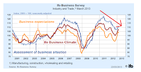
Germany is the one bright spot in the EU story right now.  However, consider this chart, which shows the IFO business confidence index:

The number has been drifting lower for the last two years, save for a spike up at the end of last year.  And the drop is for all three indicators: business expectations, business climate and assessment of the business situation.

Now, it's very important to point out that the overall readings are still very positive.  But the trend is concerning nonetheless.


France Is Still In Trouble

From the latest GDP report (another estimate of 4Q12):

In 2012 Q4, French gross domestic product (GDP) in volume* stepped back (–0.3%), after +0.2% the previous quarter. 

Over the year, GDP growth was null in 2012, after +1.7% in 2011.

In 2012 Q4, total domestic demand (excluding inventory changes) weighed down on GDP growth: –0.1 point after +0.1 point. Indeed, households’ consumption expenditure remained sluggish (–0.1% after +0.1%) and gross fixed capital formation (GFCF) continued to decrease (–0.8% after –0.4%). Exports decreased in Q4 (–0.6% after +1.0%), but less strongly than imports whose decline increased (–1.2% after –0.2%): ultimately, foreign trade balance contributed again positively to GDP growth (+0.2 point after +0.3 point). On the contrary, changes in inventories continued to weigh down on GDP growth in Q4: –0.4 point, after –0.2 point the previous quarter. 

The overall data is extremely disappointing.  First, 2012 saw no growth.  And while the economy grew 1.7% in 2011, that was largely due to a big bump in the first quarter of 2011.  Take that out, and you have two years of near stagnation in GDP.

Also look at the breadth of the problem.  Consumption dropping .1%, investment decreased .8%  and exports decreased .6%.  Put more generally, all major private sector contributors to GDP dropped in the 4th quarter.

This is not a good report and indicates the economy is in serious trouble.

Morning Market Analysis


The 60 minute SPY chart (top chart) shows that prices broke support last week and have been consolidating between 154 and 156 since.  Now the MACD has broken trend and the CMF is rising.  Prices are also trading right near resistance near the 156 area.  On the daily chart (bottom chart), we see the consolidation in more detail.  Prices used the 10 day EMA for technical support for the last week or so.  While the MACD is currently moving lower, a downward shifting MACD is common in consolidation patterns.


The Mexican ETF has broken through resistance.  Also note the strong CMF reading along with the rising MACD -- which has a lot of room to run.


The oil market has had a strong couple of days, printing very strong bars.  Prices are right at the top Fib fan, with a rising MACD and CMF.  This is a chart that wants to move higher in a big way.


Tuesday, March 26, 2013

Just Where Is That Inflation Again?

First, a big tip of the hat to Bob McTeer's Economic Policy Blog for providing the original inspiration for this post.  The following is essentially an expansion on the previously linked post.

For the last four years, there has been a continual call from conservative economists for a mammoth, Weimar Republic like spike in inflation.  While they have been wrong for that entire length of time, they continue to make the call.  The problem is there is no reason for this to happen.  Why?  Well, I'll tell you.  For those of you who believe in the inflation monster living under the bed, I'll write very slowly.  

What everyone on the right is so scared of is this chart:


According to Investopedia, the above chart represents:

The total amount of a currency that is either circulated in the hands of the public or in the commercial bank deposits held in the central bank's reserves. This measure of the money supply typically only includes the most liquid currencies.

What the right is assuming is that the total supply is 100% available to the public, or that it will immediately flood the US economy -- as in, tomorrow all of this  money will magically hit the economy and that total increase in supply will lower the value of the underlying asset.  They're essentially relying on an econ 101 analysis of supply: an increase in supply will lead to a proportionate decrease in value.

The problem with the above statement is that there's a tremendous amount of confusion about how the monetary base will enter the economy.  Remember that the cause of this recession was a financial crisis; banks didn't have sufficient reserves to cover the increase in defaults on loans.  Consider the following charts from the quarterly banking profile published by the FDIC:

During the recession, banks saw a massive spike in their total non-current loan rate (the blue line).  As a result, they had to increase their quarterly net charge-off numbers (red line).  This means that banks have had to increase their excess reserves which are:

Capital reserves held by a bank or financial institution in excess of what is required by regulators, creditors or internal controls. For commercial banks, excess reserves are measured against standard reserve requirement amounts set by central banking authorities. These required reserve ratios set the minimum liquid deposits (such as cash) that must be in reserve at a bank; more is considered excess.

The reason banks keep these are they provide an extra cushion of safety:

Financial firms that carry excess reserves have an extra measure of safety in the event of sudden loan losses or cash withdrawals by customers. This may increase the attractiveness of the company that holds excess reserves to investors, especially in times of economic uncertainty. Boosting the level of excess reserves can also improve an entity's credit rating, as measured by ratings agencies like Standard & Poor's.

If we subtract the total amount of excess reserves from the increase in the monetary base, we get this graph:


But Bonddad! The monetary base has been increasing!  We were right all along!  There is a flood of money in excess of these "excess reserves" coming into the economy and we will literally drown in dollars!!!!

No.

First, let's look at the above data from the "percent of GDP" perspective:


The above graph shows the amount of money that could get into the economy after subtracting out the increase in excess reserves and than takes that difference and divides total nominal GDP by that number arriving at a percentage.  We see that the average for the 1990s and early 2000s for this percentage about about 6.25% (I'm eyeballing the chart here).  We're currently at 7.5% -- 1.25% higher.

Secondly -- and as I've pointed out many times before -- this increase in occurring during a period low and declining monetary velocity (see the graphs here), which is

The rate at which money is exchanged from one transaction to another, and how much a unit of currency is used in a given period of time. Velocity of money is usually measured as a ratio of GNP to a country's total supply of money. 

If you print more money, but it is being spent at a lower rate than any increase in the monetary base will have a declining impact.  Declining velocity is to be expected in a debt-deflation recovery -- a recovery where the economy is primarily liquidating debts rather than buying goods.

Third, we're not seeing this increase in the monetary base lead to an above normal increase in any measure of the actual money supply.  Consider the following charts that show the year over year increase in MZM, M1 and M2:


The top and bottom charts show the year over year percentage change in MZM and M2, respectfully.  Notice how there changes are all right in line with historical experience.  The M1 graph (middle chart) is perhaps a bit more concerning, but again, it's in line with the top level of historical experience.

In summation, the big, scary inflation monster isn't out there.  


Morning Market Analysis


Of the international market I watch, the Indian market has been one of the worst performers.  The daily chart (top chart) shows that prices have been trading between 56 and 62 for the last six months.  Over the same period, momentum has been dropping and price strength has been declining.  Prices are now at the lower end of their trading range and are below the 200 day EMA.

The weekly chart (bottom chart) shows the damage to be afar reaching.  Prices have broken an uptrend that started mid summer 2012.  The MACD has given a sell signal and the CMF reading is decreasing.  Prices are also below all the EMAs.


The financial services ETF has broken trend again.  It it so at the end of February, but quickly rebounded.  So far, the currently trend break is not technically debilitating.  Prices are still above the EMAs and the CMF is still positive.  However, we are seeing a weakening MACD picture which may prove damaging in the short term.


As I've written several times, the French economy is in poor shape.  Yesterday -- despite the positive news from Cyprus -- the French ETF dropped 2.6%.  Most importantly, prices price the lower Fib fan and are now at the top Gib level from the mid-November - early November rally.   A big issue with this chart is the weakening momentum reading.


The Taiwanese ETF has been in a trading range between 13.1 and 13.8.  However, the techncials (declining momentum and volume participation) indicate continued deterioration. 

Monday, March 25, 2013

The Job Market Looks Better

From Bloomberg:

Businesses are adding employees to meet stronger demand and supplement workforces that have become increasingly stretched during the four-year expansion. Smaller companies are finding it easier to borrow as banks loosen terms on loans. 

Circle Foods LLC, a San Diego-based maker of TortillaLand uncooked fresh tortillas, has hired 165 people in the past six months and created the new position of human-resources training manager. 

“The labor market has shown signs of improvement,” Federal Reserve Chairman Ben S. Bernanke said in a March 20 press conference. He mentioned indicators such as gains in payrolls, more hours worked and a decline in claims for unemployment insurance. The jobless rate, which “remains elevated” at 7.7 percent, has nonetheless “continued to tick down.” 

The strengthening outlook for employment and growth is good news for the stock market. Sinai sees the Standard & Poor’s 500 Index rising to 1,600 later this year from 1,556.89 (SPX) on March 22.


The Euro crisis in one graph


. - by New Deal democrat

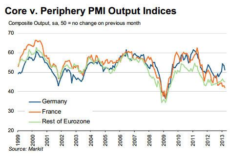
With a number of economists and pundits speculating that the imposition of capital controls in Cyprus marke the beginning of the end for the Euro in its current configuration, the below graph which I've copied from The Economist is especially telling:


Take a look at the green line. It shows that, outside of Germany and France, the average Eurozone economy has been in almost unremitting malaise or contraction for over five years! How long do the citizens of those countries put up with austerity seen as imposed by Brussels and Berlin before they decide they have had enough?

Not much longer, I suspect.

P. S. Note I'm not calling into question the EU itself, but just the single currency.

How Much Negative News Can the Euro Take Before It Breaks?

My opinion about the EU was best summed up in this piece which was re-posted over at the Big Picture blog:

And finally, there is Europe.  I previously noted that Europe is currently in a situation akin to the US under the Articles of Confederation.  We have a group a states who have created a liberalized trading code between themselves, but who also lack enough centralized authority to meaningfully implement effective macro level policy.  The Greek situation is a great example of this problem.  Greece has been fiscally reckless for some time (as in years); their budgetary policies were usually in violation of some EU covenant.  However, the central EU authority didn’t have the requisite political power to stop Greece from enacting policies that violated EU dictates.  So, the only way to actually solve the problem occurred when Greece was ready to default on its debt.  Also consider the policy problem faced by the ECB; they have to set interest rate policy for strong countries like Germany and weak countries like Greece and Spain.  In short, it’s an insane proposition from a policy implementation perspective.

It's a perspective which I currently have.  At some point, the EU will have to come to some type of understanding about its need for additional centralized power, especially in relation to state budgets, in order to survive.  I don't know what that relationship will look like, but there will have to be a change.   I also don't think this will be a bad thing.  The total EU area is one of the largest economic blocks in the world, and collectively represents a tremendous consumer and business market; they collectively have far more power together than apart.  While some will of course argue that more centralized government is bad, these are the same people who always make that argument and who also, for the most part, know less about economics than any of my three dogs. 

As I have watched from afar, my thought has literally always been that we are now at the point where the events will literally force the EU to make this change.  I have continually been wrong in this assessment.  In addition, I am beginning to wonder just how much negative news the regional block can take before it starts to fray.  While it's easy to underestimate the resilience of an economy, it's also important to keep in mind that at some point a system cannot take any more stress.  While there is no way to gauge when this will occur with the euro, recent events obviously add pressure.  Consider the following:

Italy -- a country which is in a recession -- had an indecisive election within the last three months.  One of the leading candidates was a comedian -- obviously not someone who has any meaningful political experience or any ability to build a coalition.  Another leading candidate was recently convicted of a crime.  No one had a majority.

The economic numbers from the region as a whole continue to show an ongoing recession.  The region as a whole has been contracting for the last five quarters.  Unemployment is increasing.  The manufacturing and service sector indices are showing contraction.  The region is also in the middle of a love-fest with austerity, which recent research is contractionary.  The economies that lead to the problems (Greece, Spain and Portugal) are still in terrible shape.  France is teetering on the edge.  Basically, there is little good economy news coming from the region.

And now we have problems coming from a small, offshore tax haven called Cyprus, who's banking sector has grown to abnormal proportions.  Because these banks invested in Greek debt, their respective capital took a big hit as the Greek economy tanked.  But because a large number of their depositors are thought to contain illegal gains (read Russian organized crime and general tax evaders from around the globe), the EU wants the banks to shoulder a large percentage of the bailout costs.  This lead to the incredibly stupid idea of taxing depositors to obtain funds for the bailout, a policy which many commentators have speculated (correctly, I believe) would naturally lead to a bank run.

I want to stress that I'm not saying we're at a break-up the euro point.  Frankly, I don't think we'll know we're there until we're caught off guard by an overnight statement from a country stating they're leaving.  My concern is this: there has been a dearth of good news coming from the region for an extended period of time -- as in years.  In addition, there seems to be little desire to do what is actually necessary to save the alliance.  Economic policy is contractionary; proposals to solve problems (Cyprus) are terrible and ill-conceived and the political will to do something seems to be lacking (Italy).

I'm just not seeing a lot of good ideas or positive solutions coming from the region right now.

For more, see this from Brad Delong.


Morning Market Analysis

Quick summary: the SPYs are consolidating after hitting the 156 level. On the 60 minute chart, prices have broken the trend that started at the beginning of the year. The dollar has rallied since the beginning of February, benefiting from the flight to safety bid. But now it appears to be consolidating gains.


The daily SPY chart (top chart) shows that after hitting the 156 level, the SPYs are now consolidating sideways.  All uptrends are still intact with prices using the 10 and 20 day EMA for technical support.  The MACD has given a sell-signal.

On the 60 minute chart (middle and bottom chart) we see that prices have broken the trend line that started at the beginning of the year.  Prices briefly broke this trend line in late February, but forming an inverse head and shoulders formation from which they rebounded.  Now, prices have clearly broken this trend, which is better seen in the bottom chart.  Also note the declining MACD and CMF, telling us that momentum is weakening and money is flowing out of the market right now.


Starting in early February, the dollar became the beneficiary of the "safety bid" in the market, which led to the sharp rally from 21.6 -- a rally of about 4.5%.  Now, prices appear to have hit a short-term top and are retreating a bit.  The MACD has given a sell-signal and prices are using the EMAs for technical support.  The most likely short-term price target is 22.3 -- the peak from the early/mid November.