Saturday, August 4, 2012

Weekly Indicators: mixed bag edition


  - by New Deal democrat

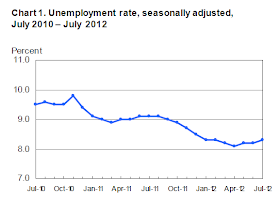
The big monthly numbers this week were obviously the addition of 163,000 jobs in July and the uptick of the employment rate to 8.3%.  July car sales held steady.   Construction spending increased, especially private residential spending, yet another good sign for the housing rebound. The Case Shiller repeat sales housing price index also improved again month over month, and is very close to turning positive YoY.  The ISM services report showed a slight uptick in expansion as did the Chicago PMI.  Personal income rose 0.5%, as did second quarter median employment costs.  Consumer confidence rose.

On the negative side, ISM manufacturing showed a very slight contraction for the second month in a row.  Personal spending was flat.  Factory orders declined -0.5%.

The high frequency weekly indicators are meant to be as close as we can reasonably get to observing economic trends in real time.  Turns will show up here before they show up in monthly or quarterly data.

Let's start again this week with Same Store Sales, which were quite weak but remained positive:

The ICSC reported that same store sales for the week ending July 28 rose 1.8% w/w, and were up +1.7% YoY.  Johnson Redbook reported a 1.1% YoY gain.  Shoppertrak, did not report.  

The 14 day average of Gallup daily consumer spending  showed an upward spike at the end of July and at $77 was $2 over last year's $75 for this period.  This is the first week of real strength after six weeks in a row of weakness. This is encouraging but we will have to see if this is just a one week outlier or if consumers are beginning to regain their footing.

Employment related indicators were also mixed to negative this week:

The Department of Labor reported that Initial jobless claims rose 12,000 to 365,000 from the prior week's unrevised figure.   The four week average fell another 2250 to 365,500.  The lowest 4 week average during the entire recovery has been 363,000.  This number does not appear to be compatible at all with further economic weakness.  

The Daily Treasury Statement showed that for July 2012, $144.0 B was collected vs. $132.2 B a year ago, an +8.9% improvement.  For the last 20 days as  of this Thursday, $130.6 B was collected vs. $132.1 B for the same period in 2011, an actual loss of -1.1%.  It's possible that this is still being affected by the artifact of the July 4 holiday, but this will disappear next week.

The American Staffing Association Index remained at 92.  This index was generally flat during the second quarter 93 +/-1. Having stayed at 92 for 2 weeks when in past years outside of the recession it was rising indicates some weakness.

The energy choke collar remains close to re-engaging:

Gasoline prices rose again last week, up .02 to $3.51.  Oil prices per barrel rose slightly for the week, from $90.13 to $91.40.  Gasoline usage, at 8820 M gallons vs. 9215 M a year ago, was off -4.3%  The 4 week average at 8756 M vs. 9065 M one year ago is off -3.4%, still a significant YoY decline.  From here on in declines in energy usage compared with last year have to be considered a sign of renewed weakness unless there is some new surprise level of efficiency compared with one year ago to explain the discrepancy.  

Bond prices and credit spreads both decreased again:

Weekly BAA commercial bond rates fell .08% to 4.77%.  These are the lowest yields in over 45 years. Yields on 10 year treasury bonds  fell 0.5% to 1.47%.  The credit spread between the two declined to 3.30%, which while still closer to its 52 week maximum than minimum, is still a significant improvement from one month ago.   

Housing reports remained mixed:

The Mortgage Bankers' Association reported that the seasonally adjusted Purchase Index declined -2.1% from the week prior, and were also down approximately -1.5% YoY, back into the middle part of its two year range.  The Refinance Index rose 0.8% to yet another 3 year high. 

The Federal Reserve Bank's weekly H8 report of real estate loans this week fell -0.1% again.  The YoY comparison declined to +0.9%.  On a seasonally adjusted basis, these bottomed last September and are up +1.1%.  

YoY weekly median asking house prices from 54 metropolitan areas at Housing Tracker  were up + 2.2% from a year ago.  YoY asking prices have been positive for 8 months.

Money supply remains positive despite now being compared with the inflow tsunami of one year ago:

M1 was flat last week, and was up +3.6% month over month.  Its YoY growth rate fell to +16.5%, so Real M1 is up 14.8% YoY.  M2 fell -0.1% for the week, and was up 0.9% month/month.  Its YoY growth rate fell to 8.4%, so Real M2 grew at +6.7%.  Real money supply indicators after slowing earlier this year,  have increased again,  and YoY comparisons are holding generally steady.

Rail traffic was mixed again, but the diffusion index improved:

The American Association of Railroads  reported a +1.0% increase in total traffic YoY, or +5,400 cars.  Non-intermodal rail carloads were down  -1.5% YoY or -4400, due once again to coal hauling.  Negative comparisons fell from 13 to 8 types of carloads.  Intermodal traffic was up 9800 or 4.1% YoY.  

Turning now to high frequency indicators for the global economy:

The TED spread rose .01 to 0.36, still close to its 52 week low. The one month LIBOR declined to 0.2440. It has retraced about 1/2 of its rise from its recent 4 month range, it remains well below its 2010 peak, and has still within its typical background reading of the last 3 years.  Even with the recent scandal surrounding LIBOR, it is probably still useful in terms of whether it is rising or falling.

The Baltic Dry Index fell from 933 to 852. It is still 182 points above its February 52 week low of 670, although well below its October 2011 peak near 2200.  The Harpex Shipping Index was steady last week after falling for eight straight weeks at 414.  It is still up 39 from its February low of 375. 

Finally, the JoC ECRI industrial commodities index fell from 117.10 to 116.70. This is still near its 52 week low.  Its recent 10%+ downturn during the last few months remains a strong sign of all that the globe taken as a whole is slipping back into recession.

Weekly indicators were quite mixed.  Initial claims, especially as measured over 4 weeks, are sending a good signal.  Housing prices are firming.  The long leading indicators of housing (especially refinancing), real money supply, and corporate bond yields also continue to be positive.  Consumer sales were weakly positive.  On the other hand, gasoline prices and sales are a negative.  Railroad data was mixed, as were purchase mortgages, and real estate loans were negative.  Shipping rates are slipping, and industrial commodities resumed their slide.

I believe we are going to see a very weak July real retail sales number.  Going forward the issue as to whether we actually tip into contraction or rebound is probably going to hinge on energy prices and whether real wages turn positive enough to assist in consumer spending.

Have a nice weekend!

Friday, August 3, 2012

Weekend Weimar, Beagle and Pit Bull

It's that time of the week again. I'll be back on Monday. NDD will be here tomorrow. Until then ....


July jobs +163,000, unemployment rises, leading indicators stable to positive

- by New Deal democrat

July employment was reported well ahead of expectations at +163,000.  Private payrolls were up 172,000, government lost -9,000 jobs.  Revisions were a wash, with May's jobs figure revised up10,000 and June's down 16,000.


The unemployment rate, however, increased to 8.3% and the broader U-6 rate increased for the second month in a row, up now to 15.0%.


The alternate, more volatile household survey jobs number actually decreased, -195,000, as those not in the labor force and the number of unemployed actually increased slightly.  This brought the labor force participation rate down 0.1% to 63.7%, and the employment to population ratio down 0.2% to 58.4%.

Those parts of the labor report that tend to lead the economy were slightly positive or neutral.  Manufacturing jobs increased by 25,000.  Note that this seasonal adjustment may have been affected by the auto plant shutdown issue. Construction employment was up 4,000 (which, considering the last 5 years, is good).

The manufacturing work week, one of the 10 official leading indicators, was flat at 40.7 hours.  Manufacturing overtime was also flat at 3.7 hours. The work week economy-wide was also flat at 34.5 hours.  Another aspect of the report thought to be leading, temporary jobs, increased by 14,000.

The leading part of the unemployment data is those out of work less than 5 weeks.  This declined by 99,000, and is now only about 150,000 above its low from last year.  Usually going into a recession this has increased by at least 300,000 off its lows.

Average hourly earnings increased a pathetic but positive 0.1%.  These have increased 1.7% in the last 12 months.  Depending on how the July CPI is reported later this month, this might be the first YoY increase in real average hourly earnings in the last 18 months.

Compared with the negatively dramatic reports of the last few months, this one is relatively "meh," which under the circumstances, is a positive.  In summary, more jobs were created than necessary to keep up with population growth, leading industries were positive, short term unemployment were positive.  The ratio of unemployed to employed and to the population grew, a negative.  Most of the rest of the report was flat, neither good nor bad.

P.S.:  Appropos of my latest critique of ECRI's recession call the other day, the YoY% change in employment growth increased to a 4 month high.  For the moment, this means that 3 of the 4 coincident indicators used to signal expansion vs. recession are not just growing, but growing at an increasing rate.

Morning Market


After rallying from mid-June to mid-Jule, the entire grains complex has consolidated gains.  Corn (top chart) is using the 10 day EMA as support, while wheat (bottom chart) is probably leading the complex lower; it has broken support and is using the 20 day EMA as technical support.  All have MACDs that have given sell signals.  I would expect sideways to slightly downward trading for the next week or so (or until we get another adverse weather report).  But, given the extent of the drought, I would expect to see prices at this elevated level for the foreseeable future.


The Australian dollar has caught a major safety bid; it has been in an upward sloping channel for the last two months.  There are several reasons for this.  First, Australia has a higher growth rate than most countries with a AAA credit rating.  Second, it has higher interest rates.  Third countries and traders are looking to diversify their holdings out of dollars and the euro.


The weekly gold chart is still showing gold trading in a very narrow range.  However, notice the MACD has given a but signal.  Also not the low volatility reading.  Don't expect this reading to stay at this level long.


After breaking an uptrend earlier this year, copper has fallen through the 200 week EMA and been trading right below that level for the last two and a half months.  Momentum is weak and money is flowing out of the market.  The real key right now is the 42 price level; should that not hold, expect prices to target the lower Bollinger Band.

The Asian Slowdown

Overall, Asia is slowing down.  Let's take a look at some of the macro data to get a good look at what exactly is happening.

Last week, South Korea announced that GDP increased .4% from the previous quarter.  This indicates that the Chinese slowdown is bleeding into other Asian countries. 


Above is a GDP chart for the last 10 quarters.  First, while the economy came out of the recession printing strong numbers in 2010, there has been an overall slowdown over the six quarters starting in 2011.  There are several reasons for the slowdown.  First, in the six quarters since 1Q11, we've seen an investment contraction in four.  Second, notice the slow pace of final consumption expenditures -- the largest gain was 1.5% in 1Q12, but this figure is an anomaly when compared with the .4% in 3Q11 and .3% in 2Q12.  Also note that in two quarters we see a decline in exports -- the real strength of the South Korean economy.  In short, we see there is a broad based reason for the overall slowdown in South Korean GDP.


Above is a graph that shows the growth rates of various economic sectors.  In the last six quarter, manufacturing has contracted twice.  Additionally, construction has contracted four times; they're also printed three contractions in a row.  While we see a big drop in electricity in 1Q12, this is probably a simple dropping off of growth from the fourth quarter.

In short, South Korea appears to be slowing in a variety of economic areas.

Now let's turn to Japan:


First of all, remember that in 2011, Japan was hit by a natural disaster, leading to the contraction in the first half of the year.  Since then, we've seen two quarters of growth and one of zero growth.

There are a few points that really stand out.   First, note there has been no contribution from the residential investment sector for the last five quarters.  Secondly, non-residential investment has only contributed to one quarter's growth.  Third, public investment has not helped that much either, only contributing to two quarters and then, not really that much.  Together, these figures indicate that investment is severely lacking in the last year.

Exports -- the previous driver of Japanese growth -- has also been stuck, only contributing to growth in one quarter over the last year.

Private consumption has actually been fairly decent.

What the above chart tells us is Japanese growth is getting hit from a variety of sectors.  This creates some big problems from a policy perspective for the Japanese authorities.

Here is the latest domestic report from the Reserve Bank of India:
9. Gross Domestic Product (GDP) growth decelerated over four successive quarters from 9.2 per cent in Q4 of 2010-11 to 5.3 per cent in Q4 of 2011-12. Significant slowdown in industrial growth as well as deceleration in services sector activity pulled down the overall GDP growth to 6.5 per cent for 2011-12, below the Reserve Bank’s baseline projection of 7 per cent.
10. On the expenditure side, significant weakness in investment activity was the main cause of the slowdown. Gross fixed capital formation, which grew by 14.7 per cent in Q1 of 2011-12, moderated to 5.0 per cent in Q2 and then contracted by 0.3 per cent in Q3 before recovering to a growth of 3.6 per cent in Q4. Growth in private consumption also decelerated in 2011-12, even as it remained the key driver of growth. The positive impact of the rupee depreciation on exports is yet to be seen.
11.  Growth in the index of industrial production (IIP) decelerated from 8.2 per cent in 2010-11 to 2.9 per cent in 2011-12. Further, IIP growth during April-May 2012, at 0.8 per cent, was significantly lower than the expansion of 5.7 per cent registered in the corresponding period of last year. The PMI rose marginally to 55.0 in June 2012 from 54.8 in May. The composite (manufacturing and services) PMI also rose to 55.7 in June from 55.3 in May.
12.  During the ongoing monsoon season, rainfall up to July 25, 2012 was 22 per cent below its long period average (LPA). The Reserve Bank’s production weighted rainfall index (PWRI) showed an even higher deficit of 24 per cent. Further, the distribution of rainfall was very uneven, with the North-West region registering the highest deficit of about 39 per cent of LPA. If the rainfall deficiency persists, agricultural production could be adversely impacted.
13.  Capacity utilisation levels in Q4 of 2011-12 as reflected in the results of the Reserve Bank’s order book, inventories and capacity utilisation survey (OBICUS) revealed the usual seasonal improvement over the previous quarter. However, lead information from the Reserve Bank’s industrial outlook survey (IOS) indicates that capacity utilisation dropped in Q1 and Q2 of 2012-13. Moreover, overall business sentiment also moderated in both the quarters.

Like other Asian countries, we see an overall slowdown.  However, India also has higher than average inflation (along with extensive political gridlock), preventing the central bank from lowering rate.

Taiwan recently announced that their latest GDP print showed a mild contraction.  Here's the data


First, the overall print isn't that bad -- a contraction of .16%, which could simply be explained as statistical noise.  However, notice the breadth of the underlying weakness: domestic demand has dropped for two quarters, gross capital formation has contracted for four quarters and exports have dropped all year.  This is not a good sign, as it tells us the slowdown is pretty broad based.

Looking at the same data from a "percent contribution" perspective, we get the following table:


Again, notice the breadth of the overall slowdown -- and how that breadth is hitting overall growth.

Singapore recently announced a mild contraction as well:
Based on advance estimates1, the economy contracted by 1.1 per cent on a quarter-on-quarter seasonally-adjusted annualised basis, compared to the 9.4 per cent expansion in the preceding quarter. On a year-on-year basis, the economy continued to grow at a modest pace of 1.9 per cent, following the 1.4 per cent growth in the previous quarter.
Here's a look at their data (from the above report):


Note the 1.1% contraction, which was caused by a drop in manufacturing -- which showed a 6% Q/Q contraction.  Also note the slowdown in construction -- which contracted from a 27.9% Q/Q expansion to a .3% and services - which slowed from a 2.7% Q/Q growth rate to a .4%.  The construction slowdown can be explained by the rapid growth in the first quarter; obviously the industry front loaded contracts for a variety of reasons.  

This is a broad based slowdown caused by the EU weakness and Chinese slowdown.


Morning Market Analysis


After rallying a few weeks ago, oil sold off near the 200 day EMA.  Now, prices are resting on the 50 day EMA.  Note the bearish developments in the technicals: the MACD is about to give a sell signal, while the CMF is dropping. 


After dropping about 27.5% (from 69 to 50), prices in the Brazilian market has bottomed and is currently trading in about a 10% range.  Note the rising MACD and CMF, indicating both positive momentum and increased volume flow. 


The Spanish (top chart) and Italian (bottom chart) markets are in the same position as Brazil's.  Both have bottomed after a fairly severe drop. 


Both the IEFs and the TLTs are right at support.  A move lower will be a key development for the markets to move higher; it's more or less mandatory at this point.


NO RECESSION BY MIDYEAR 2012


- by New Deal democrat

With yesterday's release of June real income, we now have full data through midyear 2012.  Unless there are downward revisions to the critical series upon which the NBER relies, it can confidently be stated that no recession began by that time.

It is widely acknowledged that the NBER looks primarily at 4 data series in dating economic peaks and troughs:  industrial production, nonfarm payrolls, real personal income minus transfer payments, and real retail sales (some would prefer real final manufacturing and trade sales in lieu of real retail sales, but in this case it does not make any difference).

Let's look at the performance of each of these four items.  First, here is industrial production (blue) and real retail sales (red);


We can see that while real retail sales have declined in the last 3 months, similar to their decline in 2010, industrial production has continued to make new highs.

Next, here's nonfarm payrolls (blue) and real income minus transfer payments (red):


Both nonfarm payrolls and real income minus transfer payments also continued to make new highs through midyear.

Subject to revision, with only one series in decline, and the other 3 rising, as of midyear there has been no broad decline in production, income, jobs, and spending that is the hallmark of a recession.

While I continue to have respect for Prof. Geoffrey Moore's concept of long and short leading indicators with which he founded ECRI, and I appreciate that owners of proprietary models have a vital interest in not giving away their secrets, I have to say I have been dismayed by the lack of candor ECRI has displayed in the last 10 months when economic data they cited in support of their recession call turned against them.

To begin with, their original call over 10 months ago on September 30, 2011 was that a recession was "imminent," saying "It's either just begun, or it's right in front of us."  Subsequently they revised their call, saying the recession would hit "by mid year" 2012.  In support of their original call, in this interview with Tom Keene of Bloomberg television last September 30 (link is to video), Lakshman Achuthan specifically cited initial jobless claims, first at the 3:50 mark:
Tom Keene: 400,000 claims isn't happening, is it?
Lakshman Achuthan: No, forget about it! This is -- unemployment is going back up, claims are going to be rising.
Then again at the 5:15 mark:
TK: [pointing to a graph of initial jobless claims] My hand is at 400,000 --
LA: We're going over--
TK:-- and we just. can't. get. through. it.
LA: It's going back up.
Not only did initial jobless claims not "go back up" without crossing the 400,000 threshold, they have declined to as low as 350,000 without a single week breaching the 400,000 threshold to the upside this entire year.


ECRI has never acknowledged this error.

Last September they also cited Gross Domestic Income. There is some evidence that GDP tends to be revised in the direction of GDI. In another interview on Bloomberg, on December 8, 2011:
Achuthan also noted that “the other half of the GDP report,” gross domestic income or GDI (which tends to be the more accurate measure of GDP) was up just 0.3% in the most recent quarter [NDD note: Q2 2011]. The Federal Reserve has observed that when GDP and GDI differ, the GDP figure tends to be revised toward GDI, not the other way around. Achuthan warned that the GDI figures are “a big red recession signal.”
Except that GDI did not continue to decline. In fact as of revisions published just last Friday, it appears that 3Q 2011 GDI was the trough. While I don't have a graph, here's the quarterly statistics for GDI since the 1st quarter of 2011:

2011 Q1 +2.6
Q2 +0.4
Q3 -0.2
Q4 +4.5
2012 Q1 +3.5

Similarly, revisions to GDP since 2009 released last Friday by the BEA also show that YoY GDP troughed in the 3rd quarter of 2011 and has improved since then, with YoY GDP as of midyear 2012 being better than any point in 2011:


In what appeared to be a direct response to a criticism of mine, in March ECRI claimed that the proper way of looking at the 4 coincident series that mark economic peaks and troughs was their YoY performance, saying that seasonal adjustments had been affected by the deep declines during the Great Recession of 2008-09.  In so doing ECRI even abandoned the 6 month growth metrics for their Weekly Leading Index and Coincident Index that previously they had consistently touted.

As set forth above, both YoY GDP and GDI have improved since ECRI made its recession call last September.  Not once have they acknowledged that improvement.

But let's also look at the YoY performance of the 4 coincident series marking economic peaks and troughs.

First, here's industrial production:


Industrial production has been trending higher on a YoY basis since last autumn.  On a 3 month rolling average basis, it is having its best YoY growth since the beginning of 2011.

And on a longer basis, shown below, with the exception of 2010, industrial production is improving at the best YoY rate in over a decade:


Next let's turn to nonfarm payrolls.  In his recent appearances, Lakshman Achuthan has pointed out that their YoY growth rate has declined, which indeed is true, although it appears to have stabilized in the last couple of months:


But this modest 0.2% YoY decline, which stabilized in the last two months, is nowhere near the typical YoY decline in payroll growth that has preceded most recessions:


Notice that a decline of over 1% has been typical.  Even in the case of 1970 and 1974, there was a YoY decline of 0.5% in payroll growth before the recession began.

Next, let's look at real income.  On a YoY basis, the growth rate in this series bottomed at the beginning of this year, and has been rising since.  Note that the abrupt decline YoY after December 2011 was because that was the anniversary of the 1% FICA tax cut that took effect in January 2011.  I have added a second line in red to indicate what the YoY change would have been without that 1% tax cut, and you can see that the organic growth rate of real income now is actually the highest in over a year:


Finally, let's look a real retail sales.  Here there has been a very significant decline in the rate of YoY growth -- but again not nearly so much as in the case of the last 2 recessions.  In fact this level of YoY real retail sales growth is consistent with fully half of the last expansion:


In summary, not only are 3 of the 4 critical recession marker series going up, but 2 of the 4 are growing at an accelerating rate (industrial production and real income), and the growth rate of 1 of the remaining 2 has stabilized as of midyear (payrolls).  When the YoY gain in payrolls turned down several months ago, Achuthan claimed that this metric was "joining the others."  ECRI has never acknowledged that at least half of the 4 were no longer in a declining trajectory as the first half of 2012 progressed.

Beyond that, ECRI has cited the poor YoY percentage growth in real income as never having previously occurred without an ensuing recession.  That may be true, but if so, it is also true that the rebound in the real income growth rate we have seen in the first half of this year has always occurred as or after those recessions were ending:


Again, ECRI has never acknowledged this.

Finally there is the matter of ECRI's own Coincident Index.  In March Lakshman Achuthan made a big point of the fact that the YoY growth in their Coincident Index was under 2%.  He said that every time that happened, a recession followed.  In fact when Mish called ECRI out on this claim, saying their recession explanations were "disingenuous," ECRI responded directly.  Here is Mish quoting them in his follow up blog post:
The latest USCI growth rate is 1.94% (which can be rounded off to 1.9%). In January 1996, it had dropped only to 2.06% (which can be rounded off to 2.1%). This was certainly not below current readings. Of course, no recession followed.

In 1998, the USCI growth came nowhere near current readings, so the question doesn’t arise. It wasn’t until January 2001 that it fell below 2%, and the recession began two months later.

.... If you look at all the occasions in the last 50-plus years when USCI growth fell to 2.0% or below ..., it is clear that recessions began around those dates....

In sum, it is precisely accurate to claim that y-o-y USCI growth has never dropped to current readings in the past 50-plus years without a recession ensuing.

There's not the slightest bit of uncertainty in that response, is there?  YoY growth of more than 2% in their Coincident Index means no recession, while 1.94% growth means a recession is coming.

Except, just as with GDI, just as with initial jobless claims, just as with GDP, just was with industrial production, and just as with real income minus transfer payments, the data turned against them.  Here's the graph of the YoY change in the ECRI Coincident Index since January 2011:

MonthYoY%
2010-11
YoY%
2011-12
January 3.7%2.2%
February 3.6%2.4%
March 3.6%2.1%
April 2.8%2.6%
May 2.3%2.6%
June 2.2%2.5%
July 2.1%-----
August 2.1%-----
September 2.2%-----
October 2.4%-----
November 2.5%-----
December 2.4%-----


The sub-2% reading at the beginning of this year has been completely revised away.  In fact based on present data, at no point in the last 12 months has their Coincident Index registered less than +2%.  At no point did ECRI acknowledge that revision, and at no point have they attempted to explain why that does not undercut their recession call, based on their own prior public statement that growth in this index of more than 2% did not lead to a recession.

Although I disagree with him far more often than I agree, Mish can write some great analysis and he almost always makes me think. Last week he wrote that:
Those are exactly the kinds of things that irritate me about the ECRI. The fact of the matter is Achuthan was calling for a recession in September, not December, and not June.

For details, please see my September 30, 2011 post ECRI Calls Recession Based on "Contagion in Forward Indicators"; Just How Timely is the Call?

Tom Keen: "Single Sentence, why recession now"
ECRI's Lakshman Achuthan: "Contagion in Forward-Looking Indicators"

That link clearly shows I thought a recession was imminent as well. Those are the facts. It is silly to try and hide them.

Yet, in December (after economic data firmed), Achuthan moved the date forward to June, wanting another 6 months to be proven correct.

My question in September "Just How Timely is the Call?" was a good one. The ECRI has been both very early and very late. Far from the perfect track record they claim.

That my friends is the nature of making predictions. No one is perfect, not me, not Achuthan, not anyone, and it is very foolish to pretend otherwise.

Actually, I have no problem at all with Achuthan moving the date forward. Conditions change. My problem, is revisionist history that makes it appear as if a recession call in September was a recession call for June (made in December).

All this nonsense goes away the moment Achuthan admits the ECRI does not have a perfect track record.
As Mish says, no one is perfect. I've certainly been wrong my fair share of times. If subsequent revisions to the data lead the NBER to date the onset of a recession to June 2012 or before, I will be the first to acknowledge that ECRI's recession call turned out to be correct.

But can ECRI acknowledge the reverse, based on the current data?  And how can their statements be believed in the future, when data trends upon which they explicitly rely don't pan out, or are revised away, and they never once acknowledge the problem, let alone explain it?

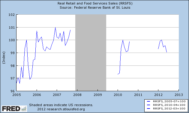
Real retail sales and the onset of recession


  - by New Deal democrat

Yesterday I referred to the business cycle analysis of Prof. Edward Leamer of UCLA, who wrote in 2007 that:
The timing [pre-recession] is: homes, durables, nondurables, and services. Housing is the biggest problem in the year before a recession... durables is the biggest problem during the recession
He found that housing typically begins to decline 5 quarters before recession, with durables and nondurables hitting their peak 4 quarters before the recession, and gently declining until the recession hits.

Retail sales include both durable goods (like cars and appliances) and non-durables, so it is a mix of consumer purchases.  Although it is one of the 4 series believed to be tracked by the NBER in dating recessions, it actually has a slight tendency to lead, and in particular to lead employment.

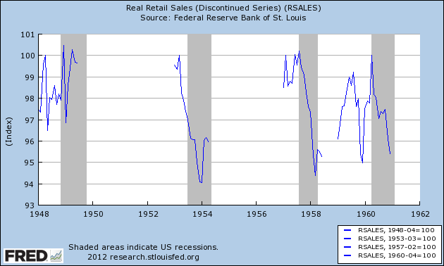
So what kind of decline, if any, is expected from real retail sales in advance of recessions?  Usually, but not always, at least 2%.

Here are the immediate post- World War 2 recesssions:


Note that in three of them, the actual peak was reached at the outset of the recession, which is what you would expect from an NBER coincident indicator.  But 3 of the 4 experienced at least a 2% decline within 6 months prior to the onset of the recession.

I neglected to include the 1970 recession in the above graph, but there was also a 3% decline from the November 1968 peak prior to the onset of that recession as well.

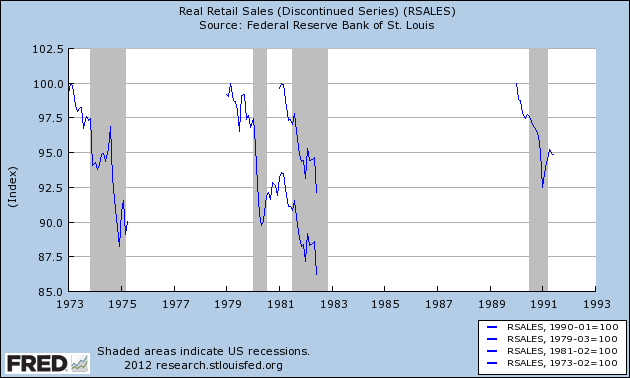
Here are the 1970's and 1980's.  In all 4 of these cases there was a decline of 2.5% in real retail sales before the onset of the recession:


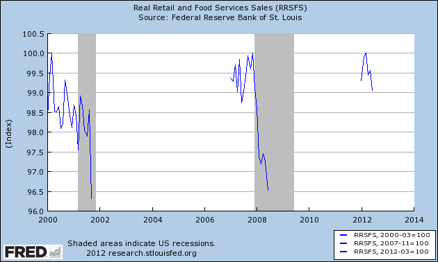
Now here are the last two recessions up to the present:


There was a 2% decline in the year leading up to the recession of 2001, and a 2% decline in 2007 before the peak was made in the 3 months before the onset of the "great recession."  Notice that we have had slightly less than a 1% decline in the last three months.

But a 1% or even 2% decline in real retail sales doesn't necessarily imply contraction.  For example, note from the below graph that there was a 3% decline in 2005, and 1% or greater declines in both 2006 and 2010 without triggering contraction.


To summarize, 9 of the 11 recessions since World War 2 have been preceded by a 2% or greater  decline in real retail sales in the months immediately preceding the recession.  The two others only experienced a 1% decline, although the decline quickly accelerated to more than 2% once the recession began.

So our present situation does not preclude being in recession by this metric, but it is more likely from past experience that as of mid-year, real retail sales only indicated a slowdown rather than an actual contraction.

This Is What A Global Slowdown Looks Like

Below I've assembled the annualized GDP growth rates for various regions of the world. Note one common trait: they're all slowing or already in recession:


Morning Market Analysis


Despite all of the reports coming from the markets about the East and the EU, the overall position of the equity markets is one of contained action; the IWMs and QQQ are trading in a range while the SPYs have just barely broken out. 


We're starting to possibly see a few cracks in the Treasury rally.  Notice the SHYs broke a short term uptrend (although they're at previous highs).  The IEFs and TLTs are right at support.