Friday, October 29, 2010
Rally to Restore Sanity
Weekly Indicators: the tricks vs. the treats edition
This week's most important statistic was surely 3rd quarter GDP, which came in at 2%,lukewarm and as expected: growth, but not enough to knock down unemployment. The Chicago PMI showed that in the Midwest at least manufacturing is still going strong. Consumers meanwhile are as gloomy as ever both about the present and the future. New and existing home sales bounced along the bottom.
Let's turn now to the high frequency weekly data.
Last Friday I said that "Purchase mortgage applications will be important to watch next week." The Mortgage Bankers' Association reported that its seasonally adjusted Purchase Index increased 3.5% last week, ending several weeks of steep decline. Thus it rebounded again from a reading back near July's lows and suggests they will indeed hold. Meanwhile, the Refinance Index increased 3.0% from the previous week. Refinancing is still proceeding at a fast clip in response to near record low 15 and 30 year mortgage rates.
The ICSC reported same store sales for the week ending October 23 increased 0.3% week over week, and were up only 1.9% YoY, again a very weak comparison with recent months. Shoppertrak once again did not report.
Gas prices declined 1 cent to $2.82 a gallon. Gasoline usage soared this week compared with the same week a year ago -- up 500,000 barrels a day at 9.358 vs. 8858 a year ago. This brought gasoline stocks down considerably, to about 5% above their normal range for this time of year. Oil stayed near $81-$82 a barrel, still near the upper end of its 6 month range.
The BLS reported 434,000 new claims. With the sole exception of one week in July that was distorted by unusual auto plant cycles, this is the lowest weekly number in over two years. It's only one week, and the 4 week average is still slightly above 450,000, but this is the most hopeful sign on jobless claims all year.
Railfax continued to show improvement across the board last week, but its rate of growth is not moreso than at this time last year. Economically sensitive waste and scrap metal improved still is running no better than last year's levels. This means there is trend growth but no higher.
The American Staffing Association reported that for the week ending October 19, temporary and contract employment advanced very slightly so that the index remained at 100.0 for the 4th week in a row. This index tends to stall in November before plunging in the second half of December, but it seems to have started early this year and bears further watching.
M1 declined .5% last week, but was up 0.5% 1month over month, and up about 6% YoY, so “real M1” is up 4.9%. M2 increased .15% last week, +0.8% month over month, and up 3.3% YoY, so “real M2” is up 2.2%. "Real" M2 is inching closer to breaking out of the "red zone" of +2.5%, which would give us the "all clear" as to any "double dip."
Weekly BAA commercial bond rates increased 0.02% last week to 5.76%. This compares with yields on 10 year bonds up +.04%.
Eighteen days into October, the Daily Treasury Statement is up $121.2 B vs. $109.4 B a year ago, a gain of 11%. For the last 20 days, receipts are up $131.4 B vs. $118.8 B a year ago, a gain of about 10.5%. The 20 day metric has been stuck very close to $130 B for several months. We really need to see this start going up, but seasonality is going to obscure the results beginning in a few week.
Retail sales are trending umcomfortably closer to zero growth YoY. On the other hand, with refinancing continuing, and possibly some long-overdue relief on the layoff front, they may not fall further. Altogether the news this week verified the prediction by ECRI's Lakshman Achuthan that there will not be a "double-dip", although a "soft landing" at 9%+ unemployment is not exactly something to cheer about.
Have a nice weekend!
The Import Problem in More Detal
Lagging Nonfarm Payrolls: Is the main culprit offshoring?
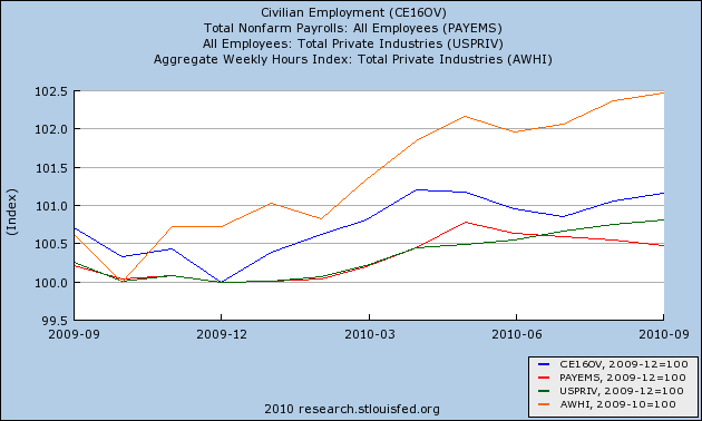
Two days ago in the first installment of this little series I pointed out that the typically reported jobs metric, Nonfarm Payrolls, was not keeping up with almost every other measure of job growth, including private sector jobs, the Household Survey, aggregate hours worked, temporary hires, and the results generated by examining payroll tax withholding. Here's the most applicable graph in case you needed a reminder:
Yesterday I took a more in-depth look at tax withholding, refining the implications of YoY changes in monthly and 12-month incrments. In that post, I noted that Rebecca Wilder had examined the issue also at the Angry Bear. She concluded:
Hours and employment are improving, supporting wage gains and higher tax receipts. But more importantly, the pace of tax receipt growth has not faltered, demonstrating ongoing recovery in the labor market and consumer demand.
But it's not enough. The gains in tax receipts are likely a function of firms adding back hours instead of pumping up the work force. (see my previous post with links on the "hourless recovery").
....
Both series [aggregate hours and nonfarm payrolls] found a trough in the third quarter of 2009, which is consistent with the bottom in tax receipt growth (chart above). However, the hours index has recovered quicker than has its payroll counterpart....
I respectfully disagree. To show why, let's take a look at the historical relationship between aggregate hours and payrolls:
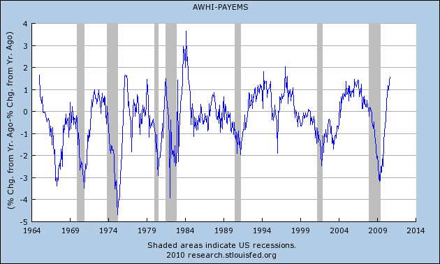
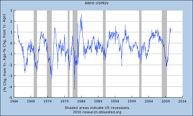
As the above graph shows, it is typical for aggregate hours to outpace payroll growth in YoY% terms in the early part of a recovery. As the expansion matures, payrolls grow faster than aggregate hours worked. The situation now is not atypical at all, particularly when compared with past deep recessions such as 1974 and 1982.
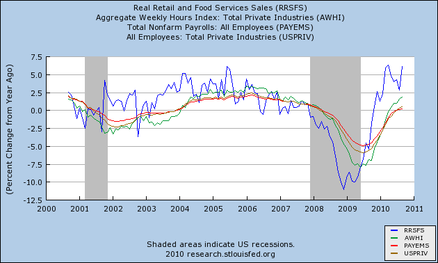
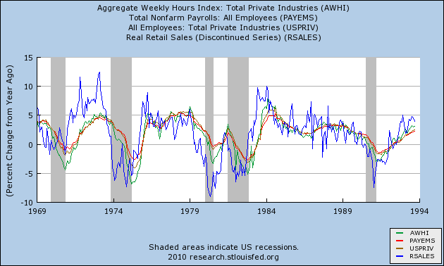
Perhaps surprisingly, it isn't the beatdown being dished out to government jobs that is the difference. Aggregate hours compared with private sector job growth also shows a similar pattern now as compared with recoveries from the steep recessions of 1974 and 1982:
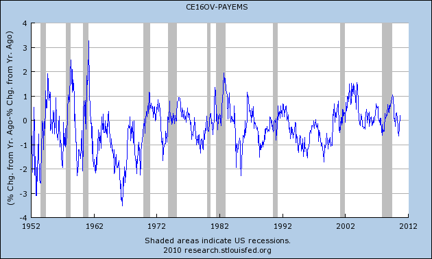
Additionally, despite the difference in growth off the bottom, on a YoY% basis, the household survey and nonfarm payrolls are quite close to one another:
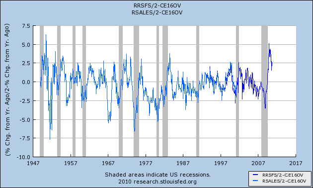
What is magnified this time is the difference between real retail sales and the Household survey, especially late last year:
There has also been a magnified disconnect between growth in real retail sales and nonfarm payrolls. While it does mirror recoveries from past steep recessions:
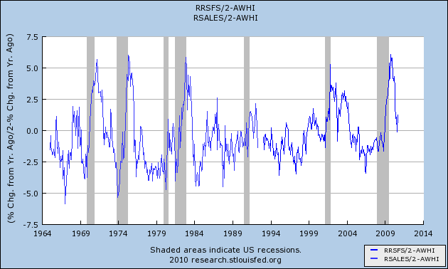
What is particularly noteworthy in the above graph is what happened in the 2002-03 period, more than a year after the bottom of the dot-com recession of 2001. Retail sales briefly faltered in late 2002, and then picked up again - but employment didn't, leading to a period of elevated lags in YoY growth on the order of 2.5%. In all prior cases consumption and employment fell in line no later than one year after significant improvement in retail sales. This is a unique pattern (so far) since the end of World War 2.
In conclusion, as noted yesterday, it seems likely that Nonfarm Payrolls, at least from March 2010 forward, will probably ultimately be revised upward at least slightly, more in accord with the growth of tax withholding and the Household Survey. But much more significantly than that, given the recent resurgence in the US' trade deficit, it seems most likely that if the disconnect between real retail sales growth and job growth as measured by both the Household Survey and Nonfarm Payrolls is probably best explained by the continuing effects of offshoring, as the US stimulates job growth in Asia.
3Q GDP Up 2%; Imports Growing Problem
Real gross domestic product -- the output of goods and services produced by labor and property located in the United States -- increased at an annual rate of 2.0 percent in the third quarter of 2010, (that is, from the second quarter to the third quarter), according to the "advance" estimate released by the Bureau of Economic Analysis. In the second quarter, real GDP increased 1.7 percent.
The Bureau emphasized that the third-quarter advance estimate released today is based on source data that are incomplete or subject to further revision by the source agency (see the box on page 3). The "second" estimate for the third quarter, based on more complete data, will be released on November 23, 2010.
The increase in real GDP in the third quarter primarily reflected positive contributions fro personal consumption expenditures (PCE), private inventory investment, nonresidential fixed investment, federal government spending, and exports that were partly offset by a negative contribution from residential fixed investment. Imports, which are a subtraction in the calculation of GDP, increased.
The small acceleration in real GDP in the third quarter primarily reflected a sharp deceleration in imports and accelerations in private inventory investment and in PCE that were partly offset by a downturn in residential fixed investment and decelerations in nonresidential fixed investment and in exports.
Let's take a look at the individual data points, starting the PCEs

Real PCEs overall are increasing at a decent rate. Also note the pace of quarter to quarter increases in increasing slightly.

Services, which account for the largest percentage of PCEs increased strongly last quarter, in line with the pre-recession pace.
 Non-durable goods expenditures are also increasing in line with their pre-recession levels.
And durable goods purchases are also increasing.
Bottom line: the consumer is adding to the recovery. This time around the consumer was responsible for 2% of overall growth.
Let's turn to investment:

Non-residential structures increased slightly last month, although I would not count on this being a strong area of growth going forward as there is a tremendous oversupply in this area.
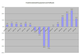 Fixed equipment and software increased, although the pace of increase is decreasing.
After adding to growth last quarter, residential investment subtracted from growth last month.
Gross private domestic investment added 1.54 to the overall growth rate, meaning the US is economy is adding sufficient investment to move forward.
Once again, imports took a big bite out of GDP, subtracting 2.61 from overall growth. This is a very big deal and indicates the import situation is developing into a primary problem going forward.
Yesterday's Market

Yesterday, we had two markets. In the AM we had a gap higher (a), followed by a down, up down market (b). In the afternoon, prices moved higher, but did so very slowly, inching up the EMAs (c).

On the daily chart, the EMAs are still in the most bullish orientation possible (a). In addition, the A/D line and the CMF both indicate new money is flowing into the market (c and d). However, the MACD indicates that momentum is decreasing (b).

The Treasury market is finally starting to sell off a bit. Notice that the shorter EMAs (the 10 and 20) are now moving lower and the 10 day EMA has moved below the 20 day EMA (a). Prices are now below the 50 day EMA as well. The MACD telegraphed this move with the decreasing momentum (a). Also notice the big drop in the A/S and CMF lines (c and d) indicating that money is leaving the market.

It's looking more and more like the dollar is putting in a temporary bottom at these levels. Notice that prices are clustered around the EMAs (a) and the 10 day EWA is now moving sideways. The MACD (b) has given a buy signal (b), although it is still negative. Also notice the A/D and the CMF lines indicate a big move into the dollar. This is either short covering (fairly likely at this part of the cycle) or new purchasers.
Thursday, October 28, 2010
Durable Goods/Case Shiller and Initial Unemployment Claims

The year over year rate of change is still positive. However, the pace of the increase is slowing, indicating that the rate of improvement is decreasing.

The month to month rate of increase shows the decrease in the pace of improvement.
Durable goods:
First, let's take a look at the headline chart -- that is, the chart that shows the total number.
 The month to month rate of change among the cities shows most demonstrated a decrease last month.
The big issue in the existing home market is a massive inventory overhang. Excess inventory = decreasing prices. I wouldn't expect this situation to change in the near future.
For durable goods, let's start with the headline number and chart:

This is a positive chart, as it shows a continued improvement in durable goods orders. However, the devil is in the details. The the biggest "problem" with these numbers is the skewing effect of aircraft orders. So let's look inside the report

Click for a larger image.
New orders without transportation orders (which are 27.5% of all durable goods orders) dropped .8% last month, and has dropped two of the last three months. However, let's look at some of the other parts of the report.
Machinery orders increased 2% last month and have increased 2 of the last three months.
Computers orders increased, but communications equipment decreased sharply. However, communications equipment has increased strongly the preceding two months, so a drop off is not out of line.
In short, the insides of this report is "fair," because it indicates there is still some retooling going on. However, ideally we'd like to see more strength.
Initial Claims:
Claims data offer rare good news on the labor market as initial claims fell steeply to 434,000 in an October 23 week that isn't skewed by special factors. The level is the lowest since July as is the four-week average of 453,250. Given that July's data were distorted by adjustment problems tied to auto retooling, the latest batch of data is perhaps the best so far of the recovery.

This drop in initial claims is welcome news, as it gets us below the 450,000. However, we need this trend to continue for several weeks, and we need this number to more to the 400,000 area and stay there.
The sum total of all this information is clear: the economy is still slow; housing is facing a massive inventory overhang that will prevent price appreciation for some time. The retooling that we saw earlier in the recovery is slowing. However, the employment situation is marginally better. There is nothing to indicate the economy is going to move quickly into a stronger recovery, but there is nothing to indicate an impending crash either.
More Evidence of Increased Pressure on Food Prices
Over the next decade, China's annual grain demand is likely to reach 573 million tons, which is above its current production levels. With marginal increases in crop yield shrinking and arable land harder to find, the bet is on that Beijing may swiftly become more reliant than ever on global markets for an essential class of commodities it is desperate to keep mostly home-grown.
.....Inside China, this has already gone from just bourse play to a matter of public interest. In October, the price of staples like cooking oil and sugar sold in China's supermarkets jumped 10% to 13%. News of food shortages—in corn, wheat, garlic, mung bean, and sugar—have dominated local headlines this year.
Food is a political hot potato, and sharply higher prices in a short space of time can stoke public anger, encourage smuggling, and threaten to up-end China's cherished standard of 95% self-sufficiency in food. Food accounts for a third of the basket of goods used to calculate inflation.
Russia has warned that the extreme drought that ruined its grain crop this year has impeded planting of winter grain, raising fears of another poor harvest in 2011.Elena Skyrnnik, Russian agriculture minister, said on Wednesday that Russia’s farmers were expected to plant about 15.5m hectares of winter grain crops this year, down from an earlier forecast of 18m hectares. Wheat usually accounts for about 85 per cent of total area of winter grain planting in Russia.
.....
Ms Skrynnik said planting of 15.5m hectares would allow for a 40m tonne crop of winter grain in 2011. Last year Russian farmers planted just under 18m hectares of winter grains before the crop was ravaged by drought.
But analysts were sceptical of the minister’s forecast, warning that delays to planting as farmers waited for signs of rain would put winter wheat seedlings at higher risk of failing.
“The government’s forecasts are over-optimistic,” said Andrey Sizov, the managing director of SovEcon, the Moscow-based agriculture consultancy.
The price of sugar is likely to surge to a 30-year high in the coming months, the top traders of the sweetener believe, as the world awaits fresh supplies from India......
The commodity has had a roller-coaster 12 months, plunging from 30 cents a pound to 13 cents in a few months this year. But now it is once again near a 30-year high and this time some traders are even more bullish than last year.
The crucial issue for the global sugar market, just as 12 months ago, is India. But the tables have turned: whereas last year traders were forecasting a poor crop in the country, the world’s largest consumer, now they are looking to India to fill a shortfall in global supplies.
.....
At the same time, there are growing expectations that the harvest in Brazil, which accounts for more than half of world exports, may fall for the first time in years in 2011 as farmers are forced to renovate their ageing sugar cane plantations. In addition, Brazil has used up the stock of cane that it usually carries forward from one harvest to the next, increasing the chance that production will be lower next year.
A closer look at Withholding tax receipts
About a year ago I started keeping track of withholding tax receipts. which are reported daily by the Treasury Department. Doomers were sure that these receipts, which were still running negative YoY, spelled, well, Doom, but I was confident that the trend was bottoming and would reverse until it became positive - which is exactly what happened. Along the way, I've become convinced they are an excellent way of a real-time look at employment, since they are the total of taxes withheld by millions of actual jobholders. You don't pay withholding taxes if you don't have a job!
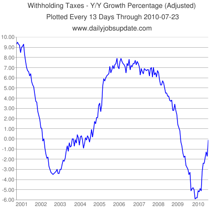
Matt Trivisonno also looks at this data, although he uses a slightly different metric. He also includes several helpful graphs (delayed 3 months for the public) that demonstrate just how useful measuring daily withholding tax data can be. (BTW, Matt's blog is a great source of technical analysis and populist-themed economic commentary). Let's compare the following two graphs. The first is from Matt Trivisonno's blog. It shows the past 12 months' vs. the 12 months previous for tax withholding as a YoY percentage for the last 10 years:
Compare that with this graph of YoY% job growth (red) and aggregate hours in private industry (blue) for the last 10 years:
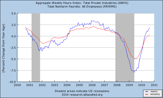
The shape of the graphs is virtually identical. Only the scale of the YoY percentages is different. (Aggregate hours changes at about 1/3 the rate of tax withholding, and payrolls by about 1/4 the rate). It seems clear that comparing the sum of the the entire last 12 months of tax withholding is directly comparable in direction and rate of change to the YoY change in jobs.
Another source making use of withholding tax data is the paid subsription service TrimTabs. In the past I have pilloried TrimTabs for its method of looking at the economy, which is to look at the entire last 12 months of payroll withholding taxes, compare it with the entire 12 months previous to that, and project that trend forward for the economy as a whole. It caused them to make one of the worst calls ever when they used the metric to declare the incipient little recession "over" in April 2008!
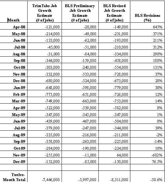
As bad as that analysis was, though, with regard to the specific bailiwick of job creation and destruction, TrimTabs' approach of using withholding taxes to estimate payrolls has been thoroughly vindicated by the Great Recession. Bonddad frequently points out that the birth/death model used by the BLS has been widely accepted by the academic community, and makes inherent theoretical sense, given their methodology of calling businesses to see if they hired or fired within the last month. At the same time, the BLS itself acknowledged in February, as it deducted nearly a million more jobs from its data for the period of March 2008-March 2009, that its birth/death metric had proven to be not properly calibrated for a decline of this magnitude, and was the primary reason for the revision. In fact, TrimTabs monthly payrolls report has proven to be much more accurate during the Great Recession than has the unmodified BLS report. Here is a chart demonstrating that fact through the end of 2009:
Month over month vs. Year over year
One problem with using 12 month sums vs. previous 12 month sums is that it lags terribly when signalling a change in trend. Ideally we would simply measure month over month. But tax withholding is seasonal. Generally May through November are "low tide" while December through March are "high tide" and April is transitional. Thus raw month over month comparisons may not be too helpful.
One way around this is to measure the YoY% change in monthly increments. This signals changes in trend early (as it did beginning a year ago). Measuring taxes withheld in any given month makes intuitive sense as well (if you have 10% more in taxes paid this year than last year during the same month, that suggests payment has gone up ~10% which after adjusting for inflation, ought to render X% more employees paying those additional taxes).
But in the last few months we have had some excellent YoY comparisons with some poor BLS (and TrimTabs - more below) results. Here is a table showing that result, by month, since April of this year, when the YoY% comparison turned positive:
| Month | 2009 Withholding receipts | 2010 Withholding receipts | YoY% change |
|---|---|---|---|
| April | 133.2 | 139.4 | +4.7% |
| May | 126.0 | 126.8 | +0.6% |
| June | 133.8 | 144.4 | +7.9% |
| July | 131.4 | 131.2 | -0.2% |
| August | 126.4 | 135.5 | +7.2% |
| September | 125.2 | 132.1 | +5.5% |
| October | 124.7 | ??? | |
| November | 127.7 | ??? |
At my request, to see if a comprehensive data set would make a significant difference, Rebecca Wilder of the Angry Bear blog earlier this week published the withholding tax YoY% change for a rolling 30 day period, and it shows a similar result, of comparative gains up to about 10% punctuated by several air pockets during the summer:
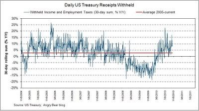
The comprehensive result is in accord with the table above. YoY monthly receipts turned postive in March, and have been positive with two notable potholes (roughly the end of May and the end of July) since then.
Despite the above, every number including census workers since June has been negative. Last month even payrolls exluding census were negative. So the method of simply comparing Month A receipts now vs. one year ago has its drawbacks.
The problem, it appears, lays with using the "first derivative." Suppose the underlying number for consecutive months A and B last year were flat. If this year, month A is up 4% and month B is up 6%, those should translate into actual gains. But suppose instead last year's month B was 10% below month A. Then the same YoY% increase from month A to B still yields a decline in jobs in month B compared with month A - although it would still seem to suggest that both months should be above their respective months last year on a YoY basis. In fact both the BLS and Household Surveys showed YoY jobs to have turned positive in July, even though tax withholding went positive first in April.
Nevertheless, it is clear that YoY monthly increases do signal a change in trend. Here is a continuation of the graph of TrimTabs monthly job estimates vs. the BLS Nonfarm Payrolls numbers for this year so far (with the monthly YoY% increase included as well). TrimTabs turned positive only in March, but since then has been generally yielded higher job numbers than has the BLS:
| Month | TrimTabs estimate | BLS Nonfarm Payrolls | YoY% change |
|---|---|---|---|
| January | -104 | +14 | -6.7% |
| February | -40 | +39 | -2.3% |
| March | +280 | +208 | +5.7% |
| April | +262 | +313 | +4.7% |
| May | +475 | +432 | +0.6% |
| June | -152 | -175 | +7.9% |
| July | -5 | -66 | -0.2% |
| August | -65 | -57 | +7.2% |
| September | -65 | -95 | +5.5% |
| October | ??? | ??? | |
| November | ??? | ??? |
If the YoY% increases by month persist (not guaranteed), it certainly seems that we should be up 1% or more jobs YoY by next spring. In any event, since March the Withholding tax approach has yielded a slightly more bullish result than the BLS' method. So far, October is running more than 5% ahead of last year. Once TrimTabs comes out with their estimate for this month's payrolls, I'll report it here.
Wednesday, October 27, 2010
Yesterday's Markets

Treasury prices have been dropping all week. Notice that prices have gapped lower at the beginning of trading (a and b) and closed near their daily lows (c, d, e)

Yesterday, I noted that prices had moved below the 50 day SMA. Here we see that prices have moved through the 50 day EMA (a). Also note the last two days have printed some strong downward bars. Finally, notice the 10 day EMA has moved through the 20 day EMA.
The Treasury market has been in a strong trend for the last approximately 6 months, which has pulled money away from equities. With Treasuries now falling, some of that money may move toward the stock market.

I also noted yesterday the dollar may be forming a short term bottom. Notice that prices have been bouncing near the 10 and 20 day EMA while the 10 day EMA has now turned slightly positive (a). Also note we could be seeing a selling climax with all the volume (b).

Yesterday, stock prices opened lower (a) with a gap down. The EMAs indicated the overall trend was down, but prices moved into the EMAs several times (b) in a standard pennant pattern Prices moved above the EMAs in early afternoon (d) and then started moving higher, forming downward sloping pennant consolidation patterns several times (d). Overall, prices formed a standard arc (e).

Gold prices are still in an upward trend (A), but they are now sitting right at important support (B). Also note that momentum has shifter, giving a sell signal (C).

Copper is also still in an uptrend (A), but prices appear to be topping (A) and the MACD has given a sell signal (B).

Lumber prices have bottomed (A) but they are not really in a strong uptrend either (B). Notice that prices are sort-of moving up, but there is no solid trend in place. Also note the EMAs (C) -- while bullish -- could be stronger (sharper angles etc...).
The Dips In Congress Want To Legislate a Double Dip Recession
U.S. House Republicans plan to try to slash $100 billion from the federal budget as early as January if they wrest power from Democrats in this year’s midterm elections, setting up possible early showdowns with President Barack Obama on taxes and spending.
Yesterday I described the US economy as a "second gear" economy. The economy is growing, but very slowly. However, there are several points that indicate a spark could lead to growth if given the right impetus. This also means the economy is far more susceptible to shocks such as a cut in government spending.
And no, this is not some theoretical model on which I'm basing this call. Austerity has been tried in the current environment several times and it has uniformly failed.
For example:
Neil Shearing, economist at Capital Economics in London, said the real lesson from the region was that, “aggressive fiscal consolidation at a time when the private sector is also retrenching is likely to lead to much weaker levels of activity and a surge in unemployment”.Much like Spain, Ireland and the UK, the Baltic states were badly hit by the bursting of a credit bubble in 2008 that sent their economies into freefall and their budget deficits soaring.
While others cushioned the impact with stimulus spending, the Baltic trio plunged straight into austerity. As a result, they suffered the deepest recessions in the European Union last year, with Latvia’s economy shrinking by 18 per cent.
The region has since stabilised but, for many ordinary people it still feels like a depression. Wages have plummeted while unemployment has rocketed, with more than a fifth of the Latvian labour force out of work.
And then there is Ireland's High Cost of Austerity:
Nearly two years ago, an economic collapse forced Ireland to cut public spending and raise taxes, the type of austerity measures that financial markets are now pressing on most advanced industrial nations.
“When our public finance situation blew wide open, the dominant consideration was ensuring that there was international investor confidence in Ireland so we could continue to borrow,” said Alan Barrett, chief economist at the Economic and Social Research Institute of Ireland. “A lot of the argument was, ‘Let’s get this over with quickly.’ ”
Rather than being rewarded for its actions, though, Ireland is being penalized. Its downturn has certainly been sharper than if the government had spent more to keep people working. Lacking stimulus money, the Irish economy shrank 7.1 percent last year and remains in recession.
Joblessness in this country of 4.5 million is above 13 percent, and the ranks of the long-term unemployed — those out of work for a year or more — have more than doubled, to 5.3 percent.
And countries that are proposing austerity measures uniformly agree it will lead to lower growth:
Britain will take an axe to its welfare state on Wednesday as part of an 80 billion-pound ($125 billion) cut in public spending that will dictate the future of both the economy and the coalition government.After months of bitter negotiations, Conservative finance minister George Osborne will announce his spending review at 1130 GMT (7:30 a.m. EDT). Cuts of 25 percent on average are in store for most government departments outside priority areas.
Economists are split between those who say the drastic action is needed and those who argue it will tip Britain back into recession. Almost all agree, however, that growth will slow and the Bank of England (BoE) will have to keep monetary policy super-loose for the foreseeable future.
Austerity measures aimed at bringing down Portugal's towering budget deficit are crucial to regain creditor confidence, Finance Minister Fernando Teixeira dos Santos said Saturday, while also acknowledging that they will slow down economic growth next year.Measures contained in the government's 2011 budget proposal are intended to "not only reduce the deficit, but will also regain the confidence of those who lend to Portugal," Mr. Teixeira dos Santos said at a news conference explaining the proposal, which the minority government late Friday had presented to parliament amid continued uncertainty on its approval.
The government expects gross domestic product in Portugal to recover by 1.3% this year, but the harsh austerity measures included in the proposal will contribute to a slowdown in GDP growth to 0.2% in 2011, Mr. Teixeira dos Santos said, because the measures will have an effect on domestic demand.
Folks, this is not difficult. First we have data -- as in facts and figures -- that can tell us is this is a good idea right now. The facts indicate it is not a good idea. And no, this is not some complicated mathematical formula. In fact, it's simple math -- hell, it's even addition which you can do on your fingers for God's sake.
Here is the GDP equation:
consumer spending + investment + exports net of imports + government spending =GDP
So, if we lower government spending (which BTW has historically accounted for about 20% GDP for the last 30 years) we are lowering GDP by definition.
There is a time to put the fiscal house back in order. When GDP growth is slow, unemployment is high, consumer spending is slow, the housing market is trying to recover and demand is soft, cutting spending is a really bad idea -- as in probably the worst idea you can imagine.
Is it a (relatively) "Jobless Recovery" OR are Nonfarm Payrolls underestimating job growth?
Yesterday Bonddad wrote a particularly good summary of the economic situation, I think. As the impetus from manufacturing fades, consumer spending has taken up slack. The economy feels like it is grinding along in slow gear, even though there are some metrics (savings, debt reduction) that like coiled springs could power a much stronger recovery if average Americans felt more confident.
Including census workers, there have been 4 straight months of declines in Nonfarm Payrolls after a strong spring start. Even worse, the BLS announced that in February it will be deducting about 330,000 jobs from the existing reports from March 2009 through March 2010. Is this just another "jobless recovery" or is something else going on?
Bonddad thinks it will take a period of 3-5 months of solid job growth for the recovery to take off again. I would take a slightly different tack, since as I have pointed out many times, consumer spending leads jobs, not visa versa. Last year when I studied this seemingly ad nauseum, I found that the best representation was to take YoY % growth in real retail sales, and divide it by 2. This has generally been a good estimate for subsequent job growth. Here is how that metric stands now:
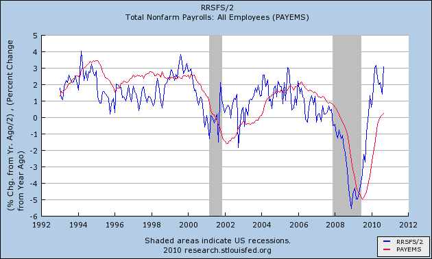
With the strong retail sales numbers from August and September, it certainly appears that nonfarm payrolls are failing to keep up. But that isn't the only metric by which nonfarm payrolls seem unusually punk. Here is a graph that compares growth from the bottom by percent of nonfarm payrolls (red), private jobs (green), the household survey of jobs which is reported each month by the Census Bureau (blue), and aggregate hours worked in private industry (orange):

As you can see, nonfarm payrolls lags all of thee other measures, several of them substantially. In fact, the household survey counted over 1,00,000 more jobs added to the economy than the BLS nonfarm payroll report in the first five months of this year.
Here's a graph showing the American Staffing Association's temporary hiring index, yet another metric that seems completely at odds with the punk payrolls number:
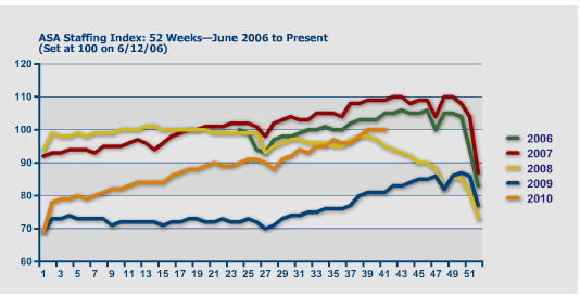
Notice how, beginning with July 2009, this index has risen strongly, taking back about 3/4 of the ground it lost during the downtrurn.
Finally, let's remember that actual withholding taxes have been running between 0% to 15% higher YoY on a monthly basis since about April, averaging somewhere over 5%. This too seems inconsistent with the nonfarm payrolls reports.
Although nonfarm payrolls reports are frequently revised downward during recessions, they tend to underestimate job growth in the first year of a jobs recovery. If so, the 330,000 downward revision might be exclusively confined to 2009, and in 16 months we could find out that the economy actually created many more jobs this year than we have been thinking.
In my next couple of posts, I'll look at the relationship of nonfarm payrolls to the household survey, private jobs, and aggregate hours in more detail. I'll also take a more detailed, nuanced look at the information revealed by the daily tax withholding statements. With the third quarter preliminary GDP report coming out on Friday, I'll also update my graph of real retail sales vs. jobs to include the latest GDP data as well.
Yesterday's Markets

The IEFs are in a very interesting place right now. First, consider (a), when prices first broke through major support. The 10 day EMA moved below the 20 day EMA and prices eventually found support at the 50 day EMA. Now we have the 10 day EMA below the 20 day EMA (b), but prices closed below the 50 day EMA, printing a strong bar. This might now be enough to send prices significantly lower, but it does indicate a major change may be in order for the Treasury market.

Yesterday, the primary action in the Treasury market happened at the open with the big drop down (a). Prices moved sideways until early afternoon, when they dropped though support (b) and then consolidated near the lows of the day (c).
However, consider this in light of the Fed's discussion about buying Treasury bonds. Fundamentally, there is a pretty strong bid coming into the market, which should keep prices from collapsing or falling too far.

Notice that the dollar has seen prices cluster around the 10 and 20 day EMAs (a) on high volume (b). These are signs of a selling climax -- high volume and a lack of major downward price moves accompanying the high volume.
Remember that the dollar and commodities in general have an inverse relationship:

If we start to see a dollar rally -- even if it is a counter trend rally -- it would take some of the upward pressure off of commodities.

Yesterday, stock prices opened lower (a) and rallied, but hit upward resistance at the previous days close (b and c). Prices fell to Fibonacci levels and rallied, this time again to the previous days close.

Oil is still hitting resistance in the 84//bbl area (A). Prices have fallen to the 50 day EMA for support, but the MACD has given a sell signal indicating downward pressure is part of the current trade.
Tuesday, October 26, 2010
The Second Gear Economy
Consumer spending is advancing at about a 1.5%-2% rate every quarter. Consumers are buying necessities, some non-durable luxury goods and durable goods, but not in massive amounts. A high savings rate indicates people are being frugal.
Manufacturing -- one of the primary early drivers -- is slowing. The eastern seaboard Fed districts are the primary cause of this. While the last Empire state number was positive, the latest Philly number was neutral. Industrial production dropped .2% last month and capacity utilization is still very low.
Services: this is an area of the economy that is growing, but slowly. The non-manufacturing ISM numbers are slowing, but still show readings about 50, indicating expansion. The new orders and business activity indexes are also slowing, but are also showing readings above 50.
Investment: business is investing in plants and equipment, essentially replacing worn out capital. Some of this recent increase is the result of delayed investment -- businesses now making investments they intended to make that were put off because of the recession. But some of this is also retooling for increased demand from overseas as well.
Lending: this is also weak. While there are signs of slight increases in the form of increased competition for loans an lower rates relative to the cost of funds, businesses are still reluctant to borrow. Some cite political uncertainty, some cite business uncertainty. I think the primary reason is the lack of demand.
Prices: there is some indication that recent price spikes in the commodities markets are starting to hit producers, but we're not seeing this emerge in CPI yet. With unemployment high there is no pressure from wage increases.
So far, the economy has expanded more or less in line with what I wrote last year in the fits and starts expansion. A combination of manufacturing, consumer spending, exports, inventory restocking and stimulus spending got the economy out of the recession. However, that period is now over; the economy needs a "kick in the pants." Instead, this is an economy stuck in second gear. There is growth, but it is slow. Most importantly, there is no one driver of growth that will pull the other sectors out of their malaise. That is, there is no sector that will take the lead. Everyone is waiting for something to happen, but no one wants to stick their neck out and commit until someone else does.
There are elements that are lining up for growth. Consider the following points:
1.) A high savings rate that would allow consumers to go on a buying spree,
2.) Record low mortgage rates and low home prices that should be encouraging home buying,
3.) Strong growth from overseas that should keep exports high and encourage more exports.
4.) The continued need to upgrade some elements of production.
However, the economy needs a spark to get there. Personally, I think that spark has to be a few months -- say, 4-6 -- of good job growth, say in the range of 150,000-200,000. Consumers and businesses need a clear sign that the worst is over. And the best sign for that would be an improving labor market -- that is the primary piece of the puzzle that is missing right now. Until that change, we're probably stick in second gear.
Beige Book, Part IV: Prices
From the Beige Book:
Input costs, most notably for agricultural commodities and industrial metals, rose further. Shipping rates increased, and retailers in some Districts noted rising wholesale prices. However, prices of final goods and services were mostly stable as higher input costs were not passed on to consumers. Wage pressures were minimal.
Let's take a look at the data:

Producers prices have been very weak over the last few months (A). They had seen much higher levels over the previous 5 years.

CPI has been very weak on a month to month basis over the last year or so (A and B). Notice how weak prices have been in relation to previous months.
Let's look at the anecdotal information from the districts:
Boston: A few firms are facing pricing pressures from rising input costs. In particular, the cost of steel and copper continue to rise as does the cost of wheat, which is used by a food products manufacturer. One responding firm increased prices modestly earlier in the year and anticipates having to raise prices another 1 percent to 3 percent between now and the first quarter of next year to cover rising steel costs. Other companies facing price pressures have strategically increased prices for some of their products and have met little resistance.
Philly: Reports on input costs and output prices indicate little change since the last Beige Book. Most of the manufacturing firms polled in September reported no change from August in the costs of the commodities they use or the products they make. However, some producers of primary metals raised prices. Construction firms gave mixed reports on prices, with some noting steady materials costs and some indicating increases for steel, lumber, and rubber products. Retailers generally noted that most wholesale costs and retail prices have been steady, although some contacts noted recent increased costs for some commodities and higher costs for international shipping. One large retailer said foreign suppliers have indicated that they plan to raise wholesale prices next year.
Cleveland: Other than volatility in steel and commodity prices, the cost of raw materials has been relatively stable. Several manufacturers announced product cost adjustments to reflect changes in steel, copper, and agricultural prices.
Richmond: Finally, our survey contacts reported that raw materials and finished goods prices, as well as wages, increased at a slower pace than in our last report.
Atlanta: District contacts reported that firms were resisting passing higher input costs through to consumers given the ongoing softness in sales. As a result, margins remained very thin. A number of manufacturers indicated that rising costs of materials and employee benefits were likely to be passed on to customers over the next 12 months.
Chicago: Price and wage pressures were moderate in September. Retailers reported wholesale price increases were becoming more widespread. Prices also moved higher for industrial metals like copper, aluminum, zinc, and gold. Shortages of silicone and copper contributed to the increase in industrial metal prices. The depreciation of the dollar was cited as one of the primary drivers of higher demand for gold. Energy costs, in contrast, were steady with natural gas prices at historically low levels. Limited pricing power continued to constrain pass-through of cost pressures to downstream prices. Wage pressures again increased only modestly on balance, although some contacts highlighted large expected increases in the cost of healthcare for employees.
Minneapolis: Overall prices remained level. Minnesota gasoline prices were relatively stable since the last report. Residential natural gas prices were only about 5 percent higher than a year ago. However, scrap metal and plastic resin prices increased since the last report.
KC: Raw materials prices increased, although selling prices and wages remained flat. District manufacturers reported that raw materials prices remained above year-ago levels and expected the upward trend to extend into the next six months. Selling prices in most sectors remained flat since the last reporting period but were generally below a year ago. Menu prices at restaurants increased modestly from month- and year-ago levels, and respondents expected prices to continue to increase, pressured by rising food costs. Firms continued to report little evidence of wage pressures across District labor markets and did not expect pressure in the near future.
Dallas: Selling prices held steady at most responding firms, but there were some reports of increases. Small parcel shipping prices rose slightly while large parcel shipping prices increased sharply, according to contacts. Prices for some petrochemicals rose during the reporting period, and agricultural respondents said commodity prices increased across the board. Food producers were considering price increases because of rising costs for dairy and sugar, and retailers noted higher costs for cotton, corn, wheat, milk and cheese.
SF: Upward price pressures were very limited on net during the reporting period. Commodity prices changed little in general, with the exceptions of continued increases in grain prices and rising prices for metals, particularly copper. Contacts pointed to very limited pricing power for most retail items and service categories, as final prices continued to be held down by weak demand and extensive competition.
Some observations in no order of importance:
- Several districts reported concerns from rising commodities
- However, there is little ability to pass on cost increases
- There is little to no wage pressure.
Yesterday's Markets

First, notice the two lines established from previous highs over the last 10 days.

Prices gapped higher at the open (a), peaked quickly (c) but couldn't maintain momentum so they fell back to a previous support level (c), established a few days ago. Prices dipped over lunch, rallied into resistance (d), moved a bit higher (e), but then fell into the close (f). Also note the increasing volume at the end of the day.

And yesterday we had the "golden cross' -- the crossing over the 200 SMA by the 50 day SMA.

Treasuries gapped higher at the open (a) then traded sideways for a few hours before moving through support (c) in a big way (d). Prices ended near their lows (e) of the day.
 Note that Treasury prices have broken through their uptrend (a) but are now moving more or less sideways (b). The reason for this is fundamental support from the Fed.
The dollar gapped lower (a) at the open and then moved sideways for the rest of the day (b).
