Friday, March 26, 2010

What a Real Recovery Looks Like: and Why We Likely Won't Have One

I am going to examine (graphically) the recovery follow the early 80's recession(s). Specifically, I am going to look at the recovery following the very deep 7/81-11/82 recession that saw unemployment peak at 10.8% and had a major decline in GDP (like our current recession). I am also going to show a comparison of where we are now (compared to where we were then) using the St. Louis Fed's assumption that the recession ended in July 2009 (meaning 7 months from the end). Finally, I am going to demonstrate why we had a very robust recovery following the end of the 1981 recession and why we are unlikely to have a robust recovery this time.

So, let's take a journey back to the early 80's when The Smith's were just getting started, the Weather Channel went live, Ripken had just began his streak, and the last decade in which the Yankees didn't win the World Series.

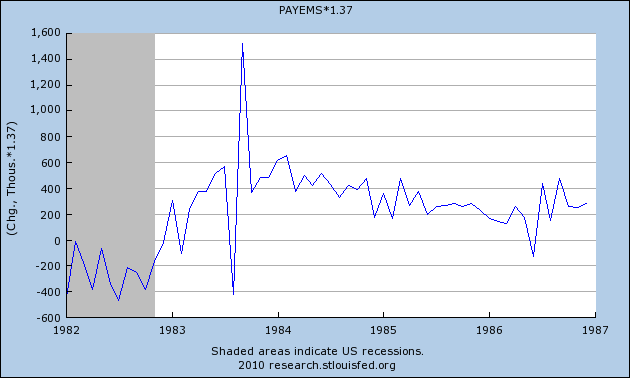
The recession that began in July 1981 (and followed on the heels of a recession that had just ended a year earlier) was the deepest (at the time) since the depression with unemployment topping out at 10.8% and GDP falling 2.6% over the recession. The recovery that followed this recession, however, was very robust (for several reasons) as we can see here looking at the decline in the unemployment rate (compared to GDP) and the change in payrolls (I adjusted this to compare to today's much higher population in rough terms):
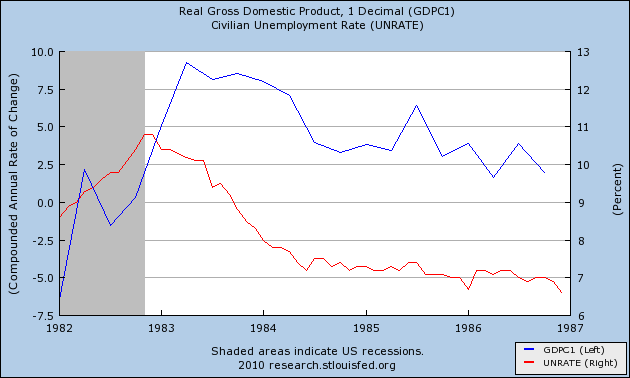
gdpvunemp

adjusted payrolls

As you can see here, the initial recovery was incredibly strong in terms of both employment and GDP, but as the decade languished, unemployment remained stuck around 7% even with consistent GDP growth above 2.5%. The reason I used an adjusted payroll growth number was to give a better illustration for purposes of comparing the positive job gains of the 80's recovery to what we may begin to see later this year (likely next month).

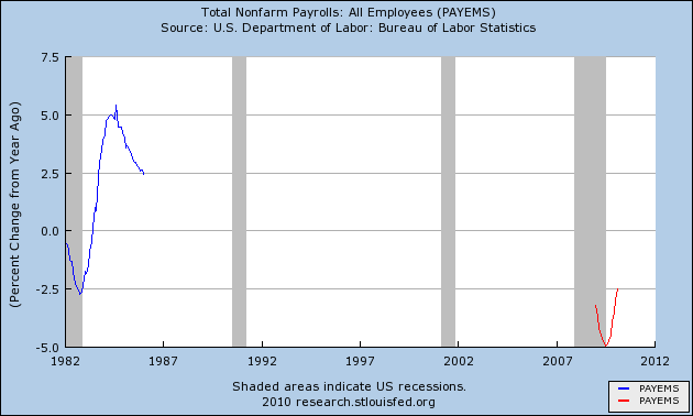
Now, let's look at some comparisons to where we are now versus then (pardon the hard to read nature of these):
payrolls comp

This first graph shows (in percent change terms) payroll growth coming out of each recession. Not only do we start with a larger hole to dig out of, but the early 80's recovery was already positive by now and then exploded over the course of that first year or so (we can use this graph to compare later on this year).

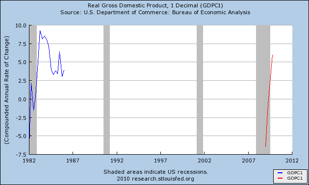
Next, looking at GDP shows us that we are already behind the 80's recovery here and that it is looking highly unlikely that we are going to catch up
gdp comp
as the initial 80's recovery saw two quarters in excess of 7.5% to kick it off, while we are looking at two Q's just above 5%. That will come back to haunt us later.

Finally, let's look at some of the drivers of the 80's recovery and see why we are not set up nearly as well as back then. First up is the elephant in the room, interest rates:
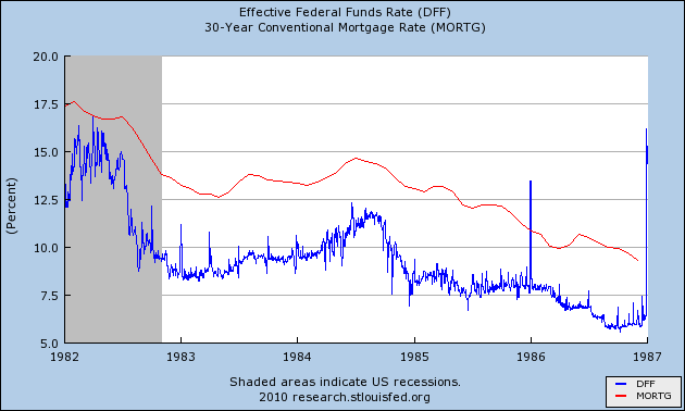
rates

While these look very high compared to today, they essentially fueled the recovery by allowing significant refinancing (and lower business costs) activity that continued for the next 25+ years to some extent. The level of these rates also kept the economy more honest, as everything had to be evaluated against a 10-year bond that was never below 7% for the decade (ie no need to chase yields and speculation). These interest rates also kept savings high
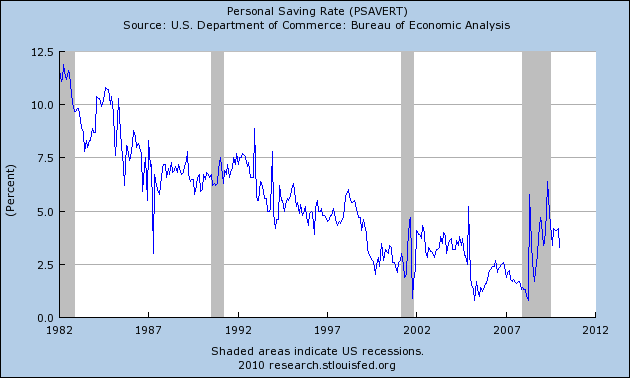
savings

which help to provide an economic backstop and can fuel growth as the rate declines (not necessarily good in the long run, but can lead to larger growth over a shorter term). Finally, we need to look at debt levels, as expanding levels of debt (to a certain point) can have a huge impact on growth
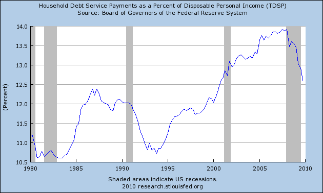
debt percent

and as we can see here, as the 80's progressed we saw debt service jump by nearly 20%, which helped to fuel the expansion.

So what does all of this say about the situation facing us today? Well, we do not have the catalysts that the 80's had to fuel a large economic expansion. Our savings rate is low and looks to be rising (good for long term, but bad in the short run). Our debt service rate high (and even after a spectacular decline is still higher than the 80's peak), which will limit our ability to use household debt (ie consumption) to jumpstart a recovery. Interest rates are already at historic lows, which will prevent significant refinancing activity from helping out families and will also create a huge ceiling on home prices going forward as rates rise. Finally, our initial burst out the gate simply wasn't fast enough to make up the ground we lost. In other words, we are likely going to be facing a recovery/expansion that has many more risks to the downside than it does catalysts to the upside and we will be doing it this time without the luxury of having a Keynesian backstop should we falter again.

For Bruce:
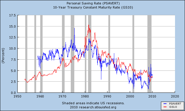
savingsv10year

Weekly Indicators: Rail Traffic, Withholding Tax upside blowouts

- by New Deal democrat

The monthly data widely reported this week was mixed. New home sales hit an all-time low, just barely. Essentially for the last year they have trended sideways. Consumer sentiment about the present ticked higher, but expectations - a leading indicator - ticked lower. Another leading indicator, durable goods orders, increased 0.5% and was the third increase in a row. January's number was revised higher, to a 3.9% increase. The GDP for last quarter was revised slightly lower, to 5.6%.

One item that got little notice, but seems particularly noteworthy, was the report by Edmunds.com that
An early look at March auto sales indicates that sales are currently pacing at a Seasonally Adjusted Annual Rate, or SAAR, of 13.2 million, according to Edmunds.com, the premier resource for automotive information.
"The industry has been recharged by incentives offers from Toyota and other automakers," observed Edmunds.com Senior Analyst Jessica Caldwell. "There is a lot of money in the marketplace right now, and people are responding."
This is only an estimate, of course, but if it close to correct, that will be the highest monthly sales since September 2008 ex-cash for clunkers. Even averaging March with February because of the Toyota issue would yield strong back-to-back sales of about 12 million SAAR, well above the 9 million SAAR low last year.

Update: The American Trucking Association reported that its
Truck Tonnage Index dipped 0.5 percent in February followed a revised 1.9 percent (previously reported 3.1 percent) January gain....

Despite the sequential decrease, the ATA said the SA was up 2.6 percent year-over-year, marking the third straight year-over-year gain. The ATA added that for the first two months of 2010, SA tonnage was up 3.5 percent compared to the same timeframe a year ago.
The weekly indicators varied from warm to downright hot. The ICSC reported same store sales for last week were up +0.1% YoY and +3.7% YoY. In a similar vein, Shoppertrak reported sales up 0.3% for last week and 1.8% YoY.

The E.I.A. weekly report showed gasoline prices increasing again to $2.82 a gallon. Gasoline demand is running equal with last year in the reported text, but the accompanying graph shows it ahead of last year(?!?).

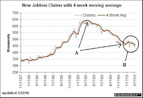
The BLS reported that last week's initial jobless claims totaled 442,000. The 4 week moving average was 453,750. As I said yesterday, the unadjusted number confirms that this time, there is no seasonal distortion detracting from the good number, and it strongly suggests that the continuing trend of initial claims is downward. (P.S.: Someone asked about the revision in reporting without which the number would have been 11,000 higher. It was right in the report. I saw it. I don't consider it material, and it doesn't change my opinion. Go look at the 4-week moving average).
Two reports were of particular note.

In the first, Railfax reported another strong week for rail traffic. All four elements of traffic - baseline, intermodal, cyclical, and total – are increasing, and increasing at a rate faster than last year. Three of the four continue to exceed last year, and baseline traffic now equals last year’s volume on a 4-week moving average basis. Additionally:
“Crushed Stone and Lumber are the two leading indicators of new construction (commercial and residential). Tracking these two economically sensitive commodities gives an up to the minute view of future construction.”
For the first time, both of these are higher YoY, and are increasing as well.

In the second, the Daily Treasury Statement showed $140.1B in withholding taxes paid through March 24. For the same number of days in March 2009, $136.2B was paid. We are currently ahead +$3.9B or 3% for March to date. In a 4 week rolling average basis, we have also pulled ahead for the first time since late 2008: $150.0B vs. $147.0B, for a $3.0B or +2.0% gain YoY. Some but not all of this may reflect census hiring.

As I said yesterday, the signs are accumulating that this will be the month where we actually show job growth.

Treasuries Are At Important Technical Levels


A.) Is this the final break to lower prices?

Here is the reason for the move:

A sudden drop-off in investor demand for U.S. Treasury notes is raising questions about whether interest rates will finally begin a march higher—a climb that would jack up the government's borrowing costs and spell trouble for the fragile housing market.

For months, investors have focused their attention on the debt crisis in Europe, but there are signs the spotlight is turning to the ability of the U.S. to finance its own budget deficit.

This week, some investors turned up their noses at three big U.S. Treasury offerings. Demand was weak for a $44 billion 2-year note auction on Tuesday, a $42 billion sale of 5-year debt on Wednesday and a $32 billion 7-year note sale Thursday.

The poor demand, especially from foreign investors, sent the bonds' prices sharply lower and yields higher. It lifted the yield on the 10-year note to 3.9%—its highest since last June, and approaching the psychologically important 4% mark. That mark has been pierced only briefly since the financial crisis in 2008.

Extraordinary Fed Measures Largely Over

From Bernanke's testimony:

Broadly speaking, the Federal Reserve's response to the crisis and the recession can be divided into two parts. First, our financial system during the past 2-1/2 years experienced periods of intense panic and dysfunction, during which private short-term funding became difficult or impossible to obtain for many borrowers. The pulling back of private liquidity at times threatened the stability of financial institutions and markets and severely disrupted normal channels of credit. In its role as liquidity provider of last resort, the Federal Reserve developed a number of programs to provide well-secured, mostly short-term credit to the financial system. These programs, which imposed no cost on taxpayers, were a critical part of the government's efforts to stabilize the financial system and restart the flow of credit to American families and businesses. Besides ensuring that a range of financial institutions--including depository institutions, primary dealers, and money market mutual funds--had access to adequate liquidity in an extremely stressed environment, the Federal Reserve's lending helped to restore normal functioning and support credit extension in a number of key financial markets, including the interbank lending market, the commercial paper market, and the market for asset-backed securities.

As financial conditions have improved, the Federal Reserve has substantially phased out these lending programs. Some facilities were closed over the course of 2009, and most others expired on February 1.1 The Term Auction Facility, under which fixed amounts of discount window credit were auctioned to depository institutions, was discontinued in the past few weeks. As of today, the only facility still in operation that offers credit to multiple institutions, other than the regular discount window, is the Term Asset-Backed Securities Loan Facility (TALF), which has supported the market for asset-backed securities, such as those backed by auto loans, credit card loans, small business loans, and student loans. Reflecting notably better conditions in many markets for asset-backed securities, the TALF is scheduled to close on March 31 for loans backed by all types of collateral except newly issued commercial mortgage-backed securities (CMBS) and on June 30 for loans backed by newly issued CMBS.2

In addition, the Federal Reserve has been normalizing the terms of regular discount window loans. We have reduced the maximum maturity of discount window loans from 90 days to overnight for nearly all loans, restoring the pre-crisis practice. In mid-February the Federal Reserve also increased the spread between the discount rate and the upper limit of our target range for the federal funds rate from 25 basis points to 50 basis points. We have emphasized that both the closure of our emergency lending facilities and the adjustments to the terms of discount window loans are responses to the improving conditions in financial markets. They are not expected to lead to tighter financial conditions for households and businesses and hence do not constitute a tightening of monetary policy, nor should they be interpreted as signaling any change in the outlook for monetary policy.

The Fed's actions during this crisis have been a primary reason the US did not slip into a depression.

Remember how this started:

See video at about 2:10 for about a minute. The country was literally hours away from a complete financial meltdown in the form of an electronic run on the banks.

The only way to deal with that is a massive influx of liquidity (record low rates) and unconventional programs like those the Fed engaged in. It's really that simple.

But also note that most of those programs are done. And for some reason no one is celebrating that -- or even pointing that out.


Yesterday's Market


Prices gapped higher at the open (A) and then formed a double top (B). Prices moved through support (C), dropped, and then consolidated in an upward sloping pennant pattern (D). Prices then fell to the 200 day EMA (E), rose in another consolidation move and finally fell through the 200 minute EMA (F). Also note the increased volume on the sell-off at the close (G).


A.) The transport average has broken its uptrend on

B.) Increase volume.

Finally -- was yesterday a key reversal day in the market?

According to the standard definition, of course, a key reversal day occurs when the market hits a new intraday high and then closes down. And that, the stock market did on Thursday.

At one point in Thursday's session, in fact, the Dow Jones Industrial Average was up nearly 120 points, reaching the 10,955 level -- a new high for the bull market that began in March 2009. Reclaiming the 11,000 level seemed like a sure thing.

And, then, the rally abruptly lost steam. By the close, the broad market had slipped into the loss column for the session -- though the Dow finished with a 5-point gain.

Dramatic as Thursday's reversal was, though, its bearishness -- in and of itself -- is probably of just short-term significance.

That, at least, is the argument made in the latest edition of Technical Analysis of Stock Trends, the classic textbook on technical chart formations. Written originally many decades ago by Robert Edwards and John Magee, this textbook was updated as part of the latest (ninth) edition by W. H. C. Bassetti, who is an adjunct professor of finance and economics at Golden Gate University.

Forex Fridays


Line A was the primary resistance line for Friday, Monday and Tuesday.

B. Prices gapped higher on Wednesday and then started moving higher on trend line C.

Yesterday, prices again moved higher at point D.


Prices are in a general uptrend, but they have consolidated in two pennant patterns A and B.

Prices moved through line C on a strong upward gap (see chart above) and have continued to move higher (D).

Fundamentally, the dollar is benefiting from the situation in Europe; the dollar is currently seen as an alternative to the Euro which is in a strong downtrend.

Thursday, March 25, 2010

Social Security Payments Exceed Revenue

From the NY Times:

This year, the system will pay out more in benefits than it receives in payroll taxes, an important threshold it was not expected to cross until at least 2016, according to the Congressional Budget Office.

Stephen C. Goss, chief actuary of the Social Security Administration, said that while the Congressional projection would probably be borne out, the change would have no effect on benefits in 2010 and retirees would keep receiving their checks as usual.

The problem, he said, is that payments have risen more than expected during the downturn, because jobs disappeared and people applied for benefits sooner than they had planned. At the same time, the program’s revenue has fallen sharply, because there are fewer paychecks to tax.

Analysts have long tried to predict the year when Social Security would pay out more than it took in because they view it as a tipping point — the first step of a long, slow march to insolvency, unless Congress strengthens the program’s finances.

Let's look at three charts compiled from information provided by the CBO:


Mandatory spending (which included SS) has been increasing as a percentage of the total federal budget. This means that Washington has less and less ability to cut spending without a change in the law.


Interestingly enough, medical payments are the real reason for the increase in mandatory payment increases.

Mandatory spending as a percent of GDP has been pretty stable. This is a very good development as it indicate we're far from the point of financial Armageddon.


Initial Jobless Claims: 442,000 - suggests March job growth


The BLS reported that last week's initial jobless claims totaled 442,000. The 4 week moving average was 453,750. On an unadjusted basis, there were 432,166 initial claims last week, compared with 601,163 initial claims a year ago.

This is the lowest number of initial jobless claims, ex- the overdone Christmastime adjustment during the four weeks at the change of the year, since September 2008. The unadjusted number confirms that this time, there is no seasonal distortion detracting from the good number.

There had been concern that the recent pause in the downturn of initial claims portended a double-dip, or continued job losses. Today's number is important. It strongly suggests that the continuing trend of initial claims is downward. As the withholding tax data suggests (wait for tomorrow), this will finally be the month where - even leaving out census positions - there is actual job growth.

From Bonddad:

Here is a chart of the data:


Note that section B -- while still moving sideways -- is at the lower end of its range. I agree that this is an extremely good development. However, we need to see continued downward movement before I start celebrating.

Yesterday's Market


Yesterday prices consolidated in a triangle pattern, bordered by A and B. Also note the the 200 minute EMA was a primary source of support.


Uptrend A is still intact. This is pretty amazing considering the several angle of this line.

Above resistance (which is now support) we have a consolidation of sorts (B).


Above the line we have a downward sloping pennant pattern (A and B) and important resistance at C.

Thursday Oil Market Round-Up


First, let's start with these two charts. They both show USO on a one year, daily scale:


Do you see any trends worth mentioning?

The oil chart is a mess, largely because there is nothing clear about it in any way, shape or form.


I have no problem with top line (C) -- that's pretty clear cut. But notice that diagonal line B ties together very low points that are pretty far out of the trading range, whereas line A really looks more like a low point of a 6 month trading range.

In addition, consider the EMA picture:


For the last 6 months, the EMAs have been whipsawing around the 200 day EMA. There is really no trend worth mentioning. The USO is in a solid trading range.

Wednesday, March 24, 2010

Durable Goods Increase


From Bloomberg:

Orders for long-lasting goods rose in February for a third month, while inventories and backlogs climbed by the most in more than a year, indicating the manufacturing rebound will keep propelling the U.S. recovery.

The 0.5 percent increase in bookings for durable goods was in line with the median forecast of economists surveyed by Bloomberg News and followed a 3.9 percent gain the prior month, the Commerce Department said today in Washington. Excluding transportation equipment, orders advanced 0.9 percent, more than anticipated.

Business spending on new equipment, inventory restocking and a pickup in global demand mean companies from Boeing Co. to Owens-Illinois Inc. can look forward to sustained sales gains. A pickup in employment is needed to broaden the expansion as the economy heals from the worst recession since the 1930s.


Here's a chart from the Census:


Click for a larger image.

This is another good report that shows manufacturing is in good shape.

Why Aren't Companies Hiring?

From the LA Times:

John Castellani, president of the Business Roundtable, said the reluctance to hire in part reflected uncertainty about the staying power of the economic rebound -- a common refrain of executives.

What's more, companies have complained that they face serious uncertainty over the future of employee-benefit costs given the Obama administration's far-reaching overhaul of healthcare.

Huge gains over the last year in worker productivity -- output per hour worked -- also have reduced the need for additional staff in the near term. The harder people work, the less their employers may feel the need to add to payrolls.

Non-farm productivity rose at a 6.9% annual rate in the fourth quarter of last year after surging more than 7.5% in both of the preceding quarters.

Corporations Have Healthy Cash Levels

From the LA Times:

The brutal recession has left many American families, small businesses and state and local governments in financial ruin or teetering on the brink.

But it's a much different story for the nation's biggest companies. Many have emerged from the economy's harrowing downturn loaded with cash, thanks to deep cost-cutting that helped drive unemployment into double digits.

And although the banking crisis starved countless entrepreneurs for money last year, credit was never scarce for business titans.

Corporate America's robust finances have been a boon for the companies' stocks: On Tuesday, the blue-chip Dow Jones industrial average hit its highest level in nearly 18 months, surging 102.94 points, or 1%, to 10,888.83.


Let's go to the data from the Flow of Funds statement.


Total financial assets increased for all of last year.


Time and savings deposits increased, as did


checkable deposits.


The only asset to show a decrease was money market funds, but given the low rate of return on those that should not be surprising.

Households continue to pay down debt

- by New Deal democrat

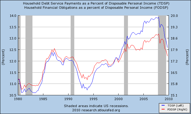
Two of the most important statistics concerning the health of the household balance sheet were released with little fanfare last Friday. They don't lead, and they are reported for the last quarter (in this case, the 4th quarter of 2009), so there is unfortunately a considerable lag, but they are nevertheless quite valuable. These are the ratios of household debt service (blue) and total financial obligations (red) to disposable personal income:


Both continued their steep decline at the end of 2009. Debt service, at 12.60% of disposable income, and total financial obligations, at 17.51%, are at the lowest level since the second half of 2000.

If the trend continues, then by the end of this year, household obligations will be well into the midrange for the 1980s and 1990s. In other words, households will be in much better shape to purchase goods and services than they have been in a long time. This bodes well for the economy going forward in 2011 and beyond.

Wednesday Commodities Round-Up


The longer perspective shows that prices formed a double top in 2008 but dropped like a stone from those levels. Prices then formed an upward sloping pattern (A) but have broken through the trend line (B).


(A) shows that prices are in a clear downtrend, which is confirmed by the extremely bearish EMA picture: all the EMAs are moving lower, prices are below all the EMAs and the shorter EMAs are below the longer EMAs.


Prices were in an uptrend (A) which they broke on Friday morning (B). Prices dropped hard (C) and (D) on several succeeding occasions. They attempted a rally (E) but couldn't maintain upward momentum and have since been moving lower, finding resistance at the EMAs (F).

Tuesday, March 23, 2010

Prophet.net: RIP

Prophet.net is no more. They left the web on March 15. They were purchased by Investools.

I found prophet sometime late in the 1990s when I was still working as a bond broker. They were one of the best technical analysis sites around. I did use them less and less as I started to use quotetracker more and more, but I still referenced some of their sites occasionally.

It is just strange when a web site that has always been there is no more.

Tim Knight -- who founded Prophet.net -- has his own website called Slope of Hope

Pay Limits Don't Send Executives Elsewhere

From the NY Times:

Of the 104 senior executives whose pay was set by the federal pay regulator in the last two years, 88 executives, or nearly 85 percent, are still with the companies even though their pay was drastically cut back, according to people briefed on the government data.

The relative stability, at least within the executive suite, suggests that a soft job market, corporate loyalty and personal pride helped deter the feared management exodus at the companies hardest hit by the pay rules.

Part of the lack of fight is the job market. However, even in a robust job market I don't think we'd see this number below say 65% at the worst. In short, once someone is over a certain amount/year they're fine.


Credit Markets Are Stabilized


The liquid, high grade corporate bond market has done well. While it broke the uptrend (A) it has moved in a sideways consolidation pattern for the last six months. There are two lines of support B and C.


The junk bond market is in the same boat. While it has broken the uptreands of A and B, it is currently moving sideways and has support at C and D.


The mortgage backed market is also in an uptrend (A). While momentum is neutral (B) there is plenty of money going into the market (C). Also note the Fed is nearly done with its purchase programs:

Mr. Bullard also said that though the Fed is on track to end its $1.25 trillion purchase program for mortgage-backed securities, it continues to leave open the option of returning if the housing market needs it.

The Fed has pared down its weekly purchases to about $10 billion, from a high of $25 billion to $30 billion at its peak. The central bank has $14 billion left to purchase in the next couple of weeks, according to latest data from the central bank.

"Yields haven't opened up, and we don't expect much to happen at the end of month, or at the end of program," he said. "All indications are that it's going to be a seamless transition."

Despite the ending of this program, the bottom hasn't fallen out of the MBB market.

And finally, the A2/P2 spread has come in and has been stable for some time.

In short, we're back to normal.

Yesterday's Market


With the SPYs, the main question is this: is (A) a quick forming pennant pattern as the index continues to move higher?


The IWCs have been a big mover. Notice the strength of today's bar. However, the technical indicators are sending mixed signals:

B.) The MACD has given a sell signal but the

C.) A/D is still moving higher.

But


The transports have broken an uptrend.


Treasury Tuesdays


First, let's start with the really long view. Long-term interest rates have been dropping for about 20 years. But, they can't get much lower. In addition, the US is issuing a lot of debt right now, indicating there is a lot more supply coming onto the market. At some point rates will probably have to increase.


Secondly, remember we're in the final leg of a head and shoulders formation. The main question is will prices move lower after they break the neckline?


Arguably prices are consolidating right now. But, I'm not sure which top line I like -- A or B. A only connects two extreme points while B works but only sort-of.

Monday, March 22, 2010

Yes, Virginia, the Stimulus Worked

From the NY Times:

Just look at the outside evaluations of the stimulus. Perhaps the best-known economic research firms are IHS Global Insight, Macroeconomic Advisers and Moody’s Economy.com. They all estimate that the bill has added 1.6 million to 1.8 million jobs so far and that its ultimate impact will be roughly 2.5 million jobs. The Congressional Budget Office, an independent agency, considers these estimates to be conservative.

.....

Of course, no one can be certain about what would have happened in an alternate universe without a $787 billion stimulus. But there are two main reasons to think the hard-core skeptics are misguided — above and beyond those complicated, independent economic analyses.

The first is the basic narrative that the data offer. Pick just about any area of the economy and you come across the stimulus bill’s footprints.

In the early months of last year, spending by state and local governments was falling rapidly, as was tax revenue. In the spring, tax revenue continued to drop, yet spending jumped — during the very time when state and local officials were finding out roughly how much stimulus money they would be receiving. This is the money that has kept teachers, police officers, health care workers and firefighters employed.

Then there is corporate spending. It surged in the final months of last year. Mark Zandi of Economy.com (who has advised the McCain campaign and Congressional Democrats) says that the Dec. 31 expiration of a tax credit for corporate investment, which was part of the stimulus, is a big reason.

.....

The second argument in the bill’s favor is the history of financial crises. They have wreaked terrible damage on economies. Indeed, the damage tended to be even worse than what we have suffered.

Around the world over the last century, the typical financial crisis caused the jobless rate to rise for almost five years, according to work by the economists Carmen Reinhart and Kenneth Rogoff. On that timeline, our rate would still be rising in early 2012. Even that may be optimistic, given that the recent crisis was so bad. As Ben Bernanke, Henry Paulson (Republicans both) and many others warned in 2008, this recession had the potential to become a depression.

Yet the jobless rate is now expected to begin falling consistently by the end of this year.

For that, the stimulus package, flaws and all, deserves a big heaping of credit. “It prevented things from getting much worse than they otherwise would have been,” Nariman Behravesh, Global Insight’s chief economist, says. “I think everyone would have to acknowledge that’s a good thing.”


Folks, this really isn't that difficult.

Here is the GDP equation:

PCE (personal consumption expenditures) + Net Investment + Net Exports + Government Spending = GDP.

At the end of 2008 three of those areas were contracting. That left government spending to take up the slack.

But, the above analysis involves math, which is scary to many people. Even if it's simple addition.

Double Dip or No Double Dip?

Barron's weighed in on the "Will there or won't there be a double dip recession" debate this weekend.

MANY INVESTORS WORRY THAT THE U.S. ECONOMY will slip back into recession this year or next. They shouldn't. More than likely we will just get more of the same: a continuation of the recovery phase that began last year, followed by a moderate expansion through the rest of this year and next, and a painfully slow decline in the unemployment rate.

Don't fret, there is still much to fear. Among the drags and headwinds slowing the recovery are the struggling housing sector, depressed small businesses and hesitant consumers. Add a central bank hoping to extricate itself from its zero interest-rate policy without causing trauma; red ink in state and local budgets, forcing layoffs and cutbacks; and massive federal debt and deficits extending as far as the eye can see.

The latest threat: fear of another credit shock, most recently sparked by talk of a possible default by Greece. For the moment, those fears have receded.

Despite the obstacles, the recovery is likely to persist, but at nothing like the turbo-charged rates after comparable recessions in the mid-1970s and early '80s (see chart below).

In the past, steep downturns have led to steep upturns. The Great Recession of 2007-09 should therefore usher in the Great Recovery of 2010, followed by a strong expansion through 2011. Many of the normal dynamics of bust and boom are going according to script. But given all the difficulties, expect this not-so-great recovery to continue, followed by a not-so-strong expansion.

.....

Combine these figures, and annual growth averaged 4% in the second half '09 -- not a bad start, but lower than similar periods following recessions of comparable depth and duration. Our prognosis from here calls for economic growth to continue to run at an annual rate of 4% through the first half of 2010. Pessimists complain that growth so far has depended too much on working down existing inventories, rather than increased consumer spending and capital investment. While the first half of this year should continue to benefit from inventory reductions, consumption and investment should begin to kick in more of their fair share in 2010.

That should be followed by a slowdown to about 3% through the rest of the year, picking up to a little better than 3% through 2011.

At that rate of expansion, the flat trend in the number of jobs will start turning up again, probably as soon as this month or next. The unemployment rate, at 9.7% in January and February, down from a peak of 10.1% in October, will keep edging down. But it should remain as high as 8.5% even by the end of next year, nearly three percentage points higher than it should be when the economy has achieved "full employment."


In case you're wondering, I think we're in for a slower rate of growth (1%-2%) from a variety of different sectors.

Payrolls vs. New Jobless Claims: Which actually leads?

- by New Deal democrat

Since it is a little bit of a slow economic news week, I wanted to share something that I've noticed but haven't had the time to fully explore yet. The specific trigger for this post is Bonddad's entry Friday taking A Closer Look at Initial Unemployment Claims, in which he noted that
initial jobless claims above 400,000 is not fatal to a recovery. But, a continuing period over 400,000 is probably confirmation of a "jobless" recovery.
Of course, in the past I have noted that actual job growth began at the level of 500,000 initial claims in recoveries from the 1970s and 1982 recessions -- although that was not the case in the 1992 and 2002 recoveries.

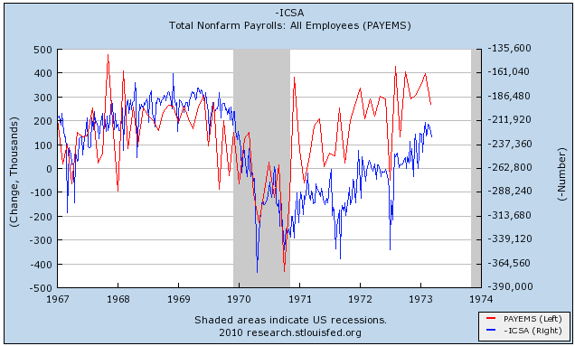
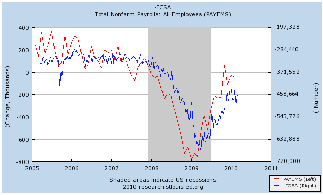
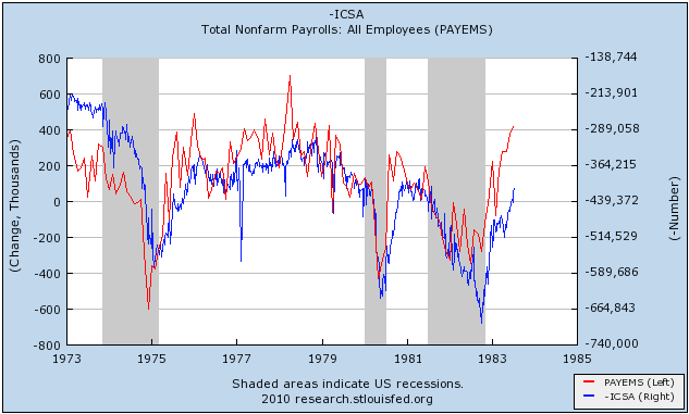
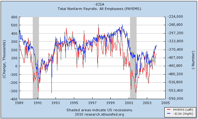
Here's what has been on my mind. Although it doesn't make any rational sense to me whatsoever, even though Initial Claims are a "leading indicator" and nonfarm payrolls are the quintessential "coincident indicator," the fact is that payrolls (jobs) have generally peaked and troughed before Initial Jobless Claims. The troughs are easy to notice, while the peaks tend to be broad and sprawling affairs.

While we have payrolls data back to the Second World War, Jobless Claims data started in the 1960's. Here is the entire 45 year history in 4 graphs, with (courtesy of the St. Louis Fred's new toy) initial jobless claims inverted:


Payrolls peaked in 1967, inverted Initial jobless claims in 1968. The same pattern plays out in 1972 vs. 1973. The 1970 recession is the only one in which jobless claims reached their maximum before payroll losses.


Job losses reached their maximum in the 1974, 1980, and 1981-2 recessions before initial jobless claims. Job gains also peaked before inverted initial jobless claims following the recessions.


Job losses peaked before initial claims in the 1991 recession, and coincidentally in the 2001 recession. Job gains plateaued before inverted initial claims peaked in the 1990s expansion.


During the Bushco expansion, once again payroll gains peaked first. They troughed last January, about three months before the trough in inverted jobless claims.

What seems just as interesting, although I haven't had the chance to explore it fully, is that payrolls also appear to anticipate jobless claims slightly for meso-sized moves during recoveries and slowdowns. Month-to-month payroll data is much noisier than jobless claims data, but in the last year the pattern seems to be holding (emphasis at this point on the word seems) .

Like I said at the outset, we all know that initial jobless claims are one of the 10 "leading indicators" and that nonfarm payrolls is the quintessential "coincident indicator," and yet the graphs don't lie.

So, is the fade of initial claims from the overdone December-January seasonal adjustment, to almost 500,000 new claims a few weeks ago, follwed by improvement to 460,000 last week a prelude to a stall in payrolls data? Or are the current initial jobless claims numbers simply the echo of the November surge in payrolls, followed by the poor December number and the middle-ish January and February payrolls data?

Market Mondays


A.) This is a sharp uptrend. As such, it won't last long as trends this sharp never last that long.

B.) This is a very important line of support as it is the high of the last 6 months.

Also note that along the way, prices have moved through important areas of resistance which are now support.


A.) The EMA picture is still strong: the shorter EMAs are above the longer EMAs, all the EMAs are moving higher and prices are above all the EMAs.

B.) Momentum is still positive, but the MACD is about to give a sell signal.

C.) Money is moving into the market.


For this rally, the small and micro-caps have led the way. as such, their chart can give important clues.

A.) This looks like a rounding top.

B.) The MACD has already given a sell-signal

C.) The A/D line started to move sideways a few weeks ago.