Friday, March 5, 2010

Weekend Weimar and Beagle

It's that time of the week. Don't think about the markets or the economy for the next two times. We'll be back early Monday.


Weekly Indicators: Bonus Weekend Photo Contest

- by New Deal democrat

Another BLS employment report, another negative number. At least for February the -36,000 reported job losses were much better than feared due to blizzard. Back out census hiring and the loss was a little worse, at -51,000. Virtually the entire loss can be blamed on construction workers, both residential and commercial, as well as government employees -- the laggards as I expected per my comments earlier this week. Unemployment remained steady at 9.7%. Average hours worked declined slightly, including manufacturing hours. I haven't crunched the numbers yet, but I suspect we are going to have the first negative LEI in almost a year when February is reported.

Other monthly measures of jobs all were better. The household survey turned higher for the 2nd month in a row. It looks like December was the bottom in that survey, which is now at a 5 month high. The ADP report at -20,000 was tied for smallest preliminary loss since the recession began. The Challenger report was also the best in well over a year. Best of all were both ISM indexes which were consistent with actual job growth in both areas, most likely starting next month.

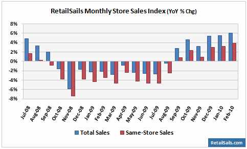
In other news, Retail Sails reported that "Preliminary results show total sales increased 6.0% from a year ago to $28.9 billion for the 30 retailers we track, while same-store sales were up 3.9% compared to a 3.4% drop in the year-ago period."

While the "same store sales" number could be subject to survivor bias, the total sales number probably isn't -- since defunct retailers simply contribute zero.

If general retail sales for February are shaping up decently, car sales dropped to a 5 month low:

2009-12-01 11.201
2010-01-01 10.769
2010-02-01 10.340

This month's car number is also subject to a lot of wiggle room, since buyers would presumably like to stop, as well as drive, new Toyotas. It appears that most prospective Toyota buyers are simply waiting, rather than buy a different brand.

Turning to high-frequency weekly numbers, same store sales for the week of February 27 were up +0.7% YoY and down -0.8% WoW. The 4 week average for February is +0.7% YOY. Shoppertrak reported a much stronger, +4.3% YoY number for retail sales for the week.

Rail traffic showed improvement YoY and comparatively with last week on all indexes. Baseline traffic, however, while improving is still slightly below last year. The culprit seems to be coal. Should we blame it on global warming?

The BLS new jobless claims report decreased to 469,000. The 4 week average also decreased slightly to 471,000.

The E.I.A. reported gas sales once again slightly under last year's, and gas prices rose again to $2.70/gallon. At week's end, a barrel of Oil traded for just under $82.00. Oil's long slow uptrend from last summer is intact, and we look on course to hit the critical $90/barrel or $3/gallon figure in a few months. This is my biggest concern for later this year.

Daily withholding taxes continued to improve. On March 3, 2010, $36.5B had been collected so far this month, vs. $36.2B for the first 3 days of March last year, so we are starting out the month ahead of last year. February finished -2.3% below last year.

Because the same date may fall on a weekday vs. weekend YoY, I am also going to start tracking the 20 day moving average of withholding tax receipts. For the last 4 weeks, $131.9B has been paid this year, vs. $134.7B last year, for a decline of -2.1%.

Withholding tax receipts by month since October are as follows:
Oct. $124.7B -12.8% YoY
Nov. $127.7B -8.8% YoY
Dec. $154.9B - 7.6% YoY
Jan. $140.0B -6.7% YoY
Feb. $ 139.6B -2.3% YoY

And now, this week's special weekend bonus feature ...

The below photo shows something that everybody should see at some point, on their "Bucket List" so to speak. Your mission is to figure out what this is:

Have a very nice weekend and I will give the answer next Friday!

Update: Well I've been busted because apparently y'all can read my file name for the photo!
If you haven't seen it, you should. Until last year, you could stand more or less right next to the glow -- until the hole opened up!

Two Points on Employment/Unemployment


The household number of employed -- which typically bottoms before the establishment survey -- may have bottomed. Note the blue line above.

Secondly -- and this is from Barry over at the Big Picture -- the recent spike up in initial unemployment claims is actually pretty typical.

BLS: Establishment Jobs Drop -36,000; Unemployment Rate at 9.7%

From the BLS:

Nonfarm payroll employment was little changed (-36,000) in February, and theunemployment rate held at 9.7 percent, the U.S. Bureau of Labor Statisticsreported today. Employment fell in construction and information, while temporary help services added jobs. Severe winter weather in parts of the country may have affected payroll employment and hours; however, it is not possible to quantify precisely the net impact of the winter storms on the measures. For more information on the effects of the severe weather on employment estimates, see the box note at the end of the release.


Let's take a look at the report's data.


The unemployment rate appears to have topped out. However,


The jobs picture is floating around 0 rather than positive gains.

From the household survey:

The number of unemployed people increased by 34,000, increasing from 14,837,000 to 14,871,000.

The household employment population increased by 308,000.

Not in the labor force decreased by 176,000.

From the establishment survey:

Total goods producing industries say 60,000 in losses, with the biggest hit to construction at -64,000. Manufacturing actually added 1,000 jobs along with 20,000 last month. That tells us the long increases in various manufacturing measures are starting to lead to some job growth. My guess is the drop in construction employment is weather related.

Service jobs increased 42,000, with a big increase coming in professional services (+51,000). Temp help again increased, this time by 47,500.

Average weekly hours decreased .1 while average hourly earnings increased $.03. Average weekly earnings also dipped because of the decrease in hourly earnings.

I'd call this report fair. The positive signs are in the household survey's increase in employment (which typically leads the establishment survey) and temporary work. That lack of a meaningful increase in jobs is disturbing, however.

Forex Fridays


I've drawn several possible upward sloping trendlines to show the basic fact that the uptrend has been broken.


A.) Notice there is no clear consolidation pattern -- no clear triangle/pennant/head and shoulders. Instead, prices are simply moving between roughly $23.50 and $23.90


Note the price EMA picture.

First, the 10 and 20 day EMAs are now moving sideways, indicating the trend is weakening. However, the 50 is still moving higher.

Also note the 200 day EMA is moving higher, indicating the long-term trend is now up.

So far, this chart looks to be consolidating.

Yesterday's Market

In the Market Monday's column I wrote the following;

Are the SPYs moving into an A/B/C (up/down/up) pattern? Let's take a look.


The chart for the week confirms that we're in the middle of a standard A (move up), B (pennant/consolidation pattern) C (second leg up) pattern.

Also note the EMA picture that is evolving. The shorter EMAs are above the longer EMAs, all the EMAs are moving higher and prices are above all the EMAs.

This trend is confirmed by the underlying technicals:


A.) Momentum is increasing

B.) Money is flowing into the market.

The big wild card right now is the employment report.

Thursday, March 4, 2010

Beige Book Sees Continued Improvement

The Fed released the Beige Book yesterday. This is a great piece of work for anyone interested in the economy. It presents a general overview of economic activity.

Reports from the twelve Federal Reserve Districts indicated that economic conditions continued to expand since the last report, although severe snowstorms in early February held back activity in several Districts. Nine Districts reported that economic activity improved, but in most cases the increases were modest. Overall conditions were described as mixed in the Atlanta and St. Louis Districts, though St. Louis noted further signs of improvement in some areas. Richmond reported that economic activity slackened or remained soft across most sectors, due importantly to especially severe February weather in that region.


Let's go to the data to get some more detail.

Consumer spending showed signs of improvement in many Districts since the last report but was hampered in several regions by severe weather conditions in early February. Retail sales improved in the Chicago, Minneapolis, Dallas, and San Francisco Districts, and New York said sales were well above year-ago levels in January and met expectations in February despite inclement weather. Philadelphia also reported that sales were moving up slowly until snowstorms hit in February. Boston and Cleveland characterized sales as mixed but slightly higher overall than year ago levels. Sales were lower than expected in the Atlanta and Kansas City Districts and were down from year-ago levels in the St. Louis District. Several Districts reported that sales were strongest for lower-priced items, while sales of luxury and big ticket items remained sluggish. However, San Francisco noted scattered reports of increased discretionary spending, and Cleveland said some retailers noted a broader, if still slight, increase in demand across a variety of products. Inventories were being managed carefully and held at fairly low levels in most Districts, but Chicago said rising sales were leading retailers to begin rebuilding inventories from low levels.


For more on this, see the recent post on personal income.

Nonfinancial services activity was reported as steady or improved by the majority of Districts. Boston, St. Louis, Minneapolis, and San Francisco reported generally solid demand in health-care services, although Minneapolis noted continued weakness in elective procedures. New York indicated that a growing number of service firms planned to increase capital spending in the months ahead, but investment expectations diminished among high-tech companies in the Kansas City District. Richmond reported that service revenues fell due to the record snowstorms, but a few contacts saw a slight pickup in demand, particularly architectural firms, hospitals, and financial service professionals.


See yesterday's post on the ADP employment report for more information -- this ADP report is largely concerned with service sector employment.

In addition, the ISM released their non-manufacturing index yesterday:

"The NMI (Non-Manufacturing Index) registered 53 percent in February, 2.5 percentage points higher than the seasonally adjusted 50.5 percent registered in January, indicating growth in the non-manufacturing sector. The Non-Manufacturing Business Activity Index increased 2.6 percentage points to 54.8 percent, reflecting growth for the third consecutive month. The New Orders Index increased 0.3 percentage point to 55 percent, and the Employment Index increased 4 percentage points to 48.6 percent. The Prices Index decreased 0.8 percentage point to 60.4 percent in February, indicating an increase in prices paid from January. According to the NMI, nine non-manufacturing industries reported growth in February. Respondents' comments vary by industry and company about business conditions."


Here is a chart of the relevant data:


Notice the clear improving trend that has been in place since the end of November 2008.

Manufacturing activity increased further in most Districts, although Minneapolis, Dallas, and San Francisco characterized overall activity as flat or mixed. Philadelphia reported widespread production increases across most industries, and manufacturers in the Cleveland District reported a general rise in capacity utilization. Many Districts reported strong production in metals, and the Boston, Dallas, and San Francisco Districts noted strength in high-tech equipment, particularly semiconductors. Cleveland, Chicago, St. Louis, and Dallas noted solid improvements in auto-related manufacturing. A consumer goods company in the Boston District said European sales were at healthier levels. Contacts in the Chicago District reported strong growth in Asian exports but remained concerned about China's underlying economic strength. Dallas reported that exports for natural-gas based products remained strong, but weak demand for refined products has trimmed margins and cut capacity utilization further. Construction-related activity remained weak in the Chicago and Dallas Districts, and new orders for commercial aircraft and parts were sluggish in the San Francisco District. Philadelphia and Richmond noted productions delays due to the winter snowstorms in February, but some factories were able to make up the losses with longer work hours and extended shifts. Several manufacturers in the Philadelphia District said production gains could be limited due to continued tightening in credit markets and adverse developments in taxes and regulations. Plant managers in a few Districts reported that a large number of customers were simply restocking inventories, leading to concerns about the sustainability of the increase. However, contacts in most Districts remained optimistic for future months, with several reports of planned increases in capital spending.


For more detail/information, see the latest post on the ISM manufacturing data.

Residential real estate markets improved in a number of Districts, remained weak or softened further in the New York, Atlanta, and Chicago Districts, was little changed in the San Francisco District, and characterized as mixed in the St. Louis District. Richmond also reported overall housing activity as mixed, but one contact noted that absent the harsh weather, market conditions might have improved. Adverse weather conditions also hampered home sales and construction in the New York, Philadelphia, and Atlanta Districts. Most Districts attributed stronger home sales to the home-buyer tax credit, with several contacts apprehensive about future sales once the credit expires on April 30. Philadelphia, Cleveland, Kansas City, and Dallas reported that sales were strongest for low-priced and starter homes, while Dallas cited financing difficulties for high-end homes. Home construction was down or stagnant in most Districts, with the exception of the Minneapolis, Kansas City, and Dallas Districts. Atlanta said the most pronounced weakness was among Georgia homebuilders, and San Francisco attributed weak construction activity to elevated home inventory levels. Home prices mostly remained flat or declined slightly, but signs of improvement were noted in the Boston and San Francisco Districts. A real estate agent in a relatively upscale area of the New York District said prices have continued to drift downward but that short sales were relatively rare and most transactions were still above the mortgage balance.

Commercial real estate conditions remained weak or declined further in most Districts, although some Districts noted slight stabilization or modest signs of improvement. Commercial real estate activity weakened in the Richmond, Minneapolis, Kansas City, Dallas, and San Francisco Districts, though Dallas noted that leasing fell at a slower rate and San Francisco cited increased leasing in some segments. Boston and Philadelphia said conditions remain weak, but both noted some improvement in sales of commercial space. New York reported softer activity in the New York City area but some steadying in vacancies and rents elsewhere, while St. Louis said activity remained weak throughout the District. Several Districts also noted that many tenants were pushing for, and in some cases receiving, concessions on rents. All Districts reporting on commercial construction said that activity remained weak or slow, except for some moderate boost from federal stimulus projects and other public construction. Credit for commercial development and transactions was still very difficult to obtain in several Districts, though San Francisco noted a slight improvement in financing availability.

Housing is not doing well. New homes sales are bouncing along the bottom and existing home sales have dropped sharply over the last two months. This is an area of the economy where we need to see more improvement and quickly.

The pace of layoffs slowed in most Districts, but hiring plans still remained generally soft. New York cited a slowdown in layoffs at a securities firm and noted a pickup in hiring in what was still characterized as an exceptionally weak legal industry. Staffing firms in the Boston District also saw a strengthening in demand, particularly from the financial and manufacturing sectors. Several manufacturing and construction firms in the Cleveland District began recalling workers, and temporary staffing accelerated in the Richmond, Atlanta, and Chicago Districts. However, Chicago said demand for permanent workers was low, and a manufacturing contact in the Richmond District held back employment due to productivity improvements. Layoffs were also reported at several retail and manufacturing firms in the Dallas District, and Minneapolis said companies in the medical insurance and financial services industries reduced employment. Wage pressures were minimal, but Boston and Cleveland noted a lift in salary freezes and Richmond said wages rose at service and retail businesses.

The opening sentence says it all -- layoffs have slowed (but they are stuck at uncomfortable levels right now) but there is no hiring yet. In short, the bleeding has stopped but we aren't getting better from there.

The bottom line is clear: the economy is continuing to improve.


ISM Employment and Nonfarm Payrolls

- by New Deal democrat

First of all, I want to thank our co-blogger Invictus who has been corresponding with the St. Louis Federal Reserve about adding new data series and functions to their Fred site. Among the items he asked them to add were the ISM non-manufacturing subsets, and they have now done so.

That comes in handy, as the ISM non manufacturing index was released yesterday, rising more than expectations to 53.0. The business activity sub-index rose from 52.2 to 54.8, and new orders rose from 54.7 to 55.0. Inventories are still contracting (a good sign) but a little more slowly at 46.0 . The employment sub-index also rose, from 44.6 to 48.6 - which means that employment is just barely contracting.

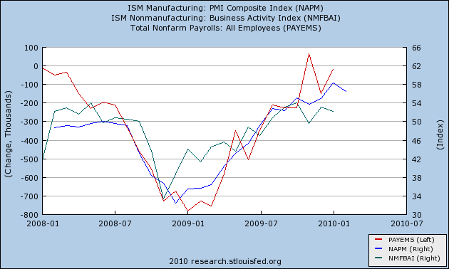
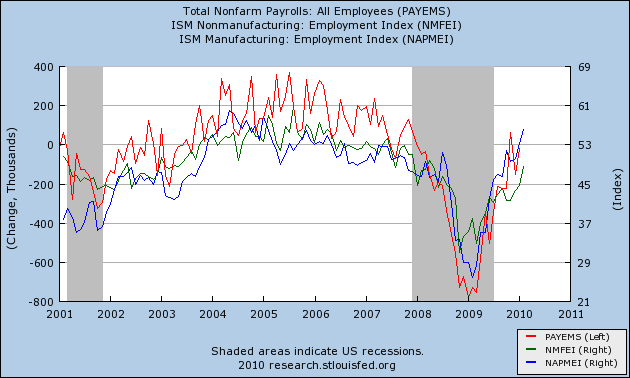
So I am now able to post this graph comparing ISM manufacturing employment (blue) with ISM non-manufacturing employment (green), and nonfarm payrolls (red):


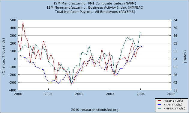
It is fair to state that neither employment sub-index leads the BLS's nonfarm payrolls number, but it does help highlight the unique divergeance of manufacturing vs. nonmanufacturing payrolls in the last 8 months. During all of 2002, both sets of employment numbers moved together. In 2003 they diverged, but it was retail employment which held up and manufacturing employment that declined -- and that was consistent with the nonfarm payrolls data.

Please also note, jobs were (just barely) added in mid-2002 even though both employment indexes were below 50 but were above 45 -- so today's employment subindex number of 48.6 is no impediment to actual job growth. A nice scatter graph showing that an ISM services employment reading over 47.5 has almost always coincided with services job growth is available at Calculated Risk here .

This time around, as I have mentioned a number of times previously, services employment was much more severely impacted by layoffs than in prior recessions -- instead of being about 10% of the layoffs, they were fully half -- about 4 million jobs.

Given the "Bifurcated recovery" I wrote about on Monday, and the fact that my "leading employment index" which predicted job growth in November or December +/- 1 month looks like it came close, but not cigar, I have been thinking about what would best tweak the index to make it more predictive.

One obvious way is to insist that GDP growth appear like it could equal 2% YoY in the current quarter. That wasn't going to happen in 4Q 2009, even with the first report of 3.8% annualized growth in the 3rd quarter. Another way is to include either housing permits/starts and/or the ISM non-manufacturing index in a weighting with ISM manufacturing to form that component of the index. That is to say, manufacturing isn't the only leading component of the economy, so is housing, and services tend to come back first before goods-producing jobs, so a better index might include a weighting of those.

Based on the above, although the non-manufacturing index is only 13 years old, it appears that its business activity subindex does add value to any leading employment index for nonfarm payrolls, as set forth in the two graphs below:

Here they are for the 2001 recession:


and here they are for the current recession (minus yesterday's reading):


My original "Leading Employment Index" relied on an ISM manufacturing reading above 53. We can tweak that in a manner consistent with both above graphs by insisting on the following:

(1) the ISM manufacturing index be above 50 and ISM non manufacturing business activity above 48 as an initial signal; and
(2) both indexes be above 52 and average 53 or higher as a final signal, which gives one or two months' lead time to job growth. That signal was triggered for one month in October (accurately) and the ISM non-manufacturing business activity subindex just fulfilled this part of the signal again yesterday.

As I see it, the only way employment doesn't turn positive by next month would have to be very large layoffs in the construction industry overwhelming hiring in manufacturing and services. We'll see how that pans out.

Yesterday's Market


A.) Prices broke an upward trend line and

B.) Have found technical support in the 112 area.


Prices have moved through resistance at points A and B.


The EMA picture is now bullish. The shorter EMAs are above the longer EMAs, all the EMAs are moving higher and prices are above all the EMAs.

Thursday Oil Market Round-Up

There is a central point to all three of the following charts: oil is clearly in a price range and has been there for about four months. From the trading side, we need to see a strong move either above ~42 or below ~35.


The USO chart using week long bars


The same chart using a year time frame.


The six month chart using daily bars.

Wednesday, March 3, 2010

ADP Reports Drop of 20,000 jobs

From ADP

Nonfarm private employment decreased 20,000 from January to February 2010 on a seasonally adjusted basis, according to the ADP National Employment Report®. The estimated change of employment from December 2009 to January 2010 was revised down, from a decline of 22,000 to a decline of 60,000. The February employment decline was the smallest since employment began falling in February of 2008.

Two large blizzards smothered parts of the east coast during the reference period for the BLS establishment survey. The adverse weather had only a very small effect on today’s ADP Report due to the methodology used to construct it. However, the adverse weather is widely expected to depress the BLS estimate of the monthly change in employment for February, but boost it for March. Therefore, it would not be unreasonable to expect the BLS estimate for February (due out this Friday) to be less than today's ADP Report even though the BLS estimate will include the hiring of temporary Census workers not captured in the ADP Report.


Let's look at the data. Click on all images for a larger image


Note the ADP and BLS report are highly correlated.


Note that manufacturing -- especially small manufacturing companies -- are the primary reason for the drop in goods producing industries. Services are adding jobs -- especially in the medium size group. Also note the following chart of service jobs:


Once again we have a comment on how the weather is effecting the numbers. Again, I'm not sure about the accuracy of these statements, but I could be wrong.

Greece Announces Spending Cuts And Tax Increases That US Will Have to Eventually Make

From the WSJ:

The government decided at a cabinet meeting to move ahead with steep cuts in civil-service salaries and entitlements, and to raise Greece's sales tax by two percentage points.


Several weeks ago I posted a long article on the federal budget. The simple truth facing the US is clear: once we're through this recession we have to do two politically unpalatable things: cut spending and raise taxes. One won't accomplish the task as it is insufficient to seriously cut the deficit.

I was watching a Sunday AM news program a few weeks ago when I heard David Brooks comment that now is the time when a third party is most viable. The reason he cited was dead-on accurate: Democrats won't cut spending and Republicans won't raise taxes. That is the political reality of Washington where fiction has become a way of life.

Wednesday Commodities Round-Up


A.) Prices rebounded to the Fibonacci level, and then encountered a bit of upside resistance.

B.) The shorter EMAs (the 10 and 20) are moving higher, although the 50 is moving sideways. The EMAs are also in a very tight orientation which is not very bullish. Also, volume has been very low.

Yesterday's Market

I use the IWMs and IWCs as risk proxies -- that is, if people are willing to put money into the smallest companies in the market, then they are willing to take more risk. I consider this a bullish sign.


A.) Note the number of strong bars since the beginning of February. Also note there have been several gaps higher -- another bullish sign.

B.) Prices consolidated, although not in a conventional pattern.

Prices have moved through important resistance points C and D.

Finally, there was a very large volume spike yesterday.

Tuesday, March 2, 2010

ISM Drops But Still Positive


From the ISM:

"The manufacturing sector grew for the seventh consecutive month during February. While new orders and production were not as strong as they were in January, they still show significant month-over-month growth. Additionally, the Employment Index is very encouraging, as it is up 2.8 percentage points for the month to 56.1 percent. This is the third consecutive month of growth in the Employment Index. With these levels of activity, manufacturers are seemingly willing to hire where they have orders to support higher employment."

Personal Income Up; Disposible Income Down

From the BEA:

Personal income increased $11.4 billion, or 0.1 percent, and disposable personal income (DPI) decreased $47.6 billion, or 0.4 percent, in January, according to the Bureau of Economic Analysis. The decrease in DPI reflected an increase in federal nonwithheld income taxes. Personal consumption expenditures (PCE) increased $52.4 billion, or 0.5 percent. In December, personal income increased $41.2 billion, or 0.3 percent, DPI increased $40.3 billion, or 0.4 percent, and PCE increased $26.4 billion, or 0.3 percent, based on revised estimates.


Let's go to the data:


Service wages are up, and have been increasing for most of last year. However,


Goods producing industries are seeing their wages stall. This makes sense, given that manufacturing employment is taking a massive hit during this recession.


After five months of increases, disposable personal income dropped.


Note that total PCEs (personal consumption expenditures) have been increasing since July.

Service expenditures -- which account for about 65% of total PCEs -- are a large reason for that increase.


Non-durable purchases appear to have stalled, but are still at higher levels than lase year.


Durable goods purchases have been increasing for the last four months. This is very good news as it indicates cash for clunkers did not skew purchases forwarded as feared.

Getting it wrong about Retail Sales and Sales Tax Receipts

- by New Deal democrat

Well (sigh), Mish is at it again.

He claims that retail sales aren't actually increasing because state sales tax receipts are in continued decline on a YoY basis. Once again, he misuses YoY comparisons, and ignores them when they contradict his case (which is often). This is the very same type of analysis he did back in June when he claimed that "Rail traffic is horrific with no end in sight." I called him on that, pointing out that simple YoY comparisons, without noting the most current trend in those comparisons, missed turning points -- and that it looked like more recent comparisons showed that rail traffic was about to turn up. In fact that is exactly what happened, and for some reason Mish hasn't commented on rail traffic in awhile.

He had the same problem analyzing the CS-CPI, noting in September how awful it was on a YoY basis, citing February 2009 YoY data! In fact, as I pointed out, that metric too was improving YoY, and as we saw last week, the CS-CPI is now positive YoY. For some reason Mish hasn't commented on the CS-CPI for awhile either.

Now he is making the exact same error with regard to state sales tax receipts. The meat of Mish's article is that state sales taxes continue to get worse and worse. He quotes or lists reports by state for 6 states, and I will not only rebut him state by state, but will examine several more states examined in an article to which he links apporivingly.

I. The starting point for our examination is national sales tax information. To begin with, Mish makes the observation that
unadjusted numbers vs. a year ago are the only valid way of looking at data. Same store sales, comparisons to projections, and non-seasonally adjusted comparisons to the previous month are all bogus comparisons.
I agree that, if we can't gauge seasonality in the data to enable valid month-over-month comparisons, then we should at very least take a look on a month-by-month "unadjusted numbers vs. a year ago" to see whether the YoY comparisons are getting better or worse -- this is what Mish failed to do with either railroad data or the CS-CPI, and why both of those data series moved against him.
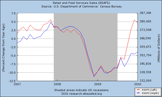
To show you what I mean, let's look at the actual retail sales series, unadjusted for inflation. In the graph below, the amount of sales are in blue, measured on the right scale; the YoY % change is in red, measured on the left scale:


Now this graph is pretty straightforward. Both measures hit their low point in December 2008 -- but the YoY % change didn't turn positive until 11 months later, in November 2009!

So if state sales tax receipts were consistent with that, on an apples to apples basis, the YoY unadjusted receipts Mish cites ought to start turning positive in November 2009, even though the actual bottom was nearly a year before. Furthermore, the maximum YoY % decline should have occurred in December 2008.

II. Now let's turn to Mish's argument and the actual data.

As to the national sales tax data, John Liscio puts out a monthly compilation of state sales tax receipt information. According to a Reuters summary of his December 2009 report, 13% of states showed growth, compared with none showing growth in November. You would think that would be an improvement in the trend. Not according to Mish:
"note that only 13% of states are reporting growth which means that 87% of states have flat to declining sales. Amazingly the headline has a positive spin that revenues was up.

Even then, close observers will note that revenues were up vs. projections. That does not mean they were up at all. That was very sloppy reporting, at best."
Except that the article very specifically uses "unadjusted numbers vs. a year ago." exactly what Mish calls "the only valid way of looking at data." The article says:
In November, no state registered sales tax revenue growth over the year, but by December 13 percent enjoyed growth.
.... Those numbers could change quickly, it said. The states reporting year-on-year growth were concentrated in the Midwest, where the federal automobile industry bailout boosted manufacturing sales and inventories.
(my emphasis)

The data support exactly what the Reuters story claimed, and the data is reported exactly the way Mish claims is the only correct way to report it. So it is Mish, not the reporter, who has a sloppy, spinny way of looking at the data. And the data turns positive in 1 in 4 states only one month after the unadjusted retail series discussed above.

In a subsequent post, just to "drive home" his point, Mish posts the following graph of sales tax receipts:


If minds were truly inquiring, they would note that this is a graph of annual data, with the most recent data point that for the entire year of 2009, which as we've pointed out above obviously came in less than 2008 when the recession was just getting underway. Duh! This is badly lagging data and tells us zero, nada, zip, nothing about the current trend. For that, we have to examine monthly data, which we'll do below.

As an aside, Mish is so proud of himself that he actually also cites this graph:


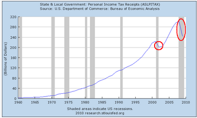
as further proof that the recession isn't over, and helpfully circles bottoms, which very clearly show that the data series is a lagging indicator that in the past has bottomed after the recession ended. That's His. Own. Graph!

III. In support of his thesis, Mish copies and pastes news reports or data from 6 states: New York, Indiana, Texas, Tennessee, Alabama, and Georgia. Let's look at what the monthly data on sales tax collections for each of those states actually shows.

Mish cites a newspaper article about New York that compares 2009 to 2008 collections on an annual, not monthly, basis, and found a 5.9 decrease in collections statewide. Not only is it a no-brainer that tax collections got worse as the recession deepened from the first to second year, but this method, of course, is precisely NOT what Mish claimed was the proper way to look at sales tax collections. In fact, had he actually checked by month, he would have found that
- in January 2010, sales tax receipts were down -2.0%.
- In December, they were UP 5.0% YoY.
- In November, they had been down -4.3% YoY.
- In October they were down -3.3%.
While the trend is a little erratic, it is nevertheless improving.

Next Mish cites Indiana, and gives the following list of monthly comparisons (YoY percentage changes are mine):

December 2009 Sales Tax: 476,111,101.58 (-4.3% YoY)
December 2008 Sales Tax: 497,628,352.13

November 2009 Sales Tax: 473,363,430.53 (-6.1% YoY)
November 2008 Sales Tax: 504,327,778.19

October 2009 Sales Tax: 485,658,222.21 (-11.1% YoY)
October 2008 Sales Tax: 546,284,648.12

In other words, the trend is that Indiana's sales tax receipts are rapidly approaching positivity YoY, and may well have bottomed in November 2009.

Texas is literally the ONLY state whose sale tax receipts support Mish's opinion. Mish gives the following list (again, YoY percentages are mine):

January 2010: $1,655.3 million (-14.2% YoY)
January 2009: $1,928.3 million

December 2009: $1,653.1 million (-11.6% YoY)
December 2008: $1,869.4 million

November 2009: $1,696.9 million (-15.4% YoY)
November 2008: $1,983.1 million

October 2009: $1,517.9 million (-12.8% YoY)
October 2008: $1,739.8 million

I'll give him Texas.

Mish next turns to Tennessee. whose tax commissioner, Dave Goetz said as to January 2010,
For the first time in many months, the total Tennessee tax collections were actually a bit above the level of the prior month a year ago
Mish actually highlights the fact that the receipts came in less than estimates -- again, not the method he himself accepts as being valid.

Since I don't have a clue what Mr. Goetz actually meant, I went to the data, which showed that total Tennessee tax collections were actually UP 1.16% from a year ago. To be fair, since I want to stick with sales taxes,
- in January, those were down -1.8% YoY.
- This is better than December, when sales tax collections were down -2.9% YoY.
- November's were down -4.5% YoY.

Tennessee doesn't support Mish's argument either.

Mish makes his most hilarious mistake when he turns his attention next to Alabama,, citing an article that states:
Taxes collected by the state Education Trust Fund continue to jump around from month to month, with tax collections in January dropping 17.5 percent, or $80.7 million, compared to January 2009, the state finance department reported Monday.

That followed a gain of 13.5 percent in December compared to December 2008 and a drop of 6.7 percent in November compared to November 2008.
Of course, the discussion isn't about corporate or estate taxes, it is about sales tax receipts, and had Mish moved his gaze ever so slightly to the left, he would have seen, clear as day in the accompanying chart, that sales tax receipts were UP 7.2% in January 2010 vs. January 2009.

In short, Alabama's statistics actually contradict rather than support Mish.

Finally, Mish turns his attention to Georgia, citing an article noting that
It was another tough month for Georgia revenue collections. Governor Sonny Perdue’s office says for the month of January, collections dipped 8.7 percent from the same month a year earlier. That now makes it 14 straight months of declining tax revenue.
That's certainly looks bad, but again Mish fails to take account of the trend. Specifically, in December 2009, Georgia reported that
The Peach State pulled in $1.4 billion, compared with $1.49 billion in December 2008.
The $1.4 billion last month included $347.4 million in sales tax revenue (down 20.2 percent),
Like Indiana and Tennessee, the Georgia statistics show continuing improvement, and a likelihood that the bottom on a monthly basis has already taken place.

IV. Mish next cites approvingly to a Motley fool bulletin board piece dating from November -- four months ago now. That piece listed 7 states who were all showing increasingly bad tax collections through October or November, some of which are those discussed above. I followed up on the others, and here is the current status through January 2010 sales tax collections:

While in California "through December, the state’s tax revenue take was down 13.7 percent to $7.25 billion," January's tax receipts were UP YoY, and in particular "Sales Tax came in about 80% higher than January 2009." which one California blogger called "finally a ray of hope that California is turning the corner on the recession."

In Florida, January sales taxes were down -4.3% YoY. But the trend was clearly improving, as December was down -4.9% YoY, and November down -8.1% YoY.

Similarly, in Pennsylvania January 2010 sales taxes were down -1.1% YoY, compared with December 2009 when they were down -1.7% YoY, and November 2009 when they were down -6.1% YoY.

In New Jersey January 2010 receipts, reflecting the bulk of the important holiday shopping season, increased by 1.9% over last January, the first monthly increase since May of 2008."

Finally, in Ohio. "January receipts were 5.2% above the same month a year ago."

To summarize: of the 11 states we have looked at, 4 actually have increased sales tax receipts compared with a year ago, 6 although negative YoY show improving YoY comparisons and probably have already hit bottom on a monthly basis, and exactly 1 - Texas - actually supports Mish's case. Oh, and one more thing: while I haven't been able to check all 11 states yet as to when their maximum YoY % decline occurred, I have done 7 of them. In 6 of the 7 -- New York, California, Tennessee, Florida, Ohio, and Pennsylvania -- the maximum YoY% decline in sales tax receipts was in December 2008. In the 7th - New Jersey - it was in November 2008.

While this isn't exactly the same as the retail sales' November 2009 YoY% turning point, it isn't an apples to apples comparison either. For example, many if not most states do not charge sales tax on necessities like food and clothing. Others do not include their gasoline taxes in the sales tax figure. Some do not record tax receipts until a month after the retail sales take place. It should hardly be surprising that this may lead to some differences in the statistical reports.

V. Finally, Mish also claims that the Census Bureau's retail sales data is bogus, claiming that it fails to account for "survivorship bias", in other words, that same store sales will increase if there are a fewer number of retail stores left. What Mish believes the Census Bureau lacks is - a birth/death model!

In fact, the Census Bureau statisticians are not idiots, and do account for this in a number of ways. The following description comes from my co-blogger, Silver Oz, this site's resident statistical geek:

From How the surveys are collected:
"Births are added to the monthly survey in February, May, August, and November of each year. At the same time, deaths are removed from the survey. To minimize the effect of births and deaths on the month-to-month change estimates, we phase-in these changes by incrementally increasing the sampling weights of the births and decreasing the sampling weights of the deaths in a similar fashion. In the first month, we tabulate the births at one-third their sampling weight and tabulate the deaths at two-thirds their sampling weight. In the second month, we tabulate the births at two-thirds their sampling weight and tabulate the deaths at one-third their sampling weight. In the third month, we tabulate the births at their full sampling weight and the deaths are dropped (sampling weight equal zero)."
And here is the reliability of the survey:

The alleged survivor bias argument appears to be addressed by both the methodology and the error in the survey itself, as the survey seems to take a gross sales number (ie dollars) and uses IRS and EIN's to identify firms for the survey (including deaths). So, while he is correct in that surviving firms have a bigger slice of the pie (master of the obvious!), that does not imply that the pie itself necessarily shrunk and the methodology seems to take care of his fears.

To which I would add that the Census Bureau also uses a chain weighting which ensures month to month consistency:
Estimation and sampling variance
Advance sales estimates for the most detailed industries are computed using a type of ratio estimator known as the link-relative estimator. For each detailed industry, we compute a ratio of current-to-previous month weighted sales using data from units for which we have obtained usable responses for both the current and previous month. The For each detailed industry, the advance total sales estimates for the current month is computed by multiplying this ratio by the preliminary sales estimate for the previous month (derived from the larger MRTS) at the appropriate industry level. Total estimates for broader industries are computed as the sum of the detailed industry estimates.
In other words, the Census Bureau tracks respondents for several months. If any go out of business, they get zeroed out. The statisticians aren't dunces. They account for exactly the issue Mish complains about, except he wasn't inquiring enough to check their actual procedures.

So I suppose in a couple of months, just like rail traffic and the CS-CPI, we won't be hearing about state sales tax receipts from Mish either.

Treasury Tuesdays


The main point of the above chart is to illustrate that prices are currently at the 50% Fibonacci level and are finding a tremendous amount of upside resistance at that level.


A.) Despite the gap higher (a positive technical development), prices have formed some incredibly weak candles, indicating the upward momentum isn't as strong as the gap indicates.

B.) Note the EMA picture: they are essentially in the same place they were several weeks ago. In other words, nothing has really changed.


Take a close look at the last ~month of price action: nothing has happened.

Yesterday's Market

Just to remind everyone, the market recap is now going to be in the AM. It's simply easier for me to get this out when I wake up and look at the markets then in the middle of the day.


Yesterday's price action can be broken down into two sections. The first (A) was right at the open. Prices gapped higher and formed two consolidation pennant patterns, using the EMAs as technical support. Then prices hit their top and continued to use the EMAs for technical support.


Yesterday I raised the possibility the market might be forming an up/down/up pattern. That appears to be the case, especially with yesterday's action.

Monday, March 1, 2010

Today's Market

A note to readers --

From now on, today's market will be posted in the AM, along with the chart of the day (Treasury, Commodities etc..). I'm just running out of time in the afternoon.

More on Recent GDP Revisions

In response to a recent post on the latest GDP revision, a commenter posted the following:

Laughing at those who said the GDP would be revised downward is a legitimate thing to do. But only if you were to give us some details about this upward revision, as you have done in the past when GDP is released. Why not explain how the analysts are wrong who are saying that this GDP upward revision is indicative of a worse situation for actual growth than the lower GDP number announced last month?


First, note the use of the "some analysts are saying this is bad" -- a tactic that a person with press experience should find reprehensible (of course, unless you're doing it). Secondly, think about the actual statement being made: "prove to me more growth isn't in fact worse." This is the standard upside down logic of the doom and gloom crowd -- for whom there is no good news. But more to the point: the number was revised higher. That means there was more growth. More growth is better than less growth -- at least in the reality based community. Remember shows like Sesame Street and their nice little presentations of concepts like big and small or more and less? That's pretty much where we are here.

At this point, Bill Engvall would say, "Here's your sign."

Let's look at the data.

Personal consumption expenditures compose the largest component of GDP. In addition, PCEs are divided into three sub-categories which are (from the largest to the smallest) services, non-durables and durables.


First, the overall trend for all real (inflation -adjusted) PCEs is still higher.


Services (which comprise about 67% of PCEs) are starting to increase after flat-lining for several years.


Purchases of non-durables dropped, but this is after 4-5 months of increases.


Real durable expenditures also increased slightly.

Let's move on to investment:


Real gross private domestic investment continues its rebound.


With equipment and software investment providing a fair amount of the growth.


Non-residential fixed investment is bottoming as is


Residential fixed investment.


The import export business appears to be moving back into its old, familiar situation: the US is again becoming a net importer. The total trade balance appears to topping out and will resume its old, downward trajectory.

Let's take a look at some of the data from the report:

Motor vehicle output added 0.44 percentage point to the fourth-quarter change in real GDP after adding 1.45 percentage points to the third-quarter change. Final sales of computers subtracted 0.01 percentage point from the fourth-quarter change in real GDP after subtracting 0.08 percentage point from the third-quarter change.


Last quarter several commentators pointed to the fact that auto production accounted for most of the growth and wondered how more growth was possible. Last quarter, auto production dropped down dramatically and we still grew.

Real personal consumption expenditures increased 1.7 percent in the fourth quarter, compared with an increase of 2.8 percent in the third. Real nonresidential fixed investment increased 6.5 percent, in contrast to a decrease of 5.9 percent. Nonresidential structures decreased 13.9 percent, compared with a decrease of 18.4 percent. Equipment and software increased 18.2 percent, compared with an increase of 1.5 percent. Real residential fixed investment increased 5.0 percent, compared with an increase of 18.9 percent.


First, PCEs did decelerate. But this is in line with my projections for GDP growth which I made last year. Briefly, while the US economy is use to PCE growth in the 3-4% range, I think we'll see them grow in the 1-2% range. So, the drop to 1.7% quarter to quarter growth isn't a concern.

Real exports of goods and services increased 22.4 percent in the fourth quarter, compared with an increase of 17.8 percent in the third. Real imports of goods and services increased 15.3 percent, compared with an increase of 21.3 percent.


While the overall trade deficit pattern appears to be returning to its old ways, it is important to note that exports are increasing. This is due to other countries buying US goods and services. In fact, exports actually added to growth last quarter accounting for 5% of overall growth.

Perhaps the best part of the report was the contribution from investment. The economy grew 5.9%, 4.63% of which was investment. In other words. investment accounted for a whopping 78.47% of growth.

I suspect what "some analysts" don't like is that inventory restocking accounted for 3.88 or 65% of overall growth. However, the "concern" over this number is misplaced. First, inventories are at very low levels:


There is plenty of room for restocking, especially in light of how lean inventories are:


As demonstrated by the lean inventory to sales ratio. Again, this is a development I anticipated in the August 31 article cited above.

In short, this is still a good report. We'll have to wait and see what the final report says before we draw really firm conclusions, but overall this is a good report -- despite what "some analysts" say.