Friday, February 12, 2010

Weekly Indicators: You're reading the right blog edition

- by New Deal democrat

There was little monthly data this week. Retail sales came in better than expected, and the inventory to sales ratio sizzled. Consumer confidence meanwhile slipped a bit. Turning to the high-frequency weekly indicators ...

The ICSC reported that same store retail sales were up 1.8% YoY and 1.4% WoW for the first week of February. This is still negative YoY in "real" terms.

Similarly, ShopperTrak reported sales for the week ending February 6 were up 1.3% YoY and up 4.0% WoW. For the month of January, they reported sales up 2.0% YoYst year.

Railfax weekly data showed cyclical, intermodal, and total traffic up both WoW and YoY. Baseline traffic now up vs. a year ago. The largest part of the cyclical improvement appears to be autos. Since the first of the year, auto loads are up 54% from last year and down 38.7% from two years ago.

Gasoline demand remained weak, proving that the remedy for high gas prices was, high gas prices. Oil finished the week in the $72-$73 range.

Finally, two items this past week show that you’re reading the right blog.

First, the BLS reported that initial jobless claims declined to 440,000 last week. This was the first reading under 450,000 that was not distorted by seasonal factors, and is thus probably the best news on the unemployment front in about 2 years. As I predicted a month ago, Doomers would ballyhoo a rise back to about 480,000 once the over-generous seasonal adjustment ended. And they obliged. As one said last week:
Weekly unemployment claims are up yet again, as is the 4-week moving average of claims.... The 4-week moving average of claims is now clearly headed up. Moreover, if the next two weeks look anything like the past two weeks, that 4-week average will soon be at 480,000.
Oops!

Secondly, as of February 10, 2010, the Daily Treasury Statement showed that withholding taxes paid for the month were running more than 10% higher than the same date last year: $63.6B vs. $57.8B a year ago.

Oops again!

You're reading the right blog.

European Growth Slows

From the WSJ:

Economic growth in the euro zone slowed in the final quarter of 2009, as only one of the currency area's four largest economies expanded.

Combined gross domestic product in the 16 countries that use the euro rose by a weaker-than-expected 0.1% in the fourth quarter from the previous quarter, and was down 2.1% on a year-to-year basis, the European Union's statistics agency Eurostat said Friday. In the third quarter, GDP rose by 0.4%.

.....

The fourth-quarter stumble is likely to persuade the European Central Bank against raising its key interest rate or withdrawing support measures for the banking sector quickly. It may also persuade governments of the need to maintain their fiscal stimulus measures at a time when bond investors are calling for swift action to cut budget deficits and contain the buildup of debt

.....

In the third quarter, Germany became the main driver of the euro zone's rebound, but that was reversed in the fourth quarter, when the French economy grew 0.6% from the three months to September, while its larger neighbor stagnated.

While consumer spending in Germany fell, it rose strongly in France as purchases of automobiles surged under the government's car-scrapping plan. In both countries, investment spending declined.

.....

Weakness in Germany has knock-on effects in eastern Europe, where many economies are closely linked to German industry. That was evident in the Czech Republic, where the economy contracted 0.6% from the third quarter.

Most economies in eastern Europe have relied on growing exports to the euro zone to drive economic growth in recent years. With the euro zone near stagnation, their prospects have also faded.

The economies of Hungary, Romania and Latvia continued to contract in the fourth quarter. All three are receiving financial support form the International Monetary Fund.


Above is a chart from the Eurostat report. Click for a larger image (obviously).

A few observations:

1.) While the third quarter growth rate was positive, it was weak (.4). As such, a move lower of .1% in the current environment shouldn't be surprising.

2.) When looking at the chart, note there are only 17 countries that have 4Q GDP numbers compared with 26 in the third quarter. I don't know the reason for this discrepancy. In the third quarter 30.7% of the countries reported negative growth rates. In the 4Q, that number increased to 47% (although so far there are fewer countries reporting).

3.) It looks as though one of the biggest reasons for the overall decrease is Germany's drop from a .7% growth rate in the third quarter to 0% in the fourth, along with Portugal's drop from .6% to 0%.


Retail Sales improve in January

- by New Deal democrat

The Census Bureau reported that retail sales rose +0.5% in January, and +0.6% ex-autos. December was revised from -0.3% to -0.1%. Year over year (not adjusted for inflation) sales were up 5.3%.

Gasoline only contributed +0.1% of that increase. That the sales increase were both with and without cars is also a good sign.

The important number for me is real retail sales, which is a harbinger of jobs growth, and which we won't have officially until the CPI is released next week, but we can estimate the total impact as being +0.4%. In January 2009 we had a retail bounce, the first sign of life from consumers since the panic of Black September 2008, so the YoY increase is about +1.5%. But the increase since the 3-month smoothed April 2009 low for real retail sales is at a rate of 3.0% a year. In the past this has indicated actual job growth.

From Bonddad:

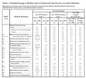
Let's look at some specific categories:


Click for a larger image.

Note there were only four sub-categories that dropped. Two of those areas (furniture and building material/supplies) are housing related.


I've blocked off the last 6 months of data. Notice that we're had four months of strong growth. One of those months was effected by the infusion from cash for clunkers. But, note that after the one month fall off we've had three of four months showing an increase.
-----
UPDATE from NDD: The inventory to sales ratio for businesses fell to 1.26 in December. This is the lowest ratio since November 2007, but even more than that, it is the lowest ratio ever excluding that month and about 6 months in 2005. Businesses are running an extremely lean operation, suggesting that inventory depletion can no longer hold back GDP or employment growth.

Forex Fridays


Click for a larger image

Prices are in a general up (A), down (B), up (C) pattern

Prices consolidated in a downward sloping pennant pattern at D.

E.) The EMA picture is bullish. The shorter EMAs are above the longer EMAs, all the EMAs are moving higher and prices are above the EMAs. Also note that prices are above the 200 day EMA and the 10 and 20 day EMA have crossed over the 200 day EMA.

A Long Road Home

The Economic Report of the President has been released and, as always, is a fascinating read.

Below is the crux of the administration's economic forecast:

As usual, I'm most concerned on the jobs front, and it seems as though even the Obama team is resigned to a brutally slow jobs recovery.

Below is a chart showing nonfarm payroll employment from 12 months prior to the start of a recession to 84 months (7 years) from the month it starts. Jobs are indexed to 100 for the recession start month. I've broken out our previous two "jobless recoveries" from 1990 (green) and 2001 (let's call it burgundy). The purple line (on top) is the average of 8 other recessions (prior to 1990 and 2001 and excluding those two), so we're looking at 10 other recessions in all. Red is the current recession. The dashed olive line is a forecast based on the average NFP growth rate of the 8 recessions (purple line). You'll note that the dashed olive line roughly parallels the purple line, as it should given the growth rates are virtually identical.

(Click through for gigundo chart)

Source: St. Louis Fed, Economic Report of the President

Based on my calculations, the Obama team (neon blue dash-dot line) is forecasting a slower-than-average jobs recovery that won't get us back to Square One (e.g. the level of December 2007) for 65 months hence, or some time in mid-2013. The 2001 recovery had jobs back to their previous high in what was then an unthinkable 46 months, a record we will handily beat this time out. (For the record, I think any forecasting beyond about 24 months becomes highly speculative, but that said, I see no reason to believe this jobs recovery will be either average or above-average.)

In any event, given what we know about almost all administrations' forecasts -- that they're too optimistic -- I find this forecast unacceptable. More must be done to put Americans to work and get us back to Square One sooner rather than later.

Thursday, February 11, 2010

Today's Market


With the QQQQs and the IWMs, note the 10 day EMA previously provided upside resistance for prices (A). However, today's price action led to prices moving through the 10 day EMA (B). But, there is still plenty of upside resistance at the 20 and 50 day EMA. Also note the 10 day EMA has moved higher on both charts (although minimally).


However, with the SPYs, note that prices have moved through the 10 day EMA before, only to retreat. But prices are still above the 10 day EMA. Also -- the 10-day EMA has moved higher (although only for a day or two at this point).

Jobless Claims Drop

From Bloomberg:

Fewer Americans than anticipated filed claims for unemployment insurance last week as an administrative backlog subsided and indicating companies are nearing the end of major staff cuts as the economy recovers.

Initial jobless applications declined by 43,000 to 440,000 in the week ended Feb. 6, the lowest level in five weeks, from 483,000 the prior week, Labor Department figures showed today in Washington. The total number of people receiving unemployment insurance and those receiving extended benefits decreased.

The fastest pace of growth in six years last quarter means the economy may be poised to add jobs as companies restock shelves to keep pace with increased sales. At the same time, with an unemployment rate projected to average almost 10 percent this year, consumer spending may be slow to recover.

“Things have not really deteriorated,” said Stephen Gallagher, chief U.S. economist at Societe Generale SA in New York. “Unfortunately it doesn’t show much improvement either.”


Here's the chart:

Bernanke's Recent Testimony

Earlier this week, Chairman Bernanke gave a policy update. This also provides a good overview of what the Fed has done to stabilize the economy.

With the onset of the crisis in the late summer and fall of 2007, the Federal Reserve aimed to ensure that sound financial institutions had sufficient access to short-term credit to remain sufficiently liquid and able to lend to creditworthy customers, even as private sources of liquidity began to dry up. To improve the access of banks to backup liquidity, the Federal Reserve reduced the spread over the target federal funds rate of the discount rate--the rate at which the Fed lends to depository institutions through its discount window--from 100 basis points to 25 basis points, and extended the maximum maturity of discount window loans, which had generally been limited to overnight, to 90 days.

Many banks, however, were evidently concerned that if they borrowed from the discount window, and that fact somehow became known to market participants, they would be perceived as weak and, consequently, might come under further pressure from creditors. To address this so-called stigma problem, the Federal Reserve created a new discount window program, the Term Auction Facility (TAF). Under the TAF, the Federal Reserve has regularly auctioned large blocks of credit to depository institutions. For various reasons, including the competitive format of the auctions, the TAF has not suffered the stigma of conventional discount window lending and has proved effective for injecting liquidity into the financial system.


First, the Fed acted in its traditional role by lowering the discount rate. This is the rate the Federal Reserve charges banks that borrow temporary loans. However, at the height of the crisis (and even today) banks were concerned about the impression this borrowing could make. If a bank goes to the Federal Reserve to borrow money and word got out, it is likely the public would view the borrowing negatively. Consider this: you hear that your bank is borrowing money from the Federal Reserve. Is that a good or a bad development? For most people, that is a bad development. In other words, borrowing from the Fed could lead to a bank run, thereby hurting the bank borrowing the funds. As a result, the Fed started a new program that was very successful in providing short-term liquidity to the market.

Liquidity pressures in financial markets were not limited to the United States, and intense strains in the global dollar funding markets began to spill over to U.S. markets. In response, the Federal Reserve entered into temporary currency swap agreements with major foreign central banks. Under these agreements, the Federal Reserve provided dollars to foreign central banks in exchange for an equally valued quantity of foreign currency; the foreign central banks, in turn, lent the dollars to banks in their own jurisdictions. The swaps helped reduce stresses in global dollar funding markets, which in turn helped to stabilize U.S. markets. Importantly, the swaps were structured so that the Federal Reserve bore no foreign exchange risk or credit risk.


These are the currency swap agreements that Representative Grayson went crazy over, thereby proving he knew nothing about central banking. Here's what a currency swap program is: the US Federal Reserve "swaps" and equal amount of dollars for foreign currency. For example, the Fed sends $100 dollars to the European Central Bank for an equal amount of euros. The Fed holds the euros and the European Central banks puts the dollars out into the European markets. Also note this key phrase: "the swaps were structured so that the Federal Reserve bore no foreign exchange risk or credit risk." So -- we weren't going to make any money, but we weren't going to lose any money.

As the financial crisis spread, the continuing pullback of private funding contributed to the illiquid and even chaotic conditions in financial markets and prompted runs on various types of financial institutions, including primary dealers and money market mutual funds.4 To arrest these runs and help stabilize the broader financial system, the Federal Reserve used its emergency lending authority under Section 13(3) of the Federal Reserve Act--an authority not used since the Great Depression--to provide short-term backup funding to certain nondepository institutions through a number of temporary facilities.5 For example, in March 2008 the Federal Reserve created the Primary Dealer Credit Facility, which lent to primary dealers on an overnight, overcollateralized basis. Subsequently, the Federal Reserve created facilities that proved effective in helping to stabilize other key institutions and markets, including money market mutual funds, the commercial paper market, and the asset-backed securities market.

First, note the Fed acted within the bounds of the law. This was not an illegal takeover of the financial system orchestrated by the Illuminati with the help of the Masons. It was the central bank of the US using its specifically enumerated powers to stabilized a very nervous and ill-performing financial system. Also note: the loans were overcollateralized -- the Fed required the borrowers to provide excess "stuff" to make sure the loan was repaid.

And guess what?

As was intended, use of many of the Federal Reserve's lending facilities has declined sharply as financial conditions have improved.6 Some facilities were closed over the course of 2009, and most other facilities expired at the beginning of this month. As of today, the only facilities still in operation that offer credit to multiple institutions, other than the regular discount window, are the TAF (the auction facility for depository institutions) and the Term Asset-Backed Securities Loan Facility (TALF), which has supported the market for asset-backed securities, such as those that are backed by auto loans, credit card loans, small business loans, and student loans. These two facilities will also be phased out soon: The Federal Reserve has announced that the final TAF auction will be conducted on March 8, and the TALF is scheduled to close on March 31 for loans backed by all types of collateral except newly issued commercial mortgage-backed securities (CMBS) and on June 30 for loans backed by newly issued CMBS.7

.....

In summary, to help stabilize financial markets and to mitigate the effects of the crisis on the economy, the Federal Reserve established a number of temporary lending programs. Under nearly all of the programs, only short-term credit, with maturities of 90 days or less, was extended, and under all of the programs credit was overcollateralized or otherwise secured as required by law. The Federal Reserve believes that these programs were effective in supporting the functioning of financial markets and in helping to promote a resumption of economic growth. The Federal Reserve has borne no loss on these operations thus far and anticipates no loss in the future. The exit from these programs is substantially complete: Total credit outstanding under all programs, including the regular discount window, has fallen sharply from a peak of $1-1/2 trillion around year-end 2008 to about $110 billion last week.

We're almost done! There are only two facilities still in operation. Think about that for a moment -- despite all of the hyper-ventilating about the Federal Reserve over the last few months, the Fed has quietly stopped most of its lending facilities. Imagine that.

Let's continue an analysis of what Bernanke said.

In addition to supporting the functioning of financial markets, the Federal Reserve also applied an extraordinary degree of monetary policy stimulus to help counter the adverse effects of the financial crisis on the economy. In September 2007, the Federal Reserve began reducing its target for the federal funds rate from an initial level of 5-1/4 percent. By late 2008, this target reached a range of 0 to 1/4 percent, essentially the lowest feasible level. With its conventional policy arsenal exhausted and the economy remaining under severe stress, the Federal Reserve decided to provide additional stimulus through large-scale purchases of federal agency debt and mortgage-backed securities (MBS) that are fully guaranteed by federal agencies. In March 2009, the Federal Reserve expanded its purchases of agency securities and began to purchase longer-term Treasury securities as well. All told, the Federal Reserve purchased $300 billion of Treasury securities and currently anticipates concluding purchases of $1.25 trillion of agency MBS and about $175 billion of agency debt securities at the end of March. The Federal Reserve's purchases have had the effect of leaving the banking system in a highly liquid condition, with U.S. banks now holding more than $1.1 trillion of reserves with Federal Reserve Banks. A range of evidence suggests that these purchases and the associated creation of bank reserves have helped improve conditions in private credit markets and put downward pressure on longer-term private borrowing rates and spreads.


First, the Fed lowered interest rates to essentially 0% -- about as low as they can go. This is the standard policy response to an economic crisis. While it does run the risk of creating an asset bubble it also helps to encourage people to borrow. In addition, a low short-term rate helps financial institutions bottom line. Remember that banks borrow short (taking in deposits) and lend long (making loans). The difference they make (also called the spread) goes to the banks bottom line.

Next, the Fed started to buy bonds. They did this to provide liquidity to the market. Anytime you hear someone say "there is no liquidity" it simply means they can't sell a particular asset. At the height of the crisis, no one was buying anything. When this happens, interest rates on bonds increase to attract buyers. This would be detrimental to an economy that isn't producing any credit. To combat this situation (and keep interest rates low), the Federal Reserve bought Treasury, agency and MBS (mortgage backed bonds).

So, how will the Federal Reserve Exit this program?

Most importantly, in October 2008 the Congress gave the Federal Reserve statutory authority to pay interest on banks' holdings of reserve balances. By increasing the interest rate on reserves, the Federal Reserve will be able to put significant upward pressure on all short-term interest rates, as banks will not supply short-term funds to the money markets at rates significantly below what they can earn by holding reserves at the Federal Reserve Banks. Actual and prospective increases in short-term interest rates will be reflected in turn in longer-term interest rates and in financial conditions more generally


Each bank that is a member of the Federal Reserve system (which is practically every bank in the US) has deposits with their respective Federal Reserve Bank. Now the Fed can pay interest on these loans. Banks won't make loans to customers at rates below the rate the Fed is paying -- that just wouldn't make any sense. So this will one tool the Fed will use to increase interest rates when the time is right.

The Federal Reserve has also been developing a number of additional tools it will be able to use to reduce the large quantity of reserves held by the banking system. Reducing the quantity of reserves will lower the net supply of funds to the money markets, which will improve the Federal Reserve's control of financial conditions by leading to a tighter relationship between the interest rate on reserves and other short-term interest rates.

One such tool is reverse repurchase agreements (reverse repos), a method that the Federal Reserve has used historically as a means of absorbing reserves from the banking system. In a reverse repo, the Federal Reserve sells a security to a counterparty with an agreement to repurchase the security at some date in the future. The counterparty's payment to the Federal Reserve has the effect of draining an equal quantity of reserves from the banking system. Recently, by developing the capacity to conduct such transactions in the triparty repo market, the Federal Reserve has enhanced its ability to use reverse repos to absorb very large quantities of reserves. The capability to carry out these transactions with primary dealers, using our holdings of Treasury and agency debt securities, has already been tested and is currently available. To further increase its capacity to drain reserves through reverse repos, the Federal Reserve is also in the process of expanding the set of counterparties with which it can transact and developing the infrastructure necessary to use its MBS holdings as collateral in these transactions.


This is central banking 101. Right now, banks have a ton of liquidity -- meaning they have a lot of cash on hand. To drain liquidity -- to lower the amount of cash on each bank's balance sheet -- the Fed will essentially swap an asset (a bond) for cash. This lowers the amount of liquidity in the system. Less liquidity = higher interest rates.

As a second means of draining reserves, the Federal Reserve is also developing plans to offer to depository institutions term deposits, which are roughly analogous to certificates of deposit that the institutions offer to their customers. The Federal Reserve would likely auction large blocks of such deposits, thus converting a portion of depository institutions' reserve balances into deposits that could not be used to meet their very short-term liquidity needs and could not be counted as reserves. A proposal describing a term deposit facility was recently published in the Federal Register, and we are currently analyzing the public comments that have been received. After a revised proposal is reviewed by the Board, we expect to be able to conduct test transactions this spring and to have the facility available if necessary shortly thereafter. Reverse repos and the deposit facility would together allow the Federal Reserve to drain hundreds of billions of dollars of reserves from the banking system quite quickly, should it choose to do so.


In essence, banks would now be able to open an account with the Federal Reserve and earn interest on the deposit. This would also drain liquidity from the system.

This was a really good speech for highlighting exactly what the Fed has done and what it's plans are. It should provide the market a great deal of calm.

Thursday Oil Market Round-Up


A.) Prices have broken through key support, which has now become upside resistance.


A.) There is strong support around 35.20

B.) Note the EMA picture is bearish (for now) -- all the EMAs are moving lower, the shorter EMAs are below the longer EMAs and prices are below most EMAs. However, also note that prices are really moving around the 200 day EMA, attempting to make a move into either bullish (above the 200 day EMA) or bearish (below the 200 day EMA) territory.

Today's Market


A.) Note the price bars are incredibly weak. In the last four days, we've had one hanging man and two spinning tops.

B.) The EMA picture is weak. The shorter EMAs are below the longer EMAs, all the EMAs are moving lower and prices are below all the EMAs.

C.) Prices overall are weak.

D.) Momentum has left the market, and

E.) Some money has left the market, although it's not a huge amount (yet).

Wednesday, February 10, 2010

Today's Market

I've got a late meeting, so this will be up in the AM.

Euro Sell-off


Click for a larger image

First, note the market is in a down (A), up (B), down (C) pattern.

Prices formed a bear market pennant pattern at D.

Note the numerous gaps lower (E) throughout the chart.

All of this has occurred as the dollar as risen. The underlying fundamental reason for this change is the Greece situation. Because of that, the US dollar is viewed as a safe haven at the euro's expense.

Will The EU Rescue Greece?

From the WSJ:

Germany is considering a plan with its European Union partners to offer Greece and other troubled euro-zone members loan guarantees in an effort to calm fears of a government default and prevent a widening of the credit woes, people familiar with the matter said.

The plan would be undertaken within the EU framework but led by Germany, one of the people said. German Finance Minister Wolfgang Schäuble has discussed the idea in recent days with European Central Bank President Jean-Claude Trichet, according to the person.

Mr. Schäuble told officials in Berlin on Monday that he had concluded there "was no alternative" to a rescue plan, according to a person familiar with his comments.

A meeting between the Mr. Schäuble and lawmakers on possible support for Greece took place Wednesday, and no decision on aid has been made yet, a finance ministry spokesman said. The comments come after Mr. Schäuble met with parliamentarians from the Christian Democratic Union and Christian Social Union, part of Chancellor Angela Merkel's center-right government, to discuss possible aid.


Once again, we revisit the issue of moral hazard in the market. This is an age-old question about how to handle situations like Greece. The reality is far grayer than we would like to admit.

First, let's consider the historical context of the Greek situation. Europe -- and the rest of the world -- is emerging from the worst recession in over 60 years. But the recovery is fragile. That means a sovereign default by any country could send the entire EU zone back into a recession. This makes the possibility of a rescue that much higher.

But there is something else to consider -- financial default at any time can lead to catastrophic results. For example, let's go back to Long Term Capital (LTC) in the late 1990s. The fear was LTC's collapse would spread out -- the result would be similar to dropping a large rock in a pond and watching the ripples emanate from the point of entry. This fear ultimately goes back to the Great Depression and the collapse of the Bank of the US (a private bank despite it's name) in 1929. The collapse of this bank lead to the first of three waves of bank failures in the US. Had the central bank stepped in the resulting crash may have been averted.

It's this situation -- one event beginning a toppling of the dominoes -- that keeps Central Bankers up at night. Yes, rescuing a bad actor does create a moral hazard. This in turn increases the possibility of further financial risk developing in the system which in turn increases stress in the system leading to the possibility of more bail-outs.

In short -- there are no easy answers.

Trim Tabs and Withholding Taxes

- by New Deal democrat

Well, {sigh} Trim Tabs is at it again, and the usual suspects are biting . They're touting the following "analysis":
Real-Time tax withholding data shows that wages and salaries declined an adjusted 1.0% y-o-y. In January 2009, wages and salaries declined 5.0%. If the labor market were improving, we would expect a positive year-over-year growth rate. The fact that tax withholding data is still declining year-over-year suggests that the labor market is still contracting.
(my emphasis). No, it doesn't. How many times do I have to point out that simple YoY comparisons miss turning points?!? The fact that YoY data is still declining means ... we're not even with a year ago. D'uh!

YoY data of course is valuable, particularly where there are large seasonal fluctuations, as there are in items like housing. Indeed there is definite seasonality in tax withholding -- generally the period of December through March shows more payments than the remainder of the year.

While it would take averaging out the last 5 or 10 years to get a more exact picture, an easy way to look at the data is to see how the YoY comparison is changing. Are the YoY comparisons getting more amplified or smaller? If more amplified, the trend is accelerating; if smaller, the turning point may already have arrived.

With that in mind, let's look at tax withholding data since January 2008.

Year/monthWithholding ($Blns)YoY% change
Jan 2008 163.4 -4.1
Feb. 2008 156.1 +6.6
Mar. 2008 162.6 +3.6
Apr. 2008 146.9 +3.2
May 2008 140.8 0.0
Jun. 2008 145.5 +0.9
Jul 2008 143.0 +6.0
Aug. 2008 136.5 +2.5
Sep. 2008 142.8 +10.4
Oct. 2008 142.5 +0.4
Nov. 2008 135.6 -0.4
Dec. 2008 167.6 -3.6
Jan. 2009 151.8 -7.1
Feb. 2009 142.9 -8.5
Mar. 2009 156.0 -4.1
Apr 2009 133.2 -9.9
May 2009 126.0 -10.5
Jun. 2009 133.8 -9.2
Jul. 2009 131.4 -8.0
Aug. 2009 126.4 -8.0
Sep. 2009 125.2 -12.3
Oct. 2009 124.7 -12.5
Nov. 2009 127.7 -5.8
Dec. 2009 154.9 -7.6
Jan. 2010 140.4 -6.7

First of all, you can easily see the seasonal pattern. Tax collections are generally strong from December through March and generally weak the rest of the year.

Secondly, note how the YoY% change remained positive until almost a year into the recession. If you were simply citing a YoY change without noticing the underlying trend, you would have been completely wrong. Notice also that withholding tax collections held up for several months after payrolls started to be cut with wild abandon in about August-September 2008. Simply put, withholding taxes lag employment data.

Finally, turn your attention to recent months. You can see that the maximum YoY percentage decline was in October, which also happens to be the lowest raw number. Between May and October, each and every month was 8% or more lower than the year before. All 3 months since November have come in lower than that comparison.

In other words, while we can't say for sure, it looks like October was the actual, seasonally adjusted bottom in payroll tax withholding.

Unsing the same methodology, Trim Tabs said the recession was already over in April 2008, something Barry Ritholtz called "one of the weakest, most poorly reasoned and mathematically challenged analyses I have read in two decades on Wall Street."

Trim Tabs and their gullible sycophants are wrong again.

Wednesday Commodities Round-Up

All of the charts below show one clear development: all the commodities groups have broken long-term trend lines. That means going forward we're in a whole new technical ball game.


Tuesday, February 9, 2010

Today's Market

Despite today's rally, the markets are still hanging on my a technical thread. Note where the prices are for the three main markets. Click on all charts for a larger image.


Where Will the Jobs Come From?

Now that it appears as though economic armageddon is behind us and we are flirting with a recovery (at least in terms of GDP and leading indicators at this point), the next question isn't when will we see job creation, but where will this job growth come from.

It is very likely that in the next couple of months we will see a positive establishment survey job creation number (the household survey already went positive in January), but it is also likely that those job gains will be small at first and we will need larger and more sustained job creation in order to really get the unemployment rate back down substantially. I am going to paint a somewhat gloomy picture of why we may be in a bind, as many of the jobs lost during the recession are likely not coming back and why the areas that have lead job creation in the recent past (ie services) are also unlikely to pick up the slack.

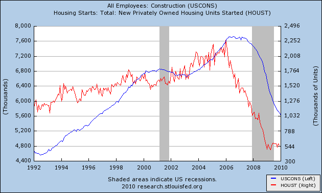
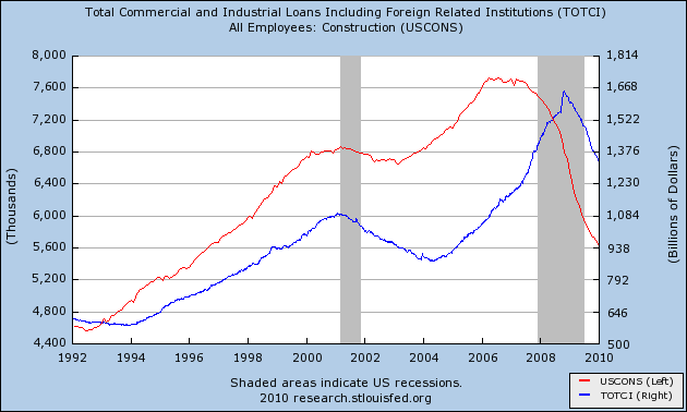
First, let's examine a leading job creator since the early 90's, construction, which nearly doubled its employment level from 1992 to the peak in 2006 (gaining around 3 million jobs). As you can see from the graphs below, construction employment tanked during this recession (right along with housing starts and commercial/industrial lending).
cons vs housing starts
cons vs comm loans
The interesting information we can gain from the second graph is that construction employment may follow commercial/industrial lending even more closely than housing starts (which makes sense because commercial/industrial projects typically employ exponentially more construction workers than houses). The graphs above are bad news for future job creation for two reasons: 1) it is unlikely that housing starts are going to see a v-shaped recovery due to inventory and loan standard issues and 2) commercial/industrial lending has yet to bottom and the days of huge (and expensive) office/retail centers may be numbered due to the internet. In other words, I wouldn't look to construction jobs to lead us out of this recession (or even to recover to their highs for a long time).

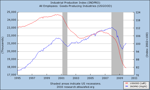
Next, let's look at goods producing employment. While goods producing employment wasn't really a major job creator at all during the last 15 years (actually a lot longer), it was still a major employment sector with 22+ million jobs prior to this recession. Since its peak in late 2006 though, good producing employment has shed over 4 million jobs (or about 20%), while industrial production only fell about 10% during this time frame.
ind pro vs goods
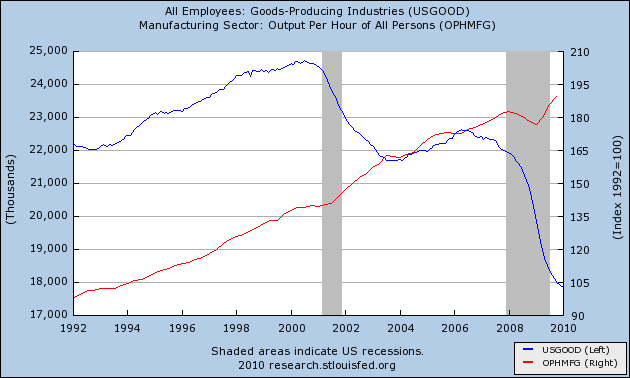
This graph shows the huge decline in goods producing jobs, that is much deeper than the decline in industrial production, but this doesn't even tell the whole story, as demand had declined too, which leads us to:
outputvgoods
This shows how dramatically the output of those goods producing employees has risen in the recent past and even continuing its rise during this recession (after a brief drop). What this shows us quite clearly is that it is not outsourcing that is taking our manufacturing jobs away, but technology increases that lead directly to productivity gains. I would estimate that the number of jobs lost in manufacturing over the last decade to outsourcing is probably less than a tenth of what has been lost to technology (remember, you read about every plant that closes and goes to China, but none about the plants that replace a few workers here and there with machines or computers). What the first graph of industrial production shows us in quite damning terms is that we are now at 2002 levels of industrial output with 4 million less employees creating that output (and production is rising again). In other words, I wouldn't look to the goods producing sector to lead us in creating jobs soon (and maybe for a very long time).

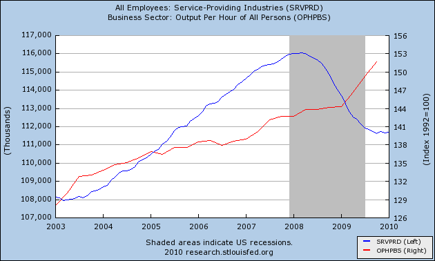
Finally, we have to look at the service sector, which had bee relatively immune (in job creation terms) to recessions in the recent past until now. During this recession services employment has lost over 4 million jobs and while it appears that the losses here have stopped, the output per hour (of the business sector) curve has steepened dramatically (ie the rate of productivity increases has increased).
servvsprod
This could be caused by many factors (including working current employees longer, although the hourly data doesn't back this up), but I believe the biggest reason for this increase is the acceptance/adoption and proliferation of technology to the service sector, something we really haven't seen before en mass. This again bodes poorly for a sudden burst in job creation as technological innovation again outpaces the need to hire new workers.

In conclusion, I fear that we may have reached a point where the creation of jobs in quantities large enough to get our unemployment rate back down to a full employment (say 5-6%) level may be behind us under the current economic paradigm. This would lead me to believe that a Keynesian solution is wrong for our situation (as the extra spending will not lead to job creation, but will be eaten up through productivity) and that the solution to our problem lies more on the policy side of creating a new paradigm that would provide a better safety net for those displaced by technology (ie things like single-payer health care, longer standard unemployment benefits, etc) and by enabling workers to gain the benefits of productivity through shorter work weeks and an increased emphasis on telecommuting.

Why I Support A Public Health Care Plan

I originally wrote this article about two years ago. The logic is still sound.

The current debate over health care is making me sick (excuse the pun). I have never seen so many people get it so wrong. Here is the logic behind the need for public health insurance.

While I will almost always advocate for a market based economic approach to allocating resources, health care is not an area where the profit motive should dominate decision making. Simply put, the end product is a patient's health. Private health insurance has a conflict of interest between the insurance company and the insured which will be resolved in favor of the insurance company a majority of the time.

Let me paint a hypothetical picture to illustrate this point. Insured makes a claim with the insurance company, which is a publicly traded company. Because the insurance company is publicly traded they must turn a profit and increase their profits to maintain their share price. In order to make a profit they have every incentive to either

1. Deny the insured's claim, or
2. Delay payment to increase the possibility the insured will drop his claim

There are numerous stories about an insured making a routine claim only to be inundated with paperwork, or being told the policy doesn't cover that procedure, or being told the insurance company has to look into the claim to see if the insurance company can make a payment. In any of these situations the central idea of insurance -- to provide some safety for the insured at a specific cost -- is compromised.

In addition, insurance companies will seek to minimize the amount of money they would have to pay to the insured. Again, remember the product here is the patient's health. Supposed the insured has a disease where the cure is expensive but a cheaper alternative exists. However, the cheaper alternative would moderately or seriously compromise the insured's quality of life. Because the insurance company is profit-driven, it will probably opt for the cheaper treatment that compromises the insured's quality of life.

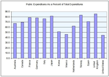
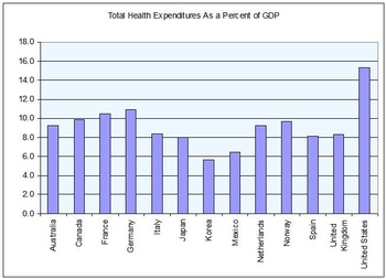
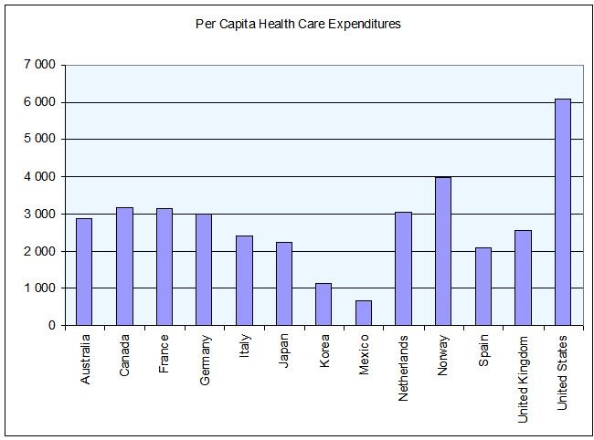
Secondly, private health care is more expensive the public health care. Here are three charts compiled from the Organization for Economic Cooperation and Development. The figures are from 2004.

First, the US spends the least amount of public money on health care.

2007-07-12-HaleOneGovernment.jpg

However, the US spends the most on health care as a percentage of GDP

2007-07-12-HaleTwoGDP.jpg

and on a per capita basis.

2007-07-12-HaleThreeCapita.jpg

Notice the partially inverse relationship between public expenditures and total amount spent on health care. In short, publicly available health care is cheaper.

Finally there is the issue of competitiveness. I'll let General Motors of Canada make the argument for me.

"The Canadian plan has been a significant advantage for investing in Canada," says GM Canada spokesman David Patterson, noting that in the United States, GM spends $1,400 per car on health benefits. Indeed, with the provinces sharing 75 percent of the cost of Canadian healthcare, it's no surprise that GM, Ford and Chrysler have all been shifting car production across the border at such a rate that the name "Motor City" should belong to Windsor, not Detroit.

Just two years ago, GM Canada's CEO Michael Grimaldi sent a letter co-signed by Canadian Autoworkers Union president Buzz Hargrave to a Crown Commission considering reforms of Canada's 35-year-old national health program that said, "The public healthcare system significantly reduces total labour costs for automobile manufacturing firms, compared to their cost of equivalent private insurance services purchased by U.S.-based automakers." That letter also said it was "vitally important that the publicly funded healthcare system be preserved and renewed, on the existing principles of universality, accessibility, portability, comprehensiveness and public administration," and went on to call not just for preservation but for an "updated range of services." CEOs of the Canadian units of Ford and DaimlerChrysler wrote similar encomiums endorsing the national health system.


Health care costs are killing American business. Our international competitors don't have to deal with these costs. As a result, private health care is making US business less competitive.

So, public health eliminates a conflict of interest that compromises individual health, is cheaper and makes the US more competitive. And we don't have a public health system because?

SEC Tries to Regroup

From the NY Times:

In the headquarters of the Securities and Exchange Commission, Mr. Madoff’s name is rarely spoken. More than seven months after he was sentenced to prison for orchestrating a global Ponzi scheme, shaken S.E.C. employees are still struggling to come to grips with how they failed to catch him before it was too late.

Many here refer to the scandal — a $65 billion fraud that, despite several red flags, went undetected by the S.E.C. for more than two decades — as “the event” or “the incident.”

It is the job of Robert S. Khuzami, the S.E.C. head of enforcement, to unmask the next Madoff — and, equally daunting, to convince skeptics that the commission can reassert itself and adequately police Wall Street.

Since arriving at the S.E.C. a year ago this month, just as the Madoff scandal was grabbing headlines, Mr. Khuzami has cut red tape, created specialized teams to plumb hedge funds and other worrisome areas and tried to make the S.E.C. quicker and more nimble.

Unlike some at the commission, Mr. Khuzami, 53, talks openly about the Madoff fiasco. “For a group of people committed to investor protection and prevention, the tragedy of investors’ losses are not lost on anyone,” he said in an interview in his bright, corner office in Washington.

While Mary L. Schapiro, the chairwoman, is the public face of the commission, Mr. Khuzami and his lieutenants are the officers on the beat. Their first challenge is to shake off the psychic blow of the Madoff affair. Not since the 1950s, when budget cuts and deregulation defanged the commission, have its stature and influence sunk so low. Mr. Khuzami, a straight-talking former federal prosecutor and Wall Street executive, says he wants to infuse the S.E.C. with the ethos of a start-up company, making it faster, more proactive and even a bit entrepreneurial.

The jury is still out on how the SEC will perform. However, let's hope they get their act together.

Treasury Tuesdays


A.) Prices moved through the downward sloping trend line and begin moving higher.

B.) Prices run into resistance at the 50% Fibonacci retracement level

C.) Note the EMA orientation. The shorter EMAs (10, 20 and 50) are all moving higher; the 10 has crossed the 50 and the 20 is about to do so; and prices are above all the EMAs.

D.) The stock has plenty of upward momentum, but

E.) Note we haven't seen a big influx into the IEFs. In fact, at one point during the rally we see a drop off.

Monday, February 8, 2010

Click for all images for a larger image


A.) Prices hit resistance in the late morning.


A.) Prices rose for the morning. Note how they rose and then fell into the EMAs for technical support.

B.) In the afternoon, prices fell through the EMAs and then

C.) Ran into upside resistance at the EMAs

D.) Volume spiked at the end of the day.

Blue Collar Jobs Are Disproportionately Lost In This Recession

The Bureau of Labor Statistics released the current employment situation report on Friday. As such, it seems appropriate to take an in-depth look at the overall employment situation in the U.S. Most of the information contained herein on the methods of collecting employment statistics is found here.

First, there are two employment surveys -- the household and the establishment survey:

Data based on household interviews are obtained from the Current Population Survey (CPS), a sample survey of the population 16 years of age and over. The survey is conducted each month by the Bureau of the Census for the Bureau of Labor Statistics and provides comprehensive data on the labor force, the employed, and the unemployed, classified by such characteristics as age, sex, race, family relationship, marital status, occupation, and industry attachment. The survey also provides data on the characteristics and past work experience of those not in the labor force. The information is collected by trained interviewers from a sample of about 50,000 households located in 792 sample areas. These areas are chosen to represent all counties and independent cities in the U.S., with coverage in 50 States and the District of Columbia. The data collected are based on the activity or status reported for the calendar week including the 12th of the month.

Data based on establishment records are complied each month from mail questionnaires and telephone interviews by the Bureau of Labor Statistics, in cooperation with State agencies. The Current Employment Statistics (CES) survey is designed to provide industry information on nonfarm wage and salary employment, average weekly hours, average hourly earnings, and average weekly earnings for the Nation, States, and metropolitan areas. The employment, hours, and earnings data are based on payroll reports from a sample of over 390,000 establishments employing over 47 million nonfarm wage and salary workers, full or part time, who receive pay during the payroll period which includes the 12th of the month. The household and establishment data complement one another, each providing significant types of information that the other cannot suitably supply. Population characteristics, for example, are obtained only from the household survey, whereas detailed industrial classifications are much more reliably derived from establishment reports


The household survey provides information on the unemployment number, which decreased from 10% to 9.7%. This was a very good number because of the following computation issues. The civilian labor force increased from 153,059,000 to 153,170,000 (or an increase of 111,000). This number is the denominator of the unemployment percentage calculation. The number of unemployed decreased from 15,267,000 to 14,837,000 (a decrease of 430,000). This means the unemployment rate actually decreased because the number of people unemployed actually decreased; in other words, the drop in the unemployment rate was not caused by computational issues. This is obviously a very good development.

Additionally, consider this chart of the unemployment rate from the report:


Since mid-Spring the unemployment rate has fluctuated between ~9.5% and 10.1%. While the overall level is not good, it does indicate the overall unemployment rate may be topping out.

The household survey also provides information about the amount of time people have been unemployed. Consider the following charts as a time series. First, people are laid-off. Then they are unemployed for a certain amount of time.


Let's start with the 4-week moving average of initial unemployment claims (this number is not from the household survey). This number has been dropping for most of the year. However, it rose to a very high level and is currently above levels associated with an expanding economy. In other words, the number of people entering the ranks of the unemployed is decreasing, but it is still at high levels.


The number of people unemployed for 5 weeks or less is decreasing, and has been for about half the last year. Also note this number is starting to approach the levels associated with an expanding economy (the levels seen between 2002-2008).


Once someone is unemployed for 5 weeks or longer, the odds are they will remain unemployed for a longer period of time. While this chart of the number of people unemployed for 5-14 weeks appears to be topping out it is still at high levels. Also note this number is far above levels associated with an expanding economy (by about 1 million to 1.2 million), indicating it will take some time to bring it back to healthy/normal levels.


While the number of people unemployed between 15 - 26 weeks appears to be topping out, it is also at high levels that will take some time (as in years) to bring back to normal levels.


And regrettably, the number of people unemployed for over 27 weeks is still increasing.

There are a few other data points from the household survey to highlight. First, consider the following unemployment rates by educational level achieved. The first number is for January 2009 and the second is for January 2010:

Less than high school diploma: 12.4%/15.2%
High School Graduates, no college: 8.1%/10.1%
Some college or associate degree: 6.4%/8.5%
Bachelor's degree or higher: 3.9%/4.9%

These unemployment figures paint a very interesting picture that has profound policy implications. Either the economy needs to start creating jobs for those with less than a college education (a highly unlikely development as will be explained below) or the workforce needs to increase the number of people with higher education.

Here are the same percentages (the unemployment rate for January 2009 and January 2010) of various age groups.

16 to 19: 20.9%/36.4%
20 to 24: 12.4%/15.8%
25 to 34: 8.1%/9.9%
35 to 44: 6.6%/8.5%
45 to 54: 5.9%/7.6%
55+: 5.3%/6.8%

Should the increase in the the unemployment rate for teenagers be a concern? I would argue no, largely because the primary "job" of a teenager is to be a student. The same argument could be made of the 20-24 crowd as they should also be in some type of educational situation. The increase to 9.9% in the 25 to 34 age group is disturbing, as is the increase to 8.5% in the 35 to 44 age group.

Finally, the number of people who were employed "part time for economic reasons" decreased from 9,165,000 to 8,316,000. This is another healthy development.

Let's turn our attention to the establishment survey.


Let's start with the total number of establishment jobs in the US (seasonally adjusted). The above graph illustrates two important and disturbing points. First, the US now has fewer jobs than the lowest point of the previous expansion. All the jobs gained during the last expansion have been wiped out. Secondly, the current total number of seasonally adjusted establishment jobs in the US is lower than the beginning of the decade.

Simply "eyeballing" the chart, we can see the US has lost over 8.2 million jobs in this recession (roughly 138,000,o00 to a little below 130,000,000).


Eyeballing this chart we have see the number of construction employees has dropped by about 2 million (approximately 7.6 to 5.6 million).


The manufacturing picture is very interesting. Notice that a large number of manufacturing jobs lost in the first recession of the decade were never replaced. Next, note manufacturers started to shed jobs in early/mid 2006. From this level manufacturing has lost about 4 million jobs (approximately 22 to 18 million).

Totaling construction and manufacturing jobs we get ~6 million. In other words, about 73% of the jobs lost during this recession came from two economic sectors -- construction and manufacturing.

Let's focus on manufacturing for just a moment. Manufacturing job losses account for a little under 50% of the total job losses (approximately 4 million of the 8.2 million jobs lost). Also note that after the first recession of the decade manufacturing jobs did not meaningfully increase. This is largely because of automation and technology replacing people. The same is true today -- perhaps more so. Assuming increased automation continues, the possibility of a large percentage of manufacturing jobs lost during the recession coming back is slim at best.

Combine the construction and manufacturing jobs lost data with the unemployment rate by educational achievement data from the household survey and you get a very interesting picture.

The great recession wiped out lower education/manual labor jobs. And the experience of the manufacturing sector after the last expansion indicates those jobs aren't coming back.

January 2010 Leading Economic Indicators

- by New Deal democrat

We have enough information now to estimate the Index of Leading Economic Indicators for January 2010. Just to referesh your memory, the LEI has a 5 decade history, and was formerly kept by the Commerce Department until its computation and makeup was outsourced to the Conference Board about a decade ago. The 10 indicators, with the weights given each indicator, are as follows:

- real money supply (35%)
- average weekly manufacturing hours (25%)
- interest rate spread (10%)
- manufacturers' new orders for consumer goods (8%)
- supplier deliveries (7%)
- stock prices (4%)
- consumer expectations (3%)
- building permits (3%)
- average weekly initial claims for unemployment insurance (inverted) (3%)
- manufacturers' new orders for durable goods (2%)

Here's my estimate of how the Leading Economic Indicators fared in January. Despite the increase in initial jobless claims and the shallow correction in the stock market, most were positive:

Real M2 remains slightly positive, so +0.02
Aggregate hours in manufacturing were up +0.14
The yield curve is still positive +0.30
ISM deliveries up strongly +.10
Consumer sentiment up, +.05
Building permits were strongly positive +.15
Durable goods' grew +.02

Stocks' 1 months vs. 3 month performance 0.0*
Consumer nondurables even in December, 0.0

Jobless claims turned negative, -0.15

*I believe the index is measured over 3 months, but I am being conservative given the correction in January.

Bottom line: it looks like January Leading Economic Indicators will net about +0.6, the ninth positive reading in a row. YoY the LEI will be up over 8%. With the exception of a few months in 2004, this will be the strongest performance in nearly two decades.

As an addendum, I read over at Barry Ritholtz' place the pundits' opinions that the LEI is "the most useless indicator." This is generally because all of its components are known before it is released. Too bad most pundits don't pay attention, since the LEI has outperformed many if not most of them in the last year. Before you go examining the minutiae of tree bark, maybe you ought to notice at the forest first.

Market Mondays


A.) Prices are right below one key support line and right above another.

B.) Note that volume has been high over the last two weeks.


A.) The EMAs are in a bearish configuration. The shorter EMAs are below the longer EMAs, all three are moving lower and prices are below all three.

B.) After moving through all the EMAs, prices

C.) attempted a rally but hit resistance at the EMAs.

D.) The last two days prices have formed a hanging man candle pattern. This can mean a reversal is coming, but statistically this is not the best pattern to trade.


A.) Momentum is clearly negative and

B.) Some volume has moved out of the stock, but we have not seen a mass exodus.