Before we go any further, how about we all give a big round of applause to New Deal Democrat for rockin’ the house during Bonddad’s absence. He did yeoman’s work this week, particularly in view of the fact that I did, quite literally, nothing at all to help him. And for that I am sorry, but business before pleasure, as it were, and this happened to be a busy week with something going on just about every night.
Second point of order: I hate Blogger. There, I said it.
Okay, having gotten that out of the way, on to some data.
I’d be a fool not to acknowledge that most of the recent economic releases have been better than expected, particularly as relates to the most of the headline numbers. However, I’m still not sold on the sustainability, and in some cases I don’t necessarily like what I see lurking beneath the surface. I continue to believe that when it comes time for the government to hand-off the spending baton to the American consumer, the transition might not go as smoothly as everyone seems to think it will.
One of the favorite ratios I like to pull out of the Fed’s quarterly Flow of Funds report (released on the 17th) is the debt-to-income ratio of U.S. households.
Here’s what that looks like (click for larger images):
Our liabilities are currently just over $14 trillion while our income is just shy of $11 trillion; we’re at 129% debt-to-income, to be precise. The good news is that we’re down from 136% in the first quarter of 2008. The bad news is that to get to “trend,” or about 114%, we need to shed another $1.6 trillion, and a reversion to the mean, 77%, implies retiring about $5.7 trillion. Consider that in six quarters we’ve only paid down $350 or so billion and you can see this will be a long slog.
Complicating the problem is that the denominator in the chart above – Personal Disposable Income – is negative year over year for the first time in the history of the series:
The good news out of the Flow of Funds report was that Americans’ net worth went up in the quarter by $2 trillion, from about $51 trillion to about $53 trillion. The bad news is that we’re still down about $12 trillion from our $65 trillion dollar peak. Other good news was that real estate owners’ equity rose a bit, from about series low 41% to 43% -- but that number has a long way to go on the upside to be where it belongs.
We know the consumer is still overleveraged. We also know that the consumer has, for several years, represented about 71% of our GDP through Personal Consumption Expenditures (PCE), or about $10 trillion dollars of our $14 trillion dollar economy. If the consumer were to pull back to the mean, say about 65% of GDP, that would imply a spending cutback of about $850 billion dollars. Some of that will no doubt be offset by the stimulus money, some no doubt by exports, some by inventory restocking. But it’s a big number nonetheless.
On other topics, BLS released state-by-state unemployment numbers last week, and it didn’t look too pretty: 27 states saw continued increases, with California hitting a record 12% and Michigan topping 15%.
I’d posted elsewhere about how the 55+ age cohort is crowding out younger job-seekers, and I really don’t like the look of charts like this one:
A chart like the one above leads in large part to one like the one below, where one might reasonably conclude that older workers are squeezing younger workers out of the workforce or, more accurately, probably preventing them from entering in the first place:
The stock market has, of course, shrugged off any notion whatsoever of double dippage and rallied along its merry way to a 60% or so gain off the March lows. I’d be lying if I didn’t say I think the market is now priced for perfection – through 2011 or thereabouts. But I learned the one key equation I needed to know early on in my career: Intellectually right + losing money = wrong. So I continue to look for signs of a top while simultaneously hoping that the economic fundamentals catch up to where the market thinks they are (or should be).
Lastly, I would note that 86% of Americans recently polled believe the country is still in recession. This is the point that many are trying to get across: While the country may have already "technically" exited recession -- or may be on the very cusp of doing so -- it is going to matter very little to the vast majority of Americans.
More thoughts on the Flow of Funds and perhaps some other stream of consciousness as time allows, which, regrettably, it rarely does.
Saturday, September 19, 2009
Friday, September 18, 2009
Another Weekend Beckons
It's time again to put aside work and enjoy your weekend. The markets look like they are going to put in yet another good week, and possibly in a couple of weeks, actually be higher year over year, frustrating all of the people who have been calling for a "crash."
I hope I have kept you informed and engaged this week. My series on leading indicators for job growth will conclude next week.
And finally -- Bonddad will return on Monday.
I hope I have kept you informed and engaged this week. My series on leading indicators for job growth will conclude next week.
And finally -- Bonddad will return on Monday.
When Will the Economy start to add Jobs? (IV.) The "Holy Grail" of Leading Indicators
- by New Deal democrat
This is the Fourth of (now) Six posts exploring leading indicators for job growth in the economy. So far I have examined:
(1) initial jobless claims, which have until now been declining gradually, and which at their trend rate must decline at least 3 more months before they would get to the point where jobs would be created;
(2) the ISM manufacturing employment data, which is very strong and suggests the jobs could be added to the economy next month, and even possibly now;
(3) Industrial Production, which even moreso than ISM manufacturing, is suggesting that job growth could happen imminently - but has a very short lead time; and
(4) duration of Unemployment, which appears to be of only limited value, to confirm a payroll reading afterward.
But today, I'm going to talk about "the Holy Grail", that leading indicator which generally and reliably gives advance notice of when job growth will occur. It is exactly counterintuitive, and I found it while looking for an series I thought would be most likely to show that job growth isn't anywhere close to happening.
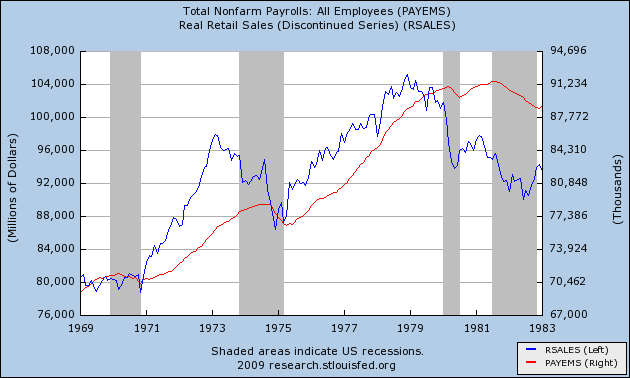
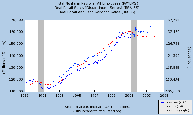
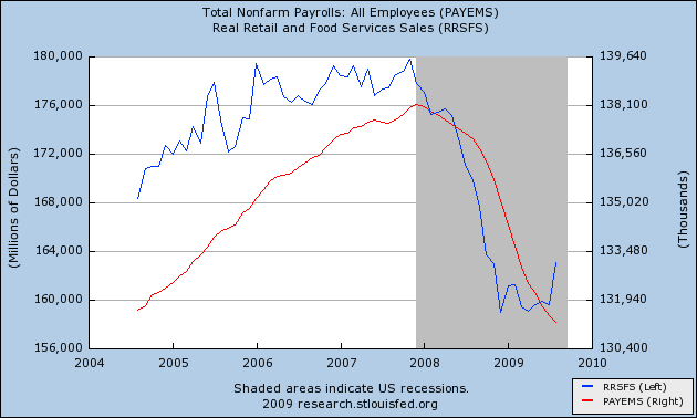
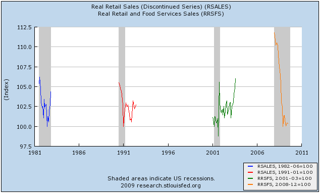
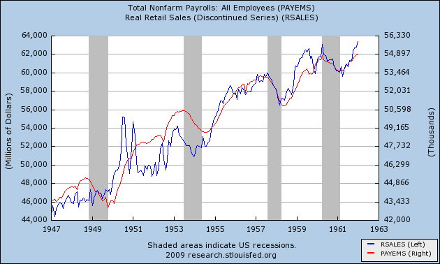
We like to think that jobs must lead consumer spending. For example, Barry Ritholtz's Big Picture blog featured a cartoon based on that very idea within the last week. It is a commonplace to read on economics blogs that, because there is no job growth, consumer spending will continue to suffer. In fact, 60 years of data shows exactly the reverese! It is real retail sales which lead the creation or loss of jobs some months into the future. It is a consistent relationship with almost no exceptions. And it is a significantly leading indicator. So I am going to show you the entire series via graphs:
Here is the postwar period from 1948 through 1962. With the sole exception of the 1961 recession, Real retail sales (the blue line) consistently peaks and troughs ahead of payrolls (the red line):
as it does during the 1970s recessions:
as it does during the 1991 and 2001 recessions and "jobless recoveries":
as it has done now:
In addition to the 1961 recession, the only other two times in which Real retail sales did not lead were the 1948 peak and the 1970 trough.
In fact, real retail sales has over the last 60 years peaked a median +5 months ahead of jobs, with the following variance: (-4, -3, 0, +1, +4, +5, +5, +11, +14, +16, +17).
It has also troughed a median +5 months ahead of jobs, with the following variance: (-2, 0, +2, +3, +4, +6, +6, +7, +9, +23). Note that the bottoms are more regular and close in time than the peaks -- peaks tend to be long sprawling affairs whereas most bottoms have been "v" shaped. I will discuss the outlier -- the 2002-3 recovery -- in some detail in part Five.
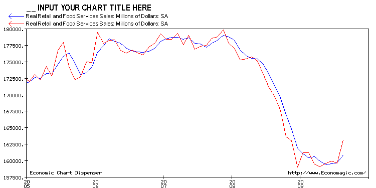
Because real retail series is a "noisy" series, it helps to smooth the data over 3 months. But doing so only moves all but one of the peaks and two of the troughs a grand total of 1 month, and the median lead time for peaks remains the same at +5. The median lead time at troughs becomes even tighter, shortening to +3.5 months.
As it happens, our own episode is one of the two episodes where smoothing the real retail sales data moves the trough, from December 2008 to April 2009. Here is the graph showing that difference, courtesy of Economagic:
What separates the cluster of entries nearer the median from the outliers is, as with Industrial Production, the strength of the move. Flat moves in real retail sales generate a lot of noise, and a longer period between the turn in sales and payrolls. Strong moves in sales generate reliable subsequent moves in payrolls within 8 months after the turn. In general, with regard to recoveries, an increase of about +2.5% a year is necessary to reliably generate a subsequent move in real retail sales.
[note that the above graph does not include this past week's 2%+ growth in real retail sales, which gives ~2.5% growth.]
This was even true of the 2002-3 "jobless recovery." When real retail sales briefly grew at about 2.5% in the first six months of 2002, in July 2002 for the first time, the economy added jobs. When real retail sales thereafter stalled again, jobs were slowly lost again.
Translating that into our recession/recovery so far, an increase from the 3-month average bottom at $159.4 million, means a move to $163.4 million. As of August's number, reported on Tuesday, the three month average is $160.9 million, a gain of 0.9%, not nearly enough of an increase yet to generate a positive jobs number.
There is much more that can be done by using Real Retail Sales as "the Holy Grail." In part Five I will discuss how it can be used in conjunction witht the other series already described to better pinpoint when job growth is likely to occur. Finally, in Part Six, I will show how it can be used to forecast the peak in Unemployment.
Thursday, September 17, 2009
Jobless claims, Housing starts, Philly Fed
- by New Deal democrat
The economic news this week has been relentlessly better, and today's news continues the streak.
Jobless claims, at 545,000, can't exactly be called "good," but it is the first time, leaving aside the July anomaly compromised by auto plant closures, that claims have been under 550,000. The 4-week moving average went down to 563,000, again the lowest save one week in July.
In terms of the extent to which this will be a "jobless recovery," the very slow decline in the 4 week average is inconsistent with a positive number, or even a number better than -100,000, when September employment is reported (the model by Michael Duecker applying Prof. Hamilton's research doesn't look like it's going to hold up so well, at least this month).
Housing starts and permits were also up. Since housing is the leading indicator of the consumer economy, its continued improvement is a welcome sign. As I pointed out a couple of weeks ago, even in the Great Depression housing bottomed in 1933 and then improved. ~600,000 permits and starts isn't very strong, but they are up over 100,000 from the April low.
Finally, the Philly Fed September reading of 14.1, up from 4.2 in August, is continued expansion and improvement. The only fly in the ointment there is that new orders, while positive, were slightly down from last month. The Philly Fed appears to confirm the Empire State survey and suggests that the ISM manufacturing index may well breach the 54 level when it is reported in 2 weeks.
In short, all of the data this week serves to confirm that the Recovery is underway. How well and how soon it will translate into jobs is still very much in question.
When Will the Economy start to add Jobs? (III.) Industrial Production & duration of Unemployment
This is the Third of probably Five posts exploring leading indicators for job growth in the economy. So far I have examined initial jobless claims, which have until now been declining gradually, and which at their trend rate must decline at least 3 more months before they would get to the point where jobs would be created; and the ISM manufacturing employment data, which is very strong and suggests the jobs could be added to the economy next month, and even possibly now.
In this, the third installment, I'm going to examine Industrial Production, and duration of Unemployment - the first of which gives a very brief leading signal, and the second of which appears to be of only limited value -- before I get to "the Holy Grail" in part IV.
Industrial Production, which was just reported yesterday morning, is probably the single most important marker of the end of recessions. It tends to make a clean "v" in graphs right at the end of recessions. This is not a coincidence since the NBER makes use of it in their determination.
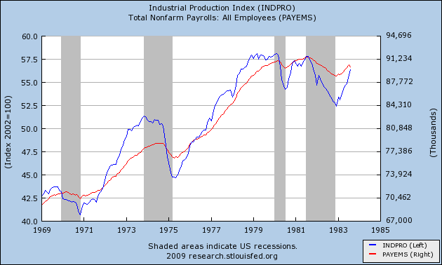
As compared with payrolls, however, industrial production does have a slightly leading characteristic. It tends to peak a median +2 months before payrolls, and to trough at the end of recessions a median +1 month before payrolls. In particular, of the 10 troughs since World War 2, in 8 of them industrial production troughed within 2 months of the payrolls number. For example, here is the graph of the two series for the 1970s recessons:
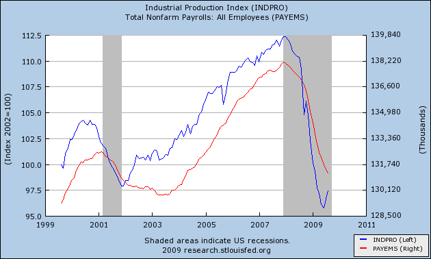
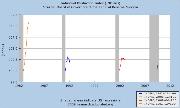
The most notable exception, of course, was 2002-3, when production troughed a full 20 months before payrolls, as shown here, along with our present recession/recovery:
Without more, at best we can say that the odds are nevertheless quite good, historically, that the trough in jobs will be within 2 months of the trough in industrial production -- which would mean the economy should start to produce actual job growth this month!
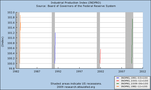
Fortunately, there is some further guidance, because the only times that industrial production has led employment growth by a relatively long period of time, it has also shown weak growth -- less than 5% a year. In more typical V shaped job recoveries, it has grown at a rate of 10% or more a year. Here are two graphs, the first showing the rate of industrial production growth in the 1953, 1992, 2002, and present recoveries two months after their trough:
and here is the same graph extended one year for the prior three recoveries:
As of today, industrial production is up 1.8% in the last two months, and looks more like the 1983 V shaped job recovery than the two subsequent "jobless" recoveries. Should it continue to increase at a similar rate in the next month or two, that would correlate very well with past instances of V shaped job recoveries.
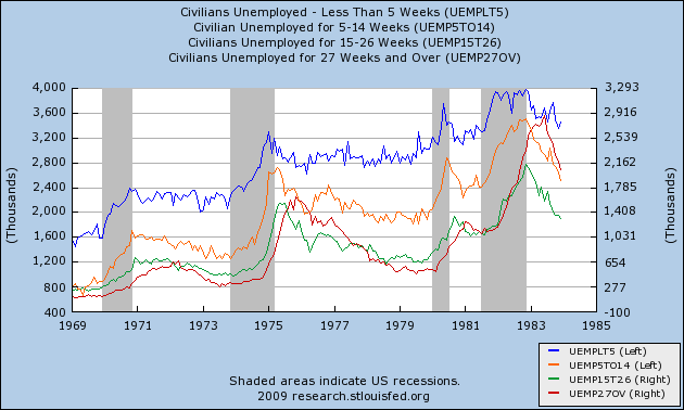
Various durations of unemployment are reported monthly together with payrolls. As I have mentioned before, the shorter the duration, the more it leads; the longer the duration, the more it lags, as shown for example in this graph (first blue, then orange, then green, then red):
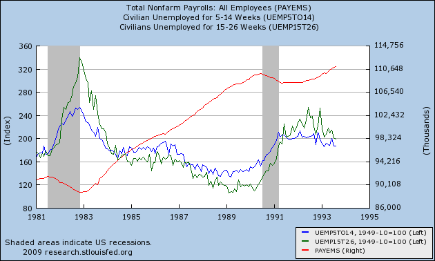
An examination of jobs data shows that it always troughs at or after the peak in the 5-14 duration weeks' employment data, but coincident with or slightly before the 15-26 week data, as shown for example here for the 1982 and 1991 recessions:
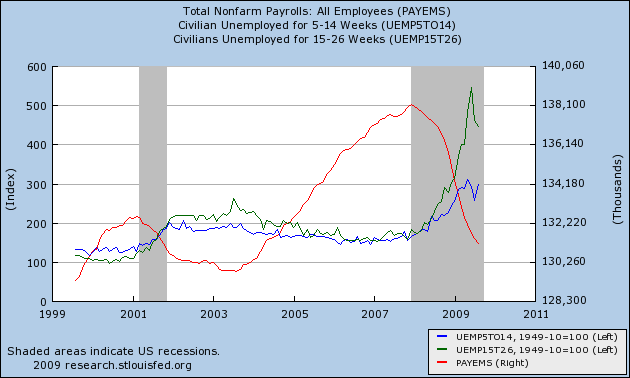
and here for the 2001 and present recession/recoveries:
Given that the interval between the peaks in the two series can be long, as it was in 2002-3, the series is of very little help. Both durations of unemployment data tend to become very "saw-toothed" as they approach and then recede from their peaks. The biggest pre-peak sawtooth in the 5-14 week data is 10%. Since we have already declined about 18% in that series before the recent upward move, that series has probably already peaked. But we have only declined about 7.5% from the peak in the 15-26 month data, which in the past has had a pre-peak sawtooth of 15%. At best, if we get a drop of more than 15% in that data, it might give us one month's lead on the trough in the jobs data.
Tomorrow (hopefully), I will discuss "the Holy Grail", the data series which almost infallibly gives a significant and relatively constant lead time for peaks and troughs in jobless claims, and also reliably indicates peaks in unemployment as well.
Wednesday, September 16, 2009
Another forecasting model for Job creation
- by New Deal democrat
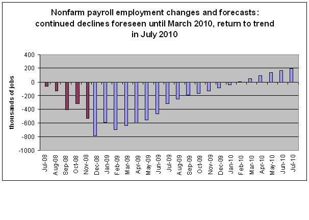
Prof. James Hamilton of Econbrowser has put up a guest post by Michael Dueker, who is using an econometric business cycle model based on research published by Prof. Hamilton. The model's last prediction of the length and job losses during the Recession, in December 2008, "Current business cycle forecasts see a July or August 2009 trough and a jobless recovery until March 2010", proved uncannily accurate in forecasting the end date of the Recession, and included this graph of projected payroll losses in 2009 and beyond:
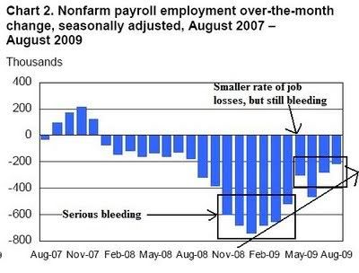
The only difference between that graph and what really happened was that February was worse than forecast, and May and June got reversed. The forecast even closely mimicked the actual 216,000 losses in August! Here's Bonddad's graph of what actually happened:
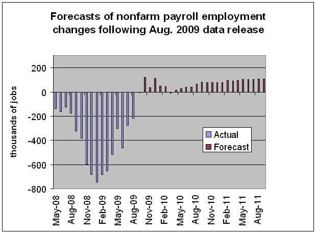
I encourage your to click through to Econbrowser and read the entire December 2008 article. Why? Because here is the updated projection of the jobs graph in the article posted Monday:
Your eyes are not deceiving you. The updated forecast calls for miniscule job losses this month, and actual growth of almost 100,000 jobs in October.
So far this year, business cycle models have been spot on, producing results diametrically opposed to the almost uniformly bearish "fundamental analysis" in the econoblogosphere.
But even I have problems going as far as Duecker. As I understand it, basically Hamilton's model considers recesssions/recoveries like an "on/off" switch for interpreting data. Depending on which you are in, you get different results. At least we won't have to wait long to see how accurate Duecker's prediction is. Per my prior posts, we would need a very quick drop of jobless claims to 500,000 or under in the next few weeks to coincide with the flat payroll projection Duecker makes for September -- and of course, we get our next installment tomorrow morning.
Industrial Production up +0.8% in August 2009
- by New Deal democrat
The Federal Reserve has reported that Industrial Production rose 0.8% in August. July's number was also revised up 0.4% to 1.0%. April through June were revised lower. Capacity utilization also rose +0.9% to 69.6% (which still means that industrial capacity is unlikely to be fully utilized for a long time to come).
Industrial Production is one of 4 or 5 metrics that are typically used by the NBER to date the end of recessions, and it typically makes a "v" bottom. That appears to have been the case again in this recession, given the +1.8% rise in only two months.
I will be examining the relationship of Industrial Production to jobs tomorrow. Not just the rise, but the strength of the upturn are important. Then, hopefully on Friday, I will start to discuss the "Holy Grail" leading indicator for job growth.
August 2009 CPI
- by New Deal democrat
This morning the BLS reported that consumer inflation rose +0.4%(seasonally adjusted) in August, up +0.2% NSA. While year-over-year prices are still - 1.5% into deflation, this is an increase from last month's bottom of -2.1%.
The deflationary bust of early 2009 unfolded in accord with the optimistic scenario I laid out in January:
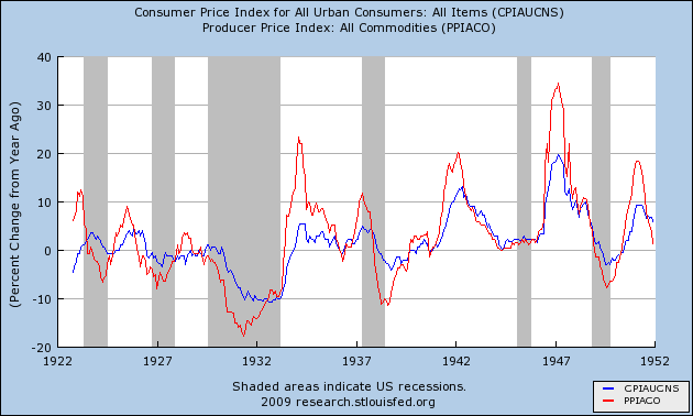
In the pre-World War 2 era of deflationary busts, including the Great Depression, PPI for commodities bottomed and turned around either before or simultaneously with CPI. when YoY CPI bottomed, the bust ended. Such a bottom coincided with increased demand. Here is the consumer and commodity inflation data during the deflationary 1920-1950 era demonstrating this point:
Note that commodities (in red) almost always turned up before the economy as a whole did. Typically CPI (in blue) bottomed on a year-over-year basis at the end of deflationary recessions, including the Great Depression.
By August, YoY commodity deflation, producer deflation, and now consumer inflation have all bottomed, signalling by pre-WW2 metrics of deflationary busts, that global consumer demand has increased, and thus the recession has indeed ended, as Fed Chair Ben Bernanke opined yesterday.
Food inflation has also turned around:
Food has declined for 5 of the last 6 months, and is now only up 0.4% YoY.
It is noteworthy that 2 of the 5 coincident indicators known to be used by members of the NBER to date the end of recessions -- real retail sales and industrial production -- have increased, and 2 others -- personal income and aggregate hours work -- appear to have bottomed, consistent with the pre-WW2 deflationary bust scenario outlined above. Only jobs have yet to turn around.
This morning the BLS reported that consumer inflation rose +0.4%(seasonally adjusted) in August, up +0.2% NSA. While year-over-year prices are still - 1.5% into deflation, this is an increase from last month's bottom of -2.1%.
The deflationary bust of early 2009 unfolded in accord with the optimistic scenario I laid out in January:
In the Optimistic scenario, the fiscal and monetary stimuli, together with intelligent new political leadership in Washington, halt the meltdown perhaps by mid-year, and wage reductions remain the exception. In the Pessimistic scenario, the stimuli fail, and wage reductions spread, leading to a wage-price deflationary spiral.
In the Optimistic scenario, monthly inflation remains positive, but perhaps at 1/3 to 1/2 the level of last year. By the end of June, first half 2009 inflation will be in the 1.4%-2.2% range. Year over year, however, as the 2008 numbers are replaced, DEflation will be realized, falling to (-2.0%) - (-2.7%) range....
In the Pessimistic scenario, monthly inflation remains near 0%-1% in the first half, and is firmly negative, though less than 2008 in the second half. By mid-year, YoY DEflation will be somewhere in the (-3%) - (-4.5%) range....
In the pre-World War 2 era of deflationary busts, including the Great Depression, PPI for commodities bottomed and turned around either before or simultaneously with CPI. when YoY CPI bottomed, the bust ended. Such a bottom coincided with increased demand. Here is the consumer and commodity inflation data during the deflationary 1920-1950 era demonstrating this point:
Note that commodities (in red) almost always turned up before the economy as a whole did. Typically CPI (in blue) bottomed on a year-over-year basis at the end of deflationary recessions, including the Great Depression.
By August, YoY commodity deflation, producer deflation, and now consumer inflation have all bottomed, signalling by pre-WW2 metrics of deflationary busts, that global consumer demand has increased, and thus the recession has indeed ended, as Fed Chair Ben Bernanke opined yesterday.
Food inflation has also turned around:
The food index rose 0.1 percent
following a 0.3 percent decline in July. The food at home index,
which fell 0.5 percent in July, was unchanged in August.
Food has declined for 5 of the last 6 months, and is now only up 0.4% YoY.
It is noteworthy that 2 of the 5 coincident indicators known to be used by members of the NBER to date the end of recessions -- real retail sales and industrial production -- have increased, and 2 others -- personal income and aggregate hours work -- appear to have bottomed, consistent with the pre-WW2 deflationary bust scenario outlined above. Only jobs have yet to turn around.
Tuesday, September 15, 2009
Important News from Bonddad
"Vacation rocks"
In other news, the DJIA closed near 9700 today, nearing the psychologically important 10,000 level. Do you think it will cross 10,000 by the end of this year? Since the markets fell precipitously in the first week of October 2008, do you believe we will have a positive year-over-year DJIA or S&P 500 print by October 10 of this year?
Retail Sales soar in August; Empire State Mfg. soars for September
- by New Deal democrat
Yesterday I noted that retail sales would probably be the most important number reported this week. The Census Bureau just obliged, reporting not only that overall retail sales soared - even above raised expectations due to "cash for clunkers" - by 2.7%! Even ex-autos, retail sales were up 1.1%.
Additionally, the New York Fed's Empire State index rose from 12.08 to 18.88 for September. This report, along with other regional reports, is looked to as a harbinger of the next ISM report. If this region's report is confirmed by those of other regions, it will suggest (per my post just below) that the ISM manufacturing index is going to continue to climb strongly, past the 54 mark that in the past has always coincided with actual job growth.
Finally, separately the Census Bureau reported that the Inventory/Sales ratio, which measures how much slack is in the sales system, declined to 1.36 in July from 1.38 in June. At the depth of the recession, this ratio had risen to 1.46. The Inventory/Sales ratio has recently been falling .02/month, and since this just-released data is 2 months old, the ratio now might actually be 1.32. In the economic expansion earlier this decade, job growth finally occurred when the ratio fell to 1.31 in late 2003, and the ratio varied between 1.24 and 1.31 for the rest of the expansion.
All of these numbers stick a fork in the idea that the recession might still be lingering (subject to confirmation by my co-blogger, Invictus, of course!). Moreover, as I will discuss later this week, the retail sales data is extremely important to a discussion of when the recovery will start to add jobs. In short, the odds of a V-shaped jobs recovery just got considerably better.
When will the Economy start to add Jobs? (II.) More on the ISM, and getting the Manpower index wrong
- by New Deal democrat
This is the second in a series of posts in which I will try to address the question, "When will the recovery add jobs?" In the first post, I looked at new jobless claims and suggested that they must fall to a level of at least 530,000 over a sustained period, or quickly under 500,000 to generate actual job growth. If jobless claims continue to decline at the slow trend of ~17,500/month, that would take another 3 months (at minimum).
In this post I will take a further look at the ISM manfuacturing index, which I have already noted correlates very strongly with job growth and loss, discussing two aspects in detail. As part of doing so, I will argue that the blogosphere overlooked perhaps the most important data in the Manpower hiring index from last week when they emphasized the part that said:
While the blogosphere correctly noted the extremely low levels of employers planning to hire, it failed to note that in the past, the manpower survey has actually lagged employment growth by one quarter, as employers tend to make plans for hiring in the coming quarter by projecting the last quarter into the future, as shown on this graph:
The first of two errors by the blogosphere is that it should have taken note that immediately subsequent to the record low hiring plans of 4Q 1982 came a hiring surge that began in January 1983, as employers quickly needed to catch up. I'll return to the second error later.
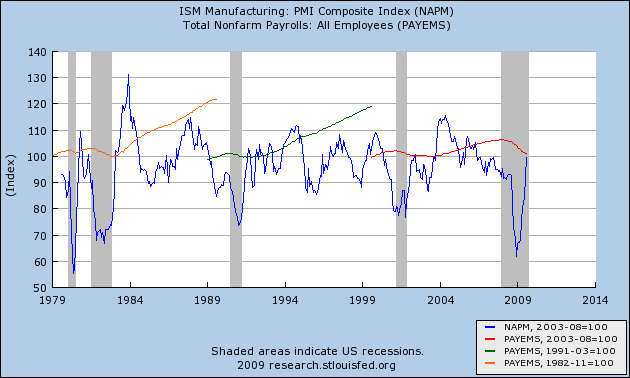
In a prior post, I noted that unlike previous recoveries in the 1992 and 2002 recoveries, the ISM manufacturing index never rose above 53.6, in contrast to earlier recoveries where it quickly rose above 55 or even 60. I have prepared a graph that confirms that indeed the level of 53 or above strongly correlates with the economy adding jobs Below that number the economy tends to shed jobs. In the graph, below, the low point for payrolls in each of the last 3 recessions (shown in red, green, and orange, respectively) is normed to 100. A reading of 103, for example, means 3 percent growth in payrolls from that low point. The ISM index is normed so that it crosses the 100 threshold at a reading of 53:
Note that the 53 level is the point where jobs began to be added in the very strong recovery after 1982, as well as during the week recoveries of 1992 and 2002. As of August, the index had surged to 52.9. Unless the index stalls out at the 53 level for several months, as it did in 2002, it suggests that job growth could begin as early as October, should there be two confirming readings above 53 in a row. Further, to date, a reading over 54 on the index has always coincided with actual job growth.
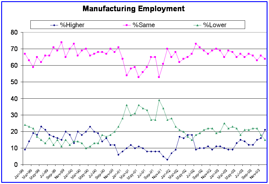
Another portion of the ISM index deals directly with employment. The employment index compares the percentage of employers planning to hire, lay off, or keep current staffing levels in the next month. A reading above 50 indicates net hiring, and visa versa for a reading below 50. Two items of data in this index stand out very clearly as harbingers of or absolutely coincident with employment growth. First, whenever the hiring vs. firing index is -5 or higher (i.e., no more than 5% more employers plan to fire than hire) and rising, where other evidence indicates a recession is ending, that has always indicated net employment growth was imminent, at least on a temproary basis.
Secondly, whenever current staffing intentions were 65+. and hiring plans were 15+, that has always coincided with positive jobs numbers in the BLS survey, including during and after the "jobless recoveries" of 1992 and 2002. Most typically as a recession ends, first fewer employers plan to lay employees off, and the number intending to keep current staffing levels rises - frequently past 65 to 70 percent. Next the percent intending to hire gradually rises even as the high percent of employers planning no change levels off or declines. In other words, employers tend to hoard plans to actually hire until they are sure that order growth is sustained, and during that interim an extraordinarily high percent will plan no changes. Here is a graph of the 2001 recession and the recovery afterward, showing this typical point:
And here is the current graph:
We just reached the 70 percent no change level in July. In August that dropped to 69, but hiring intentions rose to 13. A shift of merely two percent would give us the 65+/15+ reading that has always coincided with employment growth in the past. The current reading of the index is -6, just one short of the -5 reading that has typically been a harbinger of growth. Again, unless the trend tops out here, job growth would appear to be very close.
And that brings us to the second way in which the blogosphere got the Manpower survey at least partly wrong last week: ignored in the blogosphere was the announcement that the number of employers planning no change in staffing levels reached an all time high:
In other words, the manpower survey corresponds well to the ISM survey from July. Any unexpected increase in customer demand is going to force these employers to increase plans to hire from their extremely low levels.
In summary, the ISM manufacturing index information argues strongly that, IF present trends continue for even a couple more months, the economy will begin to add jobs.
This is the second in a series of posts in which I will try to address the question, "When will the recovery add jobs?" In the first post, I looked at new jobless claims and suggested that they must fall to a level of at least 530,000 over a sustained period, or quickly under 500,000 to generate actual job growth. If jobless claims continue to decline at the slow trend of ~17,500/month, that would take another 3 months (at minimum).
In this post I will take a further look at the ISM manfuacturing index, which I have already noted correlates very strongly with job growth and loss, discussing two aspects in detail. As part of doing so, I will argue that the blogosphere overlooked perhaps the most important data in the Manpower hiring index from last week when they emphasized the part that said:
Employers' hiring plans for the upcoming fourth quarter dropped to their lowest level in the history of Manpower's Employment Outlook Survey, which started in 1962. .... Before this year, the survey's previous low point was a net 1% hiring outlook for the third quarter of 1982.
While the blogosphere correctly noted the extremely low levels of employers planning to hire, it failed to note that in the past, the manpower survey has actually lagged employment growth by one quarter, as employers tend to make plans for hiring in the coming quarter by projecting the last quarter into the future, as shown on this graph:
The first of two errors by the blogosphere is that it should have taken note that immediately subsequent to the record low hiring plans of 4Q 1982 came a hiring surge that began in January 1983, as employers quickly needed to catch up. I'll return to the second error later.
In a prior post, I noted that unlike previous recoveries in the 1992 and 2002 recoveries, the ISM manufacturing index never rose above 53.6, in contrast to earlier recoveries where it quickly rose above 55 or even 60. I have prepared a graph that confirms that indeed the level of 53 or above strongly correlates with the economy adding jobs Below that number the economy tends to shed jobs. In the graph, below, the low point for payrolls in each of the last 3 recessions (shown in red, green, and orange, respectively) is normed to 100. A reading of 103, for example, means 3 percent growth in payrolls from that low point. The ISM index is normed so that it crosses the 100 threshold at a reading of 53:
Note that the 53 level is the point where jobs began to be added in the very strong recovery after 1982, as well as during the week recoveries of 1992 and 2002. As of August, the index had surged to 52.9. Unless the index stalls out at the 53 level for several months, as it did in 2002, it suggests that job growth could begin as early as October, should there be two confirming readings above 53 in a row. Further, to date, a reading over 54 on the index has always coincided with actual job growth.
Another portion of the ISM index deals directly with employment. The employment index compares the percentage of employers planning to hire, lay off, or keep current staffing levels in the next month. A reading above 50 indicates net hiring, and visa versa for a reading below 50. Two items of data in this index stand out very clearly as harbingers of or absolutely coincident with employment growth. First, whenever the hiring vs. firing index is -5 or higher (i.e., no more than 5% more employers plan to fire than hire) and rising, where other evidence indicates a recession is ending, that has always indicated net employment growth was imminent, at least on a temproary basis.
Secondly, whenever current staffing intentions were 65+. and hiring plans were 15+, that has always coincided with positive jobs numbers in the BLS survey, including during and after the "jobless recoveries" of 1992 and 2002. Most typically as a recession ends, first fewer employers plan to lay employees off, and the number intending to keep current staffing levels rises - frequently past 65 to 70 percent. Next the percent intending to hire gradually rises even as the high percent of employers planning no change levels off or declines. In other words, employers tend to hoard plans to actually hire until they are sure that order growth is sustained, and during that interim an extraordinarily high percent will plan no changes. Here is a graph of the 2001 recession and the recovery afterward, showing this typical point:
And here is the current graph:
We just reached the 70 percent no change level in July. In August that dropped to 69, but hiring intentions rose to 13. A shift of merely two percent would give us the 65+/15+ reading that has always coincided with employment growth in the past. The current reading of the index is -6, just one short of the -5 reading that has typically been a harbinger of growth. Again, unless the trend tops out here, job growth would appear to be very close.
And that brings us to the second way in which the blogosphere got the Manpower survey at least partly wrong last week: ignored in the blogosphere was the announcement that the number of employers planning no change in staffing levels reached an all time high:
There was one positive sign in the survey: 69% of employers said they planned no change in their hiring plans, up from 67% in the third quarter and 59% in the fourth quarter a year ago.
In other words, the manpower survey corresponds well to the ISM survey from July. Any unexpected increase in customer demand is going to force these employers to increase plans to hire from their extremely low levels.
In summary, the ISM manufacturing index information argues strongly that, IF present trends continue for even a couple more months, the economy will begin to add jobs.
Monday, September 14, 2009
ECRI: Job Growth by Year's end
- by New Deal democrat
The Economic Cycle Research Institute has made a bold prediction: there will be actual jobs growth in the service sector by the end of the year. Here's what they say:
I include this item not just for its contrarian boldness, but also because:
1. ECRI does not sell stocks or bonds. It is only a forecasting service, and has no conflict of interest.
2. ECRI was around during the Great Depression, and its forecasting model includes data from that era.
3. ECRI has been pounding the table bullish on the economy since March, calling for the recession to end by the end of summer, while almost all other pundits were predicting continued free fall at best. Now, most economists do agree that in GDP terms, the recession did indeed probably end this summer.
The Economic Cycle Research Institute has made a bold prediction: there will be actual jobs growth in the service sector by the end of the year. Here's what they say:
"The rise in WLI [weekly leading indictors] growth to a record high reinforces our earlier forecast that at least the early stage of the current economic recovery will be more vigorous than the last two," said ECRI Managing Director Lakshman Achuthan.
....
"We expect non-manufacturing employment -- which is where 91 percent of us work -- to be positive by year end," Achuthan said.
"We are talking about recovery that includes jobs growth in the non-manufacturing sector, and we are talking about a recovery that includes increases in consumer spending.
I include this item not just for its contrarian boldness, but also because:
1. ECRI does not sell stocks or bonds. It is only a forecasting service, and has no conflict of interest.
2. ECRI was around during the Great Depression, and its forecasting model includes data from that era.
3. ECRI has been pounding the table bullish on the economy since March, calling for the recession to end by the end of summer, while almost all other pundits were predicting continued free fall at best. Now, most economists do agree that in GDP terms, the recession did indeed probably end this summer.
The Economy This Week
- by New Deal democrat
Welcome back from your weekend! While Bonddad's enjoying himself on vacation this week, we won't leave you uninformed.
There's not much on the economic calendar today, but beginning tomorrow, we get reports on producer and consumer inflation, industrial production, business inventories, housing starts, initial jobless claims, retail sales (which I'll argue may be the most important release of all), and Federal reserve economic surveys in the New York and Philadelphia regions.
I'm not sure what Invictus may have planned, but in addition to the above, I plan to continue my series asking, "When will the economy add jobs?" hopefully beginning later today.