In this space you will usually find a picture of my and Mr$. Bonddad's kids -- our three dogs. However, I wanted to especially hat tip a friend who has been dead-on accurate in many economic calls throughout the last year. He blogs over at Blah3. Please show him some appreciation over the next three days and peruse the economic writing at his blog (among other observations).
I will be back on Monday morning, bright and early.
Friday, December 5, 2008
Chip Sales Decreasing
Technology was supposed to be the saving grace for this expansion. Remember -- some people continued to argue the problems in the financial sector were "contained", implying they would not spread out to other sectors. We all know now that was complete garbage.
Semiconductors are the building blocks of modern electronics -- they are in everything.
So when a semi conductor manufacturer says they are idling plants you know there is trouble ahead:
As this chart of the semi conductor's trust indicates the industry is not immune from the current market problems.

Click for a larger image.
Notice the following on the one year chart:
-- Prices are near a one year low
-- Prices are below the 200 day SMA
-- All the SMAs are moving lower
-- Prices are below all the SMAs except the 10 day SMA
The reality of the situation is this slowdown is broad and wide.
Semiconductors are the building blocks of modern electronics -- they are in everything.
Semiconductor devices, electronic components made of semiconductor materials, are essential in modern consumer electronics, including computers, mobile phones, and digital audio players. Silicon is used to create most semiconductors commercially, but dozens of other materials are used.
So when a semi conductor manufacturer says they are idling plants you know there is trouble ahead:
Toshiba Corp (6502.T: Quote, Profile, Research, Stock Buzz), the world's No. 2 maker of NAND flash memory, will halt chip production at two plants for nine days due to weak demand, in its first output break in seven years, broadcaster NHK reported on Friday.
Toshiba shares rose nearly 3 percent after the report, but company spokeswoman Hiroko Mochida denied that it planned to temporarily shut down all operations at the factories in Yokkaichi, in western Japan, and Oita, in southern Japan.
As this chart of the semi conductor's trust indicates the industry is not immune from the current market problems.

Click for a larger image.
Notice the following on the one year chart:
-- Prices are near a one year low
-- Prices are below the 200 day SMA
-- All the SMAs are moving lower
-- Prices are below all the SMAs except the 10 day SMA
The reality of the situation is this slowdown is broad and wide.
Employment Drops 533,000; September and October Revised Lower
From the BLS:
Yes -- you read that one right. Let's make a couple of preliminary observations:
-- The best read of job creation during the latest expansion is 7.2 million. We just lost nearly 7% of all the jobs created in one month.
-- September and October were revised lower. The combined total of those two months is 10% of all jobs created during the last expansion.
-- The total job losses for the last three months is 1.2 million or 17% of all jobs created in the last expansion.
There is nothing good in this report -- every area of employment was hit hard.
Consider the following points from the report:
Using the previously cited totals, we've lost 37.5% of all jobs created during the last expansion.
And the hits just keep coming:
Yesterday I posted this article which also had relevant charts regarding employment growth and the number of people unemployed for a specific amount of time.
Nonfarm payroll employment fell sharply (-533,000) in November, and the unemployment rate rose from 6.5 to 6.7 percent, the Bureau of Labor Statistics of the U.S. Department of Labor reported today. November's drop in payroll employment followed declines of 403,000 in September and 320,000 in October, as revised. Job losses were large and widespread across the major industry sectors in November.
Yes -- you read that one right. Let's make a couple of preliminary observations:
-- The best read of job creation during the latest expansion is 7.2 million. We just lost nearly 7% of all the jobs created in one month.
-- September and October were revised lower. The combined total of those two months is 10% of all jobs created during the last expansion.
-- The total job losses for the last three months is 1.2 million or 17% of all jobs created in the last expansion.
There is nothing good in this report -- every area of employment was hit hard.
Consider the following points from the report:
Both the number of unemployed persons (10.3 million) and the unemployment rate (6.7 percent) continued to increase in November. Since the start of the recession in December 2007, as recently announced by the National Bureau of Economic Research, the number of unemployed persons increased by 2.7 million, and the unemployment rate rose by 1.7 percentage points. (See table A-1.).
Using the previously cited totals, we've lost 37.5% of all jobs created during the last expansion.
And the hits just keep coming:
Among the unemployed, the number of persons who lost their job and did not expect to be recalled to work increased by 298,000 to 4.7 million in November.
Over the past 12 months, the size of this group has increased by 2.0 million. (See table A-8.)
The number of long-term unemployed (those jobless for 27 weeks or more) was little changed at 2.2 million in November, but was up by 822,000 over the past 12 months. (See table A-9.)
Over the month, the number of persons who worked part time for economic reasons (sometimes referred to as involuntary part-time workers) continued to increase, reaching 7.3 million. The number of such workers rose by 2.8 million over the past 12 months. This category includes persons who would like to work full time but were working part time because their hours had been cut back or because they were unable to find full-time jobs. (See table A-5.)
Yesterday I posted this article which also had relevant charts regarding employment growth and the number of people unemployed for a specific amount of time.
We're Nowhere Near a Bottom in Housing
Or maybe we are. My friend New Deal Democrat has a really nice story up on housing. It's a very good read on the current situation.
Forex Friday's

Click for a larger image
Notice the following on the weekly chart:
-- Prices rose 22% from the end of July to December
-- Prices hit upside resistance at price levels established in 2006
-- All the SMAs are increasing
-- Prices are above all the SMAs
-- The shorter SMAs are above the longer SMAs
BUT:
-- The RSI is very overbought and
-- The MACD is overbought

Click for a larger image
Notice the following on the daily chart
-- The uptrend started in July is still intact
-- Prices have stabilized in a 3-4 point range
BUT
-- The 10 and 20 day SMA are both moving more sideways than up
-- Prices are entangled with the 10 and 20 day SMA
-- The RSI is decreasing
-- The MACD is decreasing
Bottom line: technical indicators at the weekly and daily levels are pointing to this rally being over. The SMA/price situation on the daily chart is adding to that conclusion. Keep your eyes open for a fundamental catalyst to move the dollar lower
Thursday, December 4, 2008
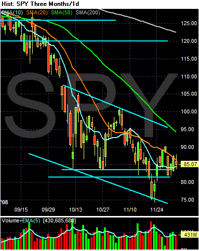
While most of the technical points are still decidedly negative, note there is strong support in the (roughly) 82-84 area. That being said, notice the still negative tone of the market.
-- All the SMAs are moving lower
-- The shorter SMAs are below the longer SMAs
-- Prices found upside resistance at the 20 day SMA
Employment is Looking Grim
From Reuters
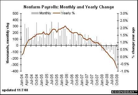
This is not good news. Consider it in light of decreasing establishment employment:
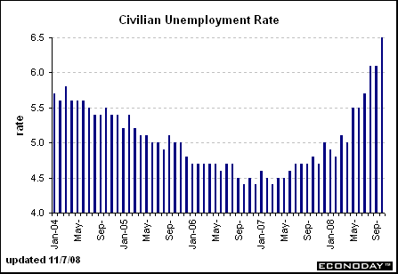
Increasing unemployment:
Increasing lengths of unemployment (click for a larger image):


And an increase in the absolute length of unemployment (click for a larger image):


The number of U.S. workers on jobless benefits rolls hit a 26-year high last month, data showed on Thursday, and it may head higher as a deepening economic slump forces a broad spectrum of firms to cut jobs.
Contributing to the labor-market gloom, a host of U.S. companies announced large-scale layoffs, including top U.S. phone company AT&T Inc, which is eliminating 12,000 jobs, and chemical maker DuPont, which is cutting 2,500.
This is not good news. Consider it in light of decreasing establishment employment:

Increasing unemployment:

Increasing lengths of unemployment (click for a larger image):


And an increase in the absolute length of unemployment (click for a larger image):


Retailers Report Terrible November
From the WSJ:
Let's think about this for a minute. Retailers already lowered expectations. And then the sales figures came in lower than the already lowered expectations. That's not good.
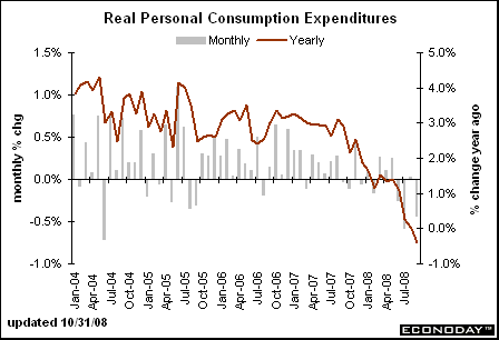
So -- without Wal-Mart's increase the discounters would have reported worse numbers. That's great news. And the other types of stores all reported bad numbers. This development shouldn't be a problem. Note that personal consumption expenditures have been dropping for some time:
As have retail sales:
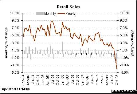
Let's take a look at some of the retail sectors to see what the charts say.

The above chart (and the charts that follow) are from Prophet.net. Notice the overall retail sector chart fell off a cliff a few months ago and is currently near 5 year lows.
Notice on the charts that follow of various sub-sectors of the retail area that prices have been dropping for some time:


Bottom line: retail is hurting badly.
Retailers reported some of the weakest sales figures in years for November, with many missing downbeat expectations, but Wal-Mart Stores Inc. continued its recent outperformance as it topped estimates on increased store traffic and transaction size.
Let's think about this for a minute. Retailers already lowered expectations. And then the sales figures came in lower than the already lowered expectations. That's not good.
Thomson Reuters noted discounters as a whole were the only retail segment expected to post same-store-sales growth for November, thanks to Wal-Mart. In contrast, department stores and apparel chains -- both of which have been struggling for some times -- were seen reporting double-digit declines. Both segments met those expectations.
So -- without Wal-Mart's increase the discounters would have reported worse numbers. That's great news. And the other types of stores all reported bad numbers. This development shouldn't be a problem. Note that personal consumption expenditures have been dropping for some time:

As have retail sales:

Let's take a look at some of the retail sectors to see what the charts say.

The above chart (and the charts that follow) are from Prophet.net. Notice the overall retail sector chart fell off a cliff a few months ago and is currently near 5 year lows.
Notice on the charts that follow of various sub-sectors of the retail area that prices have been dropping for some time:


Bottom line: retail is hurting badly.
Thursday Oil Market Round-Up
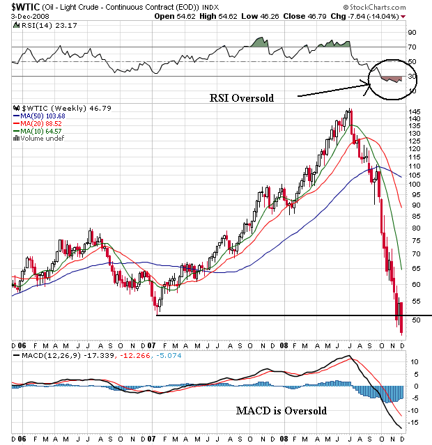
Click for a larger image
Notice the following on the weekly chart:
-- Prices are at their lowest point in three years
-- Prices have dropped 67% from their high five months ago
-- All the SMAs are moving lower
-- The shorter SMAs are below the longer SMAs
-- Prices are below all the SMAs
BUT
-- The RSI is very oversold
-- The MACD is oversold

Click for a larger image
Notice the following on the daily chart
-- Prices have been dropping for the last 5 months
-- All the SMAs are moving lower
-- The shorter SMAs are below the longer SMAs
-- Prices are below all the SMAs
BUT:
-- The MACD has been rising for about a month
Bottom line: There are technical indicators that say the market should rally. Like all indicators these should be read against the fundamental background of everybody selling their contracts and demand dropping.
Wednesday, December 3, 2008
Today's Market
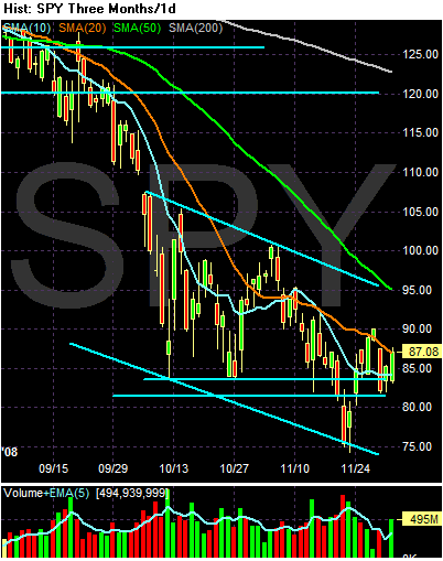
The main issue with the market right now is the volatility. As I noted yesterday, the market is in the middle of a downward sloping channel that is 20 points wide. That means there is a lot of room to maneuver. Add to that a large amount of economic uncertainty and you have serious volatility.
However, the overall background is still bearish. All the SMAs are moving lower and the shorter SMAs are below the longer SMAs. Prices are currently hitting resistance at the 20 day SMA.
Beige Book...Stinks
From the Federal Reserve:
I'll have more on this tomorrow.
Overall economic activity weakened across all Federal Reserve Districts since the last report. Districts generally reported decreases in retail sales, and vehicle sales were down significantly in most Districts. Tourism spending was subdued in a number of Districts. Reports on the service sector were generally negative. Manufacturing activity declined in most Districts, and new orders were soft. Nearly all Districts reported weak housing markets characterized by reduced selling prices and low, but stable, sales activity. Commercial real estate markets declined in most Districts. Lending contracted, with many Districts reporting reductions in residential, commercial and industrial lending and tightening lending standards. Agricultural conditions were mixed with a relatively good harvest but concerns about profitability. Mining and energy production and exploration started to soften due to lower output prices.
District reports generally described labor market conditions as weakening. Wage pressures were largely subdued. District reports characterized price pressures as easing in light of some decreases in retail prices and declines in input prices, particularly energy, fuel, and many raw materials and food products.
I'll have more on this tomorrow.
Commercial Mortgage Hitting the Skids
From Bloomberg:
1.) This should surprise, well, nobody, and
2.) It's going to get worse. A lot worse
Commercial mortgage delinquencies rose in November and will climb more as the economy slows and unemployment grows, according to Barclays Plc.
Payments more than 60 days late on commercial real estate loans that were bundled together and sold as bonds increased to 0.69 percent last month, compared with 0.57 percent in October and 0.51 percent in September, Barclays data show.
The “relative spike” in delinquent loans marks the “beginning of a sustained, upward trend,” Barclays analysts led by Aaron Bryson in New York said in a report yesterday. “We have repeatedly stressed that CMBS delinquencies are a lagging indicator of performance and tend to lag changes in employment by close to a year.”
Commercial property owners are having a harder time making debt payments as the recession curtails spending and crimps business growth. U.S. companies eliminated an estimated 250,000 jobs last month, the most since November 2001, ADP Employer Services said today.
1.) This should surprise, well, nobody, and
2.) It's going to get worse. A lot worse
Layoffs Surge
From CNBC:
Friday's job report is looking, well, terrible.
Let me add this as well. My own read on the next year is the following.
1.) So far we've lost about 16% of the total jobs created during the latest expansion (7.2 million created and 1.2 million lost). I'm obviously expecting that number to increase. The worst rate of job loss during a contraction over the last 60 years is 50% -- meaning, the percentage of jobs lost of all those created during the expansion. So, assuming a terrible rate of job loss -- say 250,000 to 300,000 a month, that means we've got about 6 months of job losses before we get to 50% rate of job losses.
2.) It's pretty obvious the new administration is considering a big stimulus bill. Assuming it will be large enough it should be enough to prevent a serious downturn. By large enough, I'm thinking $500 billion or so. Assuming that to be the case, we're looking at at least two more quarters of serious problems, probably followed by at least an additional two quarters (3Q - 4Q 2009) of really slow growth.
That means next year is shaping up to be a pretty bad year.
November layoffs at U.S. firms surged to their highest monthly level in nearly seven years during November, led by the financial and auto sectors, according to separate reports released Wednesday.
Job cuts announced in November totaled 181,671, up 61 percent from October and 148 percent higher than November 2007, when job cuts totaled 73,140, outplacement firm Challenger Gray & Christmas said in a report released on Wednesday.
A separate report by ADP Employer Services put the November job cuts at 250,000 jobs.
The November planned layoffs was the largest monthly toll since January 2002, when employers announced a record 248,475 planned layoffs.
Friday's job report is looking, well, terrible.
Let me add this as well. My own read on the next year is the following.
1.) So far we've lost about 16% of the total jobs created during the latest expansion (7.2 million created and 1.2 million lost). I'm obviously expecting that number to increase. The worst rate of job loss during a contraction over the last 60 years is 50% -- meaning, the percentage of jobs lost of all those created during the expansion. So, assuming a terrible rate of job loss -- say 250,000 to 300,000 a month, that means we've got about 6 months of job losses before we get to 50% rate of job losses.
2.) It's pretty obvious the new administration is considering a big stimulus bill. Assuming it will be large enough it should be enough to prevent a serious downturn. By large enough, I'm thinking $500 billion or so. Assuming that to be the case, we're looking at at least two more quarters of serious problems, probably followed by at least an additional two quarters (3Q - 4Q 2009) of really slow growth.
That means next year is shaping up to be a pretty bad year.
Wednesday Commodities Round-Up

Click for a larger image
Notice the following on the weekly chart:
-- Prices are below all the SMAs
-- Prices are at or near their lowest levels in three years
-- All the SMAs are moving lower
-- The shorter SMAs are below the longer SMAs
BUT:
-- The RSI is oversold, and
-- The MACD is oversold

Click for a larger image
Notice the following on the daily chart:
-- Prices have been dropping for five months
-- All the SMAs are moving lower
-- The shorter SMAs are below the longer SMAs
-- Prices are below all the SMAs
BUT:
-- The MACD has been rising for a month,
-- The RSI is approaching oversold levels and
-- Prices may be forming a double bottom
A cautionary note: several indicators have been "oversold" for several weeks. It's important to remember that no technical indicator is a fail-safe predictor of future behavior (would that it were). However, they can give important clues into the possibility of something happening. For example, it's simple logic that prices can't drop forever. Hence the possibility of a turnaround in the CRB is possible. However from the fundamental side, we're hearing more and more talk that includes terms like "deflation" and "deflationary spiral." Add to that the formal declaration of a recession by the NBER and the recent dropping in the ISM manufacturing numbers and you have a recipe for lower prices. In other words -- there are no magic formulas to any of this.
Tuesday, December 2, 2008
Today's Market
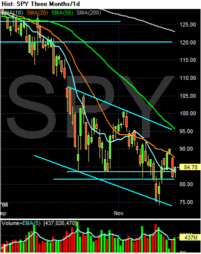
There are two important technical events right now.
1.) The market is in a clear downward sloping channel. So long as prices remain in that channel the market will be somewhat "predictable". However, notice there is roughly a 20 point range for prices to move in. That means we can have 15% - 20% moves and still be within the channel. So high volatility is still a possibility.
2.) I drew two horizontal lines to show key support areas from previously established lows. So long as these are maintained the technical outlook is fair.
However, there are still plenty of technical problems.
-- All the SMAs are moving lower
-- The shorter SMAs are below the longer SMAs
-- Prices are below the 200 day SMA
-- Prices are near the lower SMAs
Manufacturing Contracts
From the WSJ:
Here is the rel event data from the ISM press release:
This is terrible news; it indicates manufacturing is still in serious trouble. The combination of cratering commodity prices and a global recession is hitting everybody.
Below are some charts from Prophet.net that show the extent of the damange. Notice that the stock prices of all the following manufacturing sub-sectors have collpased over the last few months. Click on all images for a bigger image.


And here is a chart of manufacturing employment from the BLS. Don't expect this trend to pick-up anytime in the near future (Click for a larger image):

Grim economic data Monday showed more pain for U.S. manufacturing and construction.
The Institute for Supply Management, a key measure of U.S. manufacturing activity, said its overall index for last month moved to 36.2 from 38.9 in October and 43.5 in September. November's reading was the weakest since May 1982.
Cliff Waldman, an economist for the Manufacturers Alliance/MAPI trade group, said the sharp drop "indicates that the rapidly declining U.S. and global economies have created a deep and worrisome slump in the U.S. manufacturing sector."
The ISM report also showed payrolls shrank, with the employment index at 34.2 from 34.6. The new orders index dropped to 27.9 from October's 32.2.
And another sign emerged of the dour economy's effect on inflation. The ISM prices index hit 25.5 in November from 37.0 -- the lowest reading since May 1949.
Here is the rel event data from the ISM press release:
Manufacturing contracted in November as the PMI registered 36.2 percent, 2.7 percentage points lower than the 38.9 percent reported in October. This is the lowest reading since May 1982 when the PMI registered 35.5 percent. A reading above 50 percent indicates that the manufacturing economy is generally expanding; below 50 percent indicates that it is generally contracting.
A PMI in excess of 41.1 percent, over a period of time, generally indicates an expansion of the overall economy. Therefore, the PMI indicates contraction in both the overall economy and the manufacturing sector. Ore stated, "The past relationship between the PMI and the overall economy indicates that the average PMI for January through November (46.8 percent) corresponds to a 1.8 percent increase in real gross domestic product (GDP). In addition, if the PMI for November (36.2 percent) is annualized, it corresponds to a 1.5 percent decrease in real GDP annually."
This is terrible news; it indicates manufacturing is still in serious trouble. The combination of cratering commodity prices and a global recession is hitting everybody.
Below are some charts from Prophet.net that show the extent of the damange. Notice that the stock prices of all the following manufacturing sub-sectors have collpased over the last few months. Click on all images for a bigger image.


And here is a chart of manufacturing employment from the BLS. Don't expect this trend to pick-up anytime in the near future (Click for a larger image):

This Guys Worth $50 Million?
From the WSJ:
Let's see how Ford has done since 2006.

Click for a larger image
Clearly this guy is worth every penny.
Ford Motor Co. plans to tell Congress it is retooling itself to build small fuel-efficient cars and break from the past strategy of focusing mainly on large pick up trucks and sport-utility vehicles, and will cut the compensation package of Chief Executive Alan Mulally, as part of its bid to win support for a federal bail out of the Big Three auto makers, a person familiar with the matter said.
.....
It is unclear how Mr. Mulally's pay package will be reduced, this person said. Ideas under consideration included eliminating Mr. Mulally's salary untl the company returns to profitability, or replacing his salary with more stock options, this person said. The CEO has earned close to $50 million in total compensation since taking the helm of Ford in 2006.
Let's see how Ford has done since 2006.

Click for a larger image
Clearly this guy is worth every penny.
Treasury Tuesdays
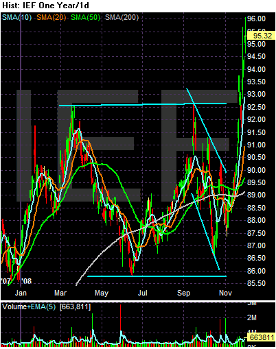
Prices have spiked above the upper trend lined of a year-long consolidation pattern. This indicates the credit crunch is still very much alive as traders seek-out investments that provide for a return of capital rather than a return on capital. While the interest rate on the 10 year is prohibitively low right now (2.72%) traders are still piling into the Treasury market.
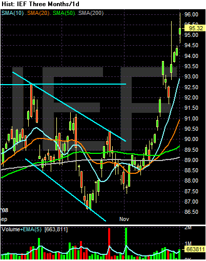
Notice the following on the three month chart:
-- Prices have clearly moved above the upper trend line of the year-long consolidation pattern
-- Prices are above all the SMAs
-- The 10, 20 and 50 day SMAs are all moving higher
-- The shorter SMAs are above the longer SMAs
Bottom line: In general, this is a very bullish chart. With the interest rate on the 10 year so low I am concerned prices can't move higher. However, we are in extraordinary times right now.
Monday, December 1, 2008
Today's Market
A combination of terrible economic reports and general concern about the length and breadth of the current downturn led to a big tumble today.
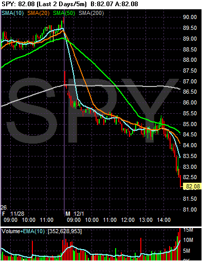
Notice the following on the daily chart:
-- Prices opened lower and then continued to drop
-- The 84.50 level offered a ton of support to prices
-- Once prices moved through the 84.50 level in a convincing fashion they tumbled on heavy volume
-- Prices closed at the absolue low on extremely heavy volume
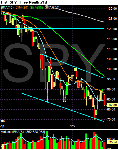
Notice the following on the daily chart:
-- All the SMAs are moving lower
-- The shorter SMAs are below the longer SMAs
-- Prices are now below all the SMAs
BUT
-- Prices are still within the downward sloping price channel
Bottom line: it's a damn ugly market right now.

Notice the following on the daily chart:
-- Prices opened lower and then continued to drop
-- The 84.50 level offered a ton of support to prices
-- Once prices moved through the 84.50 level in a convincing fashion they tumbled on heavy volume
-- Prices closed at the absolue low on extremely heavy volume

Notice the following on the daily chart:
-- All the SMAs are moving lower
-- The shorter SMAs are below the longer SMAs
-- Prices are now below all the SMAs
BUT
-- Prices are still within the downward sloping price channel
Bottom line: it's a damn ugly market right now.
Recession Began in December 2007
From Bloomberg:
I was late -- I thought the recession began in the 1Q of 2007.
The U.S. economy entered a recession a year ago this month, the panel that dates American business expansions said today.
The declaration was made by the cycle-dating committee of the National Bureau of Economic Research, a private, nonprofit group of economists based in Cambridge, Massachusetts. The last time the U.S. was in a recession was from March through November 2001, according to NBER.
“The committee determined that the decline in economic activity in 2008 met the standard for a recession,” the group said in a statement on its Web site. The 1.2 million drop in payroll employment so far this year was the biggest factor in determining that start of the contraction, the group said.
Federal Reserve policy makers at their last meeting predicted the economy will contract through the middle of 2009, in line with private economists’ forecasts. If correct, the recession would be the longest since the Great Depression.
“It is clearly not going to end in a few months,” Jeffrey Frankel, a member of the group and a professor at Harvard University, said in an interview. “We would be lucky to get done with it in the middle of next year.”
The contraction would be the second under President George W. Bush’s watch, making him the first U.S. leader since Richard Nixon to preside over two recessions.
I was late -- I thought the recession began in the 1Q of 2007.
Inflation, the Depression and Other Ruminations
There has been a lot of talk lately using the word "depression." I am in no way an expert on this event. But given the recent increase in the use of the word depression I think it would be a good idea to look at some of the economic items from that period.
Let's start with inflation. Here is a chart from the St. Louis Federal Reserve that shows the year over year percentage change in inflation.

Click for a larger image
Let's start by assuming inflation measuring statistics were less developed in the 1920s than now. That being said, this is all we've got from that period. So -- let's see what this chart says.
First, notice there were two recessions during this period. According to the NBER these were May '23 - July '24 and October '26 - November '27. But also notice the lack of year over year growth for the last four years of the decade. A little inflation is a good thing -- it indicates there is either a strong demand to increase prices or a strong enough increase in costs to allow companies to increase prices. Either way, a little inflation is healthy. However -- there was no inflation for the last four years of the decade. That is not healthy at all.

Click for a larger image
Above is the year over year percentage change in inflation from 1930 - 1939. Notice the price collapse in the first four years of the decade. From 1930 - 1934 year over year price movements s were negative. That's a heck of a lot of economic damage to recover from. Notice that year over year prices came back in 1935, but because this number was an increase from a huge drop I would argue it wasn't until 1936 at the earliest that prices got back to a healthy rate of increase. And then it would still take a few years to get back to 1930 levels.
So -- what have we learned? Deflation was an obvious issue in the 1930s. And deflation is not good.
Let's start with inflation. Here is a chart from the St. Louis Federal Reserve that shows the year over year percentage change in inflation.

Click for a larger image
Let's start by assuming inflation measuring statistics were less developed in the 1920s than now. That being said, this is all we've got from that period. So -- let's see what this chart says.
First, notice there were two recessions during this period. According to the NBER these were May '23 - July '24 and October '26 - November '27. But also notice the lack of year over year growth for the last four years of the decade. A little inflation is a good thing -- it indicates there is either a strong demand to increase prices or a strong enough increase in costs to allow companies to increase prices. Either way, a little inflation is healthy. However -- there was no inflation for the last four years of the decade. That is not healthy at all.

Click for a larger image
Above is the year over year percentage change in inflation from 1930 - 1939. Notice the price collapse in the first four years of the decade. From 1930 - 1934 year over year price movements s were negative. That's a heck of a lot of economic damage to recover from. Notice that year over year prices came back in 1935, but because this number was an increase from a huge drop I would argue it wasn't until 1936 at the earliest that prices got back to a healthy rate of increase. And then it would still take a few years to get back to 1930 levels.
So -- what have we learned? Deflation was an obvious issue in the 1930s. And deflation is not good.
My Condolences To Calculated Risk
I just read that Tanta at CR died. I wanted to pass my deepest sympathies to CR.
Market Monday's
First -- I had one hell of a time signing in today thanks to Google. Please boys -- get your act together on this one by tomorrow?
Now -- on to the show.

Click for a larger image
Notice the following on the yearly chart in daily increments:
-- Prices were moving lower until September, but the rate of decline was far more gentle compared with the post-September situation
-- Once prices made a move through the 115-120 area they dropped hard and fast. Note the increased volume during the second wave of the sell-off
-- Now prices are in a downward sloping channel
-- Prices are 28% below the 200 day SMA, indicating we're deep in a bear market
-- The shorter SMAs are below the longer SMAs
-- All the SMAs except the 10 day SMA are moving lower
-- Prices are above the 20 day SMA and rallying

Click for a larger image
Notice the following on the yearly QQQQ chart in daily increments:
-- Prices consolidated in a triangle pattern until September. Once prices broke through the lowest trend line they dropped hard
-- Prices have dropped 33% since they moved below the triangle consolidation
-- Prices are currently in a downward sloping channel
-- Prices are 31% below the 200 day SMA
-- All the SMAs are moving lower
-- The shorter SMAs are below the longer SMAs
-- Prices have rallied through the 10 day SMA and face upside resistance from the 20 day SMA, but this upward movement has not had an effect on the SMAs yet

Click for a larger image
Notice the following on the yearly chart of the IWMs (the Russell 2000) in daily increments.
-- The 65 level was extremely important to this average. Once prices fell through that level it was Katy bar the door time.
-- Prices have fallen 27% below the 200 day SMA
-- The shorter SMAs are below the longer SMAs
-- All the SMAs are moving lower except the 10 day SMA
-- Prices have rebounded to the 20 day SMA

Click for a larger image
Above is a chart of the transportation average in daily increments. Notice the following:
-- The lower 80s were a very important technical level. Once prices moved below this level they dropped really hard and fast
-- Prices are currently in a downward sloping triangle
-- All the SMAs are moving lower
-- The shorter SMAs are below the longer SMAs
-- Although prices have rebounded that rebound has not had an impact on the SMAs yet
Below are the breadth charts for the NYSE and the NASDAQ. Notice that none of them are good. In fact, they are all in a clear downtrend and indicated we're probably moving lower. Please click on all of them to get a larger image.


Finally, notice the rapid rise in the short-term (1-3 years) of the Treasury market. As traders have pulled out of the stock market they have moved into the safe areas -- the short-term Treasury market

Click for a larger image
Bottom line: All the averages are moving lower. They are each showing classic signs of a bear market (bearish SMA perspective, lower prices, downward sloping trends). The transportation average is also in a downward sloping channel, confirming the bigger trend. Market breadth is clearly negative and money is flowing into the Treasury market. I think we're going lower.
Now -- on to the show.

Click for a larger image
Notice the following on the yearly chart in daily increments:
-- Prices were moving lower until September, but the rate of decline was far more gentle compared with the post-September situation
-- Once prices made a move through the 115-120 area they dropped hard and fast. Note the increased volume during the second wave of the sell-off
-- Now prices are in a downward sloping channel
-- Prices are 28% below the 200 day SMA, indicating we're deep in a bear market
-- The shorter SMAs are below the longer SMAs
-- All the SMAs except the 10 day SMA are moving lower
-- Prices are above the 20 day SMA and rallying

Click for a larger image
Notice the following on the yearly QQQQ chart in daily increments:
-- Prices consolidated in a triangle pattern until September. Once prices broke through the lowest trend line they dropped hard
-- Prices have dropped 33% since they moved below the triangle consolidation
-- Prices are currently in a downward sloping channel
-- Prices are 31% below the 200 day SMA
-- All the SMAs are moving lower
-- The shorter SMAs are below the longer SMAs
-- Prices have rallied through the 10 day SMA and face upside resistance from the 20 day SMA, but this upward movement has not had an effect on the SMAs yet

Click for a larger image
Notice the following on the yearly chart of the IWMs (the Russell 2000) in daily increments.
-- The 65 level was extremely important to this average. Once prices fell through that level it was Katy bar the door time.
-- Prices have fallen 27% below the 200 day SMA
-- The shorter SMAs are below the longer SMAs
-- All the SMAs are moving lower except the 10 day SMA
-- Prices have rebounded to the 20 day SMA

Click for a larger image
Above is a chart of the transportation average in daily increments. Notice the following:
-- The lower 80s were a very important technical level. Once prices moved below this level they dropped really hard and fast
-- Prices are currently in a downward sloping triangle
-- All the SMAs are moving lower
-- The shorter SMAs are below the longer SMAs
-- Although prices have rebounded that rebound has not had an impact on the SMAs yet
Below are the breadth charts for the NYSE and the NASDAQ. Notice that none of them are good. In fact, they are all in a clear downtrend and indicated we're probably moving lower. Please click on all of them to get a larger image.


Finally, notice the rapid rise in the short-term (1-3 years) of the Treasury market. As traders have pulled out of the stock market they have moved into the safe areas -- the short-term Treasury market

Click for a larger image
Bottom line: All the averages are moving lower. They are each showing classic signs of a bear market (bearish SMA perspective, lower prices, downward sloping trends). The transportation average is also in a downward sloping channel, confirming the bigger trend. Market breadth is clearly negative and money is flowing into the Treasury market. I think we're going lower.