OK -- before I get to the pups I have a request. As this weekly post demonstrates I am a dog person. And I have found a dog charity that I would really like people to take notice of. It's called Baghdad Pups. It helps service men and women get dogs home who they befriend in Iraq. My wife and I call our dogs our children -- we're all very close. I can only imagine how close you would get to a dog in a war zone. And while I am against the war and have been since the beginning, my gripe is with management not the employees.
All that being said, if you've got a few bucks send it over to Baghdad Pups.
And now -- for our dogs.
Friday, October 17, 2008
Krugman on the Economy
From the NY Times:
Just this week, we learned that retail sales have fallen off a cliff, and so has industrial production. Unemployment claims are at steep-recession levels, and the Philadelphia Fed’s manufacturing index is falling at the fastest pace in almost 20 years. All signs point to an economic slump that will be nasty, brutish — and long.
How nasty? The unemployment rate is already above 6 percent (and broader measures of underemployment are in double digits). It’s now virtually certain that the unemployment rate will go above 7 percent, and quite possibly above 8 percent, making this the worst recession in a quarter-century.
And how long? It could be very long indeed.
Think about what happened in the last recession, which followed the bursting of the late-1990s technology bubble. On the surface, the policy response to that recession looks like a success story. Although there were widespread fears that the United States would experience a Japanese-style “lost decade,” that didn’t happen: the Federal Reserve was able to engineer a recovery from that recession by cutting interest rates.
But the truth is that we were looking Japanese for quite a while: the Fed had a hard time getting traction. Despite repeated interest rate cuts, which eventually brought the federal funds rate down to just 1 percent, the unemployment rate just kept on rising; it was more than two years before the job picture started to improve. And when a convincing recovery finally did come, it was only because Alan Greenspan had managed to replace the technology bubble with a housing bubble.
Now the housing bubble has burst in turn, leaving the financial landscape strewn with wreckage. Even if the ongoing efforts to rescue the banking system and unfreeze the credit markets work — and while it’s early days yet, the initial results have been disappointing — it’s hard to see housing making a comeback any time soon. And if there’s another bubble waiting to happen, it’s not obvious. So the Fed will find it even harder to get traction this time.
In other words, there’s not much Ben Bernanke can do for the economy. He can and should cut interest rates even more — but nobody expects this to do more than provide a slight economic boost.
If you look at the post below you will see all of the corresponding charts to the points Krugman makes. What is important to note is Krugman is arguing interest rate policy won't solve the problem.
Think about what happened in the last recession, which followed the bursting of the late-1990s technology bubble. On the surface, the policy response to that recession looks like a success story. Although there were widespread fears that the United States would experience a Japanese-style “lost decade,” that didn’t happen: the Federal Reserve was able to engineer a recovery from that recession by cutting interest rates.
But the truth is that we were looking Japanese for quite a while: the Fed had a hard time getting traction. Despite repeated interest rate cuts, which eventually brought the federal funds rate down to just 1 percent, the unemployment rate just kept on rising; it was more than two years before the job picture started to improve. And when a convincing recovery finally did come, it was only because Alan Greenspan had managed to replace the technology bubble with a housing bubble.
This is a very interesting idea that deserves wider discussion.
Beige Book Highlights
You know you are a total economics geek when you get excited about the Federal Reserve issuing the latest Beige Book. This is a compilation of anecdotal reports from all the Federal Reserve districts. It is released about every six weeks and is a great source of information on the economy. Let's take a look at the latest one and see what it says about various parts of the US economy.
None of this information is good especially when 70% of GDP growth comes from consumer spending. This chart shows retail sales have been slowing for awhile now:
In addition, the year over year rate of change is now negative:
Also note the consumers are shopping down -- that is, more people are going to discount places to save money. While I am all for this activity it does indicate more cost cutting on the part of consumers.
These numbers have been helped a great deal by the weaker dollar which has helped exports. However with Europe and Asia slowing this won't be the case for much longer.
The latest industrial production numbers were disproportionately impacted by two hurricanes and a strike at Boeing. Without these events the number would have been zero, so keep that in mind when you're looking at the chart. But, the longer-term trend is not good. We're clearly making less and less stuff right now.
In addition, we're using less of our productive capacity as well.
I have a hard time believing any real estate markets are stabilizing right now -- especially when the Federal Reserve failed to see the housing bubble forming. Bottom line, inventory is still sky high, credit is tightening and confidence is at multi-decade lows. My hope is that is a few more months we'll have an idea of when this will end. Here are some excerpts from a recent NY Times article that deserve mentioning:
The Beige Book does not have a section on employment. So I'll add the following charts:
The year over year rate of change in employment has been dropping for the last two years.
The unemployment rate has been increasing since the beginning of 2007.
Simply put, the economy is in terrible shape.
Consumer spending was softer in nearly all Districts. Retail sales were reported to have weakened or declined in Philadelphia, Cleveland, Richmond, Atlanta, Chicago, Minneapolis, and Kansas City; Dallas and San Francisco cited weak or sluggish sales; and Boston and New York indicated that sales were mixed and moderately below plan sales, respectively. Several Districts noted a reduction in discretionary spending by consumers and lower sales on big-ticket items. Several also reported increased activity at discount stores as consumers became more price conscious and shifted purchases toward less-expensive brands.
None of this information is good especially when 70% of GDP growth comes from consumer spending. This chart shows retail sales have been slowing for awhile now:
In addition, the year over year rate of change is now negative:
Also note the consumers are shopping down -- that is, more people are going to discount places to save money. While I am all for this activity it does indicate more cost cutting on the part of consumers.
Manufacturing activity moved lower in most Districts, and contacts expressed heightened concern about the economic outlook. Several Districts noted that credit conditions were contributing to a high level of uncertainty on the part of contacts. Declines in manufacturing activity of varying degrees were reported in Boston, New York, Cleveland, Richmond, Chicago, St. Louis, Kansas City, San Francisco, and Dallas. Atlanta reported that production remained at a low level, while Minneapolis described conditions as mixed and Philadelphia noted a slight increase in activity.
These numbers have been helped a great deal by the weaker dollar which has helped exports. However with Europe and Asia slowing this won't be the case for much longer.
The latest industrial production numbers were disproportionately impacted by two hurricanes and a strike at Boeing. Without these events the number would have been zero, so keep that in mind when you're looking at the chart. But, the longer-term trend is not good. We're clearly making less and less stuff right now.
In addition, we're using less of our productive capacity as well.
Residential real estate and construction activity weakened or remained low in all Districts. Housing activity was reported to have moved lower in Boston, New York, Philadelphia, Chicago, St. Louis, Minneapolis, Dallas, and San Francisco. While still slow, residential markets showed some signs of stabilizing in Cleveland, Atlanta, and Kansas City. Several Districts noted continuing downward price pressures and an increasing supply of homes for sale due to rising foreclosures. However, the inventory of unsold homes was reported to have declined in areas of the Boston and Atlanta Districts as well as in Philadelphia and Cleveland.
I have a hard time believing any real estate markets are stabilizing right now -- especially when the Federal Reserve failed to see the housing bubble forming. Bottom line, inventory is still sky high, credit is tightening and confidence is at multi-decade lows. My hope is that is a few more months we'll have an idea of when this will end. Here are some excerpts from a recent NY Times article that deserve mentioning:
One reliable proxy of housing values — the ratio of home prices to rents — indicates that in many cities prices are still too high relative to historical norms.
.....
The price-to-rent ratio, which provides one measure of how much of a premium home buyers place on owning rather than renting, spiked across the country earlier this decade.
It increased the most on the coasts and somewhat less in the middle of the country. Economy.com’s calculations show that while it remains elevated in many places, the ratio has fallen sharply to more normal levels in places like Sacramento, Dallas and Riverside, Calif.
.....
As of June, 2.8 percent of homes previously occupied by an owner were vacant. Nearly 1 in 10 rentals was without a tenant. Both numbers are near their highest levels since 1956, the earliest year for which the Census Bureau has such data.
.....
At the same time, Ms. Pestana said, her clients who are looking to buy are having a harder time lining up financing. One of her clients recently had to give up on a home after the lender that had offered a pre-approved loan changed its mind — a frequent occurrence, according to real estate agents and mortgage brokers.
“I am working harder than I have ever had to work to get a deal together and keep it together,” said Ms. Pestana, who has been a real estate agent for seven years.
The Beige Book does not have a section on employment. So I'll add the following charts:
The year over year rate of change in employment has been dropping for the last two years.
The unemployment rate has been increasing since the beginning of 2007.
Simply put, the economy is in terrible shape.
Hedge Fund Redemptions Creating Problems
From the Financial Times:
This explains some of the recent volatility in the markets. Fund X has a big holding in a particular security that has dropped. Fund X sells its holdings in that security to stop the loss and raise cash for anticipated withdrawals. This leads to further deterioration in the various stock prices leading to more investors wanting to pull money from hedge funds ... you get the idea.
Roubini has argued the next wave of problems will come from hedge fund related issues. Whether this is true or not only time will tell. But it does make sense in the current environment.
Troubles mounted for some of the world’s biggest hedge funds on Thursday as Highland Capital Management told investors it was shutting down two of its funds and details emerged of big losses at TPG-Axon.
The problems in the sector have set in motion a vicious cycle in the markets as hedge funds sell holdings to return money to worried investors, triggering further price declines and prompting more withdrawals. Investors pulled at least $43bn from hedge funds in September, according to TrimTabs Investment Research.
“Unfortunately, selling has begat selling as risk reduction and unwinding create spillover pressure on other funds with overlapping holdings,” Dinakar Singh, the founder of TPG-Axon said in a letter to investors at the end of September.
This explains some of the recent volatility in the markets. Fund X has a big holding in a particular security that has dropped. Fund X sells its holdings in that security to stop the loss and raise cash for anticipated withdrawals. This leads to further deterioration in the various stock prices leading to more investors wanting to pull money from hedge funds ... you get the idea.
Roubini has argued the next wave of problems will come from hedge fund related issues. Whether this is true or not only time will tell. But it does make sense in the current environment.
Forex Friday
John Murphy wrote a book a a while ago called "Technical Analysis of the Financial Markets." A central premise of the book is financial markets are inter-related. When one market goes up another goes down. It's hardly a revolutionary idea, but it definitely one work keeping in mind.
The following two charts of the euro and the dollar (weekly) show the inter-relationship that can exist between the two markets. As the dollar dropped over the last few years the euro rose. Simply put, traders now see the euro as a viable alternative to the dollar. Currently (as in the last few months), it's not so much that the dollar is rising as the euro is sinking. The reason is fundamental. Until the end of the summer, the ECB kept interest rates higher than those in the US. Trichet considered price stability a more important policy objective than monetary easing. However, at the end of the summer it became obvious that an easing was necessary. When Trichet announced his new policy direction the euro dropped. The dollar was the natural beneficiary of this policy. Remember -- there are no fundamental reasons to own dollars right now -- interest rates are low and the economy is in a recession.
On the euro chart, notice the following:
-- Prices have clearly broken the uptrend that started two years ago
-- The chart formed a double top in 2008 with the first top occurring at the beginning of the summer and the second top occurring at the end of the summer
-- Prices are below all the SMAs
-- The 10 and 20 week SMAs have moved through the 50 week SMA
-- The 50 week SMA is moving into neutral territory
-- Prices have clearly broken the downtrend they were in for several years
-- The market formed a double bottom in 2008 with the first bottom occurring in the late Spring and the second bottom occurring in mid-late summer
-- Prices are above all the SMAs
-- The 10 and 20 week SMA has moved through the 50 week SMA
-- The 50 week SMA has turned neutral
Thursday, October 16, 2008
Today's Markets
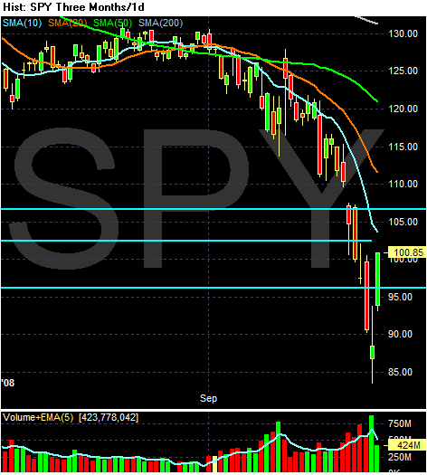
Remember -- this is still a very bearish chart.
-- Prices are below all the SMAs
-- All the SMAs are moving lower
-- The shorter SMAs are below the longer SMAs
BUT --
I drew three lines to show the points where I think the market should consolidate between. Remember, the market has dropped hard.
We're at 2002-2003 levels right now. So this is fundamentally a good place to consolidate simply from a time perspective. We're also very oversold still (and will be for a bit).
$640 Billion in Losses -- So Far
From Bloomberg:
Those are massive losses. But remember -- they're all contained to the financial sector so everything is A OK.
Banks and securities firms have reported more than $640 billion in losses, writedowns and credit provisions since the start of 2007 and raised $611 billion in capital to offset those losses, according to data compiled by Bloomberg. New York-based JPMorgan, the biggest U.S. bank by assets, reported third-quarter net income yesterday of $527 million and Wells Fargo in San Francisco earned $1.64 billion.
Those are massive losses. But remember -- they're all contained to the financial sector so everything is A OK.
Empire State Drops; PPI Still Scary
From Business Week:
Manufacturing activity is one of the economic numbers the NBER looks at when they are determining whether or not a recession has occurred. Note the Empire state number (the gray line) has been weak all year.
Also from Business Week:
While the chart looks terrifying, I'm expecting it to moderate over the coming months. Input prices -- commodities in general -- are dropping like a stone right now. In addition, manufacturing activity is clearly slowing indicating a drop in demand. I'm expecting this chart to break its upward move sometime in the next 3-6 months.
The U.S. Empire State index dropped to a -24.6 reading in October, following the September decline to -7.41. While the various components of the report were quite weak, one jumps out: The capital expenditure plans index moderated to 6.10 in October from 16.09, which unwinds the modest gains over the past two months and brings this measure to a new cycle-low. The drop raises the risk that businesses will indeed post the feared pullback in investment spending in the fourth quarter, following what appears to be a turn in the durable goods, factory goods, and nonresidential construction spending data starting in the middle of the third quarter.
Manufacturing activity is one of the economic numbers the NBER looks at when they are determining whether or not a recession has occurred. Note the Empire state number (the gray line) has been weak all year.
Also from Business Week:
The U.S. PPI report, with its 0.4% September headline drop but surprisingly firm 0.4% core (excluding food and energy prices) increase, revealed a year-over-year headline gain at the expected 8.7% from 9.6%, while the core year-over-year rate popped to 4.0% from 3.6%. The headline year-over-year rate is still well above what was the 26-year high of 7.4% as recently as January, hence showing how far the commodity price reversal still needs to go to reverse the price surge of the past year.
While the chart looks terrifying, I'm expecting it to moderate over the coming months. Input prices -- commodities in general -- are dropping like a stone right now. In addition, manufacturing activity is clearly slowing indicating a drop in demand. I'm expecting this chart to break its upward move sometime in the next 3-6 months.
Thursday Oil Market Round-Up
On the weekly chart, notice the following:
-- The year-long rally is clearly over
-- Prices are below all the SMAs
-- The 10 week SMA has moved through the 50 week SMA
-- All the SMAs are moving lower
Bottom line: the is a bearish chart
On the daily chart notice the following:
-- Price have been moving lower for three months
-- All the SMAs are moving lower
-- Prices are below all the SMAs
-- The shorter SMAs are below the longer SMAs
Bottom line: this is also a bearish chart.
Wednesday, October 15, 2008
Today's Markets
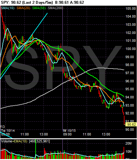
We're going to use several charts today. First -- here's the big headline grabbing chart. The market fell out of bed today with the SPYs dropping 9.61%. Also note the heavy selling at the end of trading. Traders clearly did not want to own anything going into tomorrow.
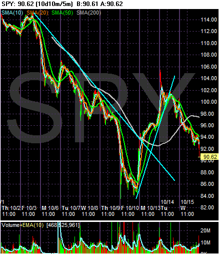
On the 10 day chart, notice that last week we lost a ton. The market dropped from 114 to 84, or a loss of 26%. But note that we're still within the wide range established over the last two weeks.
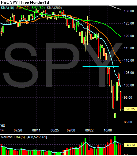
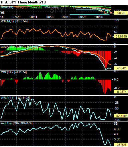
Most importantly, remember that a I mentioned the market appears to be in a wide trading range/consolidation period. Note the four days ago we had a huge volume sell-off. This may have been a selling climax. Also note the market is extremely oversold right now by most technical indicators. Here's a chart of the RSI, MACD, Chaiken money Flow, Williams Percentage Number and Accumulation/Distribution for the current price level:
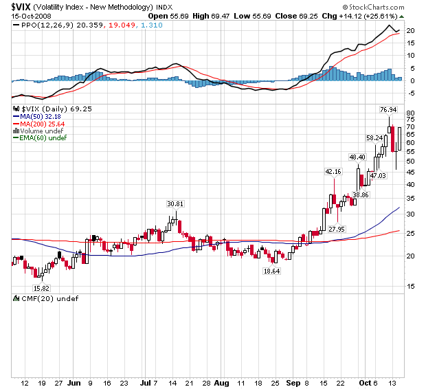
But we're also in a period of high volatility.
Until I see the market drop below roughly 84 I still think we're consolidating. There's been a great deal of fundamental action to stabilize the financial sector. Most traders know the economy is in a recession and have traded the market accordingly -- we're already at 2003 levels.
Retail Sales Drop
From Reuters:
This shouldn't be a surprise. The market was taking some major hits in that month, the job market is contracting and housing is still a mess. It's time for people to stop spending. Period.
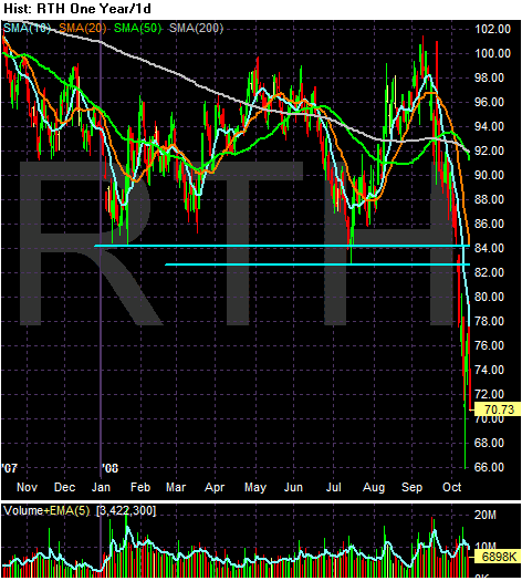
What is interesting is the retail holders ETF:
Note this ETF was trading in a range for most of 2008. A big reason is the Wal-mart and Target comprise almost 30% of the ETF. Both charts have been doing OK this year. Lowe's and Home Depot have been in a pretty wide trading range for the year as well. I have to wonder how long that trend will be continuing.
Retail sales fell 1.2 percent in September to a seasonally adjusted $375.5 billion, the Commerce Department said on Wednesday. It was the sharpest drop since August 2005 and far greater than the 0.7 percent decline economists had expected.
"We have an all-out consumer retrenchment under way," said National City Corp chief economist Richard DeKaser in Cleveland, adding he expected the economy to shrink in coming months.
This shouldn't be a surprise. The market was taking some major hits in that month, the job market is contracting and housing is still a mess. It's time for people to stop spending. Period.
What is interesting is the retail holders ETF:
Note this ETF was trading in a range for most of 2008. A big reason is the Wal-mart and Target comprise almost 30% of the ETF. Both charts have been doing OK this year. Lowe's and Home Depot have been in a pretty wide trading range for the year as well. I have to wonder how long that trend will be continuing.
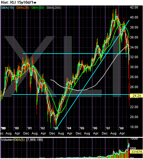
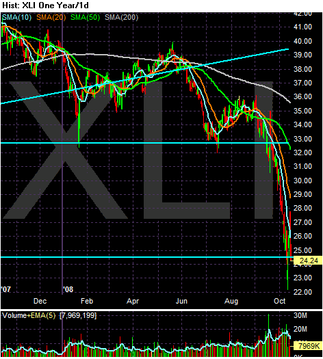
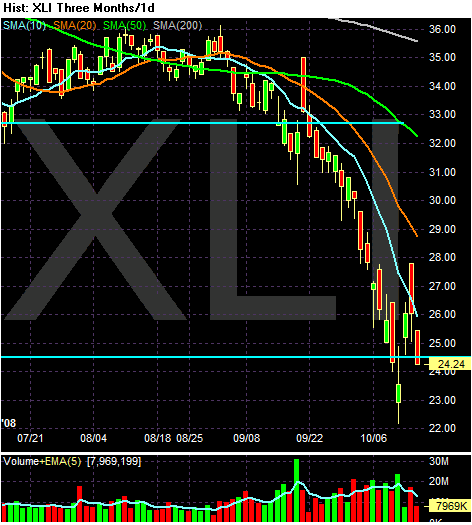
A Closer Look At S&P 500 Sectors: The XLIs
On the 15-year chart, note the chart is at levels from 2000. In other words, 8 years of gains have been wiped out. Also note the uptrend that started in 2003 was clearly broken.
On the yearly chart, notice we're near yearly lows.
On the three month chart, note the following:
-- Prices are below all the SMAs
-- All the SMAs are moving lower
-- The shorter SMAs are below the longer SMAs
Bottom line: This is a very bearish chart.
A $1 Trillion Dollar Deficit?
Consider the following two stories:
Democrats Looking At Fiscal Stimulus:
Federal Budget Deficit Could Hit $1 Trillion:
Let's look at a few basic points in no particular order of importance.
1.) According to the latest GDP report, government spending accounted for 28% of the second quarters 2.8% growth rates.
2.) According to the CBO's historical budget data, the total federal budget was $2.7 trillion in 2007. According to the BEA, the total US GDP was $14.9 trillion in the second quarter of 2008. That means the federal government's budget represents 18.12% of US GDP.
3.) Basic Keynsean economic theory states we can use the federal government budget to ameliorate the effects of the business cycle.
In theory, I have no problem with the idea of spending on infra-structure etc... These are "public goods":
Here's the problem: as we try and get out of a recession we have to spend money. This is a similar proposition to the saying, "the only way to make money is to spend money." However, the federal government has been run by morons these last 8 years. Consider the following table. It shows the total amount of US government debt outstanding.
09/30/2008 $10,024,724,896,912.49
09/30/2007 $9,007,653,372,262.48
09/30/2006 $8,506,973,899,215.23
09/30/2005 $7,932,709,661,723.50
09/30/2004 $7,379,052,696,330.32
09/30/2003 $6,783,231,062,743.62
09/30/2002 $6,228,235,965,597.16
09/30/2001 $5,807,463,412,200.06
09/30/2000 $5,674,178,209,886.86
The current amount of government debt outstanding is $10,294,381,432,306.11
If we had prudently managed the nation's finances during times of plenty, issuing tons of debt would not be an issue. However, the US issued $1 trillion of public and private debt last year. That means as we go through this recession and issue a ton of paper at the federal level we run increased risks of higher interest rates to attract the necessary financing.
Democrats Looking At Fiscal Stimulus:
House Speaker Nancy Pelosi is mulling recommendations from several economists that Congress act on an economic-recovery package that would cost taxpayers $300 billion, according to congressional aides, equivalent to about 2% of the country's gross domestic product.
The California Democrat envisions a bill that would include new spending on highways and bridges, extended benefits to unemployed workers, aid to cash-strapped states and a tax cut, congressional aides said. She has asked several House committees to examine details of a possible plan. And as part of the effort, Federal Reserve Chairman Ben Bernanke is expected to testify next week before the House Budget Committee on the state of the economy. Ms. Pelosi is expected to call lawmakers back to Washington in late November to take up the issue.
Federal Budget Deficit Could Hit $1 Trillion:
As bad as 2008 was, the current fiscal year, which began Oct. 1, is widely expected to be far worse. The director of the Congressional Budget Office recently estimated the annual deficit could hit $750 billion given the potential impacts from a possible recession and the financial markets' problems. Some private economists put the 2009 deficit at as much as $1 trillion.
On Tuesday, the White House budget office said the hole will look much deeper because accounting rules will force the administration to include all $250 billion of its bank recapitalization plan in the annual deficit as well. Under the Treasury's original plan -- focused on buying up troubled mortgage-related debt instruments from banks -- the government was expected to be able to exclude much of its spending from the annual deficit.
Let's look at a few basic points in no particular order of importance.
1.) According to the latest GDP report, government spending accounted for 28% of the second quarters 2.8% growth rates.
2.) According to the CBO's historical budget data, the total federal budget was $2.7 trillion in 2007. According to the BEA, the total US GDP was $14.9 trillion in the second quarter of 2008. That means the federal government's budget represents 18.12% of US GDP.
3.) Basic Keynsean economic theory states we can use the federal government budget to ameliorate the effects of the business cycle.
In theory, I have no problem with the idea of spending on infra-structure etc... These are "public goods":
In economics, a public good is a good that is non-rivaled and non-excludable. This means, respectively, that consumption of the good by one individual does not reduce availability of the good for consumption by others; and that no one can be effectively excluded from using the good.[1] In the real world, there may be no such thing as an absolutely non-rivaled and non-excludable good; but economists think that some goods approximate the concept closely enough for the analysis to be economically useful.
Here's the problem: as we try and get out of a recession we have to spend money. This is a similar proposition to the saying, "the only way to make money is to spend money." However, the federal government has been run by morons these last 8 years. Consider the following table. It shows the total amount of US government debt outstanding.
09/30/2008 $10,024,724,896,912.49
09/30/2007 $9,007,653,372,262.48
09/30/2006 $8,506,973,899,215.23
09/30/2005 $7,932,709,661,723.50
09/30/2004 $7,379,052,696,330.32
09/30/2003 $6,783,231,062,743.62
09/30/2002 $6,228,235,965,597.16
09/30/2001 $5,807,463,412,200.06
09/30/2000 $5,674,178,209,886.86
The current amount of government debt outstanding is $10,294,381,432,306.11
If we had prudently managed the nation's finances during times of plenty, issuing tons of debt would not be an issue. However, the US issued $1 trillion of public and private debt last year. That means as we go through this recession and issue a ton of paper at the federal level we run increased risks of higher interest rates to attract the necessary financing.
Wednesday Commodities Round-Up
On the weekly CRB chart, notice the following:
-- Prices have been dropping hard for the last three months. They are now at their lowest point in over three years.
-- Prices clearly broke the uptrend that started in the summer of last year
-- Prices are below all the SMAs
-- All the SMAs are moving lower
-- The 10 week SMA has moved through the 50 week SMA
-- The 20 week SMA is about to move through the 50 week SMA
On the daily chart, notice the following:
-- Prices are below all the SMAs
-- All the SMAs are moving lower
-- The shorter SMAs are below the longer SMAs
-- Prices have continually broken through previously established lower to make new lows
-- Prices have dropped about 36% in the last three months
Bottom line: both of these charts are bearish.
Tuesday, October 14, 2008
Today's Markets
Before we take a look at the chart, let's consider the macro-environment. The US response to the bank crisis was piecemeal at first. As a result, traders were very concerned about what was actually going to happen in the US. Therefore the markets sold-off big time.
However, over the last week or so we've seen a strong response to the problem. Europe is dumping trillions of dollars into the problem and the US will actually inject equity into 9 of the country's largest banks. As a result it appears the situation is stabilized -- at least for now
As a result, take a look at the above chart from the standpoint of stabilization. I've drawn two lines that I'm thinking will provide the general borders of the market's action for the next bit of time. This assumes nothing crazier happens in the interim. My thought is we'll see a standard consolidation -- be it a trading range or some type of triangle formation.
A Closer Look At S&P 500 Sectors: The XLFs
On the multi-year chart, notice the financials are trading at a multi-year low. Considering the current environment, this should not be surprising.
On the yearly chart, notice the financials have been headed lower for the entire year.
On the daily, three month chart, notice the following:
-- Prices are below all the SMAs (including the 200)
-- All the SMAs are headed lower
-- The shorter SMAs are below the longer SMAs
Bottom line: this is a bearish chart.
A Closer Look At S&P 500 Sectors: The XLEs
On the multi-year chart, note the XLEs have clearly broken their multi-year bull run.
On the yearly chart, note the XLEs hung-on until early September before breaking their uptrend. Traders rode this sector hard for the duration of this expansion, meaning they probably took profits in this area last.
On the three month chart, note the following:
-- Prices are below all the SMAs
-- All the SMAs are headed lower
-- The shorter SMAs are below the longer SMAs
Bottom line: this is a bearish chart.
Paulson's Press Release/Statement
From the Treasury:
First, the plan is hardly "voluntary":
The Treasury does not want to be seen as playing favorites. Hence, everybody gets to play.
I explain the inner-working of these programs in this article. The short version is I think this will stop the bleeding pretty effectively.
First, Treasury is announcing a voluntary capital purchase program. A broad array of financial institutions is eligible to participate in this program by selling preferred shares to the U.S. government on attractive terms that protect the taxpayer. Second, after receiving a recommendation from the boards of the FDIC and the Federal Reserve, and consulting with the President, Secretary Paulson signed the systemic risk exception to the FDIC Act, enabling the FDIC to temporarily guarantee the senior debt of all FDIC-insured institutions and their holding companies, as well as deposits in non-interest bearing deposit transaction accounts. Regulators will implement an enhanced supervisory framework to assure appropriate use of this new guarantee.
Third, to further increase access to funding for businesses in all sectors of our economy, the Federal Reserve has announced further details of its Commercial Paper Funding Facility (CPFF) program, which provides a broad backstop for the commercial paper market. Beginning October 27, the CPFF will fund purchases of commercial paper of 3 month maturity from high-quality issuers.
First, the plan is hardly "voluntary":
Some of the big banks were unhappy about the government taking equity stakes, but acquiesced under pressure from Treasury Secretary Henry Paulson in a meeting Monday. During the financial crisis, the government has steadily increased its involvement in financial markets, culminating with a move that rivals the breadth of the government's response to the Great Depression. It intertwines the banking sector with the federal government for years to come and gives taxpayers a direct stake in the future of American finance, including any possible losses.
The Treasury does not want to be seen as playing favorites. Hence, everybody gets to play.
I explain the inner-working of these programs in this article. The short version is I think this will stop the bleeding pretty effectively.
Treasury Tuesdays
On the year long chart, notice the following:
-- The market rallied until early March. This was in reaction to the credit crunch.
-- The market sold-off until late June to a bit below the 200 day SMA. This was in reaction to the stock market's rally at the time.
-- The market rallied again until mid-September. Again, this was a safe haven rally.
-- The market has sold off as of late.
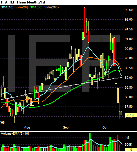
The treasury market is caught between two different important cross-winds right now. On one had we have the safe haven play. As investors deal with their concern about the other markets they will flood in Treasury bonds. At the same time, over the last few months the US government has said they will spend a lot more money. That means more treasury bonds will be issued. Increased supply = lower price.
On the daily chart, notice the following:
-- Prices are below the 200 day SMA.
-- All the shorter SMAs are now beading lower
BUT
-- All the SMAs are also very tightly bunched right now. This indicates there is a mixture of expectations in the market. There is an even balance between bulls and bears right now.
Monday, October 13, 2008
Today's Markets
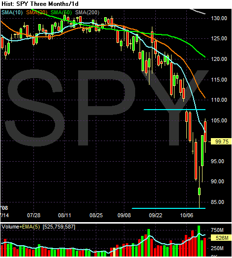
Let's try and filter out the daily noise and see that this daily chart tells us.
1.) The market was really oversold and due for a rebound. I said so, but I am hardly alone in that pronouncement.
2.) The blue horizontal lines are from previously established price levels on the chart. As such they will now provide upside resistance.
3.) There is also upside resistance at the 10 day SMA
So, we have several levels of resistance. While today's market action is encouraging, it can also be seen as a way for the markets to make-up for all the selling from last week.
In addition, consider the fundamental background.
France, Germany, Spain, the Netherlands and Austria committed 1.3 trillion euros ($1.8 trillion) to guarantee bank loans and take stakes in lenders, racing to prevent the collapse of the financial system.
The announcements came as Britain took majority stakes today in Royal Bank of Scotland Group Plc and HBOS Plc. The coordinated steps followed a pledge yesterday by European leaders to bolster market confidence as the global economy slides toward recession.
``What it should do is stabilize the banking system,'' said Peter Hahn, a fellow at London's Cass Business School and former managing director at Citigroup Inc. ``Will it stop us from having a recession? No, nothing is going to stop us from having a recession.''
The agreement among heads of the 15 countries using the euro helped trigger a rally in stocks and the euro after a market rout. The Dow Jones Stoxx 600 Index rebounded a record 10 percent today, after slumping 22 percent to the worst drop in its two-decade history last week. The currency had its biggest gain in three weeks, climbing 0.9 percent to $1.3526.
This is a huge move by the respective governments. It indicates they realize the severity of the situation. In addition, it tells us they are willing to "put their money where there mouth is" so to speak. Bottom line, this move has greatly eased the market's tension -- at least for now.
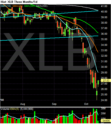
A Closer Look At S&P 500 Sectors: The XLBs
Last week did a ton of technical damage to the markets. So it seems like a good time to look a bit deeper into the markets and turn our attention to specific market sectors.
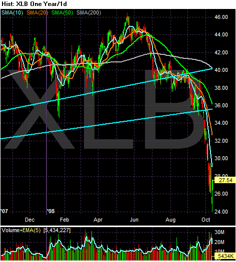
Let's start with the XLBs, which represent the basic materials sector of the market.
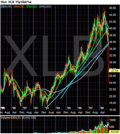
On the multi-year chart, the main point to notice is the sector has clearly broken the long-term trend lines that started in 2003.
On the yearly chart, notice the index was holding on even into August of this year. While it was declining at that time, it had only fallen by about 15%. While this isn't good, it certainly isn't horrible either. Also remember that global infrastructure development was a strong theme for most of the latest rally. It looks as though traders were hanging on to that idea for as long as possible. But when we started to hear news from Europe and Asia that they were slowing down, this sector became a portfolio liability.
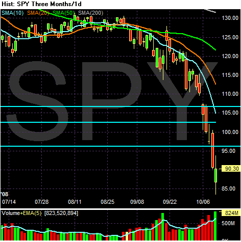
On the three months chart, notice the following:
-- Prices are below the 200 day SMA
-- All the SMAs are moving lower
-- The shorter SMAs are below the longer SMAs
-- Prices are below all the SMAs
Bottom line -- this is now a bearish chart.
The Difference Between Equity Injection and Buying Bad Debt
Let's look at the two different ways the Treasury Department is looking at helping the banking sector.
Here is how they were recently described:
Buying Debt/Loans/Mortgages
Under this plan, the government will purchase problem assets from lenders. Let's look at the pros and cons of this program:
Pros
-- It gets the assets off the books. This prevents the assets from further hurting the financial institution.
Cons
-- Define "troubled mortgage/loan".
-- The only way for this program to work is for enough of the bad mortgages/loans to be purchased to convince lenders that problem mortgages can't hurt the system. Put another way, the government has to purchase enough of these asset to inspire intra-institution confidence. I have no idea what amount that would be.
-- The only assets the institutions will sell are the ones that are probably going to remain depressed in value for the duration of their existence. No one is going to sell an asset that is or has a higher probability of making them money. This means the government stands a higher probability of taking most of the losses.
Equity Injections
Pros
-- The institutions gets cash immediately. In theory, this should encourage the institutions to start lending again.
Cons
-- Why would they want to start lending? We're at the beginning of a recession, defaults are increasing and other lenders have assets on their books that are increasing the possibility of default.
-- With housing values still decreasing in value, anything related to mortgages will also be dropping in value. That means loans and bonds tied to loans will continue to drop forcing institutions to continue writing down the value of these assets. As a result, equity may go loan loss reserves. This means the government will have to buy a large enough amount of equity to encourage lending and possibly the increase in loan loss reserves coming down the pike.
-- The government says it isn't buying an ownership interest that will lead to directing bank policy. I'm finding that a bit hard to believe. Call me cynical.
Conclusion
It's really looking as though it's going to take a combination of both of these ideas to take care of this mess.
Here is how they were recently described:
1) Mortgage-backed securities purchase program: This team is identifying which troubled assets to purchase, from whom to buy them and which purchase mechanism will best meet our policy objectives. Here, we are designing the detailed auction protocols and will work with vendors to implement the program.
2) Whole loan purchase program: Regional banks are particularly clogged with whole residential mortgage loans. This team is working with bank regulators to identify which types of loans to purchase first, how to value them, and which purchase mechanism will best meet our policy object
.....
4) Equity purchase program: We are designing a standardized program to purchase equity in a broad array of financial institutions. As with the other programs, the equity purchase program will be voluntary and designed with attractive terms to encourage participation from healthy institutions. It will also encourage firms to raise new private capital to complement public capital.
Buying Debt/Loans/Mortgages
Under this plan, the government will purchase problem assets from lenders. Let's look at the pros and cons of this program:
Pros
-- It gets the assets off the books. This prevents the assets from further hurting the financial institution.
Cons
-- Define "troubled mortgage/loan".
-- The only way for this program to work is for enough of the bad mortgages/loans to be purchased to convince lenders that problem mortgages can't hurt the system. Put another way, the government has to purchase enough of these asset to inspire intra-institution confidence. I have no idea what amount that would be.
-- The only assets the institutions will sell are the ones that are probably going to remain depressed in value for the duration of their existence. No one is going to sell an asset that is or has a higher probability of making them money. This means the government stands a higher probability of taking most of the losses.
Equity Injections
Pros
-- The institutions gets cash immediately. In theory, this should encourage the institutions to start lending again.
Cons
-- Why would they want to start lending? We're at the beginning of a recession, defaults are increasing and other lenders have assets on their books that are increasing the possibility of default.
-- With housing values still decreasing in value, anything related to mortgages will also be dropping in value. That means loans and bonds tied to loans will continue to drop forcing institutions to continue writing down the value of these assets. As a result, equity may go loan loss reserves. This means the government will have to buy a large enough amount of equity to encourage lending and possibly the increase in loan loss reserves coming down the pike.
-- The government says it isn't buying an ownership interest that will lead to directing bank policy. I'm finding that a bit hard to believe. Call me cynical.
Conclusion
It's really looking as though it's going to take a combination of both of these ideas to take care of this mess.
Market Monday's
Let's take several different looks at last week's action.
The daily chart shows a very bearish orientation. Prices are below all the SMAs, all the SMAs are headed lower, and the shorter SMAs are below the longer SMAs. But let's add a few points.'
1.) Notice there are two very long candles, which occurred on Tuesday and Thursday. There are bearish.
2.) Note the escalating volume that occurred throughout the week
3.) Note the market was down about 15% last week -- that's a huge drop.
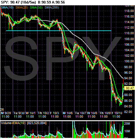
On the 10 day chart, simply notice that the week before last (the last week of September) the market stabilized a bit. Most of the damage was down last week.
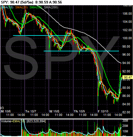
On the 5-day chart, notice there were two big moves lower last week. The first occurred from the beginning of Tuesday to mid-Wednesday. The second occurred from the beginning of Thursday to almost the end of Friday. Also note the market moved lower for most of Monday. In other words, far the majority of time last week the market was moving lower.
Keep in mind that with last week's action numerous people are looking for a reversal. Considering how oversold the market is at this point, that would make sense. However, I made the observation on Wednesday that I was expecting a reversal and look how far that went.