Boy am I glad that week is over. It's time to take a break. I'll be back on Monday. Until then, here are some pictures of the pups
Friday, September 5, 2008
An Extended, Shallow, Near-Recession
The title above is from Angry Bear. It has definitely gotten me thinking about what has happened over the last 7 years.
First, I have been extremely concerned/bearish about this expansion since I first started writing about it over four years ago. What led to that concern was the incredible proliferation of debt at the personal and federal level combined with the lack of real income growth (income less inflation). My negativity was perhaps premature -- I was concerned at the height of the "boom". However, I could not and still cannot shake the deep concern I have for the actual "strength" of this economy.
The fundamental problems I see are outlined here:
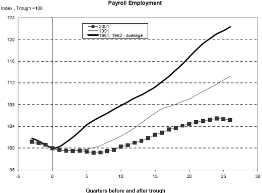
Job growth for this expansion is incredibly weak.
The above chart is from Barry over at the Big Picture blog. It shows that job growth from this expansion is the weakest of the last 40+ years. I recently got into an exchange with a more conservative person who made the observation that at the beginning of this expansion the unemployment rate was lower than at the beginning of other expansions. Therefore, the economy did not have to create near the number of jobs as other expansions in order to be productive.
One of the reasons I like to get into debates is the opportunity they provide to sharpen my analysis. And this was a good point. But after looking at the numbers, job growth is still paltry. I did the following "back of the envelope" calculations:
Regrading the observations in the last paragraph, let's assume a more conservative need for population growth at 100,000. That means the economy only created on average 58,000 more jobs/month then needed to absorb population growth. That's just not enough to create enough of a labor shortage to increase upward pressure on incomes.
And incomes are ultimately what should increase when job growth increases. The equation is simple: when the economy starts really cooking, it creates more and more jobs. As this happens, fewer and fewer people are available for work. This leads to an increase in incomes as employers raise wages to attract new employees. But this has not happened during this expansion.
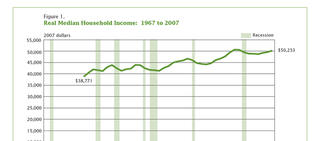
Above is a chart of real median household income from the Census Bureau. Note that wages haven't increased during this expansion, or as the Census Bureau put it in their latest report, the current level is "not statistically different from a 1999 pre-recession peak". And that's after 7 years of economic growth.
So far, we have weak job growth leading to stagnant median income. But people kept on spending for the duration of this expansion. Where did all the money come from?
Tons of debt. At the beginning of this expansion total household debt outstanding has increased from 7.6 trillion at the end of 2001 to 13.9 trillion in the first quarter of 2008. Put another way, total household debt is now almost as much as total US GDP (which was $14.3 trillion in the second quarter).
So we have the chimera of expansion. People kept spending, not because their incomes were increasing but because they were borrowing more and more to supplant their incomes. While we can get into a whole other side debate about whether or not that is a good idea, the basic point is clear. Easy credit was the primary driver of the latest expansion, not increasing incomes caused by solid job growth. And that's why the economy has never polled well despite the claims from the administration apologists. At some level, people know there is something off about the last 7 years.
On paper, the economy has grown. Economists can point to the raw data and say "we grew". That is not the question. The question is "how did we achieve that growth"? It wasn't from the growth in incomes. Instead it is from a ton of borrowing. And considering the credit melt-down we've had over the last year from excessively easy credit, maybe we need to ask ourselves if this is the best way to grow a country.
First, I have been extremely concerned/bearish about this expansion since I first started writing about it over four years ago. What led to that concern was the incredible proliferation of debt at the personal and federal level combined with the lack of real income growth (income less inflation). My negativity was perhaps premature -- I was concerned at the height of the "boom". However, I could not and still cannot shake the deep concern I have for the actual "strength" of this economy.
The fundamental problems I see are outlined here:
Job growth for this expansion is incredibly weak.
The above chart is from Barry over at the Big Picture blog. It shows that job growth from this expansion is the weakest of the last 40+ years. I recently got into an exchange with a more conservative person who made the observation that at the beginning of this expansion the unemployment rate was lower than at the beginning of other expansions. Therefore, the economy did not have to create near the number of jobs as other expansions in order to be productive.
One of the reasons I like to get into debates is the opportunity they provide to sharpen my analysis. And this was a good point. But after looking at the numbers, job growth is still paltry. I did the following "back of the envelope" calculations:
The latest expansion started in November 2001 (according to the NBER). At the end of 2001, there were 131,826,000 establishment jobs in the US. At the end of last year there were 137,623,000. That's a total gain of 5,797,000 over 6 years/72 months or 80,513/month on average. A conservative read of population growth/employment is it takes at least 100,000 month to absorb population growth. In other words, job growth didn't even keep up with population growth, let alone absorbing people who lost jobs back into the work force.
But even using your starting point, you get the following. There were 137,623,000 jobs at the end of 2007 and 129,999 at the end of 2003 for a total gain of 7,624. Divide that by 48 months and you get 158,833/month. This is barely more than population growth. either way, you have weak job growth and little reason for wages to increase because there is no lack of supply for employees.
Regrading the observations in the last paragraph, let's assume a more conservative need for population growth at 100,000. That means the economy only created on average 58,000 more jobs/month then needed to absorb population growth. That's just not enough to create enough of a labor shortage to increase upward pressure on incomes.
And incomes are ultimately what should increase when job growth increases. The equation is simple: when the economy starts really cooking, it creates more and more jobs. As this happens, fewer and fewer people are available for work. This leads to an increase in incomes as employers raise wages to attract new employees. But this has not happened during this expansion.
Above is a chart of real median household income from the Census Bureau. Note that wages haven't increased during this expansion, or as the Census Bureau put it in their latest report, the current level is "not statistically different from a 1999 pre-recession peak". And that's after 7 years of economic growth.
So far, we have weak job growth leading to stagnant median income. But people kept on spending for the duration of this expansion. Where did all the money come from?
Tons of debt. At the beginning of this expansion total household debt outstanding has increased from 7.6 trillion at the end of 2001 to 13.9 trillion in the first quarter of 2008. Put another way, total household debt is now almost as much as total US GDP (which was $14.3 trillion in the second quarter).
So we have the chimera of expansion. People kept spending, not because their incomes were increasing but because they were borrowing more and more to supplant their incomes. While we can get into a whole other side debate about whether or not that is a good idea, the basic point is clear. Easy credit was the primary driver of the latest expansion, not increasing incomes caused by solid job growth. And that's why the economy has never polled well despite the claims from the administration apologists. At some level, people know there is something off about the last 7 years.
On paper, the economy has grown. Economists can point to the raw data and say "we grew". That is not the question. The question is "how did we achieve that growth"? It wasn't from the growth in incomes. Instead it is from a ton of borrowing. And considering the credit melt-down we've had over the last year from excessively easy credit, maybe we need to ask ourselves if this is the best way to grow a country.
Forex Friday's -- The Dollar
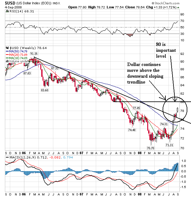
The dollar break-out continues. Notice the following:
-- Prices broke through the downward sloping trend line a few weeks ago. Then prices moved along this line for a bit consolidating gains. This week prices moved up with a gap up. That's a big move.
-- The 10 and 20 week SMAs are both moving higher
-- The 10 week SMA is above the 20 week SMA
-- The 10 week SMA is about to move through the 50 week SMA
-- It's possible to see a double bottom now. Note the first would be at 70.70 and the second would be at 71.30. I prefer double bottom to have a more pronounced space between the extremes, but that doesn't always happen.
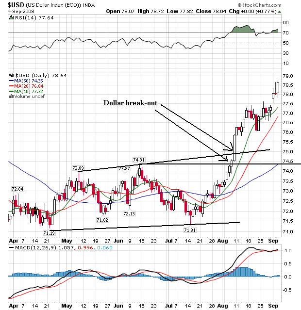
On daily chart, notice the following:
-- Prices broke through both resistance lines at the beginning of August. Note the strength of the trend break -- very strong.
-- All the SMAs are moving higher
-- The shorter SMAs are above the longer SMAs
-- Prices are above all the SMAs
-- Prices used the 10 day SMA as technical support
This is a bullish chart right now. Note on the upper chart there is strong resistance in the 80 area. Expect that to be an important technical level going forward.
Thursday, September 4, 2008
Today's Markets
This was a very important day from a technical perspective. And the reasons are very negative.
Notice the following:
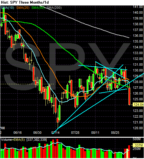
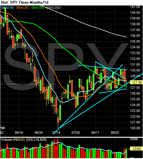
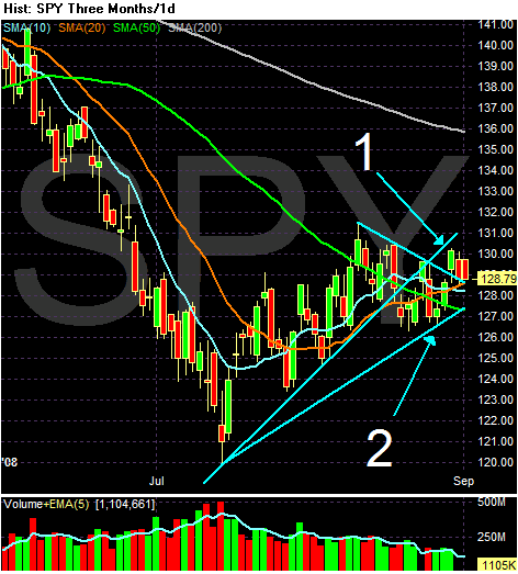
Prices fell through three important areas of technical support today.
-- The first was the 50 day SMA
-- The second was the upward sloping trend line that started in mid-July (I should add this is a weak upward sloping trend line. I think the real line was the first one that prices violated in mid-August. But an argument could be made the second line was also a trend line).
-- The third was the lower line of the triangle consolidation pattern. The market has been trading between (roughly) 127 and 130 for the last month or so.
-- Notice the higher volume on today's action
-- Note the extremely strong downward sloping bar.
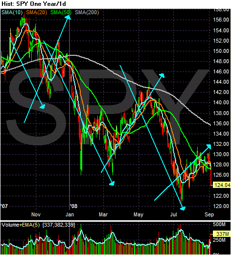
Today did a lot of technical damage. Let's take a look at the longer picture
The market is clearly in a down/up/down pattern. The market is also making a series of lower lows and lower highs. Also remember from above that today the market's broke a lot of technical support.
Short version: the possibility of going lower is very high.
The Federal Reserve Says the Economy Isn't Doing That Well
From the Fed:
Note the words used to describe almost every economic area of activity -- soft, weak and declining. There is only one area of strength -- energy and mining. That alone should tell you a great deal about the current state of the economy.
Let's look a bit deeper into the report and the numbers:
Consumer spending
First of all, remember that consumer spending accounts for about 70% of US growth. So this perhaps the most important area of the report.
Given that, note things are not good for the US consumer. The sales pace is either, the same, mixed or declining. There was no talk of "robust" spending. Also note the consumer is concentrating his spending on staples rather than discretionary items. Durables goods (goods that will last longer than three years) are taking a hit as evidenced by the slow pace of furniture, household and automobiles. There is also a trend to discount stores, indicating further penny--pinching.
The bottom line is the US consumer is not very confident about the future.
To that end, here is a chart of personal consumption expenditures.
Note the year over year percentage change has been dropping for the last year.
Here is a chart of real (inflation-adjusted) retail sales
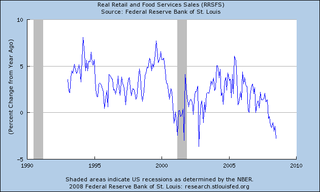
Note the year over year rate of change is now negative.
Non-financial services
Like the retail sales report, notice the adjectives used to describe overall activity. Activity is "slowing", demand is "falling", airlines are "reducing capacity", demand is "flat". Accounting firms are steady, but Dallas legal firms are down. There is no talk of expanding services or increases in employment to meet rising demand. Overall, the service sector is treading water. Here is a chart of the ISM service index:
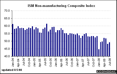
Note activity is right around 50 which is the line the report uses to delineate between expansion and contraction.
manufacturing
Manufacturing has been a mixed bag for awhile now. While domestic demand has been slowing (see points made above) exports have been doing extremely well. In fact, they are one of the only bright spots for the US economy. In last week's GDP report, they were the primary reason for the 3.3% growth rate (along with an incredibly fortuitous mathematical anomaly) However, overall manufacturing activity is still hanging between expansion and contraction:
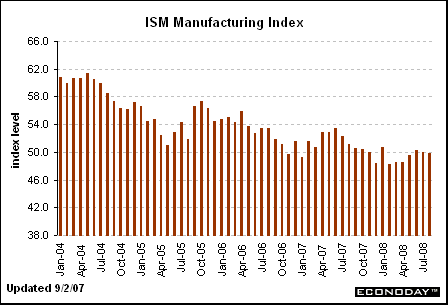
The ISM manufacturing index is hovering around the 50 level -- between expansion and contraction.
The year over year rate of industrial production has been dropping for about a year
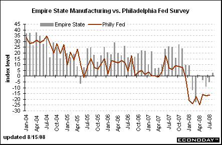
The the Philadelphia Fed and the Empire States (New York Fed) manufacturing index have been very weak for the last 6 months or so.
Housing
Here's the bottom line with housing. Inventory of existing homes is at a record in both absolute (total number available) and months of supply. As a result, prices are still dropping at a high year over year levels. On top of that, the US consumer is pulling in his spending ways, adding further pressure to the market. Finally, credit is tightening. Massive inventory + depressed consumer + tighter credit = a real estate market that isn't going to recover anytime soon.
Employment
The report does not have a separate employment section, but I wanted to add the following information:
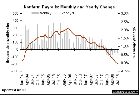
The year over year rate of employment growth has been declining for almost two years and is now moving into negative territory, and
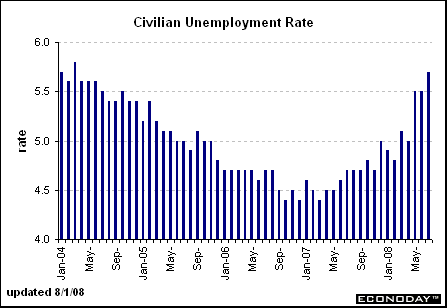
The unemployment rate has been increasing for about a year and a half.
The bottom line is simple: the economy is in terrible shape.
Reports from the twelve Federal Reserve Districts indicate that the pace of economic activity has been slow in most Districts. Many described business conditions as "weak," "soft," or "subdued." Cleveland and St. Louis reported some weakening since their last reports while Boston and New York noted signs of stabilization. Kansas City reported a slight improvement.
Consumer spending was reported to be slow in most Districts, with purchasing concentrated on necessary items and retrenchment in discretionary spending. Districts reporting on auto sales described them as falling or steady at low levels. Tourism activity was mixed but received support from international visitors in several Districts, and the demand for services eased in most Districts. The transportation industry was also adversely affected by rising fuel costs. Manufacturing activity declined in most Districts but improved somewhat in Minneapolis and Kansas City. Most Districts reported that residential real estate markets remained soft. Commercial real estate activity was slow in most Districts, and some reported further slackening in demand for office and retail space. Most Districts reported easing loan demand, especially for residential mortgages and consumer loans; lending to businesses was mixed. Districts reporting on the agricultural sector noted some relief from drought conditions. Districts reporting on energy and mining activity recorded increased activity.
Almost all Districts continued to report price pressures from elevated costs of energy, food, and other commodities, although some noted that there have been declines or slower increases in prices for several industrial commodities and energy products. Business contacts in a number of Districts indicated that they had increased selling prices in response to the high costs for their inputs. Wage pressures were characterized as moderate by most Districts amid a general pullback in hiring, although several Districts noted continued strong demand for workers in the energy sector.
Note the words used to describe almost every economic area of activity -- soft, weak and declining. There is only one area of strength -- energy and mining. That alone should tell you a great deal about the current state of the economy.
Let's look a bit deeper into the report and the numbers:
Consumer spending
Consumer spending was slow in most Districts. Retail sales and other consumer spending was reported as mixed or little changed in Boston, Chicago, St. Louis, and Dallas and weak or declining in Philadelphia, Richmond, Minneapolis, and San Francisco. Sales were described as below expectations in Atlanta but on or close to plan in New York. Cleveland and Kansas City noted some improvement in retail sales since the last report. Several Districts reported that consumers were concentrating on food, staples, and other necessary items while reducing spending on discretionary items. Chicago, Dallas, and San Francisco reported noticeable declines in spending on apparel, electronics, and jewelry. Sales of furniture and household appliances were weak in most Districts. San Francisco described sales of this merchandise as exceptionally poor. A shift of consumer shopping patterns toward discount stores and lower-price brands and away from traditional department and specialty stores was observed in Philadelphia, Chicago, Dallas, and San Francisco. Sales of motor vehicles were reported to be weak or falling in all Districts, especially for larger, less fuel-efficient cars, SUVs, and trucks.
First of all, remember that consumer spending accounts for about 70% of US growth. So this perhaps the most important area of the report.
Given that, note things are not good for the US consumer. The sales pace is either, the same, mixed or declining. There was no talk of "robust" spending. Also note the consumer is concentrating his spending on staples rather than discretionary items. Durables goods (goods that will last longer than three years) are taking a hit as evidenced by the slow pace of furniture, household and automobiles. There is also a trend to discount stores, indicating further penny--pinching.
The bottom line is the US consumer is not very confident about the future.
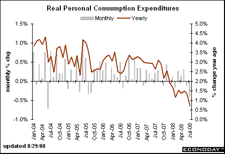
To that end, here is a chart of personal consumption expenditures.
Note the year over year percentage change has been dropping for the last year.
Here is a chart of real (inflation-adjusted) retail sales
Note the year over year rate of change is now negative.
Non-financial services
Districts reporting on nonfinancial services generally indicated some slowing in activity since the last report, although New York reported stabilization after several months of decline. Boston, Cleveland, Atlanta, and Dallas noted falling demand for freight and transportation services, and firms in those industries reported higher fuel costs negatively affecting their margins. Dallas reported that airlines were reducing capacity. Demand for information technology services was reported to be flat in Boston and down in St. Louis. St. Louis and San Francisco noted less strength in the health care sector since the last report. Business and professional services activity was weakening in St. Louis and San Francisco. Dallas reported that business was steady at accounting firms but down at legal firms. Temporary staffing activity was reported to be mixed in Boston and Richmond and stable in Dallas.
Like the retail sales report, notice the adjectives used to describe overall activity. Activity is "slowing", demand is "falling", airlines are "reducing capacity", demand is "flat". Accounting firms are steady, but Dallas legal firms are down. There is no talk of expanding services or increases in employment to meet rising demand. Overall, the service sector is treading water. Here is a chart of the ISM service index:
Note activity is right around 50 which is the line the report uses to delineate between expansion and contraction.
manufacturing
Manufacturing activity was weak or declining in most Districts but improved in others. New York reported some stabilization after months of decline, Kansas City reported a rebound after a weakening in June, and Minneapolis and San Francisco have made gains since the last report. A number of Districts reported that export orders were bolstering manufacturing activity, but manufacturers in several of those Districts have noted some recent slowing in growth from this source. Boston, Philadelphia, Cleveland, Richmond, Chicago, and Dallas reported continuing declines in demand for housing-related products and construction materials. Boston reported declining output of aircraft and other transportation parts and equipment, but San Francisco reported a high rate of aircraft production.
Manufacturing has been a mixed bag for awhile now. While domestic demand has been slowing (see points made above) exports have been doing extremely well. In fact, they are one of the only bright spots for the US economy. In last week's GDP report, they were the primary reason for the 3.3% growth rate (along with an incredibly fortuitous mathematical anomaly) However, overall manufacturing activity is still hanging between expansion and contraction:
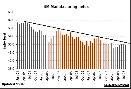
The ISM manufacturing index is hovering around the 50 level -- between expansion and contraction.
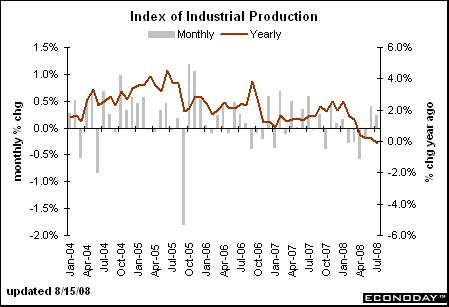
The year over year rate of industrial production has been dropping for about a year
The the Philadelphia Fed and the Empire States (New York Fed) manufacturing index have been very weak for the last 6 months or so.
Housing
Residential real estate conditions weakened or remained soft in all Districts, except Kansas City, which reported a modest increase in sales since the last report. Demand for housing was reported to be still moving down in Boston, New York, Chicago, St. Louis, and San Francisco. Residential real estate activity was sluggish in Philadelphia, Cleveland, Richmond, Atlanta, Minneapolis, and Dallas. New York reported low levels of single-family construction but a brisk pace of multi-family construction after an increase in permits in June occasioned by a change in the New York building code effective July 1. Chicago reported a faster rate of decline in residential construction since the last report as well as delays and cancellations in residential building projects. Richmond and Kansas City reported that lower and mid-price houses were selling at a better rate than more expensive houses. Atlanta and Dallas reported that inventories of unsold new houses were edging down.
Here's the bottom line with housing. Inventory of existing homes is at a record in both absolute (total number available) and months of supply. As a result, prices are still dropping at a high year over year levels. On top of that, the US consumer is pulling in his spending ways, adding further pressure to the market. Finally, credit is tightening. Massive inventory + depressed consumer + tighter credit = a real estate market that isn't going to recover anytime soon.
Employment
The report does not have a separate employment section, but I wanted to add the following information:
The year over year rate of employment growth has been declining for almost two years and is now moving into negative territory, and
The unemployment rate has been increasing for about a year and a half.
The bottom line is simple: the economy is in terrible shape.
Thursday Oil Market Round-Up
Big news on the oil front:
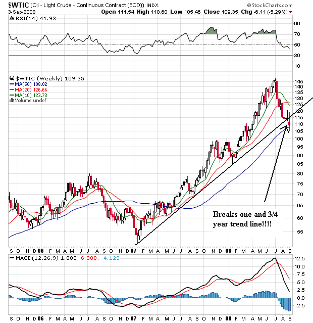
Oil broke the trend line that started in early 2007. That's a very important technical development because it signals the possible end of that rally. I say possible because we need further confirmation of the trend break. In other words, further downward price movement is necessary.
Also note that prices are right at the 50 week SMA. This is in effect the last stand of oil's rally. If prices stay above the 50 week SMA, use it for technical support and then bounce higher, then the rally may continue. But we're also in a very difficult rallying position from a fundamental perspective -- the US is in a recession and the rest of the world is starting to follow suit.
Also note the following:
-- The 10 week SMA has moved through the 20 week SMA and continues to head lower
-- The 20 week SMA is starting to turn negative
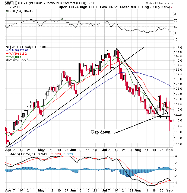
On the daily chart, notice the following:
-- All the SMAs are moving lower
-- The shorter SMAs are below the longer SMAs
-- Prices are below all the SMAs
-- Prices took a big gap down a few days ago
This is now a bearish chart
Wednesday, September 3, 2008
Today's Markets
Although the chart looks confusing and patternless right now, it really isn't. Look carefully at the market from 8/11 to today. Notice prices have been moving in a 3-4 point range. Also note the 10 and 20 minute SMAs are moving straight across, indicating a directionless short-term market.
Bottom line, we're moving sideways until we move above 130 or below 127.
The Detroit Death March Continues
From the WSJ:
The big problem for Toyota is they started to sell the SUV styled vehicles in the US -- the Tundra etc... Now they are in partially the same boat as other US car companies. As consumers start to actually think about fuel economy, Toyota's sales will take a hit.
Let's add these numbers from Ford:
Things are not looking that good, are they?
And let's add to the stupidity:
Of course they're seeing a strong response: they're basically giving cars away. At a time when they need to demonstrate they can make money, they are showing nothing more then their ability to lose money.
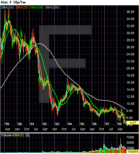
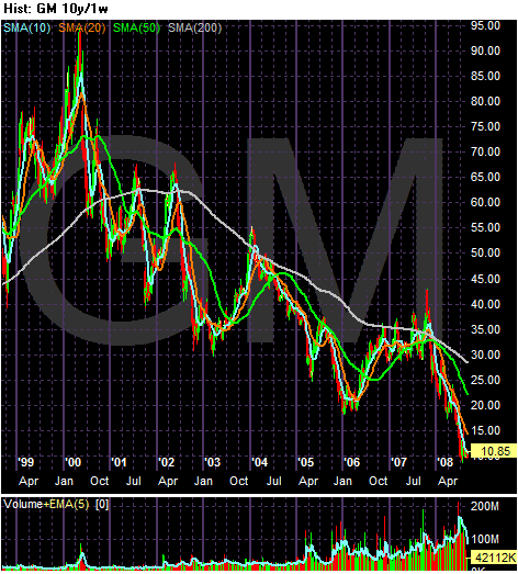
Let's take a look at four charts to show the difference between these companies. First here are Ford's and GM's 10-year charts, respectively:
Anyone see a pattern?
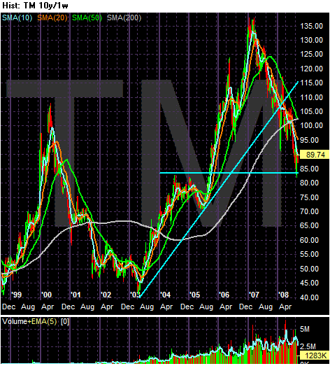
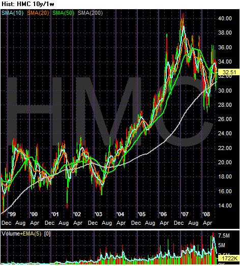
Let's compare to the Japanese car companies:
Toyota is getting hammered, but they also had an impressive performance over the last few years to fall from.
And Honda is looking really good.
The market is sending a clear message about the car companies: Detroit should go bankrupt while Japan should continue.
U.S. auto sales continued their slide in August despite stepped-up incentives to buyers, with Japan's Toyota Motor Corp. posting a 9.4% decline and Ford Motor Co. reporting a 27% drop.
The big problem for Toyota is they started to sell the SUV styled vehicles in the US -- the Tundra etc... Now they are in partially the same boat as other US car companies. As consumers start to actually think about fuel economy, Toyota's sales will take a hit.
Toyota, which is battling General Motors Corp. for the crown of the world's best-selling auto maker, said passenger car sales fell 4.3% to 129,622 while SUV sales dropped 25%. Toyota division sales fell 9.4% and Lexus recorded a 9.1% decline.
Let's add these numbers from Ford:
Ford truck and van sales fell 39% to 54,565 with SUV sales plummeting 53% and F-series truck sales tumbling 42%. Weak truck and SUV sales recently led Ford to push back the launch of its redesigned F-150 pickup truck that once was expected to drive the company's recovery.
Things are not looking that good, are they?
And let's add to the stupidity:
GM on Wednesday said it will extend its Employee-Discount-For-Everyone deals through the end of September, citing a strong response to the incentive program. GM is extending its employee discount incentive deals, hoping to lift sagging customer demand for its trucks and SUVs.
GM launched the deals on about a half-dozen 2009 models and most 2008 models in the middle of August to boost sagging demand for trucks and SUVs. For September, GM will increased the number of 2009 models carrying the discounts to 80% of the portfolio, GM spokesman John McDonald said.
Of course they're seeing a strong response: they're basically giving cars away. At a time when they need to demonstrate they can make money, they are showing nothing more then their ability to lose money.
Let's take a look at four charts to show the difference between these companies. First here are Ford's and GM's 10-year charts, respectively:
Anyone see a pattern?
Let's compare to the Japanese car companies:
Toyota is getting hammered, but they also had an impressive performance over the last few years to fall from.
And Honda is looking really good.
The market is sending a clear message about the car companies: Detroit should go bankrupt while Japan should continue.
Food For Thought
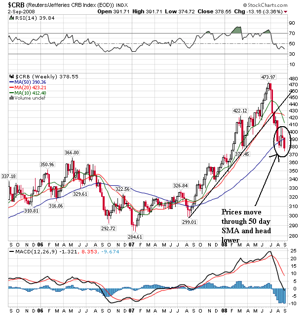
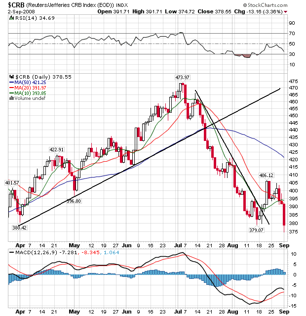
Wednesday Commodities Round-Up
On the weekly chart, notice the following:
-- The 10 week SMA has moved through the 20 week SMA
-- The 20 week SMA is also turning lower
-- Prices moved through the 50 week SMA and now have no SMAs moving below
-- Prices are below all the SMAs
-- The 20 and 50 day SMA are both moving lower
-- The 10 day SMA has moved through the 20 day SMA, but with prices below all the SMAs the 10 day SMA will start to move lower soon
Long-term, this is a bearish chart. Prices are clearly moving lower and are below all the SMAs.
Short-term this is a bearish chart. Prices are clearly moving lower and the below all the SMAs
This does present some good news on the inflation front, however. That will give the Federal Reserve a bit more wiggle room.
Tuesday, September 2, 2008
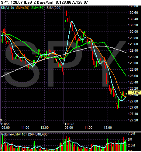
Today's Markets
Not a good day in the market. The market opened with an upward gap -- meaning prices opened higher than where they closed on Friday. However, prices started moving lower fairly quickly after that. A little before 10 prices were bouncing off the 50 minute SMA. Then a little after 11 AM prices moved through the 200 minute SMA at when time all the SMAs because sources of technical resistance rather than support.
Also note there were several downward gaps on today's chart. These are very bearish developments.
The reason for the morning's opening higher was oil was down big. But that wasn't enough to keep everybody happy.
ISM Drops Slightly
From the NBER:
The above paragraph outlines some of the economic trends the NBER looks for when dating a recession. In other words, the NBER looks at manufacturing to get an idea of where the economy is. The logic behind this is straightforward. If an economy is expanding, it makes more "stuff". If an economy is contracting, it makes less stuff.
That's why today's ISM news is important:
First, let's pull back the lens a bit to see where we are in the overall cycle.
The ISM number has been dropping for the last 4 years to its current level of around 50. 50 is the line used in the survey to distinguish between a manufacturing expansion (a reading over 50) and a manufacturing contracting (a reading under 50).
Let's tie today's number into a larger data set -- industrial production.
The year over year percentage change in industrial production is near 0% now and has been dropping since the beginning of the year. Today's number does not help that trend very much.
About the only good news from the manufacturing side has been exports, but with Japan and Europe staring at slowdowns that story may come under pressure now as well.
This is another data point that points to lackluster economic growth for the next quarter or two.
The committee places particular emphasis on two monthly measures of activity across the entire economy: (1) personal income less transfer payments, in real terms and (2) employment. In addition, we refer to two indicators with coverage primarily of manufacturing and goods: (3) industrial production and (4) the volume of sales of the manufacturing and wholesale-retail sectors adjusted for price changes. We also look at monthly estimates of real GDP such as those prepared by Macroeconomic Advisers (see http://www.macroadvisers.com). Although these indicators are the most important measures considered by the NBER in developing its business cycle chronology, there is no fixed rule about which other measures contribute information to the process.
The above paragraph outlines some of the economic trends the NBER looks for when dating a recession. In other words, the NBER looks at manufacturing to get an idea of where the economy is. The logic behind this is straightforward. If an economy is expanding, it makes more "stuff". If an economy is contracting, it makes less stuff.
That's why today's ISM news is important:
An index of manufacturing in the U.S. fell in August for the first time in three months as companies slowed production and cut payrolls in the face of weakening consumer spending.
The Institute for Supply Management's factory index fell to 49.9 last month from 50.0 the prior month, the Tempe, Arizona- based group reported today. The ISM gauge has hovered near 50, the dividing line between expansion and contraction, for the past year.
Manufacturers are receiving fewer orders as tumbling home prices and expensive gasoline weigh on consumer demand. Surging exports are keeping factories from stumbling as the broader economy slows.
``Manufacturing has been rather flat,'' said Norbert Ore, chairman of the ISM survey, in a conference call from Atlanta. ``It's a consistent story of slow contraction that's been going on for quite some time.''
The ISM index was projected to remain unchanged at 50, according to the median of 72 economists' forecasts in a Bloomberg News survey. Estimates ranged from 48.5 to 52.
First, let's pull back the lens a bit to see where we are in the overall cycle.
The ISM number has been dropping for the last 4 years to its current level of around 50. 50 is the line used in the survey to distinguish between a manufacturing expansion (a reading over 50) and a manufacturing contracting (a reading under 50).
Let's tie today's number into a larger data set -- industrial production.
The year over year percentage change in industrial production is near 0% now and has been dropping since the beginning of the year. Today's number does not help that trend very much.
About the only good news from the manufacturing side has been exports, but with Japan and Europe staring at slowdowns that story may come under pressure now as well.
This is another data point that points to lackluster economic growth for the next quarter or two.
Just For Fun....
I just did a sector comparison chart over at stockcharts.com, looking to see which sectors have performed the bast and the worst since the beginning of the year. I use the "biggie" ETFs -- XLB, XLE, XLF, XLI, XLK, XLP, XLU, XLV, XLY.
The best performing sector is consumer staples, which is down 1.34% for the entire year. And that's the best we've seen.
The worst performer is the financial sector, which is down 24.7% for the year.
What does this tell us?
1.) The market is not in a good way when one of the most defensive sectors is down for the year and is still be best performing sector.
2.) The financials are in terrible shape still (as if we didn't know that).
Market Monday's
Er -- or maybe market Tuesdays?
Anyway -- I'm back from a long weekend. Even though I'm not 100% I am feeling better.
So -- let's play a bit of catch-up and get a small lesson in chart reading.
Above is the daily chart for the SPY's. Notice we have a small problem -- where is the real upward sloping trend line. This is a great example of the "art" behind reading a chart.
-- The first line closely jibes to the price movement from mid-late July and early August. It comes close to tying together a 3-4 lows, making it a logical choice.
-- The second line ties together the bottom in mid-July with the a single point that is more thann a month away. So -- why use this line at all? In his book Technical Analysis of the Financial Markets author John Murphy (who put together Stockcharts.com) wrote a small section on fans.
Notice how we may have that here.
Aside from that, notice the following:
-- Prices are below the 200 day SMA.
-- The 200 and 50 day SMA are both moving lower
BUT
-- The 10 and 20 day SMA have moved through the 50 day SMA
-- The 10 and 20 day SMA are both moving higher
-- Prices are above the 10 and 20 day SMA, which will keep these SMAs moving higher
Anyway -- I'm back from a long weekend. Even though I'm not 100% I am feeling better.
So -- let's play a bit of catch-up and get a small lesson in chart reading.
Above is the daily chart for the SPY's. Notice we have a small problem -- where is the real upward sloping trend line. This is a great example of the "art" behind reading a chart.
-- The first line closely jibes to the price movement from mid-late July and early August. It comes close to tying together a 3-4 lows, making it a logical choice.
-- The second line ties together the bottom in mid-July with the a single point that is more thann a month away. So -- why use this line at all? In his book Technical Analysis of the Financial Markets author John Murphy (who put together Stockcharts.com) wrote a small section on fans.
Sometimes after the violation of an up trendline, prices will decline a bit before rallying back to the bottom of the old up trendline.
Notice how we may have that here.
Aside from that, notice the following:
-- Prices are below the 200 day SMA.
-- The 200 and 50 day SMA are both moving lower
BUT
-- The 10 and 20 day SMA have moved through the 50 day SMA
-- The 10 and 20 day SMA are both moving higher
-- Prices are above the 10 and 20 day SMA, which will keep these SMAs moving higher