It's that time of the week. Stop thinking about the market or the economy for awhile. Go to something -- anything else. I'll be back on Monday.
Here's Scoobey enjoying a view
And Sarge enjoying the wood floor
And Kate in a new "Weimar Spot"
Friday, July 25, 2008
Forex Fridays -- the Euro
Finally -- we have the euro.
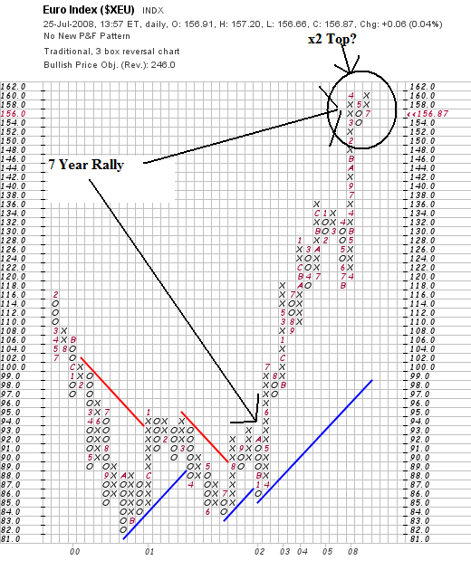
On the P&F chart, notice the following.
-- The euro has been rallying for the last 7 years. That's one hell of a rally.
-- The chart may be forming a double top.
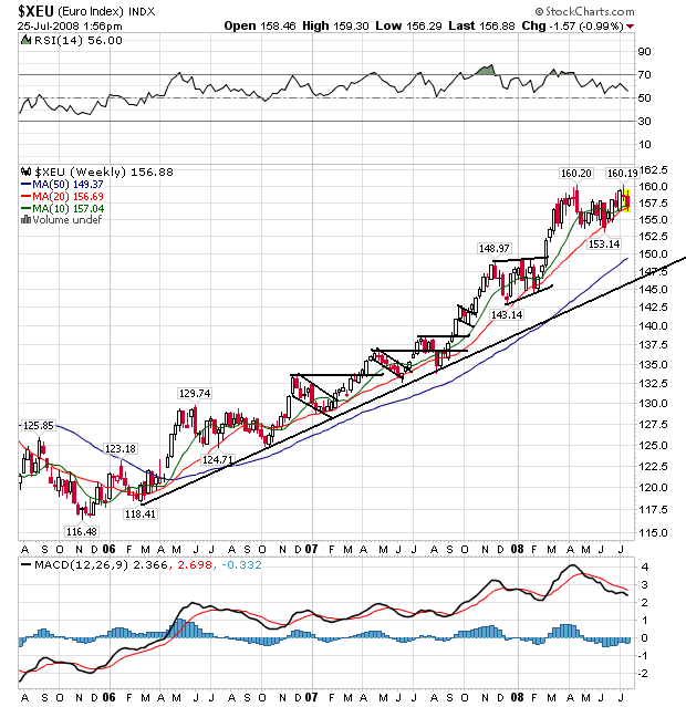
On the weekly chart, notice the strength of the multi-year rally. Prices have continually moved higher, going through levels of resistance and then consolidating gains. Also note that prices are consolidating or topping right now.
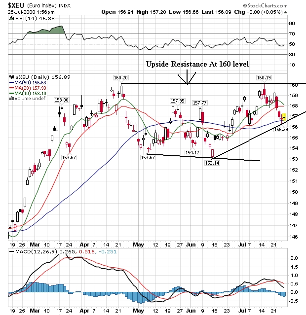
On the daily chart, notice that prices have had a hard time getting about the 160 level, which is providing a fair amount of upside resistance.
Forex Fridays -- the Yen
Let's continue with a look at the yen:
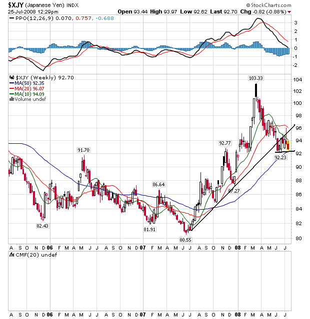
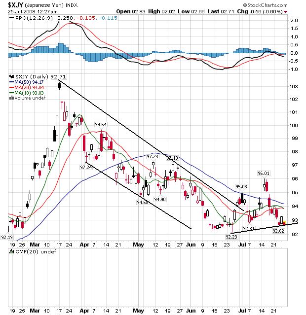
From mid-2007 until a little bit ago, the yen was in the middle of a strong rally. It continually moved through resistance and consolidated gains in a downward sloping pennant formation. Prices used the 20 week SMA as support until prices moved through this support level in March of this year. Now prices are moving sideways consolidating gains.
The daily chart shows the the latest downward sloping pennant formation in better detail. Prices peaked in mid-March and moved down until mid-June. Now they are in a slight upward sloping move, but it is a very slight movement; it can just as easily be characterized as a sideways move.
We're Nowhere Near A Bottom in Housing
From CNN:
So -- prices are dropping, sales are dropping and inventory is rising. This is not a good combination.
And adding to that inventory is the rising tide of foreclosures:
As if that wasn't enough, home vacancy rates are near records:
However, there was some good news on today's new home sales report:
At least the inventory of new homes is dropping. But the existing home market is much bigger and is therefore more important than the new home sales market. And the problems there the same as we've had for some time: high existing inventory which is increased by rising foreclosures and the high vacancy rates. These combinations are just not good and don't bode well for the future.
Sales of existing homes in June slowed more than expected and hit their lowest level in 10 years, according to an industry trade group report released on Thursday.
The National Association of Realtors reported that sales by homeowners dipped in June to an annual pace of 4.86 million, down 2.6% from a pace of 4.99 million in May.
That's the lowest rate on record since the first quarter of 1998, when existing home sales fell to an annual pace of 4.83 million, according to Walter Molony, spokesman for NAR.
The existing home sales rate - including single-family, town homes, condominiums and co-ops - is down 15.5% from the 5.75 million units sold in June 2007.
.....
But with inventory still on the rise, home prices are falling further. The number of homes available for sale at the end of June rose 0.2% to 4.49 million, which represented an 11.1-month supply of inventory at the current sales pace, up from a 10.8-month supply in May.
Meanwhile, the median price of a home sold in June fell to $215,100, down 6.1% from $229,000 a year earlier.
So -- prices are dropping, sales are dropping and inventory is rising. This is not a good combination.
And adding to that inventory is the rising tide of foreclosures:
foreclosure filings more than doubled in the second quarter from a year earlier as falling home prices left borrowers owing more on mortgages than their properties were worth.
One in every 171 households was foreclosed on, received a default notice or was warned of a pending auction. That was an increase of 121 percent from a year earlier and 14 percent from the first quarter, RealtyTrac Inc. said today in a statement. Almost 740,000 properties were in some stage of foreclosure, the most since the Irvine, California-based data company began reporting in January 2005.
``Rising foreclosures are putting downward pressure on prices, increasing the possibility that homeowners will go upside- down on their mortgages,'' said Sheryl King, chief U.S. economist at Merrill Lynch & Co. in New York. ``That will cause more losses in mortgage portfolios and less willingness from investors to securitize mortgages and therefore fewer mortgages.''
About 25 million U.S. homeowners risk owing more than the value of the their homes, according to Bill Gross, manager of the world's biggest bond fund at Pacific Investment Management Co. That would make it impossible for them to negotiate better loan terms or sell their property without contributing cash to the transaction.
As if that wasn't enough, home vacancy rates are near records:
The percentage of vacant homes available for sale in the U.S. continues to hover at record levels.
Census Bureau figures show 2.8 percent of homes, excluding rental properties, were empty and on the market from April through June. The vacancy rate hit a record high of 2.9 percent in the first quarter of 2008. It was 2.6 percent a year ago.
However, there was some good news on today's new home sales report:
Sales of new homes in the U.S. dropped less than forecast last month as builders offered incentives to reduce a glut of unsold properties.
Purchases decreased 0.6 percent to a 530,000 pace from 533,000 in May, a reading higher than previously estimated, the Commerce Department said today in Washington. A separate report showed orders for durable goods unexpectedly rose in June.
The number of properties on the market dropped by the most in four decades, today's report showed, indicating builders are making some headway in clearing out inventories.
``We may have not touched bottom yet in the housing market, but we're clearly not in any freefall,'' Joel Naroff, president of Naroff Economic Advisors Inc. in Holland, Pennsylvania, said before the report.
At least the inventory of new homes is dropping. But the existing home market is much bigger and is therefore more important than the new home sales market. And the problems there the same as we've had for some time: high existing inventory which is increased by rising foreclosures and the high vacancy rates. These combinations are just not good and don't bode well for the future.
Forex Fridays -- the Dollar
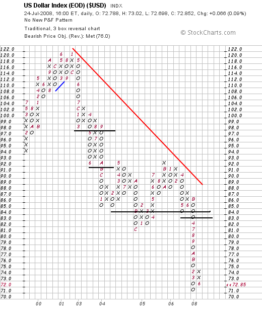
Let's start with a P&F chart to see where the price levels are:
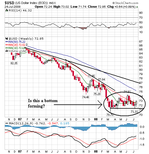
Notice the dollar has been in a clear downtrend for the last 6 years. That is a very long-lasting bear market.
On the weekly chart, notice the following:
-- Prices dropped for all of 2007. However,
-- We've seen prices stabilize around the 71-74 level. They have been at these levels for the last four months which is enough time to speculate about a bottom forming. This is a very important development. Why might prices be stabilizing? Here are a few thoughts.
1.) Bear markets only last so long. This one has lasted for the last 6 years. Think of this as the theory of inevitability.
2.) There has been a fair amount of talk about inflation from various Treasury and Federal Reserve officials. Now -- the US has had a "strong dollar" policy for the last 7 years so these statements have to be taken with a grain of salt (or an entire shaker).
3.) The markets might be thinking that given current economic facts and variables this is an appropriate price level for the dollar. After all, it has fallen quite a bit over the last 7 years.
These are all just theories.
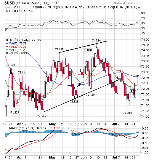
On the daily chart, notice the following:
-- There is an overall price range from 71.25 to 74 over the last few months.
-- Prices were in a slightly upwardly sloping channel from the end of April to the end of June, but they have since pulled back.
-- The SMAs aren't giving a firm reading in either direction right now. They are all heading lower but they recently they were all heading higher.
Thursday, July 24, 2008
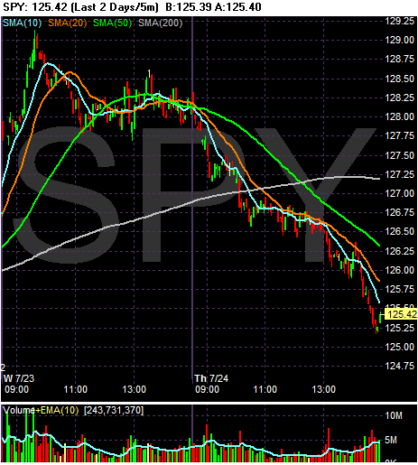
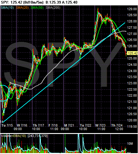
The markets opened near their close but then quickly moved lower. They gapped dwon a little before 9 AM and then gapped down again right after 9 AM. Then they moved sideways omving into the 10 minute SMA before again dropping a bit after 10 AM. By this time they had moved through the 200 minute SMA. The markets continued to move sideways with a slight downward bias until a little after 1 PM when they moved down again. They tried to rally again but ran into resistance at the 20 minutes SMA before moving down toward the close.
On the seven day chart, notice that prices have moved below the trend line started on Tuesday of last week. This is the rally that resulted from the financials getting better (or some such nonsense). Prices are now at levels from the end of last week/beginning of this week when prices are consolidating their weekly gains.
Beige Book Summary
Yesterday the Federal Reserve released the latest Beige Book. Below are excerpts from the report along with relevant charts to further explain some of the points. All charts are from Econoday unless otherwise noted.
Here is the overall summary:
Let's take this piece by piece:
Retail sales were dropping on a year over year level since October of last year. However, they did experience a slight increase last month. My guess is the stimulus checks were part of the reason for that.
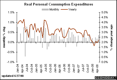
Personal consumption expenditures have been rising on a year over year basis since the beginning of the year. This figure includes retail sales but also has other expenditures such as services etc... included. The length of this increase is too long to be a statistical aberration. I have no explanation for it.
The ISM services index has been dropping for several years, indicating the overall trend is down. Also note a reading of 50 and below is considered a sign of contraction. The index has printed a reading below 50 in 4 of the last 6 months.
Industrial production has been declining on a year over year basis since the end of last year.
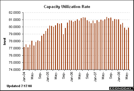
As has capacity utilization -- the percentage of manufacturing resources in use.
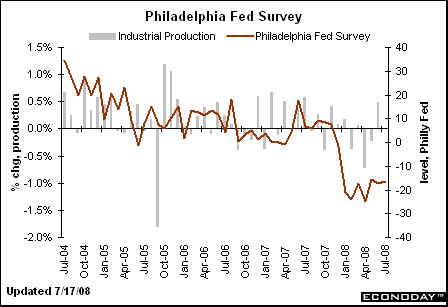
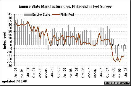
The Philly Fed has printed some terrible numbers since the end of last year,
As has the empire state survey
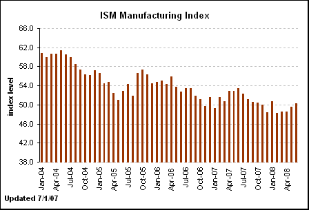
The ISM manufacturing survey has increased over the last two months, but has printed a number below 50 5 of the last months indicating a contraction. My guess is the increase over the last few months indicates an increase in export orders caused by the low dollar.
Prices are still falling off a cliff:
And today's existing home sales report hows further weakness:
The reason for this drop in sales is the tightening credit conditions mentioned above.
Sky high inventory levels + tightening credit = dropping prices.
I'm going to add two points.
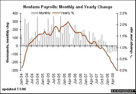
Job growth is terrible:
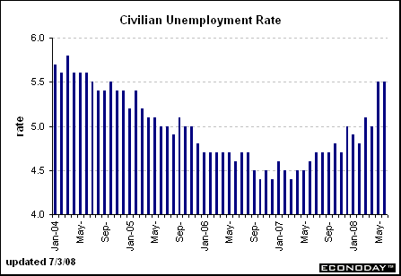
and unemployment is rising:
And then there are prices:
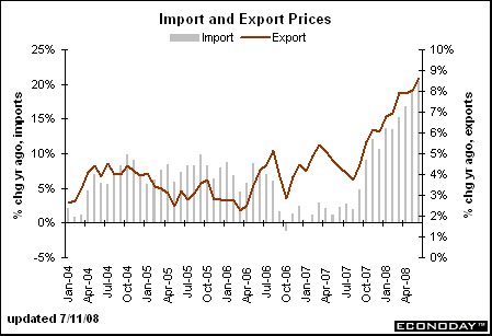
Import prices are increasing on a year over year basis, as are
Producer Prices.
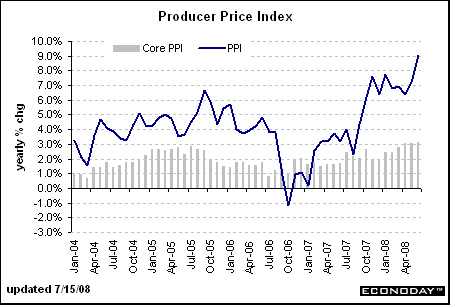
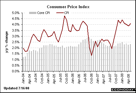
Consumer prices are at high levels on a year over year basis.
Now, recently there have been some drops in both the prices of agricultural goods and oil. If there continue we may see a decrease in inflationary pressures. But we're not there yet.
Let's review.
Consumers are slowing their shopping
The service sector is contracting.
The manufacturing sector is contracting.
Housing is still deteriorating.
Job growth is deteriorating, and
Prices are increasing.
Here is the overall summary:
Reports from the twelve Federal Reserve Districts suggest that the pace of economic activity slowed somewhat since the last report. Five eastern Districts noted a weakening or softening in their overall economies, while Chicago characterized its economy as sluggish and Kansas City noted a moderation in growth. St. Louis said activity was stable and San Francisco reported little or no growth. Cleveland and Minneapolis reported slight increases in economic activity, while Dallas described growth as steady and moderate.
Consumer spending was reported as sluggish or slowing in nearly all Districts, although tax rebate checks boosted sales for some items. Tourist activity was mixed, with residents in several Districts choosing to vacation closer to home due to high gasoline prices. The demand for services was also mixed across Districts, with strength in the IT and health care industries offsetting some weakness in other service sectors. Manufacturing activity declined in many Districts, although demand for exports remained generally high. Residential real estate markets declined or were still weak across most of the country. Commercial real estate activity also slowed or remained sluggish in a majority of Districts, although a few Districts noted slight improvement. In banking, loan growth was generally reported to be restrained, with residential real estate lending and consumer lending showing more weakness than commercial lending. Districts reporting on agricultural activity said conditions were mixed, based largely on how June precipitation affected them. Districts reporting on the energy sector said it continued to strengthen.
All reporting Districts characterized overall price pressures as elevated or increasing. Input prices continued to rise, particularly for fuel, other petroleum-based materials, metals, food, and chemicals. Retail price inflation varied across the country, with some Districts reporting increases but others noting some stability, at least for the present. Wage pressures were generally limited in most Districts, as labor market demand was soft except for highly skilled workers and in the energy sector.
Let's take this piece by piece:
Consumer spending was reported as sluggish or slowing in nearly all Districts, although tax rebate checks boosted sales for some items
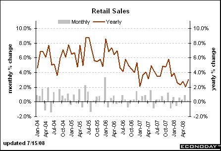
Retail sales were dropping on a year over year level since October of last year. However, they did experience a slight increase last month. My guess is the stimulus checks were part of the reason for that.
Personal consumption expenditures have been rising on a year over year basis since the beginning of the year. This figure includes retail sales but also has other expenditures such as services etc... included. The length of this increase is too long to be a statistical aberration. I have no explanation for it.
The demand for services was also mixed across Districts, with strength in the IT and health care industries offsetting some weakness in other service sectors
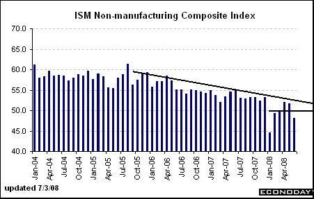
The ISM services index has been dropping for several years, indicating the overall trend is down. Also note a reading of 50 and below is considered a sign of contraction. The index has printed a reading below 50 in 4 of the last 6 months.
Manufacturing activity declined in many Districts, although demand for exports remained generally high.
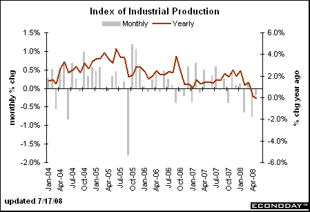
Industrial production has been declining on a year over year basis since the end of last year.
As has capacity utilization -- the percentage of manufacturing resources in use.
The Philly Fed has printed some terrible numbers since the end of last year,
As has the empire state survey
The ISM manufacturing survey has increased over the last two months, but has printed a number below 50 5 of the last months indicating a contraction. My guess is the increase over the last few months indicates an increase in export orders caused by the low dollar.
Residential real estate markets declined or were still weak across most of the country
Prices are still falling off a cliff:
Home prices across 20 major U.S. cities have dropped a record 15.3% in the past year and are now back to where they were in the summer of 2004, according to the Case-Shiller home price index released Tuesday by Standard & Poor's.
Prices in the 20 cities are now down 17.8% from the peak two years ago.
Prices were lower in April than they were a year earlier in all 20 of the major metropolitan areas as tracked by the Case-Shiller index.
And today's existing home sales report hows further weakness:
Sales of existing single-family homes declined 3.2 percent to an annual rate of 4.27 million pace. Purchases of condos and coops increased 1.7 percent to a 590,000 pace.
The median sales price fell to $215,100 from $229,000 in June 2007. The median cost of a single-family home decreased 6.7 percent to $213,800, while that of condominiums and co-ops fell 2.2 percent to $224,200.
Purchases decreased in three of four regions, led by a 6.6 percent decline in the Northeast. Sales rose 1 percent in the West, which also showed a 17 percent drop in the median price, the biggest of any region.
The number of previously owned unsold homes on the market at the end of June rose to 4.49 million from 4.482 million in May. The total represented 11.1 months' supply at the current sales pace. The agents' group has said that a five-to-six month's supply reflects a balanced market.
The reason for this drop in sales is the tightening credit conditions mentioned above.
Sky high inventory levels + tightening credit = dropping prices.
I'm going to add two points.
Job growth is terrible:
and unemployment is rising:
And then there are prices:
Import prices are increasing on a year over year basis, as are
Producer Prices.
Consumer prices are at high levels on a year over year basis.
Now, recently there have been some drops in both the prices of agricultural goods and oil. If there continue we may see a decrease in inflationary pressures. But we're not there yet.
Let's review.
Consumers are slowing their shopping
The service sector is contracting.
The manufacturing sector is contracting.
Housing is still deteriorating.
Job growth is deteriorating, and
Prices are increasing.
Thursday Oil Market Round-Up
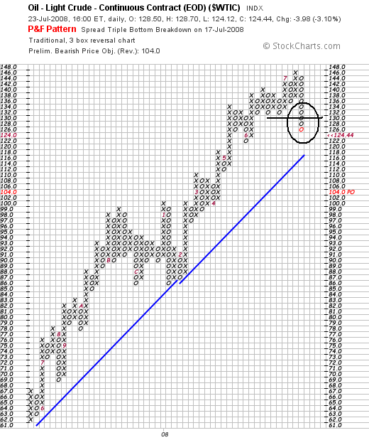
Big news in the oil market this week.
One of the biggest advantages of P&F charts is they clearly show important price levels. On the above chart, notice that 132 was a very important support level and that prices moved through that price this week.
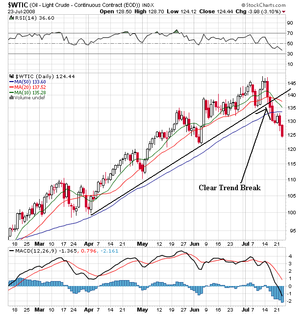
On the daily chart, notice the following:
-- Prices are below all the SMAs
-- The 10 and 20 day SMAs are both heading lower
-- The 10 day SMA has crossed below the 20 day SMA
-- Prices have broken the trend line that started in early April
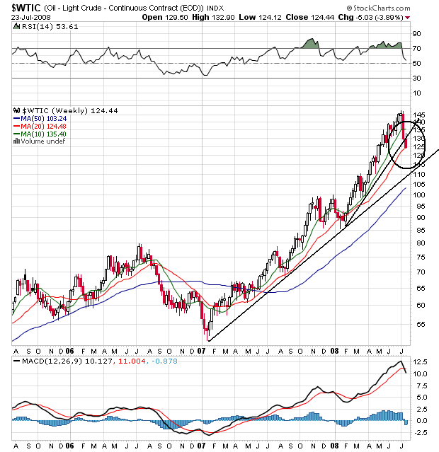
And finally we have the weekly chart. While the long-term upward trend line started in early 2007 is still firmly in place, the rally that started at the beginning of this year has clearly been broken. Prices are resting on the 20 week SMA and the MACD is overbought. This is a chart that is clearly correcting.
Wednesday, July 23, 2008
Today's Markets
Traders could have called this on in after 11 CST
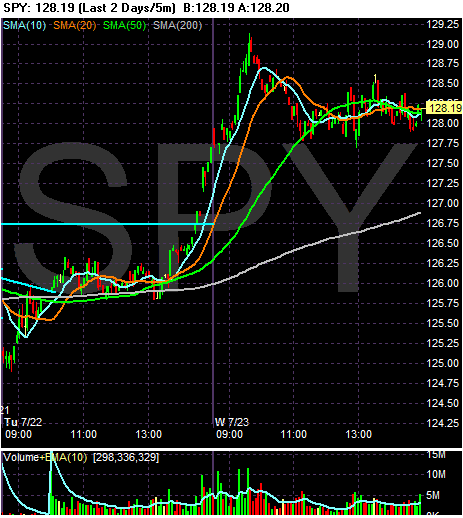
The market opened a bit higher and then consolidated right before the 10 minute SMA. The market moved up a bit after 9 AM, then fell to the 20 minute SMA. The market moved along this line for ab out 20 minutes and then fell to the 50 minute SMA. The market traded sideways for the rest of the day.
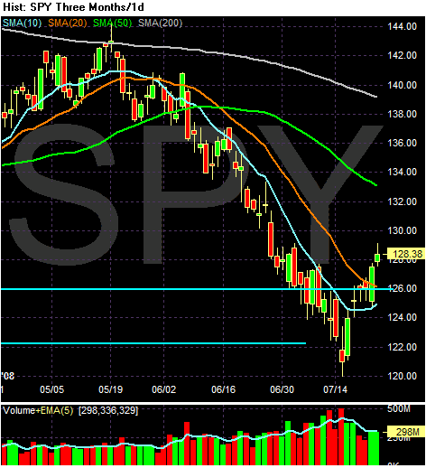
On the daily chart, notice the following:
-- Prices are above the 10 and 20 day SMA
-- The 10 day SMA is turning higher
However,
-- The shorter SMAs are below the longer SMAs
-- Prices are below the 200 day SMA
-- The 20, 50 and 20 day SMA are all moving lower.
What we may have here is the beginning of a rally. Prices have moved through the SMAs that are the lowest on the chart, indicating some bullishness. In addition, the 10 and 20 day SMA will provide support on downward moves rather than resistance. However, there is still a lot of longer term bearishness in these charts as the downward sloping 20, 50 and 200 day SMA show.
What's the Cost For Fannie and Freddie?
From Bloomberg:
While I think that number is a little high, its should be obvious that Paulson's estimates are way too low. Remember there points:
1.) Fannie and Freddie have over $200 billion in subprime assets on their books:
Paulson's $25 billion is about 11.5% of the total subprime assets and a very small percentage of the total amount of loans on the GSEs books. Short version: $25 billion is a very low ball figure.
2.) Paulson has asked for an unlimited line of credit and the ability to buy stock in the open market. That tells me he thinks this thing is getting a lot worse.
3.) How many times have we thought we were in the 9th inning of the writedown problem?
A government rescue of Fannie Mae and Freddie Mac would require taxpayers to pay ``way'' more than the $25 billion estimated by the Congressional Budget Office, potentially as much as $1 trillion, Senator Jim Bunning said.
Treasury Secretary Henry Paulson ``hasn't told us the truth about this bill,'' Bunning, a Republican from Kentucky, said in an interview with Bloomberg Television today. ``Why would you put in a backstop of unlimited amounts of money if you weren't going to need it.''
While I think that number is a little high, its should be obvious that Paulson's estimates are way too low. Remember there points:
1.) Fannie and Freddie have over $200 billion in subprime assets on their books:
Fannie Mae and Freddie Mac may need to record more writedowns after they expanded their purchases of non-guaranteed subprime and Alt-A mortgage securities just as other investors fled to safer investments, their regulator said.
The value of $217 billion of the so-called non-agency securities is falling as other financial firms write down their holdings, the Office of Federal Housing Enterprise Oversight said in its annual mortgage market report. Privately issued securities backed by subprime mortgages made up 9.2 percent of the companies' combined portfolio, while Alt-A represented about 5.8 percent, Ofheo said.
Paulson's $25 billion is about 11.5% of the total subprime assets and a very small percentage of the total amount of loans on the GSEs books. Short version: $25 billion is a very low ball figure.
2.) Paulson has asked for an unlimited line of credit and the ability to buy stock in the open market. That tells me he thinks this thing is getting a lot worse.
3.) How many times have we thought we were in the 9th inning of the writedown problem?
Follow That Lemming...
From the WSJ:
I think the short-covering is a very important part of this rally, especially in light of the SEC clamping down on some short-selling tactics.
But let's consider the news from a strictly analytical perspective.
Five of the largest US banks "reported combined quarterly losses of more than $11 billion." Yet somehow that means the bad news is over? In addition, the assessment of current conditions was "mostly somber". This from a group of people who are trained in media relations and will spin anything as good. In addition, the five added a combined total of $13 billion to their loan loss provisions which means borrowers are having harder times repaying loans. And finally, three banks cut their dividend to conserve cash. None of these development is positive. In fact, all of these are negative developments. Yet traders are buying these shares?
Five of the largest U.S. financial institutions, led by Wachovia Corp. and Washington Mutual Inc., reported combined quarterly losses of more than $11 billion. But their shares jumped an average of 14% on rising hopes that battered bank stocks have fallen about as low as they can go.
The buying frenzy, also fueled by short sellers covering bearish bets, was at odds with the mostly somber assessment by bank executives Tuesday of the shaky loans and struggling economy bedeviling the industry.
In a sign of the loan woes likely to haunt them for years, Wachovia, Washington Mutual, SunTrust Banks Inc., Fifth Third Bancorp and Regions Financial Corp. socked away nearly $13 billion in loan-loss provisions. Wachovia, Regions and Fifth Third also cut their dividends in order to conserve cash.
Financial stocks are up 31% in the past five trading days. The five big lenders that reported quarterly results Tuesday have climbed by an average of 60% over that period. Tuesday's gains increased their combined stock-market value by $11.6 billion -- almost identical to their total losses in the second quarter.
I think the short-covering is a very important part of this rally, especially in light of the SEC clamping down on some short-selling tactics.
But let's consider the news from a strictly analytical perspective.
Five of the largest US banks "reported combined quarterly losses of more than $11 billion." Yet somehow that means the bad news is over? In addition, the assessment of current conditions was "mostly somber". This from a group of people who are trained in media relations and will spin anything as good. In addition, the five added a combined total of $13 billion to their loan loss provisions which means borrowers are having harder times repaying loans. And finally, three banks cut their dividend to conserve cash. None of these development is positive. In fact, all of these are negative developments. Yet traders are buying these shares?
Wednesday Commodities Round-Up
There's some big news in the commodities charts.
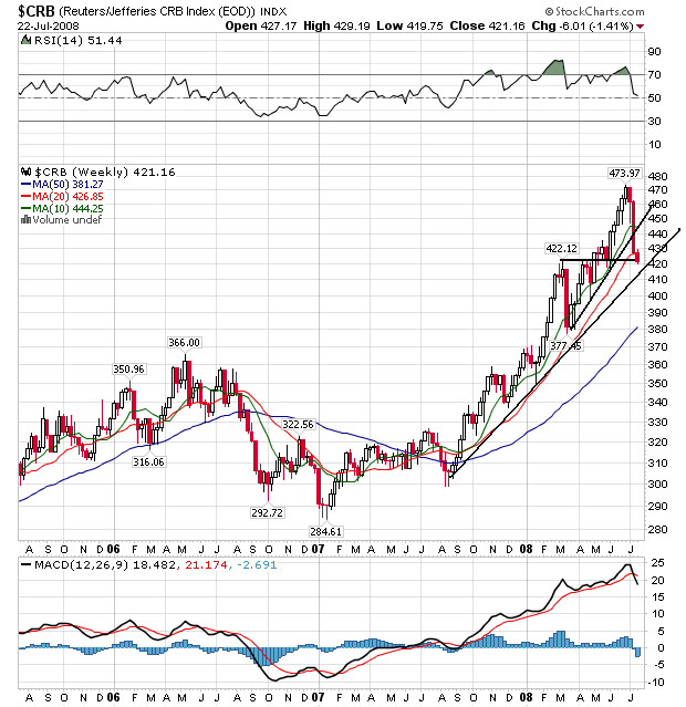
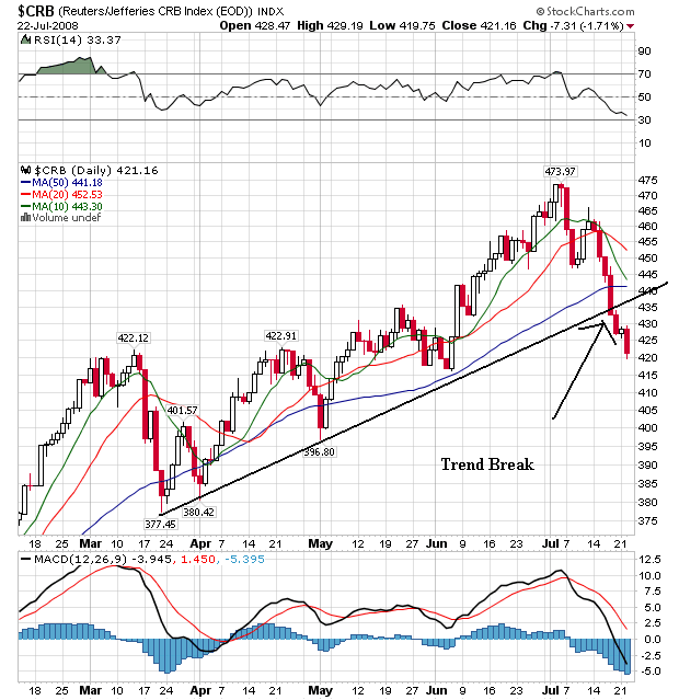
Thanks to the drop in both oil (see tomorrow) and agricultural prices (see below) we see the CRB index has broken a key trend line that started in mid to late March. Also note the following:
-- Prices are below all the SMAs
-- The 10 day SMA has crossed below the 20 day SMA
-- The 10 and 20 day SMA are both headed lower
-- The 10 day SMA is about to cross over the 50 day SMA
This chart is turning short-term bearish.
On the weekly CRB chart, notice the longer term uptrend is still in place. However, prices have moved through the 10 and 20 week SMA and are standing at a key support level.
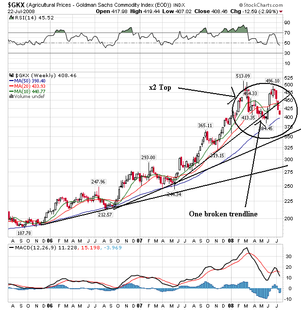
The possibility of a double top is becoming more and more likely with the agricultural prices chart. We won't know for sure until there is a definite trend break below the low point between the two tops. Until that happens, this could be a sideways consolidation as well as a possible double top.
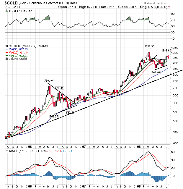
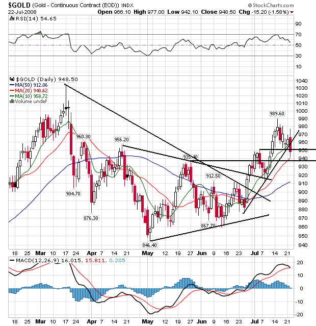
Gold has broken out of a triangle consolidation and is still in a three year uptrend. But, notice recent upward price moves have stalled a bit which is clearer of the daily chart:
Notice the following:
-- Prices have clearly broken out of a triangle consolidation and are heading higher.
-- The shorter SMAs are above the longer SMAs
-- All the SMAs are moving higher
-- Prices are using the 10 say SMA as technical support
However, combine the daily and the weekly gold charts and you'll notice on the weekly chart the last few weeks have printed some smaller candles. These could be simple pullbacks as traders book gains and wait for the next bit of news that will send prices higher. However, the recent price drops in both agricultural and oil prices may be giving gold traders reason to pause a bit and consider their next moves.
Let's tie all of these charts together.
-- Gold tells us that traders are possibly thinking commodity price pressure is slowing a bit
-- Agricultural prices may be forming a double top
-- The CRB index is clearly dropping as well
All of this bodes well for overall price pressures if these trends continue.
Tuesday, July 22, 2008
Today's Markets
On the daily chart, note the following:
Bearish
-- Prices are below the 200 day SMA
-- The 20, 50 and 200 day SMA are all headed lower
-- The shorter SMAs are below the longer SMAs
Bullish
-- Prices have broken through the 20 day SMA on good volume with a strong bar
-- The 10 day SMA is turning around
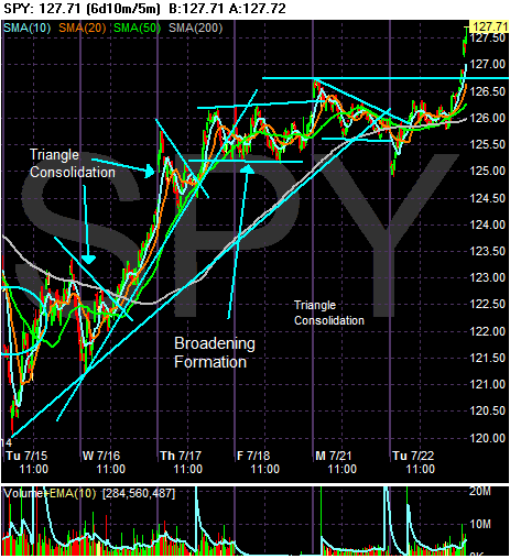
On the daily chart, note that prices rallied from 7/15 until mid-day on the 17th. Then they moved sideways for almost three days until they broke through upside resistance today. Also note that prices gapped higher on strong volume at the end of trading today. That indicates bullish sentiment is returning to the market.
The Federal Government Is Swimming in Red Ink
From the WSJ:
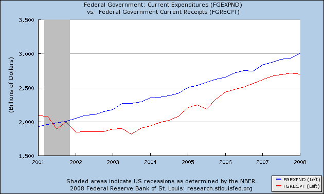
Let's take a look at the government's revenue and expenditure line from the St. Louis Federal Reserve:
Notice that space between the red and blue line? That has to be filled in by debt. And here is the debt we have issued over the last 7 years:
09/30/2007 $9,007,653,372,262.48
09/30/2006 $8,506,973,899,215.23
09/30/2005 $7,932,709,661,723.50
09/30/2004 $7,379,052,696,330.32
09/30/2003 $6,783,231,062,743.62
09/30/2002 $6,228,235,965,597.16
09/30/2001 $5,807,463,412,200.06
09/30/2000 $5,674,178,209,886.86
Given the top chart, it's no wonder that we need more debt. But note that the government has needed debt for some time. This isn't a new development.
The Treasury market is abuzz with chatter about possible changes to the government's supply calendar as the bill for the credit crunch and the weak economy keeps rising.
The Treasury Department reports its next quarterly refunding schedule on July 31. Bond investors are speculating it could bring back either the three-year note, which was eliminated a year ago, or the seven-year note, which was last sold in 1993, to meet its increased funding needs. A third option is to expand the sale of 10-year notes, making it a monthly event. Currently, the department auctions a new 10-year note every quarter and reopens it one month later.
The need for change in the supply calendar has grown in the past year as the economy has slowed, resulting in lower tax receipts. This year's economic-stimulus package has added to the budget shortfall. Other items, such as support for mortgage lenders Fannie Mae and Freddie Mac, would further increase borrowing needs.
Let's take a look at the government's revenue and expenditure line from the St. Louis Federal Reserve:
Notice that space between the red and blue line? That has to be filled in by debt. And here is the debt we have issued over the last 7 years:
09/30/2007 $9,007,653,372,262.48
09/30/2006 $8,506,973,899,215.23
09/30/2005 $7,932,709,661,723.50
09/30/2004 $7,379,052,696,330.32
09/30/2003 $6,783,231,062,743.62
09/30/2002 $6,228,235,965,597.16
09/30/2001 $5,807,463,412,200.06
09/30/2000 $5,674,178,209,886.86
Given the top chart, it's no wonder that we need more debt. But note that the government has needed debt for some time. This isn't a new development.
The Problems At Freddie and Fannie Run Deep
From the WSJ:
And why are they being looked at? Here's why:
Subprime makes up 9.2% of the GSE's portfolio at a total of over $200 billion dollars. Imagine what happens when that portfolio has to be written down.
The following is pure conjecture; I have no inside knowledge of such things.
About a week and a half ago we started to hear very negative stories about the GSEs. Then we started to see news stories about how these entities needed cash and/or were in trouble. Here's what I think happened.
Sometime during the week of July 7 phone calls were made that involved Bernanke, Paulson and the heads of the GSEs. The main thrust of the calls was this: Fannie and Freddie were not doing well. Between rising delinquencies and falling home values the GSEs portfolios were in serious trouble and getting worse. Considering that subprime debt is 9.2% of GSE portfolios we now know that GSE's are getting hit really hard.
Then we started to see a whole lot of government support packages come out in the form of trial balloons. Basically, the federal government was trying to see what the best way to handle the situation would be.
Then we saw the Paulson GSE bail-out package come out:
Note the breadth of this package. The Treasury would determine the terms and amount of the line of credit; but there is no mention at all of the possible amount. Secondly, the Treasury will essentially provide a floor for GSE stock by allowing the Treasury to buy GSE stock in the open market. This plan would essentially allow the Treasury department to prevent a GSE bankruptcy.
There are two possible explanations for this plan.
1.) Paulson is striking while the iron is still hot. He doesn't really need all of this money and authority relative to the GSEs, but he might as well ask for it now because he might need it in the future and Congress is in a giving mood right now. This is always a possibility with a package that involves politics.
2.) Paulson has seen the books and determined the GSEs are in serious trouble and he is trying to prevent a bankruptcy or something close to it. Personally, I think this is the real answer. the GSEs have been given way too much attention lately for this to not be the explanation.
Bank examiners from the Federal Reserve and the Office of the Comptroller of the Currency are looking at the books of mortgage investors Fannie Mae and Freddie Mac, a person familiar with the situation said.
The examiners are working with the two companies' main regulator, the Office of Federal Housing Enterprise Oversight, or Ofheo, this person said. This joint effort to assess the financial condition of the two government-sponsored companies was first reported by the New York Times Web site late Monday.
Fannie and Freddie face sizable losses as defaults increase and home prices fall. That has caused a plunge in their share prices over the past few weeks, though the shares have recovered somewhat in recent days. Ofheo has said that the companies' capital remains above their regulatory minimums.
And why are they being looked at? Here's why:
Fannie Mae and Freddie Mac may need to record more writedowns after they expanded their purchases of non-guaranteed subprime and Alt-A mortgage securities just as other investors fled to safer investments, their regulator said.
The value of $217 billion of the so-called non-agency securities is falling as other financial firms write down their holdings, the Office of Federal Housing Enterprise Oversight said in its annual mortgage market report. Privately issued securities backed by subprime mortgages made up 9.2 percent of the companies' combined portfolio, while Alt-A represented about 5.8 percent, Ofheo said.
By investing ``heavily'' in private-label securities in 2004 and 2005, the companies ``significantly increased their exposure to fair value losses from changes in market prices,'' Ofheo said. Structured investment vehicles and securities firms, battered by $452 billion in asset writedowns and credit losses, were invested in similar securities and have contributed to the price swings that may lead to more losses at Fannie Mae and Freddie Mac under generally accepted accounting principles.
``To the extent that those institutions recognize fair value losses on their private-label portfolios under GAAP, Fannie Mae and Freddie Mac may have to do so as well,'' the Washington-based regulator wrote in the report.
Subprime makes up 9.2% of the GSE's portfolio at a total of over $200 billion dollars. Imagine what happens when that portfolio has to be written down.
The following is pure conjecture; I have no inside knowledge of such things.
About a week and a half ago we started to hear very negative stories about the GSEs. Then we started to see news stories about how these entities needed cash and/or were in trouble. Here's what I think happened.
Sometime during the week of July 7 phone calls were made that involved Bernanke, Paulson and the heads of the GSEs. The main thrust of the calls was this: Fannie and Freddie were not doing well. Between rising delinquencies and falling home values the GSEs portfolios were in serious trouble and getting worse. Considering that subprime debt is 9.2% of GSE portfolios we now know that GSE's are getting hit really hard.
Then we started to see a whole lot of government support packages come out in the form of trial balloons. Basically, the federal government was trying to see what the best way to handle the situation would be.
Then we saw the Paulson GSE bail-out package come out:
First, as a liquidity backstop, the plan includes a temporary increase in the line of credit the GSEs have with Treasury. Treasury would determine the terms and conditions for accessing the line of credit and the amount to be drawn.
Second, to ensure the GSEs have access to sufficient capital to continue to serve their mission, the plan includes temporary authority for Treasury to purchase equity in either of the two GSEs if needed.
Use of either the line of credit or the equity investment would carry terms and conditions necessary to protect the taxpayer.
Third, to protect the financial system from systemic risk going forward, the plan strengthens the GSE regulatory reform legislation currently moving through Congress by giving the Federal Reserve a consultative role in the new GSE regulator's process for setting capital requirements and other prudential standards.
Note the breadth of this package. The Treasury would determine the terms and amount of the line of credit; but there is no mention at all of the possible amount. Secondly, the Treasury will essentially provide a floor for GSE stock by allowing the Treasury to buy GSE stock in the open market. This plan would essentially allow the Treasury department to prevent a GSE bankruptcy.
There are two possible explanations for this plan.
1.) Paulson is striking while the iron is still hot. He doesn't really need all of this money and authority relative to the GSEs, but he might as well ask for it now because he might need it in the future and Congress is in a giving mood right now. This is always a possibility with a package that involves politics.
2.) Paulson has seen the books and determined the GSEs are in serious trouble and he is trying to prevent a bankruptcy or something close to it. Personally, I think this is the real answer. the GSEs have been given way too much attention lately for this to not be the explanation.
Treasury Tuesdays
Here's a question for you: "would it be a Bonddad post without charts?"
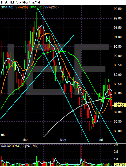
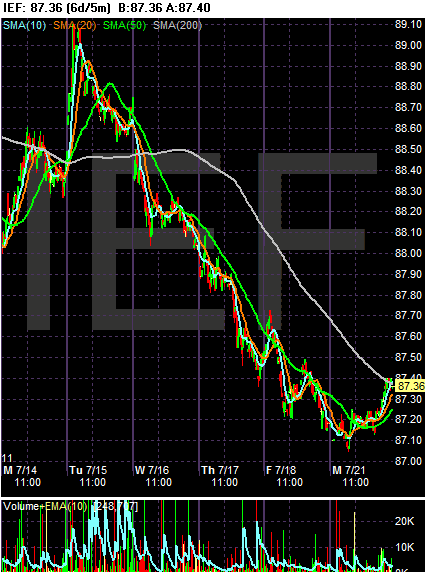
From Tuesday of last week through Friday we see the IEF -- the 7-10 year Treasury sector -- dropped continually. It continually moved through support and made new lows. The primary reason for this move was the stock market's rally. There are times in the market when stocks and bonds are inversely related; as stocks move higher they pull money away from the fixed income market. Last week was one of those times.
Looking at the 6 month daily chart, notice the IEF peaked in mid-March of this year and has been in a downward sloping trend/channel since. This also corresponds to a rally in the stock market. However, starting in mid-June the Treasury market caught a bid again largely as a result of safe haven buying. But last week prices dropped in reaction to the stock market.
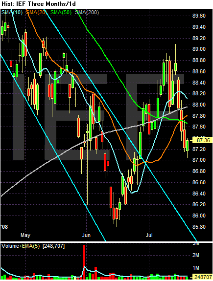
On the three month chart, notice the following:
-- Prices are below the 200 day SMA
-- The 10 day SMA turned negative
-- The 50 day SMA is still heading lower, but at a smaller angle
-- The 20 and 200 day SMA are heading higher
-- Prices are below all the SMAs
-- Prices and SMAs are bunched up pretty tightly.
So -- the chart is giving some pretty mixed signals. The shorter SMAs are bearish but the longer SMAs are bullish.
Monday, July 21, 2008
Today's Markets
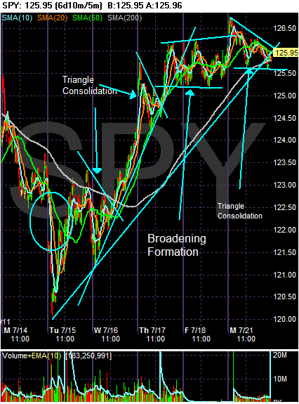
Let's step back a bit and take a look at the latest rally to see what it looks like and where we are in the rally cycle.
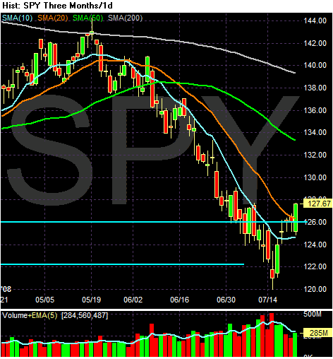
The rally started last Tuesday when the market gapped down at the open, but then rallied throughout the day. Although the market fell in the last 30 minutes, the table was set. The market rallied hard on Wednesday, especially after prices moved through the 200 day SMA and broke through upper resistance from a triangle consolidation near the same time. The market consolidated gains again early on Thursday and then broke through upper resistance again. However, from mid-day Thursday through Friday of last week the markets formed a broadening top formation. In addition, today the markets formed another consolidation pattern -- this time a triangle. Notice that after the strong run from Tuesday through Thursday of last week, the market has taken two days to consolidate gains. Also note prices are near the 200 day SMA, which will provide crucial support for a possible rally.
On the daily chart, notice prices are having a problem with the 20 day SMA providing upside technical resistance to the rally. Also note the declining volume over the last 5 days indicating declining buying interest.
What does all of this mean? The rally is stalling or consolidating. We'll know more over the next few days.
About Last Week's Rally ----
Food for thought ---
Everybody was excited because things weren't as bad as expected. It wasn't because things were better than expected or because companies beat with huge increases. Instead, companies showed smaller losses than those expected.
Are these reasons really a good reason to rally -- that is, do you want to buy something because losses aren't that bad? Or, do you want to buy something because it is earning a whole lot more than expected?
Now let's compound the problem. Over the last year, how many negative stories have we seen come out of the financial sector compared to positive news stories? Let's compound it even more. How many times has a financial CEO said "things are fine" only to have really bad news hit the wire within a week of the positive statement?
The Credit Crisis is Far From Over
From today's WSJ:
Retailers having a harder time getting credit indicates there is concern about the strength and/or sustainability of retail spending. Also note that Wal-Maryt -- the largest retailer in the world -- had to agree to tighter lending controls. This is a company with 378 billion in revenue last year. They have to agree to stricter lending standards.
This is why last week's euphoria regarding the financial sector was so completely overblown. Everyone was thrilled because several banks reported losses that weren't as large as feared. That was the good news -- banks didn't lose as much money as projected. Yet they still lost lots of money and wrote down lots of debt. And all of those writedowns are starting to crimp lending.
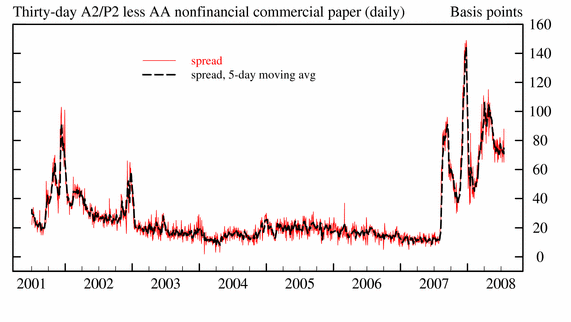
None of this should be surprising to anyone. We have seen over $400 billion dollars in writedowns. We have seen 266 mortgage lenders shut their doors. All of this is bound to have an impact -- which it has in the discount spread:
Also note that LIBOR is still higher than the discount rate.
Ladies and gentlemen -- anyone that is recommending you move into financial shares is an idiot. There are still major problems out there. Credit standards are tightening and loans are getting harder to come by even though the Fed has (again) lowered interest rates to 0% after adjusting for inflation. None of this is good news.
Banks also are pulling back on the amount of rainy-day money they have been giving out to corporate clients in the form of loans called revolving-credit facilities. Retailers such as Sears Holdings Corp. and Talbots Inc. have struggled to renew revolving-credit facilities with their bankers in recent months. Other companies, including Wal-Mart Stores Inc., AT&T Inc. and American International Group Inc., have had to agree to tougher terms on such credit.
Overall, the value of credit held by banks in the second quarter shrank 1.5% from the first quarter, according to Federal Reserve data. That was the largest three-month contraction since 1948.
These tight credit conditions are particularly worrisome because the Federal Reserve has responded aggressively since the credit crunch emerged last July. The central bank has cut interest rates seven times by a total of 3.25 percentage points.
Retailers having a harder time getting credit indicates there is concern about the strength and/or sustainability of retail spending. Also note that Wal-Maryt -- the largest retailer in the world -- had to agree to tighter lending controls. This is a company with 378 billion in revenue last year. They have to agree to stricter lending standards.
This is why last week's euphoria regarding the financial sector was so completely overblown. Everyone was thrilled because several banks reported losses that weren't as large as feared. That was the good news -- banks didn't lose as much money as projected. Yet they still lost lots of money and wrote down lots of debt. And all of those writedowns are starting to crimp lending.
Much of the decline in outstanding credit has been due to banks sharply reducing the amount of bonds and other debt securities held on their books, but the slowdown is apparent across all forms of lending. The heavy losses banks have taken on mortgage-related securities are forcing them raise cash levels, leading to tighter lending. Because they can't know what other problems might be lurking on their balance sheets, they are being especially cautious.
None of this should be surprising to anyone. We have seen over $400 billion dollars in writedowns. We have seen 266 mortgage lenders shut their doors. All of this is bound to have an impact -- which it has in the discount spread:
Also note that LIBOR is still higher than the discount rate.
Ladies and gentlemen -- anyone that is recommending you move into financial shares is an idiot. There are still major problems out there. Credit standards are tightening and loans are getting harder to come by even though the Fed has (again) lowered interest rates to 0% after adjusting for inflation. None of this is good news.
Market Monday's
I'm only going to use two charts today. But the purpose of these two charts is to demonstrate a key point: we're not out of the woods yet by any means.
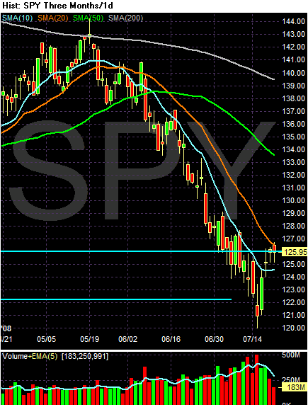
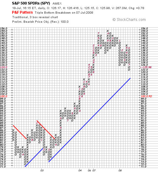
On the P&F chart, simply note there is no turnaround caused by last week's price action. None. We're still printing a bearish pattern where prices have broken through support and are moving lower.
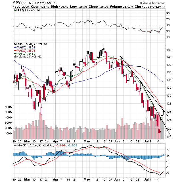
On the daily chart, notice the following:
-- The last two days the market printed two spinning tops -- candles with narrow bodies and long wicks. These are weak candles. They mean that there wasn't a great deal of intra-day action to move the markets higher; most of the gains came from the opening gap higher.
-- Prices are above the 10 day SMA but are running into resistance at the 20 day SMA
-- Prices have not broken though longer term resistance.
-- All the SMAs are still headed lower
-- The shorter SMAs are still below longer SMAs
-- Prices are below the 20 and 50 day SMA, but above the 10 day SMA
This is a chart that could continue to move higher. But the underlying technicals are not amazingly bullish right now.