Thursday, July 3, 2008
Have a Good and Safe 4th of July
The markets are closed and Mr$. Bonddad and I are getting ready to have a party tomorrow. I'll be back on Monday. Have a safe weekend.
Jobs Down for the Sixth Straight Month
From Bloomberg:
None of this is good news. Let's go to the report to see what it says:
The unemployment rate held steady. Last month when we got the big jump in the unemployment rate all the hacks out there (what Barry over at the Big Picture calls the "Pervasive Pollyannas of Prosperity") said it was all about the jump in youth unemployment and that the number would go back down. Well guess what -- the number didn't go back down.
Ladies and Gentleman -- this is a terrible report.
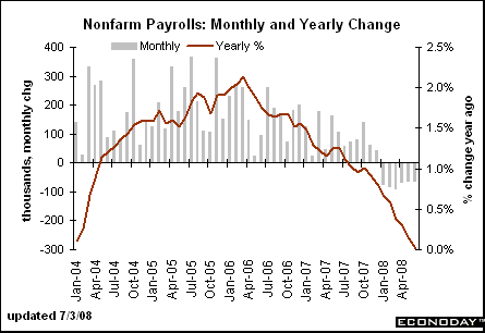
The year over year number is still decreasing, and
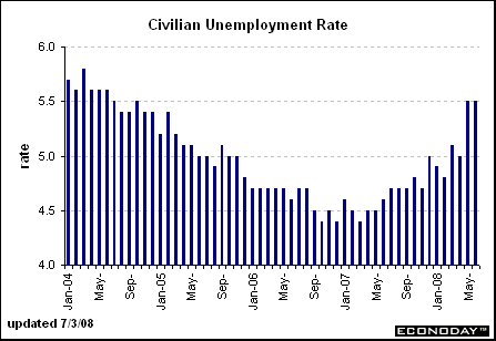
The unemployment rate is still increasing.
Short version: things are getting worse, not better.
U.S. employers cut jobs in June for a sixth consecutive month as soaring fuel prices and a slowing economy forced companies to reduce costs.
Payrolls fell by 62,000 after a 62,000 drop in May that was greater than initially reported, the Labor Department said today in Washington. The jobless rate remained at 5.5 percent after jumping in May by the most in two decades.
.....
The June figures brought total job losses for the first half of 2008 to 438,000. In 2007, the economy generated 91,000 jobs a month on average. Revisions subtracted 52,000 from payroll figures previously reported for April and May.
.....
Another report from the Labor Department today showed initial claims for jobless benefits rose by 16,000 to 404,000 last week. The total, higher than economists forecast, brought the four-week average to the highest since October 2005, just after Hurricane Katrina. The total number of people collecting benefits dropped to 3.116 million from 3.135 million.
None of this is good news. Let's go to the report to see what it says:
Nonfarm payroll employment continued to trend down in June (-62,000), while the unemployment rate held at 5.5 percent, the Bureau of Labor Statistics of the U.S. Department of Labor reported today. Employment continued to fall in construction, manufacturing, and employment services, while health care and mining added jobs. Average hourly earnings rose by 6 cents, or 0.3 percent, over the month.
The unemployment rate held steady. Last month when we got the big jump in the unemployment rate all the hacks out there (what Barry over at the Big Picture calls the "Pervasive Pollyannas of Prosperity") said it was all about the jump in youth unemployment and that the number would go back down. Well guess what -- the number didn't go back down.
Ladies and Gentleman -- this is a terrible report.

The year over year number is still decreasing, and

The unemployment rate is still increasing.
Short version: things are getting worse, not better.
Today's Markets
OK -- we'll do the recap now, largely because of this story from the WSJ:
Let's take a look at the ETFs.
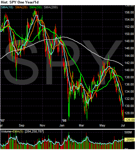
Eyeballing the round numbers on the SPYs, it looks like a 19.23% decline (156 to 126.08). In addition, notice the clear down up down pattern emerging. The first downward move is from the end of October to the beginning of March, the first upward move is from mid-March to the beginning of May with the second downward move starting at the beginning of May. Also note prices are below the 200 day SMA as well as all the SMAs. Finally, all the SMAs are moving lower.
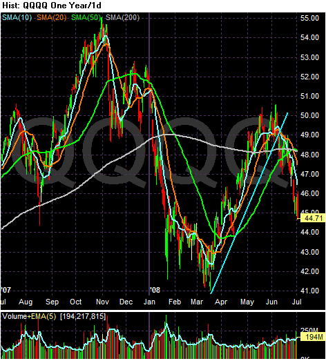
With the QQQQs, notice the following:
-- Prices are below the 200 day SMA
-- Prices are below all the SMAs
-- The 10 and 20 day SMA have moved through the 200 and 50 day SMA
-- The 10 and 20 day SMA are moving lower
-- The 50 day SMA is moving higher
-- the 200 day SMA is neutral
With prices moving lower and the shorter SMAs moving lower there will be downward pressure on the 50 day SMA to move lower as well.
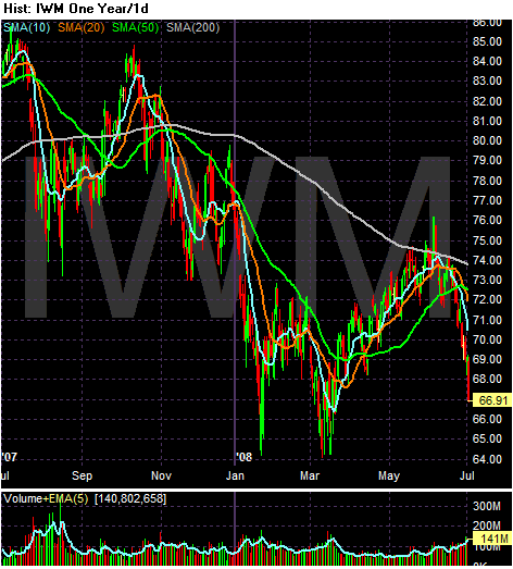
On the IWMs, notice the following:
-- Prices are down about 21.27% from their high in late October
-- Prices are below the 200 day SMA
-- Prices are below all the SMAs
-- All the SMAs are moving lower
-- The 10 and 20 day SMA have just moved through the 50 day SMA
Stocks fizzled Wednesday, ending in bear-market territory for the first time in more than 5-1/2 years as oil jumped and fears about the financial health of General Motors mounted.
The Dow Jones Industrial Average enjoyed brief rallies in morning trading but ended down by 166.75 points at 11215.51, down 20.8% from its record close in October. Traditionally, a fall of 20% from a high is considered the definition of a bear market.
The technology-focused Nasdaq Composite Index skidded 2.3% to end at 2251.46, also tumbling into bear terrain. It has now tumbled by 21.3% from its multi-year peak in October and is down 15.1% for the year to date.
Major stock indexes last suffered a bear market in the wake of the dotcom meltdown, with the Dow returning to a bull market in October 2002.
The blue-chip average had flirted with bear territory during each of the last three trading sessions, but in each instance attracted enough buyers by day's end to miss the mark by a few tenths of a percentage point.
Let's take a look at the ETFs.

Eyeballing the round numbers on the SPYs, it looks like a 19.23% decline (156 to 126.08). In addition, notice the clear down up down pattern emerging. The first downward move is from the end of October to the beginning of March, the first upward move is from mid-March to the beginning of May with the second downward move starting at the beginning of May. Also note prices are below the 200 day SMA as well as all the SMAs. Finally, all the SMAs are moving lower.

With the QQQQs, notice the following:
-- Prices are below the 200 day SMA
-- Prices are below all the SMAs
-- The 10 and 20 day SMA have moved through the 200 and 50 day SMA
-- The 10 and 20 day SMA are moving lower
-- The 50 day SMA is moving higher
-- the 200 day SMA is neutral
With prices moving lower and the shorter SMAs moving lower there will be downward pressure on the 50 day SMA to move lower as well.

On the IWMs, notice the following:
-- Prices are down about 21.27% from their high in late October
-- Prices are below the 200 day SMA
-- Prices are below all the SMAs
-- All the SMAs are moving lower
-- The 10 and 20 day SMA have just moved through the 50 day SMA
Thursday Oil Market Round-Up
First, sorry about missing the market recap yesterday. I had a ton of things come up that kept me from blogging.
Now, onto the charts.
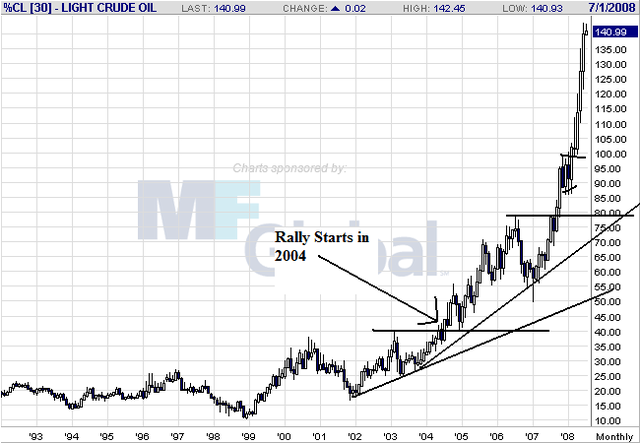
This is a weekly chart that I use yesterday to demonstrate US car companies are run by idiots. However, it's important to remember we're in the middle of a multi-year bull run in the oil market. In short, this didn't just start; it's been going on for some time.
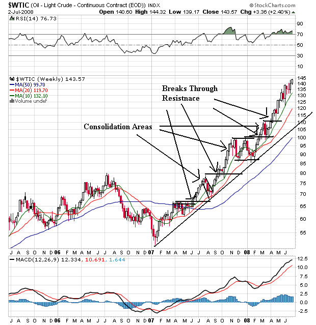
On the shorter weekly chart, notice the market has been in a rally since he beginning of 2007. The market has continually moved through resistance areas to make new highs and has consolidated gains at various times. Also note that prices are above all the SMAs and all the SMAs are moving higher. In short, this is a great example of a bullish chart.
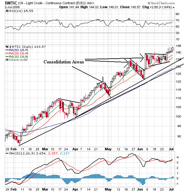
On the daily chart, notice we have the exact same thing -- upward moving prices that are continually moving through areas of resistance to make new highs. Prices are also consolidating gains. Finally, prices are above all the SMAs and all the SMAs are moving higher. In short, this is also a great example of a bullish chart.
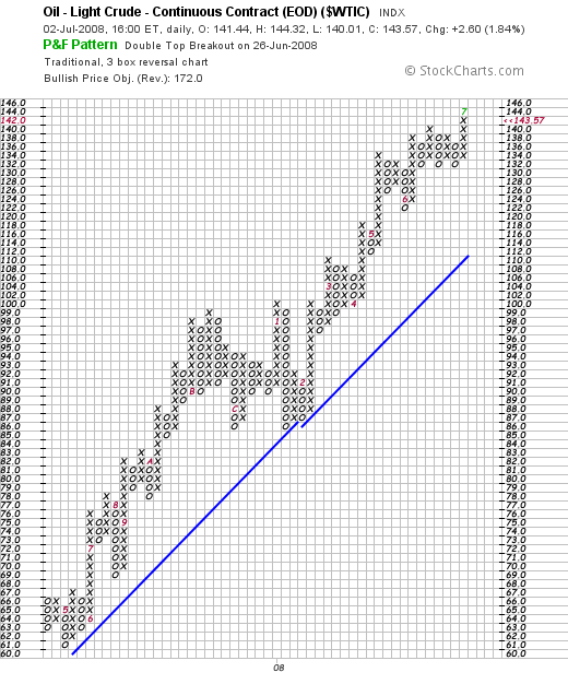
On the P&F chart, notice oil has continually made news highs. Again -- this chart is a great example of a bull market chart.
Let's look at gas at the retail level:
However, it's not all bad:
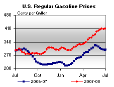
Prices have at least leveled out somewhat over the last few weeks.
However,
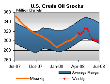
Both oil and
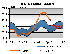
Gas stocks are at low levels, adding further upward pressure on prices.
Short version: there isn't any reason to think the bull market will end anytime soon.
Now, onto the charts.

This is a weekly chart that I use yesterday to demonstrate US car companies are run by idiots. However, it's important to remember we're in the middle of a multi-year bull run in the oil market. In short, this didn't just start; it's been going on for some time.

On the shorter weekly chart, notice the market has been in a rally since he beginning of 2007. The market has continually moved through resistance areas to make new highs and has consolidated gains at various times. Also note that prices are above all the SMAs and all the SMAs are moving higher. In short, this is a great example of a bullish chart.

On the daily chart, notice we have the exact same thing -- upward moving prices that are continually moving through areas of resistance to make new highs. Prices are also consolidating gains. Finally, prices are above all the SMAs and all the SMAs are moving higher. In short, this is also a great example of a bullish chart.

On the P&F chart, notice oil has continually made news highs. Again -- this chart is a great example of a bull market chart.
Let's look at gas at the retail level:
After a one-week respite, the U.S. average retail price for regular gasoline increased to a new record high, moving up 1.6 cents to 409.5 cents per gallon. Prices rose throughout the country with the exception of the West Coast where the price dipped a bit. On the East Coast, the price went up a cent to 405.7 cents per gallon. In the Midwest, the increase of 3.5 cents was the largest of any region and pushed the price above $4 for the first time, to 403.1 cents per gallon. The Gulf Coast price remained the lowest of any region and was the only one under $4 at 392.8 cents per gallon, an increase of 0.9 cent. The Rocky Mountain price rose 3.2 cents to 403.4 cents per gallon. Although the price on the West Coast fell, the drop was only four-tenths of a cent to 445.6 cents per gallon. The average in California also declined somewhat, going down 1.2 cents to 457.3 cents per gallon.
However, it's not all bad:

Prices have at least leveled out somewhat over the last few weeks.
However,

Both oil and

Gas stocks are at low levels, adding further upward pressure on prices.
Short version: there isn't any reason to think the bull market will end anytime soon.
Wednesday, July 2, 2008
The Credit Crunch Is Far From Over
From the WSJ:
That's 7.1% of loans that are delinquent. That's shocking. And downright scary.
Actually, it's obvious these ratios weren't a red flag to regulators. Why? Because 1/3 of banks are in this position. Regulators were obviously not paying attention to anything that was happening.
To all you jackasses who are recommending that people go long financials right now, does the above paragraph change your opinion somewhat? We're looking at additional writedowns of up to $165 billion. Is that an environment where stocks increase or decrease guys?
In an effort to prove they are just as stupid and blind to risk as the big guys, the little guys went running into an area of growth that was stimulated by record low interest rates, never really thinking that borrowers would have to pay back loans.
That's right -- because they banks have done such a good job of handling this themselves.
According to the Federal Deposit Insurance Corp., $45.4 billion of the $631.8 billion in construction loans outstanding at the end of the first quarter were delinquent. When banks announce second-quarter results in coming weeks, they are expected to report sharp increases in loans that builders can't repay. Banks are also facing intensifying pressure from federal and state regulators to deal with the problem loans on their books.
That's 7.1% of loans that are delinquent. That's shocking. And downright scary.
Nearly one in three of the banks analyzed -- or 2,182 -- had construction-loan portfolios that exceeded 100% of their total risk-based capital, a red flag to regulators, although it doesn't mean the bank is in danger of failing. Risk-based capital is a cushion that banks can dig into to cover losses.
Actually, it's obvious these ratios weren't a red flag to regulators. Why? Because 1/3 of banks are in this position. Regulators were obviously not paying attention to anything that was happening.
Over the next few quarters, banks are expected to begin recording much larger losses. In 2007 and the first quarter of this year, U.S. banks wrote down just 0.7% of their residential construction and land assets as bad debt, according to Zelman & Associates, a research firm. Over the next five years that figure could rise to 10% and 26%, which would amount to about $65 billion to $165 billion, Zelman projects.
To all you jackasses who are recommending that people go long financials right now, does the above paragraph change your opinion somewhat? We're looking at additional writedowns of up to $165 billion. Is that an environment where stocks increase or decrease guys?
During the housing boom, many small and regional banks doubled down on construction loans because they were largely shut out of the home mortgage market dominated by large originators. But now the banks' difficulties are threatening to sharply shrink the home-building industry. Credit Suisse analyst Dan Oppenheim estimates that as many as 50% of the closely held builders won't survive because of the tightening lending environment and housing downturn.
In an effort to prove they are just as stupid and blind to risk as the big guys, the little guys went running into an area of growth that was stimulated by record low interest rates, never really thinking that borrowers would have to pay back loans.
Some community banks are bristling under the regulatory pressure. "The federal government is being too reactionary," says Damian Kassab, chief executive of Michigan-based Warren Bank, which reported that 47% of its construction loans are delinquent. "They want to see it done as quickly as possible. I say 'can't we just relax, take a deep breath and work with the borrowers.'"
That's right -- because they banks have done such a good job of handling this themselves.
Auto Sales Drop Hard
Let's start this with a long-term look at oil.

Oil broke into a strong rally in 2004. It has been rallying ever since. In addition, the idea of peak oil has been around for at least 5 years that I know of and probably a lot longer. Finally, China and India have been growing at high rates for some time, indicating that demand for oil would be increasing as those two countries increased their overall standard of living. Bottom line: a spike in fuel prices is hardly surprising.
From Marketwatch:
So, we've learned that in a rising oil environment, consumers don't like trucks. US car makers love trucks. That's one of the main problems they're dealing with right now.
Let's see what the charts say about these companies:
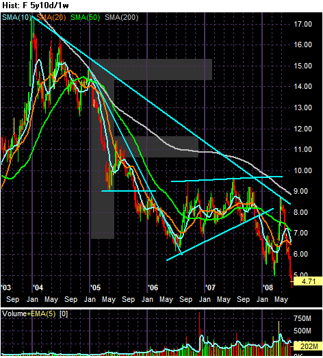
Ford consolidated in 2004 and then dropped hard at the beginning of 2005. The stock found a floor in the $9 area, then dropped again into the middle of 2006. Remember -- this is when the US economy was growing. Ford again consolidated from 2006-2007 and then fell at the end of last year. The stock tried to rally in the second quarter of 2008 but fell back.
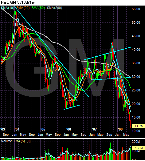
GM declined from the beginning of 2004 to the beginning of 2006. Again, this was when the US economy was growing so the stock price should have been increasing. The stock rallied through 2006 and consolidated in 2007. However, the bottom fell out at the end of 2007 and the stock has been dropping ever since.
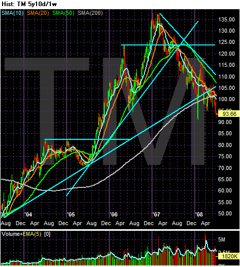
Toyota has been rallying since the second quarter of 2003. They hit a high at the beginning of 2007 and have been falling since. Over the last few months the stock has moved through the long-term upward sloping trend line, indicating a long-term reversal is at hand. However, the stock rose when the economy was growing unlike the US companies.
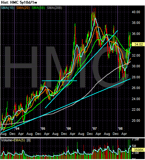
Like Toyota, Honda rose from mid-2003 until the beginning of 2007. The stock fell from the beginning of 2007 to the beginning of 2008 but has since risen. Maybe that's because they build fuel efficient cars and do it well?
The charts indicate that traders are less than enamored with US car companies and are completely enthralled with Japanese companies. There's a reason for that. One set of companies planned for high oil prices and one didn't.

Oil broke into a strong rally in 2004. It has been rallying ever since. In addition, the idea of peak oil has been around for at least 5 years that I know of and probably a lot longer. Finally, China and India have been growing at high rates for some time, indicating that demand for oil would be increasing as those two countries increased their overall standard of living. Bottom line: a spike in fuel prices is hardly surprising.
From Marketwatch:
Dearborn, Mich.-based Ford said that total sales, including sales of its Volvo brand, fell 28.1% to 174,091 cars and trucks from 242,029 last June. Retail SUV sales dropped 40% through the first half of the year, compared with the same period in 2007.
.....
Truck sales fell 35.6% to 101,981, with the flagship F-Series, the onetime industry sales leader, posting a 40.5% decline amid record-high gas prices and a persistent housing slump. Smaller passenger cars from Toyota and Honda now own the top spots.
"Consumer fundamentals and consumer confidence deteriorated as the first half unfolded," said Jim Farley, head of Ford's marketing and communications division. "The economy enters the second half of the year with a notable absence of momentum and a high degree of uncertainty."
.....
Like Ford, Chrysler LLC reported a steeper-than-expected decline, down 36% to 117,457 vehicles from 183,347 in June 2007.
June sales reflect a continued contraction of the market for its pickup trucks and sports utility vehicles, on which Chrysler depends more heavily than everybody else. Still, it was Chrysler's cars that paced the slump, falling 49% to 29,858 vehicles while trucks slid 30% to 87,599.
.....
GM reported an 18.2% decline in light vehicle sales to 262,329 cars and trucks from 320,668 in June 2007. Sales of cars slid 21.1% while trucks declined 16%. GM also was a tad more optimistic than its crosstown rival Ford with its assessment of the coming months.
"We continue to believe that there will be some strength in the economy in the second half of the year," sales analyst Mike DiGiovanni said in a conference call. "However, we're not naive enough to think this isn't a challenging time."
So, we've learned that in a rising oil environment, consumers don't like trucks. US car makers love trucks. That's one of the main problems they're dealing with right now.
Let's see what the charts say about these companies:

Ford consolidated in 2004 and then dropped hard at the beginning of 2005. The stock found a floor in the $9 area, then dropped again into the middle of 2006. Remember -- this is when the US economy was growing. Ford again consolidated from 2006-2007 and then fell at the end of last year. The stock tried to rally in the second quarter of 2008 but fell back.

GM declined from the beginning of 2004 to the beginning of 2006. Again, this was when the US economy was growing so the stock price should have been increasing. The stock rallied through 2006 and consolidated in 2007. However, the bottom fell out at the end of 2007 and the stock has been dropping ever since.

Toyota has been rallying since the second quarter of 2003. They hit a high at the beginning of 2007 and have been falling since. Over the last few months the stock has moved through the long-term upward sloping trend line, indicating a long-term reversal is at hand. However, the stock rose when the economy was growing unlike the US companies.

Like Toyota, Honda rose from mid-2003 until the beginning of 2007. The stock fell from the beginning of 2007 to the beginning of 2008 but has since risen. Maybe that's because they build fuel efficient cars and do it well?
The charts indicate that traders are less than enamored with US car companies and are completely enthralled with Japanese companies. There's a reason for that. One set of companies planned for high oil prices and one didn't.
Wednesday Commodities Round-Up
Let's take a look at a few charts from the commodity sector to see what they are saying.
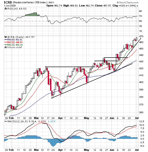
On the overall CRB chart, notice the following:
-- Prices are above all the SMAs
-- Prices have broken resistance levels and continued to move higher
-- All the SMAs are rising
-- The shorter SMAs are above the longer SMAs
Short version: this is a very bullish chart
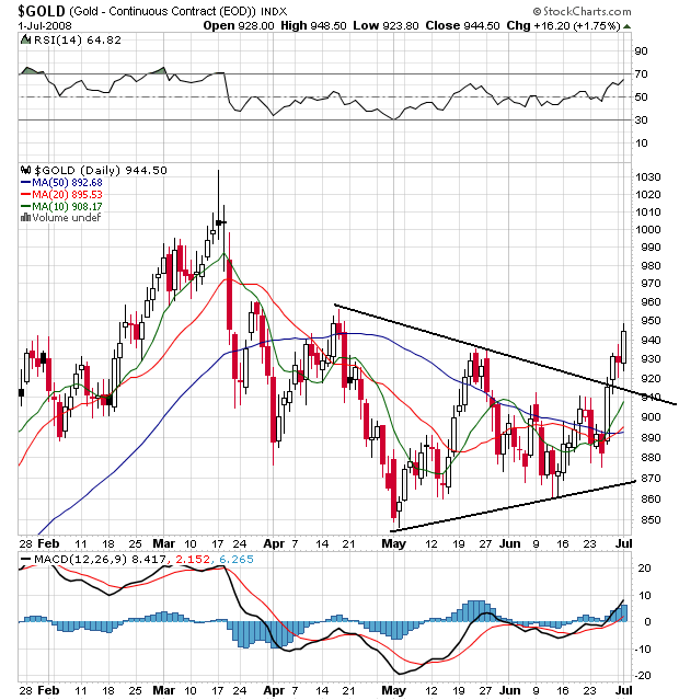
I use Gold as a proxy for inflation expectations. What's interesting about this chart is Gold has now broken out of a triangle consolidation pattern and is moving higher. Also note the 10 and 20 day SMA have turned up and moved through the 50 day SMA. This is still an early and developing situation so it could reverse pretty quickly, but it could also be the beginning of a new bull run in gold.
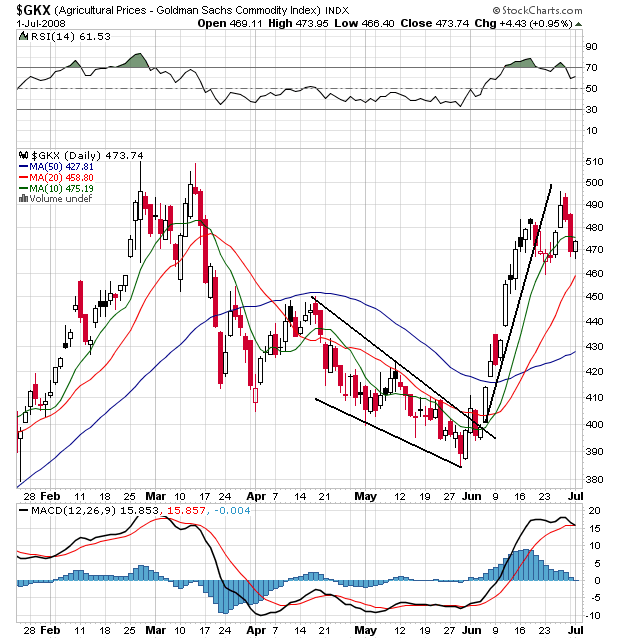
Agricultural prices have spiked since the beginning of June in reaction to the situation in the US Midwest. However, also notice the chart could be forming a double top. Peak prices from the June rally are very close to the peak prices of the rally that ended in early March. As with Gold's situation, we'll have to keep an eye on this chart to see how it plays out.

On the overall CRB chart, notice the following:
-- Prices are above all the SMAs
-- Prices have broken resistance levels and continued to move higher
-- All the SMAs are rising
-- The shorter SMAs are above the longer SMAs
Short version: this is a very bullish chart

I use Gold as a proxy for inflation expectations. What's interesting about this chart is Gold has now broken out of a triangle consolidation pattern and is moving higher. Also note the 10 and 20 day SMA have turned up and moved through the 50 day SMA. This is still an early and developing situation so it could reverse pretty quickly, but it could also be the beginning of a new bull run in gold.

Agricultural prices have spiked since the beginning of June in reaction to the situation in the US Midwest. However, also notice the chart could be forming a double top. Peak prices from the June rally are very close to the peak prices of the rally that ended in early March. As with Gold's situation, we'll have to keep an eye on this chart to see how it plays out.
Tuesday, July 1, 2008
Today's Markets
Companies that rely on gas guzzlers had big sales drops.
Moody's fired the head of the their structured finance department.
OPEC blames a weak dollar and speculators for high oil prices.
Sugar hits a three months high.
The ISM Manufacturing index rose a bit.
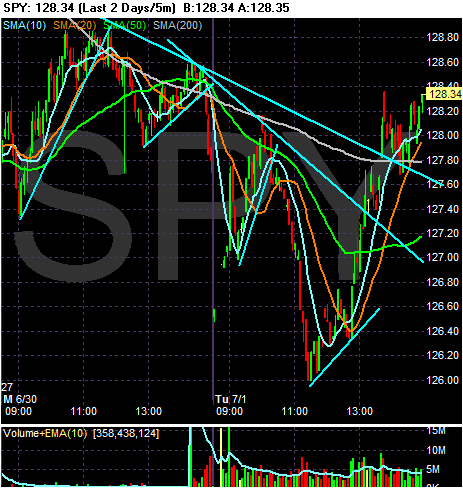
A very volatile day. Notice the following:
-- Prices fluctuated heavily between bull and bear twice
-- Notice the market broke through two levels of resistance
-- Also note the 200 minute SMA provided some resistance at first
-- The market closed near a daily high
-- Remember that in the big picture the averages are looking at a possible bear market, so anytime we see these huge drops we'll probably see some buying
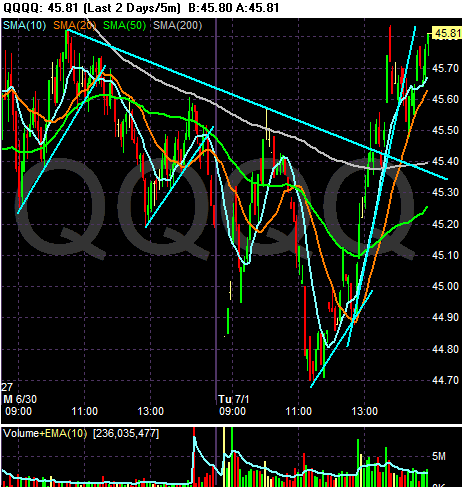
-- Like the SPYs, we have a lot of volatility
-- Notice the gap up with about an hour or so left in the day
-- Prices broke through three levels of resistance in the last 2-3 hours of trading.
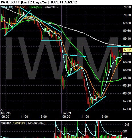
A lot of up down up action. However, notice that prices never got above the 200 minute moving average.
Moody's fired the head of the their structured finance department.
OPEC blames a weak dollar and speculators for high oil prices.
Sugar hits a three months high.
The ISM Manufacturing index rose a bit.

A very volatile day. Notice the following:
-- Prices fluctuated heavily between bull and bear twice
-- Notice the market broke through two levels of resistance
-- Also note the 200 minute SMA provided some resistance at first
-- The market closed near a daily high
-- Remember that in the big picture the averages are looking at a possible bear market, so anytime we see these huge drops we'll probably see some buying

-- Like the SPYs, we have a lot of volatility
-- Notice the gap up with about an hour or so left in the day
-- Prices broke through three levels of resistance in the last 2-3 hours of trading.

A lot of up down up action. However, notice that prices never got above the 200 minute moving average.
Financials Are Nowhere Near Bottom
From the WSJ:
Here's a chart of Wachovia Stock:
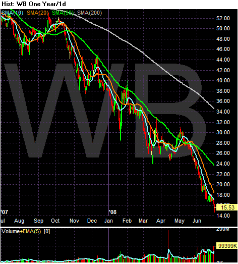
Notice the following on Wachovia's chart:
-- Prices are below the 200 day SMA
-- Prices are below all the SMAs
-- All the SMAs are headed lower
-- The shorter SMAs are below the longer SMAs
Wachovia isn't the only company having trouble:
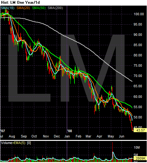
Notice the following on Legg Mason's chart:
-- Prices are below the 200 day SMA
-- Prices are below all the SMAs
-- All the SMAs are headed lower
-- The shorter SMAs are below the longer SMAs
Anyone that is saying "buy financials" right now is an idiot. This sector has a long time to go before anyone should think about going long.
In a reversal, Wachovia Corp. said Monday it would stop making option adjustable-rate mortgages, which were why the bank bought Golden West Financial Corp. but is now stuck with more than $120 billion of the rapidly souring loans.
Wachovia also said it will let option-ARM borrowers escape prepayment penalties, but loan balances likely have swelled too big for many of these borrowers to refinance.
The changes effectively mean the dismantling of the core product of Golden West, the Oakland, Calif., thrift Wachovia bought for $25 billion two years ago. Option ARMs give customers multiple payment choices, including a minimum payment that may not be enough to cover the interest due. Borrowers who elect the minimum payment on a regular basis can see their loan balance grow.
.....
More than 18% of the option ARMs originated in 2005 and 2006 are already at least 60 days past due, says Barclays Capital, which looked at loans that were packaged into securities. The vast majority of these borrowers have yet to see their monthly payments recast so they begin making payments of principal and full interest, at which point payments can increase by 60% or more.
Here's a chart of Wachovia Stock:

Notice the following on Wachovia's chart:
-- Prices are below the 200 day SMA
-- Prices are below all the SMAs
-- All the SMAs are headed lower
-- The shorter SMAs are below the longer SMAs
Wachovia isn't the only company having trouble:
Legg Mason Inc. agreed to contribute $240 million to support three of a unit's money-market funds. That follows $400 million in agreements in March.
The move marks the company's latest step in trying to stabilize its cash funds and shield investors from any losses in the underlying assets. And it is the most recent sign the credit crunch continues to roil financial markets.

Notice the following on Legg Mason's chart:
-- Prices are below the 200 day SMA
-- Prices are below all the SMAs
-- All the SMAs are headed lower
-- The shorter SMAs are below the longer SMAs
Anyone that is saying "buy financials" right now is an idiot. This sector has a long time to go before anyone should think about going long.
Is A Bear Market Forming? Pt II
From today's WSJ:
Let's look at some of the specific sectors and stocks mentioned in the article
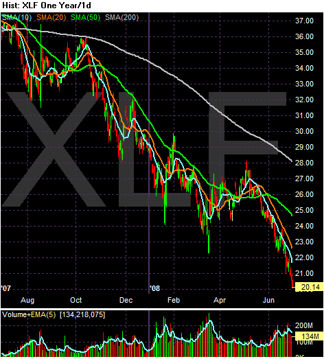
With the XLFs, notice the following:
-- The index is down 44.8% in the last year
-- Prices are below the 200 day SMA
-- Prices are below all the SMAs
-- The shorter SMAs are below the longer SMAs
-- All the SMAs are headed lower
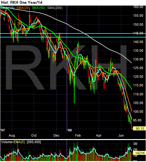
For the regional bank ETF, notice the following
-- The index is down 42.5% in the last year
-- Prices are below the 200 day SMA
-- Prices are below all the SMAs
-- The shorter SMAs are below the longer SMAs
-- All the SMAs are headed lower
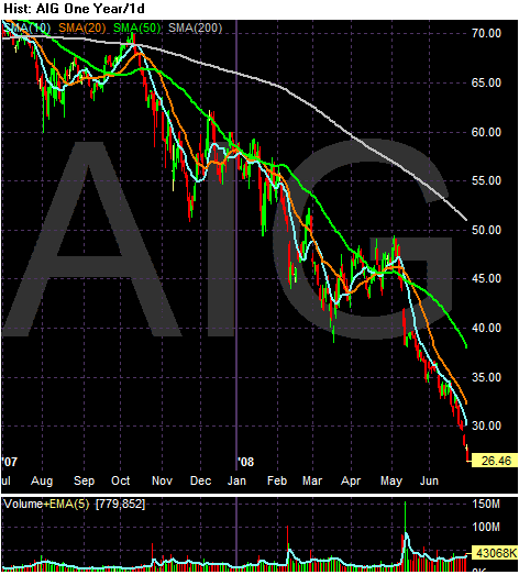
-- The stock is down 62.2% in the last year
-- Prices are below the 200 day SMA
-- Prices are below all the SMAs
-- The shorter SMAs are below the longer SMAs
-- All the SMAs are headed lower
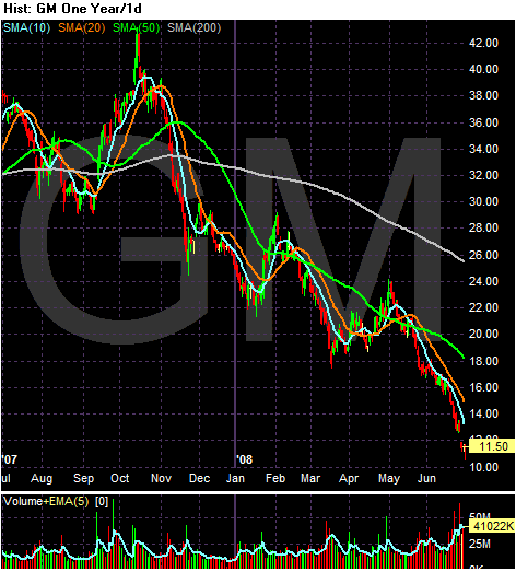
-- The stock is down 69.7% in the last year
-- Prices are below the 200 day SMA
-- Prices are below all the SMAs
-- The shorter SMAs are below the longer SMAs
-- All the SMAs are headed lower
All of these charts are bear market charts. These are terrible charts unless you are shorting the market.
I highlighted some of these points and added others in this article from yesterday.
Investors acknowledged the grim reality beginning in mid-May. That is when the Dow Jones Industrial Average began its march downward, ending the quarter (including Monday's slim 3.50-point gain) with an overall loss of 912.88 points, or 7.4%, at 11350.01 -- and perilously close to the 20% decline from a recent high that is considered the start of a bear market.
It was the third straight quarterly decline and the worst second quarter since 2002.
In each of the final two trading sessions of the quarter, the Dow industrials tipped into bear-market territory during the day but closed just shy of the mark. The Dow industrials have fallen 19.9% from their October 2007 record, so any coming session with a loss could mark the official "bear" for stocks.
The worst-performing stocks reflected the credit crisis and its implications for consumer spending. Financials led the way down as banks big and small took write-downs and reported disappointing earnings. Dow component American International Group Inc. was off about 39% in the quarter, and Bank of America Corp. fell 37%. The Dow Jones Wilshire Bank Index fell nearly 26%.
But the biggest loser among the Dow industrials for the quarter was auto maker General Motors Corp., which dropped about 40%. Of 30 Dow components, 24 ended the quarter in the red. The few bright spots included Exxon Mobil Corp. and Chevron Corp., which rose as crude-oil prices soared 38% to more than $140 a barrel.
Let's look at some of the specific sectors and stocks mentioned in the article

With the XLFs, notice the following:
-- The index is down 44.8% in the last year
-- Prices are below the 200 day SMA
-- Prices are below all the SMAs
-- The shorter SMAs are below the longer SMAs
-- All the SMAs are headed lower

For the regional bank ETF, notice the following
-- The index is down 42.5% in the last year
-- Prices are below the 200 day SMA
-- Prices are below all the SMAs
-- The shorter SMAs are below the longer SMAs
-- All the SMAs are headed lower

-- The stock is down 62.2% in the last year
-- Prices are below the 200 day SMA
-- Prices are below all the SMAs
-- The shorter SMAs are below the longer SMAs
-- All the SMAs are headed lower

-- The stock is down 69.7% in the last year
-- Prices are below the 200 day SMA
-- Prices are below all the SMAs
-- The shorter SMAs are below the longer SMAs
-- All the SMAs are headed lower
All of these charts are bear market charts. These are terrible charts unless you are shorting the market.
I highlighted some of these points and added others in this article from yesterday.
Treasury Tuesdays
Treasury's are not the best market to be in right now:
Let's look at the 6 month charts to get a better picture of that is happening.
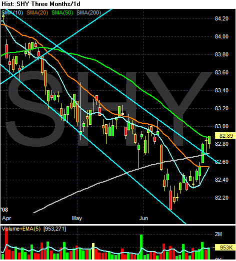
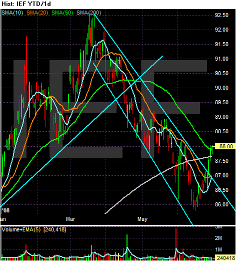
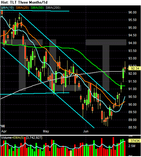
The short, medium and long end of the curve have all been dropping for a few months. The question is why? There are several reasons. First, all three parts of the curve rose in a big way in reaction to the credit crunch that started last summer. So the sell-off is simply a matter of profit taking. Secondly, the equity markets started rallying in mid-March. This rally competed with the Treasury market for funds and attention and won. Third, inflation started to become more and more prevalent:
Also remember this part of the Fed's statement:
So - why are all three Treasury sectors rallying right now -- and why have they broken through upper resistance? My feeling is the market thinks two things. First, there is a safe haven bid in the Treasury market from the recent market turmoil. Secondly, the Fed said they would probably act but didn't. The lack of action led traders to buy the market now.
U.S. Treasuries headed for their biggest quarterly loss in four years because of speculation the Fed will push borrowing costs higher later in 2008 to keep inflation in check.
Let's look at the 6 month charts to get a better picture of that is happening.


The short, medium and long end of the curve have all been dropping for a few months. The question is why? There are several reasons. First, all three parts of the curve rose in a big way in reaction to the credit crunch that started last summer. So the sell-off is simply a matter of profit taking. Secondly, the equity markets started rallying in mid-March. This rally competed with the Treasury market for funds and attention and won. Third, inflation started to become more and more prevalent:
Conflicting stories about inflation and growth will buffet markets this week and beyond, keeping bonds tied to ranges, with intraday swings, unless the credit crisis or the economy take a large turn for the worse. That would force central banks to shift their attention away from inflation back to growth -- an unlikely prospect this week, with the European Central Bank set to raise rates at its meeting Thursday.
Also remember this part of the Fed's statement:
The substantial easing of monetary policy to date, combined with ongoing measures to foster market liquidity, should help to promote moderate growth over time. Although downside risks to growth remain, they appear to have diminished somewhat, and the upside risks to inflation and inflation expectations have increased. The Committee will continue to monitor economic and financial developments and will act as needed to promote sustainable economic growth and price stability.
So - why are all three Treasury sectors rallying right now -- and why have they broken through upper resistance? My feeling is the market thinks two things. First, there is a safe haven bid in the Treasury market from the recent market turmoil. Secondly, the Fed said they would probably act but didn't. The lack of action led traders to buy the market now.
Monday, June 30, 2008
Today's Markets
Chrysler is idling a a minivan plant
The Chicago PMI rose but is still showing a contraction.
MBIA says it's fine. (FYI: so did Bear Stearns)
A morgage ruling could really play havoc with lenders
The S&P 500 fell 8.6% in June
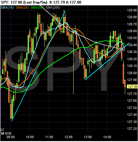
The SPYs opened with a quick move down, but then rallied until just before lunch when they ran into their 200 minute moving average. THey tried to break through, but couldn't. Right after noon CST they fell through all the SMAs, but recovered and tried to rally into the close. But they couldn't maintain momentum and they fell hard in the last 15 minutes of trading.
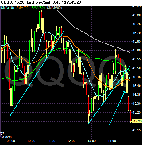
The QQQQs also opened higher and fell quickly. But notice they couldn't rally to their 200 minute SMA. The QQQQs broke their upward trend a bit after 11 AM CST and then fell until about 1 PM. They tried to rally but again got to within the 200 day SMA and fell. Notice they closed near their low of the day.
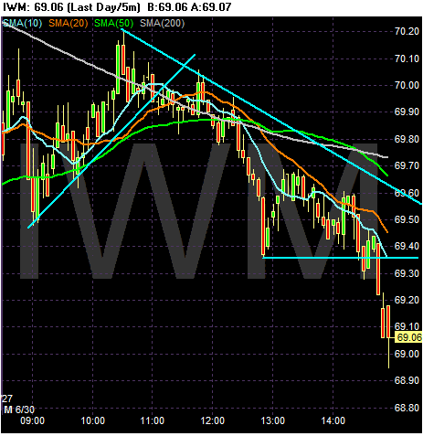
The IWMs opened a bit higher and then fell. They rallied to the 200 minute SMA where they traded until noon. Then they dropped, rallied to the 10 and 20 minute SMAs and then fell into the close.
The Chicago PMI rose but is still showing a contraction.
MBIA says it's fine. (FYI: so did Bear Stearns)
A morgage ruling could really play havoc with lenders
The S&P 500 fell 8.6% in June

The SPYs opened with a quick move down, but then rallied until just before lunch when they ran into their 200 minute moving average. THey tried to break through, but couldn't. Right after noon CST they fell through all the SMAs, but recovered and tried to rally into the close. But they couldn't maintain momentum and they fell hard in the last 15 minutes of trading.

The QQQQs also opened higher and fell quickly. But notice they couldn't rally to their 200 minute SMA. The QQQQs broke their upward trend a bit after 11 AM CST and then fell until about 1 PM. They tried to rally but again got to within the 200 day SMA and fell. Notice they closed near their low of the day.

The IWMs opened a bit higher and then fell. They rallied to the 200 minute SMA where they traded until noon. Then they dropped, rallied to the 10 and 20 minute SMAs and then fell into the close.
Is A Bear Market Forming?
I am writing this in place of my regular "Market Monday's" column. The reason is we saw a large amount of technical damage to the stock market over the last few weeks and there is growing use of the term "bear market." The question is "Is this title warranted in the current environment?" Let's take a look at the charts and the fundamental background to get an idea. First let's look at the charts.
SPYs or S&P 500
First, I don't look at the Dow Jones Industrial Average. It's 30 stocks whereas the S&P 500 is 500 and represents a far larger swath of the market. In addition, I use the tracking stocks for all the averages.
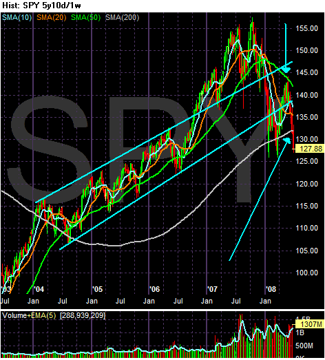
Let's start with the five year weekly chart. Notice the SPYs traded in un upward sloping channel since the beginning of 2004. They broke through the top trendline at the end of 2006 and bounced off this line at the end of the first quarter of 2007. Then the SPYs went to form a double top in 2007. In early July of last year Bear Stearns announced two of their hedge funds were in serious trouble and the credit crisis started. As a result, the SPYs fell through both of the trend lines of their upward sloping channel. In early 2008 they formed a double bottom, with the second bottom occurring when the Federal Reserve backstopped JP Morgan's purchase of Bear Stearns. Since then the SPYs have been rallying. However, over the last few weeks the SPYs have dropped hard moving through the lower trend line of the upward sloping channel the index originally formed in 2004.
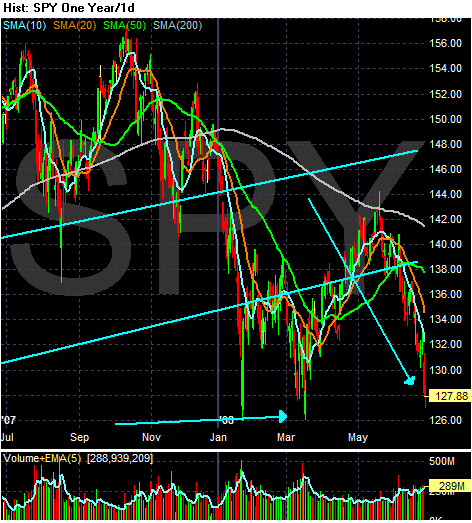
Above is a one year daily chart of the SPYs which I have included to better show the action over the last year. Notice the following:
-- Prices are below the 200 day simple moving average (SMA) -- bear market territory
-- Prices have dropped about 18% from their highs
-- Prices are clearly below the lower trend line of the upward sloping channel the average started in 2004

On the three month chart, notice the following:
-- Prices are below the 200 day SMa
-- All the SMAs are moving lower
-- Prices are below all the SMAs
-- The shorter SMAs are below the longer SMAs
This is the most bearish simple moving average orientation a chart can have.
The NASDAQ 100 or QQQQs
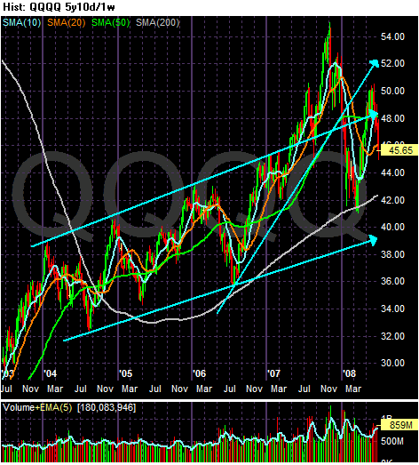
There are two important trends with the QQQQs. The first is an upward sloping channel that started at the beginning of 2004. This trend channel is still intact. The second trend started in mid-2006 and constituted an upward sloping rally from mid-2006 to the beginning of 2008 when the QQQQs fell through this trend line. So, the long-term upward sloping trend remains intact, but the shorter rally is clearly over.
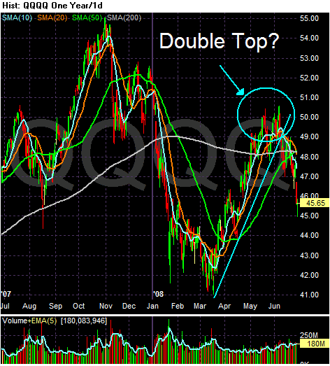
On the one year QQQQ chart, notice three things:
-- The rally that started in mid-March of this year is over, and
-- Prices are below the 200 day SMA
-- Giving the chart a very conservative eyeballing, it's down 16.62% from its late October, early November highs
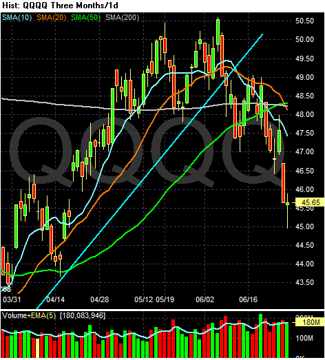
On the three month chart, notice the following:
-- Prices are below the 200 day SMA
-- Prices are below all the SMAs
-- The 10 and 20 day SMA are headed lower
-- The 10 and 20 day SMA has crossed below the 50 and 200 day SMA
This chart is not entirely bearish year. The longer-term averages (50 and 200 day SMAs) are still bullish. However, with prices and the shorter SMAs below these numbers that won't last for much longer.
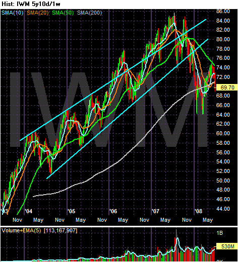
On the IWMs 5-year weekly chart, notice the average was in a clear upward sloping channel until late 2007/early 2008 when the average broke through the lower trend line. Since then the average has fallen to the 200 week SMA and has fallen through that important trend line twice. The IWMs formed a double bottom in early 2008 and rallied after the second bottom. The IWMs moved into the 50 week SMA but fell from that SMA and are now through the 200 week SMA again.
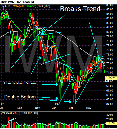
On the yearly chart, notice the IWMs were in a clear downward sloping trend from teh end of September to the beginning of March. They index continually moved lower forming consolidation patterns along the way down. This chart also clearly shows the double bottom and the ensuing rally. From the highs of last summer to the current price, the index has dropped about 18%.
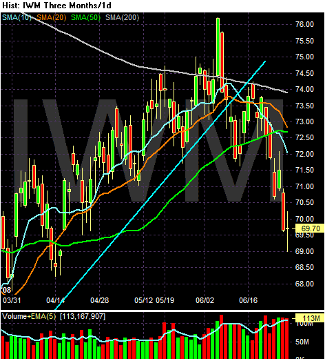
On the three month chart, notice the following:
-- Prices broke through the 200 day SMA but couldn't maintain momentum
-- Prices are now below all the SMAs
-- The shorter SMAs are below the longer SMas
-- The 10 and 20 day SMA are both headed lower
-- The 10 day SMA broke through the 50 day SMA and the 20 day SMA is about to cross below the 50 day SMA
In other words, this chart is moving into a very bearish orientation.
So far we have the following:
-- The SPYs and the IWMs are in a very bearish formation
-- The QQQQs are in a neutral bearish formation.
Let's look at the fundamental picture.
The Fed
In their last policy statement, the Fed signaled they are done lowering rates:
In addition, after adjusting for inflation interest rates are already negative, so there isn't much point in cutting rates further.
Upward Moving Commodity Pricing Pressures
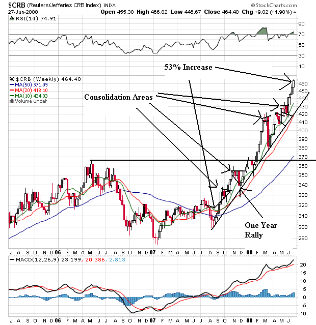
The CRB index is up 53% since August of last year. It is in a clear rally. Notice that as prices have increased they have taken the time to consolidate gains before moving higher. Also notice the following:
-- All the SMAs are moving higher
-- The shorter SMAs are above the longer SMAs
-- Price are above all the SMAs
This is a very bullish chart
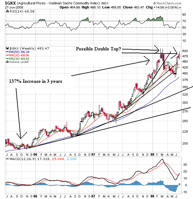
Agricultural prices have been in a three year rally, although they started to correct from this rally earlier this year and broke through key upward sloping support. However, the situation in the US mid-west gave agricultural prices a bid and they have since moved higher. But also note they could be forming a double top here. Also notice the following:
-- Prices are above all the SMAs
-- All the SMAs are moving higher
-- The 10 week SMA moved below the 20 week SMA, altghough the 10 week SMA is still moving higher
This is also a very bullish chart, although we'll have to wait and see how the possible double top plays out.
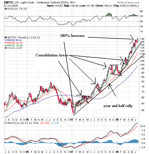
Oil is the 800 pound gorilla in the room. This chart is incredibly bullish. First, notice that for the last year oil has continually moved higher. As it has moved higher it has consolidated gains and then made hew highs. Also notice the following:
-- Prices are above all the SMAs
-- The shorter SMAs are above the longer SMAs
-- All the SMAs are moving higher
This chart is about as bullish as you can get.
So, we have spiking commodity prices hemming in the Fed and consumer spending. In addition, the "stimulus" package is about over; we've got maybe another 2-3 months of mileage from that move. In other words, the possible policy responses from Washington are gone.
A Consumer Under Pressure
Add to all this a deteriorating picture for the consumer. Consider the following charts from econoday:
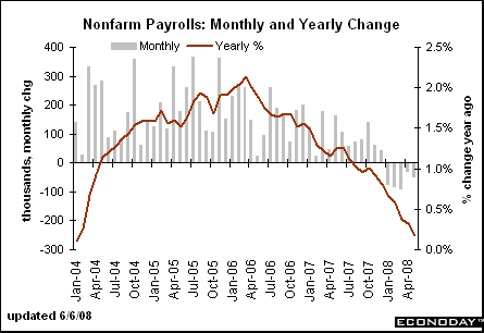
Job growth is slowing, leading to
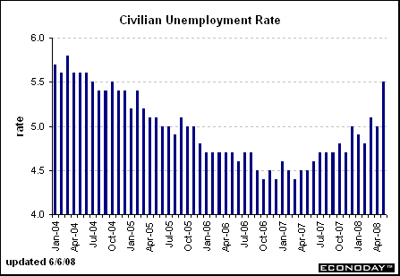
Increasing unemployment which is
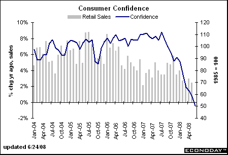
Lowering consumer confidence and
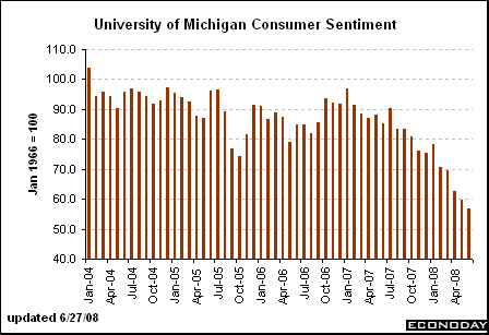
Consumer sentiment
Let's sum up:
-- Two of the three major averages are in a very bearish orientation while a third is in neutral to bearish territory
-- The Federal Reserve has indicated they are done lowering rates.
-- Higher commodity prices makes further rate cuts highly unlikely and is also hemming in consumer spending
-- The stimulus package from Washington has nearly run its course
-- The job market is weakening which is increasing unemployment and lowering consumer sentiment and confidence.
In other words, there are very few reason to be optimistic right now.
And I will add there are several points I have not gone into:
-- Housing is nowhere near a bottom because of the massive supply/demand imbalance
-- The financial sector is still reeling from writedowns
-- The dollar is still dropping
In other words -- there are plenty of negative points I have not made for reasons of brevity, none of which bode well for the future.
SPYs or S&P 500
First, I don't look at the Dow Jones Industrial Average. It's 30 stocks whereas the S&P 500 is 500 and represents a far larger swath of the market. In addition, I use the tracking stocks for all the averages.

Let's start with the five year weekly chart. Notice the SPYs traded in un upward sloping channel since the beginning of 2004. They broke through the top trendline at the end of 2006 and bounced off this line at the end of the first quarter of 2007. Then the SPYs went to form a double top in 2007. In early July of last year Bear Stearns announced two of their hedge funds were in serious trouble and the credit crisis started. As a result, the SPYs fell through both of the trend lines of their upward sloping channel. In early 2008 they formed a double bottom, with the second bottom occurring when the Federal Reserve backstopped JP Morgan's purchase of Bear Stearns. Since then the SPYs have been rallying. However, over the last few weeks the SPYs have dropped hard moving through the lower trend line of the upward sloping channel the index originally formed in 2004.

Above is a one year daily chart of the SPYs which I have included to better show the action over the last year. Notice the following:
-- Prices are below the 200 day simple moving average (SMA) -- bear market territory
-- Prices have dropped about 18% from their highs
-- Prices are clearly below the lower trend line of the upward sloping channel the average started in 2004

On the three month chart, notice the following:
-- Prices are below the 200 day SMa
-- All the SMAs are moving lower
-- Prices are below all the SMAs
-- The shorter SMAs are below the longer SMAs
This is the most bearish simple moving average orientation a chart can have.
The NASDAQ 100 or QQQQs

There are two important trends with the QQQQs. The first is an upward sloping channel that started at the beginning of 2004. This trend channel is still intact. The second trend started in mid-2006 and constituted an upward sloping rally from mid-2006 to the beginning of 2008 when the QQQQs fell through this trend line. So, the long-term upward sloping trend remains intact, but the shorter rally is clearly over.

On the one year QQQQ chart, notice three things:
-- The rally that started in mid-March of this year is over, and
-- Prices are below the 200 day SMA
-- Giving the chart a very conservative eyeballing, it's down 16.62% from its late October, early November highs

On the three month chart, notice the following:
-- Prices are below the 200 day SMA
-- Prices are below all the SMAs
-- The 10 and 20 day SMA are headed lower
-- The 10 and 20 day SMA has crossed below the 50 and 200 day SMA
This chart is not entirely bearish year. The longer-term averages (50 and 200 day SMAs) are still bullish. However, with prices and the shorter SMAs below these numbers that won't last for much longer.

On the IWMs 5-year weekly chart, notice the average was in a clear upward sloping channel until late 2007/early 2008 when the average broke through the lower trend line. Since then the average has fallen to the 200 week SMA and has fallen through that important trend line twice. The IWMs formed a double bottom in early 2008 and rallied after the second bottom. The IWMs moved into the 50 week SMA but fell from that SMA and are now through the 200 week SMA again.

On the yearly chart, notice the IWMs were in a clear downward sloping trend from teh end of September to the beginning of March. They index continually moved lower forming consolidation patterns along the way down. This chart also clearly shows the double bottom and the ensuing rally. From the highs of last summer to the current price, the index has dropped about 18%.

On the three month chart, notice the following:
-- Prices broke through the 200 day SMA but couldn't maintain momentum
-- Prices are now below all the SMAs
-- The shorter SMAs are below the longer SMas
-- The 10 and 20 day SMA are both headed lower
-- The 10 day SMA broke through the 50 day SMA and the 20 day SMA is about to cross below the 50 day SMA
In other words, this chart is moving into a very bearish orientation.
So far we have the following:
-- The SPYs and the IWMs are in a very bearish formation
-- The QQQQs are in a neutral bearish formation.
Let's look at the fundamental picture.
The Fed
In their last policy statement, the Fed signaled they are done lowering rates:
The substantial easing of monetary policy to date, combined with ongoing measures to foster market liquidity, should help to promote moderate growth over time. Although downside risks to growth remain, they appear to have diminished somewhat, and the upside risks to inflation and inflation expectations have increased. The Committee will continue to monitor economic and financial developments and will act as needed to promote sustainable economic growth and price stability.
In addition, after adjusting for inflation interest rates are already negative, so there isn't much point in cutting rates further.
Upward Moving Commodity Pricing Pressures

The CRB index is up 53% since August of last year. It is in a clear rally. Notice that as prices have increased they have taken the time to consolidate gains before moving higher. Also notice the following:
-- All the SMAs are moving higher
-- The shorter SMAs are above the longer SMAs
-- Price are above all the SMAs
This is a very bullish chart

Agricultural prices have been in a three year rally, although they started to correct from this rally earlier this year and broke through key upward sloping support. However, the situation in the US mid-west gave agricultural prices a bid and they have since moved higher. But also note they could be forming a double top here. Also notice the following:
-- Prices are above all the SMAs
-- All the SMAs are moving higher
-- The 10 week SMA moved below the 20 week SMA, altghough the 10 week SMA is still moving higher
This is also a very bullish chart, although we'll have to wait and see how the possible double top plays out.

Oil is the 800 pound gorilla in the room. This chart is incredibly bullish. First, notice that for the last year oil has continually moved higher. As it has moved higher it has consolidated gains and then made hew highs. Also notice the following:
-- Prices are above all the SMAs
-- The shorter SMAs are above the longer SMAs
-- All the SMAs are moving higher
This chart is about as bullish as you can get.
So, we have spiking commodity prices hemming in the Fed and consumer spending. In addition, the "stimulus" package is about over; we've got maybe another 2-3 months of mileage from that move. In other words, the possible policy responses from Washington are gone.
A Consumer Under Pressure
Add to all this a deteriorating picture for the consumer. Consider the following charts from econoday:

Job growth is slowing, leading to

Increasing unemployment which is

Lowering consumer confidence and

Consumer sentiment
Let's sum up:
-- Two of the three major averages are in a very bearish orientation while a third is in neutral to bearish territory
-- The Federal Reserve has indicated they are done lowering rates.
-- Higher commodity prices makes further rate cuts highly unlikely and is also hemming in consumer spending
-- The stimulus package from Washington has nearly run its course
-- The job market is weakening which is increasing unemployment and lowering consumer sentiment and confidence.
In other words, there are very few reason to be optimistic right now.
And I will add there are several points I have not gone into:
-- Housing is nowhere near a bottom because of the massive supply/demand imbalance
-- The financial sector is still reeling from writedowns
-- The dollar is still dropping
In other words -- there are plenty of negative points I have not made for reasons of brevity, none of which bode well for the future.