Busy week -- but now it's over. Mr$. Bonddad and I are getting the house ready for the big move next week. So no pictures today.
I'll be back on Monday morning.
Friday, June 6, 2008
Unemployment Jumps
From the WSJ:
There is nothing good in this report. It shows a weakening employment sector in a big way.
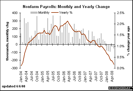
The year over year number is still dropping
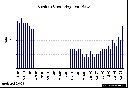
And the unemployment rate is still increasing which it has been doing since April of last year.
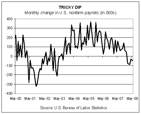
The blog Capital Spectator had the following graph which shows that this months drop was terrible -- and that the entire year so far has been bad as well.
The U.S. unemployment rate posted its sharpest one-month increase in 22 years last month, suggesting U.S. consumers already facing a housing slump and soaring gasoline prices now confront even more pressure from a weakening jobs market.
The data, which included a fifth-straight drop in nonfarm employment, should take financial-market expectations of Federal Reserve rate increases as soon as this autumn off the table.
.....
Nonfarm payrolls, which are calculated by a survey of establishments, declined 49,000 in May, the Labor Department said. The decline was broad-based, including manufacturing, construction, retail trade and business services. Payrolls fell 28,000 in April and 88,000 in March. Both were revised to show slightly larger drops.
.....
"The over-the-month jump in unemployment reflected additional workers who had lost their jobs as well as an upsurge in new and returning jobseekers," said Philip Rones, deputy commissioner of the Bureau of Labor Statistics. He cautioned that the household survey tends to be volatile between April and July due to an inflow of young people into the workforce.
There is nothing good in this report. It shows a weakening employment sector in a big way.
The year over year number is still dropping

And the unemployment rate is still increasing which it has been doing since April of last year.

The blog Capital Spectator had the following graph which shows that this months drop was terrible -- and that the entire year so far has been bad as well.

Debt Information From the Flow of Funds Report
The Federal Reserve has released the latest Flow of Funds report. This is a veritable goldmine of economic information about the US economy. There are a few points that really stand out to my mind.
All the figure area annually projected numbers.
Total debt outstanding -- that is personal, corporate and government debt outstanding -- is $31.758 trillion. Total US GDP is $14.196 trillion. That means that there is 2.23 times the amount of debt in the US relative to the total value of the US economy.
Total household debt is $13.960 trillion. That means total household debt as a percentage of GDP is 98.33%. Disposable income at the national level is $10.502 trillion. That means that total household debt is 132.92% of disposable income at the national level.
That's a ton of debt, isn't it?
Retail Sales Surprise on the Upside
From the WSJ:
IBD added the following:
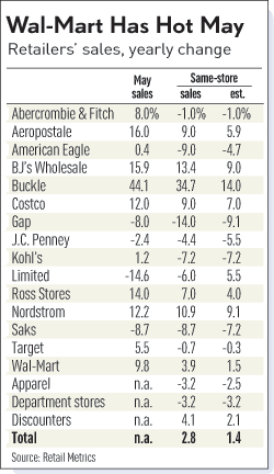
Here is a graph from IBD that shows how various stores did:
While we're talking about retail, let's look at the retail holders ETF to see how retain is doing overall in the market.
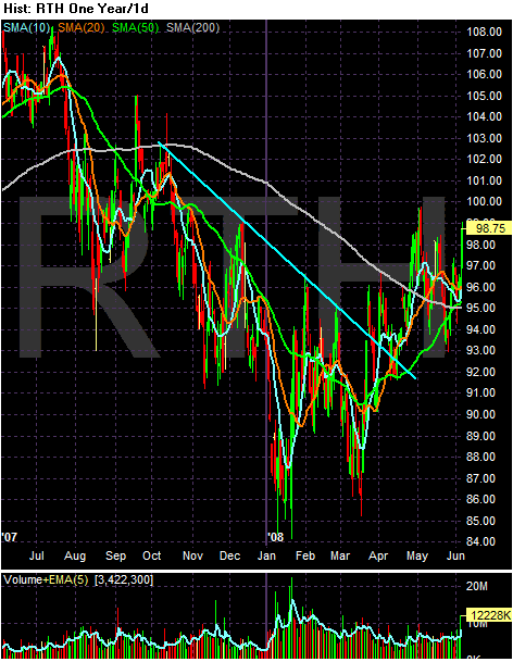
Retail -- like most areas of the market -- dropped after the initial shocks from the credit crisis hit the markets in the late summer of 2007. The index crossed below the 200 day SMA at the end of the summer in 2007 and continued to move lower until mid-March of 2008. Looking at the chart there is a double bottom that formed with the first bottom in January and the second in mid-March. Prices have rallied along with the market since the mid-March rally started.
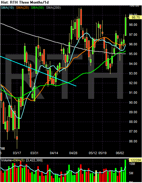
On the 3-month chart, notice the following:
-- Prices are above the 200 day SMA
-- Prices are above all the SMAs
-- Prices are technically in a bullish alignment, with the shorter SMAs above the longer SMAs. But....
-- The 10 and 20 SMAs have been heading lower since the end of April.
-- However, yesterday we saw a big volume move.
Shoppers spending their government rebate checks helped push May retail sales higher, giving companies such as Wal-Mart Stores Inc. a bigger-than-expected lift.
The majority of the growth came at discounters, such as Wal-Mart, Costco Wholesale Corp. and BJ's Wholesale Club Inc. Most department stores' sales declined, and sales at clothing chains fell short of forecasts.
IBD added the following:
Cash-strapped consumers flocked to value-oriented retailers known for low prices on necessities like food, but they scrimped on buys at stores that sell nonessentials like clothes.
.....
Department stores and women's apparel chains continued to struggle. Cooler weather hurt sales of summer goods, said Perkins. But consumers just were not in a mood to buy nonessentials.
"We had these ongoing macro drags like $4 gas, rising food prices and a soft job market, which are very much cutting into discretionary spending," he added.
Same-store sales fell 6.5% at specialty apparel stores and 3.5% at department stores, said Michael Niemira, chief economist at the International Council of Shopping Centers.
.....
But overall, the consumer remains very frugal, Niemira said.
Frugality has led consumers to trade down. Middle- to upper-income households, who typically shop at Target (WMT) and elsewhere, are looking more at Wal-Mart, dollar stores and food discounters, says Frank Badillo, senior economist at TNS Retail Forward.
Here is a graph from IBD that shows how various stores did:

While we're talking about retail, let's look at the retail holders ETF to see how retain is doing overall in the market.

Retail -- like most areas of the market -- dropped after the initial shocks from the credit crisis hit the markets in the late summer of 2007. The index crossed below the 200 day SMA at the end of the summer in 2007 and continued to move lower until mid-March of 2008. Looking at the chart there is a double bottom that formed with the first bottom in January and the second in mid-March. Prices have rallied along with the market since the mid-March rally started.

On the 3-month chart, notice the following:
-- Prices are above the 200 day SMA
-- Prices are above all the SMAs
-- Prices are technically in a bullish alignment, with the shorter SMAs above the longer SMAs. But....
-- The 10 and 20 SMAs have been heading lower since the end of April.
-- However, yesterday we saw a big volume move.
Forex Fridays
Bernanke made public statements supporting the dollar on Tuesday and Wedndesday:
The article also made this observation:
ECB President Trichet said something similar on Thursday:
So -- we have dueling central bankers (as it were). The only difference is Trichet has a history of acting on his statements, whereas the US is the talker not the doer in the central bank world. That's a big difference and it boils down to a massive credibility gap for the Fed.
Let's start this week with the euro and review it's weekly chart:
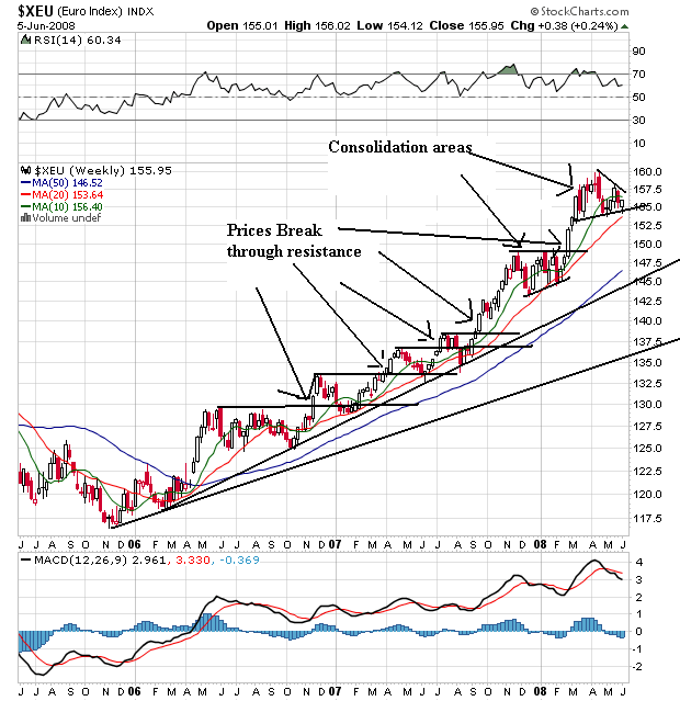
This is a great bull chart. Notice the prices have continually advanced through resistance and then consolidated gains. Also notice the shorter SMAs are above the longer SMAS and all all the 20 and 50 day SMA are moving higher. The 10 is curving lower right now and prices are caught between the 10 and 20 day SMA.
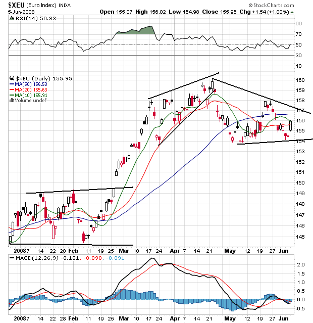
On the daily chart, notice that prices consolidated at the end of 2007 and beginning of 2008. They broke through resistance in late February, peaked in late April and have come down a bit since. Right now prices are bunched up with all the SMAs in s a consolidation pattern. But notice the big pop today after the ECB comments.

The yen has been in a rally since mid-2007. Notice that as the index rose prices took time to consolidate gains. Also note that consolidation was sharp. Right now prices have dropped below the 20 week SMA which will contribute to that SMA moving lower. Also note the 10 week SMA is about to cross below the 20 week SMA which is a bearish development.
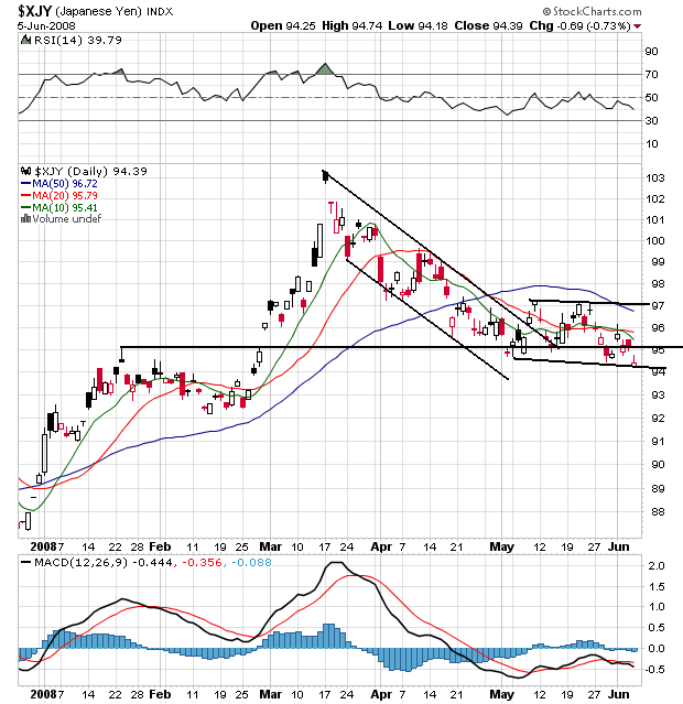
On the daily chart, notice that prices advanced from the beginning of the year through mid-March. Since then they have come down a bit and consolidated horizontally. Note that prices and all the SMAs are bunched together right now, indicating a lack of direction.
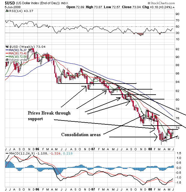
One of the nest examples of a bearish chart I have ever seen. Prices have been moving lower for two years, with prices continually breaking through support to make new lows. Note the 20 and 50 day SMA are both moving lower. The 10 week SMA is about to move a bit hight, but it has done this before at the beginning of the year with no success.
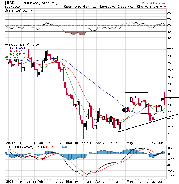
On the daily chart, notice the dollar has rallied a bit since the end of April. Also note that prices are above the SMAs which will pull them higher. Bernanke's statements jawboning the dollar may help in the short run, but we'll need action for this chart to turn around.
Federal Reserve Chairman Ben Bernanke's warning this week about the dollar's steep fall marks the latest step in a Bush administration effort that began in November to use stronger rhetoric to try to prop up the sagging U.S. currency.
The stepped-up rhetoric comes as the world's economic powers prepare to gather in Japan next week for the Group of Seven meeting. The dollar, along with the U.S. economy, is expected to be a key topic of discussion. International concerns about the dollar have been growing as Europeans, in particular, fret about the falling dollar's impact on their exports to the U.S.
The article also made this observation:
The increased focus on the dollar represents somewhat of a gamble by Messrs. Paulson and Bernanke. Their bet is that as the housing crisis subsides and the Fed finishes cutting interest rates, the dollar will climb -- making their rhetoric seem like it is having an impact.
ECB President Trichet said something similar on Thursday:
European Central Bank President Jean-Claude Trichet said Thursday that inflationary pressures in the euro zone will last longer than previously expected, with risks to price stability increasing further in the wake of robust food and oil prices.
The ECB may even raise its 4.0% interest rate, left unchanged on Thursday, at its July meeting, Trichet said. "I don't say it's certain, I say it's possible," he said.
Inflation trends have put the ECB in a state of "heightened alertness," Trichet said after the Governing Council meeting in Frankfurt.
.....
His more hawkish slant was further underscored by the bank's new staff projections for economic growth and inflation over the next two years. Inflation in 2009 is seen at around 2.4%, Trichet said.
Any projection for inflation in 2009 above 2.3% is "an unexpectedly hawkish signal," said Holger Schmieding, an economist for Bank of America.
"A number of us (on the Governing Council) "thought there was the case for raising rates," but Thursday's decision was taken by consensus, Trichet told reporters.
So -- we have dueling central bankers (as it were). The only difference is Trichet has a history of acting on his statements, whereas the US is the talker not the doer in the central bank world. That's a big difference and it boils down to a massive credibility gap for the Fed.
Let's start this week with the euro and review it's weekly chart:

This is a great bull chart. Notice the prices have continually advanced through resistance and then consolidated gains. Also notice the shorter SMAs are above the longer SMAS and all all the 20 and 50 day SMA are moving higher. The 10 is curving lower right now and prices are caught between the 10 and 20 day SMA.

On the daily chart, notice that prices consolidated at the end of 2007 and beginning of 2008. They broke through resistance in late February, peaked in late April and have come down a bit since. Right now prices are bunched up with all the SMAs in s a consolidation pattern. But notice the big pop today after the ECB comments.

The yen has been in a rally since mid-2007. Notice that as the index rose prices took time to consolidate gains. Also note that consolidation was sharp. Right now prices have dropped below the 20 week SMA which will contribute to that SMA moving lower. Also note the 10 week SMA is about to cross below the 20 week SMA which is a bearish development.

On the daily chart, notice that prices advanced from the beginning of the year through mid-March. Since then they have come down a bit and consolidated horizontally. Note that prices and all the SMAs are bunched together right now, indicating a lack of direction.

One of the nest examples of a bearish chart I have ever seen. Prices have been moving lower for two years, with prices continually breaking through support to make new lows. Note the 20 and 50 day SMA are both moving lower. The 10 week SMA is about to move a bit hight, but it has done this before at the beginning of the year with no success.

On the daily chart, notice the dollar has rallied a bit since the end of April. Also note that prices are above the SMAs which will pull them higher. Bernanke's statements jawboning the dollar may help in the short run, but we'll need action for this chart to turn around.
Thursday, June 5, 2008
Today's Markets
Wal-Mart did well with the rebate checks as did Costco. Unemployment benefits unexpectedly fell as well -- although "the four-week average for people receiving benefits edged up to 3.086 million, the highest level since March 6, 2004". That means this week's drop is stands a decent chance of being a blip on the radar screen. S&P went ahead and cut Ambak's and MBIA's ratings to AA. Oil popped $5 dollars after ECD President Trichet said an interest rate was possible next month (I'll have more on this tomorrow).
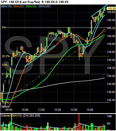
The SPYs popped hard at the open. Notice the extremely strong bars along with the large volume spike right after 9AM. Prices cooled a bit, falling to the 20 minute SMA. Prices then continue to move higher until lunch when they traded sideways until 1PM. The fell down to the 50 minute SMA, then fell through far harder on a big volume spike. Also note prices fell to the 38.2% Fibonacci level. But they recovered and rallied into the close.
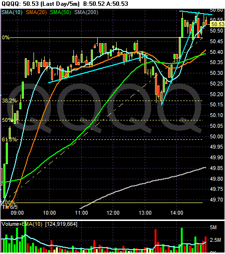
The QQQQs also spiked up hard at the opening of very strong volume. Prices moved sideways, trading in a very narrow range until 1PM. Then prices broke support and dropped printing two strong bars with a big volume spike. After that prices moved higher, and formed a consolidation pattern at the close.
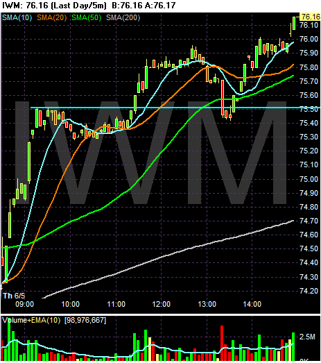
The IWMs spiked up hard at the open on incredibly strong volume. They moved sideways until 11 AM, using the 10 and 20 SMA as support. Then we saw some volume come into the market moving prices higher. There was a big sell-off about 1:25 on high volume, but prices recovered and rallied into the end.

The SPYs popped hard at the open. Notice the extremely strong bars along with the large volume spike right after 9AM. Prices cooled a bit, falling to the 20 minute SMA. Prices then continue to move higher until lunch when they traded sideways until 1PM. The fell down to the 50 minute SMA, then fell through far harder on a big volume spike. Also note prices fell to the 38.2% Fibonacci level. But they recovered and rallied into the close.

The QQQQs also spiked up hard at the opening of very strong volume. Prices moved sideways, trading in a very narrow range until 1PM. Then prices broke support and dropped printing two strong bars with a big volume spike. After that prices moved higher, and formed a consolidation pattern at the close.

The IWMs spiked up hard at the open on incredibly strong volume. They moved sideways until 11 AM, using the 10 and 20 SMA as support. Then we saw some volume come into the market moving prices higher. There was a big sell-off about 1:25 on high volume, but prices recovered and rallied into the end.
Should These Guys Be Insuring the Market?
From the NY Times:
The charts tell us the market is not confident in these companies at all.
First, there is MBIA:
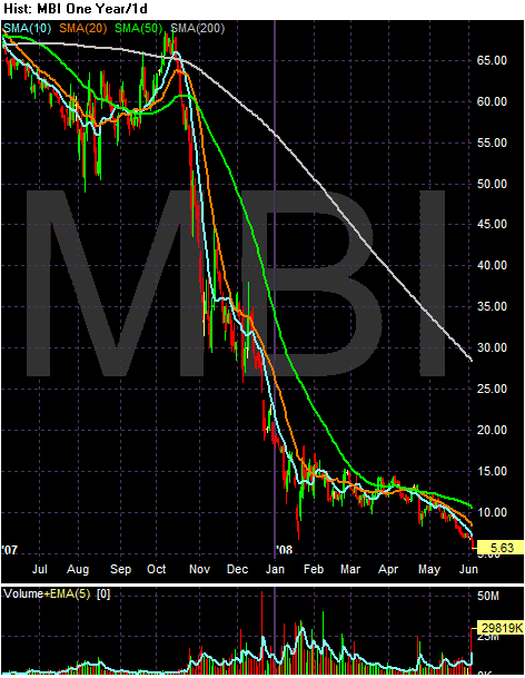
This stock plunged at the end of last summer when the credit market started to really drop hard. I guess traders thought there was no way they could actually pay all the insurance policies they had written. The stock price stabilized in the Spring of 2008, but note the more recent drop in price. Also note the very bearish price SMA alignment:
-- All the SMAs are moving lower
-- The shorter SMAs are below the longer SMAs
-- Prices are below the 200 day SMA
-- Prices are below all the SMAs
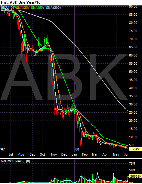
Ambak's chart isn't much different. Notice the following:
-- All the SMAs are moving lower
-- The shorter SMAs are below the longer SMAs
-- Prices are below the 200 day SMA
-- Prices are below all the SMAs
Like the airlines, it sure looks as though the market is thinking bankruptcy is a possibility.
Moody’s Investors Service said on Wednesday that it was likely to cut the top ratings of the bond insurance arms of MBIA and Ambac Financial, in a move that may cripple their ability to write new insurance.
The companies, which are No. 1 and No. 2 in the business, have been struggling to raise capital to shore up their AAA ratings, which are under pressure on concern about losses from mortgage-backed debt.
“They are in a weaker position today than they were a year ago before the mortgage crisis, and the situation doesn’t seem to be getting better in that regard,” Jack Dorer, a managing director in Moody’s financial guarantor team, said in an interview.
Plunging share prices and the high cost of accessing the debt markets are hampering the ability of both companies to raise new funds, Moody’s said.
Shares of MBIA and Ambac plunged on Moody’s action, and the cost of insuring their debt with credit default swaps jumped. Shares of MBIA closed Wednesday at $5.63, down $1.06. Shares of Ambac closed at $2.49, down 51 cents.
The charts tell us the market is not confident in these companies at all.
First, there is MBIA:

This stock plunged at the end of last summer when the credit market started to really drop hard. I guess traders thought there was no way they could actually pay all the insurance policies they had written. The stock price stabilized in the Spring of 2008, but note the more recent drop in price. Also note the very bearish price SMA alignment:
-- All the SMAs are moving lower
-- The shorter SMAs are below the longer SMAs
-- Prices are below the 200 day SMA
-- Prices are below all the SMAs

Ambak's chart isn't much different. Notice the following:
-- All the SMAs are moving lower
-- The shorter SMAs are below the longer SMAs
-- Prices are below the 200 day SMA
-- Prices are below all the SMAs
Like the airlines, it sure looks as though the market is thinking bankruptcy is a possibility.
Airlines Taking Nasty Hits
First it was American:
Then it was United:
Now it's Continental. They sent the following letter to their employees:
That makes me feel warm all over. How about you?
Seriously, it should come as no surprise that an industry heavily reliant on the price of fuel for profitability is experiencing problems. On top of that, have you flown lately? Am I the only person who finds the process extremely uncomfortable? I'm 6 feet tall and weigh 190. I am literally the average American male. And the seating arrangements suck.
Anyway -- let's see what the charts tell us.
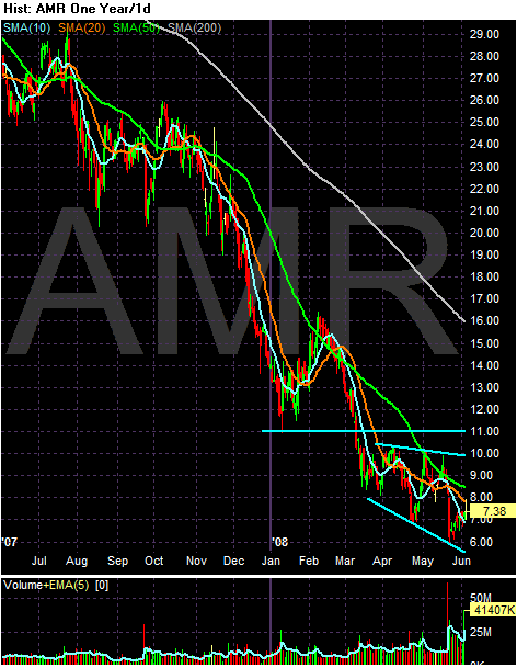
The American chart is downright ugly. Notice the following:
-- Prices are below the 200 day SMA
-- All the SMAs are moving lower
-- The shorter SMAs are below the longer SMAs
-- Prices have been dropping since last summer
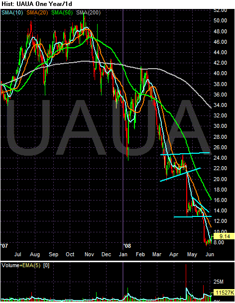
-- Prices are below the 200 day SMA
-- All the SMAs are moving lower
-- The shorter SMAs are below the longer SMAs
-- Prices have been dropping since last summer
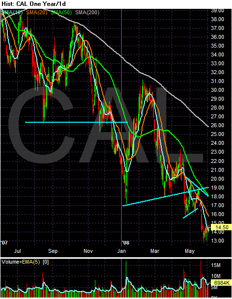
-- Prices are below the 200 day SMA
-- All the SMAs are moving lower
-- The shorter SMAs are below the longer SMAs
-- Prices have been dropping since last summer
These are terrible charts -- unless you're going short. And they tell us the possibility of a bankruptcy is in the cards.
That came two weeks after a similar move by AMR Corp.'s American Airlines, the only U.S. carrier larger than United, which said it would slash domestic capacity 11 to 12 percent after the peak summer travel season. American already has begun eliminating flights, as have No. 3 Delta Air Lines Inc. and others.
Then it was United:
United Airlines said Wednesday that it's cutting up to 1,100 more jobs, removing an additional 70 fuel-guzzling airplanes from its fleet and slashing domestic capacity as it tries to cope with spiraling fuel prices.
The nation's No. 2 carrier said it plans to cut an additional 900 to 1,100 salaried, contract and management employees by the end of the year, in addition to 500 previously announced job reductions. The combined reductions mean the airline is cutting nearly 3 percent of its 55,000 workers worldwide.
Officials said the "aggressive" moves are designed to the help the subsidiary of UAL Corp. weather an "unprecedented fuel environment." Crude oil futures prices peaked at a record above $135 a barrel nearly two weeks ago and airline fuel prices have been rocketing higher as well.
Now it's Continental. They sent the following letter to their employees:
We've always said that you deserve open, honest and direct communication. This letter and the attached employee bulletin and Q&A are part of that commitment.
The airline industry is in a crisis. Its business model doesn't work with the current price of fuel and the existing level of capacity in the marketplace. We need to make changes in response.
While there have been several successful fare increases, those increases haven't been sufficient to cover the rising cost of fuel. As fares increase, fewer customers will fly. As fewer customers fly, we will need to reduce our capacity to match the reduced demand. As we reduce our capacity, we will need fewer employees to operate the airline. Although these changes will be painful, we must adapt to the reality of today's market to successfully navigate these difficult times.
The attached employee bulletin and Q&A outline some of the steps we are taking to address this industry crisis. The situation for all airlines is serious, and the actions we are announcing today are necessary to secure our future. We regret the loss of jobs caused by this crisis, and we will do our best to minimize furloughs and involuntary terminations.
These actions will help Continental survive this crisis. You have our ongoing commitment to keep you informed as the industry evolves and adapts to these unprecedented challenges. It is important that we all keep our focus on working together during these difficult times.
That makes me feel warm all over. How about you?
Seriously, it should come as no surprise that an industry heavily reliant on the price of fuel for profitability is experiencing problems. On top of that, have you flown lately? Am I the only person who finds the process extremely uncomfortable? I'm 6 feet tall and weigh 190. I am literally the average American male. And the seating arrangements suck.
Anyway -- let's see what the charts tell us.

The American chart is downright ugly. Notice the following:
-- Prices are below the 200 day SMA
-- All the SMAs are moving lower
-- The shorter SMAs are below the longer SMAs
-- Prices have been dropping since last summer

-- Prices are below the 200 day SMA
-- All the SMAs are moving lower
-- The shorter SMAs are below the longer SMAs
-- Prices have been dropping since last summer

-- Prices are below the 200 day SMA
-- All the SMAs are moving lower
-- The shorter SMAs are below the longer SMAs
-- Prices have been dropping since last summer
These are terrible charts -- unless you're going short. And they tell us the possibility of a bankruptcy is in the cards.
We're Nowhere Near A Bottom in Housing
From Dow Jones:
This news indicates we'll see a swelling of inventory over the next 6-12 months. Inventory is already at sky high levels. That means prices are coming down.
U.S. mortgage delinquencies and foreclosures continued to rise in the first quarter despite efforts to calm the nation's troubled housing market.
The Mortgage Bankers Association said Thursday 6.4% of mortgages were at least 30 days delinquent in the first quarter on a seasonally adjusted basis, up 53 basis points from the fourth quarter of 2007 and 151 basis points from the first quarter of 2007. The figure was the highest recorded in the association's survey since 1979.
The number of foreclosure starts and loans somewhere in the foreclosure process also rose in the quarter to the highest levels the association has seen since 1979.
The survey found 2.5% of loans were in foreclosure during the first quarter, an increase of 43 basis points from the fourth quarter of 2007 and 119 basis points from the first quarter last year.
This news indicates we'll see a swelling of inventory over the next 6-12 months. Inventory is already at sky high levels. That means prices are coming down.
The Credit Crisis is Far From Over
Consider this:
Ask yourself the following questions:
1.) Does this indicate the credit markets are getting better or worse?
2.) Is this a good time to bet on a turnaround in the financial sector?
According to First American CoreLogic LoanPerformance data, the percentage of both subprime and prime mortgages that are severely delinquent are at record highs. In the Alt-A mortgage market, where loans were made to individuals with good credit who didn't fully document their incomes, nearly 11% of borrowers were more than 60 days behind in their payments as of March.
Delinquency rates and losses are also rising on construction loans, some commercial loans and other consumer debt like credit cards, which will only keep lenders' purse strings tight.
More than $200 billion of complex mortgage securities called collateralized debt obligations have hit "events of default," which give some of their investors the right to force the vehicles to liquidate their holdings of mortgage-backed securities or swaps tied to them.
Some of these CDOs are selling off their assets. In a recent report, J.P. Morgan analyst Christopher Flanagan estimated that holders of the top tranches of CDOs can expect to recover just six to 46 cents on the dollar on their investments, bad news for the bond insurers that wrote guarantees on many of these vehicles.
Ask yourself the following questions:
1.) Does this indicate the credit markets are getting better or worse?
2.) Is this a good time to bet on a turnaround in the financial sector?
Thursday Oil Market Round-up
Oil has been correcting a bit over the last week. Overall this is good news. But before we pop the champaign cork.....
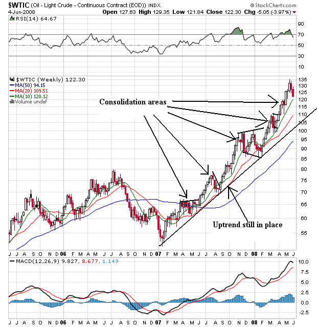
On the weekly chart, we're still in a solid bull market that started at the beginning of 2007. Prices have continually risen, moving through resistance and then consolidating their gains. Notice the SMAs are all moving higher with the shorter above the longer, prices above all the SMAs and all the SMAs moving higher. Simply put, this is what a bull market chart looks like.
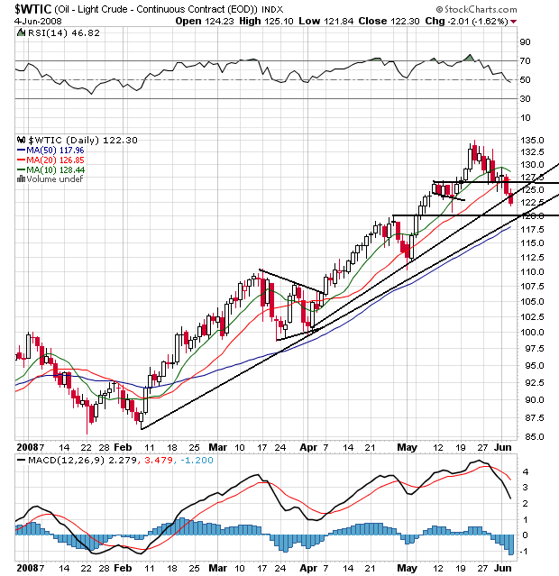
On the daily chart, notice the following:
-- Prices have moved through the trend line started in early April, but the trend line from early February is still intact.
-- Prices have moved through support established in early May.
-- All the SMAs are still in a bullish configuration with the shortest above the longest.
-- However, prices are below the 10 and 20 say SMA and the 10 day SMA is beginning to turn lower.
-- Compare the latest price action to the late March, late April periods and you'll see a lot of similarities. In other words, this looks like a consolidation rather than a correction.
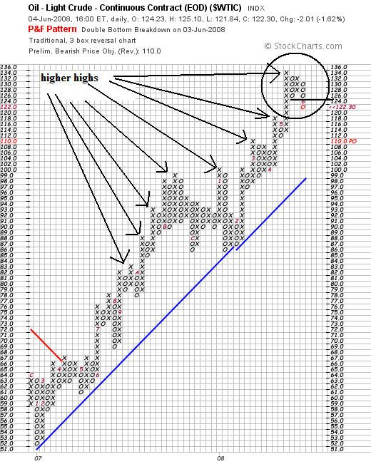
On the P&F chart, notice that prices have moved below previous established support levels in the latest correction. That can be a sign that prices are thinking about correcting. However, considering the overall strength of this chart (notice the multiple new higher highs) it's still way too early to tell if we're near a correcting phase or not.
On the gas price front we've still got an incredibly ugly picture:

On the weekly chart, we're still in a solid bull market that started at the beginning of 2007. Prices have continually risen, moving through resistance and then consolidating their gains. Notice the SMAs are all moving higher with the shorter above the longer, prices above all the SMAs and all the SMAs moving higher. Simply put, this is what a bull market chart looks like.

On the daily chart, notice the following:
-- Prices have moved through the trend line started in early April, but the trend line from early February is still intact.
-- Prices have moved through support established in early May.
-- All the SMAs are still in a bullish configuration with the shortest above the longest.
-- However, prices are below the 10 and 20 say SMA and the 10 day SMA is beginning to turn lower.
-- Compare the latest price action to the late March, late April periods and you'll see a lot of similarities. In other words, this looks like a consolidation rather than a correction.

On the P&F chart, notice that prices have moved below previous established support levels in the latest correction. That can be a sign that prices are thinking about correcting. However, considering the overall strength of this chart (notice the multiple new higher highs) it's still way too early to tell if we're near a correcting phase or not.
On the gas price front we've still got an incredibly ugly picture:
The U.S. average retail price for regular gasoline increased for the tenth straight week. Although its upward momentum slowed, the U.S. average price still climbed another 3.9 cents to hit 397.6 cents per gallon. The average for the East Coast went up by 3.3 cents to 397 cents per gallon; but prices in the Central Atlantic and New England increased by more than 5 cents, climbing past the $4 mark to reach 400.1 and 402.8 cents per gallon, respectively. The average price in the Midwest was essentially unchanged, creeping up by only a tenth of a cent to 395.2 cents per gallon. The average price in the Gulf Coast increased by 1.7 cents to 384.6 cents per gallon and remained the lowest of any region. The price in the Rocky Mountain region went up 3.9 cents to 389 cents per gallon. The price for the West Coast extended its upward surge, jumping another 13.7 cents to strike 416.6 cents per gallon. West Coast prices have risen 28.3 cents over the past two weeks. The average price in California went up even more, shooting to 424.2 cents per gallon, an increase of 14.3 cents from the previous week.
Wednesday, June 4, 2008
Today's Markets
Oil dropped again, which is overall good news. But that didn't stop United from announcing it is cutting staff and planes.In addition, for the second day in a row Bernanke stated inflation was too high although he doesn't expect an out of control 1970s style situation large because wages are falling, not rising. In other news, AMBAC and MBIA's ratings might be cut in the near future (which should have been done long ago). Finally, the service sector expanded for the second straight month.
Onto the chart.
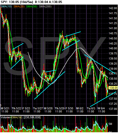
Since May 22 (the day Mr. and Mr$. Bonddad bought their house), the market has been moving between (roughly) 137 and 140. There is no clear trend in either direction. Simply put, traders are waiting for something to happen, but aren't sure what they are looking for.
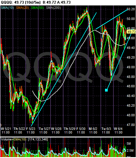
The QQQQs rallied all last week, but dropped at the beginning of this week and have since rallied back a bit while also consolidating in a pennant formation.
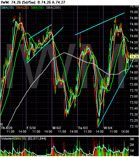
The IWMs are looking for direction as well, much like the SPYs.
Simply put, there isn't enough news in either direction to push the market one way or the other right now.
Onto the chart.

Since May 22 (the day Mr. and Mr$. Bonddad bought their house), the market has been moving between (roughly) 137 and 140. There is no clear trend in either direction. Simply put, traders are waiting for something to happen, but aren't sure what they are looking for.

The QQQQs rallied all last week, but dropped at the beginning of this week and have since rallied back a bit while also consolidating in a pennant formation.

The IWMs are looking for direction as well, much like the SPYs.
Simply put, there isn't enough news in either direction to push the market one way or the other right now.
My Conversation With the Next President
The “script” that follows assumes the highly unlikely (actually downright improbable) that Bonddad becomes the Treasury secretary in the new administration. The script makes no points regarding who will win, because frankly it doesn’t matter. The next president – whoever that is – faces a daunting federal fiscal environment.
BD: Wow – this room really is shaped like an oval. Who would have thought that.
Pres: Welcome to m new digs, BD. How was the confirmation hearing?
BD: Next to visiting my proctologist I can’t think of a better time.
Pres: Great to hear it. So, as you know BD, I made a lot of promises about what to do. I want to start in on those promises right away.
BD: Mr. President, you won’t be able to do much of anything except raise taxes and cut spending.
Pres: Why is that BD?
BD: Let me walk you through be basic logic, Mr. President. First, let’s start with a question. If you really think something is a good investment would you buy more or less of it?
Pres: I’d buy more of it.
BD: And what would that do to the price?
Pres: That would send the price higher.
BD: Do you think the converse is also true – that if you don’t like something you’ll buy less of it and that will send the price lower?
Pres: Yes.
BD: Congratulations Mr. President, you have just passed supply and demand 101. Now – let’s take a look at a long-term chart of the dollar and see what it says.
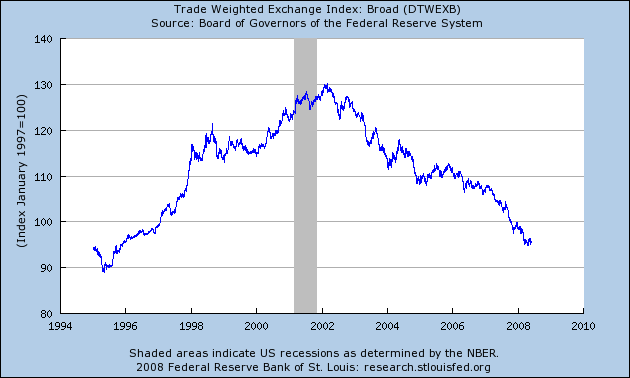
Pres: that sure looks like no one likes the dollar. Why is that, BD?
BD: Because the US’ books aren’t even close to balanced.
Pres: That’s not what the press reported! They said the budget deficit was coming down!
BD: Look! Monkeys are flying out of by butt!
Pres: You mean the budget isn’t balanced?
BD: Let me answer that with another question. If you balanced your books every year would you have to borrow money?
Pres: No.
BD: Then why has the Federal government had to borrow at least $500 billion dollars per year since 2003? Here’s the information from the Bureau of the Public Debt:
09/30/2007 $9,007,653,372,262.48
09/30/2006 $8,506,973,899,215.23
09/30/2005 $7,932,709,661,723.50
09/30/2004 $7,379,052,696,330.32
09/30/2003 $6,783,231,062,743.62
09/30/2002 $6,228,235,965,597.16
09/30/2001 $5,807,463,412,200.06
09/30/2000 $5,674,178,209,886.86
Pres: Wow. That’s a lot of debt. How is it there was this huge divergence between the debt issued and the reporting on the deficit?
BD: Because the nation’s press is full of a bunch of no-thinking idiots. Anyway – the bottom line is we owe a lot of money. And currency traders are starting to look at that mountain of debt and our lack of dealing with it in any meaningful way and they are thinking, “I’m not sure the US is serious about dealing with this debt. Let’s start to sell the dollar.”
Pres: But isn’t a cheap dollar good for exports.
BD: Yep. It’s also a great way to manufacture inflation.
Pres: Inflation?!?!?!?! How’s that/
BD: Most of the world’s commodities are priced in dollars…..
Pres: And a drop in the dollar’s price is the same thing as an increase in the price a commodity priced in dollars, right?
Pres: Put a gold start by the president’s name.
Pres: And that’s a reason why oil prices are spiking, isn’t it?
BD: Yep. Welcome to the world of inter-related markets.
Pres: So, we’ve got to do something about the dropping dollar to slow down inflationary pressures before we do anything else?
BD: Only if you want to help out the country. Otherwise, do what the last President did.
Pres: Why do we have to deal with the dollar now as opposed to later?
BD: Two reasons. First, every time a politician says, “I’ll deal with that later” he never does. Secondly, there is growing talk in the world about various central banks dropping their pegs to the dollar. There is also talk about moving away from the dollar as a reserve currency and moving into the euro. If that happens, expect the dollar to drop more. If that happens we approach a “Katy bar the door” scenario”. In other words, if we don’t deal with it now, the financial markets may deal with it for us. And that would really suck. Think Argentina in Engllish.
Pres: Wow – that sounds pretty bad.
BD: Not if you think an 18% drop in your country’s GDP and 60% of your population in poverty is a good thing.
Pres: So BD, what should we do?
BD: Raise taxes and cut spending. How you do that is your business.
Pres: I think you’re right.
BD: Wow – you actually listened. Color my impressed.
The point to the previous script is plain: whoever gets elected faces a terrible fiscal situation. It also means that a lot of the campaign rhetoric is, well, rhetoric meant to get someone elected. When whoever wins gets into the job, a hard reality will set in.
BD: Wow – this room really is shaped like an oval. Who would have thought that.
Pres: Welcome to m new digs, BD. How was the confirmation hearing?
BD: Next to visiting my proctologist I can’t think of a better time.
Pres: Great to hear it. So, as you know BD, I made a lot of promises about what to do. I want to start in on those promises right away.
BD: Mr. President, you won’t be able to do much of anything except raise taxes and cut spending.
Pres: Why is that BD?
BD: Let me walk you through be basic logic, Mr. President. First, let’s start with a question. If you really think something is a good investment would you buy more or less of it?
Pres: I’d buy more of it.
BD: And what would that do to the price?
Pres: That would send the price higher.
BD: Do you think the converse is also true – that if you don’t like something you’ll buy less of it and that will send the price lower?
Pres: Yes.
BD: Congratulations Mr. President, you have just passed supply and demand 101. Now – let’s take a look at a long-term chart of the dollar and see what it says.

Pres: that sure looks like no one likes the dollar. Why is that, BD?
BD: Because the US’ books aren’t even close to balanced.
Pres: That’s not what the press reported! They said the budget deficit was coming down!
BD: Look! Monkeys are flying out of by butt!
Pres: You mean the budget isn’t balanced?
BD: Let me answer that with another question. If you balanced your books every year would you have to borrow money?
Pres: No.
BD: Then why has the Federal government had to borrow at least $500 billion dollars per year since 2003? Here’s the information from the Bureau of the Public Debt:
09/30/2007 $9,007,653,372,262.48
09/30/2006 $8,506,973,899,215.23
09/30/2005 $7,932,709,661,723.50
09/30/2004 $7,379,052,696,330.32
09/30/2003 $6,783,231,062,743.62
09/30/2002 $6,228,235,965,597.16
09/30/2001 $5,807,463,412,200.06
09/30/2000 $5,674,178,209,886.86
Pres: Wow. That’s a lot of debt. How is it there was this huge divergence between the debt issued and the reporting on the deficit?
BD: Because the nation’s press is full of a bunch of no-thinking idiots. Anyway – the bottom line is we owe a lot of money. And currency traders are starting to look at that mountain of debt and our lack of dealing with it in any meaningful way and they are thinking, “I’m not sure the US is serious about dealing with this debt. Let’s start to sell the dollar.”
Pres: But isn’t a cheap dollar good for exports.
BD: Yep. It’s also a great way to manufacture inflation.
Pres: Inflation?!?!?!?! How’s that/
BD: Most of the world’s commodities are priced in dollars…..
Pres: And a drop in the dollar’s price is the same thing as an increase in the price a commodity priced in dollars, right?
Pres: Put a gold start by the president’s name.
Pres: And that’s a reason why oil prices are spiking, isn’t it?
BD: Yep. Welcome to the world of inter-related markets.
Pres: So, we’ve got to do something about the dropping dollar to slow down inflationary pressures before we do anything else?
BD: Only if you want to help out the country. Otherwise, do what the last President did.
Pres: Why do we have to deal with the dollar now as opposed to later?
BD: Two reasons. First, every time a politician says, “I’ll deal with that later” he never does. Secondly, there is growing talk in the world about various central banks dropping their pegs to the dollar. There is also talk about moving away from the dollar as a reserve currency and moving into the euro. If that happens, expect the dollar to drop more. If that happens we approach a “Katy bar the door” scenario”. In other words, if we don’t deal with it now, the financial markets may deal with it for us. And that would really suck. Think Argentina in Engllish.
Pres: Wow – that sounds pretty bad.
BD: Not if you think an 18% drop in your country’s GDP and 60% of your population in poverty is a good thing.
Pres: So BD, what should we do?
BD: Raise taxes and cut spending. How you do that is your business.
Pres: I think you’re right.
BD: Wow – you actually listened. Color my impressed.
The point to the previous script is plain: whoever gets elected faces a terrible fiscal situation. It also means that a lot of the campaign rhetoric is, well, rhetoric meant to get someone elected. When whoever wins gets into the job, a hard reality will set in.
More of Agricultural Prices
Below are some individual charts from the agricultural sector.
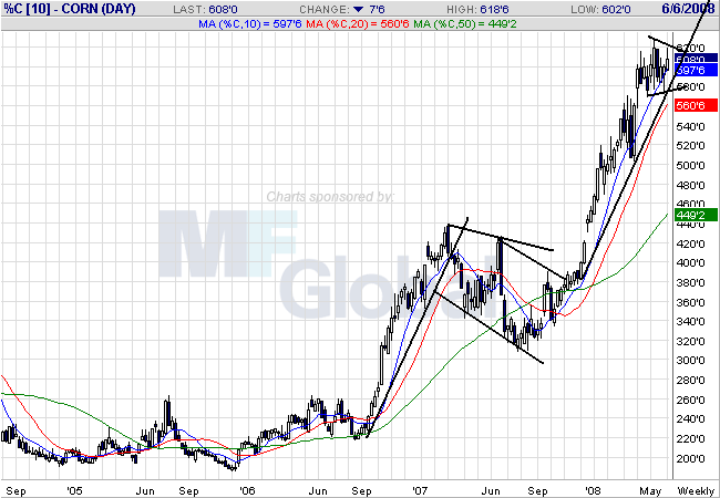
On the weekly corn chart, notice the clear rally/consolidate/rally pattern that has emerged over the last year and a half. Also notice that prices are currently consolidating at high levels.
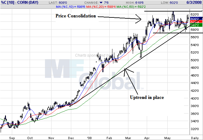
On the daily chart, notice that prices are still in an uptrend, but they are clearly in a trading range for the last two months. On the SMA front, notice the following:
-- Prices are bunched up with the 10, 20 and 50 day SMA, indicating a great deal of indecision.
-- The 10 and 20 day SMA are both horizontal right now.
-- The SMAs are in a very tight range, indicating more indecision.
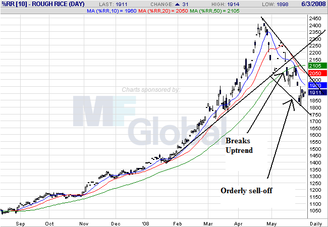
On the rice chart, notice that prices have now broken through support of a trend line that started at the end of January. Also notice the following:
-- The 10 and 20 day SMAs are both moving lower
-- The 10 and 20 day SMA have both moved through the 50 day SMA
-- Prices are below all the moving averages, which will keep pulling the SMAs lower.
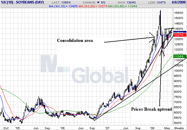
On soy beans weekly chart, notice that prices broke the uptrend that started at the end of September, but are still in a longer-term trend that started at the end of September 2007. Also notice that prices are currently consolidating in a triangle pattern.
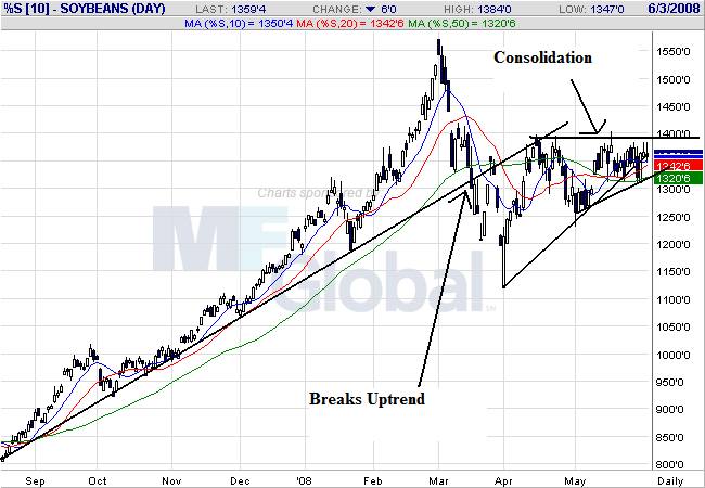
On soy beans daily chart, we can see the trend break far more clearly. Also notice that prices and the SMAs are tied up in a very tight range, with all the SMAs essentially giving a very neutral read.
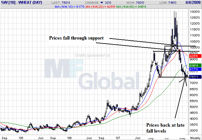
On wheat's weekly chart, notice that prices have come down to late fall 2007 levels.
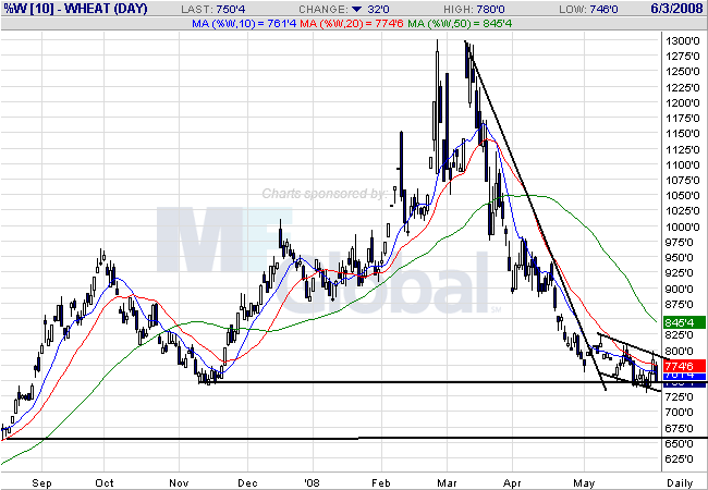
On the daily chart, notice the following:
-- The 10, 20 and 50 day SMA are all moving lower
-- The shorter SMAs are below the longer SMAs
-- Prices are running into upside resistance with the SMAs, implying prices are moving lower.
With the exception of corn (which has a huge boost from ethanol) all other agricultural commodities are coming down in price right now. That's good news for inflation.

On the weekly corn chart, notice the clear rally/consolidate/rally pattern that has emerged over the last year and a half. Also notice that prices are currently consolidating at high levels.

On the daily chart, notice that prices are still in an uptrend, but they are clearly in a trading range for the last two months. On the SMA front, notice the following:
-- Prices are bunched up with the 10, 20 and 50 day SMA, indicating a great deal of indecision.
-- The 10 and 20 day SMA are both horizontal right now.
-- The SMAs are in a very tight range, indicating more indecision.

On the rice chart, notice that prices have now broken through support of a trend line that started at the end of January. Also notice the following:
-- The 10 and 20 day SMAs are both moving lower
-- The 10 and 20 day SMA have both moved through the 50 day SMA
-- Prices are below all the moving averages, which will keep pulling the SMAs lower.

On soy beans weekly chart, notice that prices broke the uptrend that started at the end of September, but are still in a longer-term trend that started at the end of September 2007. Also notice that prices are currently consolidating in a triangle pattern.

On soy beans daily chart, we can see the trend break far more clearly. Also notice that prices and the SMAs are tied up in a very tight range, with all the SMAs essentially giving a very neutral read.

On wheat's weekly chart, notice that prices have come down to late fall 2007 levels.

On the daily chart, notice the following:
-- The 10, 20 and 50 day SMA are all moving lower
-- The shorter SMAs are below the longer SMAs
-- Prices are running into upside resistance with the SMAs, implying prices are moving lower.
With the exception of corn (which has a huge boost from ethanol) all other agricultural commodities are coming down in price right now. That's good news for inflation.
Wednesday's Commodities Roundup
Let's take a look at a few charts to see how these markets are doing.
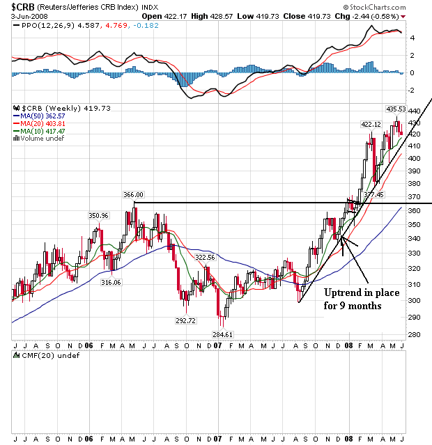
The overall CRB index has been in a rally since the end of last summer and is still there. Notice the index broke through previous price levels at the beginning of this year and has been rallying since.
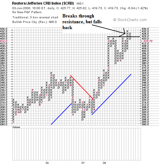
On the P&F chart, notice the prices broke through resistance but have since fallen back. The 427 - 433 area has proven tough to get through.
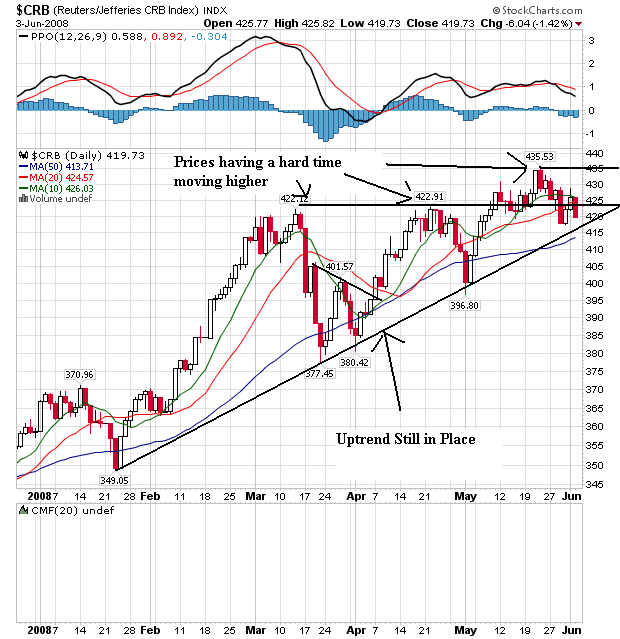
And on the daily chart, we see the difficulty in a bit more detail. Notice prices made two runs at the 422 area before getting through. And now after prices have moved through this area they have retreated a bit.
On the SMA front, notice that prices and the 10 and 20 day SMA are tangled up. The 20 day SMA and the 50 day SMA are still moving higher, but the 10 has stalled a bit. The 10 is more volatile, so this isn't the best long-term predictor. But notice it has stalled a bit as well.
The CRB may be stalling. As with all chart we'll have to wait and see how this plays out. It's also possible we're consolidating for the next move higher as well. So long as prices stay above the long-term trend that is always a possibility.
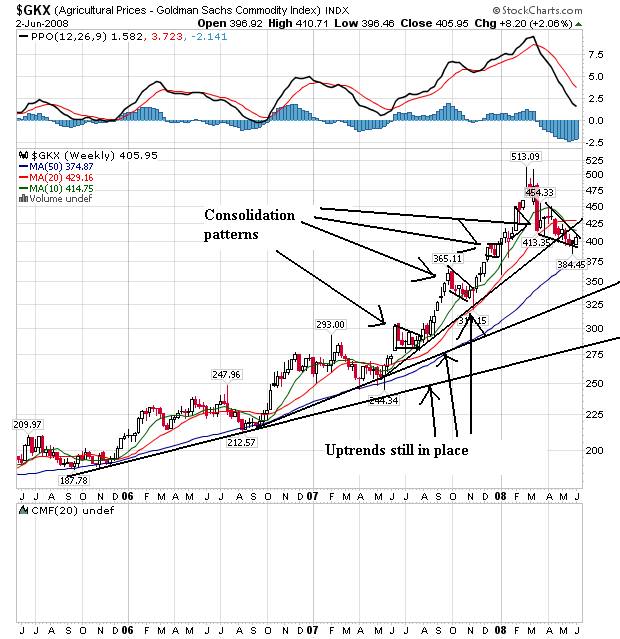
Agricultural prices have been a concern of mine for the last 6-9 months. So the latest price retreat is a welcome development from an inflationary perspective. However, several long-term uptrends are still in place, indicating the latest pennant formation could be a simple consolidation before we move higher.
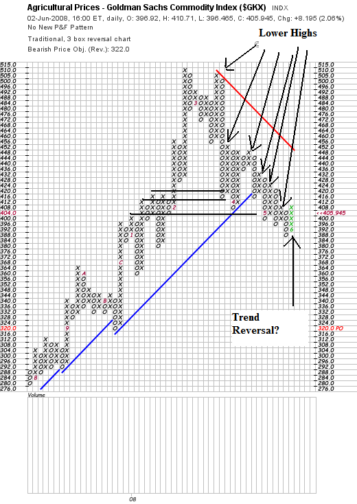
On the P&F chart, notice the series of lower highs, indicating the upward pressure is easing.
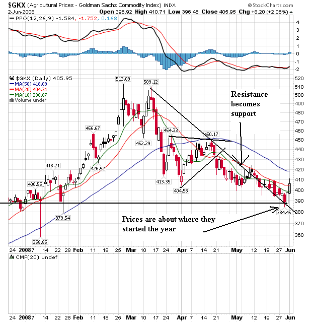
On the daily chart, notice the following.
-- Overall, prices have moved to levels we saw at the beginning of the year
-- The short term SMAs are all pointing lower, with the smaller below the longer. This is a bearish configuration.
-- However, prices have moved through the 10 and 20 day SMA, and the resistance line that started at the recent peak of 509.12 has become support. That could be a sign the market is ready for another move higher.
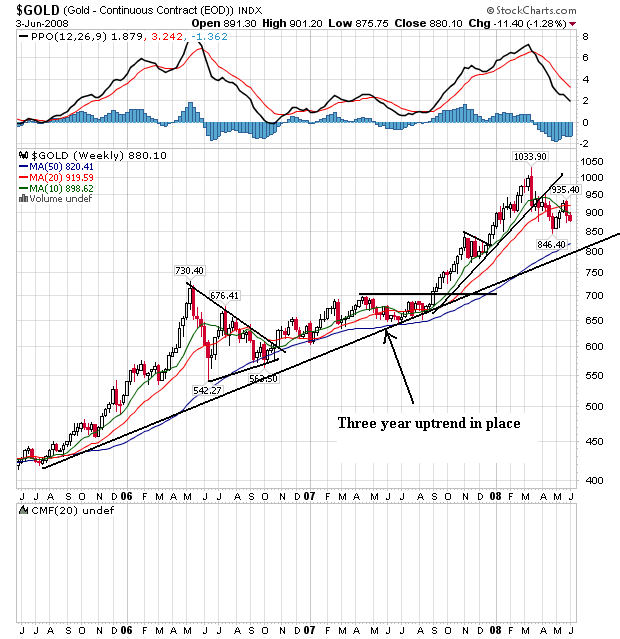
On the three year gold chart, notice the long-term uptrend is in place but prices have retreated over the last few months. This indicates that inflation expectations are still looking at higher future prices, but traders are reevaluating the overall tenor of the economy to see if that could change.
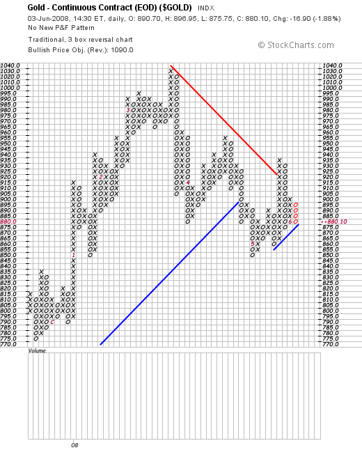
On the P&F chart, notice we have three major price peaks at lower levels.
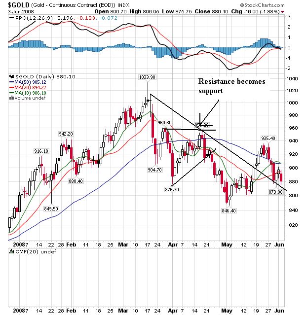
On the daily chart, we have several diverging trends.
-- Prices have dropped from their peak of 1033.90.
-- However, like the agricultural chart, we have resistance becoming short-term support along with a jumbled price/SMA picture. We need some more time with this chart for a long-term trend to develop.

The overall CRB index has been in a rally since the end of last summer and is still there. Notice the index broke through previous price levels at the beginning of this year and has been rallying since.

On the P&F chart, notice the prices broke through resistance but have since fallen back. The 427 - 433 area has proven tough to get through.

And on the daily chart, we see the difficulty in a bit more detail. Notice prices made two runs at the 422 area before getting through. And now after prices have moved through this area they have retreated a bit.
On the SMA front, notice that prices and the 10 and 20 day SMA are tangled up. The 20 day SMA and the 50 day SMA are still moving higher, but the 10 has stalled a bit. The 10 is more volatile, so this isn't the best long-term predictor. But notice it has stalled a bit as well.
The CRB may be stalling. As with all chart we'll have to wait and see how this plays out. It's also possible we're consolidating for the next move higher as well. So long as prices stay above the long-term trend that is always a possibility.

Agricultural prices have been a concern of mine for the last 6-9 months. So the latest price retreat is a welcome development from an inflationary perspective. However, several long-term uptrends are still in place, indicating the latest pennant formation could be a simple consolidation before we move higher.

On the P&F chart, notice the series of lower highs, indicating the upward pressure is easing.

On the daily chart, notice the following.
-- Overall, prices have moved to levels we saw at the beginning of the year
-- The short term SMAs are all pointing lower, with the smaller below the longer. This is a bearish configuration.
-- However, prices have moved through the 10 and 20 day SMA, and the resistance line that started at the recent peak of 509.12 has become support. That could be a sign the market is ready for another move higher.

On the three year gold chart, notice the long-term uptrend is in place but prices have retreated over the last few months. This indicates that inflation expectations are still looking at higher future prices, but traders are reevaluating the overall tenor of the economy to see if that could change.

On the P&F chart, notice we have three major price peaks at lower levels.

On the daily chart, we have several diverging trends.
-- Prices have dropped from their peak of 1033.90.
-- However, like the agricultural chart, we have resistance becoming short-term support along with a jumbled price/SMA picture. We need some more time with this chart for a long-term trend to develop.
Tuesday, June 3, 2008
Today's Markets
Another day of bad news. Lehman Brothers tanked hard on news they might have to raise more capital. GM is closing 4 truck plants because no one wants to buy gas guzzling SUVs when gas is near $4/gallon. We also got this news about car sales:
Bottom line: Detroit is in trouble. Big time.
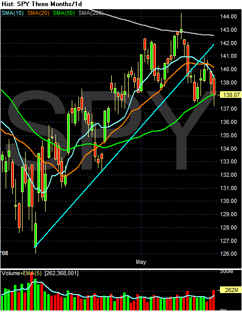
The SPYs broke trend about two weeks ago, right after they couldn't get beyond the 200 day SMA. Since then they have been selling off. Notice the following regarding their SMAs:
-- The 10 day just crossed below the 20 day SMA
-- Both the 10 and 20 day SMA are heading lower
-- Prices are below the 200 day SMA -- and couldn't get above that level
-- Prices are right at the crucial 50 day SMA
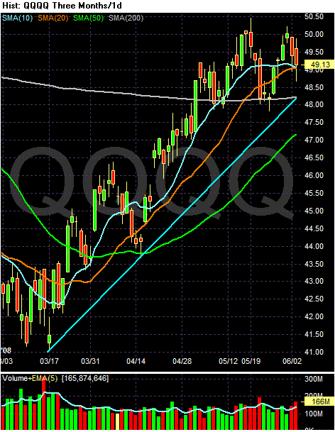
The QQQQs are still in a rally. However, the SMA picture is turning a bit mixed for two reasons. First, the 10 day SMA has been moving sideways for awhile and the 10 day SMA is about to move through the 20 day SMA. However, prices are still above the 200 day SMA which is positive. Finally, notice the QQQQs may be forming a double top right now. However, the overall picture is still positive.
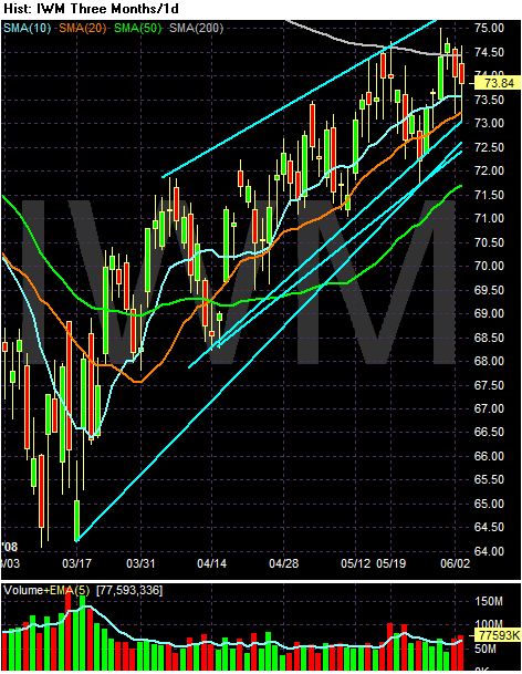
The IWMS still look good technically. Notice the following:
-- The shorter SMAs are bullishly aligned (10 > 20 > 50)
-- the shorter SMAs are all moving higher
-- Prices are above all the SMAs
-- Prices are right at the 200 day SMA and need to move through this level for the rally to continue.
GM said Tuesday its U.S. sales fell 28 percent in May compared with a year earlier, while Ford's sales fell 16 percent, Chrysler LLC's sales were down 25 percent and Toyota Motor Corp.'s sales slipped 4 percent.
Honda Motor Co., riding the wave of customers seeking better fuel efficiency, said its sales jumped 18 percent, led by a 36 percent increase in car sales. Nissan Motor Co. said its sales rose 8 percent, with a 19 percent increase in car sales.
The Toyota Corolla and Camry and Honda Civic and Accord sedans all outsold the F-series truck, which saw sales plummet 31 percent in May to 42,973. F-series trucks have been the best-selling trucks in the U.S. for 31 years and the best-selling vehicles overall for nearly as long. They also have been the best-selling vehicles each month since June 2005, when the Chevrolet Silverado pickup took a brief lead.
Bottom line: Detroit is in trouble. Big time.

The SPYs broke trend about two weeks ago, right after they couldn't get beyond the 200 day SMA. Since then they have been selling off. Notice the following regarding their SMAs:
-- The 10 day just crossed below the 20 day SMA
-- Both the 10 and 20 day SMA are heading lower
-- Prices are below the 200 day SMA -- and couldn't get above that level
-- Prices are right at the crucial 50 day SMA

The QQQQs are still in a rally. However, the SMA picture is turning a bit mixed for two reasons. First, the 10 day SMA has been moving sideways for awhile and the 10 day SMA is about to move through the 20 day SMA. However, prices are still above the 200 day SMA which is positive. Finally, notice the QQQQs may be forming a double top right now. However, the overall picture is still positive.

The IWMS still look good technically. Notice the following:
-- The shorter SMAs are bullishly aligned (10 > 20 > 50)
-- the shorter SMAs are all moving higher
-- Prices are above all the SMAs
-- Prices are right at the 200 day SMA and need to move through this level for the rally to continue.
A Closer Look At the Financial Sector
Yesterday, S&P downgraded three members of the financial community, essentially saying there were more problems coming down the pike. Let's see how the sector is doing fromo a trading perspective.
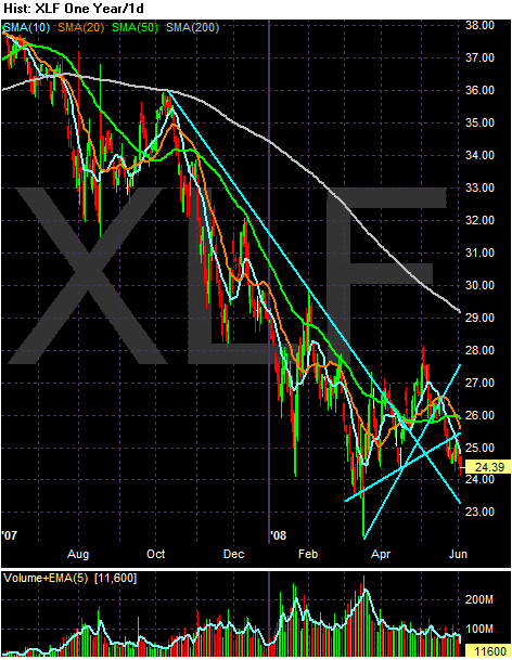
Notice the following points on the long-term chart.
-- Prices broke through their downtrend in May in an attempt at a rally. But they have since fallen.
-- Prices are below the 200 day SMA
-- Prices have broken through two smaller support lines that started in April
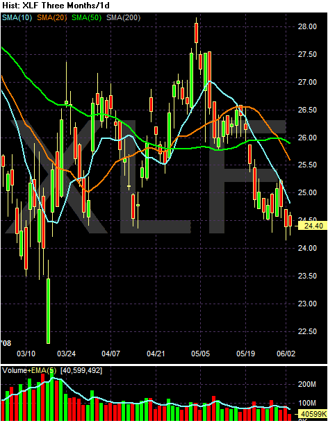
On the three month SMA chart, notice the following:
-- Prices are below all the SMAs
-- The 10 and the 20 have moved through the 50
-- The 10 and the 20 are both headed lower
-- The 50 just turned lower as well
Short version: this chart says sell me.

Notice the following points on the long-term chart.
-- Prices broke through their downtrend in May in an attempt at a rally. But they have since fallen.
-- Prices are below the 200 day SMA
-- Prices have broken through two smaller support lines that started in April

On the three month SMA chart, notice the following:
-- Prices are below all the SMAs
-- The 10 and the 20 have moved through the 50
-- The 10 and the 20 are both headed lower
-- The 50 just turned lower as well
Short version: this chart says sell me.
Construction Spending Drops; Manufacturing Weak
From the WSJ:
TO place this information in the largest context, go to this article which has a group of charts related to the manufacturing sector.
Let's look at the graphs/charts of these numbers to see what they say:
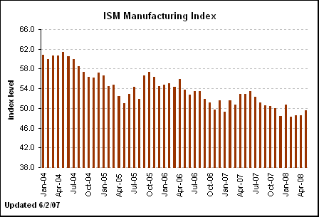
The general trend since January 2004 is lower. That's the macro-trend that supplies the backdrop. That means the one month increase will have to continue for a few more months before we can say the trend is reversed. Also note this number has been below 50 for four months. That in an of itself is a trend (a negative one) to keep in mind.
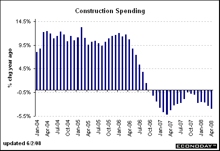
As for construction, it has had a negative impact on the economy for the better part of two years now. Notice that the latest numbers -- which show a year over year decline -- are being compared to periods where the number was already negative. That's not good news in the long run.
The fact that most ISM companies are exporters is very eye-opening. It does imply the number is skewed towards positive numbers in the current environment.
Finally -- notice this chart from the WSJ article:
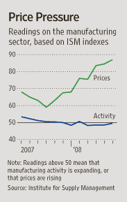
This is the prices part of the ISM report, which has been increasing for some time. That's not good. As the article noted:
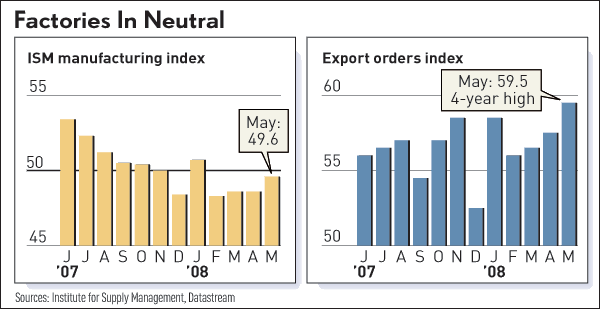
This chart from the IBD story shows two things. First, it gives us a better read of how the current numbers compare. Secondly, it shows how exports are helping out right now.

U.S. manufacturing activity contracted slightly in May, as exports kept the sector afloat and prices surged, but performed better than many economists had expected.
The Institute for Supply Management said its index of manufacturing activity rose to 49.6 in May from 48.6 in April. It was the fourth consecutive month that the index was below 50; readings below 50 signal a contraction in overall activity.
Even so, the report bolstered other recent data suggesting the economy is stagnant but not collapsing.
A separate report showed construction spending in April dropped by a seasonally adjusted 0.4% from the previous month, to $1.12 billion. Spending on private nonresidential construction, which includes hotels and office buildings, rose 1.6%, partly offsetting the slump in residential construction, which declined 2.3% in April and is down 21% from a year earlier, the Commerce Department said.
In the ISM report, exports continued to increase, extending a five-and-a-half-year trend that is helping offset slowing U.S. demand, and production expanded. New orders rose and imports grew slightly. But high commodity costs pushed prices to a four-year high, and employment and inventories contracted.
"Were it not for the weak dollar," which makes prices of U.S. goods cheaper abroad and stimulates export orders, "I really do believe we'd be looking at far lower readings," said Norbert Ore, a Georgia-Pacific Corp. executive who directs the survey. He noted that 80% of ISM member companies are exporters.
TO place this information in the largest context, go to this article which has a group of charts related to the manufacturing sector.
Let's look at the graphs/charts of these numbers to see what they say:

The general trend since January 2004 is lower. That's the macro-trend that supplies the backdrop. That means the one month increase will have to continue for a few more months before we can say the trend is reversed. Also note this number has been below 50 for four months. That in an of itself is a trend (a negative one) to keep in mind.

As for construction, it has had a negative impact on the economy for the better part of two years now. Notice that the latest numbers -- which show a year over year decline -- are being compared to periods where the number was already negative. That's not good news in the long run.
The fact that most ISM companies are exporters is very eye-opening. It does imply the number is skewed towards positive numbers in the current environment.
Finally -- notice this chart from the WSJ article:

This is the prices part of the ISM report, which has been increasing for some time. That's not good. As the article noted:
Respondents to the ISM survey noted prices are "skyrocketing" and posing "major hurdles." The prices component of the ISM survey jumped to 87 in May from 84.5 in April, and Mr. Ore noted that doesn't yet capture the full impact of rising oil prices.
This chart from the IBD story shows two things. First, it gives us a better read of how the current numbers compare. Secondly, it shows how exports are helping out right now.
